SALES / SUPPORT : 844-232-4816
How to Design a Social Media App Logo
Creating a social media logo is an exciting art brief. You get to work with modern designs, experiment with bright colors, and explore how well you have your finger on the young-adult audience pulse. Do you know what they are looking for in design and branding? If you are not sure or would like to brush up on your skills, this is the tutorial for you.
The logo design expert, William Patterson, is here with a brand new video. This time he is sharing his expertise on how to create a social media logo that is eye-catching, perfectly-designed, and completely on-brand.
If you would like to jump to the video directly, find it right below. We provided the tutorial transcript below if you want to practice and would like to have a set of written instructions ready. We have also added some additional help material so you can up your social media logo design game.
The Tutorial Transcript
Before I begin, let me tell you that this work is not for a client, and it is just my process to up my logo design game by giving myself art briefs and challenges. The art brief that I have given myself today is: to create a social media messaging app icon, something equivalent to WhatsApp, with the target market of young adults of 16-30-year-olds.
For this design brief, my focus will be on the typographical aspects of the logo because I love creating those designs. In this tutorial, I will be talking about and working with principles of typefaces and fonts. We will achieve our logotype design by slightly adjusting those principles. While it is mostly going to be a logotype design, I will also use an icon in it, just to give it that buzz.
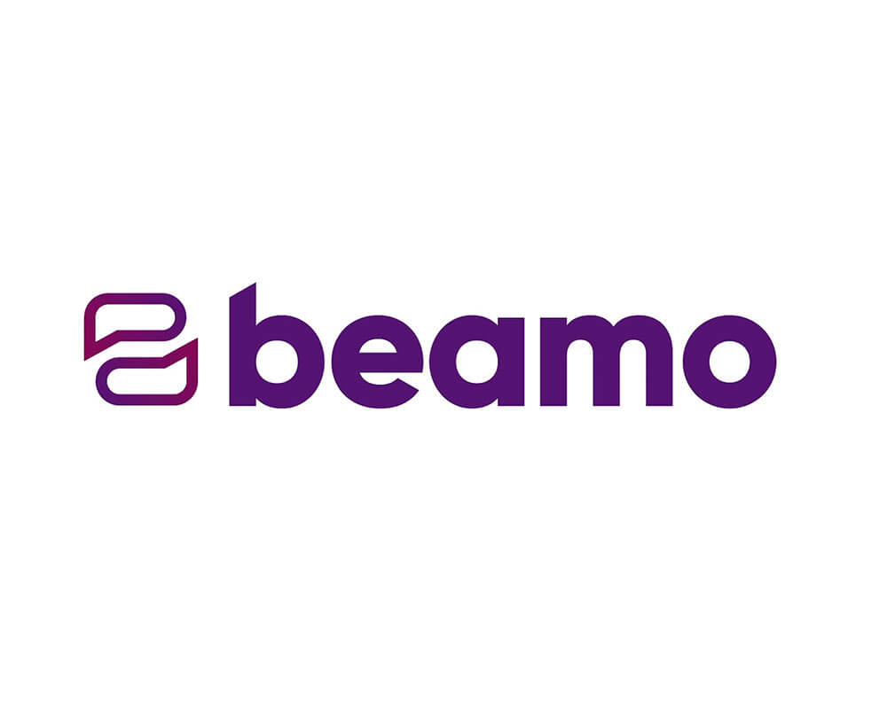
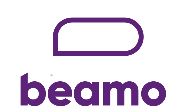
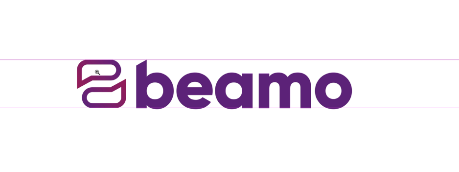
When finished, it will look like this:
So let us dive right in.
Step 1 Sketch and Select Typeface
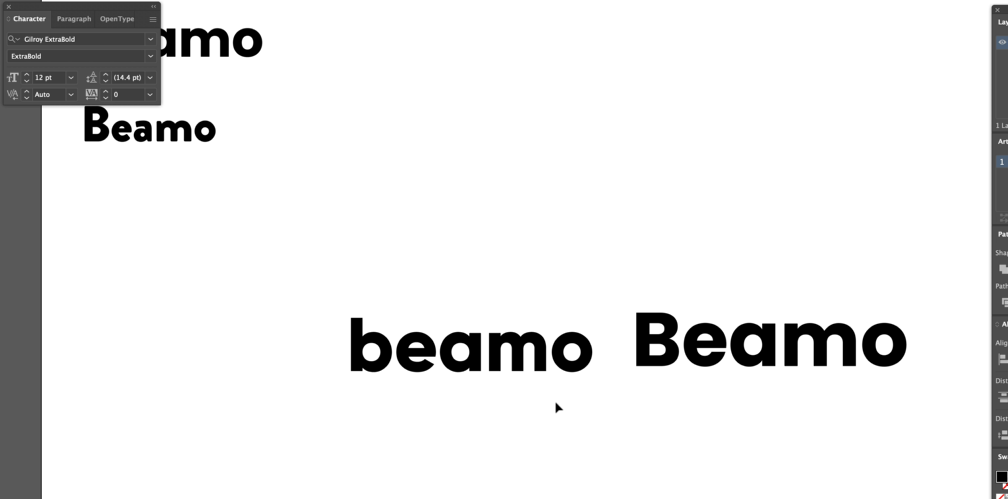
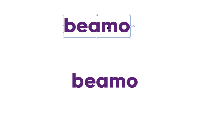
The name that I have chosen for this app is Beamo. So the first step is to write it down on your screen. Usually, I sketch my logotypes first when I am working on a client project, but for this project, we are going to skip that part.
Brand name added, now click on your toolbar and select a typeface.
I have chosen the Gilroy Extrabold because it looks more professional and modern. It is important to remember that when you are working with a contemporary company, you design their branding by using modern typefaces.
So keep checking out the design with multiple modern types to make sure what you choose works for the brand. I am checking mine in Poppins font too, and the comparison has convinced me that Gilroy is the best. So we are going to stick with that but in lower caps, because I think that looks even better.
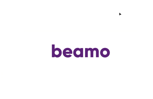
Step 2 Work on Color Options
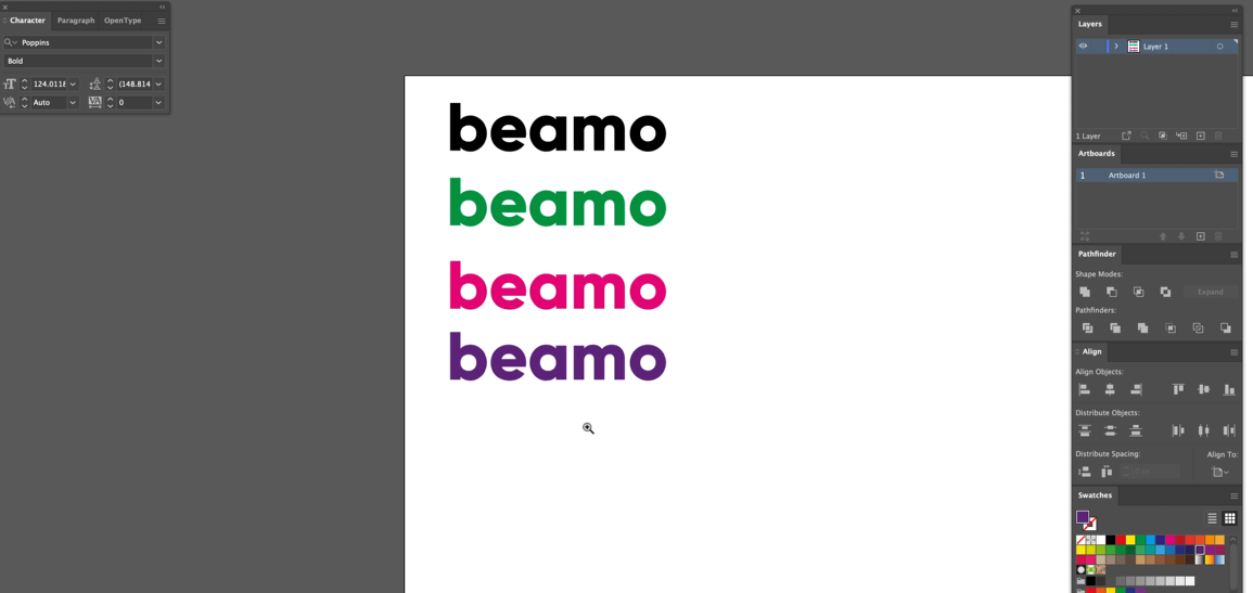
We have finalized the font style; let’s see what color we want to give to our logotype.
For a client project, you will receive specific color palette guidelines. But this is our project, and we can go a little crazy. I will use primary colors because the app is for younger people who are modern and know social media, so I want something bright and vibrant.
Start choosing colors from your Swatches panel and see which colors work best. I have tried green, and it looks a bit strange. Then pink, which looks better. I like the vibrancy of it. But let us change it more. How about purple? I think I like purple the most because it is the perfect balance between pink and dark purple or dark blue – it gives you that middle ground that will make your logo modern, but not garish.
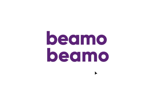
Step 3 Kern and Trace Typeface

Color figured out; we are going to talk about kerning now.
Kerning is about the amount of space between each letter in a font. While typeface designers ensure that kerning is similar in all the letters of a typeface, it is still never going to be perfect for each different project. For example, the space between letters here looks a little strange to me; to non-designers or very new designers, though, it may look okay, even perfect. But we are going to correct it.
The first thing I will do is copy and paste it up there as a reference point, so you know where you have gone wrong, which you will, ultimately, at some stage. It also helps you to take a look back and see the evolution of the logo.
To begin kerning, zoom in a little but not too in or too far, so you can be at the perfect distance to spot the mistakes without losing your perspective.
To kern the typeface, we will use the Type tool. We are going to use the Alt (Windows) or Option (Mac) and the arrow keys, and it will help us do the kerning one step at a time; that way, we will achieve exact precision.
So I can see that the ‘a’ looks a bit strange towards the ‘e’, so let us move it in. The same with ‘o’ so I will move it just a little bit in. Just keep going through all the letters to make sure that kerning is fine. If you find that something looks strange, we can always move it out a bit afterward. Now, zoom it out a little to have a better look.
Pro tip: Kerning not only makes the logotype look good but makes it more than a collection of letters – it makes it into an organic, proper word. So always work on kerning when you are designing logotypes, no matter which typeface you have chosen. Kerning also helps make the word look readable, no matter its size.
Yes, it looks perfect now. Compare it with the original kern, and you can see what a massive difference our kerning has made.
Step 4 Change Typeface to Shape
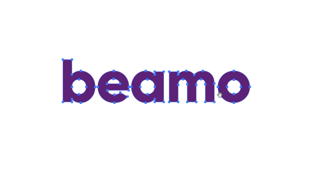
To make our logotype look even more promising, we are going to change it slightly. Press Command (Mac) or Shift (Windows) and O to outline the typography to transform the design from a font to a vector shape. The vector shape allows you to make changes to individual parts of the logo as it is no longer a word/editable text but a unique vector shape.
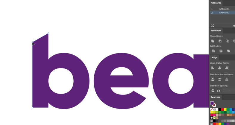
To change the shape of this logo, I am going to slant the letter 'b' in the logo just a little bit. Click on the top-left point on the letter b and bring it slightly down. And we are done. It is our final logotype, and it looks modern, fresh, and unique.
Step 5 Create an Icon
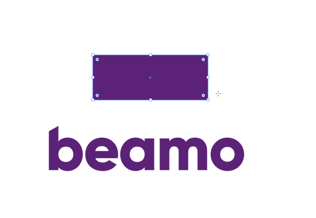
Next, we are going to work on our icon. Whenever I work with symbols and logotype together in a design, I try to keep the icon choice as clear as possible, within the context. The icon shape I have chosen for this logo is a chat bubble. To create chat bubble icon, I am going to add a square shape here and turn it into a stroke, something like this.
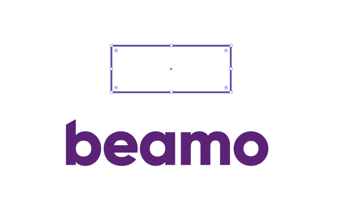
Then, I will up the stroke quite a bit to make sure it matches the weight of the font.
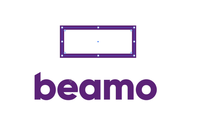
Now go to all the corners of the shape to create a chat bubble by using your Direct Selection tool and dragging them in, so it goes from a square to a bubble.
I want to give the chat bubble a pointy shape to visualize that someone’s talking. To do that, I will bring the downward point of the lower-left corner even lower. To do that, press the + sign, highlight the shape, and drag the corner down. It will give us this shape.
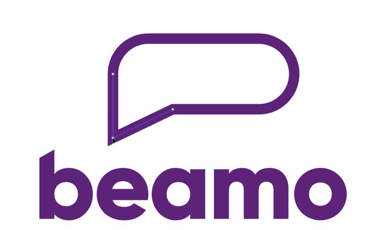
The next step is working with the Bezier path to adjust the shape even more and make it look more organic. Just keep on modifying the shape until you are happy with what you have achieved. If you do not know what a Bezier path is, then check out my video that explains all that you need to understand this concept.
Now, with all the adjustments done, this is what we have created.
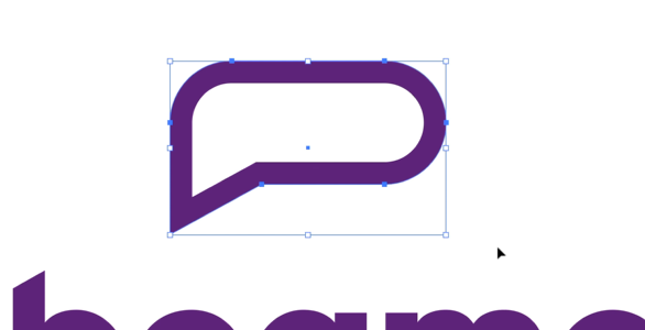
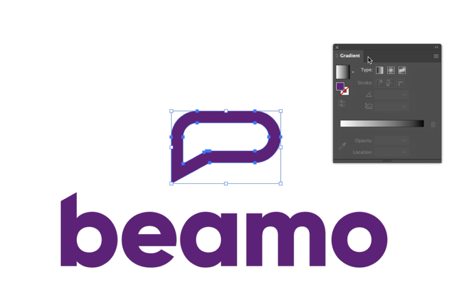
While this looks nice, I want to sure that this will work when placed inside an app icon. So let us create a square first, then round its corners, bring your chat bubble in, and make sure it fits within the entirety of the icon.
Now the next step will make the icon really something. We will be adding color gradients to it. To add the color gradient, let us first turn the outline into a vector shape again. So, highlight your chat bubble, go to Object on your toolbar, and from the dropdown list, select Path. Then click Outline Stroke. Now you can see that the shape is not a stroke, but a fill. The reason I have done this is that it is easier to add gradients to fill than a stroke.
Next, we will need to access your gradient panel. Highlight your shape, go to toolbar, select Windows, and from the dropdown menu, click on Gradient. It’ll open up the gradient box right next to your shape. You can drag the box anywhere you like to work with it more comfortably.
The reason I’m using gradients is that they are perfect if you want to gain and retain customer attention. I have done a whole video on how to work with freeform gradient colors, so make sure you check it out to get ideas and to learn what it is all about.
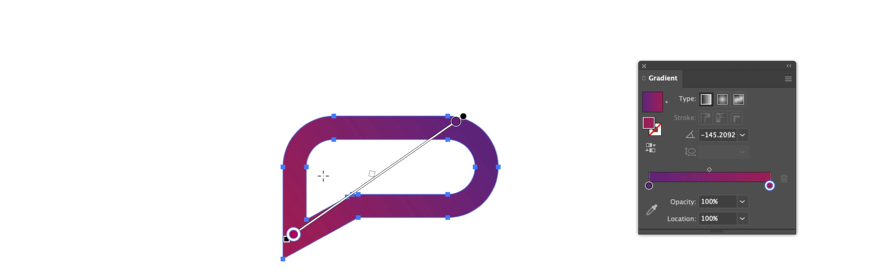
Now, gradients. I am going to use primary colors again. Drag the colors from your Swatches panel to your gradient color bar. You can choose a linear gradient, a radial gradient, or a freeform gradient, to experiment and see how it looks. I am going for a subtle effect that is great for attention but does not take focus away from the whole concept of the design. So this is what I have chosen:
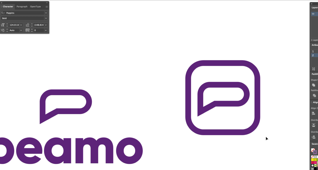
Step 6 Experiment and Test Icon Placement
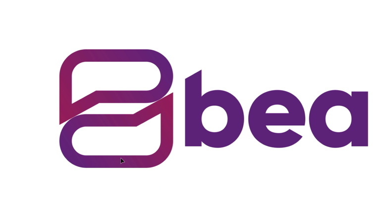
The final step is about icon placement next to the logotype. While the icon looks fine above the logotype, I want it to look even better. So I will bring it down to rest next to the ‘b’. But now the icon looks much bigger than the letter ‘b’, and I do not want that. At the same time, I also do not want to decrease the thickness of the icon because I want it to have the same weight as the logotype. So what I do is, I make a copy of the logo icon, drag it down a bit, and then flip it.
This effect makes the design look even better because it now looks like a two-way conversation with one person talking and the other replying, which is perfect. But the icons don’t fit perfectly but with a bit of adjustment, we can make it work.
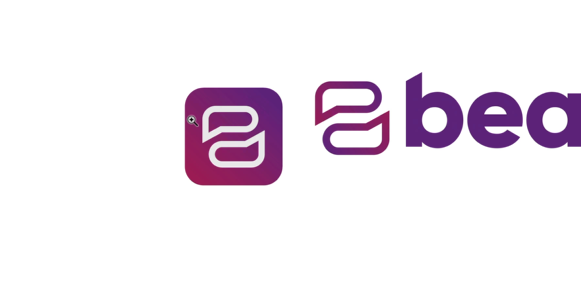
In the next step, we are going to test the icon and see if it fits into the app icon size. This test is crucial as it will help us determine if our logo icon fits into the tiny app icon container. It must not look cramped but organic and natively placed. As a designer, it is your responsibility to make sure that the icon works in tiny sizes too.
To check this, let us create another square, round in its corners, and place your chat bubble inside it. Then turn the fill of your icon with white color to make sure it stands out. Let us also change the color of the app icon itself and make it similar to our icon gradient. And there, we have it.
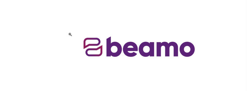
Now, the very last step: making sure that the logotype and the logo icon are in perfect balance to each other. Right now, the logo icon looks a little bigger than the type and we are going to change that. To do that, we will work with the Guidelines. These guidelines will help us know if the icon and font fit perfectly together. You to have to use these guidelines as often as possible to ensure that the sizing is correct.
As you can see, the icon still looks a bit bigger next to that ‘b’. The reason is that a corner of ‘b’ is ascending to the top. And while the guidelines tell us that the height of that top corner and the top surface of the icon are the same, our eyes still see the logo icon as a little bigger. The solution: we scale the logo icon down just a little bit and see if that works.
Yes, it works. The reason it works now is that the smaller size gives us the illusion that both ‘b’ and the icon are now of the same size. And with it, it must be clear to you how lots of logo design work is optical illusions to achieve the ideas of perfection, symmetry, and balance.
So, all done. We have our final logo ready.
Best Logo Style for a Social Media Logo
Logo styles come in various forms and types. Depending on who you ask, you may end up with 4-7 distinct logo styles. These include typographic logos (wordmarks and lettermarks), monogram logos, pictorial logos, combination marks, and others. The logo style most suitable for a social media logo, however, is the combination mark.
A combination mark or a combination logo is the mix of an icon plus a typeface, just like a logo with a telemarketer icon and company name. It is the most common style of logo design and highly popular as well.
The reasons a combination mark makes the most sense as a social media icon are:
- The typeface of the logo helps in brand name recall, and the icon part enables the social media app to have a distinct symbol that fits into the standard app icon size.
- Combination marks make the design simple and easy to understand.
- Highly effective for newer social media apps to popularize their brand name
Most of the popular social media icons, such as Twitter and WhatsApp, etc. started as combination marks. Only now, when they are house-hold names, have they evolved to rely on their more distinct and to-the-point pictorial style logos.
Let us see how they have evolved:
An Older Twitter Logo
Image: Fontlot
The Latest Twitter Logo
Image: The New York Times
Social Media Logo Design Best Practices
Graphic design, logo designing especially, is a work of acute creativity. Let your imagination go and see where it lands you. At the same time, there are tried-and-tested standards in place that let your creativity have some structure to build on. Let us see what these tried-and-tested standards – aka best practices – are when it comes to social media logo design.
Use Credible Visuals
Credible visuals make all the difference when it comes to the success of a social media logo design. A unique social media logo with original thought behind it makes the logo – and the social media platform – memorable.
With authentic visuals, you can cut through the noise and emerge as original in a sea of uninspiring logo designs. To create a credible social media logo, pay attention to every aspect of your design.
Choose icons that are obvious but still have something unique about them. Make it easy for people to spot your logo, immediately deduce what you do, and be blown away (or at least engaged) by your creativity.
Relevant to the Target Audience
Remember who your target audience is. A large percentage of people who use social media belong to the 16-30 years -old range. They know social media, are aware of the technology and will be utterly unimpressed by a poorly thought out design.
So, design a social media icon that is modern, youthful, and energetic. Choose a modern typeface and experiment with it. Go bright in your color choice and see how you can strike the perfect balance between professional and casual.
Communicative of the Brand Intent
More than any other industry logo, social media logos need to instantly decipherable. When people are on the Internet, they are looking for quick, most ready information. So make the icon and other details of the logo instantly understandable.
Through your logo design, the audience should immediately know what this new social media app is all about. Is it a messenger app or a matchmaking app logo? An online map or a new way to plan hangouts with friends?
You can communicate all about your brand intent through your social media platform logo design.
Image: Play button logo icon
Customize the Typefaces
Customize the typeface through tracking and kerning to achieve a unique look. The perfect kerning will make your logotype look more like a unified, single word, instead of awkwardly spaced letters. Spacing between each letter should be relatively similar to the eye.
But be careful about going overboard. Too much editing of the typeface and the brand name will not look modern or professional at all.
Must Fit into an App Icon
A social media brand logo and its app icon will always be different from each other. An app icon will always be a distinct icon – either a picture or a letter that can fit into the standard app icon size.
Learning from the Best Social Media Apps
We have discussed the best practices to design social media logos, let us see what the popular social media apps have done with their logos. In exploring their designs, we will see what we can learn from them.
Let us start with the biggest of them all.
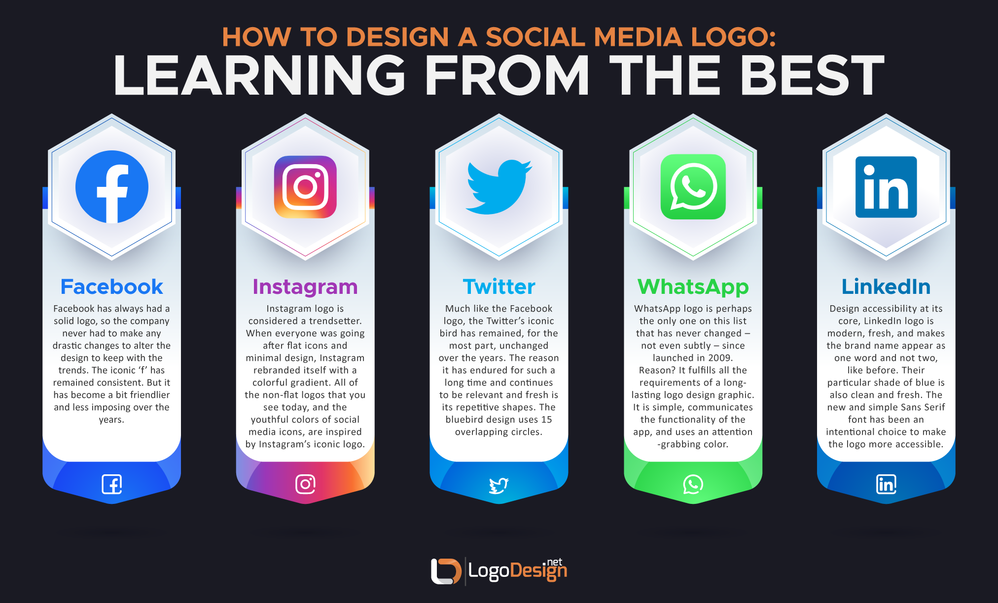
Facebook has always had a solid logo, so the company never had to make any drastic changes to alter the design to keep with the trends. The iconic letter ‘f’ in the logo has remained consistent. But it has become a bit friendlier and less imposing over the years.
Image: Wikimedia
Takeaway messages:
- Get your logo right from the beginning, so you do not have to keep changing it.
- Focus on a distinct, but simple, lettermark logo with an icon that can evolve with little effort.
- Choose a color that is attractive and can stand out in a crowd of tiny symbols.
Instagram:
The Instagram logo is considered a trendsetter in terms of visual identity and design. When everyone was going after flat icons and minimal design, Instagram rebranded itself with a colorful gradient logo. Though people mocked the logo design initially, the test of time has revealed that it is the only social media logo that still looks modern, trendy, and youthful. All of the non-flat logos that you see today, and the youthful colors of social media icons, are inspired by the iconic logo of Instagram.
Image: Wikimedia
Takeaway messages:
- Do not be afraid to take risks. Calculated risks based on knowledge and skill pay off.
- Think of ten years ahead when designing a social media logo. Instead of following trends, set them.
- When working on color gradients, choose colors that complement/contrast each other.
- To balance the brightness of colors, introduce some white in design.
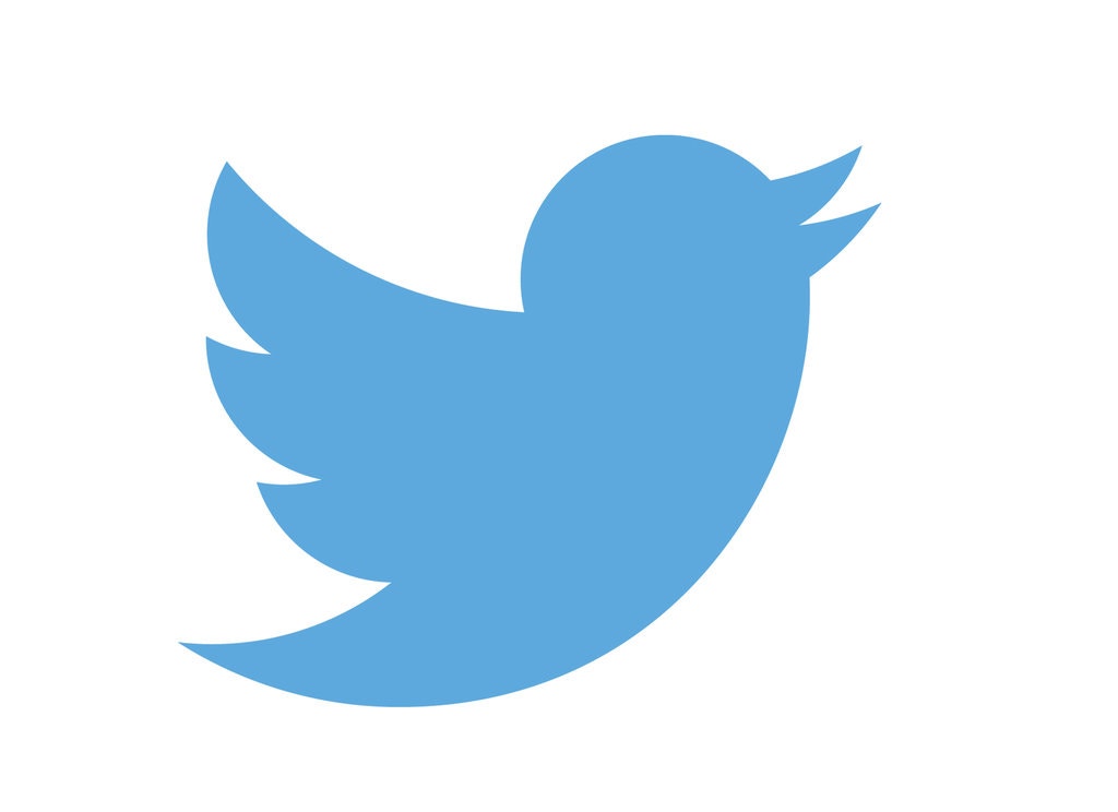
Much like the Facebook logo, the bird icon of Twitter has remained, for the most part, unchanged over the years. The reason it has endured for such a long time and continues to be relevant and fresh is its repetitive shapes. The bluebird design uses 15 overlapping circles. The repeated use of the same logo shape has made the whole design easy to understand and exquisitely non-cluttered.
Image: The New York Times
Since the word ‘twitter’ means chirping of birds, the use of a bird logo is simple in its relevance and communication for the brand.
Takeaway messages:
- Make sure there is a direct and relevant link to your logo icon and the brand name / nature.
- Rely on only a few shapes for your social media logo image and repeat them to achieve an organic design.
- The more natural a logo design looks, the easier it will be for people to comprehend it instantly.
The WhatsApp logo is perhaps the only one on this list that has never changed – not even subtly – since launched in 2009. Reason? It fulfills all the requirements of a long-lasting logo design graphic. It is simple, communicates the functionality of the app, and uses the exact right shade of color that is attention-grabbing without being too bright. The phone icon circled with a speech bubble has proven to be a trend-setting icon for social media messaging apps.
Image: Wikimedia
Takeaway messages:
- Be direct in your logo icon choice. Immediately tell people what your social media app is all about.
- For a dual-purpose app, think of creative ways to incorporate both the symbols in your logo.
The professional networking social media app has gone for a massive rebrand. While its previous logos were nothing to brag about, the new one takes the cake. Design accessibility at its core, the new logo looks more modern, fresh, and makes the brand name appear as one word and not two, like before. Their particular shade of blue is also clean and fresh. The new and simpler Sans Serif font has been an intentional choice to make the logo more accessible.
Image: Wikimedia
Takeaway messages:
- If your wordmark logo is long, pick a part of the name that is most communicative of your brand intent.
- To reach a wider audience, focus on accessibility as an integral part of your design brief.
- No matter how late it is, when you realize that something about your social media logo is not working, change it.
Conclusion
Social media logo designs need to have a fresh and simple look to them. The simpler a logo design is, the neater and more sophisticated it looks. We hope our tutorial and the accompanying material will prove helpful to you as you navigate the murky waters of social media identity designs. These can be treacherous to wade, but once you get the hang of them, working on contemporary design projects becomes a breeze.
Reviewed: by Zaheer Dodhia, CEO and Founder LogoDesign.net.
Video Tutorial by : by Will Paterson