In a world where new AI startups launch almost daily, having groundbreaking technology isn’t always enough. The brands people remember are often the ones with logos that instantly capture attention and communicate their vision.
From automation platforms and robotics companies to AI-powered healthcare and fintech solutions, the industry is growing very quickly. A strong logo can be the first thing users, investors, and customers notice about an AI company, making it a powerful tool for creating trust and recognition. Be it sleek typography, abstract neural-inspired symbols, minimal geometric icons, or futuristic color palettes, you need to consider all the elements that work together to create a versatile logo.
If you are building your own tech company, rebranding an AI product, or simply looking for inspiration, we have a collection of more than 100 AI startup logos that you can explore.
What Makes an Impactful AI Startup Logo?
A successful AI startup logo communicates innovation, intelligence, reliability, and forward-thinking ideas in a simple way. Since the AI industry is highly competitive and technology-driven, logos need to instantly create trust and also feel futuristic and memorable. Let’s explore a few factors that help them make a lasting impression instantly.
Simplicity With a Futuristic Touch
When looking to design a startup logo, keep in mind that the best ones have a clean and minimal appearance without compromising on futuristic elements. Simple logos are easier to recognize, scalable across digital platforms, and more adaptable.
Smart Use of Typography
Many startups use sleek sans-serif fonts, geometric lettering, or custom typography to create a modern and tech-focused appearance. Rounded fonts can make a brand feel approachable, and sharp geometric fonts show innovation.
Meaningful Symbols and Icons
AI logos do include abstract symbols inspired by neural networks, data connections, circuits, automation, or digital intelligence. The strongest designs use symbols that feel relevant instead of overly complicated, helping audiences quickly associate the brand with advanced technology.
Strong and Modern Color Choices
Color theory helps shape how users perceive an AI company. Blue is commonly used to represent trust, intelligence, and reliability. Similarly, gradients, purples, silvers, and neon-inspired accents create a futuristic feel. A balanced color palette helps the logo stand out without becoming visually overwhelming.
Scalability Across Digital Platforms
AI companies mainly operate heavily online, so logos must look sharp on websites, apps, dashboards, social media profiles, and mobile devices. A good AI startup logo remains recognizable when displayed as a tiny app icon or across a large presentation.
A Unique Brand Personality
Some brands focus on innovation and automation, and others focus on human-centered technology, creativity, or accessibility. A strong logo captures that personality and helps the startup differentiate itself from competitors.
100+ AI Startup Logos that are Futuristic
AI brands are shaping the future of technology, and their logos are evolving just as fast. In this collection of 100+ futuristic AI startup logos, you’ll find modern designs that combine innovation, intelligence, and creativity through sleek typography, bold symbols, minimal aesthetics, and tech-inspired visuals.
1. Grin

The logo of GRIN feels modern, approachable, and creator-focused. Its clean lowercase typography gives it a friendly and accessible personality. The subtle curve and rounded forms show the idea of a grin or smile. This minimalist design works well with the brand’s role in influencer and creator marketing.
2. Nace AI

With a simple 3D cube design to create a modern brand impression, Nace AI’s logo is just what you would expect from an AI startup. The cube suggests structure, depth, and modular thinking, which is associated with data architecture. It features bold lowercase typography wrapped across the cube’s faces, giving the logo a playful but technical feel
3. Sierra

Its icon is a floral or mandala-inspired geometric mark. Paired with a minimalist wordmark and the logo for Sierra AI has a calm and trustworthy appearance. The design communicates sophistication, reliability, and communication. It matches the company’s mission of building AI agents that feel natural and seamless in customer interactions.
4. Arena Physica

Instead of relying on flashy futuristic visuals, Arena Physica’s logo reflects a more research-driven AI aesthetic. Its geometric globe-like icon shows interconnected systems and exploration. For a deep-tech research lab than a typical software company, this works quite well. The monochrome palette also appears to be inspired by academia, physics and thinking.
5. Standard Intelligence

This logo for Standard Intelligence takes a bold, modern approach with a clean geometric icon and minimalist sans-serif typography. The cube-like symbol is to give an impression of structure, and intelligence. It feels practical, scalable, and product-focused, reflecting a company positioned around reliable, engineered intelligence.
6. Parallel

Parallel has gone with a spherical form that has lines going through to create a sense of motion and processing. It also matches with the company’s name slightly as the lines appear parallel. The clean typography and font style is great for a startup focused on technology and simplifying tasks.
7. Ineffable Intelligence

The logo for Ineffable Intelligence merges a mysterious symbol with their wordmark. Its abstract icon and thick letterforms convey depth and technological advancement closely. This AI startup has chosen a vibrant orange instead of muted or black and white colors. All the elements together make the logo look friendly too.
8. Osmo

Osmo’s logo stands out for its clean minimalism and innovative typography. The circular icon with geometric elements creates a futuristic, tech-first appearance and also keeps the focus on it’s purpose. This style draws attention to the platform’s mission to combine scent with creativity and make it easier for people to launch custom fragrances.
9. Replicate

The AI startup has a simple, abstract mark built around a geometric ‘R’-like form made from stripes. With a simple and clear-cut san serif font style, Replicate has kept it relevant to the industry too. You’ll see that the favicon appears in a bright red, featuring just the stripe. But their logo in black and white is for clarity and to show reliability in tech as well.
10. Legora

The logo for Legora is a modern wordmark and an abstract symbol that appears across their social and web presence. The minimal geometry and balanced spacing give it a sense of trust and stability, which is important for a product used by law firms. It’s icon has a subtle L merged with an abstract design that showcases AI progress in the legal industry.
11. Mindfort

MindFort has opted for ‘security-first AI branding’, using an icon that represents protection. Its structured form feels like a stylized shield that also looks a bit like the letter ‘M’. Combined with minimalist typography and a monochromatic palette, the design stands for trust, precision, and reliability.
12. Resolve.ai

Resolve.ai’s logo immediately catches the eye with its bold lime-green geometric icon paired with elegant serif typography. The abstract folded shape gives the brand a modern, AI-driven feel while also symbolizing movement and problem-solving. This AI startup uses an interesting contrast to create a memorable identity that feels both approachable and advanced.
13. Sycamore

The geometric icon is inspired by the Sycamore leaf and shows connectivity and intelligence. Sycamore has chosen serif typography to add a layer of credibility and sophistication. Its logo uses balance and structure to create a timeless visual identity that feels both innovative and trustworthy for an AI-driven company.
14. Applied Compute

Applied Compute has an orange icon made of two connected circular shapes that may symbolize a loop or an infinity concept. The bold sans-serif typography gives the name a clean, approachable, and professional appearance. Its sleek and contemporary look is commonly associated with software, AI, cloud, or infrastructure companies.
15. Liquid

It’s icon represents a water drop that has a modern, geometric appearance. With sleek typography, this logo highlight’s the company’s focus on lightweight AI systems designed for speed and adaptability. The minimalist aesthetic works well for Liquid and gives people an idea of the startup’s niche as well.
16. Juna AI

Juna AI has chosen to keep it’s logo typographic with very thick, stylized letters. The branding reflects advanced engineering, automation, and real-world industrial impact with bright gradients and impactful typography.
17. Snorkel

The startup introduces a unique mascot called ‘Dr. Bubbles’ giving the company a more approachable and human personality. Snorkel AI makes an interesting choice to go with such a logo given the industry. Paired with a minimalist wordmark where the last two letters also form a snorkel, this logo can make people look for for more information right away.
18. Magic

Its minimalist, abstract icon and sleek typography create a sense of mystery. The branding avoids playful visuals and instead focuses on sophistication, scale, and a clear-cut appearance. Magic’s logo shows the industry and purpose to engineer AGI solutions.
19. Finch Legal

Finch Legal has a simple finch as it’s icon with the name in Sans Serif font style. The AI-first legal operations company has a brand identity that creates a strong sense of professionalism. By adding ‘finch’ in it’s name and logo, it also appears friendly and approachable.
20. Sola

The abstract icon looks like stylized leaves or petals with a sparkle above, conveying ideas of growth, intelligence and transformation. Sola’s logo features the name in minimalist lowercase typography. This branding clearly shows an AI or technology company.
21. Cake AI

This logo for Cake uses an extremely minimal, geometric design that leans into clarity and modern tech. The abstract mark on the left could be a shape of a cake slice or a folded structure to symbolize layering or building blocks. It works well with the clean, sans-serif wordmark to show a sense of professionalism and engineering precision.
22. Ultravox

Ultravox has a futuristic identity, with its abstract icon in an orange-pink gradient. The wordmark is sharp, showcasing clarity and technical precision. This matches the company’s core product, which is building voice AI agents that understand speech directly.
23. New Generation

This logo uses a minimalist geometric design made of four black vertical shapes that increase in width from left to right. It creates a sense of motion and growth, giving New Generation’s logo a dynamic feel. For an AI commerce platform, this design communicates the purpose right away.
24. Fireflies AI

The Fireflies.ai logo has geometric shapes in a pink and purple gradient forming the letter ‘F’. It’s paired with simple typography for the company name. Together, the design draws focus to clarity and efficiency which are qualities associated with AI productivity tools.
25. Liminal

Liminal has chosen a sleek and futuristic minimalism that works well with the company’s mission of secure generative AI for enterprises. Its clean geometric structure that also integrates the initial of the name communicates precision, trust, and control.
26. Lemni

The icon resembles two interlocking shapes or folded forms, showing collaboration, and seamless interaction. Its rounded edges and muted tones give Lemni a more human feel. Combined with the minimalist wordmark, the logo appears contemporary and relevant for an Agentic AI platform.
27. Cohere

Cohere’s logo combines a playful abstract icon with professional simplicity. It features rounded, organic shapes in muted green, orange, and purple tones, creating a friendly look. The soft clear-cut wordmark helps the AI company look different from more corporate identities.
28. Datacurve

The curved geometric icon suggests movement, flow, and connectivity. Its minimalist style creates a clean and professional identity. With simple typography, Datacurve delivers a futuristic look with this logo that feels both intelligent and scalable.
29. Mirelo AI

Mirelo AI’s logo has a clean and futuristic design with a few lines that represent sound waves. It works well for the AI-powered audio generation and creative technology platform. The visual identity is modern and minimal, and shows innovation without relying on overly complex graphics.
30. Mithril

The logo features a sharp geometric symbol with clean typography to create a modern and technology-driven identity. Milthril has chosen an abstract star-like icon to showcase connectivity and intelligence. It includes a small accent color that adds energy to the design.
31. OpenHands

Its logo is just like the name, showing two open hands. This design choice focuses on the purpose of support, collaboration, and trust. OpenHands makes it clear that it wants to present AI as an assisting partner in the development process.
32. Mistral AI

The logo of Mistral AI is a bold ‘M’ built from pixel-like rectangular blocks, giving it a distinctly digital feel. It’s structure could suggest modularity, code, and machine learning systems. This AI startup has opted for a bright, warm color gradient to add energy and optimism.
33. Continua

Continua’s logo is a bit different and stands out for its snake-like symbol. The soft purple tones add approachability and the elegant typography balances innovation with sophistication. IThis startup has chosen a dynamic design and a futuristic identity.
34. Ada AI Agent

With an abstract figure, the icon makes it clear what Adahas to offer with it’s agentic AI for customer service. This has a minimal logo and communicates professionalism and efficiency. A lowercase wordmark also makes it appear customer-focused.
35. Cogent

The logo works well for this cybersecurity platform. It shows stability, technical expertise, and high security. The geometric symbol stands for strength or confidence. Cogent has kept the design simple and visually impactful.
36. Inception Labs

Inception Labs uses a sleek, futuristic design that reflects the company’s focus on advanced AI systems. Its structure and sharp minimalism create a sense of precision and technical depth, as the clean typography keeps the brand approachable.
37. AgentSmyth

This logo of AgentSmyth makes an impression with its experimental yet clear-cut typography. The branding avoids flashy AI symbolism and instead draws attention to its sophisticated, high-trust design language, which is very important for a financial platform.
38. Hebbia

The logo of Hebbia reflects the company’s focus on ‘AI for finance’. Its icon is a square that includes small to large geometric shapes. This matches the startup’s purpose and expertise perfectly and brings a sense of structure and balance.
39. Omnea

Omnea’s icon has a smooth, abstract form that feels quite fluid. Its rounded curves and green color palette symbolize both connection and movement, fitting for a platform designed to streamline complex procurement workflows.
40. Cursor

The icon is a sharp, angular geometric form that resembles a stylized cursor or marker, drawing focus on Cursor as an AI-first coding platform. It has a clean black-and-white appearance that gives this logo a highly modern and developer-centric feel.
41. Listen Labs

Its minimalist typography and geometric icon with soft or rounded structure create a sense of clarity and attentiveness, and intelligence. The logo highlights the core purpose of Listen quite well. Since the platform is centered around listening to human insights, it keeps the focus on that by avoiding visuals that could be overwhelming.
42. Doppel

Doppel has opted for a bright neon-lime color for it’s logo which makes the brand feel approachable but still technical. The icon looks like a split circle or mirrored shape to showcase ideas like duplication and detection, all relevant to Doppel’s focus on digital threat protection.
43. Avoca

The Avoca AI logo has a sharp abstract icon that gives a sense of motion and precision. It has a geometric cut to make it feel modern and tech-forward. This startup keeps the design minimal, going with a blue and black color palette.
44. Traba

Traba’s logo is typographic with a bold, industrial-tech feel. It appears in all lower-case letters, making the design friendly and human. This works well for a staffing platform serving warehouses, manufacturing, and supply chains.
45. Harmonic Fun
Its icon appears abstract and symbolic, representing structure, symmetry, or interconnected systems. The visual styles matches the platform’s core purpose of mathematics and logical reasoning. A monochromatic blue color adds depth to the design.
46. Ambience Healthcare

The Ambience Healthcare logo looks calm, premium, and clinical. It features typography that is clean and modern with a flowing, soft icon that looks like the silhouette of ‘A’. TThis is a good choice by the healthcare startup as it gives the brand a more human-centered feel.
47. Auctor

This logo is sleek, structured and draws attention to the name. The icon is merged with the typography with a twist on ‘a’ which represents connected workflows. Its visual style matches the company’s mission to help manage complex software implementations.
48. Elise AI

EliseAI has chosen clean typography and a stylized appearance to highlight the company name as its logo. This makes the brand feel calm, trustworthy, and credible. The identity demonstrates its expertise in automation and is well-suited to healthcare and real estate solutions.
49. Tennr
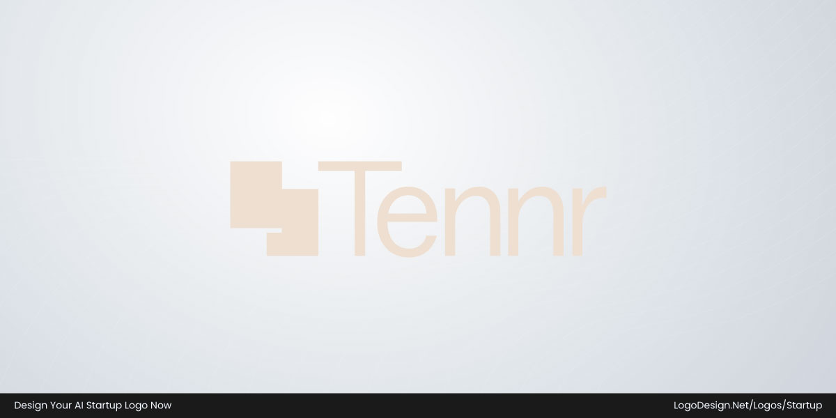
Its icon is made of blocky, offset squares representing documents or data being processed. Tennr focuses on automating healthcare and the logo is structured to show that at first glance. The warm red background balances clinical expertise with human connection.
50. XBOW

XBOW’s logo is quite stripped-back and intentional, with the icon being a minimal geometric crosshair-like shape that also appears as an ‘X’. Combined with a black-and-white color palette, the startup conveys a message of security that is relevant for the platform.
51. Glean

The Glean logo is a very interesting wordmark design. It is designed to have the ‘g’ subtly form a search icon and a smile to reflect the product’s purpose. This company aims to help people find information at work and making that experience feel simple and appealing.
52. Prepared 911

This typographic logo feels like an abstract signal, with the ‘P’ being used as a standalone icon too. Featured in a shield, it communicates coordination and emergency response. Prepared 911 has opted for a rusty gradient as its primary brand color to draw attention to the platform’s mission.
53. Cresta

The mark is abstract and rounded, representing two interlocking or flowing forms. It shows connection, feedback loops, and continuous learning. Cresta is for high-stakes customer service environments, so the brand needs to feel trustworthy and progressive.
54. Decagon AI

This logo has a modular, interconnected structure, which might symbolize agents working across channels. The wordmark is minimal, with a soft, neutral tone. It avoids sharp angles or aggressive visual styles. Decagon AI has also opted for a black color that works for the industry.
55. World Labs

It’s a clean wordmark with simple geometric spacing and an abstract symbol that could be for 3D modeling. The logo matches the core purpose of World Labs, which is to focus on spatial intelligence.
56. Sahara AI

This AI startup’s logo has a grounded base with lines above it, like a rising sun or signal burst. It represents stability and a system of agents, apps, and collaborative intelligence. The geometry is sharp and balanced, giving Sahara AI’s brand a sense of scalability and openness.
57. Allium

The Allium logo feels abstract and system-oriented, representing connected data layers. It works well for a platform in on-chain finance. With a clear-cut wordmark, this company’s branding convey it’s core message effectively.
58. Ema

Ema.ai’s icon is abstract but organic, almost resembling a brain or a connected system. The shape was designed to feel approachable and feminine. The branding has both credibility and warmth, making Ema appear as a collaborative employee.
59. Fieldguide

Fieldguide’s branding communicates organized workflows, documentation, and operational clarity, which fits perfectly for software handling audits. The abstract icon in lime green keeps it approachable instead of overly corporate.
60. HeyGen

The icon is a rounded geometric shape that is formed with multiple play buttons. Its colorful gradients match the AI video platform perfectly. HeyGen pairs it with a clean wordmark to show accessibility for creators, marketers, and non-technical users.
61. Quilter

The Quilter logo is very minimal, a clean typographic wordmark, with the standout being the stylized ‘Q’. It’s smooth, rounded, and highly legible, which shows precision, stability, and trust.
62. Ataraxis

Ataraxis has chosen an icon for its logo, which is a geometric, layered triangular mark that conveys structure and precision. The design is clean and minimal, with the company name in all uppercase letters and sans-serif font style.
63. Cyera

This logo of Cyera builds on the company’s modern, AI-native approach to data security through a clean and minimal design. Its icon features a circular arrangement of connected geometric nodes and the sharp, balanced lettering creates a sense of precision and control.
64. Basis AI

The Basis logo uses a clean circular form with a stylized ‘B’ inside that also reflects the company’s focus on AI-powered accounting systems. Paired with sleek lettering, this design has a professional and highly technical feel.
65. Rad AI

Its connected neural-network style symbol has a layered geometric structure that looks both like a brain circuit and a medical imaging network. As Rad AI is working on AI-assisted radiology, the logo matches the core purpose well. The bright blue color also shows innovation.
66. Infinitus

Infinitus has a logo that combines sleek, modern typography with an abstract icon. This futuristic visual identity works well for the company’s AI-driven healthcare communication platform. Its clean and minimal design conveys efficiency, trust, and tech-forward approach.
67. Captions

The Captions logo features a bold, abstract icon paired with a rounded lowercase wordmark. Its icon’s stacked, ripple-like form shows motion, layers, and transformation as the product is focused on AI-driven video editing.
68. Together AI

Together AI’s logo uses an abstract mark made of three interconnected circular nodes forming a collaborative shape. This icon represents ‘togetherness’ through its continuous, linked structure. With purple, pink, and orange tones, the startup has opted for an energetic feel.
69. Airspace Intelligence

This logo for Airspace Intelligence, also shown as ASI, is designed with clean, modern letterforms. It keeps the focus on the core purpose of airspace optimization and complex systems intelligence. Overall, the design is minimal but precise.
70. AMI Labs

The AMI Labs logo is a simple geometric or monogram-like visual that could symbolize structure and world-model intelligence. Paired with a clean, understated wordmark, it fits ithe positioning as a deep-tech AI research lab.
71. Squint, Inc.

Squint’s logo is simple and clear-cut, reflecting the product’s focus on clarity in complex industrial environments. A minimal, modern wordmark is paired with an abstract icon that shows its niche solution for manufacturers.
72. Commure

Its icon is built from simple interconnected, rounded lines and is followed by a sans serif wordmark in lowercase. These elements make the design impactful, showing how Commure helps streamline operations in healthcare.
73. Mindshub

This logo uses a stylized bear head as its core symbol, giving the brand a more distinctive and memorable identity. The green color palette combined with a minimalist wordmark keeps Mindshub’s design modern and tech-aligned.
74. Fathom Health

The Fathom Health logo is a straightforward wordmark in sans-serif and all uppercase letters. It focuses on clinical accuracy and enterprise healthcare. The purple to blue gradient works well for the industry.
75. Spot AI

Spot AI has small to large circular shapes as it’s icon. The logo is quite simple and designed around the idea of ‘spotting’ or detecting signals. With soft typography, it gives a sense of approachability in corporate environments.
76. Deepgram

Deepgram has kept the focus on its name with a wordmark that features a stylized ‘D’. The logo is designed to feel precise, technical, and highly readable, fitting for a company that works on accurate, real-time voice AI and transcription.
77. Socure

The Socure logo has a geometric icon with square shapes that are a bit 3D-like too. It shows stability and security, drawing attention to the core purpose of the platform. This icon can be associated with identity, trust, and network-based intelligence.
78. GetZuma

Its name is set in a modern, rounded sans-serif typeface, paired with an abstract icon like a lightning bolt or energy mark. This gives GetZuma’s brand a sense of speed, automation, and AI-driven action.
79. Podium

With a bold geometric icon, this logo is designed to convey the company’s purpose to simplify lead generation. Podium has chosen a soft, rounded wordmark to represent connection, interaction, and flow.
80. Tempo

Tempo has a sharp, geometric symbol paired with a bold sans-serif wordmark to communicate strength, motion, and precision. Its minimal black-and-white aesthetic keeps the identity clean and
81. Tavus

Its logo uses a sleek, futuristic icon that looks like an abstract face. This matches the company’s vision of human computing perfectly. Tavus has opted for clean typography and subtle geometric styling to communicate technological progress.
82. Inflection AI

The Inflection AI logo is typographic, with an ‘I’ being used as a favicon and for its social media. With a serif font style, this startup has made a distinct choice in the industry, showcasing human connection and intelligence. It has also picked a dark green as the brand color to draw users.
83. Credal

Credal’s icon has circular forms formed with line art to suggest organized data flow. It combines with a simple wordmark that highlights the name in uppercase letters. The logo works well for the technical product and agentic AI expertise.
84. PolyAI

This startup has opted for a minimalist, stylized company name with an icon that’s formed of little dots. The design shows collaboration and connectivity that PolyAI aims to streamline. Overall, its logo stands for clarity, responsiveness, and seamless communication.
85. Braintrust.dev

It has a bright blue color palette that matches the industry. Braintrust’s logo features an abstract icon that represents a brain. Paired with a clear-cut wordmark, the branding feels highly engineered and product-centric.
86. Anaconda

The Anaconda logo combines a bold green circular icon with the name to show the company’s roots in Python, open-source software, and data science. The green icon can be a reference to the ‘anaconda’ name, and also symbolize continuity and flow.
87. UiPath

UiPath’s logo is made up of a rounded wordmark merged with an icon. It could be showing a robotic eye or continuous. The bright orange branding adds energy and visibility, helping the logo stand out in the niche.
88. Fleet AI

This design is a simple, serif wordmark in lowercase, drawing attention to the startup’s name. Fleet AI also has a small ‘f’ in a box to scale its logo down easily. The mark reflects the company’s ‘collective intelligence’ and core purpose of agent coordination.
89. Moonvalley

The Moonvalley logo is a minimal wordmark-based identity with a calm, cinematic feel. It appears in a sans-serif typeface and is spaced for clarity. For a high-end generative video and AI filmmaking platform, this works really well.
90. Edra

Edra’s icon looks like an open book and represents learning or system mapping. It visually focuses on the company’s core idea, which is AI that reads operational data and understands processes. The AI startup has opted for a serif-style name to convey its message.
91. Keycard

Its icon is a symbol for a digital key and showcases security and access. Keycard maintains geometric clarity with a minimal design to communicate trust, protection as well as control. The logo matches the brand’s core idea and highlights what the startup has to offer.
92. AssemblyAI

The icon is a simple abstract shape system that could stand for an ‘A’ too. This design choice highlights AssemblyAI’s core product, to convert voice data into transcripts and insights, very well. With a clean wordmark, the logo communicates clarity in processes.
93. Runway

This AI startup keeps things very simple with its company name as the logo. It aims to show creative motion, iteration and production flow. For the favicon and social display, Runway has an ‘R’ that also appears as an arrow.
94. Wrtn

A clean lowercase wordmark is perfect for this AGI-focused startup. Wrtn. has chosen a design that draws attention to its soft geometry and symmetry, giving it a friendly but tech-forward feel. The black and white color palette adds to its authority.
95. Floqer

Floqer’s logo has a geometric mark that forms the letter ‘F’, paired with a clean wordmark. It aims to give the impression of data nodes, pipelines, or interconnected systems. The startup has chosen a red-orange color to make it stand out.
96. Crosschq
The Crosschq logo has a checkmark icon merged with a cross. It’s designed to show the company’s mission of verification and signal clarity in hiring data. This AI startup has a monochromatic blue for the wordmark and symbol to build trust in HR.
97. Sisense

Its design features a minimal abstract symbol built from dots to highlight the startup’s position in data analytics. The logo of Sisense, with the sans-serif wordmark, uses geometry and balanced proportions to add a sense of precision, stability, and reliability.
98. Composio

The icon is a minimal geometric mark built around a clean, abstract ‘node/connector’ style, reflecting its main idea of linking AI agents to many external tools. Paired with a clear wordmark that keeps the attention on the name, Composio’s logo represents reliability and growth.
99. Coplane

CoPlane has opted for a typographic logo that is quite minimalist. It shows the platform’s expertise in agentic AI for finance and operations. The startup has chosen a simple black color for versatility.
100. Bretton

A simple stylized icon combines with a clear wordmark for Bretton AI’s logo. It reflects the company’s focus on solutions for financial crime compliance. The design conveys trust, reliability and professionalism right away.
101. Sooth Labs

The Sooth Labs logo is a clean, modern wordmark-style identity with a minimal, enterprise-tech aesthetic that reflects the company’s focus on AI-driven forecasting and decision intelligence.
102. Interhuman

The Interhuman AI logo icon is a minimal, abstract geometric mark that reflects the company’s focus on understanding human behavior and social signals in real time.The design typically leans into a clean, structured form.
103. Hyperbound

The Hyperbound icon is a minimal geometric “spark / lightning-style” mark that pairs with a clean wordmark. The icon is designed to feel like a burst of motion or signal activation, which aligns with the product’s core idea, AI-driven sales roleplay.
104. Ricursive Intelligence

The design choice is intentional and shows infrastructure-level seriousness over “app-style” branding. The focus stays on the company’s mission of recursive self-improvement in AI-driven chip design.
105. Poke

The Poke logo is a minimal, modern icon of a tree (possibly palm) and works as part of a lightweight wordmark identity. It reflects the product’s positioning as a conversational AI assistant that lives inside messaging apps like iMessage, SMS, and WhatsApp.
106. Factory

The Factory AI (factory.ai) logo icon is a minimal, geometric wordmark system with a strong “industrial-tech” aesthetic rather than a standalone pictorial symbol. When the icon mark appears, it follows clean, angular geometry with a sense of modular construction.
107. Hugging Face

The Hugging Face logo icon is a simple yellow emoji-style face with a smile, closed eyes, and rosy cheeks. It’s intentionally minimal and friendly, designed to make machine learning feel more approachable and less intimidating.
Final Thoughts
Instead of literal brains, robots, or circuitry, most companies lean into abstraction, simple geometry, modular shapes, and restrained wordmarks that suggest intelligence through structure. These logos reveal something bigger than design trends. AI is moving from being something we look at to something we quietly rely on, added into the background of modern software.