They say you shouldn’t judge a book by its cover, but when it comes to beer, the logo just might be it. From majestic eagles to mischievous goats, beer logos shine in the fridge aisle. So pour yourself a glass and cheer for the 100+ beer logos that are as memorable as the first sip.
If there’s one thing the world loves, it is beer. Every country has its own take on the beverage, and they take extreme pride in their locally brewed beer. They own it and make sure the world knows it with their vibrant, meaningful, and history-laden logos.
But why do beer brands put so much effort into their logos? For starters, the beer world is highly competitive. With hundreds of beer brands on the shelves, it may be challenging to choose one that stands out. Germany alone has over 1,300 registered breweries and 5,000 beer brands. So when you walk down the beer aisle, which beer would you choose?
To pique your interest and grab your attention, beer brands spend a lot of resources on designing the perfect logo. To understand beer branding, let’s take a closer look at the anatomy of beer logos.
Anatomy Of Beer Logos
If you look closely at each beer logo, you will find several elements that are not just common but seem like a branding formula designed to stand out. Here are some aspects of a beer logo.
-
Typography
The typography of a beer logo is often the most prominent feature of a beer logo. This is why most beer brands opt for a custom typeface that is well-tuned with the brand history and messaging.
-
Symbol
History, heritage, and legacy markers are commonly used as symbols to depict the origins and brand manifesto in the logo. This creates a sense of relatability and belonging in the logo for all those who live and breathe beer.
-
Color Palette
When it comes to color palettes, there is a distinction between legacy brands and the new modern brands. Legacy or heritage-based brands use a lot of gold, red, and blue, while the rest of the brands are open to all colors, including green, yellow, and black.
-
Emblems
Logos with a traditional aesthetic are often framed within a shield or a crest. This adds history and a reflection of quality beer to the logo.
100+ Well-Brewed Beer Logos
Beer logos can be a great lesson in design and storytelling. To show you how it is done right, here are 100+ beer logos that have traveled from malt to mark with the perfect logo.
-
Aguila
Aguila logo features a stylized eagle with gold-blue wordmark.
The Aguila logo features a stylized eagle poised to take flight. The mascot is also paired with a wordmark that follows the logo’s color palette of gold and blue.
-
Allagash
Allagash logo features an autumn leaf honoring Maine heritage.
The Allagash logo features an autumn leaf, an ode to the Allagash Wilderness Waterway in Maine, the company’s home state. The leaf is an important part of the branding as it is also featured on the ‘trained’ employees’ uniform for visitor guidance.
-
Amstel
Amstel logo features a circular design with gold accents.
With a classic European look, the Amstel logo features a circular design with a gold ring and a white-red color scheme.
-
Anheuser-Busch
Anheuser-Busch logo features a lettermark with golden eagle.
The Anheuser-Busch logo is a beautiful lettermark logo with an eagle shearing through it. The wordmark also accompanies the logo emblem, but the golden emblem design stands out and is very memorable.
-
Angkor Beer
Angkor logo features Angkor Wat temple symbolizing Cambodian heritage.
Angkor’s logo embodies Cambodian heritage. The design features the Angkor Wat temple along with the wordmark. The logo is proud and legacy-bound.
-
Asahi
Asahi logo features stylized wordmark with modern Japanese touch.
The Asahi logo is a minimalist, modern design featuring the brand name in a stylized typeface that adds a Japanese touch.
-
Baltika
Baltika logo features a stylized ship within crest.
Baltika is a Russian-originated beer brand with a slightly complex logo. It features a stylized ship and a crest-like design with a gold, red, and blue color scheme.
-
Bavaria
Bavaria logo features compass within shield honoring founders.
The Bavaria logo features a compass within a shield-like design, which is a direct nod to the three Swinkels brothers who founded the brewery. The otherwise minimalistic design stays true to its traditional roots.
-
Beck’s
Beck’s logo features a key symbolizing Bremen heritage.
The key in the Beck’s logo is a symbol of St. Peter, the patron saint of St. Peter’s Cathedral in Bremen. This shows the ties of the beer brand to its origins and brand messaging.
-
Bintang Beer
Bintang logo features red star honoring Indonesian flag.
The red star holds great significance for this Indonesian beer brand. The colors and design are an ode to the Indonesian flag.
-
Birra Moretti
Birra Moretti logo features Baffo, the mustache man.
Birra Moretti’s logo features a man, and not just any man. There is a lot of story to be told. The man is Baffo, also known as the mustache man. His photo was used in the logo to represent the everyday Italian man —the beer’s perfect audience.
-
Blue Moon
Blue Moon logo features simple design reflecting brand name.
Once in a blue moon, you may find a blue moon logo on a beer bottle, and the Blue Moon beer is that brand. The logo is as simple as its name, but it works very well for memorability.
-
Brahma
Brahma logo features red ribbon and golden heritage crest.
In the Brahma logo, you will find all design elements of a heritage brand. The red ribbon with the wordmark surrounded by the golden crest all hint back at the premium beer.
-
Brooklyn
Brooklyn Brewery logo features stylized typography with community focus.
Raise a glass to toast the Brooklyn Brewery logo, as it creatively encapsulates all the communities within its logo. It’s tastefully old-fashioned, with a bright attention-grabbing color and stylized typography.
-
Budweiser
Budweiser logo features elegant red cursive wordmark design.
Budweiser is one of the most popular beer brands. The elegant red cursive font adds a lot of personality to the brand, ensuring a premium beer experience.
-
Busch
Busch logo features mountains symbolizing clean, crisp taste.
The Busch logo is a one of its kind with no reds, golds, or greens. The logo features mountains that reflect on its clean, crisp taste that feels light on the palate.
-
Carling
Carling logo features bold wordmark with black-red accents.
Carling’s logo is straightforward. The typeface is robust, with a black label positioned directly above the wordmark. The slight red accent adds a bit of flair to the logo.
-
Carlsberg
Carlsberg logo features green wordmark with hop leaf motif.
The rich green color in Carlsberg’s logo is a hint at luxury. The hop leaf motif on the ‘r’ is a tribute to the brand’s brewing heritage.
-
Castle Lager
Carlsberg logo features green wordmark with hop leaf motif.
South Africa’s national beer, Castle Lager, features an actual castle perched atop the ribbon-like design, with the complete brand name. The color choice embodies heritage and traditional brewing.
-
Chimay
Chimay logo features shield design with Trappist motifs.
The Chimay logo features two motifs embodying its ‘Trappist’ origins. The design consists of a shield-like design that houses the wordmark and motifs.
-
Coors
Coors logo features cursive wordmark with traditional design elements.
The Coors logo is both digital-friendly and traditional. It features traditional design elements and a memorable cursive wordmark that is recognized worldwide.
-
Corona
Corona logo features crown inspired by Guadalupe Cathedral.
The Cathedral of Our Lady of Guadalupe inspires the Corona logo. The design features the actual crown from the Cathedral, paired with a unique, royal typeface.
-
Cristal
Cristal logo features regal emblem with green-on-yellow design.
The Cristal logo, with its regal emblem, shines through in its vibrant design. The green details against the yellow background stand out, making the logo more recognizable.
-
Cruzcampo
Cruzcampo logo features central wordmark with red-yellow details.
The Cruzcampo logo has a lot going on with the brand name in the center and several design elements that link it back to its roots. The red color, combined with yellowish details, truly stands out.
-
Cusqueña
Cusqueña logo features Incan-inspired design with gold-red ribbon.
Cusquena’s logo with Incan-inspired elements looks regal. With its gold-and-red ribbon design, the logo adds a premium feel.
-
Dogfish Head
Dodfish logo features shark symbol with green wordmark.
The Dodfish logo features a shark symbol with a green wordmark. The logo is much different than other beer logos, which makes it stand out on shelves.
-
Dos Equis
Dos Equis logo features two Xs with Aztec ruler motif.
The Dos Equis logo is inspired by its name, which means ‘Two Xs’. The overall design is very creative, and the negative space between the two Xs is emblazoned with the head of Aztec ruler Moctezuma II.
-
Duvel
Duvel logo features simple, sophisticated design reflecting joyful experience.
The Duvel logo screams sophistication and simplicity; it tells you clearly that the beer brand is all about simple but powerful joy that will leave you wanting more.
-
Efes
Efes Pilsen logo features shield emblem with wheat stalks.
In a shield emblem design, the Efes Pilsen logo features wheat stalks that evoke the high-quality beer they brew.
-
Estrella
Estrella logo features star symbol with bold wordmark.
The Estrella logo plays on legacy with its star logo and bold wordmark. It wants to be visible, and the logo does the job perfectly well.
-
Foster’s
Foster’s logo features simple design with yellow-red-blue colors.
The Foster’s logo is a bright combination of yellow, red, and blue. The logo design is simple, but for the beer audience, it gets the job done.
-
Founders
Founder’s logo features timeless design with established brand following.
Some logos don’t need changes; they have long-standing followings, and the Founder’s logo fits the bill.
-
Genesee
Genesee logo features oval label with wheat stalks.
The Genesee logo features an oval label-like design with two wheat stalks at the bottom. The red color stands out against the white background, making the brand name instantly identifiable.
-
Goose Island
Goose Island logo features goose head within circular design.
Goose Island’s logo is exceptionally unique. With a literal goose head sprawled across the circular design, the logo is a 10/10 for memorability. The color combination also works well for the design and brand.
-
Great Lakes
Great Lakes logo features minimalistic design with luxurious typography.
Simple, minimalistic, and smart use of typography and colors. The Great Lakes logo looks perfect on a label and exudes luxury.
-
Grolsch
Grolsch logo features green wordmark with red monogram above.
The Grolsch logo is a deep-green wordmark with a monogram above. The striking contrast of green and red makes this logo stand out, especially with the customized typeface.
-
Guinness
Guinness logo features harp symbol representing luxury and elegance.
If luxury and elegance were a logo, it would be the Guinness logo. The harp symbol adds a touch of luxury, making the beer a premium beverage.
-
Harbin
Harbin logo features snowy mountains evoking scenic beer experience.
The Harbin beer logo features snowy mountains and scenic beauty that takes consumers on a journey with the first sip. The branding is perfect for beer enthusiasts who want to enjoy a beer several feet high.
-
Heineken
Heineken logo features red star with green wordmark.
The Heineken beer logo does not complicate the design. They have kept it simple with a red star and a likeable green wordmark that stands out in contrast to the red star.
-
Hitachino
Hitachino logo features red-yellow owl with bold wordmark.
This is another one of the mascot logos. The Hitachino logo features a red and yellow owl against a black background, surrounded by the wordmark in bold type.
-
Hoegaarden
Hoegaarden logo features mash paddle and bishop’s cozier.
The Hoegaarden logo features two distinct elements that are an ode to the brand’s Belgian heritage. The two aspects include a brewer’s mash paddle and the bishop’s cozier.
-
Holsten
Holsten logo features knight on horseback symbolizing power.
The Holsten logo showcases a knight in armor on horseback. This logo symbolizes power and distinguishes between the average beer consumer and those who enjoy the experience thoroughly.
-
Jupiler
Jupiler logo features raging bull within red shield.
A raging bull stepping out of a red shield is the perfect logo for a beer as strong as Jupiler. The logo is well-designed with a great color choice, ensuring it gets attention.
-
Keystone
Keystone Light logo features bold wordmark with smooth design.
The Keystone Light logo is as smooth as the liquid gold inside the can. With a bold typeface and innovative use of color, the logo conveys its message at a single glance.
-
Kingfisher
Kingfisher logo features kingfisher in flight with rainbow swoosh.
The Kingfisher logo features a kingfisher mid-flight, leaving a rainbow swoosh behind it. The colors of the logo are representative of the brand’s Indian origin.
-
Kirin
Kirin Ichiban logo features mythical Kirin with intricate details.
It may take a while to understand the Kirin Ichiban logo, but its history is impressive. The design features a mythical creature called the Kirin, and the intricate details make it very interesting and eye-catching.
-
Kronenbourg
Kronenbourg logo features year of establishment highlighting legacy.
The Kronenbourg logo is simple and plays on its legacy. Featuring the year of establishment in the center and the biggest font shows that they are proud of their legacy, and it speaks for itself.
-
Krusovice
Krusovice logo features circular design with red monogram label.
The Krusovice logo is a circular design with a red label. The design resembles a monogram that appears on each beer bottle, reminding consumers of its great taste.
-
Labatt
Labatt logo features maple leaf and wheat with gold-red design.
The Labatt logo has multiple hidden elements with a unique golden and red design. The logomark features a maple leaf to hint at Canadian roots and sheaves of wheat that reflect the beer’s quality.
-
Lagunitas
Lagunitas logo features bold wordmark with simple branding elements.
The Lagunitas logo takes a simple approach with a wordmark that’s loud and clear. They do have branding elements for different types of beer, but the wordmark appears everywhere.
-
Leffe
Leffe logo features abbey silhouette with stylized lettermark.
The Leffe beer was first brewed by the Premonstratensian canons in 1240. And the logo is an ode to the Abbaye Notre-Dame de, you can see a silhouette of the abbey, followed by a stylized lettermark.
-
Leinenkugel’s
Leinenkugel’s logo features stylized wordmark reflecting brand heritage.
Leinenkugel’s recently retired its controversial symbol from its logo and now uses a stylized wordmark that reflects the brand’s heritage.
-
Little Creatures
Little Creatures logo features baby angel holding foaming beer.
The Little Creatures logo is a baby angel bringing you a foaming glass of beer. It sounds like the perfect dream for a beer drinker. So, Little Creatures is very successful with its cutesy, mythical logo design.
-
Lowenbrau
Lowenbrau logo features roaring lion symbolizing Bavarian heritage.
Lowenbrau’s logo features a roaring lion standing on its hind legs, a nod to the brand’s Bavarian heritage.
-
Mahou
Mahou logo features stylized wordmark and optional lettermark.
The Mahou logo is simple but an exquisite design. The wordmark is a stylized font, and oftentimes the brand also uses its lettermark as its logo.
-
Michelob
Michelob logo features classic elegant wordmark with distinctive typography.
The Michelob logo design is a classic, elegant, and ever-so-slightly retro wordmark. The distinctive typography helps the beer brand to stand out.
-
Miller
Miller logo features bold traditional wordmark across product range.
With a bold and traditional typeface, the Miller logo is standard across its product range, with additions of the product name.
-
Modelo
Modelo logo features wordmark with ribbon, wheat, and lions.
The Modelo logo is a traditional design with a wordmark and a ribbon under it. The ribbon features sheaves of wheat, while the wordmark is held in place by two lions.
-
Molson Coors
Molson Coors logo features blue, yellow, and orange colors.
Molson Coors’ logo is a play on colors. It uses three colors — blue, yellow, and orange — each representing different elements of the brand.
-
Murree Brewery
Murree Brewery logo features barrel with wheat stalks symbolizing quality.
The Murree Brewery logo features a barrel with wheat stalks that hint at the quality of the premium beer. The logo reflects the brand’s historical presence and legacy.
-
Narragansett
Narragansett logo features custom stylized wordmark with distinct colors.
The Narragansett logo uses a custom-made, stylized typeface that is authentic to the brand. The color choice is perfect for a brand that wants to leave an impression.
-
Natural Light
Natural Light logo features golden wordmark with luxurious accents.
The Natural Light logo is a golden wordmark with different accents that link it to high-quality beer. The design is regal, and the color adds that touch of luxury that the premium beer audience seeks.
-
New Belgium
New Belgium logo features vintage bicycle reflecting brand heritage.
New Belgium’s vintage bicycle logo has been a reflection of the brand’s messaging of staying true to its roots. The logo is recognizable and especially relatable to the Belgian audience.
-
Oettinger
Oettinger logo features circular emblem with ribbon-like banners.
The Oettinger beer logo relies heavily on its heritage. The design features ribbon-like banners with a central circular emblem that is usually deep navy blue.
-
Pabst Blue Ribbon
Pabst Blue Ribbon logo features blue ribbon with brand name.
Pabst Blue Ribbon used to tie award ribbons around their bottles back in the late 1800s, and that’s where they got the inspiration for their logo. The blue ribbon features the brand name with a mix of cursive and bold typeface.
-
Pacifico
Pacifico logo features anchor in lifesaver ring with wordmark.
The Pacifico logo has more of a laid-back vibe because of its place of origin. The wordmark is paired with an anchor within a lifesaver ring, also hinting back at the brand’s roots in a port city.
-
Paulaner
Paulaner logo features circular emblem with monk portrait.
Paulaner has one of the most classy beer logos. With a circular emblem and a monk portrait in between, the logo looks historical and reflects the brand’s tradition, quality, and legacy.
-
Peroni
Peroni logo features white ribbon with red monogram and wordmark.
This brand smartly balances the Italian touch with simplicity. The Peroni logo features a white ribbon with a red monogram, with the brand name below. The design may be simple, but it exudes quality.
-
Pilsen Callao
Pilsen Callo logo features stylized wordmark with simple design.
The Pilsen Callo logo is as simple as it gets. The wordmark features stylized elements, while the rest of the design is plain, making it all the more memorable for beer enthusiasts.
-
Pilsner Urquell
Pilsner Urquell logo features red seal symbolizing brewery gate.
Pilsner Urquell is a heritage in its logo. Its red circular seal symbolizes the original brewery gate, and the typeface hints back at the brewery’s roots. The logo is traditional and builds on the brand’s long-standing legacy.
-
Red Stripe
Red Stripe logo features bold red diagonal stripe with Jamaican roots.
The Red Stripe logo is unmissable thanks to its unique, bold design. The iconic red diagonal stripe gives the beer its name, while its color palette instantly grabs attention with its Jamaican-inspired roots.
-
Redd’s Apple Ale
Redd’s Apple Ale logo features playful modern design with fruity touch.
With a modern and fruit-forward touch, the Redd’s Apple Ale logo is the polar opposite of other beer logos. It’s almost playful and has a friendly personality that surpasses the legacy-based logo designs.
-
Revolution
Revolution logo features fist holding wheat stalk over red star.
The Revolution beer logo didn’t stray too far from its name. In the logo, we see a fist holding a wheat stalk over a red star, signaling a beer revolution!
-
Rogue Ales
Rogue Ales logo features red star with bold, rebellious wordmark.
The Rogue Ales logo is bold and rebellious with a unique vibe. With a simple wordmark, the logo features a red star in the centre.
-
Rolling Rock
Rolling Rock logo features rectangular wordmark with circular horse emblem.
The Rolling Rock logo blends vintage with clear design. The logo features a rectangular sign with the brand name paired with a circular emblem at the bottom with a horse’s head.
-
Samuel Adams
Samuel Adams logo features shield design with bold wordmark.
The Sameul Adams logo is built on legacy but with a modern touch. The shield-like design references its history, while the bold wordmark makes it memorable.
-
San Miguel
San Miguel logo features Escudo inspired by Manila’s coat of arms.
The San Miguel beer logo features the Escudo based on the original coat of arms bestowed on the city of Manila by Phillip II. The history-rich logo is a testament to its legacy and premium-quality beer.
-
Sapporo
Sapporo logo features yellow star within wheat wreath.
The Sapporo Japanese lager gets it right with a yellow star nestled in a wheat wreath. The logo design is simple but symbolic of the beer’s top quality.
-
Shiner
Shiner logo features stylized wordmark reflecting Texas-style beer.
With a memorable wordmark, the Shiner logo looks like a true manifestation of Texas-style beer. The stylized, consistent typeface across different beer categories makes the brand stand out, no matter what your preference is.
-
Shock Top
Shock Top logo features Wedgehead mascot as mohawked orange slice.
Featuring a mascot in the logo, the Shock Top keeps it fun. The Wedgehead is a mohawked orange slice wearing glasses. This logo gives the brand a fresh identity, uplifting the entire experience.
-
Sierra Nevada
Sierra Nevada logo features banner-style emblem with red-yellow accents.
The Sierra Nevada logo features a banner-style emblem featuring the wordmark ‘Sierra Nevada’. The yellow banner has red accents, making the banner immediately grab attention.
-
Singha
Singha logo features golden mystical lion symbolizing Thai culture.
The Singha beer logo features an iconic golden mystical lion that is a powerful symbol of Thai culture. The logo symbolized strength, leadership, and courage.
-
Skol
Skol logo features yellow wordmark with eagle symbolizing freedom.
The Skol beer logo is a simple wordmark that has been updated over the years to maintain a modern look. The prominent yellow color makes the brand stand out while the eagle motif symbolizes freedom and confidence.
-
Snow
Snow logo features snowflake symbol with simple wordmark.
The Snow beer logo features a snowflake and a simple wordmark that is intended to convey its cultural identity, purity, and adventure.
-
Spaten
Spaten logo features malt shovel symbolizing brewing heritage.
Spaten’s logo was designed in 1884 by Otto Hupp. The logo features a malt shovel, which is a traditional tool used in the brewing process. The spade is a symbol of the brand and reflects the brand’s heritage.
-
Staropramen
Staropramen logo features emblem with barley, hops, and wordmark.
The Staropramen logo features a central emblem with an S, A, and P. The emblem features golden barley and hops, hinting at the brand’s heritage. The rest of the design is a wordmark with a stylized wordmark.
-
Stella Artois
Stella Artois logo features hunting horn with red-gold-white palette.
The Stella Artois logo features a red, gold, and white color palette with a hunting horn emblem, making the brewery easily recognizable.
-
Stiegl
Steigl logo features red five-step emblem reflecting brand history.
The Steigl beer logo features red-coloured five upward steps. The logo is a historical representation of the brand’s original location. The name and logo are both deeply rooted in the brand and its history.
-
Suntory
Suntory logo features bold serif wordmark with classic design.
The Suntory logo keeps things simple and strong. It’s a bold wordmark set in a clean, confident serif typeface. The branding is clear, trustworthy, and rooted in history.
-
Super Bock
Super Bock logo features red circular wordmark with bold typography.
The Super Bock logo makes its mark with a bold and energetic typography. The brand name is written in a red circular design. The typography is simple, but it exudes confidence and reflects the brand’s history in Portugal.
-
Sweetwater
Sweetwater logo features rainbow trout symbolizing outdoor roots.
The Sweetwater logo features its signature rainbow trout, which is a nod to the founder’s love for the outdoors and the brewery’s roots near the Sweetwater Creek. The brand’s playful, independent spirit comes through its logo.
-
Tecate
Tecate logo features bold eagle above strong wordmark.
The Tecate logo stands out with its bold eagle perched above a strong wordmark. The design successfully captures the brand’s roots in Mexico and portrays a rebellious spirit with just one mark.
-
Tennent’s Lager
Tennent’s logo features red T symbolizing Scottish pride.
Tennet’s logo is built around the famous red T, which is a symbol that instantly ties the brand to Scottish pride and tradition. The look is familiar to the audience, which makes it an instant choice.
-
Three Horses Beer
Three Horses logo features three horses symbolizing movement and brotherhood.
The Three Horses logo has roots in a Dutch brewery, but it has evolved into a modern symbol of movement. The new design reflects the brand’s long story and the sense of brotherhood that is tied to the Malagasy culture.
-
Tiger Beer
Tiger Beer logo features fierce tiger with blue-silver color scheme.
The Tiger Beer logo features a fierce tiger, making the brand instantly recognizable. The blue and silver colors add a premium, modern feel to the brand while linking it back to its roots in Singapore.
-
Tsingtao
Tsingtao logo features Julian Pavilion with blue sphere element.
The Tsingtao logo is a layered design that beautifully marries heritage and global recognition. The Julian Pavilion is representative of the brand’s Qingdao roots, while the blue sphere hints at its international reach.
-
Tuborg
Tuborg logo features bold wordmark with classic Clockman icon.
The new Tuborg logo goes for a simple yet modern look, built around a bold, easy-to-read wordmark. It brings back the classic Clockman icon, giving the logo a fresh, versatile look across all packaging.
-
Velkopopovicky Kozel
Velkopopovicky Kozel logo features Olda goat mascot with beer mug.
The Velkopopovicky Kozel logo features a cheerful goat mascot called Olda holding a frothy beer mug. The logo design is rooted in history; the goat represents the village of Velke Popovice, making the logo an accurate representation of the brewery.
-
Cerveza Victoria
Cerveza Victoria logo features mahogany wordmark inspired by charro attire.
The Cerveza Victoria logo is rooted in Mexican tradition, featuring a deep mahogany red wordmark inspired by charro attire. The warm, classic design is timeless, adding to the brand’s identity.
-
Warka
Warka logo features medieval shield with bold red typography.
The Warka logo features a bold, medieval-style shield that reflects the brand’s Polish heritage. The strong red tones and bold typography give the logo an immediate impact.
-
White Claw
White Claw logo features three waves symbolizing energetic brand vibe.
The White Claw logo features three waves converging to capture the brand’s signature White Claw wave. The design reflects the brand and its energetic free free-spirited vibe. It is directed towards people who want to grab life by the claw.
-
XXXX Gold
XXX Gold logo features bold red XXX with yellow-gold backdrop.
XXX Gold’s logo is all about its bold, red XXX design set against a warm yellow-gold backdrop. The design represents its heritage, and the Xs symbolize its quality and strength. The brewery illustration makes the logo feel more iconic.
-
Yanjing
Yanjing logo features Chinese calligraphy with English wordmark.
The Yanjing beer logo is a great blend of tradition and modernity. The brand name is featured in Chinese calligraphy along with the English wordmark. The design is very mindful of culture and quality.
-
Yuengling
Yuengling logo features stylized eagle with classic script wordmark.
The Yuengling logo features its classic script wordmark with a stylized eagle that reflects the German roots with American heritage, which makes the design a symbolic representation of America’s oldest brewery.
-
Żubr
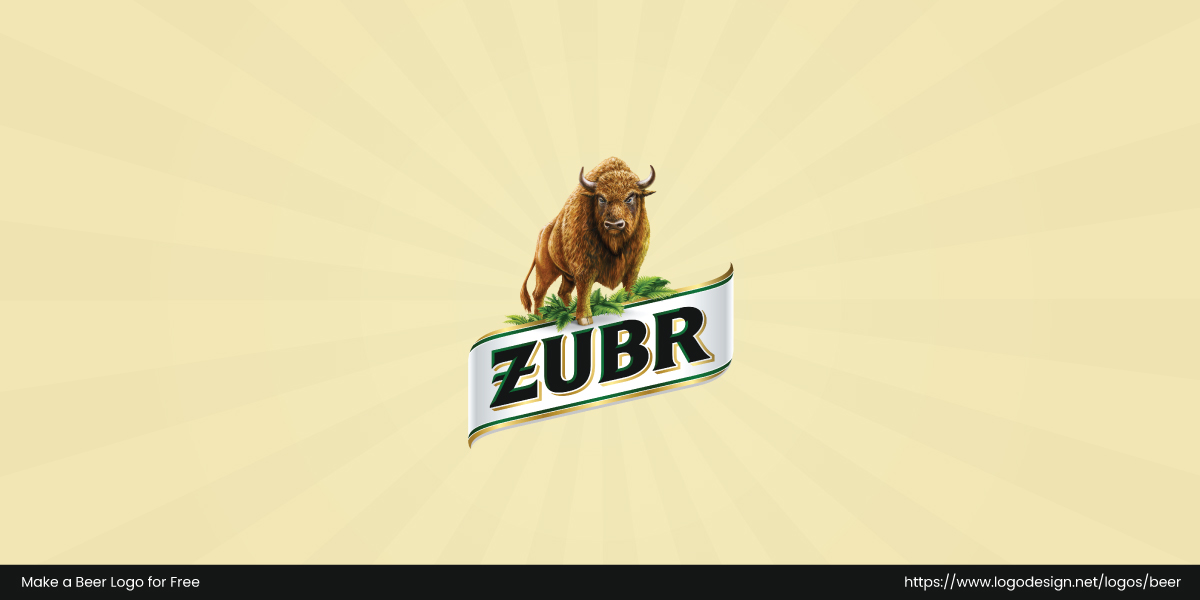
Zubr logo features European bison symbolizing strength and heritage.
Zubr’s logo features a bold European bison that symbolizes strength and the wild heritage of Poland’s Bialowieza Forest. The vibrant colors and rugged typography reflect the beer’s distinct personality.
Give Your Logo A Buzz!
Beer logos are a direct reflection of everything the brand stands for. If you are building your own beer brand from scratch, choose LogoDesign.Net’s logo maker and begin your journey.
