Some of the most valuable brands on earth don’t own a symbol. They own their handwriting, and that one flourish of lettering does the work an entire logo system needs.
Coca-Cola, Cadillac, Kellogg’s, and Instagram don’t need a symbol to be recognized—their names alone carry the identity. That’s the power of script logos, where typography becomes the logo itself.
As a form of wordmark logo design, script logos use letterforms to communicate personality, emotion, and brand character. Their handwritten style can create a sense of authenticity, craftsmanship, and human connection while maintaining a premium feel.
This collection features 100+ script logo examples, showcasing how different brands use lettering, style, and composition to build memorable identities.
So let’s get into it.
What Makes Script Logos Stand Out?
Script logos rely almost entirely on typography, making every lettering choice important. Without a separate symbol, elements like slant, weight, spacing, and letter connections define how the brand feels.
Some scripts appear elegant and refined, while others feel casual and handwritten. Each style creates a distinct personality before the name is even fully read.
1. What Are the Most Common Script Logo Styles?
Not all scripts look the same, and the style you choose sets the brand’s entire personality before a single word registers. These are the most common directions designers take when building a script logo.
- Formal calligraphic scripts feel refined and traditional. They suit luxury, beauty, and heritage brands that want to read as established and high-end.
- Casual brush scripts look spontaneous and energetic, with visible texture and movement. Food, lifestyle, and creative brands use these to feel approachable.
- Monoline scripts keep an even, consistent stroke width throughout. They read clean and modern, which makes them popular with contemporary startups and boutiques.
- Signature-style scripts mimic a real handwritten autograph. They add a personal, human touch that aligns closely with the impact of font styles on brand perception.
- Retro and vintage scripts borrow from mid-century signage and packaging. They instantly signal nostalgia and craftsmanship.
How Brands Use Color in Script Wordmarks?
Many of these decisions come down to typography in logo design, where letterforms influence perception before a brand is even read. Because the lettering already carries so much character, color in a script logo usually supports the mood rather than competing with it. The palette tends to reinforce whatever the script is already saying about the brand.
- Black and deep neutrals keep the focus on the letterforms and read as timeless and premium.
- Gold and metallics lend a script a sense of luxury, elegance, and heritage.
- Red brings warmth and confidence, which is a classic pairing with bold retro scripts.
- Pastels and muted tones soften a script for beauty, wellness, and lifestyle brands.
- Single-color simplicity is common overall, since busy palettes can clutter the delicate connections in script type.
Much of this behavior can be explained through color theory in logo design.
Where Script Logos Work Best?
Script wordmarks aren’t right for every business, but in the right hands they’re unforgettable. They tend to shine when personality and trust matter more than a literal explanation of the service.
- Beauty, fashion, and cosmetics use script to signal elegance and refinement.
- Food, bakery, and hospitality brands use it to create a handmade, inviting feel.
- Personal and creative brands such as photographers, designers, and coaches use signature scripts to feel human and one-of-a-kind.
- Heritage and legacy companies use it to communicate decades of trust in a single mark.
- Premium and artisan products use script to justify a higher price point through perceived craft.
100+ Script Logos for Brands With Personality
This collection showcases script logos across styles, from elegant calligraphy to handwritten signatures and bold retro lettering. Each example shows how typography alone can create personality, recognition, and brand identity.
1. Coca-Cola
The Coca-Cola logo is one of the most recognizable wordmarks ever created.
A global beverage company known for its iconic soft drinks, Coca-Cola uses a flowing Spencerian script in bold red. The connected lettering feels lively and familiar, reflecting optimism, tradition, and the brand’s enduring place in popular culture.
2. Cadbury
The Cadbury logo helps position everyday chocolate as a premium treat.
Cadbury is a beloved confectionery brand recognized for chocolate and sweet treats. Its elegant gold script features sweeping curves and handwritten charm, conveying richness, craftsmanship, and the sense of pleasure associated with every product.
3. Disney
The Disney logo has remained a cornerstone of the company’s brand identity for decades.
Disney is an entertainment powerhouse behind films, theme parks, and storytelling franchises. The playful black script mirrors Walt Disney’s signature style, giving the logo a whimsical personality that celebrates creativity, wonder, and childhood memories.
4. Kellogg’s
The Kellogg’s logo stands out through consistency.
Known for cereals and breakfast foods, Kellogg’s features a distinctive redrawn signature wordmark in black. The smooth, slightly slanted lettering adds warmth and familiarity, reinforcing the company’s long-standing connection with family breakfast tables. These long-running identities demonstrate many of the ideas behind designing timeless logos.
5. Barbie
The Barbie logo has evolved with generations while staying instantly recognizable.
Barbie represents one of the world’s most recognizable fashion doll brands. Its bright pink script uses rounded, energetic letterforms that feel youthful and expressive, capturing confidence, individuality, and a playful sense of self-expression.
6. Krispy Kreme

The Krispy Kreme logo reflects the brand’s long-standing bakery heritage.
Krispy Kreme is famous for doughnuts and sweet baked treats. The logo combines vintage-inspired script with a green-framed signboard, while red lettering creates appetite appeal and reflects the brand’s welcoming, old-fashioned bakery roots.
7. Campbell’s
The Campbell’s logo has become a familiar fixture in grocery aisles worldwide.
Campbell’s is best known for soups and pantry staples enjoyed for generations. Its refined red script features smooth curves and balanced proportions, projecting familiarity, dependability, and the comforting experience associated with home-cooked meals.
8. Cartier
The Cartier logo demonstrates how restraint can elevate a luxury brand.
Cartier is a prestigious jewelry and watchmaker associated with fine craftsmanship. The black cursive wordmark uses delicate strokes and generous spacing, creating an understated elegance that reflects exclusivity, sophistication, and timeless design.
9. Hallmark
The Hallmark logo reinforces the company’s role in life’s meaningful moments.
Hallmark specializes in greeting cards, gifts, and meaningful occasions. Its purple handwritten script, paired with a crown symbol, feels personal yet polished, expressing care, celebration, and the emotional connections behind every message.
10. Virgin
The Virgin logo reflects the founder-led personality behind the brand’s growth.
Virgin spans industries from travel to telecommunications and entertainment. The bright red handwritten logo appears quick and spontaneous, projecting entrepreneurial energy, challenger-brand thinking, and a willingness to break from convention.
11. Ford
The Ford logo remains one of the longest-running visual identities in the automotive industry.
Ford is a pioneering automobile manufacturer with a long industrial legacy. Its white script sits inside a blue oval, blending elegant penmanship with a structured badge to symbolize reliability, heritage, and enduring customer trust.
12. Budweiser
The Budweiser logo blends tradition with strong shelf presence.
Budweiser is a historic beer brand recognized worldwide. The ornate script wordmark appears within a red bowtie-shaped emblem, using decorative flourishes and metallic accents to communicate tradition, pride, and a premium brewing legacy.
13. Wendy
The Wendy’s logo helps the brand feel more personal than corporate.
Wendy’s is a fast-food chain known for burgers and casual dining. Its red handwritten wordmark complements the mascot illustration, creating a welcoming, family-oriented identity that emphasizes friendliness, authenticity, and everyday comfort.
14. Champion
The Champion logo bridges sportswear heritage and modern street fashion.
Champion is an athletic apparel brand with deep roots in sportswear. The script wordmark combines casual handwritten styling with the recognizable "C" emblem, reflecting movement, performance, and a relaxed confidence on and off the field.
15. Stüssy
The Stüssy logo helped define the visual language of streetwear branding.
Stüssy is a pioneering streetwear label influential in global youth fashion. The rough, graffiti-like script resembles a personal tag, conveying individuality, creative rebellion, and the underground spirit that shaped modern streetwear culture.
16. PrettyLittleThing
The PrettyLittleThing logo aligns with the brand’s fashion-forward audience.
PrettyLittleThing is a trend-focused online fashion retailer. Its flowing black script features decorative swashes and elegant curves, creating a stylish, feminine appearance that reflects glamour, accessibility, and fast-moving fashion trends.
17. Paul Smith
The Paul Smith logo reflects the designer’s personal imprint on the brand.
Paul Smith is a British fashion brand celebrated for modern tailoring and design. The handwritten black signature feels authentic and personal, highlighting creativity, craftsmanship, and the designer-led approach behind the label.
18. 7 For All Mankind
The 7 For All Mankind logo supports the brand’s premium denim positioning.
7 For All Mankind is a luxury denim brand known for elevated casualwear. The logo combines handwritten script with a bold numeral seven, balancing sophistication and edge while symbolizing quality, individuality, and contemporary style.
19. Vimeo
The Vimeo logo distinguishes the platform from more mainstream video-sharing competitors.
Vimeo is a video-sharing platform popular among creators and professionals. Its rounded lowercase script uses soft curves and friendly proportions, presenting the brand as accessible, creative, and focused on artistic expression rather than mass entertainment.
20. Handsome Frank
The Handsome Frank logo reinforces the agency’s creative and artist-led focus.
Handsome Frank is a creative illustration agency representing artists worldwide. The decorative script uses looping flourishes and classic calligraphic influences, giving the identity an artistic, bespoke feel that celebrates originality and craftsmanship.
21. Instagram
The Instagram logo has become synonymous with digital content creation.
Instagram is a social media platform centered on visual storytelling. The colorful gradient script feels modern and expressive, blending warmth with creativity while symbolizing self-expression, community, and the sharing of everyday moments.
22. Johnson & Johnson
The Johnson & Johnson logo draws credibility from more than a century of history.
Johnson & Johnson is a healthcare and consumer goods company with a long history. Its red signature-style wordmark is based on the founder’s handwriting, reinforcing trust, care, and the human connection behind the brand.
23. Kleenex
The Kleenex logo contributes to the brand’s household-name status.
Kleenex is a leading tissue brand associated with everyday comfort. The blue handwritten logo uses rounded, friendly strokes that feel gentle and approachable, reflecting softness, reliability, and the caring role the product plays.
24. Ray-Ban
The Ray-Ban logo is as iconic as many of the frames it represents.
Ray-Ban is a renowned eyewear brand known for timeless sunglasses. The white script stands confidently against a bold red background, creating a strong contrast that communicates confidence, individuality, and effortless style across generations.
25. Stoli Vodka
The Stoli Vodka logo helps the brand stand apart in a crowded spirits market.
Stoli is a globally recognized vodka brand known for its heritage and premium positioning. The logo pairs a bold red script wordmark with green sans-serif lettering, creating a vibrant contrast that conveys confidence, energy, and contemporary appeal.
26. Harrods
The Harrods logo reflects the prestige of one of the world’s most famous department stores.
Harrods is a luxury retail destination synonymous with high-end shopping. Its black handwritten wordmark uses clean, confident strokes that project exclusivity, tradition, and the refined experience associated with the brand.
27. Wilson
The Wilson logo has become a familiar sight across multiple sports categories.
Wilson is a leading sports equipment manufacturer serving athletes worldwide. The rounded red script features thick, connected letterforms that feel approachable and dependable, reinforcing the brand’s reputation for performance and lasting quality.
28. Cadillac
The Cadillac logo reinforces the brand’s reputation for premium American luxury.
Cadillac is a luxury automobile marque known for craftsmanship and innovation. Its elegant black script complements the iconic crest, blending classic penmanship with sophistication to symbolize prestige, heritage, and automotive excellence.
29. Nicole Miller
The Nicole Miller logo mirrors the designer’s personal approach to fashion.
Nicole Miller is a fashion label recognized for contemporary clothing and accessories. The handwritten black signature feels intimate and artistic, reflecting individuality, creativity, and the designer-driven identity behind the brand.
30. Eddie Bauer
The Eddie Bauer logo highlights the company’s founder-led outdoor legacy.
Eddie Bauer is an outdoor apparel and gear brand rooted in adventure. Its flowing black signature script creates an authentic, personal feel, expressing craftsmanship, reliability, and a connection to exploration.
31. Sharpie
The Sharpie logo instantly connects the brand to its signature writing experience.
Sharpie is best known for permanent markers used in homes, schools, and workplaces. The thick black script resembles marker-drawn lettering, creating a direct visual link to creativity, self-expression, and everyday practicality.
32. Babyphat
The Baby Phat logo reflects the brand’s blend of fashion and glamour.
Baby Phat is a fashion label known for bringing luxury-inspired style to streetwear. Its delicate gold script features elegant flourishes and refined strokes, communicating confidence, sophistication, and a strong sense of identity.
33. Betty Crocker
The Betty Crocker logo gives a familiar face to generations of home cooks.
Betty Crocker is a household baking and food brand trusted for decades. The white script sits inside a red spoon-shaped emblem, creating a warm, welcoming identity that symbolizes guidance, tradition, and home cooking.
34. Coors
The Coors logo celebrates the brand’s long brewing tradition.
Coors is a historic American beer company with deep roots in brewing. The flowing blue script is paired with decorative accents, combining heritage-inspired typography with a sense of authenticity and established craftsmanship.
35. Crown Royal
The Crown Royal logo reinforces the premium nature of the brand.
Crown Royal is a Canadian whisky label associated with quality and refinement. Its elegant purple script works alongside a royal crown emblem, creating a visual identity that represents prestige, celebration, and elevated taste.
36. Ed Hardy
The Ed Hardy logo captures the bold spirit of tattoo-inspired fashion.
Ed Hardy is a lifestyle brand known for graphic apparel influenced by tattoo art. The ornate black script features dramatic swashes and decorative details, expressing individuality, rebellion, and creative self-expression.
37. Entenmanns
The Entenmann’s logo has helped build trust across generations of consumers.
Entenmann’s is a baked goods brand famous for cakes, donuts, and pastries. Its blue script combines traditional styling with approachable charm, reflecting freshness, family traditions, and everyday indulgence.
38. Fender
The Fender logo is as legendary as the instruments it represents.
Fender is a renowned manufacturer of guitars and musical equipment. The red handwritten wordmark uses fluid, energetic strokes that mirror creativity, performance, and the brand’s enduring influence on modern music.
39. Johnny Rockets
The Johnny Rockets logo brings retro diner culture into the modern era.
Johnny Rockets is a restaurant chain inspired by classic American diners. Its vibrant script sits within a colorful badge, blending nostalgic styling with playful energy to symbolize fun, comfort food, and an upbeat dining experience.
40. Lilly Pulitzer
The Lilly Pulitzer logo reflects the brand’s cheerful and distinctive personality.
Lilly Pulitzer is a fashion brand celebrated for colorful resort wear. The pink handwritten wordmark feels playful and expressive, capturing creativity, optimism, and the carefree spirit associated with the label.
41. Miller
The Miller logo carries the heritage of a long-established brewing company.
Miller is a well-known beer brand with a history spanning generations. Its bold red script combines decorative flourishes with strong letterforms, creating a sense of tradition, confidence, and broad consumer recognition.
42. Mrs Fields
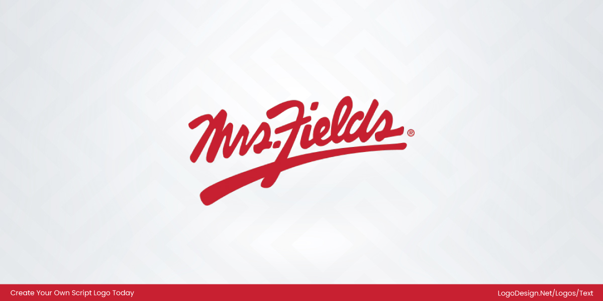
The Mrs. Fields logo supports the brand’s homemade bakery image.
Mrs. Fields is known for cookies and baked treats enjoyed worldwide. The red signature-style wordmark feels personal and inviting, reinforcing warmth, freshness, and the comforting appeal of freshly baked goods.
43. Peterbilt
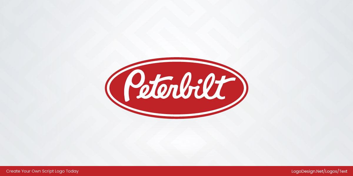
The Peterbilt logo reflects the pride and durability associated with the trucking industry.
Peterbilt is a manufacturer of heavy-duty trucks recognized for quality engineering. The white script enclosed within a red oval balances elegance and strength, symbolizing reliability, craftsmanship, and professional performance.
44. Rapha
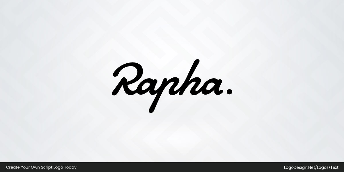
The Rapha logo has become a recognizable mark within cycling culture.
Rapha is a premium cycling apparel brand focused on performance and style. Its minimalist black script features smooth, understated curves that communicate refinement, dedication, and a passion for the sport.
45. Sean John
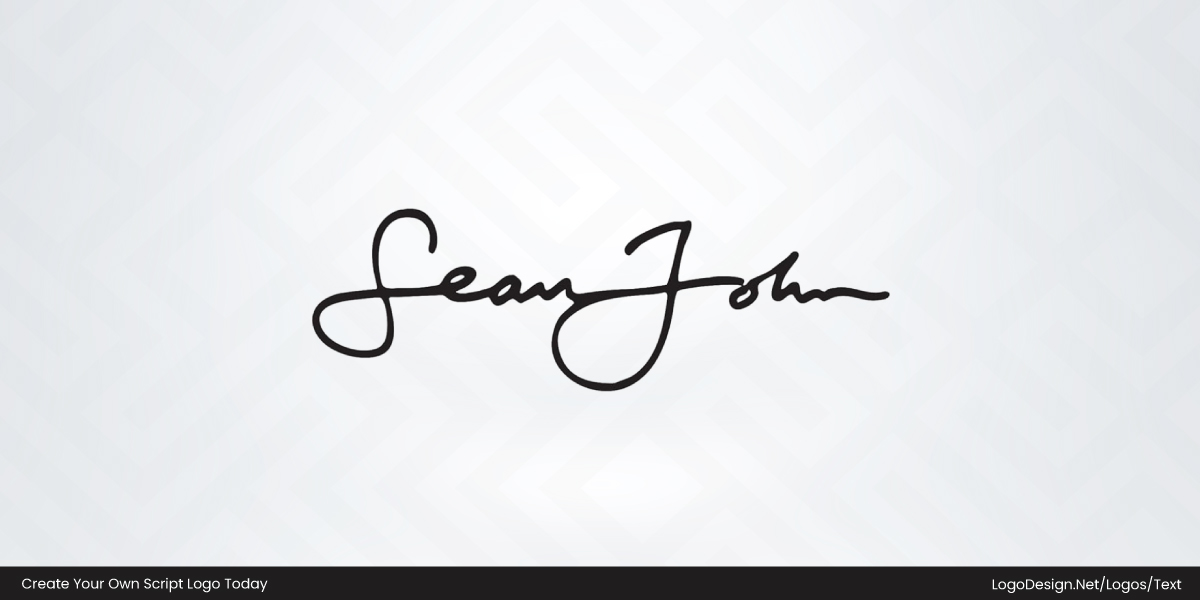
The Sean John logo reflects the brand’s influence on modern urban fashion.
Sean John is a lifestyle and fashion label known for blending streetwear with luxury style. The black signature wordmark uses smooth, connected strokes and generous curves, expressing confidence, individuality, and the founder’s personal influence on the brand.
46. Reyn Spooner
The Reyn Spooner logo reflects the brand’s long-standing connection to Hawaiian style.
Reyn Spooner is an apparel brand known for aloha shirts and resort-inspired clothing. Its navy script combines flowing strokes with a coastal emblem, expressing craftsmanship, heritage, and the relaxed spirit associated with island living.
47. Chick-fil-A
The Chick-fil-A logo has become one of the most recognizable identities in fast food.
Chick-fil-A is a restaurant chain known for chicken sandwiches and customer service. The red handwritten script incorporates a chicken motif within the initial letter, creating a friendly identity that symbolizes hospitality, warmth, and brand personality.
48. Lindt
The Lindt logo reinforces the brand’s reputation for premium chocolate.
Lindt is a Swiss chocolatier celebrated for luxury confections and fine chocolate. Its elegant gold script features delicate flourishes and classic serif details, conveying craftsmanship, heritage, and the refined experience associated with premium sweets.
49. Bonne Maman
The Bonne Maman logo supports the brand’s homemade and traditional image.
Bonne Maman is known for preserves, jams, and baked products inspired by French recipes. The black cursive wordmark uses graceful strokes and balanced spacing, reflecting authenticity, family traditions, and old-world charm.
50. Paramount
The Paramount logo remains closely tied to Hollywood’s golden age.
Paramount is a historic film studio responsible for decades of entertainment. Its dark blue script uses elegant, sweeping letterforms that evoke cinematic tradition, prestige, and the enduring legacy of classic filmmaking.
51. Milka
The Milka logo helps distinguish the brand through its unmistakable color identity.
Milka is a confectionery brand famous for Alpine milk chocolate. The rounded purple script features soft, playful curves that communicate gentleness, sweetness, and the approachable character of the brand.
52. Neiman Marcus
The Neiman Marcus logo reflects the retailer’s luxury positioning.
Neiman Marcus is a high-end department store known for designer fashion and exclusive products. Its tall black script uses slender letterforms and refined proportions, creating an upscale identity that represents elegance, exclusivity, and sophistication.
53. Von Dutch
The Von Dutch logo became an emblem of early-2000s fashion culture.
Von Dutch is a fashion label inspired by custom automotive and artistic influences. The bold black lettering combines hand-drawn styling with decorative curves, expressing rebellion, individuality, and a strong sense of attitude.
54. Free People
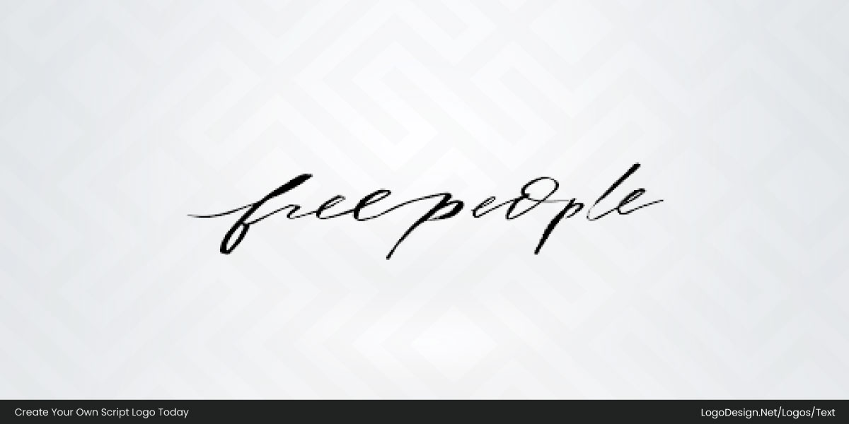
The Free People logo captures the independent spirit of the brand.
Free People is a fashion retailer known for bohemian-inspired clothing and accessories. The thin handwritten script appears loose and effortless, conveying creativity, freedom, and the relaxed lifestyle associated with the brand.
55. Christian Louboutin
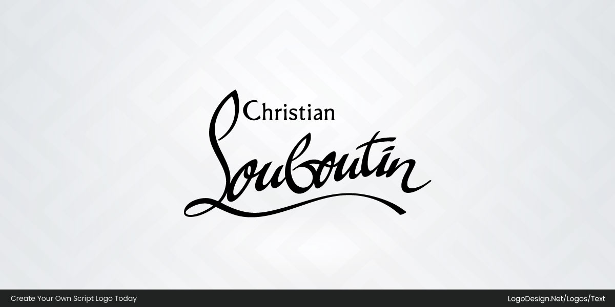
The Christian Louboutin logo reflects the designer’s personal signature and creative vision.
Christian Louboutin is a luxury footwear brand renowned for its red-soled shoes. The black script combines dramatic curves and flowing strokes, symbolizing craftsmanship, exclusivity, and the artistic identity of the fashion house.
56. Oscar de la Renta
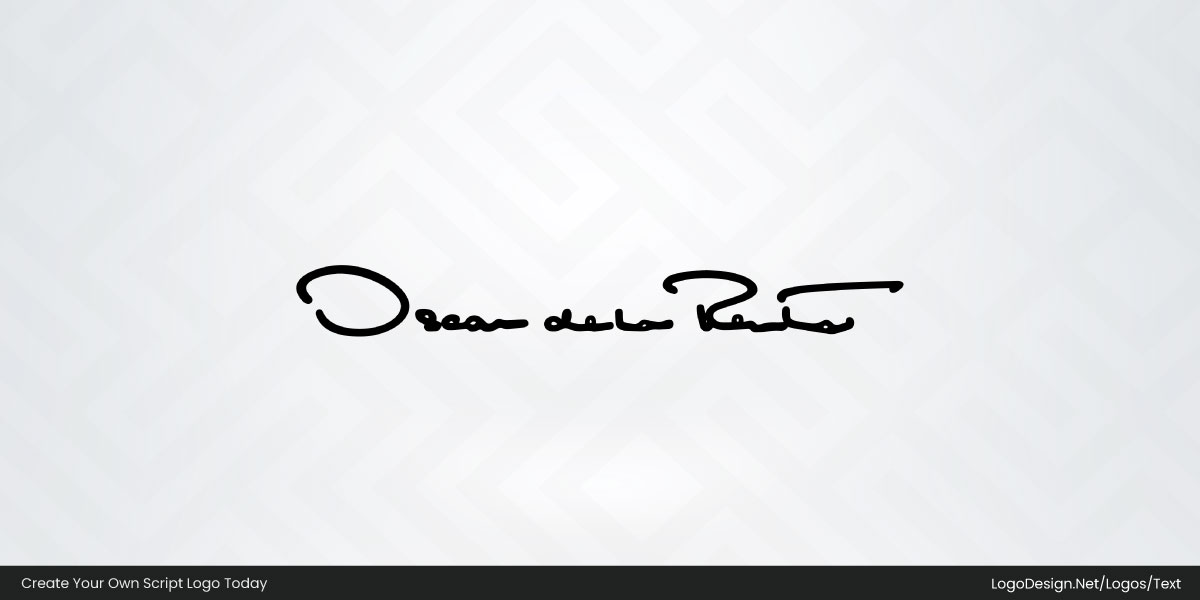
The Oscar de la Renta logo reflects the enduring influence of the designer’s legacy.
Oscar de la Renta is a luxury fashion house known for elegant couture and eveningwear. The handwritten black signature uses fluid, personal strokes that communicate sophistication, craftsmanship, and the designer’s lasting impact on fashion.
57. Saks
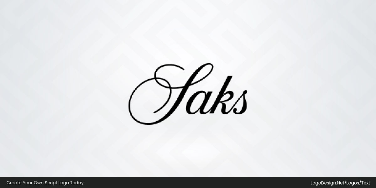
The Saks logo reinforces the retailer’s upscale identity.
Saks Fifth Avenue is a luxury department store recognized for designer fashion and premium shopping experiences. Its elegant black script features dramatic flourishes and refined curves, symbolizing exclusivity, style, and timeless sophistication.
58. Lord And Taylor
The Lord & Taylor logo carries the heritage of one of America’s oldest retailers.
Lord & Taylor is a historic department store brand associated with fashion and lifestyle products. Its expressive handwritten mark uses sweeping strokes and artistic movement, reflecting tradition, elegance, and individuality.
59. JohnHancock
The John Hancock logo draws on the power of a historic signature.
John Hancock is a financial services company specializing in insurance and investments. The blue signature-style wordmark references its namesake’s famous handwriting, representing trust, stability, and a long-standing reputation.
60. Nesquik
The Nesquik logo brings a sense of fun to the brand’s identity.
Nesquik is a flavored milk and breakfast brand popular with families worldwide. Its rounded blue lettering uses soft edges and playful proportions, conveying energy, friendliness, and the enjoyment associated with the product.
61. Tim Hortons
The Tim Hortons logo has become a familiar symbol of Canadian coffee culture.
Tim Hortons is a coffee and restaurant chain known for beverages and baked goods. The red handwritten script feels approachable and energetic, reflecting community, convenience, and the brand’s everyday appeal.
62. Carls Jr
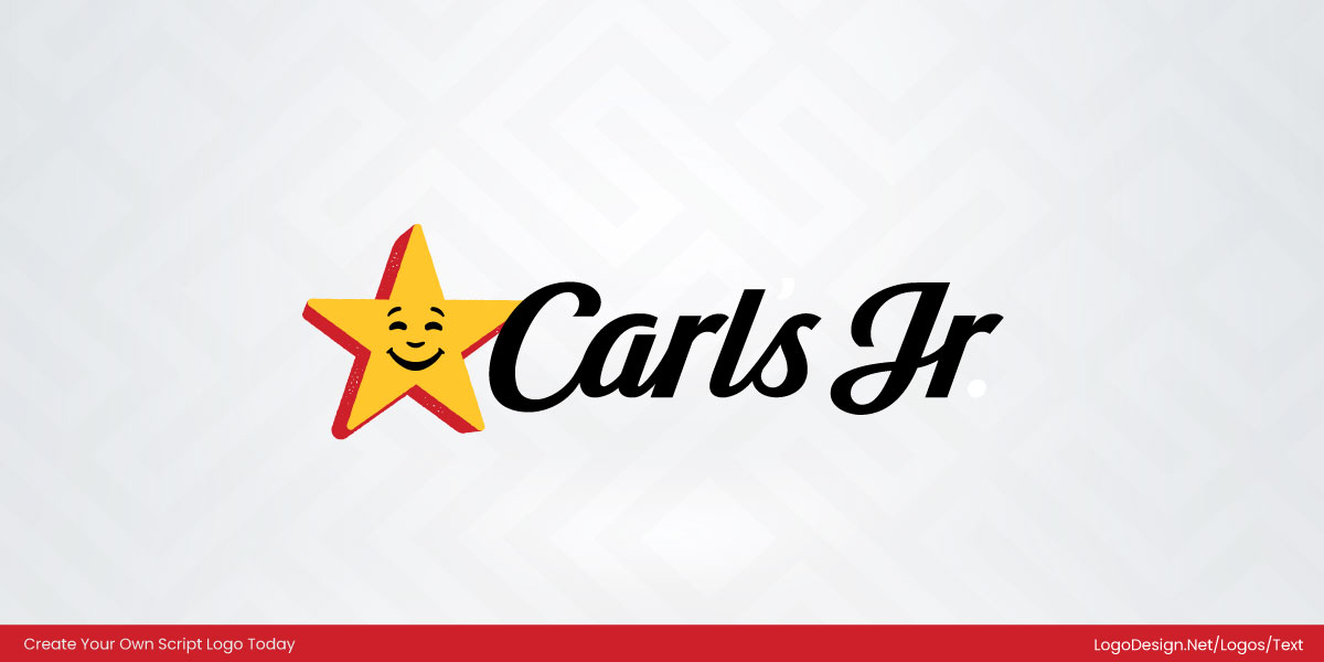
The Carl’s Jr. logo balances personality with brand recognition.
Carl’s Jr. is a fast-food chain known for burgers and casual dining. The black script works alongside the smiling star icon, creating a friendly identity that communicates optimism, approachability, and brand character.
63. Marie Callender’s
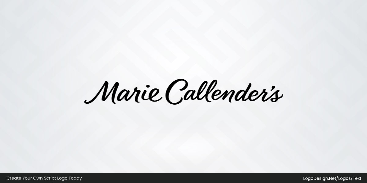
The Marie Callender’s logo supports the brand’s homemade image.
Marie Callender’s is known for pies, desserts, and comfort foods. Its elegant black script uses soft curves and connected lettering, reflecting warmth, tradition, and the familiarity of home-style cooking.
64. Hersheyland
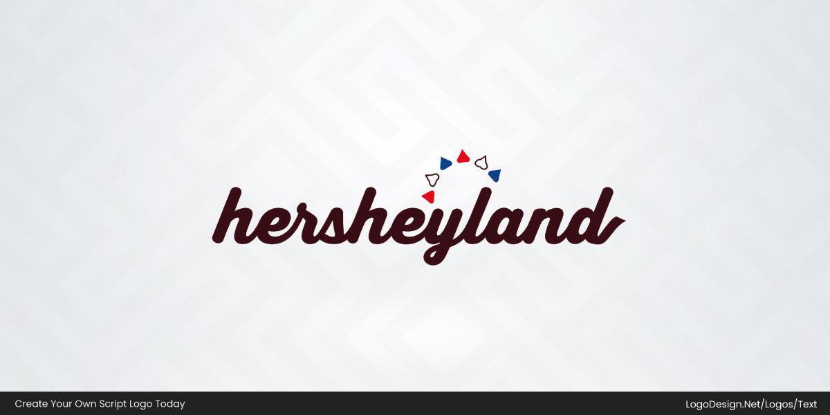
The Hersheyland logo reflects the playful and family-oriented spirit of the brand.
Hersheyland is Hershey’s digital destination for recipes, celebrations, crafts, and family activities. Its chocolate-brown script uses rounded, connected lettering and playful accents, conveying warmth, creativity, and the joyful experiences associated with Hershey brands.
65. Dribble
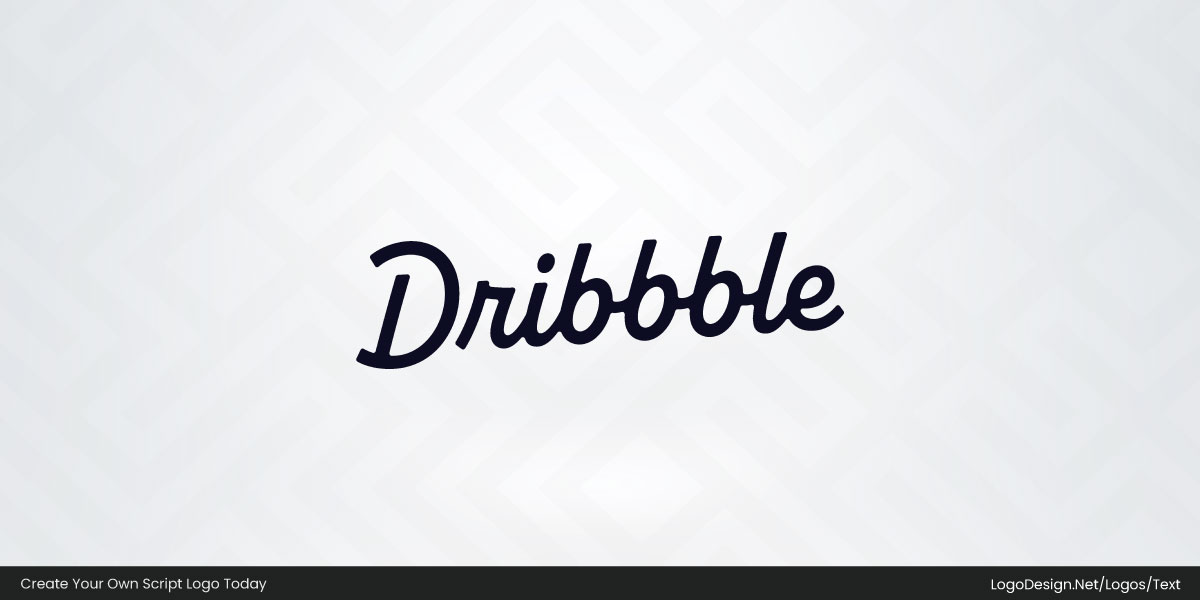
The Dribbble logo reflects the platform’s creative community.
Dribbble is an online platform where designers share work and ideas. Its dark script uses smooth, contemporary letterforms that express creativity, collaboration, and the modern nature of digital design.
66. Reese’s
The Reese’s logo is instantly associated with the brand’s signature flavor.
Reese’s is a confectionery brand famous for peanut butter cups and candy products. The bold orange script features thick outlines and energetic curves, creating a playful identity that communicates indulgence and strong shelf appeal.
67. Squier
The Squier logo highlights the brand’s connection to Fender.
Squier is a guitar brand offering accessible instruments for musicians. The yellow script within a black oval creates a strong contrast, expressing performance, energy, and the brand’s musical heritage.
68. Chupa Chups
The Chupa Chups logo remains one of confectionery’s most recognizable identities.
Chupa Chups is a lollipop brand enjoyed worldwide. Its rounded script sits inside a flower-shaped badge, combining bright colors and playful typography to symbolize fun, sweetness, and youthful energy.
69. Barq’s
The Barq’s logo reinforces the brand’s bold personality.
Barq’s is a root beer brand known for its distinctive flavor. The decorative script and illustrated berries create a vintage-inspired appearance that reflects character, heritage, and product authenticity.
70. Wal Greens
The Walgreens logo has become a familiar presence in neighborhoods across America.
Walgreens is a pharmacy and retail chain serving communities nationwide. Its red script uses smooth, connected lettering that conveys trust, accessibility, and the brand’s long-standing relationship with customers.
71. Zildjian
The Zildjian logo reflects centuries of craftsmanship.
Zildjian is a cymbal manufacturer trusted by musicians around the world. The black calligraphic wordmark uses distinctive, handcrafted forms that symbolize artistry, tradition, and the company’s musical legacy.
72. Maserati
The Maserati logo combines performance with Italian elegance.
Maserati is a luxury automobile brand known for sports cars and grand touring vehicles. The streamlined black script complements the trident emblem, expressing speed, refinement, and automotive prestige.
73. Famous Amos
The Famous Amos logo supports the brand’s friendly image.
Famous Amos is a cookie brand recognized for bite-sized treats. Its blue script features rounded forms and flowing strokes, reflecting warmth, familiarity, and the joy associated with homemade-style cookies.
74. Nathans Famous
The Nathan’s Famous logo celebrates the brand’s long-standing food heritage.
Nathan’s Famous is known for hot dogs and classic American dining. Its green decorative lettering and vintage styling communicate tradition, authenticity, and the company’s connection to its original roots.
75. Scripto
The Scripto logo reflects the brand’s focus on writing products.
Scripto is known for pens and writing instruments used in everyday life. The dark script uses smooth, connected strokes with a contrasting red accent, symbolizing reliability, simplicity, and functionality.
76. Blue Bunny
The Blue Bunny logo adds personality to the brand’s identity.
Blue Bunny is an ice cream company offering a wide range of frozen desserts. The bright blue script incorporates rabbit-inspired details, creating a playful appearance that conveys fun, freshness, and family appeal.
77. Breyers
The Breyers logo reinforces the brand’s emphasis on simple ingredients.
Breyers is an ice cream brand associated with classic flavors and quality ingredients. Its black script combines traditional styling with a small leaf detail, symbolizing freshness, authenticity, and natural appeal.
78. All Birds
The Allbirds logo reflects the brand’s modern and minimalist approach.
Allbirds is a footwear company focused on comfort and sustainable materials. The lowercase script uses clean, rounded letterforms that communicate simplicity, accessibility, and contemporary design values.
79. Rawlings
The Rawlings logo has become closely associated with America’s favorite pastime.
Rawlings is a sporting goods company known for baseball equipment and athletic gear. Its bold red script uses thick, connected strokes and a sweeping underline, conveying performance, tradition, and the brand’s deep roots in professional sports.
80. Sara Lee
The Sara Lee logo reinforces the brand’s long-standing presence in home kitchens.
Sara Lee is a food brand recognized for baked goods, desserts, and frozen products. The white script sits within a flowing red ribbon shape, combining soft curves and elegant lettering to symbolize comfort, familiarity, and everyday indulgence.
81. Titleist
The Titleist logo has become a trusted mark in the world of golf.
Titleist is a golf equipment brand known for premium balls, clubs, and accessories. Its black script features smooth, balanced strokes and subtle flourishes, conveying precision, performance, and the craftsmanship associated with the game.
82. Spangler
The Spangler logo reflects the company’s long confectionery heritage.
Spangler is a candy manufacturer best known for candy canes and seasonal treats. The red script, paired with festive illustrations and vintage details, communicates tradition, celebration, and a sense of nostalgia.
83. Dodgers
The Dodgers logo has become an enduring symbol of baseball culture.
The Los Angeles Dodgers are a Major League Baseball team with a storied history. Their blue script is paired with a flying baseball graphic, expressing movement, energy, and the excitement of the sport.
84. Braves
The Braves logo combines team pride with regional identity.
The Atlanta Braves are a professional baseball franchise with deep historical roots. The red script and tomahawk graphic create a bold, energetic identity that represents competition, tradition, and team spirit.
85. Mellow Mushroom
The Mellow Mushroom logo reflects the brand’s relaxed personality.
Mellow Mushroom is a pizza restaurant chain known for its creative atmosphere. The thick black script uses rounded, playful forms that communicate individuality, comfort, and the laid-back dining experience.
86. Portillo’s
The Portillo’s logo celebrates the brand’s Chicago heritage.
Portillo’s is a restaurant chain famous for hot dogs, Italian beef, and casual dining. Its bright red script features smooth curves and connected strokes, conveying warmth, familiarity, and a lively personality.
87. Culvers
The Culver’s logo reinforces the brand’s Midwestern roots.
Culver’s is a fast-casual restaurant chain known for butterburgers and frozen custard. The white script inside a blue oval creates a classic appearance that symbolizes hospitality, quality, and family dining.
88. Raising Cane’s
The Raising Cane’s logo reflects the brand’s energetic identity.
Raising Cane’s is a restaurant chain specializing in chicken fingers. The bold script sits within a vibrant badge, combining dynamic lettering and contrasting colors to communicate fun, speed, and strong brand recognition.
89. Freddy’s
The Freddy’s logo honors the brand’s nostalgic diner roots.
Freddy’s is a restaurant chain known for steakburgers and frozen custard. The red script features vintage-inspired letterforms and an extended underline, expressing friendliness, tradition, and classic American dining.
90. Loro Piana
The Loro Piana logo reflects the quiet luxury of the brand.
Loro Piana is an Italian luxury company specializing in fine textiles and apparel. Its elegant brown script, paired with a heritage crest, communicates refinement, craftsmanship, and timeless sophistication.
91. Kie Hels
The Kiehl’s logo emphasizes the brand’s long history.
Kiehl’s is a skincare and personal care company with roots dating back to the nineteenth century. The black script combines vintage styling with supporting typography, symbolizing expertise, authenticity, and trusted formulations.
92. Sezane
The Sézane logo mirrors the brand’s effortless Parisian style.
Sézane is a French fashion label known for modern essentials and timeless designs. Its handwritten black signature uses delicate strokes and generous spacing, conveying elegance, simplicity, and understated charm.
93. Canva
The Canva logo reflects the platform’s accessible approach to design.
Canva is a graphic design platform used by individuals and businesses worldwide. Its smooth script lettering combines soft curves and balanced proportions, representing creativity, simplicity, and ease of use.
94. Indian Motorcycle
The Indian Motorcycle logo honors the brand’s historic legacy.
Indian Motorcycle is one of America’s oldest motorcycle manufacturers. The red script and feathered headdress emblem create a dramatic identity that symbolizes heritage, freedom, and the spirit of the open road.
95. Perkins Restaurant & Bakery
The Perkins logo reinforces the brand’s welcoming image.
Perkins is a restaurant and bakery chain known for comfort food and desserts. The green script uses soft curves and a sweeping underline, expressing warmth, familiarity, and an inviting dining experience.
96. Olive Link
The Olive Garden logo reflects the brand’s connection to Italian dining.
Olive Garden is a casual restaurant chain inspired by Italian cuisine. Its hand-drawn lettering, paired with olive branches, creates a warm identity that symbolizes hospitality, freshness, and shared meals.
97. Jamba
The Jamba logo communicates the brand’s focus on wellness.
Jamba is a smoothie and juice company known for fruit-based beverages and snacks. The flowing green script and colorful fruit-inspired symbol create an energetic identity that represents health, freshness, and vitality.
98. Bob Evans
The Bob Evans logo celebrates the brand’s farm heritage.
Bob Evans is a food and restaurant brand associated with homestyle meals. Its red script and supporting typography convey comfort, authenticity, and the values of traditional farm-inspired cooking.
99. Lysol
The Lysol logo has become synonymous with household protection
Lysol is a cleaning and disinfectant brand trusted worldwide. The blue script features strong, upward strokes and a sweeping underline, communicating reliability, cleanliness, and confidence.
100. Lunet
The Lunet logo reflects the brand’s minimalist approach to eyewear.
Lunet is an eyewear brand focused on contemporary design. Its black handwritten wordmark uses fine strokes and elegant curves, expressing simplicity, sophistication, and modern style.
101. Robin Golf
The Robin Golf logo supports the brand’s mission to make golf less intimidating.
Robin Golf makes golf equipment for newer and casual players. The black script uses rounded, connected letters paired with a clean sans-serif "GOLF," giving the logo an approachable feel that aligns with the brand’s simple, modern outlook.
102. Tracksmith
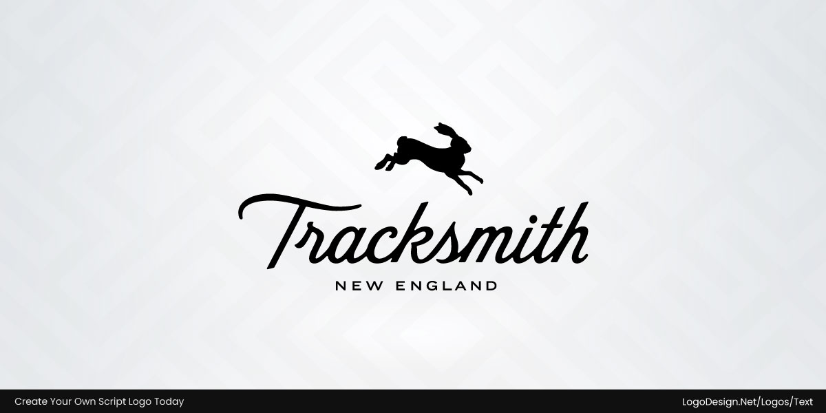
The Tracksmith logo speaks to runners who value tradition and craft.
Tracksmith is a running apparel company inspired by amateur athletics and New England heritage. Its flowing black script sits beneath a running hare, while the elegant lettering gives the identity a timeless, almost collegiate character.
103. Malbon
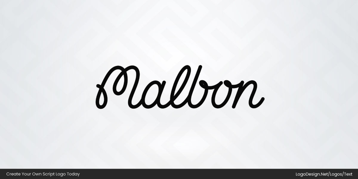
The Malbon logo helps separate the brand from traditional golf labels.
Malbon blends golf, fashion, and streetwear influences. The connected black script feels relaxed and contemporary, matching the company’s effort to bring a younger audience and a different attitude to the game.
104. Sleepycat
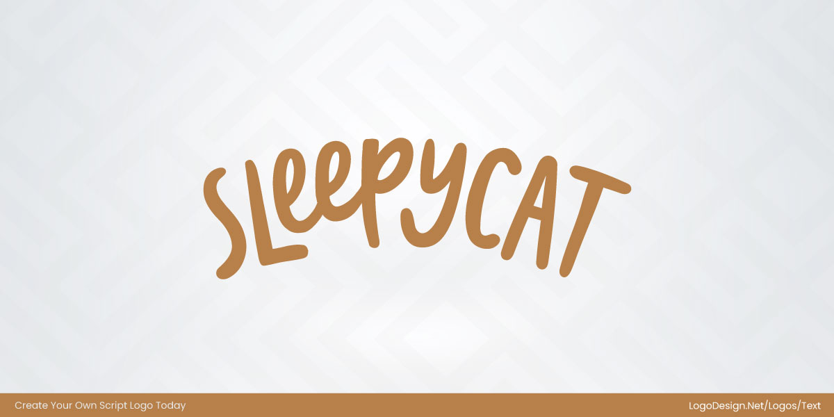
The SleepyCat logo makes the brand feel friendly at first glance.
SleepyCat sells mattresses and sleep products designed for everyday comfort. The warm brown lettering uses uneven, hand-drawn strokes and rounded forms, giving the identity a casual, cozy, and approachable personality.
105. Ghia
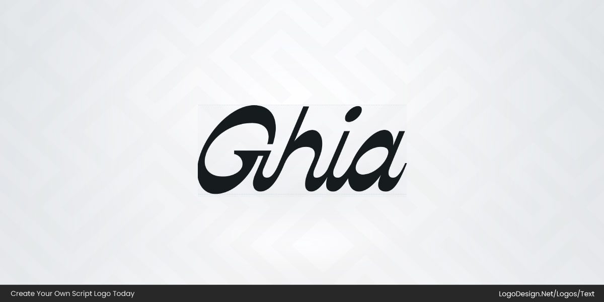
The Ghia logo positions the brand as a modern alternative in the beverage space.
Ghia produces non-alcoholic apéritifs focused on social occasions and botanical flavors. The black script combines thick curves with sharp contrasts, creating a polished wordmark that feels contemporary and fashion-forward.
Conclusion
If there’s one thing all these logos have in common, it’s that the lettering does everything. No icon, no mascot, nowhere to hide. The name has to feel elegant or playful or vintage or expensive entirely on its own, and the ones that nail it never let the script get so fancy you can’t read it. That’s the quiet trick most people miss.
Chase the one that feels like a person actually wrote it, keeps things simple, and couldn’t belong to anyone but you. The strongest script logos understand the power of simplicity in logo design: they say more with fewer strokes. Get that right and you won’t need a symbol at all. The name will do the remembering for you.
Frequently Asked Questions
1. What is a script logo?
It’s a logo designed to look like handwriting or calligraphy, flowing, connected letters instead of blocky print. Coca-Cola may pop up in your mind. Brands reach for this style when they want to feel more personal or old-school, less like a tech startup.
2. What brands use script logos?
Coca-Cola’s red cursive is probably the most recognized logo on earth. Cartier uses script for that old-money elegance. Barbie’s logo is script too, though obviously going for a completely different vibe, playful instead of luxurious. Thus, many brands opt for script logos.
3. What is the difference between a script logo and a wordmark logo?
A wordmark logo uses typography as the main visual element. For instance, wordmarks are plain and readable: Google, FedEx. A script logo is a specific type of wordmark that uses handwritten or cursive lettering, giving the brand a more personal, expressive look. One’s built to be read fast. The other’s built to be remembered.
4. What fonts are used in script logos?
Script logos commonly use calligraphy fonts, brush scripts, signature fonts, monoline scripts, and handwritten typefaces. The choice depends on the brand’s personality, industry, and readability requirements. Fonts like Pacifico, Alex Brush, and Great Vibes are used a lot. Bigger brands don’t use a font at all; they hire someone to hand-letter it.
5. Can I create a script logo using LogoDesign.net?
Yes. They’ve got script templates and fonts built into the editor, so you can pick one, tweak the colors and layout, and see it right away. Its logo maker offers various script styles, helping businesses develop distinctive brand identities without requiring professional design experience.
6. How do I choose the right script font on LogoDesign.net?
Choose a script font that reflects your brand personality and remains readable at different sizes. On LogoDesign.net, you can compare various handwritten styles to find one that best communicates your brand’s tone and visual identity. One thing people forget: check how it looks tiny, like at favicon size, because script fonts can turn into mush when they shrink.