All that glitters is not gold; sometimes, it’s yellow! Yellow logos have always been a customer favorite—and to truly grab attention, there’s no better choice than a color that simply outshines the rest.
Yellow is a lot more than just a color; it is an instant mood lifter. It has a way of making everything feel lighter. It is bright, positive, and simply impossible to ignore. This is why brands don’t avoid using yellow as their top color choice.
Picture the golden arches calling you in or the speeding DHL van that grabs your attention immediately. Each of these brands makes a statement as soon as you catch a glimpse. And the best part is that it is subtle and never too much.
The Psychology of Yellow Logos
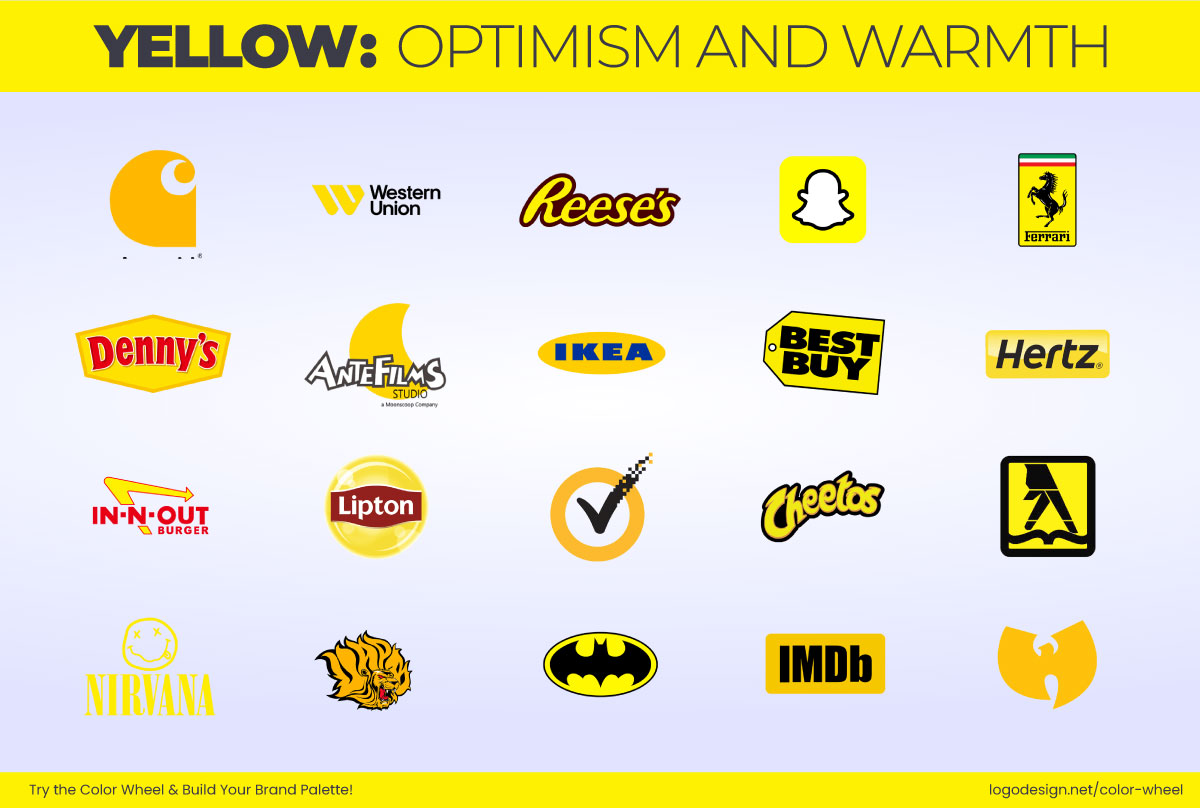
There’s a reason why yellow keeps making its way into top brands’ palettes. It is a high-energy color that immediately creates a sense of excitement in the audience. Not only that, but yellow has one of the longest visible wavelengths, making it one of the first colors that human eyes can notice. This is why it is used all over the world; it simply demands attention.
But that’s not all. Yellow doesn’t just grab attention; it also plays and teases emotion. According to research, yellow is associated with optimism, warmth, and alertness. So brands that use yellow know what they’re doing. They strategically tap into these associations so they can build a sense of trust, warmth and keep things light at the same time.
Yellow has shaped some of the most popular and memorable visual identities, including food chains, fintech, and even stationery. Let’s take a closer look at 100+ yellow logos that show just how yellow turns into branding genius!
100+ Yellow Logos That Brighten The Branding World
From the bold yellows to the subtle sunshine hues, these brands know how to use yellow to their advantage. Each of these 100+ yellow logos tells its brand story and stands out, refusing to fade into the background.
1. Starburst
The Starburst logo wraps up all the fun in the yellow logo with red details. The lively yellow adds joy and a tangy energy to the design. This combo has the perfect visibility and appeal for a candy that bursts with flavor.
2. Antefilms
The Antefilms logo’s main emblem is a golden yellow moon, which is perfect for a storytelling studio. The color signals creativity while the moon adds a bit of whimsy. The color and design play into the playful yet professional identity.
3. Arizona State Sun Devils
The Arizona State Sun Devils‘ yellow and maroon pitchfork emblem is not just about sports; it also gives energy wrapped in legacy. The yellow color adds brightness and visibility to the team that wants you to be loud and completely unmissable.
4. Arkansas PB Golden Lions
The Golden Lions wear their name quite literally. The fierce, yellowish golden lion head is bold and stands apart. It gives the team instant athleticism and a proud and energetic feel.
5. Batman
The classic yellow oval of the bat symbol tells the whole story. The bright yellow smartly cuts through Gotham’s darkness and crimes. The Batman logo uses yellow to portray resilience and recognizability that is visible to the eye and meaningful to the heart.
6. Best Buy
The yellow price‐tag logo immediately signals bargain and tech. The Best Buy bright yellow tag grabs attention in a crowded electronics aisle while the black wordmark adds a more serious vibe.
7. Billa
This supermarket chain uses only yellow for its wordmark. The all-yellow logo conveys freshness, simplicity, and accessibility. Yellow adds a friendly vibe and makes BILLA more approachable.
8. Borussia Dortmund logo
The Borussia Dortmund logo represents the fans, energy, and a burst of local pride. The black lettermark keeps the logo grounded and strong.
9. Carhartt
Carhartt’s iconic “C” emblem often appears in a bold yellow-gold patch. The color pops out and conveys visibility with durability. The yellow in this logo is not just aesthetic but also very practical.
10. Cheetos
Cheetos are a customer favorite, and the logo never fails to grab attention. The yellow tones signal fun and spark snack-time energy. With a hint of mischief and a lot of flavor, this logo made history!
11. Chupa Chups
The Chupa Chups logo is a yellow flower with red detailing. The yellow references the Spanish flag, and the logo communicates joy, sweetness, and visibility.
12. Commerzbank
The German bank’s yellow ribbon motif is energetic and confident. It is interesting that a financial institution would choose yellow; it is a bold choice, but it works amazingly by signaling openness and dynamism for the Commerzbank!
13. Continental
In the automotive industry, black always takes center stage, but Continental’s logo has changed the game. It has developed visibility, uniqueness, and trust.
14. DHL
The yellow background in the DHL logo represents speed, global reach, and urgency. It ensures that the brand is seen everywhere!
15. Ferrari
The Ferrari logo with a bright yellow shield is all Italian! The yellow sets a strong backdrop, and an elevated black horse makes the logo almost instantly recognizable.
16. Hertz
The yellow accents in the Hertz logo signal openness and high energy levels. This shows that the brand wants to be seen, and that is exactly what it accomplished.
17. IKEA
The furniture giant’s yellow and blue color palette is familiar worldwide. The yellow in the IKEA logo communicates affordability and optimism, instantly sparking the "let’s build something" energy.
18. IMDb
The entertainment-industry icon uses a bold yellow wordmark. The IMDB logo is friendly, instantly recognizable, and will ensure you click every time.
19. In-N-Out burger
The In-N-Out burger joint smartly uses two colors that increase appetite and joy. The yellow arrow in the logo makes it instantly recognizable and makes you click!
20. Kärcher
Karcher is a global leader in cleaning technology, and a simple wordmark with yellow accents makes the logo more approachable.
21. La Poste
The La Poste logo shows speed and precision, much needed for a postal company. The blue emblem with a yellow background adds dimension and vibrancy to the design.
22. Lays
The Lays logo is highly memorable. The yellow circular background reminds us of the yellow chips that are a favorite of people of all ages.
23. Lipton
The iconic Lipton logo smartly uses the color yellow to show warmth for the tea brand. It is one of the most memorable logos with smart use of color.
24. McDonald’s
The golden arches of McDonald’s logo symbolize good, comfort food that will always leave you asking for more. The yellow color stands out and appeals to the audience, making it a welcoming spot.
25. Fc Nantes
FC Nantes’ logo uses the team’s traditional colors, which helps it stand out. The logo design is a stylish lettermark that references the city of Nantes and the football club.
26. National Geographic
The National Geographic logo is an iconic yellow frame representing sunshine and the exploration scope. The logo symbolizes discovery by illuminating the way.
27. Nikon
Nikon is an optics and imaging company that uses yellow and sequential parallel lines to represent its current activities and its potential future growth.
28. Nirvana
The Nirvana logo is as simple as it can get. With a straightforward wordmark, you can expect to see a distorted smiley face that adds character to the design.
29. Radical Sportscars
The Radical Sport logo is a design marvel, with its stylized lettermark ‘R’ resembling a racetrack. The yellow color in the logo shows how fast-paced and energetic it is.
30. Reese’s
Reese’s is packed with energy, with its fun color combinations and typography in the logo. It is the perfect design to get attention and make the chocolate cravable.
31. Schweppes
Nothing says citrusy better than a yellow logo. The Schweppes logo signals the bubbly, carbonated, citrusy drinks that can pack refreshment in a can.
32. Scoot
Do you dream of traveling? The Scoot logo, with its yellow circle and simple wordmark that almost pushes the ‘t’ out of the logo, is a perfect reminder that travel will keep you young and fun-seeking.
33. Snapchat
Evan Spiegel, the co-founder of Snapchat, reviewed all the popular apps and found out that one of them uses yellow. This made him choose yellow for Snapchat as it helps the app instantly stand out.
34. Sprint
The Sprint logo features a yellow wing emblem that represents motion and fight that adds dynamism to the design while the color adds energy.
35. Stanley Tools
The Stanley Tools logo has been consistent with its color theme since the 1950s, and the design makes it stand out. The vibrant logo and stylized ‘N’ add a little flair to the design.
36. Symantec
The yellow circle with a black checkmark symbolizes protection and quality for this cybersecurity company. The Symantec design is unique for a cybersecurity company, which makes it pop out.
37. Thomas Cook
The Thomas Cook logo represents the promise of a good holiday with sunny beaches packed with energy and thrills. It will make you want to book a trip of your own.
38. Western Union logo
The yellow lettermark of the Western Union logo reflects its fast and reliable services, winning customer trust. The logo is highly professional and eases the mind with fast global money transfers.
39. The Wu Tang Clan
The stylized W, also resembling a bird in flight, is a great design for the Wu-Tang Clan. The logo’s color choice adds joy and honor, making it a creative design for the Wu-Tang gang.
40. Bumble
Social networking does not have to be boring or cold. The Bumble logo says otherwise, with its warm and inviting yellow color that takes the intimidation away from social interactions.
41. Kaipan
The yellow crescent in the Kaipan logo reflects the automotive brand’s vision of light but high-tech cards. The design and color choice itself represent energy and bouts of innovation.
42. Mello Yello
Citrusy drinks and yellow go hand in hand, and the Mello Yello logo is a perfect example. Using yellow to show the citrusy elements, the logo adds an easy-going feel ideal for a refreshing drink brand.
43. NAPA Auto Parts
Even though yellow is the background color for this logo, the Napa Auto Parts logo exudes visibility and high energy. The design and color combination make it a reliable choice.
44. Planters
The Planters logo’s confident and professional design communicates quality and credibility, making it a great design.
45. Pokemon
Most of us remember the Pokemon logo and that is mostly because of its energetic color combination. The yellow in contrast with Pokemon, adds dimension to the design so it stands out further.
46. Skin+Me
Skincare brands don’t always use yellow in their logos, but the Skin+Me design’s sunny yellow logo adds freshness and clarity.
47. Cracker Barrel logo
The Cracker Barrel logo’s yellow and brown combination gives the brand a welcoming vibe that evokes a rustic nostalgia that most of us remember.
48. B-Sides
Puffs with benefits, the B Sides logo brings a lot of energy to the snack brand. It gives a retro vibe and still tempts people to open a bag of B Sides puffs.
49. Will Bank
The Will Bank logo features a yellow circle that represents the energy, optimism, and trust that customers should have in a bank.
50. Yellow Africa
Focusing on solar energy, the Yellow Africa logo features a sun on the horizon within the ‘e’ of the Yellow. The designer has used yellow to reference the company’s work and make it more approachable and friendly.
51. Yellow Systems
The bright yellow logo of Yellow Systems grabs instant attention. The black and yellow create a striking contrast that makes the logo more energetic and can be considered youthful!
52. Yellow Ai
The Yellow Ai logo features a yellow background with black design features that combine to spell the brand name’s lettermark. The yellow color adds energy and gives the logo a more creative style.
53. Bic
The Bic logo is iconic, and using yellow immediately draws attention to it. The design has stayed consistent over the years, which has won customer confidence and added to the reliability of the brand.
54. Goodyear Tires
The Goodyear logo uses a winged foot of mercury symbol that reflects back on the brand and its premium-quality products. The color and emblem both suggest speed, reliability, and motion.
55. Juicy Fruit
The Juicy Fruit logo is a creative combination of blue, red, and yellow. Here, the yellow hints at the sweetness and freshness of the chewing gum.
56. Post-it
Sticky notes have always been pale yellow, as shown in the Post-it logo. The design and color choice are iconic and directly relate to the brand.
57. Shell
The Shell logo is highly memorable, and the yellow and red contrast makes it very recognizable. Drivers can instantly spot it from miles away because of its bright colors.
58. UPS
Yellow can also be a color for reliability, and the UPS brand is a great example of this. The mustardish yellow color adds authenticity and speed to the brand, ensuring that your packages will reach their destination safe and sound.
59. Yellow Lounge
The Yellow Lounge logo leaves little to the imagination. By showing hookah seating, the logo also smartly uses yellow to symbolize light and energy, secretly promising fun to its visitors.
60. DTEK
The yellow in DTEK reminds us of tech and innovation. The design and color reflect innovation, energy, and openness.
61. Coppel
Yellow and blue are among the most popular combinations because they complement each other. The yellow adds a dynamic energy to the Coppel logo, making it an emblem of trust.
62. Amplify Change
With the sole motive of amplifying change, the yellow logo brings energy and excitement to the design, making it a very recognizable design that signals progress. Amplify Change does yellow logos right!
63. Aftonbladet
News needs attention, and the Aftonbladet’s yellow logo ensures it does not go unnoticed. The color creates a sense of alertness that helps people keep an eye on current affairs.
64. Pack & Send
The Pack & Send logo is super fun. It features a yellow figure holding a package and sprinting. The logo strategically uses a blue background so that the yellow design pops even more.
65. Women’s Lacrosse League
The Maybelline Women’s Lacrosse League logo is a unique design that uses the iconic Maybelline yellow as its emblem. The color adds energy and speed to the logo and women’s lacrosse teams.
66. Better Butter
This Better Butter logo is groovy. The cow emblem and the wordmark are both full of energy. The yellow color makes it stick out, so you don’t miss it at all.
67. Slazenger
The leaping panther in the Slazenger logo is placed on top of a yellow circle to make it more visible and catch your eye instantly.
68. Boston Marathon
A powerful yellow unicorn is not only the logo for the Boston Marathon but also the symbol for the athletic association. The yellow adds strength and preservation.
69. Pluto TV
The Pluto TV logo, which is vibrant in color and minimalist in design, appeals to the audience with a modern style. The yellow symbolizes a bright and accessible platform.
70. Mousline
Mashed potatoes are yum, and so is this Mousline logo. Its yellow background and famous red wordmark logo are a recipe for an untamed appetite.
71. Yellow Images
Yellow Images is a minimalist wordmark. The yellow background adds energy and creativity that reflect on the brand and its business.
72. Big Yellow
The Big Yellow logo makes a statement with its yellow wordmark, which also serves as a high-visibility statement for their services and keeps them in the spotlight.
73. Caterpillar
The CAT logo is a symbol of reliability. The brand is known for its powerful products, and the color makes it more trustworthy.
74. Yellow Page
Yellow is the standard color for directories, and the Yellow Pages uses the color to guarantee visibility to all the businesses listed in the directory.
75. Mailchimp
The Mailchimp logo uses yellow, along with its mascot, to make the logo more friendly and approachable. The bright yellow makes the brand even more fun and relatable.
76. Koto Studio
The Koto Studio logo uses yellow to grab attention. It also gives the logo a fresh and energetic outlook, which is needed for marketing.
77. U.S. Army
The U.S. Army uses a golden yellow star to represent the force’s honor and excellence, adding a powerful stance to the design.
78. Surf Office
SurfOffice keeps it fun with a shield-like design with a yellow center that grabs instant attention. The yellow certifies that your managers and the CEO see the logo and plan a retreat.
79. Gourma
The Gourma logo uses yellow to add freshness to the brand. The design adds warmth and demands shoppers’ attention.
80. Thrift Plus
The yellow takes center stage in Thrift Plus’s logo. It adds optimism and energy, so thrifting is seen as a fresh approach.
81. Ling Ling
The vibrant and authentic color choice for the Ling Ling Asian kitchen is hard to ignore. The color and mascot on the logo are bold but very creative choices.
82. Melbourne Archdiocese Catholic Schools
The Melbourne Archdiocese Catholic Schools logo is a faith and a promise of the future. The cross is surrounded by yellow sunlight that makes the logo distinct and highly memorable.
83. Bolt
The Bolt logo uses color and a hidden symbol within the mark to give sparks of energy. The color choice and strong contrast ensure that the logo does what it was intended to do, which is to get attention.
84. ITVX
The sparkly yellow color of the ITVX logo was chosen specifically to help it stand out, as it is much more visible than other colors.
85. CAVA
Yellow best represents comfort food. Cava uses yellow for its logo to tempt people with Mediterranean-inspired cuisine. The logo color is unmissable, especially if you are hungry.
86. Halifax Mooseheads
The Halifax Mooseheads’ logo features a yellow golden moose head facing right. The color choice adds the team’s needed boldness and energy.
87. Plex
Want to stream movies? Plex it! The logo asks you to press play, and a yellow arrow symbol pushes you to start streaming right away.
88. Huntsman World Senior Games
The yellow logo of the Huntsman World Senior Games features a circular oval shape that symbolizes friendship, health, and peace worldwide.
89. GoTo
To stand out in a competitive market, GoTo smartly uses yellow, which improves visibility and makes the brand more approachable.
90. INSP
The yellow cowboy hat on the INSP logo is an instant reminder of the network. The hat has proven to be a sure way to get attention.
91. Atech Cloud
The yellow Atech Cloud logo symbolizes tech-focused growth. The color choice gives the brand visual movement and stability, which adds to its vibe.
92. Norton
The Norton logo features a yellow circle with a black checkmark. The open yellow circle symbolized cybersafety for everyone, and the color shows an optimistic view of the digital world.
93. Norwich City F.C
The Norwich City F.C. logo features several yellow design elements, including the Canary, lion, castle, and football. Its brilliant combination of green background and yellow elements makes the logo stand out.
94. Betterment
The Betterment logo features a yellow sun, a strategic choice that effectively conveys optimism and promises a brighter financial future.
95. GoodRX
The GoodRx logo humanizes healthcare with a yellow design that resembles an aid sign and a heart. Here, yellow makes the brand feel approachable, simple, and focused on positive savings.
96. Varta
The Varta logo promises power and high-quality products. The yellow design also cuts through the blur background, making it out to be a ‘V’.
97. MTV
The MTV logo has been historically yellow, reflecting the vibrancy of music and pop culture. They wanted to make noise and convey a loud, youthful, and dynamic visual energy.
98. Visit Cyprus
The Visit Cyprus logo uses yellow to convey its vibrant culture. While the rest of the logo is monotone, the yellow stands out much like Cyprus’s colorful culture.
99. Yubo
Yubo’s logo is a bright yellow that was designed to specially appeal to a young audience. It signifies fun, spontaneity, and energy in the social networking app.
100. Omaze logo
Omaze’s yellow logo represents the world they want to build. The color yellow has been used to reflect optimism and the spirit of working together to bring about change.
101. YAMATO TRANSPORT
The YAMATO Transport logo is very meaningful. It uses symbolism and color psychology to convince the audience that they are highly reliable and take good care of the items you entrust them with.
102. Poco
POCO uses yellow to show its technical expertise. This logo is designed to convey industry confidence and dynamic growth. The yellow is bright and unapologetic.
103. Solar Energy UK
Solar energy without yellow doesn’t seem right. This is why the Solar Energy UK logo features a big yellow circle that instantly grabs attention and reflects the brand and what it does.
104. Plenty
The Plenty logo uses red and yellow to suggest that its products are high quality and that their indoor-farmed produce is the healthier choice people should make.
105. Tour de France
The Tour de France logo features a lively yellow circle that also doubles as a wheel for the rider’s cycle. The yellow circle represents fun-filled tours in France.
106. NYC Taxi
The NYC Taxi logo uses the iconic taxi yellow to stand out and create associations in the audience’s mind. It is instantly recognizable, and the color does the job.
Logo Looking Mellow? Go Yellow!
Yellow can completely uplift the mood of your logo. If you want to breathe life and energy into your logo, be sure to add a bit of yellow, and it will shine out!
Need help with your logo design? Use LogoDesign.Net’s logo maker to come up with a logo that glows!
