Big stars, bold colors, and a sprinkle of Texas attitude, that’s the magic behind Dallas logos. Peek inside the city’s most iconic design choices and get inspired!
There’s something so magnetic about Dallas. Maybe it’s the sky-high ambition, the Southern charm, or the way business here always feels a little bigger and bolder. Whatever it is, this city doesn’t do ordinary, and neither should its logos.
In Dallas, design captures the confident, can-do energy that pulses through the city’s skyline and streets. Whether you’re starting a tech company in Uptown or a boutique café in Deep Ellum, your logo should tell a story that feels right at home here—equal parts modern polish and Texas soul.
In this blog, we’re diving into what makes Dallas-inspired logo design so distinctive. From color palettes and fonts to symbols and shapes, you’ll get a behind-the-scenes look at how local style influences great branding. And if you’re looking for instant inspiration, we’ve also got creative ideas in store, built around this city’s one-of-a-kind spirit.
Getting to Know the Dallas Design Personality
Before you pick a font or sketch a symbol, it helps to understand the personality of the city you’re designing for. Dallas isn’t a one-size-fits-all kind of place. Meaning it’s a city that’s part sleek skyline and part wide-open Texas plains. The mix of tradition and ambition shows up beautifully in local branding.
What Drives Dallas Design Trends
To get a clearer picture of what fuels the city’s creative energy, here are a few stats and facts that show how diverse Dallas’s business and cultural landscape really is:
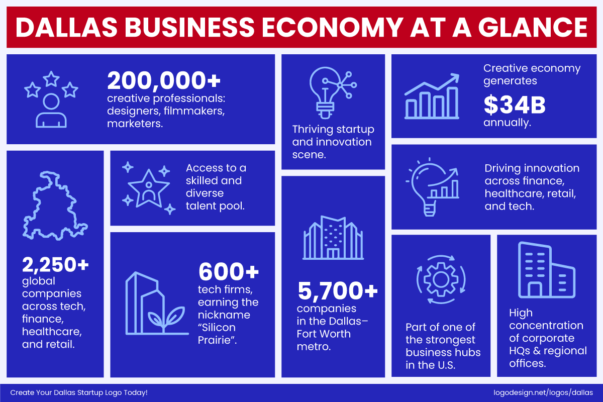
Statistics about the standing of Dallas’s business economy
- Dallas is home to over 2,250 global companies spanning tech, finance, healthcare, and retail, making it one of the strongest business hubs in the United States. (Dallas City Hall)
- The Dallas–Fort Worth creative economy generates roughly $34 billion each year and supports over 200,000 creative professionals, from designers and filmmakers to marketers.
- Known as the Telecom Corridor, the Dallas metro hosts 5,700+ companies, including 600+ tech firms, earning it a reputation as the “Silicon Prairie.”
In short, this city is buzzing with innovation and creativity. So, businesses here need logos that reflect growth, confidence, and a sense of local pride, something that feels as modern as a downtown office tower, but with a touch of Texas authenticity.
So What Does That Mean for Your Business Logo?
Dallas audiences know good design when they see it. They appreciate brands that blend style with substance, and that sense of balance is key when designing for this market.
- Confidence with sophistication – Dallas logos often look sharp and professional but never pretentious. Clean lines and refined fonts say “we mean business,” while warm colors or rustic textures keep things approachable.
- Tradition meets modernity – You’ll find plenty of brands that mix Western heritage with sleek, modern geometry, like Y.O. Ranch Steakhouse, whose branding combines a rugged Western emblem with elegant typography and a minimalist layout. It’s a visual nod to the city’s roots without feeling stuck in the past.
- Creative flair encouraged – With a growing startup scene, Dallas businesses love logos that stand out. Imagine clever shapes, dynamic layouts, or subtle motion-inspired designs that feel fresh and forward-thinking.
- Local cues go a long way – Whether it’s a skyline silhouette, a lone star, or even a color palette inspired by a Texas sunset, small regional touches instantly make a business logo feel more relatable to Dallas audiences.
Color Psychology: Shades of the Lone Star City
According to color psychology, color sets mood, builds trust, and tells people what kind of business you are before they read your name. In Dallas, certain color combos show up often because they resonate locally. Below are the ones you must have spotted at least once.
1. Blue and Silver
Blue conveys trust, authority, and stability. Silver (or greys) adds modernity and sleekness. When combined, they evoke a reliable and high-end feel. Plus, the blue + silver combo is deeply tied to Dallas Cowboys branding, so there’s familiarity and instant recognition.
Classic Dallas Cowboys logo features a star in bold royal blue with silver accents, having a timeless and instantly recognizable appeal.
Look at the Dallas Cowboys star logo, which has a bold royal/true blue + silver outline and accents. It is classic, timeless, and easily readable everywhere from stadiums to merch.
The Dallas Mavericks logo, which uses royal and navy blue shades with silver accents, convey energy and strength in its branding.
The Dallas Mavericks also make strong use of royal blue, navy blue, and silver in their branding. It gives energy and strength, with the silver helping the darker blues pop.
The Visit Dallas logo uses the blue brand colors with Stardust and Twilight Grey accents
The city’s official tourism brand, Visit Dallas, features can-do blue as its main color, with stardust and twilight grey serving as accent colors.
2. Gold and Red
Gold tones feel rich and established; they bring a sense of heritage and quality. Reds make a bold statement and bring passion into the mix. Together, especially in a place like Texas, they can feel proud, bold, and southern with a festive or strong-spirited touch.
The Golden Corral’s logo uses a red and gold palette to create a warm and welcoming vibe.
You’ll see this pairing all over Dallas. Golden Corral, for instance, uses vibrant reds and golden yellows to create a welcoming, family-friendly energy that instantly grabs attention. The color scheme is approachable yet strong.
The iconic El Fenix logo uses a warm red color to show a festive spirit and timeless tradition.
Then there’s El Fenix, a Dallas legend in Tex-Mex dining. Its long-standing use of warm reds and yellows channels both fiesta vibes and tradition, connecting generations through color alone. The hues mirror the heat of the kitchen and the lively atmosphere inside.
The Dallas Trinity FC’s logo uses gold and deep red colors to show pride, determination, and a sense of community.
Even Dallas Trinity FC, the city’s new soccer club, embraces this powerful mix with gold and deep red tones that evoke pride, determination, and a sense of community spirit. The colors tell a story of ambition and belonging.
When used together, red and gold/yellow light up an emotional spark. They draw the eye, stir up appetite and excitement, and celebrate that signature Dallas mix of tradition and modern flair.
3. Black, White, and Charcoal
These tones are neutral and powerful. Black gives weight and seriousness; white cleans things up and gives space; charcoal or mid-greys bridge dark and light, modern yet timeless. They’re extremely versatile, especially when printing on various backgrounds or when used for minimal/premium brands.
The Dallas Stars’ logo design combines silver, white, and black with bright accents for bold contrast and clear legibility.
The Dallas Stars use silver (grey tones), white, and often dark outlines/black elements in their uniforms and alternate logos. The contrast with bright accent colors helps legibility.
The Neiman Marcus logo uses a black-and-white wordmark that suggests sophistication and elegance.
Neiman Marcus, the luxury retailer’s wordmark, is a perfect example of timeless black-and-white branding. Its script font feels sophisticated, while the monochrome palette keeps the focus on elegance rather than distraction.
The Highland Park Village logo uses elegant black typography and minimalist design to signal luxury.
One of Dallas’s most iconic shopping districts, Highland Park Village’s branding leans heavily on black typography and minimal design to convey luxury and tradition without flashy colors.
4. Blue, Red, and White
Few color combinations capture Dallas’s mix of pride and professionalism quite like blue, red, and white. It’s a palette that blends trust, boldness, and energy which is perfect for a city that balances cowboy grit with modern ambition.
FC Dallas’ logo uses deep navy, vibrant red, and crisp white to show passion and integrity.
You can see this dynamic trio front and center in FC Dallas, whose crest proudly features deep navy, vibrant red, and crisp white. The combination speaks volumes— discipline and loyalty in the blue, passion and energy in the red, and a clean sense of integrity in the white.
Dallas Baptist University’s logo uses bold black, along with thin red and white strokes to signal patriotism and academic values.
Another great example is Dallas Baptist University (DBU). Their branding uses a deep, dignified blue paired with bright red and white. It’s a combination that feels both patriotic and academic.
Typography: The Voice of Dallas Brands
The fonts you see across Dallas logos tell stories of innovation, heritage, and that unmistakable Texas confidence. From sleek tech startups in Uptown to old-school diners in Deep Ellum, Dallas brands know how to make type talk.
From so many logo design fonts out there, a few stand out, including the following.
1. Bold Sans-Serifs: The Choice of Modern Startups and Tech Brands
Dallas’s growing tech and startup scene leans heavily on bold, sans-serif fonts. Think clean lines, balanced spacing, and a no-nonsense vibe.
AT&T’s logo uses a sleek, rounded icon to show Dallas’s spirit of innovation and connectivity.
Take AT&T, one of Dallas’s biggest names. Its sleek, rounded sans-serif wordmark feels approachable yet modern, reflecting innovation and connectivity. This is exactly what you’d expect from a global telecom rooted in a forward-thinking city.
The Match Group logo uses clean sans-serif typography to show Dallas’s digital-first design style and create a simple appearance.
You’ll also see this style in Match Group (the parent company behind Tinder, also Dallas-based). Their typography is confident, simple, and versatile, which is ideal for digital-first brands that need to look sharp on every screen. Sans-serif in Dallas helps project confidence quietly and cleanly.
2. Script and Slab-Serif Fonts: A Nod to Heritage and Western Charm
Dallas has deep roots, and plenty of local businesses love celebrating that through script and slab-serif typefaces that nod to tradition. These fonts feel warm, handcrafted, and full of Texas character.
The Pecan Lodge logo uses rustic, hand-drawn typography to trigger the smoky, soulful spirit of Texas.
Take Pecan Lodge, one of Dallas’s most loved barbecue spots. Its logo uses a rustic, hand-drawn script that feels smoky, soulful, and handcrafted, much like the food itself. The typography instantly communicates heritage and warmth and invites you to experience something genuinely Texan.
The Wild Bill’s Western Store’s logo uses a bold slab-serif wordmark to signal the cowboy tradition in the West End.
Then there’s Wild Bill’s Western Store in the West End, whose bold slab-serif wordmark evokes cowboy culture and craftsmanship. It’s rugged but polished, a perfect example of how local typography keeps tradition alive without feeling outdated.
This style thrives in Dallas’s boutique and heritage brands because it connects emotion, history, and hometown pride in one glance.
3. Geometric and Clean Typefaces: The Mark of Finance, Real Estate, and Luxury
In sectors like real estate, finance, and high-end design, Dallas brands gravitate toward geometric, modern typefaces that project professionalism and trust.
The CBRE logo uses a solid, balanced sans-serif typography to show stability and straightforwardness.
CBRE, one of the world’s largest commercial real estate firms, headquartered in Dallas, has a logo that uses an all-caps geometric sans-serif font. The font is solid, balanced, and designed to work across every medium, from web to print.
The Jacobs logo uses a simple, bold sans-serif wordmark that suggests functionality and reliability.
Similarly, Jacobs, the Dallas-based engineering and consulting giant, uses a simple, clean wordmark that emphasizes functionality and modernity. The bold sans-serif font underscores innovation and reliability, values at the core of Dallas’s corporate culture.
Shapes, Symbols, and Iconography: When Dallas Speaks in Design
Dallas brands have a knack for making a statement without saying much, and that’s where shape psychology comes in. Every curve, edge, and line adds personality. Sharp angles project confidence; soft shapes feel warm and welcoming.
Local designers use this smartly by weaving abstract longhorns, skyline silhouettes, or Texas star motifs with modern restraint. It’s a clever way to celebrate local pride without falling into cliché, a balancing act Dallas creatives pull off beautifully.
1. Stars, Circles, and Shields
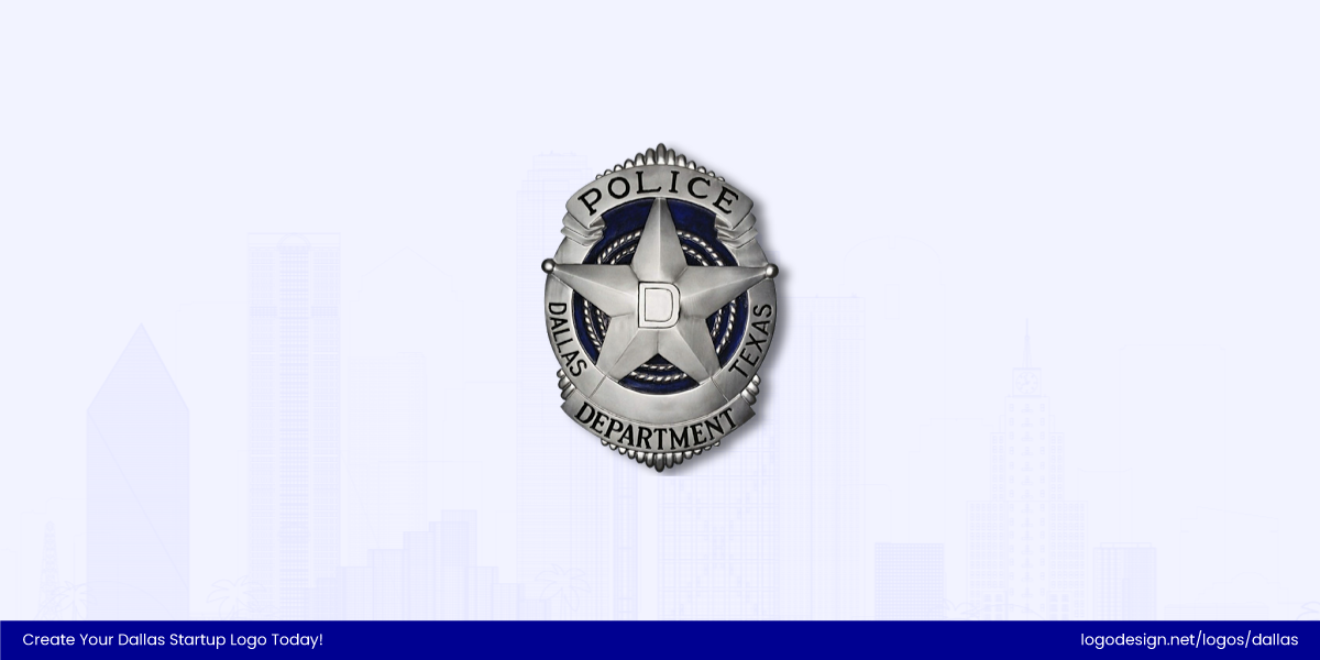
The five-pointed star Dallas Police Department uses a shield-style badge that shows authority and service.
Stars, circles, and shields are a Dallas staple. The star, of course, needs no introduction; it’s the Lone Star State, after all. You’ll spot it in the Dallas Police Department’s badge-style logo, which proudly features a five-pointed star framed in a shield to symbolize authority and service.
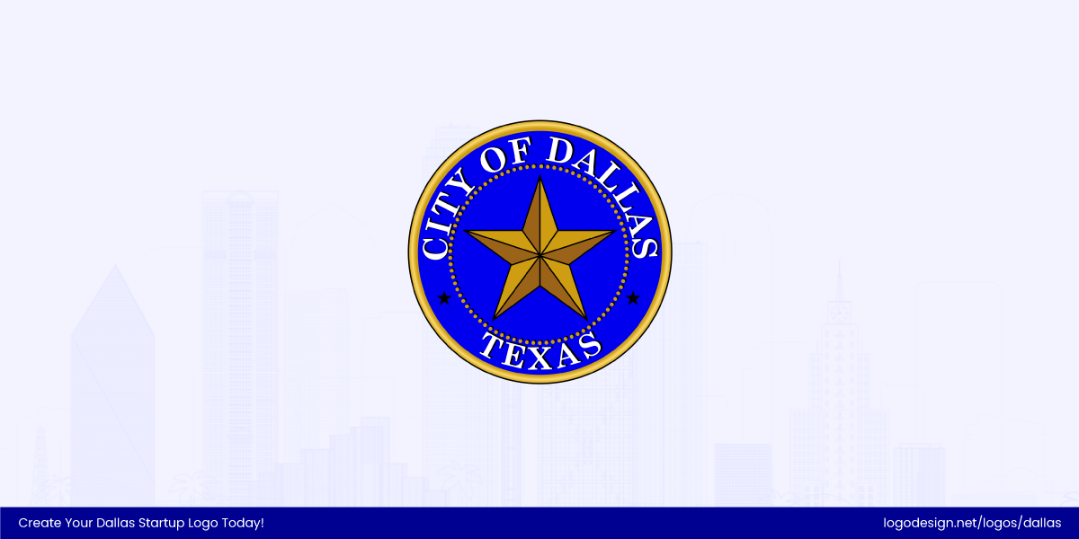
The Dallas City Seal logo has a bold star within a classic design to convey pride, unity, and heritage.
Another familiar example is the City of Dallas seal, which features a bold star enclosed within a circular frame. It’s a classic civic design that conveys pride, unity, and heritage. These shapes project strength and connection, timeless values that run deep in Dallas design.
2. Sharp Angles and Clean Lines
Then you’ve got sharp angles and clean lines, popular with Dallas’s booming tech, energy, and logistics industries.
Texas Instruments’ logo uses a simple design that shows precision and innovation in the modern economy.
Brands like Texas Instruments use geometric simplicity to convey precision and innovation, a perfect match for the city’s growing modern economy.
Atmos Energy’s logo uses an angular wordmark to represent energy flowing reliably through the city.
Another great example is Atmos Energy, whose angular, forward-tilting wordmark creates a sense of movement and reliability, a perfect reflection of a brand that quite literally keeps the city’s energy flowing.
3. Organic Shapes
Organic shapes never go out of style. Curves, waves, and fluid forms dominate the creative and hospitality scene. These forms bring warmth and movement, a welcome contrast to the city’s otherwise sharp-angled skyline.
Hotel ZaZa’s logo uses free-flowing curves that are intentionally unstructured to give an artistic feel.
Take Hotel ZaZa’s boutique hotel logo, for example. Its brand identity leans into expressive, free-flowing shapes and elegant curves that mirror its eclectic vibe. From its swirling logo script to the artistic flourishes in its interiors, everything feels intentionally unstructured.
Velvet Taco’s logo uses quirky branding with hand-drawn curves to give an energetic feel.
Then there’s Velvet Taco, another Dallas original that plays with playful, irregular shapes and quirky typography in its branding. The design feels energetic and spontaneous, much like the restaurant’s daring menu. Their visuals mix hand-drawn curves and loose, organic illustrations that instantly make the brand feel personal.
Layout and Composition: Structured Like the City Itself
Dallas’s skyline isn’t the only thing with balance and structure; you’ll see the same sense of order in how local brands arrange their logos. Layout choices here often mirror the city itself: part polished business district, part creative sprawl.
1. Centered and Symmetrical: Tradition You Can Trust
Traditional Dallas businesses tend to favor centered, symmetrical layouts that project stability and professionalism.
The Dallas Bar Association logo uses a balanced design to suggest authority.
The Dallas Bar Association logo, for instance, features a perfectly balanced seal design that is clean, circular, and authoritative.
Baylor University Medical Center’s logo uses an abstract blue and yellow icon to reinforce public trust.
Similarly, the Baylor University Medical Center logo keeps its cross emblem and typography centered, reinforcing trust and reliability. These structured layouts speak to the city’s long-standing institutions where heritage and credibility still matter.
2. Dynamic and Minimalist: The Startup Edge
Conversely, Dallas’s newer startups and creative firms are breaking symmetry for energy and impact.
Bottle Rocket’s logo uses a minimal structure and negative space to convey more personality.
Bottle Rocket, a local digital design agency, embraces negative space and minimal structure in its wordmark, letting simplicity and movement guide the eye. Both prove that in Dallas, less structure can often mean more personality.
Meanwhile, RewardStyle (now LTK, founded in Dallas) takes a more dynamic approach, using a minimalist design with generous spacing in logo and a fluid mark that scales perfectly for digital use. Both show how Dallas startups are ditching overly complex compositions for sleek, adaptable designs that work everywhere from apps to billboards.
Local Inspiration: Dallas Logos from Our Gallery
The LTK (formerly RewardStyle) logo is minimalistic, illustrating a focus on digital adaptability.
If you’re looking to capture the Dallas vibe in your next logo, you don’t have to start from scratch. We’ve handpicked a few designs from LogoDesign.Net’s logo gallery that channel the city’s energy, from bold Western heritage to sleek modern startups. This is your little visual tour through Dallas’s design personality: confident, creative, and proudly Texan.
Ready to wrangle your own Dallas-inspired logo? Check out free Dallas logos in our gallery and pick a design that fits your brand’s needs.
Tips for Designing a Logo for the Dallas Market
Creating a logo for the Dallas brand means capturing a mix of grit, pride, and modern ambition. The best local designs feel authentic, rooted in Texas tradition but forward-looking enough to stand out in a competitive city. Here’s how to strike that balance:
1. Blend the Old with the New
Dallas has deep roots, but it’s also a city that never stops reinventing itself. Combine classic design elements, like bold typography or heritage-inspired shapes, with clean, modern layouts. It’s that mix of old charm and new confidence that truly resonates here.
2. Design for Versatility
From downtown storefronts to digital ads, Dallas logos need to shine everywhere. Keep your design adaptable, scalable, and legible, whether it’s stitched on a polo or glowing on a rooftop sign in Deep Ellum. Simplicity and flexibility go a long way.
3. Stay Color-Smart
Color carries weight in Texas. Choose hues that balance energy with trust. Warm tones like reds or golds bring spirit, while blues and greys add credibility. The right color palette can make your brand feel both professional and approachable, just like the city itself.
4. Pick Fonts That Fit Your Industry
Your font choice can say more than your tagline. Choose a unique typeface, for instance, a bold sans-serif fits tech and startups, while a serif or slab-serif nods to craftsmanship and heritage. Dallas audiences appreciate type that feels intentional and confident, not generic.
5. Get Inspired Locally
Dallas’s streets, murals, and even restaurant signs are full of design inspiration. Look to local landmarks, sports teams, and neighborhood art for subtle visual cues. A small nod to the city’s culture can make your brand feel instantly familiar and rooted.
6. Test Your Design
Before locking it in, show your logo to locals or loyal customers. Dallas folks have a strong sense of what feels authentic. Their feedback can help fine-tune your design so it truly connects with the community you’re trying to reach.
Conclusion: Designing with Dallas Pride
At the heart of every great Dallas logo is a story that blends the city’s grit, style, and Texas pride. When you understand the local culture, its bold spirit, creative energy, and love for tradition, your designs don’t just look good; they feel like Dallas.
So, whether you’re a small business on Deep Ellum’s buzzing streets or a growing startup in Uptown, take the time to customize, experiment, and create something that reflects your corner of this vibrant city.
Ready to bring your Dallas-inspired brand to life? Explore our Dallas logo collection and start designing today.
