Forget being the “most creative” in the room—what if your logo could live rent-free in everyone’s minds? When you design for memory and cognitive ease, your brand becomes impossible to shake off.
Every single day, our brains are flooded with visual stimuli—billboards, app icons, storefronts, and social posts. Estimates suggest that we see anywhere from 6,000 to 10,000 advertising messages each day. Amid this avalanche, how does one brand’s logo break through the noise and stick in memory?
The idea of cognitive load pretty much explains it. When too much information vies for attention, the brain filters out the unimportant, and only a few visuals survive the cut. In branding, a logo is the mnemonic anchor, which is why 75% of people recognize a brand by its logo alone.
So, to avoid being forgotten, a logo must sync with how the human mind remembers. In this post, we’ll learn how cognitive science and memory research converge to show what makes a logo stick, as well as practical design tips to help your brand stay top-of-mind.
The Psychology Behind Motion and Emotional Recognition
Ever wonder why your brain remembers certain logos instantly while others vanish the moment you look away? It’s because our minds are wired for shortcuts. We don’t store every detail we see; instead, we absorb simplified impressions and patterns that help us recognize things. To design logos that stick, we have to understand a bit of brain science (don’t worry, no neuroscience degree required).
Our brains love order, and they instinctively organize visuals using Gestalt principles like closure, similarity, and figure-ground recognition. These mental rules help us make sense of shapes without thinking too hard.
When a logo aligns with these natural tendencies—say, like the FedEx arrow hidden between the “E” and “x” or WWF’s panda that our brain completes automatically—it feels effortless to remember.
On the other hand, complex, chaotic designs cause mental friction and are far more likely to be forgotten.
How the Brain Stores Visuals?
Our brains are designed to simplify and categorize what we see. Instead of remembering every pixel, we store patterns and meanings. When a logo is too complicated, it forces our minds to work harder—cue cognitive overload.
Here’s what actually helps:
- Simplicity: The brain loves clean, uncomplicated shapes. They’re easier to process and recall.
The Nike Swoosh uses a single curved line to symbolize movement and speed, embodying athletic energy with effortless clarity.

The Apple logo’s bitten apple silhouette is instantly recognizable — a perfect balance of simplicity and symbolism that conveys creativity and approachability.

The Target logo, composed of just two concentric circles, transforms pure geometry into a bold and memorable visual metaphor for focus and precision.

The Meta logo employs a continuous loop forming an infinity symbol, reflecting both connection and the brand’s long-term vision — simple in form yet conceptually deep.
- Consistency: Repeated exposure strengthens memory. Frequent redesigns, on the other hand, reset that recognition.
The Twinings logo has remained virtually unchanged since 1787, proving how enduring design consistency can turn a simple wordmark into a centuries-old symbol of trust and heritage.

Nestlé has preserved its nest-and-birds emblem since the 1860s, subtly refining it over time while maintaining the original metaphor of care and nourishment — a visual anchor that generations recognize instantly.
The Heinz logo has evolved only in detail since 1869, keeping its distinctive keystone shape and wordmark intact, reinforcing reliability and familiarity across every era.

Shell’s logo, first introduced in 1904, has always featured the same scallop shell silhouette — a timeless design whose strength lies in consistent form rather than constant reinvention.
- Emotional cues: We remember what makes us feel something—logos that tap into emotion leave stronger imprints.

The McDonald’s golden arches evoke warmth and happiness through their bright yellow color and rounded form, creating an instant sense of comfort and familiarity.
The Disney logo, with its whimsical script and castle imagery, stirs feelings of wonder, nostalgia, and imagination — emotions tied deeply to childhood memories.

The American Express logo uses a bold blue square to project trust, dependability, and security, reinforcing the emotional comfort that comes from reliability.

The Whole Foods Market logo pairs a green palette with organic shapes, evoking freshness, health, and a sense of natural well-being that resonates with conscious consumers.
The Dual-Coding Effect: How Logos Talk to the Brain Twice
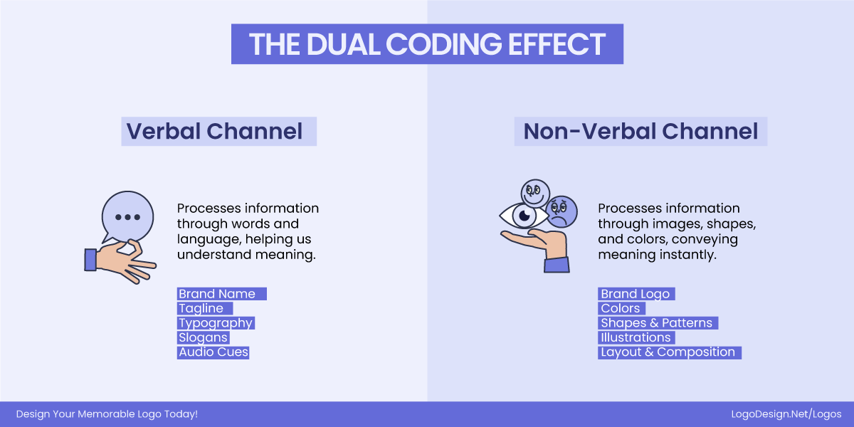
Psychologist Allan Paivio’s Dual-Coding Theory suggests that our brains process information through two parallel systems:
- The verbal system (words, names, slogans)
- The nonverbal system (images, shapes, symbols).
When a logo successfully connects the two (visual and conceptual), it becomes doubly memorable.
Take Chanel’s double C monogram: it’s not just two interlocking letters; it represents elegance, luxury, and timeless style. The brain remembers the image and the feeling.
This dual connection makes recall faster and stronger because if one cue fades (the brand name “Chanel”), the other (the double C symbol) can still trigger recognition. Logos that fail to establish this dual coding, ones that look pretty but say nothing, rarely survive beyond first glance.
Cognitive Overload in Logo Design: Too Much Becomes Forgettable
We live in a world where attention spans are shrinking faster than ever. Some studies suggest that on average, they are just 8 seconds. When your audience’s brain is already juggling notifications, content, and colors, a cluttered logo leading to cognitive reload kills brand recall. A logo that tries to say too much ends up saying nothing at all. The goal here isn’t to impress at first glance; it’s to be remembered at a glance.
Cognitive overload happens when a logo demands too much mental effort. Instead of instantly understanding what they’re looking at, people pause, trying to decode shapes, fonts, and colors that don’t align. And when that happens, the brain moves on.
When Logo Design Went From Memorable to Messy
Brands sometimes overthink simplicity in logos and end up redesigning themselves into confusion. Here are a few real-world lessons.
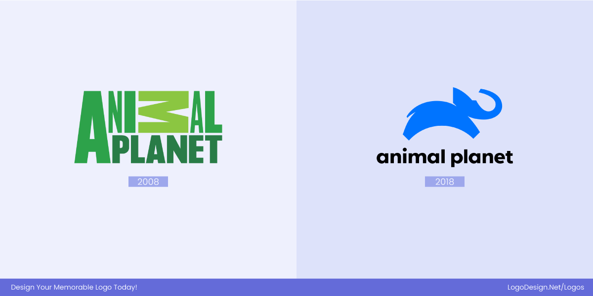
- Animal Planet (2008): The original elephant logo was instantly recognizable. But when the network switched to an abstract, typographic “ANIMAL PLANET” with rotated letters, viewers struggled to connect it with the brand’s identity. The Animal Planet’s redesign felt clever but lost emotional recognition.
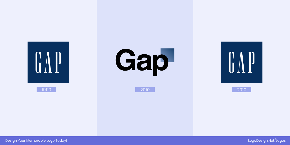
- Gap (2010): The classic blue box and serif font were iconic for decades. Then came a modern “minimalist” update with a small gradient square—a move meant to look fresh, but it stripped away familiarity. Within a week of backlash, Gap reverted to the original logo.
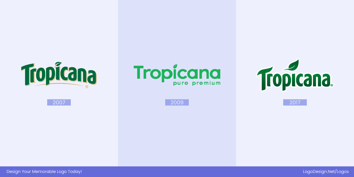
- Tropicana (2009): Tropicana’s orange-with-a-straw image was replaced by a sleek, minimal box design. It looked “clean,” but customers couldn’t find it on shelves. Sales dropped 20% in two months, forcing PepsiCo to bring back the old logo and packaging.
Each of these redesigns overloaded the viewer, not because they were ugly, but because they asked for too much reprocessing. The mental connection people had built over the years was suddenly gone.
The Simplicity Sweet Spot
Simplicity doesn’t mean boring. It means designing for processing fluency, such as how easily the brain can absorb and recognize an image. The easier it is to process, the more we like and remember.
That’s why some brands can drop their names entirely and still be instantly recognizable. Their designs respect how the brain naturally prioritizes clarity, repetition, and emotional familiarity.
Pepsi: The red, white, and blue circular icon is instantly recognizable worldwide, conveying energy and refreshment without relying on text.

Microsoft: The four-color window symbol communicates simplicity, innovation, and versatility, making the brand identifiable even without the wordmark.
BMW: The circular blue-and-white roundel evokes precision, engineering excellence, and heritage, standing out as a symbol of luxury automobiles.
Airbnb: The abstract “Bélo” symbol represents belonging and community, allowing the brand to be recognized globally without any text.
What Happens When People Recall and Draw Brand Logos from Memory?
While researching how memory and logo design work together, we came across a fascinating experiment by Signs.com—and honestly, it would feel wrong not to talk about it. The team ran a simple but brilliant study where they asked 150+ people to draw some of the world’s most iconic logos completely from memory.
Each participant had about three minutes per logo, and once finished, their drawings were rated by a panel of design and marketing experts for accuracy—based on proportions, color, and key features.
The question they wanted to answer was simple:
How accurately can we recall the logos of brands we see every single day—like Apple, Starbucks, and Foot Locker?
Turns out, not as accurately as we’d think. Have a look yourself as we share the examples below.
Example 1: Apple
Apple—a logo that feels impossible to forget. It’s everywhere: on phones, watches, laptops, and in the hands of more than 600 million users worldwide. You’d think that constant exposure would make recalling it effortless.
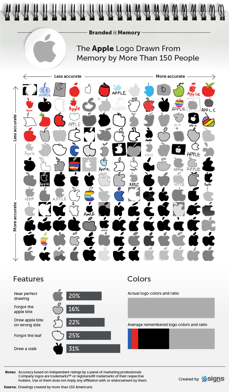
Image Source: signs.com
However, the study revealed that only about 20% of participants could draw the Apple logo with near-perfect detail. Even with something so simple, memory played tricks.
Here’s what people got right—and wrong:
- 84% remembered the bite, though 22% drew it on the wrong side.
- 1 in 3 people added a stalk, confusing the logo with a real apple.
- 15% drew the leaf facing the wrong way.
- 6% colored it red, relying on their brain’s “ideal apple” instead of the actual logo.
- A small group (3%) even drew the old rainbow-striped version, showing how nostalgia still lingers in memory.
It’s fascinating that people weren’t really remembering Apple’s logo; they were remembering their idea of what an apple looks like. Despite its simplicity, the logo exposed how even the most familiar symbols are subject to personal interpretation and imperfect recall.
Example 2: Adidas
Next up is Adidas—the second-largest sportswear company in the world and home to one of the most recognizable logos in fashion. Interestingly, the brand acquired its three-stripe logo in 1952. Decades later, those three stripes have become a global symbol of performance and lifestyle, worn by everyone from professional athletes to streetwear icons.
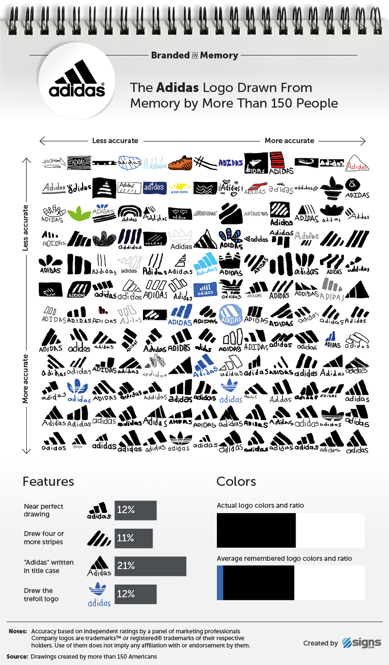
Image Source: signs.com
Even with all that visibility, the results of the recall experiment were surprising. Only 12% of participants drew the Adidas logo nearly perfectly. For a brand seen daily on clothing, shoes, and ads, that’s a strikingly low number.
Here’s where memory stumbled:
- 11% drew four or more stripes instead of three.
- 21% capitalized the “A” in “adidas”, forgetting the company’s lowercase style.
- 10% sketched the trefoil logo (the older version from 1971), which features three leaves symbolizing global unity and diversity. While it’s still used on Adidas Originals products, it’s not the company’s main logo anymore.
- 8% added blue to their drawings, likely influenced by the blue color often seen on Adidas packaging and shoeboxes, even though the official logo is typically black.
This reminds us that sometimes people tend to remember themes like three stripes rather than precise details, including their placement or shape.
Example 3: Burger King
In contrast to the clean simplicity of Apple and Adidas, Burger King’s logo is a bit more complex. It features three main parts—the brand name sandwiched between two bun halves and a blue crescent swoosh—and a brand color palette of bold red, yellow, and blue. You’d expect that extra detail to make it harder to remember, but surprisingly, it didn’t trip people up as much as you’d think.
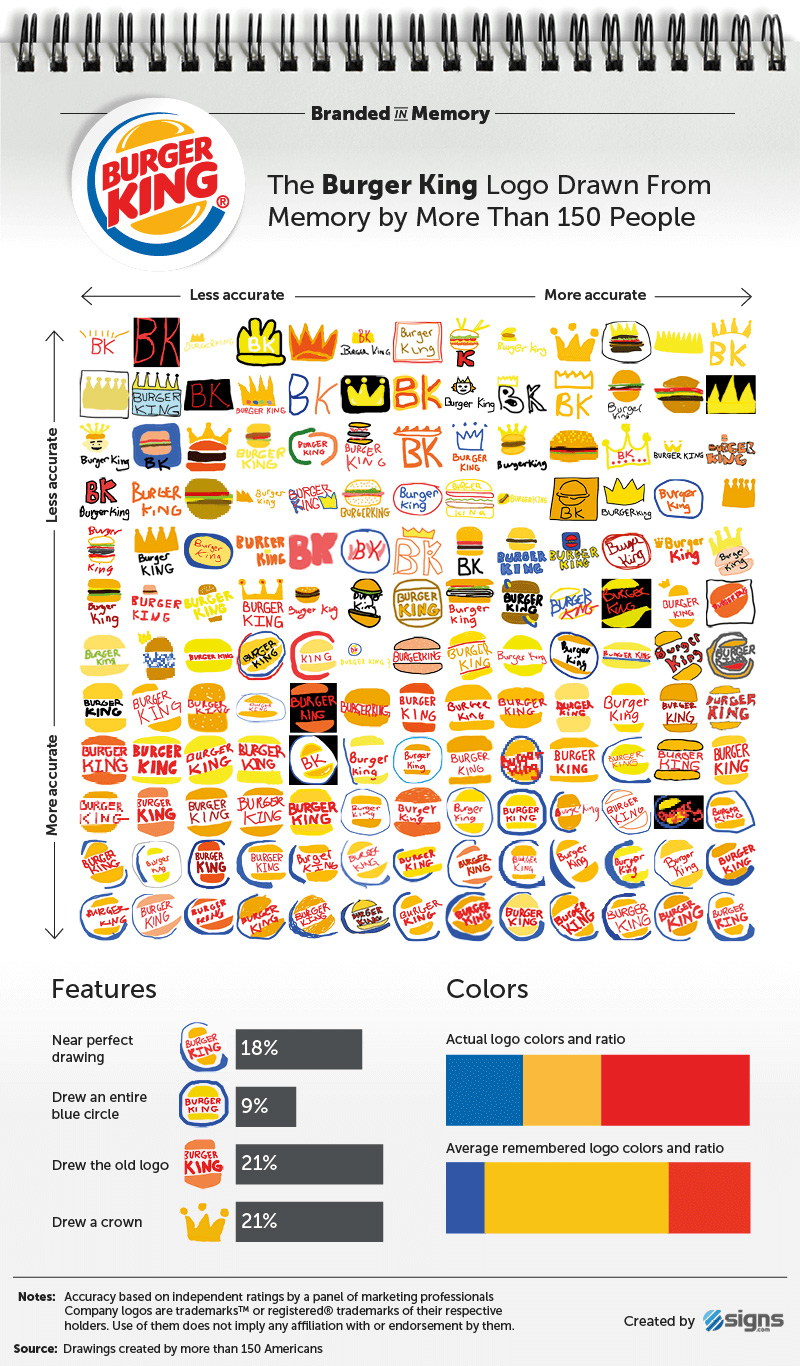
Image Source: signs.com
About 18% of participants drew Burger King’s logo almost perfectly, not far behind Apple’s 20%. Still, memory had its quirks:
- 21% added a crown, even though the logo hasn’t featured one since the “sitting king” design of the 1950s and ’60s.
- Over 1 in 5 people recreated the 1969–1999 version, with orange buns and no blue crescent.
- Many likely remembered Burger King’s ads or paper crowns rather than the actual logo itself.
The participants’ drawings were quite interesting in that they featured several forms of a crown, particularly a cognitive response to the word “King.”
Example 4: Starbucks
Since its start in 1971, Starbucks has gone through three major logo versions — each featuring its now-famous twin-tailed mermaid, or siren, borrowed from Greek mythology. The first logo showed the siren in full detail (and topless, as mythology tends to go). By 1987, the brand tidied things up — covering her with flowing hair, switching from brown to green, and giving her a more modern feel.
The current logo, introduced in 2011, took simplification even further: gone are the words “Starbucks Coffee” and the black ring, leaving only a clean green siren.
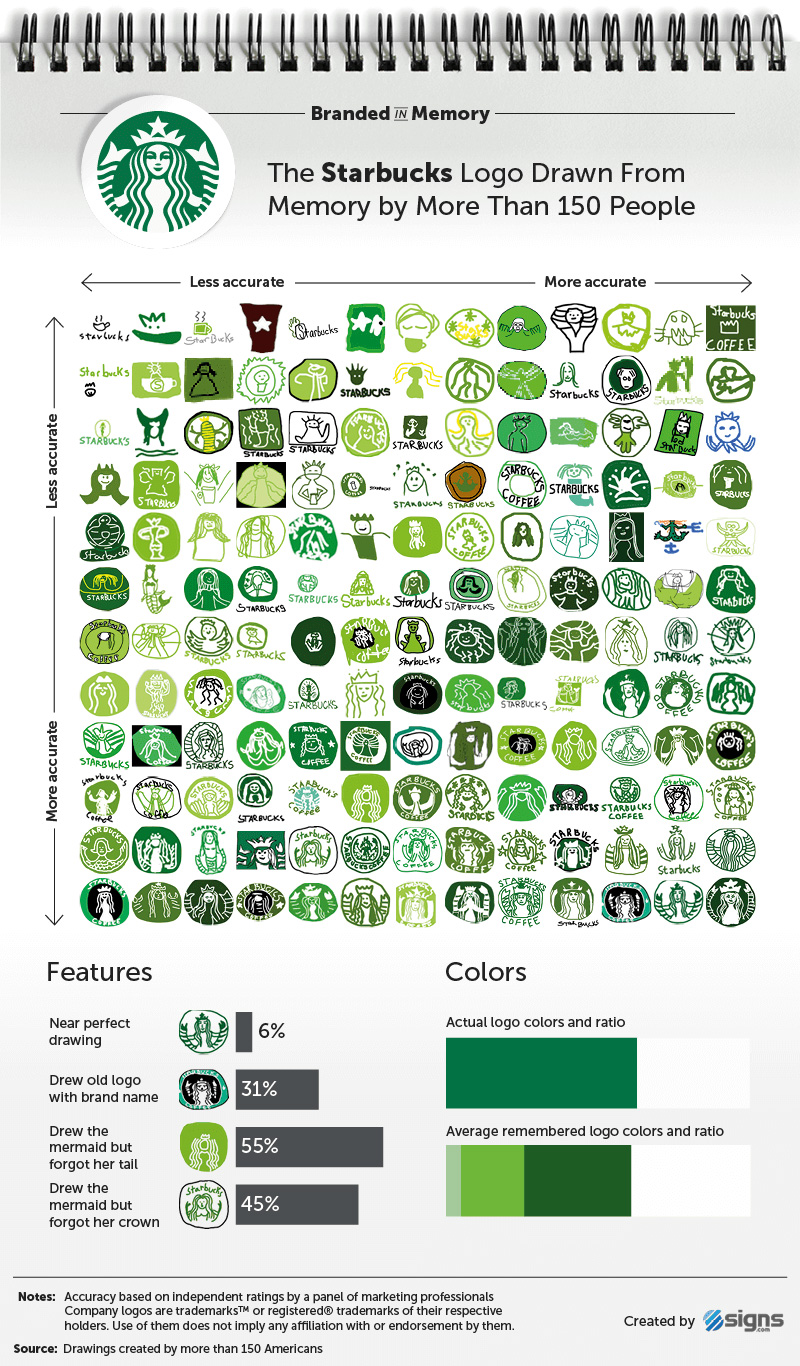
Image Source: signs.com
Looking at the drawings, you can see that despite being one of the most recognizable brands on earth, only 6 percent of participants drew it nearly perfectly from memory.
Here’s what memory missed:
- 56% forgot the siren’s crown, and of those who included it, only 16% remembered the star at its center.
- 55% omitted her twin tails entirely.
- 31% drew the older logo with text and a black circle.
Even with 18 million cups served daily, Starbucks proves that visual exposure doesn’t always equal visual recall, especially when the logo’s centerpiece is as intricate as a mythological sea creature. It also proves that complex logos are harder to recall.
Example 5: IKEA
When it comes to logos that stick, IKEA reigns supreme. The Swedish furniture giant, known for its flat-pack designs and Scandinavian simplicity, also happens to have the most accurately recalled logo in the entire experiment. Out of 150+ participants, 30% drew the IKEA logo almost perfectly from memory, outperforming all other famous logos drawn.
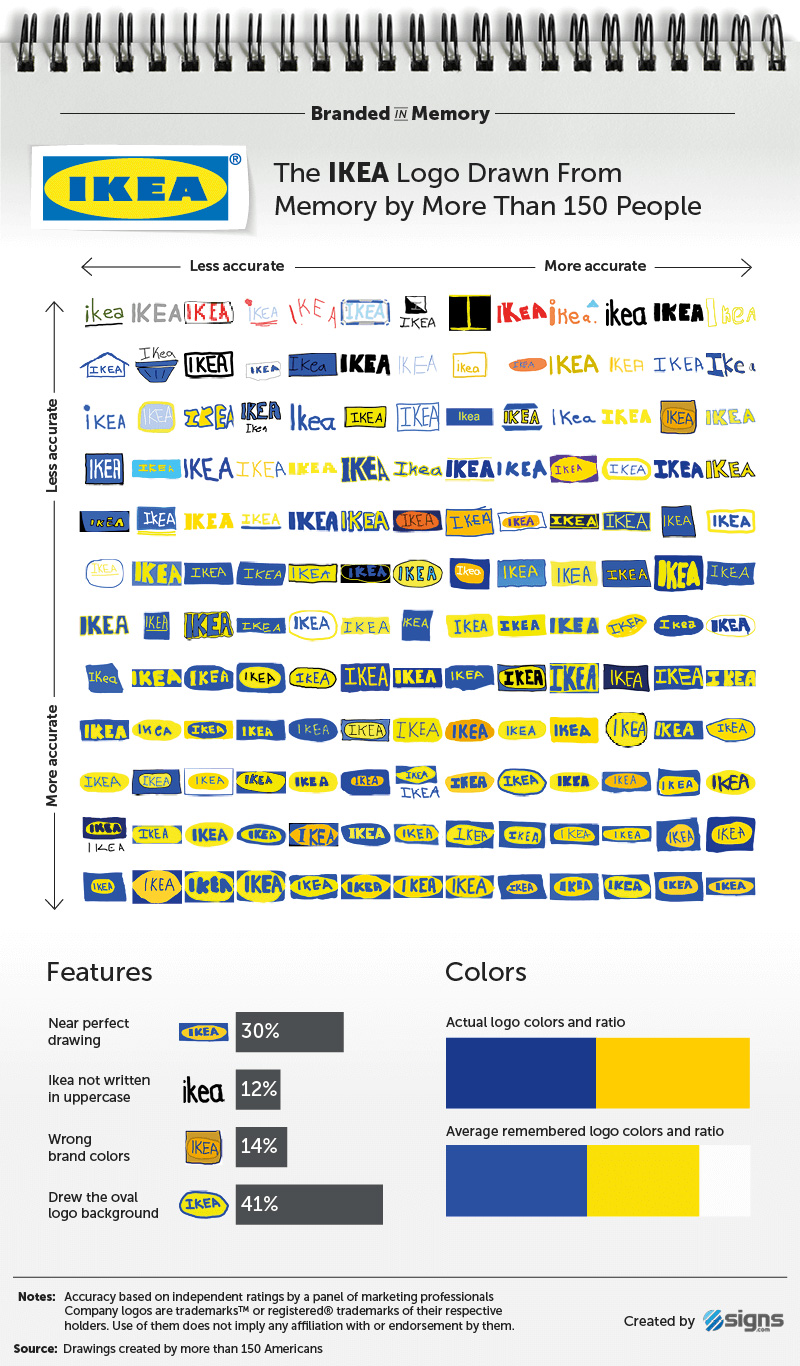
Image Source: signs.com
The results are pretty impressive for a design that hasn’t changed much in decades. The logo, featuring bold blue letters inside a yellow oval, has become as recognizable as the company’s warehouse-style stores and minimalist furniture names. It’s straightforward, symmetrical, and deeply tied to the brand’s identity, exactly what memory loves.
Here’s what participants got right (and wrong):
- 88% remembered the all-uppercase “IKEA”, a key part of its impact.
- 41% included the yellow oval, though many confused it with the storefront’s blue-and-yellow color reversal.
- Some mixed up which color came first—blue on yellow or yellow on blue—but the overall composition stuck.
IKEA’s consistency, clarity, and color contrast make it a perfect example of how simple design breeds strong recall.
Example 6: 7-Eleven
The 7-Eleven logo is one of those designs that feels like it’s been around forever — because, well, it almost has. Introduced in 1946, it’s barely changed since: a bold numeral “7” intersected by the word “Eleven” inside a white trapezoid, all set against a green background. The most significant tweak came in 1969, when the top of the “7” turned orange while the bottom stayed red, a minor update that added warmth without losing familiarity.
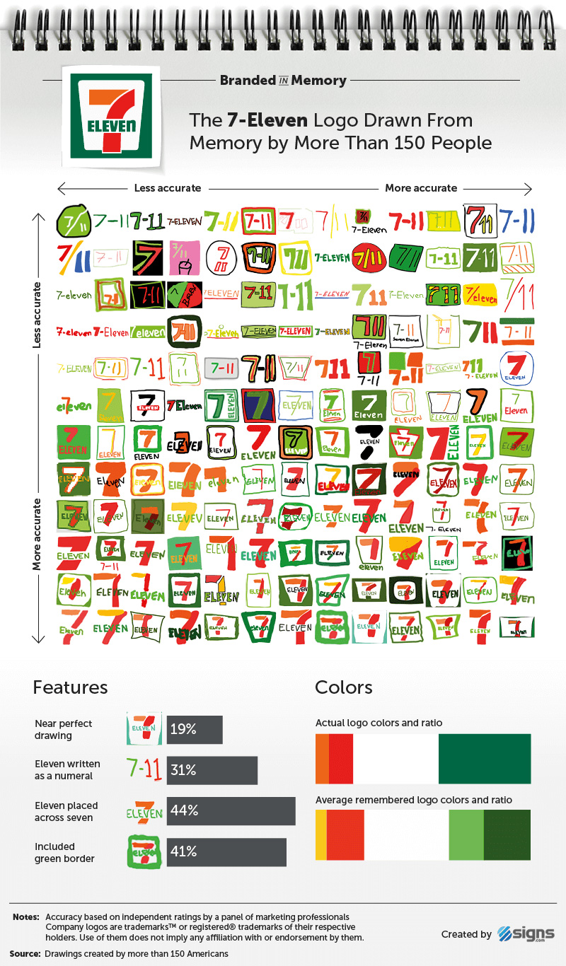
Image Source: signs.com
In the experiment, 19% of participants drew the 7-Eleven logo nearly perfectly, while another 46% came close but missed small details. The most frequent slip-ups?
- 31% wrote “Eleven” as the number 11.
- 56% placed “Eleven” beneath the 7 instead of across it.
- Talk about another sneaky logo detail, the “ELEVEn,” with a lowercase “n.” Only 1% of people remembered that.
Despite its longevity, 7-Eleven’s logo shows that familiarity doesn’t always guarantee accuracy, especially when small quirks test our visual memory.
Example 7: Foot Locker
Foot Locker is one of the few brands daring enough to feature a person in its logo, a bold move that clearly challenges memory. Alongside Starbucks, it was one of the least accurately recalled logos in the entire experiment. The design, in use since 1988, features a referee with his hands on his hips, facing right, and the words “Foot Locker” written in bold red beneath him.
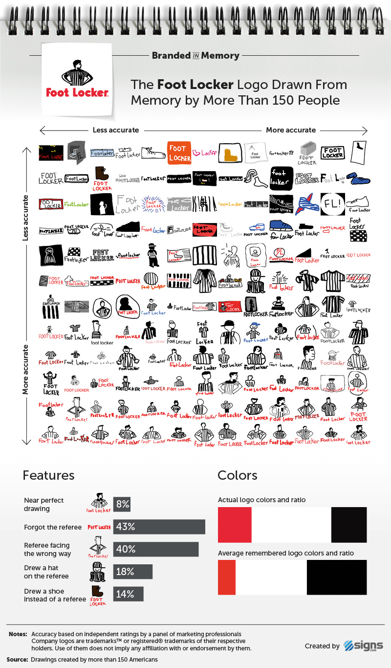
Image Source: signs.com
Despite its long history, the logo doesn’t always appear front and center; many of the brand’s 3,300+ stores simply display the red text without the referee figure, which may explain some confusion.
Here’s how participants fared:
- 57% remembered the referee, but 40% had him facing the wrong way.
- 18% added a baseball cap, which doesn’t exist.
- 9.7% drew only the striped shirt, skipping the person altogether.
- 14% literally drew a foot or a shoe instead.
Only 8% nailed the full design, proving that while human figures can give a logo personality, they also make it harder to recall with precision.
Example 8: Target
When it comes to simplicity and instant recognition, Target hits the mark. Alongside Walmart, it’s one of America’s biggest retail giants, and its bold red bull’s-eye has become a symbol that almost everyone knows.

Image Source: signs.com
In the memory experiment, 25% of participants drew the Target logo almost perfectly, making it the second-best remembered after IKEA. Another 52% got close, with only minor errors.
Here’s where memory slipped a bit:
- 41% drew the wrong number of circles — often adding extra rings.
- 59% added the word “Target”, which still appears on storefronts but is often omitted in ads since 2006 because, well, the bull’s-eye says it all.
The best part? Everyone (100%) remembered it was red, proving how strong color associations can be. After all, it is one of the bold red logos that you can’t miss!
Example 9: Walmart
When you’re the world’s largest retailer, you’d think everyone could sketch your logo from memory, right? Not quite. Walmart has gone through several logo makeovers since 1962, starting from a plain wordmark to today’s familiar blue text and yellow sunburst.
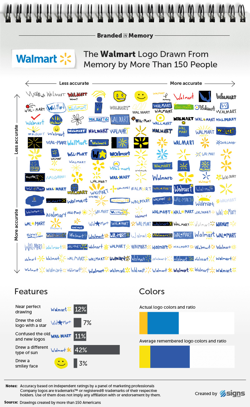
Image Source: signs.com
In the memory test, only 12% of participants drew the Walmart logo almost perfectly.
Here’s what tripped people up:
- 68% remembered the sunburst, but 42% got the number of rays wrong — usually too many or too few.
- 7% drew the old star, which appeared in the 1990s version.
- 10% even added a hyphen (“Wal-Mart”), a relic from the brand’s early years.
Despite being simple in color and typography, the sunburst’s subtle complexity made it surprisingly easy to misremember. The confusion between Walmart’s old star and new burst shows just how even small visual tweaks can blur recall, especially when a brand evolves over decades.
Example 10: Domino’s
If there were an award for logo backstories, Domino’s Pizza would be a strong contender. The three dots on its logo actually represent the first three stores opened by founders Tom and James Monaghan in the 1960s—and they are an enduring part of the brand’s identity.
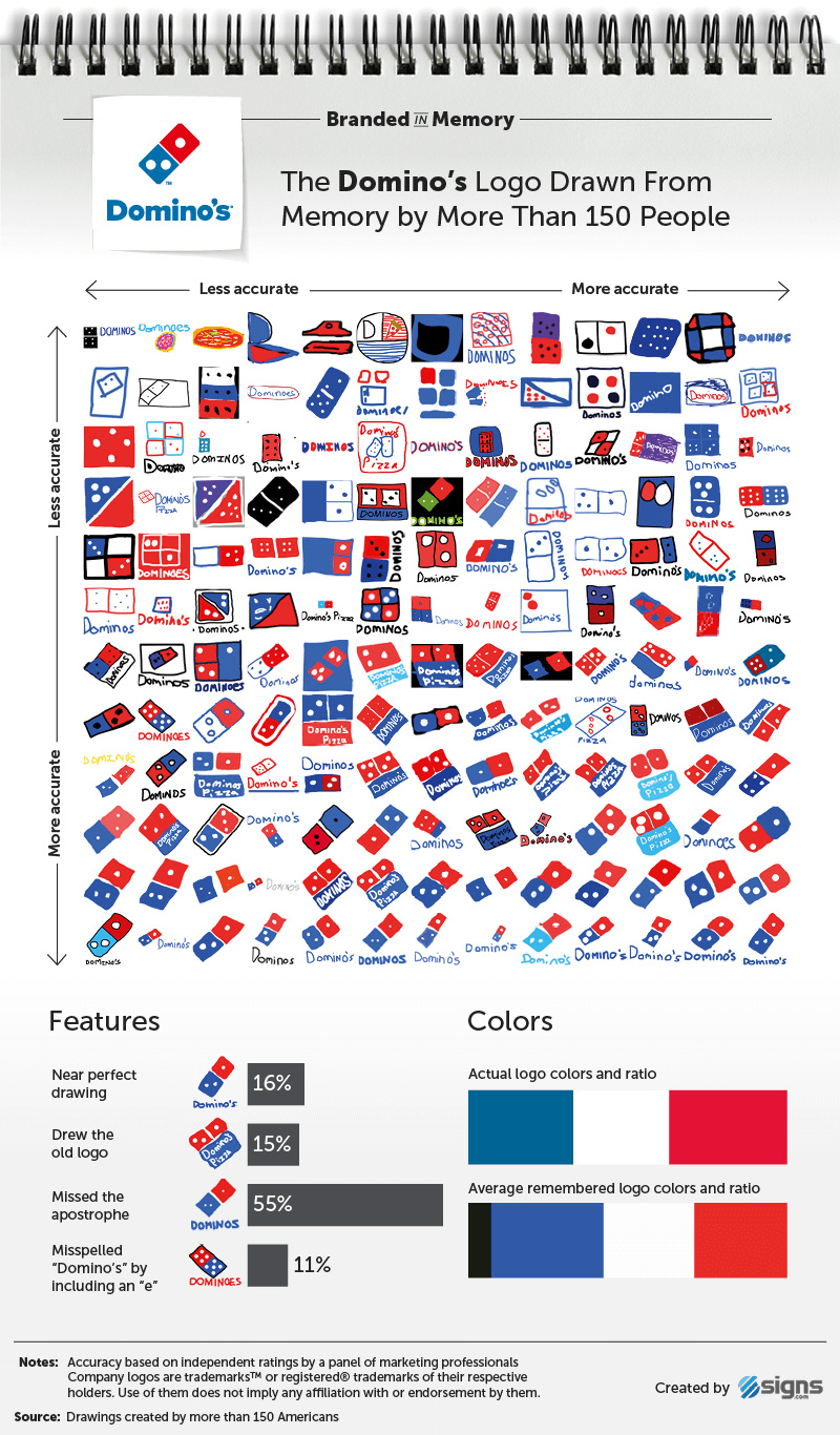
Image Source: signs.com
In the memory test, 16% of people drew the Domino’s logo nearly perfectly, while another 28% produced close matches. But the dots caused some confusion:
- 28% got the dot placement right, but 37% added too many dots, and 14% forgot them completely.
- 15% recreated the old tilted square logo (used from 1996 to 2012).
- 55% forgot the apostrophe, and 11% spelled it “Dominoe’s.”
Interestingly, even color memory leaned nostalgic — most people recalled the older royal blue instead of the current sky blue, showing how design tweaks can linger in memory long after they’re gone.
We shared this experiment to show you how, in branding, ease of recall transforms a symbol into something unforgettable. Our memory interacts with brand visuals in interesting ways. Logos packed with intricate details, like Starbucks (6%) or Foot Locker (8%), blurred in memory and were least recalled. Whereas clean, minimal designs like IKEA (30%) and Target (25%) stuck with ease.
How to Design Memorable Logos?
To design a logo that people remember, you need to make it:
- Simple
- Intentional
- Emotionally aligned
From colors to fonts to shapes, every choice you make will affect the final product.
Here are some tips for designing memorable logos:
1. Simplicity with Meaning
Keep your design clean, but give every element a reason to exist. When a logo is stripped down to its essentials, it becomes easier for the brain to process and recall. Simple doesn’t mean boring; it means purposeful and clear.
2. Avoid Cognitive Overload
The brain can only take in so much at once. When a logo tries to say too many things through extra shapes, colors, or text, it overwhelms the viewer. The goal is clarity, not complexity. A focused design gives your audience something their memory can actually hold on to.
3. Distinctiveness
Your logo should look like it belongs only to you. Unique shapes, proportions, or clever use of space help it stand apart from competitors. The goal is for someone to see your logo once and still recognize it the next time — even without the name attached.
4. Consistency
Once you’ve found what works, stick with it. Frequent tweaks and redesigns break the mental link people form with your brand. Consistency gives your audience time to build recognition naturally. The longer your logo stays familiar, the stronger the recall becomes.
5. Color Psychology
Color has power. According to color psychology, it triggers emotion and sets expectations long before anyone reads your name. Choosing a brand palette that reflects your brand’s tone helps people form an emotional connection. Limit your colors and use them consistently across all branding to reinforce recognition every time they appear.
6. Typography Cues
Type can carry memory just as strongly as visuals. The style, spacing, and flow of your lettering should mirror your brand’s personality while keeping fonts readable and balanced. When done right, your logo typography becomes part of the brand identity that people remember instantly.
Strike the Right Balance Between Creativity and Cognitive Ease
One of the hardest parts of logo design is walking the fine line between creativity and clarity. You want a logo that feels original, but if it becomes too intricate or abstract, people’s brains start to struggle. When viewers have to work to “decode” a logo, they’re less likely to remember it. This comes down to a psychological principle called processing fluency.
Now, what is processing fluency?
It’s the idea that the easier something is to understand, the more our brains tend to trust and remember it. In other words, recognition feels good. A logo that’s easy to process creates an instant sense of familiarity and comfort, even if someone is seeing it for the first time.
The best brands don’t sacrifice creativity to achieve this balance; they refine it.
Dropbox, for example, simplified its logo from a detailed box illustration to a cleaner, geometric shape that still carries meaning but works better across digital screens. It’s distinctive, but effortless to process, exactly what strong brand memory requires
Final Takeaway
At the end of the day, a memorable logo is one that stays clear in people’s minds long after they’ve seen it. The strongest logos survive cognitive overload by keeping things simple, clear, and emotionally resonant.
If your logo can be easily recalled or recognized without the name attached, you’ve passed the ultimate memory test. And if not? It might be time to revisit your design and refine it for clarity—because in branding, what people remember is what truly matters.
