In Chinese restaurants, first impressions start with the logo—where red and gold tones, stylized typography, and cultural symbols instantly convey tradition and authenticity before the menu is even seen.
A Chinese restaurant logo is more than a decorative symbol. It represents your brand identity across storefronts, delivery apps, menus, packaging, and social media. In a highly competitive dining market, a memorable logo communicates authenticity and personality. It is a promise offering a unique experience at your restaurant.
This curated collection of 100+ Chinese restaurant logos showcases how restaurants use color, typography, and symbolism to set themselves apart from others. From traditional dragon-inspired emblems to sleek modern designs, these logos demonstrate how a well-thought-out branding can attract attention and ensure customers keep coming back for more.
Make Your Menu Famous with a Bold Chinese Logo
From panda mascots to gold calligraphy, design a logo that tells your flavor story.
Why Logos Matter for Chinese Restaurants
A restaurant’s logo plays an important role in how customers recognize and remember the brand. Long before diners try the food, they encounter the restaurant through storefront signs, delivery apps, packaging, and online listings.
Exploring different food logo design ideas can help restaurant owners understand how colors, typography, and symbols influence brand perception. For Chinese restaurants, a well-designed logo helps reflect the cuisine’s character and create a distinctive, memorable identity. A strong restaurant logo can help businesses:
- Create instant brand recognition
- Communicate authenticity and cuisine style
- Stand out in competitive food markets
- Maintain consistent branding across the print and social media
A well-designed logo becomes a recognizable symbol of the restaurant’s identity when it is used consistently across all touchpoints. Over time, the logo makes it easier for customers to remember the brand quickly and connect the visual mark with a specific dining experience.
Common Design Elements in Chinese Restaurant Logos
Chinese restaurant logos often use colors and fonts unique to the culture to make them stand out. These design elements help the restaurant build a brand identity that people recognize and showcase the flavors and traditions of Chinese cuisine.
Popular design elements commonly seen in Chinese restaurant logos include:
1. Symbols
Visual components serve as quick identifiers and help communicate the restaurant’s theme and cultural symbolism.
• Dragons
• Chopsticks
• Pagodas
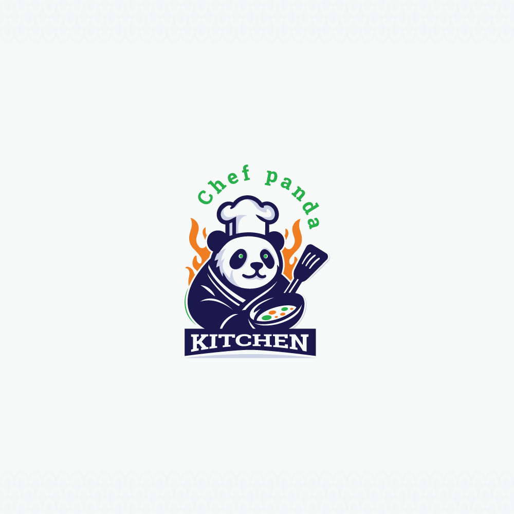
• Panda
• Bowls or noodles
2. Color Palettes
A strategic use of color palettes to create a distinctive visual identity can affect perception and set the mood.
- Red and gold for prosperity and luck
- Black and gold for premium dining
- Warm earthy tones for traditional restaurants
3. Typography Styles
Depending on the typeface selection, the brand voice is determined to be conventional, contemporary, or even expressive.
- Calligraphy-inspired fonts
- Bold brush lettering
- Modern minimalist typefaces
Restaurant logos can convey both heritage and personality through meaningful symbols, and understanding logo color psychology can help designers create stronger brand identities.
Categories of Chinese Restaurant Logos
Chinese restaurant logos come in many different styles depending on the restaurant’s concept, target audience, and overall brand identity. Rather than presenting logos randomly, grouping them by design style makes it easier to understand how different visual approaches shape restaurant branding.
Common categories of Chinese restaurant logos include:
1. Traditional Chinese Restaurant Logos
Traditional Chinese restaurant logos are heavily influenced by cultural heritage and historical design influences. These logos often use classic color palettes and symbolic imagery to communicate authenticity and a connection to traditional cuisine.


- Red and gold color schemes
- Dragons and lantern symbols
- Calligraphy-style typography
2. Modern Chinese Restaurant Logos
Modern Chinese restaurant logos focus on clean and contemporary design. By using minimal elements and streamlined typography, these logos create a polished brand identity that appeals to modern dining spaces and urban audiences.


- Simplified icons
- Sleek typography
- Limited color palettes
3. Mascot-Based Chinese Restaurant Logos
Mascot-based logos add personality and friendliness to restaurant branding. Playful characters such as pandas or animated chefs help create a welcoming brand image that is especially appealing to families and casual dining experiences.


- Panda mascots
- Chef characters
- Playful cartoon illustrations
4. Luxury Chinese Restaurant Logos
The logos of luxury Chinese restaurants are designed to convey sophistication and exclusivity. These designs often feature refined typography and elegant visual elements that reflect a premium dining experience.


- Gold typography
- Elegant emblems
- Minimal but sophisticated designs
5. Takeout and Fast-Casual Chinese Restaurant Logos
Takeout and fast-casual restaurants prioritize logos that are easy to recognize at a glance. Bold colors and simple designs ensure the logo remains clear on delivery apps, packaging, and storefront signage, helping customers quickly identify the brand.
- Bold colors
- Simple icons
- Highly readable typography
Ready to Give Your Chinese Restaurant a Face?
Bring cultural symbols to life in a Chinese logo that leaves diners hungry… for your brand.
100+ Tantalizing Chinese Restaurant Logos
1. Haidilao
The logo features clean, red typography that’s easy to recognize.
The Haidilao restaurant is a globally recognized Chinese hotpot chain. The logo consists of a circular emblem with stylized “Hi” lettering alongside Chinese characters and the English name. The red color palette symbolizes energy and warmth. It also signifies prosperity and a confident brand personality rooted in Chinese culture.
2. Chengdu Impression

Where fiery Sichuan tradition meets modern culinary identity.
Chengdu Impression is a restaurant celebrating authentic Sichuan cuisine and bold regional flavors. The logo uses bold Chinese characters paired with clean sans-serif English text. A red seal stamp adds cultural authenticity. The black-and-red palette reflects tradition and spice, while the structured typography conveys confidence.
3. P.F. Chang’s
The modern wordmark for P.F. Chang’s shows that it is a high-end restaurant with a contemporary Asian twist.
P.F. Chang’s is a globally recognized Asian-inspired restaurant chain that uses sleek black custom typography with slightly stylized letterforms. The monochrome color palette conveys sophistication, while the clean wordmark emphasizes modern dining, upscale branding, and a fusion of traditional Asian influence with contemporary restaurant culture.
4. Panda Express
Panda Express uses a friendly panda mascot to showcase their fast-casual Chinese dining.
Panda Express is a well-known American-Chinese fast-casual chain. Its logo is a circle with a cute panda drawing and capital letters. The red, black, and white colors represent energy and authenticity. The mascot-based design conveys a friendly, approachable vibe and a modern take on Chinese food.
5. Little Sheep Hot Pot
Little Sheep Hot Pot’s mascot logo highlights warmth and tradition featuring a playful sheep.
Little Sheep Hot Pot is known for its Mongolian-style hot pot food. It uses rounded letters and Chinese characters, as well as a happy sheep mascot. The green and white colors make it look fresh and warm, and the fun illustration makes it look like a friendly place to eat with your family.
6. Happy Lamb Hot Pot

Happy Lamb Hot Pot features a minimalist lamb icon highlighting its signature ingredient.
Happy Lamb Hot Pot is a Mongolian-style hot pot restaurant. Its sign has white letters on a black background and a silhouette of a lamb. The black-and-white color scheme conveys a strong sense of simplicity in logo design, giving the brand a modern yet authentic look.
7. Tim Ho Wan

Tim Ho Wan’s elegant seal-inspired logo reflects dim sum craftsmanship.
The world-famous dim sum restaurant Tim Ho Wan has a round seal-style emblem and elegant green lettering next to Chinese characters. The green color scheme suggests freshness and quality. The brand is real, has a rich history, and offers a refined but friendly dining experience.
8. Laobian Dumpling
This restaurant has a seal-style logo showcasing traditional Chinese craftsmanship.
Laobian Dumpling is a famous Chinese dumpling restaurant brand. Its logo has a traditional seal-style emblem with bold red Chinese writing underneath it. The red and gold colors represent wealth and heritage, and the classic stamp-like symbol symbolizes authenticity. It also represents the restaurant’s long history of serving great Chinese food.
9. Hakkasan
Hakkasan’s elegant gold logo embodies luxury and contemporary Chinese fine dining.
Hakkasan is a well-known high-end Chinese restaurant chain that uses sleek gold letters and a simple geometric symbol. The gold color scheme exudes sophistication and exclusivity, and the symmetrical symbol conveys elegance and the brand’s modern, refined identity.
10. Mr. Chow
Mr Chow’s bold monochrome wordmark reflects modern luxury and fine dining.
The famous luxury Chinese restaurant brand Mr. Chow has bold, all-caps, sans-serif letters set in a black rectangle. The black-and-white color scheme gives off an air of sophistication and exclusivity, while the simple wordmark shows confidence, prestige, and a modern fine-dining identity.
11. Crystal Jade
Crystal Jade’s elegant purple logo reflects refinement and premium Chinese dining.
Crystal Jade is an internationally recognized Chinese dining group. It has a decorative emblem and an elegant serif typeface. The purple color scheme conveys luxury and heritage, while the structured mark signifies sophistication and a high-end dining experience rooted in Chinese culinary tradition.
12. Paradise Dynasty

Paradise Dynasty’s refined logo blends tradition and elegance.
Paradise Dynasty is a famous Chinese restaurant known for its xiao long bao. The restaurant’s sign has elegant serif type with subtle Chinese characters. The muted gold and earthy colors give off an air of elegance and heritage. The structured wordmark suggests tradition and a high-end dining experience.
13. Kai Mayfair

A refined emblem reflecting luxury Chinese dining in Mayfair.
Kai Mayfair is a contemporary Chinese dining destination blending classic flavors with upscale London dining culture. The logo features a circular emblem with stylized “KAI” lettering and a ribbon banner below. Monochrome tones create an elegant, minimal aesthetic. The badge-style design symbolizes prestige and exclusivity.
14. Jing Fong
Jing Fong’s ornate gold emblem showcases prosperity and traditional Cantonese dining.
The well-known Cantonese dim sum restaurant Jing Fong has fancy gold lettering, a round emblem with wheat patterns, and an ornate round emblem. The gold color scheme suggests wealth and luxury, along with the crest-like shape, suggest heritage, celebration, and a grand traditional meal.
15. RedFarm
RedFarm’s bold red wordmark reflects modern, energetic Chinese dining.
RedFarm is a modern Chinese restaurant famous for its creative dim sum. The restaurant’s name is written in bright red, bold uppercase sans-serif letters. The simple color scheme brings out energy and the simple wordmark shows off a new, lively brand personality based on cutting-edge Chinese food.
16. Hutong

Hutong’s gold calligraphy logo embodies luxury and cultural authenticity.
Hutong is a high-end Northern Chinese restaurant brand. Its logo has beautiful gold calligraphy on a deep red background. The traditional color scheme stands for wealth and heritage, while the brush-style typeface shows that the restaurant is culturally authentic and offers a high-end dining experience.
17. Royal China

Royal China’s elegant shrimp emblem reflects refined Cantonese seafood dining.
Royal China is a Cantonese restaurant group. Its logo uses elegant gold lettering, a stylized shrimp drawing and subtle Chinese characters. The gold color scheme stands for luxury and refinement. The seafood theme shows that the brand is both sophisticated and culturally rooted.
18. Ping Pong Dim Sum
Ping Pong Dim Sum playful, minimalist logo makes it look like an approachable dim sum dining experience.
The modern dim sum restaurant brand Ping Pong Dim Sum has rounded, simple fonts in a soft teal color scheme. Modern culture is reflected in the clean design, and the fun name and simple wordmark give a friendly, stylish twist on traditional dim sum.
19. Dagu Rice Noodle
Dagu Rice Noodle’s playful mascot logo reflects warmth and the charm of casual dining.
Dagu Rice Noodle is a well-known chain of Chinese noodle restaurants. Its logo features fun fonts, Chinese characters, and a happy mascot drawing. The red, black, and white colors show energy and tradition. The animated character shows that the restaurant is friendly and a great place to eat casually.
20. Kung Fu Kitchen
Kung Fu Kitchen’s badge-style logo blends strength and bold culinary identity.
Kung Fu Kitchen is a modern Chinese restaurant chain that uses bold circular type and a black-and-white logo with a bowl, chopsticks, and noodles. The monochrome color schemes give off an air of simplicity and focus, while the badge-style design suggests strength and a lively culinary identity.
Make Your Menu Famous with a Bold Chinese Logo
From panda mascots to gold calligraphy, design a logo that tells your flavor story.
21. Shanghai Me

Shanghai Me’s minimalist logo showcases modern Chinese dining with urban elegance.
Shanghai Me is a Chinese restaurant brand with simple Chinese characters inside a teal square. The clean, geometric typeface color scheme gives off an air of sophistication and urban style. The simple symbol, on the other hand, shows off modern Chinese culture and a brand personality that is both refined and lively.
22. Mott 32
Mott 32’s ornate logo reflects heritage, craftsmanship, and luxury Chinese dining.
Mott 32 is a world-famous high-end Chinese restaurant that uses an elegant serif typeface in a fancy badge-style logo. The gold color scheme suggests heritage and luxury, and the vintage-inspired mark stands for tradition, craftsmanship, and the restaurant’s high-end Cantonese dining experience.
23. Imperial Treasure
Imperial Treasure’s elegant calligraphy logo reflects prestige and refined Chinese culinary tradition.
Imperial Treasure is a well-known Chinese restaurant chain, with beautiful gold Chinese calligraphy next to elegant serif type. The gold color symbolizes prestige and excellence, and the stylized characters reflect the brand’s commitment to fine Chinese cuisine.
24. China Live

The modern wordmark for China Live shows how Chinese cooking has changed over time.
The modern restaurant China Live in San Francisco has sleek lettering and a simple black-and-white color scheme. The modern wordmark conveys that the restaurant is innovative and sophisticated, while also showcasing its modern take on Chinese cuisine.
25. Dragon Beaux
Dragon Beaux blends modern typography with subtle dragon symbolism.
Dragon Beaux is known for its creative dim sum and hot pot. The restaurant’s modern typography has subtle dragon-inspired touches. The elegant design is in line with modern Chinese dining while still keeping the cultural meaning of the dragon motif.
26. Bo Innovation
The simple logo for Bo Innovation is inspired by cutting-edge Chinese cooking.
Bo Innovation, a Michelin-starred restaurant in Hong Kong, has simple fonts and elegant branding. The clean look shows creativity and new ideas, which fit with the restaurant’s cutting-edge take on modern Chinese food.
27. Lao Beijing
Lao Beijing’s calligraphic logo reflects authentic northern Chinese culinary heritage.
The logo for Lao Beijing often features traditional Chinese characters alongside classic fonts. The design emphasizes cultural heritage and authenticity, similar to Beijing-style food, evoking memories of traditional Chinese meals.
28. Canton Paradise
Canton Paradise’s logo blends modern branding with Cantonese culinary heritage.
The logo for Canton Paradise uses modern fonts, Chinese characters, and warm colors. The design is inspired by the dining culture of Hong Kong, but it also has a modern look that works well with casual but elegant Cantonese food.
29. Cafe China

Cafe China’s elegant typography reflects refined Sichuan dining.
Cafe China is a New York restaurant celebrated for authentic Sichuan cuisine. The logo uses elegant serif typography paired with subtle Chinese characters. A restrained palette enhances sophistication, while the balanced lettering reflects a refined brand personality inspired by classic Chinese dining culture.
30. Ajisen China

Ajisen’s calligraphic red seal logo celebrates tradition and bold noodle culture.
Ajisen China is a popular Asian restaurant chain known for its signature ramen dishes. The logo features bold white Chinese calligraphy set within two red square panels. The red palette symbolizes energy and appetite, while the brush-style typography reflects tradition, authenticity, and a confident, heritage-driven brand identity.
31. Little Alley

Little Alley’s minimalist logo channels modern Shanghai street-food elegance.
Little Alley is a New York restaurant inspired by Shanghai street food culture. The minimalist logo features clean, contemporary typography with understated Chinese characters. Its dark, minimal palette emphasizes sophistication, while the refined lettering reflects a stylish brand personality rooted in nostalgic Shanghai dining traditions.
32. Wok Express
Wok Express combines modern fonts with wok symbols to create a brand identity that is quick and full of energy.
Wok Express is a fast-casual Chinese restaurant that uses bold, modern typefaces with crossed chopsticks and a glowing wok pattern. The dark colors with red accents convey a sense of speed and energy, and the sleek design is inspired by modern Asian street food and quick service.
33. Lotus Garden

The logo for Lotus Garden is calming and represents harmony and nature inspired dining.
Lotus Garden is a Chinese restaurant chain named after nature and peace. The logo has soft, handwritten-style letters on a calm blue background. The lotus design symbolizes purity and harmony, and the gentle color palette conveys a sense of calm and welcome, making it a great place to eat.
34. Shanghai Garden
The colorful logo for Shanghani Garden combines nature, freshness, and real Chinese flavors.
Shanghai Garden is a Chinese restaurant named after nature. It uses a bold, stylized typeface, tropical plants, and a colorful bird drawing to create its look. The green color scheme and natural images stand for freshness and life, which is what you get when you eat real food in a lively but relaxed setting.
35. Quanjude

The calligraphic logo for Quanjude honors centuries of Beijing’s food culture.
Since 1864, Quanjude has been a famous Beijing restaurant for its traditional Peking duck. The logo has classic Chinese calligraphy and structured serif letters. The red and gold colors stand for wealth and heritage, and the traditional typeface stands for legacy, prestige, and a strong sense of culinary identity.
36. China Moon
The calligraphic logo for China Moon shows off tradition, art, and real Chinese flavor.
The Chinese restaurant chain China Moon uses brush-style typography with a red seal to make their name stand out. The black, white, and red color scheme is in line with traditional Chinese design, and the calligraphic writing gives the restaurant a warm, culturally inspired atmosphere that feels real.
37. Dragon House
The dragon in the logo stands for strength, tradition, and real Chinese flavors.
The Dragon House is a Chinese restaurant chain that uses bold, modern fonts with a round dragon logo. The black, white, and red colors are traditional and full of energy, and the dragon stands for strength and wealth. Together, they create a confident and authentic Chinese dining experience.
38. China Taste
The bowl in the logo highlights warmth and traditional Chinese comfort food.
The casual Chinese restaurant chain China Taste uses clean white text and a simple illustration of a bowl. The black and white color scheme emphasizes simplicity, and the steaming bowl stands for freshly made food, which gives the impression of a welcoming and easy-to-reach dining experience.
39. Panda House
Panda House’s panda mascot creates a friendly and welcoming Chinese dining identity.
Panda House is a casual Chinese restaurant chain that uses friendly handwritten-style type and a fun panda mascot. The red, black, and white colors are traditional Chinese colors, and the happy panda represents friendliness and a relaxed, family-friendly dining experience.
40. Dragon Garden

The logo features an elegant ship next to the restaurant’s name in monochrome colors.
The Chinese restaurant brand Dragon Garden uses clean, modern fonts and a simple dragon-and-ship logo. The black-and-white color scheme conveys an air of sophistication and simplicity, while the dragon logo symbolizes strength and heritage. This is a good mix of traditional and modern restaurant branding.
Ready to Give Your Chinese Restaurant a Face?
Bring cultural symbols to life in a Chinese logo that leaves diners hungry… for your brand.
41. Imperial Wok

The gold logo of Imperial Wok symbolizes prestige, tradition, and fine Chinese cuisine.
The Chinese restaurant brand Imperial Wok has stylized gold letters with small Chinese characters above the wordmark. The gold color scheme stands for wealth and status, and the decorative lettering stands for tradition and refinement, giving the restaurant a classic yet high-end Chinese dining identity.
42. Bamboo Dragon
The simple fonts on Bamboo Dragon’s menu are in line with modern Asian dining.
Bamboo Dragon has tall, simple letters in a deep navy color scheme. The modern, clean letterforms emphasize simplicity and sophistication. The name, which is inspired by bamboo, brings to mind nature, balance, and freshness. This fits with the calm and refined personality of a modern Asian dining brand.
43. Jade Wok

Jade Wok’s badge-style logo highlights tradition and prosperity.
The logo for Jade Wok, a traditional Chinese restaurant chain, is a circle with the bold serif initials "JW" and classic Chinese designs. The red and gold colors stand for wealth and celebration, and the emblem-style design stands for heritage, authenticity, and a warm, family-style dining experience.
44. Dragon Express
Dragon Express’s dragon mascot brings energy and playful personality to Chinese dining.
The fast-casual Chinese kitchen brand Dragon Express has fun fonts and a happy dragon mascot. The bright red, green, and gold colors make the place feel friendly and lively. The cartoon dragon represents luck and excitement, which fits with the fun, family-friendly atmosphere of the restaurant.
45. China Village

China Village’s brush-style writing is a nod to tradition and real Chinese flavors.
China Village is a traditional Chinese restaurant brand that uses stylized red lettering resembling brushstrokes. The bright red logo colors represent wealth and cultural heritage, and the expressive lettering conveys authenticity and a nostalgic link to traditional Chinese cuisine.
46. Mandarin Garden

The fun typography of the logo gives the restaurant a friendly and cheerful look.
Mandarin Garden’s logo has soft pink letters that are rounded and fun. The stylized letters give the logo a modern, friendly look, and the lighthearted color choice adds charm. As a result, it looks more approachable. It blends with the restaurant’s relaxed atmosphere, which focuses on comfort and casual Chinese dining.
47. China Palace

The logo for China Palace brings to mind royal tradition and Chinese hospitality.
The China Palace logo is a badge with elegant writing inside a bold circle. The red and black color scheme suggests authority and tradition, and the decorative shape is similar to traditional Chinese seals, which gives the restaurant a regal but friendly brand presence.
48. Shanghai Express

Shanghai Express captures the excitement of quickie, tasty Chinese food.
Shanghai Express has flowing cursive letters, chopsticks, and a takeout box picture all in one. The warm red colors and motion-inspired lines suggest speed and flavor, which fit with the brand’s lively image of fast service and real street-style Chinese food.
49. China Fusion

China Fusion’s mascot logo reflects creativity and modern Asian fusion dining.
The logo for China Fusion consists of a big, round badge with a comical mascot in the middle. The black-and-yellow color scheme creates a strong contrast. The playful character suggests creativity and modern experimentation, which is an ideal fit for the restaurant’s fusion-inspired food concept.
50. Dragon Buffet

The logo’s bold lettering showcases variety, indulgence, and classic dragon symbolism.
The Dragon Buffet’s logo uses gothic-inspired typography set against a striking red background. The dramatic lettering paired with dragon motifs is all about wealth and grandeur. This fits with the restaurant’s buffet idea and promise of a wide range of Chinese dishes.
51. Golden Lotus

Golden Lotus uses lotus-inspired branding to mix style and meaning.
Golden Lotus has elegant gold letters surrounded by decorative borders and lotus symbols. The deep brown and gold colors give off a sense of warmth and prestige, and the lotus images stand for purity and harmony. It ties the restaurant back to its traditional Chinese dining roots.
52. China Dragon

The China Dragon’s striking logo shows strength and famous Chinese symbols.
The China Dragon logo has a detailed black-and-white picture of a dragon surrounded by sharp gothic-style letters. The dark colors make it more intense, and the detailed dragon stands for strength and protection. Together, they make a dramatic and memorable visual identity.
53. Xiao Nan Guo

Xiao Nan Guo’s logo is a mix of traditional Shanghai and modern restaurant branding.
Xiao Nan Guo is a famous restaurant group in Shanghai that serves Shanghai-style food. The logo has both bold Chinese characters and modern Roman letters. The deep red color scheme makes you feel warm and real, and the balanced typography gives the brand a classy but modern look that is based on its regional roots.
54. Taste of China

The logo features a sailing theme honoring the past and encourages people to try new foods.
The Taste of China combines beautiful bilingual typography with pictures of sailing ships. The warm gold and sunset colors bring back memories of maritime trade, and the detailed artwork suggests real regional flavors and a culinary journey through classic Chinese food.
55. Tai Er Pickled Fish

The bold mascot logo for Tai Er captures the fun spirit of modern Sichuan dining.
Tai Er Pickled Fish is a very popular Chinese chain that serves Sichuan-style pickled fish dishes. The logo has fun fonts and pictures of a mascot. The monochrome colors make a strong visual impact, and the unusual design shows that the brand is young and full of energy.
56. Panda Restaurant

Panda Restaurant’s cheerful mascot adds warmth and friendliness to the brand.
Panda Restaurant is a casual Chinese eatery centered around approachable comfort food. The logo has a cute panda mascot and soft, rounded letters. The black, white, and green colors suggest nature and balance. The friendly character adds to the relaxed, family-friendly atmosphere of a Chinese restaurant.
57. Meizhou Dongpo

Meizhou Dongpo’s logo shows off its heritage and real Sichuan food.
Meizhou Dongpo is a well-known Chinese restaurant chain that serves Sichuan food. The logo has neat Chinese characters next to classic Roman letters. The colors stand for hospitality and flavor, and the balanced typeface stands for cultural pride and real food.
58. Xibei

The bold typeface of Xibei reflects the hearty spirit of food from Northwestern China.
Xibei is a well-known Chinese restaurant chain that serves food from Northwestern China. The logo has bold Chinese letters that are framed by strong graphic elements. The earthy red and yellow colors give off a warm and traditional feel, and the strong lettering shows off the rustic flavors and pride in regional cooking.
59. Golden Pavilion

The gold logo on the Golden Pavilion shows that it is a welcoming high-end Chinese hotel.
Golden Pavilion has a sleek monogram-style logo and offers a high-end Chinese dining experience. The black and gold circular badge around the “GP” letters gives the impression of power and prestige. The logo gives off a polished, high-end vibe that works well for formal dining.
60. Dragon-i Peking Duck

The gold logo on the Golden Pavilion shows that it is a welcoming high-end Chinese hotel.
Dragon-I Peking Duck is a modern Chinese restaurant that serves its own special roasted dishes. In a bright red field, an expressive calligraphic typeface stands out in white. The strong contrast and brush strokes bring to mind heritage, passion, and real Chinese cooking art.
Make Your Menu Famous with a Bold Chinese Logo
From panda mascots to gold calligraphy, design a logo that tells your flavor story.
61. Jade Pavilion

Jade Pavilion’s logo conveys heritage and timeless Chinese elegance.
Jade Pavilion is a traditional Chinese restaurant that is famous for its elegant dining. The logo features a cool blue scene of a pavilion with refined serif lettering. The architectural symbol stands for heritage and sophistication, which gives the brand a cultured and dignified personality.
62. Koi Palace

The fish emblem on Koi Palace’s sign stands for wealth and the Cantonese banquet culture.
Koi Palace is a well-known Cantonese seafood restaurant that serves dim sum and banquet-style meals. The logo has bold letters and stylized fish images. The gold and red colors make you think of wealth and celebration, and the emblematic design makes you think of plenty and festive hospitality.
63. Dragon Pearl Buffet
The dragon in the logo stands for strength and abundance.
Dragon Pearl Buffet is a popular Asian restaurant in Canada, known for its high-end “all-you-can-eat” experience. In the logo, a dragon silhouette can be seen within a nearly crescent-shaped pearl. The minimalistic color scheme keeps the identity strong and is a show of strength and wealth.
64. Shangrilla

The vibrant logo showcases energy and modern Chinese dining.
Shangrilla Chinese Restaurant is a long-standing eatery in Pakistan known for its authentic Pakistani-Chinese fusion cuisine. The logo has a modern look and feel but it also consists of cultural elements. The logo has a stylized red and blue “S” mark next to clear text. The dynamic curves convey movement and optimism.
65. KIM MUN

Kim Mun’s seal-style logo celebrates heritage and traditional Chinese identity.
Kim Mun Chinese Restaurant is a widely recognized establishment in Pakistan for serving authentic and “Desi-style” Chinese cuisine. The logo is based on a classic stamp design and has a round red seal with Chinese characters on it. The simple font keeps the identity clean, while the seal conveys authenticity and cultural pride.
66. Yum

Yum’s fun lettering shows how exciting it is to eat quick Chinese comfort food.
Yum is a playful Chinese dining brand built around fast, flavorful meals. Red letters drawn by hand with chopsticks give a casual, lively look. The expressive typeface gives off a sense of spontaneity and fun, which will appeal to a younger audience that likes street food.
67. China Blossom

The China Blossom logo features a monochrome lotus flower in the logo.
China Blossom is a Chinese restaurant and entertainment venue in Massachusetts. It offers a peaceful and artistic Chinese dining experience. Above the elegant black serif lettering is a stylized lotus blossom icon. The flower is symmetrical, which stands for purity and new beginnings. This gives the restaurant a refined and balanced brand personality.
68. Dragon Delight

Dragon Delight’s golden dragon radiates prosperity and celebratory Chinese cuisine.
Dragon Delight is a popular Chinese restaurant in Ontario, known for its authentic dishes and generous portions. The soft, neutral background makes the glowing gold pattern stand out. It suggests wealth and celebration. The design makes you think of rich traditions and fun Chinese food experiences.
69. Grandma’s Home

Grandma’s Home’s logo shows how cozy home-cooked meals are.
Grandma’s Home is one of China’s biggest casual dining chains. It serves traditional home-style food. The logo has big Chinese characters next to simple English letters. The warm red colors bring back memories and make you feel at home, and the simple font shows that it’s real family-style.
70. Panda Wok

Panda Wok House logo combines a playful Panda with strong branding.
Panda Wok is a casual Townsend, MA eatery serving a wide-ranging menu of Chinese-American staples in a family-friendly setting. The logo has a round badge layout with a cute panda mascot and big initials. The earthy brown tones make the room feel warm, and the playful character gives it personality.
71. China Chef

The temple-gate icon from China Chef honors Chinese culture and hospitality.
China Chef is a restaurant in Florida, offering authentic Chinese takeout and delivery favorites like General Tso’s Chicken and Shrimp Fried Rice. The logo has a simple font next to a colorful picture of a temple gate. The architectural symbol stands for cultural heritage and hospitality, which gives the brand a lively and culturally rooted identity.
72. Dragon Chef

Dragon Chef’s vibrant dragon badge celebrates fiery wok cooking.
Dragon Chef is a casual Chinese takeout place that serves comfort food that people know and love. Inside a circular emblem, curved serif letters spell out the name of a stylized dragon. The warm yellow-orange gradient makes you think of heat and flavor, and the dragon stands for culinary skill and energetic kitchen work.
73. Ho Lee Fook

Ho Lee Fook’s bold typeface is a good match for its modern Hong Kong dining style.
Ho Lee Fook is a lively restaurant in Hong Kong that combines modern design with traditional Chinese food. The logo has bold, expressive letters and eye-catching graphics. The bright colors show creativity, and the modern lettering shows playful sophistication.
74. Duddell’s

Duddell’s simple logo stands for modern Cantonese fine dining.
Duddell’s is a Michelin-starred Cantonese restaurant that combines art and food. The logo has simple letters inside a circle that make up the emblem. Neutral colors give off an air of sophistication, and the simple design shows modern elegance and cultural refinement.
75. Peach Garden

The blossom emblem of Peach Garden stands for wealth and the Cantonese style.
Peach Garden is a group of Chinese restaurants in Singapore that serves Cantonese food. The logo combines elegant typography with delicate peach blossom images. The soft pastel colors stand for growth and prosperity, and the graceful design stands for tradition and elegance.
76. Chili House

Chili House’s vibrant design promises bold spice and lively dining.
Chili House is a Chinese restaurant that serves spicy Sichuan food. There are chili drawings and handwritten-style letters on a bright yellow banner. The bright colors suggest heat and excitement, which fits with a bold and adventurous culinary experience focused on spicy flavors.
77. Putien

Putien’s simple calligraphy shows purity and high-quality regional food.
Putien is a Michelin-starred restaurant chain that serves Fujian food. The logo has beautiful Chinese calligraphy on top and small modern Roman letters on the bottom. The black-and-white color scheme emphasizes simplicity and elegance, giving the brand a calm, sophisticated personality grounded in authenticity.
78. Paradise Group

The gold accents on Paradise Group’s mark show prestige and leadership in hospitality.
Paradise Group is a big group of Asian restaurants that are known for their unique Chinese dining ideas. There are Chinese characters and bold serif letters inside a rectangular badge. The black and gold color scheme conveys a sense of prestige, which suggests a polished and corporate hospitality brand.
79. China Tang

China Tang’s art-deco emblem channels the glamour of old Shanghai.
China Tang is a fancy Chinese restaurant that takes its style from the glitz and glam of Shanghai in the 1930s. Art deco typeface is used in geometric gold frames. The fancy colors and balanced layout remind me of the old-fashioned classiness and sophistication of Shanghai’s dining culture.
80. Yung Kee Restaurant

Yung Kee’s calligraphic logo is a nod to its culinary history and Cantonese culture.
The famous Hong Kong restaurant Yung Kee is known for its roasted goose. The design is mostly made up of expressive brush-style Chinese characters, with simple Roman letters. The black-and-white color scheme emphasizes tradition, giving the brand a classic and heritage-rich personality.
Ready to Give Your Chinese Restaurant a Face?
Bring cultural symbols to life in a Chinese logo that leaves diners hungry… for your brand.
81. Maxim’s Palace

Maxim’s Palace combines elegance and tradition with its classic red emblem.
In Hong Kong, Maxim’s Palace is a well-known group of dim sum restaurants. The logo has a fancy script wordmark in the middle of big red blocks with Chinese characters on them. The red and white colors suggest celebration and hospitality.
82. Da Dong New York

Da Dong’s vintage badge evokes imperial Beijing culinary heritage.
Da Dong is a famous Beijing restaurant that serves roast duck and is now opening locations around the world. The fancy badge-style lettering is similar to old-fashioned signs and imperial design. Warm red tones add to the brand’s history, while decorative frames give it a royal and historically inspired look.
83. Summer Pavilion

Summer Pavilion’s minimalist typography reflects refined Cantonese elegance.
Summer Pavilion is a Cantonese restaurant with a Michelin star that is known for its fine dining. There is a balanced vertical arrangement of minimal serif typeface above Chinese characters. The neutral colors highlight a calm sophistication, which is what you would expect from a modern and elegant luxury dining experience.
84. Yong Fu

Yong Fu’s calligraphy mark is a tribute to cultural depth and culinary heritage.
Yong Fu serves Ningbo food, which is based on traditional Chinese cooking. A red seal accentuates the large, expressive brush calligraphy that is inside a muted blue square. The piece shows heritage, art, and a quiet sense of cultural pride.
85. Han Dynasty

The Han Dynasty’s bright red logo perfectly captures the fiery spirit of Sichuan food.
Han Dynasty is a restaurant brand that serves real Sichuan food. The logo has large Chinese characters at the top and simple Roman letters at the bottom. The bright red colors make you think of heat and intensity, and the strong fonts show how bold Sichuan cooking is.
86. China Chilcano

China Chilcano’s vibrant design reflects bold culinary fusion.
China Chilcano is a restaurant that combines Chinese and Peruvian food. The logo is a bright yellow background with graphic line accents, and there is bold distressed typography. The bright colors show that the restaurant is creative and willing to try new things, which fits with its fun, multicultural theme.
87. Flower Drum Restaurant

Flower Drum’s graceful illustration reflects artistry and refined Chinese dining.
In Australia, Flower Drum is a well-known Chinese restaurant that serves fine food. Next to the vertical Chinese characters is a delicate drawing of a traditional dancer. The monochrome color scheme gives the room a classy look and brings out the art and fine Cantonese cooking traditions.
88. Silks Chinese Restaurant

The golden dragon emblem on Silks is a sign of luxury and royal style.
Silks is a high-end Chinese restaurant with a beautiful logo of golden dragon art and stylized Chinese letters on the walls. The black-and-gold color scheme gives off an air of wealth and celebration, creating a grand, ceremonial look that fits with high-end hospitality.
89. Ming Court

The classy logo for Ming Court shows how fine Cantonese dining is.
Ming Court is a Michelin-starred Cantonese restaurant that is known for its fine dining. The logo has beautiful Chinese calligraphy next to simple Roman letters. The muted colors make it look more sophisticated, and the delicate fonts show off precision and culinary artistry.
90. A. Wong

A. Wong’s seal-inspired logo merges tradition with modern fine dining.
A. Wong is a Chinese restaurant in London that has a Michelin star and serves a new take on regional Chinese food. In the logo, there is a modern square seal icon above simple serif letters. The monochrome color scheme shows sophistication by combining traditional symbols with modern restaurant branding.
91. Duck & Rice

Duck & Rice’s gothic wordmark mixes traditional Chinese writing with a modern Cantonese style.
Duck & Rice is a restaurant in London that mixes Cantonese food with British pub culture. Black type that looks like Gothic writing makes a strong visual identity. The black-and-white color scheme gives off an air of confidence and tradition, while the sharp letterforms suggest heritage craftsmanship and a modern take on Chinese dining culture.
92. Xi’an Famous Foods

Xi’an Famous Foods uses a modern font and a traditional Chinese seal in its logo.
Xi’an Famous Foods is a chain in New York that serves Northwestern Chinese street food with strong flavors. In terms of the logo, there is a square Chinese seal icon next to clean, sans-serif letters. The limited black color scheme emphasizes authenticity and tradition, while the seal brings to mind regional heritage and cultural pride.
93. Junzi Kitchen

The simple wordmark for Junzi Kitchen shows how modern Chinese cooking works.
Junzi Kitchen is a modern Chinese fast-casual chain that is based on Confucian values. The logo consists of minimal lowercase letters in a bright green color, giving the design a clean and young look. The simple design shows openness, balance, and a modern way of thinking about food that comes from Chinese culture.
94. Joe’s Shanghai Restaurant

Joe’s Shanghai pairs traditional symbolism with a simple, memorable wordmark.
Joe’s Shanghai is a well-known restaurant that serves famous soup dumplings. The logo has a stylized Chinese character symbol above simple red letters. The balanced design makes people think of heritage and authenticity, which gives the brand a classic and recognizable look.
95. Golden Dragon Restaurant

Golden Dragon’s gold typography radiates prosperity and classic Chinese tradition.
In a traditional setting, Golden Dragon Restaurant serves classic Cantonese food. The dark background makes the angular gold letters stand out strongly. The metallic colors suggest wealth and celebration, while the geometric typeface shows strong confidence and long-lasting Chinese symbolism.
96. Yum Cha

Yum Cha’s brush lettering reflects lively dim sum culture and social dining.
Yum Cha is a modern dim sum restaurant inspired by Hong Kong tea culture. Handwritten-style lettering sits alongside expressive Chinese characters. The black palette keeps the design contemporary while the brush-like strokes convey warmth, spontaneity, and social dining energy.
97. Nom Wah Tea Parlor

Nom Wah’s vintage palette captures the charm of historic Chinatown dining.
The Nom Wah Tea Parlor is a historic dim sum restaurant in Chinatown that has been around since 1920. A round red Chinese emblem is next to soft yellow text. The nostalgic color scheme reminds people of old-fashioned signs and adds to the restaurant’s legacy and cultural authenticity.
98. Xiao Long Kan Hotpot

The bold red badge of Xiao Long Kan shows off the fiery culture of Sichuan hotpot.
Xiao Long Kan is a well-known chain of Sichuan hotpots known for their strong spices and immersive dining experiences. The logo is a bright red circle badge with white letters on it. The bright colors stand for heat and excitement, and the badge design makes it easy to remember the brand.
99. The Chairman

The Chairman’s decorative emblem shows status and Cantonese culture.
The Chairman is a well-known restaurant in Hong Kong that serves fine Cantonese food. For the logo, there are elegant script letters under decorative Chinese characters that are framed in gold and maroon. The decorative palette shows off prestige and cooking skill.
100. Tin Lung Heen

The elegant calligraphy at Tin Lung Heen is a perfect example of high-end Cantonese luxury.
Tin Lung Heen is a Cantonese restaurant with a Michelin star that looks out over Hong Kong’s skyline. The logo’s Chinese calligraphy that is very detailed goes well with Roman lettering that is very simple. The subdued color scheme adds to the restaurant’s luxurious and elegant fine dining atmosphere.
101. Shang Palace Paris

The gold emblem of Shang Palace represents high-end service and fine Chinese food.
Shang Palace is the main Chinese restaurant at the Shangri-La Hotel in Paris. A gold emblem mark goes with a clean serif type. The simple color scheme suggests sophistication and global status, and it gives the vibe of a high-end hospitality brand based on Asian style.
102. Szechuan Impression

Szechuan Impression’s bright script shows off its bold spices and love of cooking.
Szechuan Impression is a restaurant that serves real Sichuan food. The bright red flowing cursive typeface gives it energy and personality. The bright colors are like the spicy flavors of Sichuan food, and the script style gives off warmth and a love of cooking.
103. Philippe Chow

Philippe Chow’s elegant script shows that upscale Chinese dining is sophisticated.
Philippe Chow is a high-end Chinese restaurant chain that is known for its theatrical dining experiences. The logo is mostly made up of elegant red cursive letters. The elegant colors and flowing letters give the brand a glamorous, exclusive personality that suits high-end hospitality.
104. China Poblano

China Poblano’s bright colors celebrate the bold mix of Chinese and Mexican cooking.
China Poblano is a restaurant that combines Chinese and Mexican food. A striking bilingual palette is made up of bold block letters in red and green. The bright colors show how modern global dining mixes cultures and lets people try new things.
105. Budda Bodai

The green color scheme at Buddha Bodai is a nod to vegetarian Chinese food and harmony.
Budda Bodai is a vegetarian Chinese restaurant that follows Buddhist cooking traditions. There are soft green letters next to Chinese characters that have meaning. The calming colors stand for purity, harmony, and a philosophy based on plants, which gives the brand a peaceful and mindful look.
Dragons, Chopsticks, and Timeless Flavor
And that’s about it! A flavorful tour through 100+ Chinese restaurant logos that show just how much a culture shapes the brand identity while using colors and symbols. While putting this collection together, one thing really stood out: Chinese restaurant logos rarely rely on random elements. Almost every dragon, lotus, bowl, or brush stroke carries meaning.
Make Your Menu Famous with a Bold Chinese Logo
From panda mascots to gold calligraphy, design a logo that tells your flavor story.
Some logos lean into tradition with bold red-and-gold palettes and calligraphy-inspired typography, while others take a more modern route with clean icons and minimalist wordmarks. Seeing these designs side by side makes it clear that Chinese restaurant branding can be both deeply rooted in heritage and refreshingly modern.
The next time you walk past a restaurant sign with a dragon curling around the name or a pair of chopsticks forming part of the design, take a closer look. It’s not just decoration; it’s storytelling through design, reflecting culture, flavor, and the experience that awaits inside.
Feeling inspired? Try creating a logo of your own with LogoDesign.net and see how your ideas take shape.