You don’t need flashy effects or a crowded layout to create a memorable flyer. A handful of simple design principles can do far more.
Most flyers have a surprisingly short life. They’re picked up, glanced at for a few seconds, and either kept or forgotten almost immediately. What decides their fate is rarely the amount of information they contain. It is how quickly they communicate it. Good flyer design works in much the same way as a good conversation. It gets to the point, keeps your attention, and leaves you knowing exactly what to do next. Whether you’re promoting an event, launching a product, or advertising a local business, a few core design principles can make all the difference.
Let’s explore what separates flyers people glance at from the ones they actually remember.
What Makes a Flyer Effective?
A well-designed flyer guides people through a simple decision-making process, from noticing it to acting on it. One of the easiest ways to understand this is through the AIDA formula, a marketing model that has shaped effective advertising for decades. It stands for Attention, Interest, Desire, and Action, and each stage plays a role in turning a quick glance into a response.
• Attention
The first job of a flyer is to stand out. A bold headline, striking image, or strong color contrast should catch the viewer’s eye within seconds. If nothing grabs attention, the rest of the design is unlikely to be seen.
• Interest
Once someone stops scrolling or picks up the flyer, they need a reason to keep reading. Clear messaging, relevant visuals, and key information should explain what the flyer is about without overwhelming the reader.
• Desire
This is where the flyer answers the question, "Why should I care?" Instead of listing features, it highlights the value of the event, product, or service. Limited-time offers, exciting experiences, or clear benefits help create interest that turns into intent.
• Action
Every flyer should finish with a clear next step. Whether it is buying tickets, visiting a website, scanning a QR code, or calling a business, the call to action should be easy to find and easy to follow.
Flyers remain effective because the best ones guide viewers through these four stages almost effortlessly. Here are examples that put the AIDA formula into practice.
This bakery flyer by Bristy Sultana catches attention instantly with a mouthwatering hero image and a warm color palette that reflects the product. Once the visual draws you in, the clean layout makes it easy to spot the product name, special offer, and pricing without having to hunt for information. The tempting photography creates an immediate craving, while the contact details and ordering information provide a clear next step, completing the AIDA journey from curiosity to action.
Rather than relying on lots of text, this FatRoom Cafe flyer by Renato Cidral uses bold visuals and dramatic lighting to establish the mood at first glance. The event details are layered in a logical order, allowing readers to quickly understand what the event is, when it is happening, and why it’s worth attending. By selling the atmosphere as much as the event itself and ending with clear ticket and venue information, the design encourages viewers to take the next step with little effort.
The Building Blocks of an Effective Flyer Design
Every successful flyer is built on a few simple design decisions. These principles help organize information, highlight what matters most, and make it easier for people to understand your message within seconds. Let’s start with the foundation of every effective flyer.
1. Start with One Clear Purpose
One flyer should communicate one primary message. Trying to promote multiple offers, products, or events at once often leaves readers confused about which ones deserve their attention. Before choosing colors or images, decide exactly what you want the flyer to achieve. Is it announcing an event, promoting a sale, introducing a service, or launching a product? Once that goal is clear, every design element should support it.
A simple way to stay focused is to ask yourself:
- What is the one thing I want people to remember?
- What action should they take after reading the flyer?
- Does every image and line of text support that goal?
For example, this Mega Gadget Sale flyer by Riffat Hussen has a single objective: promote a gadget sale. Everything, from the oversized "Mega Sale" headline to the featured electronics and discount callouts, reinforces that message. Instead of distracting viewers with unnecessary information, the design keeps the focus on the products and the offer, making its purpose immediately clear.
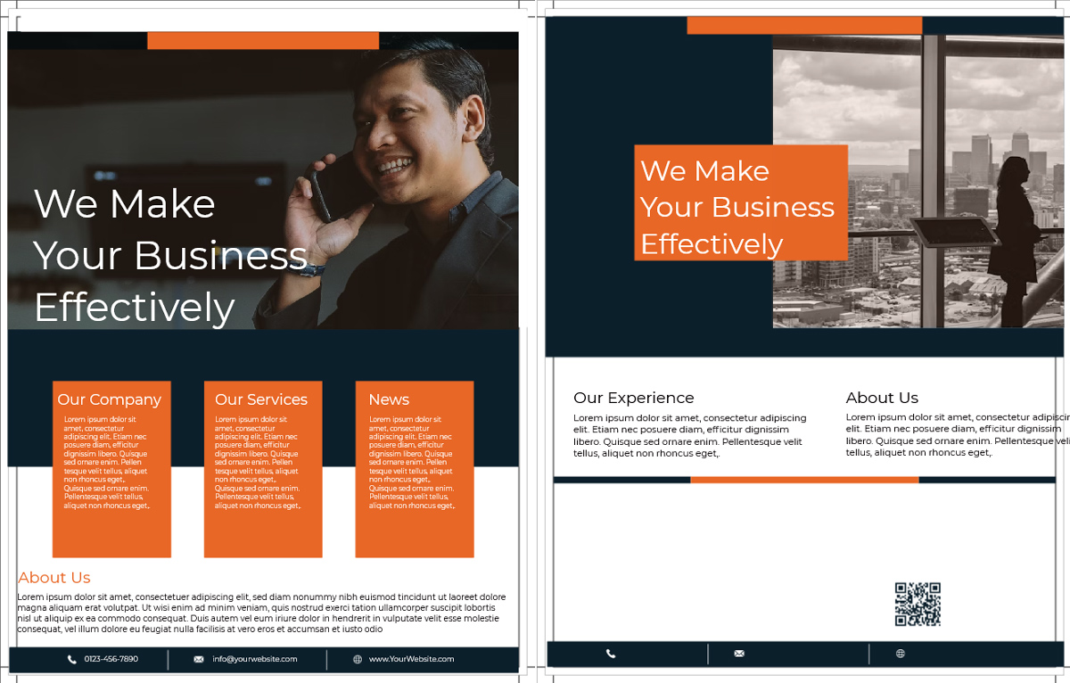
Here’s another flyer from LogoDesign.Net’s collection. It also sticks to one central idea. The headline communicates the purpose right away, while the supporting visuals and copy expand on that message rather than introducing unrelated details. The clean layout makes it easy to understand what is being promoted and what the viewer should do next, proving that clarity often has a greater impact than adding more content.
2. Build a Strong Visual Hierarchy
People rarely read a flyer from top to bottom. They scan it, looking for the most important information first. That’s where visual hierarchy in the logo and overall layout comes into play. Just as a logo uses size, color, and placement to draw attention to key elements, a flyer should guide the viewer’s eye through the content in a logical order.
A well-structured hierarchy helps readers find information without having to think about it. In most cases, they should notice the headline first, followed by the main visual, supporting details, and finally the call to action.
Your logo should also have a clear place within this hierarchy. It needs to be visible enough to reinforce your brand without competing with the headline or the main offer. Placing it near the top or bottom of the flyer usually creates the right balance between brand recognition and readability. If you don’t already have one, use a logo maker to create a logo that reflects your brand and give your flyer a more professional and consistent look.
A few simple ways to create better visual hierarchy include:
- Make the headline the largest and most prominent element.
- Use different font sizes and weights to separate primary and secondary information.
- Position important details where they naturally catch the eye.
- Leave enough space between sections so the layout doesn’t feel crowded.
Take a look at this Modern Men’s Health flyer by MD Ratul. It demonstrates a clear reading path from start to finish. The bold headline “Men’s Health Month” immediately draws attention, followed by strong visuals and neatly grouped supporting information. Even with multiple content sections, the thoughtful use of size, spacing, and contrast prevents the layout from feeling busy.
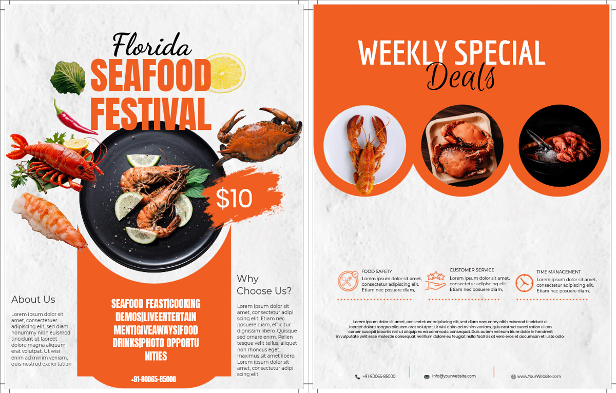
Here’s another flyer example from LogoDesign.Net. This flyer uses hierarchy to make the most important message impossible to miss. The headline stands out first, while the supporting copy, imagery, and contact details are arranged in descending order of importance. As a result, readers can quickly understand the message without searching through the design for key information.
3. Keep the Layout Clean and Easy to Scan
A flyer doesn’t need to be filled from edge to edge to feel complete. In fact, the opposite is often true. White space gives each element room to breathe, making the design easier to scan and helping important information stand out. When every inch is occupied by text, images, or graphics, readers struggle to know where to look first.
As you refine your layout, remember to:
- Leave enough space between sections instead of squeezing everything together.
- Break long paragraphs into shorter blocks or bullet points.
- Align text and images consistently for a more organized appearance.
- Remove anything that doesn’t support the main message.
Although this double-sided flyer concept by Nika Belka contains plenty of information across both sides, it doesn’t feel cluttered. The designer uses generous spacing, consistent alignment, and clear content blocks to separate information, making it easy to scan instead of overwhelming.
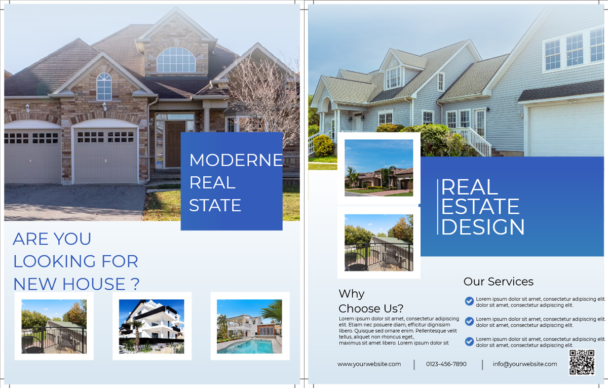
Here’s another flyer design from LogoDesign.Net that proves the same concept. A clean layout can make a design feel more polished without sacrificing information. The content is well spaced, the visuals don’t compete with the text, and each section has enough breathing room to be understood at a glance. Instead of trying to fill every empty space, the design lets simplicity do the work.
4. Use Color and Typography with Purpose
Color and typography are often the first things people notice about a flyer, even before they begin reading it. The right combination can instantly set the mood, strengthen your message, and make important information easier to spot. On the other hand, too many colors or decorative fonts can make even a well-designed flyer feel chaotic. Understanding color psychology and the impact of typography helps you make design choices that support your message rather than distract from it.
A few simple guidelines can help:
- Limit your design to one or two complementary fonts.
- Use font size and weight to emphasize important information instead of introducing multiple typefaces.
- Choose colors that suit the flyer’s purpose and reflect your brand. If you’re unsure which shades work well together, our color wheel can help you make perfect color combos.
- Make sure there’s enough contrast between the text and background for comfortable reading.
This birthday flyer by Syead Afridi proves that typography doesn’t have to be loud to make an impact. It pairs an elegant handwritten script for "Birthday" with clean sans-serif text for the supporting details, creating contrast while keeping the design easy to read. The neutral cream background, black typography, and soft peach geometric accents give the flyer a sophisticated, modern feel that perfectly suits a stylish birthday celebration.
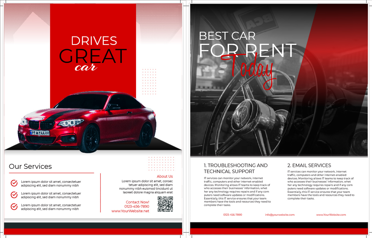
Check out another flyer template by LogoDesign.Net. This flyer uses a bold red, white, and black palette to create strong visual contrast and immediately draw attention to the featured car. The typography reflects the same balance, with oversized uppercase text emphasizing the main message, while a smaller script font adds personality to the word "car." The supporting information is presented in a clean sans-serif typeface, making the flyer easy to scan despite containing several content sections.
5. Pick Images That Add Meaning
Images often communicate faster than words, but only if they support the flyer’s purpose. A strong visual should instantly tell people what they’re looking at and reinforce the message, rather than serve as decoration. Whether it’s a product photo, a portrait, or an illustration, the image should be high quality, relevant, and placed where it naturally draws attention.
When selecting visuals, keep these tips in mind:
- Use one strong focal image instead of several competing visuals.
- Choose images that clearly relate to your offer or event.
- Avoid low-resolution or generic stock photos whenever possible.
- Make sure text remains readable and doesn’t compete with the imagery.
A good example is this Spicy Chicken Wings Restaurant flyer by Fahmida Begum that lets the food do the selling. A large, high-quality image of crispy chicken wings dominates the layout and immediately communicates what’s being offered. Rather than surrounding it with unnecessary graphics, the design uses the photo as the centerpiece, allowing the promotional text and details to support the visual rather than compete with it.
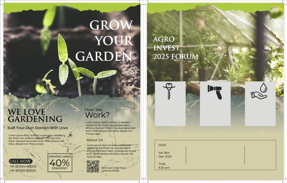
The "Grow Your Garden" flyer by LogoDesign.Net takes a more symbolic approach. Instead of filling the page with gardening tools or multiple plant photos, it features a single sprouting seedling emerging from the sand. That simple image reinforces the message of growth and new beginnings, while the surrounding layout leaves enough space for the visual to remain the focal point. The result is a flyer that feels clean, memorable, and easy to understand at a glance.
6. End with a Clear Call to Action
A beautifully designed flyer can still fall flat if people don’t know what to do next. Every flyer should end with one clear action, whether it’s buying tickets, booking a service, visiting a website, or scanning a QR code. The easier it is to take that next step, the more likely people are to respond. Your contact details should also be easy to find, so readers don’t have to search for them.
To create an effective call to action:
- Use a short, action-oriented phrase such as "Book Now," "Register Today," or "Visit Our Website."
- Place your contact details where they’re easy to spot.
- Include a QR code if it makes registration or purchasing quicker.
- Avoid adding multiple competing calls to action.
This pool party flyer by Soham Roy doesn’t leave readers wondering what comes next. Along with vibrant visuals, it gives the event date, venue, time, and contact information clear prominence, making it easy for anyone to plan their attendance. The practical details are organized neatly, so viewers can find everything they need within seconds.
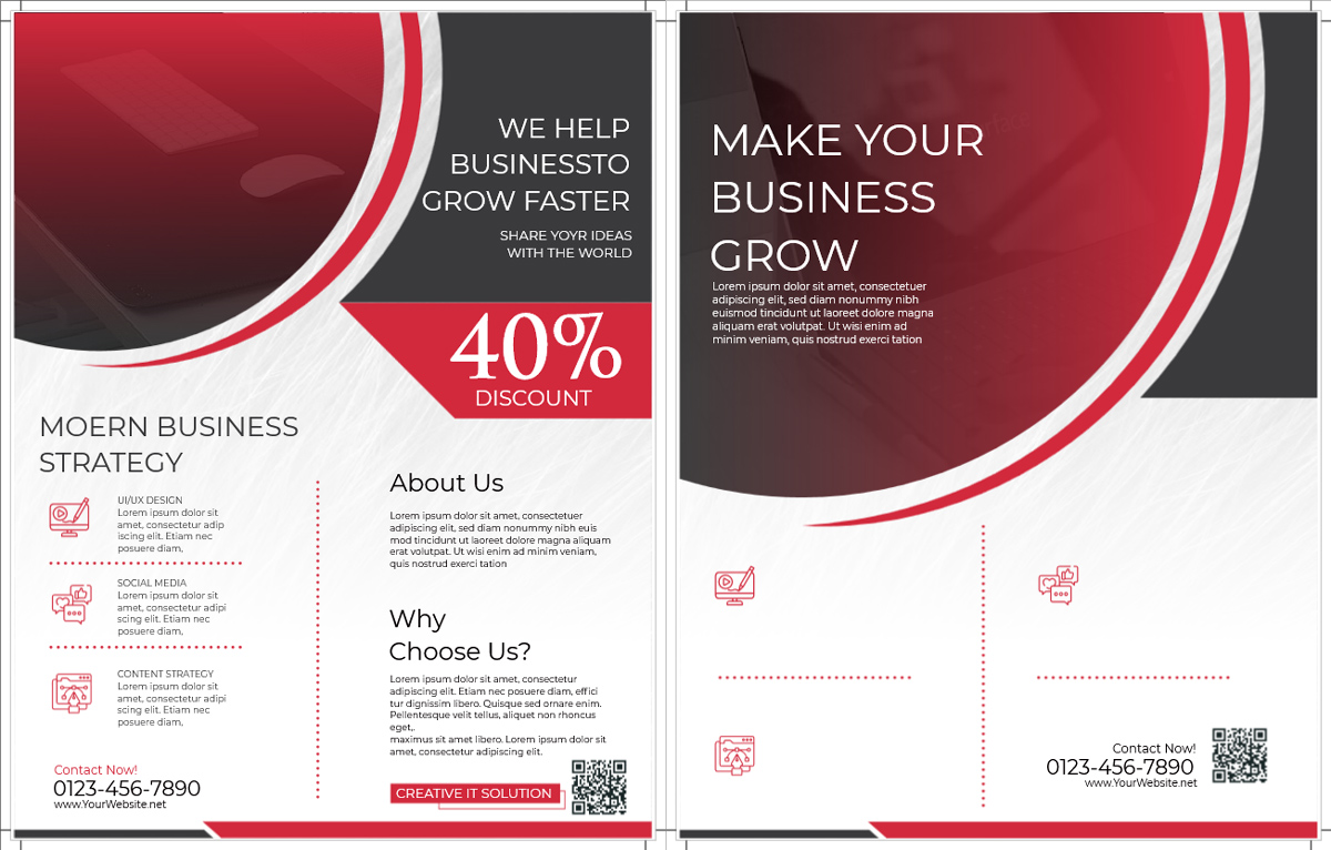
This business flyer by LogoDesign.Net pairs a strong call to action with multiple ways to get in touch. The phone number, website, and QR code are provided, allowing potential customers to choose the most convenient contact method. By removing friction from the next step, the flyer increases the chances of turning interest into an inquiry.
Good Flyer Design Is About Clear Communication
The most effective flyers aren’t always the most elaborate. They’re the ones that communicate a clear message quickly and make it easy for people to take the next step. Every design choice, from the headline and layout to the colors, imagery, and call to action, should work toward a single purpose. As you create your own flyers, look at successful designs for inspiration and apply these principles consistently.
Ready to bring your ideas to life? Create a professional, eye-catching flyer in minutes with the LogoDesign.Net Flyer Maker, complete with customizable templates for every occasion.