Here’s your quick anatomy lesson on a web page, minus the boring jargon (we promise), so you can see how each element contributes to an experience that keeps visitors engaged.
Did you know it takes 0.05 seconds for visitors to form an opinion of a website? That means you have the blink of an eye to make them stop and stare.
In case you don’t know, it all comes down to the basics. Webpages are built from a handful of simple pieces that shape the entire experience. A strong headline, clean navigation, persuasive CTA, visuals that guide the eye, and content placed exactly where it should be—every little detail makes your site trustworthy and worth exploring. And yes, even something as ambitious as launching a business website in one day is doable when you understand how these building blocks fit together.
The funny part is that most of us don’t even notice these elements until they’re missing. So, today, we’re pulling apart a webpage so you know what you must. Consider it your roadmap to creating a stunning website that does its job well.
Breaking down a webpage in 3 2 1…
1. Header
A header is the very first thing visitors see when they land on a page and sits right at the top before they even scroll. Because of that, it carries a lot of weight. More importantly, 77% of visitors never scroll past it, making it your first and maybe only chance to grab attention.
A good header helps people get their bearings quickly, shows them where they are and where they can go next. If it’s messy or overcrowded, though, visitors can feel lost before they’ve even started exploring.
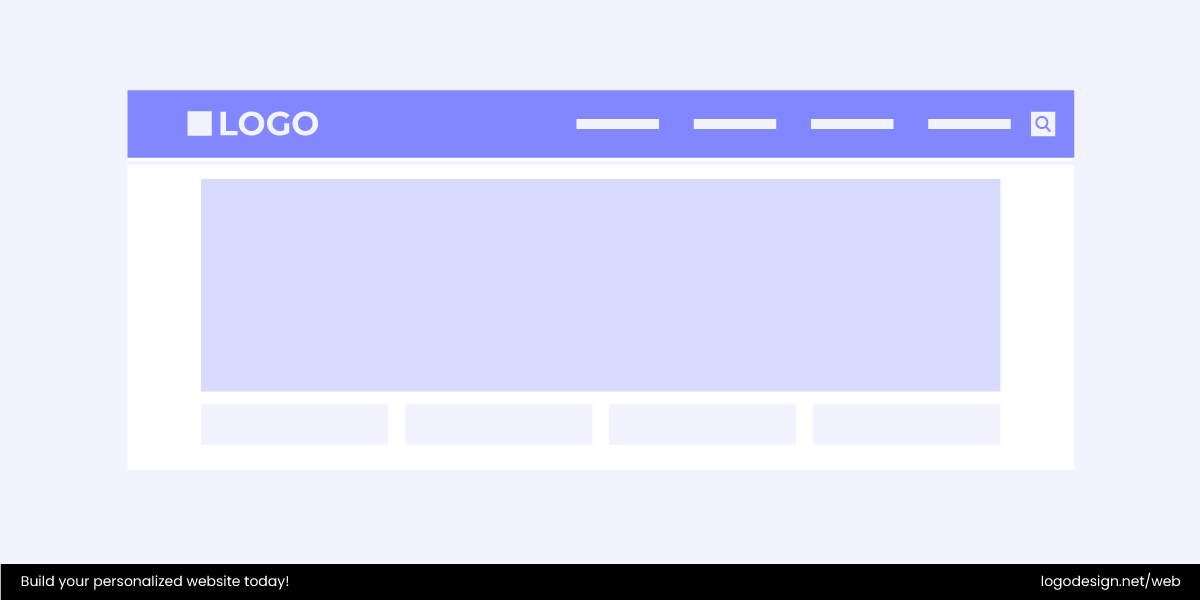
At its core, the header usually includes your main navigation, such as the links that guide people to the key sections of your site. But it can also pack in other useful details, depending on your goals.
For example:
- Business Logo – your brand’s stamp of identity.
- Navigation links – the main categories or pages.
- Call-to-action button – like “Sign Up” or “Book Now.”
- Social media links – for connecting beyond your site.
- Contact info – quick access to a phone number or email.
- Search bar – handy for sites with lots of content.
- Language switcher – if your site speaks to a global audience.
Do you know what makes a header so important for usability? It’s because it’s placed in the most scannable zone of a page. Since they are so important, it’s important use a reliable editor with social header templates adjusted to differently-sized platforms.
No matter what reading pattern people follow, for example, the classic “F-pattern” or a quick zig-zag across the screen, it all starts at the top. And for languages read left to right, the eyes naturally land on the corners. That’s why you’ll often see a brand logo in the top left and a call-to-action button on the right. These spots are too valuable to waste.
Common Website Header Styles
While we’re at it, let’s also talk about the most common header styles.
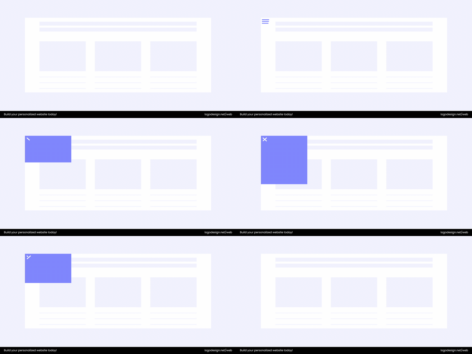
- Hamburger Menu: This style hides the main navigation behind a small three-line icon (yes, it looks like a hamburger). It keeps the design clean and uncluttered, but still gives users access to more links when they need them.
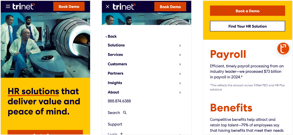
TriNet’s mobile site, for example, uses a hamburger menu to neatly organize its service options without overwhelming the small screen.
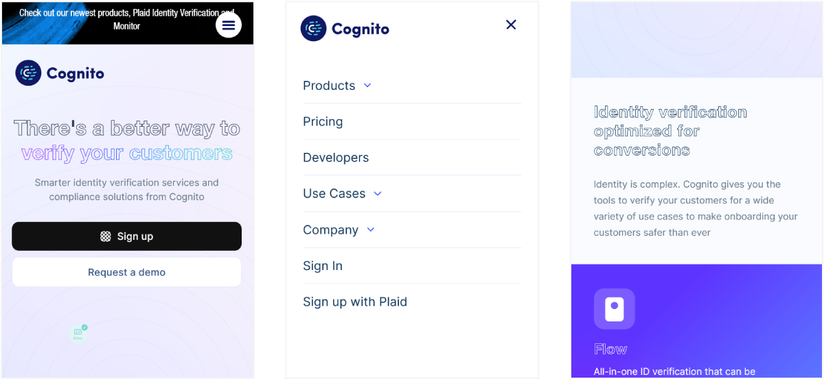
Cognito HQ follows a similar approach, tucking away its navigation to keep the interface minimal.
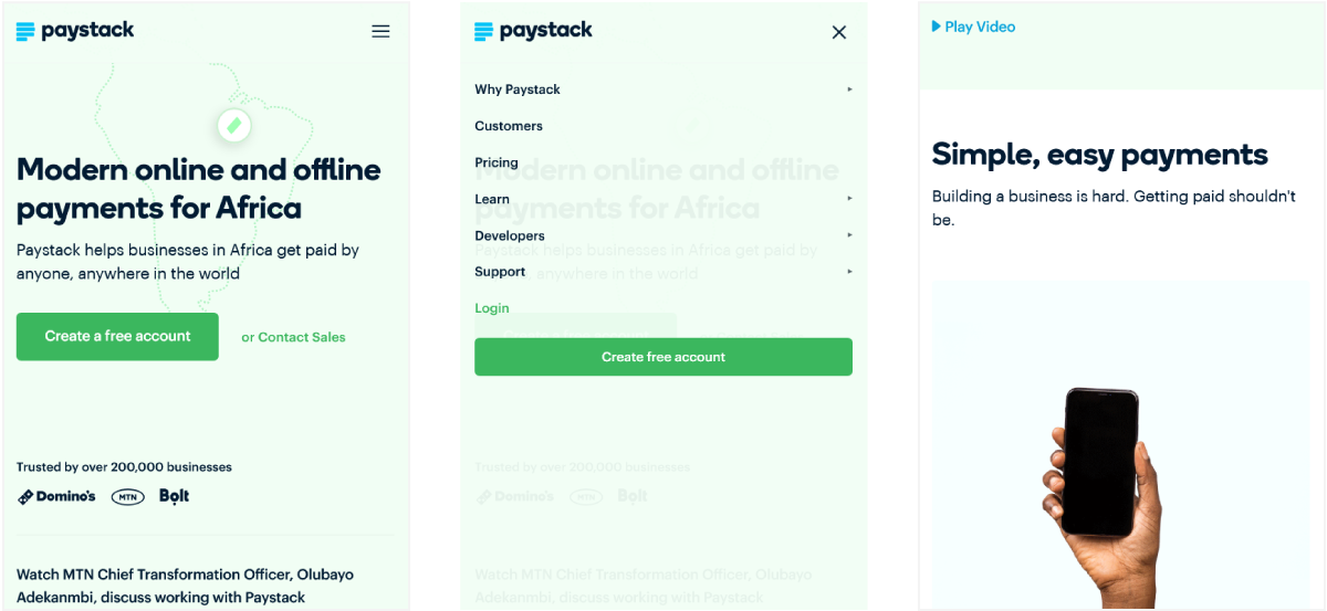
Paystack also relies on the hamburger menu on mobile. It ensures users can quickly reach detailed pages while still enjoying a sleek, distraction-free design.
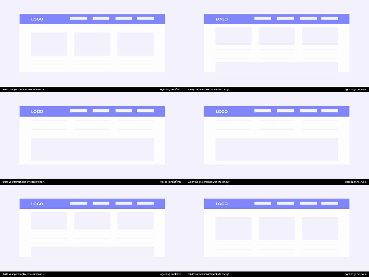
- Sticky Header: A sticky header stays put at the top of the screen even as users scroll down the page. It’s especially handy on content-heavy or long-scrolling sites where you don’t want visitors to lose access to the menu.
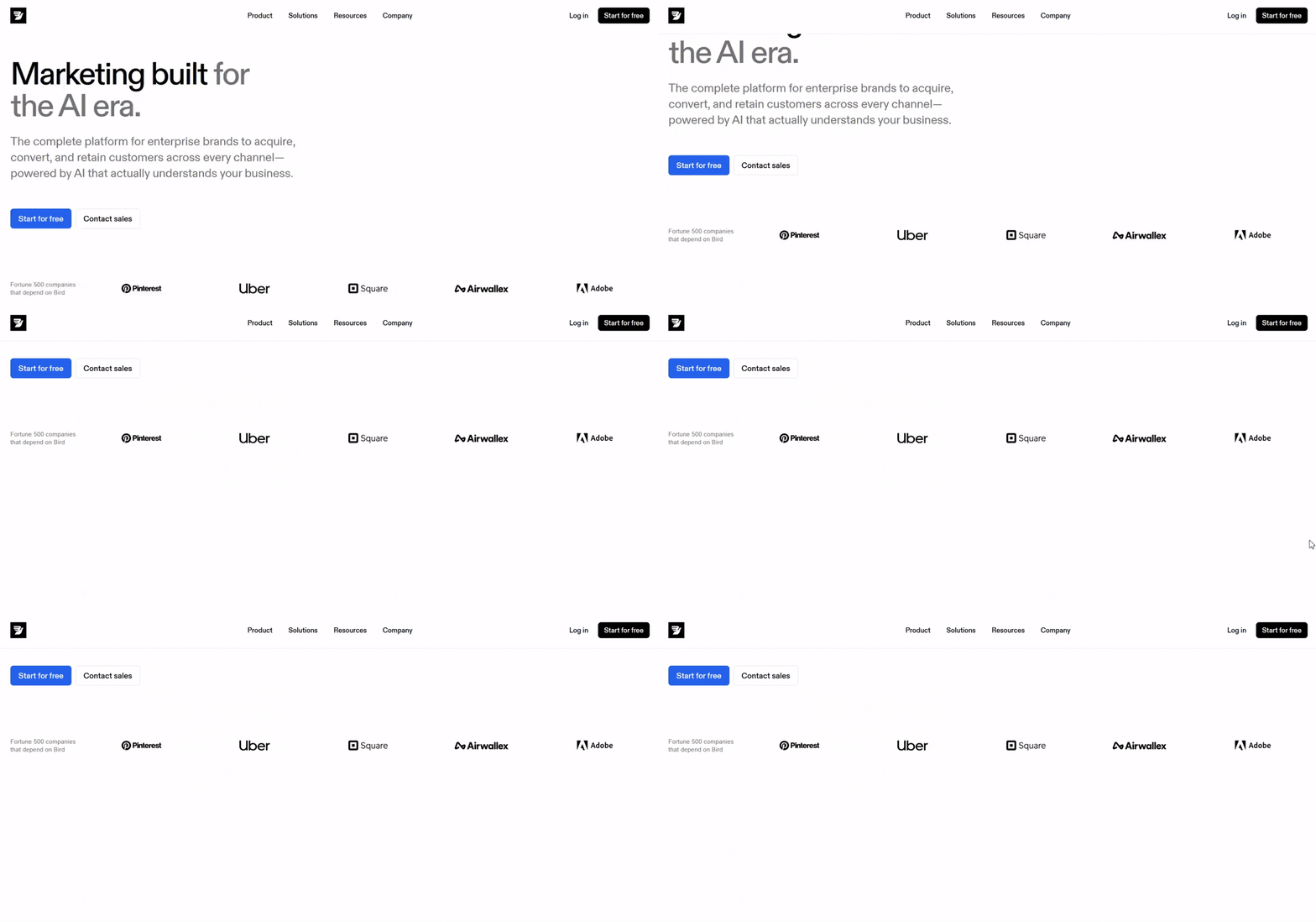
See how Bird uses a sticky header to keep its navigation front and center even while scrolling through its site.
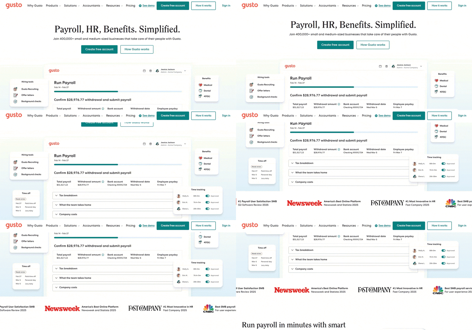
Gusto also keeps its main menu visible so visitors can jump between solutions without backtracking.
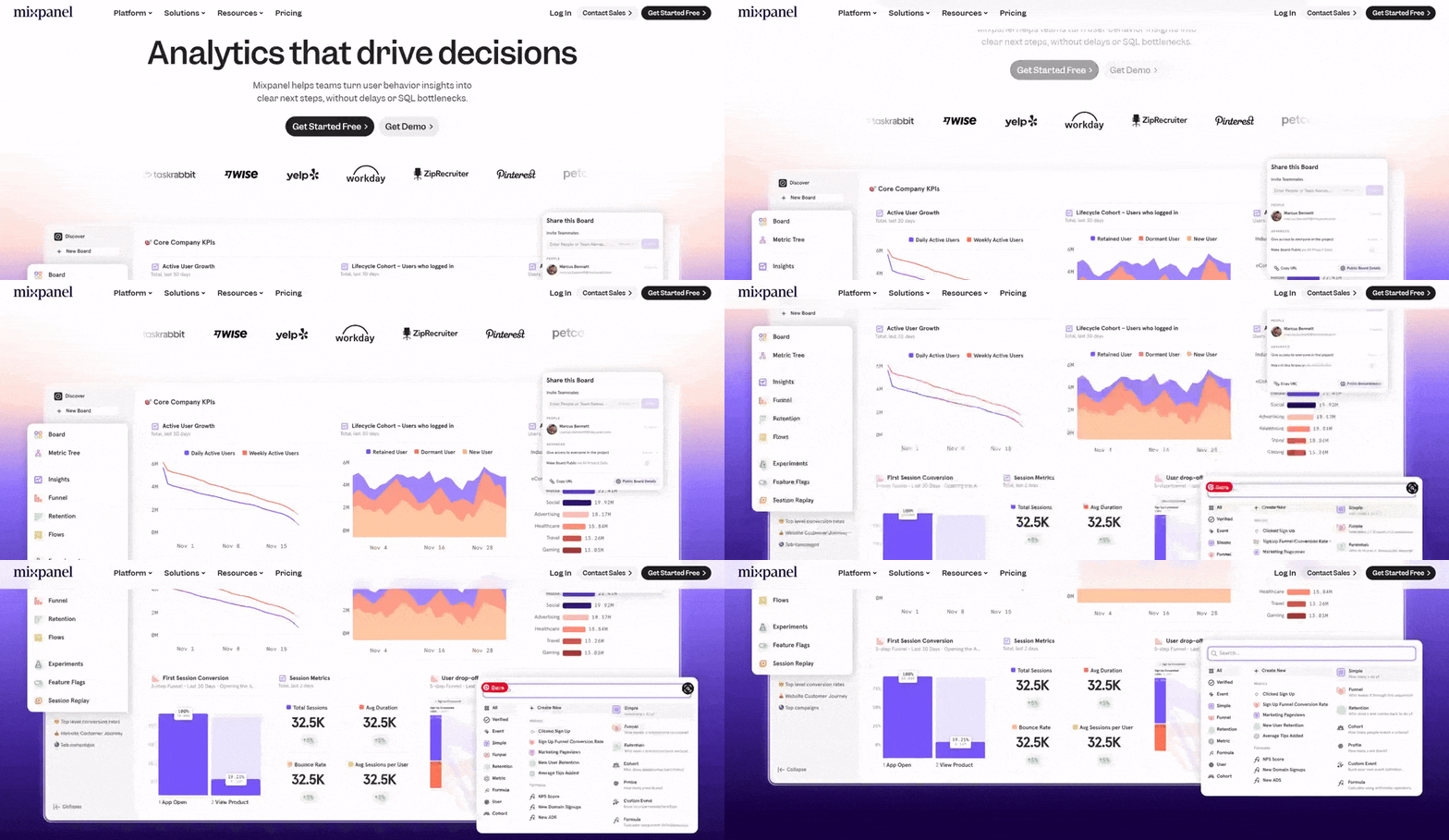
Mixpanel’s sticky header helps guide users through its feature-rich platform.
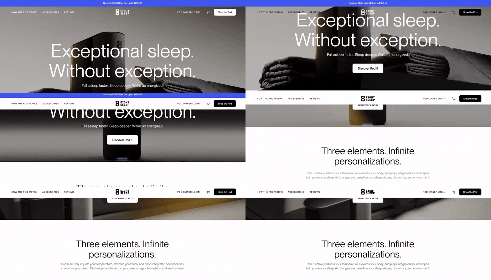
Eight Sleep uses one to keep its shopping navigation accessible at all times—especially important on a product-focused site.
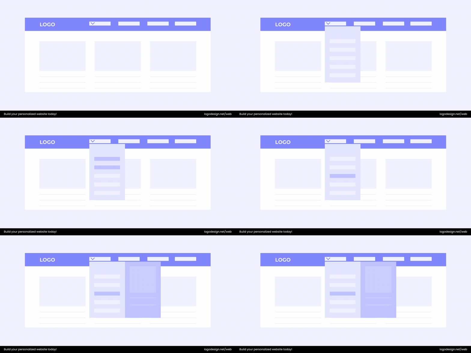
- Two-Layer Navigation: Some sites need to serve two distinct paths of navigation, like “Products” and “Resources.” A two-layer header allows for both without cramming everything into one row.
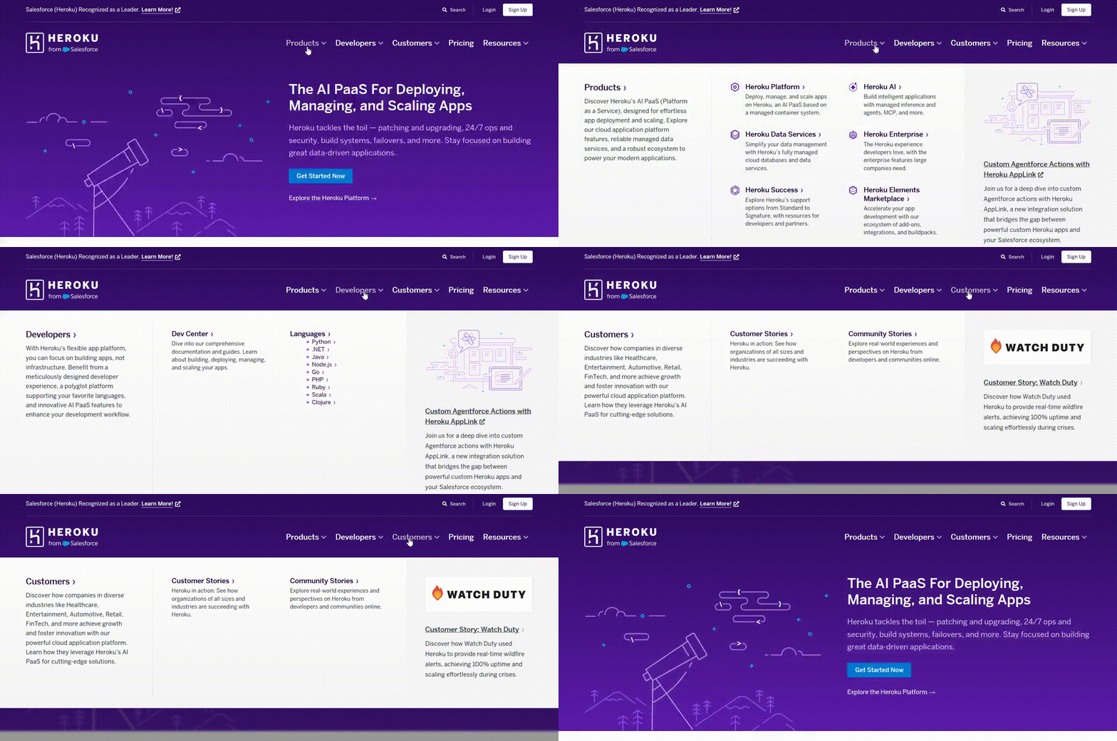
Heroku’s website is a good example. It separates its product offerings from its developer resources so visitors can find exactly what they need.
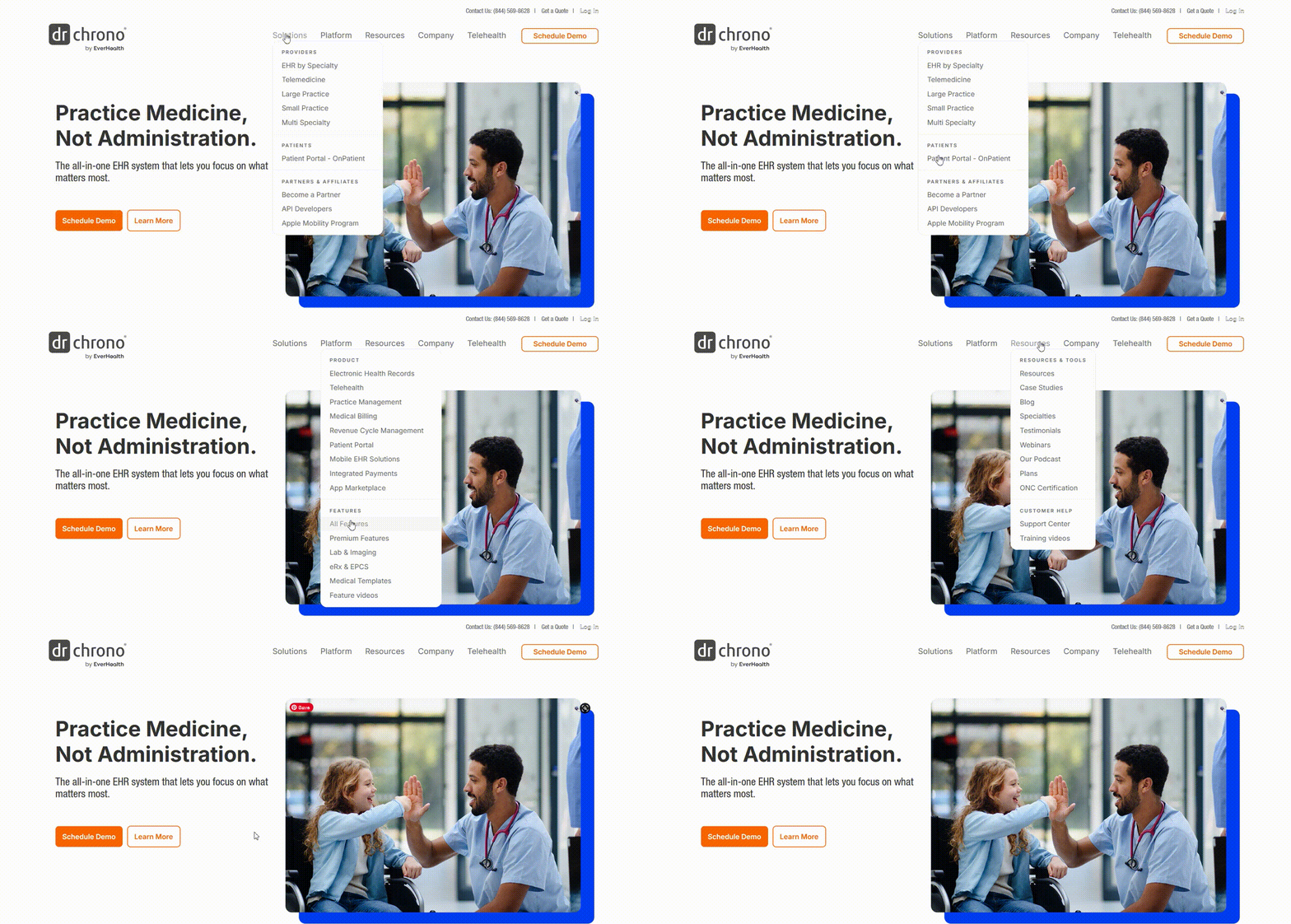
DrChrono’s website presents an ideal example. It gives equal space to its solutions and support content without overwhelming users.
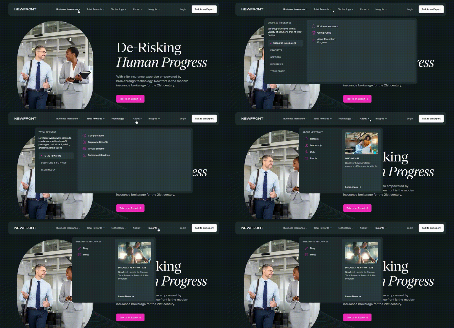
Newfront also uses two-layer navigation to balance its service details with insights and resources, creating a clear, user-friendly structure.
The trick here is balance. Include too much, and you risk overwhelming people. Include too little, and they might struggle to find their way around. The best headers hit that sweet spot; they’re clear, simple, and strategic.
2. Hero Section
The hero section, which sits above the fold (the pre-scroll area of the web page), sets the tone for everything that follows. In fact, studies show that visitors spend 57% of their viewing time above the fold, which makes the hero area one of the most valuable pieces of real estate on your website.
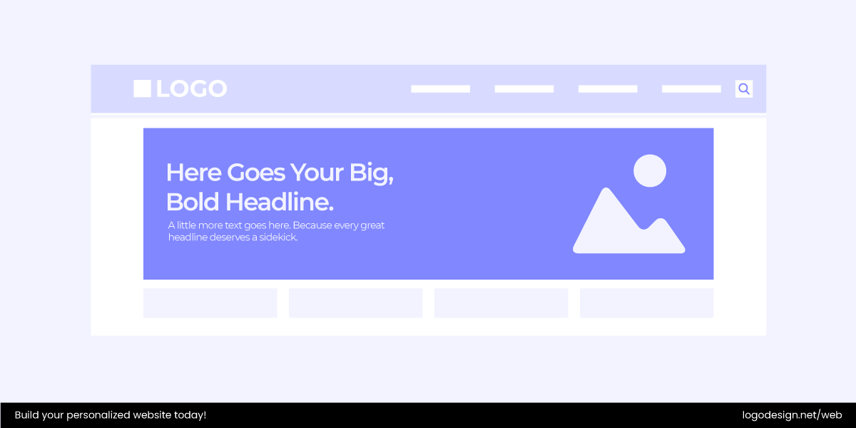
A good hero section has one job: grab attention fast and communicate your core message in a way that feels clear and inviting. It doesn’t need to feature a literal “hero,” no capes required. Instead, it could be a product photo, a bold headline, a video, or even a clean typographic statement. The goal is to hook visitors instantly and encourage them to either scroll or click further.
Common elements in a hero section include:
- Headline – short, bold, and crystal clear about what you do.
- Subheadline – a supporting line that adds clarity or value.
- Hero image or video – a strong visual hook (product photo, lifestyle shot, abstract design, or animation).
- Call-to-action (CTA) button – “Shop Now,” “Get Started,” or “Learn More.”
- Supporting copy – a quick note on why your offer matters.
Popular Hero Section Styles
Let’s look at some popular styles a hero section can be:
- Static Hero Image: A large, eye-catching image paired with a clear headline and CTA. Simple and effective when done right.
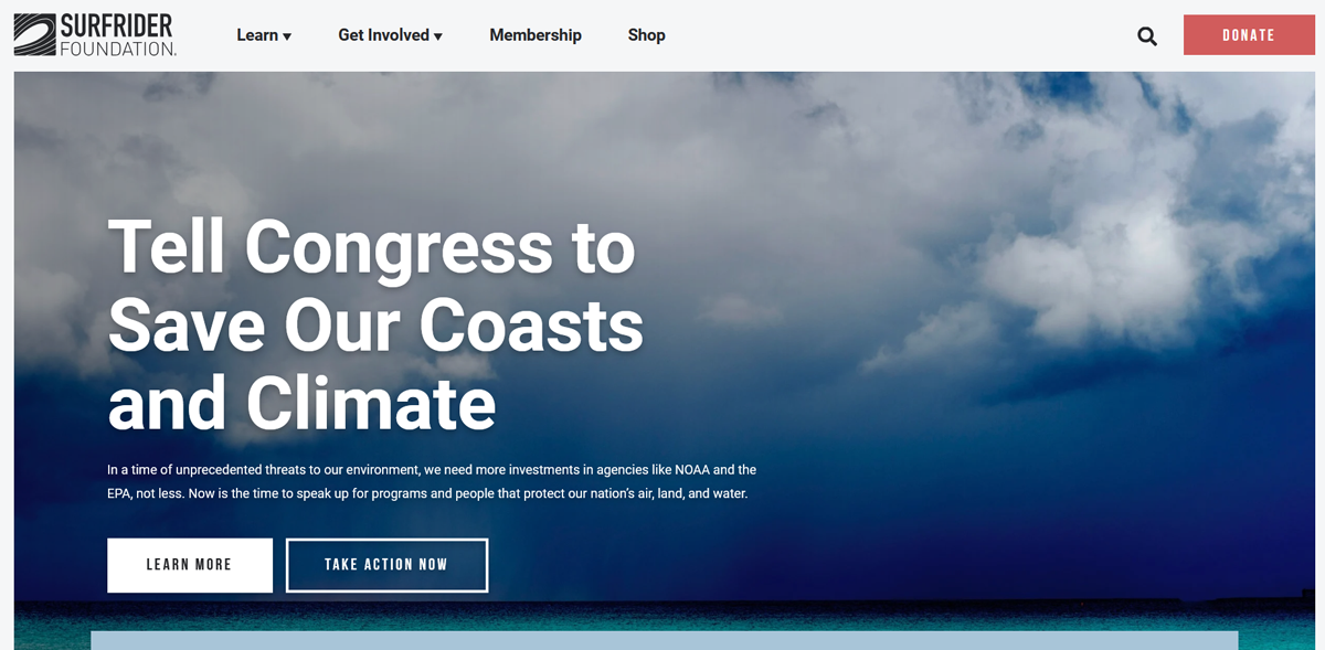
Surfrider Foundation uses a bold ocean image to immediately connect visitors with its mission of protecting coasts and waterways.
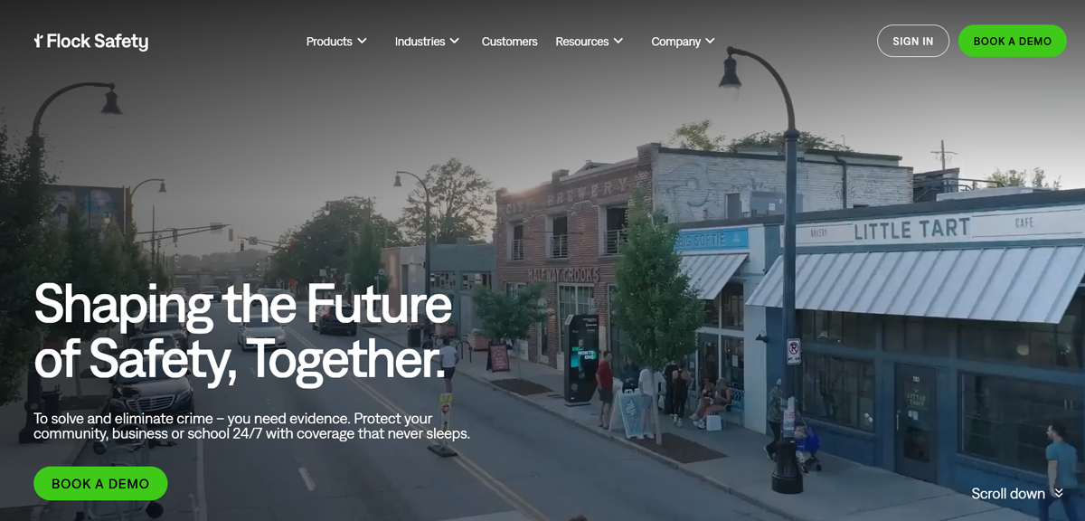
Flock Safety uses a striking visual to highlight its community safety focus alongside a direct call-to-action.
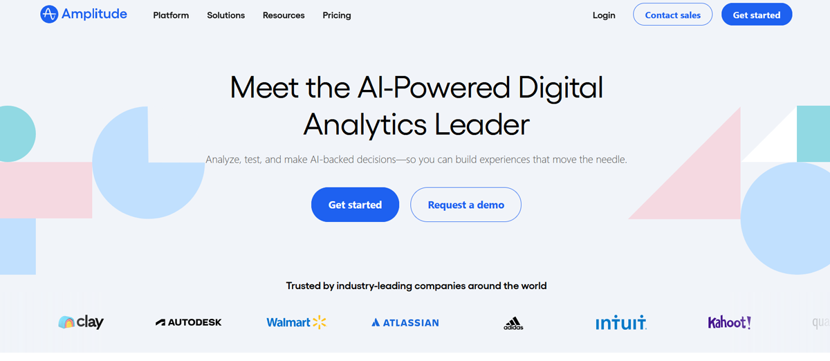
Amplitude also relies on a static hero image. It combines a clean background with concise messaging that highlights its product value.
- Hero Slider/Carousel: Rotating images or banners, often used to showcase multiple products, services, or messages. (Tip: keep it minimal, as too many slides can overwhelm users.)
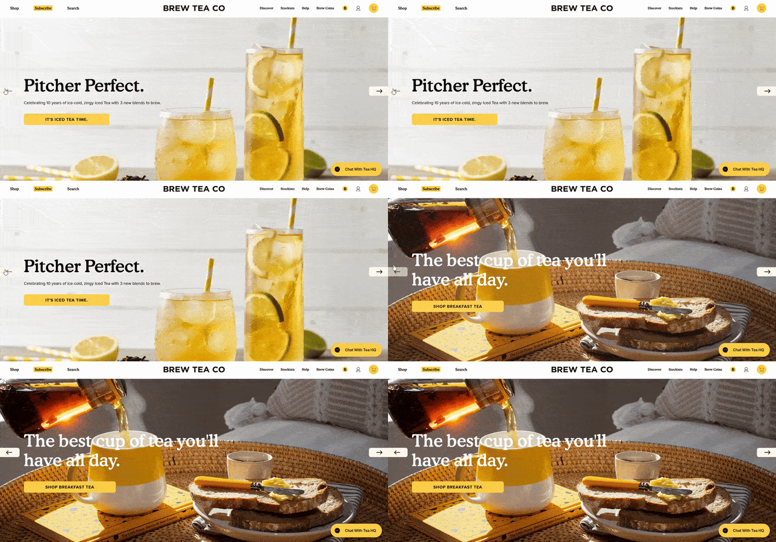
For example, Brew Tea Company features a hero slider to highlight different products while keeping the design sleek and focused.
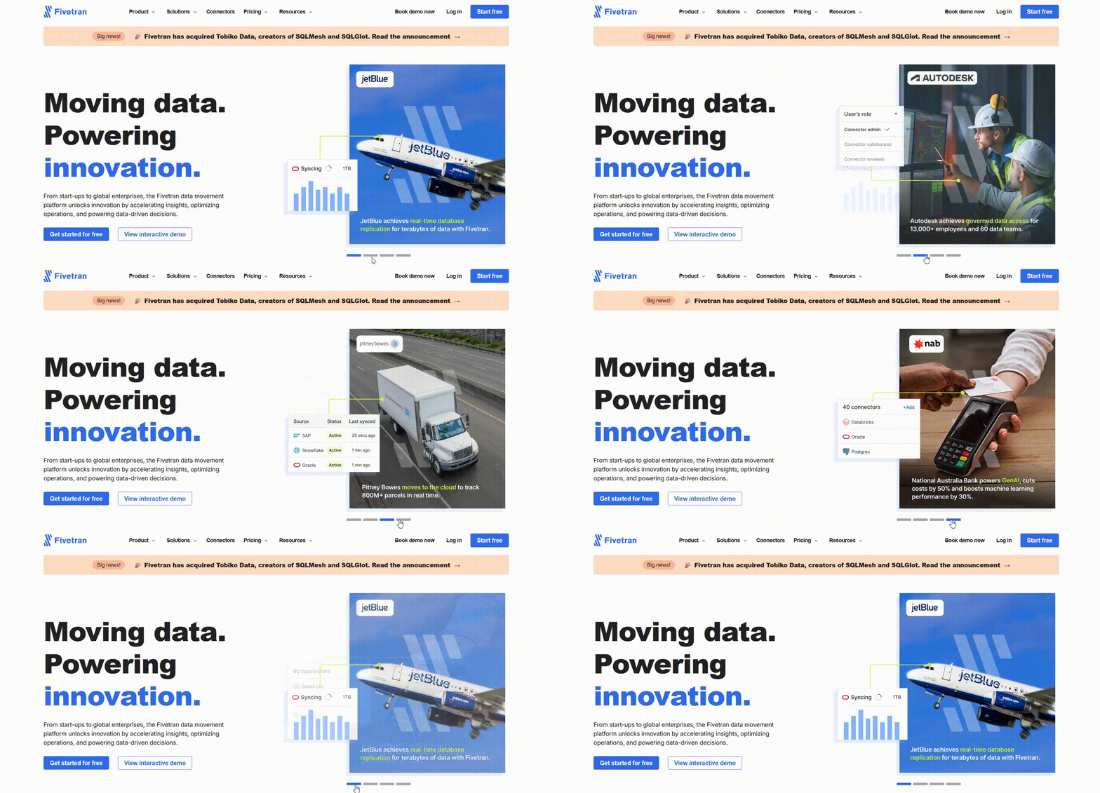
Fivetran also features a rotating banner, which allows it to spotlight various use cases and customer stories without cluttering the page.
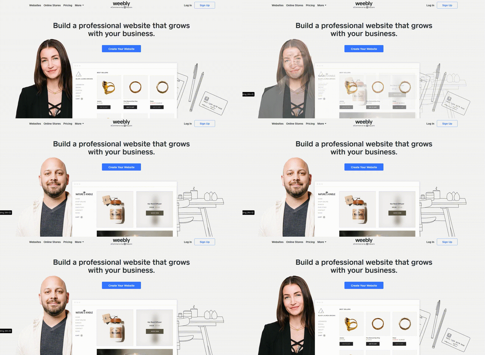
Weebly takes a similar approach by using its carousel to present multiple features and benefits in a way that feels engaging but is still easy to follow.
- Video Background Hero: Using a short looping video or animation as the hero background to create atmosphere and capture attention. Great for storytelling, but should never distract from the CTA.
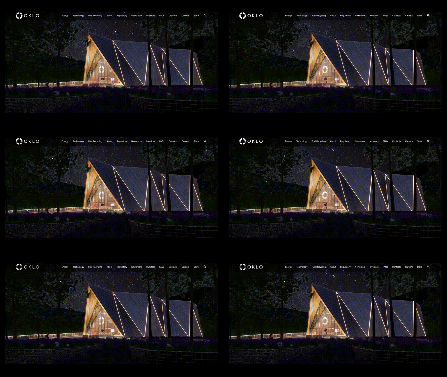
Oklo’s site uses a video background to convey innovation and energy, setting the tone for its mission.
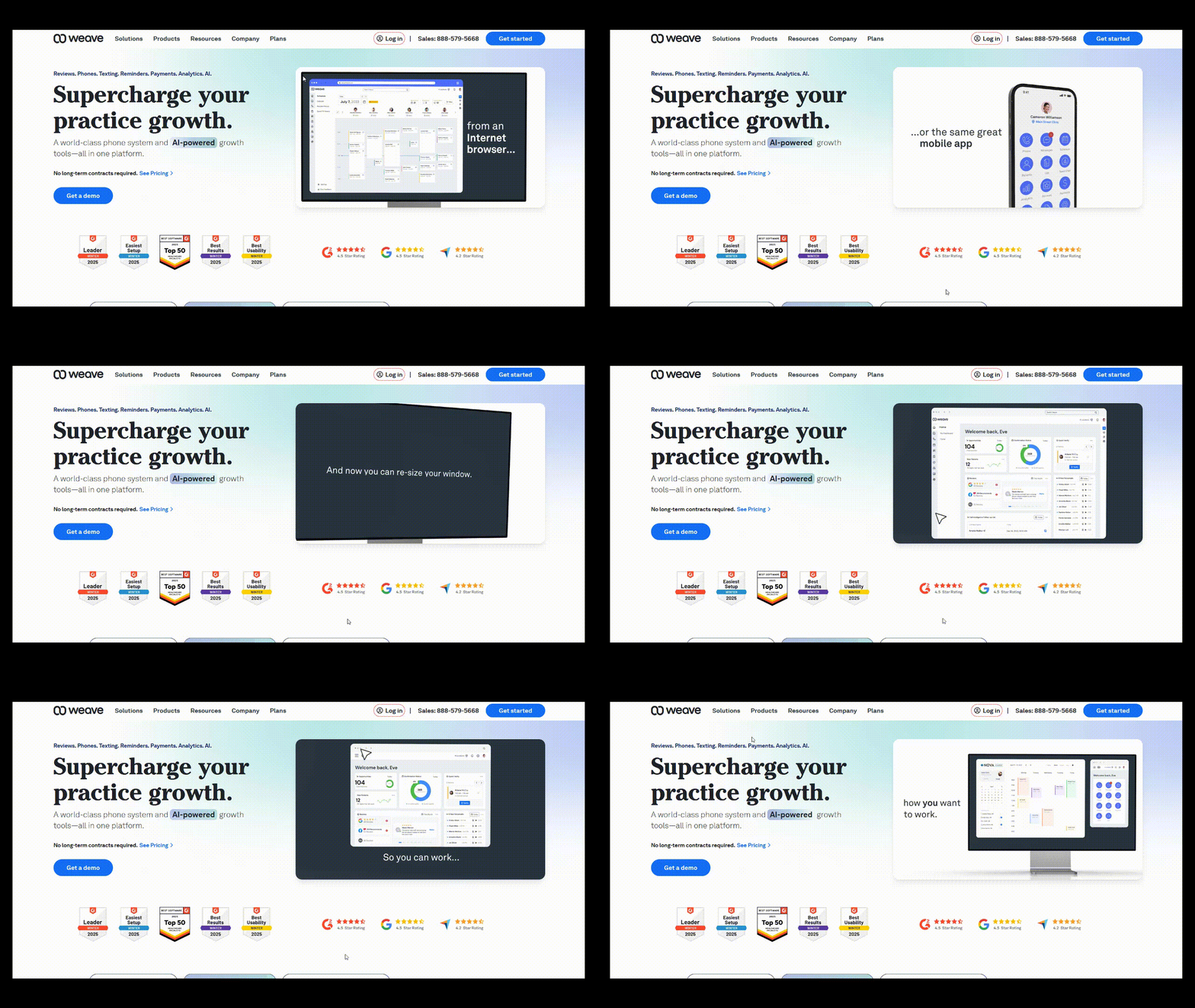
Get Weave takes a customer-focused approach and uses subtle motion to make the brand feel approachable and dynamic.
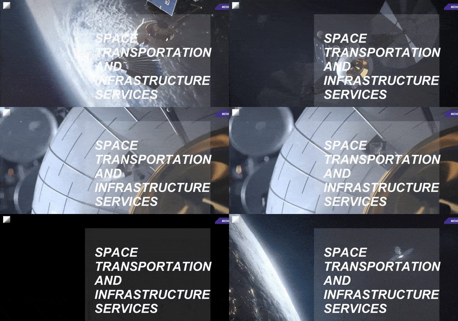
Momentus leans into space-themed visuals to tell its story through movement.
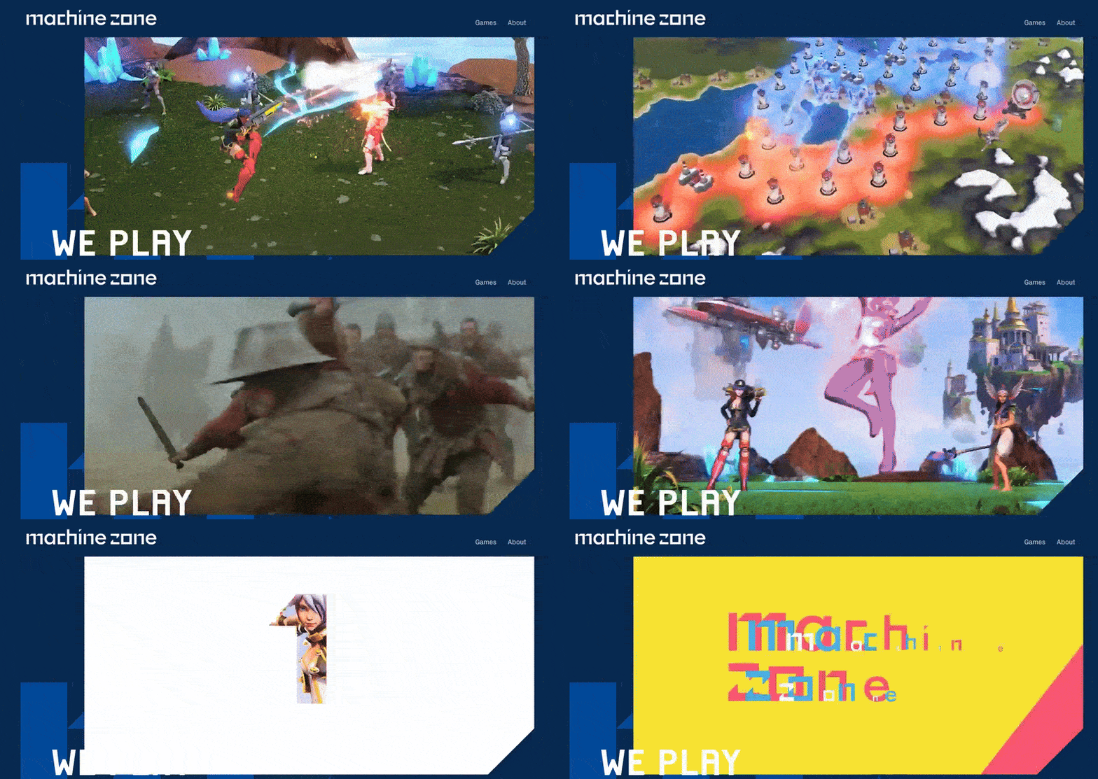
Machine Zone’s site also combines a sleek video with bold text to immediately capture visitor interest.
- Minimalist Hero: Sometimes, a minimal design is all you need. A clean background, bold text, and one strong button can outperform busy designs.
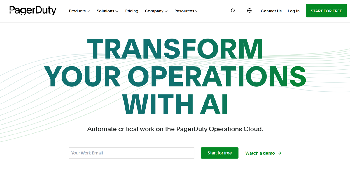
Pager Duty presents a perfect example if you want to see a minimalist hero section in action. It uses bold typography and a single call to action that draws focus.
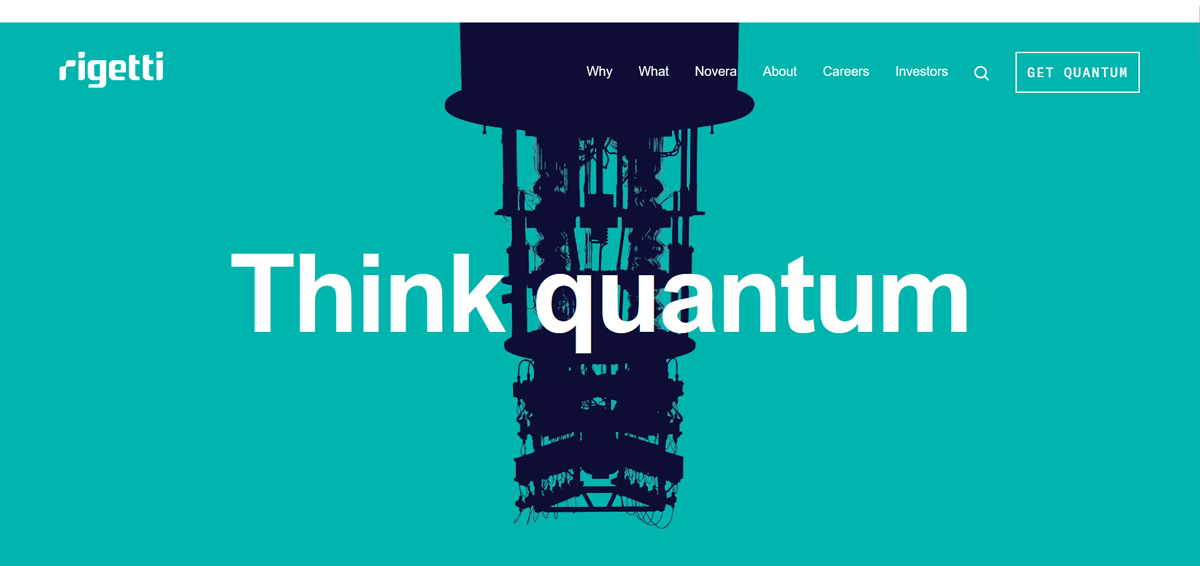
Rigetti follows a similar path and relies on whitespace and sharp text to communicate its message without distraction.
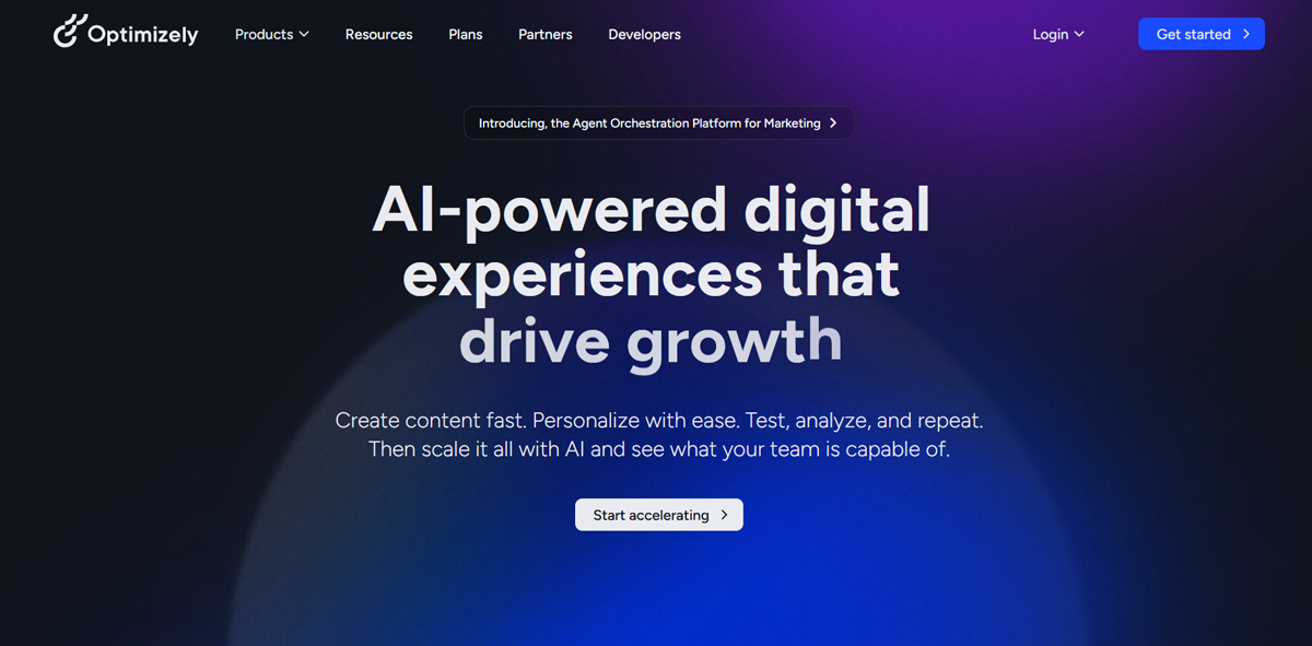
Optimizely also embraces minimalism. It pairs a clean layout with one standout button to guide users straight to action.
With a hero section, you must tell visitors what you’re offering and how to take the next step in seconds. It’s your elevator pitch, only visual and delivered in the first screen view.
3. Call-to-Action Button
If your header and hero section set the stage, the call-to-action (CTA) button is the spotlight moment. It’s where you invite visitors to actually do something. Whether it’s “Sign Up,” “Buy Now,” or “Get Started,” a CTA button transforms a casual browser into an active participant. In other words, it’s where clicks turn into conversions.
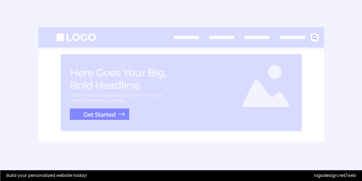
What makes a CTA button different from every other button on your site is its purpose: it’s designed not just to function, but to persuade. That’s why it needs to stand out visually and communicate clearly in just a few words. A weak or hidden CTA often means missed opportunities; users may scroll past without taking the next step.
Tips for an Effective CTA Button
- Make it stand out – use bold colors or contrast so it doesn’t blend into the background.
- Keep the text short – clear, action-driven words like Download Now, Subscribe Free, or Start Trial.
- Use placement wisely – CTAs work best above the fold, but repeating them in strategic spots (like at the end of a page) can help too.
- Create urgency (without pressure) – phrases like Limited Offer or Join Today nudge users to act now, not later.
- Test, test, test – A/B testing different button text, colors, and placements often reveals surprising results.
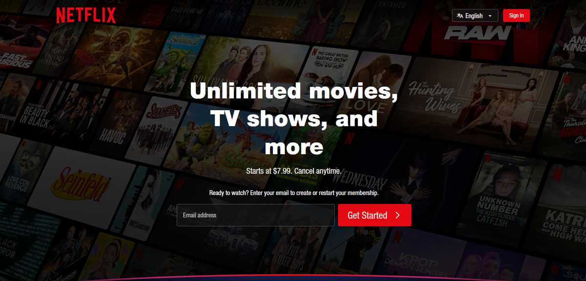
Think about Netflix’s prominent “Get Started” CTA button in red set against a black background, which makes it harder not to notice.
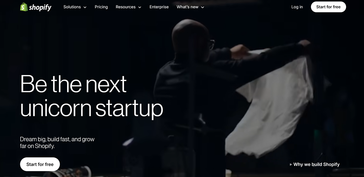
Shopify also places a bold CTA on its homepage/blog that commonly pushes “Start free trial” and invites immediate sign-up to the platform.
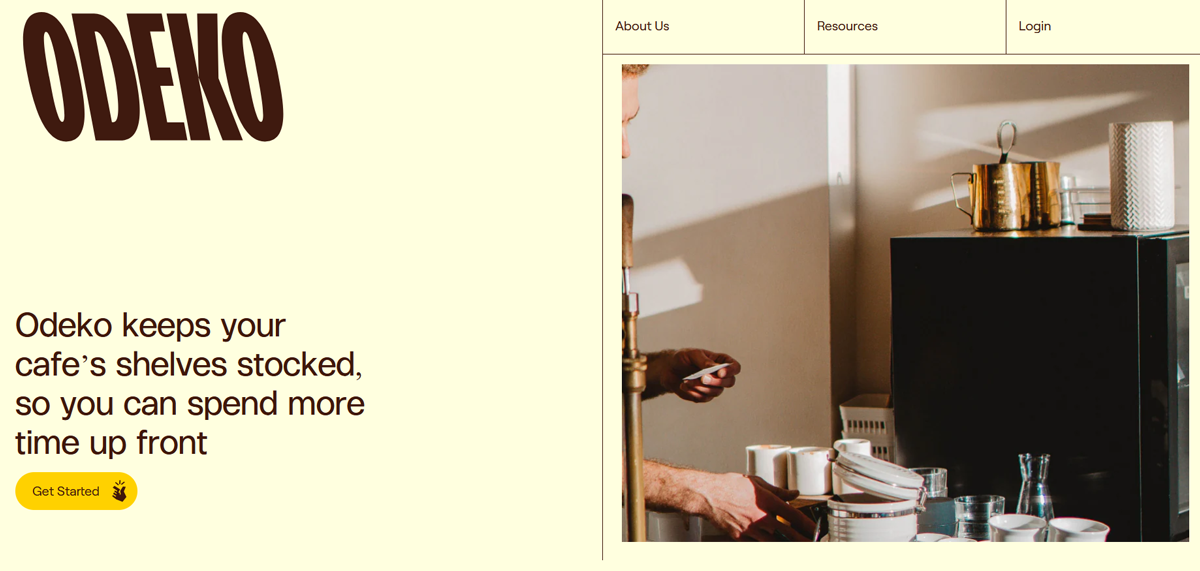
Using the same principle, Odeko places a clear “Get Started” button front and center, making it easy for café owners and small businesses to explore its platform quickly.
Turns out, a CTA button is the bridge between interest and action. Nail it, and you guide visitors exactly where you want them to go.
4. Menus
A menu is a website’s main navigation tool. It lists links or options that guide visitors to different sections, pages, or actions. Whether it’s pointing someone to your pricing, blog, or contact form, the menu acts like a roadmap for the whole site. A good menu saves people from wandering in circles, which means fewer frustrated clicks and happier users.
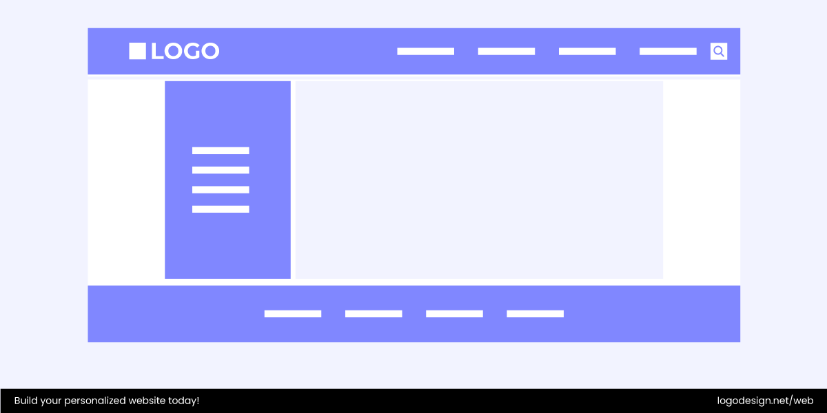
Menus can be simple lists of actions (Buy, Save, Send) or structured around categories (Shop, Blog, Support). Either way, they should feel natural and predictable so users don’t need to think twice about what’s behind each link.
Where menus live:
- Header menus – the classic horizontal lineup at the top.
- Sidebar menus – vertical lists that stick to the left or right.
- Footer menus – smaller, secondary menus tucked at the bottom.
Menu Styles You Can Try
Here are a few popular menu styles you’ll see around the web:
- Classic Horizontal Menu: This is the most common setup where navigation links are arranged in a line across the top of the page. It’s familiar, easy to scan, and works best when you don’t have too many categories. Think of most corporate websites or blogs — “Home | About | Services | Contact” right up top.
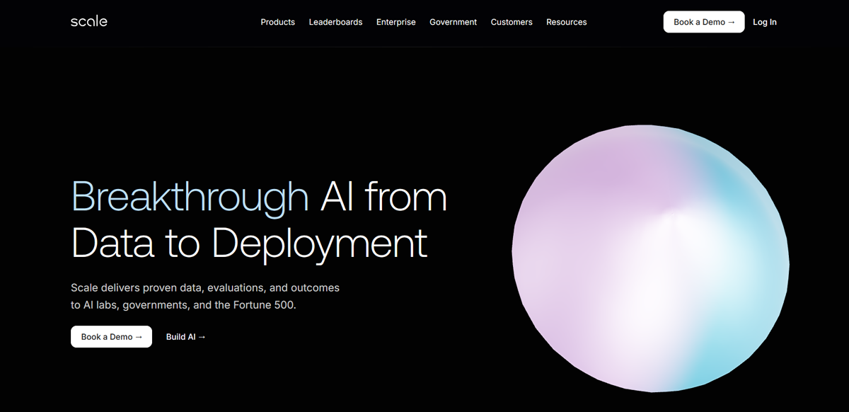
Scale’s straightforward horizontal menu is a classic example of keeping navigation simple while directing attention to its core offerings.
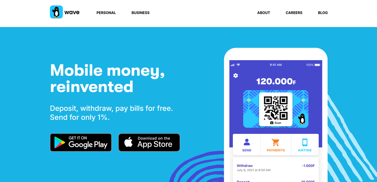
Wave also follows this style, presenting clean, easy-to-spot links that guide users across its global platform.
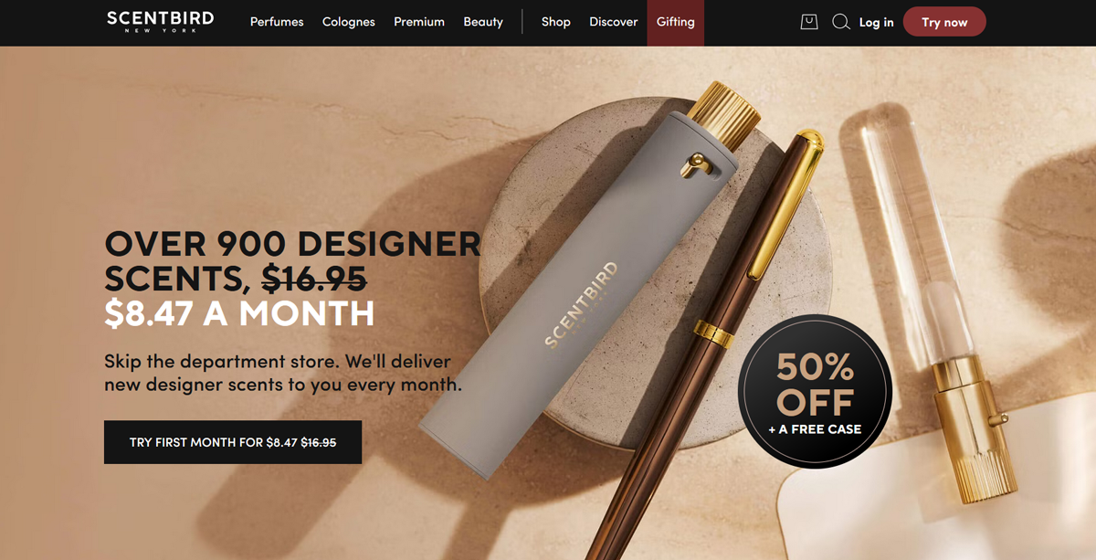
Scentbird makes use of a horizontal menu as well. It places product categories front and center to make browsing fast and intuitive.
- Sidebar Menu: Instead of sitting across the top, sidebar menus run vertically along the left or right side of a page. They’re popular in dashboards, blogs, or resource-heavy sites where users need quick access to multiple categories without cluttering the header.
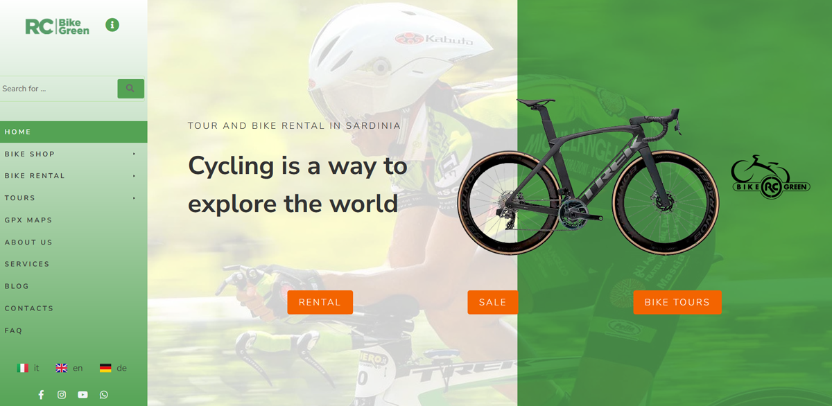
Bike Green‘s e-commerce site uses a sidebar menu to facilitate navigation, allowing shoppers to browse categories without feeling overwhelmed.
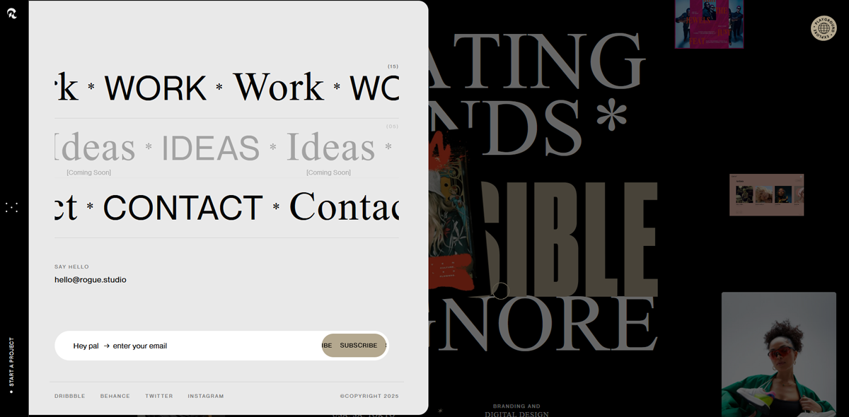
Rogue Studio takes advantage of a sidebar to showcase its creative work while keeping the design sleek.
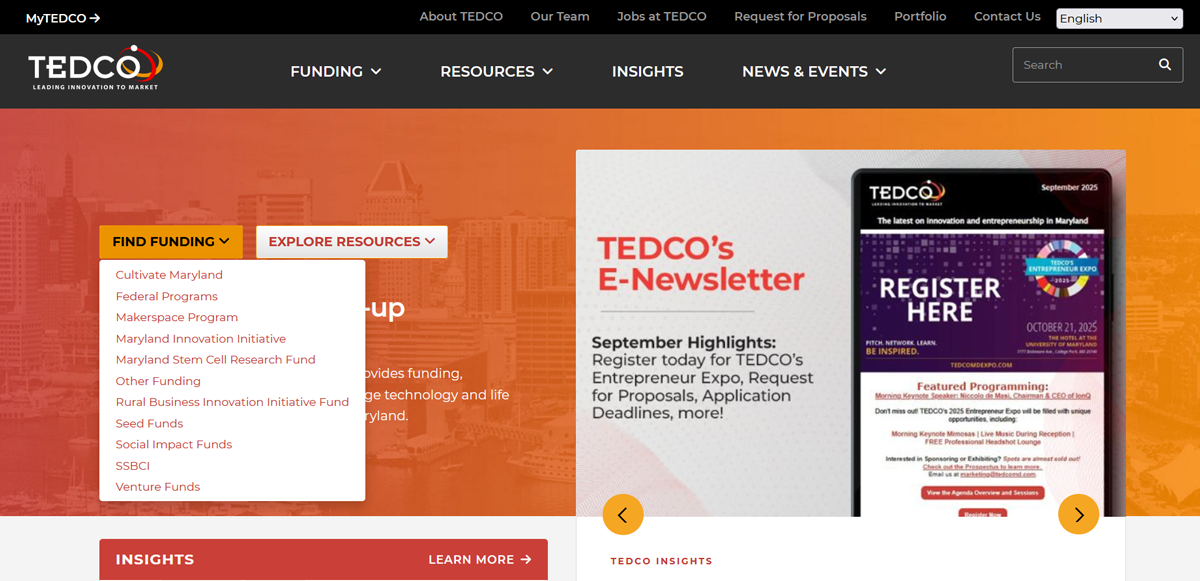
TEDCO also uses this layout, placing essential links along the side so visitors can quickly dive into different resources.
- Dropdown & Dropup Menu: A dropdown opens a hidden list of links when you hover or click an item in the main menu. It’s great for organizing subcategories without overwhelming visitors. A dropup works the same way but reveals links upward instead of downward. It’s useful when space is tight near the bottom of a layout.
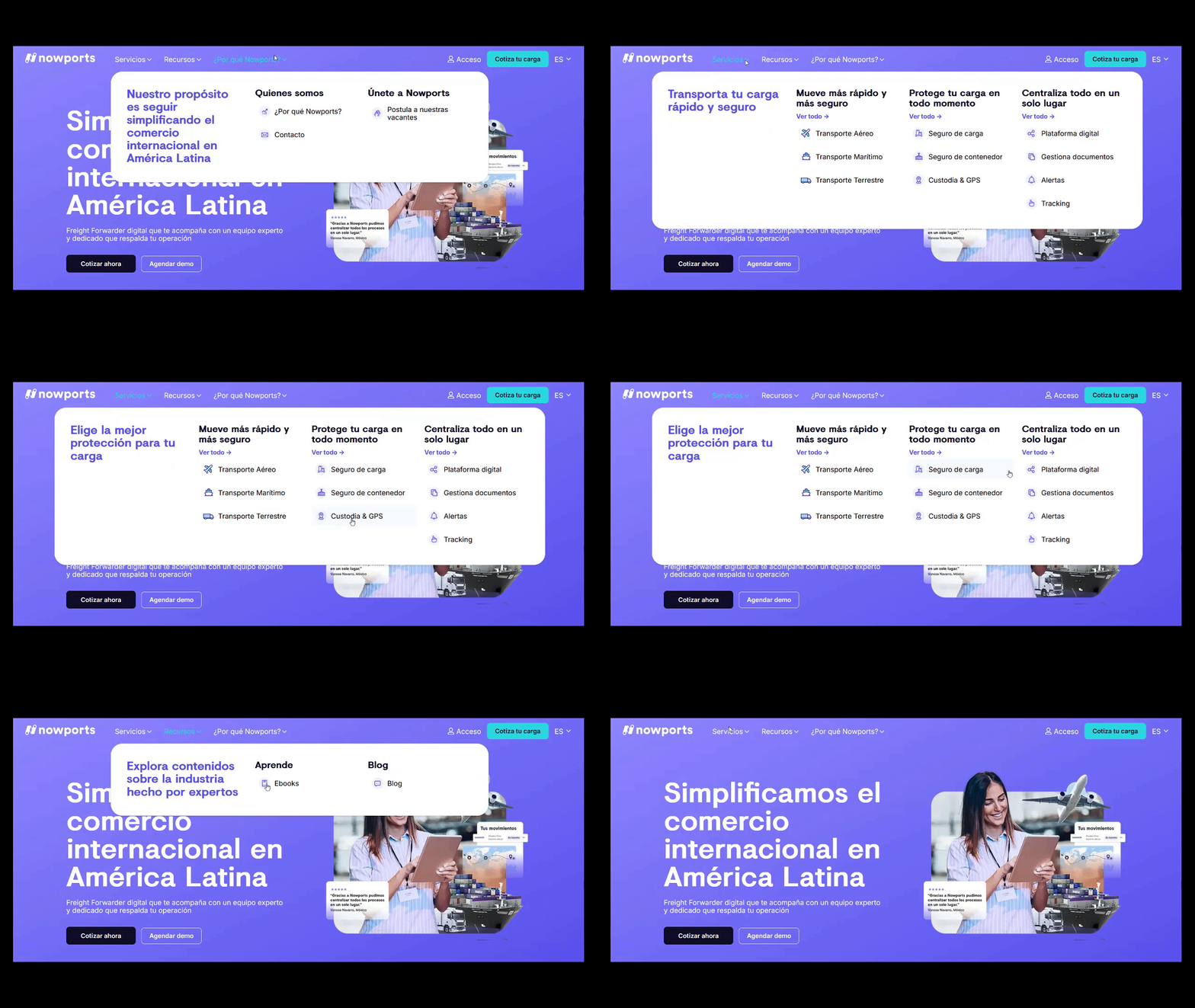
Nowports makes excellent use of dropdown menus to neatly group its service offerings while keeping the header section clean.
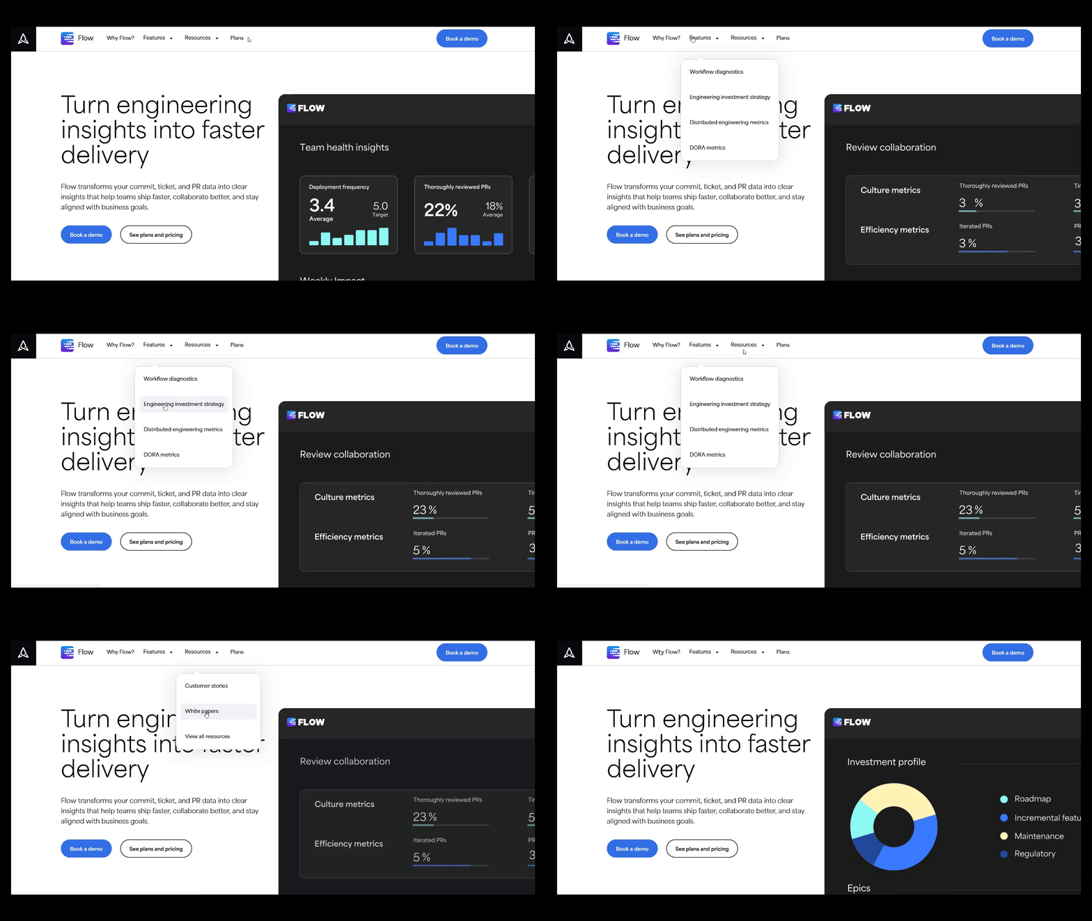
Similarly, Appfire’s Flow site relies on dropdowns. It allows visitors an easy way to explore multiple solutions without cluttering the main navigation.
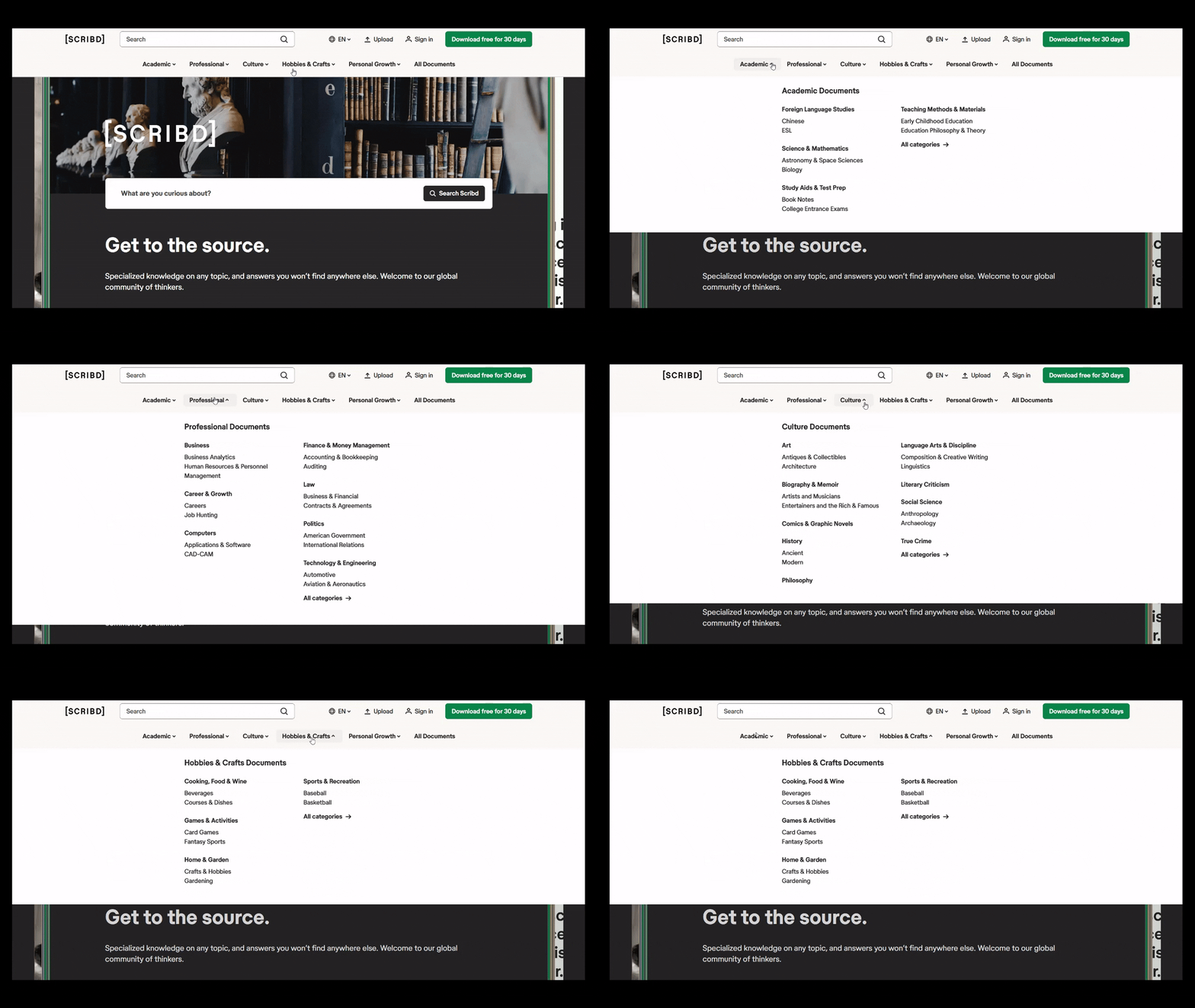
Scribd uses dropdown navigation too, helping users quickly filter through its huge library of content while maintaining a streamlined design.
- Megamenu: For sites loaded with content (e-commerce stores, news outlets), a megamenu expands into a large panel showing multiple columns of options at once. Instead of endless scrolling, users can see all categories in a neat, two-dimensional layout.
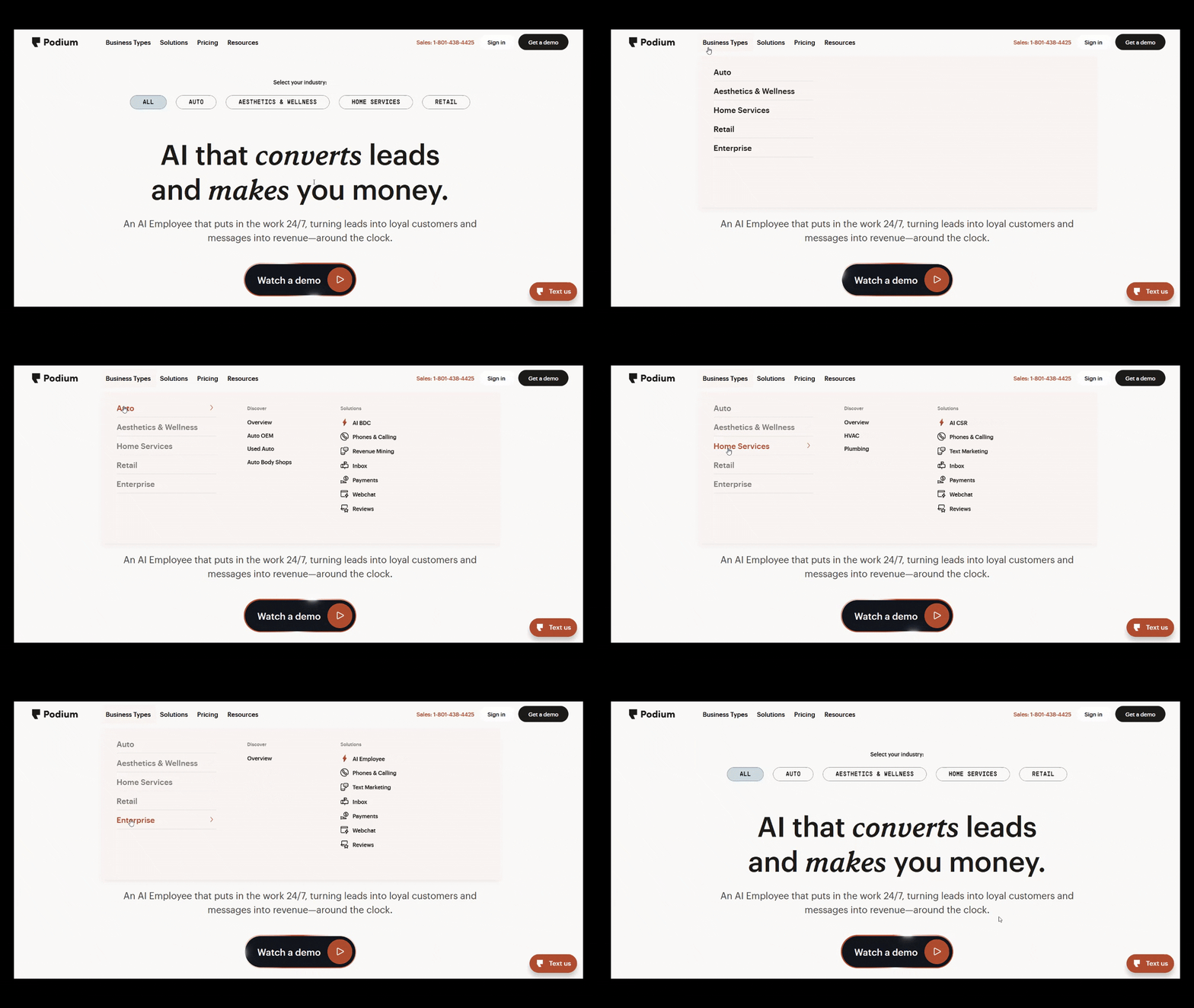
Podium uses a megamenu to showcase its wide range of customer communication tools in an organized, scannable way.
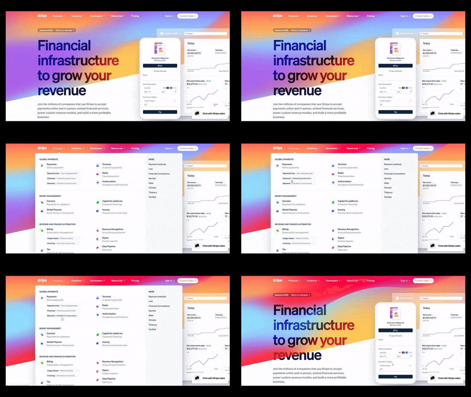
Stripe also employs this style and presents multiple solutions and resources in a clean grid that makes navigation feel effortless.
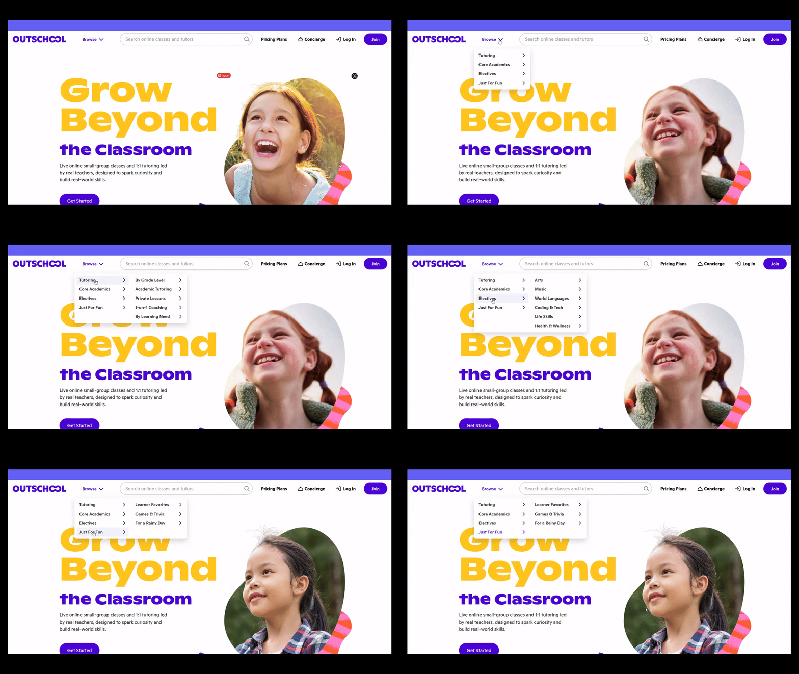
Outschool follows suit. Their megamenu helps parents and students browse through a vast catalog of classes without feeling lost.
- Hamburger Menu: The little stack of three lines that opens up into a full menu when tapped. It saves space and is especially handy for mobile design, though it’s also used on minimalist desktop layouts. Familiar, clean, and functional.
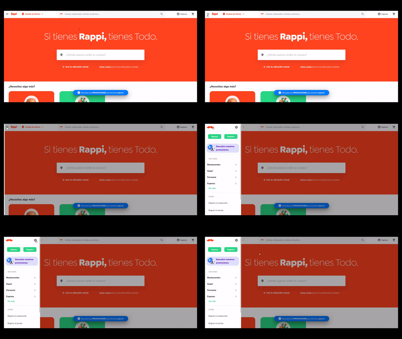
Rappi uses the hamburger menu to keep its app-like interface simple. Its menu lets users quickly access categories without crowding the screen.
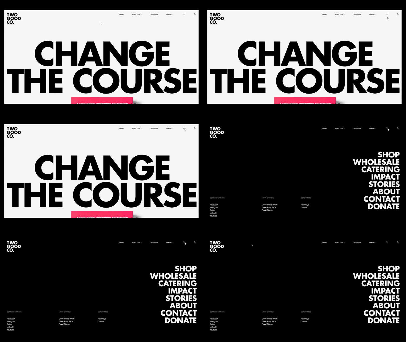
Two Good tucks navigation neatly away, so the focus stays on its striking visuals.
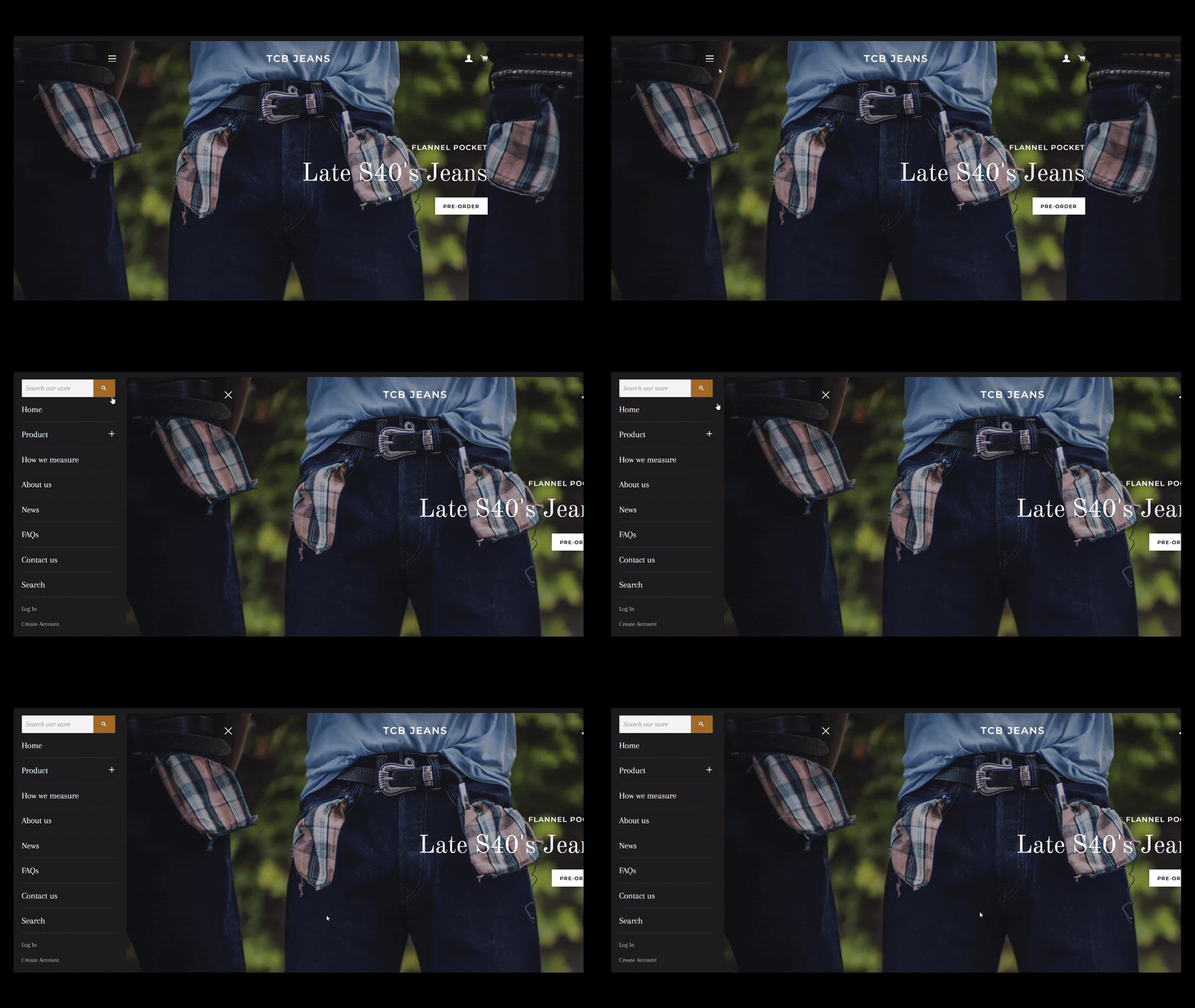
TCB Jeans applies the hamburger menu on its Shopify store, making it easy for shoppers to browse collections while maintaining a clean, streamlined look.
Pro tip: Don’t get fancy at the cost of usability. Users rely heavily on familiar navigation patterns, so clarity always beats cleverness.
5. Internal Search
A search bar might look like a small box, but it can greatly affect how people experience your site. It’s the shortcut visitors rely on when they don’t feel like clicking through menus or scrolling endlessly. Type, hit enter, and boom, the right page pops up (at least, that’s how it should work).
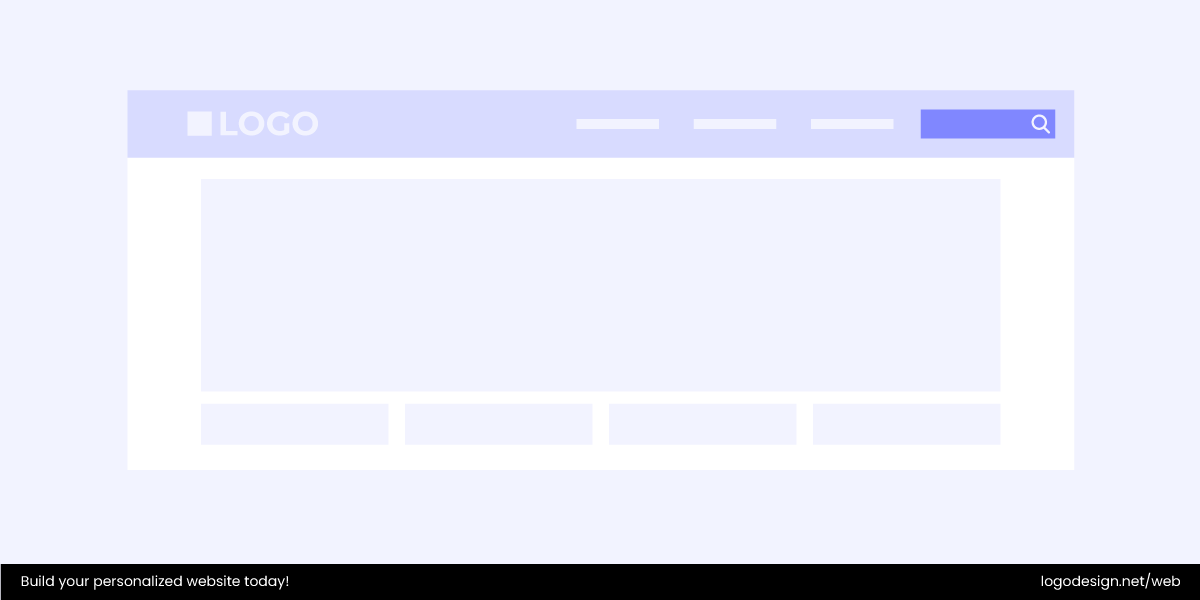
When designed well, an internal search function:
- Saves time by getting people straight to what they want.
- Increases usability and user satisfaction.
- Helps retain visitors who might otherwise give up.
- Can boost conversions by guiding users to products, posts, or resources faster.
That said, not every site needs one. If your website is small — say, a one-page portfolio or a simple company site, clear navigation is often enough. But if you’ve got 50+ pages of content, a search bar should be there.
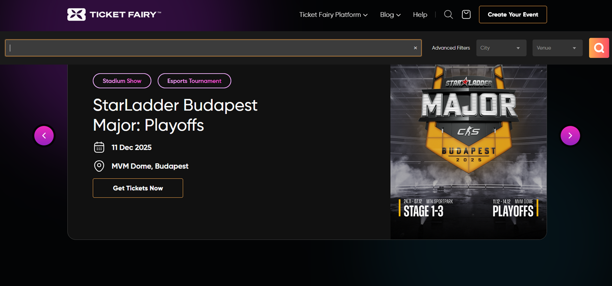
Ticket Fairy’s search feature helps users quickly locate events without digging through endless listings.
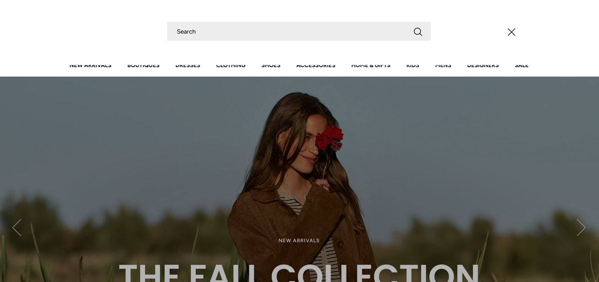
Shoptiques offers a search bar so shoppers can jump straight to specific brands or items across its huge inventory.
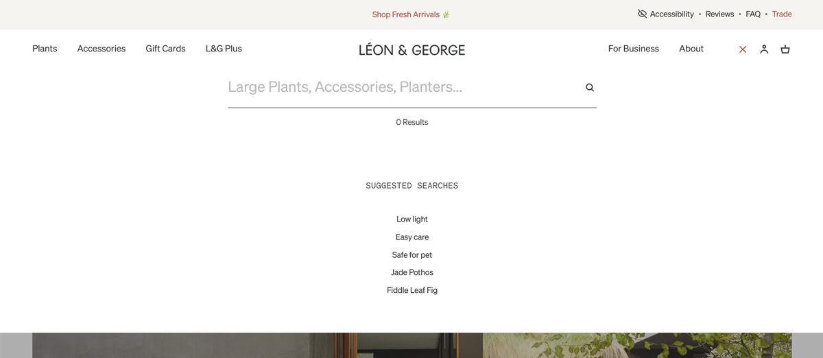
Leon & George also makes search central to its experience, helping plant lovers find the exact greenery they want.
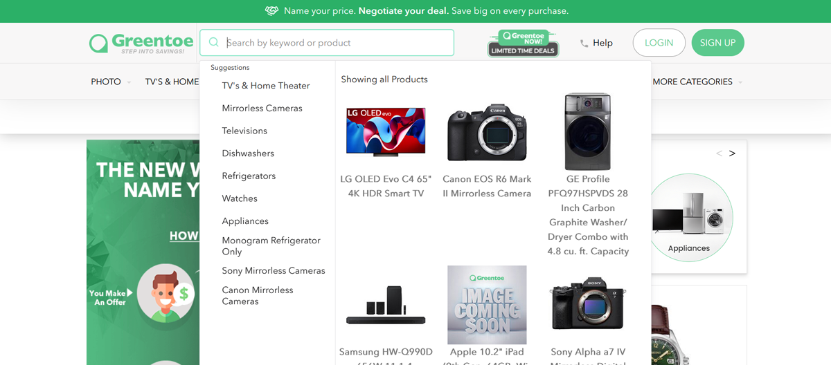
Greenoe uses a search feature to simplify shopping by letting customers locate deals and products right away.
Important note: Search should support navigation, not replace it. Some users prefer clicking links over typing queries, or may struggle with spelling, language, or simply don’t like the effort of typing. That’s why the best sites offer both: clear menus and a helpful search option.
6. Breadcrumbs
Breadcrumbs are handy navigation aids that help users know exactly where they are on your site. They usually appear as a slim horizontal trail of links. For example:
Home > Shop > Shoes > Sneakers
They give people a quick sense of the site’s structure and an easy way to jump back a few steps without retracing the entire path.
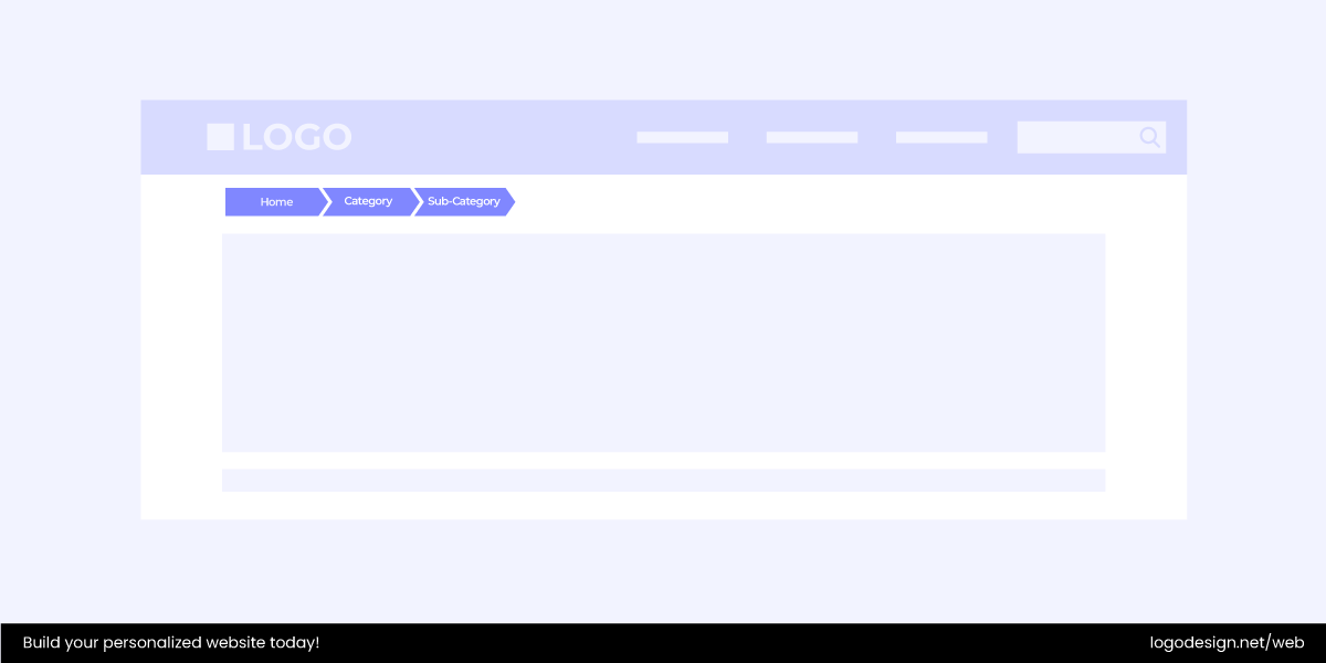
While breadcrumbs never replace your main menu, they work beautifully as a secondary navigation tool, especially on large or content-heavy websites. They are a must-have for e-commerce platforms, news sites, or blogs with hundreds of posts.
Why breadcrumbs matter:
- Make content easier to find.
- Cut down on unnecessary clicks.
- Use minimal screen space.
- Lower bounce rates by making users feel in control.
On small, simple sites, you can skip them. But once your website grows and layers start stacking up, breadcrumbs can keep visitors confident, oriented, and moving forward instead of feeling lost.
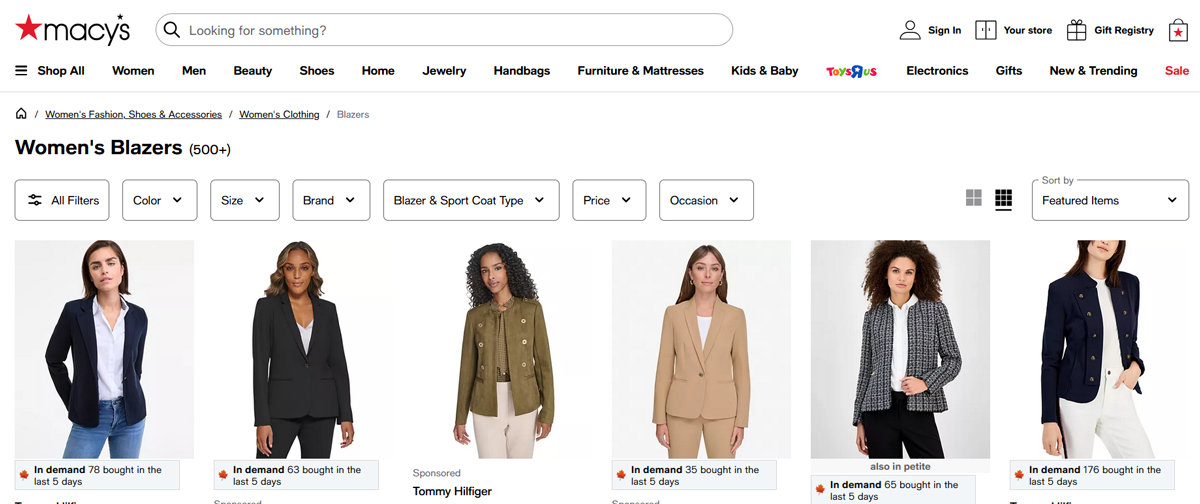
Macy’s, for instance, uses breadcrumbs to help shoppers backtrack easily through categories like kids’ clothing without starting over.
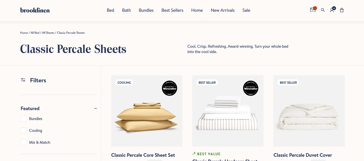
Brooklinen also incorporates them, making it simple for customers to navigate between product collections.
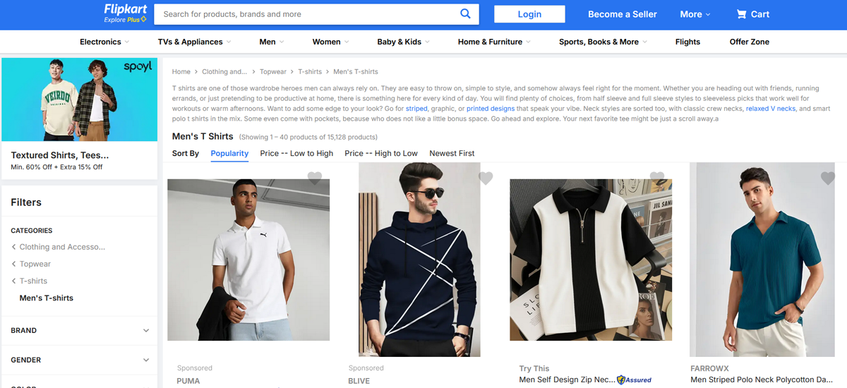
Flipkart also relies heavily on breadcrumbs, giving users a clear path through its deep catalog of men’s fashion, ensuring they never feel buried in endless layers.
7. Cards
Cards (sometimes called tiles) are like little content containers that make big chunks of information easier to scan. These neat, bite-sized packages hold just enough detail for someone to decide if they want to learn more.
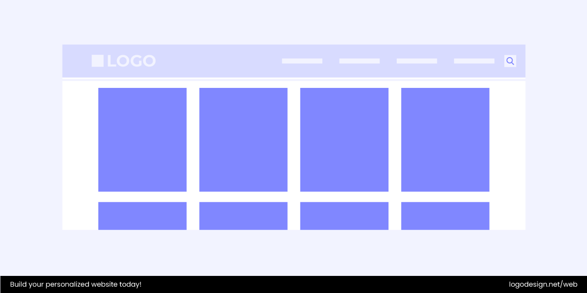
You’ve probably seen them everywhere, such as on e-commerce sites showing products, streaming platforms listing movies, or blogs highlighting articles. Each card feels self-contained but is part of a bigger grid, which makes browsing smooth and organized.
What a card might include:
- Image – the visual hook, like a product photo or video thumbnail.
- Title or heading – tells you what the item is.
- Supporting text – a short description, price, or snippet.
- Action buttons – like Add to Cart, Save, or Read More.
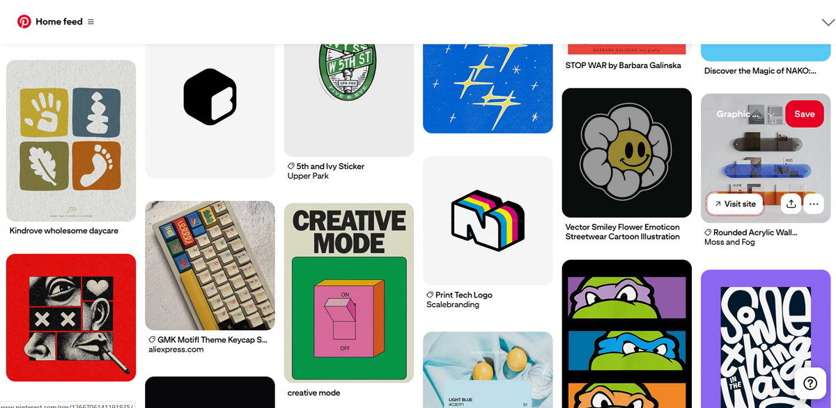
The best example would be Pinterest, which built its entire platform around a card-based layout. Every “pin” is essentially a card that shows an image, description, and link — simple, consistent, and endlessly scrollable.
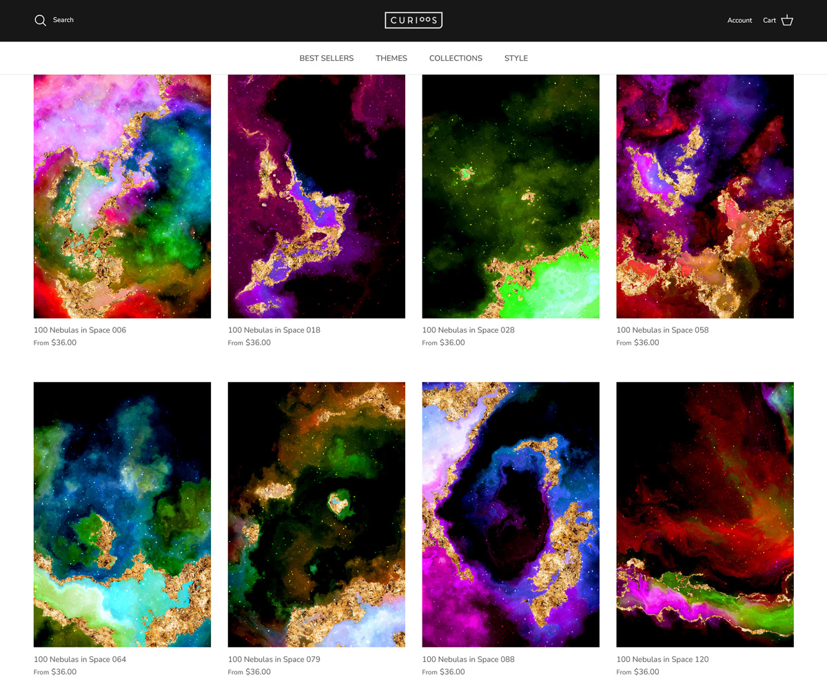
Similarly, Curioos uses cards to showcase its curated art collections in a way that feels visually appealing yet easy to navigate.
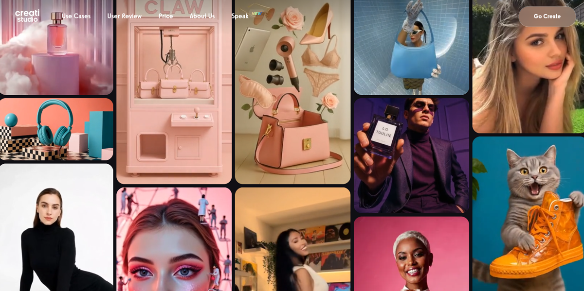
Creati Studio also features a card-based grid to present projects, making it effortless for users to scan and explore work at a glance.
8. Slider
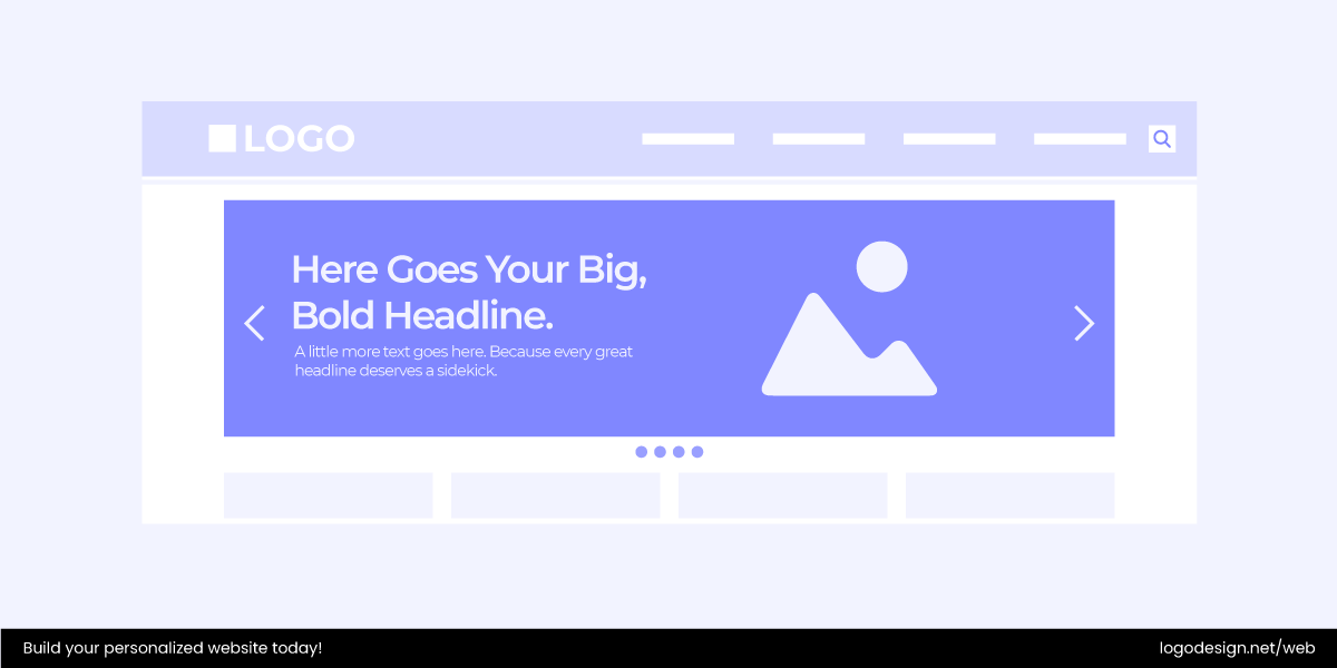
A slider is an interactive design element that works like a slideshow or carousel, rotating multiple pieces of content within the same space. It’s a common feature on e-commerce and business websites, often used to spotlight featured products, promotions, or visual galleries more dynamically.
Benefits and Drawbacks of Sliders
Benefits of sliders include:
- Space-saving – multiple items can be shown without cluttering the page.
- User engagement – motion naturally draws attention and interaction.
- Visual appeal – adds energy and flow to an otherwise static page.
But sliders also have drawbacks:
- Slower load times – the extra functionality can hurt speed and SEO.
- Distraction – showing too many options at once reduces clarity.
- Mobile issues – swiping and responsiveness don’t always translate well.
- Banner blindness – users may skim past if it feels like advertising.
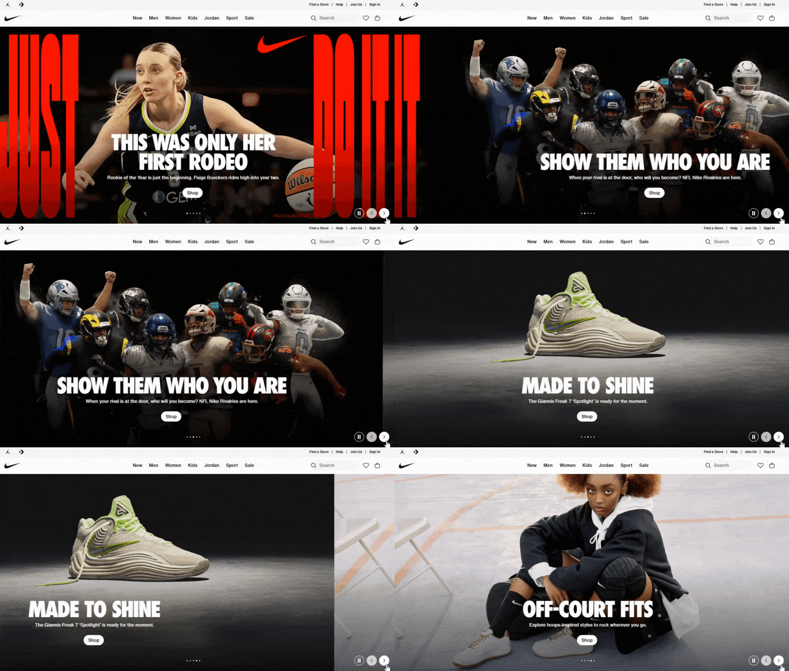
For instance, Nike’s website uses sliders to rotate through new product launches and seasonal campaigns. This keeps the homepage fresh and engaging, while still guiding visitors toward key calls to action.
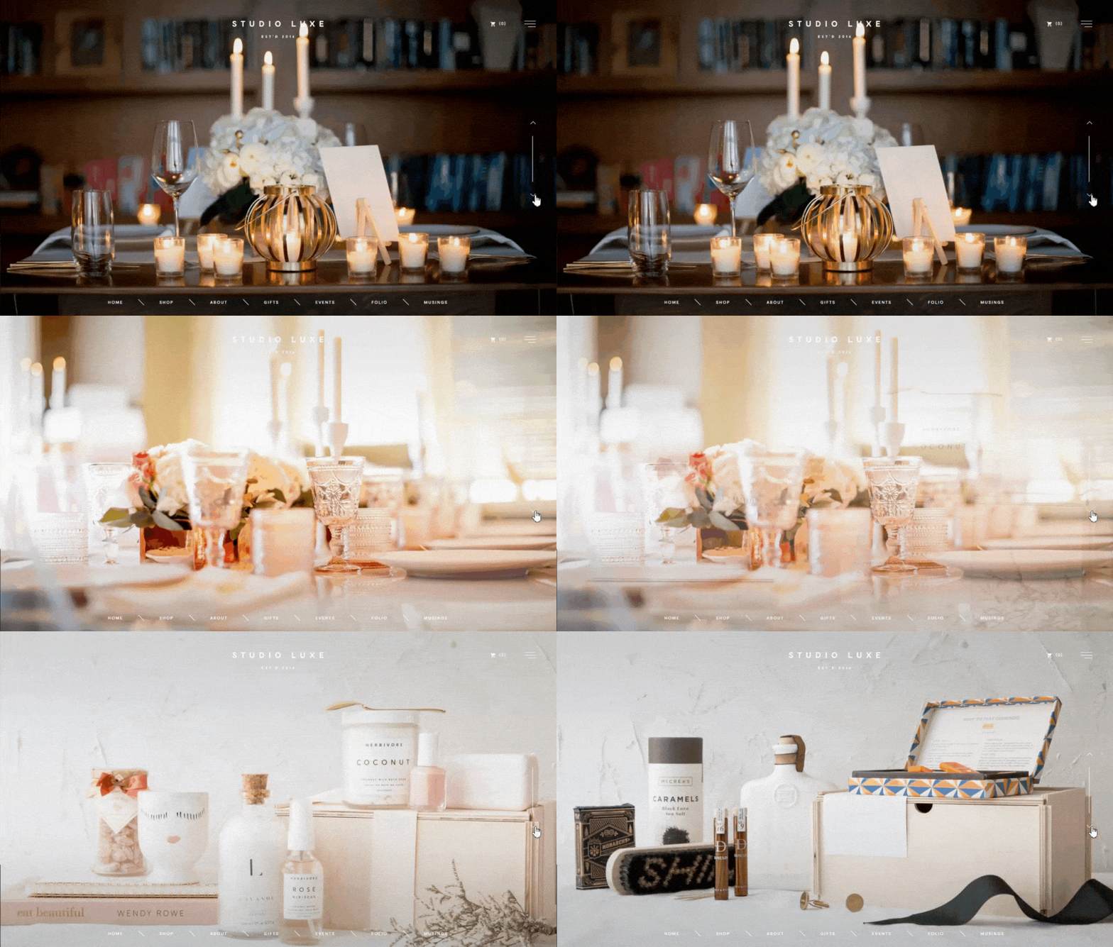
Studio Luxe also leans on sliders to present its design work in a polished, interactive way.
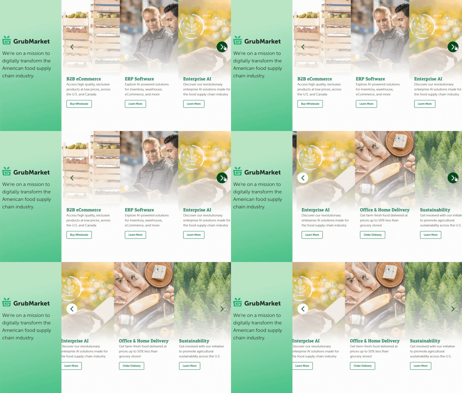
GrubMarket uses a slider on its homepage to highlight seasonal deals and services, giving visitors a quick snapshot of what’s new without overwhelming them.
9. Form
A form is one of the most important interactive elements on any website. It is the digital equivalent of a paper form but smarter, faster, and more flexible. Forms allow users to send information directly to your system, and can be of various types, such as:
- Registration forms
- Check out/payment forms
- Contact or feedback forms
- Subscription forms
Because forms are the main bridge between users and a website, they need to be clear, simple, and intuitive. A cluttered or confusing form is one of the quickest ways to lose a visitor. The process should feel less like a chore and more like a natural flow toward completing a task.
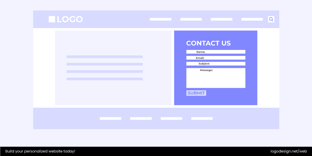
Best practices include:
- Keeping required fields to a minimum.
- Grouping related information logically.
- Offering visual prompts or inline validation.
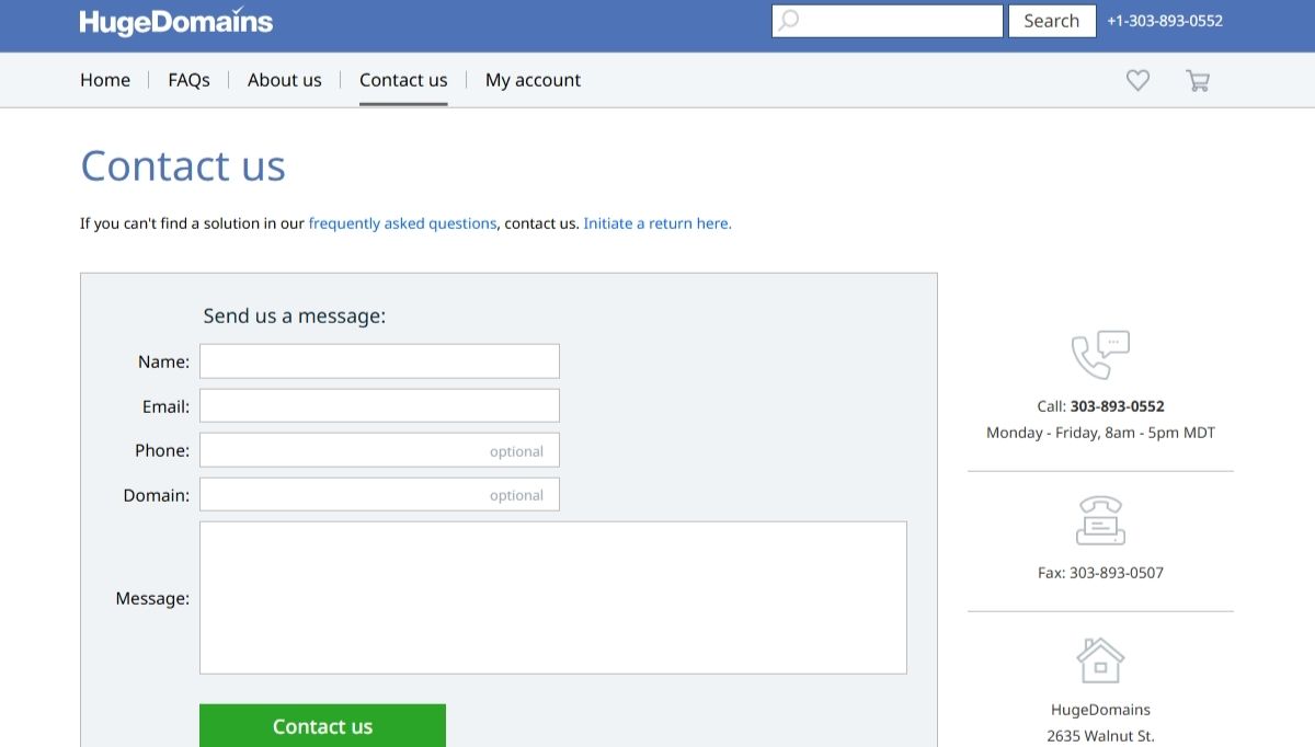
Take the HugeDomains’ contact form, for example. It’s straightforward and asks only for essential details to avoid friction.
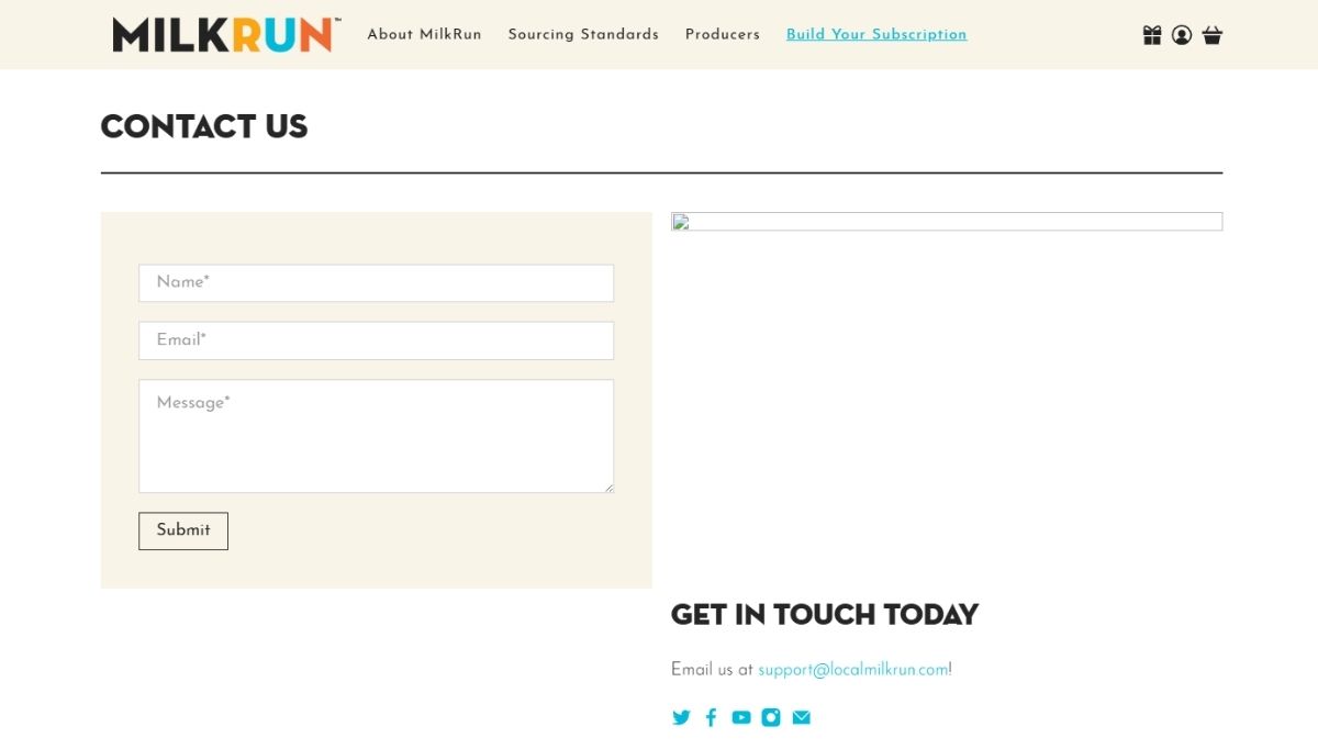
Local MilkRun incorporates a clean contact form, designed to make it easy for customers to reach out without confusion.
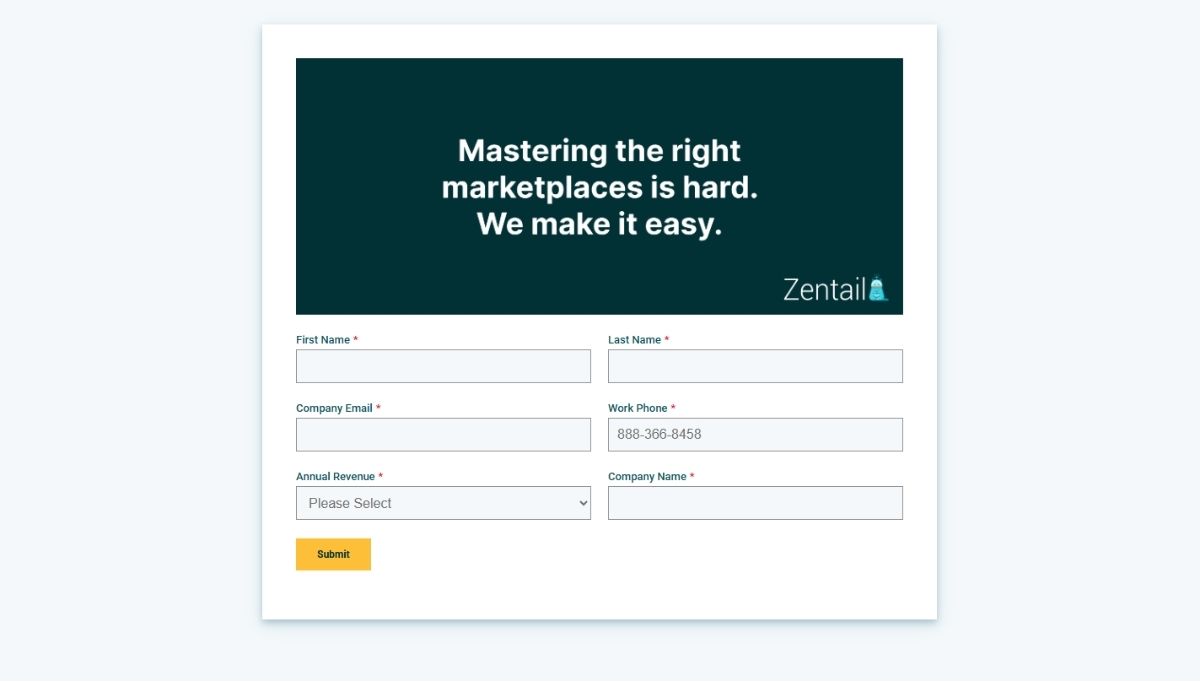
Zentail provides well-structured forms for product demos and inquiries, guiding users through a clear submission process.
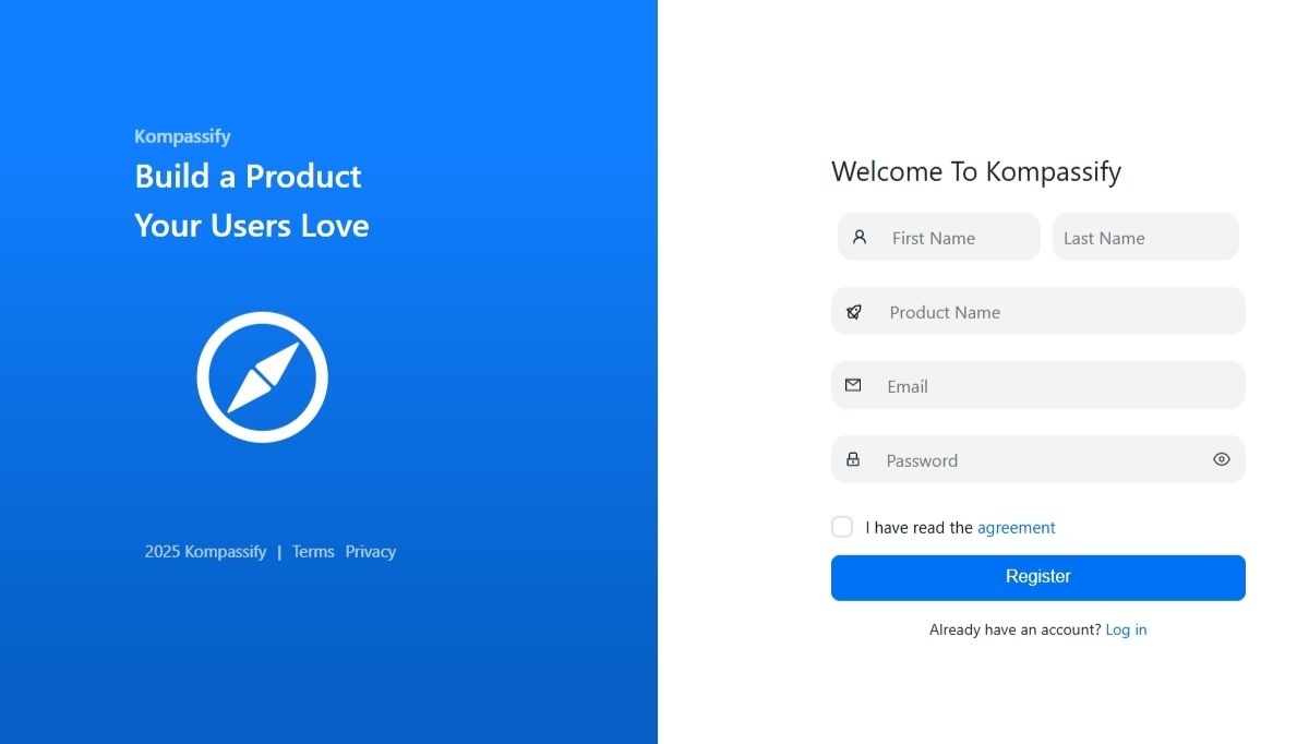
Kompassify, on the other hand, features a registration form that balances multiple fields with an intuitive design, making onboarding smooth for new users.
10. Progress Indicator
A progress indicator (usually in the form of linear bars, dots, or circles) is small but plays a big role in shaping user experience. It shows visitors where they are in a process or how much of a page they’ve covered. For long articles, guides, or content-heavy pages, it prevents users from feeling lost and gives them a sense of pacing. They help them decide if they have time to continue reading.
Beyond scrolling, progress indicators are especially useful in multi-step tasks like filling out lengthy forms, completing a checkout process, or onboarding in an app. By showing users how far they’ve come and what’s left, they reduce uncertainty and frustration while boosting motivation to complete the task.
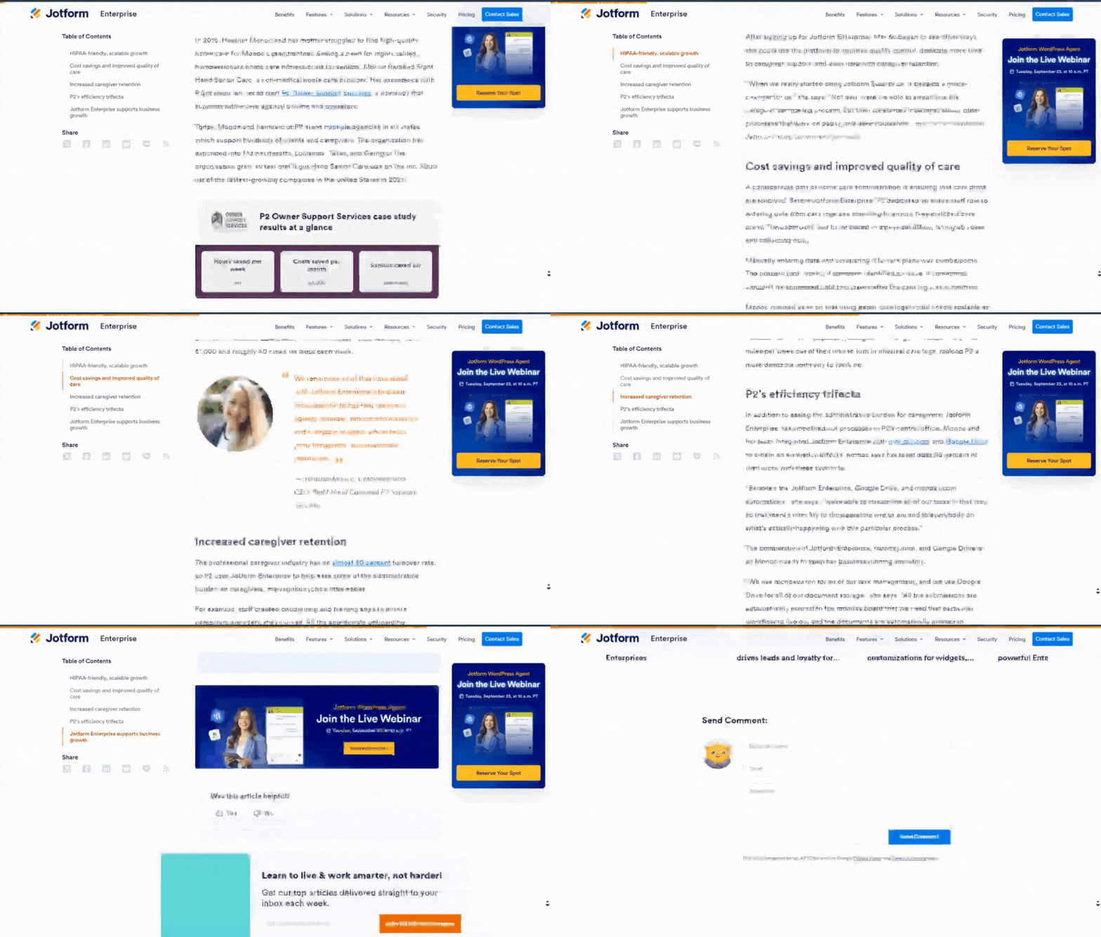
Jotform demonstrates this well in its case studies, where a visible progress bar keeps readers engaged through longer content.
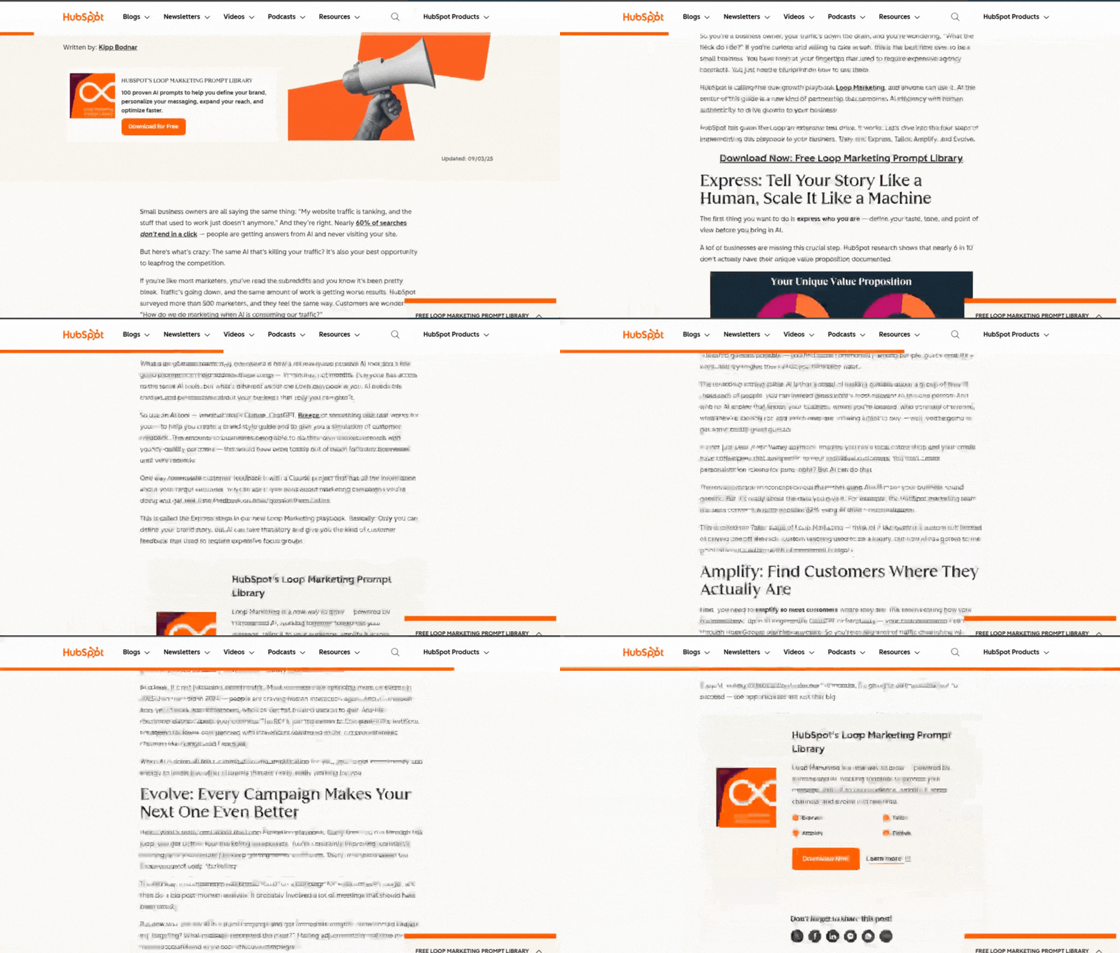
HubSpot’s blog also uses a subtle scroll indicator, letting marketers know how far along they are in an article.
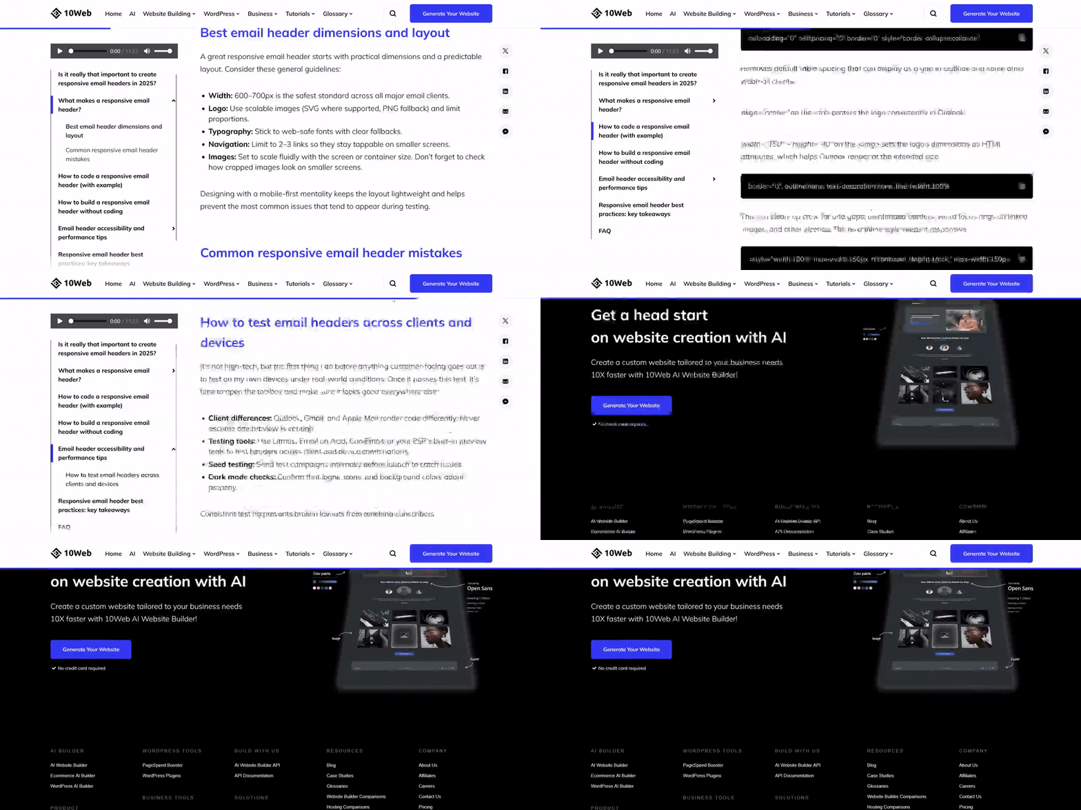
Similarly, 10Web’s blog integrates progress tracking on design guides, making it easier for readers to pace themselves through detailed content.
11. Images/Media (Photos, Video, Graphics)
Would you be attracted to a text-only website? Probably not. A webpage without visuals feels flat. Images, videos, and graphics shape the mood, explain ideas faster than words, and help people connect with your message.
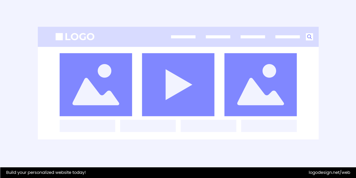
In fact, studies show that people remember 65% of information paired with visuals three days later, compared to only 10% with text alone.
Here are some of the most common types you’ll see:
- Photos – whether it’s product shots, behind-the-scenes team pictures, or lifestyle imagery, photos add a human touch and build trust.
- Videos – explainer demos, testimonials, or background clips give your page energy and keep visitors engaged longer.
- Graphics & illustrations – icons, charts, or custom visuals simplify information and tie everything together stylistically.
For example, sharp product images in an online shop can be the difference between a click and a bounce. In a SaaS site, a short animated walkthrough can make a complex feature instantly clear. When chosen carefully, media works hand in hand with your content to drive results.
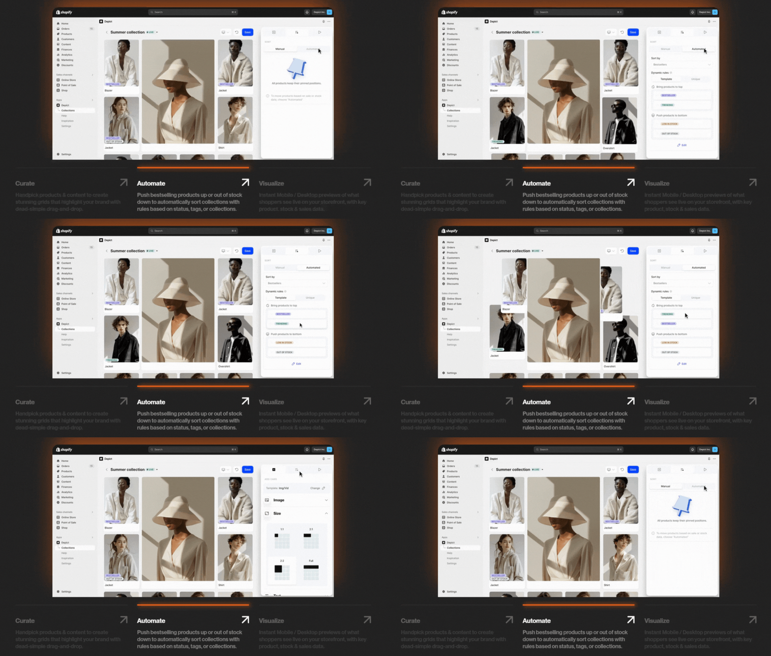
Depict.ai uses high-quality visuals to show how its platform improves online shopping experiences, making the product feel tangible and trustworthy.
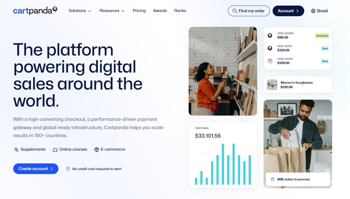
Cartpanda relies on engaging graphics and media to demonstrate its e-commerce solutions in action.
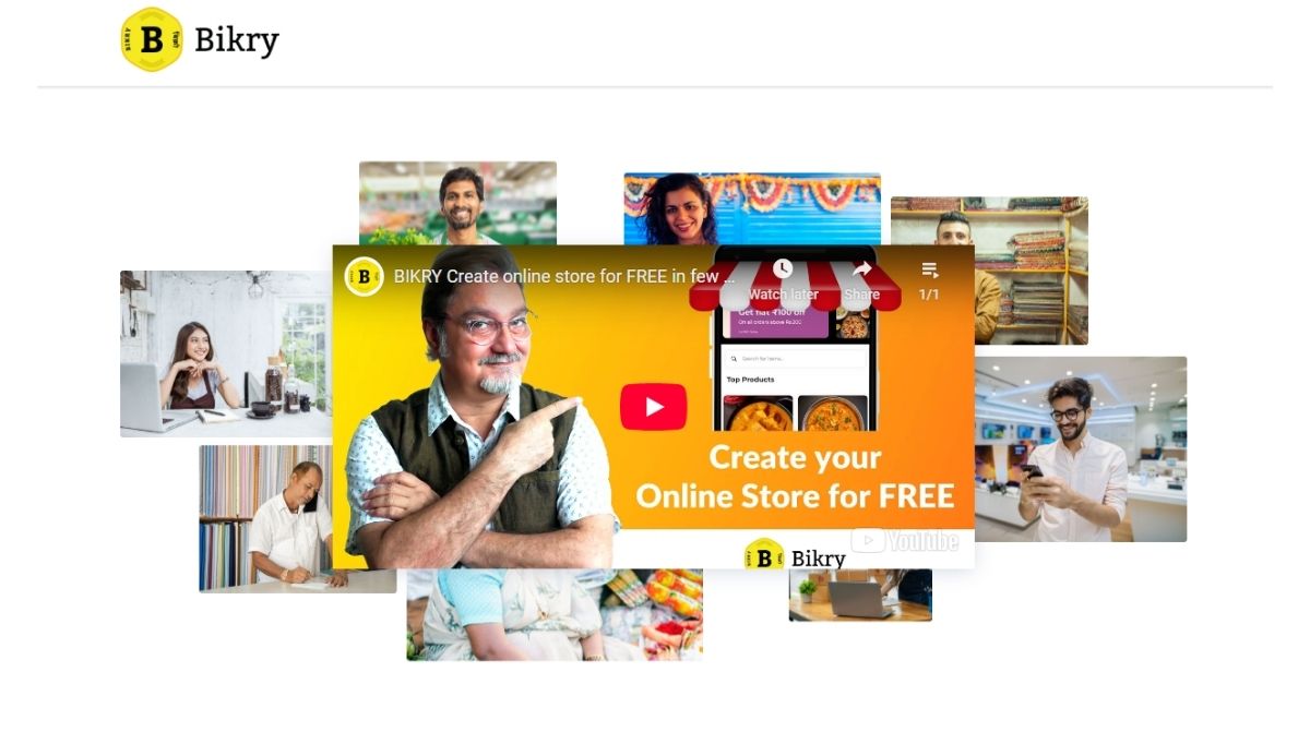
Bikry also leans on images and videos to connect with local businesses, showing real-life use cases in a way that’s both relatable and persuasive.
12. Favicon
It’s tiny, but it matters. A favicon is that little icon you see in a browser tab, next to the page title. It is your site’s mini logo, a small but mighty piece of branding that helps users spot your page in a sea of open tabs.
Even though it’s just 16×16 pixels (sometimes larger in modern browsers), a favicon makes your website feel polished and professional. Without one, you’ll often see a blank page icon, which can make your site look unfinished or less trustworthy.
Favicons usually feature:
- Logos – a simplified version of your brand mark.
- Initials or monograms – a single letter works great for minimalist designs.
- Symbols – a clean, recognizable icon tied to your brand.
And here’s why it counts: favicons improve brand recognition and boost usability. A user with 15 tabs open (we’ve all been there) can instantly find your site without reading every title. It’s a small detail, but like most good design, the little things add up to a smoother experience.
Flow.space, for instance, uses its favicon to extend its branding consistently.
Tablevibe goes for a minimal, letter-based design that stays crisp even at tiny sizes.
AgendaPro keeps it clean with a simple, recognizable icon that helps users quickly spot their tab in a busy browser window.
13. Footer
A footer is the last chance to be helpful before visitors close the tab or move on. Sitting at the very bottom of the page, it’s a space people instinctively scroll to when they’re looking for extra info.
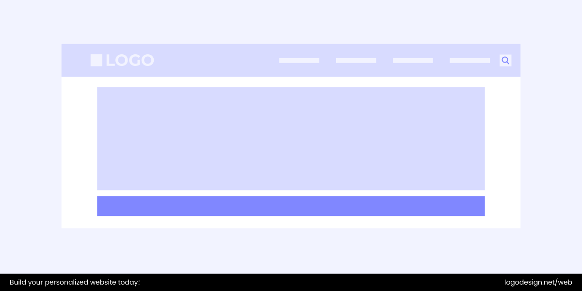
To put it better, a footer is your site’s “catch-all.” Anything that didn’t quite fit neatly into the header or hero often finds a home here. From quick links to policies, it’s a familiar place users check for the essentials. It’s also one of the most common places to display your web domain name, reinforce your brand identity, and make it easy for visitors to remember where they are.
Signs of a Good Footer
A good footer often includes:
- Brand identity – usually the logo or company name.
- Navigation links – About page, FAQs, Privacy Policy, Terms, etc.
- Contact info – email, phone number, or even a short form.
- Social links – icons that connect users to your active channels.
- Newsletter sign-up – a simple way to stay in touch.
- Badges or certifications – trust builders like SSL, payment seals, or awards.
Pro tip: If your site uses infinite scrolling (like social media feeds), a traditional footer can feel lost. In those cases, a sticky or compact footer works better, keeping essentials accessible without breaking the flow.
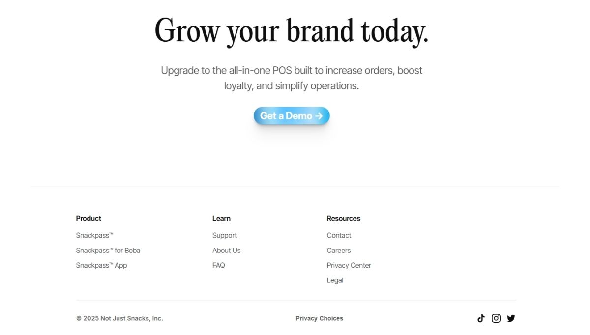
Snackpass, for instance, keeps its footer light yet functional, linking directly to policies and support pages.
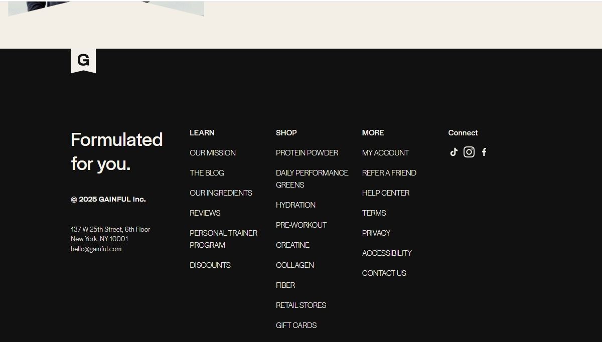
Gainful takes a more structured approach by adding newsletter sign-up and social links for continued engagement.
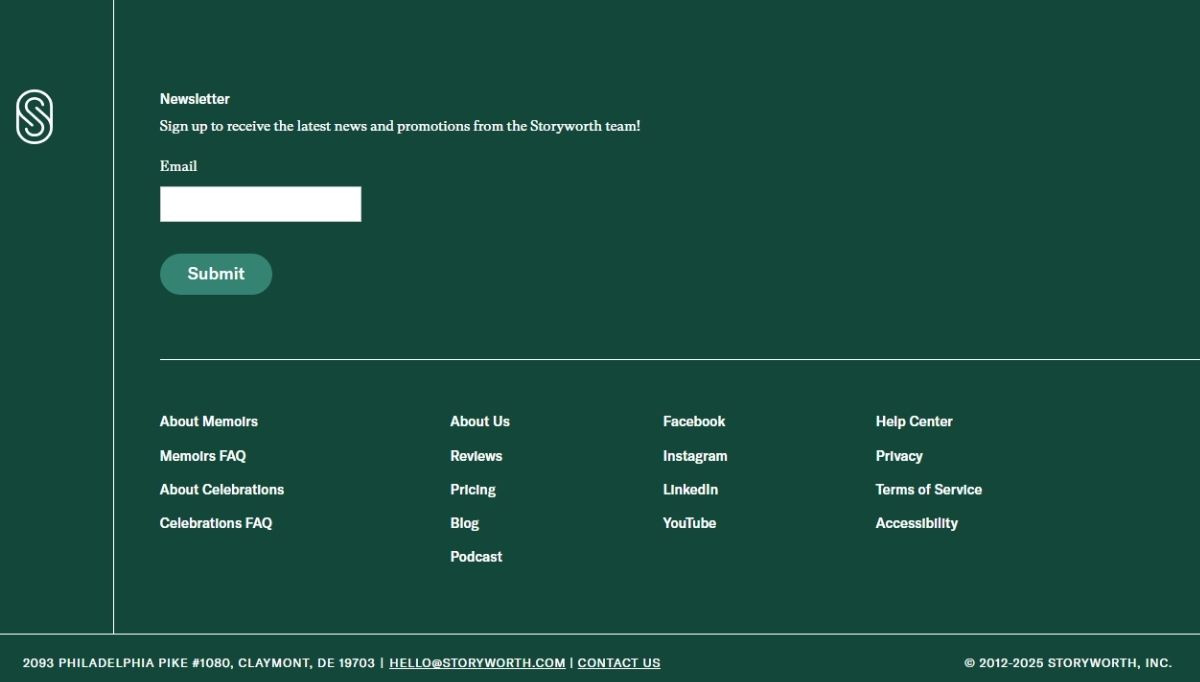
Storyworth’s website footer blends branding with navigation. It reinforces trust while giving visitors everything they need at a glance.
The Bottom Line
At the end of the day, you don’t have to cram in features to make your website stand out. The goal should be to create an experience that feels natural, helpful, and easy to navigate. The basics are there to guide people, but it’s how you piece them together that matters.
A thoughtful layout, clear messaging, and small touches of personality can turn an ordinary page into one that people actually enjoy spending time on. And if you’re new to this, website builders are perfect for beginners for putting these fundamentals into practice without needing to be a pro.
