Designing a logo is only half the job. The real challenge is making sure it never loses its identity when placed on different backgrounds, colors, and surfaces.
A logo doesn’t get to choose where it will appear, so it needs to be ready for anything. Whether it’s going on a website, a coffee cup, a dark T-shirt, product packaging, or a social media post, it should look just as clear and recognizable every single time. Yet many logos are designed with only one background in mind, which leads to awkward fixes later. Suddenly, text disappears, colors clash, or important details get lost. That’s why experienced designers think about different backgrounds from the very beginning, not after the logo is finished. In this guide, you’ll learn the simple design choices that help a custom logo stay sharp, readable, and consistent wherever your brand appears.
Why Background Compatibility Matters
A logo isn’t judged only by how it looks in a presentation or on a designer’s screen. It’s judged by whether people can recognize it instantly, no matter what’s behind it. If the background competes with the logo, recognition drops. A dark wordmark on a dark surface blends in. A light icon on a white background almost disappears. Even a beautiful color palette can lose its impact if there’s not enough contrast.
This is why background compatibility has become an essential part of logo design rather than a final adjustment. Many websites now offer both light and dark mode, so a single version of a logo isn’t always enough. Print brings its own challenges too, since paper colors, finishes, and materials can slightly change how colors appear.

Some of the world’s most recognizable brands are built with this flexibility in mind. Apple‘s logo is rarely tied to one specific color. You’ll see it in black, white, silver, or embossed directly into a product, yet the shape is unmistakable.

Spotify takes a similar approach by using different logo variations depending on the interface while keeping its familiar icon and proportions consistent. The lesson is simple. A strong logo doesn’t depend on the background to look good. It works because the design itself is clear enough to adapt.
Step 1: Build Your Logo in Black and White First
Before you start thinking about colors, gradients, or special effects, strip everything back to black and white. It may seem less exciting, but this is where you’ll find out if your logo is actually strong. If people can recognize it without color, you’ve built a solid foundation. If it only works because of bright colors or effects, the design probably needs more work.
A good logo should be recognizable from its shape alone. That’s why designers pay close attention to the silhouette, spacing, and overall balance before choosing a color palette.
Think of the Nike swoosh. Remove the black, swap it for white, or print it in a single ink, and it’s still instantly recognizable because the shape carries the brand.
This is also where the conversation around monochrome vs multicolor logos becomes important. A monochrome version isn’t just a backup for printing. It’s a simple way to test whether the design can stand on its own.
Pepsi‘s globe remains recognizable even without its signature red and blue, although the colors certainly strengthen its identity.
NBC‘s peacock tells a different story. Without its colorful feathers, much of the visual personality is lost, making the logo less distinctive. That’s why the strongest logos never rely on color alone to be remembered.
Step 2: Keep the Core Shape Simple
Once your logo works in black and white, the next step is making sure the shape itself is easy to recognize. Simple doesn’t mean plain or forgettable. It means every line has a purpose. As logos get smaller, whether in a website header, app icon, or favicon, fine details and thin strokes are often the first things to disappear.
This is also where shape psychology comes into play. Rounded shapes tend to feel approachable and friendly, while sharp angles can communicate strength, precision, or energy. Choosing the right shape helps reinforce your brand before anyone even reads the name.
Look at Airbnb‘s Bélo symbol. It uses clean curves, balanced spacing, and very little detail, yet it’s recognizable even at small sizes.
Shell‘s iconic shell is another great example. Over the years, the company has gradually simplified the illustration, removing unnecessary details while keeping the shape people already knew. The result is a logo that feels just as strong on a billboard as it does in a tiny app icon.
Older logos often tell the opposite story.
Earlier versions of the Starbucks logo featured a more intricate illustration, extra text, and decorative elements around the siren. While visually interesting, those details became harder to read at smaller sizes, which is one reason the brand gradually simplified the design over time.
Step 3: Test Your Logo on Every Background Before Calling It Finished
A logo isn’t really finished until you’ve pushed it beyond the perfect white artboard. One of the easiest ways to spot problems is to place it on a variety of backgrounds before signing off on the final design. This simple habit can reveal issues with contrast, readability, and spacing that you might otherwise miss.
As a final check, test your logo on:
- A white background
- A black background
- A gray background
- Your primary brand color
- A busy photograph
- A patterned background
- A transparent website header
- A mobile app icon
Well-known brands do this exceptionally well. Adidas switches between black, white, and single-color versions without changing the familiar three-stripe identity.
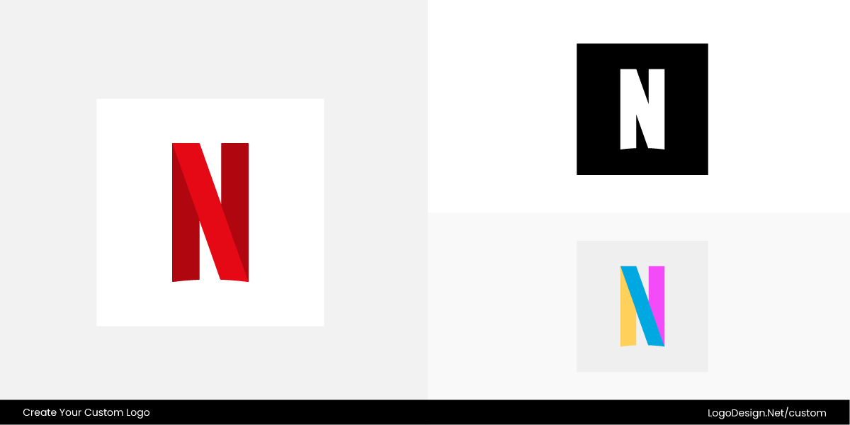
Netflix often uses its red "N" on black, but you’ll also find white and black versions across different marketing materials, where the shape remains just as recognizable.
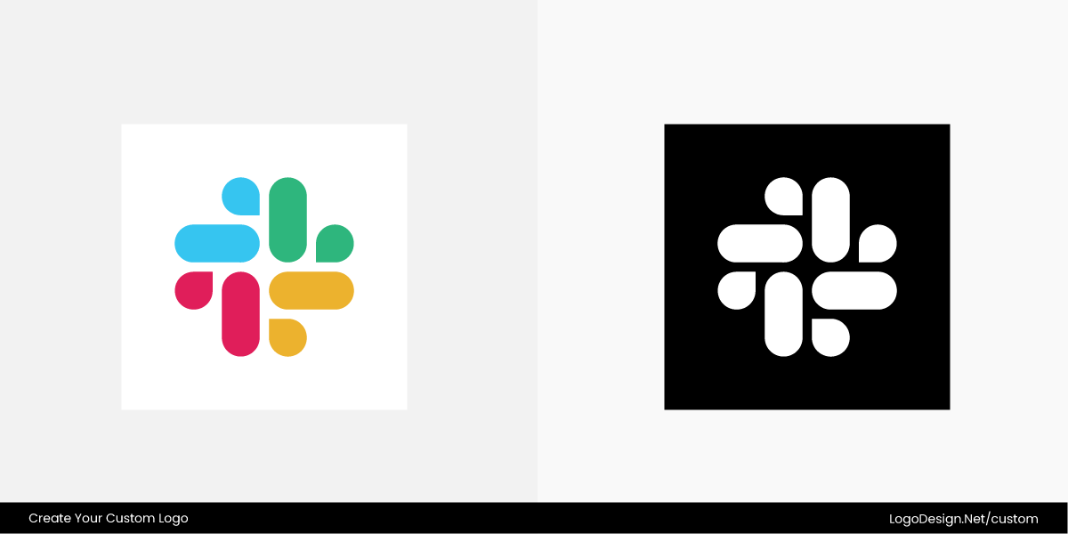
Slack is another good example. Its colorful symbol appears in full color when there’s enough contrast, but simplified monochrome versions are used when the background demands it.
If your logo still looks balanced, readable, and recognizable after this test, you’re designing for the real world, not just the design canvas.
Step 4: Create Light and Dark Logo Versions
Once you’ve tested your logo on different backgrounds, you’ll quickly realize that one version won’t cover every situation. That’s why professional brands create a small set of approved logo variations instead of relying on a single file. The idea isn’t to redesign the logo each time. It’s to make sure the same identity stays clear and consistent wherever it’s used.
A complete logo package should include:
- Full-color logo: Your primary version for websites, marketing materials, and everyday branding.
- White logo: Best for dark backgrounds where the standard logo would lose contrast.
- Black logo: Ideal for light backgrounds, official documents, and simple print applications.
- One-color logo: Designed for embroidery, engraving, stamps, merchandise, and any production method limited to a single ink or color.
Avoid the temptation to simply invert the colors and call it done. Every variation should be tested to make sure the logo remains balanced and readable.
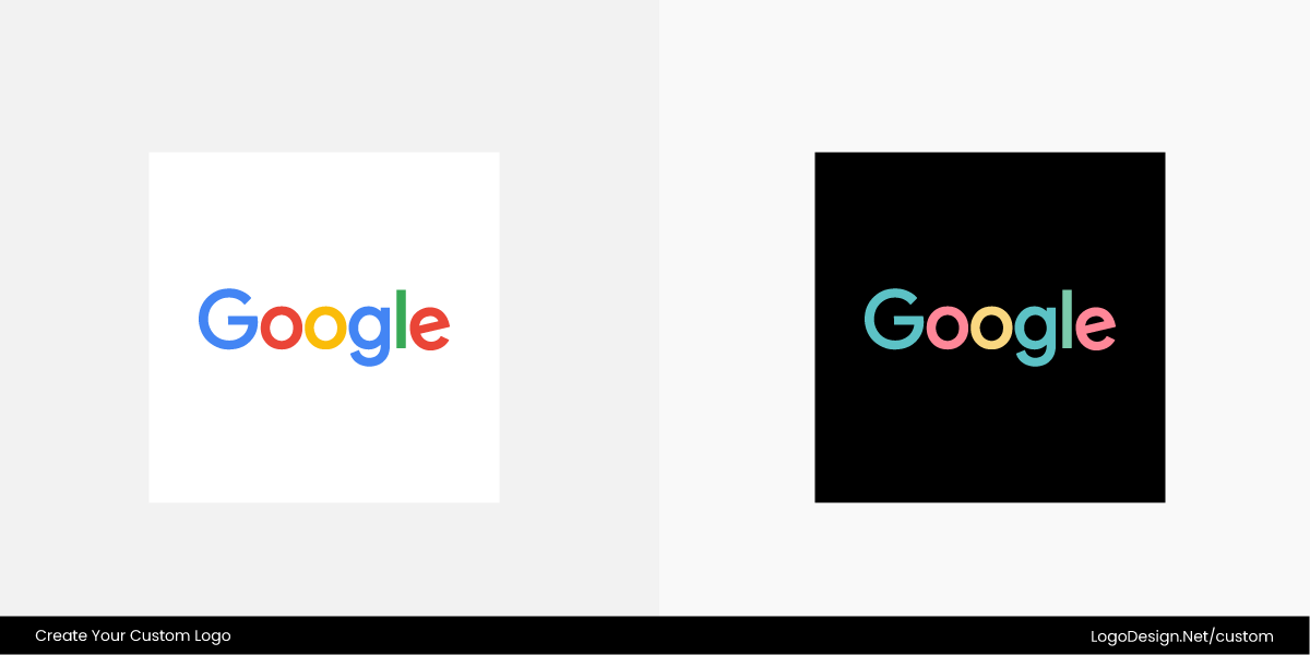
You can see this approach in many well-known brands. Google provides official assets that include full-color, white, and monochrome versions for different environments.
Microsoft follows detailed brand guidelines that specify exactly which logo variation should be used on light and dark backgrounds.
FedEx does the same, ensuring its famous hidden arrow remains visible and recognizable whether the logo appears in full color or a single color.
Step 5: Use Contrast Instead of More Colors
When a logo starts disappearing into the background, the solution usually isn’t adding more colors. In fact, extra colors can make the design feel cluttered and inconsistent. A carefully planned brand color palette paired with good contrast almost always produces better results.
Contrast plays a big role in visibility and readability. If your logo blends into the background, people have to work harder to recognize it, and that’s the last thing you want. Instead of introducing another color, try improving the separation between the logo and its surroundings. A thin white outline can help on dark or busy backgrounds, while a dark outline works well on lighter surfaces. In some cases, a subtle shadow or a solid background badge can give the logo enough breathing room without changing the design itself.
You can see this approach in action with several well-known brands. NASA‘s famous "worm" logo relies on a bold, single-color design that remains highly legible because of its strong contrast.
The North Face often switches between black and white versions depending on the background while keeping the design unchanged.
Patagonia also adapts its logo across labels, apparel, and digital platforms by using contrast instead of unnecessary colors, making sure the iconic mountain silhouette always stands out.
Step 6: Design for Photos, Not Just Solid Colors
By this point, your logo should work well on solid backgrounds. Now it’s time to test it on something much less predictable: photographs. This is where many logo color mistakes become obvious. A logo that looks crisp on a plain background can easily get lost against a busy image with varying colors, shadows, and textures.
Think about where your logo might appear, such as website hero banners, social media graphics, video thumbnails, or event photography. Instead of forcing the logo directly onto the image, give it a little help. A solid badge creates a clean backdrop, while a semi-transparent overlay can improve readability without hiding the photo. You should also pay attention to safe placement and padding so the logo isn’t competing with faces, text, or other visual elements.
Many brands already follow these logo principles. Adobe often places its logo inside a clean red square, making it easy to spot even when it’s layered over promotional images.
Red Bull carefully positions its logo in open areas of action photography instead of placing it over busy subjects.
National Geographic relies on its simple yellow frame and generous spacing, allowing the logo to remain recognizable even when surrounded by striking, colorful imagery.
Step 7: Think Beyond Screens
It’s easy to judge a logo by how it looks on a computer screen, but that’s only part of the story. Sooner or later, it may need to be embroidered on a uniform, laser engraved onto metal, stamped in foil on packaging, printed as a sticker, wrapped around a vehicle, or added to promotional products. Each of these production methods has its own limitations, and not every logo is built to handle them.
The biggest challenge is fine detail. Thin lines, tiny text, and intricate patterns often disappear or become blurry when they’re stitched, engraved, or printed at small sizes. A design that looks sharp on a high-resolution display can quickly lose its clarity once it’s produced in the real world.
Brands with long-lasting logos understand this well. Rolex keeps its iconic crown bold enough to remain recognizable on everything from watch dials to premium packaging.
Lacoste‘s crocodile has been refined over the years, so it still looks clean when embroidered on clothing.
Caterpillar also uses a strong, uncomplicated wordmark and symbol that reproduces consistently across heavy machinery, workwear, decals, and large vehicle graphics without losing its impact.
Step 8: Save Your Logo in the Right File Formats
You’ve put time into designing a logo that works on every background, so don’t let the wrong logo file format undo all that effort. Different platforms and printing methods require different file types, and sending the wrong one can lead to blurry graphics, missing transparency, or poor print quality.
Here’s what your final logo package should include:
- SVG: Perfect for websites because it scales without losing quality.
- PNG: Ideal for digital use, especially when you need a transparent background.
- Transparent PNG: Great for presentations, social media, and marketing materials where the logo needs to sit cleanly on different backgrounds.
- PDF: A reliable choice for brochures, flyers, and most print projects.
- EPS: Preferred by many professional printers for large-format and high-quality printing.
- JPEG: Best used only when transparency isn’t needed, such as documents or simple previews.
- AI source file: Your editable master file for future updates or design changes.
Keeping these files organized means you’ll always have the right version ready, whether you’re updating a website, ordering merchandise, or sending artwork to a printer.
A Quick Background Compatibility Checklist
Before you call your logo finished, give it one final review. Whether you’re working with a designer or creating your own, this checklist can help you spot problems before they become expensive fixes. It’s also a useful addition to your custom logo design brief, since it sets clear expectations for how the finished logo should perform across different applications.
Ask yourself these questions:
- Does it still look recognizable in black?
- Does it work just as well in white?
- Is it clear and readable at 24 px?
- Can it stand out on top of a photograph?
- Does it work in both light mode and dark mode?
- Will the details hold up when embroidered?
- Is it still recognizable when printed in a single color?
- Does it look good on product packaging?
- Can it work without gradients?
- Can it stand on its own without shadows or special effects?
If you can confidently answer "yes" to every point, you’ve created a logo that’s built for more than just a mockup. It’s ready for real-world use.
Design a Logo Ready for Any Background
The best logos aren’t the ones with the most colors or the fanciest effects. They’re the ones that stay recognizable wherever they appear. By keeping the design simple, testing it in different environments, and preparing the right file versions, you’ll end up with a logo that’s ready for everyday use, from websites to packaging and everything in between.
Ready to create one of your own? Design a logo that works everywhere with LogoDesign.Net’s logo maker and bring your brand to life in just a few clicks.