You’ve been calling it a font all along… but was it really? Time to settle the age-old mix-up that designers secretly roll their eyes at.
The words font and typeface may be considered similar or almost the same. They are used in everyday conversations about text and design. But the difference between the two is quite a lot and goes much deeper than most people realize.
It’s easy to see why the terms get confused. When it comes to typography in logos or branding, font and typeface appear very closely together. As we work with design tools and web platforms, intermixing the two becomes quite common. But understanding these terms and knowing when to use each can make a huge difference in graphics.
So let’s break down the true meaning of font and typeface, and help you understand where to use them.
Font and Typeface: Clearing Up the Basics
While they are definitely related, understanding the true meaning is key. Once you know what each one means, you can pick font styles to influence brand perception in the right way.
Here’s the simple definition and some examples to clarify.
What is a Typeface?
This is a complete set of characters, including letters, numbers, and symbols, all in the same visual style. Think of this as a family that shares a similar appearance. Typefaces include different fonts that represent their own weights, sizes, or styles.
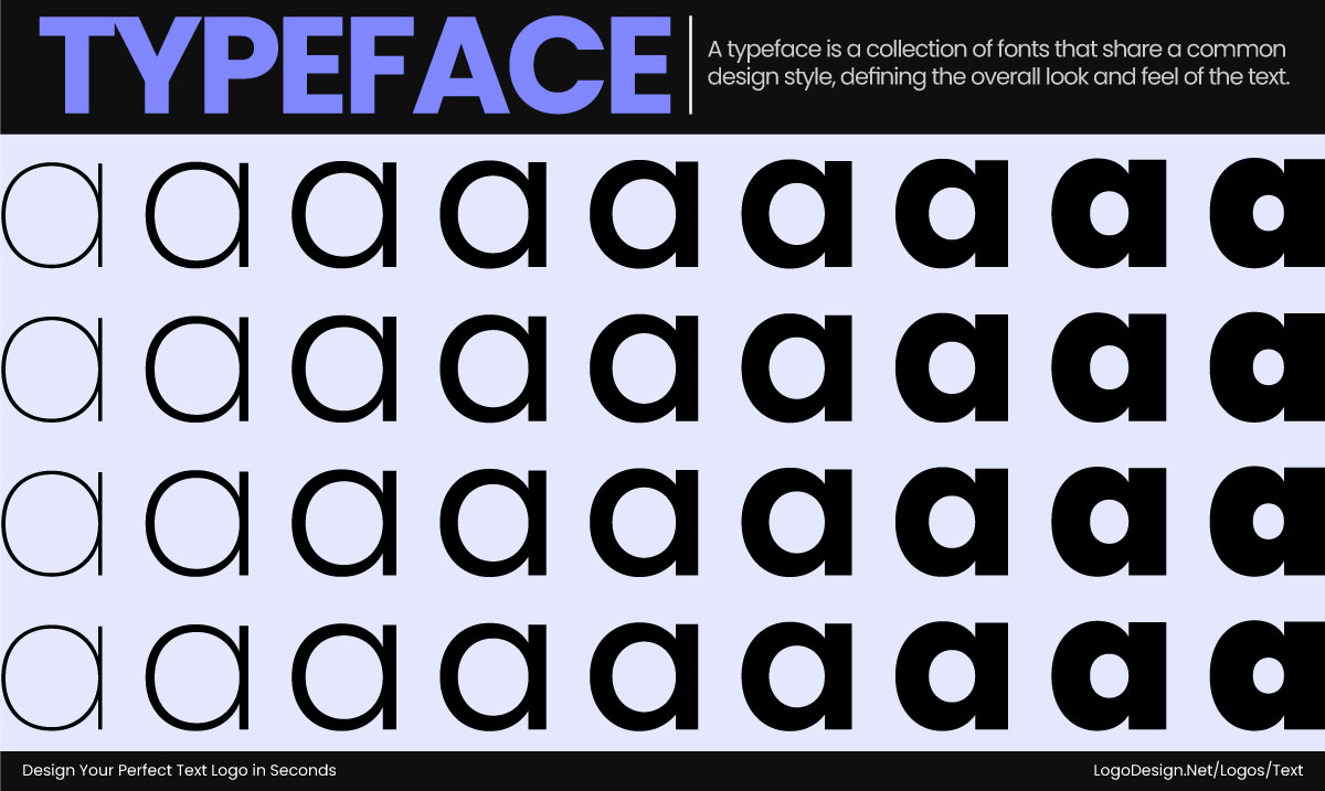
The typeface is a combination of fonts with a similar design to improve the look and feel of the text
So it’s a family where each member has their specific roles, such as regular, bold, italic, or light. They work together but have different purposes as context changes.
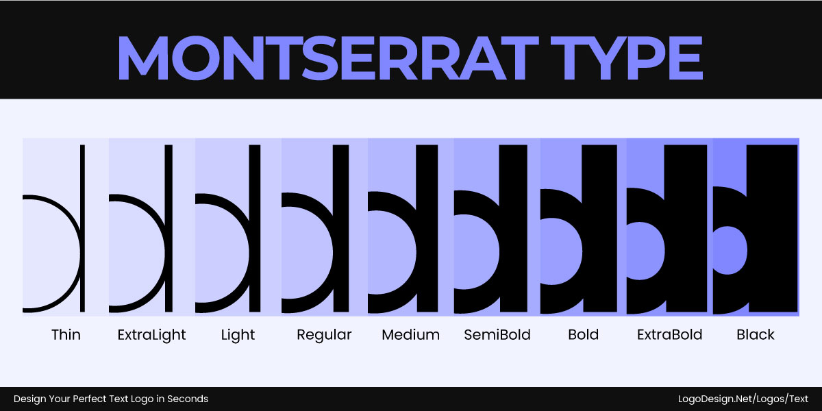
The different styles of the Montserrat typeface, from thin to black, build a consistent feel
• Montserrat – The Typeface
The typeface is Montserrat, created in 2010 by Julieta Ulanovsky in Buenos Aires and later expanded through the Google Fonts project. It includes individual fonts like Montserrat Regular, Montserrat Bold, or Montserrat Light—different styles that all belong to the same cohesive family.
What is a Font?
Now, it’s been mentioned above how both terms differ. Let’s break this down further here so it’s easier to keep in mind. While a typeface is used for an entire set of letters or numbers, a font is the variation of that design. So it’s how your text appears when displayed in specific weights and sizes.
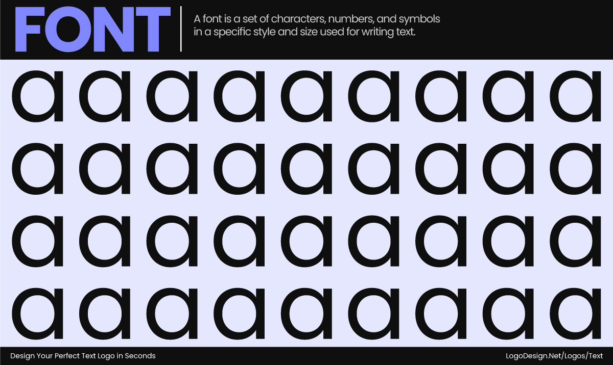
Fonts are a set of characters and numbers of different weights that deliver a message
In the history of typography in branding, the term ‘font’ referred to the physical set of metal blocks used for printing. For letterpress printing, metal blocks would be used in different sizes and weights of a typeface. Today, it’s all about looking for digital fonts that help you stay true to your core message.
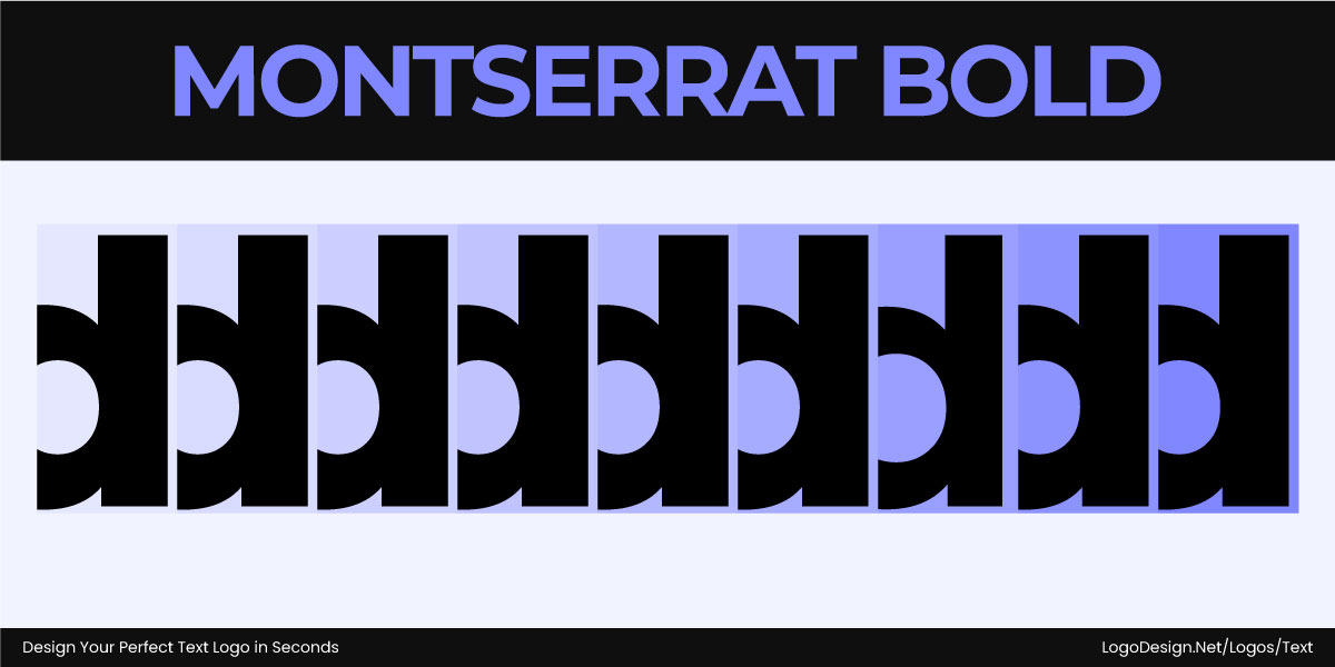
The Montserrat bold fonts, with heavy strokes, that show authority
• Montserrat – The Font
Montserrat Regular, Montserrat Bold, and Montserrat Italic are specific fonts within the Montserrat typeface. Regular serves as the standard weight, Bold provides stronger emphasis with a heavier stroke, and Italic offers a slanted style for highlighting or adding contrast in text.
Font vs. Typeface: Breaking Down the Key Differences
A typeface defines the overall brand identity, while a font, whether serif or sans serif, brings that style into a format that can be used.
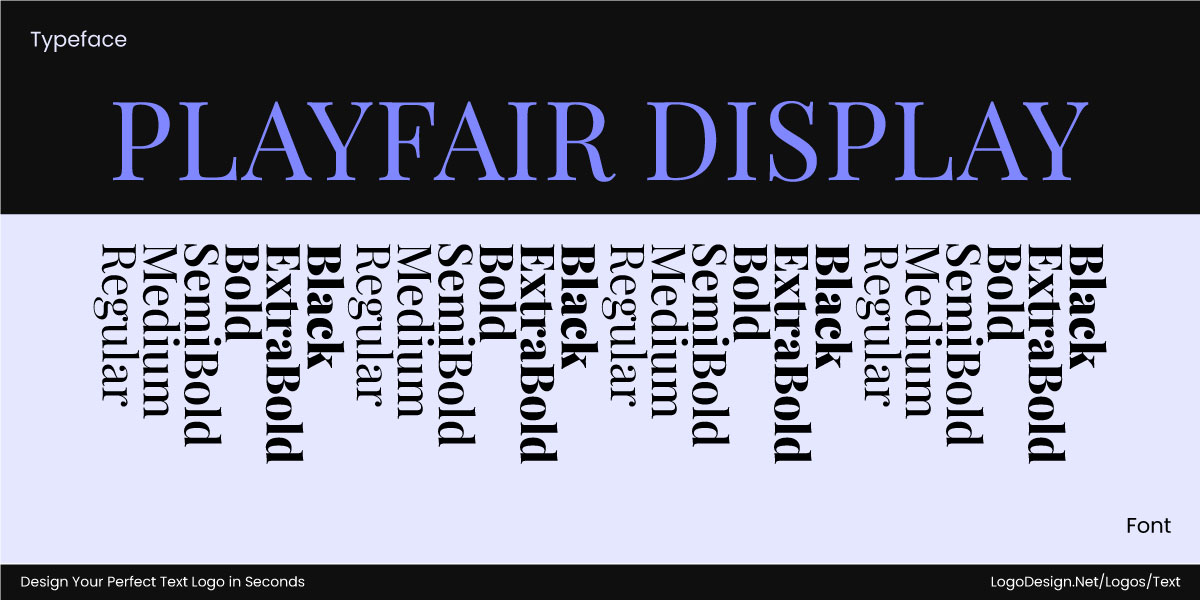
Different styles of the Playfair Display fonts communicate different messages
Here are five key differences that you need to keep in mind.
• Scope: The Big Picture vs. the Details
A typeface works at a high level and showcases the aesthetic of letterforms. So you’ll find it giving a cohesive identity to an entire family of fonts. Think of some of the most famous letterform logos you have come across. The typeface brings the design together. When a designer chooses a typeface, they are selecting the core of the text, its curves, proportions, and mood.
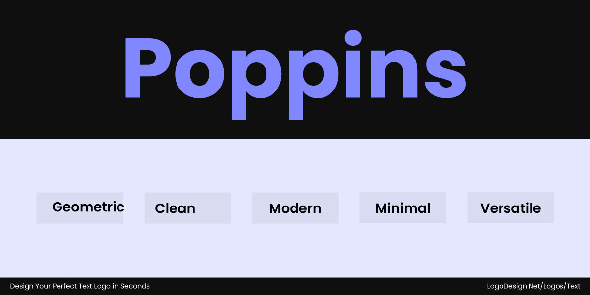
Poppins is a clean and neutral typeface that’s used to display diversity, can be used across industries
For example, Poppins, as a typeface, is known for its clean, neutral, and versatile design that works across most industries. The foundation remains the same regardless of whether it appears as bold, italic, or light.
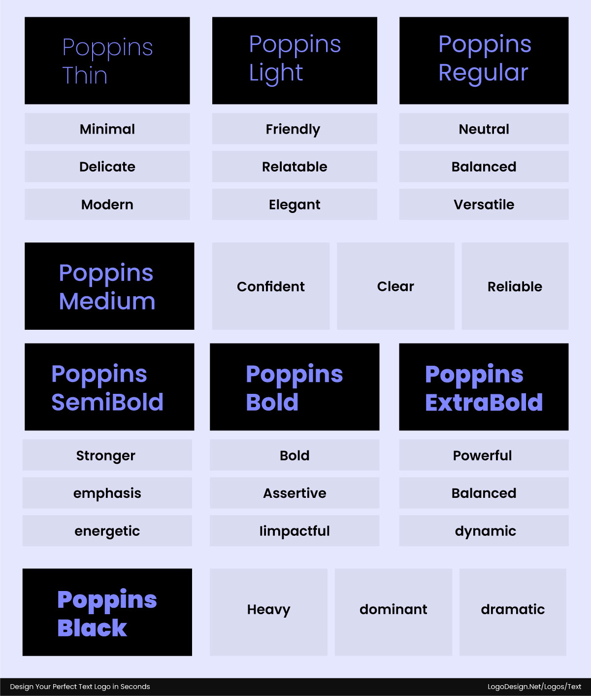
Different styles of the Poppins fonts with different meanings and can be used by various brands
As you choose fonts, the scope narrows and becomes more precise. They include all the variations within a typeface that a designer or printer uses. The light or bold format is considered your font style. This takes the general design of Poppins but applies a particular weight and size. So for logos, web design, and printing, a typeface represents an idea, and a font is the tool used to implement it.
• Versatility: One Family, Many Looks
Typefaces are designed to provide flexibility and versatility by offering multiple styles and weights. Within one typeface, you may find regular, bold, italic, condensed, extended, light, or black variations. This allows a single typeface to work with different requirements without losing its appearance. The Roboto typeface has a range of variations, from ultra-thin to extra-bold, and designers can use it to draw attention anywhere.
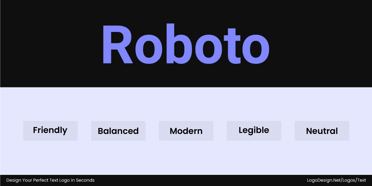
The Roboto typefaces have a friendly and modern look to draw attention to the viewers
Fonts are quite specific, so if you pick a style, you should stick to it to avoid common typography mistakes.
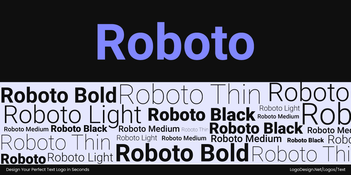
Different styles of the Roboto typeface, with different weights and sizes, are used to display various messaging
In a way, there is less flexibility or versatility to change the way it’s displayed. Instead of considering Roboto as a whole, a font focuses on one choice, such as Roboto Thin Italic at 14pt. That single font shows all the properties like style, weight, and size that make it distinct from the others in the set.
• Design vs. Application
Typefaces are chosen during the conceptual phase of design. They set the mood, tone, and voice of the brand.
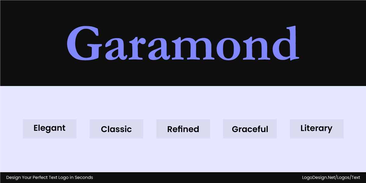
The Garamond typeface is used to display an elegant and graceful appeal that shows personality
For example, Garamond as a typeface highlights elegance and tradition, making it one of the top fonts for logo design. The main category shows the personality on a bigger scale, helping businesses and designers make an impact on the viewers within seconds. Selecting a typeface requires careful consideration, as it will play a key role in how your brand will be perceived for a long time.
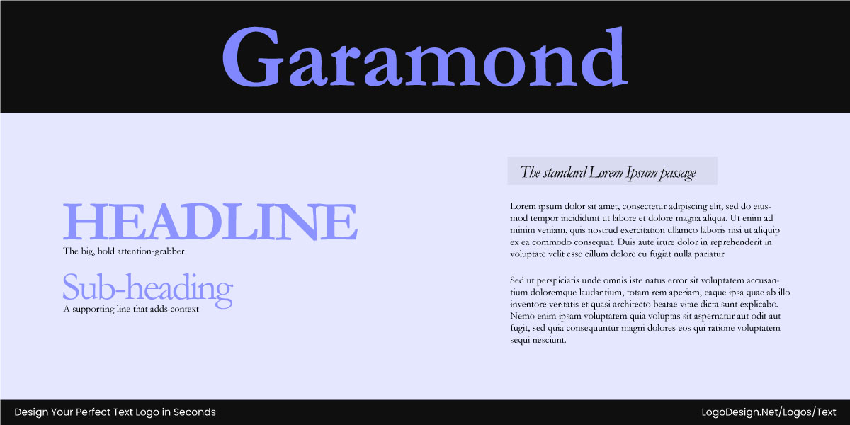
The Garamond typeface is used for headlines, grabbing attention, and subheadings, that adds context
Fonts come into play when finalizing the actual design. Once a typeface is chosen, the next thing is to decide which font variations will be used in which context. So Garamond Italic may be used for a tagline while Garamond Regular is chosen for the brand name and website headlines. This way, it’s easier to ensure that your content is functional and relevant to the core of the brand as well. Consider the font as a practical application of a typeface, turning abstract brand tone into readable, usable text.
• Consistency: A Unified Look
By choosing one typeface across all branding materials, businesses can maintain consistency in all external and internal communications.
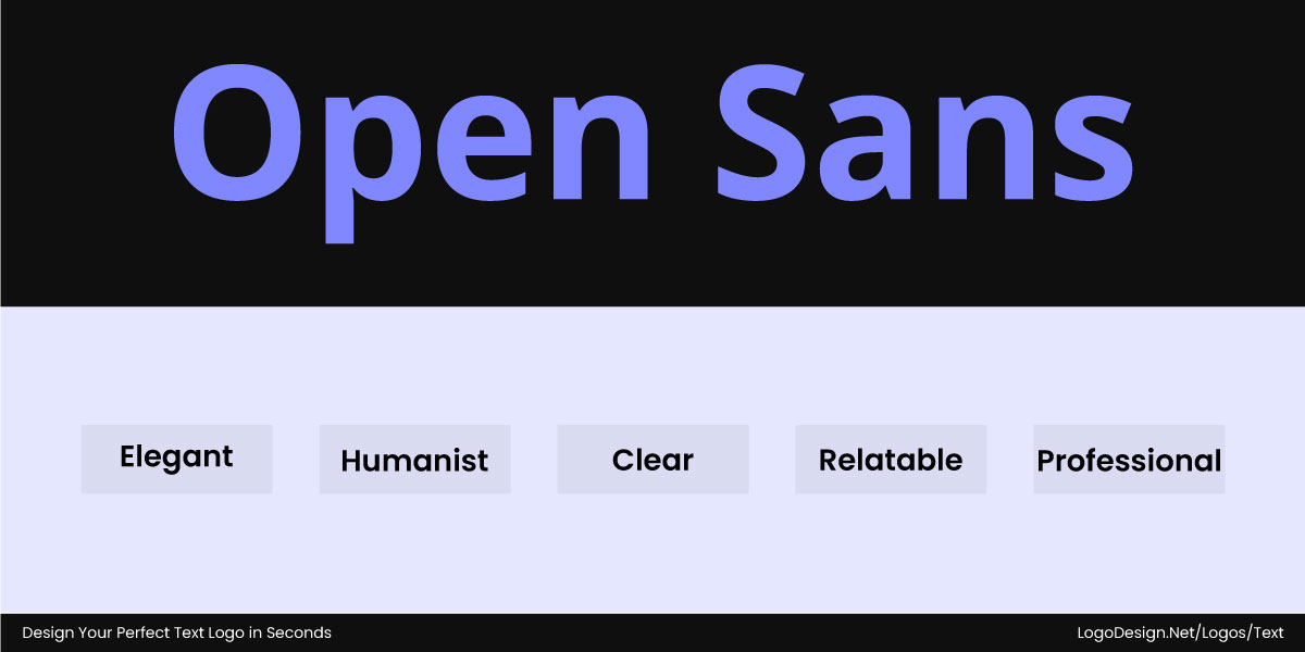
The Open Sans typeface gives a clutter-free look and a professional feel
For instance, using Open Sans everywhere as the typeface helps the audience associate it with the brand. The typeface sets the tone of voice for the brand, so no matter where the text appears, it feels familiar and is a pillar of the brand identity.
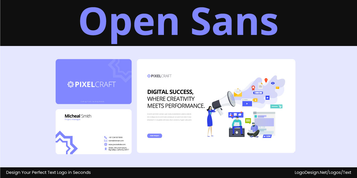
Open Sans typeface is used to enhance readability on websites and other platforms
Fonts then work within that typeface to establish visual hierarchy while still preserving the brand’s consistent look. Open Sans Bold could be used to enhance readability in logo while Open Sans Regular might be used for body text on the website. These font choices help guide the reader’s eye without confusing the viewer about the typeface. In this way, fonts create a visual differentiation while the typeface keeps harmony.
• Granularity: Zooming Into the Details
Typefaces represent the family, the overall system that designers can refer to in brand guides.
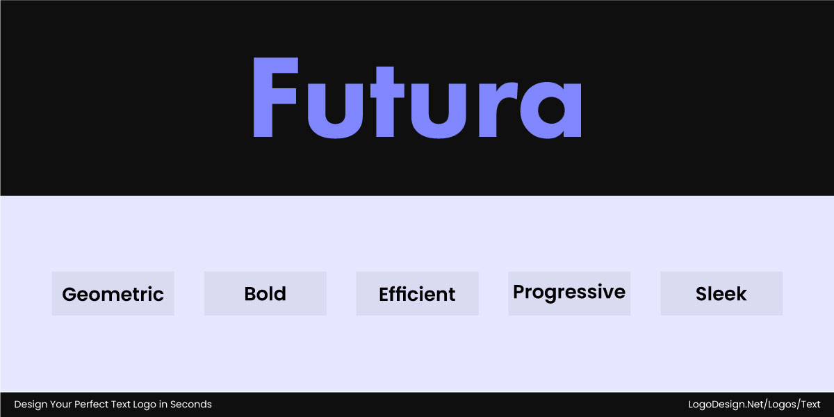
The Futura typeface gives a bold appeal to communicating a single message
For instance, the style guide might say that all brand communications use the Futura typeface to communicate the main message. This helps them define the element without focusing on a single possible variation beforehand.
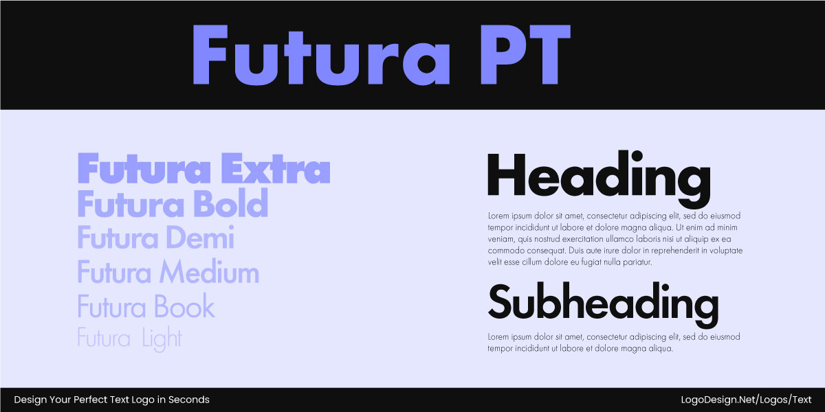
Different styles of the Futura PT typefaces used for headings and subheadings
Fonts are more granular tools as they go into each tiny detail. With a certain font, you know exactly what will be used in design or print, with weight, style, and size given. A designer working with a logo generator tool doesn’t simply say add the font Econimica. They set it to Economica Bold Italic 18pt. Without this granularity, a typeface would be considered as a whole set and quite abstract.
When People Say “Font,” But Really Mean “Typeface”
When people say font, they’re usually talking about a typeface, without even realizing it. The mix-up is so common that it slips into everyday conversations, design briefs, and even branding discussions. To show you how often this happens, here are a few classic examples.
| What People Say | What They Mean |
| “I love the font Garamond.” | “I love the typeface Garamond.” |
| “Our logo uses the Helvetica font.” | “Our logo uses the Helvetica typeface.” |
| “Can you switch this to the Arial font?” | “Can you switch this to the Arial typeface?” |
| “That headline looks better in the Futura font.” | “That headline looks better in the Futura typeface.” |
| “The website uses the Roboto font.” | “The website uses the Roboto typeface.” |
| “I changed the font to Times New Roman.” | “I changed the typeface to Times New Roman.” |
Font vs. Typeface in Action: Where the Difference Really Shows
Understanding the practical application of fonts and typefaces can help you make informed choices for readability and brand recognition across both digital and print media.
1. Logos: Picking the Personality, Not Just the Style
In logo design, a typeface gives a brand its voice. It decides whether the mood feels modern, elegant, or playful. The font takes it a step further by adjusting how the voice comes across. A bold cut might make the logo feel strong and assertive, while a thinner weight can soften it, adding a sense of creativity and openness. Typeface and font together shape the brand’s personality and turn simple text into custom typography for the logo.
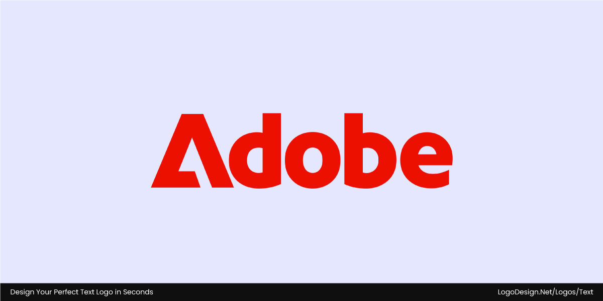
The wordmark logo of Adobe, which is used to display a modern and professional feel to signal authority
The Adobe logo uses its custom Adobe Clean Display typeface for a modern, professional feel, with a bold font on the wordmark to signal authority and innovation.
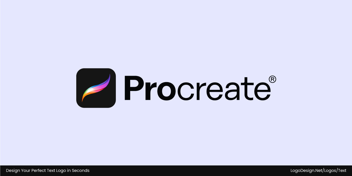
The Procreate logo uses bold and light fonts to show reliability
The Procreate logo, on the other hand, balances bold and light fonts to blend reliability with creativity—perfect for a digital art tool. Together, typeface and font turn simple text into a distinct brand identity.
2. Social Media and Graphics: Consistency Across the Brand
When you’re designing graphics for social media or marketing campaigns, start by thinking about how your audience will see it. The typeface sets the overall feel and recognition, while the font gives you room to adjust. A bold version can grab attention in a post, while a lighter variation works perfectly for captions or supporting text that guides the eye.
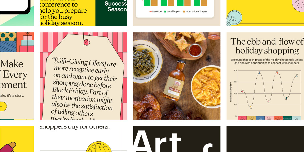
Mailchimp uses a combination of bold and light fonts that gives a playful appeal across campaigns – facebook.com/mailchimp
Take Mailchimp’s graphics as an example—the chosen typeface, with its bold and light font variations, highlights the brand name while keeping the design playful and distinctive across campaigns.

Patreon uses a sans-serif typeface that gives an approachable feel across different-sized platforms – facebook.com/patreon
Similarly, Patreon’s social visuals use a geometric sans-serif typeface that looks simple and approachable, while font variations across app icons, posts, and promotional materials ensure the identity feels cohesive yet adaptable.
3. Websites: Flexible Systems for Screens
In the context of websites, the difference between typeface and font is technical and directly affects how a site looks and feels. A typeface like Roboto or Garamond sets the overall voice of the design, while fonts such as Roboto Bold, Italic, or Light bring that voice to life in specific places—headlines, buttons, menus, or body text. Designers typically set typefaces in CSS using font families, then refine hierarchy and emphasis through weights and styles.
They also have to balance practicality with personality: web-safe options like Arial or Georgia work everywhere, while custom fonts from Google Fonts or Adobe Fonts add character but need proper setup to avoid slowing things down.
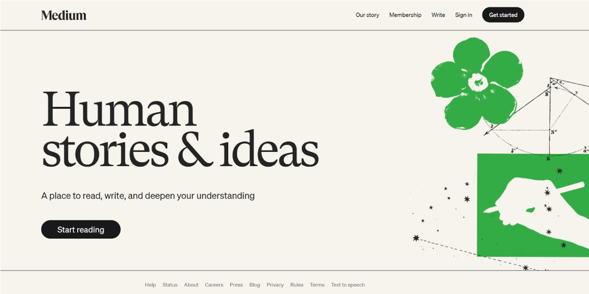
Medium’s custom serif font balances elegance and readability, with different weights for headlines and body text.
For example, Medium uses a custom serif typeface to make long-form reading both elegant and comfortable, while its fonts vary in weight to distinguish headlines from article text.
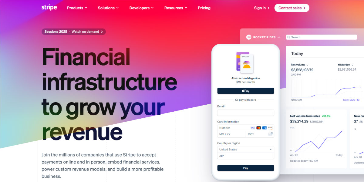
Stripe uses clean sans-serif typefaces and font weights to create a clear, professional digital appeal.
Stripe, on the other hand, relies on a clean sans-serif typeface with carefully chosen bold and light fonts to create a professional, user-friendly hierarchy across its product pages. These choices show how typefaces set the brand’s digital voice, while fonts refine clarity, usability, and flow on screen.
4. Print: Balancing Form and Function
In print design, typeface and font work hand in hand to shape both personality and readability. The typeface sets the tone—formal, modern, or elegant—while the fonts within that family create structure through different weights and sizes. When used consistently, they keep layouts clear and polished. But if the mix is off, the result can feel messy and distracting.
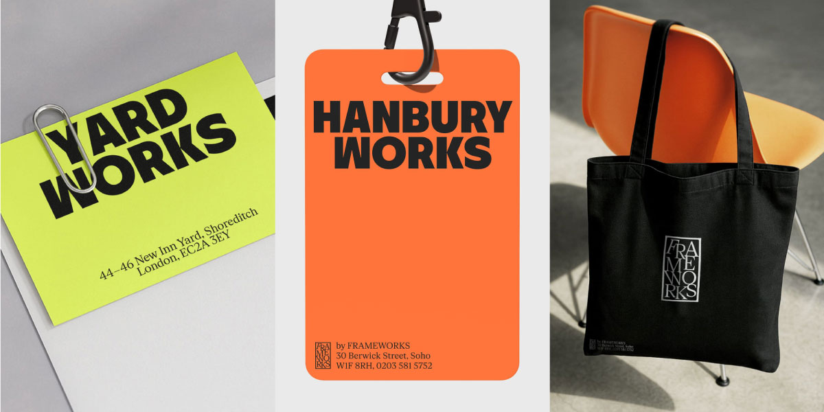
Frameworks use consistent typography across print materials, bold for headings and light for body text.
Take Frameworks as an example. From business cards and stationery to tote bags and lanyards, they stick to one typeface with clear rules: bold for headings, lighter weights for body text. That consistency keeps everything professional, balanced, and instantly recognizable across their printed materials.
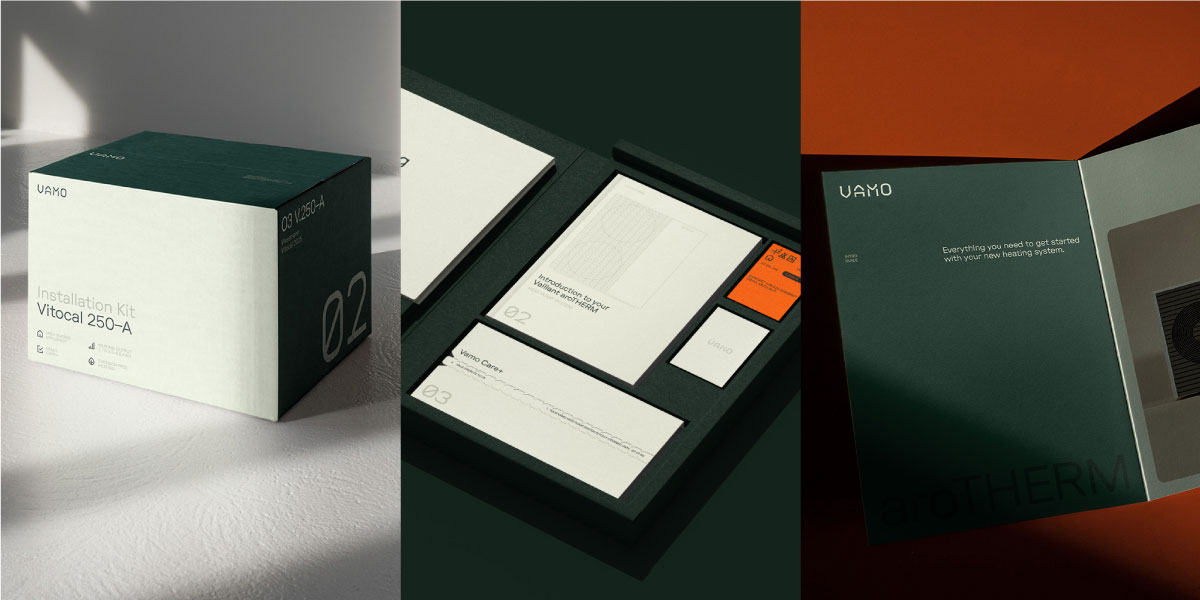
VAMO’s design balances bold clarity with elegance across packaging and print, ensuring readability
In its packaging, welcome kits, and leaflets, VAMO uses its typeface family to strike a balance between elegance and clarity. Important messages stand out in bolder fonts, while supporting details are kept lighter and smaller. The result is print that’s easy to read yet still carries a refined, polished feel across every touchpoint.
How to Use Typeface + Font to Build a Brand Presence?
Building a strong brand presence isn’t about choosing typeface or font in isolation—it’s about how they work together. The typeface sets the overall voice and personality of the brand, while fonts add the details—through weights, sizes, and styles—that shape hierarchy, clarity, and emphasis across every touchpoint.
Let’s break this down further here.
1. Start with the Typeface for Strategy
The typeface should be chosen before any specific fonts, because it shows the style, emotion, and identity you want to project. Research the audience, industry trends, and your brand’s message and tone (luxurious, friendly, authoritative). Also consider licensing early if you need support for Cyrillic, Arabic, or Devanagari languages. Finally, test the typeface for scalability, as you want the logo to be legible on a billboard and on the app as well.
Consider the following factors:
- Brand personality: Do you want to appear formal, innovative, playful, elegant, or bold?
- Industry relevance: Serif typefaces are common in publishing, law, and academic industries. Sans-serif families work well in tech, startups, and lifestyle brands.
- Cultural context: Certain typefaces have their own associations in different markets. Script ones show tradition in Western branding but might look informal in Asian countries.
- Medium adaptability: Will this typeface work well as a favicon and on social media?
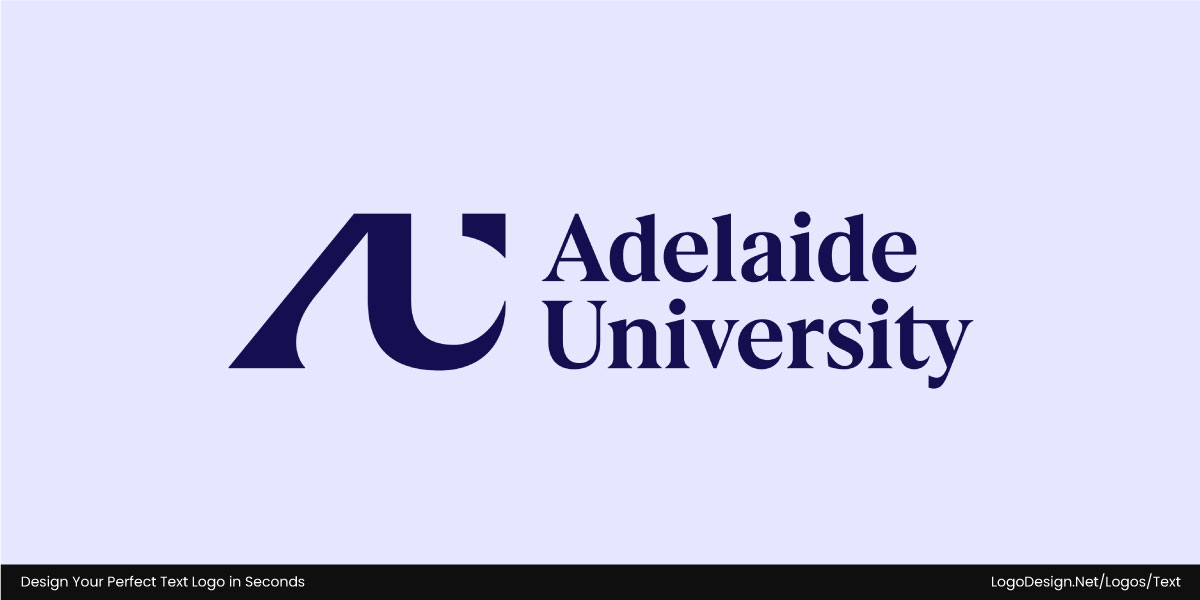
Adelaide University’s wordmark merges a traditional appeal with a modern look
Adelaide University’s wordmark is set in National 2, a serif typeface with modern refinements that nod to the school’s heritage while reflecting its evolving outlook. It carries tradition and academic weight, but the subtle details keep it feeling current and progressive.
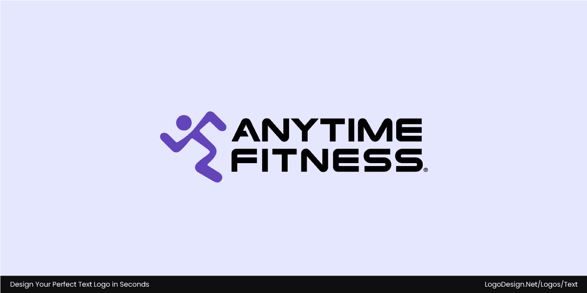
Anytime Fitness logo uses sans-serif for a bold, energetic look with friendly clarity, staying visible across platforms.
In contrast, Anytime Fitness uses a rounded sans-serif that feels approachable, energetic, and full of movement. By shifting between bold for emphasis and lighter weights for support, the brand stays clear and visible across everything from gym signage to digital screens while still feeling friendly and active.
2. Use Fonts for Functionality
Once you’ve chosen the typeface family, fonts help make it function across different materials. Fonts (weights, italics, condensed or extended) are the practical tools designers use to create hierarchy, clarity, and emphasis. Decide which font will work well in logos, H1/H2, body text, captions, and CTAs. A/B test to see which brings in the results you want.
Choose the right font pairings for your logo and branding. Think of something like bold fonts for wordmarks and headings, medium fonts for subheadings, and lighter fonts for web content. Italic or condensed fonts can also add personality to taglines and social media graphics. Keep in mind that a thin font may look great in digital ads but could be difficult to read in small-print product packaging.
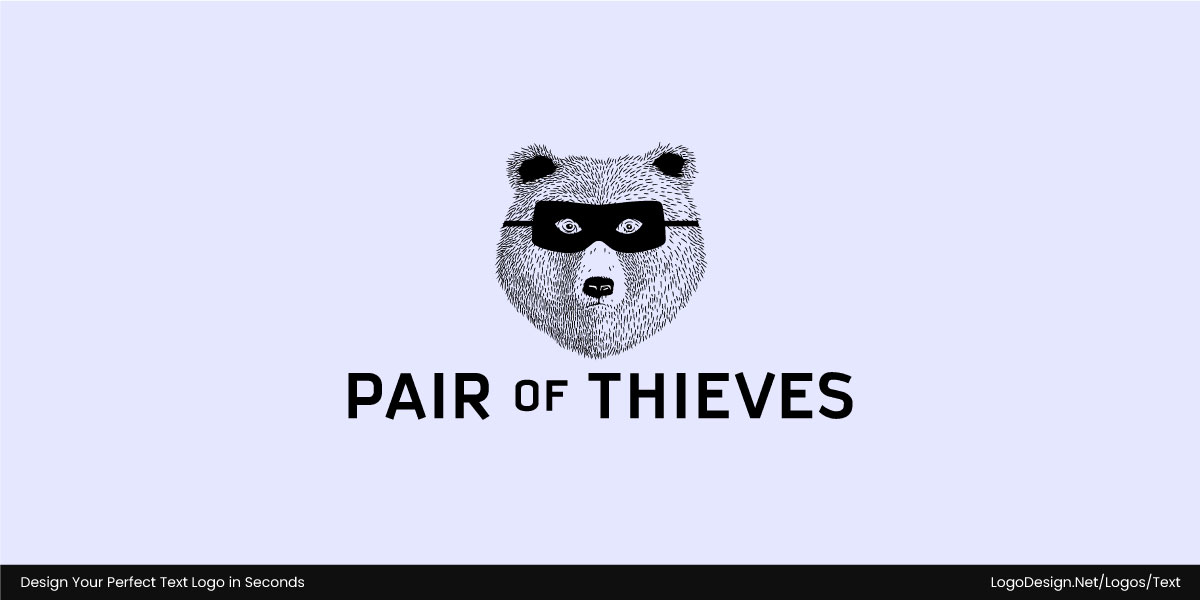
The Pair of Thieves logo uses an all-caps sans-serif typeface for a clean and bold look.
The Pair of Thieves logo uses a clean, all-caps sans serif typeface that gives it a bold, no-nonsense look.
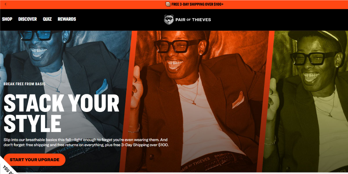
The Pair of Thieves website uses a bold font to make product names and key sections stand out.
On the website, the brand shifts to a bold condensed font to establish hierarchy. It helps product names and key sections pop off the page.

The Pair of Thieves uses bold headlines and sans-serif captions to create a contrast across social media. – Instagram.com/pairofthieves
For social media, that same condensed style is paired with a lighter sans serif for captions and details. The contrast keeps the bold text attention-grabbing while the lighter type supports. This balance makes the brand’s identity feel both consistent and versatile across platforms.
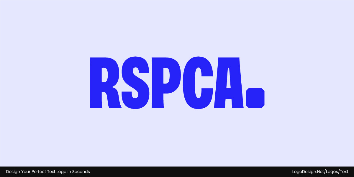
The RSPCA logo in bold Roboto font, showing strength, trust, and compassion.
The RSPCA logo uses an extra-bold Roboto font that gives its wordmark a strong, approachable, and trustworthy character. The bold mark reflects the organization’s authority and compassion.
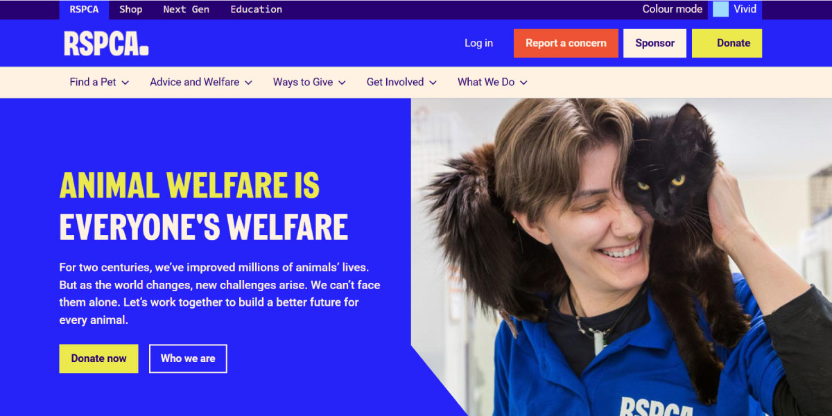
The RSPCA website features Roboto font family, having different weights and sizes, showing the important of each part of text
To keep things consistent, their website sticks with the Roboto family throughout. Bold weights are used for headings to grab attention, while regular and lighter styles handle body copy and supporting text. It’s a simple approach, but it keeps everything clear, professional, and trustworthy for the audience.
3. Focus on Flexibility and Consistency
Typefaces help create a consistent tone of voice, and fonts add expression as well as flexibility to that. If you need to boost recognition across multiple platforms, focus first on the typeface. And then think of enhancing the voice with font styles.
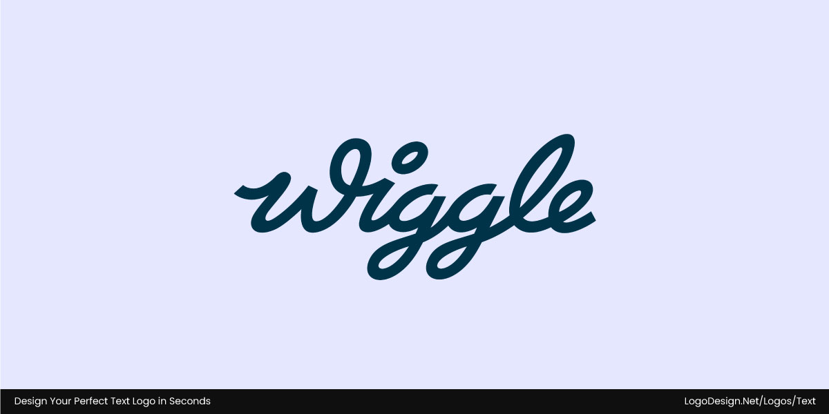
The Wiggle’s logo uses a hand-drawn script with smooth curves, giving it a human and energetic feel.
Wiggle’s logo is a custom script wordmark with smooth, flowing curves that give it a warm and approachable feel. Its hand-drawn style sets it apart from the more common geometric sans-serifs in sports retail, making the brand feel more human and energetic.
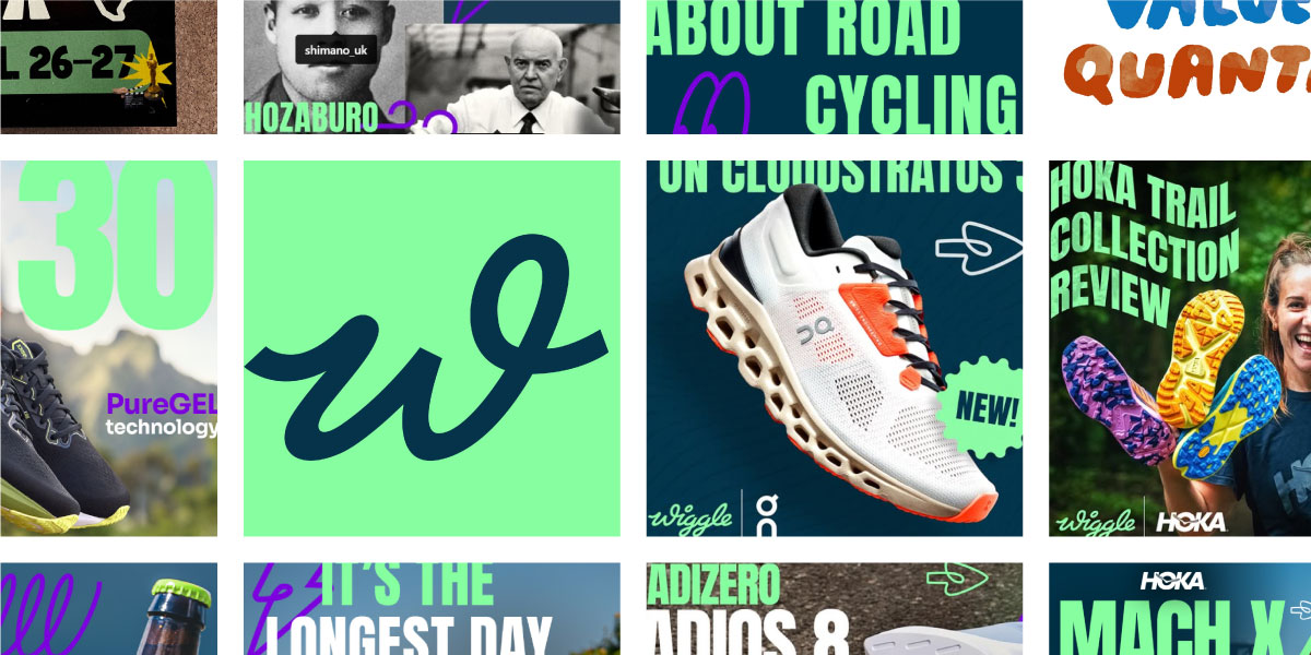
Wiggle’s social media platforms use simplified marks for profile icons, app buttons, and other platforms, for instant recognition.
On social media and in smaller spaces, Wiggle often trims the logo down to its stylized “w.” This simplified version keeps the same friendly tone while working perfectly for profile icons, app buttons, and quick recognition across digital platforms.
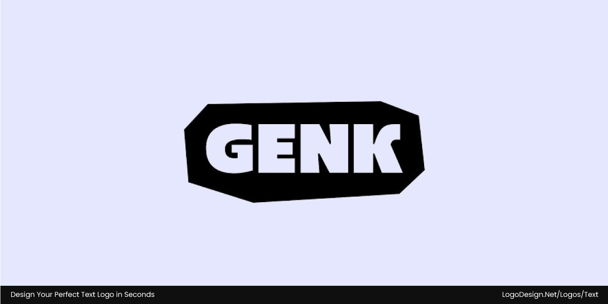
The bold GENK logo shows strength, confidence, and a sleek urban edge that’s attention-grabbing.
GENK’s logo uses a bold, modern sans-serif with sharp edges and geometric lines that instantly project strength and confidence. The heavy letterforms grab attention, while the spacing and balance give it a clean, urban edge.
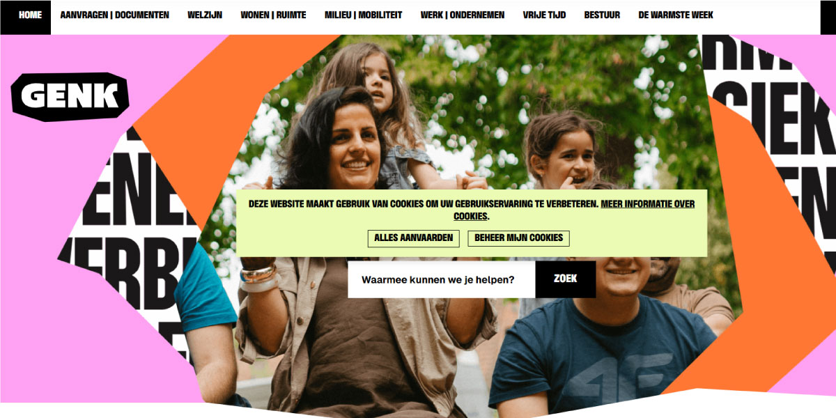
For Genk’s digital platforms, it uses bold and adaptable designs to keep a consistent appeal
What makes this choice effective is its flexibility. On the website, the bold wordmark grounds the navigation with clarity. On social media, the same font scales easily for covers and graphics, keeping the brand visible and recognizable everywhere. By sticking to a consistent but adaptable typographic system, GENK maintains authority while staying versatile across digital and print.
The typeface also ties sub-brands together, with each one using different weights or pairing with a display font for variety. When applied across marketing materials, this creates a strong family resemblance without losing individuality.
4. Match Typeface to Emotion, Fonts to Context
Use font choices to change expression or tone as you want. The typeface will set the emotion or core feeling, as that shows who you are. You can pick styles according to the context, like whether you want to bring out urgency or start a casual conversation.
You can choose a professional typeface to build trust and showcase authority in an industry like finance or banking. Use very light fonts and generous spacing for catalogues, brochures, and flyers, but go with bolder fonts for CTAs on your website.
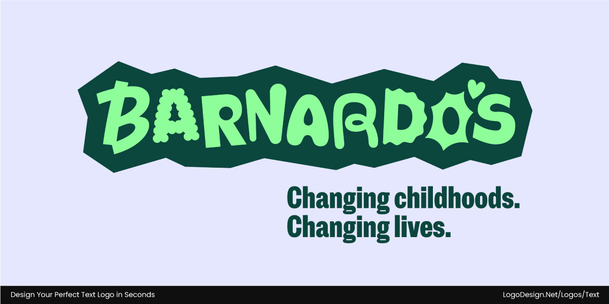
Barnardo’s logo uses unique letters that show a safe, unified space, showing inclusivity and protection
Barnardo’s brand identity leans heavily on typography to reflect its mission of supporting children and transforming lives. The custom logo type is a visual metaphor for a safe space. Each letter feels a little different, almost like it carries its own emotion, yet together they form a unified whole. It’s a powerful way to express the charity’s ethos of inclusivity and protection.

Barnardos uses a custom typeface and clean sans-serif to give a mix of balancing personality with usability.
That same approach carries through their website, where the custom typeface appears in headings, paired with a clean sans serif for calls-to-action and body text. The mix strikes a balance between personality and practicality, keeping the site engaging but still easy to use.

For social media, Barnardos uses playful fonts for light posts and serious ones for urgent campaigns. – Instagram/Barnardos_UK
On social media, the typography becomes even more flexible. Posts might use playful fonts for lighter messages and more serious ones for urgent campaigns. This adaptability shows how typeface sets the emotional foundation, while font choices fine-tune the message for each context.
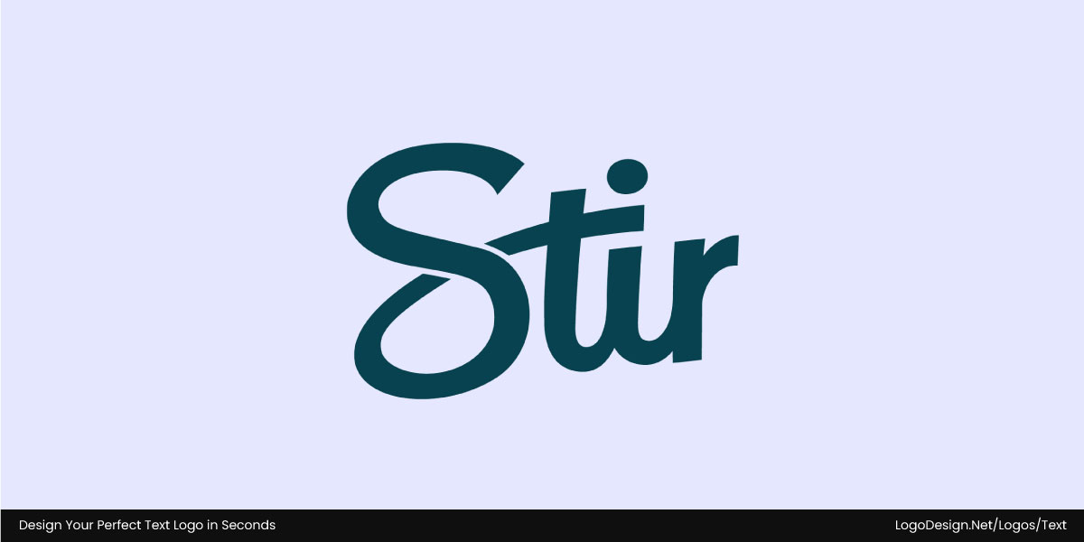
Stir’s logo uses handwritten script to convey warmth, authenticity, and a personal touch.
Stir’s logo is built on a custom script typeface that feels warm, handwritten, and approachable. The typeface captures the sense of connection and personal touch that the brand wants to share with single parents. The flowing script conveys authenticity and intimacy, anchoring Stir’s emotional core.
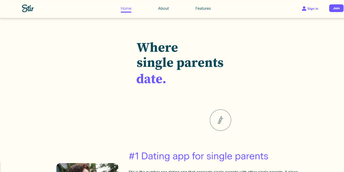
On the website, Stir uses serif headings for trust and sans-serif body text for clarity.
On the website, the tone shifts slightly. Headings use a serif font to suggest trust and seriousness, while the body text uses a clean sans serif for readability and a modern edge. It’s a thoughtful mix—romantic and personal for the logo but clear and trustworthy for everyday communication.
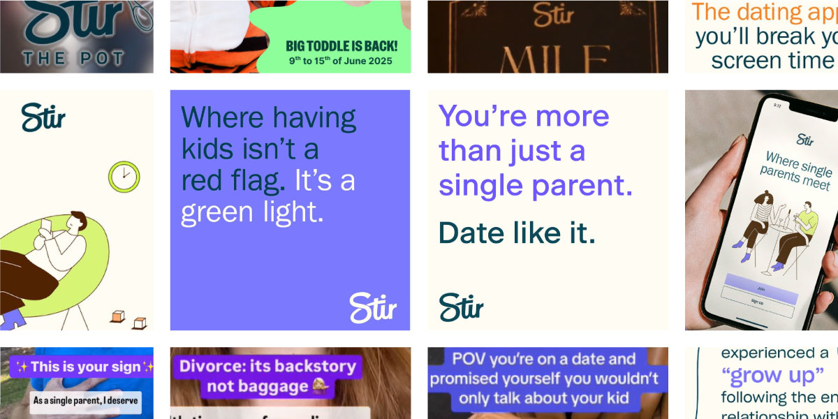
On Stir’s social media platforms, they use simple sans serif fonts for clarity, while subtle type choices carry the brand’s mood – Instagram/Stir.App
Social media leans even further into simplicity. Posts rely almost entirely on sans serif fonts, keeping messages direct, legible, and accessible. The script logo makes fewer appearances here, yet the brand’s emotional foundation still comes through, showing how typefaces set the mood, while fonts adapt to different contexts.
5. Consider Technical Requirements
Sometimes, real-world applications also impact font choice. Think web performance, variable fonts, print reproduction, licensing, and global appeal. You have to keep all of these in mind with your logo and brand assets. To make your logo versatile, think of scalability first. Bolder fonts within a typeface family work better for app icons or favicons when scaled down.
In web design, you may choose a typeface for cross-browser consistency and then select specific fonts optimized for performance. Self-hosted variable fonts let you choose many weights with a single file, but older browsers may not support them. So choose fonts that are clear in small sizes on low-DPI devices.
For printing, certain fonts within a typeface family look more readable at small sizes or on different papers. For tiny text (nutrition labels, product UPCs), pick font variants with larger x-height and heavier strokes.
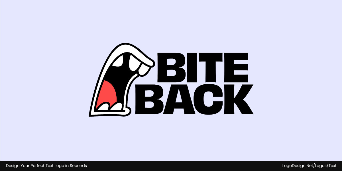
Bite Back uses bold typeface with a condensed sans serif to show a sharp appeal, legible at any size.
The BiteBack logo is bold and instantly eye-catching, built on a condensed sans serif that makes the wordmark stand out. Its heavy strokes and tight spacing keep it sharp and legible, even when scaled down for icons or smaller print—making it a smart, versatile choice.
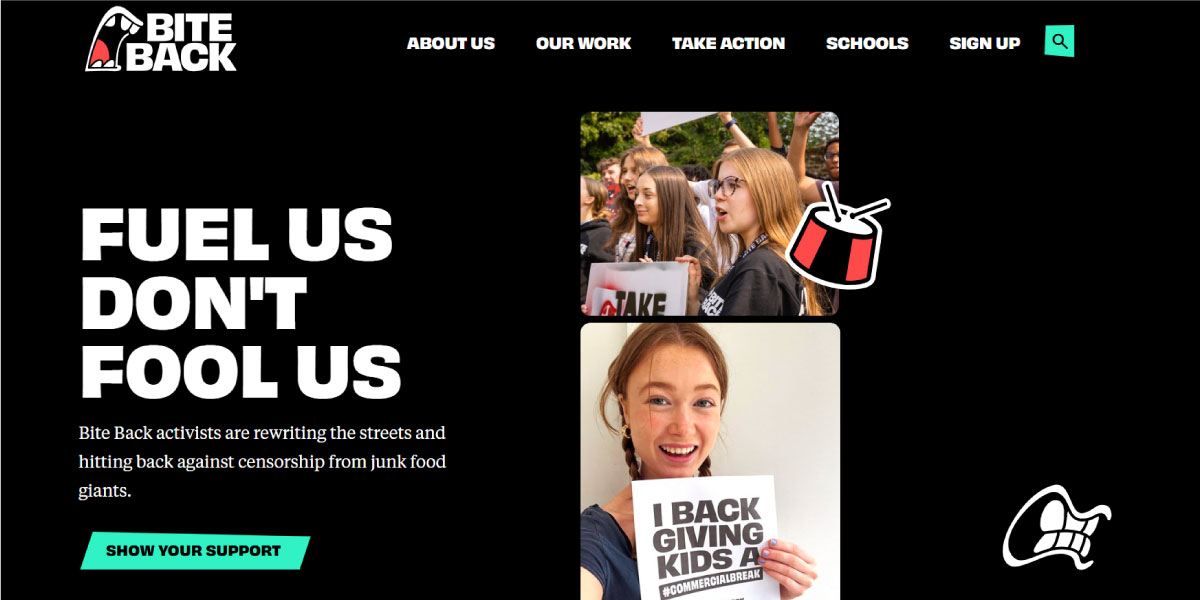
On BiteBack’s website, it uses a clean sans-serif font that adapts to any screen, staying fast, crisp, and clear.
On the website, BiteBack continues with a sans-serif typeface that adapts smoothly across different screen sizes. The fonts are optimized for speed and clarity, so text loads quickly and stays crisp.
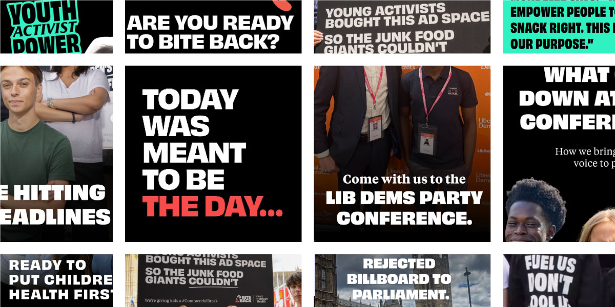
On BiteBack’s social media platform, it uses a clean and consistent design to make posts easy to read on mobile. – Instagram/biteback2030
On social media, the same clean style carries through in posts and captions. It reinforces consistency while keeping everything easy to read on smaller mobile screens.
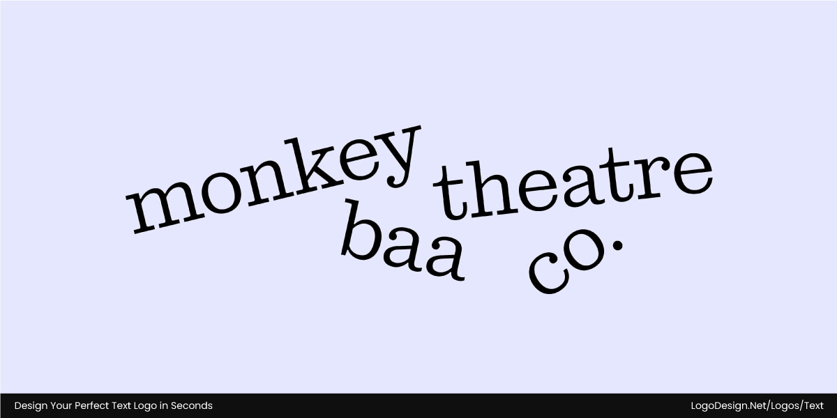
The Monkey Baa Theatre logo has playful serifs with lively curves, capturing the fun spirit.
Monkey Baa Theatre Company takes a slightly different approach. Its logo uses a lively serif typeface with playful curves—perfect for a children’s theatre. The distinct shapes give the logo personality while still being clear and legible at any size.
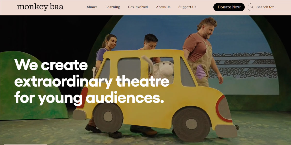
Monkey Baa Theatre’s website uses bold sans-serif typography to enhance readability.
On the website, the typography shifts to a bold sans-serif for longer text, ensuring readability without losing impact.
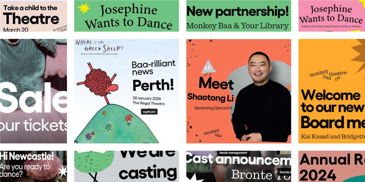
On Monkey Baa Theatre’s social media, it combines playful serif and clean sans serif for an expressive brand voice – Instagram/monkeybaatheatreco
Social media, however, allows more variety: sometimes posts lean on a playful serif, other times on a straightforward sans serif, depending on the tone. This mix shows how wise font choices adapt to context—keeping the brand voice expressive while ensuring clarity is never lost.
Quickfire Type vs. Font FAQs: Let’s Clear Up More Mysteries
Typography can get tricky, especially when you’re juggling terms like typeface and font. And when you factor in typography for multilingual logos, clarity becomes even more important. Let’s clear up some of the most common questions designers run into.
1. How many fonts can a single typeface have?
A single typeface can have multiple fonts in the same family and there’s no specific number here. For example, the Roboto typeface includes:
- Roboto Regular
- Roboto Bold
- Roboto Light Italic
- Roboto Condensed Bold
- Roboto Slab
- Roboto Mono
These are just some of the fonts in the family. Each of these is a separate one with variations in weight, style, or width within the overall typeface.
2. Are typefaces free to use, or do I need to buy fonts?
Typefaces can be free to use sometimes but you need to keep in mind that the font might not be. What you pay for is the font file that lets you use the typeface on your computer or website. Some typefaces are open-source and completely free (like those on Google Fonts), while others require you to purchase a font license from the creator or a foundry.
3. Why knowing the difference between typeface and font matters in design briefs?
It can cause a misunderstanding and lead to deliverables that are not accepted by the client. A typeface is the main design (like Futura), while a font includes the appearance of that typeface (such as Futura Bold 12pt). If someone says, ‘use the Futura font’, do they mean:
- Regular or Bold?
- Uppercase or Lowercase?
- Desktop or Web?
In design briefs, saying ‘typeface’ when you mean ‘font’ can lead to the wrong visual results and confusion.
4. Are there legal issues with using fonts without a license?
Yes, absolutely. Using fonts without a proper license is a legal violation. Even if a font file seems easy to download for free online, that doesn’t mean you have the legal right to use it. Fonts come with End User License Agreements (EULAs) that outline where and how you can use them. Unlicensed fonts can result in fines or lawsuits, especially in commercial or client projects.
5. Why a typeface may be free, but the font file isn’t.
A typeface is the design idea as in the way they appear when displayed. And that can be free or open-source. But to actually use it, you need a font file like .otf or .ttf, and that’s protected by copyright.
So even if the design of the typeface is freely available or in the public domain, the specific digital file that renders it on your computer may be a commercial product.
6. Is there a difference between web fonts and desktop fonts?
Yes, there is. Desktop fonts are installed on your computer and used in software like Photoshop, Illustrator, or Word. They’re meant for print or static image design. Web fonts are optimized for use on websites. They load via CSS and are designed to appear consistently across different browsers and devices. They are seen in different file formats:
- Desktop: .ttf, .otf
- Web: .woff, .woff2, .eot, .svg
Also, they typically require different licenses. A desktop license doesn’t cover web use, and vice versa.
The Final Word on Typeface vs. Font
All in all, a typeface sets the personality and voice of a brand, while fonts bring that voice to life in specific contexts—shaping tone, hierarchy, and usability.
Whether in logos, websites, or print, understanding the difference helps you build designs that feel memorable and stand the test of time with fewer changes needed.
