The world’s most famous football logos weren’t designed in a day. They were shaped by wars, television, printing presses, and millions of passionate supporters. Let’s trace the story behind every crest.
A football logo has a tough job. It has to represent an entire club in a space small enough to fit on the left side of a jersey. Somehow, the best ones manage it. One glance at Barcelona’s crest or Manchester United’s badge is enough for millions of fans to know exactly who’s playing, even before the match kicks off.
That kind of recognition isn’t built overnight. The world’s most famous football logos have been shaped by decades of victories, heartbreak, rivalries, and loyal supporters who see the badge as part of the club itself. The same is true for national federations and tournaments, where a single emblem appears on everything from match tickets to trophies and broadcast graphics.
Look closely, and you’ll find that every crest has picked up pieces of history along the way. Some borrowed from city coats of arms. Others evolved to suit television, merchandising, or the digital age. Together, they tell a story that’s every bit as interesting as the football played beneath them.
The History and Evolution of Football Logos Over the Years
Football badges have never stayed frozen in time. While some clubs have protected their identities for generations, almost every well-known football logo has been refined to keep up with changing styles, printing methods, and how fans experience the game. The result is a design history that stretches far beyond football itself. Let’s take a look.
• Origins (Late 19th Century): Before Football Had a Brand
When organized football clubs began appearing across Britain and Europe in the late 1800s, branding wasn’t high on anyone’s priority list. Clubs were formed by factory workers, churches, schools, railway companies, and local communities. Their identity came from where they belonged, not from a carefully designed logo.
At this stage, a football logo was mainly a marker of belonging. Clubs needed a symbol that represented their location and history, rather than a design that worked across merchandise, television, or digital platforms.
Sheffield FC, founded in 1857, is one of the earliest examples of this approach. Its first visual identity was closely linked to the city itself, following the tradition of using civic symbols rather than creating an independent football mark. Later historic versions of the badge developed into a more recognizable football crest, with the club name, founding year, and traditional imagery emphasizing its status as the world’s oldest football club.
Queen’s Park FC, established in 1867, reflected the formal style of Scottish institutions during the Victorian era. Its early identity followed a heraldic approach, using structured layouts and traditional symbols rather than illustrations created specifically for football. The design language matched the club’s origins as a community sporting organization and reflected the influence of older institutional badges.
In Italy, Genoa CFC, founded in 1893, developed a badge strongly connected to local heritage. The club’s identity drew from Genoa’s civic symbolism, particularly the griffin associated with the city’s coat of arms, while the famous red and blue colors became central to the club’s football identity. This showed how early clubs often adapted existing regional symbols into their own emblems.
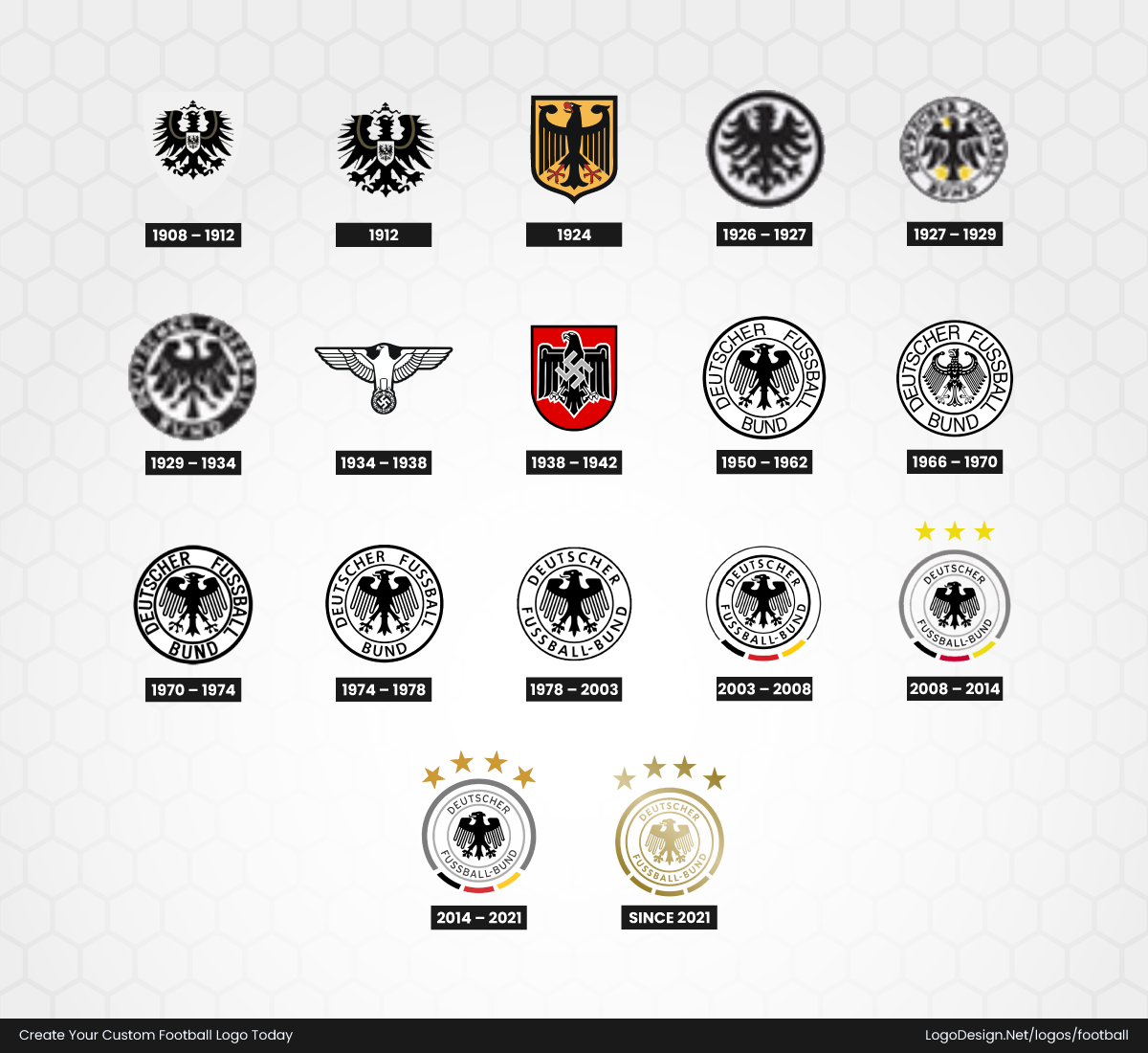
National teams followed the same pattern by using established symbols of national identity. Early versions of the German national football team logo featured the black eagle, taken from German heraldic tradition. The design relied on a recognizable national emblem that already represented authority and unity.
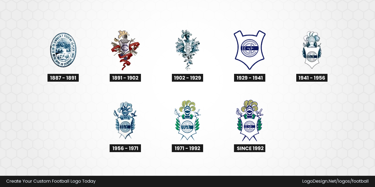
Outside Europe, Club de Gimnasia y Esgrima La Plata, founded in Argentina in 1887, also reflected the influence of institutional design. Its early badge styles followed the formal appearance of social and athletic organizations of the period, using traditional crest structures and symbolic elements connected to the club’s broader community roots.
These early football logos were not designed to compete visually in a global marketplace. They were symbols of origin. Whether borrowed from a city coat of arms, a national emblem, or a historic institution, their purpose was simple: to show who the club represented and where it came from.
• Early 20th Century: Football Crests Become Club Identities
By the early 1900s, football clubs were no longer just local groups. As competitions became more organized and fan communities grew, teams began creating symbols that belonged specifically to them. This period marked the rise of the traditional football crest, where clubs moved beyond borrowed civic symbols and developed more detailed identities of their own.
Shield-shaped designs became one of the defining styles of the era. Influenced by European heraldry, these badges often included elements such as crowns, castles, animals, initials, Latin phrases and other symbols connected to history, power, and local pride. Unlike earlier marks, these crests were designed to be displayed proudly on embroidered kits, scarves, and official club materials.
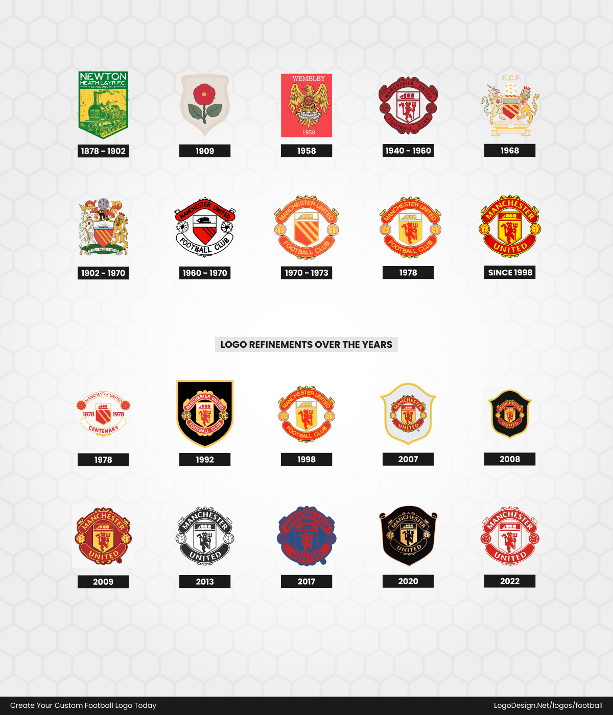
Manchester United shows how club identity evolved during this period. Before becoming Manchester United, the club was known as Newton Heath LYR Football Club, with early badges connected to its railway origins. After the name change in 1902, the club gradually moved toward a stronger Manchester identity, adopting symbols linked to the city’s heritage. The famous ship from Manchester’s coat of arms became a key visual element, representing the city’s trading and industrial background. Later versions introduced the red devil symbol, but the early crest history shows how clubs began transforming local references into lasting football identities.
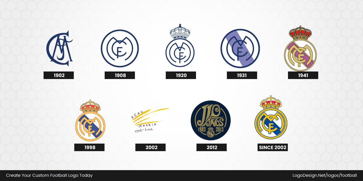
Real Madrid became another example of how external recognition influenced football badge design. After receiving the royal title "Real" in 1920, the club added the crown to its emblem, creating a stronger connection with Spanish royalty. Early versions featured the intertwined "MCF" initials inside a circular design, while the crown became the defining symbol that separated the club from earlier regional-style badges. Over time, the crest continued to evolve while protecting these historic elements.
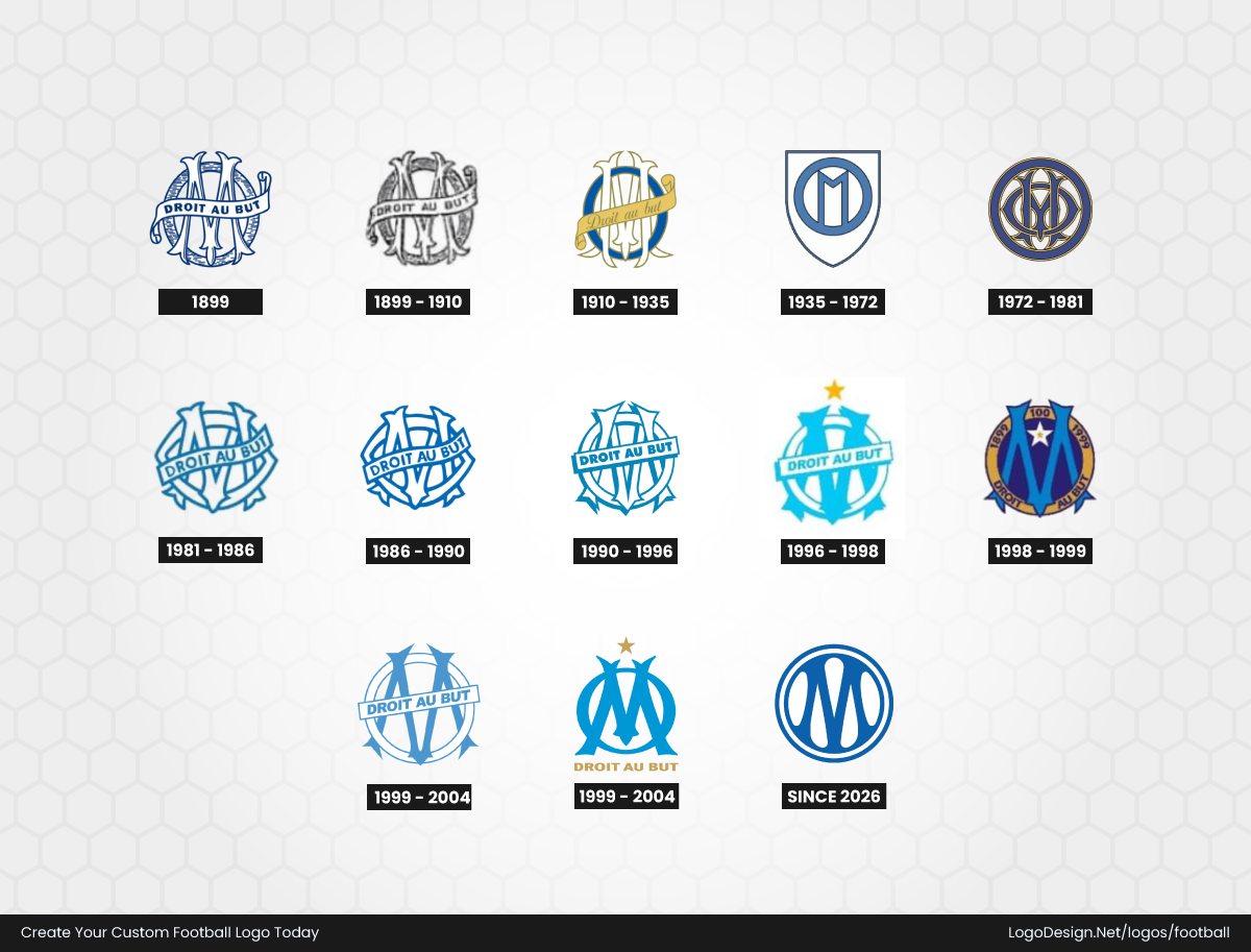
In France, Olympique de Marseille developed a badge built around simplicity and strong club recognition. The early designs focused on the club’s initials, with the iconic "OM" monogram becoming the central feature. Later versions incorporated the famous motto "Droit au But" ("Straight to the Goal"), showing how football clubs began adding phrases and symbols that expressed their sporting philosophy.
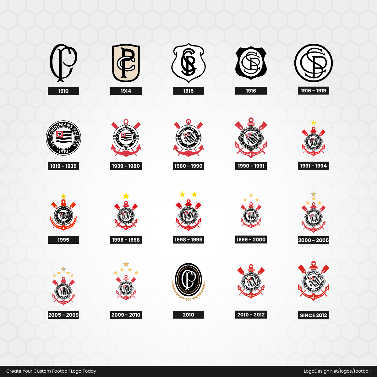
In South America, Corinthians, founded in 1910, followed a different but equally important path. Early versions of the badge reflected the club’s maritime-inspired roots, featuring elements such as anchors and oars before evolving into the more recognizable circular crest used today. The design connected the club’s working-class origins with symbols of strength, unity, and community.
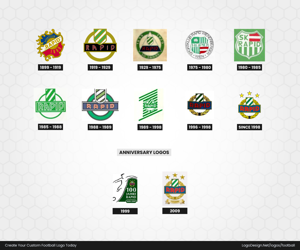
Rapid Wien, founded in 1899, also reflected the influence of early European football heraldry. Its historic badges relied on the club’s initials and the traditional green-and-white color scheme, creating a simple but recognizable identity. The design demonstrated how some clubs did not need complex artwork, but instead built recognition through consistent colors and typography.
By this period, football logos had become much more than identification marks. They represented history, ambition, and belonging. Whether through royal crowns, city symbols, club initials, or traditional mottos, these early 20th-century crests created the visual language that still defines football branding today.
• Mid-20th Century: Simpler Designs for a Bigger Audience
After the Second World War, football entered a new era of mass popularity. Clubs were reaching larger audiences through newspapers, printed programmes, radio, and eventually television. This created a new challenge for football logos: they needed to remain recognizable even when reproduced at smaller sizes or in limited printing formats.
Many clubs began simplifying their visual identities. Detailed illustrations were reduced, unnecessary decorative elements disappeared, and stronger symbols became the focus. Instead of relying on complex coats of arms, teams started building badges around one memorable feature, whether it was an animal, letterform, color combination, or local symbol.
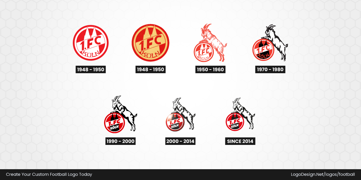
1. FC Köln is a strong example of this transition. The club’s identity became centered around the goat mascot, which was introduced as a tribute to the famous club symbol Hennes. Earlier versions of the badge used more traditional layouts, but the goat became the defining visual element, making the logo instantly recognizable. The use of a single strong symbol reflected the growing importance of creating badges that supporters could identify quickly.
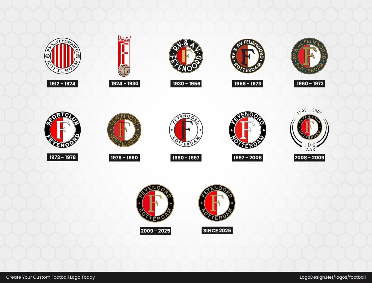
Feyenoord followed a similar path by strengthening the role of its most recognizable elements. The club’s red-and-white split design and the prominent "F" monogram became the foundation of its identity. Rather than relying on complex decoration, the badge focused on bold contrast and simple typography, allowing it to work effectively across kits and printed materials.
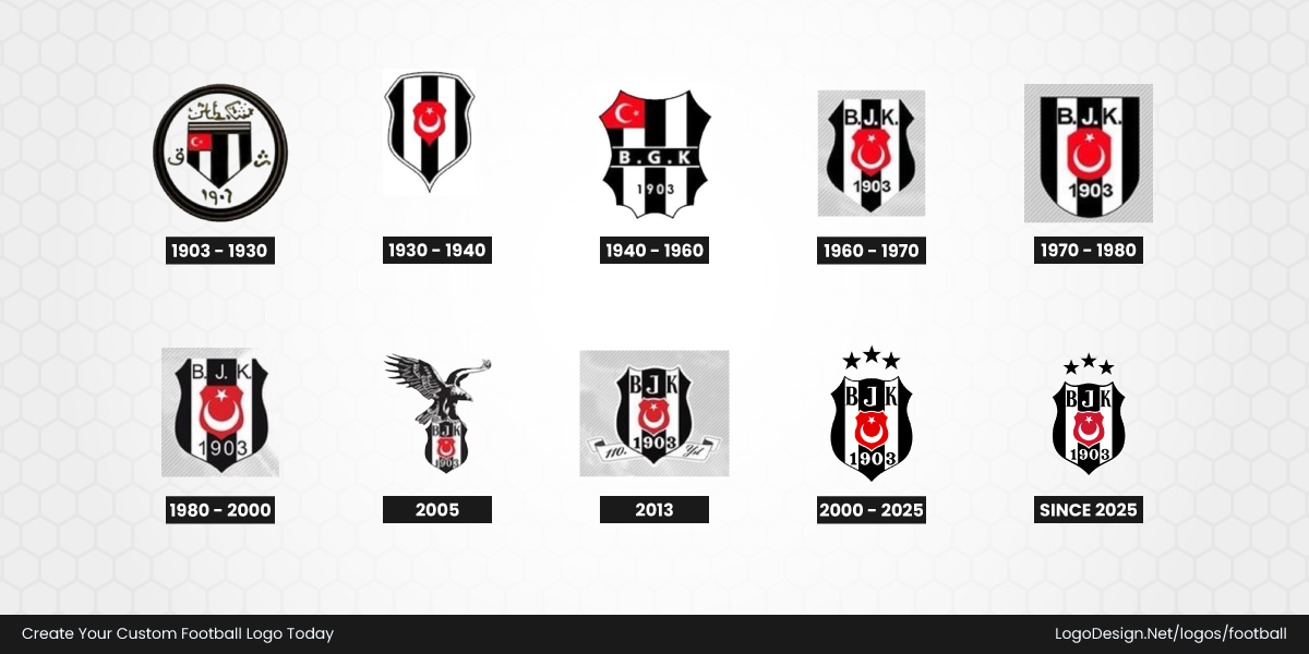
Beşiktaş developed one of football’s most distinctive identity systems during this period. Its black-and-white crest retained traditional elements, including the club initials and the Turkish flag detail, but the overall structure remained clean and easy to reproduce.
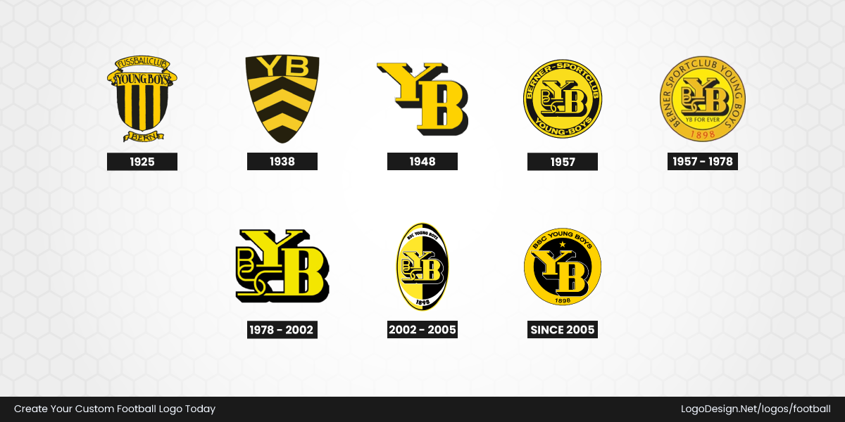
BSC Young Boys also represents the move toward simpler club recognition. The Swiss club’s yellow-and-black identity became central to its badge, with the initials and strong color contrast creating an emblem that was easy to recognize on shirts, flags, and printed materials. The design relied more on consistency and color memory than elaborate artwork.
By the mid-20th century, football logos were no longer designed only to look impressive on official documents or embroidered clothing. They needed to function everywhere. Clubs began realizing that the strongest identities were often built around fewer elements, clearer symbols, and designs that supporters could recognize instantly from a distance.
• Modern Era (1990s to Present): Designed for Every Screen
The rise of digital media changed football logo design more than any previous period. Club badges were no longer limited to shirts, scarves, and match programmes. They now had to work across websites, mobile apps, television graphics, video games, social media profiles, and global merchandise.
As a result, many clubs began refining their identities with cleaner shapes, stronger typography, and fewer unnecessary details. The goal was not always to create a completely new logo, but to make existing symbols more flexible across different formats while protecting the history supporters already recognized.
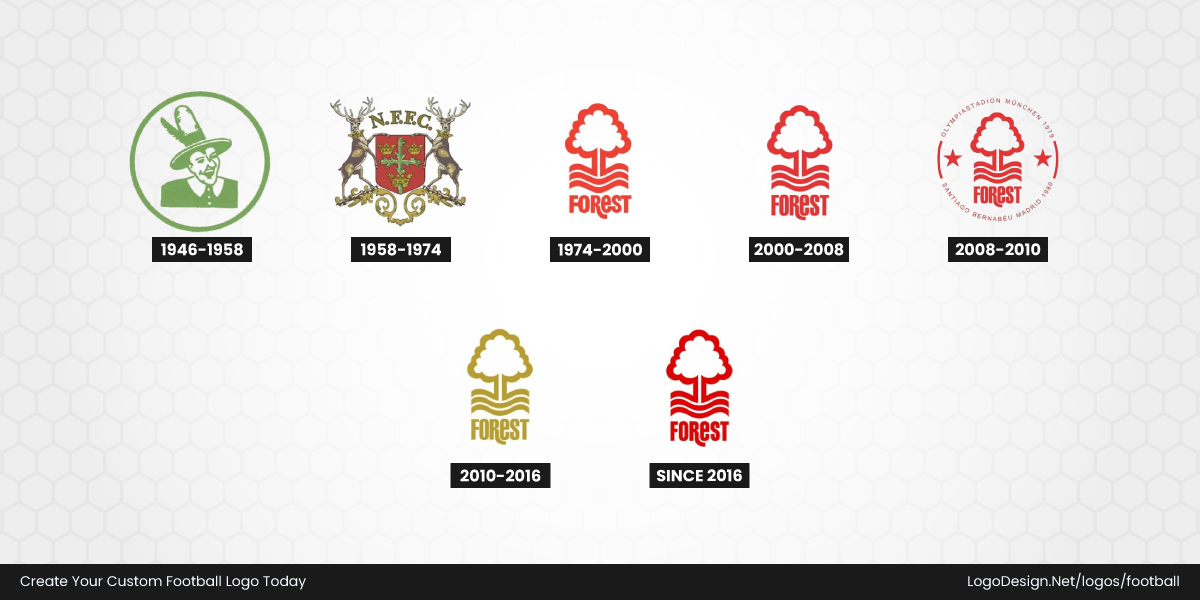
Nottingham Forest demonstrates how a club can modernize while keeping its heritage intact. The famous tree and river design remained the heart of the identity, reflecting the club’s connection to Sherwood Forest and Nottingham. Over time, the badge became cleaner and more streamlined, allowing the simple tree symbol and red color palette to stand out more effectively across digital platforms and merchandise.
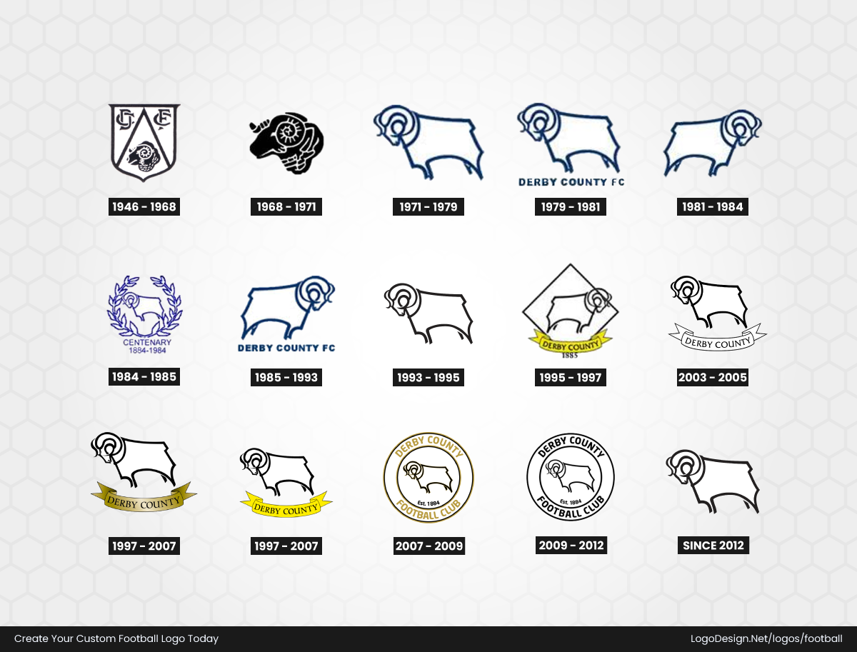
Derby County followed a similar approach by refining one of football’s most recognizable animal symbols. The club’s ram emblem remained the central feature throughout its redesigns, but later versions simplified the shape and removed unnecessary detail. The result was a stronger, more adaptable mark that preserved the club’s traditional identity while improving visibility in modern applications.
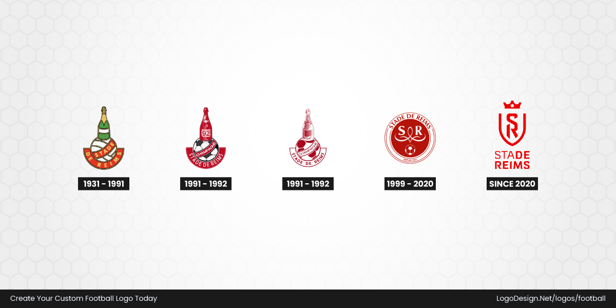
In France, Stade de Reims modernized its crest while maintaining its historic character. The club retained important heritage elements, including the traditional shield structure and the initials associated with its name, while introducing a cleaner design that works better for contemporary football branding. The updated identity balances nostalgia with the needs of digital communication.
Newer clubs have approached football branding from a completely different direction. St. Louis City SC, which joined Major League Soccer in 2023, was created with a digital-first mindset from the beginning. Its crest uses a modern shield shape with a bold arch symbol inspired by the Gateway Arch, connecting the team to St. Louis while creating a simple, recognizable mark for global audiences. The clean typography and strong color system were designed to work across broadcasts, apparel, and online platforms.
Today, successful football logos are expected to adapt to every place supporters encounter them. Whether a century-old team is simplifying its badge or a new club is building an identity from scratch, the strongest designs combine heritage, recognition, and modern flexibility.
FIFA and FIFA World Cup Logos
FIFA and the FIFA World Cup share the same global stage, but their visual identities serve very different purposes. One represents the organization behind the game, while the other changes with every tournament, celebrating the culture, creativity, and identity of each host nation.
The Evolution of the FIFA Logo
Unlike most football clubs, FIFA hasn’t reinvented its visual identity every few years. Its logo represents the organization that governs the sport worldwide, so stability has always taken priority over dramatic redesigns.
Even so, the FIFA logo has gone through several updates over the past century. Each version reflects the design style of its time while holding onto the same message: football is a global game.
• 1928-1977: The First Official FIFA Logo
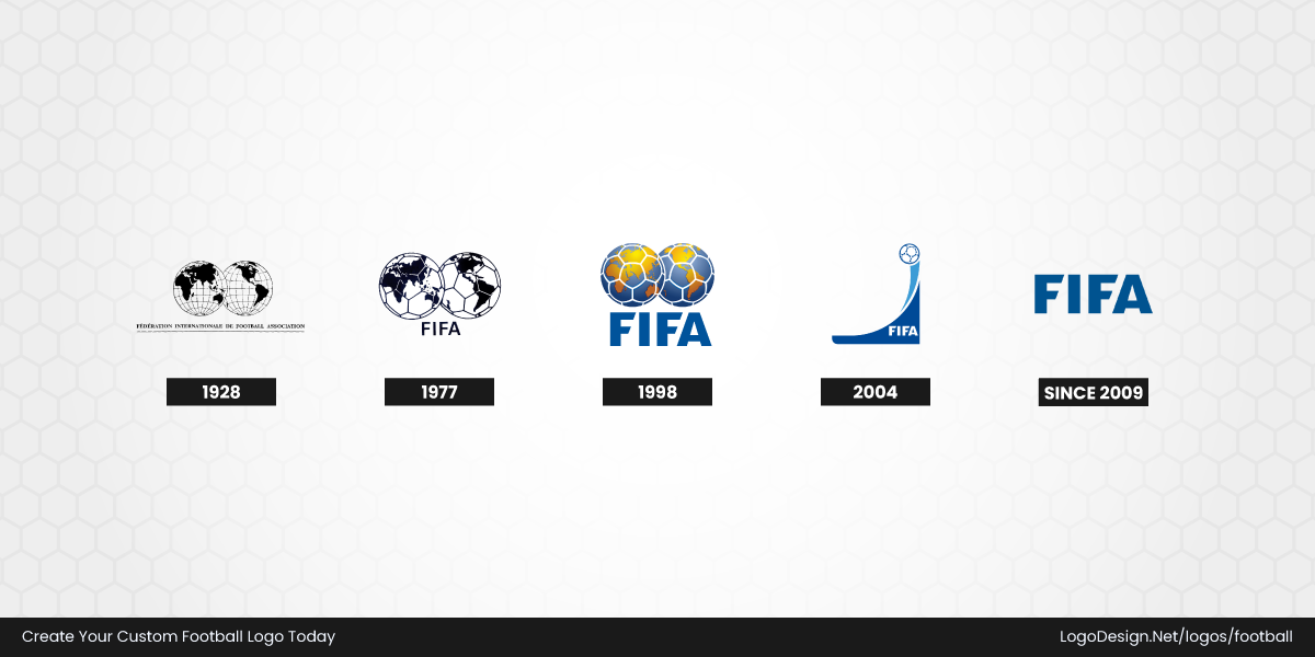
FIFA introduced its first official logo in 1928, and it laid the foundation for every version that followed. The design featured two overlapping globes with the French inscription “Fédération Internationale de Football Association” beneath it in capital letters. It was simple, monochrome, and created with classic logo typography that reflected the formal style of international organizations during that period.
The choice of globes wasn’t random. They symbolized football’s growing international reach at a time when the sport was expanding beyond Europe. Instead of focusing on individual nations or competitions, the logo emphasized unity. That message remains at the heart of FIFA’s identity today.
Perhaps the most impressive thing about this globe logo version is how long it lasted. While many organizations refreshed their branding every decade or two, FIFA kept its original identity for nearly fifty years, proving that a strong symbol doesn’t always need constant redesigns.
• 1977-1998: A Stronger Identity for a Global Audience
By the late 1970s, football had become one of the world’s biggest spectator sports. Television broadcasts reached millions of homes, and FIFA needed a logo that reproduced more clearly across different media.
The updated design kept the familiar twin globes but added the recognizable football panel pattern inside each one. The lettering also became cleaner and bolder, making the FIFA logo easier to read whether it appeared on official documents, television graphics, or tournament branding.
This redesign made FIFA’s identity easier to recognize. Every update had a practical purpose, and the logo became more distinctive without losing the elements people already associated with world football.
• 1998-2009: Color Takes Centre Stage
The late 1990s brought one of the biggest visual changes in FIFA’s history. For the first time, the organization moved away from a flat monochrome appearance and introduced the familiar blue-and-gold globe design that many fans still recognize today.
This wasn’t simply a cosmetic update. It reflected the design trends of the era, when brands across the world embraced gradients, highlights, and three-dimensional effects. At the same time, color psychology played an important role in shaping the new identity. Blue reinforced ideas of trust, professionalism, and global unity, while gold represented excellence, achievement, and the prestige associated with international football.
As football’s commercial reach expanded, the logo also needed to perform across sponsorships, merchandise, and worldwide broadcasts. The refreshed design gave FIFA a stronger visual presence without abandoning the globe symbol that had already become synonymous with the organization.
• 2004–2015: Celebrating a Century of FIFA
In 2004, FIFA marked its 100th anniversary with a commemorative emblem that appeared alongside its primary visual identity. Rather than replacing the existing FIFA logo, it celebrated a major milestone in the organization’s history.
The anniversary mark featured a football riding a sweeping blue wave, creating a strong sense of movement and momentum. The flowing shape represented the continued growth of the sport, while the football remained the unmistakable focal point. Blue was once again the dominant color, reinforcing trust, stability, and FIFA’s position as football’s governing body.
Unlike the main logo, this wasn’t designed as a permanent identity. It was created to celebrate a historic occasion while still feeling connected to FIFA’s established brand. It’s a good example of how organizations can introduce limited-edition branding without losing visual consistency.
• 2009–Present: A Simpler Corporate Identity
In 2009, FIFA introduced a refreshed corporate logo that took a very different direction. Instead of relying on the familiar globe emblem, the organization adopted a clean wordmark featuring only the acronym FIFA in bold, uppercase blue lettering.
The redesign reflects a broader shift in corporate branding, where many global organizations moved towards simpler, typography-led identities. Every letter was carefully refined, but the most distinctive feature is the custom-designed "F." Its angled horizontal strokes give the strong wordmark logo a unique appearance without making it difficult to read. It’s a subtle detail, yet one that helps the logo stand apart from an ordinary sans-serif typeface.
From a design perspective, the redesign prioritizes clarity above everything else. The bold letterforms remain legible whether they appear on official reports, websites, social media, or broadcast graphics.
The Evolution of FIFA World Cup Logos
While FIFA’s corporate logo has remained relatively consistent over the decades, the FIFA World Cup follows a completely different approach. Every tournament receives its own official identity, allowing each host nation to express its culture, traditions, and visual style through design.
Instead of building one timeless logo, the World Cup creates a new emblem for every edition, turning each tournament into a visual snapshot of its time and place.
• 1930–1962: Tournament Posters Before Brand Systems
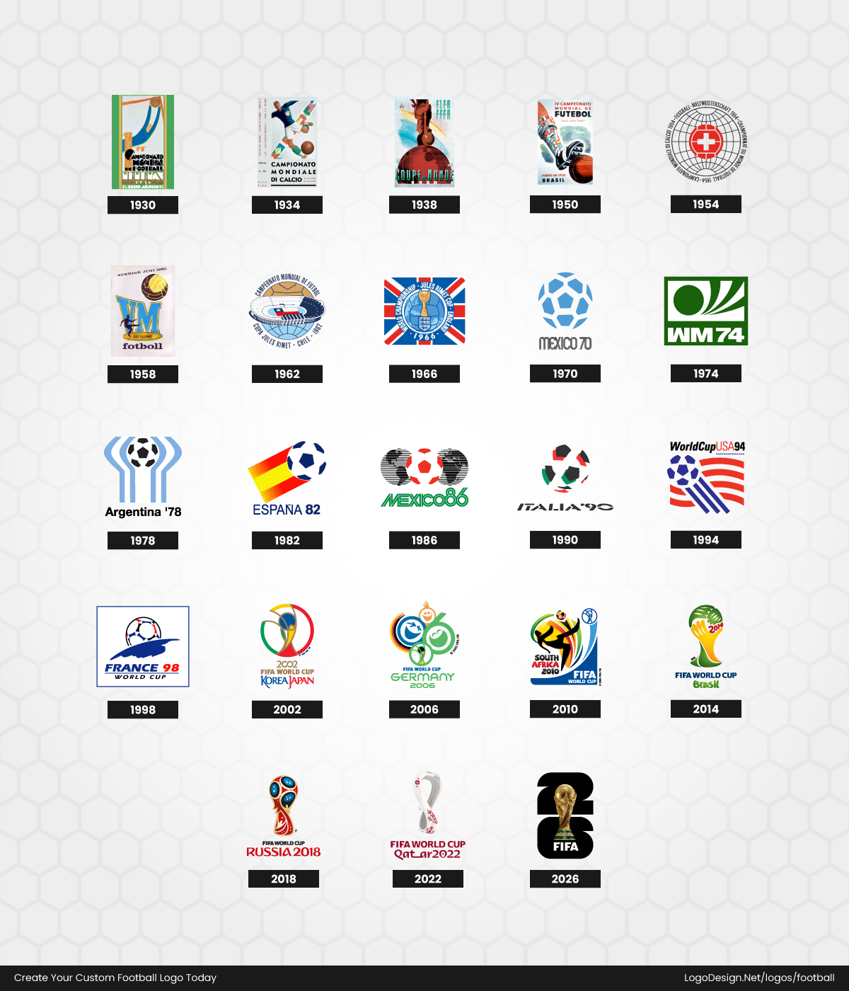
The earliest FIFA World Cups didn’t use logo systems in the way we understand them today. Instead, tournaments were promoted through illustrated posters that combined typography, national symbolism, and football imagery into a single composition. These graphics acted as both promotional artwork and the tournament’s visual identity.
1930 Uruguay – Art Deco poster, decorative typography, goalkeeper illustration in Uruguay’s national colors.
1934 Italy – Heroic footballer, Italian tricolor, competing nations’ flags, poster-style composition.
1938 France – Hand-painted footballer, elegant typography, simplified tricolor-inspired artwork.
1950 Brazil – First official tournament emblem, hand-lettered typography, Brazilian flag colors.
1954 Switzerland – Red football with the Swiss cross, faint globe backdrop, multilingual tournament text.
1958 Sweden – Stylized football, Swedish flag colors, clean geometric composition.
1962 Chile – Circular football motif, Chilean flag colors, simplified modern layout.
Rather than creating reusable brand assets, these early identities focused on producing memorable event posters that reflected the artistic style of their era.
• 1966–1990: National Symbols Become the Identity
As television expanded football’s global audience, World Cup branding became far more recognizable. Tournament logos began incorporating memorable national symbols alongside mascots, creating identities that were instantly associated with their host countries.
1966 England – Jules Rimet Trophy, Union Jack ribbon, three lions beneath the trophy.
1970 Mexico – Iconic optical "MEXICO 70" typography with a geometric football at the centre.
1974 West Germany – Abstract football-and-player graphic paired with the bold "WM 74" wordmark.
1978 Argentina – Stylized raised arms forming the World Cup Trophy, finished in sky-blue national colors.
1982 Spain – Football integrated with the Spanish flag, clean typography, simplified tournament branding.
1986 Mexico – Minimal line illustration of a football above bold Mexico ’86 typography.
1990 Italy – World Cup Trophy rendered with the Italian tricolor using a clean three-dimensional composition.
During this period, mascots, logos, posters, and television graphics began working together as one unified branding system rather than separate promotional pieces.
• 1994–2010: Color, Culture, and Global Television
By the 1990s, the FIFA World Cup had become one of the biggest sporting events on the planet, and its branding reflected that global reach. Logos became more colorful, layered, and dynamic, often using gradients, flowing shapes, and three-dimensional effects that matched contemporary graphic design trends.
1994 USA – Football merged with the Stars and Stripes, a patriotic color palette, and a globe-inspired layout.
1998 France – Blue globe, golden football, sweeping horizon line, refined three-dimensional styling.
2002 Korea/Japan – Infinity-inspired circular mark surrounding the trophy, gold, red, and blue palette.
2006 Germany – Smiling faces orbiting the World Cup Trophy with bright blue and yellow gradients.
2010 South Africa – Footballer silhouette, African-inspired patterns, vibrant green, yellow, red, and black colors.
Rather than simply identifying the competition, these logos became storytelling devices that introduced millions of viewers to the personality of each host nation.
• 2014–Present: Digital-First Tournament Branding
Modern World Cup logos are designed with digital platforms in mind from the very beginning. They still celebrate the host nation’s identity, but they must also remain clear on smartphone screens, social media profiles, merchandise, broadcast graphics, and interactive digital experiences.
2014 Brazil – Trophy formed by three interlocking hands, vibrant green and yellow, fluid organic shapes.
2018 Russia – Trophy silhouette inspired by Russian folk art with deep red, blue, and gold ornamentation.
2022 Qatar – Infinity-loop silhouette inspired by a traditional shawl, burgundy palette, elegant calligraphic curves.
2026 Canada, Mexico, and United States – Photographic FIFA World Cup Trophy layered over the number 26, creating a modular identity adaptable for all 16 host cities. It is the first World Cup emblem to feature the actual trophy rather than a stylized illustration.
Today’s World Cup logos are expected to perform across far more touchpoints than ever before. Clean shapes, scalable layouts, versatile typography, and flexible branding systems have become just as important as cultural storytelling, ensuring every tournament identity remains recognizable wherever fans experience the game.
FIFA, FIFA World Cup, and FIFA Club World Cup: What’s the Difference?
It’s easy to assume these names all refer to the same thing, but they actually represent three different brands with three different jobs.
Each has its own visual identity because each serves a different audience and purpose. Once you understand that distinction, the design choices behind their logos make a lot more sense.
FIFA Logo
The FIFA logo is the corporate identity of football’s governing body, so its purpose is very different from a tournament logo. It appears on official documents, rankings, websites, and communications throughout the year, which is why consistency matters more than frequent redesigns. Clean logo typography, a professional color palette, and subtle refinements over time help reinforce FIFA’s authority while keeping the brand instantly recognizable.
FIFA World Cup Logo
A World Cup logo represents a single tournament rather than the organization itself, so every edition receives a unique identity. Designers take inspiration from the host nation’s culture, traditions, and visual style to create an emblem that captures the spirit of that event. While the artwork changes every four years, the best designs are memorable, versatile, and easy to recognize across everything from stadium signage to digital broadcasts.
FIFA Club World Cup Branding
The FIFA Club World Cup has its own branding because it celebrates club football rather than international teams. Its identity focuses less on host-country storytelling and more on prestige, global competition, and elite club success. As the tournament has grown, the branding has become cleaner and more modern while maintaining a clear visual connection to FIFA’s overall identity.
How Tournament Branding Differs from FIFA’s Corporate Identity
Although these identities belong to the same organization, they’re designed with very different goals in mind.
| Brand | Represents | How Often It Changes | Main Design Focus |
| FIFA logo | Football’s governing body | Rarely | Authority, consistency, and global recognition |
| FIFA World Cup logo | A single World Cup tournament | Every edition | Host nation culture, celebration, and tournament identity |
| FIFA Club World Cup | The global club championship | Updated when needed | Elite club football and international competition |
A good way to think about it is this: FIFA is the parent brand, while the World Cup and Club World Cup are its biggest products. The organization needs a visual identity that stays familiar year after year. Tournaments have far more freedom. They can experiment with colors, symbols, and storytelling because each edition represents a new chapter in football history.
That balance is one of the reasons football branding remains so interesting. A timeless corporate identity builds trust over decades, while tournament logos capture the excitement and personality of a single moment in the sport.
Football Team Logos: What Makes Them Iconic?
If you look at some of the coolest sports and fitness logos, you’ll notice something interesting. They don’t all use the same colors, symbols, or shapes, but they do follow many of the same design principles. The most memorable clubs build their identity piece by piece, making deliberate choices about the badge, typography, colors, and symbols they use. That’s why a great football logo feels familiar even after decades of updates. Every element has a purpose, and together they create a visual identity that supporters proudly wear, recognize, and pass on from one generation to the next.
It Starts with the Shape
The shape is one of the first things people notice, maybe even before the colors or the club name. It influences how the badge feels at first glance, which is why designers often think about shape psychology before adding any other element. Some shapes communicate tradition, while others feel modern or more versatile.
The most common shapes you’ll see in a football logo include:
• Shield
The classic choice for a football crest. Inspired by heraldry, shield icons suggest strength, tradition, and protection. Many of Europe’s oldest clubs have stayed with this shape for decades because it reflects their heritage.
Ashanti Gold SC pairs its traditional shield with an elephant and a football, celebrating the club’s roots in Ghana’s historic gold-mining industry while reinforcing its community identity.
Leeds United wraps its iconic white rose of Yorkshire inside a clean shield, giving the club a timeless look that balances regional pride with modern simplicity.
Real Salt Lake combines a royal crown, bold initials, and a blue-and-gold shield, reflecting both the club’s regal name and its ambition on the pitch.
San Jose Earthquakes combines a modern shield with a central football, bold "Quakes" lettering, and diagonal black-and-blue stripes inspired by seismic fault lines, while "San Jose 1974" pays tribute to the club’s original NASL roots.
Lobi Stars FC places a bold star above a classic football inside a traditional shield, with "Makurdi" proudly displayed across the top. Finished in blue, white, and black, the crest reflects both the club’s hometown and its long-standing identity as The Stars.
• Circle
One of the most popular modern layouts. Circle logos create a balanced, symmetrical look and adapt well to social media icons, merchandise, and digital platforms. Clubs like Manchester City and Bayern Munich use circular badges to combine history with a cleaner appearance.
Blackburn Rovers frames its famous red rose inside a circular crest, with the club’s Latin motto completing a badge that proudly reflects Lancashire heritage.
Charlton Athletic keeps its circular identity simple, centering a bold sword emblem that references the area’s historic connection to sword-making.
Atalanta BC uses a flowing profile of the Greek heroine Atalanta, where sweeping black-and-blue lines create a sense of speed and movement within the circular badge.
Chicago Fire FC centers its circular badge around a Florian Cross, with a bold red "C" and the iconic six-pointed Chicago star, blending the city’s firefighting heritage with its civic identity.
Kahrabaa Ismailia SC combines a football with a lightning bolt inside a circular emblem, directly reflecting the club’s name and long-standing association with Egypt’s electricity sector.
• Heraldic/Ornate Crest
Inspired by European heraldry, ornate football crests often combine shields, animals, wreaths, banners, and historic symbols into a richly detailed emblem. These designs celebrate a club’s heritage and local identity, giving supporters a badge filled with history rather than just a simple mark.
Bayer 04 Leverkusen surrounds its circular "Bayer" emblem with two red lions and the club name, creating a richly layered crest that reflects both tradition and civic symbolism.
Sunderland AFC incorporates a castle, lions, a ship, and the city’s historic motto into an elaborate shield, celebrating Sunderland’s maritime roots and centuries-old heritage.
Ajax originally used an intricate illustration of the Greek hero Ajax, complete with classical detailing, before later simplifying it into the iconic line-art version seen today.
FC Twente combines a traditional shield with a rearing red horse, representing the historic coat of arms of the Twente region while reinforcing the club’s local identity.
1. FC Saarbrücken builds its ornate crest around a lion taken from Saarland’s heraldry, framed within a traditional shield that reflects the club’s strong regional heritage.
• Diamond
Diamond-shaped football badges stand out by breaking away from traditional shields and circles. The diamond shapes’ sharp geometry creates a bold, modern look while giving clubs a distinctive silhouette that’s easy to recognize on kits, merchandise, and digital platforms.
SV Werder Bremen is instantly recognizable for its green diamond carrying a bold white "W", proving how a simple geometric shape can become an iconic club identity.
Angers SCO frames its monogram inside a sleek diamond, giving the badge a clean, elegant appearance while staying true to the club’s traditional colors.
Colorado Rapids incorporates a faceted diamond within its crest, echoing Colorado’s mountain landscape while adding depth to the club’s modern identity.
Borussia Mönchengladbach has remained faithful to its famous diamond for decades, with the bold "B" monogram creating one of German football’s most recognizable emblems.
ACF Fiorentina builds its badge around a diamond featuring the iconic red fleur-de-lis, connecting the club directly to the historic symbol of Florence.
• Oval
Oval badges offer a softer alternative to shields while preserving a traditional football feel. Their elongated shape provides extra space for symbols, typography, and club colors, making them both distinctive and easy to adapt across different applications.
Forward Madison FC uses a vibrant oval crest featuring a pink flamingo and a stylized sunrise, creating one of the most distinctive identities in American football.
SC Freiburg places a bold black griffin inside a red-and-white oval, drawing directly from the city’s historic coat of arms.
AC Milan has retained its famous oval badge for over a century, combining the red-and-black stripes with the Cross of Saint Ambrose, a lasting symbol of Milan.
FC Shakhtar Donetsk frames crossed mining hammers within an oval, honoring the club’s industrial origins in Ukraine’s coal-mining region.
AZ Alkmaar builds its identity around an oval carrying the bold AZ monogram, using clean red-and-white geometry for a sharp, contemporary look.
• Polygon
Polygon-shaped badges move beyond traditional shields and circles, using bold angles and custom outlines to create a more distinctive silhouette. They help clubs stand out while giving designers greater freedom to build memorable, modern identities.
Nashville SC uses an octagonal badge inspired by the city’s iconic water towers, with a bold soundwave monogram reflecting Nashville’s deep musical heritage.
Minnesota United FC builds its crest around a wing-shaped polygon featuring the Loon, Minnesota’s state bird, alongside a sky-blue stripe representing the Mississippi River.
Alemannia Aachen keeps things timeless with a striking triangular badge carrying the club’s "A" monogram, making it one of Germany’s most recognizable minimalist crests.
FC Viktoria Köln combines a faceted shield with the city’s red-and-white colors, using sharp geometric panels to give the traditional badge a contemporary edge.
Hamburger SV stands apart with a simple black-and-white diamond enclosed inside a blue polygonal frame, proving that a clean geometric arrangement can become instantly iconic.
Typography Gives the Club a Voice
Typography isn’t just there to display a name. It helps supporters recognize the club instantly and adds personality to the overall design. Many clubs even invest in custom typography so their lettering becomes as recognizable as the symbol itself.
Most soccer logos include these typographic elements:
• Club Initials
Many clubs build their identity around a distinctive monogram rather than their full name. Compact lettermarks are easy to recognize at any size and often become just as iconic as the badge itself, whether they’re stitched onto shirts or displayed as digital icons.
For example, Fulham FC places an elegant FFC monogram at the heart of its black-and-white shield, using bold red lettering to create an instantly recognizable focal point.
Villarreal CF crowns its intertwined CVF initials with a royal crown, combining the club’s name and prestigious "Real" status into a refined emblem.
L.R. Vicenza centers its historic R initial inside a clean red-and-white crest, preserving a monogram that has represented the club for generations.
Karlsruher SC keeps things strikingly simple with a KSC monogram enclosed in a blue circular badge, proving that strong typography alone can define a club’s identity.
• Full Names
Some clubs choose to place their complete name directly on the badge, making the identity clear even to new audiences. This approach works especially well for clubs building recognition across different regions, where the name itself becomes a key part of the visual identity.
Sporting Kansas City uses a bold wordmark-style treatment around its shield, with the full club name reinforcing its strong connection to the Kansas City community.
New Mexico United places its full name prominently within a yellow-and-black crest, pairing typography with regional symbols to create a clear and approachable identity.
Tampa Bay Rowdies uses its complete name and two stars, with retro-inspired lettering that matches the club’s historic character.
Fortuna Sittard integrates its full name into a traditional green-and-yellow crest, maintaining a strong link between typography, club heritage, and local recognition.
• Founding Year
Adding a club’s founding year turns a logo into a piece of history. These dates act as a reminder of longevity, connecting modern teams with the generations of players and supporters who built the club.
TSV 1860 Munich highlights 1860 directly in its name and identity, making its long history one of the most recognizable parts of the club’s branding.
Mainz 05 uses 1905 within its name, creating a simple but powerful link between the badge and the club’s century-long football journey.
Hannover 96 places 96 at the centre of its identity, with the number becoming an instantly recognizable symbol of the German club.
VfL Bochum incorporates 1848 into its badge, reflecting the club’s origins and making its historic foundation part of its modern visual identity.
Whatever the approach, the chosen logo fonts should be readable everywhere. If the typography becomes difficult to recognize, even the strongest symbol loses some of its impact.
Colors Create Identity
Colors are often what supporters connect with first. Long before they notice the finer details of a logo, they recognize the club’s familiar palette. A well-planned color scheme helps a team stand out while reinforcing its story. Understanding color theory in logo design also ensures those colors remain effective across jerseys, merchandise, and digital platforms.
Color choices usually reflect the following things:
• Regional Identity
Many clubs use colors as a visual connection to their hometown, region, or local culture. These palettes often borrow from city flags, landscapes, traditional symbols, or historical associations, turning simple colors into markers of belonging.
Golden Arrows FC uses gold and green as a bold reflection of the club’s identity, with the colors creating a strong connection to its South African roots and energetic playing style.
Richards Bay FC carries blue and white tones that reflect its coastal home, drawing visual inspiration from the sea and the city’s waterfront character.
Chennaiyin FC blends blue with shades of yellow, representing the club’s connection to Chennai while capturing the vibrancy and cultural energy of Tamil Nadu.
Ipswich Town is defined by its famous blue and white palette, colors deeply associated with Suffolk and the club’s long-standing regional identity.
• Club Heritage
Some football colors are not chosen for appearance alone. They carry memories of past teams, historic achievements, founding communities, or traditions that supporters have carried forward for generations.
Chongqing Tonglianglong FC uses red and gold as its primary colors, creating a bold identity that reflects the club’s ambition, regional pride, and connection to Chinese football culture.
Manly United FC features blue, red, and white, continuing the visual tradition of the club’s Manly roots and its connection to the Australian coastal community.
Manurewa AFC embraces blue and gold, colors closely tied to the club’s long-standing identity and its place within the Manurewa community in Auckland.
East Fife FC is recognized by its distinctive black-and-gold palette, a historic combination that has become inseparable from the club’s identity since its early years.
• Sports Energy
Some clubs use colors to communicate intensity, ambition, and competitive spirit. Bright tones, strong contrasts, and dynamic combinations often help create a visual identity that feels energetic both on the pitch and among supporters.
Gangwon FC uses cyan, orange, white, and gold to create a powerful identity, with the colors reflecting energy, passion, and the club’s bold presence in Korean football.
Al Wehda FC combines red, white, and orange tones to create a striking palette that represents pride, passion, and the club’s deep connection with Mecca.
Stop Out FC’s logo features red, black, and yellow, giving the club a strong, classic appearance while reflecting its community-driven football culture in New Zealand.
Hull City is instantly recognizable through its amber and black stripes, a fierce combination that inspired the club’s famous "Tigers" nickname and creates a powerful match-day identity.
• Prestige
Some football colors are closely tied to success, legacy, and the status a club has built over time. These palettes become symbols of achievement, tradition, and the reputation earned through generations of competition.
Daegu FC uses sky blue and white, along with orange accents, a refined combination that gives the club a clean, respected identity while reflecting its place in Korean football.
Celtic FC is defined by its iconic green-and-white hoops, a historic color pattern that represents the club’s heritage and worldwide recognition.
Sheffield Wednesday carries its famous blue-and-white stylized owl in its logo, a traditional look that has become a key part of the club’s long-established identity.
Peñarol uses black and yellow, colors inspired by the railway origins of the club and now associated with one of South America’s most successful football institutions.
• Nature/Local Environment
Football clubs often take inspiration from the landscapes, wildlife, and natural features surrounding them. These colors help create a sense of place, allowing supporters to see their home region reflected in the club’s identity.
Norwich City FC uses its famous yellow-and-green palette, colors closely associated with the canary bird and the club’s long-standing nickname, The Canaries.
Brighton & Hove Albion features blue and white stripes inspired by its seaside location, creating a visual link with the coastal character of the city.
Forest Green Rovers embraces green and white, reflecting its environmental values and strong connection to sustainability and the natural world.
Alloa Athletic uses amber and black, a combination linked to the football club’s heritage and the local identity of Alloa, while creating a distinctive presence on the pitch.
The most iconic football logos rarely rely on a large palette. A few well-chosen colors, used consistently over time, usually leave the strongest impression.
Football Logos Around the World: Signature Design Elements by Country
Football logos often reflect the culture, history, and design traditions of the countries they come from. While modern clubs compete on the same global stage, their badges still carry local influences, from royal symbols and civic crests to regional animals and historic typography.
Let’s take a look at football logos around the globe.
Europe
European football clubs have some of the oldest and most influential badge traditions in the world. Many modern team logo ideas still borrow elements that first became popular in Europe more than a century ago.
England
English clubs are known for traditional shield-shaped badges, heraldic lions, mythical creatures, and strong links to local history. Founding years are often displayed prominently, and many crests still draw inspiration from city coats of arms, giving each football logo a strong sense of place.
For example, Brentford FC’s modern circular badge centres on a detailed bee, a symbol closely associated with the club’s nickname, \"The Bees.\" The clean color palette and founding year create a design that feels both traditional and modern.
Liverpool FC’s crest is one of the clearest examples of English heritage branding. The Liver Bird remains the focal point, while the Shankly Gates and memorial flames add layers of history that supporters instantly recognize.
Leicester City‘s badge combines a circular layout with the iconic fox head, representing the region’s historical connection to fox hunting. The simple composition makes the symbol highly recognizable across kits and digital media.
FC Halifax Town uses a traditional shield-based football crest featuring a crowned lion derived from Halifax’s civic heraldry. It’s a strong example of how English clubs continue to preserve local symbolism within modern branding.
Spain
Spanish football logos are easy to spot because they proudly celebrate history and regional identity. Royal crowns, local flags, and historic symbols appear throughout many club badges, while ornate detailing gives them a distinctive, traditional feel. Even after modern refinements, most Spanish clubs have preserved the elements that connect them to their cities and supporters.
Real Madrid‘s crest is one of the most recognizable in football. The royal crown reflects the club’s Real ("Royal") title granted by King Alfonso XIII in 1920, while the intertwined initials sit inside a circular badge crossed by the club’s signature blue band. Despite several refinements, the overall design has remained remarkably consistent for more than a century.
Deportivo La Coruña’s badge combines several symbols of the club’s heritage. A royal crown sits above the crest, while the purple diagonal sash references the historic flag of Galicia. The elegant circular frame and traditional detailing make it a classic example of Spanish football branding rooted in regional pride.
Atlético de Madrid has carefully modernized its crest while preserving its most meaningful symbols. The bear reaching for the strawberry tree, borrowed from Madrid’s city coat of arms, remains the focal point, alongside the red-and-white stripes and blue border that supporters instantly associate with the club.
RC Celta‘s crest stands out thanks to the Cross of Saint James, a symbol deeply connected to Galicia’s history and religious heritage. Topped with a royal crown and finished in the club’s signature sky-blue colors, the badge blends historical symbolism with a clean, elegant composition that has become synonymous with the club’s identity.
Italy
Italian football logos are known for their refined simplicity. Oval and shield-shaped badges are especially common, often featuring the Italian tricolor, city emblems, or historic crosses. Rather than relying on elaborate decoration, Italian clubs usually achieve a timeless look through balanced layouts, clean typography, and meaningful symbolism.
UC Sampdoria’s distinctive shield badge reflects the club’s strong identity through a clean, symbolic design. The shield features two blue stripes separated by a single red stripe, echoing the club’s iconic colors, while the striking black eagle silhouette at its center represents strength, pride, and determination.
SSC Napoli takes the opposite approach with one of football’s simplest identities. A bold white "N" inside a blue roundel has become instantly recognizable, proving that a minimal logo can be just as iconic as a highly detailed crest.
Bologna FC‘s oval badge reflects classic Italian design. The club’s red and blue colors, the cross of Saint George, and the initials BFC are arranged in a clean, symmetrical layout that has remained largely unchanged for generations.
US Cremonese uses a traditional shield featuring the club’s distinctive red-and-grey stripes and the letters U.S.C. Its straightforward design puts heritage first, showing how many Italian clubs prefer clarity and tradition over frequent visual reinvention.
Germany
German football logos are built around clarity and consistency. Circular badges are especially common, paired with bold typography, simple color palettes, and clean geometric layouts. The result is branding that feels modern and highly functional, whether it’s displayed on a stadium facade, a jersey, or a mobile app.
FC Bayern Munich‘s circular badge combines the club’s red-and-white colors with the blue-and-white Bavarian diamond pattern at its center. Its balanced layout has remained largely unchanged, making it one of the most recognizable football logos in the world.
FC Schalke 04’s iconic circular badge has remained remarkably consistent throughout its history. Its simple blue-and-white design features the club’s initials alongside the number “04,” commemorating its founding year, 1904. The clean, minimalist emblem reflects the club’s proud tradition and has become one of the most recognizable symbols in German football.
Borussia Dortmund proves that simplicity can be powerful. The bright yellow circular badge with the bold BVB 09 monogram is instantly recognizable and remains highly effective across merchandise, broadcasts, and digital platforms.
Hertha BSC stands apart with a waving blue-and-white flag enclosed within a shield. Inspired by the club’s historic pennant, the badge uses minimal detail while creating a distinctive identity that supporters can recognize at a glance.
France
French football logos blend tradition with modern branding. While historic symbols like the rooster and the fleur-de-lis still appear across French football, many clubs have adopted cleaner, more minimalist identities over the years. Blue, white, and red also feature prominently, reflecting the country’s national colors and strong sense of identity.
Take a look at Paris Saint-Germain (PSG). It has a circular badge that combines the Eiffel Tower with the fleur-de-lis, representing both Paris and the club’s French heritage. The clean composition and limited color palette have helped make it one of the most recognizable football logos in modern football.
LOSC modernized its identity with a geometric dog head enclosed in a hexagonal badge. The sharp lines and simplified styling give the crest a contemporary look while still referencing the club’s long-standing nickname, Les Dogues.
Olympique Lyonnais‘s crest combines a shield with the club’s initials and the iconic golden lion, a symbol taken from the city’s coat of arms. The balanced layout and restrained color palette create a badge that feels both traditional and modern.
Toulouse FC‘s circular badge is inspired by the city’s coat of arms, combining the Occitan Cross, the Fleur-de-Lis, and the Paschal Lamb within a clean, symmetrical design. Finished in the club’s signature purple, it blends regional history with a modern, minimalist identity.
South America
South American football logos are full of personality. While many clubs use traditional shields and circular badges, the designs often feel bolder and more expressive than their European counterparts. Bright colors, championship stars, distinctive monograms, and strong club symbolism reflect a football culture where identity, passion, and history are worn with pride.
Brazil
Brazilian football logos are every bit as expressive as the country’s football culture. Bold lettering, bright combinations of yellow, green, blue, red, and black, championship stars, and classic shield or circular badges are common features. Many clubs have refined their logos over the years, but they’ve stayed true to the symbols and colors that supporters instantly recognize.
Flamengo‘s badge is instantly recognizable thanks to its bold red-and-black striped shield and the intertwined CRF monogram in the upper corner. With no unnecessary decorative elements, it proves how a simple, well-balanced design can become one of the most iconic identities in South American football.

São Paulo FC‘s distinctive triangular shield is unlike almost any other in football. It features the bold SPFC initials above the club’s signature red, white, and black stripes, creating a clean, instantly recognizable identity that has remained largely unchanged since 1930.
Fluminense‘s shield combines deep burgundy, green, and white with an elegant intertwined FFC monogram at its center. The flowing lettering and traditional color palette give the badge a refined look while preserving the club’s long-standing identity.
Botafogo keeps things remarkably simple with a black shield containing a single white star. That lone star, known as the Estrela Solitária (Lone Star), has become one of the most recognizable symbols in Brazilian football, proving that a minimal design can leave a lasting impression.
Argentina
Argentine football logos strike a balance between tradition and prestige. Sky blue and white, borrowed from the national flag, appear across many club identities, while stars, laurel wreaths, and classic shield designs celebrate success and long-standing heritage. Rather than chasing design trends, many Argentine clubs have preserved their core identity for decades.
Boca Juniors uses a classic shield outlined in gold with the bold CABJ monogram at its center. The simple blue-and-gold color palette has become synonymous with the club, showing how a clean, confident design can remain instantly recognizable across generations.
Racing Club embraces simplicity with a shield made up of sky-blue and white vertical stripes, reflecting both the club’s identity and Argentina’s national colors. The uncluttered layout has become a defining feature of its historic crest.
Vélez Sarsfield uses a distinctive shield featuring the CAVS monogram set against blue-and-white panels. The angular shape and restrained styling give the badge a timeless look that has remained consistent through the years.
Estudiantes de La Plata combines tradition with symbolism through a shield wrapped in laurel branches, representing achievement and excellence. The red-and-white striped crest, paired with the club’s initials, creates a classic football identity that stands apart from many of its domestic rivals.
Uruguay
Uruguayan football logos have stayed remarkably faithful to their roots. Most clubs continue to use traditional shield designs, subtle references to the national flag, and restrained color palettes instead of frequent redesigns. The focus is on preserving history, making these badges feel authentic, recognizable, and closely tied to each club’s identity.
For instance, Liverpool FC Montevideo‘s logo features a traditional shield with black-and-blue stripes crossed by a white sash bearing the L.F.C. initials. A gold star crowns the badge, while a football framed by green laurel branches sits at the base, adding classic sporting symbolism and reinforcing the club’s heritage.
River Plate‘s crest combines a classic shield with red-and-white stripes and the club’s initials. The balanced composition and minimal ornamentation give it a timeless appearance while staying true to the club’s long-established identity.
Defensor Sporting uses a distinctive shield built around its iconic purple color, one of the most recognizable identities in Uruguayan football. The clean lines and uncluttered layout let the club’s initials and colors take center stage.
Montevideo Wanderers‘ crest features a black-and-white shield with the M, W, F, and C initials arranged around a classic football at its center. Four gold stars sit above the badge, adding a sense of achievement, while the clean, symmetrical composition reflects the club’s heritage-first approach to branding.
Chile
Chilean football logos combine strong national identity with bold, uncomplicated design. Shields remain the most common shape, while red, white, and blue frequently reflect the national flag. Many clubs also draw on local history and cultural symbols, creating badges that are distinctive without feeling overly ornate.
Colo-Colo‘s shield features the profile of the Mapuche chief Colo Colo, the Indigenous leader after whom the club is named, set against a deep blue background with a red banner carrying the club’s name. A mourning ribbon across the chief’s forehead has remained part of the crest since 1927, making it one of South America’s most symbolic football logos.
Universidad de Chile’s badge centers on a bold blue "U" beneath a red owl, known as the chuncho, which represents wisdom and is one of the club’s most recognizable symbols. The clean, geometric composition gives the crest a distinctive identity while honoring the club’s university roots.
Unión Española stands out with one of Chile’s most distinctive crests. A black eagle surrounds a red circular center carrying the UE monogram, while the red-and-yellow palette reflects the club’s Spanish heritage and gives the badge a strong heraldic character.
Coquimbo Unido‘s shield is divided into bold black and gold quarters and topped by the head of a pirate, a tribute to the city’s long maritime history and the club’s famous "Pirates" nickname. The striking color combination and creative mascot make it one of the most recognizable badges in Chilean football.
Colombia
Colombian football logos often favor clean, structured designs that are easy to recognize from a distance. Circular and shield-shaped crests are the most common, with many clubs incorporating the national colors, local landmarks, stars, and symbolic animals to reflect regional identity while keeping the overall design simple and timeless.
Atlético Nacional‘s badge features a green-and-white shield topped with a castle-like crown, symbolizing strength and leadership. The bold A and N monogram keeps the design clean, while the geometric lines have helped make it one of Colombia’s most recognizable football crests.
Millonarios‘ crest displays a blue shield outlined in black, with two interlocking rings in the upper half and a bold "M" beneath them. The uncluttered blue-and-white palette and geometric layout give the badge a clean, timeless appearance that has become one of the most recognizable identities in Colombian football.
Deportivo Cali‘s crest is built around a classic green-and-white shield featuring the club’s initials. Free from unnecessary decoration, the badge reflects the club’s long-standing tradition and shows how a minimal design can remain instantly recognizable for generations.
Deportes Tolima combines national symbolism with regional pride through a shield divided into gold and burgundy, featuring the D and T initials. The dynamic composition gives the badge a bold, distinctive identity while celebrating both the club and the country it represents.
North America
Football logos in North America lean toward modern sports branding rather than traditional heraldry. Many clubs favor bold geometric shapes, clean typography, and simplified icons that work well across digital platforms, merchandise, and stadium branding while remaining easy to recognize at any size.
United States
American football clubs, particularly in MLS, often embrace minimalist aesthetics with strong geometric shields, custom lettering, and carefully balanced layouts. The result is a new generation of crests that feel contemporary while still drawing inspiration from local history, culture, and community.
Inter Miami CF uses a sleek black circular crest trimmed in pink, featuring two intertwined herons standing back-to-back beneath a stylized sun. The elegant symmetry and restrained color palette give the badge a premium, modern identity.
Seattle Sounders FC‘s crest is built around a layered shield in shades of blue and green, with the Space Needle rising through the center. The combination of city symbolism and bold geometric forms creates a logo that is both modern and unmistakably Seattle.
Portland Timbers‘ logo has a circular green badge with an axe design at the center, referencing Oregon’s logging heritage. The simple structure, along with the club’s green and gold colors, creates a strong connection to the region’s identity.
Orlando City SC‘s badge is a purple shield crowned by a gold lion’s face, with 21 sun rays radiating outward to represent the club’s original vision and Florida’s nickname as the Sunshine State. The minimalist styling keeps the crest bold and instantly recognizable.
Canada
Canadian football logos often combine modern sports branding with national identity. The maple leaf remains one of the strongest visual references, while many clubs use clean shields, circular badges, and simple typography to create logos that work across jerseys, digital platforms, and merchandise.
Toronto FC‘s football logo features a bold shield shape with a red maple leaf, surrounded by the club name and founding details. The use of red and black reflects Canadian identity, while the simple structure gives the badge a modern MLS feel.

Vancouver Whitecaps FC uses a blue-and-white shield featuring stylized mountain peaks and wave-like elements, reflecting the city’s coastal landscape and the club’s connection to British Columbia. The clean geometric design creates a strong sense of place.

CF Montréal‘s logo centers on a blue shield with a white fleur-de-lis, a reference to Quebec heritage, along with the club’s name. The design blends regional culture with a contemporary football identity.
Ottawa Fury FC‘s crest featured a shield with a bold red maple leaf at the center, reflecting the club’s Canadian identity. The badge also included the club name and a stylized representation of Ottawa’s heritage, with the clean shield layout giving it a traditional football appearance.
Mexico
Mexican football logos often carry a strong connection to national history, indigenous heritage, and local identity. Many clubs use bold colors, powerful animals, and symbolic elements inspired by Mexican culture. Compared with some other regions, Mexican crests often embrace richer details while still maintaining strong recognition on jerseys and merchandise.
Club América‘s crest highlights a yellow-and-blue circular badge with the letters CA placed prominently over a map of the American continent. The simple geometric design, bold color contrast, and strong initials make the crest instantly recognizable while reflecting the club’s name and international identity.
Tigres UANL‘s badge centers on the club’s famous tiger head symbol, representing strength, determination, and competitive spirit. The blue-and-gold color palette and clean shield structure create a powerful identity that connects with the university roots of the club.
Santos Laguna‘s logo fuses a green-and-white football-shaped badge with the club name inside. A gold crown sits above the emblem, while championship stars highlight the club’s Liga MX titles. The simple green-and-white palette and football-inspired shape create a strong connection to the club’s identity as "Los Guerreros."
Club Necaxa‘s crest uses a red shield with white vertical stripes, with the word NECAXA placed across the upper section and gold stars above the badge. The red-and-white design reflects the club’s traditional identity, while the shield format gives the logo a classic football appearance.
Costa Rica
Costa Rican football crests often have a strong connection to club tradition, with many teams keeping classic badge structures rather than chasing overly modern redesigns. Bold colors, simple symbols, and championship details are commonly used to create identities that supporters instantly associate with their clubs.
The logo of Deportivo Saprissa features a maroon (or deep burgundy) background with a bold white letter "S" in the center. The clean structure and dominant color create one of Costa Rica’s most recognizable football identities, with a design built around simplicity and strong club recognition.
Liga Deportiva Alajuelense‘s crest uses a shield-shaped design divided into red and black sections, with the LDA initials placed in the upper area. A prominent white star appears within the lower section, while the bold contrast between red, black, and white gives the badge a powerful traditional appearance.
Puntarenas FC‘s shield-shaped badge has the club name placed across the top and a strong orange-and-black color palette. The design includes an orange shark overlapping a soccer ball, reflecting the identity of the club from Puntarenas while maintaining a classic football crest structure.
Municipal Pérez Zeledón‘s logo blends a blue-and-white shield with the club’s initials and a prominent football graphic at the center. The simple badge structure and traditional colors reflect the club’s regional identity while following the classic style used by many Costa Rican teams.
Jamaica
Jamaican football crests often draw heavily from the country’s national identity, using the familiar green, gold, and black palette seen across Jamaican culture. While many clubs keep their designs straightforward, they often rely on strong lettering, shields, and symbolic elements to create badges that feel energetic and connected to their communities.
Arnett Gardens FC‘s crest features a shield-shaped badge divided into black, white, and red sections. The centre of the logo includes two white lions holding footballs, while the top includes the club name and the founding year "Since 1977". The bold red-and-black palette and lion imagery create a strong, powerful identity.
Mount Pleasant Football Academy‘s crest uses a circular blue-and-gold design with the academy name around the outer ring. A gold lion appears on a blue shield at the centre, supported by a ribbon and laurel details below. The combination of heraldic elements and clean circular framing gives the badge a traditional yet modern sports identity.
Montego Bay United‘s new crest moves away from a traditional football badge in favor of a clean, contemporary emblem. It features two stylized palm trees with birds in flight, capturing the character of Montego Bay, while the crimson red and forest green color palette pays tribute to the club’s Seba United heritage.
Tivoli Gardens FC‘s crest features a green shield outlined in black, with the intertwined letters "T" and "G" displayed prominently in black and orange at the center. The straightforward composition and bold contrast give the badge a traditional football look while making the club’s initials the clear focal point.
Africa
African football logos often place as much emphasis on heritage as performance. National symbols, military traditions, and regional pride frequently appear alongside classic shield designs, giving many clubs badges that feel deeply rooted in history rather than passing design trends.
Egypt
Egyptian football crests are known for their heritage-inspired styling, often featuring eagles, military emblems, and the country’s signature red, white, and black palette. While some modern clubs have adopted cleaner designs, many still preserve traditional symbols that reflect national pride and long-standing football culture.
Al Ahly‘s famous red shield features a soaring black eagle, Arabic and English club names, and the founding year 1907 on the crest. The eagle has remained the club’s defining symbol for more than a century, while the red-and-gold palette reinforces its identity as Egypt’s most decorated club.
Ceramica Cleopatra FC‘s logo is an elegant shield finished in the club’s signature gold and deep burgundy colors. At its center is a forward-facing golden lion’s head, symbolizing strength, pride, and determination. The symmetrical layout and refined detailing give the badge a modern look while reinforcing the club’s ambitious identity in Egyptian football.
Al Ittihad Alexandria Club‘s logo, in a green-and-white circular badge, features the club’s Arabic name prominently around the design. Its clean layout, traditional color palette, and classic circular format have remained key elements of the club’s visual identity through successive logo updates.
Tala’ea El Gaish SC‘s logo incorporates a green-and-white circular badge with the club’s official name in Arabic at its center. Military-inspired elements reflect the club’s connection to the Egyptian Armed Forces, while the clean, symmetrical layout reinforces its disciplined and heritage-driven identity.
Morocco
Moroccan football logos often blend traditional symbolism with refined, modern styling. Circular badges and classic shields remain popular, while stars, Arabic typography, and geometric influences help preserve a strong sense of national identity.
Wydad AC‘s crest features a red-and-white circular badge with the club’s Arabic name at the center and "W.A.C." displayed along the lower ring. Five gold stars frame the badge, while the bold circular layout has become one of the most recognizable identities in Moroccan football.
Maghreb AS de Fès’ logo is built around a circular badge in the club’s traditional yellow and black colors. The stylized "MAS" initials form the focal point of the design, while the clean circular layout reflects the club’s deep historical roots and enduring identity in Moroccan football.
Kawkab AC Marrakech‘s crest combines a traditional shield with a laurel wreath, creating a badge that reflects both heritage and sporting prestige. It prominently features the KACM initials, the club’s Arabic name (الكوكب المراكشي), and a red-and-white color palette, with football imagery reinforcing its identity as one of Morocco’s historic clubs.
Union Touarga Sport’s logo highlights a yellow-and-black shield with the UTS initials at its center. A royal crown sits above the badge, while a traditional football reinforces the club’s sporting identity. The bold color palette and classic shield design reflect the club’s heritage and its historic ties to Rabat’s Touarga district.
Nigeria
Nigerian football logos often combine modern shield designs with the country’s signature green-and-white color palette. Eagles, footballs, and bold geometric layouts are common, creating badges that balance national identity with a contemporary sporting look.
Kano Pillars FC’s crest features a green shield with the club’s name centered. A stylized pillar stands at the center above a football, reflecting the club’s name and serving as the badge’s defining visual element. The yellow, green, black, and white palette reinforces its Nigerian identity.
Heartland FC‘s logo incorporates a green-bordered shield enclosing a large red heart, which serves as the badge’s defining element. Inside the heart, the white "HC" initials appear alongside a small football, while a green ribbon displaying "1976" at the base marks the club’s founding year.
Ikorodu City FC‘s logo features a traditional heraldic shield in maroon, yellow, and white, centered around the silhouette of a local hunter, a tribute to the club’s cultural roots and its "Oga Boys" nickname. The badge also incorporates "EST 2022" within the shield, combining heritage-inspired symbolism with a clean, modern identity.
Plateau United FC‘s crest integrates a rounded shield design with a central rock formation representing the unique landscape of Plateau State, including the famous Shere Hills. A football element reinforces the club’s sporting identity, while the green, yellow, and white palette reflects the region’s natural beauty, heritage, and the club’s "Peace Boys" identity.
South Africa
South African football logos often blend modern club branding with national and regional influences. While some teams use bold contemporary designs, many incorporate local symbols, distinctive colors, and cultural references that connect the badge to the club’s identity and community.
Kaizer Chiefs‘ crest features a gold circular badge outlined in black, with a black profile of a chief wearing a feathered headdress at the center. The club name surrounds the emblem, while two footballs placed on either side reinforce its sporting identity. The gold-and-black palette and distinctive symbol make it one of South Africa’s most recognizable football logos.
Mamelodi Sundowns‘ logo blends a yellow circular badge with green detailing, centered around the club’s distinctive raised hand gesture with one finger pointing upward. The club name surrounds the emblem, while the bold yellow-and-green palette creates a strong and instantly recognizable identity.
AmaZulu FC‘s logo displays a sleek vertical shield-shaped design in the club’s traditional green-and-white color palette. The badge prominently displays crossed traditional spear and knobkierie symbols, representing Zulu heritage and warrior traditions, with "AMAZULU FC" typography and the founding year 1932 completing the emblem.
Stellenbosch FC‘s crest uses a modern shield format with a burgundy and gold color scheme. The design incorporates a stylized grapevine and football elements, reflecting the club’s connection to the Stellenbosch region and its local heritage.
Ghana
Ghanaian football logos often combine strong national symbolism with bold visual identities. Many clubs use black, white, red, and green tones, along with traditional motifs, animals, and heritage-inspired elements that connect their badges to local communities and Ghanaian football culture.
Asante Kotoko‘s logo features a porcupine symbol, representing strength, resilience, and the club’s Ashanti heritage. The badge also incorporates the Twi motto “Kum apem a, apem beba” along with a shield design and the traditional black, green, and gold colors associated with the Asante identity.
Hearts of Oak SC‘s logo features a central oak tree, symbolizing strength, longevity, and the club’s deep roots. The badge incorporates a rainbow design in red, yellow, and blue, along with the founding year 1911, while the modernized shield format improves its visibility across digital platforms.
Medeama SC‘s logo highlights a traditional shield design in the club’s signature mauve and yellow colors. The badge prominently displays the "MSC" initials at the center, with "Medeama" placed across the top, creating a classic football identity built around the club’s name and heritage.
FC Samartex’s logo brings together a classic shield design in the club’s signature green-and-white colors, reflecting its connection to the forests of Samreboi and the Samartex timber industry. The badge represents the club’s identity as "The Timber Giants," with a strong, heritage-focused design symbolizing growth and community.
Asia
Asian football logos often balance traditional cultural references with modern design principles. Many clubs incorporate regional symbols, local mythology, and national influences while using clean layouts that work across jerseys, digital platforms, and global competitions. From Japanese simplicity to broader Asian heritage motifs, these crests often reflect a strong connection between clubs and their communities.
Japan
Japanese football logos frequently combine minimalist modern crests with cultural symbolism. Clubs often draw inspiration from local history, mythology, nature, and regional identity, using refined shapes and balanced compositions that reflect Japan’s design philosophy.
Urawa Red Diamonds‘ red-and-black diamond-shaped logo design is inspired by the club’s name and identity. Its core design elements include a central red diamond, a vintage football, Sakuraso primroses, and a historical educational structure.
Kashima Antlers‘ logo is centered on a deep red shield with the club name and a prominent antler symbol, referencing the city’s historical connection to the Kashima Shrine and its sacred deer. The traditional imagery combined with a clean layout reflects the club’s regional heritage.
Vissel Kobe‘s crest uses a shield-shaped badge featuring the club’s signature black-and-white striped design. It includes a dynamic "V" accent and a bold crimson palette reflecting owner Hiroshi Mikitani’s connection to Harvard Business School.
Cerezo Osaka‘s logo highlights a pink wolf holding a sword, symbolizing fighting spirit, strength, and determination. The badge also includes a cherry blossom (sakura) representing the club’s name, a golden crown reflecting ambition, and blue-and-white vertical stripes inspired by Osaka’s rivers, creating a design rooted in local identity and sporting values.
South Korea
South Korean football logos often combine sleek contemporary styling with cultural and regional symbolism. Many clubs use strong geometric shapes, bold typography, and animal motifs such as tigers to represent strength, while national colors and local references help establish a distinct identity.
FC Seoul‘s emblem highlights a shield-shaped design with a black, gold, and red color palette, reflecting the club’s modern identity. The badge incorporates the club name, a stylized tiger face, and Seoul’s city symbolism, creating a strong connection between the team and the capital.
Suwon Samsung Bluewings‘ crest features a blue shield design with the club’s name, wings, and a castle-inspired motif representing Suwon Hwaseong Fortress. The blue, red, and white palette and clean structure create a strong, recognizable identity.
Jeju SK FC‘s mark combines a shield-shaped design inspired by Jeju Island’s natural landscape and cultural heritage. The badge highlights the club’s orange identity, reflecting Jeju’s tangerines, sunsets, and passionate supporters, while elements inspired by Hallasan and the island’s environment connect the team to its home region. The club’s full name appears within the modern emblem, reinforcing its updated identity.
Incheon United FC‘s logo is built around a vertical oval emblem inspired by the city’s maritime identity. The badge combines an anchor, ship’s wheel, and soaring wings, symbolizing Incheon’s connection to the sea, leadership, and ambition. The blue-and-black stripes, along with the "IUFC" initials and founding year 2003, complete the club’s coastal-inspired identity.
Saudi Arabia
Saudi Arabian football logos often reflect the country’s heritage, regional identity, and modern sporting culture. Clubs commonly use Arabic typography, national colors, and symbols linked to local history, such as falcons, landmarks, and traditional motifs, while maintaining bold designs suited for modern football branding.

Al Hilal‘s current logo features a minimalist blue-and-white abstract mark centered on vertical blue shapes. The negative space creates the letters “H” and “S”, representing Hilal and Saudi, while the curved forms reference the club’s traditional crescent symbol. The simplified design reflects the club’s modern global identity.
Al Nassr’s crest features a modern circular design centered around a stylized map of the Arabian Peninsula, reflecting the club’s Saudi roots and regional identity. The badge uses blue and yellow tones, symbolizing the seas and desert landscape, with "NASSR" at the top and "RIYADH 1955" at the bottom marking the club’s name, location, and founding year.
Al Ittihad Club’s logo has a shield-shaped design in the club’s iconic yellow-and-black colors. The badge prominently includes the club name in Arabic and English, along with "Jeddah" to highlight its home city. A large number "1" represents the club’s historic status as Saudi Arabia’s first established sports club, while the founding year details complete the heritage-focused emblem.
Al Qadsiah FC‘s badge features a maroon-and-yellow shield with Arabic and English text. The badge incorporates a traditional sailing dhow symbol, representing the club’s connection to Al Khobar and the Eastern Province’s maritime heritage.
China
Chinese football logos often combine traditional cultural symbols with modern sports branding. Dragons, national colors, and regional references are common elements, while many clubs use clean geometric layouts and bold typography to create badges that represent both local identity and contemporary football culture.
Shanghai Port FC’s logo incorporates a rounded shield design dominated by the club’s signature red color. At its center is a stylized white eagle, whose shape also incorporates nautical elements inspired by a ship and anchor, reflecting Shanghai’s port identity and the club’s roots. The badge is completed with bilingual club lettering and a laurel wreath symbolizing achievement and success.
Wuhan Three Towns FC‘s logo is centered on a traditional shield-shaped design with a dragon at the top, representing power and cultural heritage. The badge also includes blue and white wave patterns inspired by the Yangtze and Han Rivers, while the club name and deep blue and white palette reflect Wuhan’s regional identity.
Zhejiang FC‘s logo fuses a green circular design with a laurel wreath surrounding a football, representing achievement and football heritage. A floral and moon-inspired pattern adds a cultural connection to the beauty of the Zhejiang region.
Beijing Guoan’s logo features a green circular emblem with a shield and stylized lion motif representing the club’s identity. The badge incorporates the club name, Beijing references, and green-and-yellow colors that have become strongly associated with the team.
India
Indian football logos often blend regional heritage with modern sporting identities. Clubs use cultural symbols, local landscapes, and traditional imagery such as animals, landmarks, and colors to represent their communities while creating contemporary badges for a growing football audience.
Mohun Bagan Super Giant‘s crest features a sailboat symbol, representing the club’s historic origins and connection to Kolkata’s maritime heritage. The green-and-maroon color palette reflects the club’s traditional identity, while the classic emblem design honors its long football legacy.
NorthEast United FC’s logo features a shield design with bold red-and-black vertical stripes and a contrasting black border. The badge is topped with eight stars representing the eight states of Northeast India, symbolizing regional unity and the club’s connection with the Northeast.
The Odisha FC badge draws from the state’s heritage through a Konark Sun Temple-inspired chakra, symbolizing movement and progress. A ship motif linked to parent company GMS sits within the purple-and-blue shield, blending regional culture with the club’s modern identity.
Jamshedpur FC’s round blue-and-red crest blends the city’s steel heritage with Jharkhand’s cultural identity. The center shows a machine forging a football from molten steel, while Saura tribal artwork, Alchiki script, and the Jubilee Diamond add regional and historical meaning to the industrial-inspired badge.
Oceania
Football logos across Oceania often combine national symbols, coastal influences, and local heritage with clean contemporary styling. Clubs in the region frequently use bold colors, simplified emblems, and regional references to create identities that connect with both local supporters and international audiences.
Australia
Australian football logos often blend national symbols, native wildlife, and sporting traditions with modern design approaches. Many clubs use the country’s iconic green-and-gold palette, along with shield motifs, stars, and local references, to create bold identities that reflect Australian pride.
Sydney FC’s crest uses a shield-shaped design in the club’s signature sky blue and navy colors. The emblem showcases a white Sydney Opera House silhouette above the Commonwealth Star, connecting the club with the city’s most recognizable landmarks and Australian identity.
Melbourne Victory’s emblem uses a navy-and-white shield design built around a bold "V" symbol. The simple structure reflects the club’s name and winning spirit while creating a strong, recognizable identity.
Adelaide United’s emblem uses a red-and-blue shield design with a central football surrounded by a stylized laurel wreath. The badge includes the club name, creating a clean identity that reflects the team’s South Australian roots.
Brisbane Roar’s logo is centered around a stylized roaring lion in orange and black, representing strength and confidence. The contemporary design connects the club’s identity with Queensland while maintaining a bold football aesthetic.
New Zealand
New Zealand football logos often balance minimalist design with national identity, drawing inspiration from native wildlife, local landscapes, and community heritage. Black-and-white palettes, clean geometric shapes, and subtle cultural references give many clubs a distinctive contemporary look.
Auckland FC’s logo uses a modern shield design centered around a bold "A" shaped like the volcanic peak of Rangitoto Island. Finished in black and electric blue, the badge also incorporates knight visor-inspired detailing as a nod to the club’s Black Knight Football Club ownership.
Rather than a traditional crest, Wellington Phoenix uses a phoenix in flight formed from sweeping curved lines. The minimalist mark represents rebirth and ambition, with the gold-and-black palette giving the club a distinctive visual identity.
Eastern Suburbs AFC adopts a traditional crest in the club’s white and yellow colors, reflecting its long-standing "Lilywhites" identity. The design prominently displays the club name in a clean, classic layout, emphasizing its heritage and strong community roots in Auckland’s eastern suburbs.
Birkenhead United‘s logo uses a traditional red-and-white shield that reflects the club’s long-standing identity and home colors. The design prominently displays the club name and incorporates a classic football motif, giving the emblem a timeless look rooted in the club’s football heritage.
Fiji
Football logos in Fiji often reflect the country’s coastal identity, community pride, and regional heritage. Many clubs use bold colors, traditional shield layouts, and simple sporting symbols that create recognizable identities while celebrating their local roots.
Lautoka FC‘s logo is built around a traditional blue-and-white shield featuring a prominent anchor and a football at its center. The maritime-inspired design reflects the club’s connection to Fiji’s port city of Lautoka, while the bold typography and classic crest preserve its long-standing football heritage.
Rewa FC‘s emblem is presented in the club’s red-and-white colors, reflecting its long-standing identity. The design celebrates the club’s "Delta Tigers" nickname through its bold visual style, while references to the Rewa Delta and the founding year 1928 reinforce its deep regional heritage and history.
Nadi FC‘s logo uses a traditional green shield that reflects the club’s long-standing identity. The emblem prominently displays the club name and founding year (1937), while its clean, classic design represents the team’s heritage and its connection to Nadi, home of Fiji’s international gateway and the club’s famous "Jetsetters" nickname.

Nadroga FC‘s identity is centered on a rearing stallion and a football motif, representing the club’s famous "The Stallions" nickname and its spirit of strength and determination. Set within a gold-and-blue shield, the emblem also displays the club name, creating a bold identity closely tied to the Nadroga region.
Papua New Guinea
Football logos in Papua New Guinea often celebrate the country’s rich indigenous culture, vibrant wildlife, and regional pride. Birds of paradise, bold color palettes, and traditional motifs are commonly paired with classic football crests, giving clubs identities that reflect both local heritage and community spirit.

Morobe United‘s logo uses a green-and-gold shield featuring the club name and a Bird of Paradise, one of Papua New Guinea’s most recognizable national symbols. The classic football styling reflects the club’s strong connection to Morobe Province and its local heritage.
PNG Hekari FC’s logo uses colors such as red, black, green, and yellow along with a stylized football at its center. The bold color contrast reflects the club’s competitive identity, while the streamlined layout gives the logo a modern appearance.
Port Moresby Strikers‘ logo uses a bold shield design in red, orange, and black. A stylized player kicking a football dominates the center, emphasizing action and movement, while the Southern Strikers FC name is displayed prominently in bold lettering, giving the club a strong and energetic visual identity.
FC Bougainville‘s logo uses a rounded crest with a blue football at its center, flanked by two stylized bird heads that reflect the island’s natural and cultural heritage. The FC Bougainville name is prominently displayed, giving the emblem a distinctive identity rooted in the region.
New Caledonia
New Caledonia football logos often combine French sporting influences with Pacific heritage, using clean crest structures and locally inspired symbols. Many clubs incorporate regional colors, natural elements, and community references to reflect the islands’ unique cultural identity.
AS Magenta’s logo features a deer standing above a football, representing the club’s distinctive identity and connection to its “Les Canaris” nickname. The emblem uses yellow, white, and green tones, creating a recognizable design inspired by the club’s heritage in New Caledonian football.
Hienghène Sport’s logo highlights the club’s connection to its hometown through the silhouette of La Poule de Hienghène, the famous rock formation that represents local pride. Set within a blue-toned crest, the design also includes ocean-inspired wave elements and the club name, reflecting the coastal identity of the region.
AS Auteuil’s logo uses a traditional crest format with strong blue tones and club lettering. The straightforward design reflects the club’s community-based identity and long-standing presence in New Caledonian football.
Olympique de Nouméa’s logo combines a blue-and-white color palette with a rousette (New Caledonian flying fox and the club name inside a shield. The logo reflects local identity while honoring the club’s French sporting heritage.
Popular Icons Used in Football Logos
Football logos often rely on powerful symbols that supporters can recognize instantly. From animals and landmarks to cultural references and historic objects, these icons help clubs express their personality, values, and connection to their community.
• Animals: Symbols of Strength, Pride, and Identity
Animal and pet icons have been part of football branding for generations because they communicate qualities that clubs want to represent, such as courage, speed, loyalty, and dominance. Well-chosen animals turn simple badges into symbols supporters proudly associate with their team.
Lions
Few animals appear in football logos as often as the lion. Associated with royalty, bravery, and protection, lion icons have long been used in heraldry and continue to represent clubs seeking a bold, commanding identity.
Chelsea FC features a blue lion holding a staff on its crest, a symbol rooted in the club’s historic connection with the Metropolitan Borough of Chelsea.
Portsmouth FC also uses a lion within its crest, reflecting the club’s traditional maritime and royal associations while maintaining a strong local identity.

Lions FC has built its entire identity around the animal, with the lion symbol reinforcing the club’s name and representing strength, confidence, and competitive spirit.
Lions Gibraltar FC places the lion at the centre of its branding, using the animal as a direct representation of pride and the club’s Gibraltar heritage.
Eagles
Eagles are popular football symbols because they represent ambition, sharp vision, and the ability to rise above challenges. Clubs often use eagle logos to create a sense of pride, movement, and a powerful connection with their supporters.
Crystal Palace FC features an eagle above the club’s red-and-blue stripes, reflecting the team’s nickname and adding a sense of strength and identity to the badge.
Águilas Doradas’ crest is centered around a striking golden eagle, a symbol of strength, ambition, and resilience. The bold design reflects the club’s identity, while the eagle’s commanding presence reinforces the team’s competitive spirit and aspirations on the pitch.
SS Lazio incorporates a golden eagle into its emblem, connecting with Roman symbolism and representing the club’s historic ties to the city of Rome.
Go Ahead Eagles uses the eagle as the centrepiece of its identity, with the bird representing determination and the club’s strong connection to Deventer.
Wolves
Wolf logos are used in football branding to represent unity, resilience, and teamwork. The animal’s connection with pack behavior makes it a natural symbol for clubs built around collective effort and a strong fighting spirit.
AS Roma features the famous she-wolf nursing Romulus and Remus, linking the club directly to Rome’s legendary founding story and ancient heritage.
FC Midtjylland incorporates a wolf into its identity, reflecting the club’s nickname and representing determination, teamwork, and a relentless competitive mindset.
Wolverhampton Wanderers FC uses the wolf’s head as its iconic emblem, creating one of football’s most recognizable symbols while representing the club’s name and identity.
US Lecce includes the she-wolf in its crest, referencing the historic symbol of Lecce and connecting the club with the city’s cultural roots.
Bulls
Bulls icons are often featured in football logos because they represent strength, confidence, and an aggressive competitive spirit. Their strong visual presence helps clubs create identities built around intensity and fearless performance.
RB Leipzig features two red bulls charging toward a football, symbolizing energy, ambition, and the club’s fast-paced approach to the game.
Oxford United uses a bull in its crest, reflecting the club’s nickname The U’s and the historic connection of the animal with Oxfordshire’s local identity.
Torino FC incorporates a charging bull into its badge, a direct reference to the city of Turin and the region’s famous Toro symbol.
Roosters
Rooster symbols are popular in football because they represent confidence, alertness, and a fearless attitude. Their bold stance and energetic character make them a natural choice for clubs that want to project determination and pride.
Daejeon Hana Citizen uses a rooster-inspired identity, connecting the club with the animal’s symbolism of courage, strength, and competitive spirit.
Tottenham Hotspur features the iconic cockerel standing on a football, a symbol that has become one of the most recognizable images in English football.
Galo Maringá builds its identity around the rooster, with the bird reflecting the club’s fighting mentality and giving the badge a strong local character.
Galvez EC uses a rooster’s face in its emblem, representing bravery and energy while reinforcing the club’s nickname and connection with Brazilian football culture.
Dragons
Dragons bring a sense of legend and identity to football logos, often representing courage, protection, and national or regional heritage. Their mythical status makes dragon symbols especially powerful for clubs wanting a bold and memorable presence.
Wales National Football Team features the iconic red dragon, a national symbol that represents Welsh history, pride, and identity.
Wrexham AFC incorporates the Welsh dragon alongside club colors, connecting its badge with the town’s heritage and the wider culture of Wales.
Association Sportive Dragon, Tahiti, uses the blue dragon as a central identity element, reflecting the club’s name while creating a powerful and distinctive visual presence.
Leyton Orient includes two red dragons in its crest, a symbol linked to the club’s historical identity and one of the most recognizable elements of its badge.
Elephant
Elephants are used in football branding to represent power, stability, and deep-rooted identity. Beyond their physical strength, elephant logos often carry cultural meaning, making them especially important symbols for clubs and national teams.

Calinense FC uses the elephant as a key part of its identity, with the animal reflecting strength, tradition, and the club’s distinctive character in Brazilian football.
Catania FC features the famous elephant symbol of Catania, a direct reference to the city’s historic emblem and the iconic Liotru statue.
Ivory Coast National Team uses the elephant as a national symbol, representing strength, unity, and the country’s heritage through the famous nickname The Elephants.
Kerala Blasters FC incorporates an elephant-inspired identity, connecting with Kerala’s cultural traditions and representing loyalty, pride, and community spirit.
• Stars: Symbols of Success and Sporting Legacy
Stars are among the most recognizable additions to football logos, usually marking major achievements, championship victories, or a club’s historic importance. A single star icon can represent a landmark triumph, while multiple stars often tell the story of years spent collecting honors.
Crvena Zvezda features a red star as the centrepiece of its crest, reflecting the club’s name while becoming a symbol of its identity and proud Serbian football heritage.
Cruzeiro displays stars within its blue circular badge, representing the club’s historic achievements and connection to the famous Southern Cross constellation.
Red Star FC uses the star as a defining element of its emblem, tying directly to the club’s name and its tradition in French football.
Philadelphia Union also incorporates stars in its crest, representing the club’s connection to Philadelphia’s history and the city’s three original settlements.
• Football: The Game at the Heart of the Badge
The football icon is one of the clearest ways a club can show its purpose instantly. Whether used as a central feature or a supporting detail, the ball connects the badge directly to the sport, competition, and shared passion of supporters.
AFC Bournemouth includes a football within its crest, reinforcing the club’s sporting identity while complementing the coastal-inspired design elements around it.
SL Benfica places a classic football at the centre of its crest, serving as the foundation beneath the eagle and shield while reinforcing the club’s proud footballing tradition and historic identity.
Egyptian Football Association places a football within its emblem, paired with red and black lines, creating a direct link between the sport and the country’s footballing identity.
Phoenix Rising FC features a football within its crest alongside the rising phoenix symbol, combining the idea of the game with themes of renewal and ambition.
• Crown: A Mark of Royal Recognition
Crowns appear on football logos to signify royal patronage and historic prestige. For many Spanish clubs, the crown symbol reflects the honor of receiving the title "Real", turning the badge into a reminder of both heritage and official recognition.
Real Oviedo’s historic crest blends royal symbolism with traditional heraldry. A blue shield featuring a golden cross is crowned by an ornate red-and-gold royal crown, reflecting the club’s “Real” title and its royal patronage.
Real Sociedad crowns its striped football and flag emblem, preserving a historic symbol of royal recognition while celebrating the club’s Basque roots.
Real Betis features a detailed crown above its green-and-white triangular crest, reinforcing its royal status and long-standing identity in Spanish football.
RCD Mallorca tops its circular badge with a royal crown, pairing the symbol with the club’s initials to reflect both tradition and official heritage.
• Laurel Wreath: A Symbol of Honor and Achievement
Dating back to ancient Greece, the laurel wreath has long represented victory, excellence, and distinction. In football, it often surrounds or supports a club’s main emblem, adding a sense of prestige without overpowering the overall design.
Everton FC incorporates laurel wreaths beside Prince Rupert’s Tower, representing honor, success, and the club’s proud traditions.
Olympiacos FC surrounds its famous laurel-crowned youth with a circular wreath, celebrating the club’s name, which is rooted in the spirit of Olympic champions.
Arminia Bielefeld frames its bold "A" monogram with a laurel wreath, reinforcing the club’s heritage while giving the badge a distinguished appearance.
CD Leganés integrates laurel branches into its crest, complementing the town’s coat of arms and adding a classic symbol of recognition and achievement.
• Castle: A Symbol of Local Heritage
Castles often appear in football logos to celebrate a club’s hometown, historic landmarks, or centuries-old civic identity. Castle logos instantly connect the badge with the place the club proudly represents.
RC Lens incorporates the city’s historic fortress within its crest, reinforcing the club’s deep connection to Lens and its industrial heritage.
Hibernian FC includes Edinburgh Castle as a defining feature, proudly linking the badge to Scotland’s capital and the club’s home city.
SC Braga places the iconic Archiepiscopal Palace towers at the centre of its crest, making one of the city’s best-known landmarks part of the club’s identity.
Al Ain FC features a fort-inspired design that reflects the city’s historic architecture and cultural heritage in the United Arab Emirates.
CD Universidad de Concepción incorporates a stylized castle element inspired by the university’s emblem, representing knowledge, tradition, and institutional pride.
• Ship: Honoring Maritime Roots
For clubs founded in port cities or historic trading centres, ship icons are a natural emblem. They celebrate exploration, commerce, and the communities that grew around the sea.
CR Vasco da Gama proudly displays the famous Portuguese sailing ship, paying tribute to the explorer after whom the club is named.
Plymouth Argyle features the Mayflower, honoring Plymouth’s rich naval history and its role in one of history’s most famous voyages.
Grimsby Town FC includes a fishing trawler in its crest, reflecting the club’s long-standing connection with one of England’s most important fishing ports.
FC Hansa Rostock subtly incorporates a historic ship within its badge, referencing the city’s traditional coat of arms and local heritage.
• Cross: A Reflection of History and Place
Crosses often appear in football logos because they are taken directly from city flags, historic coats of arms, or regional emblems. Rather than representing religion alone, cross elements usually celebrate a club’s local identity and heritage.
Parma Calcio carries the black cross from Parma’s historic coat of arms, making the city’s identity an unmistakable part of the club’s crest.
Malmö FF features the light-blue shield of Malmö with a clean cross-inspired composition that reflects the city’s traditional heraldry.
Cagliari Calcio includes the cross of Sardinia within its badge, linking the club directly to the island’s historic Four Moors emblem.
• Torch: A Symbol of Passion and Determination
Torch logos represent ambition, hope, and the drive to keep moving forward. In football branding, they often symbolize the fighting spirit of a club and the flame that unites players and supporters.
East Bengal FC places a burning torch at the heart of its crest, symbolizing resilience, pride, and the club’s enduring spirit.
Al Ahli Tripoli incorporates a torch as a symbol of aspiration and perseverance, reflecting the club’s ambition both on and off the pitch.
FK Partizan uses a torch within its historic emblem, representing strength, progress, and the club’s long-standing traditions.
Torch FC makes the flaming torch its defining visual element, using it to represent the club’s name and competitive identity.
• Initials / Monograms: Instantly Recognizable Branding
Many clubs rely on lettermarks instead of detailed illustrations. Well-designed lettermark logos create a compact identity that remains clear on shirts, apps, merchandise, and social media, and instantly becomes associated with the club itself.
Toluca FC places its interlocking CDT monogram at the centre of the badge, creating a clean identity that has remained recognizable for decades.
LAFC builds its entire crest around the bold LA monogram, with the winged letterform giving the modern badge a distinctive character.
CF Monterrey uses the famous striped M monogram, one of the most recognizable letter-based logos in Mexican football.
Juventus transformed its identity into a minimalist J, proving that a single letter can become a global football brand.
• Lines: Adding Movement and Structure
Lines are often used to create rhythm, direction, and balance within a football crest. Whether they appear as stripes, borders, or geometric elements, line-related elements help shape the badge while strengthening the club’s visual identity.
Sevilla FC uses vertical red-and-white stripes as a tribute to the club’s traditional colors, adding depth behind the historic crest.
Levante UD’s traditional shield crest features bold blue and crimson stripes, reflecting the club’s historic colors. The classic design is complemented by a central football and the club’s initials, while the shield shape emphasizes Levante’s long-standing heritage and proud identity in Spanish football.
Göztepe SK incorporates strong horizontal and vertical striping within its badge, echoing the club’s famous yellow-and-red colors while giving the crest a structured, dynamic appearance.
Wolfsberger AC uses bold black vertical stripes running through its shield, giving the crest a clean, structured look while reinforcing the club’s black-and-white identity.
Football Logos in Print, Apparel, and Merchandise
A football logo isn’t designed just for the crest. It has to perform everywhere, from match kits and training gear to scarves, caps, collectibles, and digital media. The strongest badges stay clear, recognizable, and impactful no matter where supporters see them.
• Jerseys and Kits
A football shirt is where a club’s identity is worn with pride. Whether embroidered, woven, or heat-pressed, the crest becomes the visual focal point of every kit, while sponsors and manufacturers are carefully arranged so the badge always remains the star of the shirt.
Image Source: Wikimedia
See how the North Dakota State University Football Jersey places the Bison head logo prominently on the chest, while shoulder stripes, player numbers, and conference patches demonstrate how a logo anchors the overall kit without competing with other graphics.
Image Source: Wikimedia
Portugal National Team Kit shows the Portuguese Football Federation crest embroidered over the heart, balanced neatly with the manufacturer logo on the opposite side. Even with player names, numbers, and tournament details, the national badge remains the shirt’s focal point.
• Matchday Posters
Matchday posters are where football logos become the centerpiece of event branding. Every element, from player photography and fixture details to club colors and typography, is built around the crest to create an instantly recognizable identity. Whether announcing a league fixture, promoting a derby, or celebrating a cup final, the badge is usually positioned prominently at the top, centre, or alongside the headline, ensuring supporters can identify the club at a glance across both print and digital platforms.
The examples below showcase how designers use football logos across different matchday poster styles, from bold social media graphics to premium promotional artwork for some of the world’s biggest clubs and competitions.
• Fan Merchandise
Football logos are just as important off the pitch as they are on it. They appear across a wide range of custom promotional products, helping supporters carry their club’s identity into everyday life while creating valuable merchandise and brand recognition.
Common football merchandise includes:
T-shirts – Custom football shirts featuring bold crests or club-branded graphics.
Hoodies – Comfortable apparel with embroidered or oversized logo designs.
Scarves – Matchday essentials displaying club colors and iconic crests.
Caps – Clean embroidered logos for casual supporter fashion.
Mugs – Everyday collectibles featuring club badges and slogans.
Stickers – Compact designs perfect for laptops, bottles, and notebooks.
Flags – Large-format graphics celebrating club pride on matchdays.
Keychains – Portable accessories carrying miniature versions of the club crest.
This collection by Zakaria Moussaoui on Behance showcases how club-inspired logos translate naturally across modern apparel using bold placement and minimal graphics.
Ilya Tsymbalar Football Development Foundation presents a cohesive merchandise system on Behance, where the logo is applied consistently across clothing, accessories, and branded promotional products.
Here’s another project on Behance by Zarina Barbolova. This FWC 2026 merchandise design illustrates how tournament branding extends beyond the official logo into scarves, apparel, souvenirs, and other fan-focused merchandise.
• Stadium and Event Graphics
A football logo plays a major role in shaping the matchday experience. From giant entrance banners and pitch-side billboards to directional signage, fan zones, and trophy presentation backdrops, the crest helps create a consistent visual identity throughout the stadium. No matter where supporters look, the club’s branding remains front and centre, reinforcing recognition and atmosphere.
• Printed Publications
Football logos are equally important across printed materials produced throughout the season. They appear on matchday programmes, ticket designs, club magazines, annual reports, membership cards, and official publications, giving every piece a professional, unified look while strengthening the club’s identity beyond the ninety minutes on the pitch.
• Digital Extensions
Today’s football logo has to perform far beyond the stadium. It appears across websites, mobile apps, livestreams, social media, digital campaigns, and interactive fan experiences, making adaptability just as important as great design. A badge that works at every screen size helps clubs stay recognizable wherever supporters engage.
Social Media
Football clubs use their logos as a constant visual anchor across social platforms. Whether it’s a match announcement, player signing, goal celebration, or behind-the-scenes content, the crest helps every post feel instantly recognizable while reinforcing the club’s identity.
A match-action photo captures players battling on the pitch, while the club crest and familiar black-and-white branding instantly identify the post as Rosenborg content, even before fans read the fixture update.
The carousel post on FC Bayern Munich’s Instagram combines high-quality player photography with bold flowing graphics, showing how clubs can turn simple match images into eye-catching social content while maintaining a polished visual identity.
This cinematic tribute to Gonçalo Ramos blends the Paris Saint-Germain (PSG) crest, club colors, match highlights, interviews, and signature celebrations into a polished YouTube video that keeps the club’s branding consistent from thumbnail to closing frame.
@fcbarcelona The first shirt. The first name. Lamine Yamal. #fcbarcelona #fcb #yamal #barça #barçaontiktok ♬ original sound – fcbarcelona
In this TikTok video, FC Barcelona celebrates Lamine Yamal’s first official shirt with a clean, emotional reveal, focusing on his name across the back of the jersey and the significance of this milestone as he begins a new chapter with the club.
Here, Arsenal wishes Leo (Leandro Trossard) good luck with a matchday graphic featuring both national team crests, player imagery, and the FIFA World Cup 2026 trophy, showing how clubs blend tournament branding with support for their own players on the international stage.
Chelsea FC unveils its pre-season tour schedule with Cole Palmer’s shirt taking centre stage, combining bold fixture information, tour destinations, and clean club branding in a graphic that’s both promotional and instantly recognizable.
Applications
Football logos need to work at their smallest size inside mobile apps. Whether supporters are following live scores, buying tickets, managing their Ultimate Team, or checking tournament updates, the club or competition logo becomes the first visual cue users recognize on their home screen.
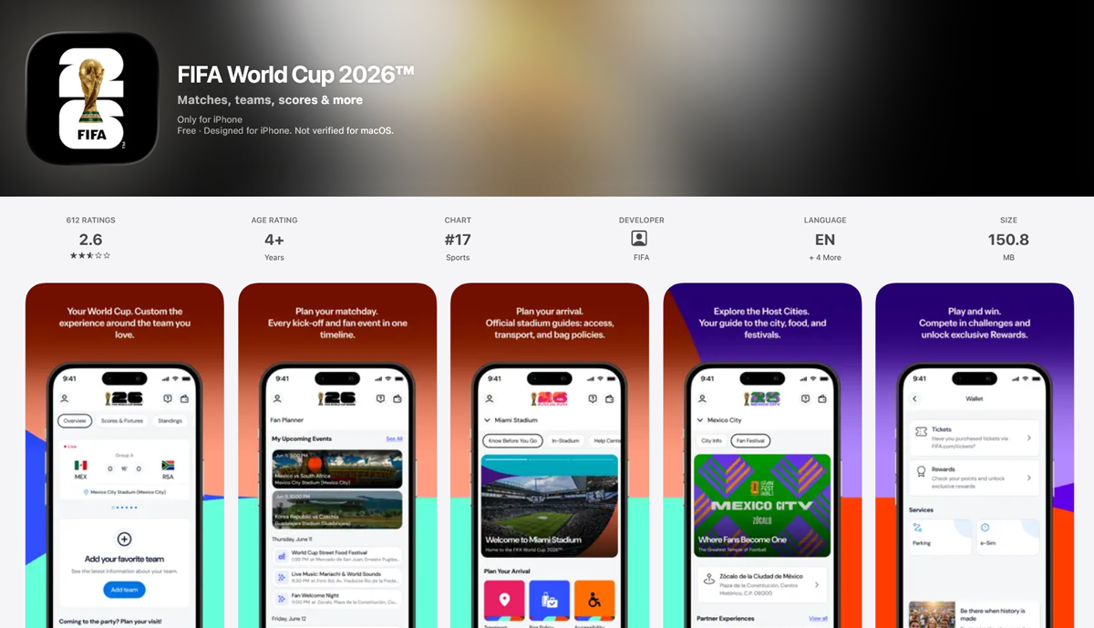
FIFA World Cup 2026 App uses the official tournament emblem throughout the interface, creating a consistent identity across schedules, live scores, and fan content.
FIFA Official App keeps FIFA’s corporate logo front and centre, reinforcing the governing body’s identity while delivering news, rankings, and global football updates.
EA SPORTS FC 26 Companion App prominently features the EA SPORTS FC branding, giving Ultimate Team players an instantly recognizable hub for squad management and transfer market activity.
FWC2026 Mobile Tickets places the FIFA World Cup 2026 logo at the heart of the ticketing experience, ensuring the tournament’s branding remains consistent from ticket purchase to stadium entry.
Websites
A football club’s website is often its digital home, so the logo has to do much more than sit in the header. It guides navigation, reinforces brand identity across every page, and creates a familiar experience whether supporters are buying tickets, reading match reports, or shopping for merchandise.
FIFA World Cup 2026 places the tournament logo prominently in the site’s global navigation, tying together fixtures, news, ticketing, and fan information under one consistent identity.
Rangers FC uses its full club name alongside its iconic crest, while the website’s blue-and-white branding, accented with subtle touches of red, creates a clean and unmistakably Rangers experience from the homepage to the club store.
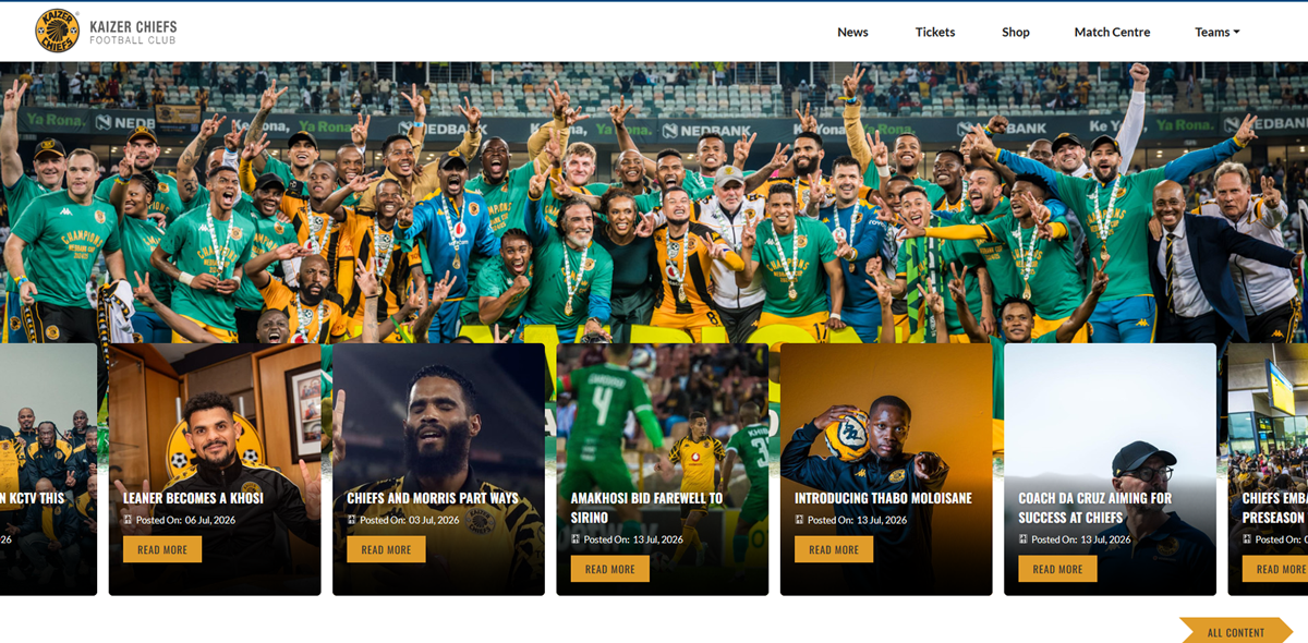
Kaizer Chiefs carries its distinctive circular badge across every page, pairing the iconic crest with the club’s signature black-and-gold branding.
LA Galaxy builds its website around the modern shield logo, using clean layouts and bold club colors that keep the brand instantly recognizable from homepage to matchday content.
GNK Dinamo Zagreb consistently features its historic "d" monogram across navigation, fixtures, academy pages, and club updates, proving how a simple emblem can unify an entire digital experience.
Summing Up: Great Football Logos Aren’t Born Overnight
The best football logos aren’t remembered because they’re the most detailed or the most modern. They’re remembered because they stand for something. A century of football history shows that the strongest badges evolve with the game while holding onto the symbols, colors, and stories that supporters connect with.
If you’re ready to create a badge of your own, take inspiration from the past but design for today’s game. Try LogoDesign.Net’s logo maker to explore professionally designed templates, customize every detail, and create a football logo that’s ready for everything from digital platforms to match-day jerseys.
FAQs
Get clear answers to the most common football logo design questions, including tips on colors, layouts, symbols, and branding choices.
1. How do I choose colors for a football team crest?
A club’s colors should tell its story. Many iconic teams use palettes inspired by their city’s history, regional symbols, or local traditions. When choosing colors for a football team crest, focus on meaning first, then aesthetics.
A few guidelines:
- Start with one dominant color and one or two supporting shades.
- Choose colors that represent your team’s personality and community.
- Ensure the palette works on jerseys, merchandise, and digital screens.
- Avoid too many colors that can make the crest feel crowded.
Looking at colors used by different industries can also help you understand how bold, recognizable palettes create stronger connections with audiences.
2. What elements should be in a modern football logo?
A modern football logo focuses on clarity rather than filling every space with details. While older badges often included many symbols, today’s designs prioritize one strong idea that works across digital and print platforms.
Key elements include:
- One main symbol, such as a mascot, monogram, ball, or shield.
- A clean, readable typeface.
- A balanced layout with enough empty space.
- A limited color palette that remains effective everywhere.
The best modern crests preserve a club’s history while making it easier to recognize. Exploring team logo ideas can help amateur clubs find a strong foundation while creating a unique identity.
3. Why do sports logos use trophy symbols?
A trophy is one of the fastest ways to communicate success, competition, and achievement. That is why trophy logo designs are widely used in tournament branding, youth leagues, championship events, and club anniversary badges.
As football grew into a global entertainment industry, organizers needed symbols that fans could recognize instantly across posters, tickets, broadcasts, and merchandise. A simple trophy icon could give an event a sense of prestige and represent the highest level of competition.
For anyone designing memorable logos, a trophy should add meaning rather than act as decoration. The strongest designs use it to support the story behind the competition.
4. How to design an award logo for a sports tournament?
An award logo should celebrate achievement without becoming visually crowded. The strongest tournament logos usually focus on one central symbol instead of combining too many elements like trophies, stars, ribbons, and decorative details.
A good approach is to:
- Choose one primary championship symbol, such as a cup, medal, or laurel wreath.
- Pair it with bold, readable typography.
- Use a simple color palette that works across print and digital media.
- Leave enough space so the logo remains scalable and clear at small sizes.
A balanced design keeps the event name visible on tickets, medals, broadcasts, and social media while creating a memorable tournament identity.
5. Which World Cup logo is considered the best?
Ask ten football fans, and you’ll probably get ten different answers, but the World Cup logo for Mexico 1970 appears near the top of many designers’ lists, and for good reason.
Instead of relying on a detailed illustration, it used thick black lines, concentric circles, and bold lettering inspired by the Op Art movement. The design captured the creative spirit of the host nation while remaining highly recognizable. More than fifty years later, it still feels fresh because it wasn’t chasing short-lived design trends.
The logo also solved a practical problem. It worked just as well on a stadium banner as it did on a tiny match ticket or newspaper advertisement.
6. How is a FIFA tournament logo created?
Every tournament has its own personality, but it also needs to feel like part of the same global competition. That’s the balancing act behind a FIFA logo and identity.
The process usually begins with the host nation. Designers explore local culture, architecture, traditional art, national colors, and symbols that fans immediately associate with the country. Those ideas are then shaped into a modern identity that can work across television graphics, stadium signage, merchandise, digital platforms, and official publications.
At the same time, the branding has to remain clearly connected to FIFA. That means following visual standards for typography, spacing, and overall presentation while still giving each tournament its own character. The result is a logo that feels unique without losing its place within one of the world’s biggest sporting events.
7. How do sports logos show motion and energy?
Well, a sports logo doesn’t need an athlete sprinting across it to feel energetic. Most of the time, that sense of movement comes from smart design choices rather than the illustration itself. Designers use forward-leaning shapes, sharp angles, flowing lines, and dynamic layouts to make a logo feel fast and energetic.
Logo typography also plays an important role. Italic or angled letterforms suggest movement, while bold strokes keep the design clear and readable from a distance. Diagonal elements can add energy without making the logo feel crowded.
Modern sports and fitness logos often use sleek typography, strong silhouettes, and simple compositions that work across jerseys, websites, and mobile screens. The best designs feel active because every element guides the eye forward.
8. What do helmet logos symbolize in sports branding?
A helmet is a powerful sports symbol that represents strength, protection, resilience, and determination. That is why football, hockey, rugby, and youth sports teams often use helmet logo graphics to create a bold identity.
Beyond safety equipment, a helmet suggests a team that is prepared, disciplined, and ready to face challenges. Many helmet-based designs use sharp edges, strong angles, and bold face masks to reinforce this competitive spirit.
A simple helmet silhouette with a few defining details often creates more impact than an overly detailed illustration. When designed well, a helmet becomes a symbol of teamwork, courage, and the passion that connects fans with a team.
9. How do you design a mascot logo with a helmet?
When you design a mascot logo with a helmet, start with the character’s face. The eyes and expression create the personality, so focus on making them clear and impactful before adding details.
Build the helmet around the expression with a bold, recognizable shape. Keep details simple so the design works on uniforms, embroidery, and digital platforms.
A few key tips:
- Make the eyes visible at smaller sizes.
- Use thick outlines instead of delicate strokes.
- Simplify the face mask into clean shapes.
- Test the silhouette in black and white before adding color.
A strong mascot logo should remain confident and recognizable across every application.
10. What is the best logo format for jersey printing?
A great logo can still produce disappointing results if it’s supplied in the wrong file format. Vector files are the preferred choice because they can be resized without losing sharpness, whether the logo appears on a sleeve, chest, or large banner.
The most common logo formats include:
- SVG for websites, digital graphics, and design software.
- EPS for professional printing and embroidery.
- AI for editing original artwork in Adobe Illustrator.
Raster files like JPEG and PNG can work online, but they may lose quality when enlarged. Before production, always test the logo at different sizes to ensure details and text remain clear on custom football shirts.
11. How do you design a clean logo for a sports kit?
A clean sports kit logo needs to work within limited space while standing out alongside sponsor marks, manufacturer branding, and player details. Overly detailed badges can become difficult to recognize when printed or stitched onto fabric.
Keep the design compact with a clear main symbol and avoid unnecessary borders, tiny details, or long text that may disappear at smaller sizes.
Check the logo across different placements:
- Left chest.
- Sleeve badge.
- Training wear.
- Caps and merchandise.
Using a dedicated sports team logo maker can also help ensure the badge is properly formatted before creating a complete football jersey design.
12. What are the best fonts for fitness and sports logos?
Typography can shape the personality of a sports logo as much as the symbol itself. The best fonts improve balance, confidence, and readability across jerseys, scoreboards, merchandise, and digital platforms.
Popular font styles for sports and fitness logos include:
- Heavy sans-serif fonts for strength and visibility.
- Custom slab serif fonts for a traditional or collegiate feel.
- Geometric sans-serifs for modern branding.
Avoid script fonts, thin typefaces, and overly decorative styles that become hard to read. Choosing legible logo fonts ensures the team name stays clear at every size, from stadium displays to profile pictures.