Pepsi, Target, and countless others went circular for a reason. Sure, it’s versatile and soft—but there’s much more behind this timeless shape than meets the eye.
From the perfectly round Target bullseye and Starbucks emblem to the minimalist icons of Spotify, Google Chrome, and Instagram, circular logos are quite popular across industries. And there are many reasons behind this.
Firstly, circles in branding is not about just making an aesthetic choice. They have deep cultural and emotional meaning, and also offer practical advantages that make them ideal for digital and print media. If you consider the psychology of shapes here, circles are known for having a global appeal and increasing recognition for brands.
Circles in logo design have a deep cultural and emotional value, ideal for both digital platforms and print materials
Let’s break down the ‘circle logic’ behind modern branding and explore why so many successful companies go round when it comes to design.
The Psychology of Circles
Circles have always been associated with ideas like wholeness, balance, and continuity. In branding, the shapes help convey emotional messaging that influences how we feel about a product or company.
1. Unity & Wholeness
A perfect circle in the middle and smaller circles on the side represent an endless loop and completeness
Circles naturally represent wholeness and continuity; there’s no beginning or end, just an endless flow. That’s why they’re often used by brands that want to convey harmony, unity, and inclusiveness.
2. Community & Connection
Overlapping circles suggest inclusion and are used to show social bonds
Since circles have no beginning or end, they naturally stand for connection and unity. In branding, they highlight shared values and relationships, which is why many social or community-focused brands lean toward circular designs.
3. Movement & Energy
Spiral arcs show motion and progress
The round shape of a circle gives off a sense of movement and flow. Spirals or circular patterns often symbolize progress and adaptability, making them perfect for brands that want to convey energy, innovation, and growth.
4. Softness & Approachability
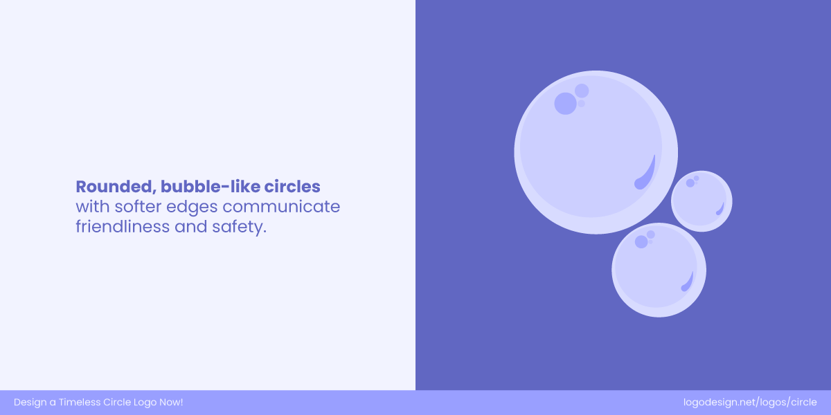
Bubble-like circles, with soft edges, show friendliness and safety
Unlike shapes with sharp edges, circles naturally feel soft, safe, and inviting. Their gentle form gives logos a human touch, helping brands appear more approachable, friendly, and easy to connect with.
5. Spiritual & Natural Associations
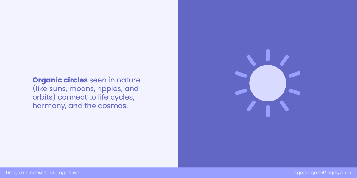
Organic circles that are used to form natural elements suggest connectivity and harmony
Circles are everywhere in nature, from the sun and moon to the ripples in water. They represent rhythm, eternity, and balance, giving brands a timeless, universal, and almost spiritual visual language.
Why Circles Make Powerful Brand Symbols?
The psychology of circles might explain why they feel right. But in the modern world of digital-first branding, there are also practical reasons why circles are dominating visual identities.
1. Circles Scale Beautifully
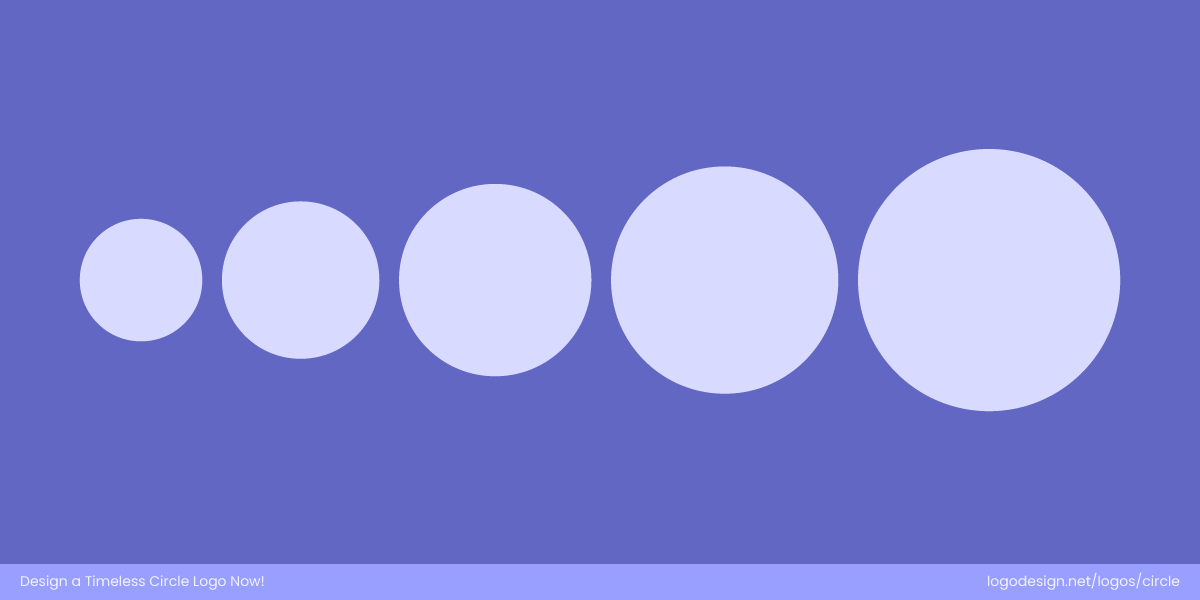
Scaled circles presented in an order work well across differently-sized screens
One of the key challenges in brand design today is scalability. Your logo needs to work across multiple formats and sizes. This includes mobile screens, smartwatches, browser tabs, digital ads, business cards, packaging, and even billboards.
Circles maintain their appearance at any scale. They’re immediately recognizable, even in small or low-resolution formats. Unlike text-heavy or complex designs, a simple circular logo remains clear and functional, be it a 16×16 pixel favicon or a moving advertisement on the side of a bus.
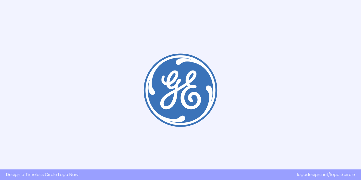
The GE monogram logo has stylized G and E letters and a circular border, along with a blue background to retain the brand’s identity
The GE monogram features a hand-scripted “G” and “E” nestled inside a decorative circular frame. The looped letters flow into each other with elegant swirls, giving a feeling of continuity and craftsmanship. The circle keeps the entire design contained — making it recognizable whether on a giant billboard or a tiny device. Even reduced to small sizes, the blue round holds its shape and retains the brand’s identity due to the strength of that circular enclosure.
The National Vision wordmark logo features a circular icon that shows simplicity
National Vision’s refreshed logo features a circular icon inspired by the iris of an eye, complemented by sleek, modern typography. The circle perfectly represents vision and clarity, echoing the brand’s mission of accessible eye care. Its simple, balanced shape ensures instant recognition, whether on store signage or tiny app icons. The design’s clean geometry translates seamlessly across digital and print media, maintaining its sense of trust, precision, and visual harmony in every format.
2. Circles Fit the Digital World Naturally
Modern UI design is quite circular if you look closely. From app icons on smartphones to profile pictures on social media, digital platforms feature circular frames to improve user experiences. So when your brand has a logo in such a shape, it fits quite well into these spaces without cropping or resizing.
For example:
- Instagram stories display profile pictures in circular forms
- iOS and Android both use rounded icons for apps
- Platforms like WhatsApp or Slack show contact photos in circles
>Watch how a free logo editor helped CodeNest design a social media-ready logo for an appealing user experience.
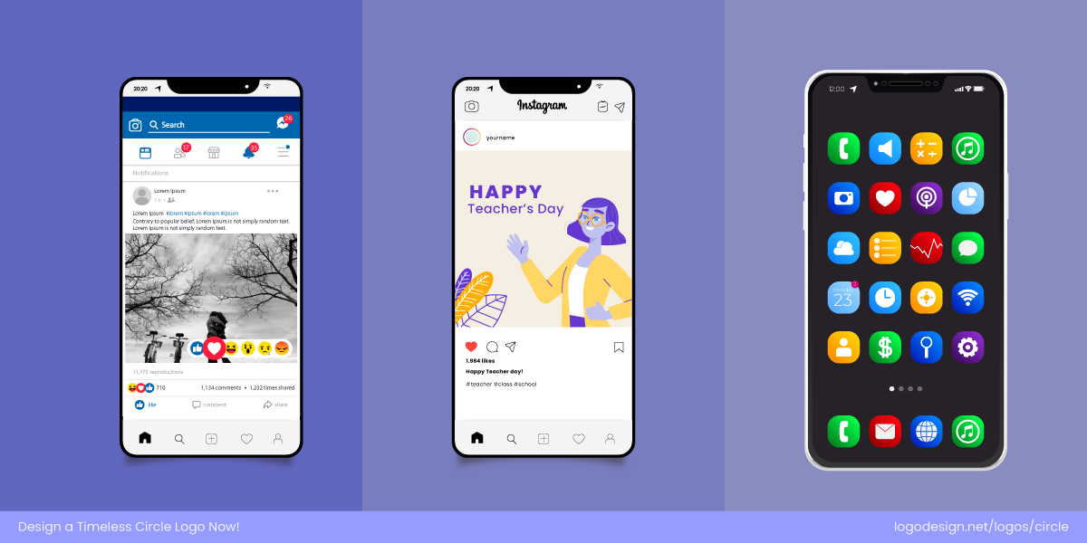
The circular logos shown across different digital screens
A circular logo is pretty much pre-optimized for digital use, making it quite suitable for brand consistency across platforms. Target’s bullseye logo shows how being ‘circle-native’ makes it fit well on apps like Instagram and TikTok, where the brands have to display their icons in circular forms.
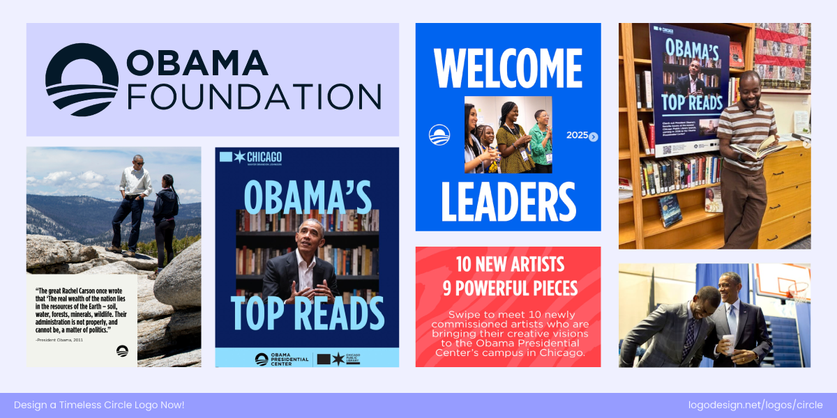
The Obama Foundation uses a circular rising sun logo that suggests hope and progress across various promotional items – Source: Instagram/obamafoundation
The Obama Foundation logo uses a rising sun within a circle, symbolizing hope, progress, and unity. Its circular form makes it instantly adaptable for digital platforms—whether as a favicon, app icon, or social profile—retaining both clarity and symbolism even at small sizes.

The Crunchyroll’s swirl logo is used across various branding items to suggest motion and flow – Source: Instagram/crunchyroll
Crunchyroll’s circular swirl logo is designed with motion in mind, echoing the flow of anime culture. Because it’s inherently round, the logo sits naturally in digital spaces like app stores, streaming platforms, and social media, ensuring strong brand consistency across touchpoints.
3. Circles Are Born for Motion
With video content and motion design becoming one of the main elements of branding, the ability to animate a logo or brand element matters more than ever. Circles offer natural motion pathways like spins, ripples, rotations, and bounces. Such effects feel intuitive and interactive when applied to circular forms.
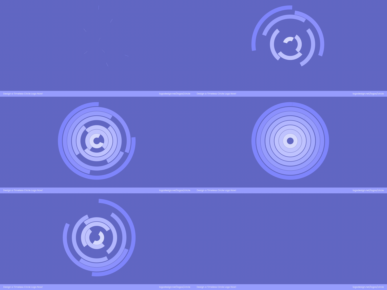
Animation circular forms suggest movement that feels modern
Animation with circular elements feels fluid and continuous, aligning with the psychological concepts of movement, life, and evolution. This adds an extra layer of dynamism to brands that want to feel modern and engaging in digital media.
When Fertility Logo Redesign by Universal Favourite
The When Fertility logo by Universal Favourite uses a circular form paired with an organic cell shape that subtly reacts in motion — soft pulses or fluid shifts. Even as it’s animated, the round enclosure keeps the wordmark feeling both credible and compassionate, helping the brand stand out while also feeling trustworthy.
Afresh Logo Redesign by Upperquad
The Afresh logo, designed by Upperquad, features a dynamic circular emblem that comes alive with smooth, fluid animation. The movement symbolizes freshness, adaptability, and forward motion — qualities that align with the brand’s mission to modernize the food industry with intuitive technology.
4. Circles Play Well with Negative Space
The circular form naturally creates a self-contained canvas, making it easier to balance positive and negative elements within a single shape. Its smooth, continuous edges prevent the design from feeling fragmented, allowing negative space to appear deliberate and harmonious.
A circular logo with negative space is used to highlight a star-like icon
Circles also help frame the negative space, keeping it visually contained and easier for the viewer to interpret. This makes them ideal for logos that rely on hidden symbols, dual imagery, or minimalist storytelling — where what’s not shown is just as powerful as what is.
Cambridge Audio’s circular logo mirrors a volume dial, using negative space and balance to symbolize sound and precision.
The Cambridge Audio logo is a clever study in circular design and negative space. Its emblem—a circle within a circle—echoes the tactile experience of turning a volume dial, directly linking the mark to sound and precision. The subtle negative space within the “C” shape keeps the logo open and breathable while maintaining a sense of engineering balance, making it instantly recognizable across both print and digital formats.
The San Diego Zoo Wildlife Alliance logo uses circular geometry and negative space to unite a lion, rhino, and condor.
The San Diego Zoo Wildlife Alliance logo by Pentagram masterfully blends circular geometry with negative space to tell a story of connection. Within the circle, silhouettes of a lion, rhinoceros, and California condor emerge through the clever use of contrasting shapes — each defined as much by what’s absent as what’s present. The circle itself becomes a symbol of the natural world’s balance and unity, while the interplay of negative space reinforces the organization’s mission: that all wildlife is interconnected within one shared ecosystem.
5. Circles Pull the Eye Inward
Circles have a magnetic quality — their continuous, enclosed form naturally draws the eye toward the center. In logo design, this makes them perfect for creating a clear focal point that instantly captures attention. The viewer’s gaze settles within the circle, giving the design a sense of focus and intention.
A circular logo is being used to display a magnetic effect by showing an inward pull
This inward pull helps brands highlight their core message — whether it’s a symbol, a monogram, or an icon.
The Natural History Museum’s logo has concentric circles that guide the eye inward, symbolizing curiosity and discovery.
The Natural History Museum’s logo is a great example of how circles naturally draw the eye inward. Its concentric word rings create a ripple effect that pulls focus toward the center—just like curiosity draws us toward discovery. This circular motion adds depth and direction, guiding the viewer’s gaze right to the heart of the design. It’s a clever visual metaphor for the museum’s purpose: exploring life from its origins and inspiring a deeper connection with the natural world.
A swirling circular logo design that draws the eye inward, symbolizing motion, flow, and seamless efficiency.
The Ocado logo features a circular swirl that naturally pulls the viewer’s eye toward the center. The spiral shape creates a sense of motion and flow, which is dynamic but still balanced. This continuous movement mirrors the brand’s promise of seamless delivery and efficiency, showing how a simple circular form can communicate both energy and direction within a logo.
6. Circles Belong Everywhere
Circles belong everywhere because they’re one of the most versatile and universally recognized shapes in design. Their smooth, balanced form carries no sharp edges or hierarchy, allowing them to adapt to any brand personality — bold, calm, or modern.
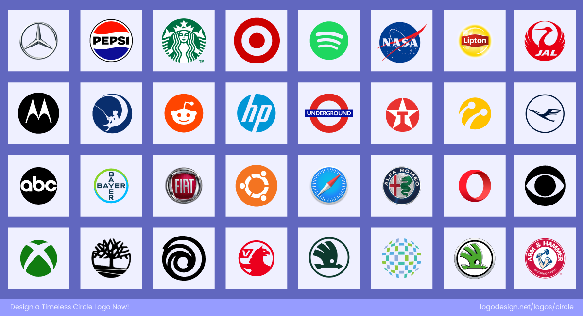
Renowned brands from various industries using a circle logo
Circles transcend industries — they’re universal symbols that adapt to nearly any brand story. From science to food, they communicate connection, energy, and continuity.
The Royal Astronomical Society logo has a circular emblem to symbolize the unity and a loop that encourages discovery.
The Royal Astronomical Society logo features a circular emblem that symbolizes the cosmos and the endless pursuit of discovery. Its round form captures the idea of unity and continuity, which perfectly represents an organization dedicated to exploring the vast, interconnected universe.
The Collective’s bold circular wordmark gives warmth and a community feel to build a connection through food
Meanwhile, The Collective, a modern food brand, uses a bold circular wordmark that feels warm, inclusive, and down-to-earth. The round shape reinforces its sense of community and shared enjoyment, perfectly aligning with a brand built around connection through food.
Whether representing galaxies or gatherings, circles prove they can shape the identity of brands in completely different worlds — and still feel right at home.
7. Circles Build Seamless Systems
Circles are naturally repetitive and modular, making them ideal for building cohesive brand systems. Their perfect symmetry allows them to connect, overlap, or radiate outward without breaking visual harmony. It’s a quality that translates beautifully into patterns, textures, and motion graphics.
A grid of circular dots with circular borders that create intentional repetition and rhythm
From minimalist dots to complex circular grids, these patterns maintain a unified aesthetic that feels intentional and balanced — reinforcing brand recognition through repetition and rhythm.
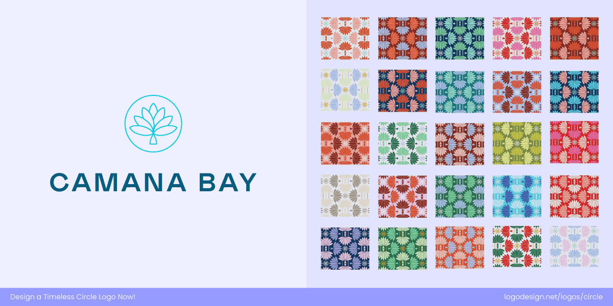
The Camana Bay logo uses a blossom icon around a circular shape, showing evolution and pattern.
Camana Bay’s logo, designed by Steffen Studio, uses circular and petal-like forms to create a versatile visual ecosystem. The central “blossom” mark evolves into a dynamic pattern system across architecture, signage, and promotional materials. These soft, repeating circles form rhythmic, layered compositions that feel distinctly Caribbean — fluid, balanced, and connected — proving how circular geometry can scale seamlessly from a single logo to an entire brand world.
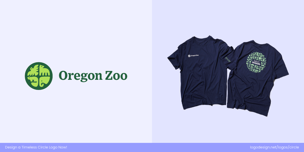
Organic circular motifs from the Oregon Zoo’s logo flow across merchandise and signage, building a connection between wildlife, people, and planet.
The Oregon Zoo’s circular logo expands naturally into a pattern language that feels organic and alive. The curved, animal-inspired shapes within the circle extend into prints and merchandise, creating cohesive visual systems that echo nature’s cycles. On apparel and signage, the repeated circular motifs communicate the Zoo’s mission — harmony between wildlife, people, and planet — while maintaining a clean, unified look.
How to Create a Circular Logo That Stands Out?
From tech startups to global corporations, circles are timeless because they feel approachable and can adapt well. But designing an effective circle logo requires quite a lot of effort and strategic choices, like the right brand colors. Let’s take a look at some of the steps to create such shapes in branding.
1. Use Grids and Proportions for Balance
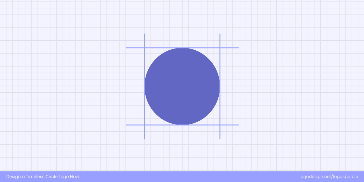
Using a grid when drawing a circular shape can help maintain dimensions and bring stability
Circles are naturally symmetrical, but balance can easily be lost when combined with text or icons. Using geometric grids helps maintain proportion, ensuring that every element feels intentional and visually stable.
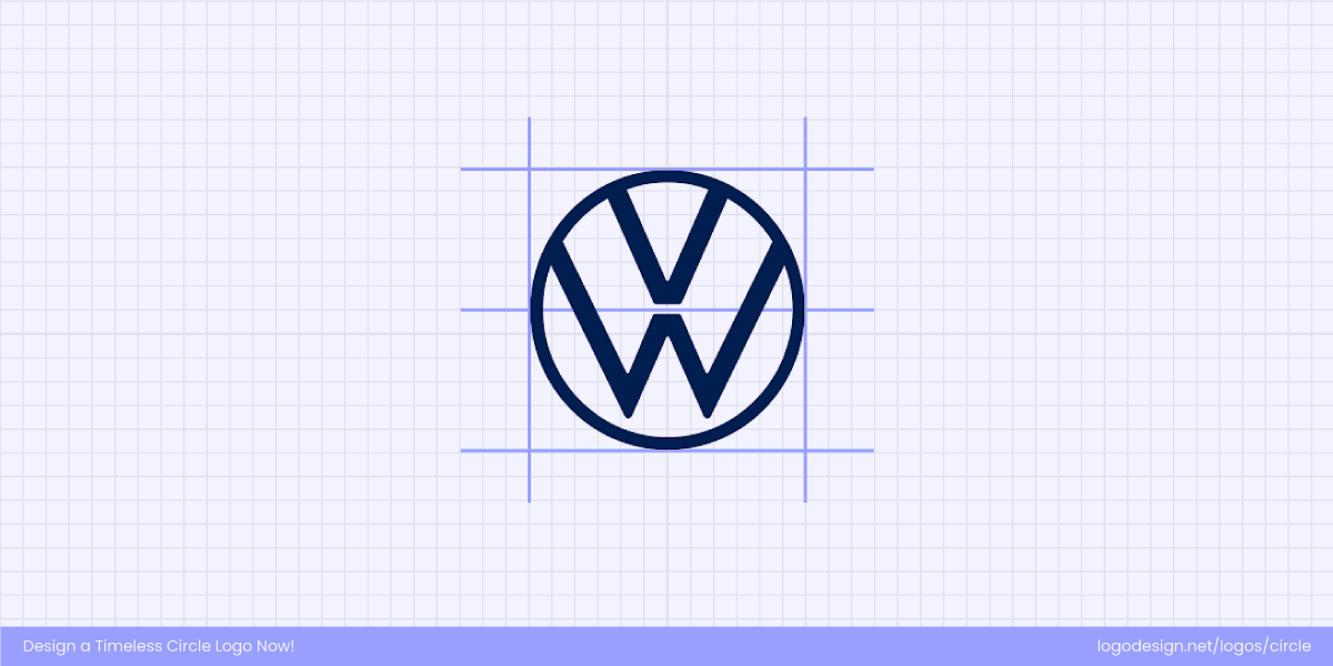
Volkswagen’s logo uses a precise circular grid to align the ‘V’ and ‘W’, creating perfect balance.
Consider Volkswagen’s icon here, which relies on a precise circular grid to keep the ‘V’ and ‘W’ perfectly aligned within the outer ring. The harmony and balance in the design makes this logo timeless.
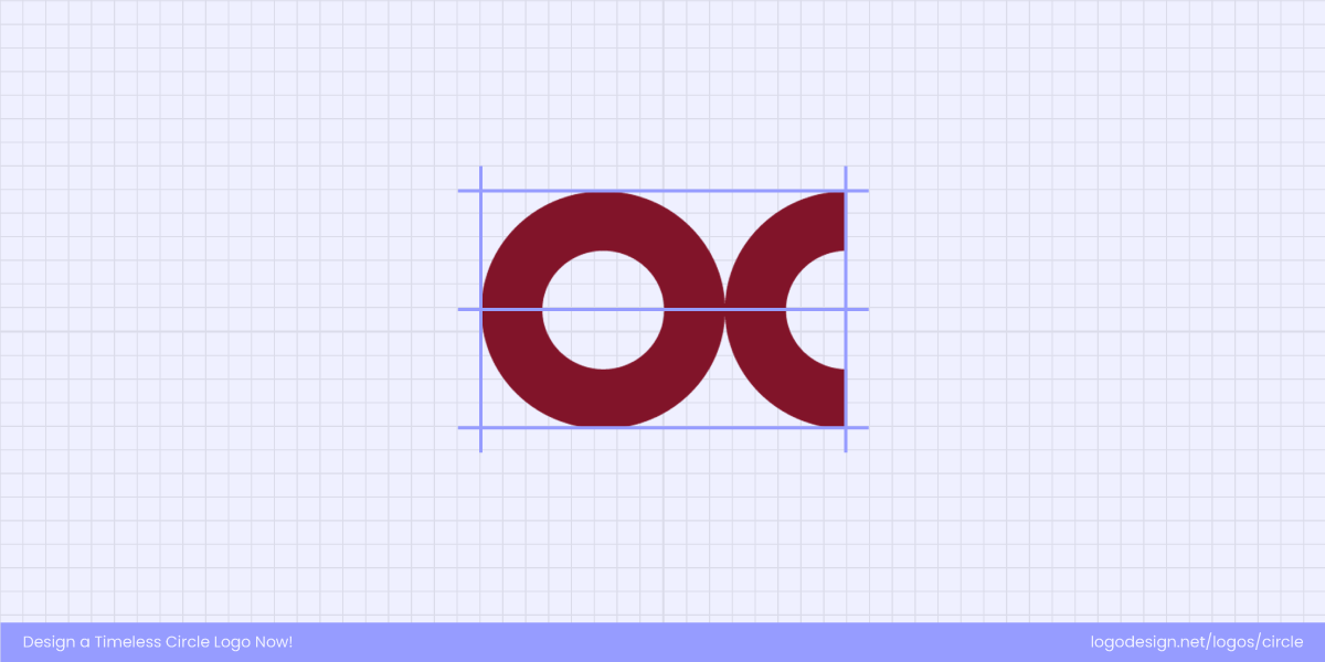
Balanced geometry in the Oklahoma Christian University logo, precise grids shaping a circular monogram.
The Oklahoma Christian University logo is a strong example of balance through geometric precision. Its circular “OC” monogram uses consistent proportions and spacing, creating visual stability and harmony. The design feels structured yet approachable—showing how grids can keep circular logos refined, legible, and cohesive across applications.
2. Add Depth with Overlaps or Cuts
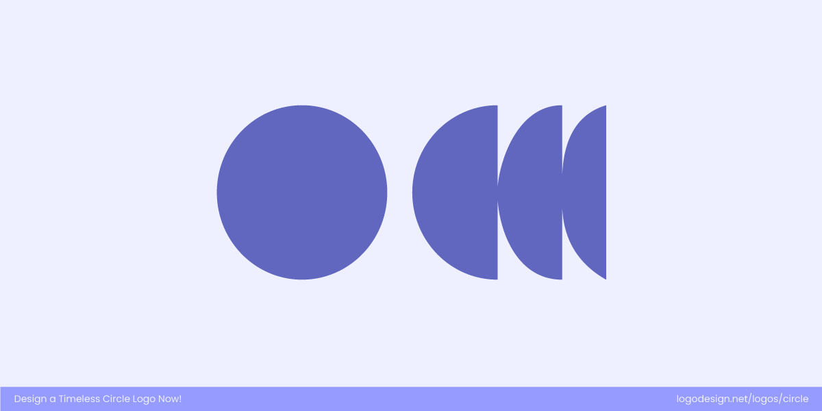
Layered and broken circles add depth, movement, and contrast while keeping the design balanced and unified.
Breaking or layering circles adds depth and storytelling to your design. Overlaps can suggest unity and movement, while subtle cuts create contrast and focus. The goal is to introduce variation without disrupting the circle’s integrity.
With clean cuts and subtle overlaps, The Avenues logo shows a sense of depth, motion, and refined unity.
The Avenues logo features subtle cuts and overlaps within its form. The way certain parts of the letterforms intersect or recede gives a feeling of depth and sophistication without disturbing the unitary structure. The cuts aren’t harsh; they’re clean, helping the logo feel dynamic yet coherent.
The King Arthur Baking Company logo has overlapping wheat crown elements to create dimension within a circular emblem.
King Arthur Baking logo incorporates overlapping elements — the wheat crown motif interlocks with other shapes. Those overlaps add dimensionality and visual layering, making the symbol richer while keeping it grounded in a circular or crown-like frame.
3. Choose Between Solid and Outlined Forms
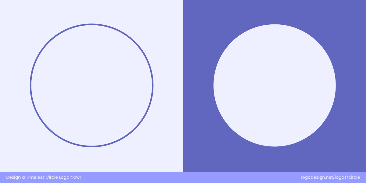
Bold and solid or open and airy, the circle style you use dictates your brand’s tone.
Decide whether your circle should feel bold and grounded or open and airy. Solid shapes convey strength and authority, while outlined forms feel flexible and adaptable. Choosing the right style defines your brand’s tone.
The Oslo Kommune logo has an outlined circle showing openness, and the symbol showing modern governance.
The Oslo Kommune logo uses a refined outlined circle that feels open and contemporary. The thin line in the design adds a sense of transparency and approachability, reflecting the city’s commitment to accessibility and modern governance. The outlined style keeps the design light while maintaining structure and authority.
A bold, solid circle shows Azerbaijan Travel’s strength and unity, making it recognizable across all platforms.
The Azerbaijan Travel logo uses a bold, solid circle to ground its identity in confidence and energy. The filled shape adds visual weight, making it instantly recognizable across travel materials and digital platforms. Its solid form conveys strength and unity, ideal for a national tourism brand aiming to inspire trust and excitement.
4. Define the Circle’s Role
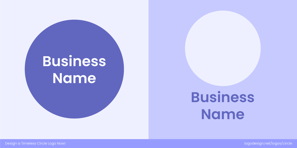
Circles can frame your design or be your design, whether they are in a container or your core identity.
Circles can either contain other design elements or serve as the main form themselves. When used as containers, they feel compact and official. When the circle is the logo, it becomes the personality of the brand. Define how central the shape is to your identity.
The iconic Vodafone circle, a bold speech mark symbolizing connection and conversation.
Vodafone logo uses the circle as the brand itself — bold, energetic, and instantly recognizable. The circular “speech mark” shape communicates connection and conversation, making the form integral to the brand’s personality rather than just a frame.
The Higgidy logo is a circular logo with a handcrafted and welcoming appeal, with a compact badge.
Higgidy’s logo uses a circle as a friendly container for its wordmark, giving the brand a handcrafted, approachable feel. The shape neatly holds the text together, creating a compact badge that feels warm, balanced, and perfect for packaging.
5. Balance Symmetry and Asymmetry
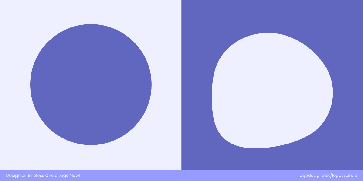
Choosing symmetry means creating a sense of calm and stability, while going for an asymmetrical circular design triggers energy and motion.
Perfect symmetry gives a sense of calm and order, while slight asymmetry introduces energy and character. The balance between the two creates a logo that feels both stable and dynamic.
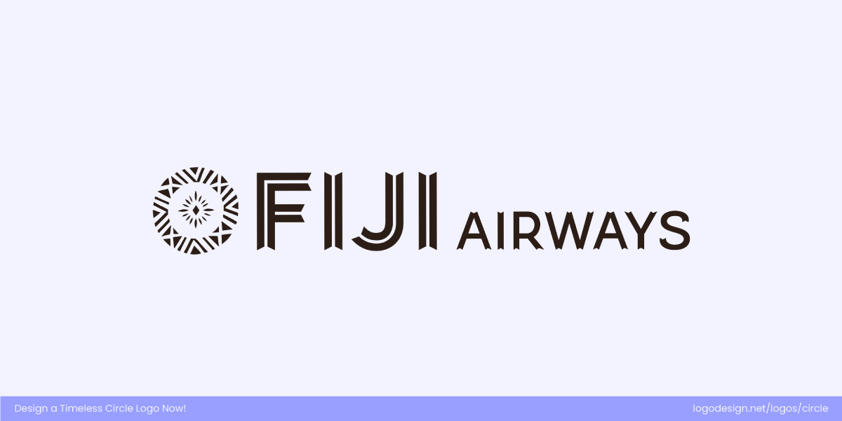
The symmetrical circular motif in the Fiji Airways’ logo suggests calm and reliability.
The circular motif in Fiji Airways’ logo is beautifully symmetrical, evoking a sense of calm, reliability, and confidence. This balance mirrors the airline’s commitment to stability and professionalism, giving the brand a grounded yet welcoming feel.
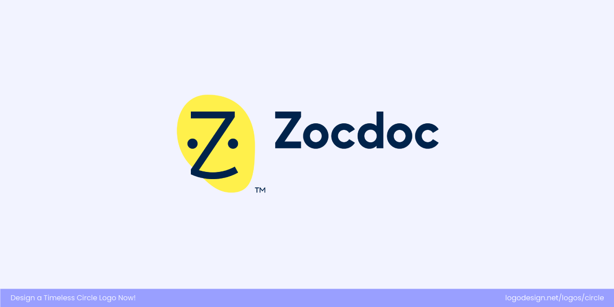
Zocdoc’s slightly off-balance yellow circle adds a playful, human touch, matching the brand’s patient-friendly approach.
Zocdoc’s yellow circle is intentionally a little off-balance, adding a touch of playfulness to the friendly face within. This slight asymmetry makes the design feel more human and approachable. It perfectly reflects the brand’s empathetic, patient-first approach to healthcare.
6. Design with Motion in Mind
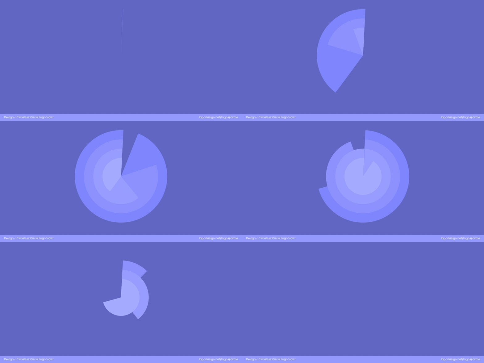
Animated circular forms bring motion to your brand when circles are rotating and pulsing
Circular forms lend themselves naturally to animation. When designed with motion in mind, they can rotate, ripple, or pulse effortlessly, giving your brand a dynamic and engaging presence across digital media.
By designing with animation in mind, logos can extend beyond static icons and become living brand assets.
National Gallery of Canada Logo Redesign by Area 17
The National Gallery of Canada’s logo, created with digital agency AREA 17, is an animated design that seamlessly shifts from a square to a circle using nine secondary symbols. This transformation captures the evolving nature of art and the gallery’s ongoing journey toward decolonization. Inspired by the glass ceiling of the Scotiabank Great Hall, designed by architect Moshe Safdie, the animation beautifully represents openness, inclusivity, and continuous renewal.
CETT Logo Rebrand by Mucho
CETT’s new logo, designed by Mucho, features a circular form enhanced by a smooth gradient animation, symbolizing transformation and innovation in tourism, hospitality, and gastronomy. The movement within the circle reflects the institution’s forward-thinking approach to education while capturing the lively, ever-evolving spirit of Barcelona.
7. Test Across Colors and Backgrounds
Since circles are quite prominent, they must be tested thoroughly against a variety of backgrounds. A red circle on white may be striking, but what happens when it’s used on a red background? It is a good idea to test against multiple colors and background elements to make sure that your design is visible from far away and at a close distance, too.
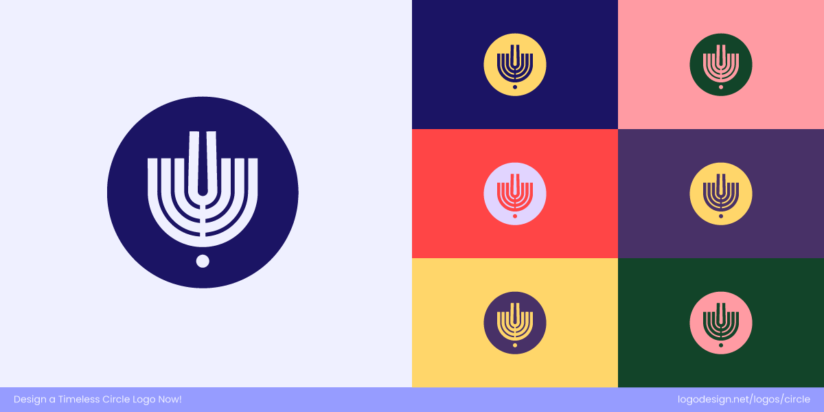
The Israel Philharmonic Orchestra logo unites a Hanukkiah and a tuning fork, combining tradition and music.
The Israel Philharmonic Orchestra (IPO) logo beautifully blends tradition with music by combining a Hanukkiah (menorah) and a tuning fork into one elegant symbol. Its thoughtful design adapts effortlessly to different colors and backgrounds, ensuring it looks striking on everything from digital platforms to concert programs and merchandise.
The World Scouting logo, a purple fleur-de-lis within a circular emblem, suggests unity and global connection across all formats and cultures.
The World Scouting logo features a purple fleur-de-lis enclosed within a circular emblem, symbolizing unity, purpose, and global connection. Designed for versatility, it remains clear and recognizable across all backgrounds, colors, and formats — from uniforms and badges to digital media. It also ensures the organization’s identity stays strong and consistent worldwide.
Circle Styles and Their Symbolic Meaning in Logos
There are different styles of circles, each with its own emotional association and meaning. Understanding these can help explain why so many modern logos lean toward the circle.
• Solid Discs
A bold, solid circle shows strength, confidence, and trust, used by brands in finance, tech, and infrastructure.
A solid, filled circle communicates power, boldness, and dependability. It’s grounded and unmistakable, often used to convey a sense of authority and trust. Brands that want to project confidence, especially in finance, technology, and public infrastructure, consider these shapes or styles.
The ArtCenter Dot, a bold orange circle, shows creativity and clarity, which is the spirit of ArtCenter College of Design.
ArtCenter College of Design’s logo is instantly recognizable. It’s a simple, bright orange circle known as the “ArtCenter Dot.” It’s a symbol of creativity, clarity, and forward thinking. Since the school’s early days under founder Tink Adams, this bold dot has embodied the college’s energy and commitment to design excellence, perfectly representing its vibrant creative community.
USA Today’s blue circle, a simple, modern symbol of a complete daily news cycle and global perspective.
Similarly, USA Today’s logo features a solid blue circle, called “the point,” sitting right beside its name. This clean, minimal symbol captures the idea of a complete daily cycle, a global perspective, and the end point of each day’s news. It’s simple but meaningful, giving the brand a modern, trustworthy, and instantly familiar look.
A solid disc is also visually dominant, making it ideal for logos that need to stand out on screens, packaging, and business card layouts.
• Rings
Interlocking rings show connection and unity, used by brands to suggest openness and relationships.
Outlined circles or rings emphasize openness and relationships. They’re used to symbolize connection, unity, or a shared ecosystem. It’s why such symbols are popular in industries like telecom, networking, or community-driven platforms. Rings visually guide the eye inward, creating a sense of focus, like a lens or spotlight.
The clean geometric ring framing and the bold ‘NO’ monogram in the Neuköllner Oper logo show focus and unity.
The Neuköllner Oper logo perfectly captures this concept. Its clean, geometric ring forms a striking frame around the “NO” monogram, representing focus, clarity, and unity. The simplicity of the circle gives the design balance and sophistication, making it instantly recognizable.
Open, flowing rings show creativity and motion, used to display inclusivity and a human spirit.
Similarly, the Creative Circle logo uses open, flowing ring shapes to convey creativity, collaboration, and motion. The circular outline feels dynamic yet inclusive, reflecting the organization’s mission to celebrate creative energy while staying approachable and human.
• Multiple Circles
Overlapping circles create a connection and collaboration, used by brands to represent seamless teamwork.
When multiple circles or parts of circles overlap, they show relationships, integration, and cooperation. This style is especially common in businesses that value collaboration or cross-functionality, such as consulting firms, tech platforms, or healthcare alliances. Asana’s logo has three circles forming a triangle and seamless transaction. It’s associated with shared values or co-creation.
Telefónica’s dotted ‘T’ symbolizes connection and unity, with each circle representing global communication.
The Telefónica logo captures the idea of connection beautifully with a series of circular dots forming the letter “T.” Each dot acts as a connection point, coming together to build a cohesive structure — a fitting visual metaphor for communication, integration, and network unity.
The Stawberry Hotel logo uses playful circles to form a strawberry shape, showing diversity and unity.
In contrast, the Strawberry Hotels logo arranges several solid circles of different sizes into the shape of a strawberry. This playful use of circles represents diversity, warmth, and a sense of togetherness. Both logos use multiple circular elements to express connection.
• Arcs
An arc shows motion, growth, and connectivity, used by brands to suggest progress and forward momentum.
A partial circle or arc naturally suggests motion and progress. Arcs feel dynamic and forward-moving, making them a popular choice for industries that want to express innovation, connectivity, or growth. They often appear in designs where energy radiates outward — much like Wi-Fi or RSS symbols — visually conveying expansion, communication, and forward momentum.
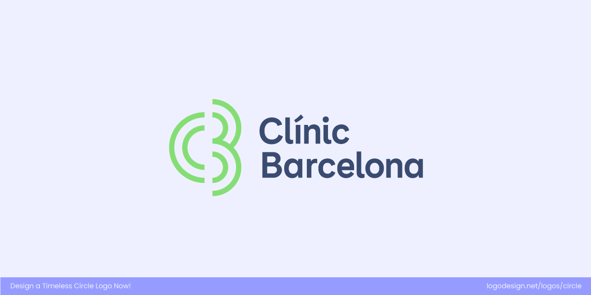
The Clinic Barcelona logo has an elegant upward arc that shows care, progress, and innovation in healthcare.
The Clínic Barcelona logo features a soft, upward-curving arc that feels like a protective embrace. This shape reflects care, progress, and human-centered innovation in healthcare, while subtly guiding the viewer’s eye upward to suggest growth and advancement.
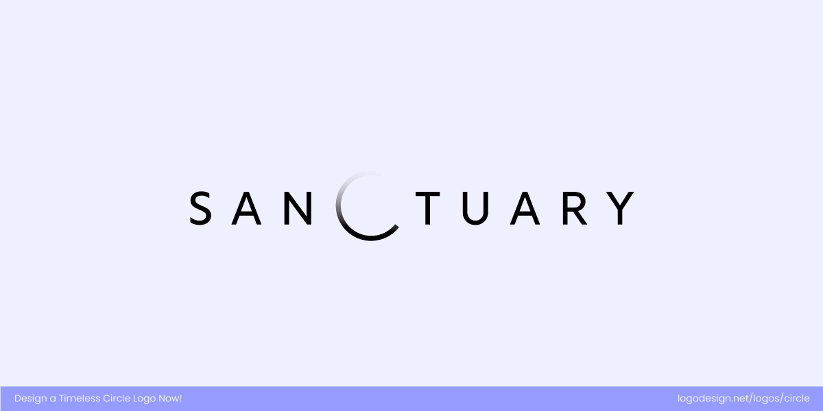
The Sanctuary on the Moon logo uses a sweeping lunar arc to replace the letter C, showing exploration and expansion.
On the other hand, the Sanctuary on the Moon logo uses a sweeping arc reminiscent of a celestial orbit. This design conveys exploration, expansion, and a futuristic outlook, perfectly aligning with the brand’s forward-thinking, visionary identity.
Coming Full Circle: Takeaways!
Circle logos endure because they combine universal symbolism with modern practicality. They communicate ideas like unity, motion, and authority while remaining versatile across digital and print platforms. By balancing simplicity, proportion, and adaptability, circle logos help brands stay memorable, clear, and relevant for years.
- Circles symbolize wholeness, continuity, and unity, making them ideal for brands that want to convey harmony and inclusiveness.
- Their round form naturally suggests motion and progress, helping brands communicate energy, growth, and adaptability.
- Circles feel soft and approachable. They give logos a human touch that fosters friendliness and connection.
- Circular logos scale seamlessly and integrate well into digital platforms, fitting app icons, social profiles, and UI elements without cropping.
- Motion and animation feel intuitive within circles, allowing brands to create dynamic, engaging visuals.
- Circles work perfectly with negative space, support hidden symbols, dual imagery, or minimalist storytelling.
- Different circle styles: solid discs, rings, arcs, or overlapping forms, convey unique traits, from authority and reliability to collaboration and creativity.
