Ever heard about branding by geometry? It’s the reason circles feel friendly, squares feel stable, and triangles radiate energy. These subtle psychological cues make you trust, admire, or even crave a brand.
Shapes are among the first things our brains process when we see a logo. Before we even read the name or process colors, we think of whether the design feels strong or soft, stable or dynamic, trustworthy or playful. This is all based on its geometry. That’s the power of shape psychology.
Whether it’s a circle representing community, a triangle conveying innovation, or a square symbolizing stability, shapes have meanings that extend far beyond their basic forms. They have profound psychological associations, many of which are universal.
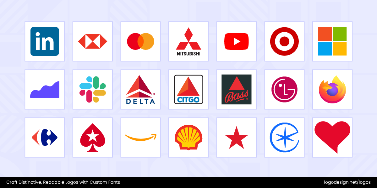
To understand this in-depth, let’s discuss the psychology of shapes in logo design here. Different shapes influence perception across various industries, and you can utilize them to create more powerful and emotionally appealing brand identities.
What is the Psychology of Shapes?
Shapes are not just visual elements; they have symbolic meanings that drive subconscious emotional responses. These reactions are shaped by both psychology and cultural learning. It’s why certain shapes feel trustworthy, dynamic, calming, or aggressive before a single word is read.
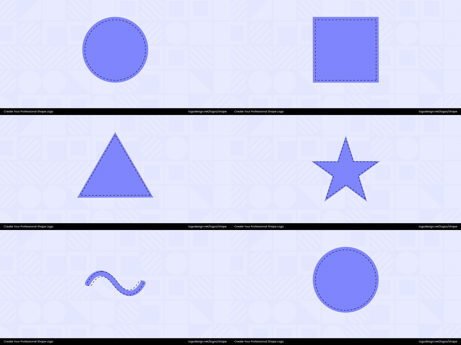
In logo design, understanding the psychology behind core geometric shapes can help brands communicate their values more clearly and quickly.
Why Shapes Matter?
Shapes are important for how people see brands. The psychology of shapes says the brain links shapes to feelings and ideas. When someone looks at a logo, the brain quickly spots edges and outlines. This happens before people think about what the logo means.
- The primary visual cortex (V1) helps people see shapes and outlines. This changes how they feel about a brand.
- Curved shapes look friendly and welcoming. Sharp angles can seem strong or even scary.
- The fusiform gyrus helps people know shapes they have seen before. This makes it easier to remember a brand’s logo.
- Brain scans show these brain parts connect to memory and feelings. So, shapes can make people think of a brand.
- MIT research found that V1 also helps with visual memory. This means people remember logos with special shapes more easily.
If you think about it, different shapes evoke different emotions in people.
For example, sharp-angled shapes like triangles can make people feel nervous or alert. These shapes are commonly found in warning signs, so the brain links them to danger. Fluid arc shapes may be perceived differently by people. Both sharp and arc shapes can help a logo stand out.
Designers need to use creative shapes that make people feel positive emotions. Studies show that the brain reacts very fast to shapes in logos. According to EEG and eye-tracking tests, shapes might be one of the first elements to get noticed in designs.
When the brain first processes a shape, it links it to a memory or a feeling about the brand. This helps people recognize brands fast and make strong connections.
First Impressions with Logo Shapes
First impressions are important in logo design. The psychology of shapes in logo design influences how people feel about your brand or business right away.
Let’s take a look at some of the first impressions associated with logo shapes.
- Logos with geometric shapes, clean lines, and simple appearances show trust, clarity, and skill.
- Minimalist shapes look modern and use the brain’s love for patterns to make brands feel familiar.
- Patterns and shapes in logos connect to big ideas and feelings. This helps people remember brands.
- Using simple shapes in logos helps people know brands fast and feel something. It’s why geometry is important for first impressions.
Utilizing the right shapes in a logo can help convey a brand’s image as trustworthy, fun, or creative. Therefore, it’s essential to decide whether to incorporate a shape as the core element or as an element that unifies the design.
Core Shapes and Their Psychology In Logo Design
Circles, squares, triangles, abstract and symbolic shapes, or lines are used in logos to evoke specific emotions or convey particular ideas. Let’s take a look at how they can help connect with audiences and maintain a sense of balance as well.
1. Rounded Shapes: Circles, Ovals, and Curved
Circles, ovals, and ellipses are often used in logos to show unity and togetherness. Since they have no beginning or end, they are considered powerful symbols of continuity. Consumers also believe that circles signify protection and lasting connections. This makes them quite effective for brands that want to present themselves as friendly, supportive, and people-centered.
Psychologically, rounded shapes are often associated with safety and comfort. The curves make them non-threatening and approachable, helping to create an emotional connection between a brand and its audience. When people see circular logos, they think positively of the brand.
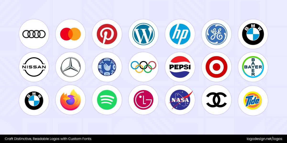
The Olympic rings show global unity and cooperation, while the circular form of the Starbucks logo emphasizes a welcoming and consistent experience.
The Psychology Behind Circle Logos
You’ll find that circular shapes have a few common associations in design psychology, and they are followed closely in branding.
• Unity
Circles represent togetherness and connection, symbolizing how elements are brought into a complete whole.
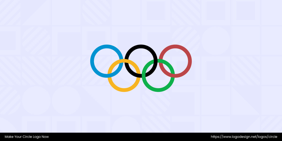
The five interlocked rings in the Olympic logo symbolize unity among the world’s continents. The logo design was chosen to promote feelings of global unity, collaboration, and teamwork. The rings represent international collaboration and the spirit of the Games.
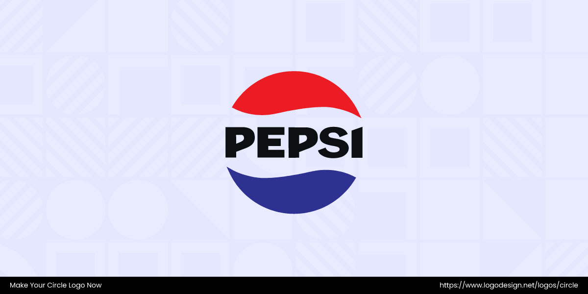
The Pepsi logo has a circular design with sections of red, white, and blue that are known to show harmony, unity, and balance. The logo is part of the company’s rich history and carries a strong emotional connection with its consumers.
• Community
The shape implies inclusivity and shared purpose, making people feel part of a group or collective.
The Google Maps logo features a circular pin-shaped design with soft curves and bright colors that are known to show connection and accessibility. The logo is a part of the company’s rich history and represents the brand promise of making every journey simple and intuitive.
The Volkswagen (VW) logo has a circular design with interlocking elements that show unity and connection. The logo creates an emotional connection with the consumers.
The Green Party of Canada logo has a circular form that has become closely tied to the party. It shows unity and growth, reinforcing a sense of community and shared purpose.
• Wholeness
With no beginning or end, circles suggest completeness and balance, reflecting a sense of fulfilment.
It features a circular design with sections of blue and white that are known to show speed and mobility. Beyond its iconic look, the BMW logo evokes trust, heritage, and the thrill of the luxury driving experience.
Target’s logo, with the red circle, is similar to the shape of a bullseye, representing precision and focus. This logo popularly shows accuracy, focus, and value, making customers feel confident in finding exactly what they need with the brand.
• Feminine Energy
Circles are often linked to softness, nurturing, and emotional depth, traditionally associated with feminine qualities.
Chanel’s two interlocking curved Cs form a circular design that is well-known for elegance and balance. The brand’s timeless luxury and enduring sophistication are evident at first sight.
Just like Chanel, the Gucci logo has two interlocking “G” letters in a rounded, circular form that flows smoothly. The soft curves are often used to display grace and elegance, qualities linked with feminine energy.
The Garnier logo has a circular green emblem with clean, modern lettering that reflects natural vitality. It shows softness and nurturing qualities, reinforcing feminine energy in beauty and care.
The Bodyshop logo has a circular form of the emblem that has become closely tied to the brand. It shows nurturing and wholeness, signalling feminine energy and natural care.
Protection
The closed shape of a circle gives a sense of safety and containment, like a shield or boundary, so it works well for security brands too.
A circular design with a diagonal arrow, the Volvo logo shows strength and protection. The logo emphasizes the company’s identity of being safe and reliable, with the logo creating a deep emotional connection.
The colorful circular icon of Google Chrome conveys global connectivity and diverse options. You can see that the logo brings feelings of worldwide connection, speed, and versatility. It also means that the browser is fast, reliable, and supports different user choices.
The UN Tourism logo has a circular form surrounding the globe that has become closely tied to the brand. It shows protection and unity, reinforcing trust in global travel.
• Infinity or Continuity
Circles loop endlessly, showing continuity, and are a good way to symbolize timelessness in logo designs.
You can see that the connected circles are associated with trust, fluidity, and ease of use. The Mastercard logo highlights a smooth, secure payment experience and draws attention to the idea of global connection.
In the Audi logo, you can see that the circular form is associated with unity, balance, and continuity. The logo design conveys a seamless driving experience while emphasizing the brand’s global presence and interconnected legacy.
The Coppel logo has an interlinked key and lock form that suggests continuity. It shows connection and infinity, reinforcing reliability.
2. Angular Shapes: Squares, Rectangles, Triangles, and Polygons
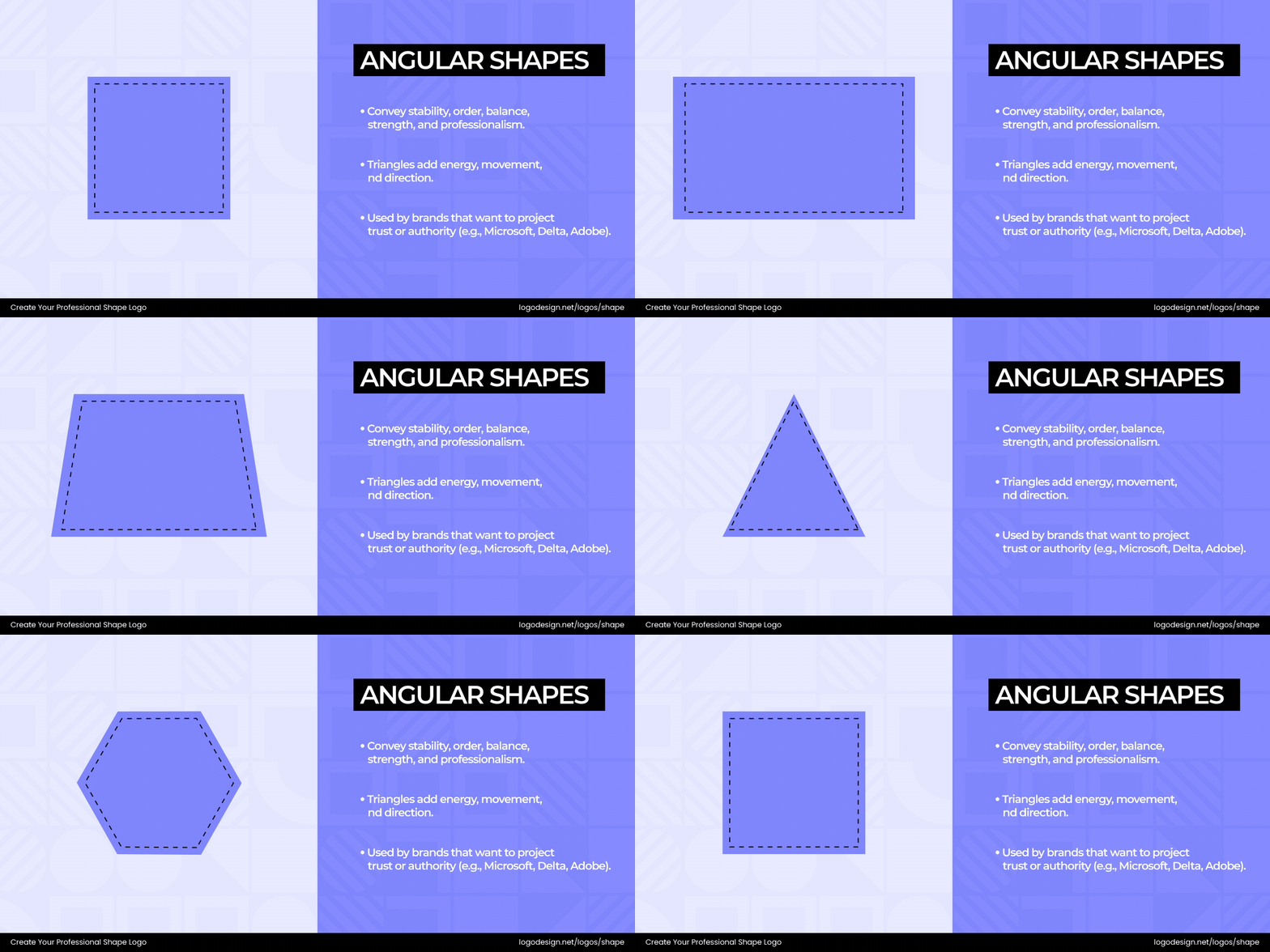
Angular geometric shapes represent structure and trustworthiness. With their firm, right-angled edges, they’re perceived as secure, solid, and dependable. These traits are for brands in conservative or high-trust industries. These shapes are also easy to align and scale, making them practical in branding for different mediums.
a. Squares and Rectangles
Their straight lines and right angles add order and balance. Such shapes are associated with logic, professionalism, and control. These qualities work very well for brands in industries like finance, law, healthcare, or journalism.
Unlike circles—squares, rectangles, polygons or triangles provide a visual sense of containment and safety, making the viewer feel that the brand is solid and secure. This can build confidence in the minds of customers as well.
The Psychology Behind Square and Rectangle Logos
Let’s discuss some of the most popular associations with such shapes in logo design here.
• Stability
Squares and rectangles give a grounded and unmoving appearance. This creates a sense of permanence and strength, showcasing that the brand will last a long time.
The yellow rectangle in the National Geographic logo acts like a frame, showing exploration, knowledge, and discovery. If you look closely, you’ll see how it draws attention to the brand’s purpose and mission.
The Coder logo has a structured and balanced arrangement that suggests clarity. The square logo shows stability, giving a tech-friendly feel.
• Balance
With equal sides and angles, squares have symmetry and balance. This visual balance creates a positive perception for businesses in the legal and financial industries.
It’s a bit unusual for logos in this industry, but the square block around the wordmark Lego has become closely associated with the brand. It showcases creativity and imagination for kids.
The BBC logo’s continuous rectangular form of the letters has become closely tied to the brand. It shows stability and balance, reinforcing authority in reporting.
The SRI logo’s central element is the square ‘future cube’, inspired by robotics and machines. The squares represent balance and credibility, drawing from the brand’s research heritage.
• Reliability
These shapes are associated with predictability and dependability. Brands that use them often appear consistent, trustworthy, and committed to delivering on their promises.
The Other box logo has a solid rectangular frame around its name that conveys structure and dependability. It gives a message that the brand is reliable and consistent.
The Joves De Barcelona logo has bold, structured typography that conveys strength and clarity. The clean rectangular form suggests dependability, trust, and reliability.
• Order
The geometric forms show logic and organization, making them ideal for brands that value their processes or precision. They mean that everything is in its right place.
The Uniqlo logo uses a bold red square with white block letters that show clarity, balance, and precision. This design has a modern identity and draws attention to the idea of simplicity.
The Microsoft logo has four equal squares arranged in a grid that has become closely tied to the brand. It shows clarity and structure, bringing order to technology.
• Professionalism
Since the shapes are quite clear-cut, both squares and rectangles are commonly associated with seriousness and competence.
The rectangular frame around the ‘American Express’ shows security, structure, and trust at first glance. It aligns well with the company’s reputation in finance and credit services.
The vertical rectangle, shaped like a window between the words in the Blank Street logo, immediately conveys openness, creativity, and possibilities, giving the brand a simple yet professional appearance.
• Masculine Energy
These shapes also represent traditionally masculine traits such as strength, control, and dominance.
The Moreschi logo has a bold, streamlined typeface that conveys strength and precision. Its sharp lines and structure show masculine energy, reinforcing confidence and authority.
The Hércules logo is bold and muscular, showing strength. Its solid structure conveys masculine energy, showing power and resilience.
b. Triangles
The points in triangles show direction and action. Brands use these shapes to look strong and determined. Their pointed edges and structure make them one of the most dynamic and versatile shapes in logo design. You’ll find that brands use such shapes in their logos to show energy and progress.
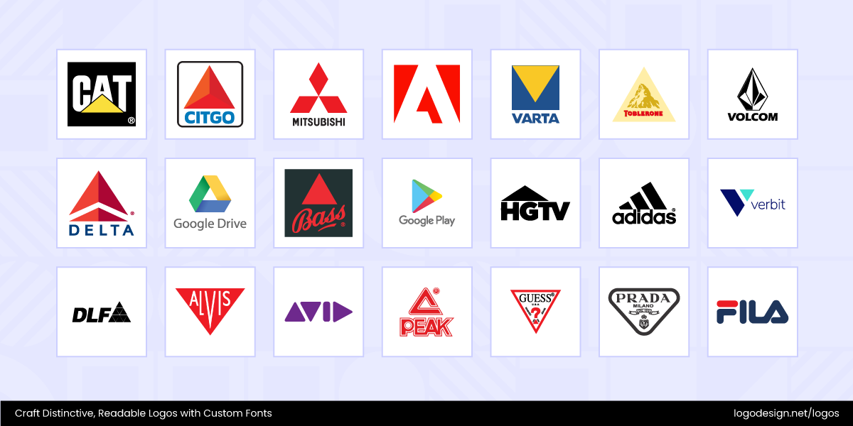
The way a triangle points changes what it means. And the way it’s structured plays an important role in its psychological impact:
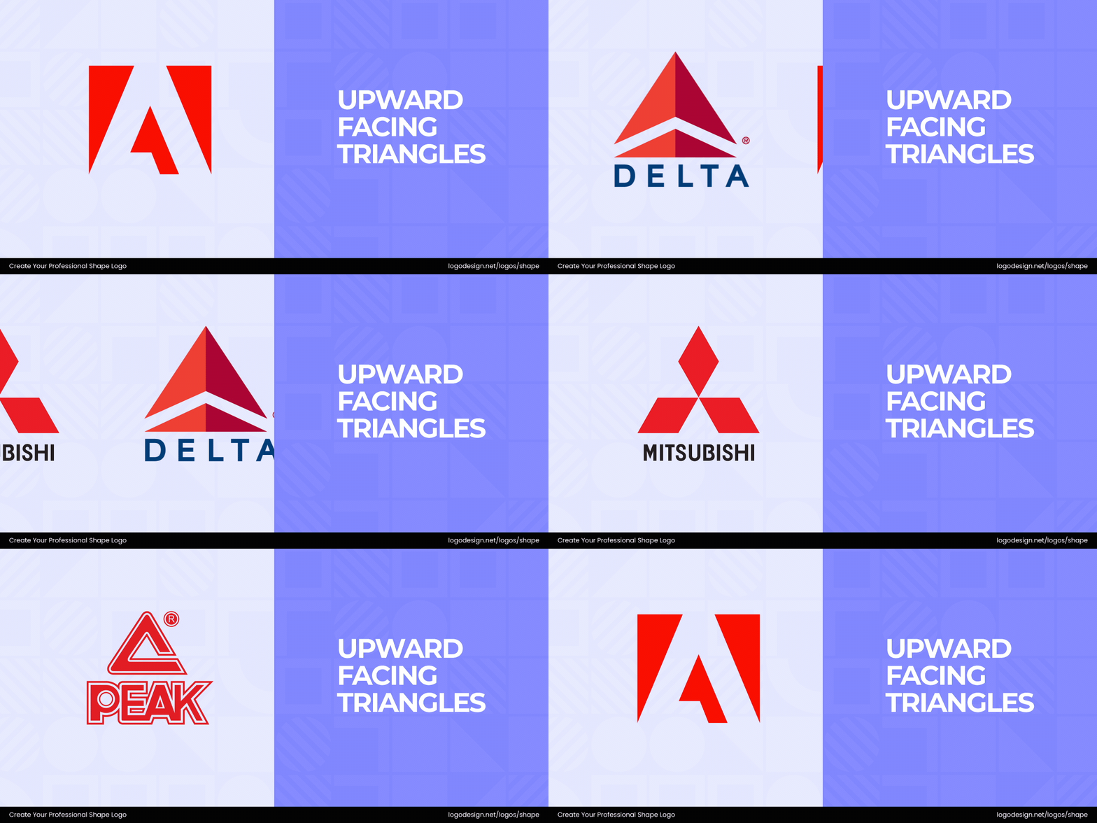
- Upward-facing Triangles: Associated with growth, ambition, and moving toward success. They bring a sense of climbing upward, making them ideal for brands that want to inspire progress or exploration.
- Downward-facing Triangles: This structure shows stability and innovation as the edge points to the ground. They work well for industries that need to communicate dependability.
- Sideways or Dynamic Triangles: Such shapes are used to show uniqueness and movement. Technology companies and startups often use dynamic triangles to show cutting-edge thinking.
When used well, triangles make logos feel confident, purposeful, and active. These are all qualities that can help brands connect with ambitious, growth-minded audiences.
The Psychology Behind Triangle Logos
The following traits are associated with triangles in logo design.
• Power and Authority
Triangles are sharp and pointed, which gives them a natural sense of strength and dominance. They often feel more authoritative than softer shapes like circles or curves.
The Prada logo has a sharp inverted triangle that draws immediate attention and commands presence. It shows exclusivity and prestige, reinforcing authority in the world of luxury fashion.
The HSBC logo has a geometric triangular form arranged in a bold red and white pattern. It shows precision and strength, reinforcing authority in the global finance market.
• Stability
Due to their wide base, triangles provide a sense of balance and security. They feel structured and grounded, which tells people that the brand is reliable.
The Fila logo has bold angular elements within its lettering, particularly the triangular form of the “A.” It shows stability and strength, reinforcing reliability in sportswear.
The Caterpillar logo uses a bold triangle form with heavy block letters emphasizing strength and durability. It shows stability and toughness, reinforcing authority in machinery and construction.
The Vessel logo has a structured design with a downward-facing triangle that displays strength, consistency, stability, and support.
• Energy and Movement
The angular lines of triangles suggest action, speed, and direction. They naturally draw the eye upward or downward, creating a motion effect that works well in logos.
The Google Play logo has a dynamic triangular form pointing to the right, which has become closely tied to the brand. This dynamic shape reflects progress, action, and the brand’s forward-thinking spirit.
The AllTrails logo, with its upward triangular peak and flowing form, has become closely tied to the brand. It reflects the spirit of adventure and the excitement of exploring the outdoors.
• Innovation
Their sharp edges and precision symbolize out-of-the-box thinking and innovative ideas. Brands looking to establish themselves as leaders can include such shapes in their logos.
The Delta Air Lines logo has a sharp triangular form that rises upward, symbolizing ascent and ambition. It shows strength and direction, reinforcing power and authority in global travel.
The HoldOn Bags logo features a distinctive design where the letter “O” is stylized as a trash bag. The bag shape includes a subtle triangular top, resembling a drawstring closure. This clever design choice adds a playful and meaningful touch.
The Paper Triangles logo uses crisp geometric triangular forms to represent originality and ingenuity. Its pointed edges reflect momentum, ambition, and a daring approach to design.
• Spirituality
Across cultures, triangles are known for their association with the Christian Holy Trinity. The shape also shows a connection between body, mind, and spirit. This association can help brands appear thoughtful, meaningful, and focused on spirituality.
The BodySim logo centers on an upward-facing triangular shape that is linked to strength, stability, and growth. Paired with smooth curves, it creates a visual balance that reflects mindfulness and inner alignment.
The Stratum AI logo has ethereal design elements that build a spiritual connection. The triangular form’s balanced proportions reflect clarity of purpose and the harmony between technology and people.
• Resilience
Triangles are considered strong structural forms and can showcase durability, reliability, and resilience in branding. Companies in niches like construction or jewelry can use the shapes for visual impact.
The Toblerone logo has a triangular mountain peak that shows the brand’s Swiss heritage. Its solid and unshakable form demonstrates strength and resilience.
The Apollo logo incorporates bold, striking elements that embody the brand’s strength and perseverance. Its structured triangular form stands as a symbol of resilience, stability, and forward ambition.
The TamLabs logo features two upward-facing triangles, a design choice that conveys strength and balance. Their sleek, structured form symbolizes resilience while reinforcing the brand’s sense of stability.
c. Polygons – Pentagon, Hexagon, and Octagon
Polygons are two-dimensional shapes with three or more lines that show balance and structure. Brands use these shapes for various purposes, including stability, connection, and creativity. With their multiple sides and angles, polygons can adapt to many styles, making them flexible and modern in logo design.
Triangles (with three sides), squares (with four sides), and rectangles (also with four sides) are all forms of polygons.
Let’s look at the polygons with five or more sides, along with what they represent.
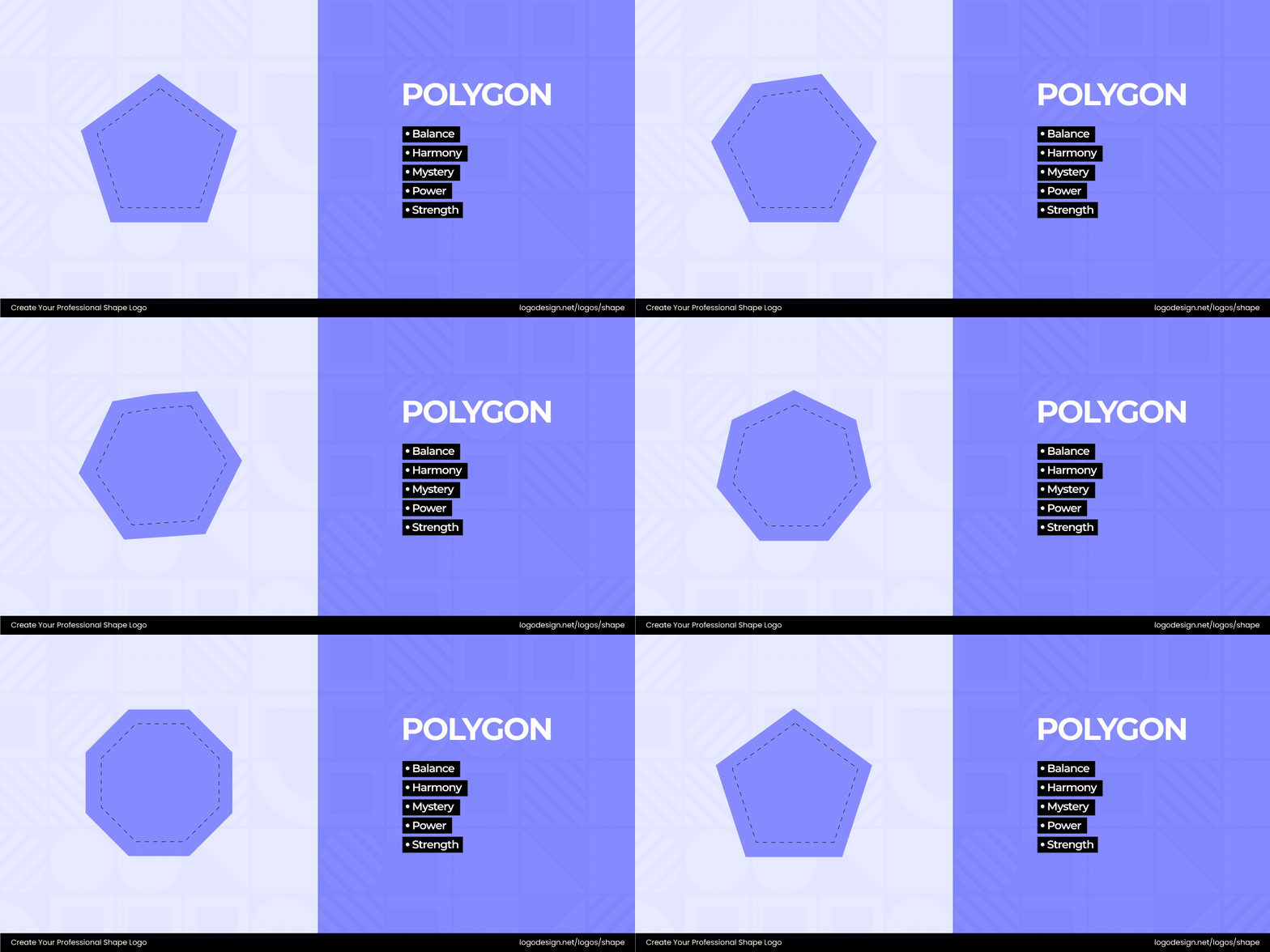
- Pentagon: The pentagon, a five-sided polygon, symbolizes balance, protection, and strength. In logo design, it works well for brands aiming to convey trust, resilience, and long-lasting reliability.
- Heptagon: Heptagons are seven-sided polygons that convey a sense of unity. They represent balance, wisdom, and deeper understanding, making them well-suited for brands that want to emphasize knowledge and spirituality.
- Hexagon: Linked to balance, unity, and efficiency, these six-sided polygons reflect harmony and efficiency, making them perfect for brands that want to convey a natural appeal, collaboration, and structured innovation.
- Octagon: Associated with balance, harmony, and renewal, the Octagon is an eight-sided polygon with a sense of openness. It is ideal for brands wanting stability and authority while encouraging fresh perspectives or growth.
- Nanogon/Decagon/Dedecagon: More than eight-sided polygons are called Nanogon, Decagon, and Dedecagon. These polygons are a preferred option for brands that need to display unity, creativity, and sophistication.
Together, these shapes show how geometric structures can convey unity, progress, and clarity in a logo design.
The Psychology Behind Polygon Logos
The following traits are associated with polygons with five or more sides in logo design.
• Stability
Polygons feel stable and are a staple of strength. They appear solid and well-built, which reassures people that the brand is dependable.
Honeywell Forge’s logo uses a hexagonal design with gradient tones that are known to show stability, energy, and innovation. This suggests a forward-looking vision and is strongly connected to modern industry.
The Scopo AR logo uses a stylized hexagonal cube formed by interlocking lines that create a three-dimensional effect. This geometric design symbolizes structure, stability, and innovation, aligning with the company’s focus on augmented reality solutions for industrial applications.
• Dynamism
Polygons have various angles and sides that give the feeling of dynamism and movement. Brands can use this to signal adaptability, versatility, and a modern way of thinking.
The Heytessa logo uses flowing lines and angled shapes that form an abstract, forward-moving emblem. It shows dynamism, conveying energy, progress, and a sense of constant motion.
The Mountain Hardwear logo has a stylized hexagon with intersecting lines that form a simplified “gear” or “mountain” shape. It suggests motion, energy, and the spirit of adventure in outdoor exploration.
The Sirum logo features a stylized, upward-moving form that blends sharp angles and smooth curves into a dynamic, abstract shape. It shows energy and forward motion, conveying innovation and progress.
• Innovation
This shape, with its many sides and angles, can spark curiosity and fresh ideas. When used in a logo design, it can suggest that the brand is innovative in its operations.
The Flyp logo features a dynamic, curved shape that suggests motion and transformation. It shows innovation, capturing the idea of seamless change and forward-thinking solutions.
The Mashgin logo features a clean, angular design forming a stylized “M.” It shows innovation, representing speed, automation, and cutting-edge technology.
• Power
When brands want to signal authority and power, using a polygon-shaped logo can be the right idea. The bold strokes and edges show that the brand has influence.
The Node.js logo features a hexagonal shape enclosing the word “Node” in bold, modern lettering. It shows power, conveying speed, efficiency, and strength in server-side development.
The Dustin Group logo features bold, angular shapes forming an abstract “D” symbol. It shows power, projecting strength, reliability, and authority in the technology sector.
• Creativity
The many sides of the polygon, combined with different strokes, create creativity in the brand’s logo. It gives viewers a feeling that the brand can improvise and adapt.
The User Gems logo features a faceted gem shape composed of sharp, angular polygons in balanced symmetry. It suggests creativity, innovation, and sparkling ideas.
The Petcube logo showcases a stylized hexagon with a minimalist face-like design inside. The subtle facial features within the hexagon add a touch of playfulness and approachability, aligning with Petcube’s mission to connect pet owners with their pets through technology.
The Guesty logo presents a stylized outline of a house, built with continuous angled and curved lines that create a polygon-like structure. The creative form suggests shelter and structure, while its flowing internal curve adds an element of warmth and approachability.
• Order
Precise angles created with the polygon shape show a sense of order to the design.
When used in a brand’s logo, it gives clarity to the viewers.
The ShipBob logo has a hexagonal form with an inward arrow-like cut, creating a sense of depth and direction. The polygon conveys stability and structure, while the dynamic angles suggest movement, efficiency, and forward progress.
The Harmonic logo features three small hexagons arranged within a circular form. The combination of polygons and curves symbolizes structure meeting fluidity, suggesting order, balance, connection, and modern harmony.
3. Organic and Abstract Shapes
If you think about it, these shapes are used strategically in logos. Organic shapes come from things in nature. Abstract shapes can be associated with objects or figures and interpreted according to perceptions.
a. Organic Shapes
Organic shapes are largely inspired by nature—think leaves, waves, clouds, animals, or silhouettes. With their curves, spirals, and flowing lines, they bring warmth, creativity, and emotional depth to logos. Designers often use these forms to express friendliness, approachability, and a playful sense of creativity in brand identity.
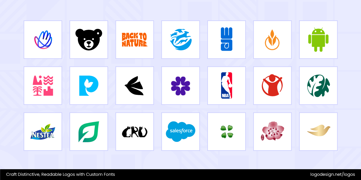
A logo with soft curves or natural forms doesn’t feel corporate or rigid; instead, it feels accessible and authentic, like it’s inviting you in. This makes them particularly effective for brands that want to connect emotionally with their audience.
Depending on how they’re styled, they can communicate very different moods. Organic logos also play into psychology by creating trust through imperfection. With most industries dominated by minimalistic and geometric branding, such shapes make an impact for their honesty and uniqueness.
The Psychology Behind Organic Logos
These shapes are known to be associated with the following traits or characteristics.
• Friendliness
Unlike sharp, rigid lines, these softer outlines give a sense of openness, making brands appear approachable and customer-focused.
The MND Scotland logo incorporates a welcoming hand-shaped design. Its soft, gentle forms convey warmth, approachability, and a sense of human connection, reflecting the organization’s mission to stand beside individuals and families affected by motor neurone disease.
Steiff features a bear in its logo, a sign of comfort and care. Combined with gentle, welcoming typography, it reflects warmth, trust, and the cherished human connection the brand has fostered for generations.
• Creativity and Expression
Organic shapes are used for their originality and artistry. When used in logos, they create a distinctive, unconventional look that helps brands express creativity, innovation, and out-of-the-box thinking.
The Back to Nature logo incorporates organic design elements that convey warmth and connection. A subtle leaf tucked into the letter “K” pays homage to the brand’s roots and mission of making snacking wholesome and healthy.
The Humane World for Animals logo uses design elements that convey openness and compassion. With its soft shapes and animal-inspired mascot, it reflects kindness, empathy, and a genuine care for animals.
• Calmness/Relaxation
Smooth, rounded organic forms can add a soothing effect, like waves or gentle movement. They help brands in industries like wellness or skincare create a sense of comfort.
The WaterAid logo uses a fluid droplet form combined with soft curves, reflecting the natural movement of water. It shows calmness and care, reinforcing trust in providing life’s most essential resource.
The Culinary Institute of America logo has a primary foundational element: a sheaf of wheat, which is a traditional and historical symbol for food in many cultures. The subtle form feels calm and composed at a glance.
• Playfulness
When organic forms are colorful or whimsical, they show vibrancy and fun. They work very well for brands in entertainment or lifestyle, as their audiences connect with such shapes.
The First Choice Holiday logo features vibrant and organic design elements such as mountains, trees, and waves, which show carefree enjoyment and relaxation. Its simple and bold typography suggests adventure and memorable experiences.
The Parkinson’s UK logo uses bold typography that conveys energy and optimism. Its layout with a leaf-like figure in the capitalized P shows playfulness and a spirit of positive change.
• Nature-Inspired
Since they also appear as leaves, animals, or landscapes, organic shapes are closely associated with nature. This is why eco-friendly and outdoor brands sometimes rely on these shapes.
The Ferm Living logo uses nature-inspired design elements that symbolize organic balance and mindful living. Its soft curves suggest unity with the environment.
The Katholino logo features organic design elements that show unity and sustainability. Add to that the organic shapes suggest growth and connection to the natural world.
• Human-Like
Organic shapes have a human-made quality, as if they’ve been sketched by hand or illustrated. This helps brands elicit emotional responses from consumers.
The NBA logo has curves and straight lines that combine to form a basketball player figure. It shows movement and builds a connection with the energy of the game for fans.
The Save the Children logo has a circular form with a simplified human figure reaching upward inside it. It shows hope, building a connection of care and support for children.
The Android logo has a geometric form of circles and rectangles that combine into a simplified robot figure. It shows friendliness, building a connection with technology for humans.
b. Abstract Shapes
Abstract shapes are built from unique lines, patterns, and elements that come together to form a concept. They allow brands to communicate core ideas or emotions in a distinctive way. Because these designs invite personal interpretation, each viewer can find their own meaning within them. At times, designers add subtle details to guide the audience toward the intended message. Abstract shapes hold a special power in logo design—they move beyond literal representation and rely on imagination to spark a connection.
Abstract shapes can hold multiple meanings at once, making them especially useful for brands that want to express concepts like innovation or transformation without relying on literal imagery. One of their greatest strengths is timelessness—because they avoid specific cultural symbols or products, they remain relevant across decades, industries, and regions.
Of course, abstract logos can also feel mysterious, as their meaning isn’t always immediately clear. Consistency in color, tone, and messaging helps bridge that gap, allowing audiences to connect with the design. By encouraging personal interpretation, these shapes tap into imagination and feel unique to each viewer. Their modern and sophisticated nature is why they are often favored in technology, lifestyle, and community branding.
The Psychology Behind Abstract Logos
Here are the psychological associations with abstract shapes in logo design. Let’s dive in.
• Innovation
Abstract shapes are considered experimental and innovative. Since they don’t resemble familiar objects, the shapes reveal differences in thinking and an unconventional approach.
The ScalarField logo has an abstract form with curves and intersecting lines that converge into a dynamic shape. It shows innovation, progress, and the forward movement of ideas.
Accenture’s logo includes a forward arrow above the name. Simple yet powerful, it symbolizes innovation, direction, and progress.
• Flexibility and Adaptability
They are not relevant to one industry or niche, and this makes them versatile as a company grows. It gives the impression that a brand can grow and stay relevant for years.
This British Petroleum logo features an abstract green and yellow sunburst. While it doesn’t directly show oil or energy, it does focus on sustainability and clean energy.
The Rally logo uses three curved tapering bands (or stripes) that seem to converge toward a point or horizon. The abstract form hint towards motion, direction, and flow.
• Mystery
Since abstract shapes are open to interpretation, they generate curiosity. People give them various meanings, which increases brand recall and engagement as well.
The Montblanc logo has a geometric form of a rounded white star with six edges enclosed in a black circle. It shows mystery, symbolizing hidden depth and lasting elegance within luxury.
The Berghain logo has a geometric form of sharp rectangles and bold lines that combine into a stark, block-like figure. It shows mystery, creating an aura of secrecy.
• Universality
Abstract shapes go beyond language and cultural barriers by not depending on just visual imagery. This communicates inclusivity and shows global appeal everywhere.
The ‘belo’ symbol in the Airbnb logo is an abstract shape combining elements of a heart, a location pin, and a person. This abstract icon showcases belonging, connection, and global community.
The TradeFlow logo has an interconnected form of flowing lines that merge into a half-globe figure. It shows universality, bridging people through seamless exchange.
• Expressive
Abstract forms can have an impact on moods, bringing out calmness, energy, or excitement. They can be considered quite expressive by saying more with less.
The Chase Bank logo has an abstract octagon shape created from four trapezoids. The icon conveys a modern and professional image, making the brand appear reliable and structured.
The Airestech logo combines a flowing form of curves and balanced shapes into a modern emblem. It shows expressiveness, building a sense of energy and connection.
• Sophistication and Modernity
Many abstract logos have minimalist designs. This shows that a brand is cutting-edge, stylish, and aligned with modern values.
The Trilith logo combines clean lines and minimal shapes to create an architectural mark. It demonstrates sophistication and presents modernity.
The Spectrum.Life logo has a clean arrangement of bold typography that combines into a streamlined wordmark. The visible light spectrum is used as a metaphor for its diverse range of health and well-being services.
4. Symbolic Shapes
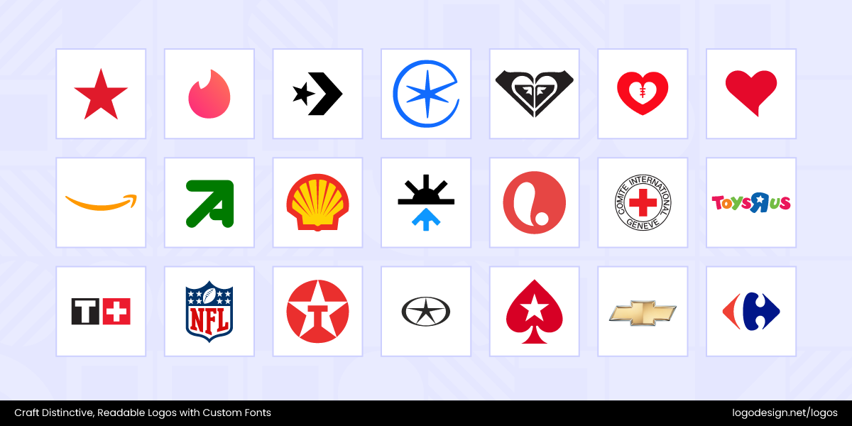
Symbolic shapes are instantly recognizable, making their meaning clear at a glance. They convey emotions and ideas within seconds, which is why they’re so effective in logo design. Simple yet powerful, these shapes help brands leave a lasting impression and connect quickly with their audiences.
a. Stars
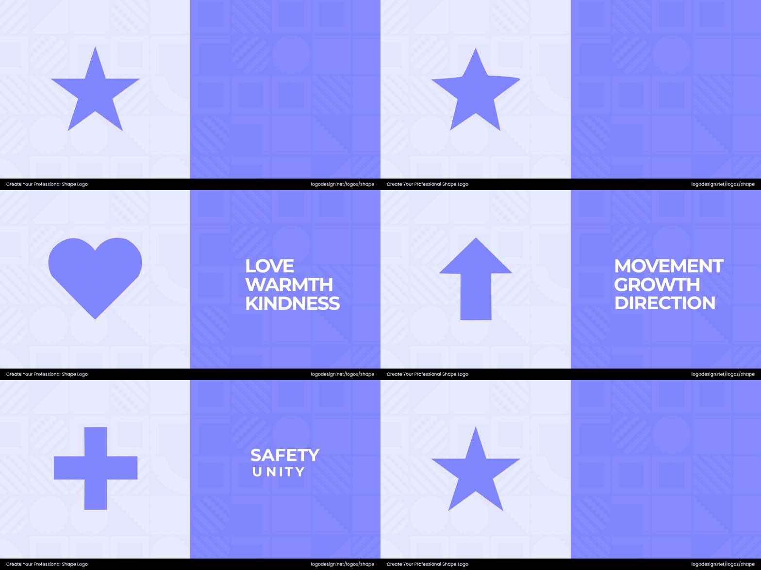
Stars symbolize success, recognition, and inspiration. They showcase that a brand is aiming high, delivering top-quality, or helping people reach their goals
Macy’s logo shows excellence and the ‘star quality’ shopping experience they aim to deliver. Their logo conveys achievement and high standards at first glance.
The Converse logo has a geometric form of a bold star paired with clean lettering that creates a striking visual identity. It shows energy and confidence, building a connection with the people.
The Eurostar logo combines a flowing form of curves and a star motif into an emblem. It shows speed and guidance, a connection across borders for people.
The Psychology Behind Star Logos
Stars carry powerful meanings that shape how we see a brand. Let’s explore what the psychology behind the star logo is all about.
• Guidance
Stars have long been used for navigation, so they naturally suggest direction and reliability. A brand using a star can feel like a steady guide people can trust.
• Aspiration
Stars represent dreams, goals, and ambition. Including them in a logo links a brand to progress, growth, and the drive to reach higher.
• Achievement
Stars are symbols of recognition and excellence. They convey prestige and high standards, showing that a brand values quality and accomplishment.
• Energy
The sharp points of a star create a sense of movement and vitality. They make a brand feel dynamic, exciting, and full of life.
• Hope
Stars inspire optimism and possibility, carrying a positive, uplifting message. They give a sense of light and guidance even in challenging times
b. Hearts
The heart is a shape globally associated with love, kindness, and care. Brands use it to highlight human connection, warmth, and customer support.
The Roxy logo has two mirrored shapes that form an iconic heart symbol. The symbolic shape maintains a strong visual connection to its parent brand, Quiksilver, which features a cresting wave and a mountain. The heart shape was chosen to appeal to a female audience.
The HeartKids logo incorporates a stylized heart shape that blends curves and playful elements into a caring design. It shows warmth, building a connection with children and families facing heart conditions.
The MHI Fondation logo uses a stylized heart shape and clean typography that feels dynamic and approachable. It conveys compassion, care, and a focus on advancing heart health through research.
The Psychology Behind Heart Logos
Hearts, commonly associated with emotions, make a brand feel more human. Here’s the psychology behind heart logos.:
• Love
Hearts symbolize affection, warmth, and genuine emotional connection. They help brands feel more personal and relatable, almost like they’re speaking directly to your heart.
• Compassion
A heart shape often communicates kindness, empathy, and support. That’s why it’s widely used by charities, non-profits, and healthcare brands that want to show they truly care.
• Trust
When a brand uses a heart, it can build a sense of loyalty and reliability. It reassures people that they’re in safe, supportive hands.
• Passion
The shape also conveys enthusiasm and energy. It reflects dedication to a cause, product, or community, giving the brand a spirited personality.
• Wellness
Hearts are strongly associated with health, vitality, and positivity. Lifestyle, fitness, and wellness brands often rely on this shape to inspire balance and well-being.
c. Arrows
Arrows convey direction, progress, and forward movement. In logo design, they communicate a brand’s drive toward the future and convey a sense of positivity and momentum.
With a curved arrow in its brand identity, Amazon shows friendliness and forward progress. It also highlights the brand’s wide range of products from ‘A to Z’.
The New Aim logo features an arrow integrated into a minimalist geometric design. It conveys direction and progress, symbolizing focus and forward movement toward goals.
The Visit Plymouth logo uses a bold arrow integrated into a circular shape, creating a sense of movement. It conveys exploration and guidance, inviting people to discover the city.
The Psychology Behind Arrow Logos
Arrows guide the eye and the mind, giving brands a sense of movement and direction. According to shape psychology, here’s what arrows represent.
• Direction
Arrows show movement and guidance, suggesting a clear path forward. They help brands feel purposeful and easy to follow.
• Purpose
This shape symbolizes growth, improvement, and forward-thinking. They are frequently used in tech industry logos to align the brand with development and evolution.
• Speed
Arrows convey efficiency, agility, and quick action, making a brand feel energetic and responsive.
• Motivation
Arrows also inspire action, ambition, and momentum. This shape encourages audiences to engage or move forward with the brand.
• Focus
The pointed shape emphasizes precision and targeting, reflecting a brand’s clear objectives and purposeful approach.
d. Crosses
The shape associated with healing, well-being, and balance. Crosses are mostly used by healthcare, wellness, or socially driven organizations.
The Red Cross logo has a bold, geometric form of a simple cross that stands at the center of a square. It conveys neutrality and care, symbolizing humanitarian aid.
The ICRC logo has a bold, symmetrical cross shape that has become closely tied to the brand. It shows neutrality and protection, reinforcing trust and humanitarian aid.
The Tissot logo features a bold, clean typeface and a distinctive cross symbol. It shows precision and Swiss heritage, building a connection with craftsmanship for watch enthusiasts.
The Psychology Behind Cross Logos
Crosses are more than religious symbols, they instantly convey care, reliability, and trustworthiness. Let’s dig into the psychology behind crosses.
• Care
Crosses suggest protection, help, and support. They make healthcare, charity, and service-oriented brands feel approachable and nurturing.
• Trust
The shape communicates reliability, safety, and ethical integrity, reinforcing confidence in the brand.
• Faith
Often linked to spirituality, belief, or tradition, crosses can reflect values, heritage, or a guiding principle.
• Balance
The symmetrical form naturally conveys stability, order, and harmony, giving a brand a grounded, dependable presence.
• Aid
Crosses instantly signal assistance, service, or life-saving intent, making them highly effective for emergency, medical, or support-focused brands.
These symbolic shapes are effective because they are immediately recognizable across cultures. If you think about it, they are quite obvious and don’t require extra explanation. Designers add them to logos for higher memorability and to make a strong emotional impact.
5. Lines
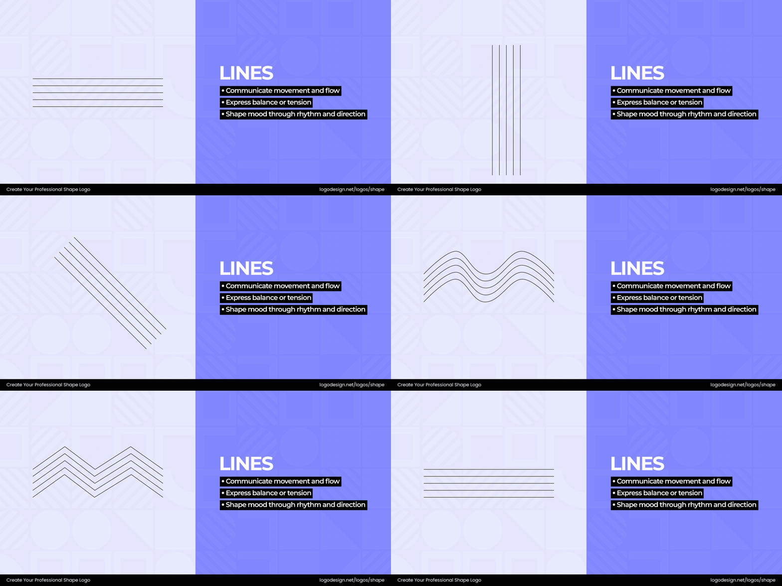
Lines in a logo can shape perception, set the mood, and add depth of meaning. Their weight, direction, and curvature influence how a brand is experienced—whether suggesting movement, authority, calmness, or energy. Even a single stroke has the power to transform a logo’s personality.
Designers use lines to communicate brand values in ways that people immediately recognize. For example, sharp, straight lines can make a logo look precise and professional, while flowing, curved lines make it appear approachable and human. The thickness, spacing, and orientation of lines in logos set the tone of a brand.
Types of Lines
If you think about it, different types of lines and patterns have their own meanings or associations in logo design.
Let’s take a look at what the most common types are.
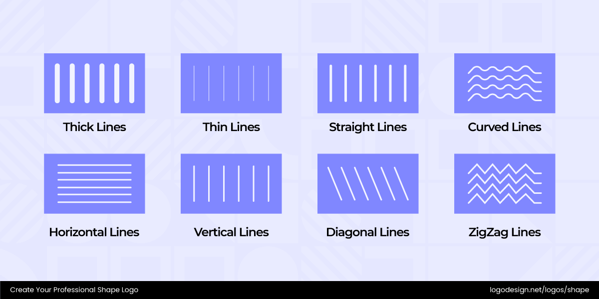
- Thick Lines: Heavy strokes make a logo look bold, reliable, and authoritative.
- Thin Lines: Fine strokes convey sophistication, attention to detail, and minimalism.
- Straight Lines: They bring clarity, discipline, and stability.
- Curved Lines: Flowing curvy lines add friendliness, motion, and a human touch.
- Horizontal Lines: Parallel lines show peace and movement.
- Vertical Lines: Up-and-down strokes communicate strength, ambition, and progress.
- Diagonal Lines: They introduce speed, innovation, and excitement.
- ZigZag Lines: Sharp lines that create a ‘Z’ pattern, showing excitement and danger too.
The Psychology Behind Line Logos
Here are some associations with lines and patterns in logo designs and how brands can use them effectively.
• Strength and Boldness
Heavy lines or bold patterns add power and strength to a logo design. They highlight confidence and leadership, making the brand appear credible and trustworthy.
The IBM logo consists of bold, horizontal blue stripes forming the letters “IBM” in a strong, geometric typeface. It shows strength and professionalism, projecting authority and reliability.
The Paystack logo has a bold, angular form with strong lines forming a stylized “P” shape. It shows strength and confidence, suggesting reliability and power in financial technology.
• Precision
Thin, delicate lines show precision and attention to detail. When in a repeated pattern, they bring out speed and a motion effect too.
The Cisco logo uses vertical lines to represent an electromagnetic signal and the Golden Gate Bridge. This line-based design reflects communication, technology, and connection.
The ReachPower logo uses sharp, angular lines and symmetrical shapes to form an abstract lightning bolt, along with P and R letterforms. It shows precision and conveys accuracy.
• Structure and Balance
Straight lines and grid-like patterns convey discipline, balance, and clarity. They appeal in logos in industries like finance, legal, or real estate.
The Alpine USA logo features a bold, custom-designed "A" with diagonal lines. These lines show growth, progress, and innovation. The design conveys a sense of structure and balance, emphasizing precision and reliability.
The State Street logo uses a series of vertical bars of varying heights. It shows structure and balance, conveying stability and trust.
• Dynamic
Diagonal and ZigZag lines appear like a movement in logos. They are used to bring out excitement, innovation and create a futuristic appearance as well.
The Soundcloud logo includes a series of lines that resemble both sound waves merged with a cloud. The lines represent creativity, energy, and the flow of music.
The Konica Minolta logo has a circular form with horizontal lines cutting across it, creating a sense of movement and energy. It shows dynamism and continuous progress in technology.
The Sister Manchester logo features bold, interlocking shapes forming a stylized “S” and “M.” It reflects energy and forward motion, showing dynamism.
• Creative Flow
Organic line patterns like spirals or wavy forms feel imaginative and free-flowing. This makes them great for creative, lifestyle, or wellness brands.
The Utopia Orchestra logo has a flowing form of curves and lines that combine into an abstract musical arrangement. It shows creativity, expressing unity and the dynamic movement of music.
The Dunhill logo features a wordmark in a clean, uppercase typeface. The elongated lines show elegance and timeless sophistication, building a connection with luxury and craftsmanship.
The Aliva logo has a flowing, abstract shape that combines smooth curves into a dynamic form. It shows creativity and conveys a sense of innovation.
• Simplicity or Clarity
Minimalist lines and patterns draw focus to modern design and clear communication. They work well for brands that value professionalism.
The AlphaSense logo has a clean wordmark with sharp, modern lettering and subtle spacing emphasizing readability. It shows clarity and suggests the brand’s identity of making complex information easily understandable.
The Scribd logo features bold lettering with two brackets. It shows simplicity, emphasizing readability and approachability, creating a clear connection with the reader.
Emotional Associations of Shape Qualities
Let’s take a look at the emotional impact of shapes in logos and the traits associated with them.
• Curves vs. Edges
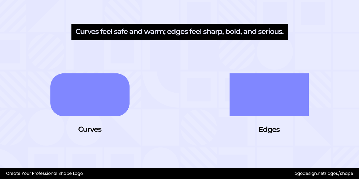
Curves in logos feel soft and inviting, often symbolizing warmth, comfort, and approachability. Edges, on the other hand, carry sharpness and precision, reflecting strength, authority, and confidence.
The Aetna logo has a smooth, flowing curve forming its wordmark, with rounded edges that create a sense of approachability. It conveys trust and care, reflecting a connection to health and well-being for people.
The Elevance Health logo has a geometric form of angular shape and clean lines. It shows professionalism, reflecting trust and a modern approach to healthcare solutions.
The Renault logo has a sharp, angular form of interlocking rhombuses that create a bold diamond shape. It conveys precision and dynamism, symbolizing innovation and movement.
The Mazda logo has a flowing, wing-like shape formed by smooth curves that converge into a stylized “M” within an oval. It conveys motion and innovation.
• Symmetry vs. Asymmetry
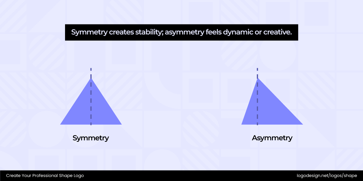
Symmetry in shapes creates balance, order, and harmony, making logos appear trustworthy and stable. Asymmetry creates contrast and movement, showing creativity as well as innovation.
The Anastasia Beverly Hills logo features a symmetrical design. Its elegant, serif lettering and balanced proportions convey sophistication and luxury, reflecting precision and artistry in beauty.
The Tower28Beauty logo features a modern, asymmetrical wordmark with slightly uneven letter spacing and varied line weights. It conveys a sense of playful sophistication, emphasizing individuality and approachable beauty.
The Starbucks logo has a circular form framing a twin-tailed mermaid, with mirrored symmetry along the vertical axis. It conveys elegance, building a connection with a sense of premium coffee.
The Peet’s Coffee logo has an asymmetrical emblem of a stylized “P” with sweeping curves and uneven angles that create a dynamic, hand-crafted feel. It conveys warmth and artisanal quality.
• Proportions & Scale
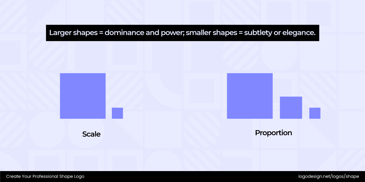
Larger shapes are used for attention and dominance. The traits associated with them emotionally are confidence or authority. Smaller shapes and proportions feel delicate and refined.
The British Business Bank logo has a clean, geometric form centered around an arrow pointing upwards. It conveys growth and forward movement, showing progress and support for businesses.
The Tangerine logo has a sleek, curved form with an arrow integrated into its design, creating a sense of forward motion and growth. It conveys dynamism and progress.
The Alcatel Mobile logo features a sleek, rounded typeface and a subtle speech bubble shape. It conveys communication, emphasizing connection and interaction between people.
The Vodafone logo is circular and curved, resembling a speech bubble. It represents communication, showing connection and conversation between people.
• Closed vs. Open Forms
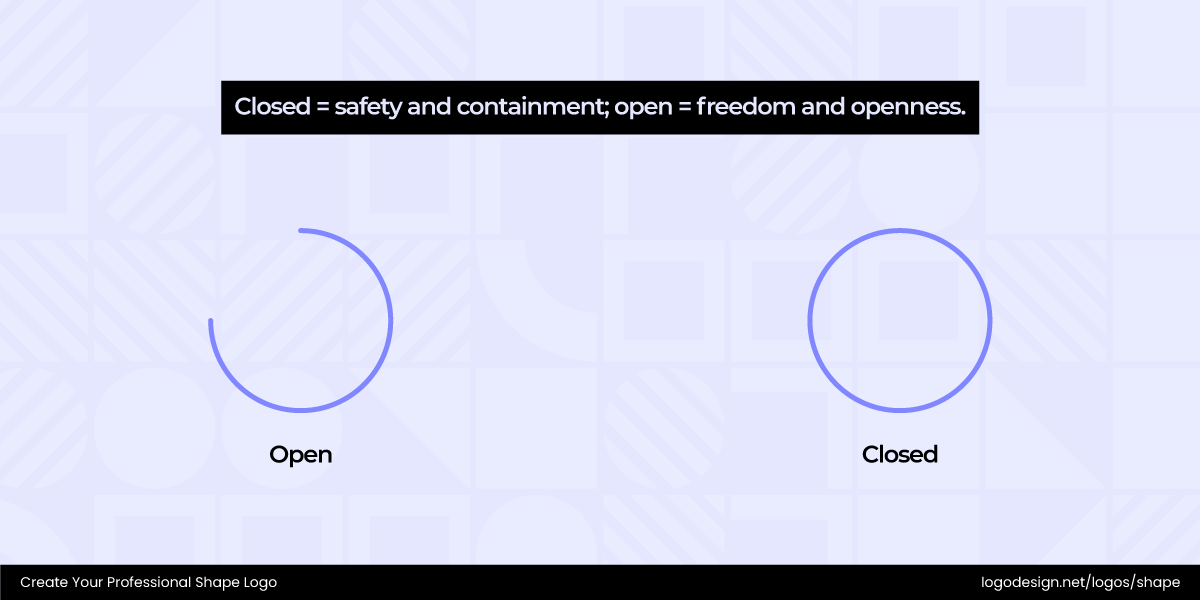
Closed = safety and containment; open = freedom and openness.
If you go with closed ones first, they mostly communicate protection, safety, and containment. They bring out feelings of security and reliability. Open shapes are emotionally associated with freedom, transparency, and openness.
The CAAM logo has a closed form composed of interlocking geometric shapes forming a stylized "CAAM" monogram. It conveys structure and unity, showcasing a strong cultural identity.
The National Museum of Scotland logo has an open form of abstract shapes and flowing lines that suggest movement and curiosity. It conveys accessibility and invites exploration, building a connection with potential visitors.
The Arbitrum logo has a closed form consisting of layered, angular shapes that combine into a stylized, abstract “A.” It conveys precision and structure that reflects the brand’s innovative image.
The Polygon logo has an open, angular form made of interlocking hexagons that create a stylized “P” shape. It conveys connectivity and focuses on linking blockchain solutions.
The Intersection of Shapes + Colors + Fonts
Shapes don’t exist in isolation; their meaning is amplified or softened by color and typography. So it’s important to understand their intersection of all elements.
SHAPES + COLORS
While shapes give structure and symbolic meaning, colors bring emotion and tone. The same shape can communicate very different ideas when paired with different colors. And similar colors change meaning depending on the shape they fill.
A circular logo, for example, can take on very different meanings depending on the color. Here are some logos with circles in yellow, green, and blue.
The Ricard logo’s core is a circular yellow shape that conveys warmth and energy. Its bold simplicity creates a sense of approachability, triggering a friendly and inviting brand presence.
The Telgea logo has a circular green form and balanced lines that combine into a clean, modern symbol. It shows growth and innovation, building a connection between technology and sustainability.
The USA Today logo has a bold blue circle as its geometric form, representing clarity and focus. It conveys simplicity and modernity, showing straightforward news delivery and authenticity.
Similarly, an organic shape like a bird can shift in meaning when used in different colors. See how many logos incorporate them in different colors and what they mean.
The Hollister logo features a sleek silhouette of a black bird using flowing lines. It conveys freedom, effortless movement, and a relaxed coastal lifestyle, connecting the brand to youth, adventure, and casual fashion.
The Audubon logo has a stylized bird in dark blue and green, with smooth, flowing shapes that simplify the form of a perched bird. It creates a sense of nature, building a connection between humans and wildlife.
The Bluebird Botanicals logo features a light blue bird in a minimalist, flowing shape that conveys calm and natural simplicity. It triggers feelings of wellness and trust.
Here are a few color and shape combinations you can draw inspiration from:
• Rounded Shapes + Cool Colors
Circles, ovals, and soft curves paired with cool tones like blues, greens, or purples create a calming and approachable impression. This combination often signals trust, reliability, and harmony, making it popular in healthcare, tech, and community-focused brands.
The Allugator logo has a smooth, rounded shape that blends curves into a stylized alligator figure. It uses cool green hues to create a calm, approachable vibe that conveys trust.
The Overmoon logo consists of rounded circles and soft curves that combine into a smooth, abstract shape. It demonstrates calmness and creativity, building a sense of modernity and approachability.
• Rounded Shapes + Warm Colors
When warm tones like red, orange, and yellow fill rounded shapes, they radiate energy and friendliness. This pairing feels playful and inviting, often used by brands that want to spark excitement or build emotional connections.
The TomTom logo has a rounded, overlapping shape forming a stylized heart-like symbol. It uses warm reds that convey energy and approachability, giving a sense of guidance and connection for drivers.
The Couchsurfing logo has a rounded shape with soft curves forming a stylized “C” that suggests movement and openness. It uses a warm orange to evoke friendliness and community.
• Angular Shapes + Cool Colors
Sharp edges combined with cool colors strike a balance between authority and professionalism. These logos feel structured yet composed, often appealing to industries like finance, engineering, or corporate tech.
The NLIX logo has angular shapes composed of triangles and parallelograms that combine into a dynamic, forward-moving figure. Paired with a cool green, it shows energy and innovation, building a solid connection with modern technology.
The Togg logo has a geometric form of angular shapes and sharp lines in blue that combine into a stylized “T” emblem. The logo echoes modernity and innovation, building a connection with advanced technology.
• Angular Shapes + Warm Colors
Pairing triangles, squares, or geometric edges with bold warm tones creates a sense of power and momentum. This combination feels assertive, dynamic, and innovative, making it ideal for startups and brands aiming to disrupt.
The Super.com logo has angular shapes that interlock to form a bold, dynamic symbol. The warm color convey energy and approachability, creating a sense of forward momentum.
The Monarch Structures logo is a geometric form of sharp polygons that combine into a stylized monarch crown. The angular shape, paired with a warm yellow, perfectly conveys the brand’s strength and energy.
• Organic Shapes + Earthy Colors
Free-flowing, nature-inspired forms in earthy tones like browns and greens instantly connect a brand to sustainability and authenticity. They suggest growth, balance, and a down-to-earth personality.
The Yeo Valley logo has a heart-like shape with natural-colored text inside, suggesting freshness and wholesomeness. The earthy green tones honor their natural ingredients and focus on caring for the environment.
The Nutiva logo has organic shapes that flow with smooth, rounded edges, forming a natural, plant-inspired mark. The logo features earthy tones that highlight health, sustainability, and a strong connection to nature.
• Abstract Shapes + Gradient Colors
Abstract forms filled with gradients feel futuristic and versatile. The blending of shades adds depth and motion, often giving logos a cutting-edge, innovative quality suited for creative, tech, and lifestyle brands.
The Asana logo features three overlapping circular shapes arranged in a triangular pattern, forming an abstract and balanced composition. The soft gradient colors add energy and flow to the collaborative platform.
The MVMT logo has an abstract form of sharp, intersecting lines and gradient colors that create a minimalist, watch-like shape. It shows modernity and precision, building a connection with style and time.
SHAPES + TYPOGRAPHY
Typeface and shape combinations can either reinforce or contrast emotions in a logo. A bold, angular typeface paired with sharp shapes might emphasize authority and strength, while a soft, rounded font inside a circular form can suggest warmth and inclusivity. The same shape can feel entirely different when combined with serif, sans serif, or script typefaces. This intersection of typography and shape gives designers endless opportunities to tailor brand personality.
Some common and effective pairings include:
- Rounded shapes + sans serif fonts for a modern, friendly feel.
- Angular shapes + bold serif fonts for authority and tradition.
- Organic shapes + handwritten/script fonts for creativity and approachability.
- Minimal geometric shapes + clean sans serif fonts for a contemporary, timeless look.
Let’s explore some typography and shape combinations in logo design:
• Text Inside Shapes
The brand name or initials sit within a circle, square, or rectangle, creating a contained and structured design. This combo works well for seals, badges, and emblems, emphasizing unity and completeness.
The Foxes Club logo has a stylized fox head enclosed within a circular shape, paired with clean, modern typeface inside it. The logo conveys agility and cleverness, as associated with the fox.
The Canfor logo features a clean, circular form enclosed in a red rectangle. The company name in bold typography is placed inside the circle. It shows stability and growth, reflecting a connection to sustainability and natural resources.
The Cymes logo has a clean, modern text-based design enclosed within a subtle shape. It conveys professionalism and precision, reflecting a focus on reliability and structured solutions.
• Text Beside Shape
Here, the logomark (icon) sits next to the wordmark, balancing imagery with typography. This layout offers flexibility, as text and icons can be used together or separately.
The Colgate-Palmolive logo features bold, sans-serif text placed beside a smooth, curved lettermark that suggests motion and freshness.
The Nextdoor logo has a house-shaped figure that sits besides the company name in a simplified sans-serif font in a green color. The logo pairing flawlessly depicts the brand’s mission to connect local neighborhoods and supports real estate activities.
The Doodle logo features a playful square icon with the word “Doodle” in bold black next to it. The logo shows creativity and approachability, inviting users to engage in simple, fun, and collaborative scheduling.
• Text Wrapped Around Shapes
Letters or words form a circular or curved path around a shape, giving the logo a cohesive, unified look. It often creates movement and works well for community or association brands.
The Jacobsen Bryggeri logo features a circular emblem with a stylized hop cone at its center, surrounded by the brand name wrapped along the curve. It conveys the premium beer brand’s craft and tradition.
The Paris Basketball logo has a geometric form of circles and arcs that combine into a stylized basketball. The company name is wrapped around the upper part of the circle. Overall. The logo feels energetic and fun.
The Isle of Wight Tomatoes logo features a circular form representing the island, with smooth, flowing lines suggesting coastline contours. Text wraps around the star shape, creating a sense of inclusion and community.
• Text Integrated into Shapes
Typography merges with or is cut out of the shape itself. This creates a sleek, modern effect where text and form feel inseparable, making the logo highly memorable at a glance.
The Buena Fé logo has a flowing design, with text integrated into an organic, curved style. The logo stands for the brand’s fresh, juicy, and earthy visual brand identity.
The ZigZag Vodka logo is a geometric form of angular lines. It features a chunky, block-letter "Z" that encompasses the symmetrical two-part name "ZIG ZAG" within its horizontal strokes, symbolizing an irreverent, anti-straight identity.
The Bow Wow Academy logo has a geometric form of rounded shapes and angular lines that combine into a stylized dog figure with a playful stance. It shows approachability, fun, and educational spirit for children and pet lovers alike.
• Shapes Replacing Letters
A shape stands in for one or more letters in the wordmark, adding symbolism and creativity without losing legibility. This combination is often used to make logos playful or innovative.
The ZSL uses a stylized geometric arrangement of animals to form the letter “S.” Its clean yet symbolic design reflects the organization’s focus on wildlife conservation, combining simplicity with care for the natural world.
The Protergia logo replaces the letter “O” with abstract geometric shapes, creating a modern and dynamic wordmark. The design reflects energy, innovation, and forward momentum, while its clean geometry conveys precision and reliability.
The MySwitzerland logo uses a bold cross inside a red square to replace the letter “T,” instantly tying the design to the Swiss flag. This clever integration reinforces national identity while keeping the logo modern and recognizable. The geometric balance of the square and cross also conveys stability, trust, and heritage.
• Shapes Highlighting Text
Underlines, boxes, or borders frame or emphasize the wordmark, drawing attention to the brand name and giving it structure or emphasis.
The Sessions logo features a stylized "S" enclosed within a circle, forming a clean and compact emblem. It conveys simplicity and focus, representing the brand’s friendly vibe.
The Activus logo features a leaf-inspired form placed above the wordmark, symbolizing growth, vitality, and eco-conscious values. Its organic shape conveys energy and innovation, while the upward motion suggests progress and a forward-thinking brand identity.
The ADA Music logo combines bold lines and geometric shapes to form a stylized ‘ADA’ within circular strokes. The design conveys modernity and creativity, while the flowing circular form highlights connection and rhythm—echoing the essence of music itself.
• Shapes Created by Text
The typography itself forms the overall logo shape — for instance, arranging letters into a circle or a square. This approach emphasizes creativity and unity, where type and shape are one.
The Shore Thing logo takes a text-based approach, stacking the two words with a wave-like divider in between. The use of dark blue above and light blue below mirrors the ocean’s depth and surface, creating a natural sense of flow, balance, and movement.
The Bolthouse Farms logo features bold, uppercase typography arranged in a clean, stacked layout, with the letters forming a strong, structured block. This text-as-shape approach conveys stability and confidence, while the simplicity of the design reflects freshness, authenticity, and the brand’s natural quality.
The Earth Rated logo integrates a stout, cute dog into the negative space of the “t” and “h,” creating a playful and welcoming design. The logo feels warm and friendly, emphasizing pet care and trust.
Key Takeaways
- Rounded shapes like circles show warmth and friendliness
- Angular shapes, such as squares and triangles, have structure or stability
- Organic and abstract shapes are natural and used for creativity
- Symbolic shapes like stars, hearts, arrows, and crosses have global appeal
- Straight lines create order, and zigzags can be for energy
- Curves feel friendly, but edges are sharp and bold
- Symmetry feels stable, while asymmetry is dynamic
- Large shapes show dominance, and small shapes mean elegance
- Closed forms are used for safety, and open shapes for freedom
- Color changes emotions while shape stays the same
- Fonts feel different paired with similar shapes
