Ever spotted a famous logo in another language while travelling? You still knew the brand instantly! It’s no coincidence. That’s the magic of multilingual logo typography making brands feel familiar everywhere.
As more businesses go global, maintaining a consistent visual identity can become increasingly challenging. Since diversity in languages can make it difficult for people to connect with brands, it’s important to consider typography in logo design, which is at its core. While symbols and icons may be understood globally, typographic logos must be multilingual to effectively connect with diverse audiences.
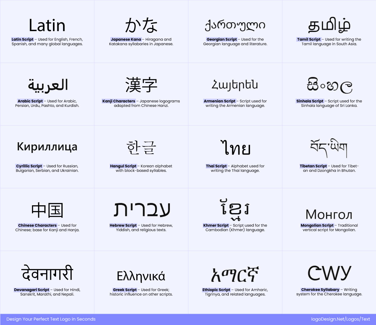
20 different multilingual typographies that connect with a specific audience
Take this as an example here. What works in Latin-based scripts would probably not work in Arabic, Chinese, or Devanagari. So this is where typography for multilingual logos comes into play.
Let’s explore what you need to know about navigating different languages and preserving brand voice with a truly global brand identity.
The Globalization of Logos
Many brands aim to or are already operating on a global scale. This means that their brand assets, such as font styles that influence perception, need to work well with multiple languages or scripts. What looks clean and balanced in one language may lose its meaning or appearance in a different region. Typography plays a crucial role in recognition, awareness, and emotional appeal across cultures.
Now, it’s important to consider that custom fonts or typefaces can sometimes be misunderstood when they appear in various scripts, resulting in confusion among consumers. A logo that looks great in its original language, for example, English, could turn out completely different when adapted into Arabic or Chinese.
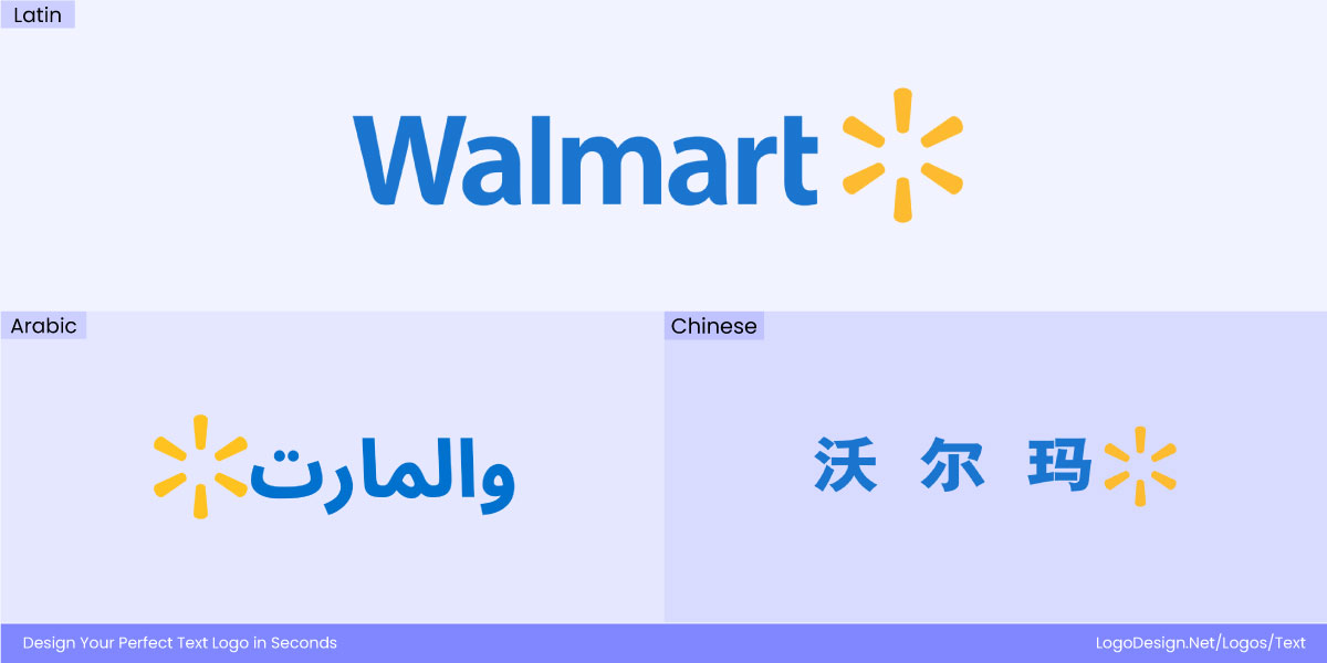
Walmart logo versions in Latin, Arabic, and Chinese to connect with the people of different countries.
This can impact how people connect and recognize a brand’s logo across countries. To avoid this, businesses need to have a multilingual logo design that looks like its original version regardless of the language. It needs to work according to other linguistic requirements without compromising on brand recognition.
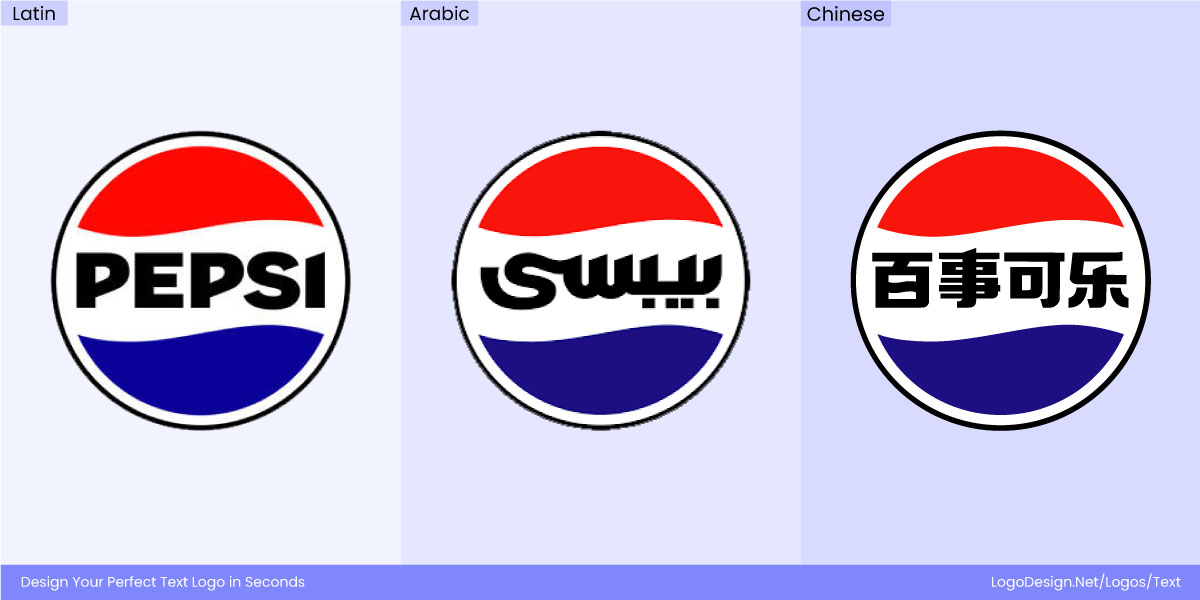
The iconic and timeless Pepsi logo with typographies in Latin, Arabic, and Chinese.
Pepsi is one of those rare global icons whose logo speaks a universal language. Whether it’s written in English, Arabic, Chinese, or Cyrillic, the bold curves and timeless energy of the Pepsi wordmark never lose their punch. The brand flexes across scripts without losing its identity—proof that Pepsi’s design isn’t just about letters, it’s about a feeling. No matter where you are in the world, when you see that familiar Pepsi logo, it still shouts refreshing, vibrant, and unmistakably Pepsi.
Multilingual Typography: Shaping Logos that Speak Every Language
Typography conveys brand values and characteristics in logo design. And this can vary across different languages and cultures. The choice of typeface can bring out specific emotions and associations, impacting how consumers perceive a brand’s identity and message.
1. Logos as Typographic Signatures
When Logos Becomes Signatures in Every Script
A logo is more than a mark—it’s a signature that carries across cultures and languages. In multilingual branding, typography becomes the bridge that keeps identity intact while adapting to new scripts. Every choice—whether translating a Latin wordmark into Arabic, Chinese, or Devanagari—shapes how the brand is perceived.
The weight of strokes, the balance of curves, and the spacing of characters must honor both the brand’s original personality and the visual rhythm of the new script. Done well, multilingual typography ensures that a logo isn’t just recognizable in one language, but resonates universally—speaking with one voice, no matter the alphabet.
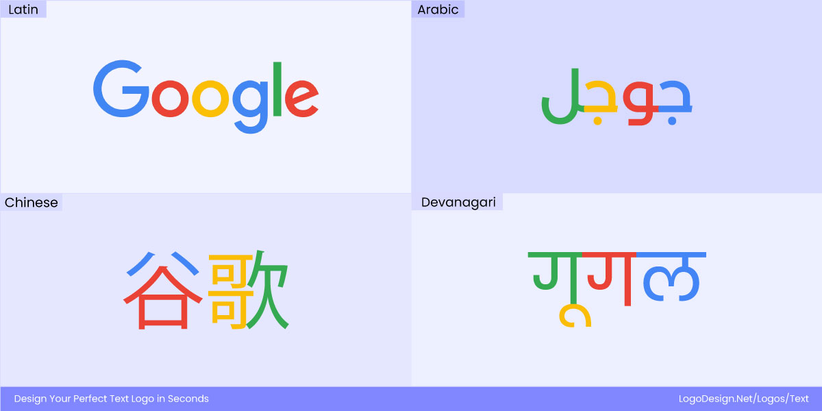
The Google Logo with red, blue, yellow, and green wordmark, designed in Latin, Arabic, Chinese, and Devanagari languages
The Google wordmark (red, blue, yellow, green) adapts across scripts like Arabic (جوجل), Chinese (谷歌), and Hindi (गूगल). The geometric simplicity of the 2015 redesign was chosen to make it work seamlessly across all scripts and screen sizes.
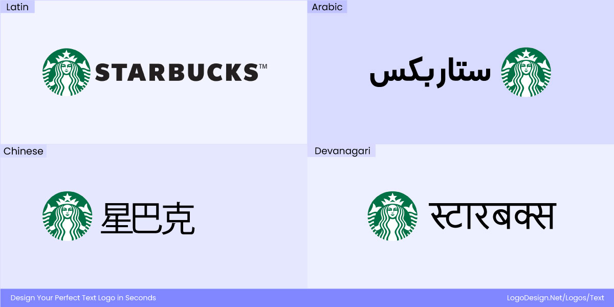
The Starbucks Logo with wordmarks in Latin, Arabic, Chinese, and Devanagari languages
Similarly, the Starbucks logo adapts its wordmark into local scripts such as Cyrillic (Старбакс), Chinese (星巴克), and Arabic (ستاربكس), while always keeping the iconic siren mark at its core. The typography shifts to match linguistic and cultural contexts, but the siren remains untouched, ensuring Starbucks stays instantly recognizable across every market worldwide.
2. Semantics in Typography
How Letters Carry Meaning Beyond Words
Typography is more than style—it’s a language of emotions and associations. Every curve, stroke, and proportion carries meaning that can shift depending on culture and script. In multilingual logos, this becomes even more important: a font choice that feels modern and innovative in one market may seem cold or impersonal in another.
Luxury brands often rely on high-contrast serifs to signal timelessness and exclusivity, while tech companies lean on clean geometric sans serifs to express innovation and progress. But when these serif or sans-serif logo identities travel across scripts, the challenge is to keep the same personality alive.
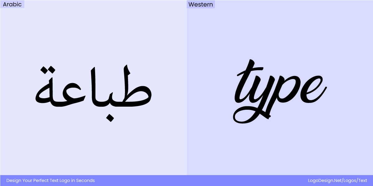
Arabic Calligraphy, with rigid geometry and flowing elegance, while Western Calligraphy, having thicker strokes to show tradition.
Arabic calligraphy, with its flowing elegance, can make rigid geometric adaptations feel distant. East Asian scripts use stroke weight and proportion to convey harmony, respect, and tradition—so a typeface that reads as “minimalist” in the West might feel stripped of warmth in those contexts.
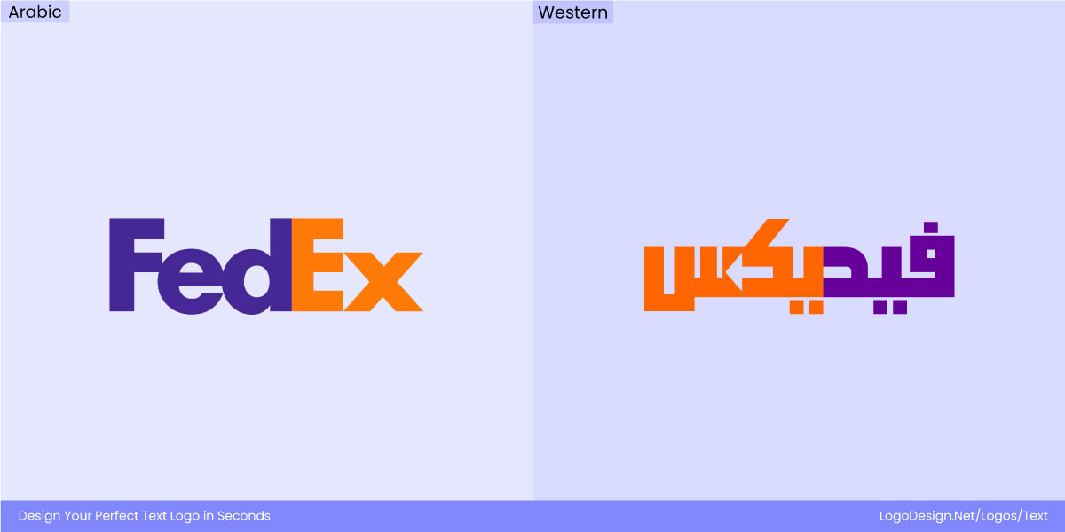
FedEx logo with Arabic and Western wordmarks to show hidden arrows and communicate speed
FedEx uses Univers, whose hidden arrow subtly communicates speed and precision across languages.
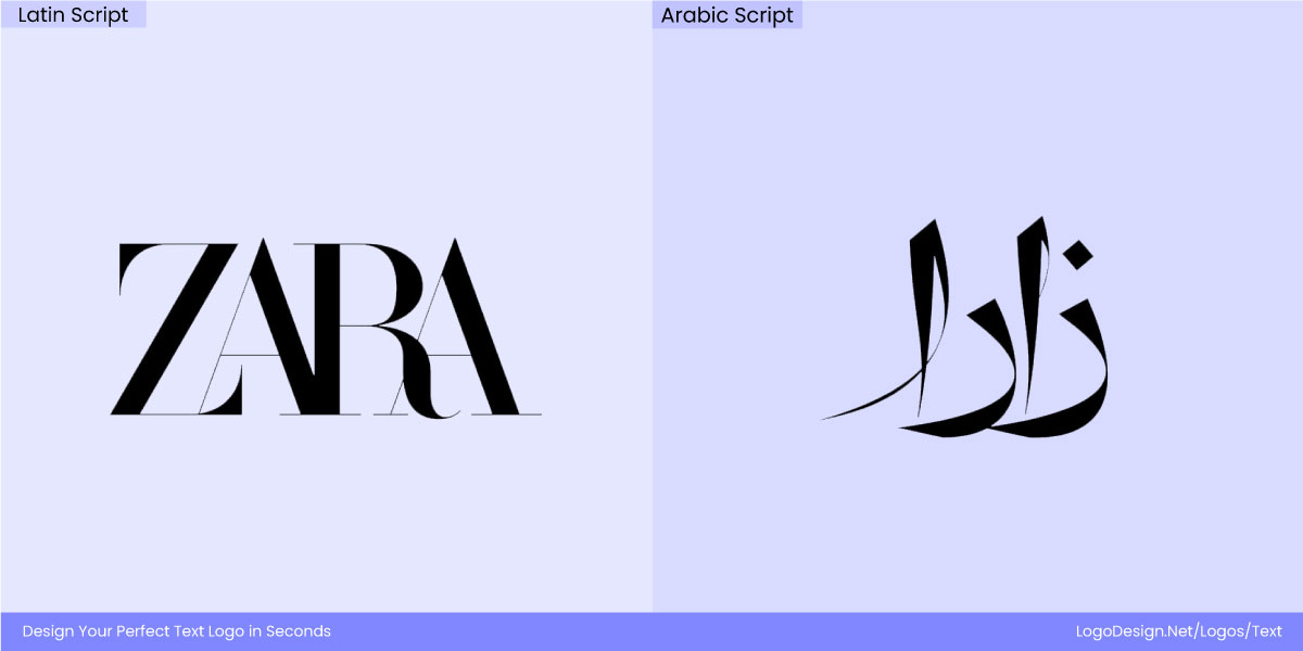
The 2019 Zara logo in Latin and Arabic Script, showing how a change in language can alter opinions
Zara’s 2019 redesign—from airy serifs to a compressed, modern serif—shows how even subtle changes in letterforms can dramatically alter perception, no matter the script.
The history of typography reminds us that type is never neutral. As brands go multilingual, each choice of font carries cultural meaning and emotional weight across borders.
Why Multilingual Typography Is Harder Than It Looks?
It is incredibly important for typography in logo design to work with technical and cultural limitations. Type-based logos have to follow the structure of their original language, and that can impact multilingual variations. So people may not be able to understand them in other languages at all, and this is quite a big mistake in typography.
Let’s take a look at the core challenges here.
1. Script Compatibility and Harmony
Different linguistic styles have restrictions on structure, appearance, and flexibility that can make consistency somewhat difficult to achieve.
• Contrast in Proportions
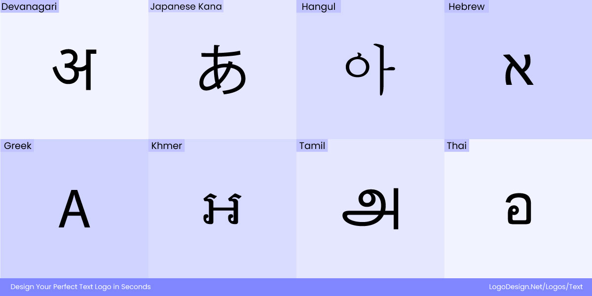
Different linguistic styles like Devanagari, Japanese Kana, Hangul, Hebrew, Greek, Khmer, Tamil, and Thai
Latin characters are typically wider and versatile, while scripts like Devanagari feature more vertical structures and dense characters. Hanzi (Chinese characters) are square in form, while Arabic is flowing and connected. Creating visual harmony between all such scripts requires a lot of effort and time.
• Stroke Behavior and Internal Geometry
Elements like ascenders, descenders, counters, and stroke contrast also change a lot in scripts.
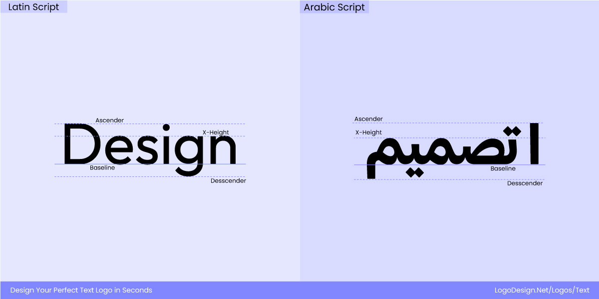
Latin Script, which has thicker strokes and a dynamic presence, while the Latin Script has thinner strokes
For example, Arabic text can be quite dynamic and fluid, while Latin is more fixed. Maintaining the original look across languages means redesigning the letters, which can appear differently to the audience.
2. Directionality and Layout Constraints
Multilingual logos need to work with scripts that have various reading directions and layouts for display.
• Right-to-Left vs. Left-to-Right
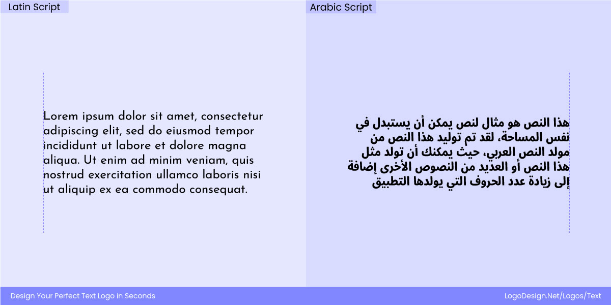
Full paragraphs shown in Latin, starting from the right, and Arabic scripts, starting from the left
Languages like Arabic, Hebrew, and Urdu are read right to left, which goes against established Latin-based logo structures. Simply changing the direction of the layout can lead to misinterpretation.
• Vertical Layouts in East Asian Branding
Some East Asian logos (particularly in Japanese and traditional Chinese contexts) are designed vertically for visual impact. Adapting to a horizontal Latin logo can be challenging for both designers and brand owners.
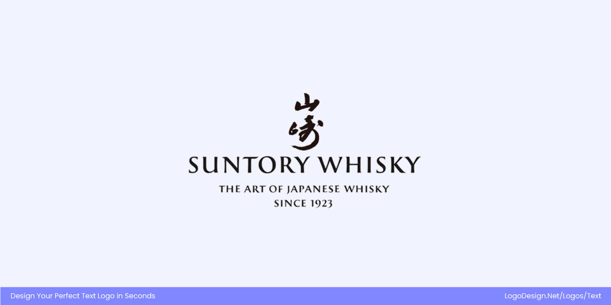
Suntory Whisky logo shows a vertical layout, using Japanese calligraphy with wordmark in Latin script.
Take House of Suntory’s whisky branding, for example. Their logo often appears as an elegant vertical stack of kanji, where each character carries equal weight in a column. It feels refined, ceremonial, and deeply rooted in Japanese calligraphic tradition. Trying to stretch those same characters into a horizontal line not only disrupts the harmony, but it also risks flattening the cultural resonance that makes the mark powerful in the first place. The logo’s grace comes from its vertical descent, much like whisky poured into a glass — fluid, measured, and precise.
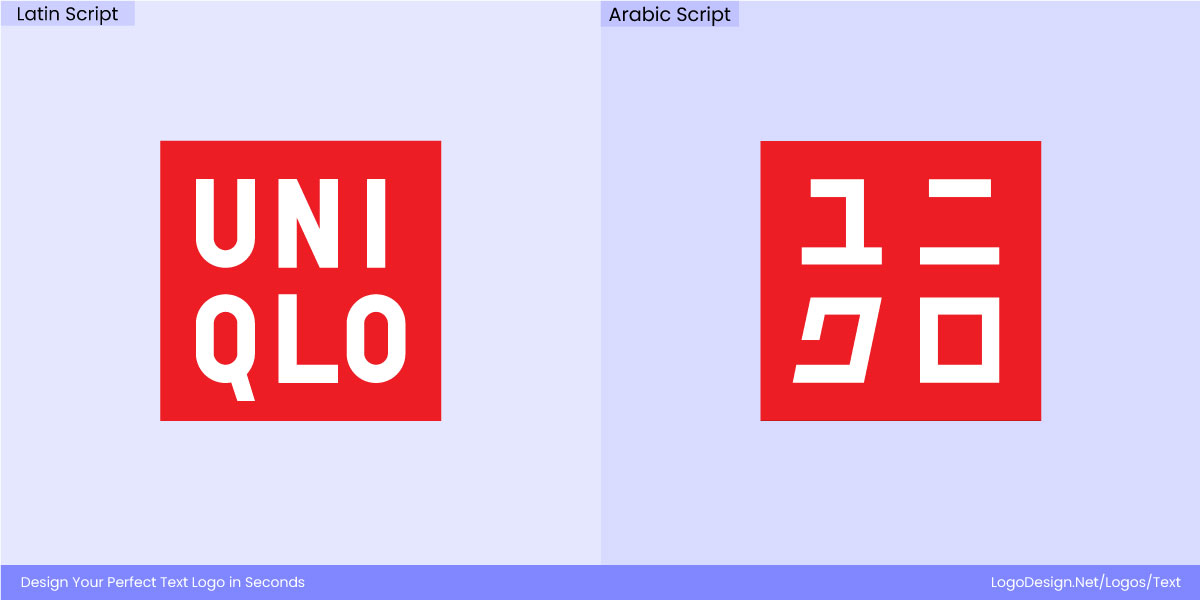
Uniqlo logo, with a vertical layout, written in Latin and Japanese scripts in a box-like figure to avoid cultural clash
Uniqlo, on the other hand, plays a very different game. The brand also features a vertical logo in Japan — ユニクロ set inside its iconic red square. But instead of flipping it horizontally for the Western market, Uniqlo chose to simply mirror the orientation with the Latin script. The English “UNIQLO” sits in the same square, with the same vertical feel. By maintaining the block-like proportion, the brand avoids the cultural clash and creates a perfectly flexible system that works in both Japanese and English.
3. Font Availability and Rendering
Even if you can get past the other challenges, you may find a few limitations that impact multilingual typography and font pairings in brand design as well.
• Limited Type Systems Across Scripts
Very few commercial or open-source typefaces support a consistent design voice across multiple scripts. A brand may find a perfect Latin font, only to discover that no matching Arabic, Devanagari, or Hanzi variant exists in the same visual style.
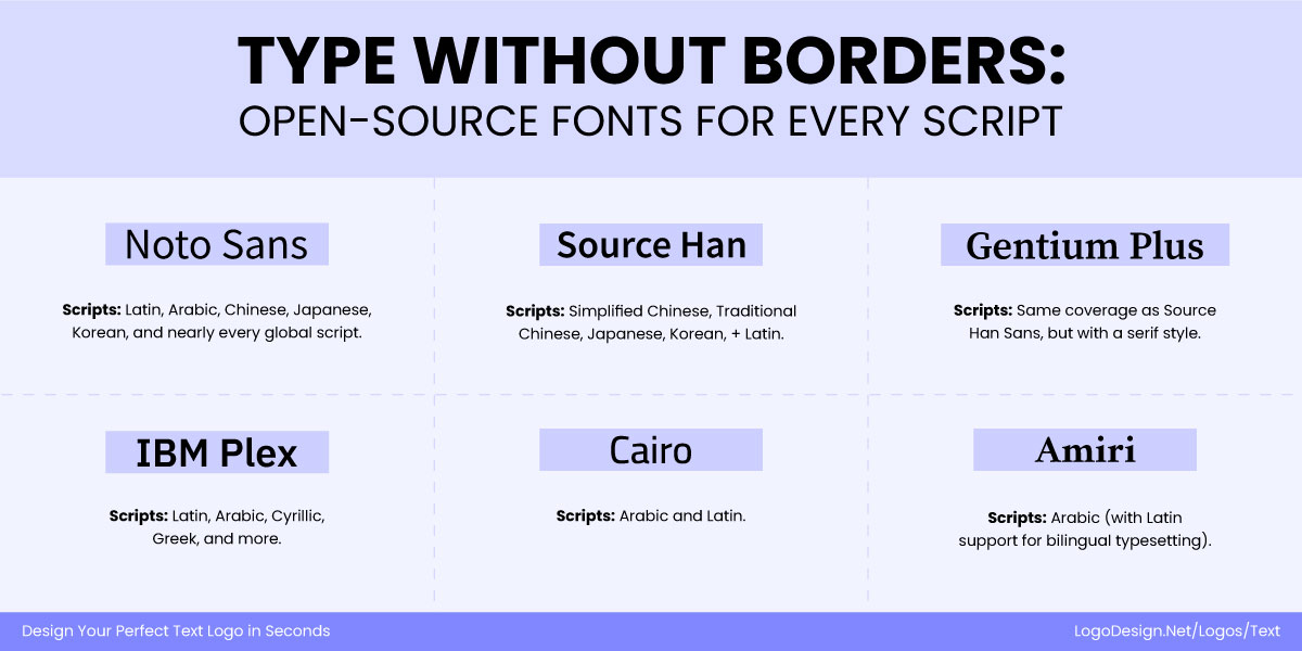
Global typefaces that are legible in different cultures and give a consistent feel to the design
• Cross-Platform Rendering Issues
Font rendering engines behave differently across various devices, browsers, and operating systems, resulting in visual inconsistencies in logo display. This is especially problematic for web and mobile environments, where brand logos need to remain pixel-perfect at all sizes and contexts.
How to Build Logos Across Scripts and Cultures?
Here are the strategies used for choosing multilingual logo typography.
1. Unified Multi-Script or Pan-Unicode Fonts
One great approach to multilingual logo design is using a unified multi-script typeface. This essentially means selecting a type family that has been designed to support various global scripts. This strategy works very well for brands that prefer a minimalist look.
By using a unified family, it is easier to avoid mismatches and be consistent with the identity across cultures. Font families such as Noto, Source Han Sans, Source Han Serif, Dubai Font, and Amiri & Amiri Latin have been developed to appear unified across multiple scripts. They offer thousands of styles designed with harmony in stroke contrast, weight, and proportions.
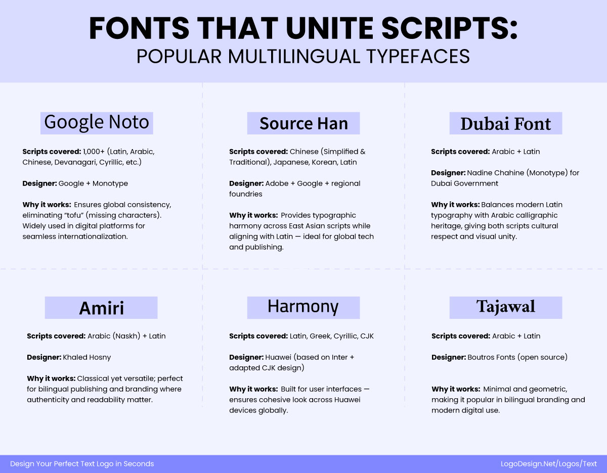
Famous multilingual typefaces that brands use to keep a consistent design for wordmarks in different languages
Building on this, many global brands go a step further by commissioning custom multiscript typefaces. This ensures that their logos and brand voice don’t just look consistent, but also feel authentic within different cultural and linguistic contexts. Custom families are designed to retain the brand’s core DNA while adapting letterforms to scripts as diverse as Arabic, Chinese, and Devanagari. For these brands, typography becomes a strategic asset, not just a design choice.
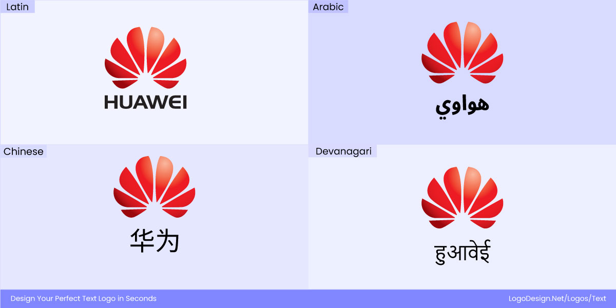
The Huawei logo using a customized font type that works for wordmark in Latin, Arabic, Chinese, and Devanagari
Huawei developed HarmonyOS Sans, a custom multiscript family that supports Latin, Cyrillic, Greek, and CJK scripts. By unifying these diverse writing systems under one design language, Huawei ensures its branding and user interface typography remain visually cohesive and globally consistent, while still resonating across local markets.
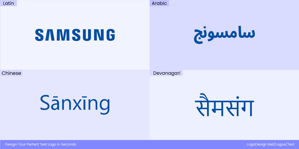
Samsung logo using a customized typeface in different languages to ensure a global identity
Similarly, Samsung has invested in a custom multiscript typeface, SamsungOne, designed to cover 26 writing systems and over 400 languages. This extensive range ensures that the brand’s visual identity and voice stay consistent across global markets while still feeling authentic within each cultural and linguistic context.
2. Custom Typeface per Script (Aligned Stylistically)
With this strategy, brands can build loyalty among local audiences. But it does require a lot of effort to appear the same in different scripts. For a custom typeface in each script such as Latin, Arabic, Hangul, Devanagari, or CJK, it is crucial to consider some key factors that need to match.
These include:
- Matching weight
- Contrast
- Terminal shapes
- Overall tone
This involves teams of type designers and native readers focusing on proportions, numerals and sizes so that text doesn’t lose its originality or flow. The brand name in Latin and Arabic for example, needs to look the same even though both letterforms are very different from each other. This also requires consistent design discipline, as teams need to collaborate on the display and aesthetic of each letter.
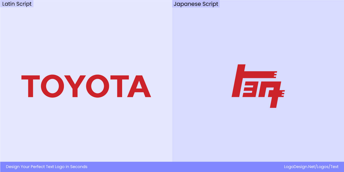
The Toyota logo using bold strokes in Latin script and carefully drawn edges in Japanese script
Toyota’s global wordmark is set in Latin, with bold, geometric letterforms. In Japanese, the kana version (トヨタ) was carefully drawn with similar weight and proportions, maintaining the logo’s visual balance while respecting the structure of Japanese characters. By designing a dedicated script version rather than using a generic font, Toyota ensures its identity remains instantly recognizable and consistent across markets.
For Coca-Cola, the iconic Latin logo uses Spencerian script, with its flowing, elegant curves. When adapting to Arabic (كوكاكولا), a custom Arabic script was created to echo the same sense of movement and rhythm, ensuring the logo feels familiar yet natural in the new script. In Chinese (可口可乐), the characters were designed with playful, brush-like energy that reflects the same dynamic flow as the Latin version, preserving the brand’s signature personality across languages.
3. Transliteration vs. Translation
When working with multilingual logos, brands must decide if they want to transliterate their name (recreate the sound) or translate it (convey the meaning). The first one allows them to be consistent with their phonetic identity. This makes it easier for customers to recognize the brand name across markets.
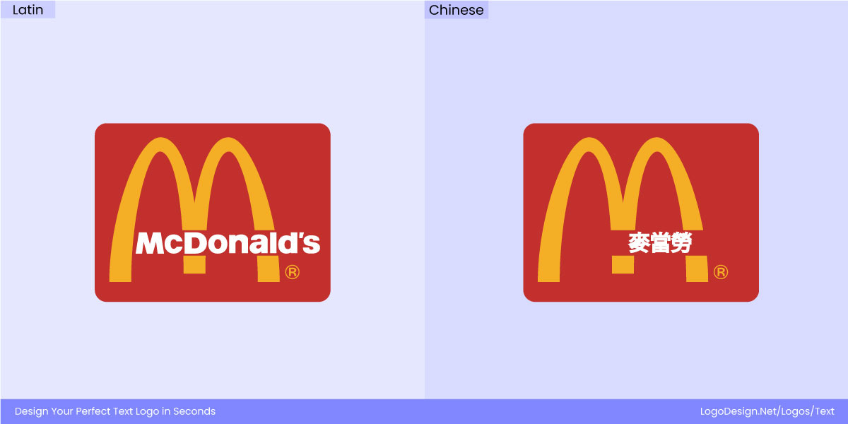
In Arabic, McDonald’s is rendered as ماكدونالدز (Mākdūnāldz), a direct phonetic transliteration of the Latin name. This approach preserves the brand’s global identity and pronunciation while making it readable and familiar for Arabic-speaking audiences.
Translation can provide immediate meaning in local languages.
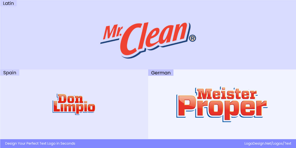
Mr. Clean logo uses different wordmarks for languages of different locations to connect with the consumers
Mr. Clean translates into over 50 names worldwide (“Meister Proper” in Germany, “Don Limpio” in Spain). It would be challenging for this to work in a direct phonetic transliteration, as the context can be lost. Now, this choice is never just a matter of language. To make your multilingual logos work, you also need to pay attention to trademark protection, consumer perception, and tone of voice.
It’s why slogans and taglines are mostly translated instead of being transliterated since they need to convey the right message. Multilingual logos combine a recognizable visual element with localized wordmarks to stay true to their brand identity.
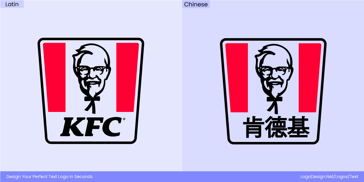
For instance, KFC maintains Colonel Sanders’ iconic face worldwide, but its wordmark is transliterated into scripts like Chinese in a way that feels natural to local audiences.
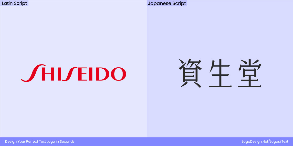
The Shiseido logo has a multilingual wordmark in English, Japanese, and Chinese, all having the same elegance
Shiseido, the Japanese cosmetics company, has developed multilingual wordmarks across English (Shiseido), Japanese (資生堂), and Chinese (资生堂 / 資生堂) that preserve the same elegant and refined appearance in every script.
What to Know About Each Script in Multilingual Logo Design?
Each script brings its own typographic challenges and cultural associations that must be respected in a multilingual logo system.
• Latin (Baseline)
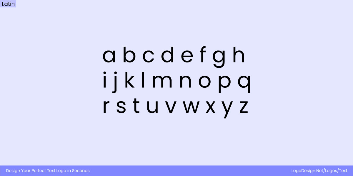
Latin script is widely used in most logos around the world as they’re well-defined, elegant, and easier to understands
Latin script is the base for most of the global brand typography. It’s well-defined structures like ascenders, descenders, serifs, and counters make it easier to be displayed in a range of styles. So, from clean geometric fonts to traditional or elegant, Latin scripts are pretty adaptable.
When designing multilingual logos, it’s important to consider the unique characteristics of each script; for Latin, these guidelines can help maintain brand consistency while easing adaptation to other writing systems:
- Highly flexible and widely recognized across print and digital formats.
- Often considered the “base” script for multilingual brand design.
- Designing in Latin first helps establish hierarchy and visual identity.
- Can be challenging to adapt letterforms for other scripts without losing consistency.
- Pay attention to proportions, spacing, and stroke weight to ease cross-script adaptation.
- Ensure legibility at small sizes, especially for type-only logos.
- Maintain the brand’s personality through font choice, style, and typographic details.
• Arabic
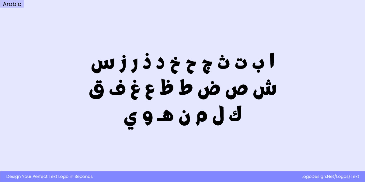
Arabic script has letters that have different shapes and positions that appear thick and stylized
The script is typically cursive, with letters that change shape depending on their position in a word. It is also written from right to left and does have deep roots in typography. Arabic appears more fluid than Latin as you can find a stylized variation to adapt accordingly. Traditional Arabic scripts such as Naskh and Ruq’ah convey tradition and core values while modern trends do inspire a simplified form too.
Designing logos in Arabic requires balancing cultural authenticity with brand consistency. The following considerations can help maintain legibility and preserve the script’s unique character:
- Overly geometric or Latinized Arabic fonts can feel unnatural or out of place.
- Decorative or highly stylized calligraphy may reduce clarity, especially in digital formats.
- The flowing structure of Arabic letters may require custom adjustments for spacing, proportions, and stroke connections.
- Designers should respect traditional calligraphic rules while ensuring the logo works across various sizes and media.
• Chinese, Japanese, and Korean (CJK)
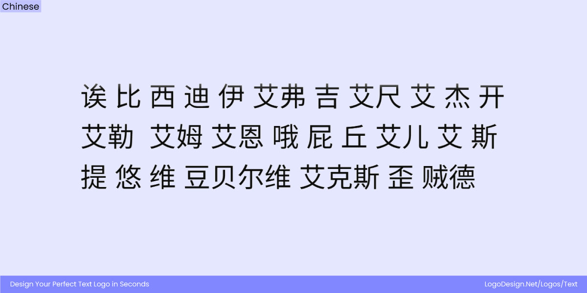
CJK script uses elements that have many characters, block-like clusters, and heavy strokes.
These are visually quite dense and follow a square proportion, which is quite the opposite of Latin typography. Chinese uses thousands of logographic characters, Japanese combines kanji with kana syllabaries, and Korea’s Hangul system arranges letters into block-like clusters. These scripts do appear more compact or stroke-heavy and different from other typefaces that are easier to produce.
When designing multilingual logos that include CJK characters, it’s essential to balance readability, weight, and layout so that both scripts harmonize visually:
- Modern logos often use minimal, sans-serif styles for clarity, but CJK characters can appear visually heavier than Latin letters if not carefully adjusted.
- Ensuring proportional weight between CJK and Latin is crucial to prevent one script from overpowering the other.
- Vertical layout compatibility, especially in traditional Japanese contexts, adds another layer of complexity to logo design.
- Stroke density, spacing, and character height must be carefully managed to maintain legibility across sizes and media.
• Devanagari and Indic Scripts
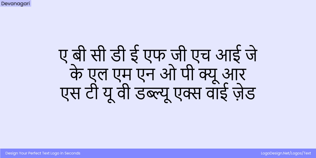
The Devanagari script using consistent stroke density with simplified shapes, being a digital-first appearance
Devanagari scripts have a shirorekha (a horizontal top line connecting letters) and unique characters. These scripts often have high x-heights and density, which is why maintaining consistency without flattening cultural identity is incredibly important. Its features give Indic logos a very different look that does not work well with Latin. Devanagari can appear dense, but modern texts have tried to simplify shapes in digital use.
When designing multilingual logos in Devanagari, it’s essential to respect the script’s unique structural features while maintaining brand consistency:
- Direct transliterations of Latin brand names often fail because the scripts have very different proportions, strokes, and shapes.
- Custom typefaces or adaptations are usually required to make Devanagari versions visually align with the original Latin logo.
- Attention to the script’s horizontal headline (shirorekha), character spacing, and vertical proportions is essential for legibility.
- Designers must balance cultural authenticity with brand identity, ensuring the logo feels natural in both Latin and Devanagari contexts.
Creating Logos That Work Across Languages: Responsive, Modular, and Adaptable
To make sure that your multilingual logos are timeless and adaptable, they need to be designed with modularity, responsiveness and scalability in mind.
• Logo Matrix
When designing with a logo matrix, creating a flexible typographic grid that can adapt across different scripts becomes easier. Instead of redesigning each localized logo from scratch, the matrix works with proportions, alignments, and spacing rules that are quite structured. They can work well with Latin, Arabic, CJK, or Indic scripts. The characters may change a bit, but the overall appearance of the logo remains consistent.
For example, the weight of strokes, balance of negative space, and connection between letters or symbols are according to the matrix. No matter the script, the logo feels part of the same family.
For example, the MIT Media Lab logo system, designed by Pentagram, uses a 7×7 modular grid to expand the brand identity across 23 research groups. Each logo is derived from the “ML” glyph, creating a cohesive yet flexible visual family. While originally for internal groups, this structured approach also makes it easier to adapt logos to different languages and scripts, keeping consistency intact.
Similarly, 23andMe uses a motif-based system developed by MetaDesign, with 23 distinct logos referencing DNA building blocks. This modular design allows the brand to maintain a unified identity while creating localized versions that resonate with diverse linguistic and cultural audiences.
Productside’s modular logo system, designed by Truth and Consequences, uses a flexible grid that ensures instant recognition while seamlessly adapting across scripts and languages—maintaining brand unity and consistency in every market. Built on a logo matrix, the design allows multilingual adaptations without losing proportional harmony or visual identity.
• Responsive Logo Typography
Multilingual logos must be optimized for mobile and low-resolution contexts. This may involve simplifying complex script details or rebalancing the typography for legibility at smaller sizes. For example, elaborate calligraphic styles may need to be presented in a simple format for clarity on small displays. Responsive logo typography includes creating versions of the same logo that minimize complexity but keep it recognizable.
Brands working in Arabic or Devanagari reduce the details for smaller screens. This allows the script to be readable and preserve its cultural authenticity. In Chinese, Japanese, and Korean, some dense strokes may need to be simplified for clarity on business cards or favicons. This approach, based on creating a primary logo, simplified version, and micro brandmark, helps businesses appeal to their consumers across scales and devices.
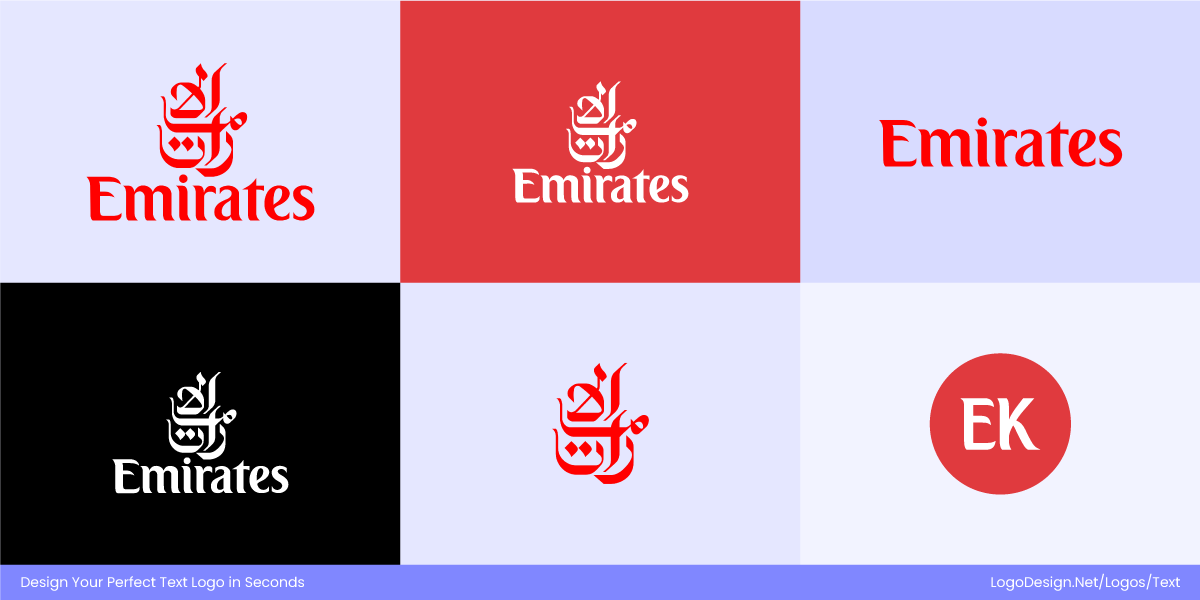
Emirates logo for different-colored backgrounds, various-sized displays, and in specific languages
Emirates Airlines shows how responsive design works across scripts. The Arabic wordmark "الإمارات" uses elegant calligraphy, paired with the Latin “Emirates.” Across platforms, the brand adapts this into simplified marks for small screens, apps, and stationery, while preserving the same premium identity.
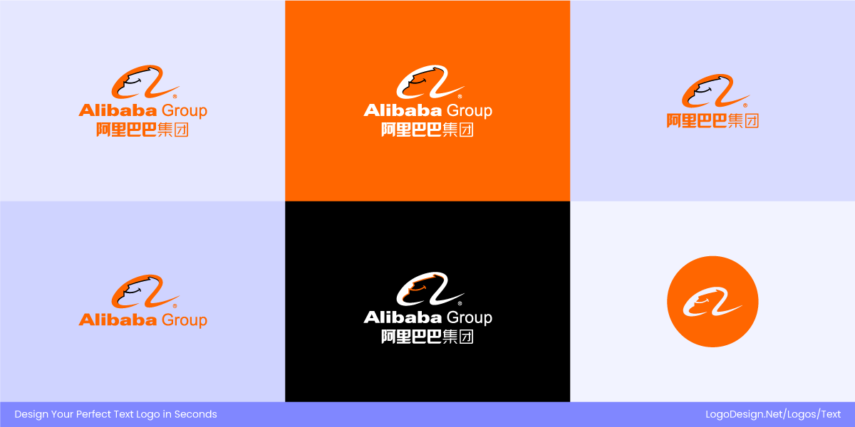
Different Alibaba Group logos for different backgrounds, various sizes, and specific languages
Alibaba’s logo highlights its Chinese roots with the stylized characters "阿里巴巴," while also using the Latin “Alibaba” globally. The system flexes between detailed full logos, simplified digital icons, and micro brandmarks, ensuring consistency whether it’s on e-commerce platforms, favicons, or global campaigns.
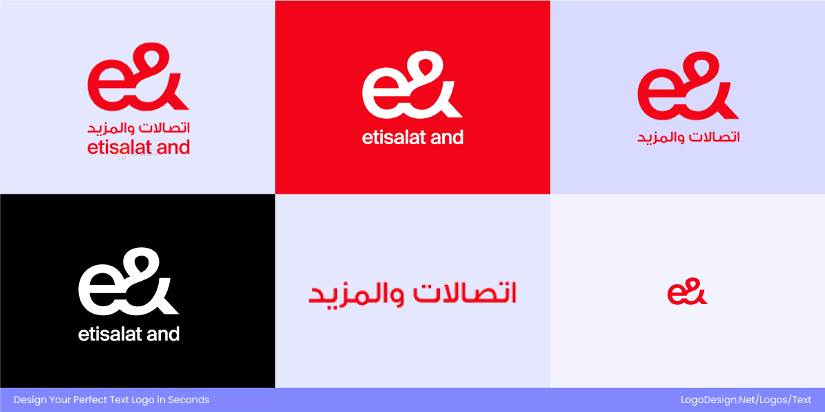
Etisalat logo versions that are responsive for multi-colored backgrounds, in different languages, and for various locations.
Etisalat’s new identity replaces its former green with a bold, solid red, symbolizing energy and modernity. The Arabic wordmark "اتصالات" is paired with the English “Etisalat,” while the brand’s icon cleverly merges an “e” with an ampersand. Across platforms, the system adapts responsively—complete bilingual lockups for global campaigns, a simplified red icon for apps and favicons, and localized Arabic-first versions for regional audiences.
• Logo Lockups and Hierarchy
For global brands, a simple translation does not have the same impact as the original logo. This is where logo lockups and hierarchy come in. A lockup is an arrangement that combines the global logo with a localized script version. The global name increases recognition while the localized version builds trust and accessibility. Companies like Toyota or Hyundai do display their Latin logo alongside Japanese or Korean versions in domestic markets.
This is not just practical but also shows respect for local audiences. Many brands use a ‘lockup’ format, combining the global brand name with a localized name or tagline. Think of this like a hierarchy where the multilingual logos promote inclusivity by adding regional scripts to their original styles.
The Al Jazeera logo combining Arabic calligraphy with a bold Latin wordmark, giving an accessible look
Al Jazeera’s logo relies entirely on a stylized Arabic calligraphy of “الجزيرة,” which has become globally iconic in its own right. Instead of pairing Latin and Arabic together, the brand reinforces hierarchy by making the Arabic version primary, while Latin text (“Al Jazeera”) often appears in secondary lockups for accessibility in international markets.
Tencent logo combining the Latin wordmark with the Chinese script to retain cultural authenticity
Tencent emphasizes its Chinese heritage by prominently using “腾讯” in its domestic logo. For global contexts, the Latin wordmark “Tencent” is paired with or replaces the Chinese script in certain lockups. This hierarchical arrangement ensures recognition abroad while retaining cultural authenticity at home.
Bibigo logo uses a Hangul script with its wordmark to show its Korean roots and worldwide accessibility
Bibigo intentionally integrates Hangul (“비비고”) into its core wordmark system, ensuring the Korean script travels with the brand into international markets. Lockups often feature both the Latin “bibigo” and Hangul, giving equal hierarchy and communicating the brand’s roots while making it accessible worldwide.
Tools, Fonts, and Frameworks for Multilingual Logo Typography
Let’s examine all the factors to consider when designing multilingual logo typography.
• Type Families
Choosing a multi-script type family is key to making multilingual logo typography work. Fonts like Noto, IBM Plex, Helvetica World, and Arial Unicode MS can cover multiple global scripts while being consistent with branding. A unified type family reduces the need for constant customization while providing scalability across markets.
• Design Tools
Designers working with multilingual logos often need specialized software and platforms to handle script-specific complexities. The logo creator tool by LogoDesign.Net allows for custom font creation and flexibility. Users can get logos for multiple scripts with unique structures or stroke patterns. Additionally, resources like Fontshare, Typotheque, and Rosetta Type Foundry provide global font collections with cultural sensitivity built into their design.
• Fallback Systems for Digital Logos
On digital platforms, not every device or browser can render custom fonts in the right. This is where web-safe font stacks and fallback systems become essential. By setting up a prioritized list of fonts, designers ensure that logos still display legibly if a preferred typeface fails to load. Variable fonts are another important tool, as they allow for weight, width, and style adjustments across scripts in one file.
Your Go-To Checklist for Multilingual Logo Design
• Research & Strategy
- Identify target markets and scripts (Latin, Arabic, Devanagari, CJK, etc.).
- Decide whether to use translation, transliteration, or both in the logo.
- Check cultural meanings, connotations, and associations of words/shapes.
• Typography & Script Considerations
- Choose typefaces that have consistent multiscript support.
- Ensure stroke weights, proportions, and spacing align across scripts.
- Balance readability with brand personality (serif vs sans serif, calligraphic vs geometric).
- Adapt for vertical scripts (e.g., Japanese) where necessary.
• Logo Structure & Lockups
- Define hierarchy: which version is primary (Latin or local script)?
- Create lockups that combine global + localized versions.
- Use a logo matrix/grid to maintain proportion across scripts.
• Cultural Sensitivity
- Avoid forcing scripts to mimic Latin forms unnaturally.
- Respect calligraphic traditions (Arabic, Devanagari, etc.).
- Test with native speakers/designers for authenticity.
• Scalability & Responsiveness
- Create logo variations: full version, simplified version, and micro mark.
- Check legibility on small screens, packaging, and signage.
- Reduce details for dense scripts (e.g., Chinese, Arabic) at small sizes.
• Testing & Validation
- Test in print, digital, and environmental contexts.
- Validate across different devices and resolutions.
- Gather feedback from local audiences for authenticity and trust.
Typography in multilingual logos must accommodate different cultures, visual tone, and emotional associations. A well-designed multilingual logo increases recognition and strengthens the brand globally. Balancing consistency with cultural sensitivity helps brands remain universally recognizable and locally relevant.
