Red logos are making history and grabbing attention, left, right, and center! Rooted in history, culture, and color psychology, red is a sure choice for brands wanting to create a buzz!
Red isn’t just a color; it is a statement. It’s the shade that makes you stop, look, and remember.
Think of the world’s most iconic brands, Coca-Cola, Netflix, and YouTube; all of them are red. And this is not by chance, many famous brands use red as the primary color for their logos. Do you want to learn why?
Let’s examine the hype surrounding the color red and the logos of some brands that use it.
Design Red Logos That Demand a Second Look
Get inspired by over 100 logos that prove red is bold, dynamic, and unforgettable. Create yours now.
Why Do Brands Favor Red In Their Logos?
According to the color theory, red is one of the most powerful colors on the color wheel and is associated with emotions such as passion, love, excitement, and even emergencies. These emotions are the holy grail for marketers as they translate to action. You are likely to find red logos in many industries, including food, fashion, energy, and even tech.
With a wavelength of 700 nm, red is one of the most visible colors. Even at a distance, people are more likely to notice red than other colors. Once it grabs attention, the color signals our brains that it is time for action now and that we should act urgently. These triggers ensure that the color red stays in our memory for a long time.
The Psychology of Red Logos
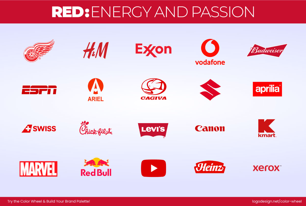
Some famous red-colored logos that display energy and passion
On a psychological level, red takes it further by raising our heart rates, encouraging faster decision-making. For instance, in restaurant logos, the color red is used to stimulate appetite, so more people buy food and beverages from brands with red logos. Similarly, red is bold and energetic in the entertainment industry, conveying confidence and trust in finance and retail.
100 + Red Logos That Prove The Power Of Colors
If you are considering a red logo for your brand, this collection of 100+ red logos will give you the inspiration you need and guide you in designing one that truly stands out.
1. Coca-Cola
The classic red wordmark Coca-Cola logo, which brings joy, excitement, and a nostalgic feel
Coca-Cola red is not just a color; it is a feeling. The logo comes with a hit of nostalgia and a parched throat. The logo alone can tingle our energy and joy, making it highly recognizable. This is one case where a red logo is just as identifiable as the drink itself.
2. Netflix
The bold red color in the Netflix logo is a signal to stop and watch, making it hard to ignore.
Netflix is bold and unapologetically red. In not many words but just a logo, the red logo says, "STOP what you’re doing and watch." The logo is impossible to ignore. The color choice and implementation pull in viewers for just one more episode.
3. Target
Target’s logo, with the bold red bullseye, is designed to make you stop and shop.
Bullseye! The red Target logo is simple but so powerful. The color signals the mind to stop and get what it wants by hitting the mark. The bullseye makes it a big target on savings.
4. Levi’s
The bold red Levi’s logo uses a tag against classic denim, a simple yet powerful symbol.
Want a lesson in fashion branding? The Levi’s logo stitched onto every denim piece is branding at its finest. The red is a beautiful contrast to blue jeans, making the logo stick out and take center stage. The logo is authentic and unabashedly red.
5. Canon
The Canon logo uses a bold red wordmark that balances innovation with approachability.
The Canon logo is clean and authoritative, using a simple red wordmark. It signals cutting-edge technology while still conveying that it is accessible to all. The red color is the perfect choice for attention and approachability.
6. H&M
The bold red H&M logo captures the fast fashion market by triggering urgency and gaining instant recognition.
Fast fashion and an even faster recognition, all because of H&M’s red wordmark. The red signals the urgency that fashion-forward individuals look for when they set out to get trendy clothing.
7. Nintendo
The vibrant red Nintendo logo symbolizes play, power, and timeless fun.
What says energy better than a red logo? The Nintendo logo is all about excitement and high energy levels. Be it a Mario game or switching it over to a Switch control, the logo is a consistent part of its storytelling.
8. Budweiser
The Budweiser logo has a bold red color to display heritage and trigger appetite.
The Budweiser logo is a red banner of heritage. The calligraphic script on a red arch demands attention, sitting on a beer shelf. The design appeals to the appetite and then provides a sophisticated solution.
9. YouTube

The YouTube logo features a vibrant red color and a white play button to show action and excitement.
The YouTube logo is designed to be a visual magnet. It features a vibrant red block housing a small triangle, also popularly known as the play button. The clean contrast of red and white conveys action and excitement.
10. ESPN

ESPN’s logo uses a bold red wordmark to create the illusion of speed and energy.
ESPN’s logo is a testament to speed. The logo design uses a simple horizontal line splitting the wordmark to add the illusion of speed. The bright red color immediately grabs attention and conveys the energy in all the action-packed events it covers.
11. Suzuki

The iconic ‘S’ in the Suzuki logo combines modern precision and samurai heritage.
An unmissable logo like Suzuki’s grabs attention and conveys the tradition and heritage the brand has been serving for so long. The stylized lettermark adds movement and precision to the brand image while the curved but pointed lines link the brand back to glyphs and samurai history.
12. Swiss International Air Lines
The Swiss International Air Lines logo uses a bold red and white color scheme and an aircraft-like symbol to represent heritage.
The Swiss International Air Lines logo, heavily inspired by the national flag, symbolizes quality. The color and logo are highly recognizable and can be clearly spotted against an aircraft’s white body.
13. Verizon
Verizon’s logo uses a bright red color with a gradient, showing a new beginning.
Implying power and quality, the Verizon logo uses a bright red color in its wordmark. But the new logo is not all solid. It has a subtle but noticeable gradient effect on the left side of the V. The gradient is smartly placed and symbolizes a new horizon.
14. Toyota
Toyota’s logo uses red to show energy and performance in every promotion.
Toyota knows the significance of a red logo, so it uses a red version of its logo for all its signage and advertisements to push energy and performance.
15. Marlboro
The iconic red chevron in the Marlboro logo shows sophistication and instant global recognition.
Smoker or non-smoker, the Marlboro logo is one of the most recognizable logos out there. The red chevron gives the logo a feeling of sophistication, married with memorability.
16. Frito-Lay
The Frito-Lay logo, with the red ribbon, shows reliability and quality.
There’s something about red ribbons in logos that adds a flair of reliability and quality. The color red does the heavy lifting to maintain the visual balance of the Frito-Lay logo, which has a red ribbon and the slogan written in red right below.
17. HSBC
The HSBC logo uses a bold red and white hexagon that shows tradition and global confidence.
While blue is the most preferred color for banks, HSBC uses red as its wild card and stands out. The red and white hexagonal shape gives the logo more structure, conveying the bank’s dynamism and global energy.
18. Colgate
Colgate’s logo uses bold red color to show energy and sincerity.
Responsible for smiles worldwide, Colgate smartly uses its red logo to convey its vibrant energy and sincerity. When you stroll down the toothpaste aisle in the grocery store, the Colgate logo and packaging will definitely stand out.
19. Lego
The LEGO logo uses bright red to capture childhood’s playful energy and excitement.
Lego is a world of its own, but its iconic red logo stands out in the broader world. The colors communicate a child-like excitement and energy.
20. Ace Hardware
The ACE Hardware logo uses bold red to showcase professionalism.
The ACE hardware lettermark is a professional-looking logo. Its vibrant red color and stylized font add brand messaging to the image.
21. Pinterest

The Pinterest logo, with bold red, captures attention, symbolizing saving and inspiring ideas.
The red in the Pinterest logo makes it immediately recognisable, and its prominent design implies the platform’s idea: to pin the concepts you like.
22. Chick-fil-A
Chick-fil-A’s logo, with bold red, stands out by the roadside and is a clever visual pun to draw hungry drivers in.
It’s difficult to stay visible on the roadside, but the Chick-fil-A logo does that well. The fast-food brand cleverly uses the color red and a visual pun to attract people and offer a satisfying meal.
23. Pizza Hut
Pizza Hut’s logo features a bold new all-red design with melty ‘z’ and uses a fresh modern font type.
Pizza Hut has gone all red! The new logo is completely red and has a new font. The z’s of Pizza are dripping into Hut, probably resembling the dripping cheese, while the hat stays on!
Also Read: How a new Pizza brand enhanced its branding to attract leads and boost sales.
24. KFC
KFC’s iconic logo features red colors with Colonel Sanders, symbolizing quality and crave-worthy flavor.
The red mascot KFC logo plays at the heartstrings with an appetite-enticing logo that features the brand mascot, Colonel Sanders, as a testament to its top-quality food.
25. Wendy’s
Wendy’s logo has an iconic red color that triggers warmth, trust, and appetite.
Wendy’s logo has a warm story, and the red further iterates the brand message of warmth, appetite, and food you can trust. The red is the star of the show as it features in the emblem as well as the wordmark.
26. Adobe
Adobe’s logo emphasizes its iconic red for a stronger, more intentional look.
Bolder, intentional, and better than ever, Adobe’s logo was redesigned with a strong focus on the signature red, which gives it all the more attention now.
27. CNN
The CNN’s logo uses a bold, dark-red color to convey professionalism and authority.
CNN does not shy away from using a darker shade of red. The logo, because of its color, gives the brand a more professional look, which is essential for a news platform of their stature.
28. Red Bull
The Red Bull logo uses icons of two red bulls, showing energy and sparking excitement.
Red for an energy drink logo? Yes, Please! The Redbull logo does justice to its name and brand messaging with a highly charged emblem and a straightforward wordmark. Just looking at it gives you jolts of energy.
29. Air Canada

The Air Canada logo uses a red leaf in a rounded casing, indicating a trustworthy option for travelers.
The Red Rondelle, a brand representation, has symbolized trust for all travelers since 1965. In the words of Air Canada itself, “Customers routinely tell us that no matter where they are in the world, as soon as they see the rondelle on an aircraft tail, they feel they are already at home.”
30. Amstel
The Amstel’s logo uses red, white, and gold colors for warmth and an inviting feeling.
Pairing red with white and gold makes for an elegant combination. Amstel’s logo invites its customers to take a sip and enjoy the warmth and flavor.
31. Beats by Dre
The Beats by Dre logo uses a red passion color shade to show the combination of bold design and music.
Music and passion are synonymous; red is the best color to translate that passion onto a logo. The Beats by Dre logo is exclusively designed to evoke the dynamism of music, and it does that well!
32. British Red Cross

The British Red Cross logo uses red and white to symbolize urgency and humanitarian aid.
The red and white combination is an international symbol for emergency or relief situations. The red cross on the British Red Cross logo is easily identifiable and screams for attention to humanitarian issues.
33. Delta Airlines
Delta’s logo features a dark red triangle and arrow, symbolizing speed and reliability for travelers.
Delta Airlines‘ emblem is a dark red triangle with a trajectory arrow breaking the symbol. The logo symbolizes speed and reliability for all travelers.
34. Domino’s (part red)
The Domino’s logo uses bold red accents to spark appetite and a sense of urgency for fresh, hot pizza.
Although the Domino’s logo is not completely red, the red surely stands out. It creates a sense of urgency and hunger for a slice of steaming pizza.
35. GameStop

GameStop’s logo uses bold red for ‘Stop,’ instantly catching the eye and making viewers pause.
What smart use of color! The designers have cleverly used red for the Stop in GameStop, immediately grabbing attention and forcing the audience to actually stop and take another look.
36. Jollibee
The Jollibee logo uses bright red and a cheerful bee mascot to create a lively and inviting energy.
Just like the hardworking bee, red is hard at work in the Jollibee logo. The bee mascot adds a lot of buzzing energy, which pairs well with the red logo’s energy, enticing the audience to walk in.
37. Kellogg’s
Kellogg’s logo uses red script and a vibrant color palette to make the brand stand out with energy and confidence.
In the crowded cereal aisle, Kellogg’s stands out because of its signature script and color. The color palette adds vitality to the brand image, making it the top choice.
38. KitKat
The KitKat logo uses red, white, and brown for a bold and delicious contrast.
The KitKat logo is a classic, combining red and white to make it stand out. The logo is a powerful contrast against the brown chocolate.
39. Lipton (part red)
The Lipton logo features a red banner and white wordmark, reflecting its heritage of over a decade.
The Lipton logo consists of a red banner with a white wordmark. The design recalls its 135-year legacy.
40. Monopoly
The Monopoly logo uses bold red to convey power, ambition, and excitement.
The red in the Monopoly logo symbolizes power and ambition, which are also the very keywords of this game. The vibrant red color makes sure customers pick it up when they go to a toy store.
41. Opera Browser

Opera’s red, ribbon-like logo stands out among blue browsers, making it bold and memorable.
In a world where internet browsers are mostly different shades of blue, Opera stands out with its ribbon-like red logo. The logo gives Opera the opportunity to be memorable because of its difference.
42. Ray-Ban
The Ray-Ban logo’s bold red color highlights confidence and effortlessly draws attention.
For those who want to make a fashion statement, Ray-bans are a must have! The red logo shows its efficiency and the power of attracting attention.
43. Ruffles
Ruffles’ logo uses a bold red packaging that grabs attention and stirs up your appetite.
Ruffles knows how to bring in the business. The brand uses a bright red that is hard to miss and will definitely make you hungry.
44. Staples
The Staples logo uses a vibrant red to mix both tradition and serious professionalism.
Red on white surely stands out! The Staples logo is a message within a logo, the emblem and wordmark are both a vibrant red showing tradition with a lot of professionalism.
45. Supreme
The Supreme logo’s simple white wordmark on a bold red background is visually appealing.
The Supreme logo is simplicity in its truest form. But simplicity does not devoid a logo of its aesthetic. The red background with a white wordmark is very appealing.
46. Texaco
The Texaco star logo uses bold red for a sense of strength and reliability.
Texaco’s red star is a bold signal of trust, tradition, and strength. The fiery red makes the brand instantly recognizable at gas stations, giving off a sense of reliability and energy.
47. Toyota Racing
Toyota Racing’s logo uses the color red, which symbolizes speed, adrenaline, and high performance.
Red and racing go hand in hand, and Toyota Racing knows it well. The brand’s red logo conveys speed, adrenaline, and high performance.
48. Uniqlo
Uniqlo’s bold logo uses a red square to make fashion minimalist and commanding.
Minimalist yet commanding, Uniqlo’s red square makes fashion approachable and bold. The color gives it a modern edge, making the brand stand out in a sea of retail brands.
49. Vodafone
Vodafone’s logo uses a bright red speech mark to convey energy, movement, and starting a connection.
Vodafone’s red speech mark doubles as a conversation starter. The bright red communicates energy, movement, and connection, making the logo feel alive.
50. Wells Fargo
Wells Fargo’s logo uses a red background to symbolize its strength, security, and stability.
With a long heritage, Wells Fargo uses red to symbolize strength, security, and stability. The bold color makes the financial brand feel powerful and dependable.
Red, Ready, Logo!
Create a brand logo that’s fun, striking, and almost impossible to ignore.
51. Xerox
The Xerox logo uses a red ball to symbolize transformation and innovation.
The Xerox red ball logo symbolizes transformation and innovation. The red brings energy and dynamism to a brand once known mainly for copiers, showing the world it’s much more than that.
52. Yelp
Yelp’s logo uses a vibrant red burst to be as loud and attention-grabbing as a fantastic, highly-rated review.
Yelp’s red burst logo captures attention the way a great review does. It’s loud, vibrant, and full of energy, encouraging people to dive into the world of ratings and recommendations.
53. Zomato
Zomato’s bold red logo is to trigger the appetite of food lovers looking for home delivery.
Red is an appetite’s favorite color, and Zomato knows it. The red logo makes you hungry before you even scroll through the menu. It’s bold, simple, and perfect for a food delivery giant.
54. Arsenal FC
Arsenal’s red logo screams loyalty and fighting spirit, a brand built on tradition and reliable power.
Arsenal’s iconic red kit and logo radiate loyalty, power, and fighting spirit. It is a brand built on reliability and tradition.
55. Bank of Montreal (part red)
The BMO’s logo uses vibrant red circles to show confidence and signal that it is an approachable brand.
The red circle in BMO’s logo feels like a stamp of confidence. It adds vibrancy to the brand, and makes it a bit softer to add a pop of approachable energy.
56. BBC News
The BBC News logo uses an authoritative red color to demand attention and creative urgency.
Serious, authoritative, and commanding, BBC News uses red to demand attention. It makes every headline feel urgent and important, exactly what a global news leader should do.
57. Boston Red Sox
The Red Sox logo uses red to convey tradition, energy, and America’s love for baseball.
The name says it all. Boston Red Sox embrace red not just in the logo but in identity. The logo sparks tradition, energy, and a symbol of America’s love affair with baseball.
58. Budvar
Budvar’s logo uses bold red for a premium and striking presence on the shelf.
Budvar’s red logo gives the Czech beer brand a premium yet bold personality. It makes the label stand tall in the beer aisle, demanding attention.
59. Calgary Flames
The Calgary Flames’ logo uses red to capture fire, intensity, and heat.
Could there be a more fitting color? Red in the Calgary Flames’ logo captures fire, intensity, and heat, making it one of the most visually on-point sports logos out there.
60. Canadian Tire

Canadian Tire’s logo uses a red triangle and bright red background for instant visibility and a sense of trust.
Canadian Tire’s red triangle is as recognizable as maple syrup. The color gives it instant visibility and a sense of trust and the red scream, we have what you’re looking for!
61. Chicago Bulls
The Chicago Bulls logo uses red to amplify intensity, giving it a fierce and iconic presence.
The Chicago Bulls logo is ferocious in red. The color amplifies the bull’s intensity, making it one of the most intimidating and iconic sports mascot logos of all time.
62. Chili’s
The Chili’s logo uses a red pepper and bold red color to convey spice, flavor, and a warm, inviting vibe.
The Chilli’s red pepper says it all, spice, kick and a boat load of flavors. The splash of red makes the brand all the more warm and inviting.
63. Emirates
The Emirates’ logo uses a striking red for a sense of luxury and warmth.
Emirates’ pure red logo is a lesson in elegance. It symbolizes both luxury and warmth that matches the reputation of this world class airline.
64. Formula 1
The Formula 1 logo uses bold red and black colors to convey speed and intensity.
The Formula 1 logo is a lettermark that captures speed and intensity. Take a closer look at it and you will feel as if the logo is moving. The color gives it speed and precision.
65. Harvard University (crimson logo)

The Harvard logo uses a deep crimson color for a sense of prestige and tradition.
The Harvard crimson logo is not just red but it is tradition in a color. The deep shade is symbolic of Harvard’s prestige, heritage and intellectual power.
66. Hot Wheels
Hot Wheels’ logo uses fiery red to convey speed, excitement, and danger.
Hot Wheels blazes across in its fiery red logo and the design fits perfectly while the color adds speed, fun and a bit of danger.
67. Indomie
The Indomie logo uses a bold red color to create an instant appetite appeal and make the noodles look irresistible.
Indomie red logo is an instant appetite appeal. The bold shade makes the noodles look even more irresistible, making you hungry with a single glance.
68. Johnson & Johnson
The Johnson & Johnson logo uses red to convey a personal, trustworthy, and caring feeling.
The Johnson & Johnson iconic cursive logo in red feels personal, trustworthy and full of care. The brand designed for babies uses the color to reinforce its bond of care.
69. Kinder

The Kinder’s logo uses red and white for a cheerful and innocent feeling.
Kinder’s logo pairs red with white that creates an immediate sense of innocence and joy. The red adds warmth and cheer connecting kids and parents.
70. Marvel
Marvel’s logo uses bold red to convey energy and action.
Marvel’s red block logo is larger than life. The bold shade is full of energy, superheroes, action and imagination making it one of the most iconic red logos.
71. Mattel

Mattel’s logo has a jagged design with bright red color for a playful and energetic feeling.
Mattel’s jagged red burst logo feels playful and dynamic. The red shouts creativity and fun making the toys feel exciting even before we open the box.
72. Meijer (red variant)
Meijer’s logo uses red to create a friendly and approachable feel for everyday shoppers.
Meijer the retail giant is red, approachable and friendly. The logo adds warmth to the brand and makes it more inviting for everyday shoppers.
73. Reebok
Reebok’s logo uses bold shapes and strong lines for a sense of power and performance.
Rebook’s logo radiates power and performance. It makes the sportswear brand feel bold and competitive which is perfectly in sync with athletes who push their limits.
74. Santander
The Santander logo uses red and white colors to evoke energy and trust.
The fiery Santander logo evokes energy and trust. It balances the warmth with authority reassuring customers that their money is safe and sound.
75. Shell V-Power
Shell V-Power’s red logo conveys energy, speed, and high-performance power.
Shell V-Power’s red logo is all about high performance. It is not just fuel but energy, speed and motion redefined.
76. TGI Friday’s
TGI Friday’s logo uses red stripes and letters to spark excitement and create a lively vibe.
Red stripes, red letters and red appetite, TGI Friday’s logo is a full blown celebration. The color works overtime to entice customers into thinking of the sizzling plates and Fridays!
77. Caviga
The Caviga logo uses a bold red for a confident and modern impression.
Caviga’s red logo channels strength and modernity. The bold shade is confident, innovative and leaves a lasting impression.
78. Virgin
The Virgin logo uses bold red and playful script for a confident and creative vibe.
The Virgin logo doesn’t just use red but it owns it. The playful script partnered with bold red is confidence in a logo. It radiates rebellion, creativity and sheer brand messaging.
79. Fujitsu

The Fujitsu logo uses red color fonts for a sleek and energetic vibe, along with a modern impression.
The Fujitsu red wordmark is sleek and futuristic. The lettering feels innovative while the red adds bouts of energy and modern reliability.
80. McAfee
The McAfee logo uses red to convey protection, safety, and urgency.
Red doesn’t just mean danger. In the McAfee logo, red is a symbol of protection. The color instantly signals safety and urgency, which are required for a cybersecurity brand.
81. Band Aid
Band-Aid’s logo uses bold red font to symbolize care and healing.
With a no-nonsense approach, the Band-Aid logo uses red to symbolize care and healing. If you have a cut or minor injury, Band-Aid is happy to help and heal.
82. American Heart Association
The American Heart Association’s logo, which shows a flame and heart, symbolizes life and urgent care.
The American Heart Association’s heart and flame emblem symbolizes life, vitality and urgent care. This logo comes with a purpose and that is to serve.
83. Starburst
Starburst’s logo uses bright red to create a bold and energetic feeling.
Starburst’s logo is as bold as the candy itself. It is drenched in red and instantly sparks excitement and appetite, reminding of the sweet and fruity explosions of taste.
84. Sparkasse
The Sparkasse’s logo uses a red S to convey strength and accessibility.
Sparkasse’s minimalist red S stands for financial confidence. The bright red tone conveys both strength and accessibility, reassuring clients that their money is in capable hands.
85. i-Thrive

The i-Thrive logo uses red for a bold and uplifting feeling that reflects growth and well-being.
The i-Thrive red design is clean yet impactful. It uses the shade to symbolize growth, energy and well being that connects deeply with its mission.
86. Canfor
The Canfor’s logo uses a red block to convey strength and endurance.
Canfor’s red block logo communicated strength and stability. As a leader in forestry products, the brand uses red to symbolize sustainability and endurance.
A Splash of Red Goes a Long Way
Make a playful, bold red logo that packs a punch. Start now.
87. Eggo
Eggo’s logo uses bright red and a playful handwritten style to convey nostalgia and the joy of breakfast.
Eggo’s playful red logo stands out in the breakfast aisle. The handwritten-style wordmark conveys nostalgia and the joy of grabbing a hot waffle straight out of the toaster.
88. THC Design
THC Design’s logo uses bold red fonts that are tightly spaced for a striking and unconventional statement.
The THC Design’s red mark is a unique design that is bold and disruptive. Red is not usually associated with cannabis but here it makes a statement.
89. Waschusett Brewing Company
The Wachusett Brewing Company’s logo uses red fonts to convey heritage and boldness for an authentic feel.
The Wachusett Brewing Company’s red logo pairs heritage with unique boldness. It’s authentic, inviting and signals great craftsmanship.
90. Dawtona
Dawtona’s logo uses red fonts and a free-flowing style to convey freshness, taste, and reliability.
Dawtona’s red logo is appetite inducing which is perfectly suited for a food brand. The color promises freshness, taste and reliability with every packaged item.
91. Global Witness

Global Witness logo uses a bold red speaker for a sense of urgency and attention.
The red speaker logo of Global Witness demands attention as an NGO that exposes corruption and injustice.
92. South Flats

The South Flat’s logo uses red to convey vibrancy and energy for a bold, modern identity.
South Flat’s red logo is a unique design that anchors its modern identity. The color conveys vibrancy and energy that makes it stand apart.
93. Rocket Companies
The Rocket’s logo uses bold red to convey ambition and a forward-thinking spirit.
This logo demands attention and is not shy about asking for it. The Rocket’s red color adds ambition and a forward-thinking spirit, making it simply hard to miss.
94. Mui Motosumi

Mui Motosumi’s logo uses deep red for a bold and tradition-rooted look.
Mui Motosumi’s logo leans on a rich red to symbolize tradition and resilience. The color-focused cultural nod keeps the logo looking bold and future-facing.
95. SanDisk
SanDisk’s logo uses red to convey innovation and a sense of technology in motion.
SanDisk’s red wordmark reflects technology in motion. The shade evokes innovation, which is exactly what you want from a brand storing your data.
96. Arclin
The Arclin logo uses a bold red for an energetic and highly visible identity.
Professionalism and structure are hallmarks of the Arclin red logo. The shade lends it an industrial identity, adds energy, and enhances visibility.
97. Miss Millie’s
Miss Millie’s logo uses red and a flowing style to spark hunger and an inviting feel.
The logo does justice to Miss Millie’s fried chicken. It is comfort food branding 101. The red brings out the hunger while Miss Millie satiates it.
98. Glad
Glad’s logo uses red to create a friendly and trustworthy feeling for household products.
Glad’s red logo does exactly what its name suggests. The red color spreads positively and makes the household products feel more approachable and trustworthy.
99. CI&T
The CI&T logo uses a crisp red color to convey energy and a modern, digital-forward feel.
The red in CI&T logo is crisp and modern. It focuses on digital solutions and it’s not just a color but exudes energy!
100. Joves Barcelona
The Joves Barcelona logo uses vibrant colors and bold design for a creative feel.
The bold Joves Barcelona logo is creative, vibrant, and empowering, just what young communities are looking for!
101. MySwitzerland
MySwitzerland’s logo uses red and white colors for a sense of heritage, trust, and safety.
MySwitzerland uses the red and white identity to make the logo instantly recognizable which evokes heritage, trust, and safety.
102. Reddit
The Reddit logo uses orange and white colors to inspire energy and encourage open conversations.
The Reddit logo is energy in every look. It motivates people to voice their opinions and engage in healthy conversations without holding back.
P.s. It also calls itself the heart of the internet (no wonder the logo is red).
103. Nomad Health
Nomad Health’s logo uses a bold font style that encourages people to trust in medical care.
Nomad Health’s red logo is a testament that medical help should never be ignored. Its logo houses a compass within the ‘o’, adding more meaning to the wordmark.
104. Ed Red

The EdRED logo uses bright colors to trigger hunger and appetite instantly.
Warning: Don’t look at the logo for longer than 5 seconds, or hunger will strike you! The EdRED logo is appetite-inducing, as its bright red color triggers all our hunger pangs.
105. Angi
The Angi logo uses a bright color for a memorable and eye-catching feel.
The Angi red logo is unmissable and definitely memorable. It will pop into your head anytime you want to start a home project.
106. BAC
The BAC Credomatic logo uses vibrant red for a bold and memorable identity.
New-age banking says goodbye to standard blue logos. Red is the new blue. The BAC Credomatic logo is vibrant and etched into memory.
107. RedBox

RedBox’s logo uses a package-like icon enclosed in a box, suggesting that it keeps deliveries safe and on track.
Lost packages? Not with RedBox. Its red logo alone sticks out in a pool of deliveries, so there is no question of packages being lost in transit.
108. UW Credit Union
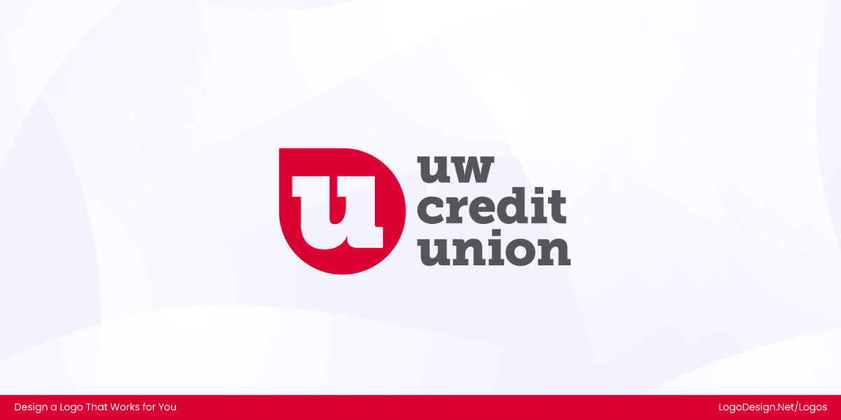
The UW Credit Union logo uses red to create a bold and standout impression.
The UW Credit Union logo is yet again an example of reimagined banking that takes the center stage and delivers! The red always shines through.
109. Home Credit

Home Credit’s logo uses bold elements to convey support and access to life’s essentials.
Home Credit’s logo breathes life into underserved communities with the promise of attainable loans and help to build homes and access the necessities of life.
110. Comic Relief

Comic Relief’s logo uses red and white colors for a bold and attention-grabbing look.
A bold wordmark with a white and red contrast, the color and font make Comic Relief’s logo impossible to miss.
111. Red Hat

Red Hat’s logo uses a bold red color for a strong, memorable brand presence.
A red hat is not just an emblem; the icon is memorable and constantly reminds us of the brand. The red logo is perfect for Red Hat, which serves 90% of U.S. Fortune 500 companies.
Final Thoughts on Red Logos
Red isn’t just a color; it is a brand’s heartbeat. Looking through these 100+ logos, it is clear that these brands didn’t choose red by chance. They prefer it because it works. So if you’re designing your own logo, don’t just pick red because it is bold, but choose it because it tells your story and connects with the brand.
Use our logo maker to design your very own red logo, and it won’t whisper but shout!
