SALES / SUPPORT : 844-232-4816
How Colors Tint Our Emotions with Examples in Branding and Marketing
Absence makes the heart grow fonder but the last thing we want in our designs is the absence of color – a canvas without shades, tints, and tones of hues. Sure, there are black and white logo designs, especially in the fashion industry, but then they pair the monogram with smashingly colorful marketing and branding designs. The truth is, we as humans, weren’t born in a black and white world, and even though (in a point in time) films had no color, there were shadows and highlights that brought depth into the moving images.
You see colors are the essence of successful branding, one that touches viewers on an emotional level. We can go on to say that color breathes emotions into brand identity designs such as a professional logo design or a responsive website design or a customized packaging.
Realizing the significance of colors in branding, we will now explore how this graphic element taps on emotional appeal to help designers and business owners create spectacular branding graphics.
The Role of Color in Branding
A McDonald’s logo in red and yellow has made its mark in the fast-food industry and it will be all too awkward to suddenly, one day, see the logo design in any other color like purple or pink. This said, the choice of color is critical because not all colors have the desired effect. For example, we can reminiscence French fries with the yellow arches but seeing them in pink won't remind us of the same food, in fact it might just put us off. Just as selecting the appropriate colors is crucial for brand identity, ensuring the technical aspects of your brand's online presence are equally important. For instance, setting up a proper SPF (Sender Policy Framework) record helps protect your brand's email communications from spoofing and phishing attacks. Utilizing an SPF generator can simplify this process, ensuring your emails are authenticated and aligned with the trust your brand colors work so hard to build.
And from this, we come to the concept of ‘color associations’ and this friends is an important part of the ‘create your color palette’ activity. When deciding which color or set of colors will suit a particular brand, skilled designers need to make sure that they work out the math of associations. The beverage company Pepsi decided on a specific shade of blue and red for their cola brand and with it, through years, they have associated their brand image. With years of exposure, people who drink their soda, have been trained to think of Pepsi in these two colors and they’re comfortable with the choice the brand made. Had it been a brown logo, it wouldn’t have had the same impact, would it? Visualize it, a brown Pepsi logo. Nope, doesn’t feel right.
But the real questions are:
- Why do brands have a unique color palette?
- Why does a brand choose a distinct color scheme?
- Why is it so challenging to pick a color for a brand?
The answer to this is that colors have personalities. Pink, although being used by tech startups, has largely maintained itself as a feminine color. Green seems appropriate for agriculture businesses because it resonates with the beauty of nature but then certain greens don’t have a good reputation and they are mostly used in marketing designs of cleaning services for all things gross.
This is why graphic designers have to be careful when deciding on colors for a brand. Separately each color has a meaning and when put together with others in a palette, the meanings and feelings change. Red alone means danger or love, and yellow means creativity and hunger, so when put together red and yellow can mean ‘love for food’ for a brand like McDonalds
Graphic designers use color associations to send specific brand messages to their audiences. Each color can have a personal, cultural, historical, political, and of course emotional context. Silver feels rich, black feels sexy, and orange feels smart.
This takes us to the next section of this guide, the science and psychology of colors.
The Science of Colors
Artists and designers have long believed that colors have a decisive effect on our emotions, moods, and feelings. Research has also concluded that colors even affect our physiology. Certain colors increase our blood pressure, others calm us, and still, others increase our metabolism.
As per Shannon B. Cuykendall and Donald D. Hoffman, the color-emotions associations are born out of evolution, culture, and personal experience. So, while these pairings may be highly subjective and cultural, we do find some consistencies in color-emotion pairings.
In one study, scientists asked their research participants to associate emotion words to various colors, they found that majority of participants chose red to represent feelings of anger, blue to represent calmness, associated feelings of fear with black, happy with yellow, and so on.
In an interesting 2011 study, students of Stanford and Berkeley were interviewed regarding certain color pairings and the emotions they provoked. The results concluded that each college’s students favored their college colors more and associated positive emotions toward them and hated their rival school’s colors and associated them with negative feelings.
All of these studies correspond with the notion that the color-emotion duo are highly individualistic. However, empirical science is just beginning to scratch the surface of these associations. Therefore, it’s quite early to say anything for certain. But the historical and cultural evidence of the color-emotion associations is still quite overwhelming. As researchers continue to study these associations more, designers and artists will become better informed about how to use these pairings to communicate information to the audience.
Major Emotions Associated with Colors
Once upon a time, psychologists assumed that most human emotions can be categorized into 7 distinct types. However, there has been recent research that has claimed that human beings can feel emotions that can be categorized under 27 unique, but intimately linked categories.
In this article, we will talk about 7 of the major emotions that we feel every day. These emotions also make up the range of feelings that most marketers and designers want to evoke in their audience.
It is important to mention that the way different colors affect our moods depends on the type that is being used. For example, a tint of blue has a calming effect, a tone of blue has a serious and sad connotation, and a shade of blue signifies security.
While we chart out the different emotions and see which colors have the power to affect them, you can help this journey by beginning to understand how the relation between colors and emotions help startups, small businesses, and large corporations do their branding.
Happy Colors
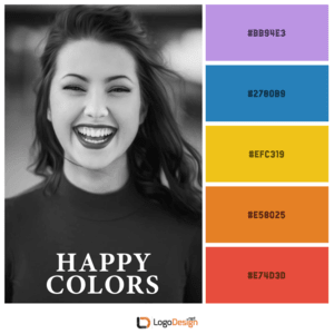
The colors that make you smile or laugh fall under this category. Perhaps not the gruesome or gothic brands, but most want their audiences to feel positive when they come into contact with their branding. And what’s the most positive emotion of all? Happiness.
Colors that make us feel happy and positive are usually warm colors such as red, yellow, and orange. In different intensities, these colors can also seem passionate, exciting, and hunger-stimulating. However, talking specifically about ‘happiness’, keep the colors brighter and lighter. Peach, muted orange, lilac, and other pastel shades can also seem positive without being too ‘on the nose’.
Some color pairings you can combine to activate happy and positive emotions in your audience:
Palette 1) Red, yellow
Palette 2) Blue, yellow, orange
Palette 3) Lavender, sky blue, pale pink, light green
Palette 4) Neon green, Barbie pink, light blue,
Image: Behance
Sad Colors
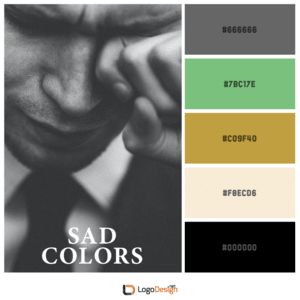
Of course, you would think that brands always want to make their audience happy but the hard-pressed truth is that portraying sadness is just as or more powerful. This said, the design isn’t gloomy but the emotion it throws at people makes them feel sorrow and pain. Think of social justice movements, memorial posters, or remembrances of local/national tragic events.
In such instances, designers need to amplify the emotions of somberness, seriousness, and sadness. Colors that the majority of people associate with such emotions are the deepest and darkest shades of cool colors or neutral shades. Think of dark blue and green, black, grey, and white. Beige and brown are also used to represent a serious occasion. You will also see shades of yellow being used to represent tragedy and sadness.
Some color palettes that you can use to achieve sad emotions:
Palette 1) Beige, mustard, grey
Palette 2) Brown, blue, beige
Palette 3) Black, grey, matte blue, forest green
Palette 4) Tan, brown, faded green
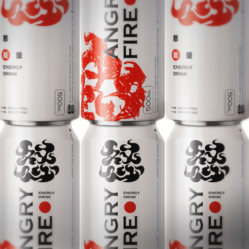
Angry Colors
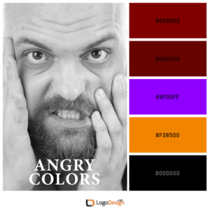
Every once in a while, we all become Angry Birds. This is because anger is this intense emotion humans feel – it can range from mild annoyance to a full-blown passionate display of fury. The color that most suitably and consistently represents intense anger is red. The energy and bluntness of red has the tendency to charge people with this negative emotion.
Red, in its deepest shades, can also portray violence, war, and blood. It is also a color that is used to evoke feelings of fear and terror.
Interestingly, surveys have discovered that people also associate white with anger. The anger that white represents is considered the purest, most undiluted form of rage. Yellow is also sometimes associated with feelings of anger, jealousy, and irritability.
However, in the mainstream media and graphic design industry, the prevalent color that a large number of audiences readily associate with anger is red. If you want to tone it down a little, you can add a bit of yellow in it or shades of orange.
Here are some colors that you combine to initiate emotions of anger and fear, etc. through your graphics:
Palette 1) Violet, blood-red, deep red
Palette 2) Black, blood red, off white, CG red
Palette 3) Bright red and deep red
Exciting Colors
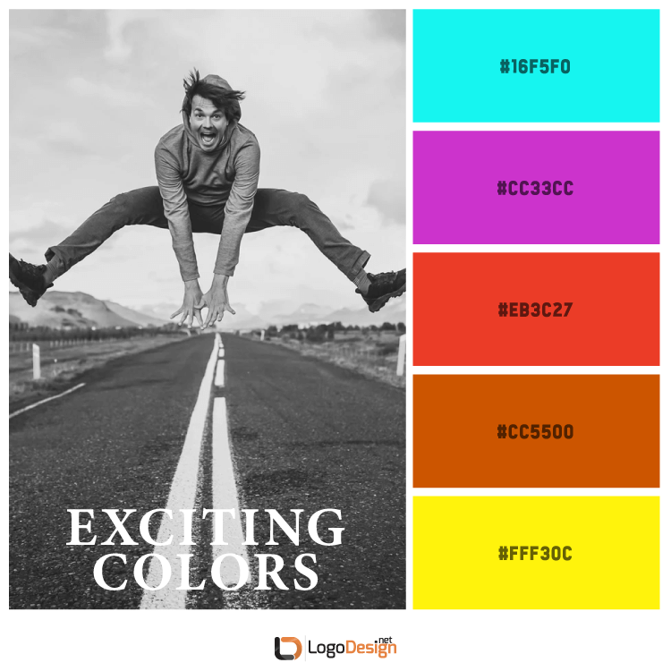
What types of designs excite you? Which colors make jump off your sofa?
In the design and corporate world, colors are used to make people feel excited and interested in a new product, a new service, a new venture, or a new concept. Next to happy and joyous colors, it is the exciting colors that take the lead in branding and marketing.
The colors and shades that put people into an excited and energetic state of emotion are brighter and chirpier shades. Shades such as bright red, a vivid yellow, lighter almost neon green, and magenta, etc. make us feel energized and excited to experience something great. Royal blue, bright orange and emerald green shades are also used to convey emotions of interest, excitement, and high energy.
Some color combinations that scream excitement:
Palette 1) Fluorescent blue, steel pink, sunny yellow, muted orange
Palette 2) Blue, orange, lime, cherry tomato, red
Palette 3) Yellow, pink, island green, etc.
Attention-Grabbing Colors
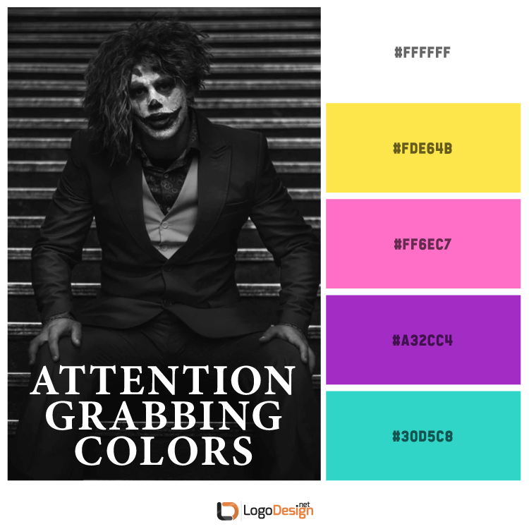
hing and calming colors as its official color palette, you can grab the attention of passersby by using a solidly pigmented color that’s bright and appealing.
However, some colors stand out in the crowd. And therefore, designers most often go to them when they want to make people stop in their tracks. Warm colors in bright shades like red, yellow, orange, magenta, and neon shades are popular as attention-grabbing colors.
But use them in moderation so as not to overwhelm the whole design. You can also use them as accent or secondary colors to make your design pop. A logo with nothing but red can surely get your attention, but a stroke of red in the sea of grey will make you notice it more and perhaps even help you remember it better.
Some color combinations that will always grab your attention:
Palette 1) Purple, green, turquoise, white
Palette 2) Yellow, blue, red
Palette 3) Dark green, yellow, pink
Palette 4) Neon pink, yellow, purple, green
Fun Colors
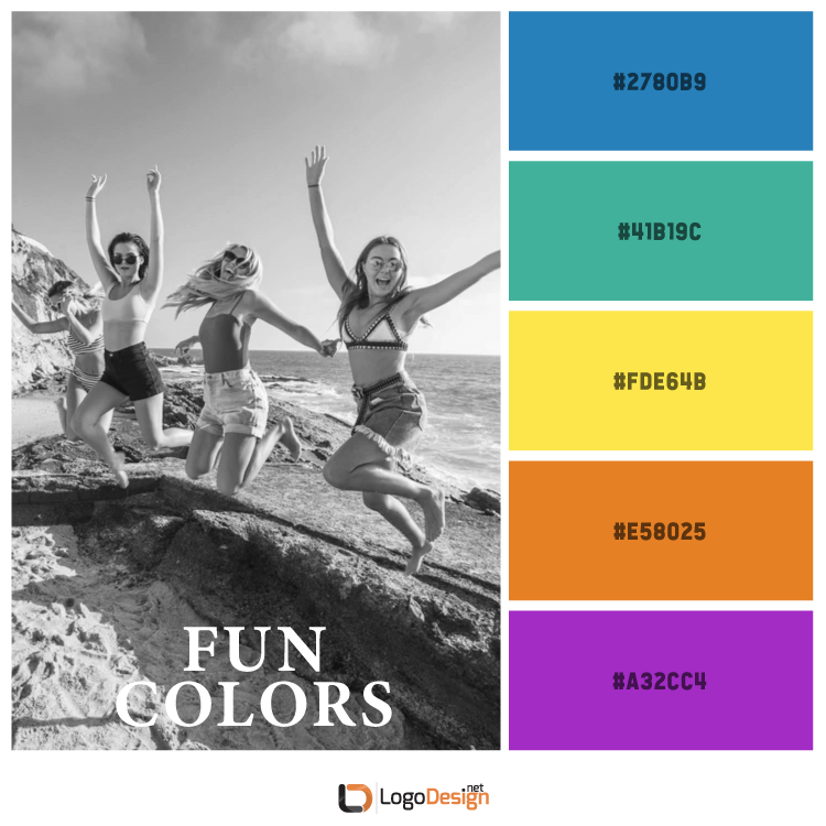
Seen the fun colors of Legos? They instantly catch attention and the next thing you know, you are paying for a box. Primary colors can make us think of fun times or put us in the mood to expect something exciting. These include red, yellow, blue, and their variations.
One of the major reasons these colors look fun to us is because as children we can detect these colors long before we can see other shades. That is why you will see a lot of marketing and branding directed at children using primary colors.
In addition to the three primary colors, some other colors are also used to evoke emotions of fun and happy times. Orange, bright green, pink, and purple are used to recall fun times, happy occasions, and to instill feelings of energy, openness, and freshness.
Some fun color combos that you should definitely try:
Palette 1) Orange, blue, white, green
Palette 2) Yellow, blue, green
Palette 3) Purple, yellow, pink
Palette 4) Orange, red, pink
Relaxing Colors
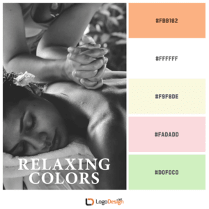
After a hard day at work, what you need is to relax. Relaxing colors put us in a calm and soothing state of emotions. They help us feel stress-free and refreshed.
Most often, the cool side of the color wheel is employed to represent feelings of calm and relaxation in product packaging, marketing, and logo design. These colors include blue, green, purple, and their different combinations. Peach, soft green, white, beige, and other pastel shades are also popular colors to evoke soothing and calming emotions.
Depending on the specific shade you are using, your calming color can range from soothing to depressive. Therefore, it is critical to get your color choice right the first time and zero-in on shades of cool colors that make us feel positive, light, and fresh. Industries that make the most use of calming and soothing emotions are health and beauty, yoga and meditation, and spa and resorts, etc.
Some relaxing colors you can introduce in your branding:
Palette 1) Peach, white, faded green
Palette 2) Ivory, pale pink, tea green, peach
Palette 3) Powder blue, white, pale pink, melon
Palette 4) Lavender, light cyan, white, diamond blue

Colors Are Intricately Linked With Emotions
While color associations with emotions are largely subjective, there’s no denying the fact that colors have a decisive impact on how we feel and respond to stimuli in the environment.
As researchers continue to study this intricate link more and more, we’ll be able to have more exact and precise information regarding how this connection ebbs and flows.
For now, we can use these individual and subjective associations to get people talking about our designs and brands. If different people are getting different emotions from the colors on your website and logo, that’s your brand starting a conversation. And branding is all about getting people to talk about you more.
If you are a designer creating a brand identity for a business and are not sure how to navigate these subjective connections of colors to emotions, know that as long as you are not wading in too deep and banking on the universal similarities of these connections, you are good to go. For more insights and feedback, you can always invest in focus groups, customer personas, and beta testing.
So, now that you know that different colors and different shades have the power to influence our emotions and behavior, do you feel ready to infuse this knowledge into your next design project?