SALES / SUPPORT : 844-232-4816
The Psychology Of Colors in Logo Design
What Does Your Logo Say to Viewers?
No, we aren't just talking about the literal words that might be included, such as in a wordmark logo. We’re talking about other ways of sending messages — specifically, the psychology of colors and how it influences how your logo is viewed and received.
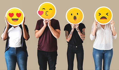
Famous artist Pablo Picasso noted, "Colors, like features, follow the changes of the emotions." Just like your facial expressions might reflect how you feel, colors can also make adjustments to your emotional state — sometimes subtle, sometimes drastic.
It isn't unusual to hear about the logistics and science of color psychology; extensive research has been conducted into the reasons behind why certain colors affect us in certain ways.
When it comes to practical application, however — such as how color psychology can be effectively employed within logo designs — there’s a little bit more to it than just "how does this make you feel?"
Source: freepik.com
Color Psychology — Meaning And Uses in Logos
Take a good look around at your surroundings right now. Are you in your work space? At home? In a cafe using complimentary wifi? Wherever you’re at, take a moment to think about how it makes you feel.
Are you anxious? Sad? Excited? Calm and peaceful?
The odds are, the colors surrounding you have a big part to play in how you’re feeling at this very moment in time. For good or bad, your emotions and mood are affected by your environment, and color is a big part of that.
Source: freepik.com
Why is color psychology important to logo design?
Consider this case study by A J Elliot and H Aarts, which "examined whether perception of the color red influences basic motor functioning." The results of the research identified “a link between red and basic motor action." Fundamentally, what the study boiled down to was that the color red led the viewer to react to stimuli with greater force and greater speed. The conductors of the study concluded that the results
"highlight the need to attend to the functional, as well as aesthetic, value of color." Color psychology thus influences your brand on a wider scale. There is a reason why famous brands are so good at using color psychology to influence our choices and emotions."
Now picture your business logo design being revealed to the public, and based on your color choices, a higher percentage of your potential clients are motivated to quickly seek out your business or services. Though attention to color psychology is no guarantee of success, as with any aspect of design, if it can contribute to the growth of your business, it’s definitely worth a deeper look.
There are no across the board rules that work for every single individual when it comes to the psychology of color. But research shows that we can assign a certain value to colors when it comes to instigating emotions in the majority of viewers. Although perceptions of hue and tone vary, enough studies have been done to give us certain parameters to work in, especially with regard to design choices. Let's take a look at how color psychology is involved in the following:
- Industry
- Culture
- Demographics
- Emotions
Color Psychology in Logo Design - By Industry
If you do a quick Google search for logos by a certain industry, such as for real estate or construction logos, you might very well notice a common thread.
That's because the psychology of color continues to develop, even within smaller circles, such as in a given industry.
Companies put a lot of thought into what colors best represent them, and this isn't just based on what the personal preference of the owner is — or, at least, it shouldn’t be. Colors send messages, and companies choose colors that are in line with the message they want to present to their customers.
Banking and financial companies, for instance, tend to opt for solid, primary colors with a clear psychological motivation: blues are common, since blue imparts a feeling of trustworthiness and reliability. Two things that everyone wants in their financial institution logos. Financial institutions such as CitiBank, Fifth Third Bank, and Chase Manhattan Bank, to name a few, have all found the effectiveness of using strong, calm blues in their bank logos.
Color psychology plays a part in which banking logos a viewer is drawn to, giving them the equivalent of subliminal messaging: you can trust us.
Real estate interests trend toward greens. Green is a more versatile color, appealing to both genders, and is strongly connected to nature, growth, and prosperity. Why is this effective for real estate logos? Picture a logo that sends the message: grow with us!


Real estate, house and home improvement logos are centered around fostering a feeling of happy, healthy family, since the idea of "family" is what generally underlies the desire to build or purchase a home of your own. Companies like Trulia and Clover Realty rely on noticeable green in their logo designs. In appealing to both men and women, and promoting growth and prosperity, green gets at the root, so to speak, of what drives the real estate market.
Restaurants frequently opt for red logos. Red is a motivating, stimulating color, moving the viewer to action, as well as catching the attention more readily than some colors.
It might be faster to mention well known restaurants that don’t use red in their logos, but here’s a brief rundown of some names you’ll almost certainly recognize: McDonalds, In ‘N’ Out, Arby’s, KFC, Pizza Hut, Wendy’s, Denny’s, Outback Steakhouse, Nando’s, Dairy Queen, Dunkin’ Donuts — the list goes on. As mentioned in the case study above, it elicits a strong physical reaction: come and eat!

Source: kfc.com
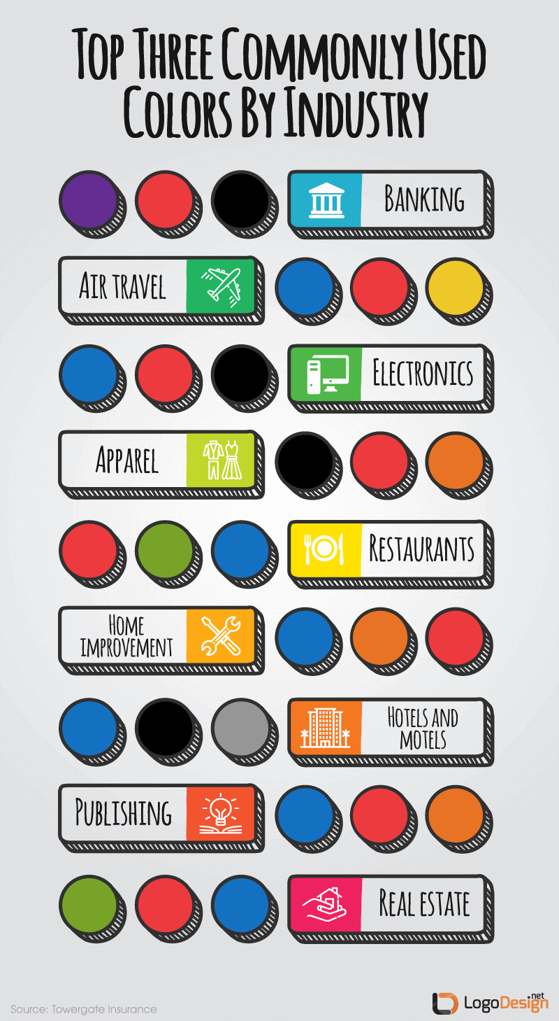
To sum up, professional logo designers must understand that each type of industry follow color schemes that reflect the psychology of their customers and their perception of the companies in it. If your business is looking for a way to follow this trend then the following infographic would help you quickly pick colors for your business logo in minutes.
Color Psychology in Logo Design - By Culture
An even more broad set of parameters is involved when it comes to color psychology as perceived by culture. This is largely because this differs so widely depending on where any given viewer is from, how they were raised, and what their background is.

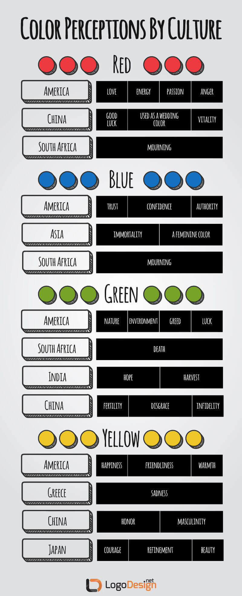
Author Kendra Cherry of Everything Psychology Book in an article notes, “Your feelings about color are often deeply personal and rooted in your own experience or culture. For example, while the color white is used in many Western countries to represent purity and innocence, it is seen as a symbol of mourning in many Eastern countries.”
Another example is yellow. Frequently used as an instigator of warm, friendly, attractive emotions in the United States, it’s seen as the color of death, mourning, and sadness in Latin America.
Green, viewed in the States as a color closely tied to nature, is seen in China as being associated with infidelity. So a company that uses green prominently in its logo may choose to modify the color somewhat when expanding to Chinese markets, especially if the company wants to promote a message of trust and reliability.
Japan views the color black as being modern, sleek, impressive, and forward thinking. So a jet black vehicle that sold well in Japan was imported to India, where the sales were less than impressive. Consumer research showed that the consumers weren't reacting as well to the product, largely because the color black is viewed as a symbol of death in India.
Knowledge of and attention to how colors are perceived in various cultures is important if you want to appeal to a wide variety of people and backgrounds, and even more important if your company is headed for international availability. As the examples above show, color psychology can make or break the success of a venture.
International perceptions of colors don’t always mandate that you redesign your logo when expanding to other countries. But it does reflect why it’s a good idea to have other color options that play well with your standard colors — ensure that your logo looks good in black and white, for instance.
Color Psychology in Logo Design - By Demographic
Color psychology can be continually broken down into smaller and smaller sections, but some vitally important demographics to take account of are age and gender.
Some colors are typically seen as either masculine or feminine, while others are viewed as gender neutral. This can change fairly drastically, however, as evinced by the blue vs. pink for infants. For a long time, a gender neutral color (white, specifically) was the choice for little ones, but in the mid 19th century, pastel colors were introduced, and according to the book Pink and Blue: Telling the Girls From The Boys In America, by author Jo B. Paoletti, the colors were not intended to be gender specific — at first.
In a Ladies' Home Journal article in June 1918 published on Smithsonian website states, "The generally accepted rule is pink for the boys, and blue for the girls. The reason is that pink, being a more decided and stronger color, is more suitable for the boy, while blue, which is more delicate and dainty, is prettier for the girl."
So it's entirely likely that color psychology according to gender is what we make it, but that doesn’t mean it doesn’t exist.
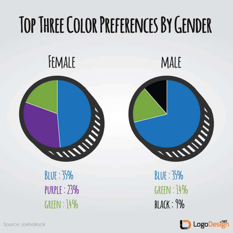
According to a study by Joe Hallock, 57% of men polled chose blue as their favorite color, whereas only 37% of women polled said the same. Earlier studies indicated similar conclusions, with one study from 1897 indicating that blue was preferred over red by men, and vice versa for women.
Though the results are somewhat ambiguous when it comes to differences in what colors actually mean to each gender, it is still fairly clear that the appeal differs depending on whether you are male or female. So for design that is intended chiefly for female viewers or consumers, it makes sense to take preferences into account when choosing your color palette for your logo.

Take upscale clothing lines as an example. When related to clothing, black is seen by women as a slimming, fashionable color; when used in a fashion label logo, it can evoke much the same feeling, to the point that a high number of fashion labels, especially those with lettermark logos, stick with black and white. Prada, Louis Vuitton, Chanel, Gucci, and Kate Spade New York are all prime examples.
Men's Warehouse, on the other hand, dispenses with the suggestion of sleekness and modern style and opts for solid, comfortable army green and dark orange — perhaps not the "favorite" colors of men who were polled, but certainly evocative of a shopping experience that is more about getting it over and done with than taking time along the journey.
Education in color taste is partly responsible for this, as well as experiences that influence how we view certain colors, but it all boils down to the same: knowing your intended audience and reviewing how they’re likely to respond to a certain color is vital for a successful, memorable logo design.
Source: freepik.com
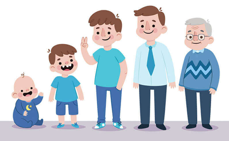
Talia Wolf in her article states that, with age, "the basic "popular" colors such as red and blue stay high on most people's lists but preferences to other colors such as yellow, green and others tend to change a lot.""And researcher Joe Hallock, mentioned above, found that his polls led to more conclusions based on demographics. “With maturity comes a greater liking for hues of shorter wavelength (blue, green, purple) than for hues of longer wavelength (red, orange, and yellow)." So if the main tendency as we age is to "cool down" when it comes to our favorite colors, that could play a big part in the choice of logo color, especially if your business is age-oriented, such as a company that provides senior services.
A stand out example of age-oriented color psychology logo decisions is the retail clothing company Justice For Girls. It isn’t just the fun, youthful font with the scribbled heart to dot the I — it’s the hot pink color of the letters and the baby blue accent that would make practically any of the target demographic tug on their mom’s sleeve until they’ve pulled them through the door.
Color Psychology in Logo Design - Emotions
A 2002 study entitled "A Study of Colour Emotion and Colour Preference" by Li-Chen ou, et. al, discussed the findings of a number of other studies that predated it, and broke it down thusly: "universal colour-emotion factors may exist across different research, no matter what different colour-emotion scales are studied." Basically, though the studies differ in how they determine the emotions elicited by colors, there’s no doubt that colors do, in fact, elicit emotions.
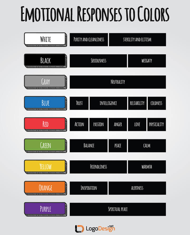
Red, almost across the board, is seen as a physical color; as mentioned near the beginning of this article, research shows that it is more likely to encourage a physical reaction, as though the viewer is reacting with a fight or flight trigger. It isn't a color that soothes, but a color that disturbs and unsettles.
It can be employed well in restaurant logos meant to instigate action, or even gym logos and exercise related businesses, such as Bally Total Fitness, Crunch fitness logos, and others.

Source: BallyTotalFitness.com
Source: lowes.com, facebook.com
Blue is the opposite. It is a soothing, calming color. It can also be perceived as cold and aloof, however. It’s used to its best advantage in logos that don’t require a lot of immediate action or active emotional response from the viewer, such as in logos like Facebook or Lowe’s.
Green is peaceful and balanced, likely partly because it is so strongly identified with nature. It’s very frequently seen in organic farm logos, natural products, and the like, as it draws the viewer towards a feeling of calmness and environmental awareness.
Orange is emotionally enlivened and alert. It can be seen in a variety of markets, from Tinder to Harley Davidson; anywhere that a orange logo needs to be paid attention to.

White can be seen as symbolizing purity, something untouched; but it also can give a feeling of sterility and elitism. It is often paired with another soothing, calming color, such as green. Emotional responses to colors are also not across the board, just as responses based on culture, age, gender, and other factors are not going to hold true of everyone. But some basic knowledge of what emotion might be triggered based on color usage can be incredibly helpful when it comes to design.
So let's move on and talk about color usage in logo design, shall we?
Color Usage In Logo Design
So you have probably all of the information you could ever need, regarding color choices in logo design. You know the whys behind design decisions made by others.
Now it's time to focus on your own design.
Market and consumer research plays a big part in design decisions; as all of the information up till now can attest, whether you end up choosing a bright yellow or a peaceful, calming green for your logo may be more likely either to attract or repel your intended audience. So before making a decision on your logo color palette, take another look at the statistics and demographics you’re trying to appeal to.
If your chief demographic is young men, analyze the colors most likely to appeal to them based on where they’re coming from, the exact ages they’re likely to be, and male-based gender preferences as listed above. Take into account the trends in your market; that doesn’t mean you have to follow along with the crowd; in fact it’s frequently better not to. But trends can be a valuable tool for showing us what works and what doesn’t.
Consider the root message of your company. Your logo is the ambassador for your brand; if you have a solid, serious, trustworthy company and want to establish yourself as someone not to be trifled with, a bright, happy, yellow and red hued logo is probably not the way to go.
It's a good idea not to use too many colors, as well. Remember, your logo has to be seen in a lot of places, and the reprint, resize, and rendering values should be through the roof. Does it look good even if the values are a little off? Take your logo through some test runs and put it through its paces.

Source: wwf.org

Source: gucci.com
Your color selection may be just as recognizable as the logo itself; for instance, it may be difficult to draw out the exact deer on the John Deere logo (it is a deer icon, right? A stag?) but most consumers will recognize John Deere green as being the color of the logo; and not just because the company name is right there in the color title.
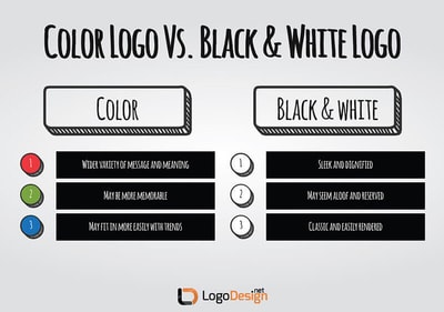
Of course, sometimes a logo just requires something extra simple: black and white.
This is commonly seen in what whitespace designs that utilize shape logos on more than one level. Black and white are such a perfect juxtaposition of meanings and emotions that it may almost seem like cheating to use them for your logo; but the tone conveyed by a black and white logo is very distinct, for the most part, and must be taken into consideration like in penguin logo designs.
Source: freepik.com
Black and white logos tend to give the viewer a feeling of no-nonsense, sleek, modern efficiency. For some bold black and white logos, think of classic logos like Adidas, Nike, Gucci, and Apple. Black and white logos can result in a very dignified, aloof feeling for a company’s brand, so if that isn’t what your company is about, it’s best to use at least an accenting or highlighting color.
Color Selection
Once you’ve made the decision about whether to focus on a color logo or a black and white logo, there are further considerations to be made. All colors are not created equal; while the basis of color psychology is often predicated on rather simple, uncomplicated, common shades, there are nuances of shade, hue, and tone that might make a large difference in how well your logo is accepted and remembered.
Mixing colors: Sometimes your logo requires something a little extra; sometimes the message of your company isn't able to be wrapped up in the psychology of just one color.
That's perfectly fine, however, because multiple colors can be used, if it fits the bill for your company.


The caution here is to use colors, basically, that don't make the viewer's eyes bleed when they are seen together. Colors that are appealing and send a great message on their own may not play well with others.
That doesn’t mean that you should shy away from bold contrasts. Some colors that seem to be opposing in theory may actually work together to create a strikingly perfect logo. Just ask any Christmas inspired logo design that has managed to win its way into the consumer's favor.
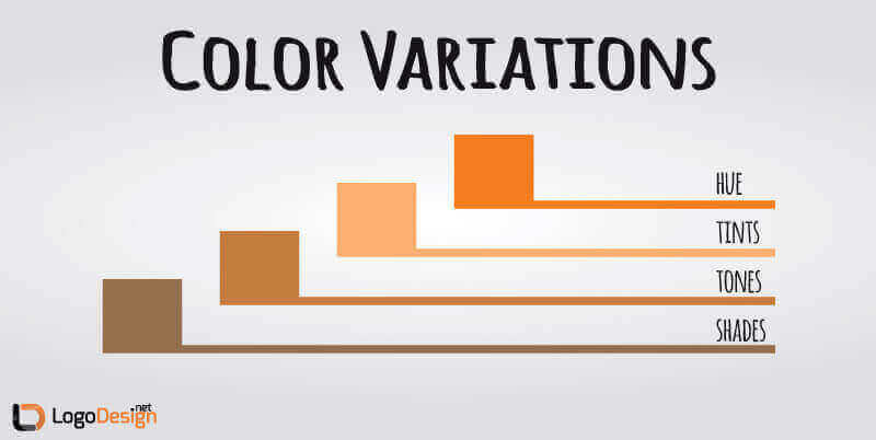
Hues: A hue is basically a "true" color or pure spectrum color that is found in the hue rainbow or circle. Using true colors, without adjustments to tone, shade, and tint, should theoretically give the clearest, strongest message according to color psychology, but that isn’t always true.
Strong primary colors, while they may still convey some of the commonly understood psychology message, can also be seen as harsh, especially if they are extensively used. A simple Z lettermark logo on a solid, bright, true blue background (picture the blue of the screen that used to be seen when booting up older computers) may not give the sense of trustworthiness that you want.
Choosing a color that sends the right message and hits the right tone for your company may be a question of altering the color by adding other colors.
Tints, Tones, and Shades: Altering the color can be achieved in a few different ways.
A certain tint of a color is achieved by mixing the hue with white to lighten the color. The lighter the color, the softer the effect; this may be exactly what you want, depending on your business. Lighter blues, for instance, can be more calming and soothing, more likely to cut the "coldness" aspect of the color.

Tones are altered by the addition of grey, or by both black and white; in other words, both tinting and shading. Adjusting the tonal quality can assist you in creating a unique logo color that fits your business to a tee, while still playing on the psychological impacts of color choices.
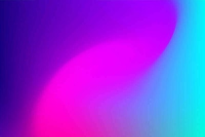
Gradients: A color gradient is also known as a color progression, or color ramp. Basically, it allows for the progression of colors, from one hue, through its permutations by either tinting or shading, to another hue. This can be one way of mixing colors in your logo.
Gradients are also known as "ombre," which is a popular trend in design. It's probably a good idea not to go to overboard with gradient within a logo, however, as too many shades or tints (or colors) in a small space may keep the logo from being seen as a cohesive whole, which would probably wreak havoc with your intended message.
Source: istock.com/Dimitris66
Color Wheel
The idea behind the design of a color wheel dates back to at least the early 1700s. It was used to illustrate the differing permutations of colors based on changes in tints and shades.
Choosing colors that play well with others or that provide a good contrast can be difficult, but the setup of a color wheel can take some of the guesswork out of it.
Pay attention, however, to the tones of the colors you choose. Mixing warm and cool, especially if they might clash, can muddy the waters of the message you want to give.
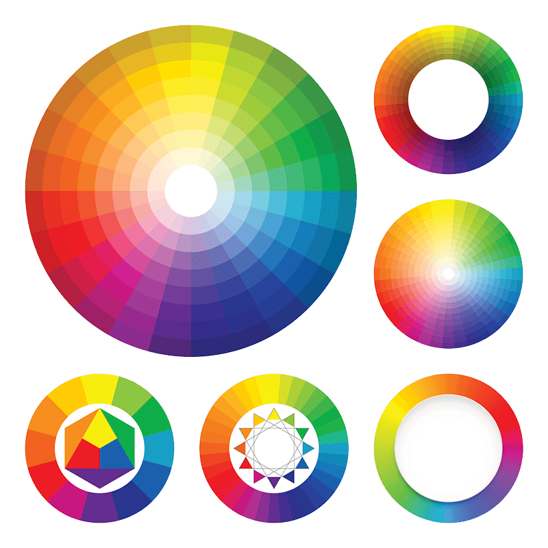
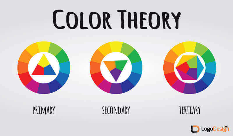
Let's take a brief look at the different levels of colors found on a color wheel:
Source: istock.com
Though color theory governs how colors are typically chosen, especially when they are being mixed together or used alongside each other, the psychology of color has a part in the choice as well.
When using a color wheel to choose the colors for your logo, looking for color harmony is an important consideration — not just the harmony of the colors, but also the harmony of the message the colors present.
Though color psychology may not be a guarantee of the success of a design decision, if you do your research and know who your audience is, it can definitely give you a leg up when it comes to a memorable, durable, unique logo design.
This article has been written and verified by Zaheer Dodhia, an expert in logo design and branding.
