SALES / SUPPORT : 844-232-4816
A Step-by-Step Guide on How to Design the Perfect Logo for Your Company
What's in a logo?
The simple answer, according to one online dictionary, is that a logo is "a symbol or other design adopted by an organization to identify its products, uniform, vehicles, etc."
That's pretty straightforward, right?
But the fact is that a logo does much more than that. A well designed logo should speak to your audience. A logo should communicate a message about your company, and clearly indicate the tone and personality of your brand. It should also be memorable, unique, and visually appealing.
The perfect logo should be the perfect fit.
So how do you design your perfect logo?
Let's start at the beginning.
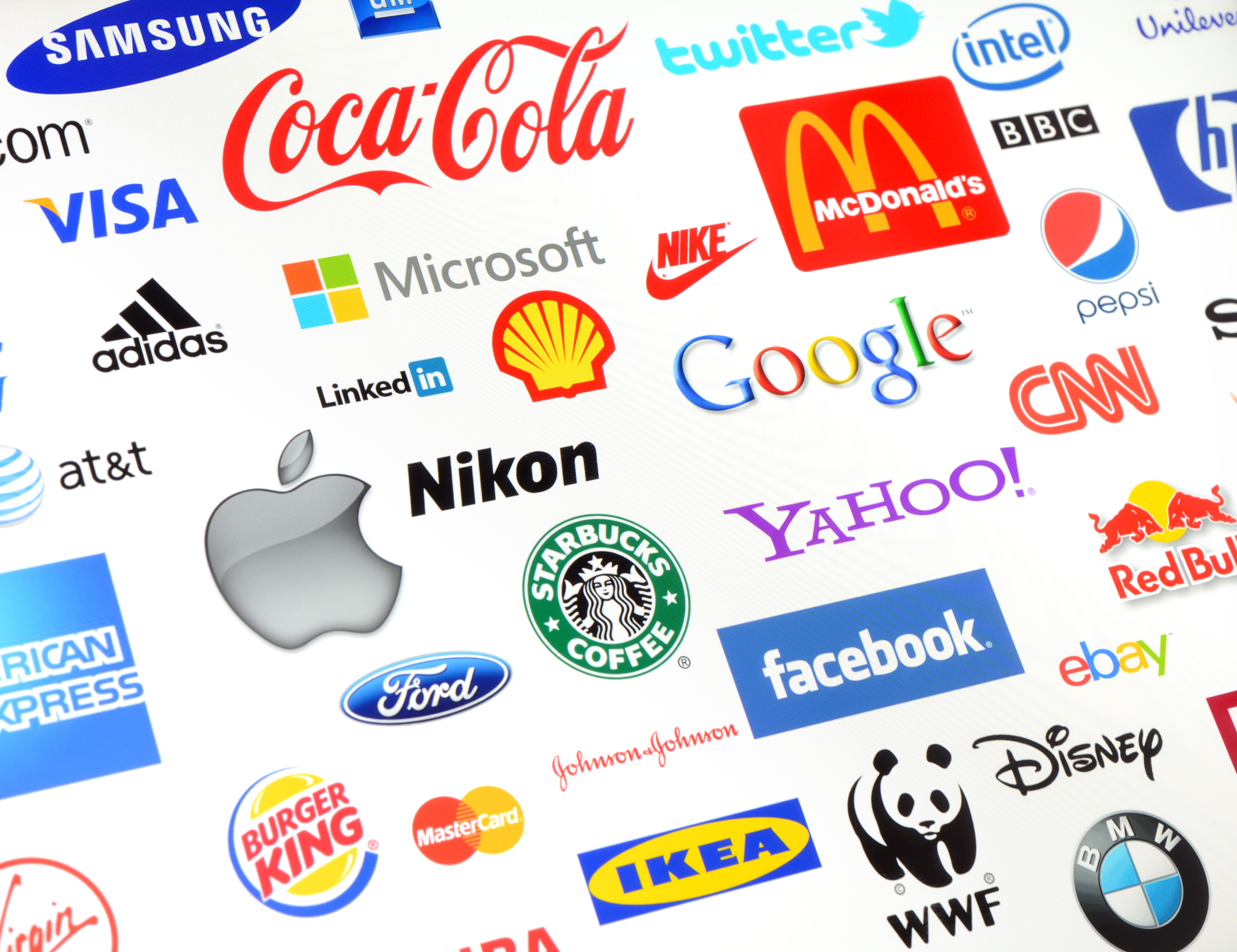
Step One: Research
You probably didn’t think that this was going to be the very first step, did you? But research is a vital part of putting together a logo that works well for you and stands out from the competition. Just like researching for small business ideas to make money, logo design ideas also come from extensive research.
It's hard to avoid mindlessly following a trend when you don’t know what the trends are, right? And it’s just as difficult to ensure that you don't use a logo too similar to an existing one if you don’t know what logos are already out there.
This is especially important within your own market. Take some time to look into your competitors and analyze their logos. Make notes on what mistakes to avoid: a graphic that is too similar, a nearly identical font, or the same shade of blue.
Source: istock.com/Jagrutiben Patel
The last thing you want is for your potential customers to get you mixed up with someone else, and buy from your competitor!
Step Two: Inspiration
Inspiration famously comes in many forms. In terms of inspiring and creative logo designs, you don’t necessarily have to get your inspiration from other logos that are already in existence.
There are plenty of other places to look, even places that don’t necessarily have any direct connection to graphic design.
That being said, there’s nothing wrong with paying attention to existing logos and finding out what you like and what you don't, and what works and what doesn’t.
In fact, while you're going through the process, it's very likely that you'll start noticing pieces of graphic design that you otherwise wouldn't have paid much attention to — that's definitely what happened to me when I started studying graphic design. Suddenly logos became fascinating!
Source: istock.com/hocus-focus
There are two types of inspiration that I would urge you to check out: internal and external.
Internal inspiration comes from your brand itself. It’s found by thinking about the story behind your company, the values and beliefs, the goals and guidelines.
Write down words that define your brand's personality, and think about what visual concepts illustrate those words. Whether direct or abstract, sketch out a few possibilities. This is the ideal time for brainstorming.
- Existing logos
- Pinterest boards
- Behance
- Logo design sites
- The world around you
Remember, the point of turning to outside sources for inspiration is not to mimic or copy an existing idea. The point is to learn what you like and what you don’t like, train yourself to think outside the box, and open your mind to creative possibilities.
Step Three: Choose A Color Palette
This is technically something that can be done later on during this process, but I like to have my basic palette in mind before I get too far in creating my logo.
Color might seem like a secondary consideration for a logo, but it's actually one of the more vital components of your design. The reason for this has a lot to do with the psychology of logo color.
Source: istock.com/GeorgePeters
Color psychology is based on the theory that there are reasons why we like certain colors more than others. The research behind it also explores how we react to colors, and what psychology of colors might elicit certain feelings or moods.
This area of psychology is used and exploited by marketers all over the world. And that makes sense, because how people react to colors tends to change from culture to culture.
Though the rules are not hard and fast, and what works for one person won't always work for everyone else, the basics remain the same: we tend to respond in a certain way to a certain color.
Blue, for example, is a soothing color for bank logos.
Yellow can be warm and friendly, ideal for communication and media logos.
Red can have a negative connotation of anger, but can also be the most highly motivating color, to the point that seeing it is like a call to action.
It's also important to keep in mind that the most effective logos are often the most simple. Your logo is going to be used in a lot of different situations, rendered by a lot of different printers on different materials, and matching the colors may prove to be difficult at times.
On top of that, a huge variety or range of colors included in one small logo can be overwhelming to the viewer, causing them to miss the message of the logo or just not pay attention to it at all.
Source: istock.com/pop_jop
That's one of the reasons why a whopping 95 percent of the top brands out there today use only one or two colors in their logo.
These are all things to take into account when choosing your palette.
For the purposes of this article, I'm creating a logo for a board game company called Reyquake (fake). I want to think outside the box, so rather than stick with the bright colors commonly used for these types of game logos, or going with the default suggested by the name (yellow and purple), I’m choosing teal blues and greens, with a light yellow for accent.
Step Four: Sketch It Out
This part really depends on you as a designer. Some designers will choose to skip it and go directly to using a software to start to put their logo design ideas together.
Personally I like to sketch things out. I'm not great at sketching. But it doesn’t require a lot to get a basic idea down on paper.
And the great thing about sketching your ideas out ahead of time is it gives you the freedom of just trying things out, without having to commit a lot of time to something that may or may not work in the end.
So take some time and try it out. Get a sheet of scratch paper and go to town! Think about your research, your inspiration, your word-related concepts for your brand, and even just elements that you happen to like, such as animals icons or flower logos of particular shapes.
Anything goes at this point. The point is to fill your page with possibilities.
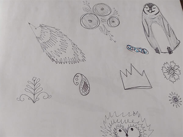
Image: Tarif Khan
Not all of these are going to have what it takes to make it through the rest of the logo design process. But at least one of them will definitely be worth pursuing and taking to the next step.
Give yourself plenty of time for this step, and take a good long look at the drawings you've made. Then choose one or two that you think have what it takes, and get ready to rumble.
Step Five: Digitize
There are several different methods of digitizing a drawing, and it really comes down to your style and how you like to work.
- You can draw out a more refined version of an idea, and either scan it into your computer or take a picture.
- From there, you can use the drawing as an outline and create the lines of your vector logo over the original sketch.
- Or, you can run a vectorization tool over the drawing itself and render it as a vector, able to be scaled up and down without losing integrity.
Or, rather than doing any of those things, you can start from scratch in your program and just use your sketch as a basic guide to the digital version.
In this case, for Reyquake, I chose to do the second one. I chose this because the sketch that I ended up using as my logo inspiration was quite simple, and I felt that the “genre” the company belonged to would benefit from straight lines and sharp edges.
I’ve used several different softwares, but for this logo I used Gravit Designer which is versatile, relatively easy to use, and gloriously free.
I opened up a new file and set the canvas to unlimited. (Gravit Designer does have several pre-set templates and sizes that you can use for creating custom graphic design for specific platforms, like Facebook.)
Since my logo is going to be quite simple and not require a great deal of adjustments or layers, I just started with the line tool.
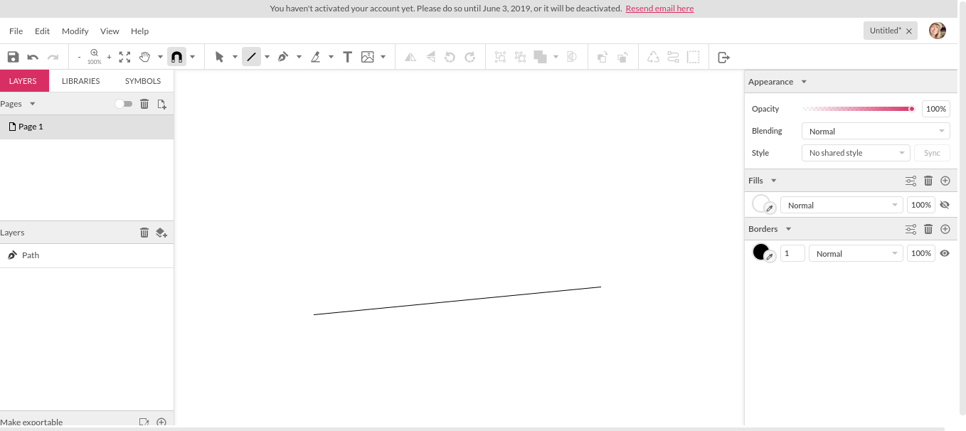
Other options, like the shape tool and the pen tool, are also easy to use. But I wanted to create my own shape logo, and the line tool gives you guidelines, which made it easy to connect the lines.
A word of caution about the line tool in this particular software — your lines look connected, but you won’t be able to use the fill tool unless you take the extra step of connecting the lines as paths.
I'll show you how to do that when we get to that point. But it’s worth noting ahead of time to save yourself some frustration.
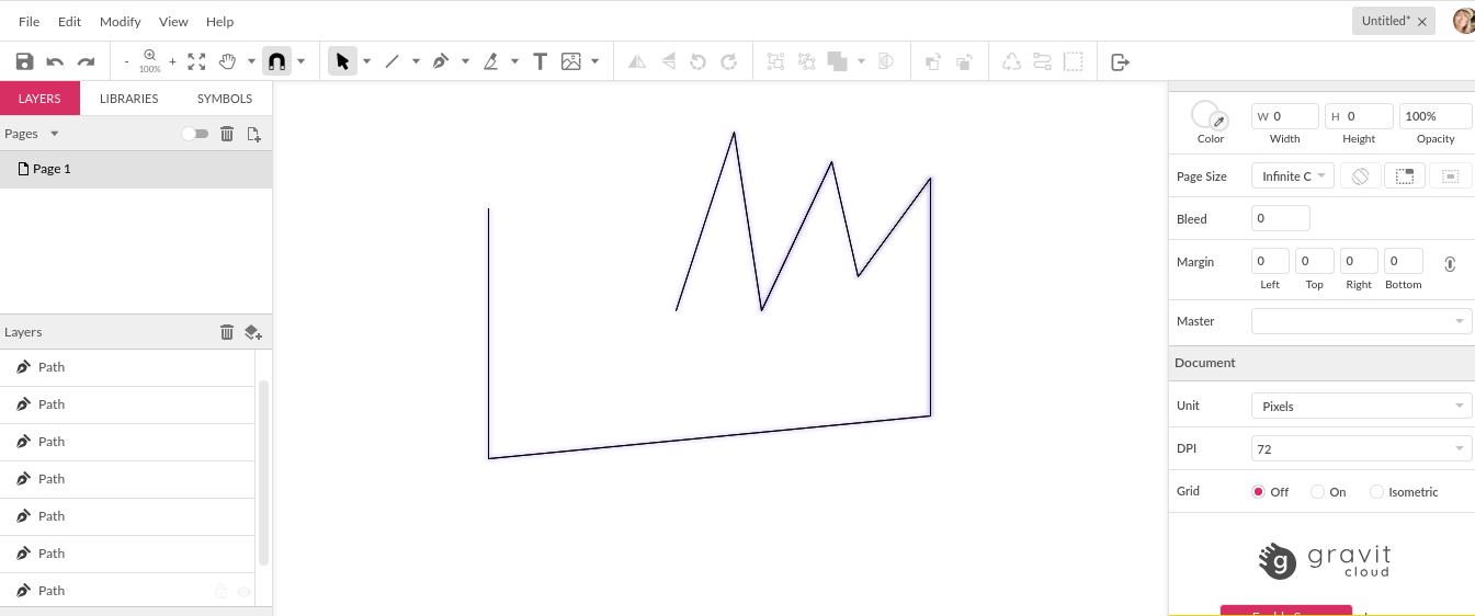
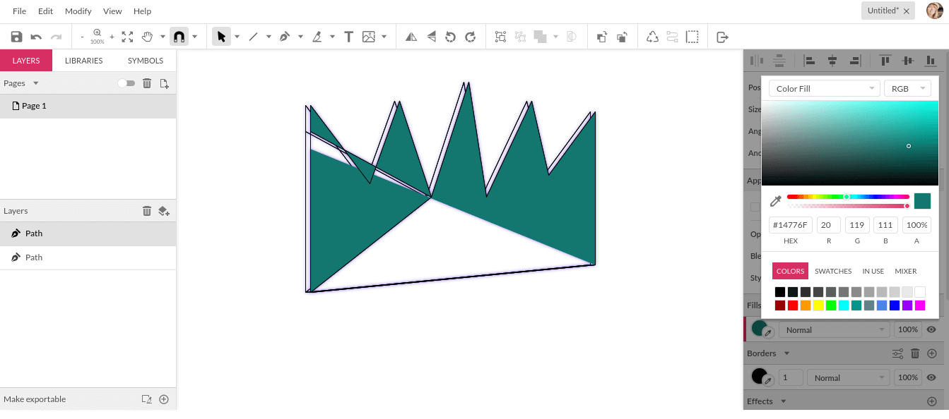
As I put my lines together, I turned on a blue drop shadow for each one to create a fuller effect to the lines.
After a few adjustments, my jagged crown logo was complete, blue drop shadows and all. Now, I wanted to give it a little extra dimension, so I used "select all" and grouped it, connecting each element into one shape.
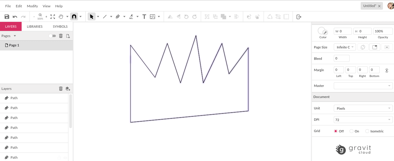
Then I used "duplicate" to give myself an identical copy of the shape, and moved it slightly to the left to give it dimension.
I adjusted the colors on the drop shadows for the second crown outline, using one of the fill options, to help the dimension stand out a little bit more.
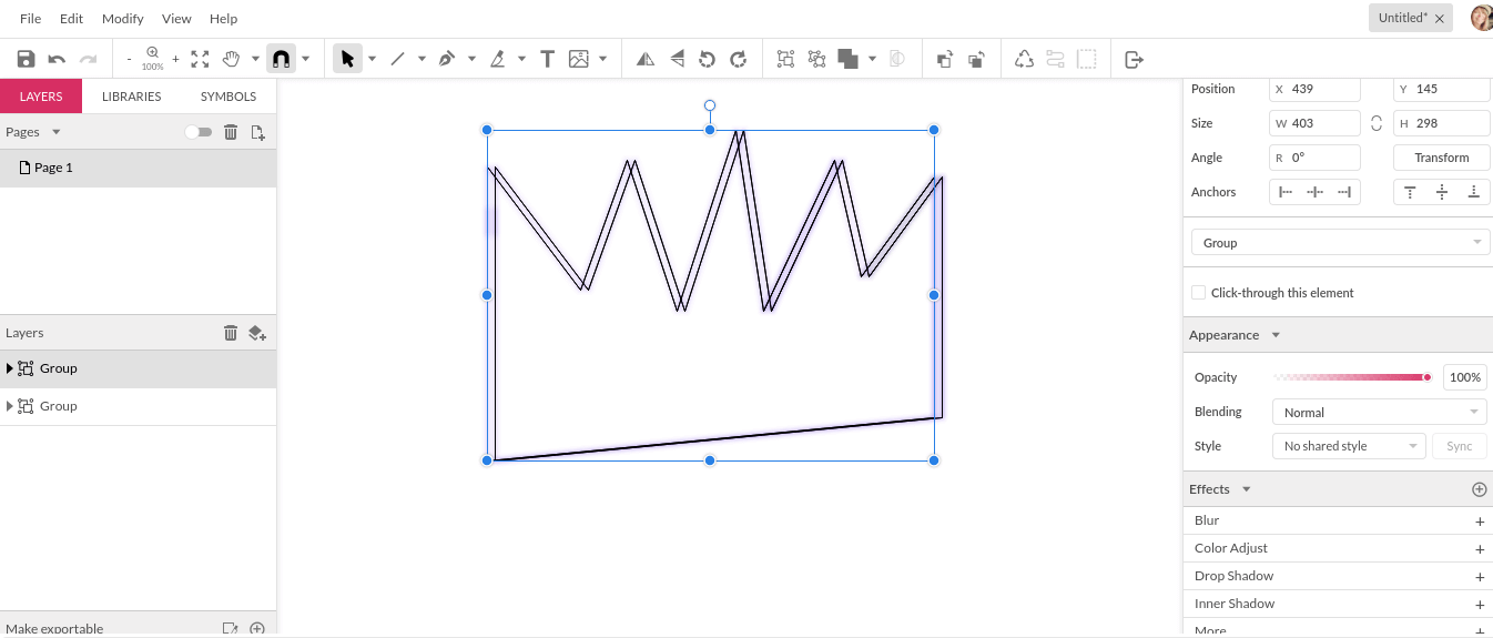
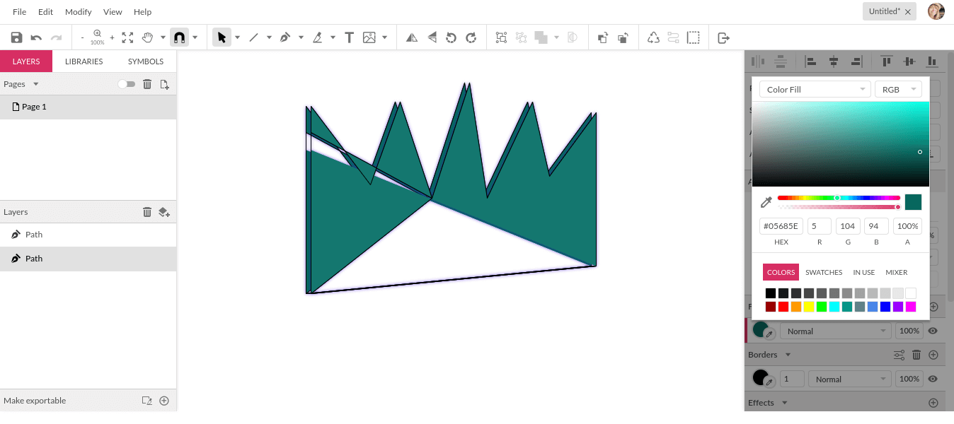
The next step was to fill in the color that I wanted, but before I could do that I had to ungroup both layers and use the path tool as shown below.
I selected all and then chose "connect path lines" to create an entire closed shape. It did look like it was closed before, but appearances are deceiving.
But now my crown is a whole shape! Which means it is fillable!
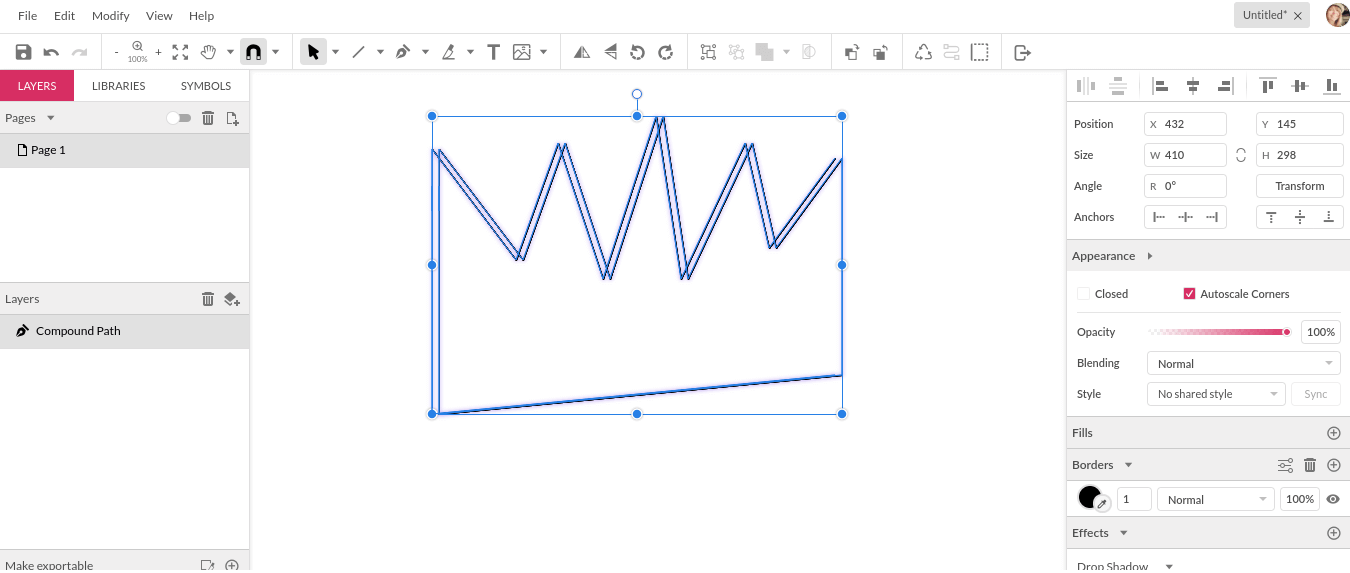
The path connected the lines and also created a diagonal line from side to side, top to bottom, which was ideal for my choice of fill, so I left it was it was.
Then selected the second layer and filled in with a slightly darker, more opaque shade of the same teal. With the echoing colors and the blue drop shadows, I've got my color palette that I had in mind before I even started using the software.
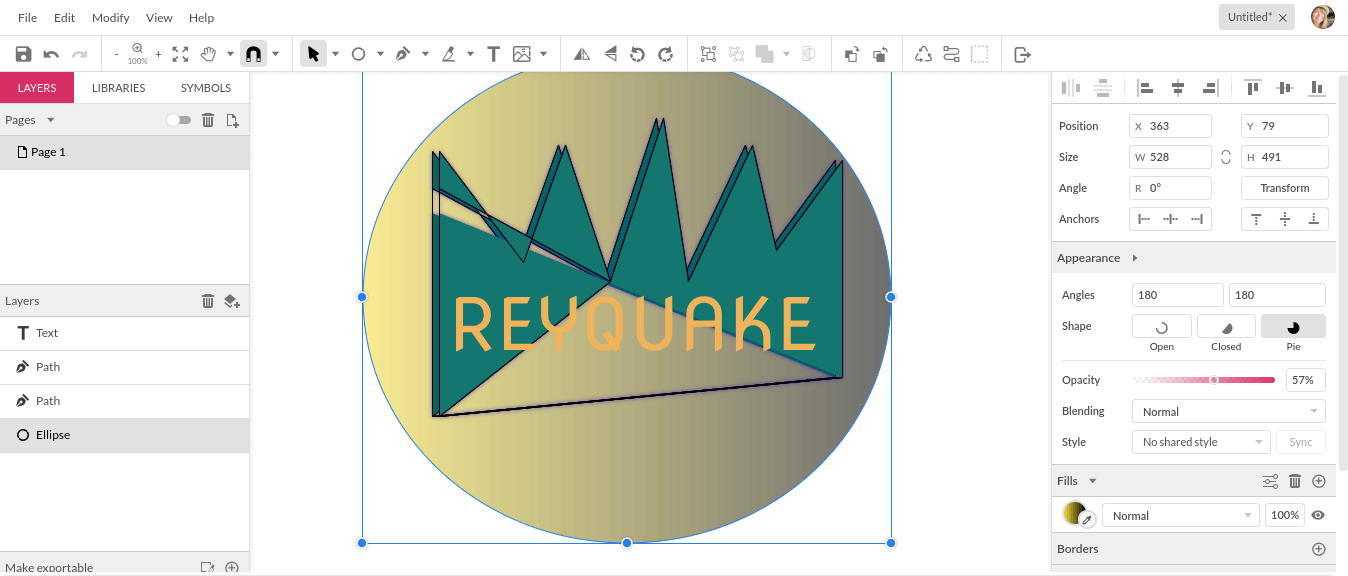
I made a slight adjustment to the lines at this point, and moved on to the text.
Gravit Designer has several fonts to choose from, so I chose a fun, well-defined font with a lot of impact behind it. (I'm also in favor of checking out new fonts that don’t come standard with programs, such as some available on Behance.)
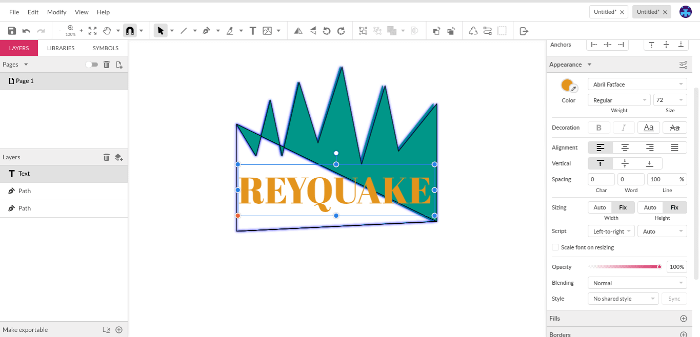
After my final few adjustments, I used the shape tool with a gradient fill to give my company logo design a background, to give it an extra layer of definition that will help it to stand out when it is used on marketing materials and packaging

Step Six: Adjust And Refine
As I worked through this process for this particular logo, I changed things as I went. And sometimes that will happen — you will see something and know immediately that you want it changed a little bit, and you can make it so right away.
But that isn't always the case. Sometimes it takes a little time, thought, and focusing on something else before you realize that something seems to be missing and in need of a little tweaking.
For instance, it wasn't until later that I realized I really wanted to underscore the text in the logo.
Though it may not seem like much, allowing yourself time to think about the process and the result can sometimes radically influence the logo’s success. Logos do not require rash decisions; they require research, forethought, and even hindsight.
Before you save your final version, save a copy that is ungrouped, so you can go back in and make changes to individual elements if necessary.
Then group your logo all together so it saves as one element.
Success!
But you're not done yet.
Step Seven: Check For Scalability And Adaptability
Now that your logo is "finalized" (in quotation marks because sometimes there are several finalizations required) and joined together as one graphic, take some time to check on the scalability.
Scalability is vital for a logo. Think about all the different places that your logo will be used. From things like business cards and other marketing materials, to product packaging, to your website, to social media platforms, to — who knows? — billboards and the sides of busses.

istock.com/milindri
Obviously there's an incredible range of sizes covered in all of those platforms.
So a scalable marketing logo is one that will not lose its integrity when it is either shrunk in size or blown up. It means that it won’t get fuzzy, distorted, and look poorly rendered just because it isn’t shown in its original designed size.
This is important for several reasons:
- Poorly rendered logos are often difficult to read and decipher, causing confusion among your audience.
- A confused audience is less likely to even try to decipher a logo, because they don’t see the benefit of it.
- Unscalable logos reflect badly on your company.
- A logo may be the most beautifully designed piece of graphic art in existence, but if it renders poorly and is unscalable, it doesn’t matter a bit.
Try your logo in several different sizes, possibly even printing it out, to ensure that it is scalable.
Of course, if you’ve followed the steps above you’ll have a vector image, which is ideal for scalability. Vectors can be scaled without losing their integrity, but raster images are based on pixels, which is why they get fuzzy when their size is changed.
Your logo also needs to be adaptable. Since it’s going to be used in so many different places, in so many different mediums, it’s a good idea to test a few variants out. Your logo should show in black and white well like this scissors logo, and in one color. You should also have variants without text, if text is included in your original logo.
Step Eight: Test Drive
Now that you’ve got your logo complete and scalable, it’s time to take it on the road.
Not literally, of course. But getting feedback can be incredibly valuable in terms of what works and what doesn’t.
istock.com/ilo
Be sure to ask specific questions to get the details you need.
How to Get Feedback for Your Logo
istock.com/lankoga
You probably won’t get the same answers from everyone — but if you do, that aspect definitely needs attention — and you don’t necessarily need to change things about your logo based on someone else’s opinion
But an extra set of eyes, especially from those who haven’t been involved in the graphic design process, can definitely help to pinpoint weak areas.
Step Nine: Final Tweaks
With all that feedback under your belt, it’s back to the software..
Open up the copy you saved prior to grouping. Each element can be edited as necessary. Add to, take away from, adjust colors and sizing and spacing.

istock.com/Ilyaliren
Once you've completed the changes that you may have had on notes from your feedback group, take another moment to look back over the research you did at the beginning of the process. Consider the personality of your brand as compared to the personality of the logo.
Do they work well together? Do they express the same goals, the same tone, the same feeling? If so, then you can truly count your logo adventure as a success! So what’s the final step to designing your perfect logo?
Step Ten: Unleash The Perfect Logo
Now that you've put your perfect logo together, it's time to take it a step further and put your perfect logo to work.
Logos are vital to any branding effort. An effective one really helps to "sell" a company, rendering it memorable. So your logo isn't at the end of its journey by any means.
- Use your logo to create other visual materials, such as business cards and marketing materials. Your logo is a perfect jumping off point, for the simple fact that it's the ambassador for your brand, the main thing people will think of when they think of your company.
- Use your logo liberally in your online presence. This includes not only your official company website, but also your social media profiles.
- Use your logo as an identifier for the creation of apps and other software. This may require a more simple, stripped down version of your logo, such as you created when you were testing the scalability.

istock.com/JoyImage
The more effective a logo is, the more good it will do your brand as a whole. Creating the perfect logo is by no means easy, but it's also not beyond your grasp
And remember, it's all about the success of your company. Success is always worth the effort. With these ten simple steps, you have everything you need to create a logo that will pull its weight in helping you to grow your brand.
By Tarif Khan, Head of Design,
Connect with him via tarif@logodesign.net or LinkedIn