SALES / SUPPORT : 844-232-4816
The Ultimate Step-By-Step Guide to Logo Design

What's in a logo? Ideally, a well-designed logo will be a visual ambassador for your brand. It will tell your intended audience something vital about the brand. It’s the perfect way to open up communication with your clients and customers.
The logo will carry a lot of responsibility, since it's often the first thing that catches the eye. As designer Milton Glaser famously said, "There are three responses to a piece of design: yes, no, and WOW!"
Obviously, for your brand ambassador, you’re aiming for WOW
The logo isn't restricted to just the front of a brick and mortar store, or the business card that gets handed out to advertise services. Scalability and flexibility are important parts of the design, since your logo will need to translate to all areas of marketing, from big to small.
Memorability is a key aspect. Often, you have only a few seconds to grab the attention of a consumer. You want your logo to stick in their minds, even with only a brief time of exposure.
So far, you know you want a positive response, flexibility, and memorability. What other vital aspects are there to your logo? And just how do you make your company logo memorable and attractive?
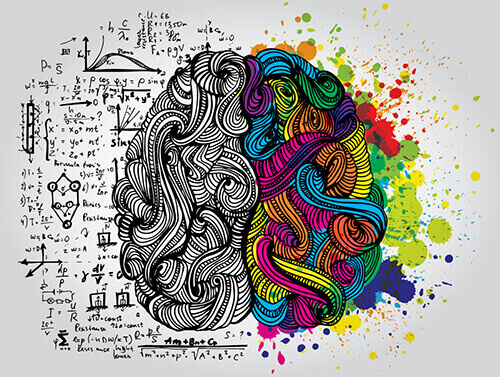
Take a look at our extensive step by step guide to logo design, from the blank page to the finished product.
Source: Zilliondesigns
Step One: Assemble Your Creative Brief
Whether you're working for a client or creating a logo for your own company, a clear direction is important for any logo design. The creative brief provides that direction.
If you're working with a client, have an extensive conversation or series of conversations. Find out firsthand about the business, its mission statement, what it provides, and what the client wants to communicate to his or her customers.

Take note of details like tone (is the business more formal or informal?), colors and fonts already being used in the design of the business, and any other aspects that need to be reflected in the logo.
Do they need a minimal logo or are willing to go with illustrative logo design ideas?
Remember, however, that the logo isn’t really for the client; the logo is for the target market. So research is definitely involved in assembling the creative brief. Lots of research, as a matter of fact.
Not only do you need to know the target market and the demographic the logo is aimed at, you should also conduct independent research on the company and client, the market in which it operates, and other competitors.
Finally, make sure that you have clearly outlined the timeline for the project, what is expected to be delivered, and the agreed upon budget for completion.

- What you want from a creative brief:
- A clear direction and goals for the logo
- Target market and demographic
- Research into market and competitors
- Details about colors, fonts, etc., that should be incorporated
- Timeline, expectations, and budget
Step Two: Be a Sketch Artist
With the creative brief firmly in mind, it's time to actually get creative.
Though you know that your logo is ultimately going to be completed digitally, using a computer, it's always a good idea to start with the old standby of designing a logo with a pen, pencil, and paper. Don't be tempted to try and shave off a few steps; scribbles are a fun, and necessary, part of design.
Don't restrict yourself to only a few possibilities. Use a blank sheets of paper for logo design — or several sheets, if you feel the need — and fill it up. Some designers like to rule the paper into several smaller boxes and fill each one with a possible design. Others prefer to play a little fast and loose, and fill the page without using any borders. Whatever works for your individual creative mindset, as long as it gets done.
With the creative brief as a basic outline for what the aim of the logo actually is, including some of the details to be included, don't be afraid to think outside the box in this stage.
Suppose your client has suggested a logo concepts with the letter S typeface as part of the design. While you certainly would want to put together ideas that conform to the client’s suggestion, if you come across an idea that doesn’t use typeface but can still get the message across, sketch it out. You’re probably going to submit multiple possible designs for approval, so you can at least give other possibilities a consideration at this point.
This is a good stage in which to take a look at other designs that you like and analyze what about them speaks to you. Copying famous designs is a big no-no, but you can definitely learn a lot from what works for others. And you can get some inspiration from logo designs you find aesthetically appealing, too.
Toward the end of this phase, you should have a fairly good idea of two to four strong possibilities that you want to take to the next step.
- What you want from the sketch phase:
- Think outside the box
- Go the old-fashioned route with pen, pencil, and paper
- Don't be afraid to explore possibilities
- Choose designs that you feel strongly about to progress to the next step
Step Three: Consider Color, Font, and Other Details
In your creative brief, you may well have had your client outline some of the details that should be included in the logo, such as a choosing a color scheme for your logo is already in place, font choices, or whether or not there should be any typeface involved at all.
If the client hasn't made any requests or suggestions regarding these details, this is the time to go back to your market research. What is the target audience? What is the intended message of the logo? How will your color choices reinforce it?
Researching color palettes in a logo and the psychology of color can go a long way to helping you decide the tone of the logo palette.
June McLeod's book Colour Psychology Today , in discussing what colors do for a logo and branding, says that, "[Color] has far more reaching consequences than catchphrases and buzz words." A color that is "completely wrong for the business is long remembered for the wrong reasons."
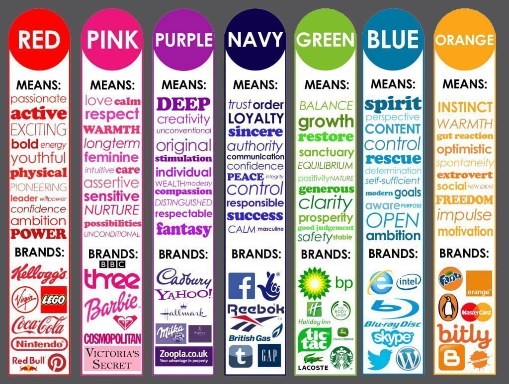
Source: Piplum
You definitely want a memorable logo, but you want people to associate it with a positive memory. Even something that seems as small as the color choice can make or break your logo.
You may be working with a letter-based logo design, in which case you can choose to look at available fonts, or hand-sketch your own logo. One thing to remember with font-based logos is not to make it too busy. Also, keep in mind the tone that a font automatically lends to any design.
- Serif fonts tend to be seen as reliable, stable, and respectable, if a bit more formal.
- Sans serif may be seen as more contemporary, as well as clean and simple.
- Script fonts communicate a more creative, sometimes feminine feeling to a logo.
- Another possibility is a novelty font, which uses unusual features such as marks, dots, and appendages.
Including too many elements in a logo design will detract from its memorability. "The simpler the image is, the easier it will be for the audience to remember — the brain simply has less to process," states designer Gareth Hardy in his book Smashing Logo Design — the Art of Creating Visual Identities. "Simplicity is probably the attribute that goes the furthest to improving the success of a logo. Simple ideas and imagery make effective logos."
What you want to remember with design details:- Color choice can contribute or detract from the message of the logo
- A logo can include or not include typeface
- Fonts lend a feel to the logo just as color does
- Keep it simple
Step Four: Mock Ups and Feedback on Initial Designs
Now that you have a few real possibilities that you feel have legs, it’s time to move on to the next step: creating a mock up, and taking it out into the field.
You can choose to keep your mock ups in paper and pencil format, just like your sketches, except with refinements, smoothing them out a little, and adding your choices for colors, fonts, and other details.
Alternatively, you can break out your design software and do a few virtual mock ups. These don’t necessarily need the time and effort that you will eventually put into the real thing, but they should give a viewer a pretty good idea of what the end result will look like.

With mock ups in tow, reach out for feedback.
It's tempting to look for feedback from those we know: our close friends, our family, those we have within easy reach. But friends and family are notoriously difficult to get unbiased opinions from. Besides which, the important thing is the audience to which your logo is directed.

Reach out to the community, if possible, to find those who will be directly interacting with the company you’re designing for. You’ve already done your market research, so you know who you should be looking for.
You may be able to reach out on Facebook or other social media, or you might visit local events, such as farmers markets, to get honest, unbiased opinions on your design options.
Have a few questions in mind that will help you to elicit answers; sometimes, even just a simple viewpoint question can be overwhelming to someone who isn't expecting it, so having a series of leading questions ("Does this make you feel good or bad? Do you want your grocery store logo to look like this, or not? Does it make you feel that you can trust the company?") is a good idea.

- What to look for in feedback:
- Aim to reach your target audience
- Provide multiple options
- Ask specific questions about what they like and what doesn't work for them
- Be ready to incorporate honest feedback into the design decisions
Step Five: Develop the Logo
By this point, you should be pretty certain which logo you're going to develop into the finished product. Double check that it fits the criteria asked for in the creative brief, and look at your requirements for tone, message, and feedback notes.
Got all that? Good! Now it's time to make it a real thing.
Gareth Hardy advises, "If you're relatively new to drawing on-screen, get the sketch as close as possible to how you want the final logo to look before scanning it into the computer."
Some designers prefer to have less sketching to work with, executing most of the logo designs with a computer. It really depends on what your skill level is, and how comfortable you are with the scanning/uploading process, as well as drawing virtually.
From pencil sketch to virtual logo, it's time to take your design and put it into the format necessary for it to function as a logo. The exact process for this will depend on your design software of choice. Upload or scan your sketch into the program so you have something to work from.
You may be using simply a mouse, or you may have opted for a drawing tablet that communicates with your program. Either way, it's all about what works for you and what makes you comfortable as you work on your logo.
Trace the paths to give your logo its virtual bones, and experiment with the details as you go. This is the time to figure out what really works the best in the smaller details, such as line thickness, angle and curve, and exact placement of the font and other elements.
With your logo as a vector image, it gives it scalability and workability that a raster image does not always have. Remember, the logo is probably going to be used in a variety of formats. It may be shrunk down for a promotional pen or a business card, and it may be expanded for a bus wrap or a billboard. Ensuring that your logo is scalable gives it the flexibility needed while keeping the details from being compromised.
Gareth Hardy says, "The ability for a logo design to remain consistently legible regardless of the size is extremely beneficial." The identity of each individual logo will be affected at a different minimum size. "The smaller that this minimum size is, the more flexible the logo."
Remember that at this point you can still have a few options that you’re working with, before you make your final decision.
- What to remember in developing your logo:
- Convert the logo to a vector image
- Make final decisions on details like coloring, placement, line thickness, and angle and curve
- Check for workability and scalability
Step Six: Get More Feedback
Now it's time to get back out there in the field. Even more so than the previous time you looked for feedback, reach out to the intended audience for the logo and the company it represents.
Remember that one of the key elements you're looking for in this logo is its memorability.
"Once a logo has become familiar you no longer even need to read the words to know what they say, because you recognize it by its shape" designer Sarah Hyndman says in her book Why Fonts Matter.
The aim of the logo, apart from the message it delivers, is to stick in the minds of those who see it.
So an approach you might take is to have your test audience look at the logo, then take it away and ask them to draw it from memory. What do they remember about it? Do they remember it at all?

This is the final chance to get valuable feedback on what your logo is actually saying to those who look at it. Is it inspiring them to seek out further communication with the company it represents?
Step Seven: Final Result
By this point, you should be very clear on which design you believe will work, why it will work, and what should be done with it. Take the final suggestions back to the design in the designing software, and make any necessary alterations.
Check your design for the goal set that you've decided on for the logo.
- Remember, you're looking for a logo that is:
- Memorable
- Flexible
- Attractive
- On-message
- To the point
- Responsive
- Inspiring
- WOW!
Do one more run through the creative brief to ascertain that you’ve fulfilled the criteria asked for by your client, and proof the design in the software.
With the process list all checked off, you should be able to feel confident in having designed the ultimate logo!

This article has been written and verified by Zaheer Dodhia, an expert in logo design and branding.