Max it out or tone it down? Learn how to make minimalist logos or maximalist logos that click.
A logo should not only be attractive but also be easy to identify, communicate swiftly, and establish trust at various touchpoints. Your custom logo design should effectively convey meaning, whether it shows on a smartphone screen, product packaging, or a billboard. But then, how do you make sure this happens? Simply put, it comes down to design principles of maximalism vs. minimalism that help manage cognitive load in branding. Think of logos of brands like Apple and Starbucks here. The tech company icon is a pictorial with a neutral color palette. Starbucks has chosen to go with a more maximalist logo design.
The image displays logos of various brands from different industries, like technology, food, entertainment, travel, clothing, and more.
Both logos work well and are recognized worldwide, but which one manages cognitive load in branding? Minimalist logo designs are a timeless graphic design trend, and it’s for this reason, other than versatility. They drive instant recognition and include only one or two design elements that send the message without overwhelming the viewers. But in some cases, maximal logos can manage the load well, too.
What is Cognitive Load?
The cognitive load theory describes how the overuse of visuals or complex information can confuse viewers and make it difficult for them to understand or recall design elements. If an image or design has a lot of clutter or many different visual elements, it can increase the viewers’ cognitive load, and they may not give it much attention.
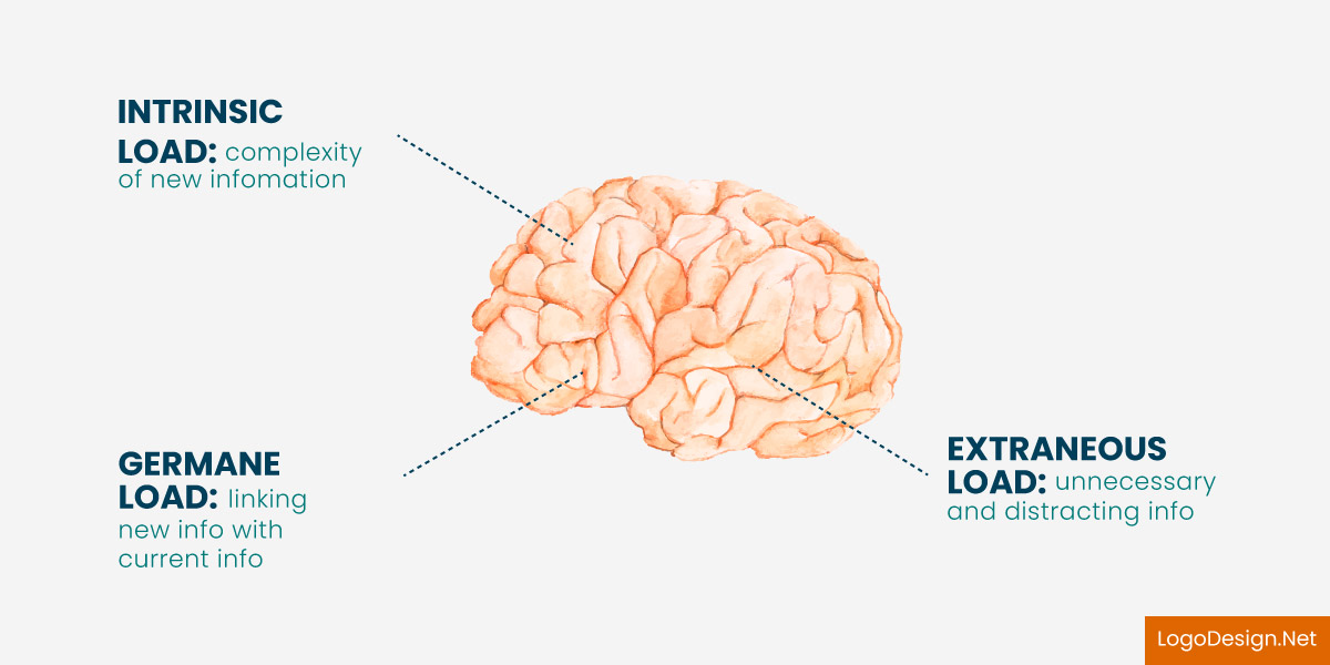
The image of the brain highlights the three types of load that will be handled by the brain. These include intrinsic load, germane load, and extraneous load.
Importance of Cognitive Load in Branding
Designers have to prioritize the way a human brain processes information. This is why it is essential to consider cognitive load in branding, particularly for logo design. You need to keep in mind how maximalist or minimalist logos might impact the consumer’s ability to recognize the brand and build a positive perception. If the cognitive load becomes too much, people may not connect with the design at all.
A good logo design is about creating a symbol that balances clarity and visual appeal. Knowing how design affects people cognitively allows you to make more informed choices that improve user experience, brand recall, and long-term brand loyalty. A maximalist logo may not always overwhelm the viewers, but it could take some time to be understood and associated with the business.
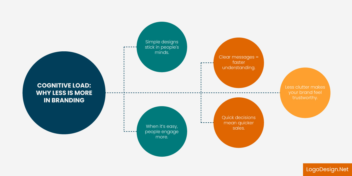
This image discusses the impact of cognitive load in branding
A minimalist design is a popular choice for a brand symbol as it reduces the cognitive load in branding and helps manage it better. For example, a simple icon with neutral or solid colors might be easier to identify and instantly recall than a complex logo with an illustrative design or multiple colors.
Maximalist vs Minimalist Logos: How to Manage Cognitive Load
The choice between these two design approaches can be challenging to make. One of the first things you must consider is recognition and brand awareness. In a survey of 2500 customers, over half said they preferred to shop from brands with recognizable logos. This shows that your logo, be it maximalist or minimalist, needs to connect with viewers within seconds. So, how do you create a design that achieves that?
By managing cognitive load and making sure every element is balanced. Now, it is easier with minimalist logo design than with maximalist ones. Let’s break this down here.
Minimalist Logos
Minimalist logo designs focus on the less is more approach. They emphasize simplicity, clarity, and the core message by removing any clutter. The aim is to have a logo that is instantly identifiable in the simplest visual terms and conveys thebrand’s identity at first glance.
This instant awareness boosts brand recall and builds loyalty, which is very important in competitive industries where customers receive many brand impressions daily.
Minimalist design shines in tech, wellness, lifestyle, beauty, and organic food industries. For example:
This is the logo of OpenAI
OpenAI’s minimal logo, with its simple black-and-white symbol and clear wordmark, reduces cognitive load by being easy to recognize and remember. The interwoven design evokes a sense of connection and innovation.
The image displays the newly rebranded logo of X, formerly known as Twitter
X’s minimal logo, featuring a simple white X on a black background, reduces cognitive load by using a straightforward, instantly recognizable design that conveys the platform’s new meaning without unnecessary complexity.
The image shows a minimalist logo for the company, Rhode
Rhode has a simple wordmark of the name as its logo. A more minimal variation is an ‘r’ that appears as a favicon. People don’t have to go into much detail or spend too much time understanding the logos or visual elements.
How Minimal Logos Manage Cognitive Load?
- Improved Scalability
These logos are visible in any size, from small app icons to big billboards. They have one or two elements and colors, making the designs easy to scale anywhere.
- High Recognition
Minimalist logos maintain their appearance against different backgrounds and create recognition in print and digital mediums. They cannot be missed, and they can be easily recognized with one or two colors, a single letter or symbol, or a plain wordmark.
- Quick Brand Recall
When people spot these logos, they do not have to spend much time trying to recall the brand, industry or what the company represents. If you take one of the examples above, like Rhode, it is a simple wordmark. And you can instantly pick it out on products, signs, billboards or pop-ups.
With a significant chunk of consumers interacting with brands on small displays on their smartphones or tablets, the advantages of minimalism are obvious. Fewer elements mean the cognitive load is reduced everywhere.
Maximalist Logos
This brings us to the question of choosing a maximalist approach in design. Should you avoid it completely or pick a few elements? It mostly depends on your brand’s message. For many businesses, maximal logos might work and reduce the cognitive load in branding.
In different industries, such as music and entertainment, food, gaming, and sports, you may have to choose elaborate or illustrative logo designs.
There are several examples of maximal logos where cognitive load is balanced.
The image displays the logo of Harley Davidson
Harley-Davidson’s design takes a maximalist approach without overwhelming the viewer. The maximalist logo addresses cognitive load using a balanced color scheme and clean sans serif font, which helps organize visual elements and makes the design bold yet easy to process.
This is the logo of Versace, which manages a maximalist approach
Versace’s maximalist logo manages cognitive load through its neutral color palette, which tones the complexity and allows the intricate design to remain visually accessible and elegant.
How Maximalist Logos Manage Cognitive Load?
- Unique Designs
With maximalism, you can have a unique design associated with your brand. Consider Red Bull’s logo as an example here. It is elaborate but follows a two-color palette, their signature red and yellow. This manages the cognitive load and helps viewers pick it out, too. So, while minimalism might be timeless in graphic design, it may not work everywhere.
- Tells a Story
You must also remember that overly simplified logos can seem uninteresting or similar to those of their competitors. It’s easier to tell a story with a character or more visual elements in design. Starbucks does it well with the siren/mermaid, with a fascinating history.
- Brand Association
Getting people to associate a character or mascot logo with your brand is easier. A minimalist logo can easily disappear among similar designs without a strong brand identity or visual cues.
You must carefully balance showcasing your USP(unique selling point) without overwhelming the viewers. It could be with maximalist logos or a minimal style with one or two striking elements.
Maximalist logos are usually considered visually heavy; however, they can lower cognitive load when they have relevance and clarity. These logos often use well-known visual elements such as cultural icons, relatable characters, or industry-specific imagery with higher recall. These features do not confuse the target audience as they are apparent. So the audience knows what the brand is trying to convey without uncovering complex details or abstract icons.
This immediate recognition reduces the cognitive load needed to define the brand, making the logo more appealing and memorable. A well-designed maximal logo also uses visual hierarchy, contrast, and relevant typography to make a visual impact. If you keep the structure clear, you will find that people can quickly identify with the design. It allows the brain to understand the design in different steps instead of all at once, even if there are several levels of complexity.
In this way, maximalist logos, no matter how complex, could reduce cognitive load with visual appeal and harmony.
Minimal Logo vs Maximal Logo: When to Use Each
To make a well-informed decision between maximalist and minimal logo design styles, focus on key factors. These include brand positioning, target market, industry background, and marketing collateral. Let’s discuss these in detail.
Brand Positioning
Think of the message your company is sending to its target audience.
Minimalist logos typically match brands that aim to be seen as sophisticated, clear-cut, or innovative. If you want to go with such an icon, you need to pay attention to keeping only the most necessary visual elements. So consider neutrals, simple black or white, or a monochromatic color palette. Include an icon, letter mark, or shape that defines your business.
Maximalist logos are completely different, so you must consider how to position your brand with them. They work well for companies that want to get people talking at first look and associate their brand story with them.
Target Audience
Your audience’s expectations and preferences matter.
Minimalist logos usually have broad appeal and are especially good for creating a positive perception for corporations as they appear more professional. They need less time to understand and identify on any medium.
For recognizable maximal logos, you need to keep in mind that they attract more niche viewers. Think sports fans, streetwear enthusiasts, young adults, or children, and people who value nostalgia or good storytelling.
Industry/Niche
Your industry will help you decide on a design style. Technology, finance, cosmetics, and lifestyle companies usually use minimalistic designs to communicate clarity and confidence. Industries such as gaming, music, food and beverage, and festival culture opt for maximalism. Mascots, colors, and calligraphic font styles can drive recognition and emotional response in these niches, so powerful, complex logos would be ideal.
Digital and Print Media
This is another critical factor to focus on here.
Minimalist logos scale well, are responsive, and remain clear in small places such as app icons or favicons.
Maximalist logos might have problems with scalability, but they are eye-catching on marketing materials such as packaging, billboards, or event branding since there’s more room to draw attention and engage people.
Considering all these for maximalist and minimalist logos, you can choose the right style for your brand or business. Test your design among a focus group so you can get an idea of the audience’s perception beforehand. This way, making changes and improving the logo to match the brand message is easier.
Got Questions?
How are Maximalist and Minimalist Logos Different?
Minimal logos have clear lines, one shape or icon and a simple color palette. They are quite obvious and easy to scale across mediums. Maximal logos are more complex, include illustrations or imagery and gradient hues or more than two colors. They tell a story with more visual elements.
How does cognitive load impact brand recognition?
If brand elements are complex or confusing, they increase cognitive load, as people cannot figure out the purpose, mission, or USP. Higher cognitive load means that your audience will have difficulty recognizing your brand logo, colors, and typeface. Lower cognitive load means stronger recognition, as clean lines, a geometric shape, or a simple icon can be easily understood.
Which logo style, minimalist or maximalist, is better for my brand?
It depends on your brand message and industry. Minimalism is timeless, so you can go with that, but if you want people to think or talk about your brand’s story, a maximal style could be a good choice.
How can a brand balance simplicity and detail in logo design?
Use relevant visual elements that convey the right message and include colors that do not overwhelm the viewers. If the logo has different details, keep the colors and fonts simple. Every element should grab the viewer’s attention and help them figure out what the logo is trying to say within seconds.
What industries benefit more from minimalist or maximalist logos?
Minimalist logos are great for industries like fashion, technology, skincare, and lifestyle. Maximalist logos can also work well for brands associated with food and beverage, entertainment, and sports, as many companies use mascots or illustrations.
