Logos don’t always need intricate designs, symbols, or the mascot to make an impact. All you need are a few letters, which are enough to build an empire.
Is your branding not as crisp as it should be? Use a lettermark logo! They’re simple, clean, and versatile enough to make a brand instantly recognizable.
To inspire you, we have pulled together an ultimate lookbook of 100+ logos that simply nail this approach. But before we jump right into them, let’s break down what makes lettermark logos so powerful.
What Are Lettermark Logos?
A lettermark logo is a type of logo design that uses the brand’s initials or even a single letter as the core visual. The design leverages typography to cleverly use the company’s name as the visual identity to make a memorable logo.
This can be seen in many popular brands such as IBM. Despite having a long name, the brand uses its initials to present as the logo, making them easily recognizable. With a strong typeface, brand colors, and a unique layout, you can simply turn a few letters into a timeless logo that reflects the entire brand.
But the power of lettermark logos is in their simplicity. Using only a letter or two, a brand can leave a strong impression on the audience and tell its complete brand story without the help of any other branding material.

Types of Lettermark Logos
There are so many lettermark logos out there, and they don’t all look the same. Different designers use different approaches to make the initials stand out in a lettermark logo, and it can depend on your brand’s personality and the target industry. Here are some of the main types of lettermark logos you will come across later.
• Monogram
Monogram logos are classic lettermarks. They have intertwined or even overlapping letters, most with elegant typography. Luxury brands such as Louis Vuitton and Chanel most commonly use monogram lettermarks, as do some formal institutions.
• Initials
Some lettermark logos are simply initials in block-style letters. These logos symbolize strength and authority and are most popular with B2B audiences who want to associate with businesses or companies that are experts in their field. Some of the best examples include BBC and IBM.
• Typography
This is where designers must let their creativity run amuck and stylize fonts with shapes and curves or even create custom fonts. For example, the Netflix N only uses the right typography to show how a single letter can feel like an entire cinema. Beware of typography mistakes that can surely make your stylish logo sloppy.
• Signature
Founders often want the logo to reflect their ideology and use signature lettermarks to add a personal human touch to the brand. Designers do not have much space when it comes to a signature logo, but the color and other design elements can completely elevate the visual representation. Some of the best lettermark logos are those of Kellogg’s and Disney; they’re instantly recognizable and add a lot of story to the brand.
Tips To Keep In Mind When Designing Lettermark Logos
Designing a lettermark logo requires great skill. Since there is little to work with, these tips are essential to remember when beginning the process.
• Don’t Overcomplicate It
Logo designers can complicate a lettermark design by adding too many design elements. The best way to go forward in a lettermark design is to remember that less is more. A clean and minimalistic design will translate better on all platforms and mediums, so keep it simple.
• Choose The Perfect Font
The lettermark logo’s hero is the typography. Choose typography that works well with your brand and your target audience. For instance, if you want to give off a traditional vibe, you can go for a serif font, or a sans-serif font if you want to look modern.
• Keep Scalability In Account
Ensuring your logo stays the same on different platforms or mediums is crucial for scalability. It should look strong on a phone screen and everywhere else. So, before you design the final draft, test it on different scales so you know it is readable and does not pixelate in the biggest sizes.
• Make Smart Color Choices
Lettermarks may include just initials, but with a pop of color, you can make all the difference. Designers know this to be true: colors have a significant impact on the audience, and choosing the right color is essential to appealing to your target audience.
• Add Creative Elements
Logos are the perfect opportunity to add subtle creativity. You can use hidden meanings, clever symbols, and more, but do not compromise clarity to make it creative.

The Ultimate Lettermark Logo Collection
You may already know these lettermark logos and can instantly recognize them. That’s precisely what you should take inspiration from.
1. Chanel

The intertwined double-C emblem of the Chanel logo screams luxury! This lettermark logo is instantly recognizable as it is featured on all of Chanel’s products, including bags and perfumes. It reflects luxury and heritage in one lettermark.
2. HP

On printers and laptops, the lettermark logo is simply enough. The color and font choice convey innovation and trust, making HP the first choice of many tech enthusiasts.
3. McDonalds

The Golden arches? Two fries or the M? It’s a perfect lettermark. The McDonald brand is the iconic global symbol of fast food and the bright yellow against the red makes it unmissable.
4. Netflix

A red film strip shaped like an N! It’s sleek, minimal, and instantly recognizable with a creative nod to film reels.
5. PayPal

Simple lettermark, just like their payment processing. The bold, modern typography with a clever color choice makes PayPal a trustworthy payment partner.
6. Google’s G

A multicolored lettermark with a capital G automatically spells out Google in our heads. Each of the color segments within the alphabet reflects diversity, creativity, and innovation.
7. Unilever

The iconic blue U is not just a lettermark but the core visual element of the brand. The simple U reflects all of Unilever’s diverse portfolio. It is like one unifying element for all products.
8. CNN

For some, it is a minimalist masterpiece; for us, it is a clever lettermark. The lettermark logo is perfect for a global news brand, and the bold and flowy monogram makes it minimalist but powerful.

The LV lettermark happily marries luxury and tradition. The intertwined L and V effortlessly capture French elegance and can be found on all of its leather goods, symbolizing sophistication in its purest form.

A lettermark so goated it survived the brand name change. The YSL monogram was designed in 1961, and it continues to be the most celebrated lettermark. The elongated typography reflects Parisian glamour.
11. LG

LG lettermark is more than meets the eye. Can you see a face? With clean typography, the LG logo conveys innovation and technology, all done with a smile.
12. HBO

Say cheese! The HBO lettermark has a camera hidden in plain sight. The lettermark itself captures the brand’s identity and symbolizes storytelling.
13. Baskin Robbins

BR or 31? The lettermark is a logo and a promise. The design smartly hides 31 flavors, making it fun and memorable for ice cream lovers worldwide.
14. Kellogg’s

William Kellogg’s signature has been etched in history with branding made perfect. But more than a lettermark, the logo symbolizes the tradition and trust the brand is known for.
15. Yahoo!

Do you ever yell Yahoo! in your head when you see this lettermark? So do we! The lettermark captures the energy and quirkiness of the brand with a simple exclamation mark.
16. WordPress

Clean, simple, and minimalist, the W monogram is a perfect example of a lettermark logo. It reflects reliability and a strong community, making it the most popular website publishing platform.
17. Tesla

The T of Tesla is not just its letter mark but also its motor’s rotor. Its futuristic and minimal design reflects the brand’s commitment to innovation and excellence in engineering.
18. Disney

Walt Disney may have passed on, but his signature remains. The playful curves reflect the iconic imagination and storytelling Disney is known for.
19. Adobe

Wives are always right, especially if they designed your company’s (Adobe) logo. Adobe’s co-founder’s wife designed the angular A logo, and it perfectly aligns with Adobe’s reputation.
20. Superman

The iconic lettermark logo is enclosed in a shield, kept safe by Superman himself. The bold red S is not just a lettermark, but it is also a symbol of hope and heroism.
21. Volkswagen

As the ‘people’s car,’ the Volkswagen letterman is highly recognizable. The clean white letters within a blue circle reflect reliability and precision, making it one of the most recognizable lettermarks.
22. Gucci

The intertwined Gs make a great letterman logo as an homage to the founder. The monogram is synonymous with luxury fashion and can be seen on all Gucci products.
23. Warner Bros

With the initials W and B, the lettermark logo has ruled our childhood. The crest-like design reflects tradition, authority, and creativity.
24. AT&T

The lettermark doubles as a combined monogram, forming a single visual unit. It represents a trusted legacy brand while reflecting modern innovation.
25. H&M

Hennes and Mauritz, in a lettermark logo, wouldn’t have worked as well as the iconic H&M. Its simple yet striking, making it a standout in the fashion world.
26. P&G

The moon and star imagery continues with a customized serif font for quality and reliability. The elegant serif lettermark reflects quality and trust.
27. BBC

Black squares with bold white letters for clarity, structure, and the BBC ethos. The clear lettermark logo makes the BBC one of the most recognizable media logos worldwide.
28. NBC

The NBC lettermark perfectly contrasts bold black lettering with a beautiful peacock icon. The colors symbolize creativity and storytelling that shine back on American broadcasting.
29. Rolls-Royce

The Rs intertwined make one of the most recognizable lettermark logos/monograms. The elegant and simple lettermark reflects the prestigious automotive brand and its commitment to timeless engineering.
30. Hyundai

The stylized H for Hyundai also shows two people shaking hands. Cool, right? The design is clever and subliminally conveys trust and reliability to promote customer connection.
31. KIA

Symmetry, rhythm, and rising! The KIA lettermark simply flows, just like its cars. The visual rhythm is futuristic and portrays the brand’s forward-looking ideology.
32. ISB

The ISB lettermark is precisely what a business school should represent. It is bold with a simple font that gives the logo a formal and legacy impression.
33. GMC

Red and silver GMC letters in a chrome ring symbolize the brand and its engineering. This instantly recognizable lettermark conveys strength and durability.
34. Under Armour
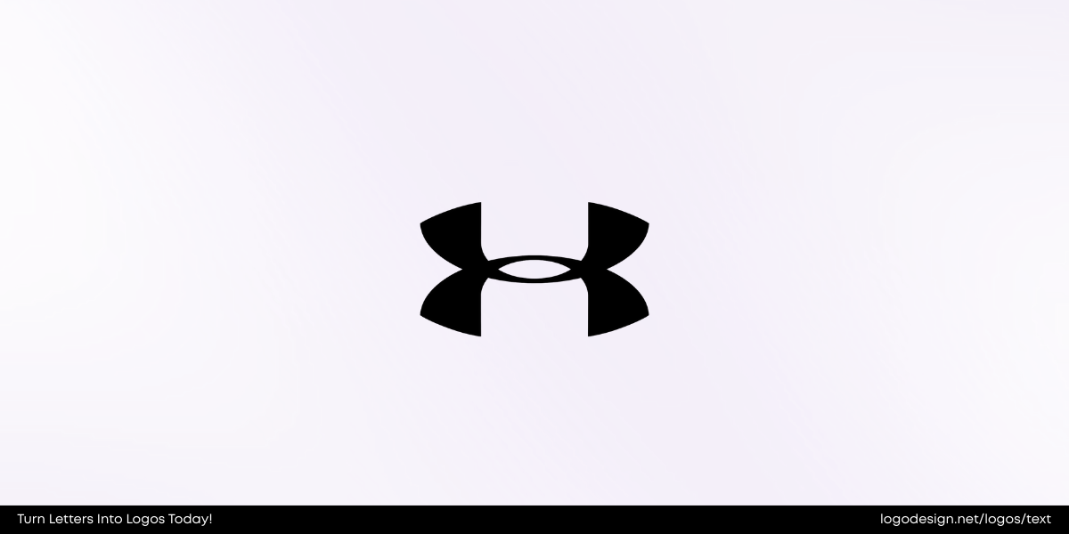
A lettermark that represents performance and strength. The interlacing U and A make it a very powerful lettermark that aligns with the brand’s innovative, high-performance athletic wear.
35. New York Yankees

The New York Yankees logo is as global as it gets. In addition to baseball, the lettermark also serves as a fashion and cultural statement.
36. JAC

The lettermark uses a sleek, modern font. The clean lines and bold lettering tell the story of the company’s global presence and modern approach.
37. New Balance

The stylized N with speedmarks accurately depicts motion and athletic performance. The design is simple yet embodies agility and motion, just what the target audience is looking for.
38. NVRD

Artistic and stacked letters create a unique lettermark for the NVRD logo. The modern and unconventional design reflects the brand’s creativity and bold personality.
39. Extreme Reach

X is commonly used for extreme shines through here! The X in the XR is the focal point and gives a sleek and modern look all while symbolizing connection and versatility.

A lettermark that represents rich history gives off strong vibes, conveying the brand’s authority and tradition-focused brand voice.
41. CNET

The CNET lettermark is trust personified. The red circle radiates trust and modernity needed for a tech news leader.

The artistic lettermark simply stands out! The Catskill Art Space’s lettermark logo tells the brand story by reflecting creativity and structure to align with modern art and design.
43. Nasjonalmuseet

NAM–the initials look like a visual icon and are definitely a lettermark that balances heritage and modern designs.
44. Big C Charters

A nautical feel with a clean and simple lettermark. The clean logo evokes trust with a hint of adventure that fits perfectly with the brand’s identity.

Cultural and classic letter mark that serves its purpose. The simple typography in this letter mark reflects the accessibility and mission of the brand.
46. T-Mobile

A vibrant magenta T is recognizable everywhere. This lettermark reflects innovation and a youthful energy, adding more personality to the whole brand.
47. F1

The swooshing F1 lettermark makes a perfect logo. It effortlessly captures energy, excitement, and motion. It is one of the smartest sports lettermarks ever.
48. ASICS

A modern symbol with right-angled lettermark that embodies athleticism and performance. The typography and other design elements align with the overall brand image.
49. DKNY

Donna Karan is in NY, so DKNY simply makes sense. It’s bold, minimal, and urban, making the logo look fashionable and timeless.

The color, font, and lettermark all fit perfectly. It embodies Black culture, music, and entertainment and is a strong, creative, aspirational lettermark.
51. MTV

MTV is nostalgia in a lettermark. It broke all design rules and defined pop culture with a graffiti-style M. The logo was a mix of youth rebellion and creativity.
52. EE

The EE logo uses bold lettering to symbolize connection and simplicity. The lettermark reflects the reliability and connectivity the brand wants to offer.
53. Calendly

The C as an icon, followed by the brand name, looks on-brand. The rounded C and simple typography reflect the brand’s role as a scheduling and productivity tool.
54. Kawasaki

Bold black sentence case lettermark provides a clear and visual presence. They represent performance, precision, and power, perfect for a brand known globally.
55. GAM

The GAM logo has a unique lettermark with plain initials separated by lines to add structure and authority. This not only looks unique but also adds a professional element.
56. LBDO

The LBDO logo is intimate, with elegant typography that perfectly represents the brand voice. Just looking at it makes you feel good!
57. HCMA

The squiggly M paired with a solid C, A, and H! The HCMA lettermark reflects creativity that is balanced with architecture.
58. Inter Milan

The Inter Milan lettermark also doubles as a sleek monogram. It is minimal yet impactful, and reflects the club’s strong football legacy.
59, Jimmy John’s

Bold lettering in a tight circle, the JJ looks great. The Jimmy John’s lettermark sits inside a circle for balance and recognition while conveying confidence!
60. Calvin Klein

The Calvin Klein letter mark is timeless and definitely understated. Its minimal serif typography embodies elegance, simplicity, and modernity.

61. Caterpillar Inc

CAT is a construction based on strength. Its lettermark is strong and industrial, with a yellow triangle suggesting stability and strength.
62. PlayStation

Playful 3D design where P and S are intertwined. The lettermark is colorful, playful, and iconic. Its creative design merges technology with fun.
63. STC

The Saudi Telecom logo conveys connectivity with a futuristic design. The “STC” lettermark is clean, often paired with vibrant gradients.
64. DQ

The hot and cold logo presented by a red eclipse. The lettermark is dynamic yet straightforward, representing its hot and cold products.
65. JVC

This Japanese brand keeps it simple with a striking red lettermark. Its clean, sans-serif design conveys strength and clarity and reflects the Japanese brand’s influence in electronics.
66. Foilco

F. Lettemark, in a scalloped design, is creative at its best. The unique design reflects craftsmanship, innovation, and artistry, reflecting the brand’s premium foil printing services.
67. WeTransfer

WeTransfer’s rounded, lowercase lettermark is soft, approachable, and user-friendly. The minimalist logo typography mirrors the platform’s easy-to-use interface.
68. Juventus F.C.

Clean, thick lines, which combine football and identity, represent strength and unity while redefining the club’s identity.

It doesn’t get better than a handwritten signature logo! Its flowing script evokes trust, care, and authenticity, symbolizing the brand’s efforts in healthcare and family products.
70. GE

This is the perfect example of an elegant and industrial lettermark. Its circular frame and decorative script balance innovation with tradition.
71. KFC

It’s legendary and global! Love at first sight! KFC’s bold red lettermark, paired with Colonel Sanders’ portrait, is iconic worldwide.
72. Jimmy Choo

Luxury meets Typeform! The lettermark is sleek and understated with a luxurious aura. The designers did a great job reflecting the brand’s reputation.
73. Xerox

Such a visually appealing lettermark. The clean red lettermark is modern and dynamic but still manages to convey innovation with approachability.
74. Canberra

Overlapping letters can work wonders sometimes! The lettermark is fresh and distinctive, with a layering design that portrays a forward-looking spirit.
75. The Art Directors Club

The ADC letters reflect design, creativity, and authority. The lettermark reflects the professional prestige and community of global art directors and creative leaders.
76. DC Comics

Comic book nostalgia and creativity are enclosed in a circle. The bold initials have become synonymous with superheroes, making the lettermark recognizable.
77. Cartoon Network

In a checkerboard design, the letters look playful yet structured. The lettermark captures the brand identity with tact and creative flair.
78. TNW

Futuristic block-letter logo to claim the digital space. The bold typography perfectly aligns with the platform’s tech-savvy identity.
79. Veon

This lettermark looks so simple but so global. With the clean and simple lettermark, the logo represents the brand’s modernity and futuristic vision.
80. Trader’s Club

The electrifying lettermark to match the brand vibe. The lettermark resonates with the brand identity and offers confidence and momentum.
81. Milano Film Fest

Under the spotlight, the lettermark logo is shining through. It is creative and promotes cinematic storytelling celebrating the independent film culture.

It’s a lettermark with a purpose. The lettermark communicates urgency and responsibility needed to forward the brand’s mission.
83. Habilis

The H has layers; take a closer look. The lettermark reflects the brand’s deeper growth and versatility.
84. McGrathNicol

The lettermark logo radiates tradition with a hint of modernity. Its lettermark is designed to convey trust and stability to represent the consultancy’s services.

It simply looks beautiful! Simple but oh so flowy, the design is elegant and reflects heritage, culture, and timelessness.
86. SKF

It’s a fresh take at an engineering company! The lettermark is fun, technical and a strong visual icon reflecting back on the brand’s reputation.

This lettermark is design perfection. The modern typography is creative and expressive without going overboard.
88. CI&T

It’s sleek and futuristic, and the colors go perfectly well. The lettermark with bold typography is in perfect alignment with the company’s IT and business solutions.
89. BioBurger

The BioBurger lettermark is fun to look at, and the logo is fun, approachable, and organic, just like the burgers. It is a great example of branding done right.

Clean and straightforward lettermark. The typography reflects on scientific research and puts the brand forward as the leading hub for discovery.
91. HMH

HMH’s solid block-letter design is authoritative and straightforward. The bold typography reflects education, reliability, and tradition.
92. FDM

It’s bold and minimalist for global IT. The clean design is professional and technical, ensuring the audience that the brand has global reach.
93. PEZ

Candy enthusiasts can spot this lettermark from miles away. Its geometric design reflects fun, nostalgia, and creativity, perfectly capturing the spirit of the beloved candy brand.
94. RIX Riga Airport

Travel efficiently with Latvian pride! The design represents movement, travel, and pride, making it the best choice for an emblem.
95. Facebook

One of the finest lettermarks out there. The iconic F lettermark is powerful as it is seen to be a very influential design and logo.
96. X.com

A single letter with extreme power! Much like Tesla, the X design conveys power and limitless potential that falls in line with Elon Musk’s vision.

A substantial and minimal lettermark. The minimal typography portrays clarity and focus, which the brand uses to align with education and youth empowerment.
98. Clarysse

The lettermark represents the brand’s luxury linen. The lettermark is a lesson in craftsmanship and tradition that aligns with the brand’s premium products.
99. British Basketball League (BBL)

Dynamic energy and the perfect lettermark to support it. The sporty aesthetic reflects the competition and athleticism of the brand.
100. BioZeroc

A brick and B-smart branding! The sharp but visually pleasing design furthers the company’s mission to revolutionize construction.

102. Zerion

Clean and tech-driven, Zerion’s lettermark is the perfect match. It feels like a window into the future of finance. It’s clean, sharp, and designed for the future.
102. EA Sports

The sporty lettermark appeals to the gaming industry. EA Sports’ circular mark is bold, athletic, and instantly tied to the adrenaline of virtual competition.
103. ESPN

Red letters with sharp edges instantly depict sports. Big, red, and fast. ESPN’s letters look like they’re moving even when they’re standing still.
104. Pinterest

The P is also a Pin! Simple yet genius, it’s the kind of design that makes you smile whenever you notice it.
105. V&A

Typography that turns into art, which is also a lettermark! The ampersand is definitely the star here and adds visual harmony.
106. UDIT

A Spanish university logo that makes initials look sharp. The lettermark is bold and professional, confidently representing the university.
107. TV2

Smart and broadcast-ready lettermark. The TV2 lettermark is designed to be unmistakable and perfectly tuned to the rhythm of the media.
108. Dense

A hair clinic that promises style every time. The simple D is layered with so much personality and looks like a great haircut in the form of a logo.
109. Radius Recycling

Circular lettermark that reflects renewal and sustainability. The logo represents the cycle of recycling and giving materials a new and better life.
110. IBM

The IBM lettermark is timeless and visionary. The logo is a true symbol of trust and technology, as this brand has stood the test of time.
111. RCA Corporation

Iconic. Red. Bold. The lettermark screams authority and is simply impossible to miss given its impeccable design.
112. Co-op

Friendly lettermark for trust and community. The soft and rounded letters feel friendly and approachable, making the audience feel welcomed to the community.

Education that looks fashionable. The SFT lettermark has the confidence of fashion and is paired with the discipline of academics.

This lettermark balanced heritage and athleticism. Its lettermark balances both sports and community with a special nod to history.
115. eMa, Ecole des Musiques Actuelles

A professional lettermark featuring music! The playful yet professional design sings with rhythm and is tuned to the role of the music school.
116. Mighty Buildings

The mighty M says it all! Its solid structure represents the brand’s bold, geometric, and strong construction.
117. Aol

Digital first lettermark! AOL’s lettermark was ahead of its time, and the simple letters carry the weight of the early internet era.
118. NASA

All things space in this lettermark! NASA’s clean, bold typography is packed with ambition, exploration, and the wonder of space.
119. SAP

Corporate with heavy notes of modern. The logo is crisp and authoritative that is fitting for a company like SAP.
120. NPR
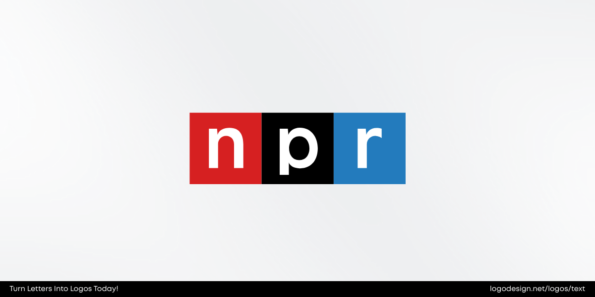
Three squares with three letters! NPR’s logo is clean and balanced and instantly recognizable.
Conclusion
That’s all, folks! These lettermark logos are a lesson in design. Less is more; if you want your logo to convey your brand story, a lettermark logo is the way to go! Create your own lettermark logo with LogoDesign.Net!