Design math says “perfect.” Your eyes say “nope.” The human eye has its own rules, and optical adjustments keep everything looking sharp, balanced, and memorable in the real world.
Open up any design software, draw a “perfect” circle, and drop it next to a square. Chances are, the circle will look a bit too small, even though it’s mathematically the same size. Strange, right? Well, not quite. That’s the everyday battle between geometry and human perception.
Designers know this funny little secret that even if geometry is flawless, our eyes are terrible at math. A logo can have perfectly even lines, identical curves, and textbook symmetry, but still look weird. That’s because human perception isn’t wired for perfection; it’s wired for balance.
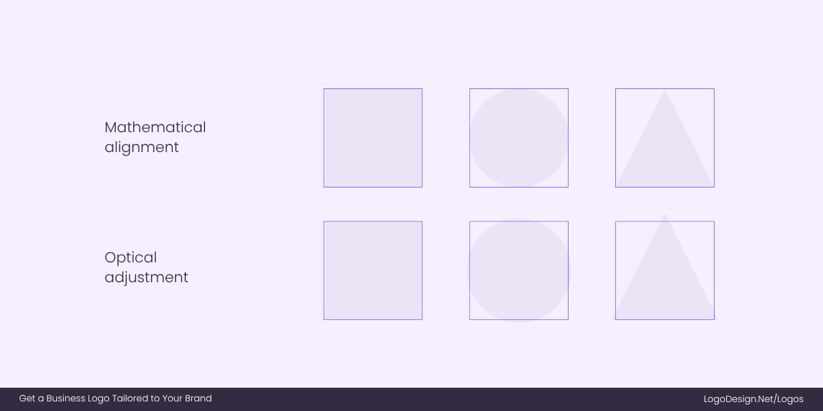
Mathematical alignments that make the shape look smaller, while optical adjustments help fix the perception of individuals
To fix this, designers use optical adjustments—tiny fixes that are rarely ever noticed, but always felt. Turns out, imperfect can sometimes be perfect (and vice versa). So let’s wrap our heads around the concept of optical adjustments and how it applies to logos that look flawless to the human eye.
The Illusion of Perfection in Logos
Our brains and geometry don’t always see eye to eye. What’s mathematically correct can still look wrong because human perception is full of quirks and biases. That’s why perfect shapes often trick us.
To help you understand better, here are a few common illusions that affect logos.
• Circles vs. Squares
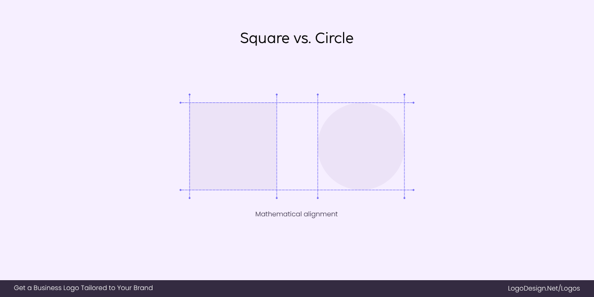
Circle next to a square, having the same height, as the circle looks smaller because straight lines feel solid
Place a circle beside a square of the same height, and the circle will look smaller. This happens because our eyes read curved edges as retreating inward, while straight lines in the design feel more solid and expansive. The square’s flat sides “hold” their boundaries clearly, but the circle’s curves visually pull inward, giving the impression of less space.
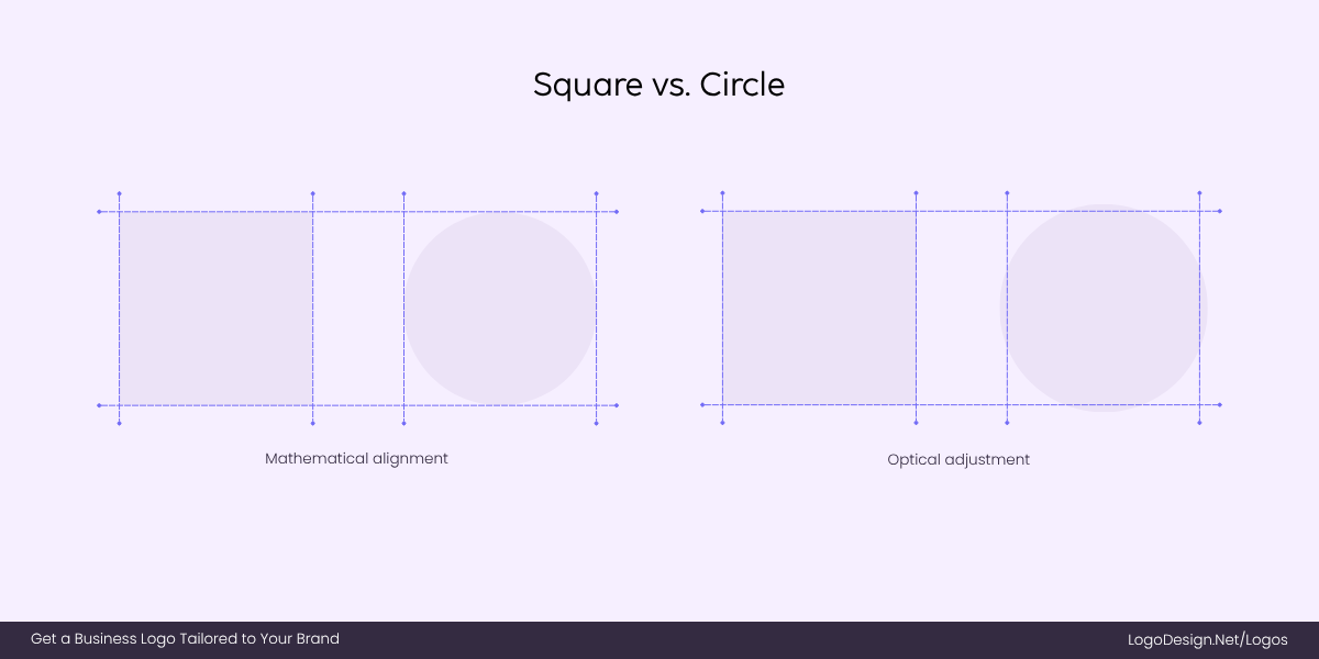
Designers correct the imbalance between the square and the circle by making the circle bigger for a better optical view
To correct this imbalance, designers often enlarge the circle slightly so it visually matches the square. This adjustment ensures that neither shape feels weaker or out of proportion, creating a sense of balance and harmony in the design.
• Circles vs. Triangles
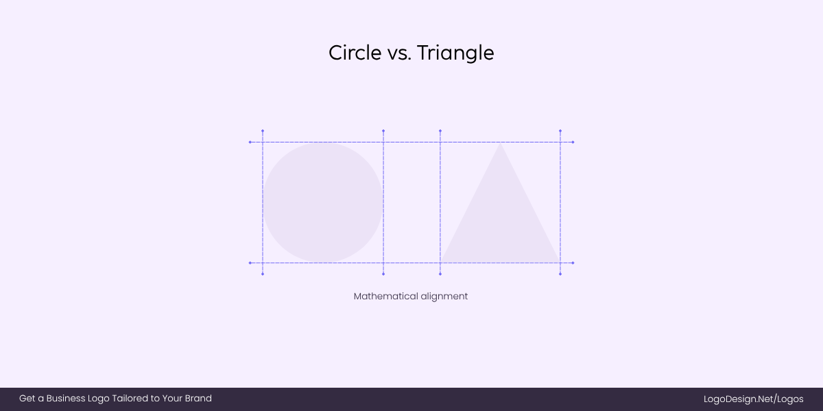
When a circle and a triangle are placed next to each other, the triangle, with its pointy tip, appears larger
Triangles have an inherently aggressive visual presence. Their sharp angles and pointed tips command attention in a way curves rarely do. When you set a circle and a triangle to the same height, your eye reads the triangle as larger and more dominant.
The circle, on the other hand, feels contained and inward-facing. Even though both shapes are mathematically equal in height, the triangle wins the visual contest.
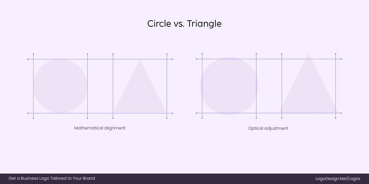
As the circle appears shorter than the triangle, designers make it up by enlarging the circle
That’s why designers subtly enlarge circles when pairing them with triangles—so the softer shape doesn’t appear weak or secondary. It’s less about geometry and more about the psychology of shapes in a logo.
• Equal Lines, Unequal Perception
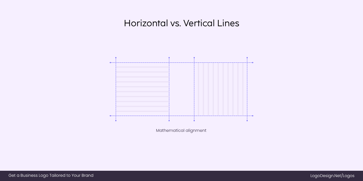
Even if the two lines are equal, vertical lines appear longer than the horizontal lines
Two lines of the same length, one vertical, one horizontal, don’t appear equal. Vertical lines usually appear longer.
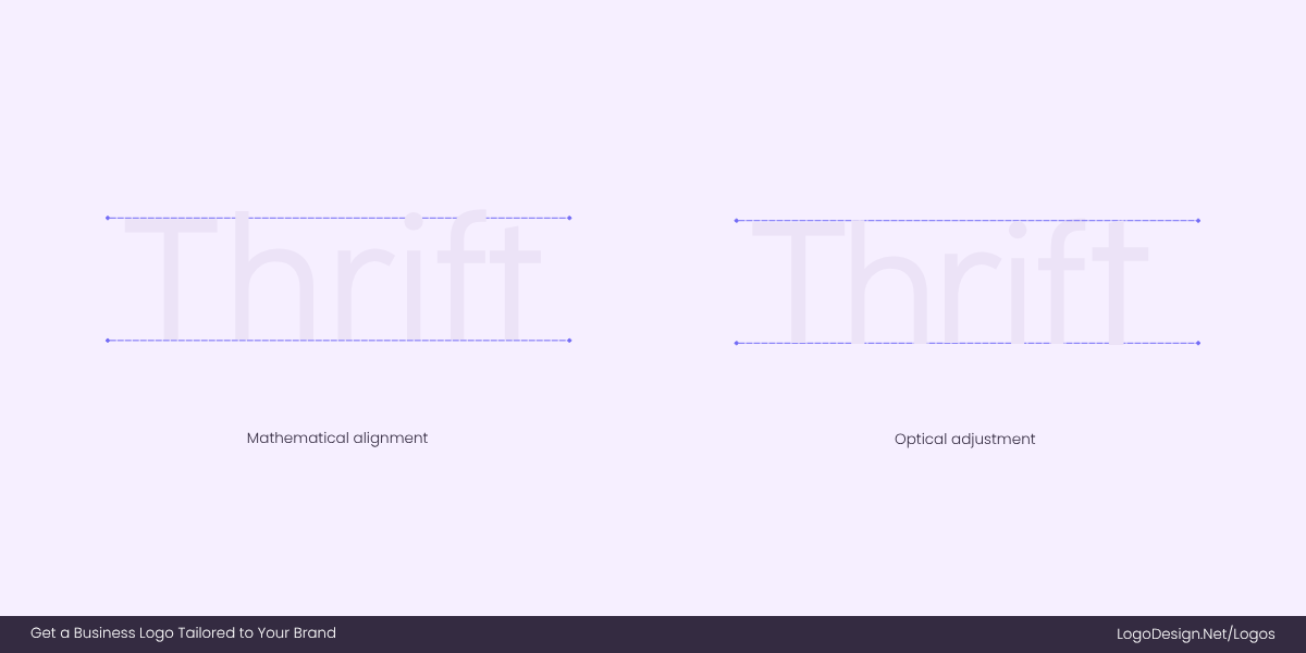
To make sure the vertical and horizontal lines of “H” and “T” appear the same, designers make the optical adjustments
This is why the stems of letters like H or T often get tiny adjustments in logo typography to avoid looking stretched.
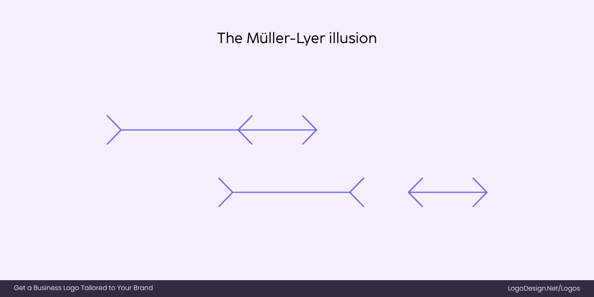
The Müller-Lyer illusion shows that two lines of the same length appear different because of where the arrows are pointing
The Müller-Lyer illusion is a perfect representation of this. Two lines of identical length appear different because of the arrow tips at each end. One line has inward-pointing arrows, making it appear short, while the other has outward-pointing arrows, making it look longer. The same distortion happens in logo designs.
• Straight vs. Curved Edges
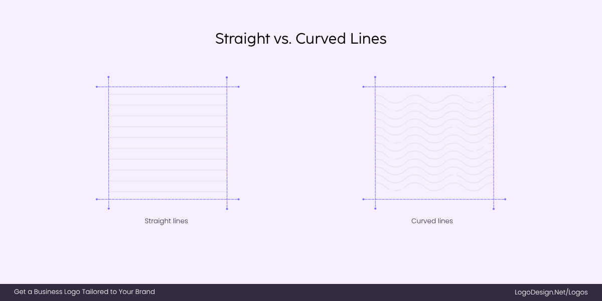
Straight and curved lines of the same length, where the curved line appears crowded and longer
If you give a curve and a straight edge exactly the same amount of space, the curve will always look like it’s crowding the line. Our brains interpret curved edges as spilling over, so they feel tighter than they are.
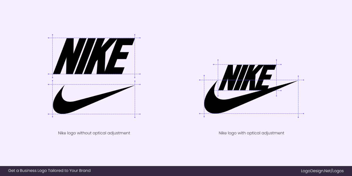
Nike’s Swoosh appears bold when the wordmark is closer, as compared to when there’s spacing in between
A great example is the Nike swoosh beneath the bold, straight “NIKE” wordmark. If the swoosh were aligned with equal measured spacing, it would look jammed against the letters. By giving the curved shape more breathing room, the logo feels open, dynamic, and balanced—proof that optical adjustments beat strict geometry every time.
• Thin vs. Bold Elements
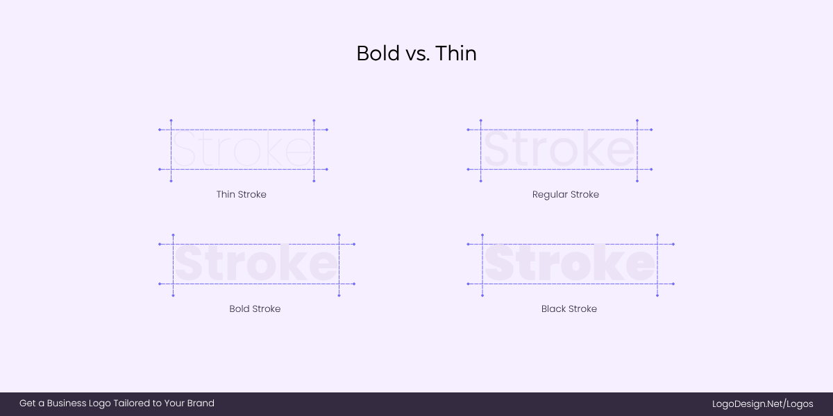
Thin strokes are harder to read and disappear faster, and bolder strokes are easily readable
Thin strokes or typefaces tend to disappear faster to the human eye, while bold marks carry more visual weight. When placed side by side, thin elements often need extra breathing room to avoid feeling cramped, while bold ones may need to be nudged upwards or loosened in spacing to stop them from looking too heavy. Without these adjustments, the balance between logo typography and iconography can feel off.
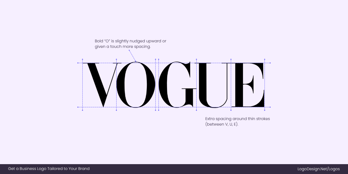
The Vogue logo with letters of different weights, increasing and decreasing the space between letters
Think of the Vogue wordmark; it uses extremely thin, elegant serifs compared to the bold “O.” To keep the logo visually balanced, the thin strokes have extra spacing around them so they don’t disappear next to the heavier letterforms. It’s a subtle optical adjustment that preserves both delicacy and impact.
What Are Optical Adjustments in Logo Design?
Optical adjustments are the subtle tweaks designers make to ensure a logo looks right to the human eye, even if it’s technically imperfect on a grid. Our brains don’t judge geometry the way math does—curves, angles, and contrasting colors can distort how we perceive balance. That’s why many famous logo designs rely on optical tricks to create harmony, clarity, and legibility in real-world use.
Key Optical Tricks Designers Use
Logos that feel effortless often hide a surprising amount of precision work. Designers spend hours fine-tuning details so they read correctly to the human eye.
Here are some of the most common optical adjustments that quietly shape some of the world’s most iconic logos of all time.
1. Curve Overshoot
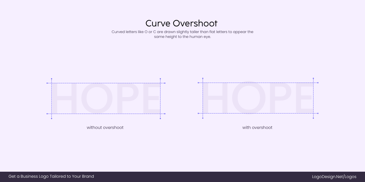
Curved letters like “O” and “C” of the same height appear taller. Designers solve this issue with overshooting
Curved letters (O, C, S) and shapes like circles or ellipses often appear smaller than flat-edged shapes of the same height. Our eyes interpret curves as shrinking inward, which makes them feel weaker when set alongside squares, rectangles, or tall letters. Overshoot solves this problem: designers extend circular shapes slightly above or below the baseline and cap height so they feel balanced with straighter forms.
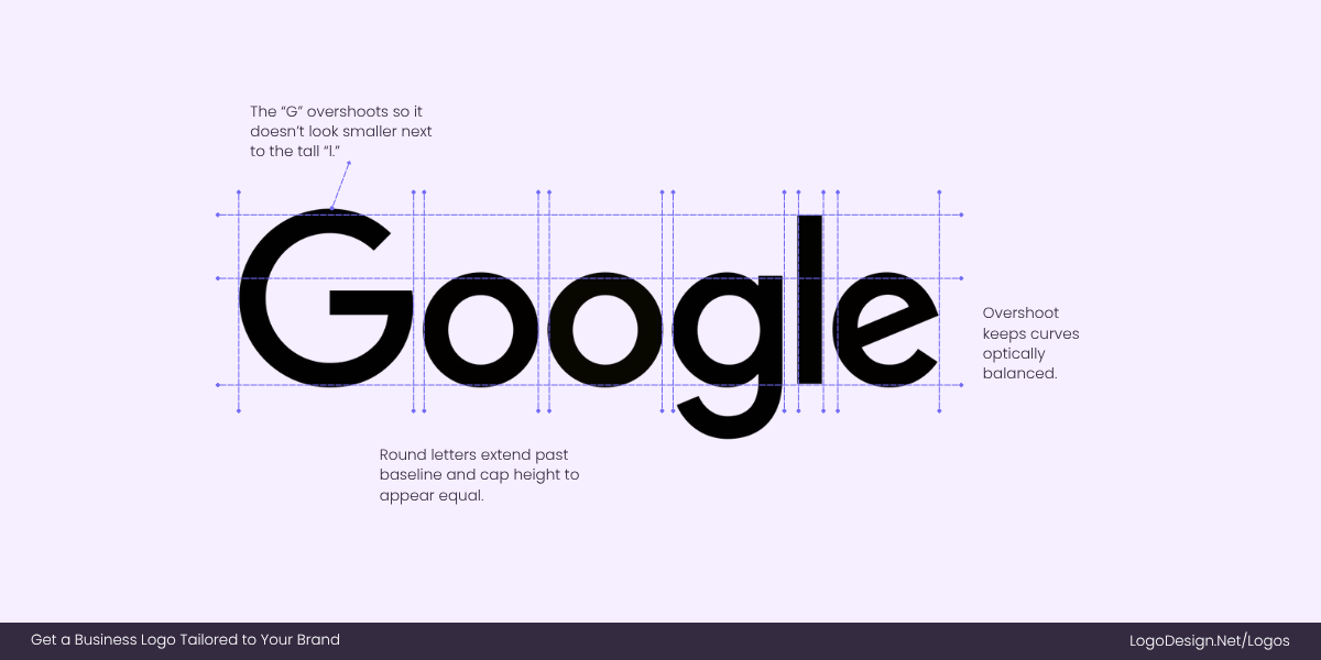
Curved and rounded letters are overshot to ensure the entire wordmark appears to be of the same height
Take the Google “g” in its wordmark logo. If you were to draw it perfectly inside the same height as the “l,” it would look shorter. To fix this, designers let the round parts poke just beyond the invisible boundary line. You’d never notice unless you looked closely—but without it, the “g” would feel like it didn’t belong.
2. Optical Balance (Visual Weight)
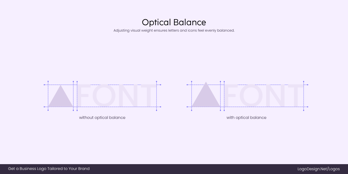
Optical balance is when designers adjust shapes by eye, ensuring triangles feel visually balanced.
Not all shapes carry equal weight. A triangle, for example, feels bottom-heavy because of its wide base, while a tall rectangle looks steadier. If you center these mathematically, they can look off-balance to the human eye. Designers correct this by shifting shapes slightly, so the balance feels right even if it isn’t exact.
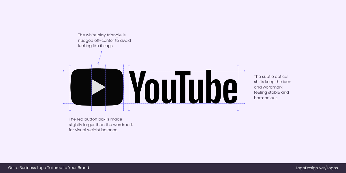
The YouTube play button isn’t perfectly centered to ensure it looks balanced to the optical vision.
The YouTube play button proves this. The white triangle inside the red rectangle isn’t exactly centered—it’s nudged just enough to look stable. If it were placed dead center, it would seem to sag downward, making the whole icon feel awkward. This tiny adjustment makes the logo look balanced.
3. The Irradiation Phenomenon (Compensating for Color Contrast)
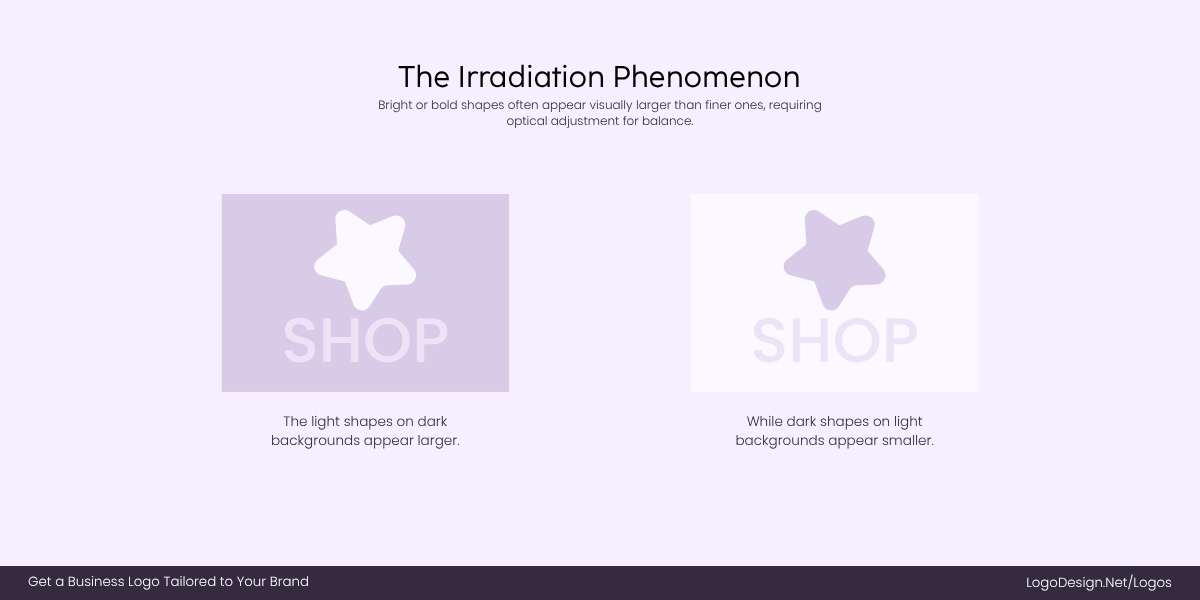
The Irradiation Phenomenon makes light colors expand on dark backgrounds, and dark colors on lighter backgrounds appear thinner.
Logos don’t live in one color. A mark that looks perfect in black can look bloated or “fatter” when inverted to white on black. This is due to the irradiation phenomenon, where lighter colors appear to expand against darker ones. If designers don’t compensate, a logo can look inconsistent across different applications.
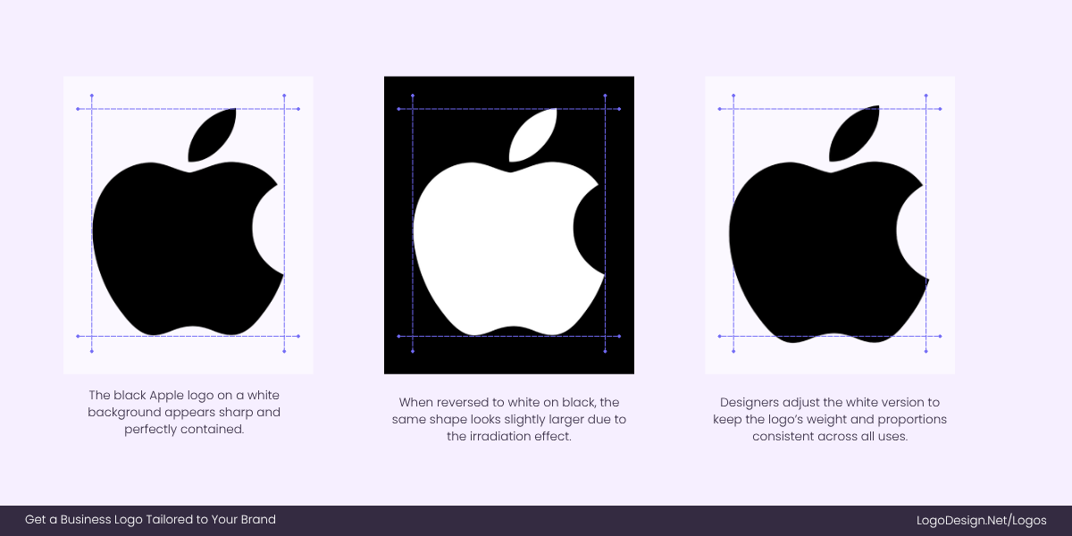
Apple tweaks its white logo so it looks the same size as the black one, keeping the brand mark consistent across devices and packaging.
The Apple logo is a classic case. On a white background, the black version looks crisp and contained. But when flipped to white against black—like on MacBooks or iPhones—the same shape would appear slightly larger if left untouched. Designers fine-tune the white version so it feels identical in weight and proportion, ensuring Apple’s mark always looks consistent, whether it’s glowing on a device or printed on packaging.
4. Gestalt Principles
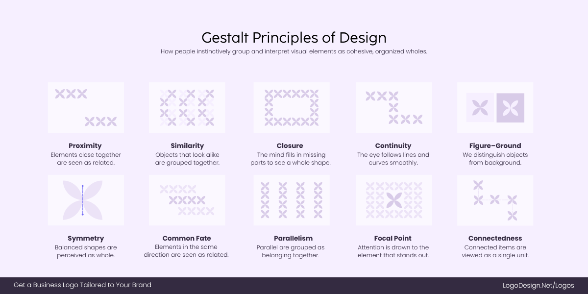
Gestalt principles help logos feel complete and memorable by letting the brain fill in the gaps.
Gestalt principles are all about how our brains simplify complex visuals. Designers use tricks like closure (filling in gaps), similarity, and proximity to make shapes more engaging and memorable. Instead of spelling everything out, logos hints at forms and lets the brain do the rest. This not only saves space but also makes logos more intriguing.
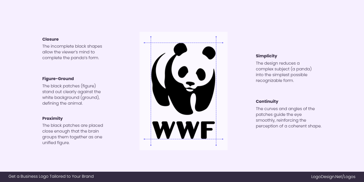
WWF’s panda logo shows how simple shapes and closure can make us see a full image instantly.
The WWF panda logo is iconic for this reason. It’s not a full drawing of a panda—just black patches positioned carefully. Yet our brains instantly close the gaps and see the full animal. That clever use of closure creates a strong, simple mark that sticks in memory without being overly detailed.
5. Countering Gravity
Here’s a quirky thing: when you place an object perfectly in the middle of a shape, our eyes often perceive it as sinking. Designers call this a “gravity effect.”
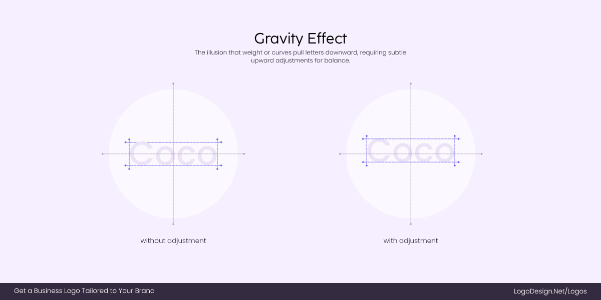
The gravity effect is the illusion where letters are pulled down, solved by placing the wordmark slightly above the center.
To counter it, elements are lifted slightly higher than the true center, making them look balanced. This is especially important in circular or symmetrical logos.
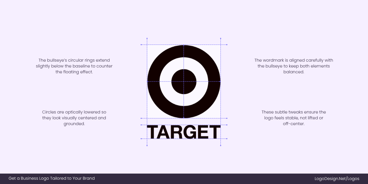
Target’s bullseye looks perfectly centered because designers subtly adjusted the rings to make them visually centered.
The Target bullseye is a great case. If each ring were drawn mathematically equal and centered, the middle dot would appear to drift downward. Designers lifted and adjusted the rings so the whole logo feels stable and centered. That subtle tweak is what makes the bullseye instantly pleasing to look at.
6. Letterform Optical Kerning
Kerning in a logo is the space between letters, but here’s the catch: spacing that’s mathematically equal often doesn’t look equal.
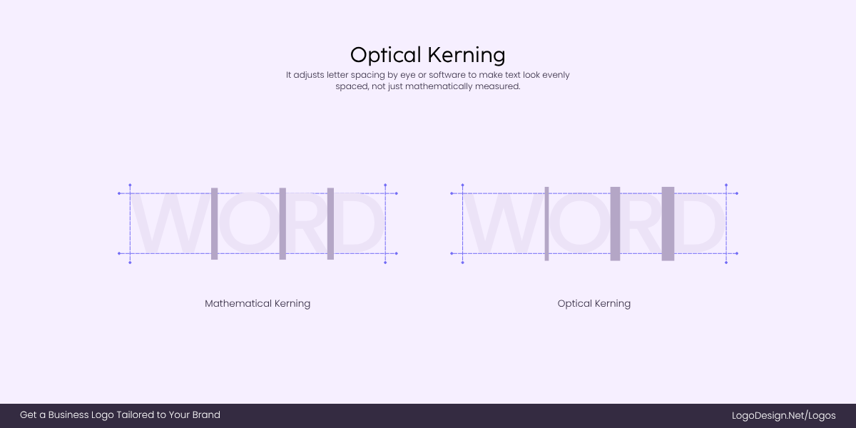
Optical Kerning is when designers reduce the spacing between text, as text spaces appear uneven.
Curved letters (like “O”) seem to leave more space than flat ones (like “H”), even when the numbers are identical. That’s why designers use optical kerning—adjusting by eye so words feel evenly spaced and readable.
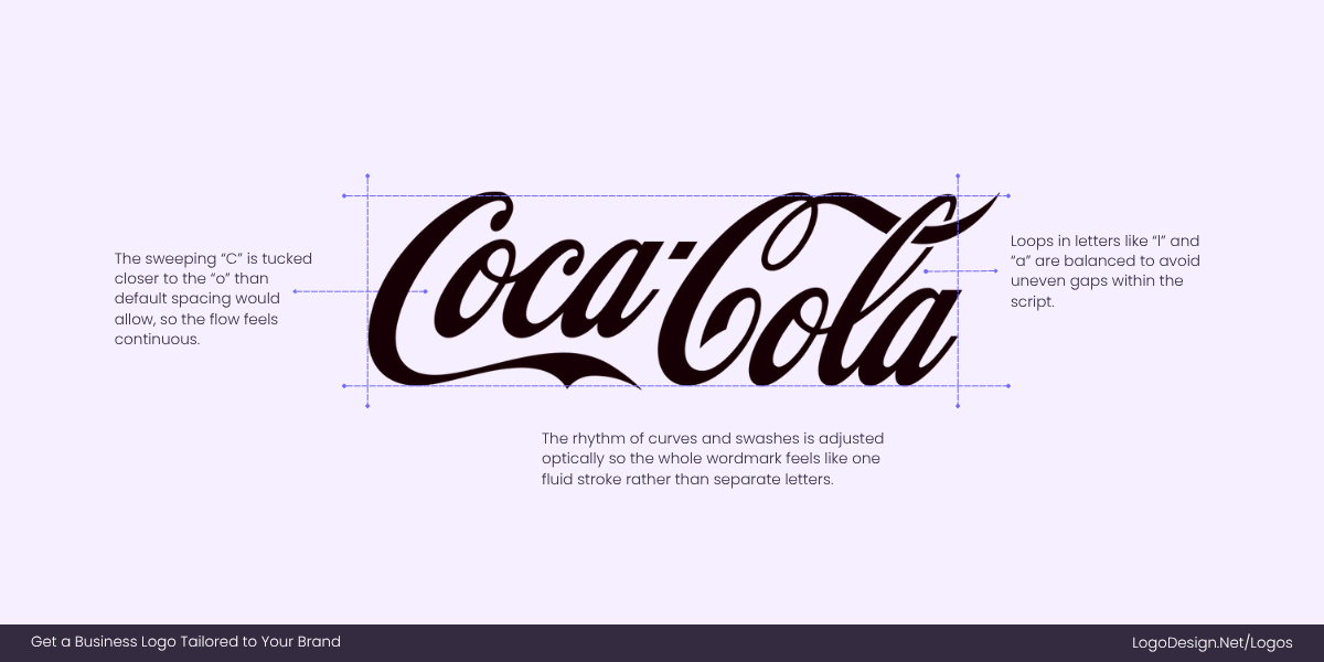
The Coca-Cola script shows how optical kerning appears balanced and even.
The Coca-Cola wordmark is a great showcase. The script letters flow into each other, and the kerning isn’t mathematically consistent, but it feels perfectly balanced. Without optical kerning, logos would look clunky and uneven.
7. Perspective Compensation
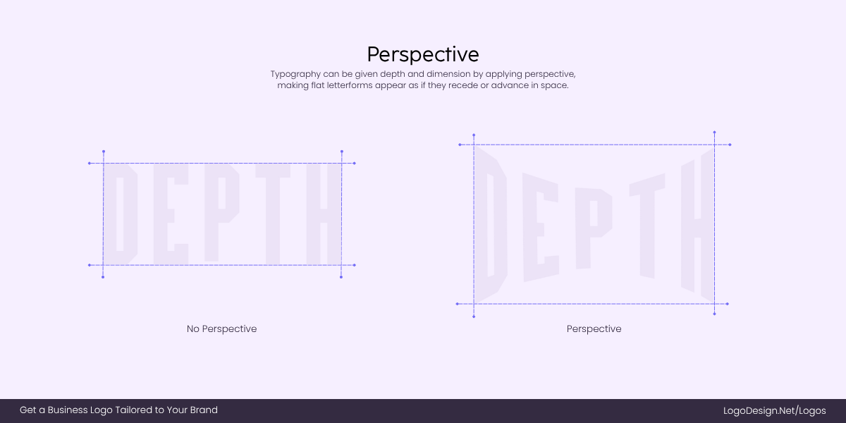
Perspective compensation makes 3D or tilted logos look visually correct, even if their geometry isn’t technically perfect.
When logos are designed to appear 3D, tilted, or used in angled environments (like on packaging, signage, or app icons), straight geometry often looks distorted. Designers apply perspective compensation by subtly reshaping elements so they look correct from the intended viewpoint, even if they’re technically “wrong” on paper.
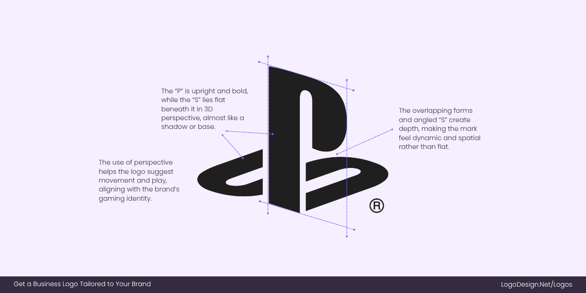
The PlayStation logo overlaps P and S by using perspective to appear naturally aligned.
The Sony PlayStation logo shows this principle. The “P” and “S” overlap in a perspective illusion, and their shapes are redrawn to look natural when combined, even though they wouldn’t line up mathematically.
Optical Balance ≠ Mathematical Symmetry
When you’re designing a business logo, snapping everything to a grid feels safe, but the eye plays by different rules. That’s why optical balance exists. It’s not about chasing flawless symmetry; it’s about knowing when to trust your instincts over your alignment tools.
Grids and smart guides are great tools—but they’re only starting points. At the end of the day, the final judge is always the human eye.
When Logos Fool the Eye (On Purpose)
Let us be clear that optical adjustments aren’t accidents; they’re deliberate choices designers make to avoid logo mistakes and make it feel balanced and natural, even when it isn’t mathematically perfect. Some of the most effective logos in the world quietly bend geometry to play to our perception. Below are a few brands that use clever optical tweaks.
Toyota – Balancing Overlapping Ellipses
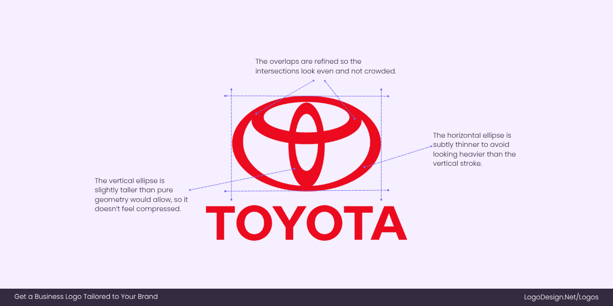
Toyota’s logo uses subtly adjusted ellipses to create balance and symmetry in the design.
The Toyota emblem is made of three ellipses, but they aren’t mathematically identical. The horizontal and vertical ellipses are subtly adjusted in thickness and height so they don’t appear lopsided. Without this tweak, one ellipse would look heavier, and the whole mark would feel off-center. The adjustments give the logo its signature symmetry and stability, even though strict geometry would make it look uneven.
LEGO – Letterforms With Overshoot
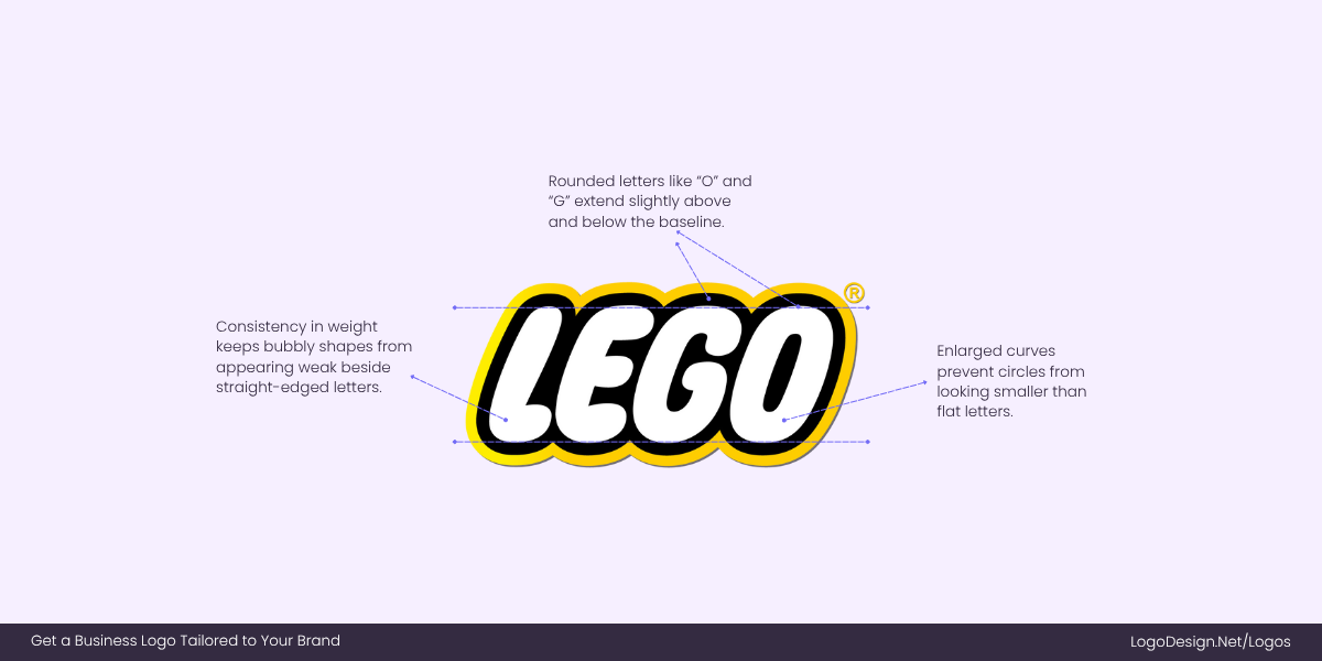
LEGO enlarges its round letters slightly above and below the baseline so circles don’t look smaller than straight edges.
In the LEGO wordmark, the rounded letters like “O” and “G” extend slightly above and below the baseline. This is a classic overshoot adjustment: perfect circles drawn to the same height as flat letters (like “L” or “E”). By enlarging the rounded letters just a touch, LEGO ensures the wordmark feels consistent and bold. Without it, the bubbly style would look shrunken next to straight edges.
Pringles – Optical Centering of Features
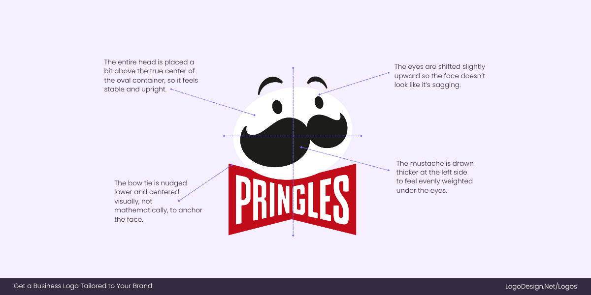
Mr. Pringle’s logo shows optical centering, where the wordmark appears slightly shifted so the design looks perfectly balanced.
Mr. Pringle’s face may look perfectly centered, but if you overlay a grid, you’ll see that his eyes, mustache, and bow tie are all slightly shifted. While this seems like a mistake, it’s optical centering. Because curves and asymmetrical elements can make a design feel like it’s sliding one way, the features are nudged into place until the character looks balanced. The result is a logo that feels stable, friendly, and instantly recognizable.
Google Maps – Adjusted Pin Proportions
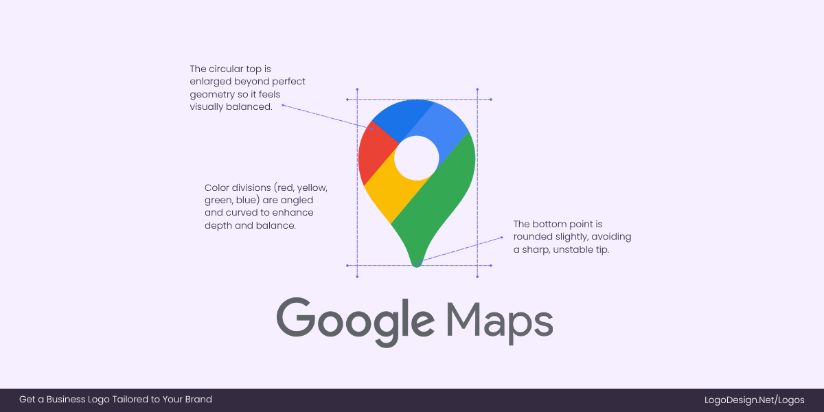
Designers tweaked the Google Maps pin’s proportions by softening and enlarging the circle to make it feel stable, instead of heavy.
The Google Maps pin is iconic, but a perfect circle sitting on a perfect triangle would be top-heavy and unbalanced. For this reason, designers enlarged and softened the circular top, making it slightly bigger than pure geometry would dictate. This way, the pin feels stable and inviting, not like it’s about to topple.
Unilever – Balancing Complexity With Negative Space
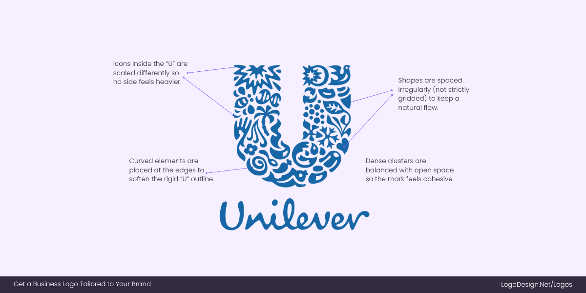
Unilever’s logo shows balanced chaos by using scaled icons placed optically for a cohesive, uncluttered look.
The Unilever “U” logo is made up of dozens of mini-icons, from leaves to fish. Instead of aligning these strictly within a grid, designers distributed them optically so the whole “U” feels balanced. Some elements are scaled up, others down, so the logo doesn’t look lopsided despite its complexity. Without these tweaks, it would feel cluttered instead of cohesive.
How to Sharpen Your Eye for Optical Balance
Even with smart tools, grids, and alignment features, your eye is the final judge. Achieving optical balance in logos takes practice, but there are simple tips you can use to sharpen your instincts.
• The Zoom-Out Test
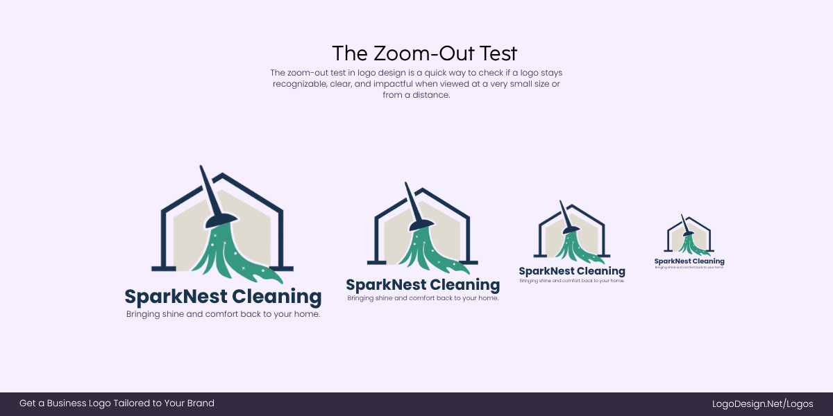
SparkNest Cleaning logo shows various zoom-out versions to show if the design stays balanced at small sizes.
A logo that looks balanced at full size can fall apart when scaled down. By zooming out, you force your brain to focus on the overall proportions rather than the details. If one side feels heavier or a shape seems to drift, that’s your cue to adjust. This trick is beneficial when making a versatile logo that works on tiny app icons or business cards.
• The Flip Trick
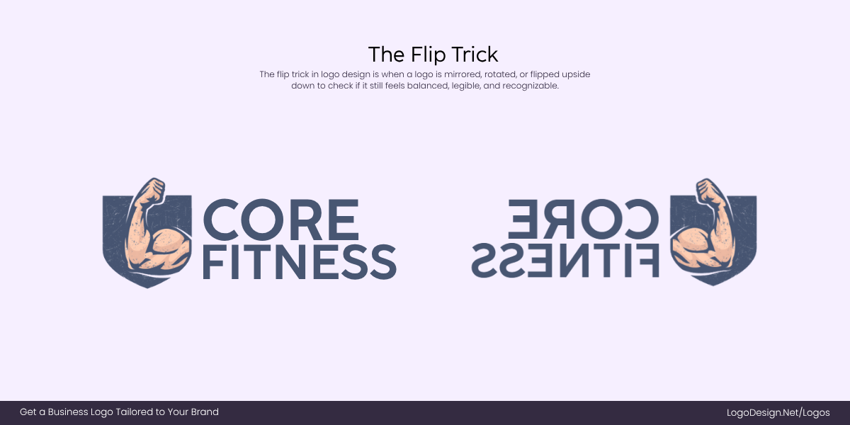
The Core Fitness logo using the flip trick to reveal hidden imbalances by breaking your brain’s pattern recognition.
Flipping your design horizontally or vertically is similar to giving your brain a fresh set of eyes. Suddenly, areas that looked fine before may seem tilted or off-center. This is because reversing the image breaks your pattern recognition and exposes imbalances you’d been “blind” to. Many experienced designers use this as their go-to test before finalizing a mark.
• The Backdrop Check
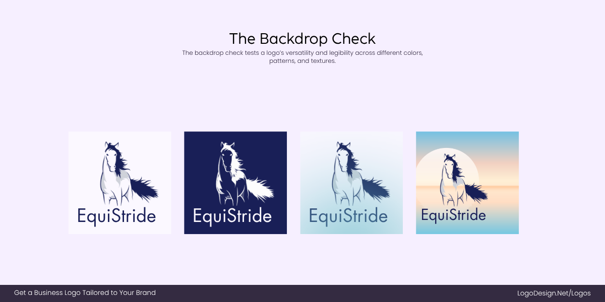
The EquiStride mascot logo tests the design in different background colors, contrast, and spacing to keep it consistent.
Logos rarely live on one background. A mark that looks perfect on white might feel too heavy on black or too faint on color. By testing across multiple backgrounds, you’ll see how contrast shifts visual weight. This is where optical adjustments like thinning strokes or micro/macro spacing ensure your logo feels consistent in every setting.
• The Proportion Overlay
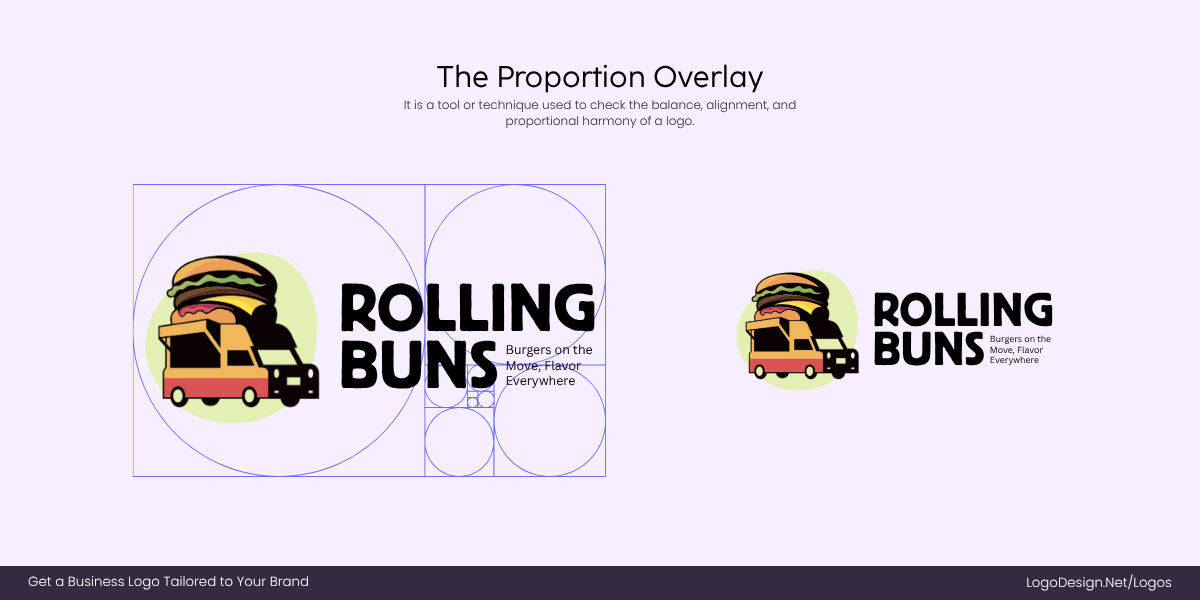
The Rolling Buns’ restaurant logo shows a proportion overlay to make it appealing to the eye, instead of having it geometric correct
Classic proportions like the golden ratio, grids, or isometric frameworks aren’t strict rules—they’re reference points. Overlaying them on your design can help you see if shapes are slightly off or if certain parts need optical correction. The goal isn’t to force geometry but to check whether your eye and the math agree.
• The Feedback Filter
Sometimes, the best test is a third eye. Clients or fellow designers may not know the technical term for what’s wrong, but they can sense when something feels “off.” Training yourself to listen, decode, and act on that feedback sharpens your ability to spot imbalances on your own. Over time, your eye becomes the ultimate alignment tool.
Bringing It Together: Optical Design Over Mathematical Rigidity
Perfect geometry might satisfy a grid, but it doesn’t always satisfy the human eye. A logo built only on mathematical precision can suffer from awkward spacing, poor readability, or an unsettling stiffness.
That’s why optical adjustments exist. By compensating for the quirks of human perception, you can create a logo that appears balanced, approachable, and trustworthy. No, it doesn’t mean distorting the design; it’s about enhancing it so the audience experiences harmony rather than distraction.
In branding, this distinction is crucial. People don’t judge a logo with rulers or alignment tools; they judge it by instinct. If it feels natural, it builds trust. If it feels awkward, it creates doubt.
The takeaway is simple: perfection in logo design isn’t always mathematical. The best logos succeed because they look right, even when they aren’t strictly “right.” In design, optical balance always trumps rigid geometry.
Glossary of Terms
Logo design comes with its own set of technical terms that may sound confusing at first. This glossary breaks them down in simple words so you can understand the principles behind optical adjustments more clearly.
• Baseline
The invisible line on which most letters sit in typography. Rounded or angled letters often extend slightly below the baseline as part of overshoot.
• Cap Height
The height of flat uppercase letters (like H or T). Rounded uppercase letters (like O or C) often rise slightly above this to maintain visual equality.
• Gestalt Principles
Design psychology rules that explain how people perceive shapes and patterns, like how our brains fill in missing details to see complete forms.
• Golden Ratio
A mathematical ratio (about 1.618:1) which is often used in design grids to create pleasing proportions, sometimes used as a guide for logo balance.
• Gravity Effects
An illusion where centered objects appear to “sink” downward, often corrected by nudging them slightly upward for true balance.
• Irradiation Phenomenon
A visual effect where lighter colors (like white) appear to expand against darker backgrounds, making shapes look larger than they really are.
• Negative Space
The empty space around or inside a logo’s shapes or letters. Designers use negative space strategically to create balance, clarity, or hidden meaning.
• Optical Adjustments
Subtle tweaks made to shapes, spacing, or proportions so a logo looks visually balanced to the human eye, even if it isn’t mathematically perfect.
• Optical Balance
The overall harmony of a design, achieved by trusting the eye rather than strict grids or mathematical symmetry.
• Optical Kerning
Adjusting the space between letters by eye instead of relying on exact measurements, ensuring words look evenly spaced and natural.
• Overshoot
When round letters or shapes (like O or circles) are drawn slightly taller or wider than flat letters to make them appear equal in size.
• Perspective Compensation
Small adjustments made to shapes in 3D or angled designs so they look correct from the intended viewing angle, even if distorted on paper.
• Proportion Overlay
The practice of checking logo shapes against reference frameworks (like grids or the golden ratio) to spot areas that may need optical correction.
• Visual Weight
The perceived “heaviness” or dominance of a shape or line. Bold elements look heavier than thin ones, even if they take up the same space.
