SALES / SUPPORT : 844-232-4816
61 Famous Logos’ Fun Facts and their Meanings
If you think about it, you probably come across several logos every day. While some of them are instantly recognizable and can be spotted easily on shoes, clothes or food items, others you might be able to recall from memory. Have you ever looked at a logo and wondered about the story behind it? Some of the most famous brand logos across the globe weren’t just created in a day. A few of them did not even become popular until much later.
Take any known logo design that you see around all the time such as Starbucks or Coca-Cola. They actually have very interesting stories behind their creation. There are such surprising facts and meanings behind popular icons that you may have never guessed.
To give you an insight into the facts and meanings that are found in famous logos, we have compiled a list of some highly engaging ones. Some of them might be very surprising!
- Carpentry Logos
- Meat Butcher Logos
- Temple Logos
- Pub Logos
- Chicken Restaurant Logos
- Ngo Logos
- Night Club Logos
- Martial Arts Logos
- Laser Logos
Logo Design Stats
After extensive research, we’ve found these key discoveries that have been made about logo design trends.
Over 60 Percent of Famous Logos are Combination Marks
Combination logos are a popular type of logo being used by some of the most famous brands in the world. For logo design beginners this basically means combining two types of logos together. So you can have a wordmark with a monogram, picture or abstract mark.
Target, Adidas, Amazon, Airbnb, Microsoft and Burger King are a few examples of combination marks that are recognized everywhere.
Image Source: Wikimedia
Image Source: Wikimedia
65 Percent of Brands have the Colors Blue and Red in their Logos
According to data and observations, blue and red are highly popular colors used by famous brands in their logos. Around 35 percent of the top companies use blue while 30 percent go with red logos. In the chart below, you can see some of the colors used by well-known corporations distributed across 26 industries.
Both blue and red are a widely popular choice in every sector. Some examples of blue logo designs include Facebook, IBM, Ford, PayPal and Twitter. While a few widely recognized red brand symbols are Coca-Cola, Netflix, Target, Adobe and Levi’s.
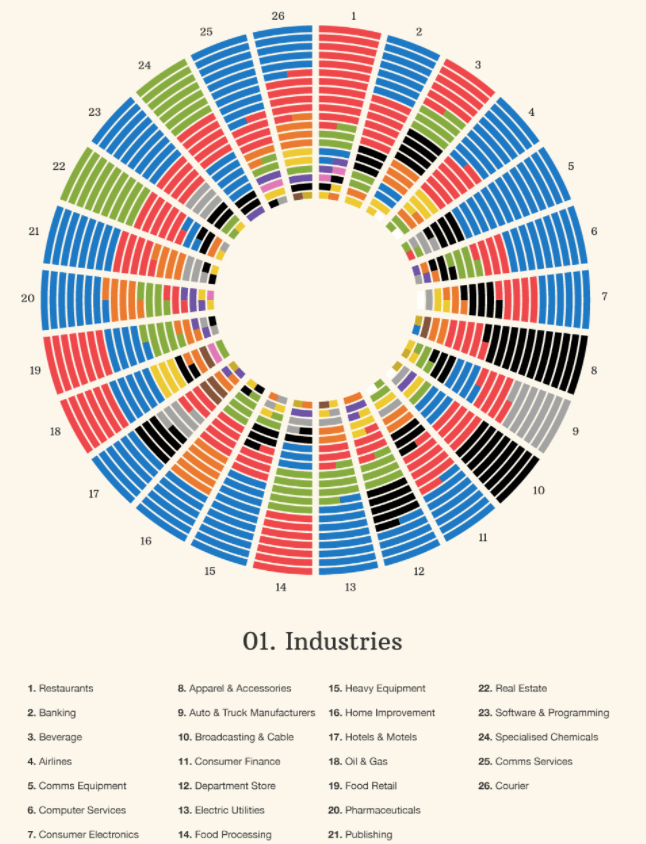
Image Source: digitalsynopsis.com
73 Percent of Famous Logos Use Sans Serif Font
Logos of brands such as Subway, Panasonic, JCPenney, Chanel and Toyota all feature a Sans Serif font style. According to data, around 3/4 th of the most famous brands in the world have Sans Serif fonts and typefaces. Helvetica is widely used in a lot of popular brand identity designs.
Image Source: Wikimedia
Amazon is the most Valuable Brand in the World
The company’s ecommerce logo design is recognized by billions of people across all ages. It ranks first on the list of the most valuable brands in the world followed by Apple and Google.
Coca-Cola’s Logo Cost $0 to Design
With a brand value of over $84 billion, you would expect the beverage company logo to cost a lot. The original logo made in 1886 was designed by one of the founding partners and bookkeeper, costing the corporation nothing.
Image Source: Wikimedia
The Top Five Brands in the World are all in the Tech Industry
Samsung, Apple, Amazon, Microsoft and Google brands are ranked as the most valuable companies across the world. They are all worth between made in 1886$100 to $260 billion as of 2021.

It took Nike’s Logo Designer 17.5 hours to Come up with the Swoosh
Carolyn Davidson, the graphic design student known for designing one of the most famous logos of the modern times, created the swoosh in 17.5 hours. Some experts believe that it took her slightly more than that since a few drafts were initially rejected. However, she charged the founders for only that amount of time.

The Brand Identity Design for FedEx has over 40 Awards
Given the iconic design of the logo, it is no surprise that it has been listed among the best ones. The brand symbol has won over 40 awards since its creation.
Image Source: Wikimedia
15 Percent of Small Businesses Would Pay more than $1000 for a Logo
In a research report, it was discovered that around 15 percent of small businesses would pay over $1000 for a good logo design. Other than that, 65 percent are willing to pay at least $500 to $1000.
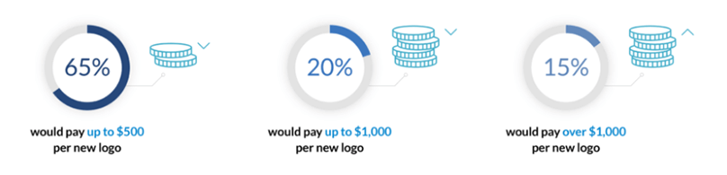
Image Source: financesonline.com
McDonald’s Logo is Inspired by the Restaurant’s First building
When the restaurant started to become famous, the founders hired a new architect to change the design of the building. Stanley Clark Meston came up with the Golden Arches that became the inspiration behind the popular fast food restaurant logo.
MGM have Changed Six Live Lions in their Logo Since 1916
The movie company is known for the lion mascot in the logo design. Over the years, they have made use of six different real lions before switching to a CGI one in 2021.
Fun Facts about Logos
You just might be surprised to learn some of these fun facts about the logos of your favorite brands! Here is a list of them.
Image Source: Pinterest
Nike’s Logo Designer got Paid in Stocks
It is widely known that the legendary swoosh logo was designed by graphic design student Carolyn Davidson in 1971. While she was initially paid $35 for it, her actual compensation was the company’s stocks. Phil Knight, Nike’s co-founder, gave her stocks and a swoosh ring in gold almost 12 years later as the business achieved success.

Gap's Failed Rebranding Cost the Company $100 Million
The company introduced a new clothing logo and announced that they were rebranding in 2010. The response to it was so negative that the corporation went back to its original design in six days. It also cost them around $100 million.
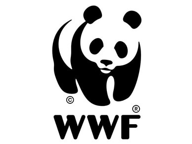
The WWF Panda Logo was Chosen to Reduce Printing Costs
You may be able to recognize the panda anywhere today. In the beginning, the organization picked the symbol to make a strong impact with minimal printing costs. The black and white color of the panda means that the costs remain quite low.
Stella Artois's Logo was Created in 1336
While there is debate about this beer company logo being the oldest one being used today, Stella Artois created the brand mark more than 600 years ago.
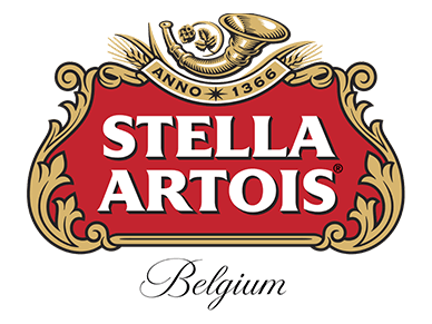
Image Source: Wikimedia
The Adidas Logo Mountain Stripes Represent Challenge
The company is known for the three stripes in its logo which stand out on all the products. Its variation, which looks like a mountains logo has been created to showcase a difficult challenge or ‘climb’ that has to be overcome.

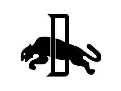
Puma's First Symbol was the Cat Jumping through the Letter ‘D’
In 1948, the company introduced its logo with the wild cat making a jump through a ‘D’. This initial was taken from the name of the founder, Rudolph Dassler. It was used until 1968.
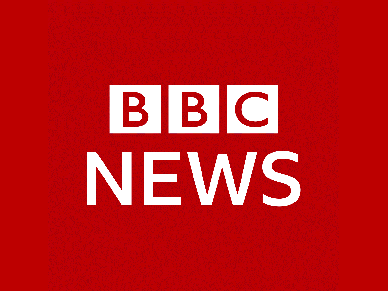
BBC Paid $1.8 million for its Current Logo
The broadcasting network introduced the simple logo design in 1997. It cost them a total of $1.8 million and ranks among one of the most expensive icons in the world.
The Lowercase 'n' in 7-ELEVEn is used for its Friendly Appearance
When the logo for the company was created, the wife of the President thought it looked quite aggressive. The lowercase letter ‘n’ was added to make the all caps design friendlier.
Domino’s Pizza Introduced 3 Dots in their Logo to Symbolize the Number of Restaurants
The pizza chain started to become popular during the 1960s. The founder came up with the 3 dots in the pizza restaurant logo during 1965 to represent the three restaurants that had opened up. Originally, it was decided that a dot would be added to the brand mark every time a new Domino’s Pizza began working. As the corporation started to grow quickly, this became impossible.
The Bird in Twitter’s Logo is Named after a Basketball Legend
You may not be aware of the fact that the bird logo used as Twitter’s symbol has a very interesting name. The company’s co-founder, Biz Stone, comes from Boston and he named the icon after legendary basketball player, Larry Bird. The athlete played for the Boston Celtics.
Symantec Acquired Verisign and the Deal Cost $1.28 Billion
The company which is presently known as NortonLifeLock was reported to spend over a billion dollars on its rebranding in 2010. This is actually not the whole truth. Synmantec took over VeriSign and got ownership of their tick mark as well.
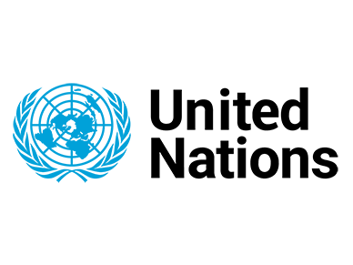
The United Nations Emblem Shows the World Map from the North Pole
It is actually a little known fact that the symbol of the United Nations features the world map from an angle taken from the North Pole. The laurel wreath stands for peace. The North Pole was chosen to avoid making any one country more important than the other.
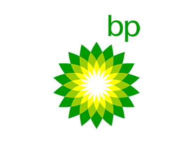
British Petroleum’s Rebranding Failed after the Oil Spill in 2010
The company introduced a new logo in the 2000s and launched a rebranding strategy to show itself as environmentally conscious. This plan took a huge hit when the oil spill disaster occurred in 2010. BP paid $211 million for its current logo which is now considered a rebranding failure.
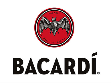
The Bat Found in Bacardi’s Logo is actually Found in Mexico
Bacardi made the choice to use a specific type of bat in their logo that is known for its ability to protect sugarcane crops from harmful insects. It is called a free-tailed or fruit bat and happens to be found in Mexico. The bats are considered a lucky charm by Mexicans as well.
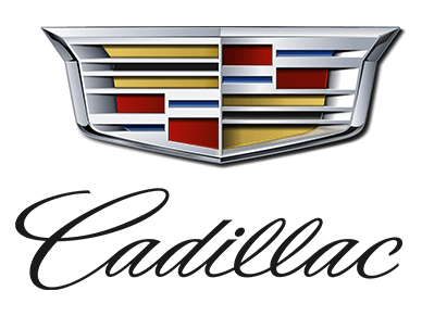
Cadillac’s Logo Crest is Inspired by the Family Symbol of Detroit’s Founder
It may be a bit difficult for you to believe but the famous crest in Cadillac’s brand symbol is inspired by the founder of Detroit’s coat of arms. His name was Antoine de la Mothe Cadillac and he had roots going back to French Royalty.
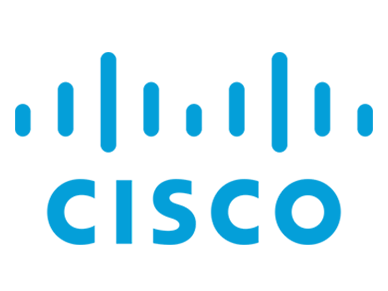
The Tech Company, Cisco, has the Golden Gate Bridge as Their Logo
The company’s name is taken from San Francisco which is sometimes referred to as ‘cisco’. Its original technology logo had both the towers of the golden gate bridge and the current one represents the shape and structure as well.
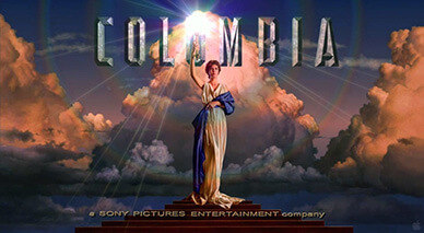
Jennifer Joseph is the Torch Girl in Columbia Pictures’ Brand Mark
You may have come across the logo with the woman holding the torch on your screen many times. It is a real model named Jennifer Joseph who is a graphic designer. Her shoot for one of the most famous entertainment brand identity designs was the first and last time she modeled.
Michael Jordan is not Jumping for a Dunk in the Jumpman Logo
Nike’s collaboration with Michael Jordan has been quite successful and led to the creation of the line known as Jumpman. Its basketball logo is the silhouette of the legend jumping with a ball. Surprisingly, he is not going for a dunk but actually doing a ballet move.

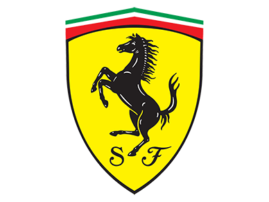
Ferrari’s Horse is Taken from the Plane of a WWI Fighter Pilot
Enzo Ferrari, the founder of the automobile company, began using the dancing horse in his logo after meeting the parents of pilot Francesco Barraca. You might find this quite surprising but the symbol was used by Barraca on his plane when he flew in WWI. The pilot’s parents met Ferrari and thought that he should use the horse as a sign of good luck on his cars.
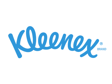
Saul Bass Designed the most Long Lasting Logos
The designer was one of the widely recognized names in graphic design and continues to be an inspiration for many. He has designed some of the most popular logos across the world which include Quaker Oats, AT & T, Kleenex and United Airlines. The logo designs of Saul Bass are known to last for 34 years on average, with a few of them still in use today.
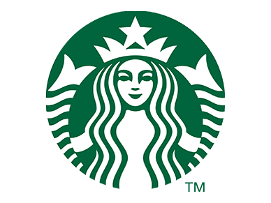
The Starbucks Siren went through a Minor Change in the Redesign
When the company launched their coffee brand logo redesign in 2011, there was a minor detail that most people missed. You may be very surprised to know that the designers made a very small change to the famous siren’s face and added a longer dip on the left side. If you look closely, you will see it!
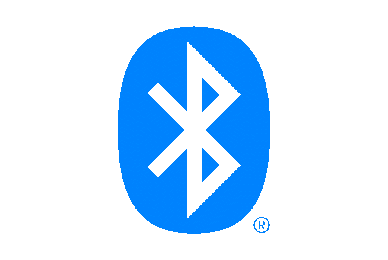
Bluetooth’s Logo is a Combination of Runic Letters
The popular icon that you see on your phones everyday has quite an interesting story behind it. Both the symbols are taken from the name of a Viking King known to rule Denmark. The logo has two runic or Nordic letters, ‘B’ and ‘H’ which are the initials of the ruler. He was also rumored to have a broken tooth that was blue.
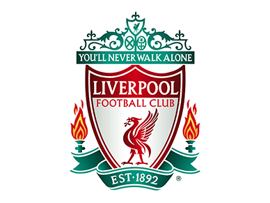
Liverpool Football Club’s Logo Design Pays Tribute to Victims of a Disaster
One of the most famous football clubs across Europe and the United Kingdom, Liverpool, has quite an elaborate football team logo design. Its emblem features two lit flames which are a tribute to the 96 casualties that were a result of the Hillsborough Disaster. It was the biggest tragedy in football where people died in an incident of human crush.
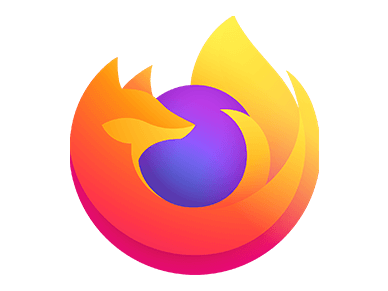
The Icon of Mozilla Firefox has a Red Panda on it
Despite the name of the browser, there is no fox in the logo. Mozilla Firefox’s brand identity design has always been a red panda which is a protected and rare species. The recent change attracted a lot of attention from their loyal customers as people thought that the ‘fox’ had disappeared. However, a clarification was issued by the company that the symbol was still very much a part of the logo design.
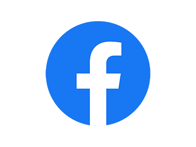
Mark Zuckerberg is Colorblind so he Chose Blue for Facebook’s Logo
The reason why Mark Zuckerberg picked blue for the social media network’s logo is that he happens to be colorblind. It is the most prominent color for him in the spectrum and he cannot see much of red or green. So Zuckerberg chose to make this the primary brand color of Facebook.
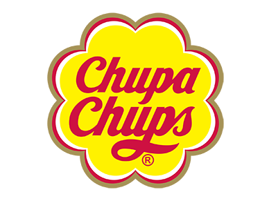
Salvodar Dali Designed a Logo for a Candy Brand
Dali, who was a widely recognized artist of the modern times, turned into a logo designer for just once in his career. He designed the brand symbol of Lollipop brand Chupa Chups. It has only been minimally upgraded with the icon keeping to most of its original design.
Hidden Meanings in Logos
While you might have learnt a lot of unknown facts about your favorite logos here, the mystery doesn’t end right now. There are many logos that we see everyday and a number of them have cleverly hidden meanings in their design. Here are a few that you may not have noticed as yet.
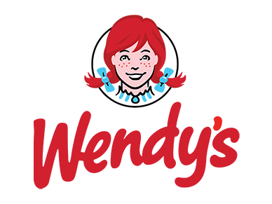
The Girl in Wendy’s Symbol has ‘Mom’ Written on her Collar
The restaurant chain is known for the smiling girl, Wendy, in their logo. Now, you may already be familiar with the fact that the image is inspired by the owner’s daughter but very few people are aware that there is the word ‘mom’ written on the collar.
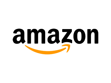
Amazon’s Arrow Represents that the Company has Everything from A to Z
The arrow in the tech giant’s logo is usually considered a ‘smile’ below the wordmark. However, it goes from A to Z and shows that the marketplace has all kinds of products in every category.
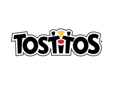
The Two ‘T’s in Tostitos’ Logo are People Holding a Tortilla Chip
Tostitos logo design has two prominent ‘T’s which represent two people with a tortilla chip. They are holding it over the dip or bowl of salsa which is the dot on the letter ‘I’.
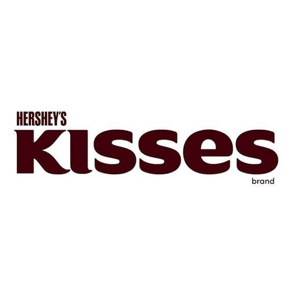
Hershey’s Kisses Features their ‘Kiss’ in the Logo
You can almost miss it at first glance. If you tilt your head slightly, you will see that there is a triangular space between the first two letters forming into a kiss in the logo wordmark. This design between K and I is similar to the chocolate shaped ‘kisses’ inside the packaging.
Source
Baskin Robbins has the Number 31 in their Brand Mark
If you look closely, you will see that the letters ‘BR’ also have the number 31 incorporated within them. The ice cream logo was chosen to showcase the number of flavors that the company has to offer.

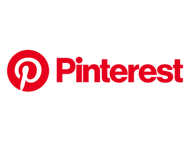
There is Actually a Pin in the Logo of Pinterest
The social media network is known for its famous ‘P’ in its symbol. While the detail is easy to miss, you will actually find a pin in a logo design that is used to put up pictures or messages on a wall.
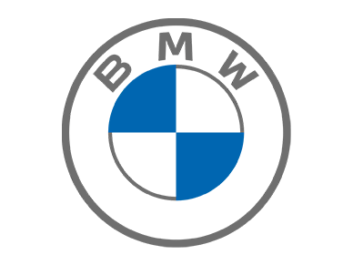
BMW’s icon Features the Official Colors of Bavaria
It is commonly believed that the company has a propeller in its logo and the colors showcase the wind or air. This is actually not true. BMW has used the official Bavarian colors of the state which is located in Germany. The corporation began manufacturing cars in the town.
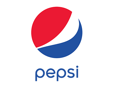
Pepsi’s Logo Rebrand Showcases the Magnetic Field Around Earth
The corporation redesigned its minimalistic logo during 2008. Its color palette and symbol are said to represent the magnetic field of the planet and Feng Shui.
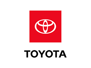
The Toyota Logo can also be seen as a Thread Passing through the Needle Eye
Toyota’s brand mark represents the ‘heart’ of the company. If you look closely, you will realize that one of the core designs in the logo is of a thread going through the needle eye, which symbolizes its origin. In 1946, Toyota was known for producing high-quality sewing machines.
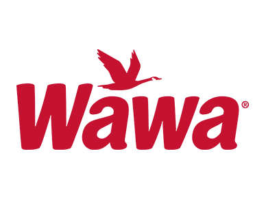
Wawa means Flying goose in Native American
If you have ever wondered why there is a goose in the corporation’s brand symbol, well, there’s your answer! Since the name translates to ‘flying goose’, its logo also has one.
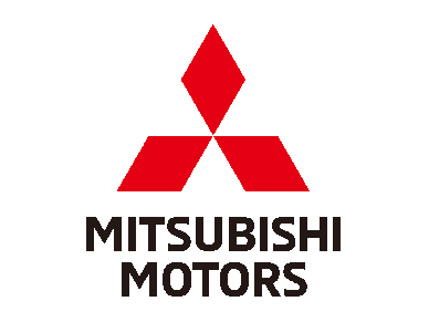
The three Diamonds in Mitsubishi Represent its Name
In Japanese, Mitsubishi is a combination of words which mean ‘three diamonds’. The name combines ‘mitsu’ which stands for three and ‘hishi’ that is used to describe diamond logo or rhombus shapes.
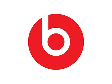
Beats by Dre has an Icon Featuring a Head Wearing Headphones
The ‘b’ in the symbol is actually a head from the side which is wearing headphones. Look closely and you will spot it too!
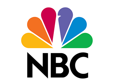
The Colors in NBC’s Logo Represent the Company’s Divisions
There is no doubt that the logo design looks like a peacock and even stands for the network’s motto, ‘proud as a peacock’. However, the colors have a deeper meaning than just representing the bird. Each color in the symbol highlights a division of NBC.
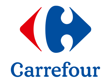
Carrefour means ‘Crossroads’ which is Shown in their Logo Design
The supermarket chain has a name which translates to ‘crossroads’ and there are two opposite arrows in the logo to represent that.
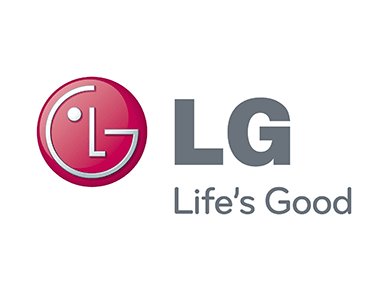
There is a Smiling Face in LG’s Brand Mark
You will discover that the corporation has created a smiling face in its logo with the initials L and G. In the middle, there is a nose formed with L while G creates a smile on the face.
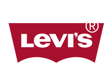
Levi’s Bat Shape also Represents the Pocket Design in their Denims
It is known that the bat shape in Levi’s logo has been inspired by Batman. However, what you may not be aware of is that it also showcases the design of the back pocket on their jeans.
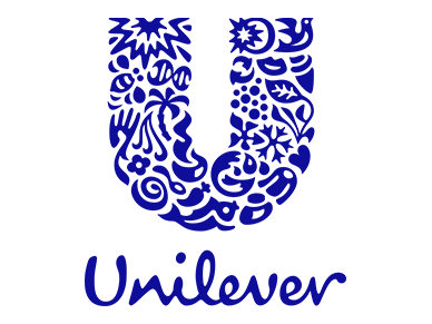
The ‘U’ in Unilever’s Logo has Symbols from its Sub- Brands
Unilever has created its ‘U’ logo to highlight the company’s values and its sub-brands or core products as well. There are 25 elements that make the U that stand for all the products and brands that the corporation is known for.
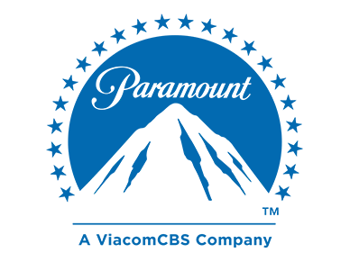
The 22 stars in Paramount’s Brand Symbol Represent the Stars Signed by the Studio
When the studio began, it made deals with many famous actors. In 1916, its logo was launched with 22 stars that represented the number of celebrities who were under contract with the company..
Evernote’s Elephant was Chosen because the Aanimal is known for its Good Memory
The note-keeping app has an elephant in the logo design which was mainly picked for its memory. Experts have stated that this is one animal that has a great memory and can remember everything which is similar to what Evernote does.
The Four Rings in Audi Showcase the Merger of Four Automobile Companies
Audi was founded with the merger of four car manufacturers and its logo stands for that. The four interconnected rings highlight the creation of the company.

Hyundai's ‘H’ Showcases two People Shaking Hands
Mostly, people believe that the H stands for the name of the company. It actually showcases the values of the brand where customer satisfaction is the priority. The letter symbolizes two people shaking hands in the logo which probably means that an agreement has been made.
The Logo for Patek Philippe was Used to Represent the Knights of Calatrava
The creator of Patek Phillippe chose the cross due to its rich history which dates back to the 12th Century. This symbol represented the Order of Calatrava which was made of powerful knights who were ready for battle at all times.
There is a Chicken in Chick-Fil-A’s Brand Mark
It is actually quite visible and you can see the chicken restaurant logo design clearly on a closer look. The ‘C’ of Chick-Fil-A has a small chicken which highlights the specialty of the restaurant.
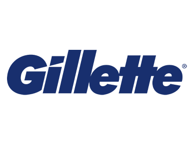
Gillette’s Logo Highlights the Razor Sharp Cut of their Products
If you observe the first two letters of the wordmark, you will see that they appear as if cut or sliced by a razor. The dot on the ‘I’ and the end of ‘G’ are designed to showcase an angle created by the product.
These are some creative facts and meanings behind some of the most well-known logos in the world. If you are looking for your next inspiration, you can look through a few ideas that might take you in the right direction. Logo designing is almost an art and with the right use of colors, typography and imagery, you can create a brand identity which your audience remembers for years.
- Dry Cleaner Logos
- Diner Logos
- Lab Logos
- Dermatologist Logos
- Culinary Cuisine Logos
- Tour Logos
- Conference Logos
- Festival Logos
- Circus Logos