Circles bring calm, triangles bring energy, and squares keep things grounded. Pair them together just right and you’ve got yourself a logo that clicks, pops, and sticks in memory.
A single shape can express clarity and simplicity — but logos rarely rely on just one. What truly defines meaning is the relationship between shapes. When circles meet squares, or triangles intersect with curves, something more powerful emerges: emotion, tension, and harmony all working together.
Most successful brands use multiple shapes to add depth and dimension to their identity. A circle can soften a square’s rigidity, while a triangle can inject energy into an otherwise calm composition. These interactions allow designers to simultaneously express balance, innovation, and connection — transforming basic geometry into a cohesive visual story.
This article explores how combining shapes enhances logo storytelling, recognition, and emotional resonance. While shape psychology looks at what individual forms represent, shape combination theory dives deeper into how these forms interact and how contrast, alignment, and proportion can make a logo feel unified, dynamic, and unforgettable.
The Science and Psychology of Shape Interaction
Behind every effective logo lies a visual system rooted in how the human brain organizes and interprets form. Shapes don’t exist in isolation; they interact according to cognitive and perceptual rules that influence how we perceive unity, contrast, and meaning. Understanding the science behind these interactions — from Gestalt theory to cross-cultural perception — helps designers craft logos that feel balanced, memorable, and emotionally resonant.
• Gestalt Principles in Shape Combinations
Gestalt principles explain that people naturally group and interpret visual elements based on proximity, similarity, continuity, and common fate. When shapes share alignment, proportion, or rhythm, the viewer perceives them as one cohesive form — the logo feels unified and intentional.
The Spotify logo has three curved lines of different weights, giving the feeling of sound and rhythm.
For example, the Spotify logo combines curved lines and a circular boundary, applying the principle of proximity — the lines are spaced closely enough to be perceived as a unified wave inside the circle. Spotify is one of those brands that uses a combination of shapes and spacing to convey cohesion, rhythm, and the feeling of sound in motion.
The SoundCloud logo shows a sequence of vertical bars with equal spacing, creating a musical rhythm.
The SoundCloud logo pairs a half-circle cloud form with a sequence of vertical bars, using the principle of similarity to tie varied shapes together through consistent curvature and spacing, reflecting harmony and musical rhythm.
The NBC logo has a series of teardrop-like icons, which look like peacock wings to the eye.
Meanwhile, the NBC logo unites teardrop-like shapes in a circular arc, applying continuity so the eye follows a smooth, radiating motion from the center outward. In each case, the interplay between geometric forms and Gestalt principles transforms simple shapes into a cohesive visual story that feels purposeful, balanced, and emotionally resonant.
Conversely, when these principles are disrupted, the design may appear fragmented or unstable.
• Cognitive Processing
Our brains are wired to seek order and reduce complexity. Research in visual cognition and brand psychology shows that logos with complementary shapes are easier to process, evoking familiarity and trust. Contrasting shapes, on the other hand, demand more attention — they create visual tension that enhances memorability. This is where managing the cognitive load becomes crucial: minimalist logos use simple, complementary shapes to make recognition effortless, while maximalist logos rely on layered or contrasting forms to engage the viewer more deeply and leave a lasting impression.
The icon in the Toyota logo combines three overlapping ellipses, that form the letter ‘T’ to the eye, when it’s connected.
The Toyota logo combines three overlapping ellipses — circular shapes that intersect to form a symmetrical, unified mark. This arrangement creates harmony and familiarity, symbolizing connection and trust while making it easy for the brain to process.
The AT&T logo has layered curved lines that, when combined, form a spherical design, hinting at global connectivity.
The AT&T logo also builds on circular geometry, using layered curved lines within a sphere to suggest global connectivity and depth. The repetition of smooth contours reinforces order and balance, making the brand instantly recognizable.
The Delta logo has two upwards triangles to show progress and energy.
In contrast, the Delta Air Lines logo uses a triangle nested within another triangular frame, introducing sharp, directional energy that commands attention while remaining stable and minimal. Together, these examples show how shape combinations — whether circular and soft or angular and structured — influence cognitive ease, emotional response, and brand memorability.
• Cultural Dimensions
Shape combinations also carry meaning that transcends perception and enters the realm of culture. In many Eastern visual systems, a circle and square pairing symbolizes the harmony between heaven and earth — spiritual balance and grounded reality.
In contrast, Western interpretations of the same forms often frame them as a dialogue between emotion (circle) and logic (square). These cultural dimensions explain why similar shape pairings can evoke different feelings across audiences.
Recognizing these nuances allows designers to use shape combinations that resonate authentically within specific cultural contexts while maintaining universal appeal.
The Starbucks logo brings a modern and ancient feel with a circular frame that shows unity and motion.
The Starbucks logo beautifully shows how shape combinations can express cultural depth. The circular badge — symbolizing unity and inclusivity — frames a mythical siren drawn with wavy, organic lines that evoke motion and emotion. This contrast between the structured circle and fluid curves reflects a balance between Western order and ancient storytelling, blending modern design precision with timeless mythic symbolism.
The Bank of China logo combines the round heaven and square earth to show a harmonious appeal.
The Bank of China logo perfectly embodies the traditional Chinese concept of Tian Yuan Di Fang — “round heaven, square earth.” The circular form represents unity and the cosmic order, while the inner square evokes structure, stability, and the physical world. Together, they reflect the balance between spiritual harmony and practical grounding.
The three connected diamond-like icons in the Mitsubishi logo show precision and harmony.
The Mitsubishi logo blends samurai symbolism (loyalty and integrity) with geometric precision. The triangular forms overlap in harmony — a reflection of unity, strength, and purpose, deeply tied to Japanese minimalism and mon values (balance through contrast).
• Emotional Connection with Contrast
Humans are naturally drawn to contrast, as opposites stimulate attention and emotional response. When designers combine shapes with differing traits, such as the stability of a square with the fluidity of a circle, the result is tension that feels alive.
A circle combined with a square pairs harmony with structure, approachability with reliability. This combination conveys balance, professionalism, and trustworthiness while still feeling friendly.
Domino’s logo has a rounded square shape and friendly dots, which combine to show approachability.
The Domino’s restaurant logo pairs a rounded square with circular dots, blending structure with friendliness. This contrast conveys reliability and trust while remaining approachable and playful, making the brand feel both dependable and inviting.
A circle combined with a triangle pairs softness with sharpness, stability with movement. This combination can bring out a sense of confidence.

The Telegram logo uses a sharp paper plane within a soft circle, showing speed and energy.
The Telegram logo combines a triangle (the paper plane) with a circular background, pairing sharpness with softness and motion with inclusivity. This contrast conveys speed, energy, and forward momentum while remaining friendly, approachable, and confident, reflecting the brand’s focus on dynamic yet user-friendly communication.
A hexagon combined with a circle pairs precision with continuity and technicality with community. This combination conveys efficiency, innovation, and collaboration, making it feel both strong and inviting.
Calendly’s logo has a hexagon to show precision, and the circular shape forms the letter ‘C’.
The Calendly logo blends a rounded hexagon with circular curves, merging precision with flow. The hexagon adds structure, reliability, and efficiency, while the circular “C” brings warmth, approachability, and motion. Together, these contrasting shapes create a sense of balance — a harmony between order and ease, perfectly reflecting Calendly’s goal of simplifying scheduling.
Contrast in shapes can also showcase opposite brand values such as innovation and tradition, simplicity and sophistication, or structure and creativity. An oval or ellipse with a square can humanize a tech company’s sharp, futuristic identity.
• Convey Brand Meaning through Harmony
While contrast creates energy, harmony builds trust. When shapes share similar curves, proportions, or alignment, they evoke calm balance and professionalism. Viewers perceive these designs as stable and intentional, leading to feelings of safety and reliability.
The Pepsi logo has thick curves and bold colors to show harmony and motion.
The Pepsi logo achieves harmony through its symmetrical circle and balanced wave division. The red, white, and blue curves mirror each other, creating motion with stability. This interplay of shapes conveys energy, balance, and youthful confidence.
The Walmart logo has a rounded wordmark and six-point spark to show friendliness and trust.
The Walmart logo shows harmony through its rounded wordmark and six-point spark symbol. Each ray radiates evenly, echoing the type’s smooth curves. Their shared proportions express clarity, friendliness, and trust.
Sanofi’s logo uses circles and gentle curves to form an abstract ‘S,’ showing stability and care.
The Sanofi logo uses repetition and symmetry to create visual calm. Two identical circles balance a soft, curved line forming an abstract “S.” The consistent curves and spacing in the logo convey care, stability, and warmth.
Combining shapes that work together in a design is a good idea, like circular corners on a square or soft curves inside a triangle. This results in unity and harmony, and also shows that the brand’s values align well.
• Balancing Logic with Emotion
Every strong logo connects with both the rational and emotional sides of perception. Geometric logo shapes like squares and triangles represent structure, order, and reason — they appeal to logic. Organic shapes such as circles and curves suggest empathy, inclusivity, and emotional warmth.
The Chase Bank logo has an interlocking octagon to show motion and openness.
The Chase Bank logo embodies this balance through its structured octagonal shape composed of interlocking geometric segments. The sharp symmetry reflects discipline and reliability, yet the continuous, rotating motion within the form adds a sense of flow and openness — logic meeting approachability.
Slack’s logo features a color icon with playful curves, showing warmth and balance.
In Slack’s logo, the tension between rigid alignment and soft, rounded edges captures this same duality. The grid-based cross suggests clarity and function, while the colorful, curved elements radiate friendliness and collaboration — an emotional counterpoint to the systemized structure.
Volkswagen’s logo has a sharp ‘V’ and ‘W’ enclosed in a circle to display precision and harmony in the design.
The Volkswagen emblem also demonstrates this equilibrium beautifully. The precise, angular letters “V” and “W” are perfectly nested within a circular frame. The circle softens the mechanical precision of the inner shapes, symbolizing unity, community, and trust layered over engineering rigor.
• Communicating Motion or Forward-Thinking
Shape combinations can also imply motion and progress — essential qualities for brands that want to feel innovative or transformative. Triangles within or beside circular forms create upward thrust, while overlapping and tapering shapes convey speed and direction.
BP’s logo, with the sunflower-inspired design, shows energy and the company’s evolution toward sustainable transformation.
The BP (British Petroleum) logo demonstrates this concept through its radiating sunflower-inspired logo. Built from layered, pointed shapes expanding outward, it conveys energy, renewal, and constant evolution. The circular core grounds the design in stability, while the outward motion of the geometric petals expresses progress and sustainable transformation — a visual metaphor for the company’s transition toward cleaner energy.
The AllTrails logo’s upward triangle signals adventure and continuous movement through nature.
The AllTrails logo also captures a sense of motion through its triangular mountain symbol enclosed within a circular frame. The upward triangle represents ascent, adventure, and discovery, while the circular enclosure adds continuity and inclusiveness. This interaction between sharp and curved shapes creates visual lift — a forward motion that mirrors the brand’s spirit of exploration and movement through nature.
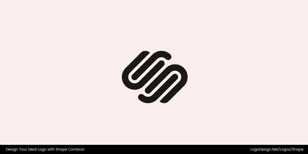
The Squarespace logo uses interlocking S-shapes that create a flow, signaling continuous innovation.
In the Squarespace logo, two interlocking “S” forms twist and overlap, creating a seamless loop that suggests flow and evolution. The symmetry grounds the logo in logic and precision, while the intertwined shapes introduce motion and adaptability. The result is a visual rhythm — one that reflects creativity in motion and continuous innovation.
Whether through radiating geometry, rising forms, or interwoven lines, these logos show how shape combinations can express momentum, growth, and a brand’s readiness to move boldly into the future.
The Types of Shape Relationships
Every logo is built on relationships — not just between colors and typography, but between the shapes that define its visual structure. How these forms interact determines whether a logo feels calm or dynamic, unified or complex. From harmonious pairings to energetic contrasts, the relationships between shapes give logos their personality and emotional tone. Let’s explore five key types of shape relationships and what they communicate.
1. Complementary Shapes
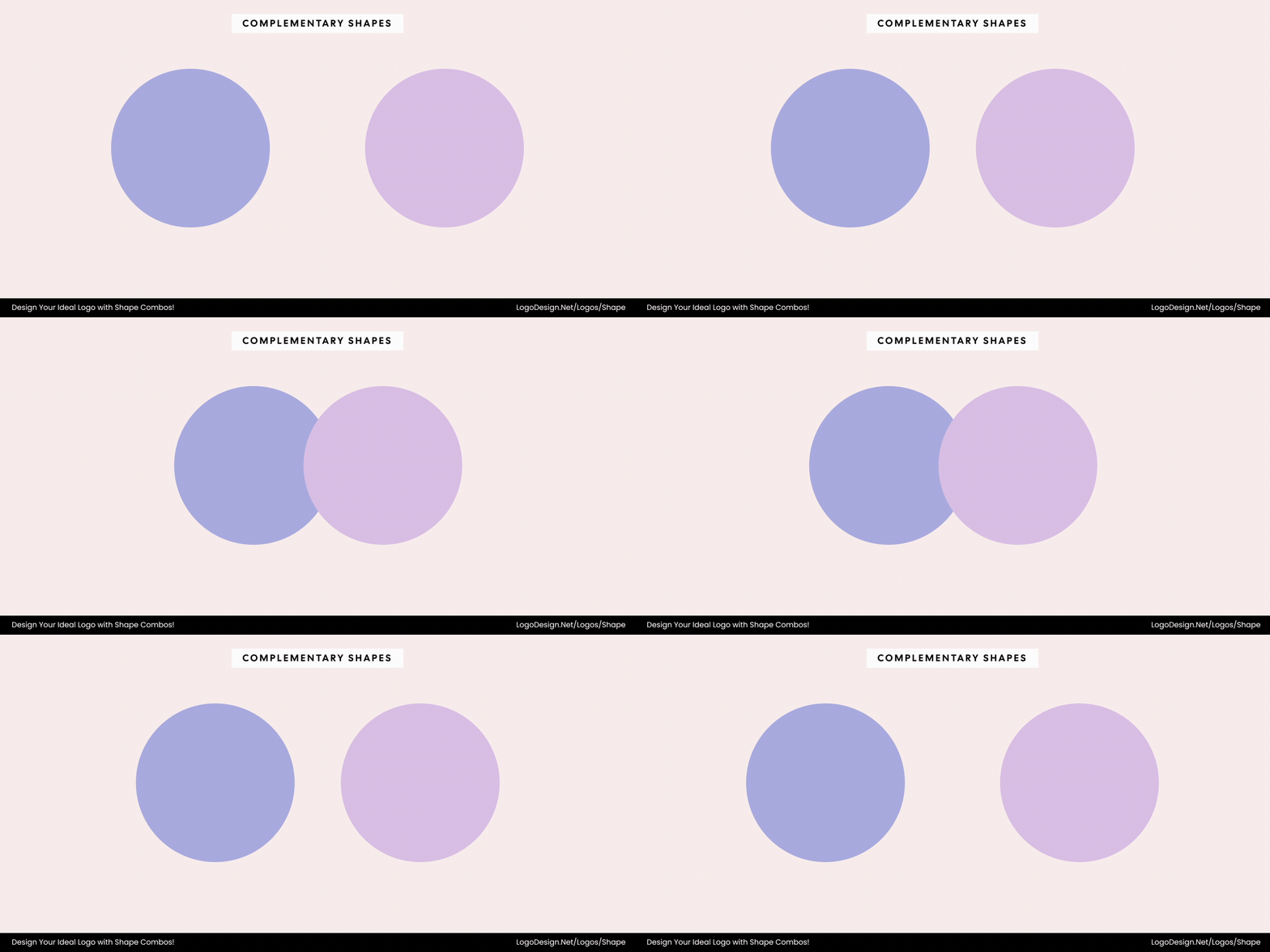
Having similar shapes in the design shows harmony, trust, and professionalism.
When shapes share similar geometry or proportion, they create a sense of visual harmony. This relationship evokes trust, professionalism, and calm balance. The viewer’s eye moves smoothly through the design, reinforcing unity and reliability — qualities that make a brand feel consistent and composed.
2. Contrasting Shapes
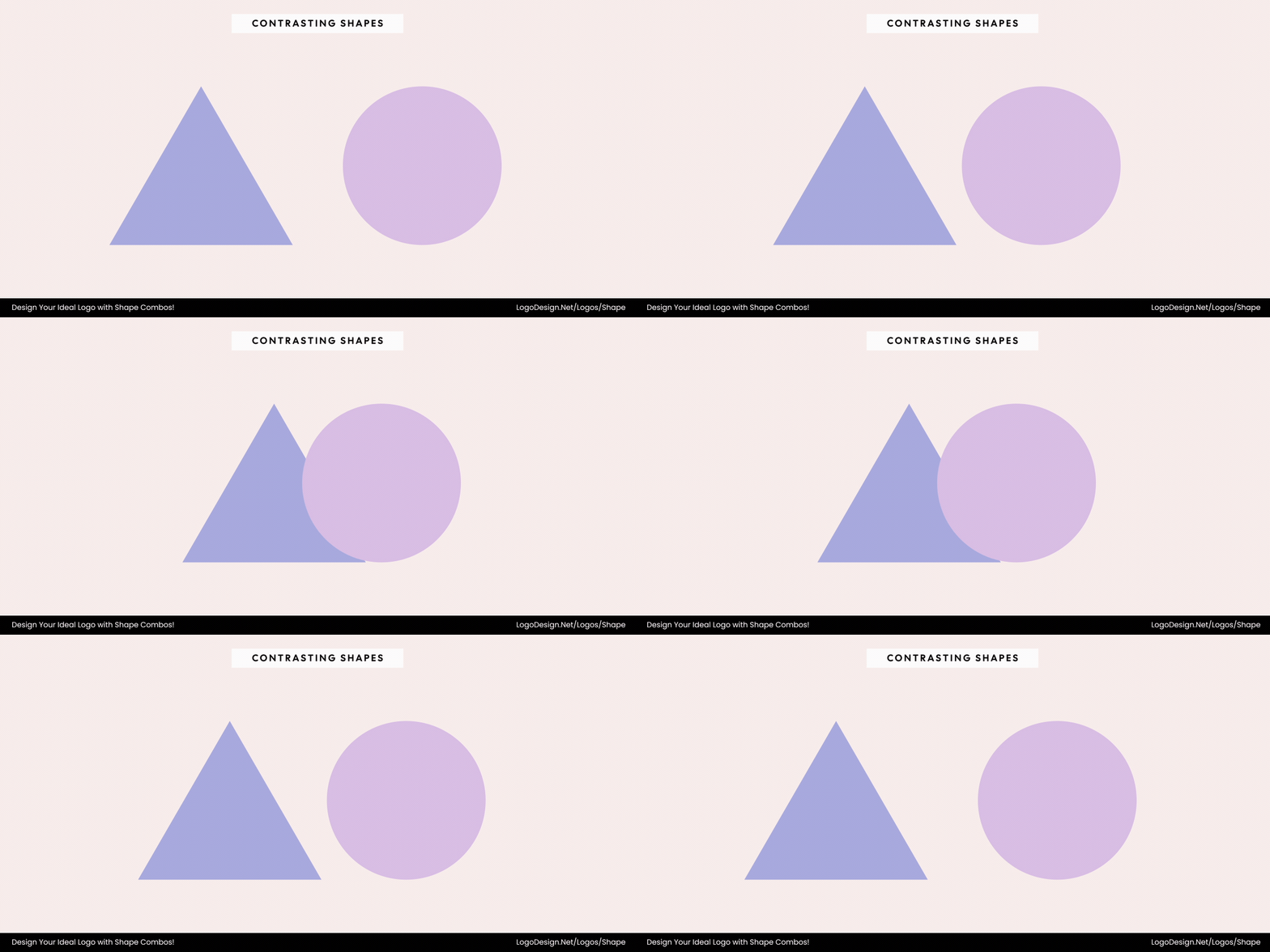
Contrasts in shapes create feelings of excitement and tension, often used to show progress and motion.
Opposing forms — such as sharp versus soft or static versus dynamic — generate visual tension and excitement. This contrast adds movement and modernity, creating a sense of energy and progress. Logos built on contrasting shapes often feel bold, forward-thinking, and memorable.
3. Integrated Shapes
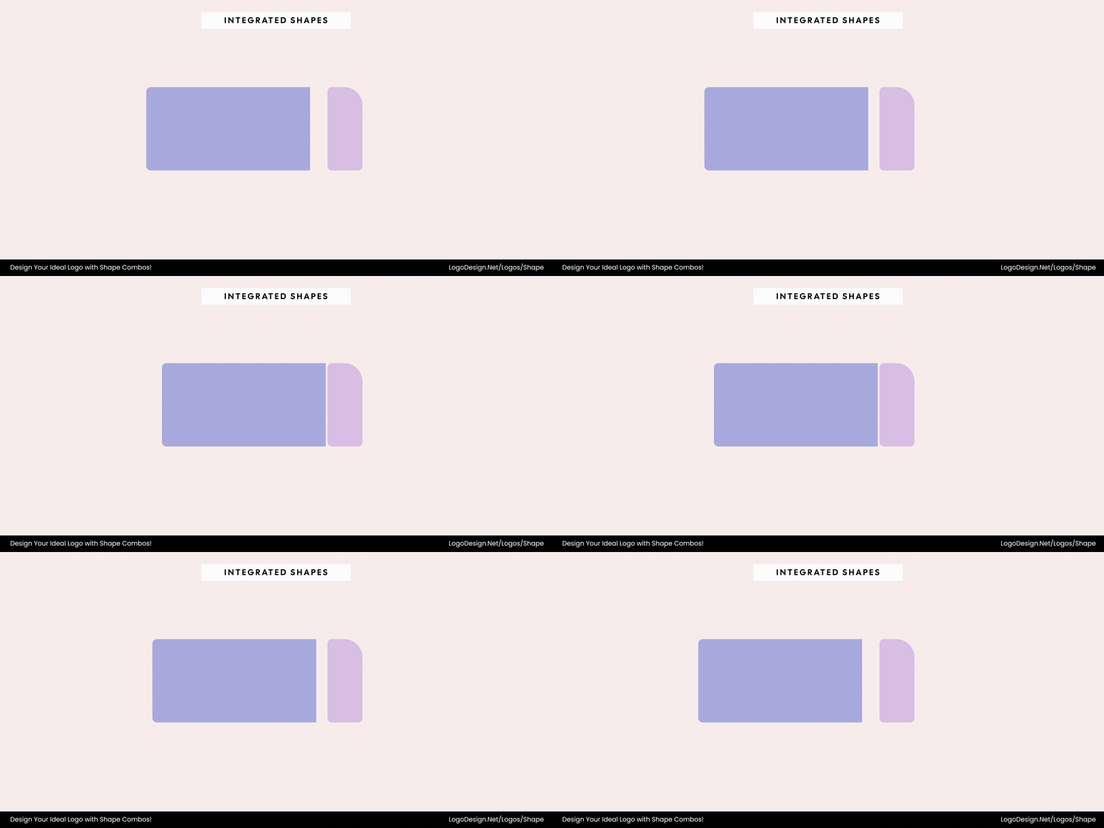
Merging multiple shapes into one unified shape can show creativity, innovation, and connected ideas.
When multiple shapes physically merge to form a single emblem, they convey synthesis and innovation. This integration represents unity — the blending of ideas or elements into one cohesive form. It reflects creativity, intelligence, and the power of connection.
4. Nested or Contained Shapes
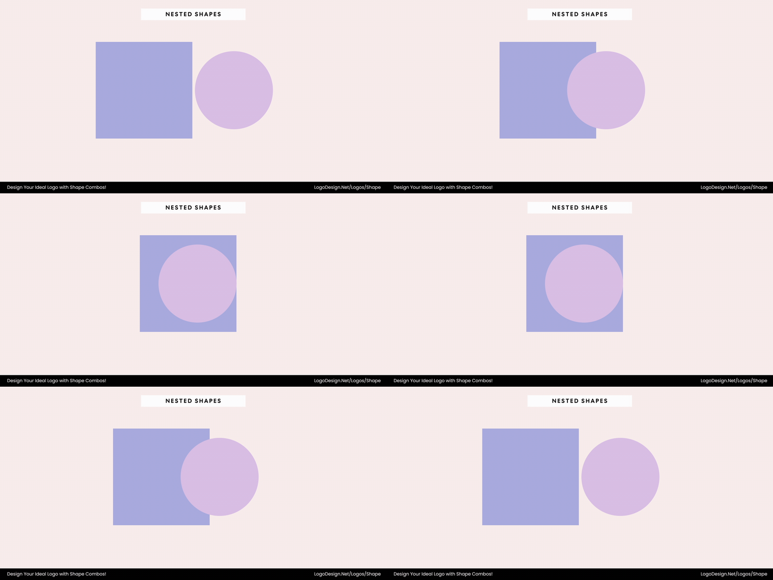
One shape combined with another often symbolizes focus and protection, and is used to convey stability and protection.
Placing one shape inside another communicates focus, hierarchy, and protection. This structure draws the viewer’s eye inward, suggesting stability and a sense of purpose. It can also represent safety, organization, and clarity of vision.
5. Patterned or Modular Shapes
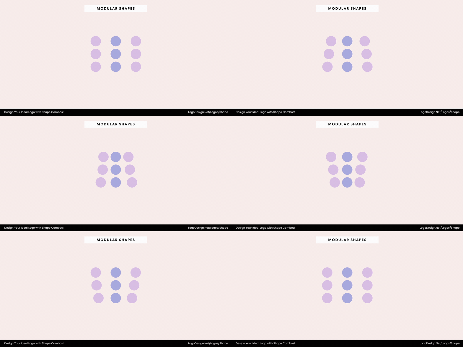
Repetition and tessellation in a design are often used to show growth and consistency.
Repetition or tessellation transforms simple geometry into rhythm and structure. This relationship conveys growth, consistency, and systems thinking. It suggests a brand that is evolving, adaptable, and built on strong foundational principles.
Principles To Effectively Combine Shapes In Logo Design
Designing a logo that combines multiple shapes is a process of structural thinking, visual logic, and aesthetic appeal.
Let’s discuss some of these principles for combining shapes in the right way.
1. Balance and Proportion
A strong logo composition relies on balance — the even distribution of visual weight among shapes. Whether the elements differ in size, form, or orientation, their arrangement must feel stable and proportionate. Using geometric grids or golden ratios can help achieve harmony, ensuring no part of the design feels heavier or disconnected.
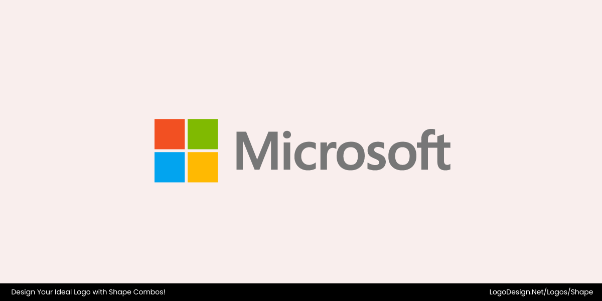
The Microsoft logo has four equal squares in perfect symmetry to convey clarity and reliability.
The Microsoft logo demonstrates balance and proportion through its symmetrical grid of four equal squares. Each quadrant shares the same size, spacing, and visual weight, creating a calm, stable composition. This precise geometry conveys reliability, clarity, and harmony, reinforcing Microsoft’s image as an organized, dependable, and user-focused brand.
2. Hierarchy and Focus
When multiple shapes coexist, one must take the lead. Establishing visual hierarchy clarifies what the viewer should notice first and what supports it. By defining focal points and secondary elements, a logo becomes easier to interpret, more memorable, and instantly recognizable at any scale.
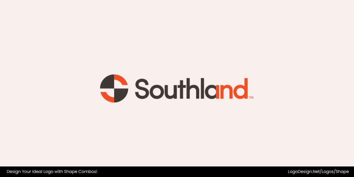
The Southland logo uses a geometric design with a bold split circle as a focal point and to create a visual flow.
The Southland Industries logo uses multiple geometric shapes to create a clear hierarchy. The bold split circle leads the composition as the focal point, while the two triangles support it, adding direction and balance. The arrangement ensures the circle dominates, with the triangles reinforcing structure and visual flow.
3. Visual Harmony and Alignment
Shapes that share geometric relationships — such as consistent curvature, line weight, or axis alignment — naturally create harmony. Proper alignment prevents tension between forms and enhances legibility, giving the logo a sense of order and intentional design.
The Commonwealth logo has a stylized ‘C’ with 34 radiating lines to show a global reach.
The Commonwealth logo demonstrates harmony through precise geometric relationships. A central globe is surrounded by 34 evenly spaced radiating lines, forming a stylized “C.” Consistent line weight, curvature, and alignment give the shapes a cohesive, balanced, and polished appearance, reflecting unity and intentional design.
4. Contrast and Interaction
While harmony keeps a logo grounded, contrast brings it to life. Opposing shapes — sharp and soft, geometric and organic, filled and outlined — add visual energy and character. The key is purposeful contrast: when shapes interact meaningfully, they create depth, symbolism, and dynamic balance.
The MINI logo uses a bold circle with wings, symbolizing focus and freedom.
The MINI brand’s emblem effectively uses contrasting geometric shapes and their interaction to convey essence: central focus (circle), outward motion and freedom (wings), bold simplicity (monochrome) — all working together in a dynamic, balanced logo.
5. Scale and Adaptability
An effective logo retains clarity across all scales. When combining shapes, ensure the design remains legible and balanced from small digital icons to large signage. Simplifying secondary elements and emphasizing strong outlines improves scalability and ensures the logo adapts seamlessly across mediums.
The Cushman & Wakefield logo uses a stylized building with bold red bars, reflecting the company’s industry with a clean design.
The Cushman & Wakefield logo combines multiple geometric bars to form a stylized building shape — a clear nod to its real estate roots. The simplified, structured arrangement ensures the logo remains cohesive and recognizable at any size. Its bold lines, minimal color use, and balanced proportions make it highly adaptable across mediums, from digital icons to large-scale signage.
6. Color and Tonal Harmony
Color relationships help define how shapes interact. Consistent tones, gradients, or monochromatic palettes can distinguish layers without overwhelming the composition. Harmonious color use allows shapes to complement one another, supporting clarity and reinforcing the brand’s emotional tone.
Feed The Children’s logo has balanced blocks of orange, green, blue, and pink to reflect optimism in their mission.
The Feed The Children logo exemplifies color and tonal harmony with its bright, rectangular blocks in orange, green, blue, and pink. The distinct yet complementary colors create a vibrant, balanced composition that is clear, engaging, and reflects the organization’s optimistic mission.
7. Meaningful Geometry
Every geometric choice should connect to the brand’s story or values. Circles within triangles, intersecting squares, or overlapping polygons can symbolize ideas such as unity, growth, focus, or stability. When geometry carries meaning, the logo transcends aesthetics — becoming a visual language that communicates purpose and identity.
The Singtel logo uses five red dots with a curved arc, showing the company’s commitment to progress and innovation.
The Singtel logo uses five red dots along a curved arc to convey meaningful geometry. Each dot represents a core value—Customer First, Integrity, Innovation, Teamwork, and Excellence—while the arc symbolizes progress and forward motion, turning simple shapes into a visual language that reflects Singtel’s mission and innovation.
8. Spatial Relationship and Negative Space
When multiple shapes interact, the space between them is just as meaningful as the forms themselves. Negative space defines relationships, creates breathing room, and often hides secondary meaning (like hidden symbols or subtle motion cues). Designers can use spatial balance to suggest openness, connection, or flow, ensuring the composition feels intentional and uncluttered.
The Griffin MSI logo uses clean geometry and thoughtful negative space to feel inviting.
By thoughtfully using negative space, proportional gaps, and simplified geometric form, the Griffin MSI logo successfully uses spatial relationships to enhance clarity, openness, and meaning. It isn’t just about the cube—it’s about how the shape interacts with its internal and external spaces, creating a design that feels intentional, inviting, and aligned with the museum’s purpose.
9. Dynamic Composition and Movement
Static symmetry isn’t the only way to achieve balance — slight asymmetry or directional flow can make a logo feel more alive. By rotating, tilting, or staggering shapes, designers introduce implied movement and rhythm. This principle works especially well for tech, automotive, or innovative brands that want to convey adaptability and forward motion.
The dynamic circles forming the ‘C’ in Cancer Research UK’s logo show progress and forward momentum.
The Cancer Research UK logo creates a sense of motion through its series of colored circles forming the letter "C." The varying sizes and staggered placement of the circles introduce directional flow and rhythm, making the composition feel lively rather than static. This dynamic arrangement conveys progress, adaptability, and forward movement, reflecting the organization’s mission of continuous advancement in cancer research.
Common Shape Pairings and What They Represent In Logo Design
Here’s a closer look at the most common shape logo pairings and what they represent.
1. Circle + Square
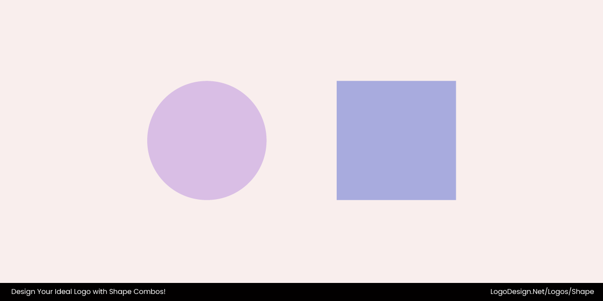
The pairing shows a balance between two opposite traits: the organic nature of the circle and the structured nature of the square. This reflects a brand’s commitment to stability, creativity, and technological progress.
- Circle: Harmony, unity, wholeness, and infinity
- Square: Stability, structure, order, and groundedness
The Zip logo combines structured squares with friendly circles to show reliability and approachability.
The Zip logo blends circles and rounded squares to create a design that feels both structured and friendly. The square forms suggest reliability and stability, while the circular curves add warmth, approachability, and motion. Together, these shapes convey balance — a brand that’s trustworthy yet modern, precise yet people-focused.
2. Circle + Triangle
This combination is associated with motion and growth as well as stability. The triangle inside the circle conveys a sense of dynamic action while being contained in security. So the boundary shows unity among elements in a way.
- Circle: Unity, harmony, and completeness
- Triangle: Direction, power, focus, and progression
The Schindler Group logo uses a circle and an upward-pointing triangle to show seamless progression.
The Schindler Group logo combines a circle and a triangular form to create a symbol of precision and upward momentum. The circle represents unity, reliability, and the continuous flow of movement — reflecting Schindler’s commitment to seamless mobility. The triangle, pointing upward, introduces direction, innovation, and progress. Together, these shapes form a balanced visual — stable yet dynamic — perfectly embodying a brand that moves people with purpose and efficiency.
3. Circle + Organic Shape
In a circle logo, pairing the shape with organic shapes showcases a sense of growth in a defined direction. This works great for brands looking to convey creativity, flexibility, and order.
- Circle: Unity, completeness, and timelessness
- Organic Shape: Growth, creativity, and natural forms
The organic shapes and rising bands within a circle in the Obama Foundation logo convey growth and a forward-looking vision.
The Obama Foundation logo is a strong example of how organic shapes can bring life to a circular form. The enclosing circle provides structure and unity, while the curved, rising bands inside introduce a sense of motion, optimism, and growth. Together, they convey progress within order — symbolizing a forward-looking vision grounded in stability and purpose.
4. Square + Triangle
This pairing is used for its association with stability, progress and aspiration. It speaks to the balancing of practicality and visionary goals.
- Square: Structure, order, and groundedness
- Triangle: Ambition, direction, and forward movement
The Zerion logo combines the square and triangle shapes to show stability and innovation.
The Zerion logo combines a square’s stability with triangular energy, symbolizing a balance between practicality and progress. The grounded frame conveys reliability, while the dynamic triangles suggest innovation and forward motion—a fitting reflection of a brand built on trust and ambition. Together, these forms create a harmonious, solid, and visionary structure.
5. Organic + Geometric Shape
This combination represents the harmony between nature’s freeform designs and the precision of human-made structures. It suggests a balanced approach to innovation and design, humanizing technology or scientific advances.
- Organic Shape: Fluidity, creativity, nature, and adaptability
- Geometric Shape: Precision, logic, and order
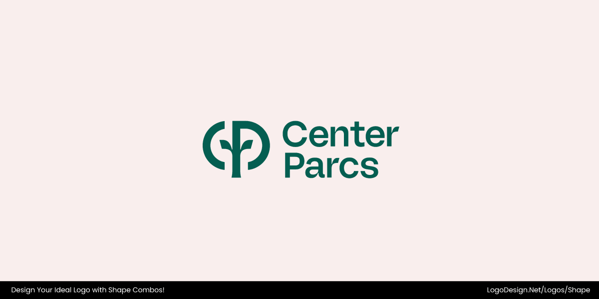
The Center Parcs logo uses organic leaf forms made from thick curved lines to show a connection between nature and design.
The Center Parcs logo is a strong example of an organic and geometric shape combination. The flowing, leaf-like form conveys nature, growth, and vitality, while its clean, geometric structure adds balance and intentionality. Together, they express harmony between the natural world and thoughtful human design — perfectly reflecting the brand’s focus on comfort within nature.
Techniques for Combining Shapes in Logo Design
Combining shapes isn’t just about fitting forms together — it’s about weaving meaning through structure. Designers use visual techniques like layering, merging, or alignment to build stories, depth, and emotion within a logo. These combinations can suggest connection, evolution, precision, or harmony, giving even the simplest marks a multidimensional feel.
1. Layering
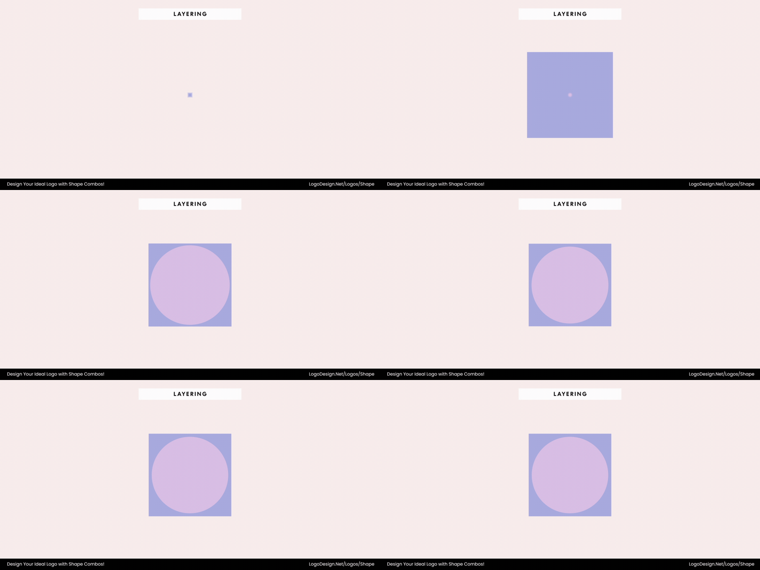
Layered shapes and transparency create depth, connection, and dimension in a compact and consistent design.
Layering places shapes on top of one another to build depth, hierarchy, and visual richness without overwhelming the design. When paired with transparency, it adds dimension and narrative — each overlapping form can represent connection, diversity, or transformation. This technique helps suggest volume, light, and meaning while keeping the logo compact and cohesive.
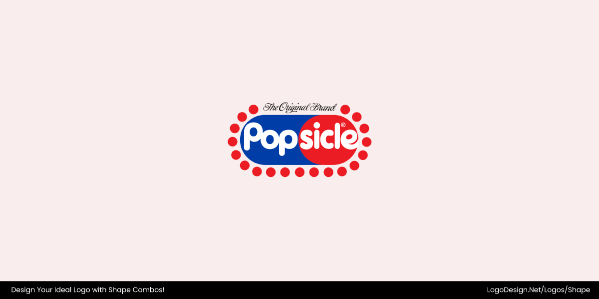
The Popsicle logo has layered shapes with subtle transparency to create a connection in a compact design.
The Popsiclen logo features a blue oval overlapped by a red circle, surrounded by a layer of smaller circles that add texture and playfulness. The rounded typeface and bold colors convey a friendly, approachable personality, while the layered shapes create depth, movement, and visual interest, making the logo instantly recognizable.
2. Interlocking Shapes
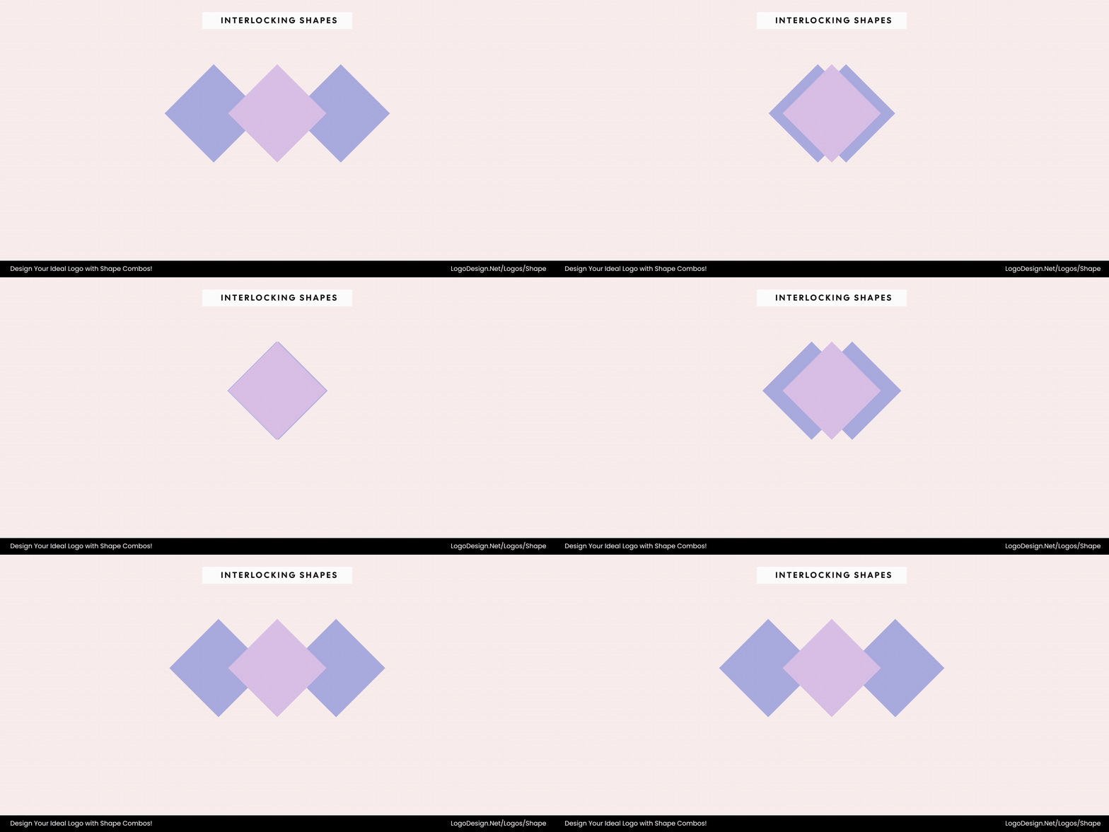
Interlocking shapes show unity, trust, and collaboration by connecting parts of the design.
Interlocking shapes visually “fit” together like puzzle pieces, symbolizing unity, trust, and cooperation. This technique expresses partnership between elements, whether that means people, ideas, or systems working toward a shared purpose. It’s also useful for brands that want to show reliability through connection.
The Visaprint Logo has two interlocking triangles forming a ‘V’, showing partnership.
In the Vistaprint logo, two geometric triangle shapes interlock seamlessly to create a ‘V’ and convey collaboration between the brand and its customers — visually communicating reliability and partnership.
3. Merging (Fusion)
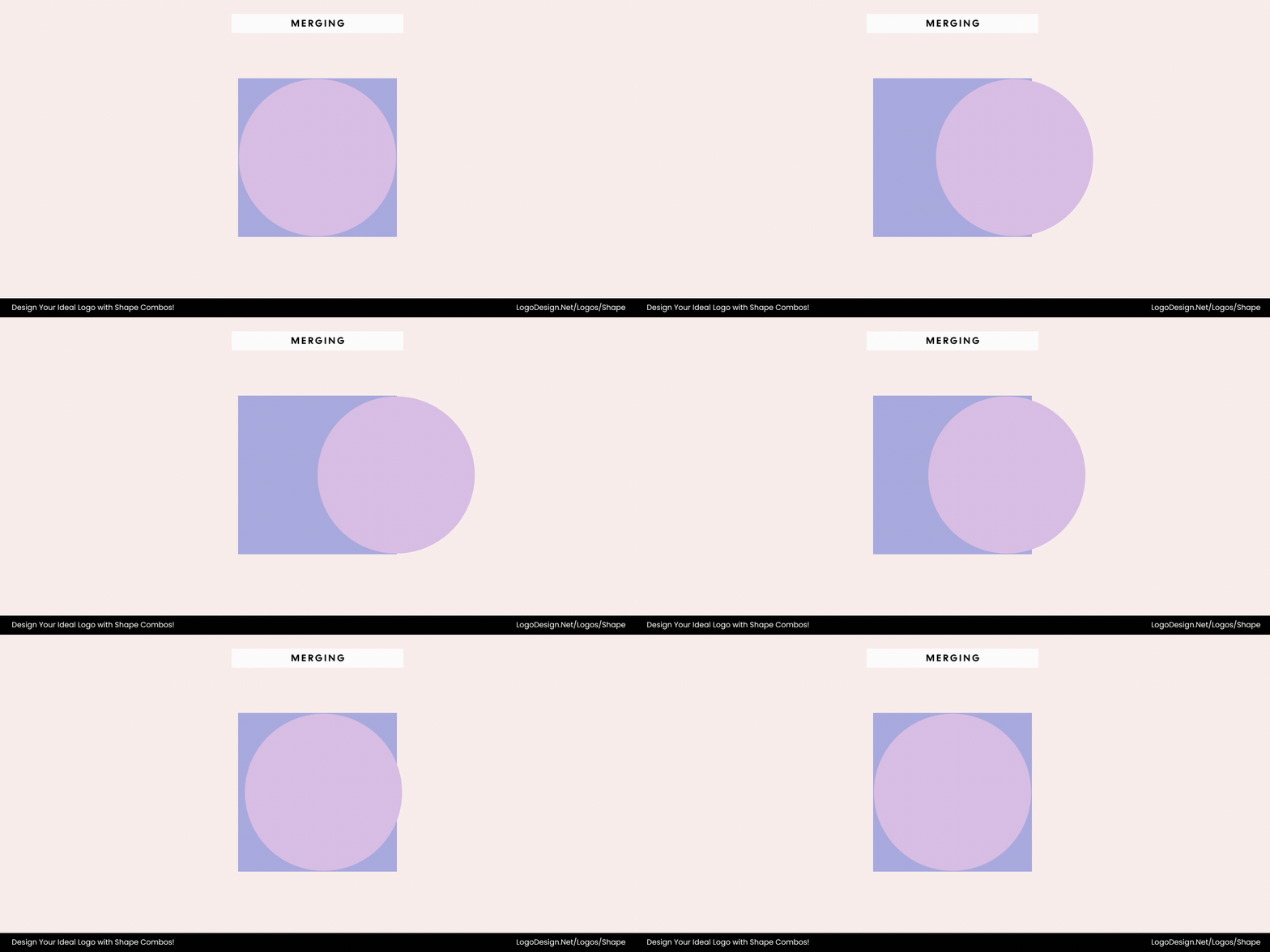
Merging means combining various forms into one to show integration, innovation, and a singular purpose.
Merging is the blending of two or more forms into one unified shape. It communicates integration, innovation, and synergy — a perfect fit for tech or service brands that combine multiple capabilities into a single solution. A well-merged logo feels balanced and purposeful, suggesting cohesion and shared direction.
The red and green shapes in the Delta Assurance logo merge into a unified ‘D’, symbolizing synergy and connection.
The Delta Assurances logo exemplifies this technique, featuring a red triangle and a blue trapezoid that seamlessly combine into a single “D” shape. The integration of these distinct geometric forms conveys unity, cohesion, and synergy, reflecting the brand’s commitment to comprehensive, connected insurance solutions.
4. Overlapping Transparency
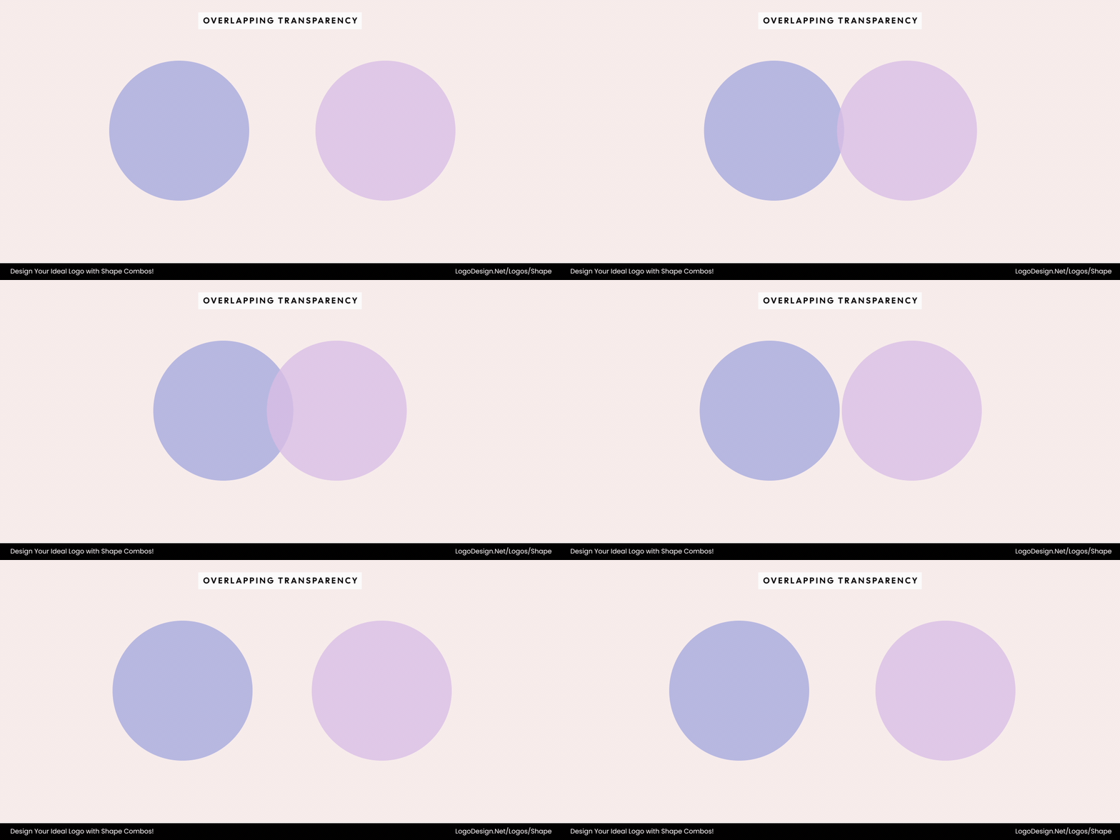
Overlapping transparent elements create depth, harmony, and connection in the design, showing openness and collaboration.
Transparency in overlapping shapes adds dimension, color blending, and visual storytelling. It shows relationships, diversity, and the blending of ideas — ideal for modern, open, and collaborative brands. Transparent layers can also guide the eye through a logo, creating a dynamic yet approachable feel.
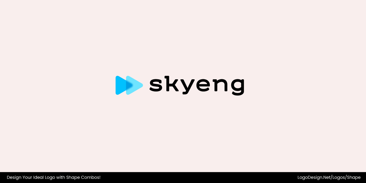
The Skyeng logo has overlapping blue shapes with a forwarding arrow that shows movement and progress.
The Skyeng logo uses overlapping translucent geometric shapes to create a sense of movement and connection. Two angled forms — resembling triangles or directional arrows — intersect with varying shades of blue, producing a subtle blend where they overlap. This transparency effect not only adds depth and dimension but also symbolizes collaboration, progress, and the exchange of ideas — fitting qualities for an innovative education brand built on interaction and growth.
5. Encapsulation
Encapsulation in a symbol or letter framed within a shape highlights focus and shows protection.
Encapsulation places one shape inside another — often a symbol or letter framed by a circle, square, or shield. This technique establishes structure, focus, and authority while emphasizing protection or containment.
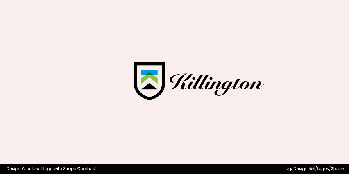
The Killington Resort logo has a shield and mountain icon, showing structure and motion to attract the attention of adventure lovers.
The Killington Resort logo illustrates encapsulation through a shield-shaped frame containing three stacked triangles that form a stylized mountain. The geometric pairing of the stable shield and dynamic triangles conveys both protection and motion — reflecting the resort’s balance of safety, structure, and outdoor adventure.
6. Negative Space Integration
Hidden shapes in the design emerge through negative space to turn simple forms into unique symbols.
Negative space lets hidden shapes emerge through gaps between other forms — often revealing secondary meaning. A triangle formed between curves or a shape cut out of a square can transform simplicity into clever symbolism.
The Carrefour logo uses negative space to form a ‘C,’ with red and blue arrows, showing direction and movement.
The Carrefour logo is a strong example of negative space used with geometric balance. Two opposing arrow-like shapes — one red, one blue — frame a white space that forms the letter “C.” This hidden letter not only reinforces the brand’s identity but also symbolizes direction, choice, and movement — fitting for a major retail chain whose name literally means “crossroads.”
7. Alignment and Symmetry
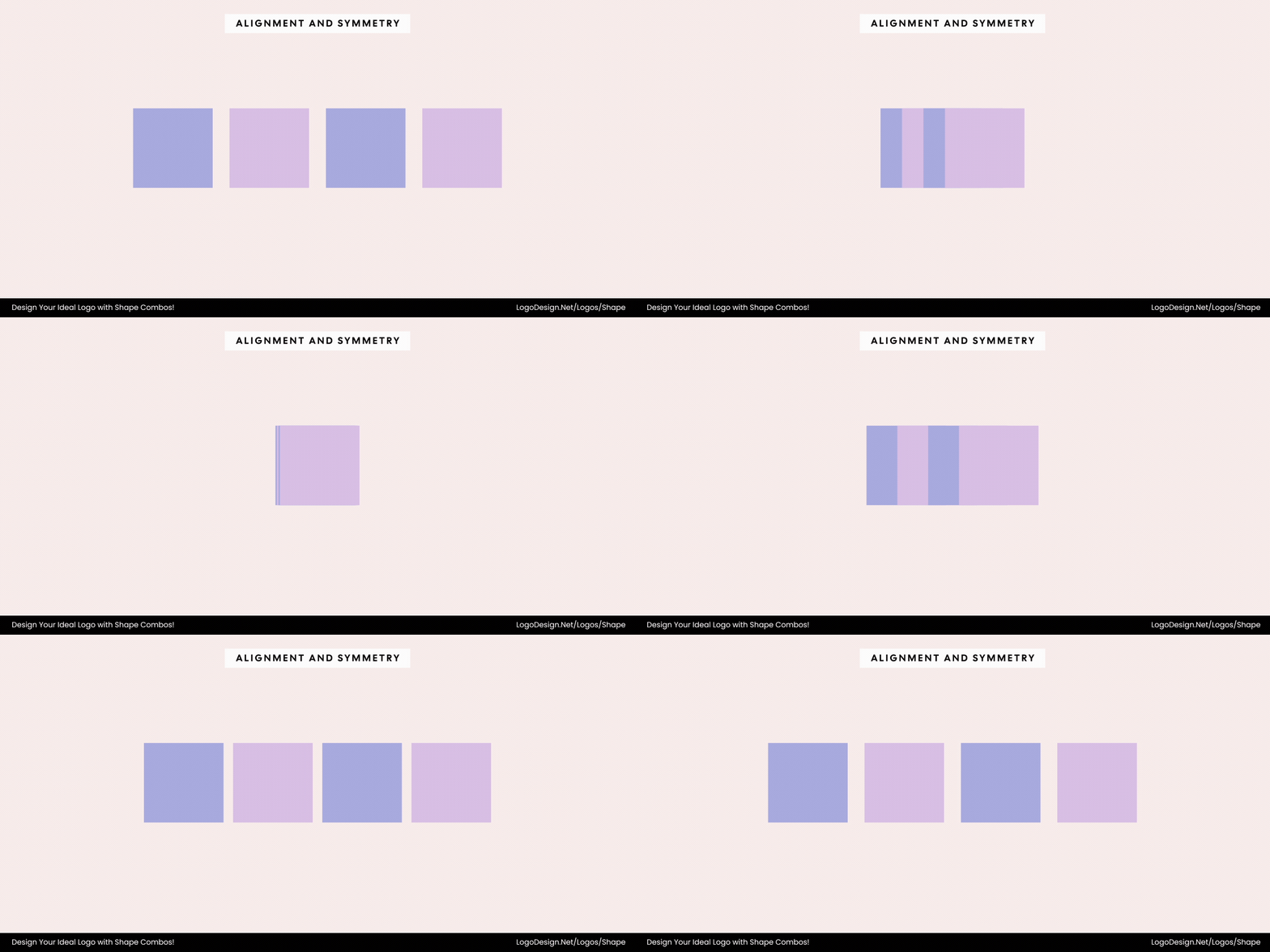
Balance and symmetry in shapes create harmony and build trust.
Alignment arranges shapes — circles, triangles, or rectangles — in deliberate balance to project harmony and structure. Symmetry reassures viewers through visual order, making it ideal for trustworthy or institutional brands.
The Equinor logo uses six interlocking rhombuses to form an emblem, showing innovation, stability, and energy.
The Equinor logo features a symmetrical, geometric emblem composed of six interlocking rhombuses, creating a balanced, flower-like shape. This precise alignment conveys harmony, stability, and reliability, reinforcing the brand’s identity as a trustworthy and forward-thinking energy company. The bold red colored logo adds energy and dynamism, while the clean, modern lines emphasize innovation and professionalism.
8. Juxtaposition (Contrast of Shapes)
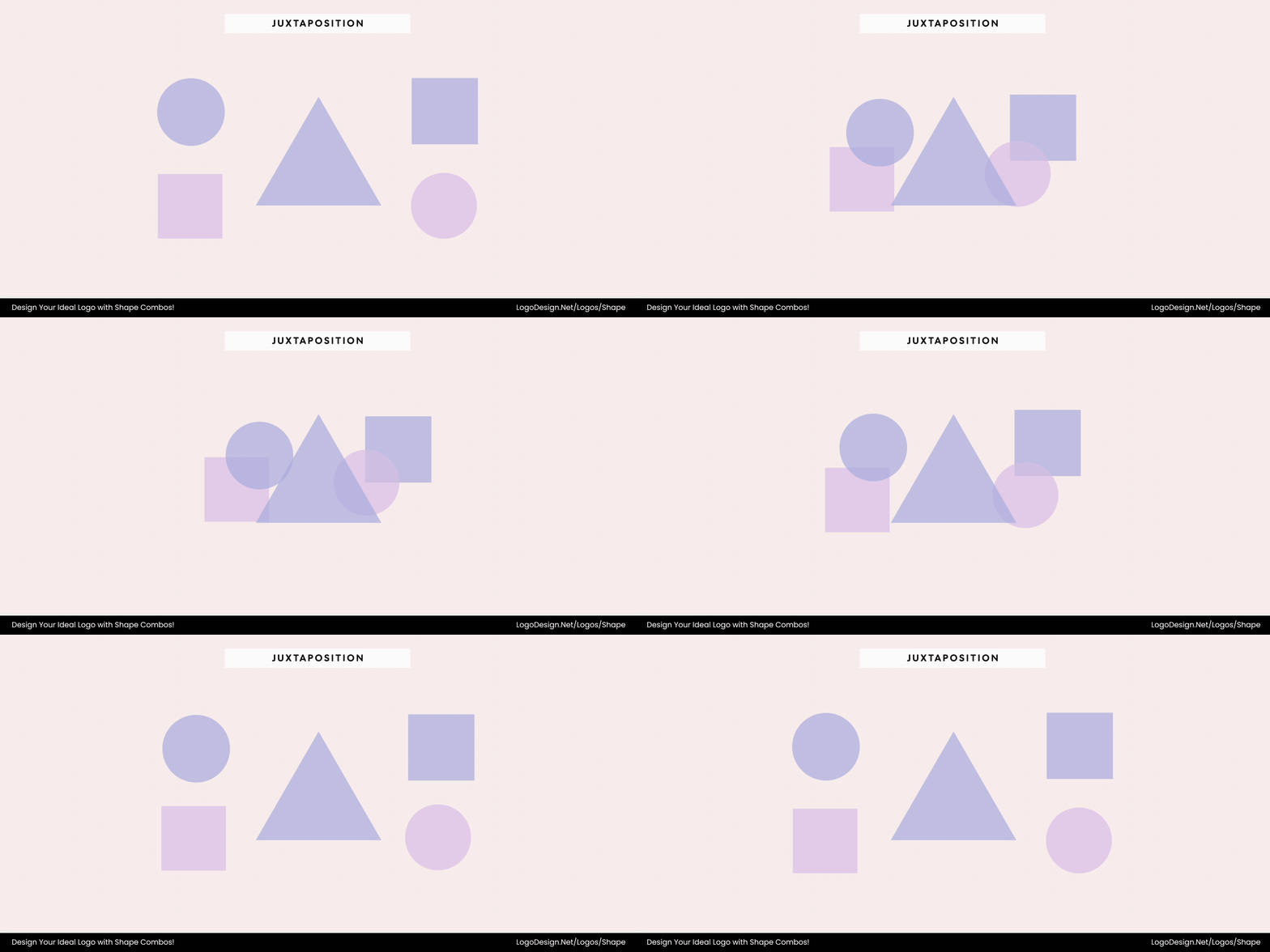
Using contrasting shapes like circles, squares, and triangles creates balance and precision.
Juxtaposition balances opposites — round versus angular, soft versus sharp — to energize a composition. Circles combined with squares or triangles reflect balance between emotional warmth and logical precision.
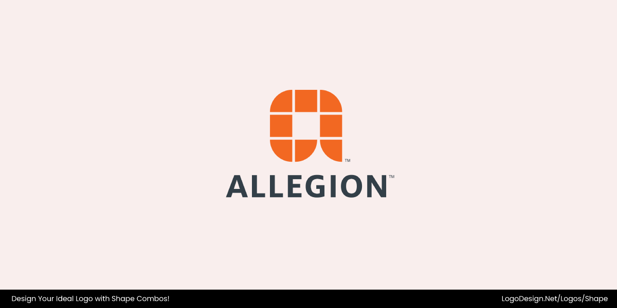
The Allegion logo shows precision with soft curves, creating a balance between reliability and approachability.
The Allegion logo perfectly demonstrates juxtaposition through the interplay of geometric precision and soft curvature. The design features a modular square grid with rounded edges, merging angular structure with approachable warmth. This contrast between order and fluidity reflects Allegion’s balance of technological reliability and human-centered design — a brand that’s both secure and accessible.
9. Fragmentation
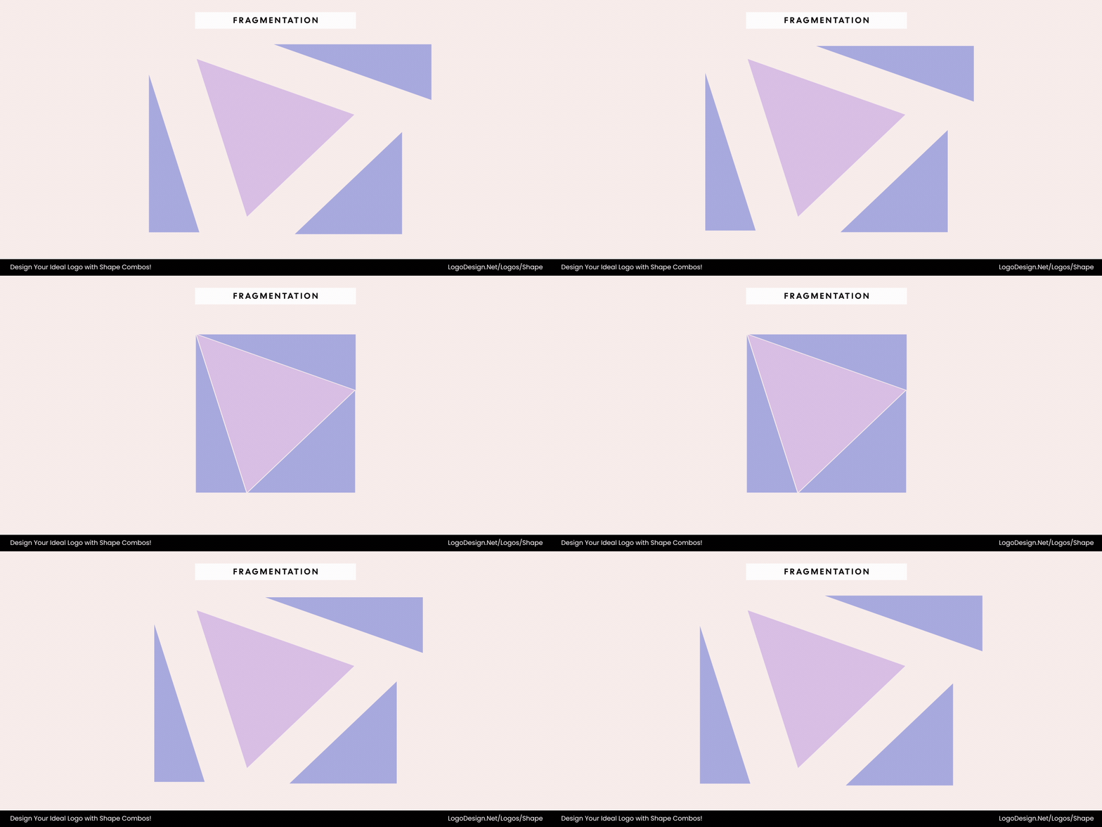
Fragmented shapes are used to show energy, transformation, and evolution.
Fragmentation breaks a unified shape — often a circle or polygon — into smaller parts that still connect visually. It’s a symbol of energy, transformation, and evolution, suited for tech or digital brands.
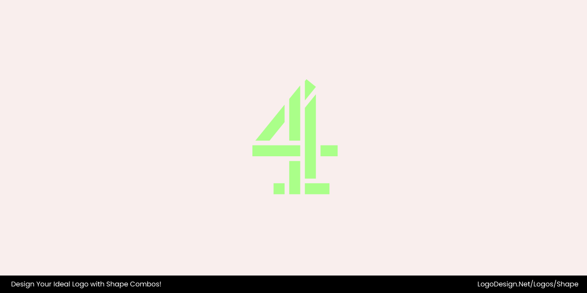
With nine blocks, the Channel 4 logo shows innovation and movement.
The Channel 4 mark is composed of nine distinct geometric blocks that together form the numeral “4”. These blocks, while separate segments, visually connect to form a whole — a clear example of fragmentation. The segmented construction gives the logo a sense of modularity and movement, suggesting innovation and change.
10. Continuity Through Lines or Flow
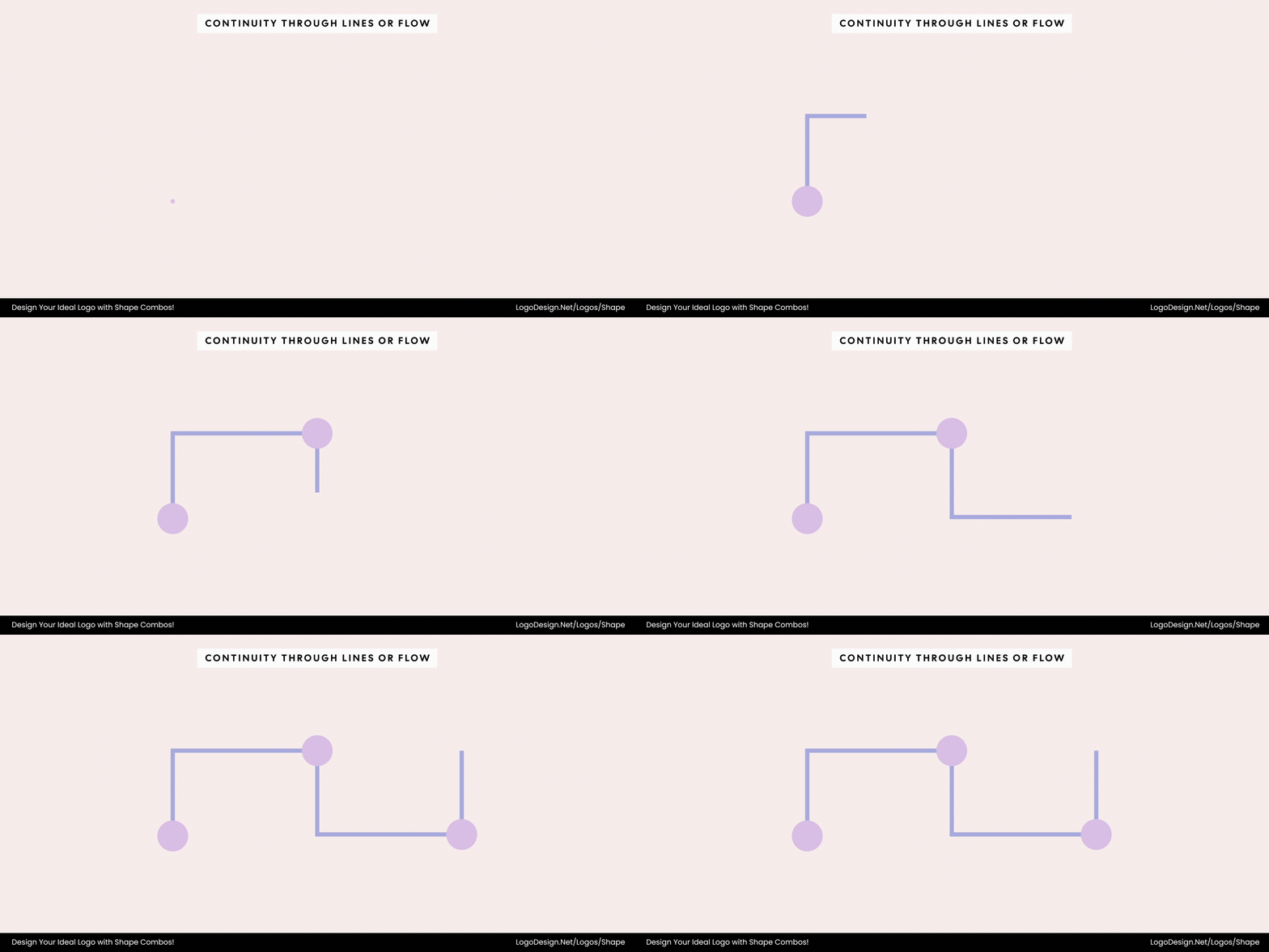
The curved lines linking shapes convey energy, movement, and connection.
Flow uses curved or continuous lines connecting geometric anchors like circles or triangles to create rhythm and movement. It implies energy, connection, and flexibility — essential for brands emphasizing dynamism.
Telia’s logo features a swirling ribbon to show seamless communication in motion.
The Telia Company logo is a vivid embodiment of flow in motion. Its swirling, ribbon-like lines breathe around an invisible core, creating a pulse and rhythm — almost like digital energy taking form. The smooth curves guide your eye in a continuous loop, suggesting connection without boundaries. Each contour feels alive, weaving together geometry and movement in harmony. It’s a visual metaphor for how communication travels: fluid, flexible, and full of momentum.
11. Repetition and Rhythm
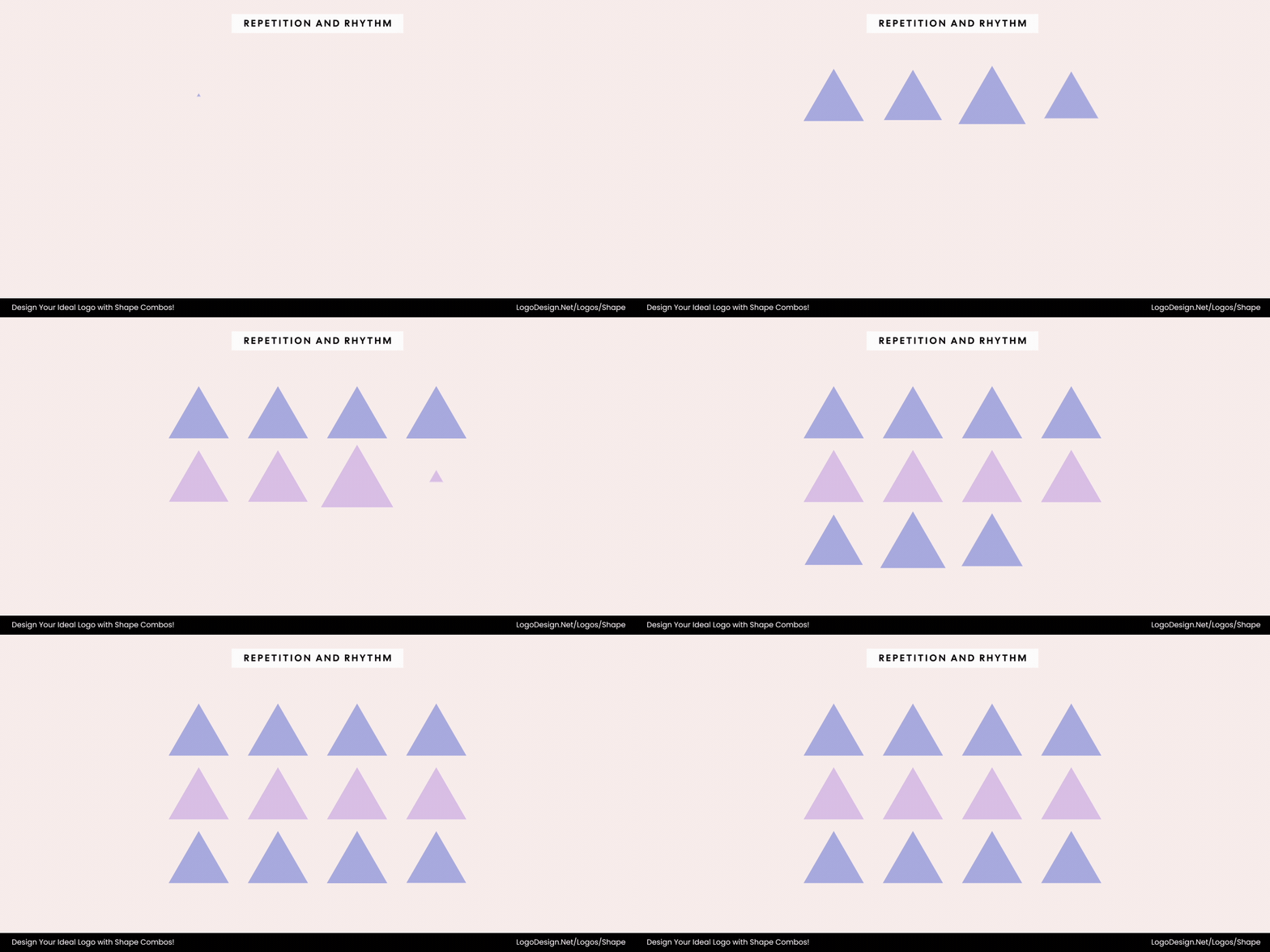
Repeating shapes like circles or squares creates unity and reinforces brand consistency.
Repetition uses multiple instances of the same shape — like rows of circles, squares, or triangles — to build unity and reinforce brand consistency. It communicates reliability and systematic design.
The Brussels Airlines logo uses a grid of red dots, showing precision with movement to signal reliability.
The Brussels Airlines logo demonstrates repetition through its grid of red circular dots, each identical in form but varied in size. This consistent use of circles creates rhythm and cohesion, symbolizing connection and reliability—key traits for an airline. The repeating pattern gives the mark a modern, systematic feel, while the variation in dot size adds movement and a touch of human warmth within the geometric precision.
12. Shape Containment or Framing
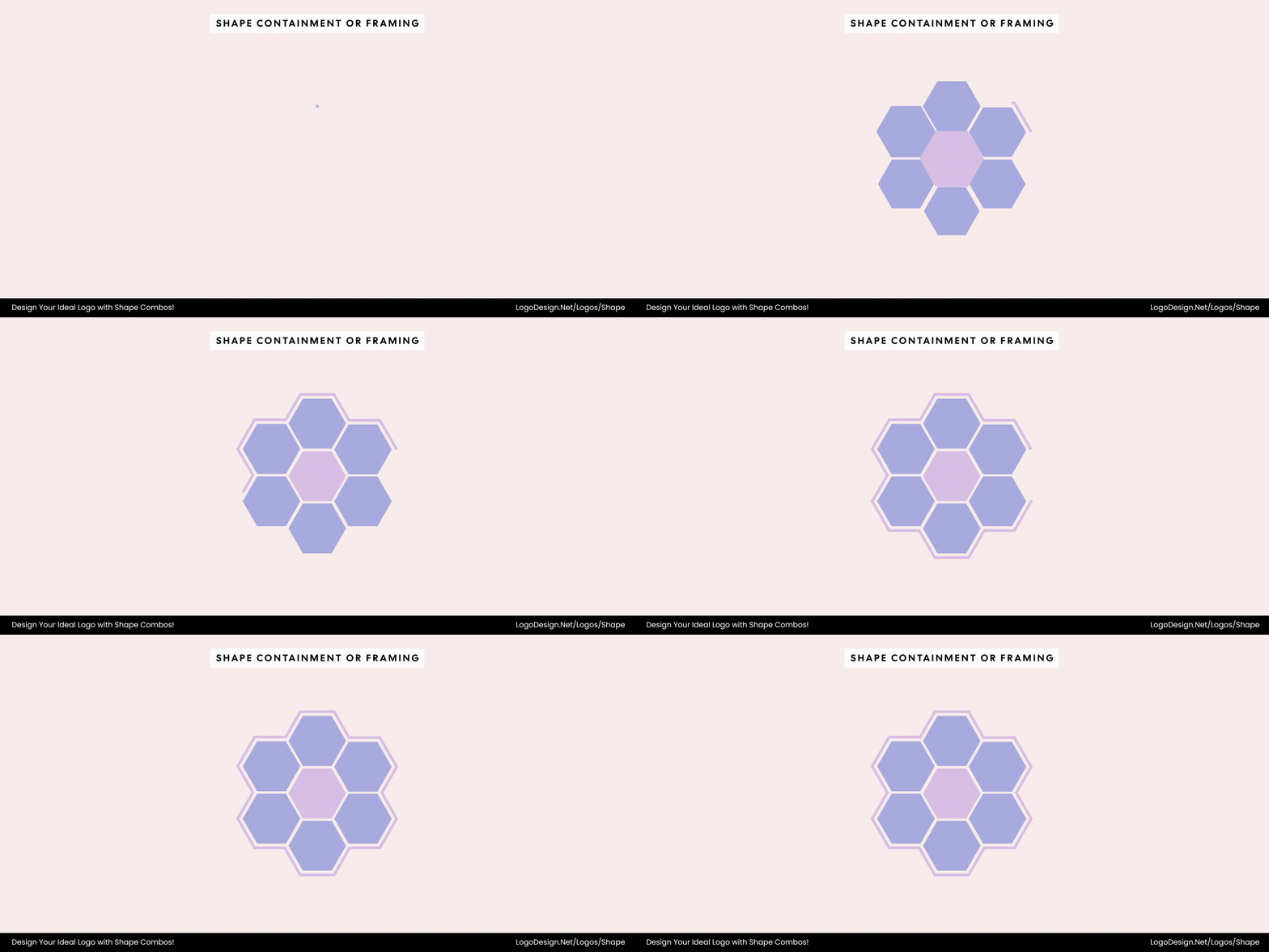
Framing is used to bring scattered elements together, highlighting focus and precision.
Framing unifies scattered shapes by placing them within a defined form, such as a circle or rectangle. It suggests completion, focus, and precision, ideal for brands with curated or crafted offerings.
The Citroën logo has an upward chevron that’s neatly framed in an oval, showing precision and balance.
The Citroën logo is a clear example of shape containment, featuring two upward-pointing chevrons framed within a vertical oval. This geometric framing unifies the chevrons, creating a focused, balanced composition that conveys precision and engineering excellence. The contained shapes give the logo a sense of completion and structure, reflecting the brand’s commitment to innovation and quality.
13. Gradation and Transformation
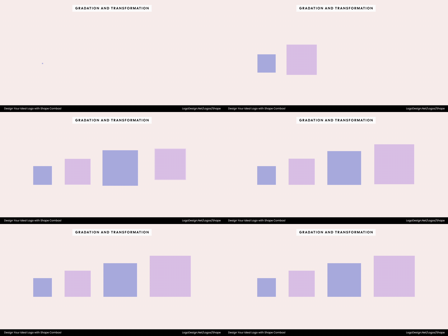
Gradation and transformation in shapes are used to signal evolution and forward momentum.
Gradation transforms shapes progressively — from small to large, square to circle, or angular to smooth — representing innovation and evolution. This dynamic approach symbolizes forward momentum and digital change.
The Coppel logo uses three shrinking circles that transform into a key, showing progress and modernity.
The Coppel logo uses a series of three circles that gradually decrease in size, coming together to form a symbolic key. This subtle transformation from simple geometry to a meaningful icon conveys progress, unlocking potential, and a seamless connection between tradition and modernity.
Color, Texture, and Typography in Multi-Shape Logos
When designing logos with multiple elements, such as shapes, color, texture, and typography, these are essential components that shape perception. They enhance visual appeal, reinforce meaning, and communicate the brand’s personality effectively.
1. Color and Contrast
Color plays a defining role in how multiple shapes interact and relate within a logo. It helps separate, connect, or emphasize individual elements — guiding the viewer’s perception of structure and meaning. In multi-shape compositions, color and contrast determine whether forms appear unified or distinct, flat or dimensional, and harmonious or dynamic.
• High vs. Low Color Contrast
When color contrast is high — such as pairing complementary hues or combining light and dark tones — each shape stands out clearly, reinforcing individuality and balance within the design. This is particularly effective for brands that want to highlight diversity, multifaceted services, or creative energy.
The Instacart logo has a vibrant carrot formed from a warm orange semicircle and a cool green teardrop, showing freshness and energy.
Instacart’s logo combines an orange semicircle with a green teardrop-like shape to form a stylized carrot. The strong contrast between the warm and cool hues, as well as between the curved and pointed forms, creates a fresh, energetic look that emphasizes vitality and movement.
On the other hand, low contrast or tonal palettes merge shapes more subtly, evoking unity, sophistication, and calm.
The Doodle logo has rectangles that blend light and dark shades to convey harmony and calm.
The Doodle logo, built from overlapping rectangular forms in soft blue tones, uses minimal color contrast to create a cohesive and understated composition. The subtle shift between light and dark shades merges the shapes seamlessly, suggesting harmony, clarity, and a calm digital experience.
• Monochrome vs. Multicolor palette
In the monochrome vs multicolor palette, the monochrome one emphasizes form and composition over color. It enhances clarity and simplicity, making geometric relationships the focus. Such palettes work well when a brand aims for timelessness or professionalism — the shapes themselves carry the story.
The Indigenous Pact logo uses purple triangles, emphasizing harmony and balance.
For example, the Indigenous Pact logo uses a series of light and dark purple triangles to form a unified mark. This monochrome approach highlights the geometric interplay and creates a sense of cohesion and balance without relying on multiple colors.
Conversely, multicolor palettes celebrate variety and collaboration. They allow each shape to express a unique identity while contributing to a cohesive whole — a visual metaphor for inclusivity or interconnected ideas.
The Commercetools logo has a colorful icon with squares and triangles that suggest flexibility, innovation, and harmony.
The commercetools logo, for instance, combines squares and triangles in three distinct colors to create a dynamic and recognizable identity. Here, the variation in color reinforces the brand’s emphasis on flexibility and innovation while maintaining visual harmony through consistent geometric forms.
2. Texture and Depth
Texture, gradients, and transparency differentiate overlapping shapes, add dimensionality, and enrich the visual experience. Proper use of these elements ensures the logo is dynamic yet legible.
Finland’s Foreign Affairs logo has sophisticated gradients and textures that convey precision and depth.
Ministry for Foreign Affairs of Finland employs a refined mix of gradient colors and textured shapes to create a logo rich in detail and visual depth — a design that reflects precision and sophistication.
Lay’s new logo features a textured circle with fine lines that create a sense of motion and touch.
Similarly, Lay’s recently introduced a new logo that incorporates a subtly textured circle, where a series of fine lines in the design generates a sense of motion and tactility.
In both cases, texture and gradients elevate flat forms into dynamic compositions, conveying modernity while maintaining clarity across applications.
3. Typography Integration
Typography plays a crucial role in unifying a logo’s shapes and reinforcing its visual message. The logo typeface you choose determines how the geometry is perceived — whether it feels friendly and approachable or strong and authoritative. Fonts interact with shapes through contrast, rhythm, and balance, and the harmony between letterforms and graphic elements can transform a simple symbol into a cohesive brand mark.
• Humanist Fonts + Circular Forms
When shapes are circular or organic, pairing them with rounded or humanist fonts enhances the design’s softness and approachability. The power of circle logos lies in their ability to create visual balance — their smooth curves naturally complement friendly and humanist typefaces..
The Harmonic logo uses smooth curves to create a friendly, inviting flow, suggesting innovation and a human connection.
The curves in both the typography and the forms establish a natural flow that feels friendly and inviting — a quality seen in the Harmonic logo, where the smooth letterforms and soft shapes convey innovation grounded in warmth and human connection.
The Pop-A-Shot logo uses a circular design to suggest motion and energy.
Similarly, the Pop-A-Shot logo combines circular energy and playful typography to express motion and fun, making the design approachable and full of character.
• Sans Serif Fonts + Angular Forms
By contrast, angular or geometric shapes align best with structured, sans-serif fonts, reinforcing precision and balance. The crisp geometry in these combinations communicates modernity, order, and dependability.
The Fiji Airways logo uses various lines to spell the brand name, giving it a structured, cultural look to build trust.
The Fiji Airways logo also uses geometric rhythm and refined typography to evoke structure and cultural heritage while maintaining elegance and trustworthiness.
4. Functional Considerations
While creativity drives multi-shape logos, functionality ensures they work seamlessly in the real world. A design that looks great on screen should also perform well in print, digital, and motion formats. Test how shapes, textures, and colors hold up when scaled down or displayed on different backgrounds.
• Versatility
Complex logos, with multiple shapes, may lose clarity at smaller sizes. Simplifying outlines or reducing overlapping layers ensures readability on business cards, favicons, or mobile screens.
• Formats
Logos should be tested in different formats, including single-color or black-and-white versions. Ensure overlapping shapes and textures remain clear and distinguishable.
• Adaptability
Consider how the logo performs in motion or animation. Shape combinations may require slight adjustments to remain impactful across static and dynamic contexts.
Key Takeaways
Combining multiple shapes in a logo can completely transform how a brand is perceived. From balance and contrast to motion and harmony, shape combinations go beyond aesthetics and communicate emotion, meaning, and identity. When used with intention, every geometric pairing becomes a story in itself and helps brands stand out while staying memorable.
- Shapes influence emotion and meaning. The combination of geometric and organic forms determines how a brand feels, structured and professional, or fluid and approachable.
- Contrast adds focus and excitement. Pairing sharp edges with curves or large forms with small ones draws attention and creates rhythm in the design.
- Harmony enhances trust and professionalism. Balanced proportions and consistent geometry make a logo feel dependable and thoughtfully designed.
- Negative space brings symbolism and balance. Thoughtful use of empty areas can reveal hidden meanings and improve readability at various scales.
- Proportion and scalability are essential. Multi-shape logos must maintain harmony when resized — clear structure ensures visibility across screens, packaging, and signage.
- Color, texture, and typography unify the system. These elements bridge individual shapes, reinforcing brand tone and ensuring the composition feels complete and versatile.
