SALES / SUPPORT : 844-232-4816

How To Create A Negative Space Logo Design?
The negative space is the background or area surrounding the subject in an image. On the contrary, the positive space is the foreground or the subject itself. Stated in simpler terms, positive space is filled while the negative space is empty.
Negative space within a logo can cause a miraculous success when used thoughtfully and intelligently as an efficacious design tool of the modern era. As is customary with highly creative logo designers, the blank areas of a shape logo pattern can be made to act dynamically vis-à-vis the filled areas. Logos that play and present with negative space are significantly clever and creative, and yet they retain their subtlety and simplicity.
Generally, the trick works this way: Concealing a shape within the space between the letters in the logo , or inside the icon or illustration. It would be unnoticeable at the first sight and then suddenly it becomes evident, creating an entirely different level of applause and appreciation for the logo design concept behind it.
The Way To Creating A Negative Space Logo
Developing a wordmark or letter logo with negative space is a piece of cake by no means. They aren’t created out of a miracle; it literally takes hours of painstaking work to execute the mental concept in its original, genuine countenance. Through help from a quality video tutorial, the steps in creating your own logo can be eased out at their best.
Our vlog provides the comprehensive guide for crafting a clever space logo using Adobe Illustrator, all by yourself. An easy, step-by-step guideline is sure to deliver you ample guidance in fulfilling your need right from scratch. The procedure is so simply prepared, even a novice would be able to play at it efficiently.
So, without sparing a moment let’s proceed with our stepwise guidelines. Don’t forget to give it a “thumbs-up” if you like it and share any of your queries by dropping them in the Comments section.
Step 1:
Here, we are using the word “BANDIT” to create negative space logo for our tutorial reference. Over the white backdrop, we conceptualize a face for the logo design and roughly draw it. The sketch would be used within the blank or empty area of the letter “A” in BANDIT.
Step 2:
The font and color have already been selected. A copy of the word BANDIT is created by pasting the sketch layer in front (Cntrl+F).
Step 3:
Make an outline of “A” (Cntrl+Shft+O), cut it, delete the rest and then paste the “A” in front, so that now only “A” is visible. Delete the internal or the inner parts of it by deleting the anchor points until all are cleaned away.
Step 4:
Widen the letter from either sides by clicking on the anchors and nudging them.
Step 5:
Next is altering the color of the “A” to any color of your choice. Flip it, convert it into an outline and lock it temporarily.
Step 6:
Trace out all the dark areas of this drawing using the pen tool. Note that these are only rough bandit logo templates and not an actual one. Flip the outline to fill with some color of the selected regions.
Step 7:
Convert the two filled patches into a compound path (Cntrl+8). Draw the rim to create a hat for a logo using the same process.
Step 8:
Next, draw in a similar fashion the eyes. After it, the top portion of the hat is to be drawn and get it aligned with the “triangle” of the letter “A” in the logo.
Step 9:
Intersect the shape of the “A”. Flip the background of the outline, select the two patches compounded earlier into a single path and intersect them.
Step 10:
Group together the patch of the triangle, align the rim and the top of the hat with the central line.
Step 11:
Since the triangle is no longer needed, the entire figure is ungrouped. Change its color to brown, for instance. Group the whole illustration and make a copy.
Step 12:
Paste the new face over the letter “A” of BANDIT. Create a new layer and paste the newly formed BANDIT in front. Create outlines (Cntrl+Shft+O), delete the letter “A” from BANDIT. Align the height and width of the new graphic with the other letters in BANDIT.
Step 13:
Turn the entire word to gray color, adjust its size and we have ready with us a negative spaced logo graphic where the white space of the “A’ has been utilized to the fullest.
Negative Space Logos Bearing Positive Results
A great many world renowned company logos have stood the test of time through their intellectual usage of the negative space within their graphic. For instance, the logos representing CAT, FedEx, NBC and Spartan Golf Club. The very first look of all of these fails to reveal anything unique or unusual, but a keen eye reveals a well-concealed specialty associated with each of the stated examples. Each one makes use of the negative space with absolute smartness and dexterity so that even a mere logo makes you ponder over it while soaking up all the fun.

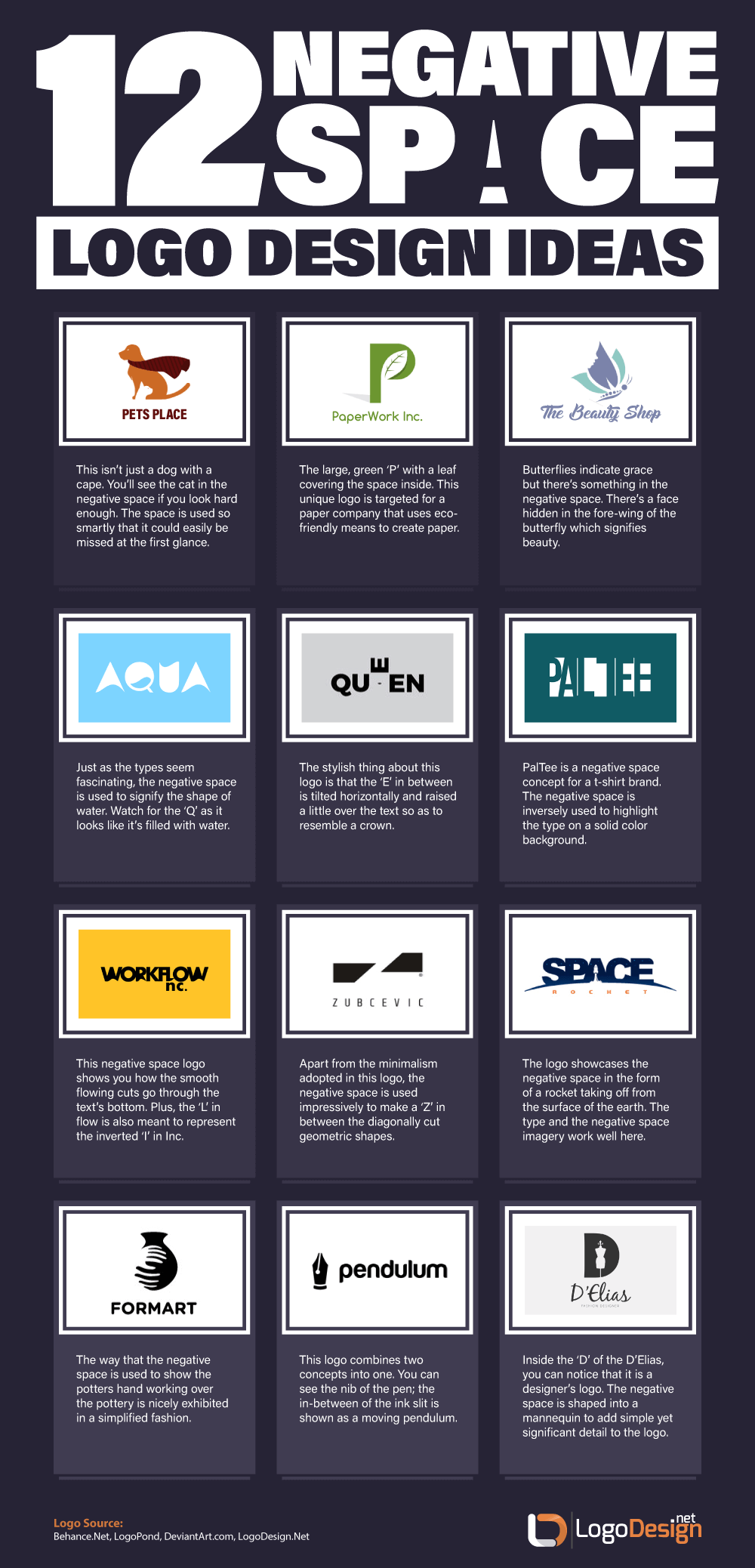
Below we present an array of original ideas dealing with the utility of negative space in logo designs. This happens to be genuine work of art from scratch where each illustration is an outcome of firsthand effort of a professional logo designer.

Beneficial Utility Of Negative Space: The Path To Glory
So, what goes beyond ingenuity, cleverness, tingling spines, tickling design taste-buds and incredible popularity a creative logo presents with? A great negative space in logo design is able to quickly grab viewers’ attention and get through the business’s core values and instincts in a fabulous way, turning it visionary, memorable and longer lasting.
Let’s delve a bit deeper to get it elaborated.
Borne With Simplicity & Creativity
With the usage of a few shades and shapes, the negative space business logo appear truly modest and decent, adapting well to different contexts so that they are absolutely visually compelling and catchy; being responsive for different design systems and memorable to your consumers is yet another gem to its crown.
More Trendy & Voguish
There is no denial to the fact that business logos emphasized with a cool combination of the negative and positive spaces are the true all-rounders that stand out from the crowd, being profoundly trendier, voguish and remarkably stylish all the way.
Ideal Weapon For Brand Recognition Via Depth & Concept
By all standards, a negative space logo is sufficiently potent in catching the viewers’ eye, grabbing and holding their attention for a good while until the subtle layers of meaning are unfolded via mental compatibility and association.
The Entertainment & Inclusion Aspect
The entertainment and fun aspects of a negative space logo should have really topped our list since the sheer feeling of a viewer figuring out the “hidden secret” of your customized logo is inexplicable. It lets the consumers participate and get engaged with your brand in the best possible way.
This concludes our tutorial which, in our slightest of opinions, would prove a milestone for all your DIY negative space logo designing requirements. Further, you may head onto our website LogoDesign.Net for great industry-oriented logo designs on your own accord. Just punch in the keyword(s) that you want and begin creating a FREE logo through our smart online logo maker tool.
Author Bio
By Tarif Khan, Head of Design,
Connect with him via tarif@logodesign.net
or LinkedIn
This article has been reviewed and verified by Zaheer Dodhia, an expert in logo design and branding