Thanksgiving marketing isn’t just turkeys and pie; it’s color psychology at work. Orange and brown quietly steal the show, spark nostalgia, and make everything feel just a little cozier!
November rolls in with cold mornings, crunchy leaves, and the unofficial start of comfort season. Regardless of losing some daylight, it’s the time for flannel shirts, hot drinks, and planning who’s bringing what to Thanksgiving dinner. In case you’ve noticed, the world suddenly feels wrapped in warm shades of orange, brown, yellow, and red.
Those same autumn colors follow, on grocery displays, coffee cups, restaurant menus, social media graphics, and every other Thanksgiving ad you scroll past. Brands know how these hues hit us right in the feelings. There’s something about them that just fits this time of year. They make us feel warm, hungry, and a little nostalgic.
Orange feels alive and festive; brown feels steady and familiar. Together, they’ve become the signature look of November. But there’s real color psychology behind why these work so well — and no, it’s not just because they match the turkey or pumpkin.
Let’s get into the nitty-gritty of it.
Why Color Picks Make or Break Your Thanksgiving Campaign?
Thanksgiving is a much-awaited family affair and a massive moment for businesses. The long weekend marks the start of the holiday shopping rush, and according to the National Retail Federation, nearly 197 million Americans shopped between Thanksgiving and Cyber Monday in 2024. So, whatever you put in front of your audience needs to grab attention fast without fading into the background.
Colors play a huge role in that. Warm, earthy tones like orange and brown do more than “look like fall.” They instantly make people think of comfort, food, and family—exactly the emotions that drive Thanksgiving marketing. When a brand wraps an offer in those tones, people are more likely to stop scrolling and click.
That’s the power of color. It doesn’t just decorate an ad—it shapes how people feel about it. During Thanksgiving, when everyone’s emotions are already tied to warmth and togetherness, the right colors can make your brand part of the moment.
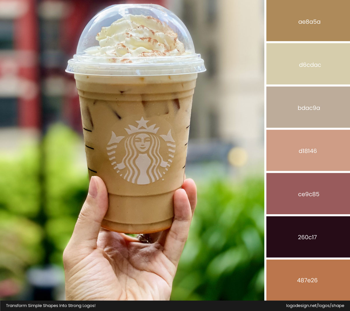
Starbucks Grande Iced Pumpkin Spice Latte.jpg” by JimmyStardust, used under CC BY-SA 4.0.
A classic, high-profile example is Starbucks’ Pumpkin Spice push, a limited-time fall offering that coincides with the start of autumn. The Pumpkin Spice Latte (and surrounding seasonal content) leans heavily on warm browns, toasted-orange accents, and cozy visual cues across press releases and social posts — a look that instantly reads “fall” to millions of customers and reliably drives traffic each year.
The Psychology of Warm Colors: Why They Feel Like Home
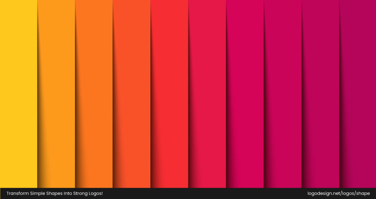
Warm colors like oranges, reds, browns, and yellows sit on the side of the color wheel that makes us feel cozy, energized, and connected. Talking about psychology, these hues are known to spark feelings of happiness, enthusiasm, and togetherness. They pull people in and make things more inviting. In marketing, that closeness is everything.
When you’re selling during a season that’s all about comfort and connection, using colors that emotionally feel warm makes your campaign hit differently. To understand this better, imagine a Thanksgiving ad for pumpkin pie in cool shades of teal or blue. Surely, the pie will feel cold, distant, and, well, unappetizing. That’s because cool colors (like blue, green, and purple) tend to calm us down — they’re great for brands that want to communicate freshness or trust, like a spa or a tech company. But for a holiday built around food, family, and comfort, cool tones just don’t bring the right emotions.
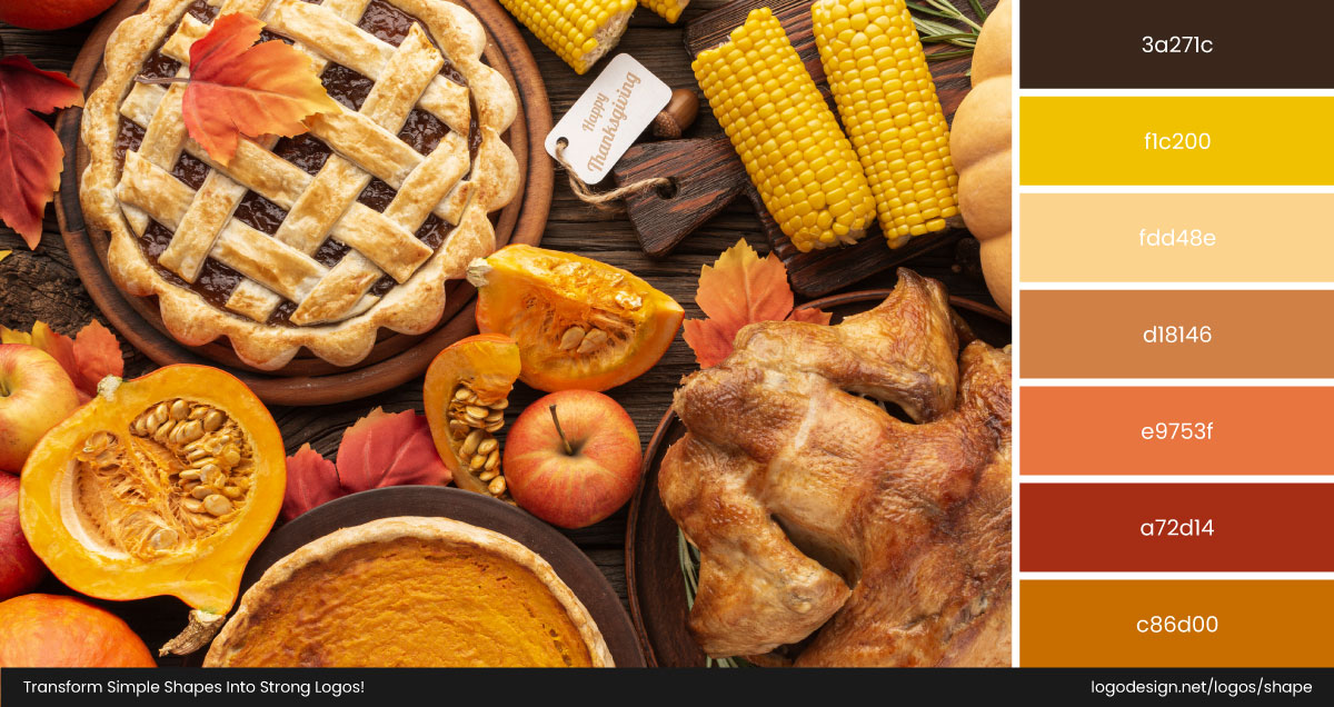
Warm colors, on the other hand, feel welcoming. That’s why the warm color palette dominates every Thanksgiving aisle, email banner, and social post you see in November. It feels right because it is right for the occasion.
• Colors Rooted in Nature and History
Thanksgiving’s color palette wasn’t invented by designers but inherited from nature and history. The holiday occurs at the peak of autumn, when orange and brown dominate the landscape. These hues represent harvest: pumpkins, corn, apples, and turning leaves.
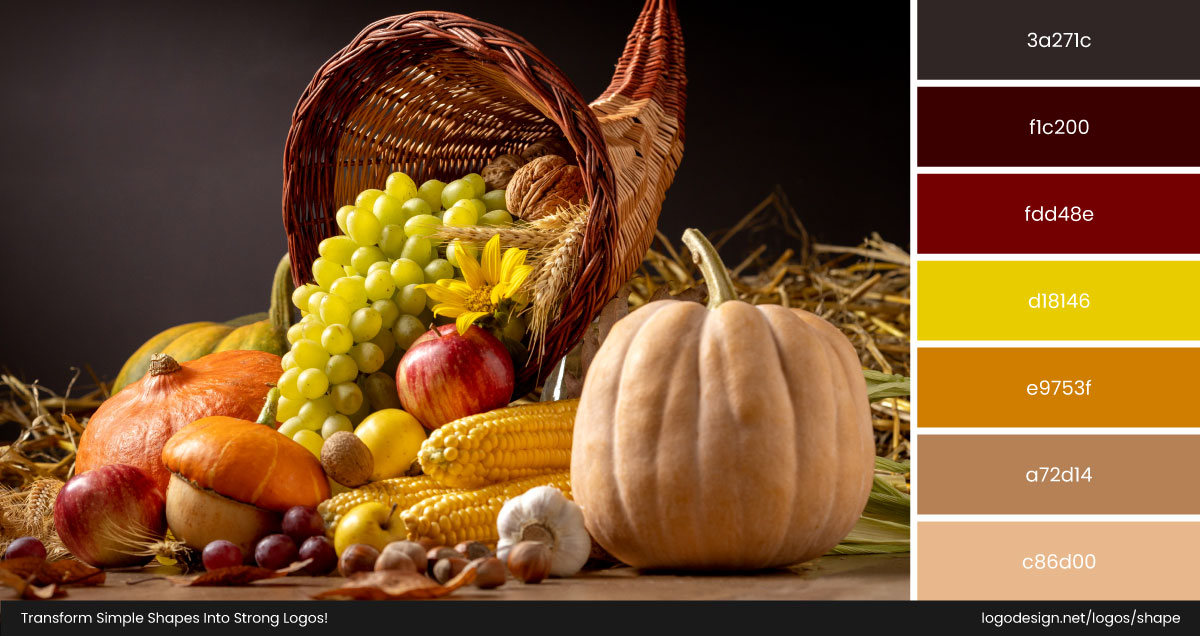
The traditional narrative of the "First Thanksgiving" between the Pilgrims and Native Americans in 1621 was a harvest festival set in the autumn. The foods on that table — roasted turkey, squash, corn, and pumpkin — all carried the earthy, golden-brown tones that became linked to the season. Over the years, as Thanksgiving evolved into a national celebration, those natural shades stayed at the center of its visual identity.
• The Emotional Impact
Did you know there’s real science behind why orange and brown dominate fall marketing? Marketers love these colors for a reason: they work.
- They spark appetite. Studies show warm hues make food look more appealing, which is gold for any Thanksgiving campaign.
- They evoke warmth and security. Orange and brown mimic the comfort of firelight and the sturdiness of home.
- They’re timeless. Unlike trendy color palettes, these tones are rooted in human experience — harvest, food, family, and earth.
So while trends will come and go, these two colors will keep owning Thanksgiving. The dominance of orange and brown is a blend of practical association with the fall season and a deliberate use of the psychology of colors to evoke nostalgic and heartwarming feelings. And in marketing, that’s what makes people stop scrolling, smile, and think, yeah, that feels like Thanksgiving.
• The New Influencer Aesthetic: Pumpkin-Spice Feeds
Scroll through Instagram in November and you’ll see a flood of warm‑filtered images—pumpkins, latte art, burnt-orange sweaters, muted browns in décor. Influencers are leaning into “pumpkin spice feeds” filled with warm filters, soft browns, copper lighting, and subtle orange highlights. It’s not overt branding but vibe. When lifestyle posts use these tones, they make viewers subconsciously link those hues to togetherness, warmth, and our November rituals. So, brands tapping into that vibe feel naturally part of the story.
Caitlin Covington (@cmcoving) is known as the face of “Christian Girl Autumn. " Her feed is full of rust-orange sweaters, autumn leaves, and warm browns—quintessential fall and Thanksgiving tones.
Marie Loren (@thepumpkinspiceboo) is another creator who defines “all things cozy” with lots of orange mugs, burnt brown backgrounds, and fall décor in her Instagram feed.
Maggie Michalczyk (@onceuponapumpkin), her user handle says it all. Maggie features fun seasonal recipes and visuals in autumn, with intense burnt orange and deep browns.
The Star Colors of Thanksgiving Marketing
If warm colors are the heart of fall, orange and brown are its soul. These two shades define Thanksgiving visually and emotionally. They’re rooted in nature, tied to tradition, and have a proven psychological pull that makes them irresistible for marketers.
1. Burnt Orange: The Warm Glow of Autumn
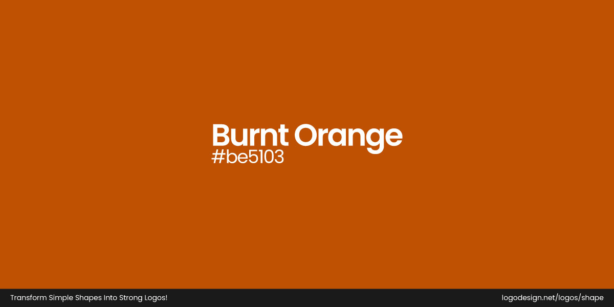
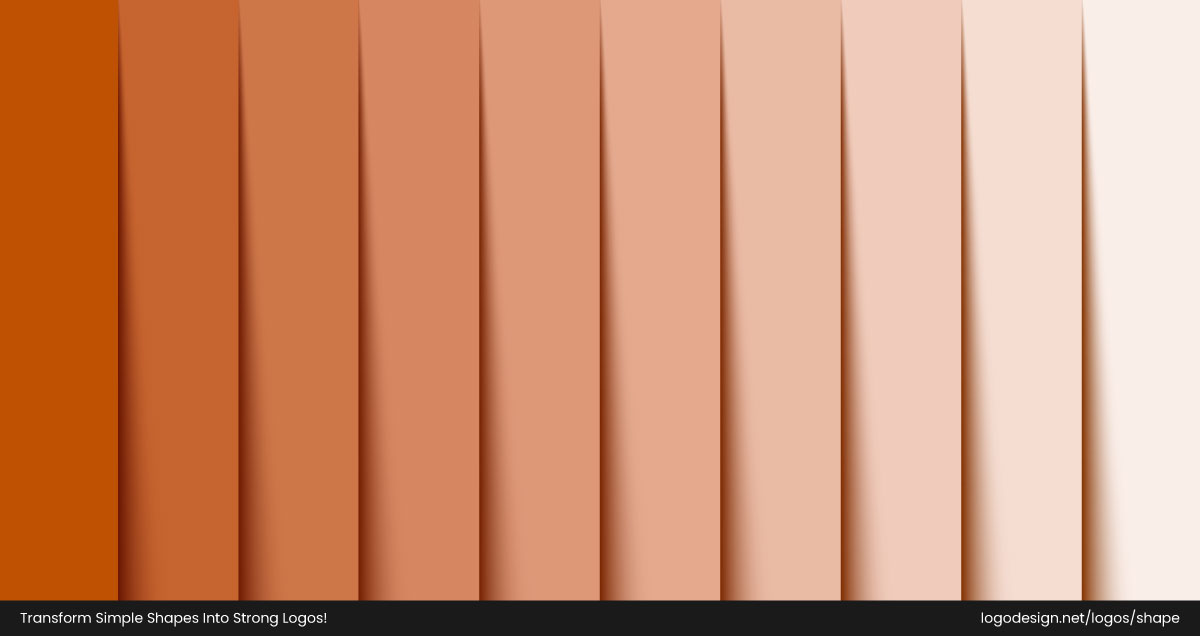
Burnt Orange isn’t just orange turned darker — it’s autumn in a color. It captures the look of crackling bonfires, roasted pumpkins, and sunset skies. With its rich, muted tone, Burnt Orange blends energy with sophistication.
Psychologically, it evokes warmth, enthusiasm, and comfort without the brashness of bright orange. It’s the “welcome home” color of Thanksgiving — inviting and cozy. Brands use Burnt Orange in seasonal designs, packaging, and décor to convey friendliness and festive cheer while staying grounded in authenticity.
2. Espresso Brown: The Grounded Classic
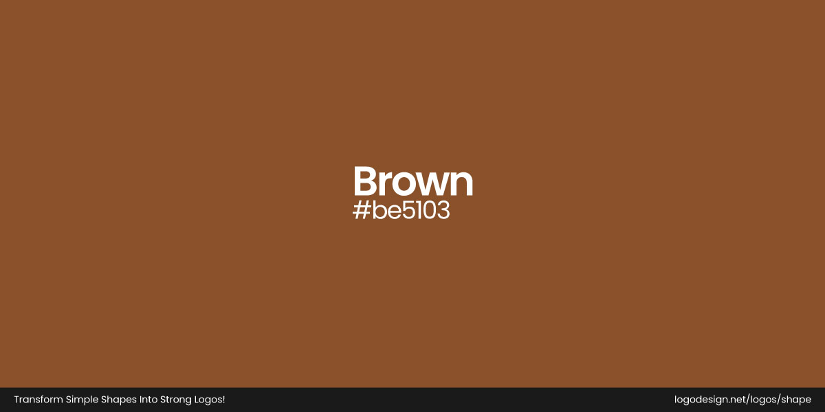
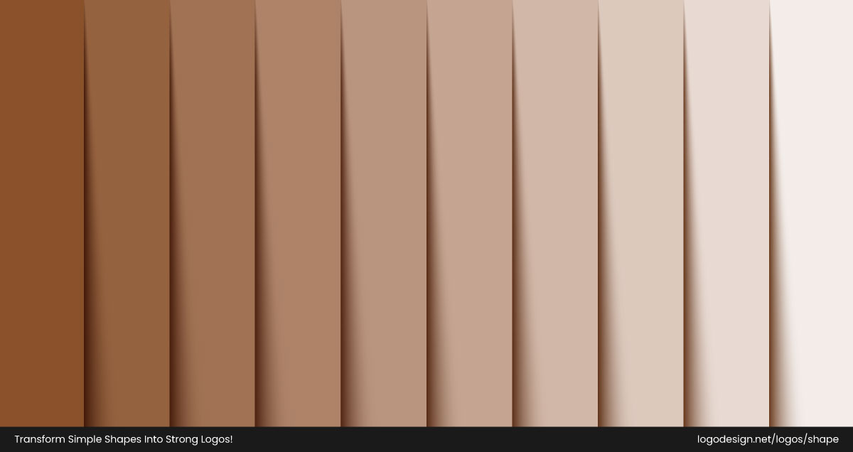
If Burnt Orange brings the excitement, Brown brings the grounding. It’s the color of wood tables, baked bread, and fertile soil — the essence of harvest and home. In color psychology, brown signifies stability, comfort, and reliability.
When used in textures, typography, or photography, brown instantly communicates “authentic” and “handcrafted.” It’s the perfect base color, offering a warm foundation that supports brighter tones like Burnt Orange, Golden Yellow, or Cream. It’s what makes Thanksgiving visuals feel cozy instead of cluttered.
3. Golden Yellow: The Harvest Glow
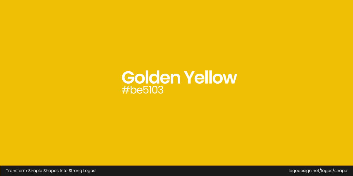
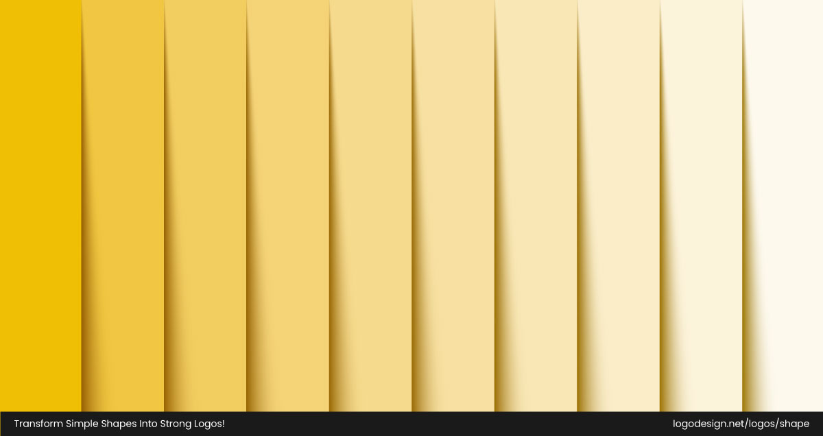
Golden Yellow shines with optimism and abundance. It’s the color of cornfields, candlelight, and warm sunshine — everything that makes Thanksgiving feel bountiful. Psychologically, it represents joy, gratitude, and generosity.
Design-wise, Golden Yellow is excellent for highlighting focal points or adding a cheerful accent to otherwise earthy palettes. It pairs beautifully with Burnt Orange and Brown to enhance the sense of richness and harvest warmth.
4. Deep Red: The Festive Heart
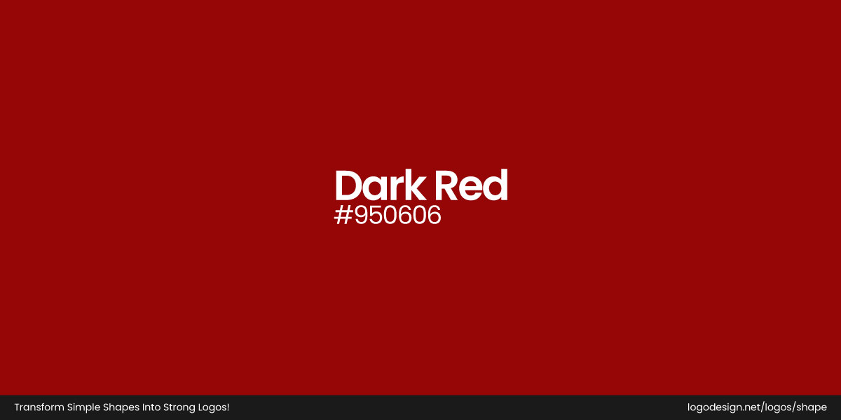
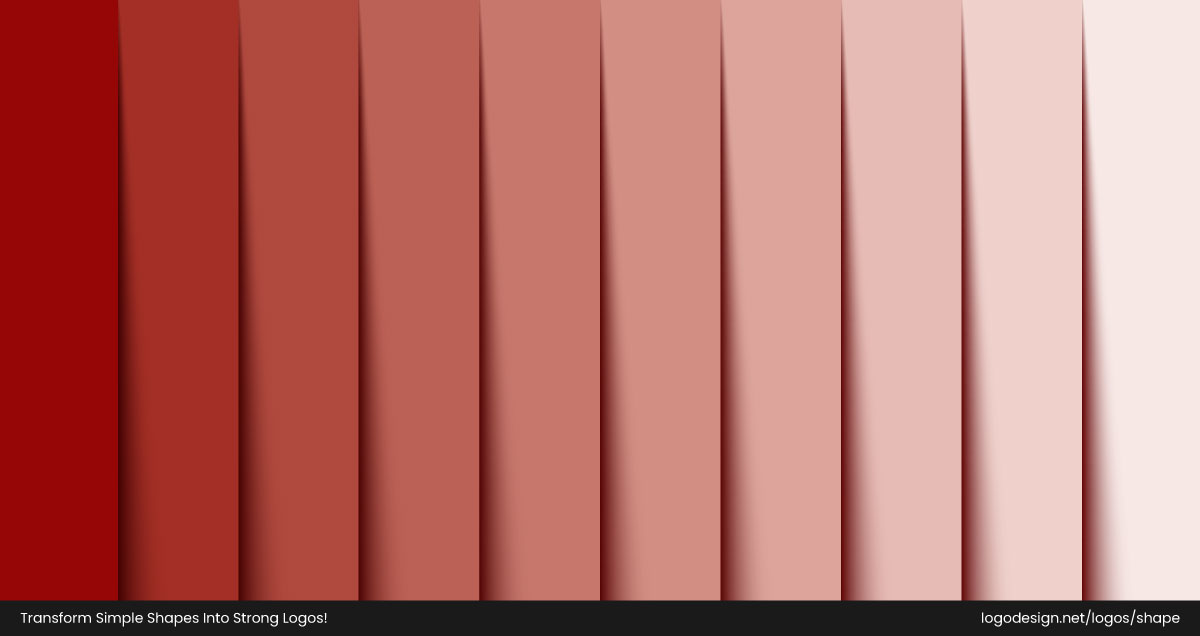
Deep Red carries emotional depth — it’s the color of cranberries, wine, and turning maple leaves. It embodies passion, togetherness, and the indulgent side of Thanksgiving.
In color psychology, deep reds stir appetite and emotion, making them ideal for food-related campaigns and festive visuals. When used with restraint, they add sophistication and a sense of celebration to autumn palettes.
5. Olive Green: The Natural Balance
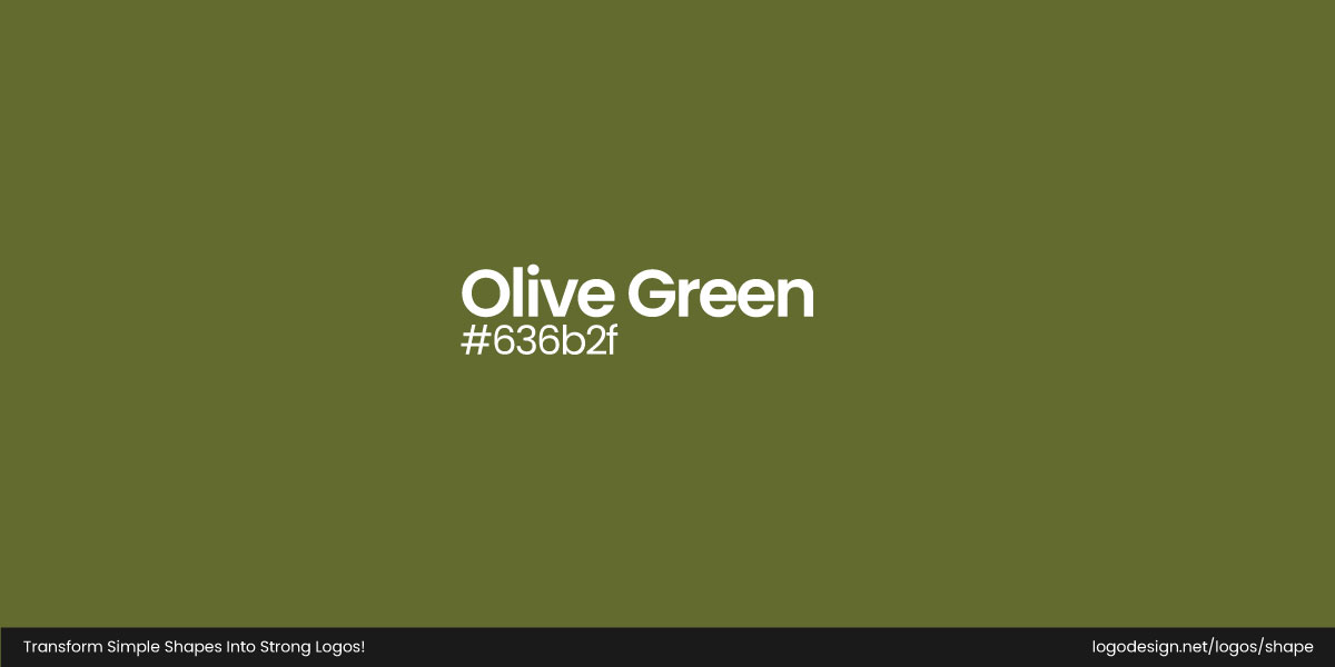

Olive Green brings calm to the season’s warm hues. Inspired by fall foliage and the earth’s natural tones, it introduces harmony and grounding to Thanksgiving color schemes.
Psychologically, green represents renewal and balance — a reminder of nature’s cycle even as the year winds down. Olive Green works beautifully as a complementary tone, softening the intensity of Burnt Orange and Deep Red while reinforcing the natural, rustic feel of Thanksgiving visuals.
The Perfect Pair: Brown + Orange Tones in Branding
Together, orange and brown strike a beautiful balance — one lively and emotional, the other grounded and sincere. Orange gets your attention; brown earns your trust. In marketing, that’s the sweet spot.
We’ve put together some of the best Thanksgiving visuals of all time — as frothy and enjoyable as that pumpkin pie you’ll be eating for breakfast the rest of the week.
1. Ibotta’s Cozy Orange in Digital Campaigns
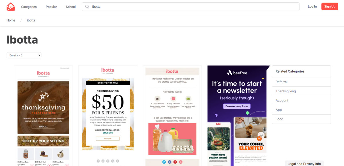
When you’re competing for attention in a crowded inbox, color is everything — and Ibotta knows it. Their Thanksgiving email campaigns pop with glowing orange tones that instantly scream “holiday season.” The orange reflects the theme of abundance and gets users in a festive mindset, ready to click, save, and shop for the holidays.
2. Hershey’s Seasonal Packaging
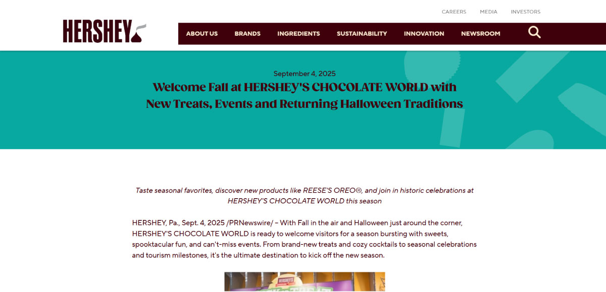
If brown had a mascot, it’d probably be Hershey’s. Every fall, the chocolate giant leans into its natural color palette with deep browns, rustic golds, and burnt orange highlights. The packaging feels rich, nostalgic, and perfectly aligned with Thanksgiving’s homey vibe. That subtle blend of color does double duty: it celebrates the warmth of the season while keeping Hershey’s iconic chocolate identity front and center.
3. DiGiorno’s Thanksgiving Pizza
The rumors are true…THANKSGIVING PIZZA IS BACK 🦃🍕
Yep, we heard how many of you loved and wanted to try this iconic pizza last year, so we've teamed up with @Kroger Family of stores to make that dream a reality.
And it all starts NOW. You in? pic.twitter.com/ZjNowAJkWb
— DiGiorno (@DiGiorno) October 21, 2024
Now here’s a brand that had fun with the season. DiGiorno’s limited-edition Thanksgiving Pizza, topped with turkey, gravy, and sweet potatoes, was a major hit. It’s quirky, creative, and visually delicious, drenched in all the golden-brown, orange-tinted goodness you’d expect from a Thanksgiving feast.
4. Macy’s Thanksgiving Day Parade
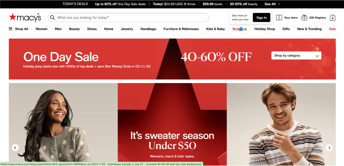
No Thanksgiving is complete without the Macy’s Parade — and their branding knows it. Each year, their visuals burst with rich oranges, reds, and browns, reflecting the joy and warmth of the season. From the posters to the parade floats, the palette instantly tells you, “It’s time to celebrate.” Over the decades, Macy’s has turned this color scheme into a visual tradition, a cue that the holidays have officially arrived.
5. Whole Foods’ Heartwarming Posts
Not every Thanksgiving ad needs fireworks; sometimes, all you need is sincerity. Whole Foods Market nails this every year with its minimal yet thoughtful Thanksgiving social posts. It’s simple, useful, and on-brand — exactly what you’d expect from a company built around wholesome living. It feels human, not corporate, which is why people actually stop to read it.
6. Trader Joe’s Fall in a Basket
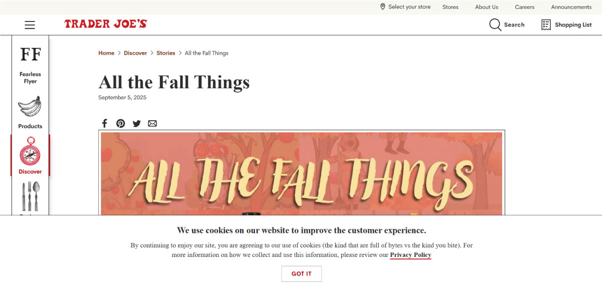
Trader Joe’s might as well be the unofficial ambassador of autumn. Walk into their stores in November and you’re wrapped in a palette of oranges, caramels, and warm browns, from product packaging to shelf displays and even handwritten chalkboard signs. Their seasonal favorites (pumpkin brioche, maple butter, and cinnamon) come dressed in designs that feel cozy, rustic, and joyful. Trader Joe’s doesn’t just sell food; it sells the feeling of Thanksgiving every time you grab a shopping basket.
7. Coca-Cola’s Share a Coke Campaign
From gratitude to the finest feast of the year, the best things in life are shared. #Thanksgiving #ShareACoke pic.twitter.com/J4fzrZmZVF
— Coca-Cola (@CocaCola) November 23, 2017
Coca-Cola’s seasonal campaigns often play with the palette in subtle but effective ways. In 2017’s Thanksgiving‑linked post, the brand used warm browns and amber tones around the iconic red to reflect a “shared‑table, thank‑you” vibe. They didn’t alter their logo, but the use of brown/orange in their visual assets taps into the seasonal feel without sacrificing brand identity.
8. Panera Bread’s Warm Fall Menu Visuals
Panera Bread uses a mix of soft browns, warm creams, and muted orange accents around their new menu announcement. The whole visual feels like the season — familiar, comforting, and just festive enough.
9. Google’s Thanksgiving Logo Doodle
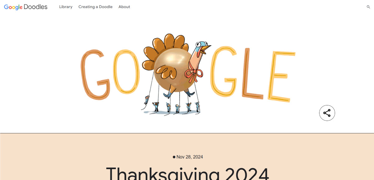
Every year, Google swaps out its standard logo for a Thanksgiving Doodle — and 2024 leaned straight into warm harvest tones. The letters were reimagined with a cozy, autumn-table setting featuring soft browns, deep oranges, and a friendly turkey illustration right in the center. It’s playful, familiar, and instantly seasonal without feeling overdone. The moment you land on the homepage, you get that “Oh, it’s Thanksgiving week” feeling — and that’s the whole point.
10. Campbell’s ‘Sides Season’ Holiday Campaign
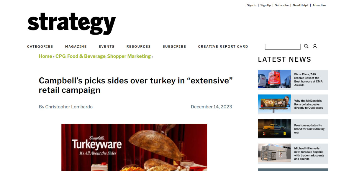
Campbell’s had a little fun with Thanksgiving tradition by openly choosing sides (quite literally). It showcases the sides that people care about more anyway. The campaign uses warm, harvest-inspired tones and connects strongly with the seasonal mood of food, family, and gathering.
How Small Businesses Can Use These Colors Effectively
Thanksgiving is the perfect time for small businesses to tap into the warm, inviting vibe of orange and brown. This autumn-inspired brand color palette can guide emotions, influence perception, and even nudge customers to take action.
It’s not just color theory; it’s human behavior. We’re wired to respond to warmth emotionally and physically. And in a season defined by comfort, gratitude, and shared meals, no other colors could tell that story better.
Here’s how you can make it work for your brand:
- Use Orange for Energy and Attention: Orange grabs the eye without being as aggressive as red. It is perfect for call-to-action buttons, promotional banners, or limited-time packaging. For example, you can add a “Shop Now” button or a special Thanksgiving edition product label.
- Use Brown for Stability and Authenticity: Brown evokes warmth, trust, and reliability. It is great for backgrounds, packaging, or digital visuals when you want your brand to feel grounded and artisanal. It pairs beautifully with natural textures like kraft paper, wood, or burlap.
- Layer with Complementary Tones: Cream, gold, and muted greens can soften the palette and create a cohesive seasonal look. Use cream for balance, gold for a festive shimmer, and muted green for subtle contrast reminiscent of harvest foliage.
- Highlight Products and Promotions: A bright orange accent on your logo, packaging, website banners, or social posts can subtly guide customers toward featured items or deals. It draws attention without feeling pushy.
- Consistency Across Touchpoints: Make sure your seasonal colors are applied consistently—social media, email campaigns, packaging, and in-store displays. A cohesive palette instantly communicates Thanksgiving vibes and strengthens your brand presence.
- Keep It Natural and Authentic: Don’t make color mistakes by overdoing it. Warm colors work best when balanced and purposeful. Even small tweaks—a brown header, an orange button—can make your visuals feel seasonal without feeling gimmicky.
Make the Smart (and Subtle) Seasonal Shift
Well, to your surprise, Thanksgiving branding is less about slapping pumpkins everywhere or drowning everything in orange. It’s about leaning into the true feeling of the season — the coziness, the familiar routines, and the family-in-the-kitchen moments.
Warm colors like orange and brown work so well this time of year because they feel like home. They remind us of warmth, comfort, and slowing down a little — which is basically Thanksgiving in a nutshell.
And the good news is that you don’t need a massive rebrand to lean into this. Small, tasteful tweaks can bring your brand into the season without losing its identity. While we’re at it, let’s talk about a few small seasonal tweaks that you can make to your business logo.
- Shift the color palette. Not entirely, but you can swap your usual accent color for a warm orange or brown.
- Add a small seasonal element like a leaf, a squash outline, a tiny turkey silhouette, or a steam swirl.
- Warm the backgrounds or gradients with a soft amber or cream undertone to instantly shift the mood to fall season.
- Lean into textual touches, for instance, craft paper, linen, woodgrain, or soft grain overlays for that cozy look.
- Use these changes in social headers, email footers, packaging stickers, or campaign banners during the season.
No need to be loud or cliché, just remember that the most memorable seasonal marketing is subtle, warm, and human. Whether you’re a big brand, a small café, or a solo creator, using color intentionally can make your audience feel welcomed.
Ready to make your brand feel warm, familiar, and genuine this season? Start with tweaking your logo.
