CodeNest cracked the code to fast, smart branding with LogoDesign.Net’s tools. No agency. No big budget. Just bold moves—and a brand that means business. See how.
Breaking into the tech world is no easy feat, especially when you’re trying to stand out in a sea of sleek competitors. This case study follows how a brand-new startup, CodeNest, carved out a bold and professional identity using LogoDesign.Net’s suite of branding tools. From logo to social headers to infographics, they built a visual presence that helped them look like they’ve been in the game for years.
About CodeNest
CodeNest was launched by Emma Ruiz, a former freelance software developer from Austin, Texas. It is a SaaS company born out of a need she saw time and time again—small businesses struggling to manage complex backend systems. Emma’s idea was simple: make backend tools smarter, not harder.
Having a great idea alone wasn’t enough in a market full of fast-moving tech companies. Emma knew why a business needs a logo, among other things, to have a consistent brand image. CodeNest needed to look the part—professional, tech-forward, and memorable. From the very first logo to the final shareable infographic, CodeNest’s visual journey was all about simplicity and strategy.
A quick snapshot:
Company Name: CodeNest
Founder: Emma Ruiz
Industry: Software as a Service (SaaS) / Tech
Company Size: 8 employees
Location: Austin, Texas
Services Offered:
- Backend infrastructure tools for small businesses
- Custom APIs and cloud integrations
- Real-time analytics dashboards
- Ongoing tech support and maintenance
The Business Challenge
Launching a tech startup is tough, but building a professional brand from scratch? That was the real headache for Emma Ruiz.
She knew her product had potential. CodeNest had already landed a couple of pilot clients, but the branding? It didn’t exist yet. No business logo, no social media presence, no visuals to explain what her platform actually did. Emma needed to look sharp, fast—but hiring a full-fledged design agency wasn’t in the budget. Not in the early days.
“I just couldn’t afford to spend thousands on branding,” she said. “But I also couldn’t afford to look like an amateur.”
So, Emma started looking for innovative but affordable alternatives. She wanted something quick, flexible, and good enough to hold its own next to the big players. That’s when she stumbled on LogoDesign.Net, a suite of DIY branding tools that promised exactly what she needed: no-frills, no-wait, professional-grade design.
With zero design experience but a clear vision for CodeNest, Emma dove in. What happened next helped shape how her brand is seen today.
Designing the Foundation: CodeNest’s Logo Journey
The first thing Emma wanted to lock down was a logo—something simple, sharp, and memorable that could instantly communicate who CodeNest was and what it stood for. She wasn’t looking for anything flashy. Her initial vision was a clean wordmark logo that would put the brand name front and center, with no distractions.
So she headed over to LogoDesign.Net’s logo maker, typed in her business name and industry, and started browsing through the options. Hundreds of logo designs popped up (minimal, modern, geometric, bold, you name it!), and three in particular stood out right away:
CodeNest logo using a simple blue font with negative space, designed with LogoDesign.Net
CodeNest logo using green-colored 3D font, designed with LogoDesign.Net
CodeNest logo using thick, black, and techy font, designed with LogoDesign.Net
They were clean, easy to customize, and visually balanced. But something still felt off. “They looked great,” Emma said, “but they didn’t really say anything about what we do or how we think.” So, she kept digging.
This time, she explored the information technology logo category, and that’s when two new options caught her attention:
CodeNest logo using an earth-like icon and blue fonts, designed with LogoDesign.Net
CodeNest logo using an earth-like icon with a jigsaw puzzle, designed with LogoDesign.Net
The globe element spoke to CodeNest’s mission—connecting systems, data, and people in seamless and innovative ways. After a quick chat with her team, Emma decided to go with the Jigsaw Puzzle Globe. It was smart, symbolic, and left room for personalization.
With the logo selected, Emma used the built-in editor to make the design her own:
Here’s how she tweaked it:
- Changed the primary color to shades of blue (symbolizing trust, innovation, and stability)
- Customized the slogan area to add: “Systems That Just Work”
- Choose Helvetica Neue for a clean, modern feel
- Adjusted the puzzle lines slightly for better balance in smaller formats
CodeNest logo using an earth-like icon having green and blue jigsaw puzzles, designed with LogoDesign.Net
And just like that, the logo was done. It was ready to go on everything from pitch decks to product dashboards. She downloaded the logo in all file formats and realized, “We finally have a face to our name.”
Creating a Cohesive Social Presence with Custom Headers
With CodeNest’s logo finalized, Emma moved on to the next big step: launching their official social media presence. As they prepared to go live on platforms like Facebook, LinkedIn, Twitter, and Instagram, she knew that keeping the branding consistent across all channels was crucial because that is how they were introducing themselves to the world.
Designing impactful visuals for social media was a must. Emma turned to LogoDesign.Net’s social header maker to make a strong first impression. She wanted something modern, eye-catching, and editable, so she could tailor the design to reflect CodeNest’s personality.
After browsing through dozens of options, she found a Facebook header template that stood out:

Social media header with green background and bold white fonts, designed with LogoDesign.net
From there, Emma took full control of the design. Using the editor, she:
- Replaced the placeholder image with one more relevant to her business
- Dropped in her newly created logo
- Updated the headline and subtext to match CodeNest’s mission
- Adjusted the fonts and colors to stay in sync with her brand palette
Once the Facebook header was finalized, she resized and slightly modified the same design for Twitter and LinkedIn to maintain a seamless visual identity. It was quick, easy, and saved her the hassle of designing everything from scratch.
Have a look at the final header:
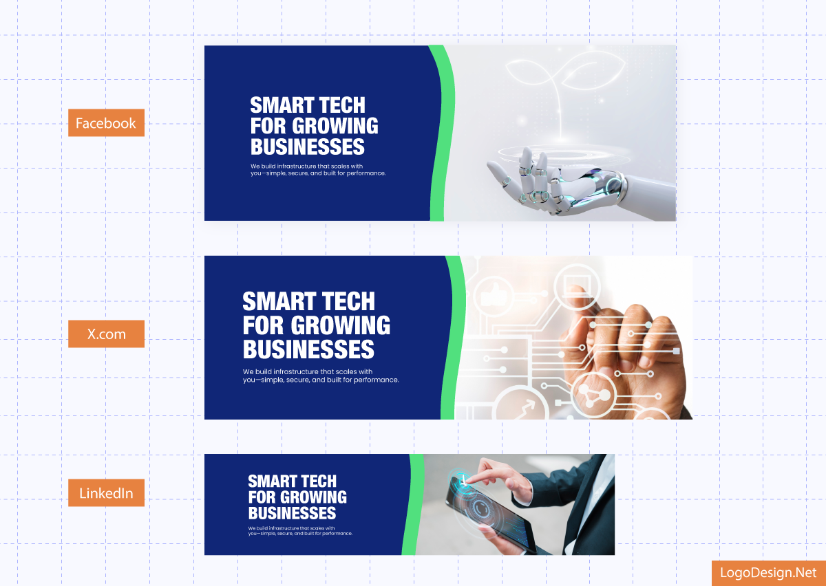
Social headers for different platforms using a dark blue background and thick white fonts, designed with LogoDesign.net
As for Instagram, she took a more creative route instead of a header. Emma used the same template layout to craft an introductory post—a snapshot of what CodeNest is all about. It featured their logo, a short tagline, and a clean layout showcasing their core services. It was the perfect way to start conversations with early followers.
The final post turned out exactly how she imagined:
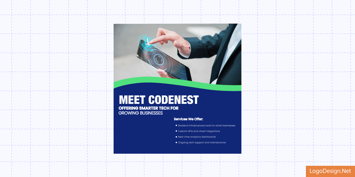
Social post using an image with a dark blue background and thick white fonts
Each platform had a header (or post) that felt native, yet clearly part of one cohesive brand story.
Also Read: How Soundwave Podcast used a logo editor to design social media headers.
Turning Insight into Impact: Creating a Branded Infographic
After wrapping up her social headers, Emma wanted to take things a step further and share valuable insights with her audience in a visually engaging way. She knew infographics should be a part of the small business marketing strategy as visuals are processed 60,000 times faster than text.
So Emma headed to LogoDesign.Net’s infographic maker. She browsed through several editable templates, eventually narrowing them down to two that felt on-brand:
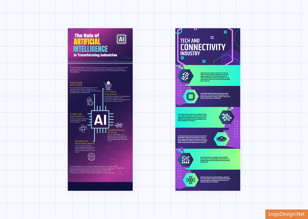
Two tech-friendly infographics using pink and purple backgrounds, having differently structured text, designed with LogoDesign.Net
While both had potential, the second one aligned more closely with her content’s intent. It had just the right structure to present her message clearly without overwhelming the reader.
Emma then added her company logo and dropped her infographic content into the ready-to-edit template she finalized.
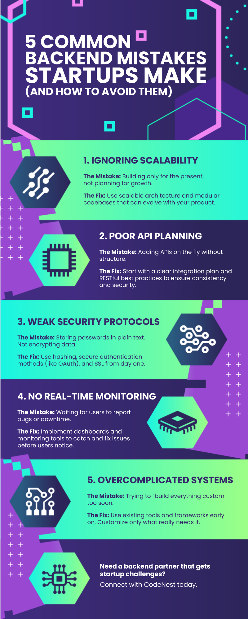
An extended infographic using different shades of purple and green, along with tech icons, designed by LogoDesign.Net
At this stage, the infographic looked great, but it lacked consistency with her brand identity. So, to fix that, Emma tweaked the fonts and layout slightly. She also customized the color palette with CodeNest’s signature blue tones.
The final result was a sleek, informative, and professional infographic that was perfect for sharing on CodeNest’s website and social platforms. Take a look:
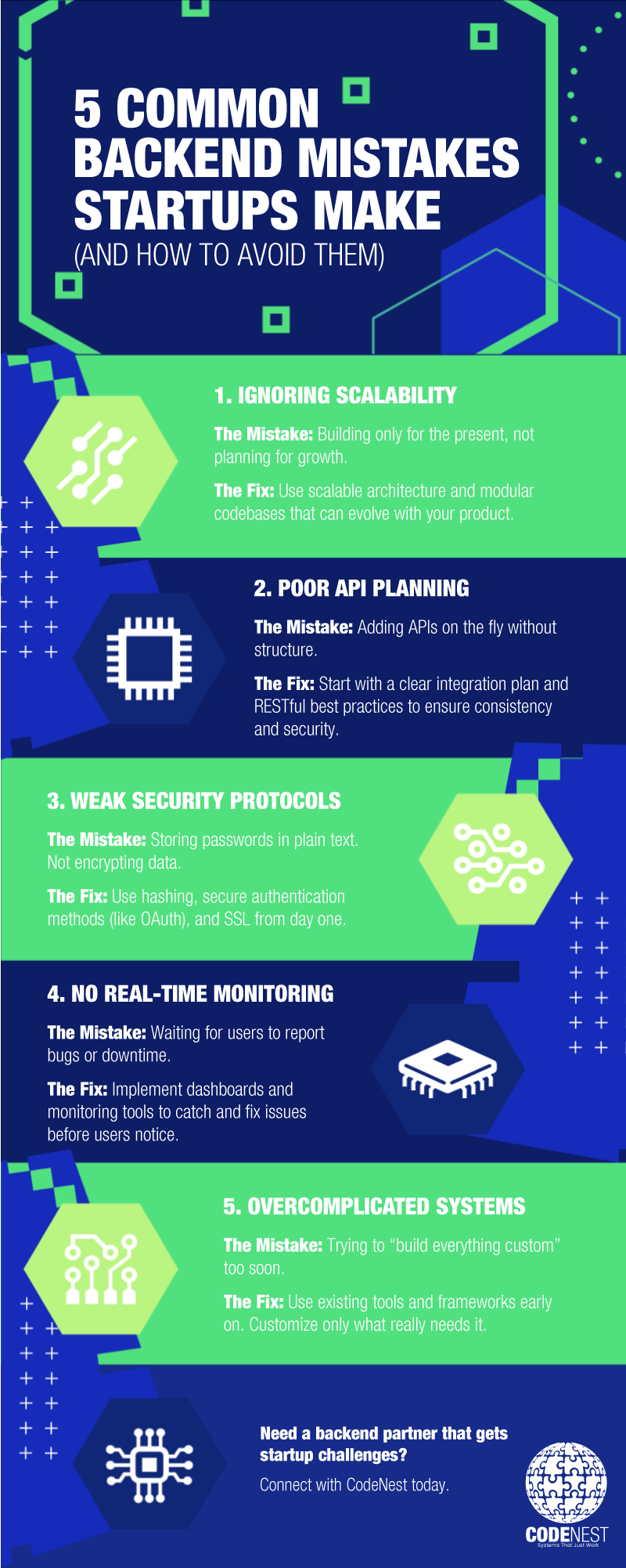
An extended infographic using different shades of blue and green, designed with LogoDesign.Net
The Results
With just a few tools and a clear vision, Emma managed to shape CodeNest into a brand that looked as sharp as its services. The logo gave the startup a professional face. The social headers brought consistency across platforms, making every profile feel intentional and on-brand. And the infographic? It quickly became one of their most-shared posts and earned attention from early-stage investors and potential clients.
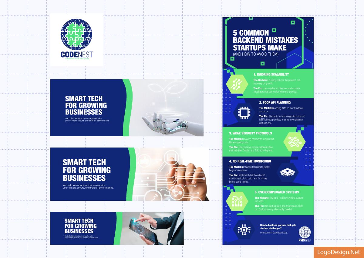
Branding element for CodeNest, with blue and green colors and thick white fonts, designed with LogoDesign.net
In less than a week, CodeNest went from having no visual identity to looking like a seasoned player in the tech space. The best part is that they did it all without hiring a design team or blowing the budget.
Build Your Brand Without the Overhead
From logo to launch-ready visuals, LogoDesign.Net gives you everything you need to create a consistent brand identity. Start from scratch or refresh your visuals; our easy-to-use branding tools help you look professional from day one.
Start designing today at LogoDesign.Net.
Case Study: How CodeNest Went From Startup to Standout – All in Days!
Launching a tech startup is tough. Branding one on a tight budget? Even tougher. See how CodeNest used LogoDesign.Net to create a sleek logo, social media visuals, and a share-worthy infographic without the usual back-and-forths. Dig into the case study to see how they impressed investors and clients with a sharper brand identity, just like their SaaS product, from day one.
