Finding a font can turn into a rabbit hole fast. So we did some of the digging for you and rounded up 101+ free fonts worth knowing.
Finding a good font should not feel like digging through an endless pile of options and hoping something finally clicks. Yet that is exactly what happens when you start looking for fonts online. Quite frankly, there are thousands to choose from, and while plenty look great at first, they do not all work well once you put them into an actual design.
The right typeface in a logo can make it feel sharper, a poster more inviting, or a website much easier to read. The best part? You do not have to spend a fortune to find one. We have rounded up 101+ free fonts worth trying, from clean and simple typefaces to bold, playful, and distinctive styles.
Before we begin, let’s take a quick look at common typography styles.
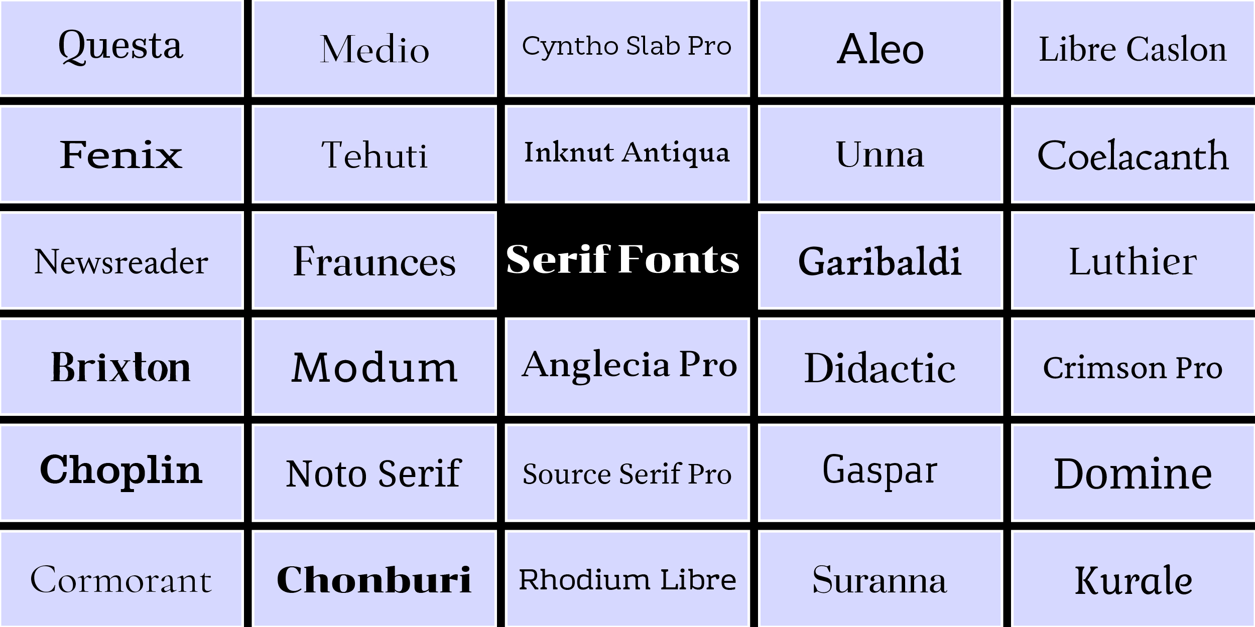
- Serif Fonts: Serif fonts have small strokes at the ends of their letters, which gives them a more traditional and refined appearance. You will often see them in brands that want a sense of elegance, heritage, or authority. Vogue, Zara, and Rolex are perfect examples.
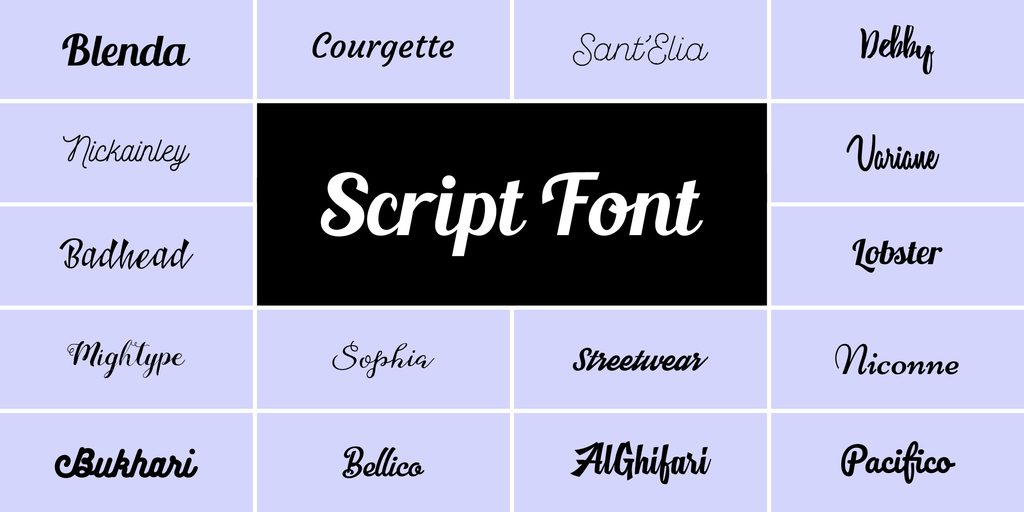
- Script Fonts: Script fonts take their cues from handwriting and calligraphy, so they tend to feel more personal, expressive, and decorative. They can be beautiful for brands that want a distinctive signature-like look. Coca-Cola, Disney, and Cadbury are well-known examples of script logos.
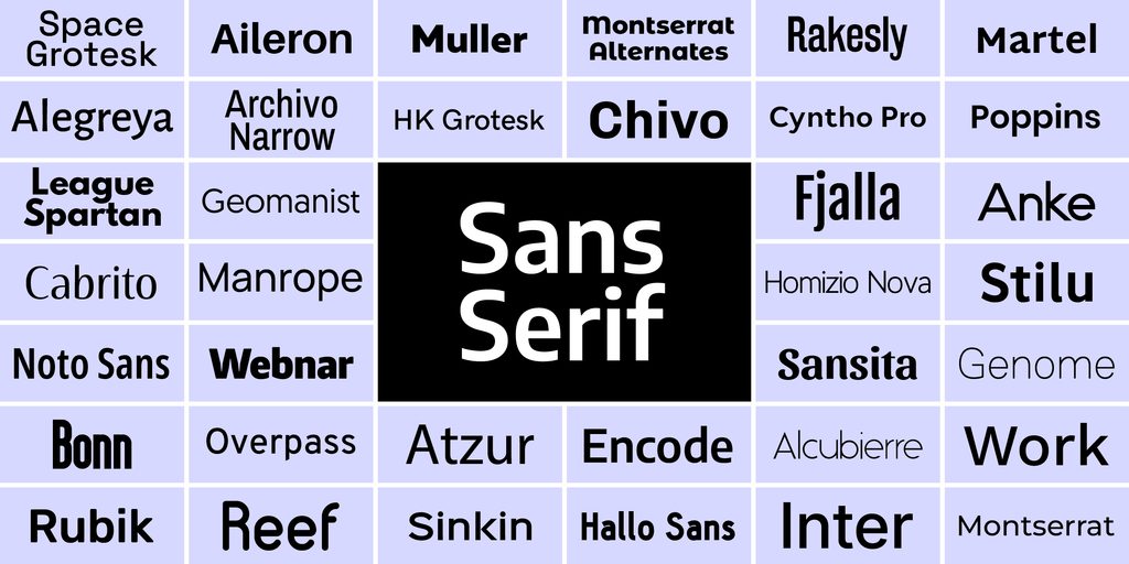
- Sans Serif Fonts: Sans serif fonts keep things clean and straightforward, with no little strokes at the ends of letters. They are easy to read and can feel modern, friendly, or professional depending on the design. Google, FedEx, and Spotify are familiar examples of brands using sans-serif lettering.
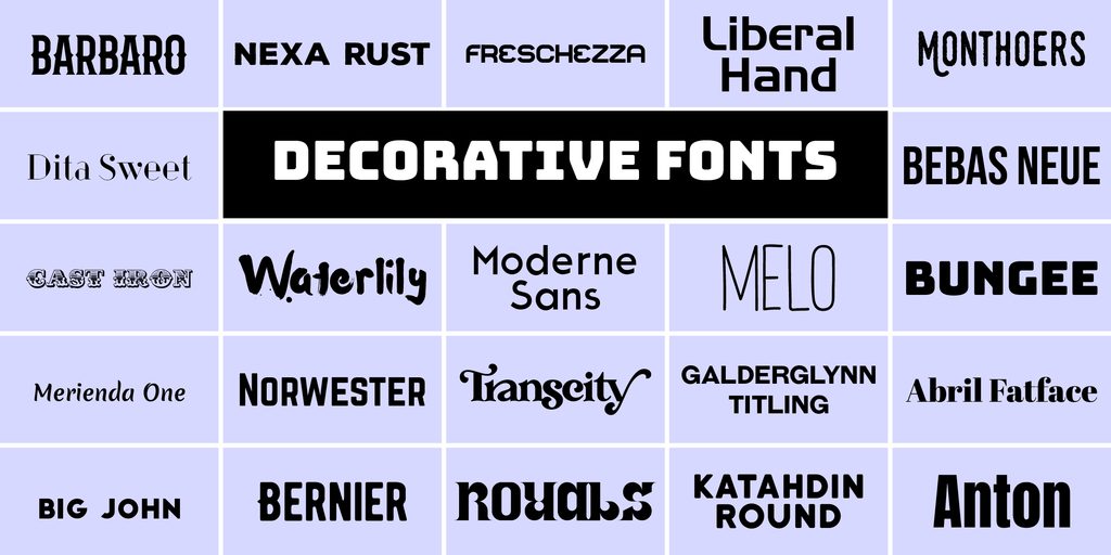
- Display / Decorative Fonts: Display and decorative fonts are designed to make a visual statement, often using bold, unusual, or highly stylized letterforms. They are commonly used in logos, posters, packaging, and headlines where the typography needs to stand out. LEGO, Disney, and Fanta are recognizable examples of brands using distinctive display-style lettering.
Serif Fonts
1. Questa
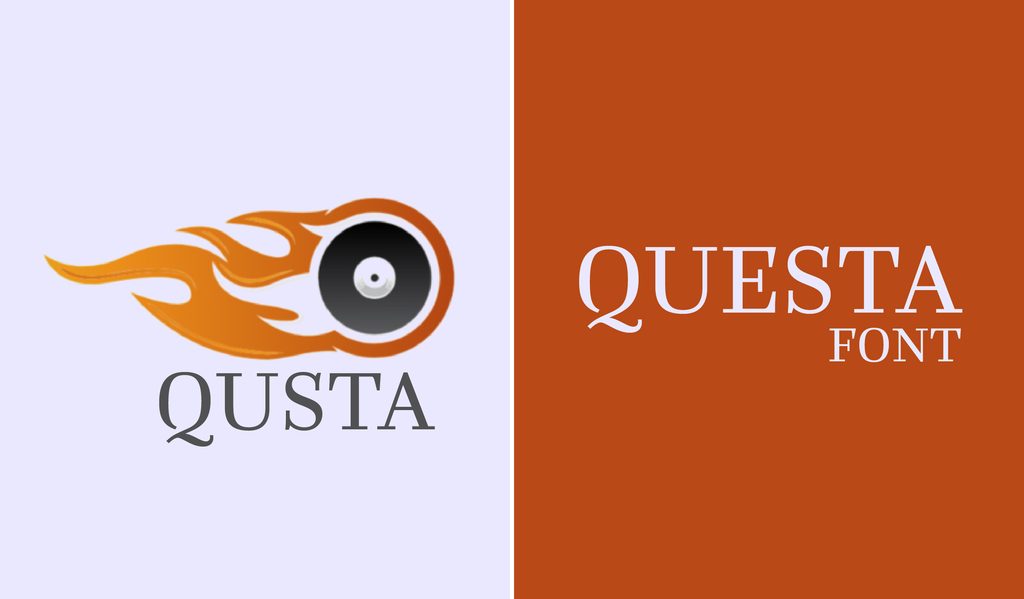
Questa gives you a whole little toolkit, with serif styles for text and display work plus a matching sans serif. It is handy when one project needs several type treatments that still belong together.
2. Fenix
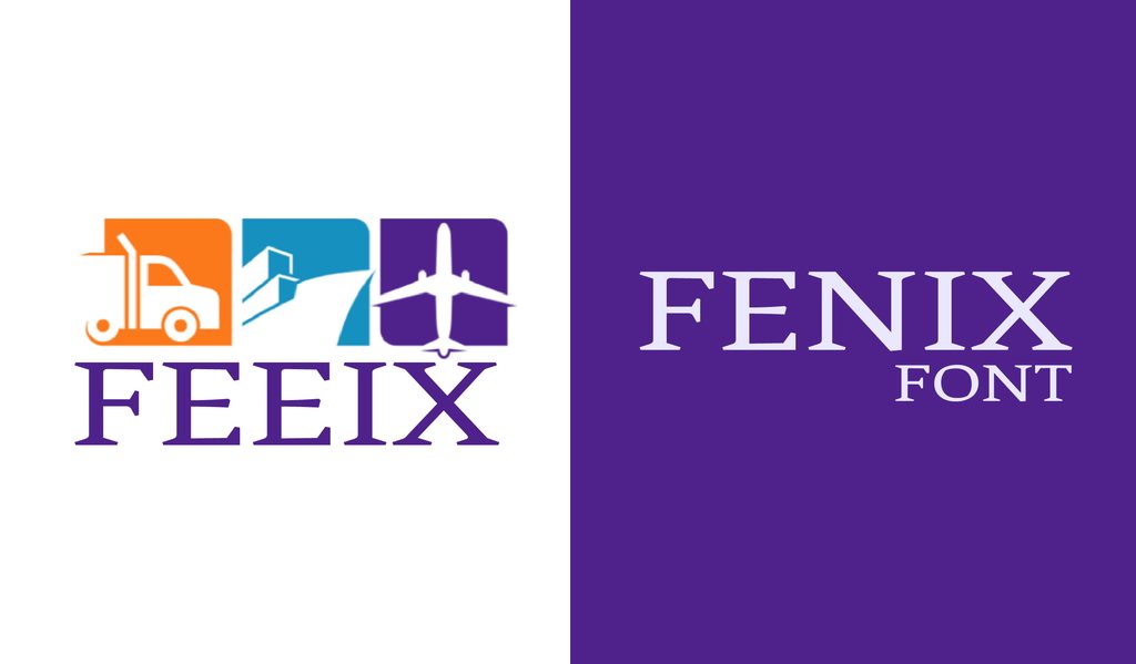
Fenix has strong, angular serifs that give it a distinctive look while keeping the letters easy to read. It works just as well in smaller text as it does in larger headings.
3. Newsreader
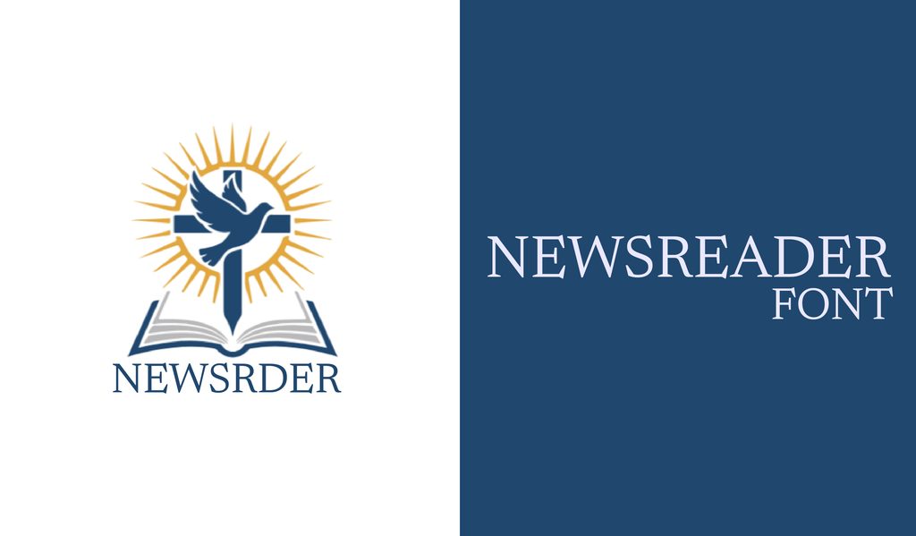
Newsreader was built for long-form reading, with proportions that stay comfortable across screens and print. It fits naturally into websites, magazines, articles, and other text-heavy designs.
4. Brixton
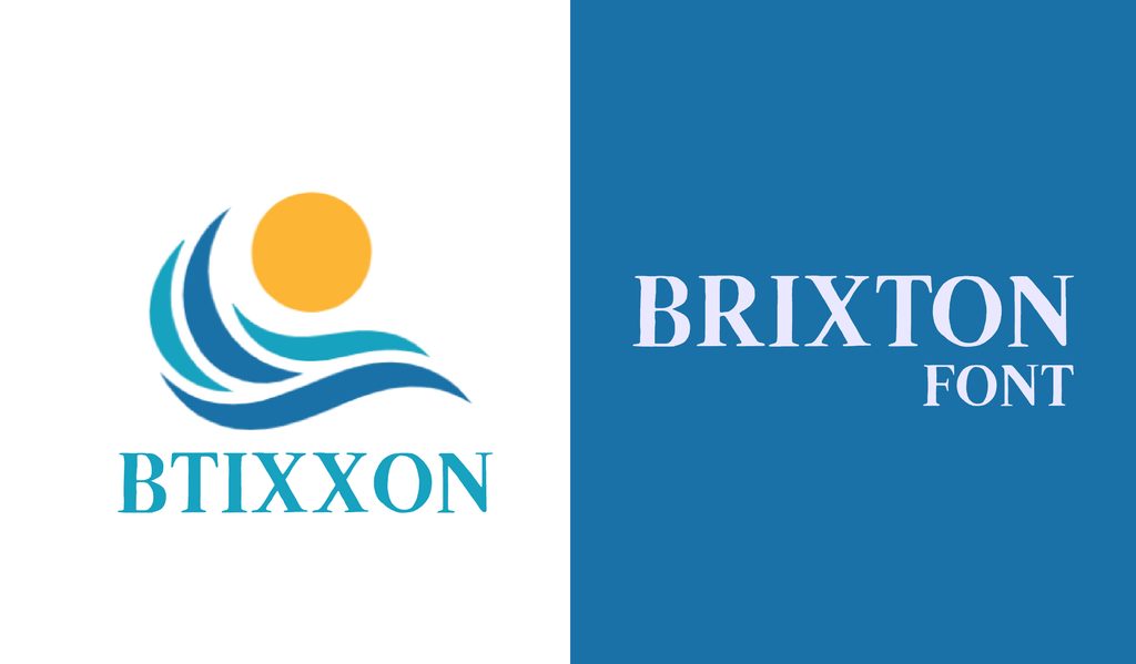
Brixton gives the traditional serif treatment a hand-drawn twist. Its alternate characters add even more personality, making it a fun choice for designs that should feel less formal.
5. Noto Serif
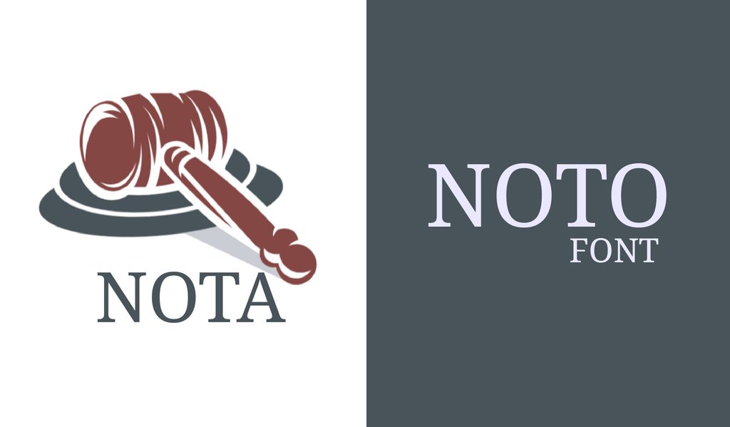
Noto Serif is a reliable choice when you need clean, readable serif text across screens and languages. It fits naturally into websites, apps, articles, and other digital work.
6. Choplin
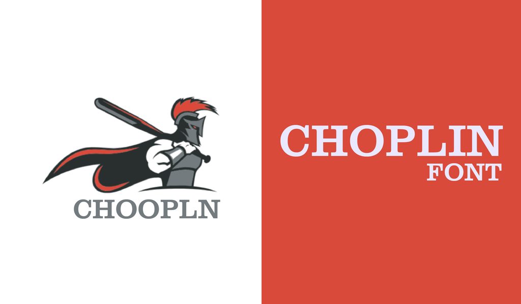
Choplin brings the sturdy look of a slab serif, softened with rounded details. It has enough personality for packaging and websites without feeling overly formal.
7. Cormorant
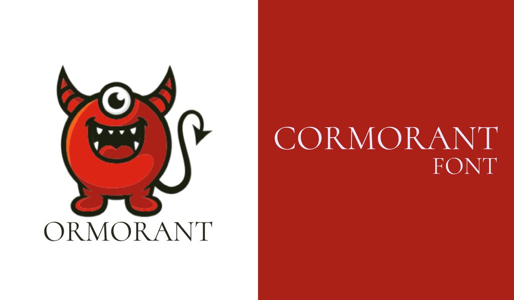
Cormorant takes cues from Garamond and gives them a sharper, more refined edge. It looks particularly well at larger sizes, whether you are working on print or web designs.
8. Medio
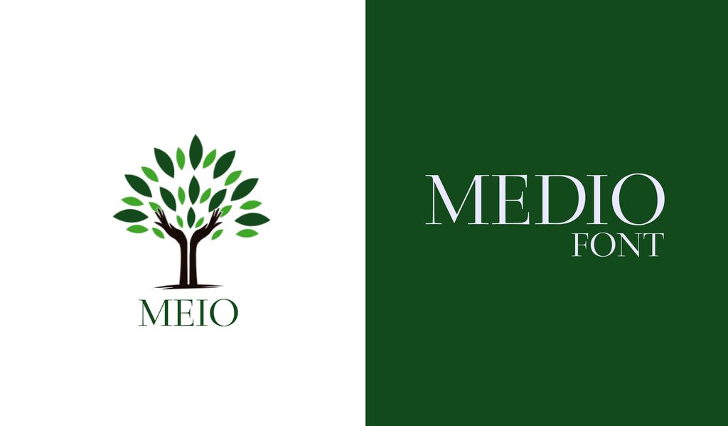
Medio pairs fine serifs with a noticeable contrast between thick and thin strokes. The result has a polished, high-end feel that suits invitations, fashion work, and classic branding.
9. Tehuti
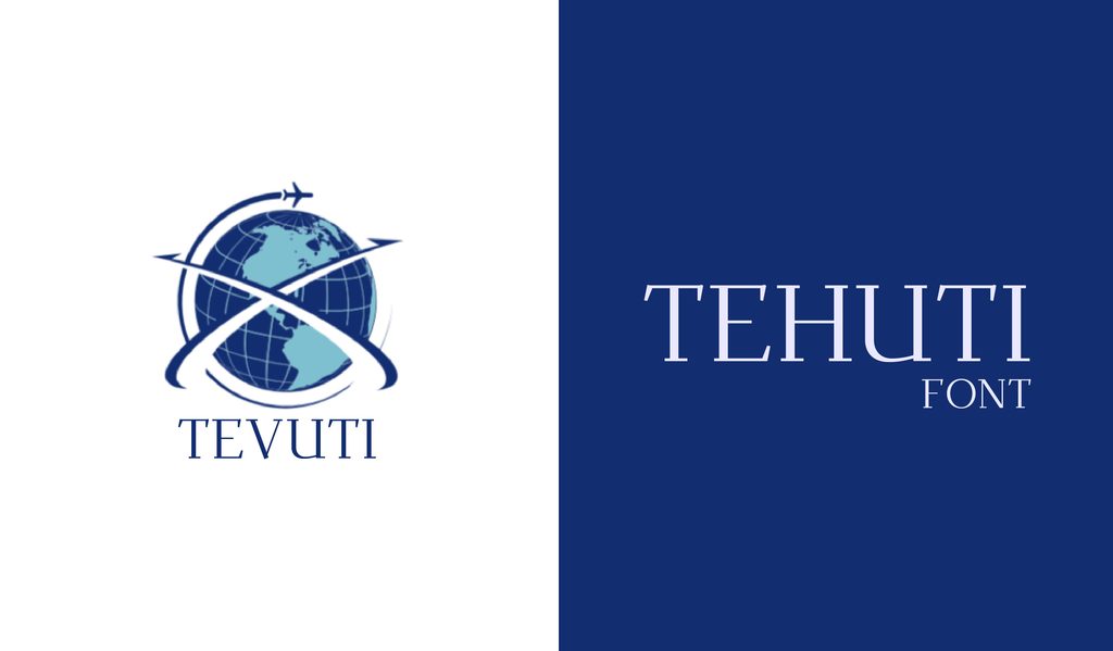
Tehuti has a delicate, elegant look with alternate characters that add a little extra detail. It is a good match for traditional designs, formal layouts, and longer pieces of text.
10. Source Serif Pro
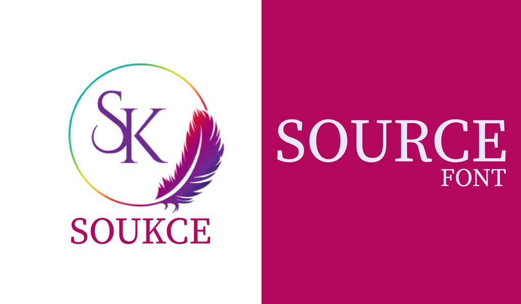
Source Serif Pro has that familiar bookish look, with a classic style that still feels at home on modern screens. It is an easy pick for articles, books, and other text-heavy designs.
11. Rhodium Libre
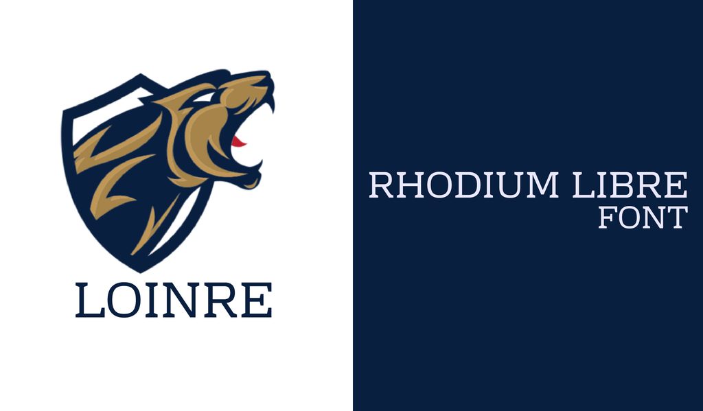
Rhodium Libre has wide, open letters that stay clear even at smaller sizes. That makes it a handy serif for websites and mobile apps.
12. Fraunces
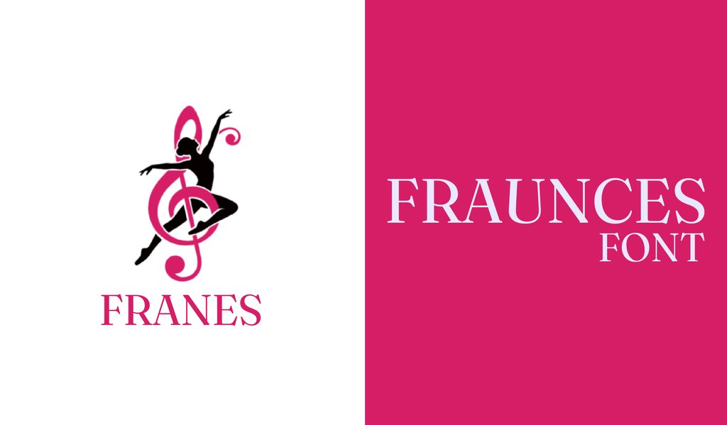
Fraunces mixes old-style serif details with playful, slightly quirky shapes. Its distinctive personality makes it a fun option for branding, headlines, packaging, and editorial designs.
13. Modum
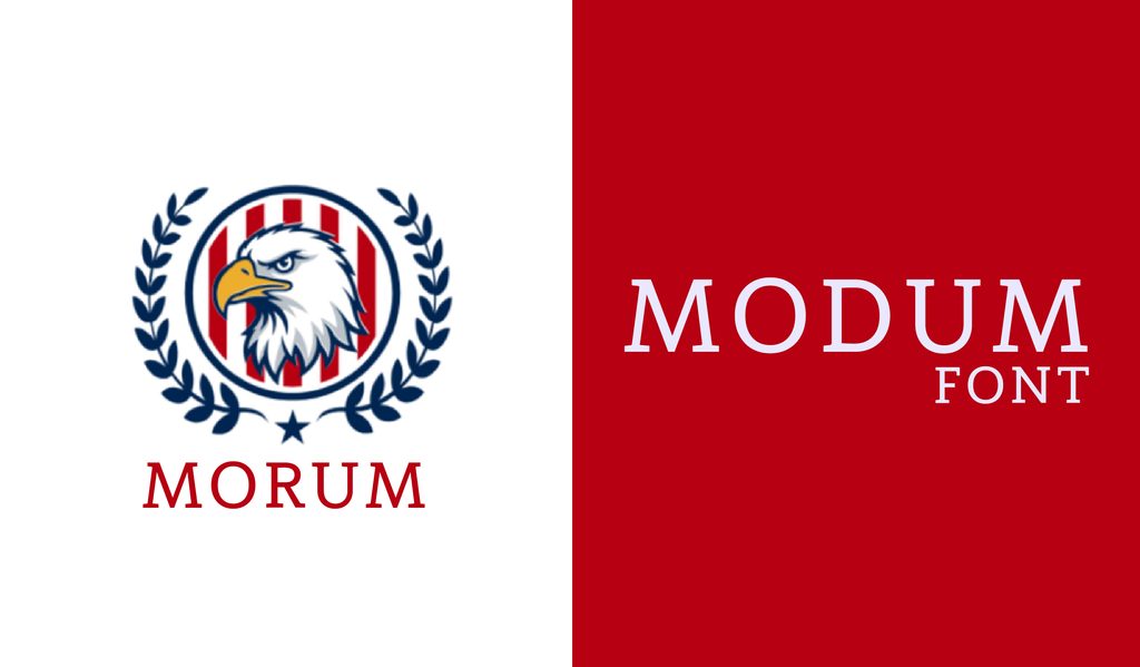
Modum was made with long reading sessions in mind, so it feels right at home in books, newsletters, and magazines. Its alternate letters, small caps, and ligatures give designers plenty of options.
14. Aleo
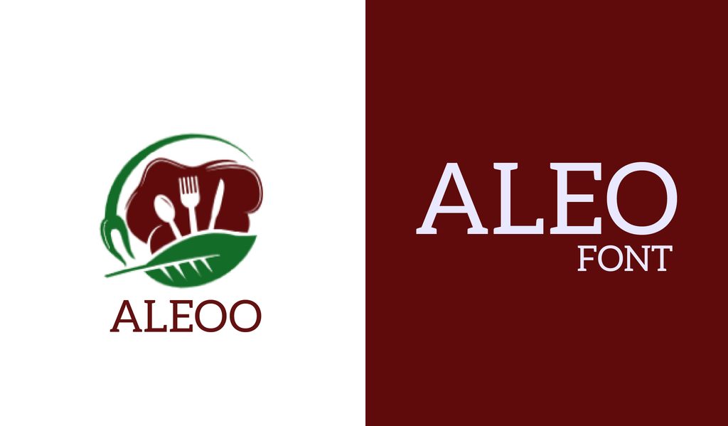
Aleo softens the usual slab serif with rounded edges, giving it a friendly feel. It reads well on websites, brochures, and promotional material without looking too stiff.
15. Inknut Antiqua
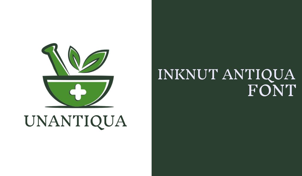
Inknut Antiqua draws heavily from old manuscript lettering, giving it a formal, almost carved appearance. Despite that historical feel, it remains comfortable enough for long-form reading.
16. Unna
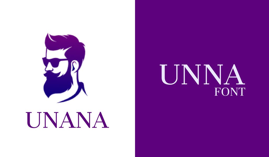
Unna mixes strong letter strokes with fine, delicate serifs for a softer look. It was made with books in mind, but it also works nicely on websites and editorial layouts.
17. Libre Caslon
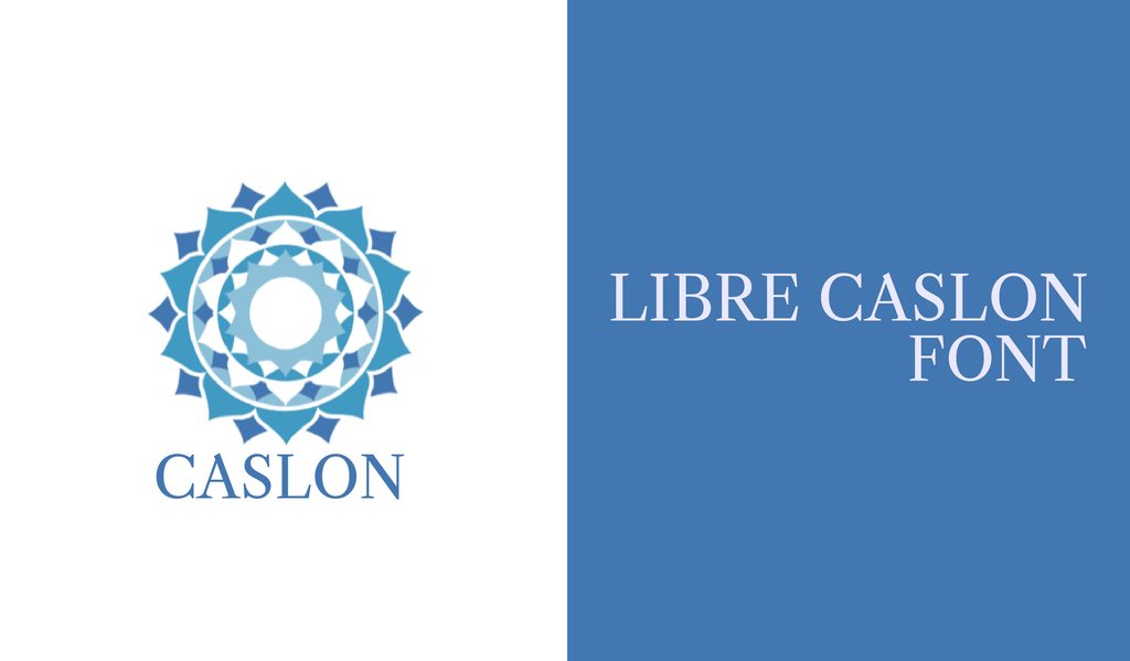
Libre Caslon brings the character of William Caslon’s classic typeface into a web-friendly family. Its text and display versions make it easy to carry the same look from headlines into smaller copy.
18. Chonburi
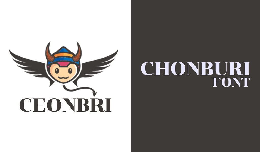
Chonburi is a bold serif with plenty of presence. Save it for big headlines, titles, and display text where you want the type to do some of the talking.
19. Garibaldi
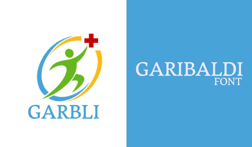
Garibaldi has an elegant, old-fashioned quality inspired by calligraphy. It works well in long passages, especially in books, magazines, and other editorial layouts.
20. Cyntho Slab Pro
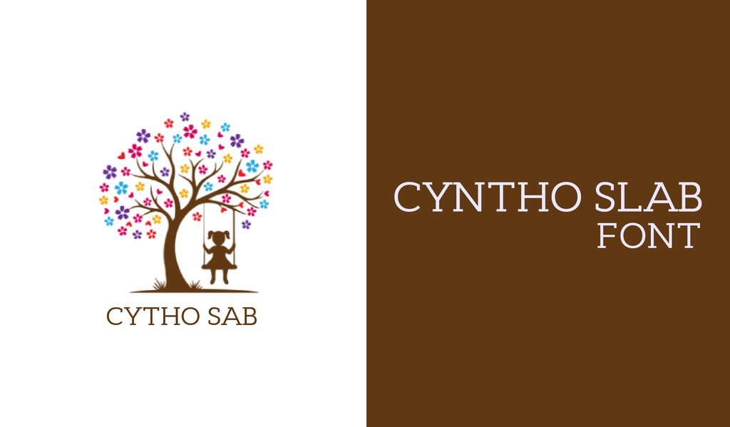
Cyntho Slab Pro gives you a modern slab serif with clean geometric shapes and real italics. It is easy to use across everything from business material to more casual designs.
21. Didactic
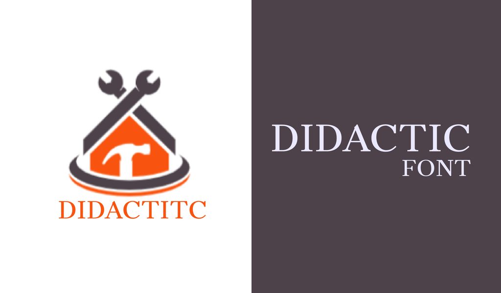
Didactic has sharp, tidy letterforms that hold up nicely at different sizes. It is a straightforward choice when you need serif text that stays clear without looking plain.
22. Coelacanth
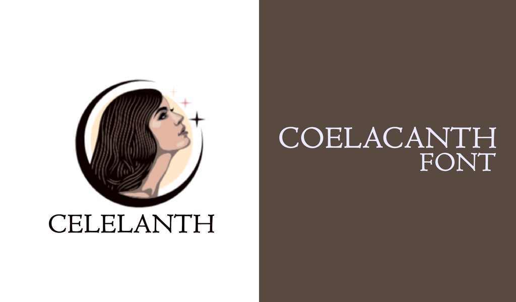
Coelacanth is a digital revival of the classic Centaur, so it carries plenty of old-style charm. Its readable letterforms make it especially suited to books and other long stretches of text.
23. Luthier
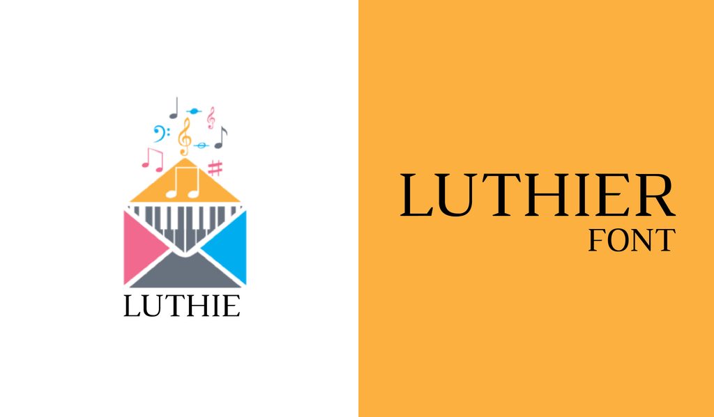
Luthier has crisp, high-contrast serifs that give even ordinary text a more serious edge. It works well for documents, headlines, and designs where you want a traditional feel with sharper details.
24. Gaspar
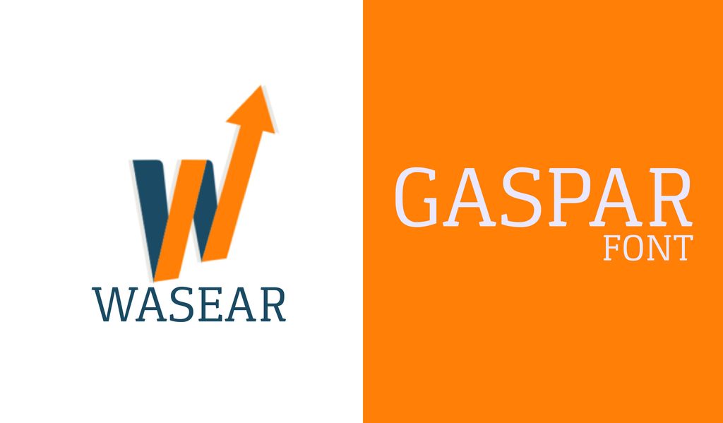
Gaspar gives the slab serif a contemporary spin without losing its sturdy character. Its two weights make it flexible enough for both print and web projects.
25. Domine
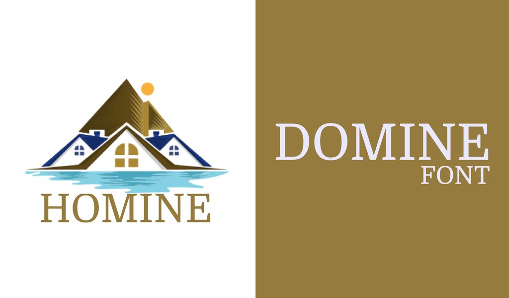
Domine has open letters and short serifs that keep the type feeling light and friendly. It is particularly comfortable for body copy on websites.
26. Suranna
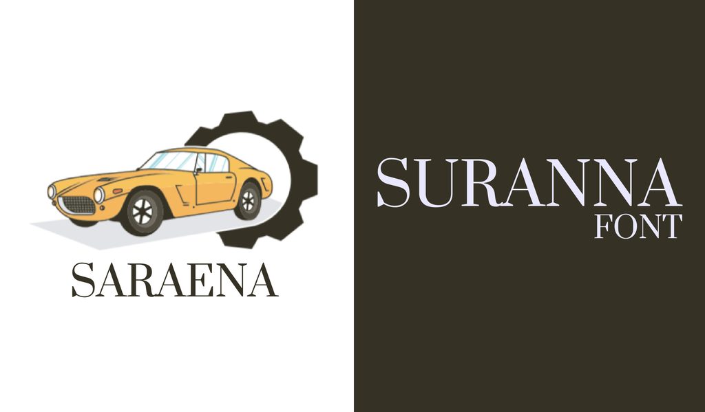
Suranna has some unusual letter shapes that give it a distinctive look without hurting readability. It was designed for news publishing, so long passages are right in its comfort zone.
27. Anglecia Pro Text
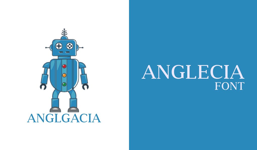
Anglecia Pro Text blends old-school serif details with a cleaner modern touch. Small caps and ligatures make it especially useful for editorial layouts with clear headings and body text.
28. Kurale
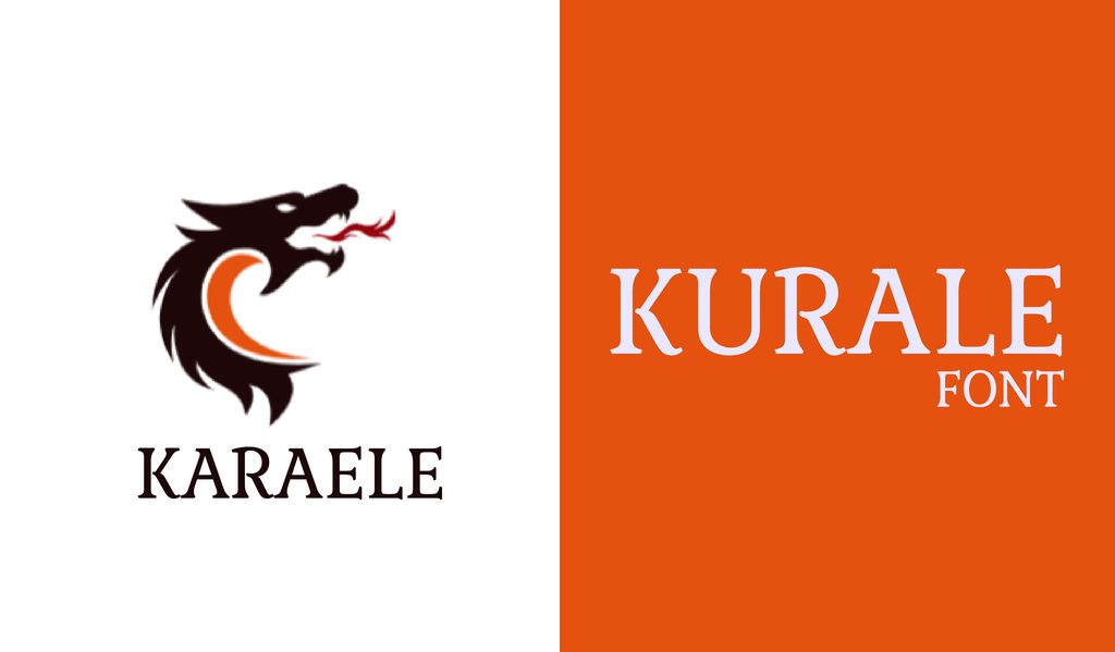
Kurale has soft curves and little curled details that give it more personality than a standard serif. It stays readable in body copy while looking especially nice in larger headings.
29. Crimson Pro
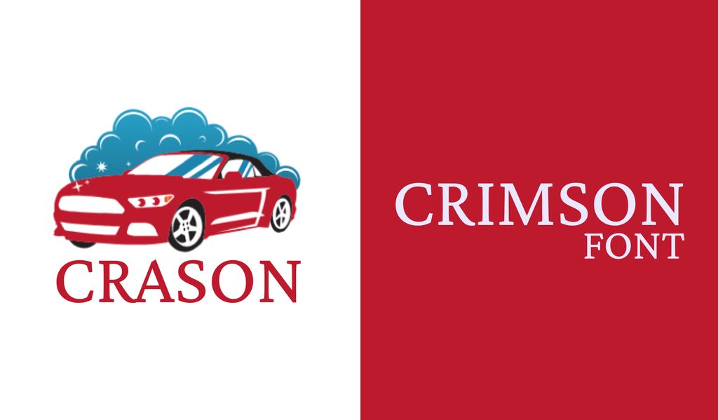
Crimson Pro has the warmth of classic book typography, with slightly refined letterforms. It works especially well for articles, books, and editorial layouts.
Script Fonts
30. Blenda Script
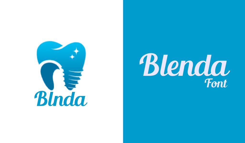
Blenda Script leans hard into vintage lettering, with bold strokes and a few stylish alternates. It is a natural fit for logos, posters, and apparel.
31. Nickainley Script
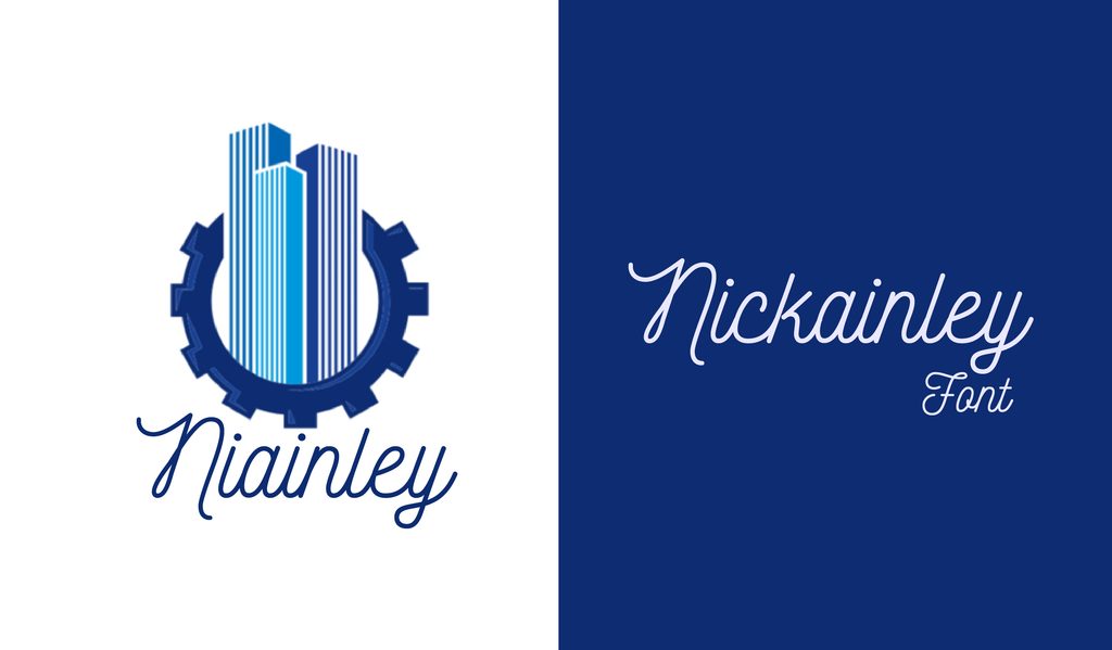
Nickainley keeps things simple with a clean monoline style that still feels handwritten. It is a good choice for logos, labels, cards, and other designs that need a personal touch.
32. Mightype
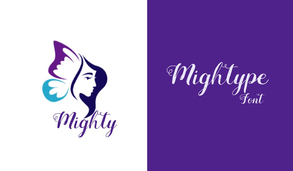
Mightype feels like someone picked up a brush and started lettering by hand. Its swirls and swashes make it a natural fit for invitations, promotions, and playful social graphics.
33. Bukhari
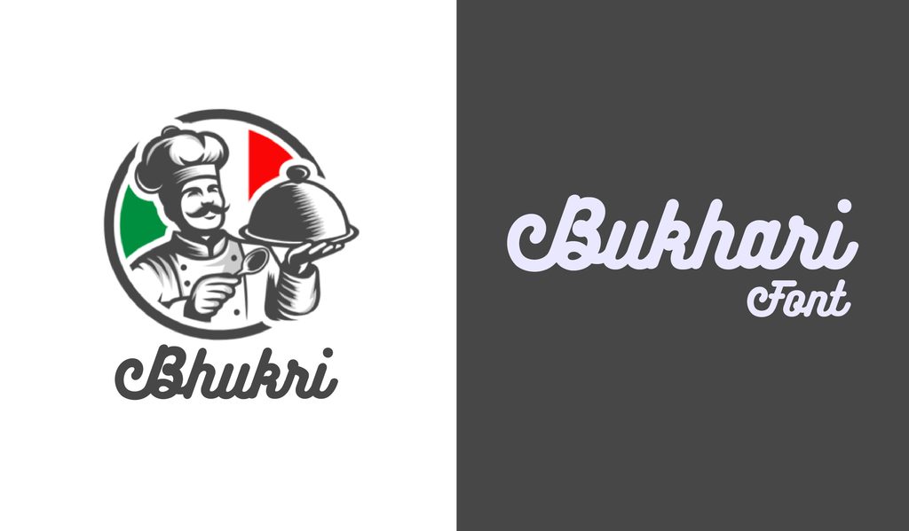
Bukhari has thick, chunky strokes that make it easy to spot from across the page. Its alternate characters also give you room to customize logos, labels, and T-shirt designs.
34. Niconne
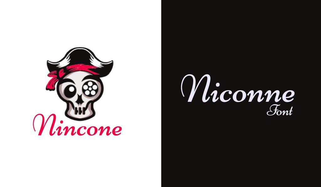
Niconne has an elegant cursive feel without becoming difficult to read. Its unconnected letters give it a fancy touch that works well for invitations, labels, and decorative headings.
35. Debby
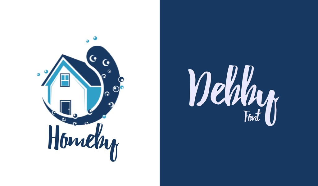
Debby keeps its hand-drawn look a little rough around the edges, which is part of its appeal. Use it when a poster, invitation, or card needs something personal and imperfect.
36. Streetwear
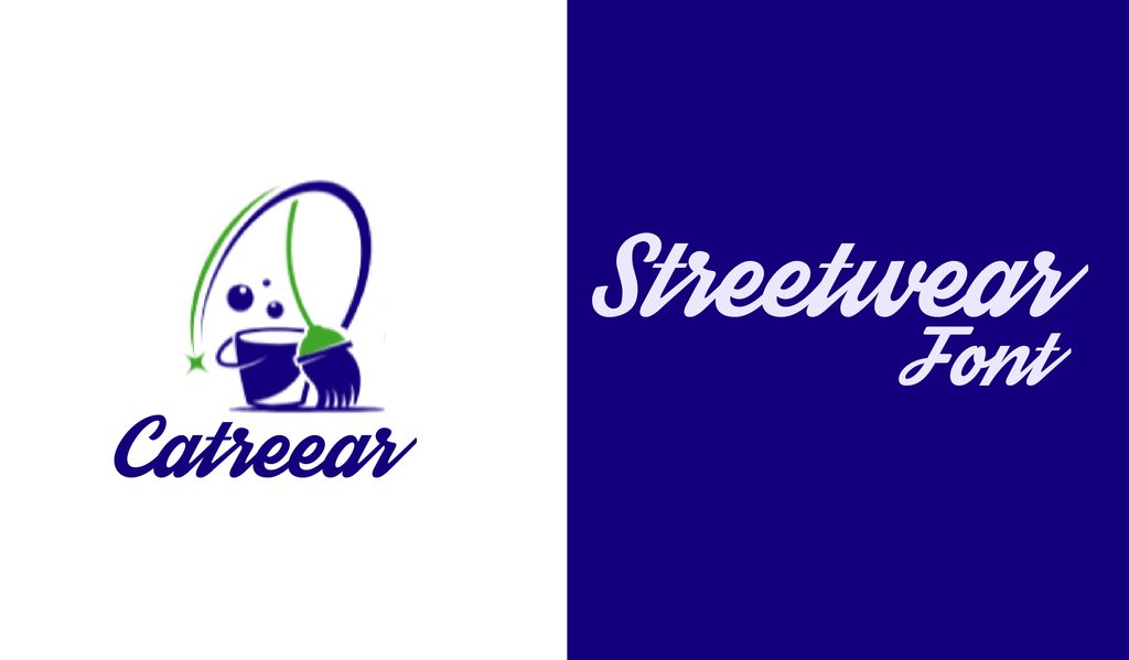
Streetwear has that unmistakable retro sportswear feel, with lettering that would look right at home on a vintage jersey. Try it on logos, T-shirts, and other bold apparel designs.
37. Sophia
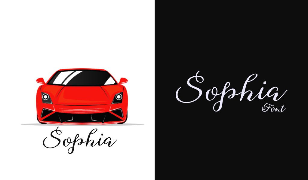
Sophia looks like wet ink dragged across paper, with smooth strokes and a natural hand-lettered feel. It is a lovely choice for digital designs that need a little more personality.
38. Badhead
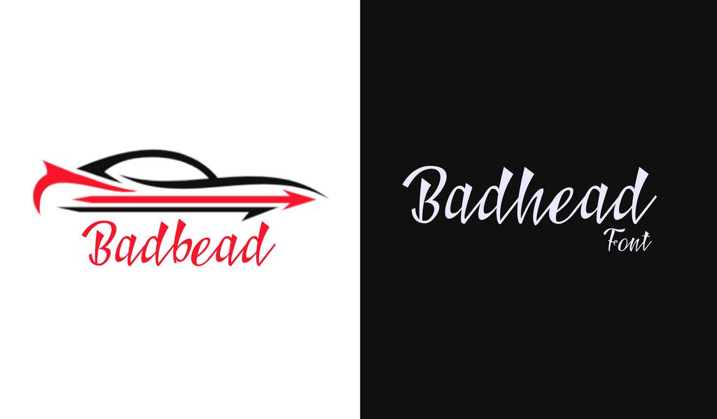
Badhead has a rougher, edgier personality than most decorative scripts. Its alternates and ligatures let you push the lettering further when a polished script feels too sweet.
39. Courgette
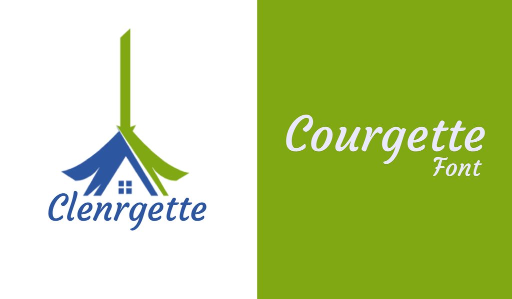
Courgette looks like brush handwriting, but the letters stay surprisingly neat. It works well for lively headings, short passages, cards, and other display work.
40. Sant’Elia
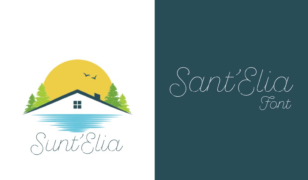
Sant’Elia has a relaxed, handwritten feel, with swashes and alternate characters to play around with. The rough version is especially nice when you want a worn, vintage print effect.
41. AlGhifari Script
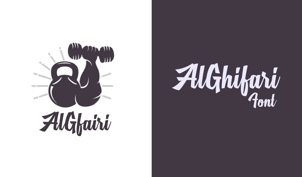
AlGhifari has upright, brush-like strokes that give it a sharper edge than most scripts. It works particularly well for bold lettering with a graffiti-inspired feel.
42. Bellico
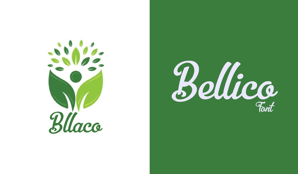
A flowing script with plenty of swashes, alternates, and ligatures to experiment with. Bellico gives posters and typographic artwork a decorative touch without going overboard.
43. Variane Script
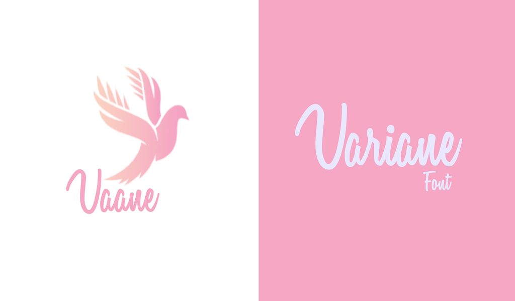
Variane Script has the loose, fluid look of 1950s handwriting. It brings an easy retro feel to greeting cards, advertisements, promotions, and other designs that need some charm.
44. Pacifico
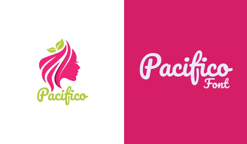
Pacifico has a loose brush-script style inspired by 1950s surf culture. Its relaxed lettering works nicely for logos, packaging, posters, and playful branding.
45. Lobster
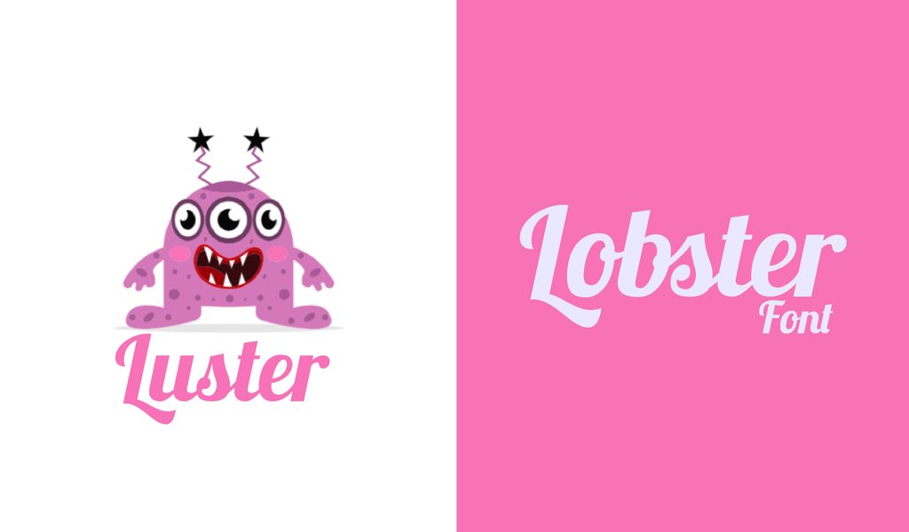
Lobster combines bold connected letters with a retro feel that immediately catches the eye. It works particularly well for short headlines, logos, menus, and poster designs.
Sans Serif Fonts
46. Space Grotesk
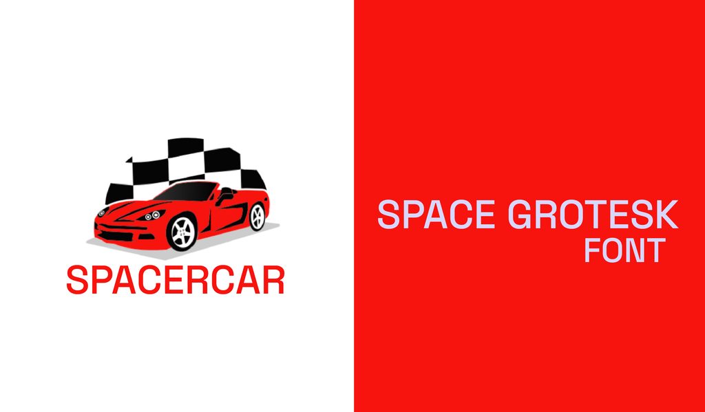
Space Grotesk has the clean structure of a modern sans serif with a few unusual letter shapes that give it more personality. It works nicely for tech branding, editorial layouts, posters, and bold headings.
47. Alegreya Sans
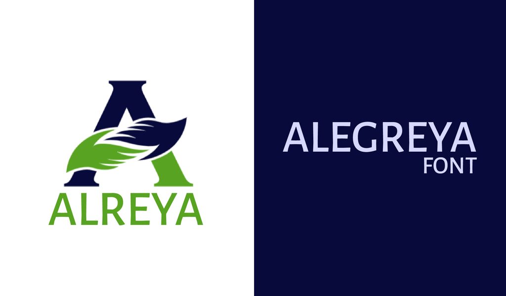
Alegreya Sans has a softer, slightly calligraphic feel that keeps long passages comfortable to read. With seven weights, italics, and small caps, it gives you plenty of room to play with book layouts and editorial work.
48. League Spartan
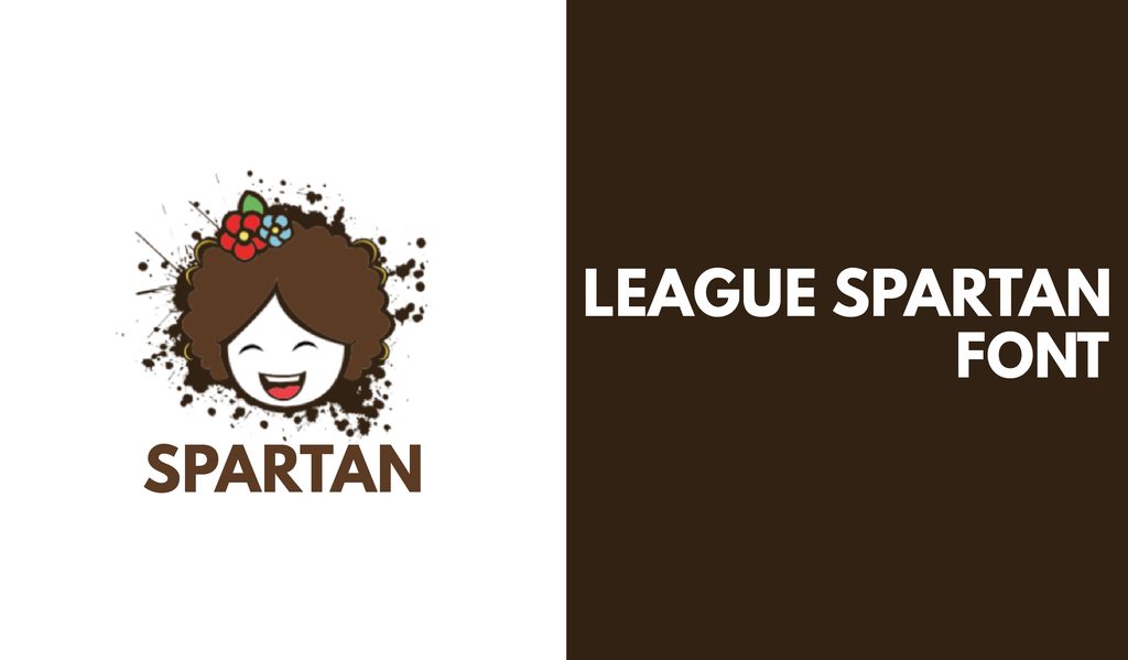
League Spartan does not need much help getting noticed. Its bold geometric letters look particularly sharp in uppercase, making it a strong choice for logos, posters, and standalone headlines.
49. Cabrito Semi Light and Medium
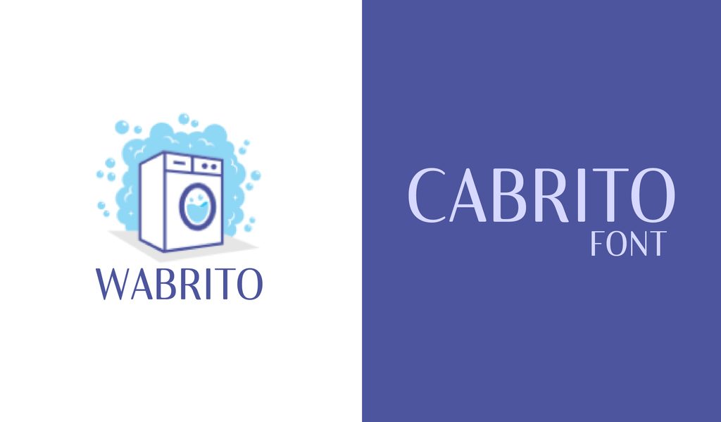
Cabrito sits somewhere between a traditional serif and a clean sans serif, with rounded details that give it an easygoing feel. You can try it on packaging, websites, or any project that needs something a little different.
50. Noto Sans
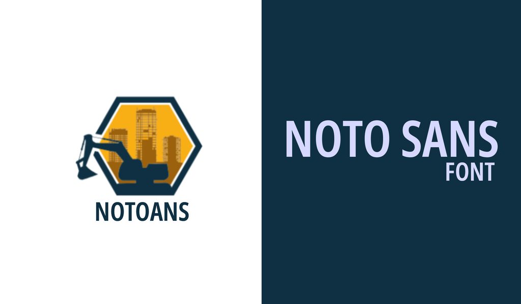
Noto Sans is the dependable choice when readability matters, especially across different languages and screens. It fits naturally into websites, apps, and other projects where clear text is the priority.
51. Bonn
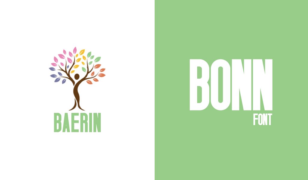
Bonn is tall, narrow, and built to make an impression at larger sizes. Set it in uppercase for logos, posters, and bold headings where space is limited, and the type needs to stand out.
52. Rubik
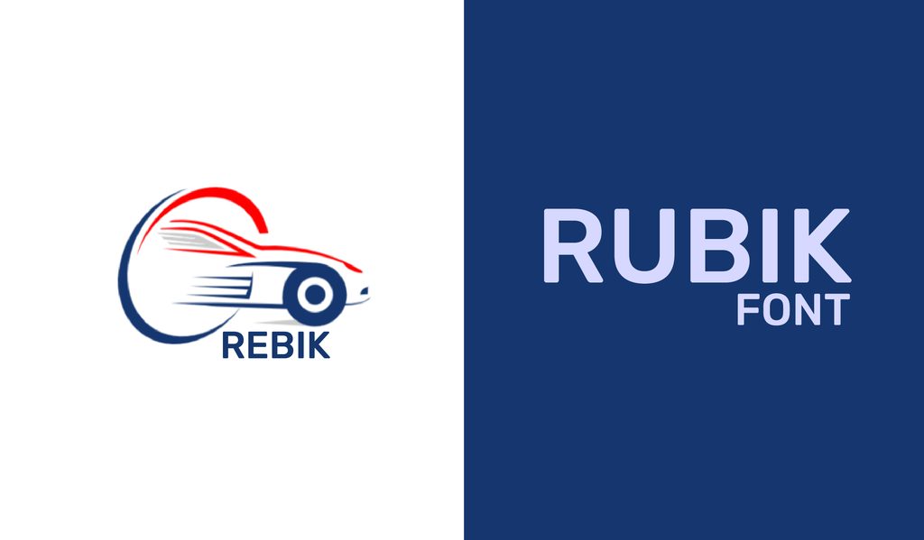
Rubik has sturdy letterforms and rounded corners, which give it a strong look without making it feel too serious. It is a nice choice for branding, packaging, and websites that need a bit of presence.
53. Aileron
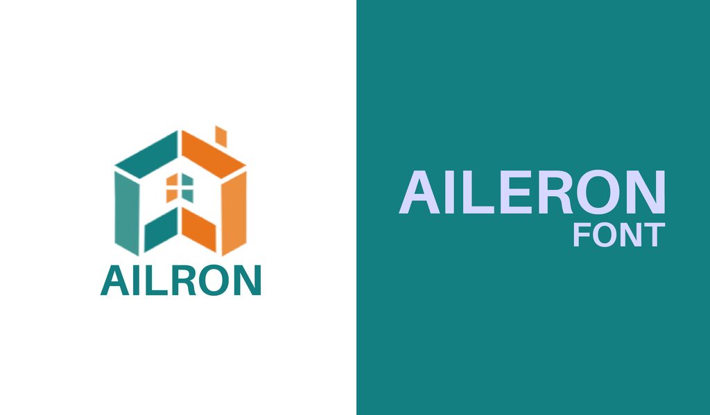
Aileron keeps things simple at first glance, then adds a few subtle twists that stop it from feeling ordinary. With 16 weights and styles, it is especially useful when you need one typeface to carry an entire layout.
54. Archivo Narrow
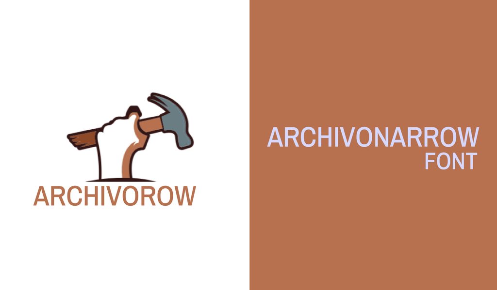
Archivo Narrow is a lifesaver when your design has plenty to say but very little room to say it. Its slim proportions let you fit more text into headings, posters, labels, and compact layouts without making things look cramped.
55. Geomanist Regular
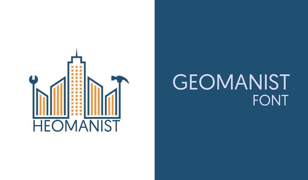
Geomanist has clean geometric shapes that look sharp in headings without becoming difficult to read in smaller text. It is a good all-rounder for websites, branding, editorial layouts, and modern display work.
56. Manrope
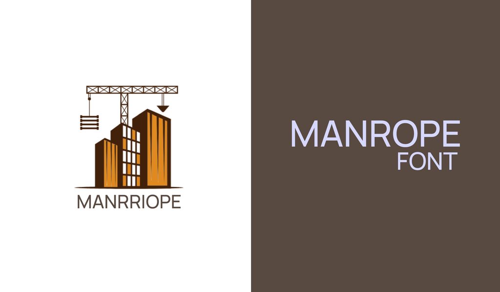
Manrope has a smooth, contemporary look. Its clean proportions make it useful for websites, presentations, branding, and other designs that need a modern typeface with some warmth.
57. Webnar Bold
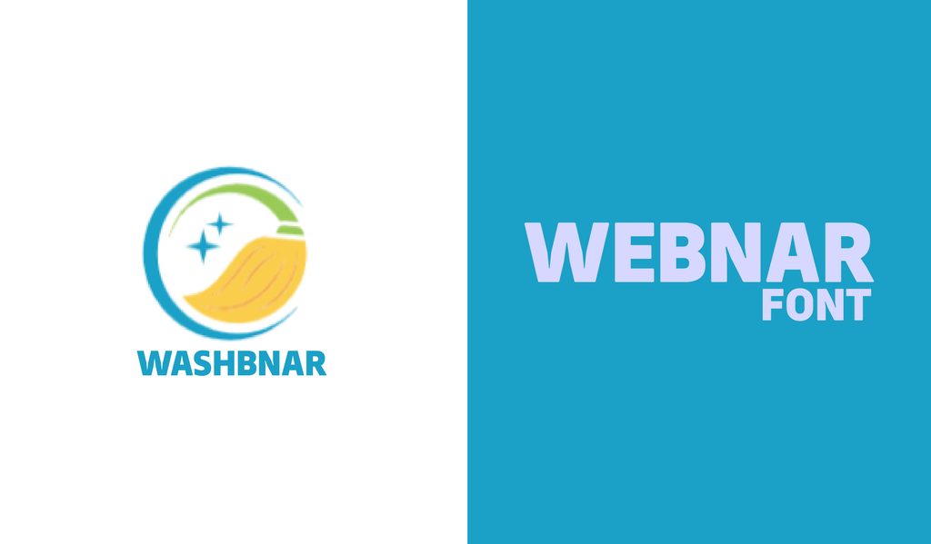
Webnar Bold is made to get noticed, especially in headlines. Its geometric shapes keep the lettering crisp and readable, making it a solid pick for technology-focused designs, posters, and other punchy layouts.
58. Overpass
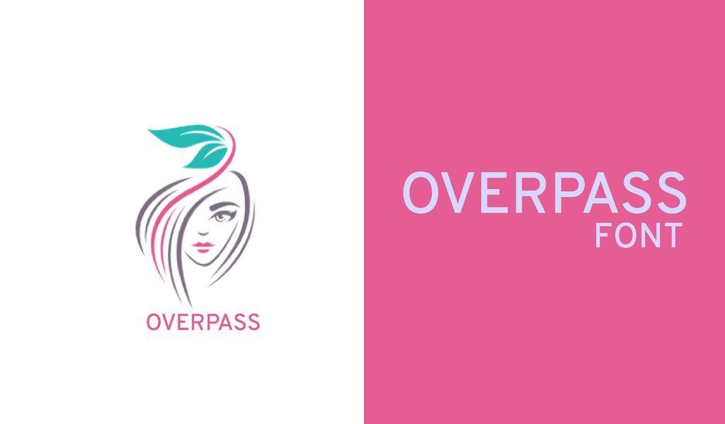
Inspired by the lettering found on U.S. highway signs, Overpass has a practical, familiar feel. Its different weights make it easy to use across both body copy and headings, so it can handle everyday design work without much fuss.
59. Reef
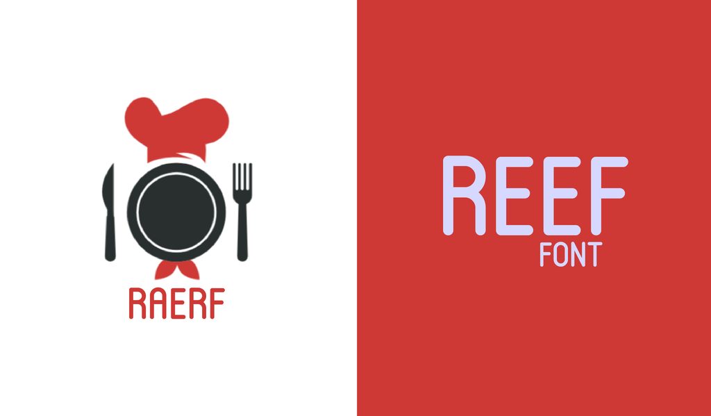
Reef has rounded, bubbly letters that bring an instant sense of fun to a design. It is a great fit for casual branding, invitations, packaging, or anything that could use a little more energy.
60. Muller Thin and Extra Bold
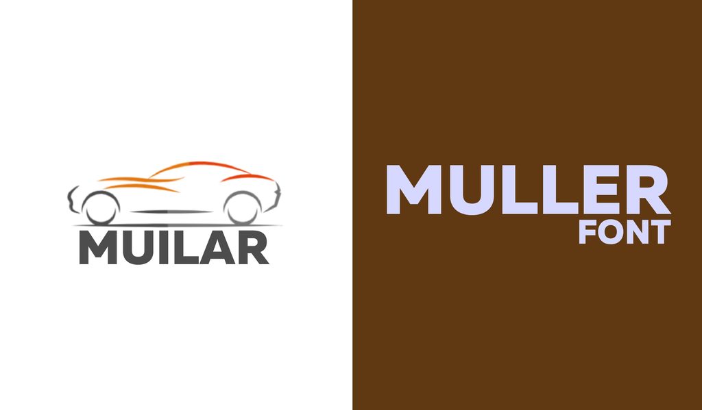
Muller offers nice contrast between delicate thin lettering and strong, heavy weights. Its wider letterforms also hold up well at smaller sizes, making it useful for everything from magazine pages to branding.
61. HK Grotesk
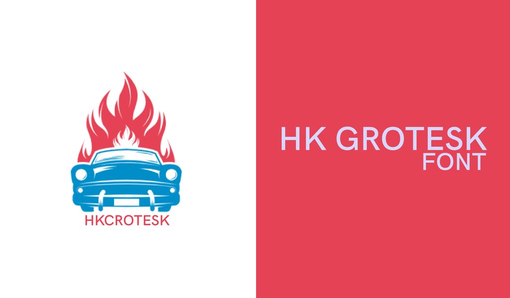
HK Grotesk takes inspiration from classic grotesque sans serifs and keeps the result wonderfully straightforward. It works well when you need clean, readable text that stays quietly in the background of the design.
62. Poppins
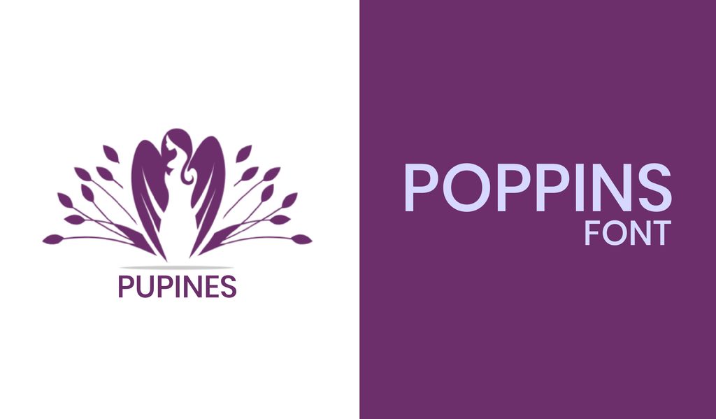
Poppins is clean, geometric, and easy to drop into a modern layout. Its simple shapes work particularly well on websites when you want the typography to feel neat without becoming overly formal.
63. Anke Sans
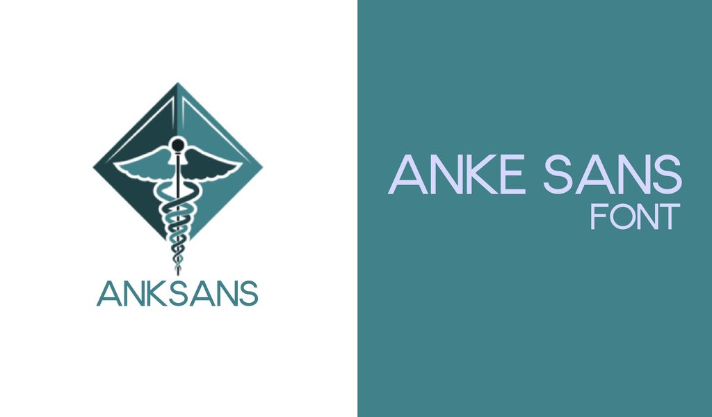
Anke Sans keeps its geometric foundation simple, then throws in a few quirky details that give it some personality. It works especially well when a design needs to feel young, friendly, and approachable.
64. Work Sans
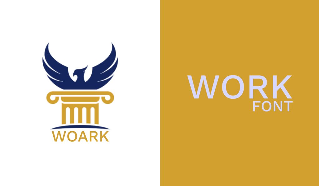
Work Sans was made with screens in mind, so it feels right at home on websites and digital interfaces. Its ten weights also make it easy to build a clear hierarchy without switching between several typefaces.
65. Atzur
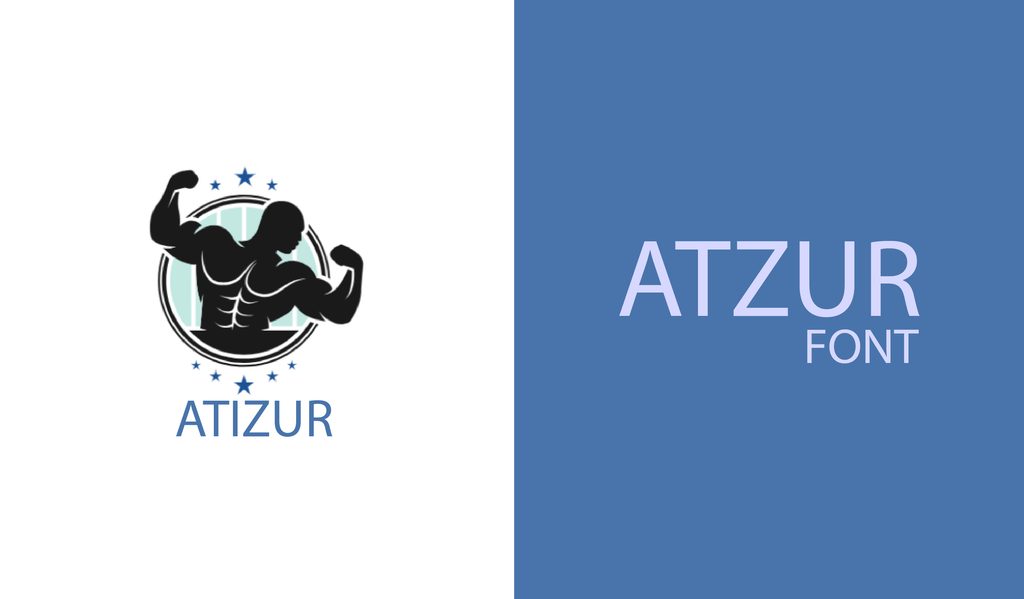
Atzur sits in that interesting space between serif and sans serif, giving you a little of both worlds. Its open letterforms also stay readable at smaller sizes, making it handy for business cards and other compact designs.
66. Sinkin Sans
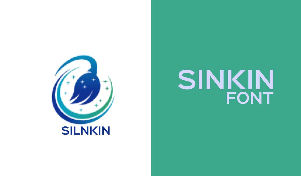
Sinkin Sans gives you plenty to work with, including nine weights and matching italics. The subtle details keep the letters crisp on screen, making it a useful pick for websites and digital documents.
67. Montserrat Alternates
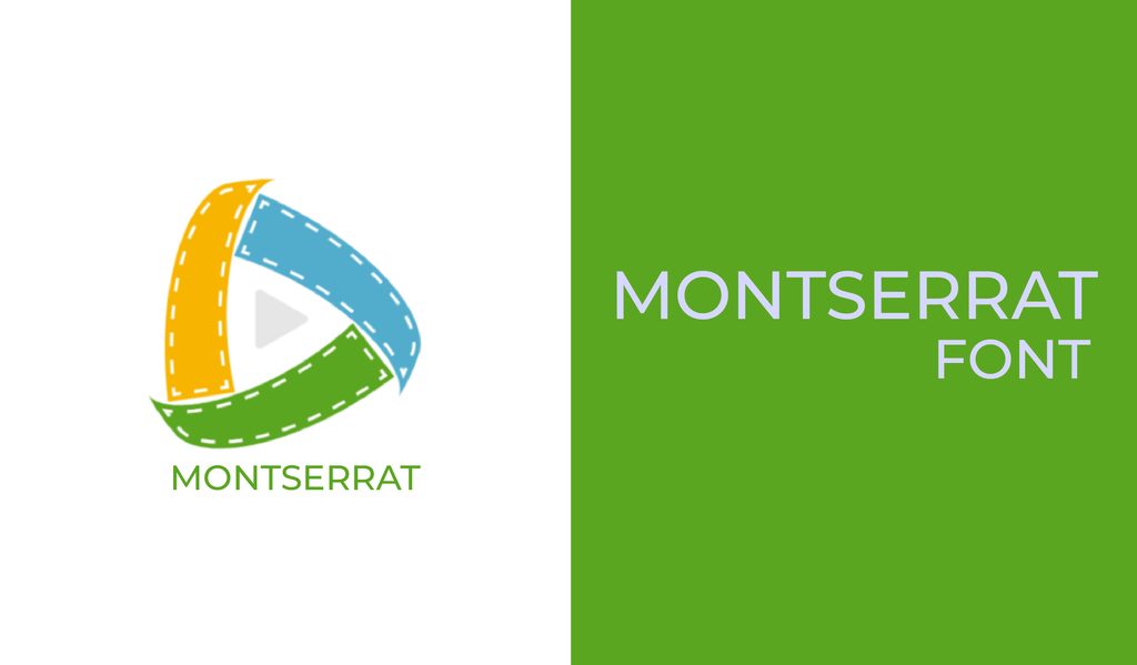
What if regular Montserrat feels a little too familiar? Montserrat Alternates has got your back. It gives some of its letters a different personality. It is a handy choice when you want to add a custom touch to a simple wordmark or heading.
68. Chivo
Chivo is a practical grotesque sans serif that handles both uppercase and sentence-case text with ease. Its range of weights makes it useful for everything from everyday body copy to attention-grabbing headlines.
69. Genome
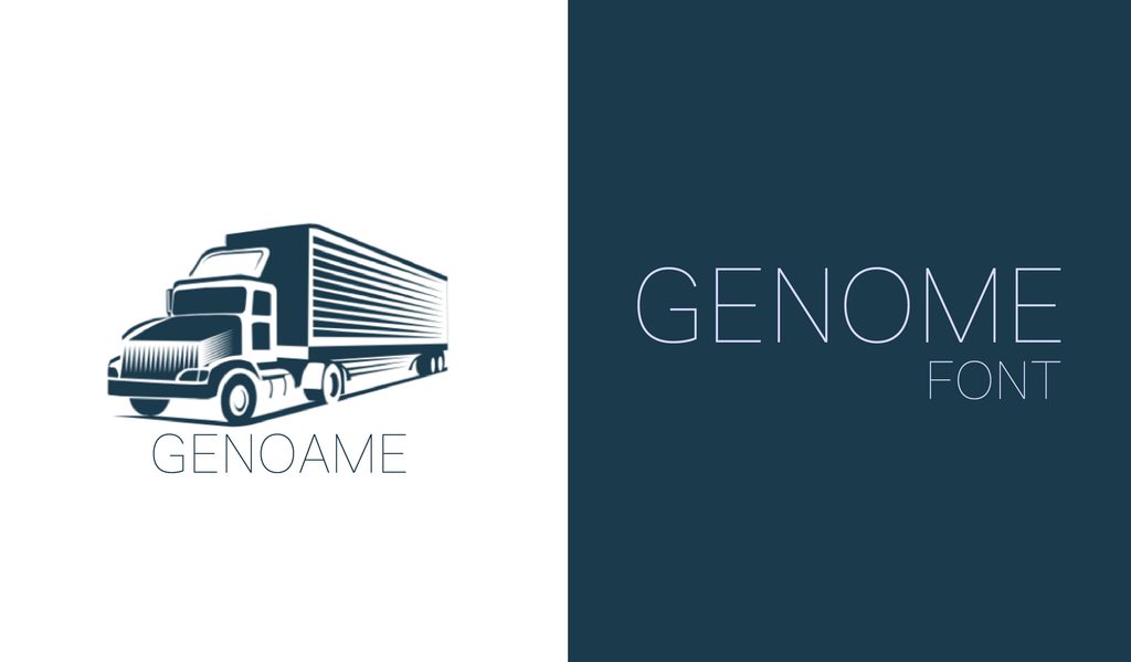
Genome has a light, airy quality that looks particularly good when given plenty of space. Its thin letters are better suited to larger sizes, making it a natural fit for websites and clean, spacious layouts.
70. Stilu
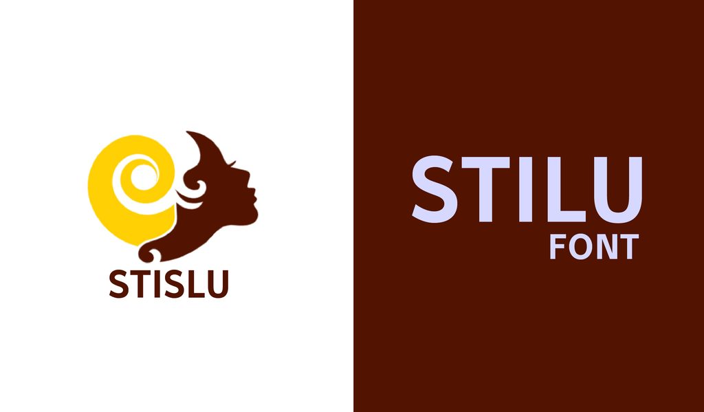
Stilu brings a bold, contemporary feel while giving you enough weights to handle different parts of a design. Small caps and ligatures add extra flexibility when you want more character in your typography.
71. Montserrat
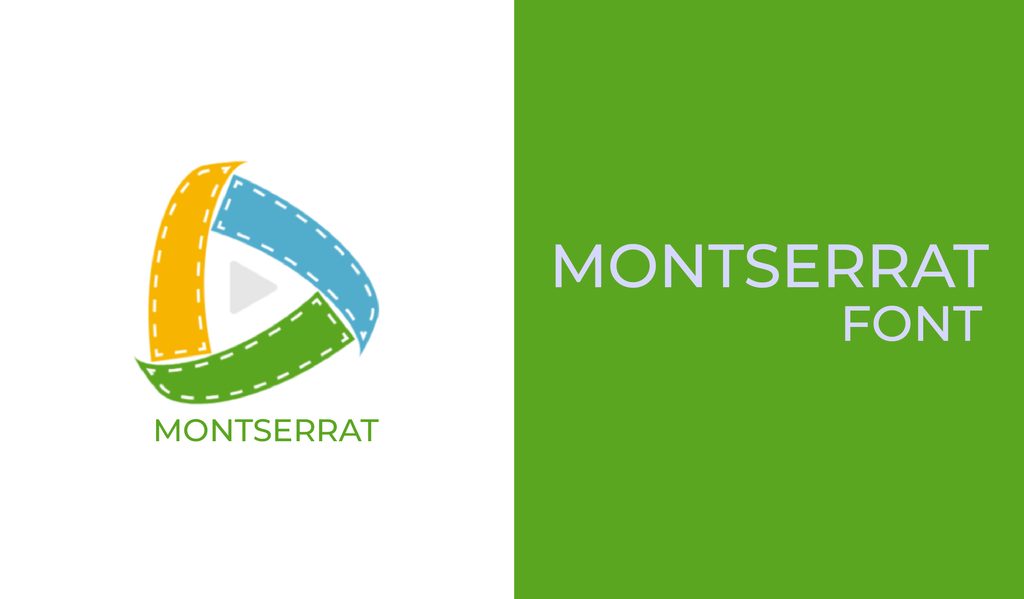
Montserrat is the sort of font you can reach for when you want something clean without making the design feel cold. Its range of weights works equally well for logos, headings, websites, and everyday text.
72. Encode Sans
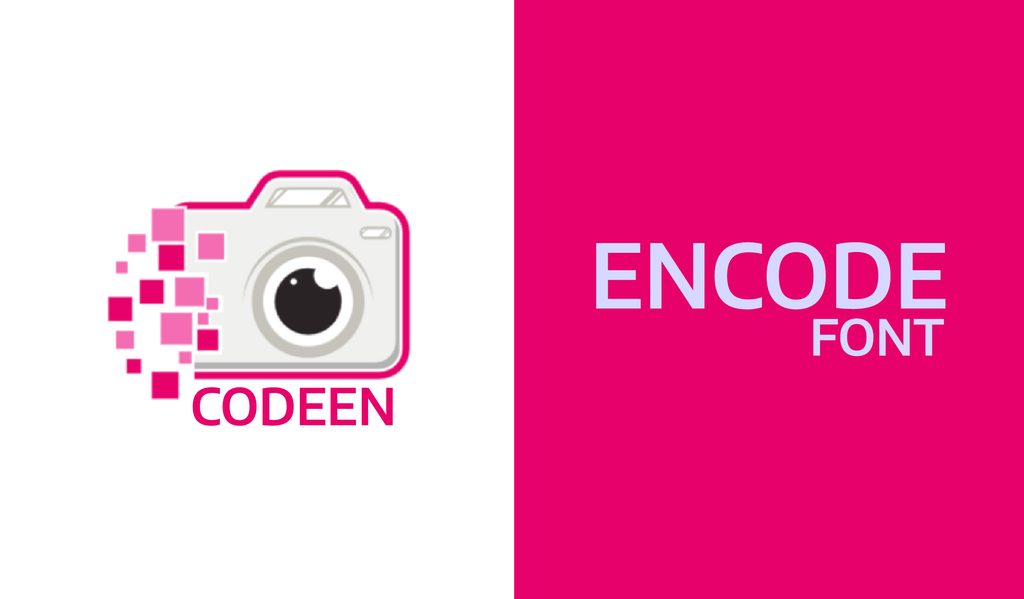
Encode Sans is the kind of font that can quietly handle a complicated layout without getting in the way. With a wide range of widths and weights, it is especially useful when a design has lots of information to organize.
73. Hallo Sans
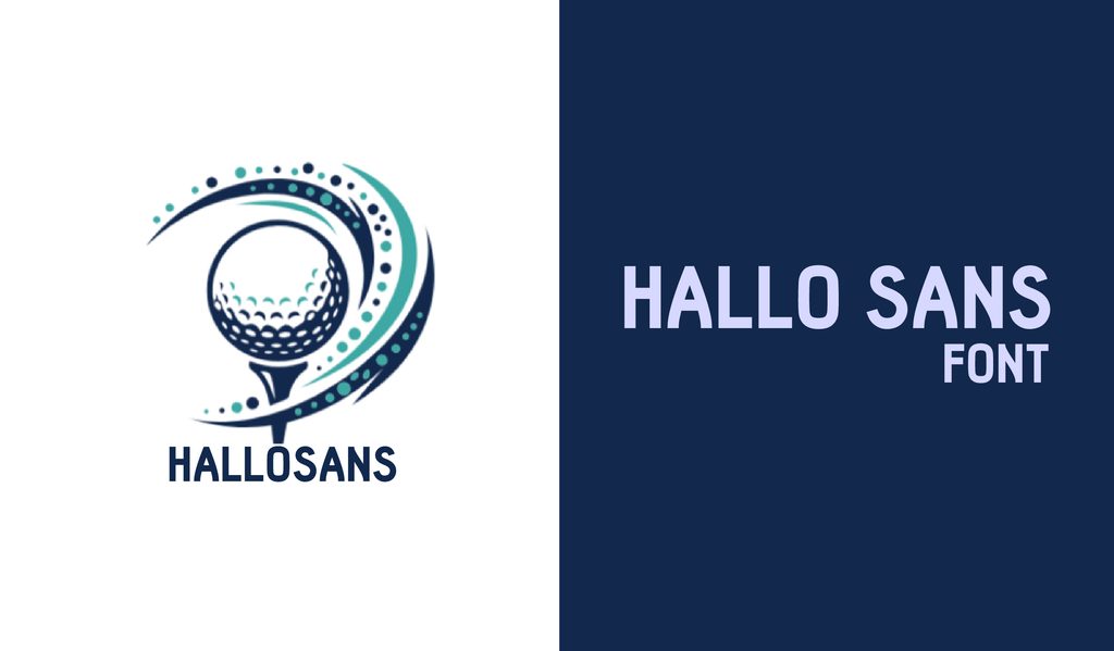
Hallo Sans takes a few liberties with familiar letter shapes, which is exactly where its charm comes from. It is worth trying when a casual design needs something slightly quirky without going completely off the rails.
74. Rakesly
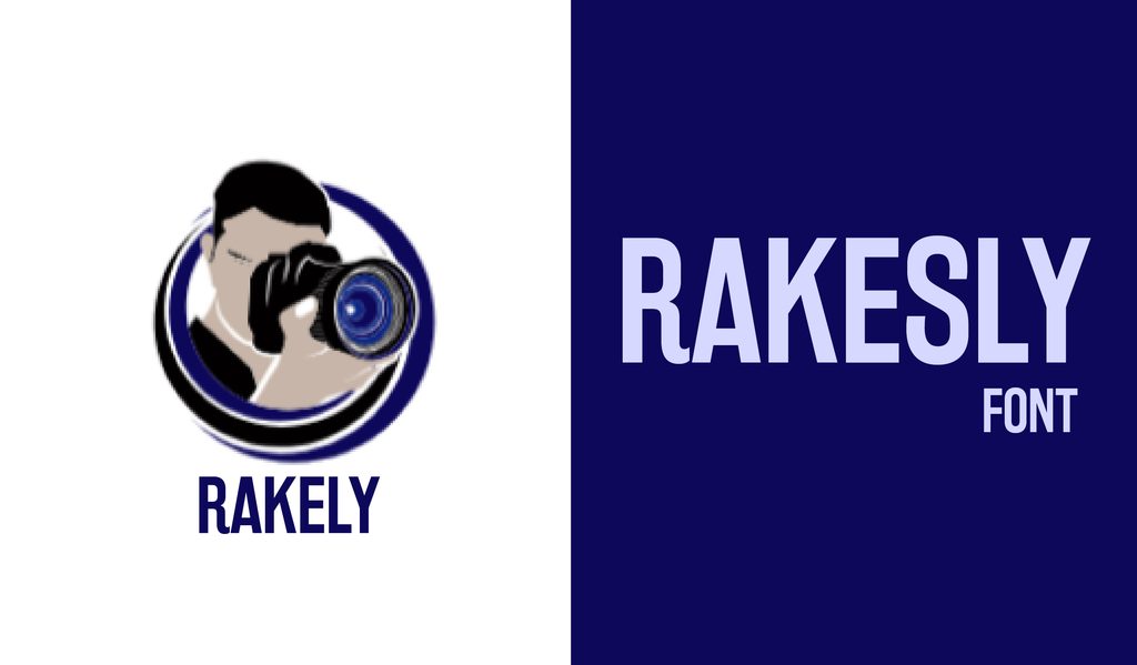
Rakesly has a condensed, old-school headline feel with plenty of character. Its six weights make it useful beyond big titles too, especially when you need to squeeze text into a narrow space.
75. Cyntho Pro
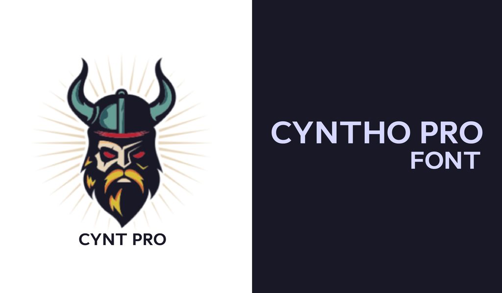
Cyntho Pro has a clean geometric shape, but its real italics and small caps give you more flexibility than you might expect. It works just as comfortably in a polished corporate layout as it does in something more relaxed.
76. Fjalla
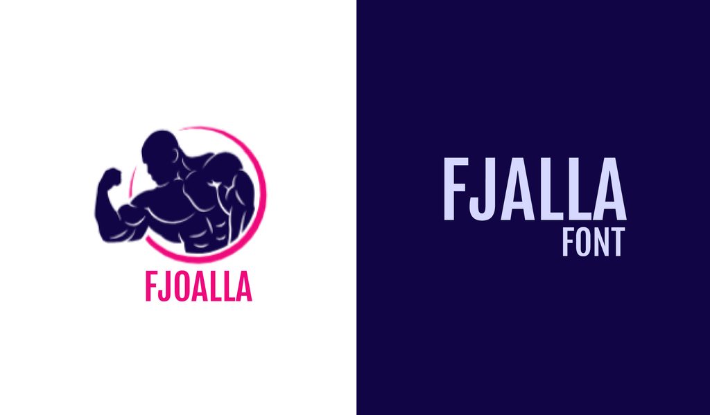
Fjalla has a bold, condensed shape that immediately gives headings some weight. It is especially good for display text and short blocks of copy where you want the words to make an impression.
77. Homizio Nova
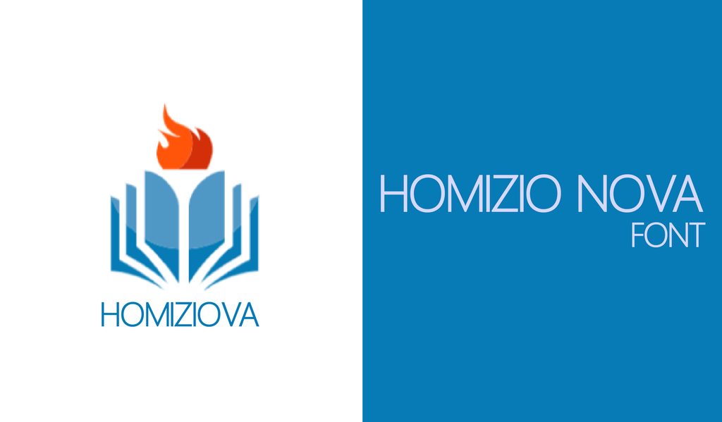
Homizio Nova keeps things quiet and readable, with generous lowercase letters that make longer text easy on the eyes. Use it when you want your content to do the talking rather than the typeface.
78. Sansita
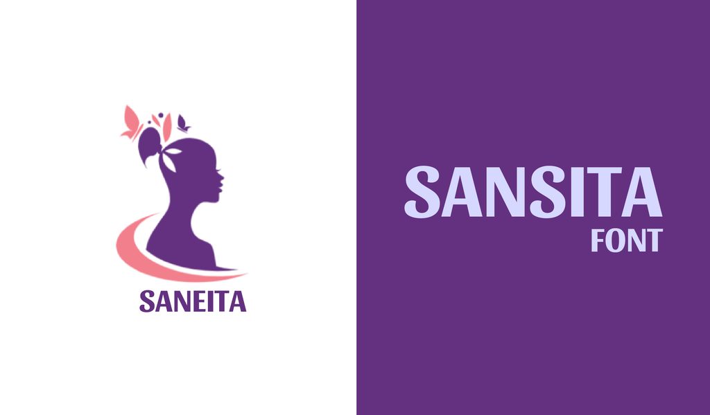
Sansita gives the usual sans serif a lively twist with curved, calligraphy-inspired details. It is a fun option for branding and packaging, especially when a plain geometric font feels a little too serious.
79. Alcubierre
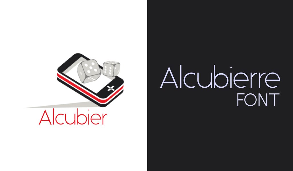
Alcubierre keeps things minimal and lets the shape of the letters do the work. It looks especially good in uppercase, so try it for headings, presentation covers, resumes, or other designs where large type takes center stage.
80. Inter
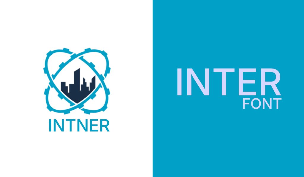
Inter was designed with screens in mind, so its letterforms stay crisp and comfortable to read at different sizes. It is a particularly good choice for websites, apps, dashboards, and clean interface designs.
81. Martel Sans
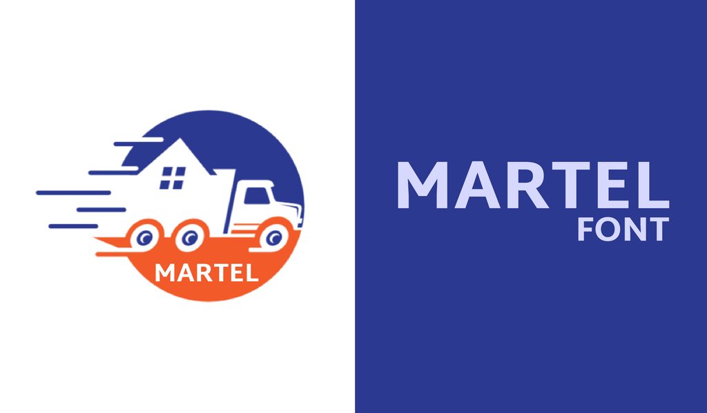
Martel Sans was made with readability in mind, so it settles flawlessly into long stretches of text. The range of weights also makes it easy to build headings, subheads, and body copy without changing fonts.
82. Bonn
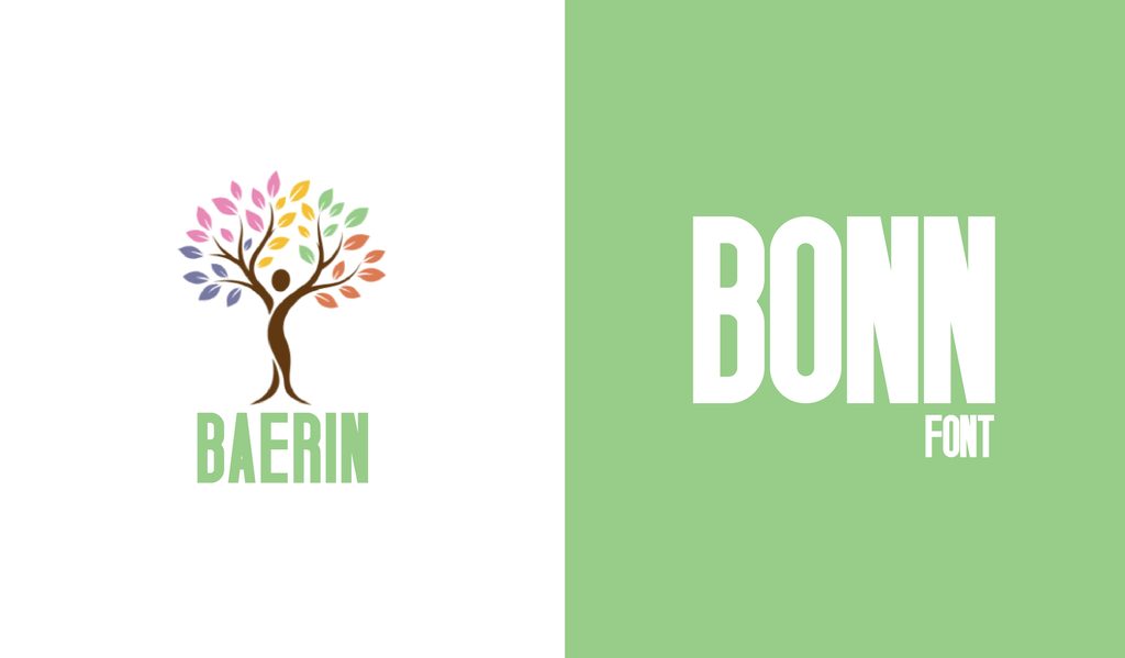
Bonn is tall, narrow, and built to make an impression at larger sizes. Set it in uppercase for logos, posters, and bold headings where space is limited, and the type needs to stand out.
83. Chivo
Chivo is a practical grotesque sans serif that handles both uppercase and sentence-case text with ease. Its range of weights makes it useful for everything from everyday body copy to attention-grabbing headlines.
84. Aileron
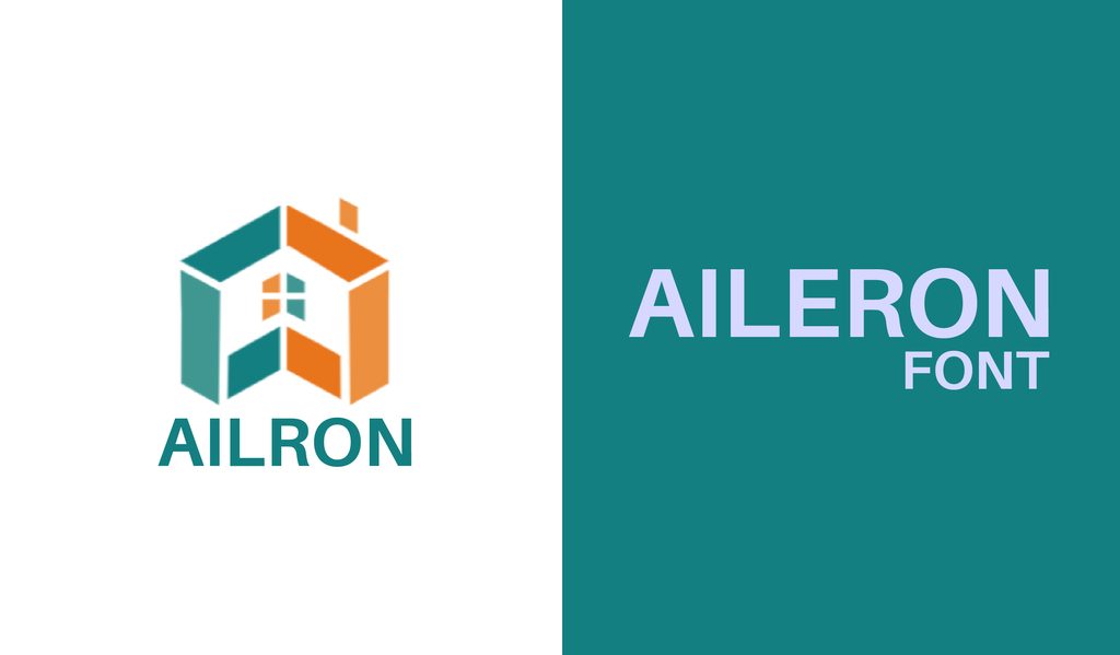
Aileron keeps things simple at first glance, then adds a few subtle twists that stop it from feeling ordinary. With 16 weights and styles, it is especially useful when you need one typeface to carry an entire layout.
Display / Decorative
85. Barbaro
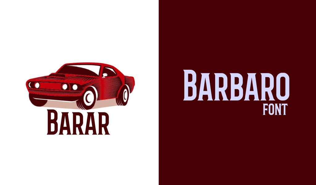
An old-school Western feel, with crisp lettering and a version that adds spurs to the characters. Barbaro works nicely for logos, packaging, badges, and vintage-style branding.
86. Dita Sweet
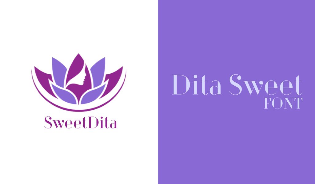
Dita Sweet mixes elegant curves with sharper details inspired by classic fashion illustration. It has a glamorous feel that suits magazine covers, posters, and fashion-focused branding.
87. Cast Iron
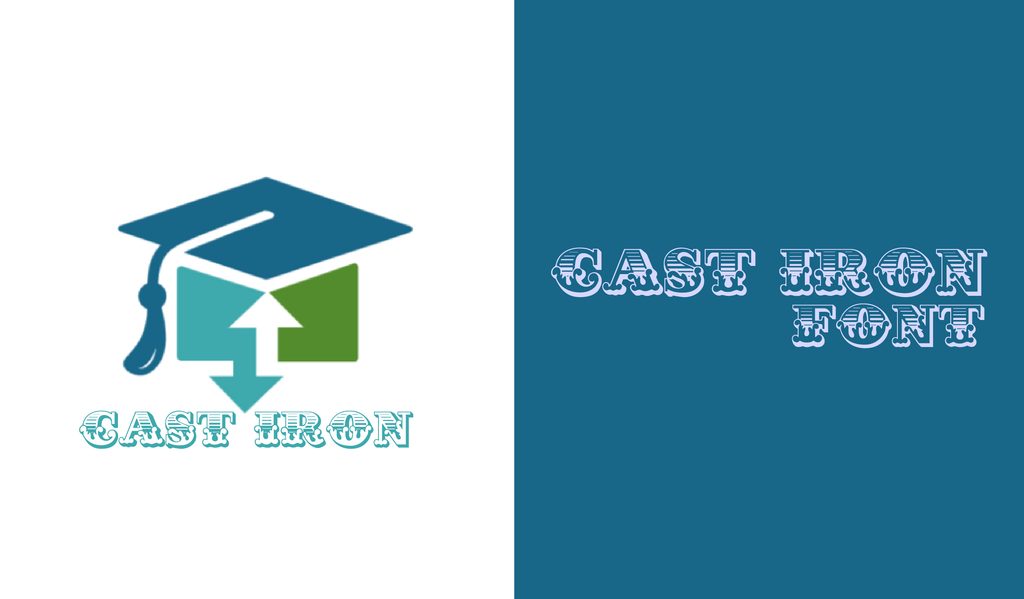
Cast Iron is a condensed, all-caps font with angular lettering and plenty of visual weight. Use it for logos, headlines, and branding that needs a sturdy industrial edge.
88. Merienda One
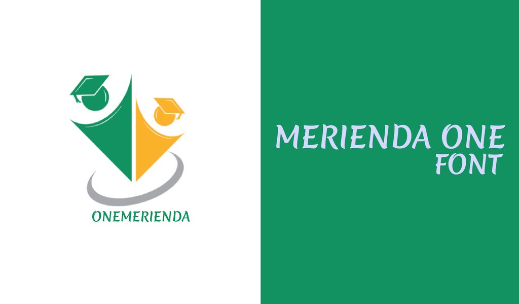
Merienda One has loose, brush-like strokes that give ordinary lettering a more artistic feel. It works especially well on posters, flyers, invitations, and other designs built around a strong typographic focal point.
89. Big John / Slim Joe
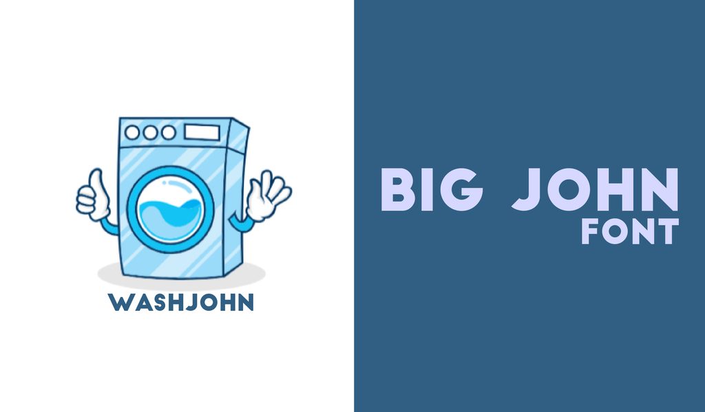
Big John and Slim Joe are designed as opposites, with one bringing heavy lettering and the other keeping things thin. Put them together for posters and layouts that need strong contrast.
90. Nexa Rust
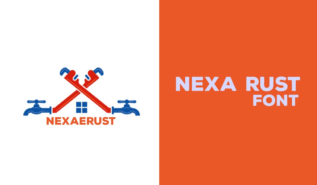
Nexa Rust comes as a small family of rough, textured styles, so you can mix and match depending on the look you want. It is a fun option for vintage logos, packaging, and rustic designs.
91. Moderne Sans
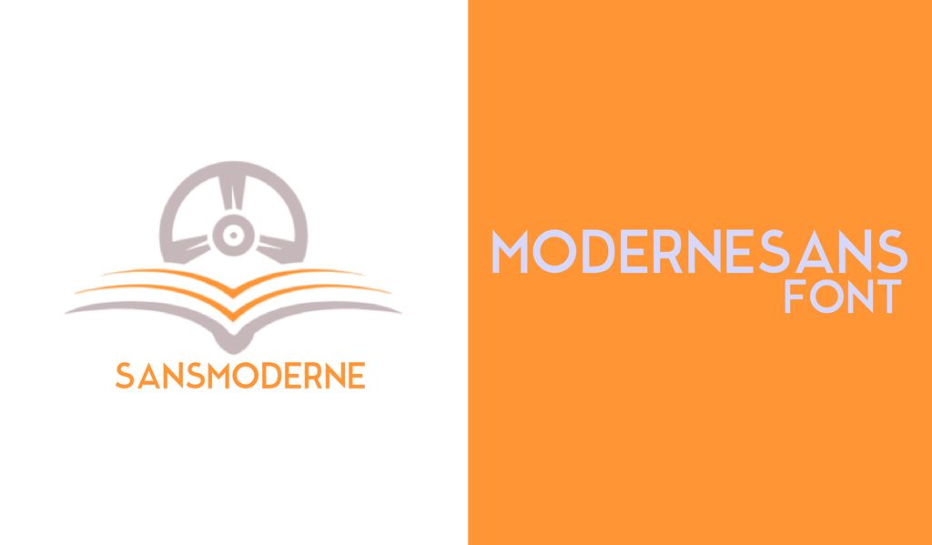
Moderne Sans borrows from the sharp geometry of 1920s typography, giving it a distinctly Art Deco feel. It looks especially striking in uppercase titles, posters, and decorative layouts.
92. Waterlily
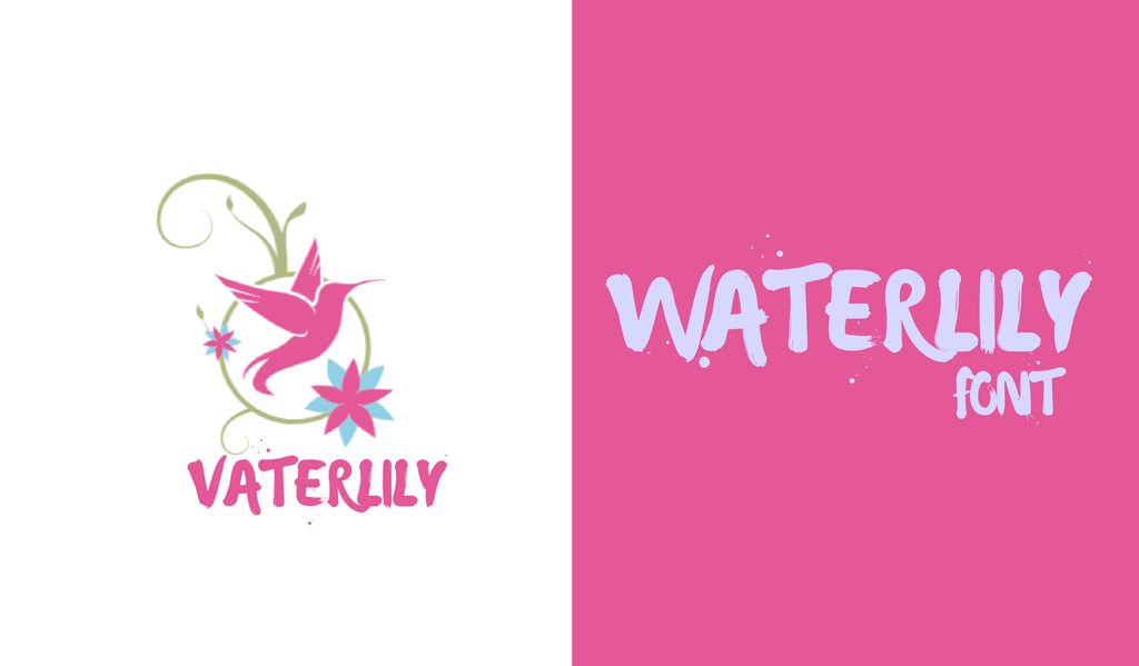
Waterlily has the loose, painted quality of lettering done with a real brush. Try it on greeting cards, invitations, artwork, or anywhere you want the type to feel handmade.
93. Norwester
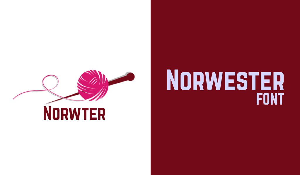
Norwester is narrow, geometric, and unapologetically bold. Its uppercase letters and small caps make it particularly useful for logos, posters, labels, and compact headlines.
94. Bernier
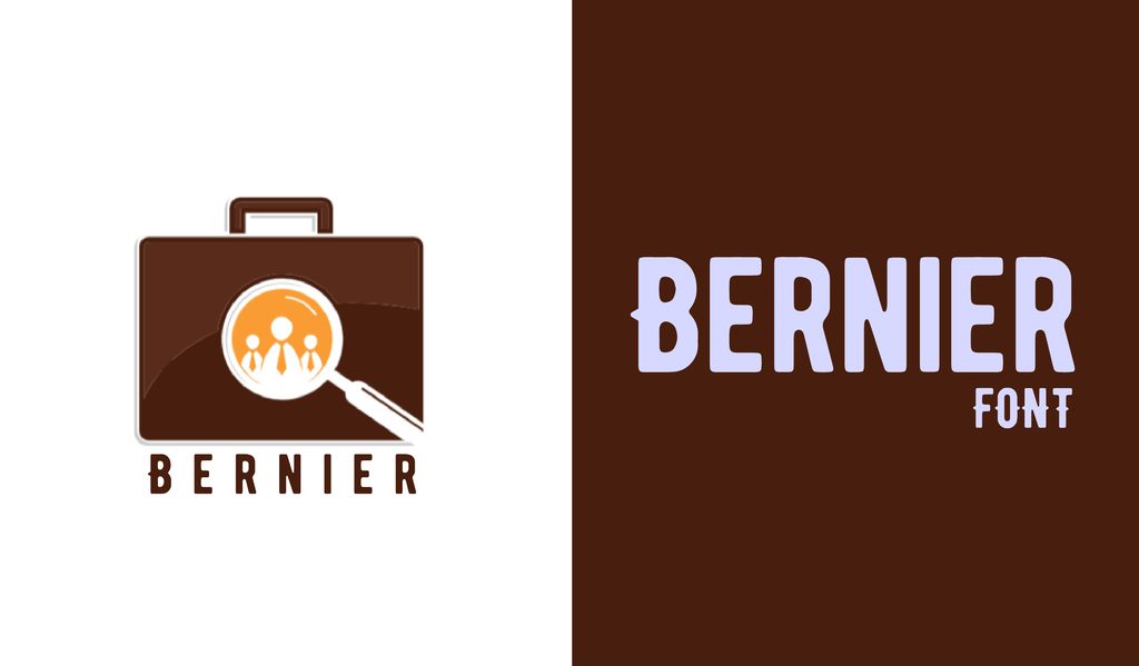
Bernier gives you three different styles, including a distressed version that looks like it has been stamped onto paper. It is a natural fit for retro posters, badges, packaging, and vintage branding.
95. Freschezza
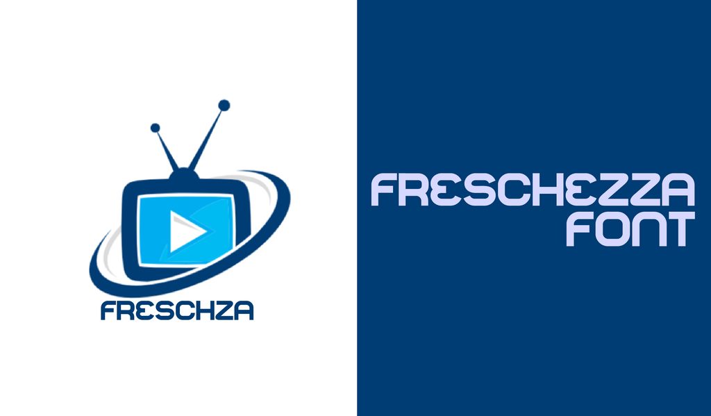
Freschezza has a playful, funky look and comes in styles that can be layered to create a dimensional effect. It is made for posters, party graphics, invitations, and other upbeat designs.
96. Royals
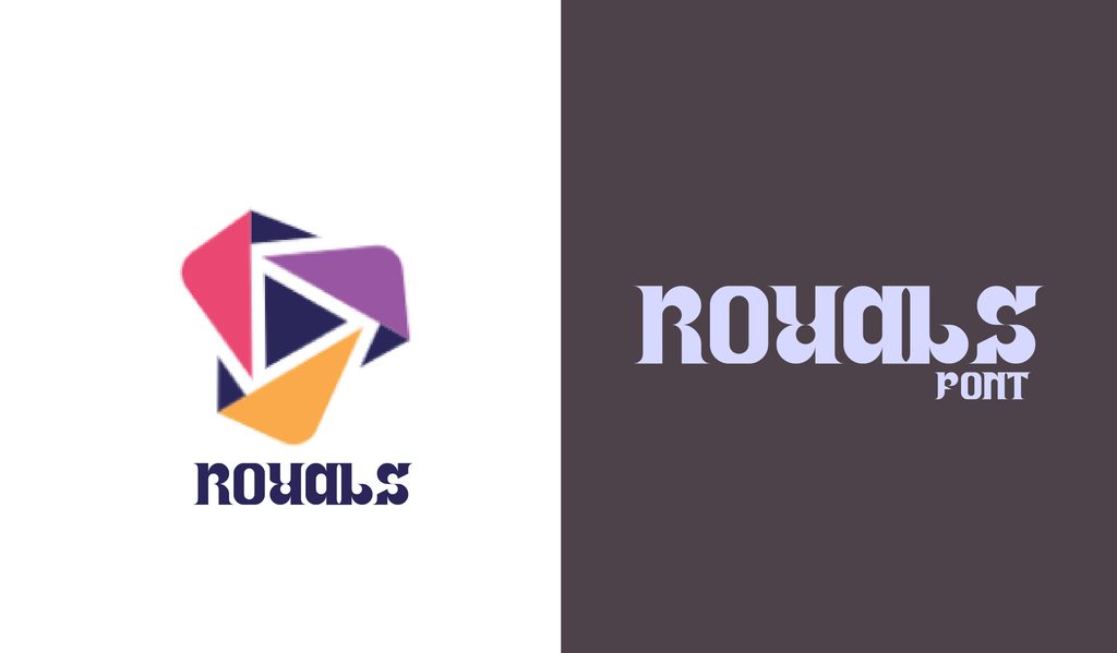
Broad, sturdy uppercase letters with a slightly vintage character. Royal’s different styles make it useful for signage, logos, and labels, where the lettering needs some weight.
97. Melo
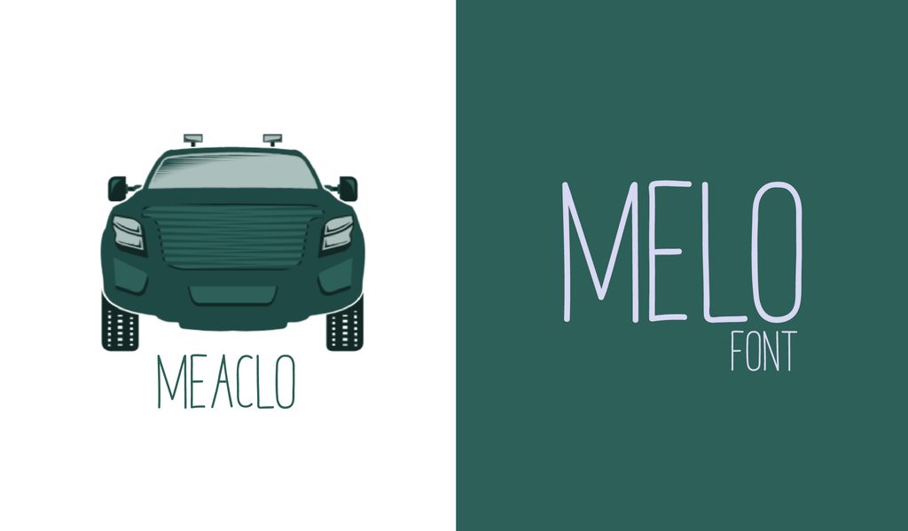
Melo keeps things casual with handmade uppercase lettering that feels like it was drawn rather than typeset. It works well for crafty branding, packaging, posters, and personal projects.
98. Galderglynn Titling
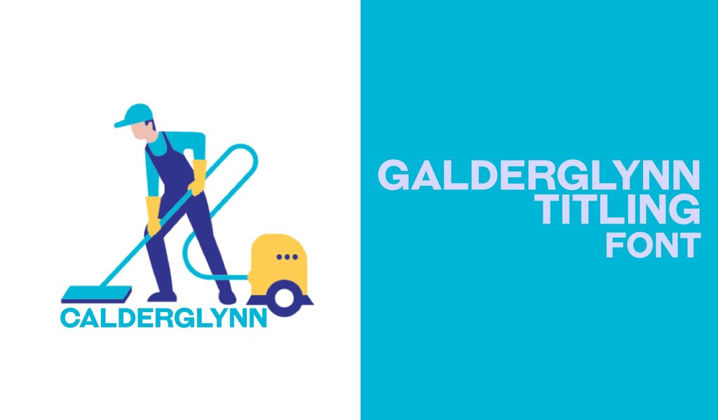
Galderglynn Titling takes inspiration from old metal type, with letters that have a distinctly vintage character. With several weights and italics, it has plenty of range for titles and display work.
99. Katahdin Round
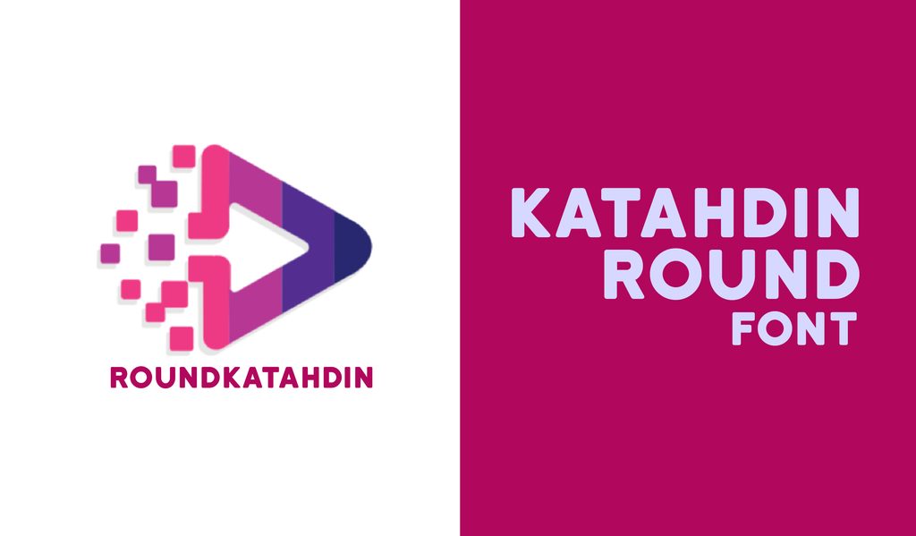
Katahdin Round has bold lettering softened by rounded corners, which makes its strong presence feel a little friendlier. It is well suited to logos, posters, signs, and attention-grabbing titles.
100. Liberal Hand
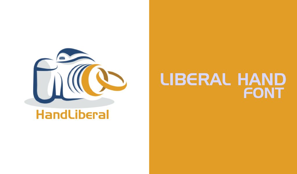
Liberal Hand combines a classic serif structure with rough, hand-drawn details. The result has a rugged quality that fits rustic logos, packaging, posters, and old-school branding.
101. Monthoers
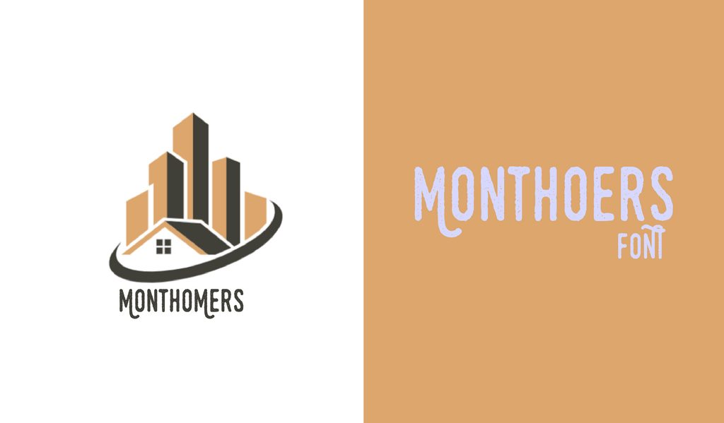
Monthoers has an inky, printed texture that gives lettering an intentionally imperfect feel. Its decorative swashes are a nice touch for vintage logos, posters, and featured typography.
102. Bebas Neue
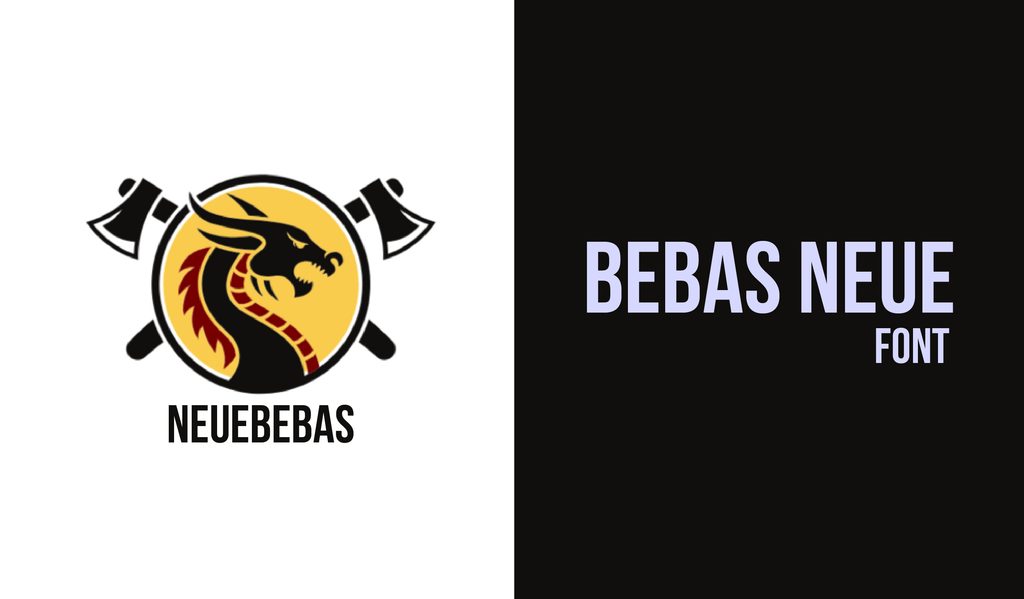
Bebas Neue is tall, bold, and built for headlines that need to stand out. Its clean uppercase lettering works especially well on posters, logos, packaging, and other display-heavy designs.
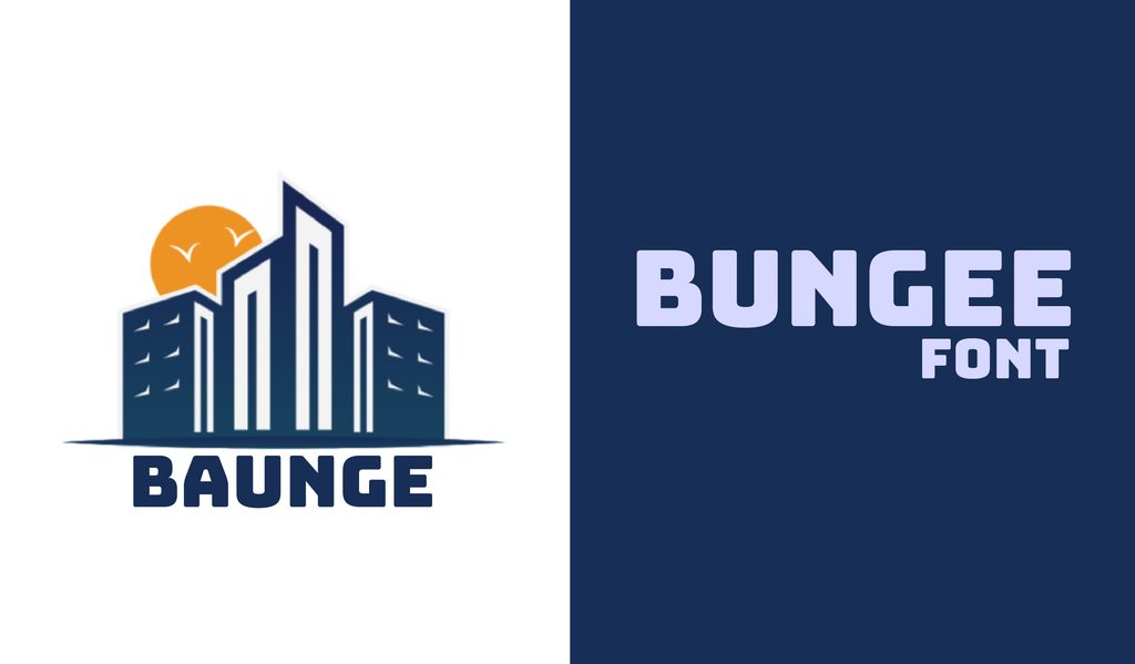
103. Bungee
Bungee takes its cues from old-school urban signage, with chunky letters designed to work horizontally or vertically. It brings plenty of personality to posters, logos, packaging, and bold headlines.
104. Abril Fatface
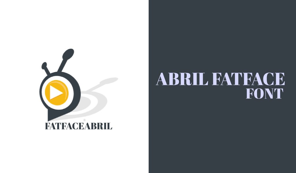
Abril Fatface pairs dramatic thick strokes with delicate hairlines, giving even a single word plenty of presence. It is especially striking on magazine covers, fashion branding, posters, and large headlines.
105. Anton
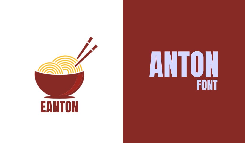
Anton is tall, heavy, and unapologetically bold. Its condensed letters make it useful when a headline needs to grab attention without taking up half the page.
Summing Up
The right font can change the whole mood of a design, sometimes with just a few letters. From clean sans serifs to expressive scripts and bold display faces, there is plenty here to experiment with. Try a few, mix styles, and see what clicks. Your next great design might start with a font you almost skipped.