Your website layout can make visitors stay, click, or leave in seconds. If your pages feel off but you cannot tell why, this guide helps you spot what’s going wrong and fix it with clarity.
Your website layout is the foundation of how users experience your brand online. Within seconds of landing on your site, visitors begin forming opinions based on how easily they can navigate, find information, and interact with your content. A structured layout guides users naturally, builds trust, and encourages action. It’s important to keep in mind that there’s no universal layout that works for every business.
What works for an eCommerce store may fail for a law firm, and a creative portfolio layout might not suit a SaaS platform. Each industry comes with its own user expectations, content needs, and conversion goals. And this makes layout selection more than just a design choice that needs to be made before you create your website.
Let’s explore how to choose the right website layout for your industry by understanding key layout types, user behavior, and practical selection strategies.
What Is A Website Layout, And Why Does It Matter?
A website layout refers to the structured arrangement of elements on a webpage. It covers how content, images, navigation menus, and calls to action are organized and presented to users. From the placement of your header and navigation bar to the flow of information across sections, every layout decision influences how easily users can interact with your site.
The building blocks of a web page have a key role in shaping user experience and business outcomes. A clear, well-organized layout helps visitors navigate the site, guiding them toward key actions such as making a purchase, filling out a form, or exploring your products or services. It also influences your brand identity, supporting your visuals, messaging, and core message.
- Creates Strong First Impressions: A clean, modern layout builds instant credibility.
- Enhances UX: Clear structure and smart typography choices make navigation effortless.
- Guides User Behavior: Strategic placement of content and CTAs drives key actions.
- Improves Readability: Strong visual hierarchy, spacing, and typography make content easy to scan.
- Boosts Engagement: An intuitive layout encourages users to explore more.
- Increases Conversions: Reduced friction helps turn visitors into customers.
- Supports Branding: Layout, brand color palette, and fonts reinforce a consistent brand identity.
- Reduces Bounce Rates: A clear structure keeps users on your site longer.
- Optimizes for Mobile: Responsive design ensures a smooth experience on all devices.
- Improves SEO: Better user experience contributes to higher search visibility.
Core Components of a Well-Structured Website Layout
Every effective website layout is built on a clear structure supported by essential elements. These components work together to organize content, guide user behavior, and create a seamless browsing experience. Rather than viewing a layout as a single design, it’s more accurate to see it as a system where each part plays a specific role in how users navigate, interact, and engage with your site.
Understanding these key elements is crucial when designing visually appealing layouts from scratch or customizing web templates as a beginner.

1. Website Header
The header is the top section of your website and the first thing users see. It usually includes your logo, main navigation menu, and key actions like sign-in or contact buttons.
A well-designed header stays consistent across all pages, helping users navigate easily while reinforcing your brand identity. Its main purpose is to give users quick and easy access to the most important areas of your site.

Listen Labs uses a clean, minimal header that keeps navigation simple and distraction-free. Instead of overcrowding the space, it focuses on clarity, allowing users to quickly understand where to go next. The header works seamlessly with the hero section, where short videos communicate the brand’s value, showcasing real customer pain points and how the platform solves them in a clear, engaging way.
2. Intuitive Navigation
Navigation is the system that helps users move through your website. It can appear as a top menu, a dropdown, a sidebar, or a mobile hamburger menu.
Clear and intuitive navigation makes it easy for users to find information quickly and without confusion, improving the overall browsing experience.

Blossom Health uses a clear sticky navigation that stays consistent across all pages. It provides easy access to key sections of the website and also includes quick options for logging in and connecting, making the experience simple and user-friendly.
3. Hero Section
The hero section is the main area at the top of a webpage, usually placed just below the header. It typically includes a headline, supporting text, visuals, and a primary call to action (CTA).
This section sets the tone for the website, communicates the core message, and quickly helps users understand what the brand offers.

XBow uses an interactive hero section that clearly highlights its core value proposition. It includes a strong call-to-action to request a demo, making it easy for users to take the next step. The hero is seamlessly integrated into the overall website experience, creating a smooth and engaging first impression.
4. Optional Sidebar
A sidebar is an additional column, usually placed on the left or right side of a webpage, that displays secondary content. This can include navigation links, filters, recent posts, or advertisements.
Sidebars are commonly used in blogs and e-commerce websites to make extra content and navigation easily accessible without cluttering the main page.

Applied Intuition uses a structured sidebar on its website to organize news content. The sidebar works alongside the main layout, giving users quick access to news categories and making it easier to browse articles, switch between topics, and find relevant information without disrupting the main reading experience.
5. Content Area
The content area is the main section of a webpage where your primary information is displayed. It includes text, images, videos, and other elements that deliver value to the user.
This section relies on clear hierarchy, spacing, and structure to make content easy to read, scan, and understand.

Traba uses content-rich sections to clearly communicate its value proposition. The pages highlight key business benefits using strong messaging supported by real statistics, helping users quickly understand impact and performance.

The platform also incorporates interactive data visualizations and charts within the content area to present complex information in a simple, visual format, making insights easier to grasp and more engaging for users.s
6. Calls-to-Action (CTAs)
CTAs are elements that encourage users to take a specific action, such as signing up, requesting a demo, making a purchase, or contacting a business.
They are placed strategically throughout a website—often in the hero section, within content, and at the end of pages—to guide users toward key goals and improve conversions.

Statsig uses clear and consistent CTAs across its website, such as “Get started” and “Book a demo.” These prompts are placed at key points in the user journey, making it easy for visitors to take action as they learn about the platform’s features and value.
7. Website Footer
The footer is the bottom section of a website and is often the last place users interact with. It typically includes important links, contact information, social media icons, and sometimes additional calls to action.
A well-organized footer helps users quickly find key information and provides one last opportunity for engagement before they leave the site.

Method Financial uses a detailed, structured footer that clearly organizes information across multiple categories. It highlights the industries it serves and includes links to resources, company information, and social media profiles. The footer also includes a dedicated developer section, making it easy for technical users to quickly access relevant documentation and tools.
Different Types of Website Layouts
Each layout type serves a different purpose and is better suited for content styles and user experiences. These core structures are widely used as they effectively balance usability, aesthetics, and functionality.
1. F-Pattern

The F-pattern layout is a web design structure based on natural eye-scanning behavior, where users first read horizontally across the top of a page, then move slightly down for a shorter second horizontal scan, and finally continue scanning vertically along the left side. This creates an “F-shaped” reading flow. It is most commonly used in text-heavy and information-driven websites such as news platforms, SaaS landing pages, and B2B service sites.
Key Traits
- Strong focus on top headlines and hero content
- Left-aligned hierarchy for easy scanning
- Information arranged in short, scannable sections
- Designed for fast scanning, not deep reading
- Prioritizes clarity and quick information discovery

Stord’s B2B page uses a natural F-pattern for scanning content.
Stord uses the F-pattern to simplify complex B2B logistics information. The hero section starts with a clear headline and value proposition that users scan horizontally. Below that, the content is broken into short sections that highlight key benefits and use cases. As users scroll, everything stays left-aligned, allowing quick vertical scanning of important business information.

Vivodyne applies the F-pattern to present technical scientific content clearly. The page begins with a strong headline and explanation that anchors the first horizontal scan. Below, structured sections break down complex biological concepts into simpler parts. As users scroll, the left-aligned layout helps them quickly scan technical details and key insights.

Passport Global uses an F-pattern SaaS layout where the hero section immediately communicates the core message through a headline and CTA. Supporting sections below reinforce benefits and features in short, scannable blocks. The consistent left-aligned structure helps users move vertically through the page and quickly understand the service offering.
2. Z-pattern Layout
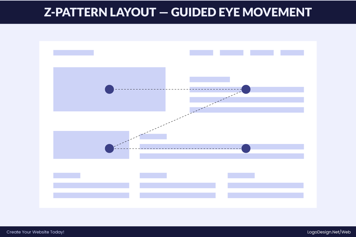
The Z-pattern layout is a web design structure based on how users naturally scan simple, visually driven pages. The eye typically moves from the top-left to top-right, then diagonally down to the bottom-left, and finally across to the bottom-right, often where the CTA is placed. This creates a “Z-shaped” reading flow.
It is most commonly used in landing pages, startup websites, and marketing pages where the goal is quick attention capture and fast conversion rather than deep reading.
Key Traits
- Strong top-left to top-right horizontal scanning
- Clear diagonal eye movement across the page
- CTA often placed at bottom-right (final focal point)
- Minimal content, strong visuals
- Designed for quick decision-making and conversions

HelloFresh uses the Z-pattern by first drawing attention to the logo at the top-left, then guiding the eye to a CTA at the top-right. The next movement takes the user diagonally down to a large food image or promotional headline in the center of the page. Finally, the eye lands on a strong call-to-action near the bottom-right. This structured flow helps users quickly understand the offer and move toward signing up.

Snackpass applies a high-energy Z-pattern centered on real-world food ordering. Branding appears in the top-left, with simple navigation on the right. The diagonal movement highlights app screenshots and social ordering features, while the bottom-right focuses on downloading the app, reinforcing its core use case of fast, social food discovery and ordering.

Lucy uses a product-driven Z-pattern similar to e-commerce layouts. The top-left branding is clean and minimal, while the top-right navigation remains understated. The diagonal flow emphasizes bold, editorial-style product visuals and skincare packaging, and the bottom-right section directs users toward exploring products and purchasing, making discovery feel visual and conversion-oriented.
3. Asymmetrical Layout

The asymmetrical layout is a web design structure that intentionally breaks visual balance to create movement, contrast, and modern appeal. Instead of using rigid grids, elements are placed unevenly with varying sizes and spacing. Despite this imbalance, the layout still maintains visual harmony through hierarchy, contrast, and alignment cues.
Key Traits
- Uneven but intentional visual balance
- Strong use of contrast and scale
- Guided focal points instead of strict grids
- Creates dynamic, modern aesthetics
- Often used in creative and experimental branding

Locomotive uses an expressive asymmetrical layout where typography and visuals are deliberately offset across the page. Large-scale imagery is paired with minimal text blocks placed off-center, creating visual tension. The uneven spacing guides attention through scroll-based storytelling, giving the site a cinematic, experimental feel typical of creative digital studios.

Stripe Atlas applies a structured asymmetrical approach where bold illustrations and typography dominate one side of the layout, while explanatory text and steps sit offset on the other. This contrast helps break down complex startup incorporation information into digestible sections while still maintaining Stripe’s clean, high-trust visual identity.

Shogun uses asymmetry to highlight its website builder features through a layered visual hierarchy. Large product mockups are positioned alongside staggered text blocks and feature callouts. The layout avoids rigid alignment, instead using spacing and contrast to guide attention across sections, reinforcing its positioning as a flexible, design-first e-commerce tool.
4. Single-Column Layout

The single-column layout presents content in one continuous vertical flow, making it highly readable and mobile-friendly. It removes side distractions and focuses the user attention on sequential reading. This structure is commonly used for blogs, documentation, and resource hubs where clarity, depth, and uninterrupted content consumption are the main goals.
Key Traits
- One continuous vertical content flow
- Highly readable and mobile-optimized
- Minimal distractions and side elements
- Strong focus on long-form content
- Ideal for blogs, docs, and case studies

Substack uses a clean single-column layout designed for long-form reading. Articles are presented in a straightforward vertical flow with minimal UI distractions. Images and text appear sequentially, allowing readers to focus entirely on the content. This format is especially effective for newsletters and opinion pieces where readability and immersion are the priority.

OpenRouter uses a vertical single-column layout to present its enterprise API offering. The page flows through clear sections describing capabilities, integration benefits, and use cases. Each block is stacked logically, making technical information easy to follow while maintaining a developer-focused reading experience without visual clutter.

ConfidentLIMS uses a single-column blog format for its blog pages and case studies. The content is presented in a continuous scroll with headings, paragraphs, and visuals aligned centrally. This structure allows readers to focus on the technical narrative and operational insights without distraction, making complex lab workflows easier to understand.
5. Multi-Column Layout

The multi-column layout divides a page into two or more vertical sections, allowing multiple types of content to be displayed simultaneously. This structure improves scanning efficiency and navigation, especially for content-heavy platforms. It is commonly used in eCommerce, marketplaces, and news websites where users need to compare or browse many items quickly.
Key Traits
- Multiple vertical content columns
- High information density without clutter
- Supports quick comparison and scanning
- Ideal for marketplaces and news sites
- Encourages parallel browsing behavior

Raise uses a multi-column layout to showcase discounted gift cards across brands. Products are arranged in clean grid columns with price and discount details visible at a glance. This structure allows users to quickly compare deals across categories, supporting fast decision-making in a deal-driven marketplace environment.

GOAT uses a multi-column product grid to display sneakers and streetwear listings. Each column features product images, pricing, and condition details, enabling fast visual comparison. The layout is optimized for browsing large inventories, helping users filter and evaluate products efficiently in a visually driven resale marketplace.

Wild Earth uses a multi-column eCommerce layout to present pet food products and bundles. Items are displayed in structured product cards across multiple columns, highlighting ingredients, benefits, and pricing. This format supports easy comparison between product types, helping pet owners quickly evaluate nutritional options and make purchase decisions.
6. Single-Page Layout

A single-page layout presents all key information on one continuous scrolling page. Users move through content using scrolling or anchor links instead of navigating between multiple pages. It works best for startups, portfolios, and landing pages where the message is focused, concise, and designed for quick understanding.
Key Traits
- All content on one scrollable page
- Navigation via scrolling or anchor links
- Strong section-based visual separation
- Ideal for landing pages and portfolios
- Best for focused, goal-driven messaging

Every Last Drop uses a storytelling-driven single-page layout focused on environmental awareness. The page guides users through a continuous scroll showing water usage facts in everyday activities. Each section builds on the previous one with illustrations and short messages, creating an engaging narrative that gradually reinforces water conservation awareness.

Open Peeps uses a minimalist single-page layout that showcases a hand-drawn illustration library. The page is structured as a continuous scroll where different character variations are displayed in clean sections. Each block highlights poses, compositions, and styles, making it easy for designers to browse and understand the asset system without distraction.

RIG.ai uses a single-page product-focused layout to present its AI infrastructure platform. The page flows through a clear hero section, followed by explanations of capabilities, architecture, and use cases. Each section is tightly structured and scroll-based, helping technical users quickly understand the product’s value without navigating multiple pages.
7. Multi-Page Layout

A multi-page layout divides content across separate pages like Home, About, Services, and Contact. Users navigate through menus instead of continuous scrolling. This structure is widely used for corporate, SaaS, and service-based websites because it organizes large volumes of content clearly and allows for better scalability as the site grows.
Key Traits
- Content split across multiple dedicated pages
- Navigation-driven user flow
- Supports large and complex information
- Scalable and easy to organize
- Common in corporate and SaaS websites

Toggl uses a structured multi-page layout to organize its product ecosystem. Features, pricing, integrations, and blog content are separated into dedicated pages accessed through a top navigation bar. This approach keeps information focused and digestible, allowing users to explore specific areas without overwhelming them on a single page.

Bulletin uses a multi-page eCommerce-style layout to organize brand discovery and shopping. Users navigate between home, product categories, and individual brand pages through a clear menu system. Each page focuses on a specific function, making it easier to browse independent brands and explore collections without cluttering a single interface.

Instacart relies on a multi-page structure to manage its complex grocery platform. Users move between home, store listings, product pages, cart, and checkout through guided navigation. Each page serves a specific purpose, helping users efficiently browse stores, select items, and complete purchases in a structured, step-by-step flow.
8. Grid-Based Layout
A grid-based layout organizes content into structured rows and columns, creating a clean and predictable browsing experience. It is widely used in eCommerce and image-heavy websites where multiple items need to be displayed simultaneously. This structure helps users scan, compare, and navigate content efficiently without losing visual clarity.
Key Traits
- Content arranged in rows and columns
- Consistent spacing and alignment
- Easy comparison across items
- Highly scannable and structured
- Common in eCommerce and visual platforms

Quince uses a refined eCommerce grid layout to display apparel and home products. Items are arranged in evenly spaced columns with strong imagery and minimal text. This structure emphasizes product visuals and pricing, enabling users to compare options بسهولة while maintaining a premium, uncluttered shopping experience.

Bluestone uses a grid-based layout to present jewelry collections like watches and charms. Each product appears in a uniform tile with imagery and pricing, making it easy to browse multiple designs at once. The structured grid enhances comparison and supports smooth navigation across a wide catalog of accessories.

Claim uses a modern grid layout to present deals and brand offers in structured tiles. Each card highlights rewards, visuals, and partner brands, allowing users to scan multiple offers at once. The consistent grid spacing creates a clean browsing experience while encouraging exploration across different promotions.
9. Magazine / Content-Heavy Layout
This layout is designed for content-rich websites like blogs, news platforms, and editorial experiences. It organizes large amounts of information into structured sections with headlines, visuals, and previews. The goal is to encourage browsing by making content easy to scan while highlighting featured stories and key topics.
Key Traits
- Multiple content sections and categories
- Strong headlines with supporting visuals
- Mix of large features and smaller content blocks
- Encourages browsing and exploration
- Editorial, news-style presentation

Harvey uses a content-heavy layout to present legal AI solutions through structured sections. The page combines strong headlines, supporting visuals, and modular content blocks. Information is layered in a way that allows users to scan key offerings quickly while still accessing deeper insights into transactional workflows and capabilities.

NewLimit uses a content-heavy editorial layout to present its scientific research. The page mixes long-form explanations with structured sections, visuals, and highlighted insights. This approach allows users to explore complex biology topics while scanning key ideas, creating a balance between deep reading and accessible content discovery.

Abridge applies a magazine-style layout to explain its healthcare platform. Content is divided into sections with bold headings, visuals, and short descriptive blocks. This structure helps simplify complex revenue cycle processes while allowing users to scan across multiple aspects of the platform without losing context.
10. Split-Screen Layout
A split-screen layout divides the interface into two distinct sections, often used to present contrasting ideas, choices, or complementary content. It is popular in modern landing pages and creative sites where balancing visuals and messaging is important. This structure supports storytelling by letting users compare or absorb two sides simultaneously.

Ritual uses a split-screen approach to balance product storytelling and brand messaging. One side highlights clean product visuals and ingredients, while the other presents benefits and explanations. This structure reinforces trust and clarity, helping users understand the product while staying engaged with a visually calming layout.

ManyChat uses split-screen sections to demonstrate its chat automation platform. Visual examples of messaging flows appear on one side, while the other side explains features and benefits. This layout helps users immediately understand how the product works in practice, making complex automation concepts easier to grasp.

Aura uses a split-screen hero section to introduce its digital security platform. One side presents a strong headline and value proposition, while the other shows product visuals or an interface. previews. This layout quickly communicates purpose and functionality, guiding users toward a clear call-to-action early in the experience.
11. Full-Screen Visual Layout
This layout centers around large, immersive visuals that fill most or all of the screen. It is commonly used by luxury brands, product showcases, and storytelling-driven websites. The design relies on strong imagery, minimal text, and whitespace to create emotional impact and guide users through a cinematic, scroll-based experience.
Key Traits
- Large, full-screen images or videos
- Minimal text and clean typography
- Strong emotional and visual impact
- Scroll-based storytelling
- Focus on product or brand experience

Anduril’s Space page uses full-screen visuals to communicate advanced defense technology. Large, high-impact imagery and dark backgrounds create a cinematic tone, while minimal text overlays explain capabilities. Each scroll introduces a new visual section, reinforcing a sense of scale and innovation while keeping users immersed in the narrative.

Scalify uses a full-screen layout to present its AI-driven marketing platform with bold visuals and gradients. Each section fills the screen with minimal text and strong headlines, creating a modern, high-impact feel. The scroll transitions guide users through features and benefits while maintaining visual focus and clarity.

Reflect Orbital uses a full-screen visual storytelling approach to present its space-based light technology. Large, immersive visuals dominate each section, paired with concise text. The scrolling experience reveals new scenes progressively, helping users understand the concept while maintaining a strong sense of innovation and futuristic design.
What Makes an Effective Website Layout?
An effective website layout isn’t just about aesthetics—it’s about how well all elements work together to guide users, communicate clearly, and drive action. A strong layout reduces friction, improves usability, and helps users find what they need without effort.
Here are the key factors that define a high-performing layout:
1. Clear and Intentional Visual Hierarchy
Visual hierarchy directs attention to what matters most. By using size, contrast, color, and spacing, you can highlight headlines, key messages, and calls-to-action. A clear hierarchy helps users scan quickly, understand content instantly, and take action without confusion.

Lettuce emphasizes hierarchy through a dominant hero headline paired with a single primary CTA. Supporting sections use smaller typography and softer contrast, clearly separating primary messaging from secondary details. The layout ensures users immediately understand the core value before exploring deeper content.

Sennos uses a structured, section-based hierarchy where each block introduces a clear headline followed by concise supporting text. The consistent vertical rhythm and spacing create a predictable scanning pattern, helping users move top-to-bottom while progressively understanding the product offering.
2. Cohesive and Consistent Branding
A cohesive layout reinforces your brand identity across every page. Consistent use of colors, custom typography, imagery, and tone builds recognition and trust. When everything feels aligned, the website appears professional and reliable, while inconsistency makes it feel fragmented.

Resolve AI maintains consistency through repeated UI patterns such as card layouts, icon styles, and gradient accents. These elements appear across pages, reinforcing a unified visual identity while ensuring users recognize interactions and components instantly throughout the interface.

Ineffable AI applies a consistent typographic scale and muted color palette across all sections. The restrained design language, including consistent spacing and minimal visual variation, creates a calm, cohesive experience that aligns closely with its brand positioning.
3. Strategic Use of Whitespace
Whitespace (negative space) gives content room to breathe. It reduces clutter, improves readability, and helps users focus on key elements. Well-used spacing creates a clean, modern feel, while overcrowded layouts can overwhelm users.

Greenly separates dense informational content using large vertical spacing between sections and generous padding within text blocks. This prevents environmental data from feeling overwhelming and allows users to process each section independently without visual fatigue.

Planned uses whitespace to isolate key UI components, especially in feature sections where each block is given its own visual space. This separation makes interactions clearer and prevents overlapping visual priorities, improving overall clarity and focus.
4. Fully Responsive Across Devices
A strong layout adapts seamlessly to all screen sizes. Whether on desktop, tablet, or mobile, content should remain clear, functional, and visually consistent. Responsive design ensures a smooth experience everywhere and helps retain users.

Linx Security restructures multi-column desktop sections into single-column stacks on mobile, maintaining readability without compressing content. Navigation simplifies into a compact menu, ensuring usability remains intact even as layout density changes across devices.

Railway adapts complex developer-focused layouts into simplified mobile views by reorganizing grids into vertical flows. Interactive elements and navigation remain accessible, demonstrating a thoughtful approach to preserving functionality across screen sizes.
5. Optimized for Speed and Performance
Design choices directly impact load time. Heavy visuals, animations, or unoptimized elements can slow down the experience. An effective layout balances visual appeal with performance to keep pages fast and users engaged.

InstantDB prioritizes performance by using minimal imagery and lightweight components. The page loads almost instantly, with no heavy animations blocking rendering, making the interface feel fast and responsive from the first interaction.

Kernel keeps its layout extremely lean, relying on simple typography and minimal assets. The absence of large media or complex scripts ensures rapid load times and smooth scrolling, reflecting a performance-first design approach.
6. High Content Readability
Readable content keeps users engaged. This includes appropriate font sizes, proper line spacing, and strong contrast between text and background. When content is easy to consume, users are more likely to stay and take action.

Sanity presents technical content using a clear typographic hierarchy, with well-spaced paragraphs and consistent line lengths. This structure makes complex developer-focused information easier to read and reduces cognitive load during long-form content consumption.

Obvious AI simplifies readability by breaking content into short, digestible sections with clear headings. The contrast between text and background ensures clarity, while spacing prevents text from feeling dense or overwhelming.
7. Accessibility-First Design
An inclusive layout works for all users. This means readable typography, proper color contrast, and support for assistive technologies like screen readers and keyboard navigation. Accessibility improves usability while expanding your audience.

Temporal uses high-contrast text, consistent heading structures, and predictable layouts to support accessibility. The clear organization ensures users can navigate content logically, even though deeper accessibility features are not immediately visible.

TealHQ focuses on clarity with readable typography and strong contrast across UI elements. The consistent navigation structure and clearly defined sections help users interact with the interface more easily across different accessibility needs.
8. Designed for Fast Scanning
Most users scan instead of reading word-for-word. A well-structured layout supports this with clear headings, short sections, and logical organization. This makes it easier to find key information quickly.

Italic uses bold section headings and short descriptive blocks to allow users to quickly identify relevant content. The layout avoids long paragraphs, making it easy to skim and locate key information efficiently.

Superhi structures its pages with clearly separated sections and concise text, allowing users to scan quickly. Visual breaks between sections help users jump directly to areas of interest without reading sequentially.
9. Balanced and Well-Aligned Structure
Balance and alignment create a sense of order and professionalism. A well-aligned layout guides users naturally through content, while proper visual balance ensures no section feels too heavy or empty. This results in a smoother, more intuitive experience.

Astral maintains precise alignment between text, visuals, and spacing, creating a visually stable layout. Each section feels evenly weighted, preventing any single element from dominating or disrupting the flow.

Base Power Company balances visual elements by distributing content evenly across sections. Consistent alignment and spacing ensure the layout feels structured and controlled, avoiding clutter or imbalance.
10. Clear Navigation and Wayfinding
A strong layout makes it easy for users to know where they are and where to go next. Navigation should be simple, visible, and predictable across all pages. Menus, links, and page structure should guide users naturally, helping them move through the site without confusion or unnecessary effort.

Wander uses a simple top navigation combined with clear page segmentation, helping users understand their position within the site. Navigation options are visible and predictable, reducing confusion during exploration.

Cradle structures navigation with clearly labeled menus and logical grouping of pages. Users can move between sections easily, with consistent navigation placement reinforcing orientation across the site.
11. Conversion-Focused Design (CTA Strategy)
An effective layout is designed with a goal in mind. Whether it’s signing up, making a purchase, or booking a demo, calls-to-action should be placed strategically throughout the page. Clear messaging, logical placement, and reduced friction help users take action without hesitation.

Remote places primary CTAs prominently in the hero section and repeats them strategically throughout the page. Buttons use strong contrast and clear wording, ensuring users always have a visible next step.

Aniva Health integrates CTAs within content sections, aligning actions with context. This placement encourages users to act at relevant moments rather than only at the beginning or end of the page.
12. Content Prioritization and Information Architecture
A good layout doesn’t just organize content—it prioritizes it. The most important information should appear first, followed by supporting details in a logical flow. This helps users quickly understand the value of the page without feeling overwhelmed or lost.

Varda introduces its core value proposition immediately, followed by structured sections that expand on details. The layout ensures users grasp the main idea quickly before diving into supporting content.

Ngrok organizes technical information into clearly labeled sections, prioritizing essential details first. The structured layout helps users navigate complex content without getting lost.
13. Interaction and Feedback States
Users need clear feedback when they interact with a website. Hover effects, button states, loading indicators, and subtle animations help communicate what’s happening. These small details improve usability and make the interface feel responsive and intuitive.

Tempo uses subtle hover effects and animated transitions to indicate interactivity. These feedback cues help users understand when elements are clickable or active, improving overall usability.

Noon Design incorporates animated feedback in buttons and transitions, making interactions feel responsive. These micro-interactions provide clear signals that actions have been triggered.
14. Visual Consistency Across Sections
Consistency goes beyond branding—it includes spacing, components, buttons, and layout patterns. A well-structured design system ensures that elements behave and appear consistently across the site. This creates a more polished experience and makes the layout easier to scale over time.

Infinite Machine maintains consistent component styling, including repeated layouts and typography patterns. This uniformity ensures a cohesive experience across all sections.

Things uses consistent spacing, typography, and layout patterns across pages. This repetition creates predictability, making the interface easier to navigate.
15. Emotional and Visual Engagement
A layout should not only function well but also feel engaging. The use of imagery, color, and composition can create emotional impact and capture attention. Strong visual storytelling helps users connect with the brand and makes the experience more memorable.

Palmstreet uses bold imagery and layered compositions to create a visually rich experience. The layout emphasizes visual storytelling, drawing users into the content through strong visual cues.

Olipop combines vibrant colors with playful layouts to create a strong emotional connection. The design reflects the brand’s personality, making the experience feel energetic and memorable.
How Industry Shapes Website Layout Choices?
Website layout is never one-size-fits-all. Just as different industries use different colors in logos to signal meaning and build recognition, they also shape how websites are structured. Each industry carries its own set of user expectations, content priorities, and goals.
When users land on a site, they subconsciously expect a familiar structure. If that expectation isn’t met, it can create confusion or reduce trust.
For example, users expect clarity and structure in finance or legal websites, while in eCommerce, they expect fast browsing and easy product comparison. Choosing a layout that aligns with both the industry and user intent is key to usability and credibility.
• Corporate & B2B Websites
Corporate and B2B websites focus on clarity, structure, and trust, typically using multi-page navigation with clearly defined sections for products, services, and case studies. The layout is designed to help users understand offerings quickly and move toward inquiry or demos.

Unmind uses a calm, structured layout with clear sections that explain workplace mental health solutions step by step. The design feels minimal and reassuring, using spacing and typography to build trust while keeping information easy to digest.

Navan presents its product through a clean, modular structure with strong hierarchy and focused messaging. Each section breaks down travel and expense solutions clearly, guiding users toward demos and enterprise engagement.
• eCommerce & Marketplaces
eCommerce layouts are designed for fast product discovery, comparison, and purchasing. Grid systems, filters, and strong product visuals dominate this space.

GetYourGuide uses a card-based grid layout where travel experiences are shown with images, ratings, and pricing. The structure allows users to quickly scan options, compare activities, and make booking decisions with minimal effort.

Grove organizes products in clean grids with category-based browsing and strong product imagery. Each section highlights eco-friendly household items, making it easy for users to explore, compare, and shop efficiently without unnecessary complexity.
• Creative, Portfolio & Agency Sites
Creative industries prioritize expression, storytelling, and visual impact. Layouts are often unconventional, using motion, asymmetry, and immersive visuals.

April Taylor’s portfolio uses a minimal, editorial layout with strong typography and generous spacing. The design keeps attention on the creative work, allowing visuals and case studies to stand out without distraction or unnecessary UI elements.

Pancake Web Studio uses a playful, experimental layout with bold visuals and interactive transitions. The structure feels dynamic and personality-driven, using motion and creative spacing to reflect the studio’s expressive design approach.
• Healthcare and Medical
Healthcare websites focus on accessibility, trust, and simplicity. Users often visit with urgent needs, so layouts must be highly intuitive and distraction-free. These sites typically use clear service sections, strong readability, and easy appointment flows.

Grail presents its cancer detection technology through clean, structured sections that balance scientific detail with simplicity. The layout builds trust through clarity and controlled pacing of information.

Mammoth uses a minimal, research-driven layout with clean spacing and modular sections. The design focuses on explaining biotech innovation in a straightforward way, making complex scientific ideas easier to understand and navigate.
• Legal Services
Legal websites prioritize credibility, reassurance, and clarity. Layouts are structured and straightforward, often breaking complex services into simple steps. Strong trust signals and clear calls-to-action are essential.

Litify uses a structured SaaS-like layout to explain legal workflow solutions. The design breaks down enterprise legal operations into clear sections, helping users understand how the platform improves efficiency and case management.

Supio keeps its layout minimal and focused on messaging clarity. Each section explains legal AI capabilities in simple terms, using strong hierarchy and spacing to maintain readability and trust.
• Fintech & Banking
Fintech websites focus on trust, security, and smooth onboarding. Layouts are minimal, structured, and designed to guide users toward financial actions.

Celo uses a clean, modern layout that combines storytelling with technical explanations. The structure makes blockchain and financial inclusion concepts easier to understand while maintaining a strong focus on clarity and accessibility.

Bitso focuses its crypto platform through a simple, structured layout that focuses on onboarding and usability. The design helps users quickly understand trading features and financial tools without overwhelming complexity.
• SaaS & Technology
SaaS websites are designed to communicate value quickly and drive conversions. They combine storytelling with structured product explanations.

Celestia presents a technical, developer-focused layout with structured sections explaining blockchain architecture. The design keeps information organized and accessible, helping users understand complex infrastructure clearly.

Dialpad uses a clean SaaS layout with benefit-driven sections, product demos, and use cases. The structure guides users through features in a logical flow that supports product understanding and conversion.
• Media, News & Editorial Platforms
These platforms prioritize discovery and readability across large volumes of content. Layouts use grids, columns, and editorial hierarchy.

Morning Consult uses a structured grid layout to present reports, insights, and data-driven content. The design helps users quickly scan research topics and understand complex information.

Axios uses a simplified editorial layout with short text blocks and bold headlines. The structure is designed for fast scanning, allowing users to quickly consume news updates.
• Personal Blogs & Publishing Platforms
Blogs focus on long-form reading and simplicity. Layouts are minimal, often single-column, with strong emphasis on typography and spacing.

Feld Thoughts uses a minimalist blog layout with strong typography and single-column structure. The design removes distractions, allowing users to focus entirely on reading long-form content comfortably.

Contentful organizes articles in a clean, structured layout with clear spacing and category navigation. The design supports easy browsing and ensures a smooth reading experience across topics.
• Travel, Hospitality & Experience Brands
These industries rely on emotional storytelling and visual impact. Layouts are immersive, often using large imagery and cinematic scrolling.

MyLighthouse uses full-screen visuals and minimal text to create a cinematic browsing experience. The layout focuses on mood and storytelling, encouraging users to engage emotionally with travel inspiration.

SevenRooms combines structured storytelling with strong visuals to explain hospitality tools. The layout balances clarity and engagement, making complex product offerings easy to understand.
• Education & E-Learning Platforms
Education platforms focus on clarity, progression, and structured learning paths. Layouts are modular and easy to scan.

Tegore AI uses a clean, structured layout to present AI learning tools. The design breaks down complex concepts into simple sections that are easy to follow and understand.

Risely AI uses a guided, modular layout that explains learning features step by step. The structure helps users quickly understand the platform’s educational value and progression flow.
How to Choose the Right Website Layout – A Step by Step Guide
Choosing the right website layout is about aligning your site’s structure with your goals, audience, and content. For a platform that lasts, no matter the industry, you need to think about how to drive better results without making any major changes with trends or technology. Let’s take a look at how you can make more strategic decisions.
1. Define Your Primary Goal
Start by identifying what you want your website to achieve. If your goal is to sell products, generate leads, showcase your work, or provide information, this decision will shape your layout. For instance, an eCommerce site needs strong product visibility and a seamless checkout flow, while a service-based business will need clear calls-to-action and trust-building sections. A portfolio should focus on visuals with minimal distractions.
2. Understand Your Target Audience
Your layout should reflect how your audience prefers to browse and interact. Consider their behavior, device usage, and expectations. Some users prefer quick scanning, and others engage more deeply with detailed content. A layout that works well with these preferences provides a smoother experience and keeps users coming back. It’s also important to pay attention to mobile users, as a large portion of traffic now comes from smaller screens.
3. Analyze Your Industry
Every industry has certain layout patterns that users are already familiar with. Studying competitors and industry leaders helps you understand what works and why. For example, SaaS platforms rely on conversion-focused landing pages, and corporate websites use structured multi-page layouts. Following these patterns helps create a sense of familiarity, which improves usability and trust.
4. Organize and Prioritize Your Content
Before finalizing a layout, map out your content and determine what matters most. Decide what users should see first and how information should flow across the page. Prioritizing key content helps you make sure that your layout supports your goals instead of overwhelming users with too much information. A clear content hierarchy makes navigation easier and improves overall readability.
5. Match Layout Type to Function
Once your goals and content are clear, choose a layout that supports them effectively. Different layout types serve different purposes, so it’s important to focus on functionality instead of the latest trends. A grid layout works well for product-heavy websites, a multi-page structure for content-rich businesses, and a single-page layout is ideal for focused storytelling or campaigns.
6. Plan User Flow and Navigation
Think about how users will move through your website from the moment they land on it. A good layout creates a natural flow, taking visitors from one section to another without confusion. Navigation should be simple and intuitive, and calls-to-action should be placed where users are most likely to interact with them. Clear sections and proper spacing can direct attention and enhance the overall experience.
7. Focus on Mobile Responsiveness
With the majority of users browsing on mobile devices, your layout must adapt seamlessly to different screen sizes. A responsive design keeps your website functional and visually appealing across all devices. This includes simplifying navigation, optimizing content for smaller screens, and avoiding overcrowded layouts that can frustrate users.
8. Test and Refine Your Layout
Choosing a layout is more than just a one-time decision since it requires ongoing evaluation and improvement. Monitoring user behavior through analytics can help you understand what’s working and what needs adjustment. Test different layout variations and make data-driven improvements to boost your website’s performance and meet user expectations over time.
Where Do Website Layouts Go Wrong?
Even well-designed websites can fail when layout decisions hurt usability, clarity, or conversions. Most issues come from ignoring how users actually scan and interact with pages, or from prioritizing aesthetics over function. Below are the most common and impactful layout mistakes to avoid.
1. Trend-Led Design Without User Intent
Designing around trends instead of user needs often results in layouts that look modern but don’t perform well. A style that works for a creative portfolio may not suit a legal or corporate site where clarity, trust, and structure matter more than experimentation.
2. Overcrowded Layouts and Cognitive Overload
Too much content on a single page or section reduces clarity and overwhelms users. When multiple elements compete for attention, cognitive overload messes with brand recall. In short, nothing stands out. Good layouts use spacing and structure to guide focus and make scanning effortless.
3. Weak Visual Hierarchy
When everything is given equal visual weight, users don’t know where to look first. Without a clear hierarchy in typography, spacing, and contrast, key messages and actions get lost, reducing engagement and conversions.
4. Poor Mobile Responsiveness
A layout that works on desktop but breaks on mobile creates major usability issues. Misaligned elements, unreadable text, or poor spacing can frustrate users. Since mobile usage dominates web traffic, responsive design is essential.
5. Confusing Information Flow
If users can’t naturally move through content, they drop off quickly. This often comes from unclear navigation, poorly grouped content, or inconsistent section structure. A good layout always follows a predictable and intuitive flow.
6. Lack of Content Prioritization
When everything looks equally important, users struggle to understand what matters most. Strong layouts clearly prioritize key messages, supporting content, and calls-to-action in a logical order.
7. Inconsistent Design System Usage
Inconsistent spacing, typography, color mistakes, or components makes a website feel unstructured and unprofessional. It also reduces trust. A consistent design system ensures clarity and strengthens brand identity across all pages.
8. Poor Accessibility Design
Ignoring accessibility limits usability for many users. Low contrast, unreadable fonts, missing labels, or a lack of keyboard navigation can exclude users and reduce overall effectiveness. Accessibility improves both usability and reach.
9. Slow Performance Due to Layout Choices
Heavy visuals, unoptimized images, and complex animations can slow down load times. Even visually strong layouts fail if they feel slow. Performance directly impacts engagement and bounce rates.
10. Lack of Testing and Iteration
A layout should evolve based on real user behavior. Without A/B testing, analytics, or user feedback, it’s difficult to identify friction points. Continuous optimization is essential for improving usability and conversions over time.
Modern Website Layout Techniques
Modern website layouts are built using a combination of CSS technologies, design systems, and architectural patterns. Together, these approaches ensure interfaces are responsive, maintainable, and scalable across devices and product sizes.
1. CSS Grid & Flexbox
CSS Grid and Flexbox are the foundational layout systems used in modern web design. Flexbox handles one-dimensional layouts, making it ideal for aligning items in rows or columns, while CSS Grid manages two-dimensional layouts with precise control over both rows and columns. Together, they allow developers to build highly responsive and structured interfaces that adapt smoothly across different screen sizes.
- Flexbox (1D layout: row or column alignment)
- CSS Grid (2D layout: rows + columns control)
- Grid Template Areas for semantic layout structure
- Subgrid for nested alignment consistency
- Auto-fit and auto-fill for responsive grids

Mintlify uses a highly structured documentation layout built on grid and flex principles. The page is divided into a fixed sidebar navigation and a main content column aligned using flexible row-based layout behavior. Content sections stack vertically with consistent spacing, while multi-column elements adapt responsively, indicating strong reliance on Flexbox alignment and grid-based page structure.
2. Responsive & Mobile-First Design
Responsive design ensures websites adapt to different screen sizes, while mobile-first design starts with the smallest screen and progressively enhances for larger devices. This approach improves usability, performance, and accessibility by prioritizing essential content and functionality before scaling up layouts for desktops and larger displays.
- Mobile-first breakpoints strategy
- Media queries for adaptive layouts
- Fluid images and flexible containers
- Responsive navigation patterns (hamburger menus, drawers)
- Progressive enhancement approach

Slash demonstrates a mobile-first responsive system where content collapses into a single-column layout on smaller screens and expands into multi-column sections on desktop. Navigation transforms into compact patterns like hamburger menus, and typography scales fluidly. The layout prioritizes core functionality on mobile, progressively enhancing spacing, layout complexity, and visual hierarchy on larger screens.
3. Container Queries
Container queries allow components to respond to the size of their parent container instead of the entire viewport. This enables truly modular and reusable UI components that can adapt independently depending on where they are placed within a layout, making design systems more flexible and predictable.
- Component-level responsiveness (not viewport-based)
- Ideal for reusable cards and widgets
- Works with card grids and dashboards
- Enables true modular design systems
- Reduces dependency on global breakpoints

Omni displays component-level responsiveness, where interface cards and modules adjust independently within their parent containers. Rather than relying solely on viewport breakpoints, UI blocks resize and reorganize based on available container width. Dashboard-style components shift layout density dynamically, indicating a modular system where widgets respond to surrounding layout constraints rather than global screen size.
4. Fluid Layouts (Clamp, Min, Max, Viewport Units)
Fluid layouts use modern CSS functions to create smooth scaling between screen sizes instead of abrupt breakpoints. This results in more natural and visually consistent designs where typography, spacing, and element sizing adjust proportionally across devices.
- clamp() for responsive typography and spacing
- min() and max() for size constraints
- Viewport units (vw, vh) for proportional scaling
- Eliminates excessive breakpoint dependency
- Improves visual smoothness across devices

Comfy uses smooth scaling typography and spacing that adjusts continuously across screen sizes. Headings, margins, and section padding appear proportionally responsive rather than snapping at breakpoints. The interface maintains visual consistency as elements scale fluidly, suggesting the use of CSS functions like clamp() and viewport-based units to ensure gradual transitions in size and spacing.
5. Card-Based Layouts
Card-based layouts organize content into modular blocks that typically include images, titles, and metadata. This structure makes information easier to scan, compare, and interact with, which is especially useful in content-heavy platforms like marketplaces, feeds, and dashboards.
- Modular, reusable content blocks
- Ideal for product listings and feeds
- Supports grid or masonry layouts
- Enhances scanning and readability
- Works well with infinite scroll systems

Collective organizes content into structured card blocks containing titles, descriptions, and supporting metadata. These cards are arranged in a responsive grid that adapts to screen width, enabling easy scanning of multiple items. The layout supports modular content browsing, with consistent spacing and alignment that enhances readability and allows efficient comparison across different content entries.
6. Modular Design Systems
Modular design systems break interfaces into reusable components such as buttons, cards, headers, and sections. These components can be combined in different ways across pages, ensuring consistency and making large-scale applications easier to maintain and extend over time.
- Reusable UI components (buttons, cards, modals)
- Consistent spacing and typography rules
- Scalable multi-page architecture
- Centralized design tokens
- Foundation for design systems in large apps

Replicate uses reusable interface components such as model cards, input fields, and result panels repeated across pages. Each module behaves consistently regardless of context, indicating a component-driven architecture. Pages are assembled from standardized UI blocks, ensuring consistent spacing, typography, and interaction patterns across different model pages and workflows within the platform.
7. Atomic Design Methodology
Atomic Design is a structured approach to building UI systems by breaking interfaces into hierarchical levels: atoms, molecules, organisms, templates, and pages. This method helps teams design and maintain complex systems by ensuring every component has a clear level of reuse and responsibility.
- Atoms (basic elements like buttons and inputs)
- Molecules (small component groups like search bars)
- Organisms (larger sections like navigation bars)
- Templates (page structure without content)
- Pages (final UI with real content)

Slate Auto demonstrates atomic design through its structured breakdown of UI elements into reusable components. Basic elements like buttons and inputs combine into search modules, which then form larger navigation and content sections. Pages appear assembled from hierarchical building blocks, reflecting a clear separation between atoms, molecules, and full-page templates.
8. Utility-First CSS (Tailwind Approach)
Utility-first CSS focuses on building layouts using small, single-purpose utility classes instead of writing custom CSS. This approach speeds up development, ensures consistency, and reduces the need for large stylesheets by composing designs directly in markup.
- Example framework: Tailwind CSS
- Rapid layout composition using utility classes
- Consistent spacing and design tokens
- Reduces custom CSS overhead
- Encourages reusable design patterns

Wonder Design reflects a utility-first approach where spacing, typography, and layout consistency appear tightly controlled and highly systematic. UI elements show consistent spacing scales and alignment patterns, suggesting composition through predefined utility classes rather than custom CSS. Layout adjustments are precise and repetitive, indicating structured design tokens applied directly at the component level.
9. CSS Framework-Based Layouts
CSS frameworks provide prebuilt grid systems, components, and layout utilities that simplify responsive design. They are widely used for rapid development and team standardization, especially in projects where a consistent UI structure is more important than custom design.
- Example: Bootstrap
- Prebuilt responsive grid systems
- Ready-made UI components
- Standardized layout patterns
- Faster prototyping and development
- Cross-browser consistency

Factory AI uses a standardized grid system and consistent UI components typical of CSS frameworks. Pages are structured with predictable alignment, spacing, and responsive breakpoints. Buttons, panels, and sections follow uniform styling rules, suggesting reliance on a prebuilt framework for layout structure, enabling rapid consistency across dashboards and content-heavy application screens.
10. CSS Custom Properties (Variables)
CSS custom properties allow developers to define reusable values such as colors, spacing, and typography scales. This makes it easier to maintain consistent design systems and enables dynamic theming, such as switching between light and dark modes.
- Centralized design tokens (colors, spacing, fonts)
- Easy theme switching (dark/light modes)
- Runtime updates using JavaScript
- Improved maintainability in large systems
- Works well with design systems and components

Loop demonstrates theme-driven design consistency, where colors, spacing, and typography appear systematically reused across the interface. Light and dark modes suggest runtime style switching powered by CSS variables. Design tokens likely control global styling, allowing consistent updates across components without breaking layout integrity, especially in buttons, backgrounds, and interactive UI elements.
11. Advanced Layout Patterns
Advanced layout patterns are specialized structures used for specific UI needs such as content feeds, dashboards, or navigation systems. These patterns go beyond basic grids and flex layouts to support richer, more interactive user experiences.
- Masonry layouts (Pinterest-style uneven grids)
- Sticky headers and sidebars
- Off-canvas navigation menus
- Infinite scroll and pagination systems
- Scroll snapping for carousels and feeds

Pallet showcases advanced layout structures through dynamic, feed-like interfaces that resemble a content discovery system. It uses masonry-style card arrangements and continuously expanding content sections. Navigation includes sticky elements and scroll-driven browsing behavior, supporting infinite exploration of content. The layout adapts dynamically, enabling both structured dashboards and fluid, feed-based browsing experiences.
12. Interaction-Aware Layouts
Interaction-aware layouts adjust based on user behavior rather than just screen size. This includes dynamic changes triggered by scrolling, hovering, or visibility, improving usability and making interfaces feel more responsive and intelligent.
- Scroll-based sticky elements
- Lazy loading of offscreen content
- Intersection Observer-based animations
- Dynamic reflow of UI components
- Behavior-driven UI updates

Monk uses scroll-triggered transitions where sections animate into view as users move down the page. Content dynamically shifts based on viewport visibility, suggesting intersection-observer-style animations. Certain UI elements remain fixed while others transform or fade, creating a behavior-driven interface that responds directly to scrolling, hovering, and user engagement patterns across the page.
13. Semantic & Accessible Layouts
Semantic layout design focuses on using proper HTML structure and accessibility practices to ensure websites are usable by all users, including those using assistive technologies. It improves navigation, SEO, and overall usability.
- Semantic HTML tags (header, main, section)
- Logical tab order for keyboard navigation
- ARIA roles for complex components
- Screen reader compatibility
- Improved SEO structure

Bluefish AI presents a clearly structured layout with hierarchical sections, consistent heading usage, and logically grouped content blocks. The interface is organized for readability and likely supports screen readers through semantic sectioning. Navigation flows linearly through well-defined content regions, improving accessibility and SEO structure and ensuring predictable keyboard navigation across distinct feature explanations.
14. Performance-Oriented Layout Design
Performance-oriented layouts are designed to reduce loading time and improve rendering efficiency. They focus on optimizing how content is delivered and displayed, ensuring smooth user experiences even on slower devices or networks.
- Critical CSS for above-the-fold content
- Lazy loading for images and sections
- Preventing layout shifts (CLS optimization)
- Progressive enhancement strategies
- Optimized asset loading strategies

Span demonstrates performance-focused layout behavior through modular UI components that load progressively within a dashboard environment. Above-the-fold elements render first, while secondary panels appear as needed. The layout maintains stability with reserved space for components, reducing layout shift. Lazy-loaded modules and optimized rendering patterns support smooth interaction even in complex workspace views.
| Technique | Where It’s Used | Do’s | Don’ts |
| CSS Grid & Flexbox | Page layouts, dashboards, navigation bars, forms, alignment systems | Use Grid for full page structure; use Flexbox for alignment inside components; combine both for scalable layouts | Don’t force Flexbox for complex 2D layouts; don’t over-nest grids unnecessarily |
| Responsive & Mobile-First Design | Entire websites, SaaS apps, e-commerce platforms | Start from mobile constraints; progressively enhance; test across breakpoints early | Don’t design desktop-first and shrink later; don’t ignore touch interactions |
| Container Queries | Cards, widgets, dashboards, reusable components | Use for component-based systems; isolate UI behavior per container size | Don’t replace all media queries blindly; avoid unsupported legacy environments if needed |
| Fluid Layouts (clamp, min, max, vw) | Typography, spacing systems, and responsive UI scaling | Use clamp() for font sizes; combine with design tokens; reduce breakpoint dependency | Don’t overuse viewport units for everything; don’t ignore accessibility scaling |
| Card-Based Layouts | Product listings, feeds, galleries, dashboards | Keep consistent structure; ensure visual hierarchy; optimize for scanning | Don’t overload cards with too much info; don’t make inconsistent heights without strategy |
| Modular Design Systems | Large apps, SaaS platforms, multi-team products | Build reusable components; enforce spacing and typography rules; document system | Don’t create one-off components everywhere; don’t break consistency per page |
| Atomic Design Methodology | Design systems, component libraries, scalable UI architecture | Build from atoms → pages; enforce hierarchy; reuse aggressively | Don’t overcomplicate small projects; don’t treat it as rigid law |
| Utility-First CSS (Tailwind-style) | Rapid UI development, startups, design systems | Use consistent utility patterns; extract reusable components when repeated | Don’t create unreadable markup; don’t avoid abstraction when repetition grows |
| CSS Frameworks (Bootstrap, etc.) | Rapid prototyping, admin panels, internal tools | Use for speed and consistency; leverage grid system properly | Don’t fight the framework heavily; don’t ship uncustomized generic UI blindly |
| CSS Custom Properties (Variables) | Theming, design systems, spacing scales | Centralize colors/spacing; enable dark mode easily; reuse tokens | Don’t hardcode values everywhere; don’t create unstructured variable sprawl |
| Advanced Layout Patterns | E-commerce, media platforms, content-heavy apps | Use masonry for visual content; sticky UI for navigation; infinite scroll where needed | Don’t overuse infinite scroll; don’t break navigation clarity |
| Interaction-Aware Layouts | Modern SaaS, interactive dashboards, dynamic UIs | Use scroll-based enhancements; lazy load offscreen content; improve perceived performance | Don’t rely on interaction for core content; don’t hide essential UI behind behavior |
| Semantic & Accessible Layouts | All production websites (critical layer) | Use semantic HTML; ensure keyboard navigation; support screen readers | Don’t rely only on div-heavy structures; don’t ignore accessibility testing |
| Performance-Oriented Layout Design | High-traffic apps, mobile-first experiences | Optimize CLS; lazy load images; prioritize above-the-fold content | Don’t load heavy assets upfront; don’t ignore layout shifts |
| Masonry Layouts | Pinterest-style feeds, galleries, portfolios | Use for visual diversity; optimize image loading | Don’t use for structured data tables; don’t break readability |
| Sticky / Fixed Layouts | Navigation bars, side menus, dashboards | Keep navigation accessible; use sparingly | Don’t block content; don’t over-stack sticky elements |
| Off-Canvas Layouts | Mobile navigation, filters, side panels | Keep primary content visible; ensure easy dismissal | Don’t hide critical navigation; don’t overuse on desktop unnecessarily |
| Scroll Snap / Feed Layouts | Carousels, mobile feeds, story-like UIs | Use for controlled scrolling experiences | Don’t force snapping where free scroll is better |
| Multi-column Layouts | Blogs, articles, text-heavy content | Improve readability on wide screens | Don’t reduce readability on mobile; don’t over-split short text |
Key Trends Shaping Web Layouts Today
Modern web layouts are no longer just about looking good—they’re about clarity, interaction, and performance. Today’s best designs focus on guiding attention, improving usability, and creating smooth, engaging experiences across devices.
1. Minimalism & Clean Design
Minimal design keeps interfaces simple, focused, and easy to understand by removing unnecessary visual clutter. It helps users quickly identify important content and actions without distraction, creating a calm and structured browsing experience.
Why It Works
- Clean typography and strong visual hierarchy
- Plenty of whitespace for breathing room
- Limited, intentional color palettes
- Simple navigation and clear content structure

Auctor uses a restrained interface with minimal text, soft spacing, and clear hierarchy. Pages focus on essential messaging with limited navigation and strong typography, removing visual noise so users can quickly understand the product value without distraction.

Yuzu Health presents healthcare content using clean layouts, soft color palettes, and generous whitespace. Information is structured into simple sections with minimal UI elements, helping users focus on key benefits and reducing cognitive load during navigation.

Glide Apps uses a simple grid-based landing layout with strong typography and minimal visual clutter. Content is organized into clear sections with limited color variation, making the interface easy to scan and understand quickly.
2. Dark Mode Layouts
Dark mode layouts use deep backgrounds with light text to improve comfort in low-light environments. They also enhance visual contrast, helping content and images stand out more clearly while creating a modern, immersive browsing experience.
Why It Works
- Reduced eye strain
- High contrast for visual focus
- Better emphasis on images and media
- Modern, premium aesthetic

Blackstar uses a dark-themed interface with high-contrast typography and bright accent highlights. The deep background enhances visual focus on key content blocks, while images and UI elements stand out prominently, creating a cinematic and immersive browsing experience.

Humble Robotics uses a dark UI with muted backgrounds and bright focal elements. Content sections are clearly separated using contrast, making technical information and visuals easier to distinguish while maintaining a modern, high-tech aesthetic.

Legora uses a dark-toned interface with structured content blocks and bright accent colors for emphasis. The contrast improves the readability of dense information while maintaining a polished SaaS-style visual identity across the platform.
3. Interactive & Dynamic Layouts
Interactive layouts respond to user actions through animations, hover effects, and micro-interactions. They make interfaces feel more engaging and responsive while guiding users smoothly through content and improving overall usability.
Why It Works
- Hover effects and micro-interactions
- Smooth animations and transitions
- Real-time UI responses
- Engaging, guided browsing experience

HumbleOps features interactive UI elements with hover-triggered animations and responsive dashboards. Content panels update dynamically based on user interaction, creating a fluid experience where navigation and data visualization feel continuously responsive.

SpiralDB uses interactive database-style components where tables and views adjust dynamically based on filters and user actions. Micro-interactions and real-time updates make the interface feel reactive and highly engaging during data exploration.

Avec AI incorporates animated transitions, hover states, and interactive content blocks. User actions trigger immediate visual feedback, making the interface feel responsive and guiding users through AI-driven workflows in a structured, engaging way.
4. Scroll-Based Storytelling
Scroll-based storytelling reveals content gradually as users scroll, turning pages into structured narratives. It controls pacing through animations and transitions, making complex information easier to understand and more engaging to explore.
Why It Works
- Animated content reveals
- Section-by-section storytelling flow
- Controlled pacing of information
- Strong visual transitions

PhysicsX uses scroll-triggered animations to reveal technical content in structured sections. As users scroll, diagrams and explanations transition smoothly, turning complex engineering concepts into a guided, step-by-step visual narrative.

Interhuman AI presents its content as a flowing narrative where scrolling reveals sequential sections with transitions and visual changes. The pacing is controlled to gradually introduce ideas, making abstract AI concepts easier to follow.

Cosmos uses scroll-based transitions where visual content, text, and layouts evolve as users move down the page. The interface behaves like a continuous story, with smooth animations guiding users through curated content collections.
5. Card-Based & Modular Layouts
Card-based layouts organize content into reusable blocks that are easy to scan and compare. Each card holds structured information like titles, images, and metadata, making content more digestible and flexible across different layouts.
Why It Works
- Uses modular, reusable content blocks
- Works well for feeds and listings
- Supports grid or masonry layouts
- Improves scanning and readability

Swap Commerce uses a card-based interface where each product or data point is displayed in modular blocks. These cards are arranged in responsive grids, making it easy to scan, compare, and interact with multiple items efficiently.

Chroma organizes content into modular cards representing datasets and AI components. Each card contains structured metadata and actions, allowing users to browse and manage complex information in a clean, scalable grid layout.

Goodfire uses a modular card system to present models, workflows, and outputs. Each card acts as an independent unit, enabling flexible arrangement across dashboards while maintaining consistent spacing and readability.
6. Mobile-First & Responsive Design
Mobile-first design starts with small screens and progressively enhances layouts for larger devices. It ensures essential content is prioritized first while maintaining usability and performance across all screen sizes.
Why It Works
- Prioritizes mobile usability first
- Uses flexible grids and layouts
- Adapts navigation for devices
- Ensures consistent cross-device experience

Podimo prioritizes mobile listening experiences with responsive layouts that adapt seamlessly across devices. Navigation collapses into compact menus, and audio content is optimized for small screens without losing usability or clarity.

Leland uses a mobile-first structure where content stacks vertically on small screens and expands into structured layouts on desktop. Navigation and learning resources adjust fluidly, ensuring accessibility and usability across devices.

Succinct employs responsive design with flexible grids and scalable typography. The interface adapts cleanly across screen sizes, maintaining readability and usability while ensuring consistent layout behavior on both mobile and desktop.
7. AI-Driven & Adaptive Layouts
AI-driven layouts adjust dynamically based on user behavior and context. They personalize content placement and structure to create more relevant and intuitive browsing experiences.
Why It Works
- Adapts based on user behavior
- Personalizes content dynamically
- Improves the relevance of information
- Creates smarter user experiences

Speak adapts learning content dynamically based on user input and progress. It generates personalized lessons and adjusts UI flow depending on user goals, creating an adaptive learning experience tailored to individual performance.

Hopper uses AI-driven interfaces that adjust travel recommendations, pricing insights, and booking suggestions in real time. The layout dynamically updates based on predictive models and user behavior patterns.

Warby Parker’s quiz interface adapts questions and recommendations based on user responses. The layout changes dynamically, guiding users through personalized eyewear selection with branching logic and responsive UI updates.
8. Performance-Focused Layouts
Performance-focused layouts optimize speed, stability, and rendering efficiency. They reduce loading times and ensure smooth interactions through techniques like lazy loading and layout stability improvements.
Why It Works
- Uses lazy loading for content
- Optimizes above-the-fold content
- Prevents layout shifts (CLS)
- Improves speed and responsiveness

Zed uses a highly optimized interface with instant rendering and minimal UI latency. The layout prioritizes fast code editing with lazy-loaded components and efficient rendering to ensure smooth performance even in complex projects.

WorkOS uses optimized SaaS layouts with fast-loading documentation and dashboard components. Above-the-fold content renders quickly, while secondary elements load progressively to maintain performance and reduce initial load time.

Watershed uses performance-optimized dashboards with lazy-loaded analytics modules and stable layout structures. Content loads progressively, preventing layout shifts and ensuring smooth interaction even with large datasets.
Ready to Pick the Right Website Layout?
At the end of the day, there’s no “perfect” layout that works for every website. It always comes down to what you’re trying to achieve, who you’re speaking to, and how your industry already sets expectations. When those three things line up, the website just feels easier to use. A thoughtful structure improves usability, builds trust, and directly impacts results.
Today, tools like an AI website builder can simplify this process by helping you test layouts, adapt designs, and refine user flow without starting from scratch. Still, the best outcomes come from combining smart tools with strong design decisions.
If you’re ready to build something that actually feels right for your brand, try our professional website builder and get started with a layout that works for you.