What happens when two fonts don’t get along? Chaos. But when they click? Suddenly, your logo and brand design feel effortless. Here’s how to nail the perfect pairing.
In logo design, pairings—whether it’s colors, fonts, or color-type—play a massive role in how your brand is perceived. And when it comes to fonts, let’s put it this way: would you wear a tuxedo jacket with gym shorts? Probably not, especially if you’re aiming to make a good impression.
Or else, would it be right to choose a decorative font with an artsy edge for a finance company logo? You should rather pick a font that conveys feelings of security and trust. The same rule applies to design; your fonts should complement each other, not clash for attention.
When typefaces in your logo or brand identity don’t align in tone, style, or weight, the whole design feels unbalanced. But get the logo-brand design pairing right, and suddenly, everything clicks. The message becomes clearer, the visuals feel intentional, and your brand instantly looks polished and professional.
So how do you nail the perfect font pairing? That’s exactly what we’ll explore in this blog.
What is Font Pairing?
Font pairing is simply the art of choosing two typefaces that work well together. One font usually takes the lead (often for headings or logos), while the other plays a supporting role (like body text on websites, business cards, or branded materials). Together, they create consistency and flow across your brand identity.
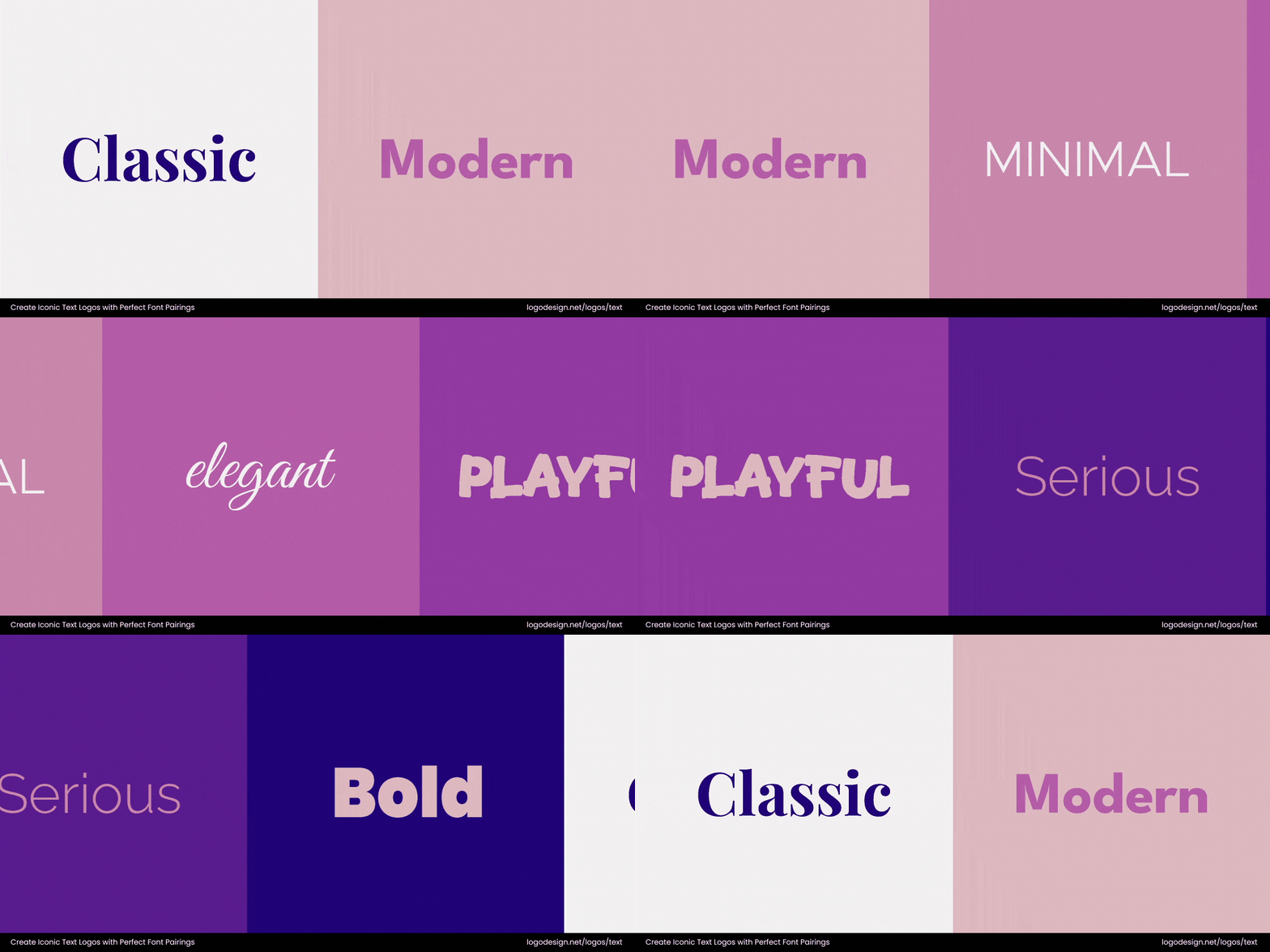
The different types of fonts are shown next to each other
When done right, font pairing adds interest, contrast, and balance to your logo design and branding. It ensures your design feels intentional, not chaotic, while also making your message easier to read and remember. That’s why typography in logo design involves finding combinations that create harmony and reinforce your brand’s personality.
What is Visual Hierarchy in Typography?
Visual hierarchy is all about guiding the viewer’s eyes in the right order. It’s like a roadmap for your content. Your audience should notice the most important message first (like a logo or headline), and then naturally flow to supporting details.
In typography, this is achieved through size, contrast, color, and alignment/space.
1. Size
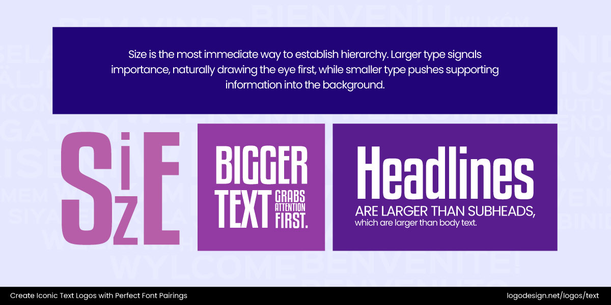
Different sizes for various parts of the text used to draw attention
Larger text naturally draws attention before smaller text. This is why headlines stand out before subheads and body copy.
City of Bristol College logo using bold fonts to ensure it gets noticed
The City of Bristol College logo is a good example; its bold name is scaled up, ensuring it’s the first element you notice before the supporting details.
2. Contrast
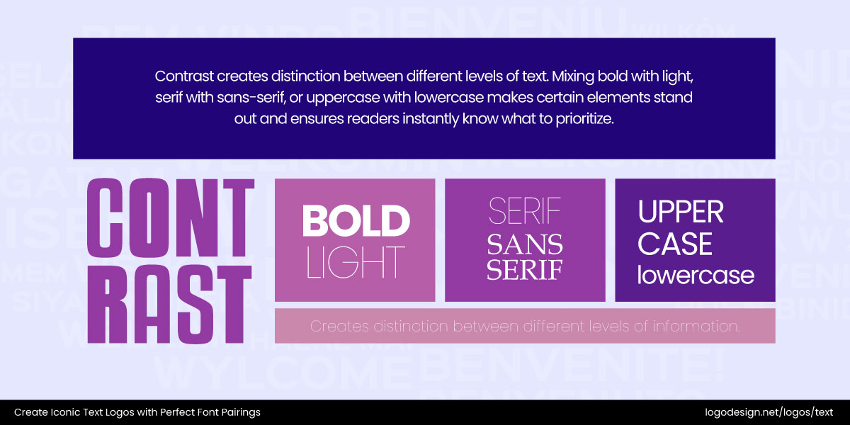
Different contrasts that show how fonts stand out among each other
Pairing bold vs. light, serif vs. sans serif, or uppercase vs. lowercase creates instant distinction.
The River Spirit Gold Club logo uses contracting font thickness to make the primary text stand out
The River Spirit Golf logo demonstrates this well with its clean contrast of font weights. This makes the primary name pop while still keeping balance.
3. Color
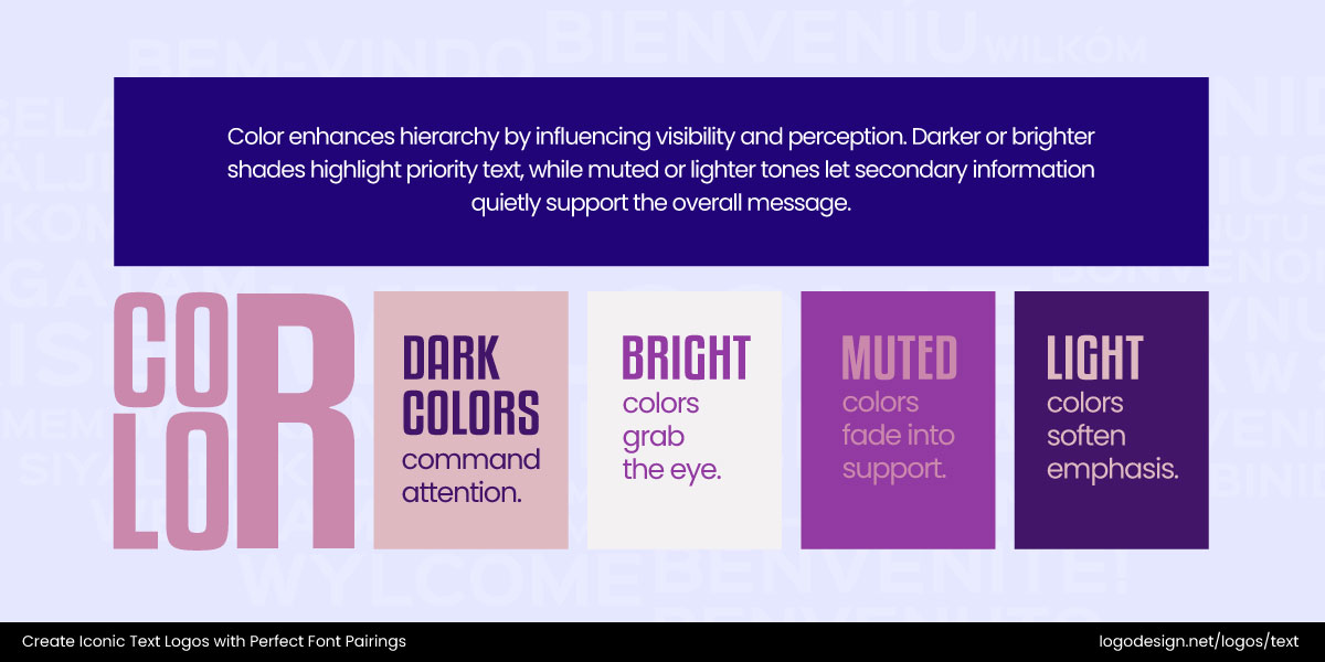
Colors influence the text perception, with brighter shades indicating priority and lighter tones used for secondary information
Stronger or brighter shades grab attention, while muted tones recede.
Oregon Fruit Company logo using softer hues for different lettering
The Oregon Fruit Company logo uses this to its advantage: bold, deep lettering for the name, paired with softer supporting hues, keeps the hierarchy clear and effective.
4. Alignment and Spacing
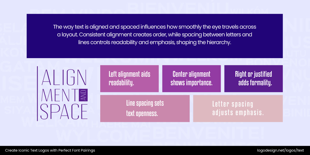
Text spacing and alignment dictate how the eyes skim through when reading
Where text is positioned and how much breathing room it gets guides the eye.
ANDMORE logo shows clear letter spacing and center alignment to give prominence to the brand name
The ANDMORE logo shows this clearly. Its careful letter spacing and central alignment give the brand name prominence, making it feel structured and intentional.
The hierarchy makes your brand communication clear and effortless because the design is literally doing the heavy lifting.
The Key Principles for Font Pairing
Much like any other pairing, you need chemistry when you’re picking the best logo fonts. You need enough contrast to make things interesting, but enough harmony to make sense together. In logo and branding design, the right pairing creates a rhythm that makes your brand instantly recognizable and easier to trust.
1. Contrast is Key
Opposites really do attract in typography. A serif vs. a sans-serif, or a bold type paired with something thinner, makes your design pop. It’s the tension that creates visual interest.
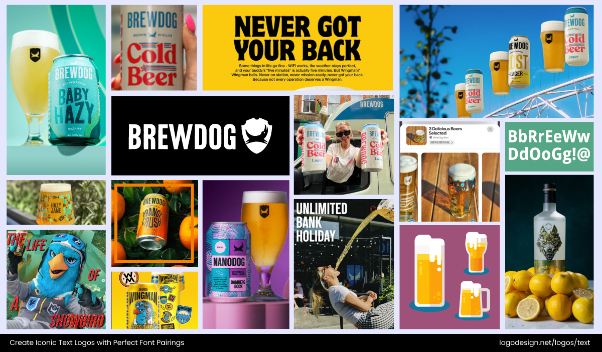
The Brewdog logo is legible across different platforms – Instagram/@brewdogofficial
Take BrewDog’s logo, for example. The rugged, bold type for the name often plays against cleaner fonts in supporting text. That contrast reflects their edgy-but-polished brand voice perfectly.
2. Complementary Moods
Fonts tell stories, and mixing two with clashing vibes feels like putting jazz and heavy metal on the same playlist. But when the moods match, your branding feels seamless.
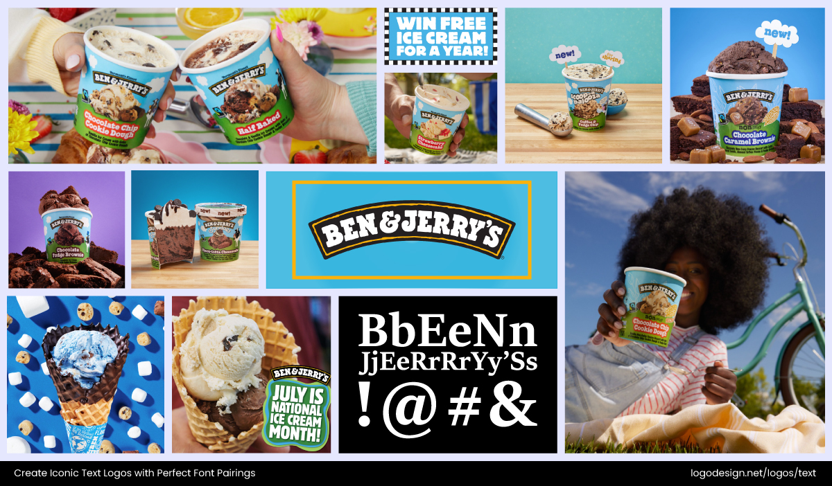
Ben & Jerry’s logo has a playful appeal with rounded edges across different packaging and platforms – Instagram/@benandjerrys
Look at Ben & Jerry’s logo and brand design. Their chunky, playful typeface works beautifully when paired with simpler, rounded fonts in packaging and campaigns. Both feel friendly and fun, amplifying the brand’s quirky personality.
3. Establish a Hierarchy
Hierarchy guides the eye, deciding who gets the spotlight and who supports from the sidelines. A strong font upfront with a softer one behind it keeps things structured.
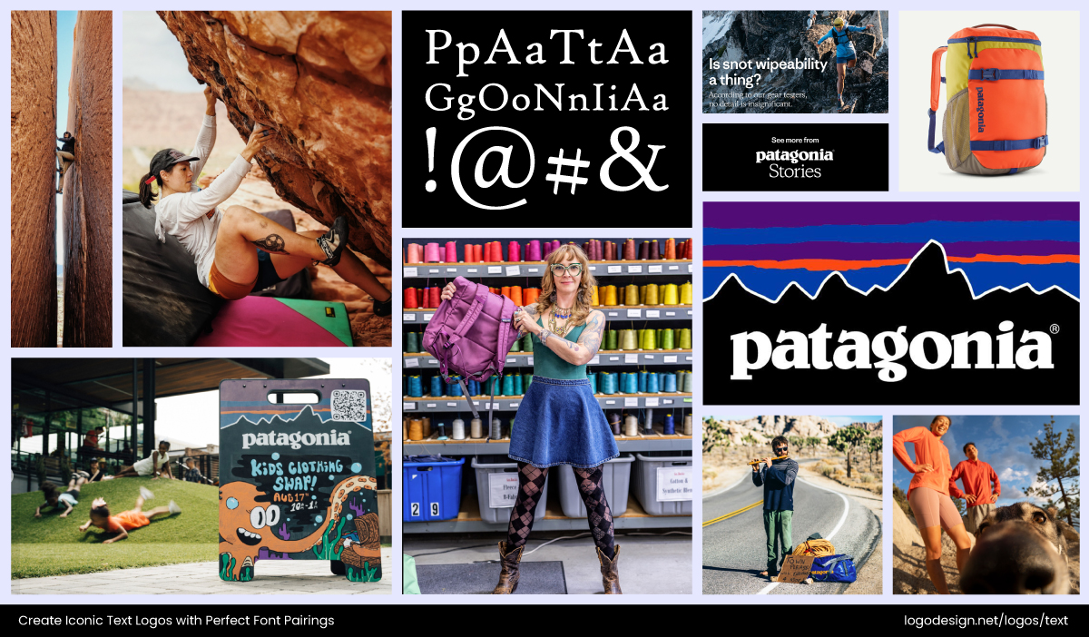
Patagonia logo uses bold and light fonts, based on the platforms it’s displayed on – Facebook/PATAGONIA
Patagonia’s logo nails this principle. Its bold, uppercase lettering takes command, while smaller, lighter fonts are used in product tags and labels. The balance ensures the brand name always speaks first, with details quietly backing it up.
4. Prioritize Readability
Stylish is good; squinting is not. Fonts need to hold up whether they’re blown up on a billboard or shrunk onto a business card. Readability is especially critical for smaller text or taglines that appear alongside your logo.
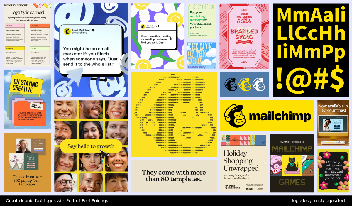
The Mailchimp logo uses a legible font that’s casual and is visible across different platforms – Instagram/@MailChimp
Mailchimp demonstrates this nicely by choosing legible logo fonts. Their friendly, casual logotype is easy to read, while supporting copy uses straightforward sans-serifs that scale beautifully. The result? A brand that feels approachable without sacrificing clarity.
5. Balance is Everything
Good pairing is as much about restraint as it is about choice. Even the best fonts fall flat without balance. Too much contrast creates chaos, while too much similarity dulls the design. Balance ensures clarity, cohesion, and a polished final look.

The Airbnb logo uses a modern wordmark that creates a balance – Instagram/@airbnb
The Airbnb logo shows this well. It’s a rounded, modern wordmark that balances simplicity with friendliness, avoiding clutter while leaving plenty of breathing space around supporting fonts.
Tips and Techniques for Combining Fonts Effectively in Logo Design
Now that we’ve talked about principles, let’s get into the “how.” Pairing fonts involves strategy. You don’t just pick fonts that look aesthetic together; you must also consider the impact of font styles on brand perception.
These practical approaches will help you create pairings that feel intentional, balanced, and totally on-brand.
#1: Start with Understanding Your Brand’s Personality
Before you even start mixing fonts, you need to know who your brand is. Every brand carries traits such as playful, serious, bold, or refined, and your font choice should mirror them. Serif fonts often suggest trust and tradition, sans serifs lean toward clarity and modernity, while scripts add elegance or personality.
The Ace & Tate logo gives a clean look, which is good for this eyewear brand
Ace & Tate, an eyewear brand, uses a clean, geometric sans-serif typeface that reflects their straightforward, design-led personality without unnecessary frills.
The Triodos Bank logo has curved lines with a green icon that communicates the bank’s mission
Compare that with Triodos Bank, which uses a no-nonsense serif with flowing curved lines that communicate the bank’s mission to create a more sustainable world.
Both brands nail personality through typography, but in very different ways.
#2: Combine Font Styles Strategically
The serif and sans-serif combo is one of the oldest tricks in the book, but it works because of the contrast it creates. Serifs carry an air of tradition, reliability, and depth, while sans serifs give off a modern, approachable vibe. Put them together, and you get a mix of heritage and freshness.
Of course, that’s just one pairing; different combinations like script with sans serif or monospaced with sans serif can lead to very different results and font pairings.
| Combo | Example Fonts | Why It Works | Best For |
| Serif + Sans Serif | 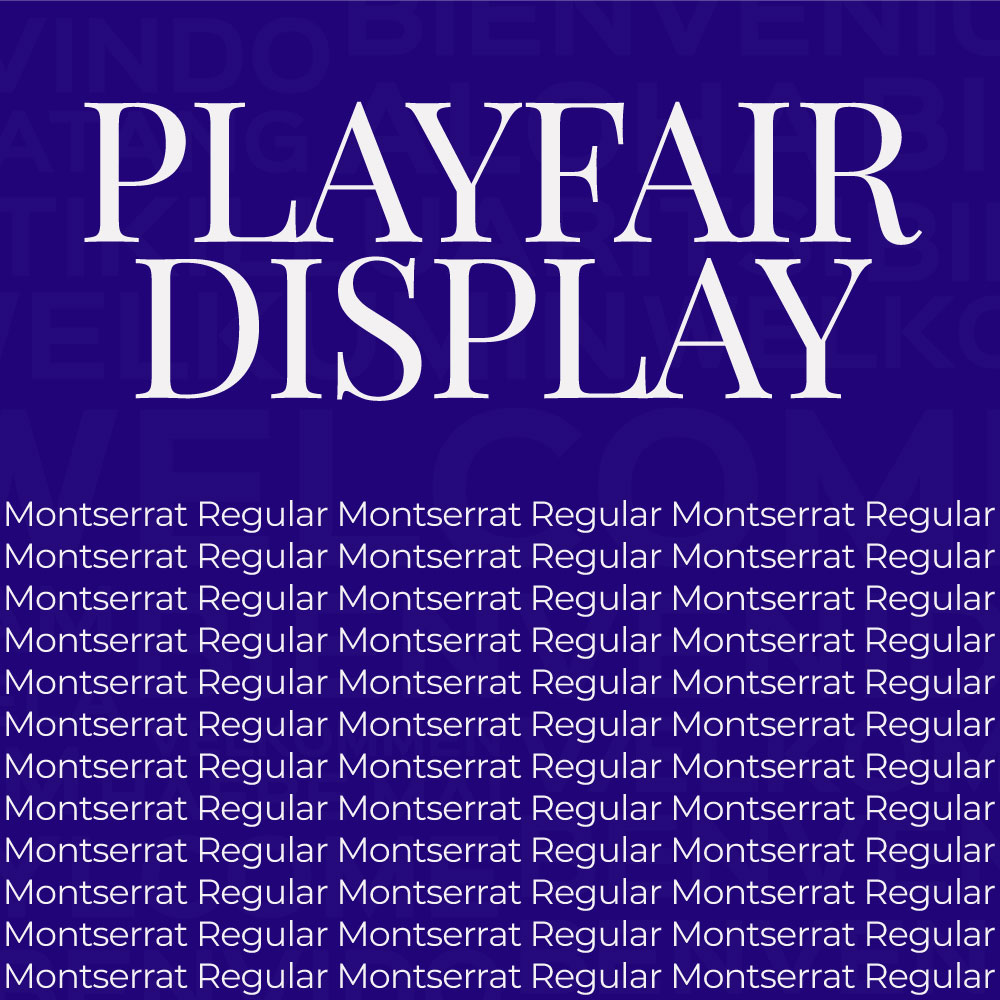 Playfair Display + Montserrat |
Classic meets modern; balances elegance with readability | Luxury brands, tech startups, professional services |
| Script + Sans Serif | 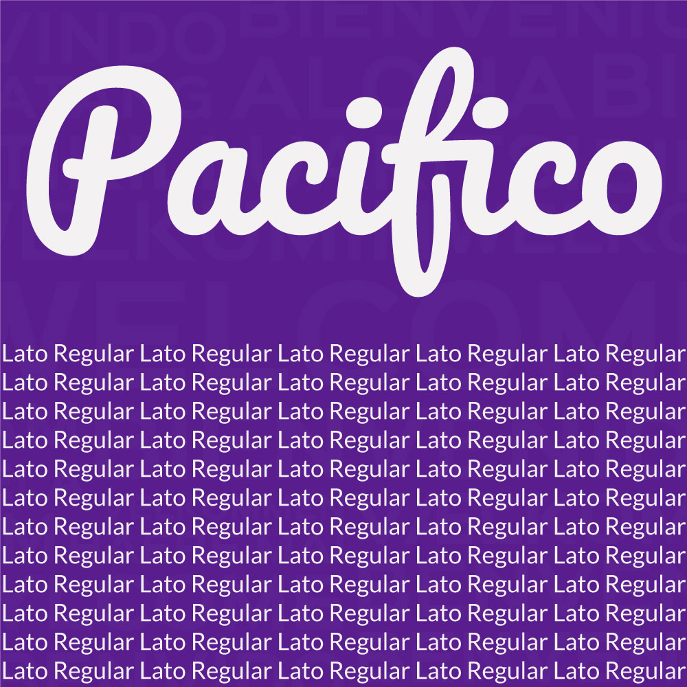 Pacifico + Lato |
Playful or personal touch + clean readability | Creative brands, boutiques, lifestyle products |
| Bold + Light (Same Family) | 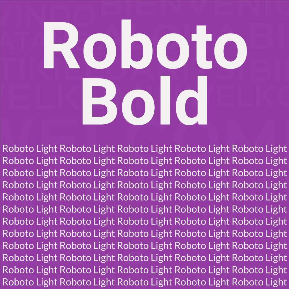 Roboto Bold + Roboto Light |
Creates hierarchy and visual contrast while staying consistent | Minimalist logos, tech, corporate branding |
| Display + Simple Sans Serif | 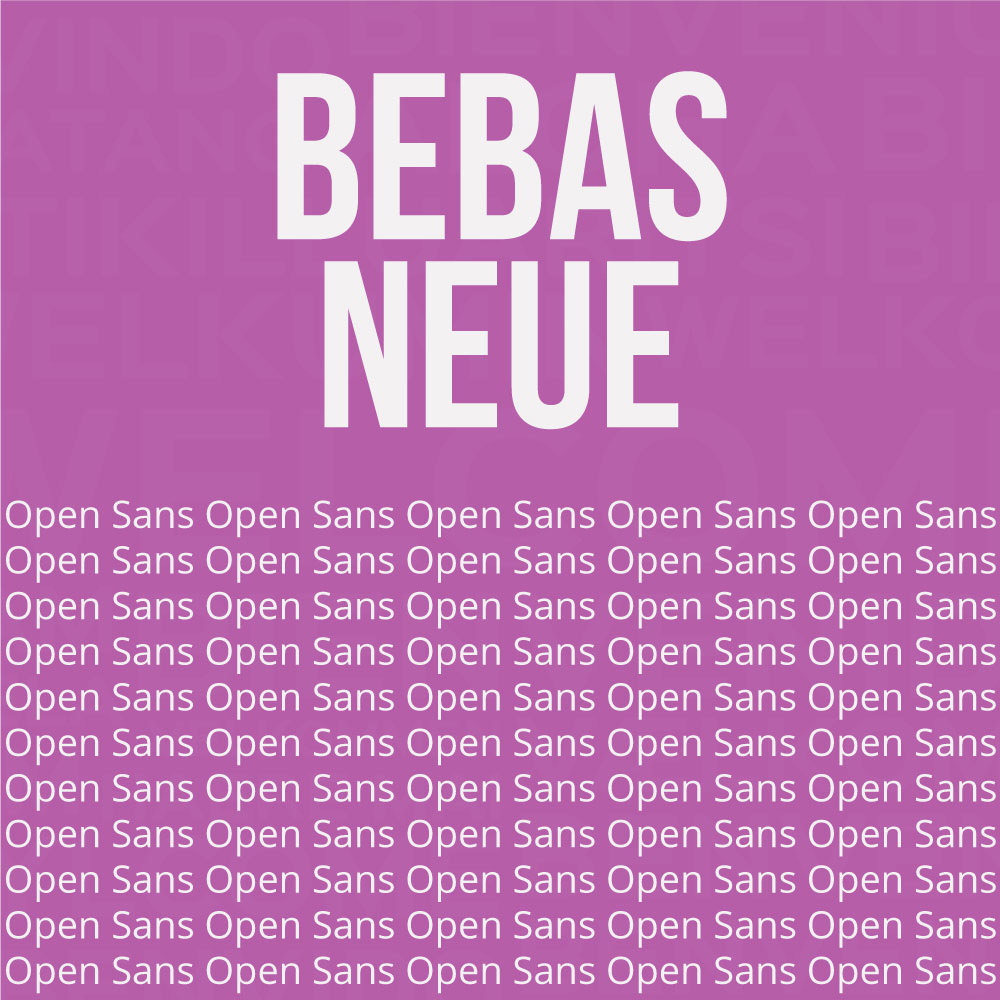 Bebas Neue + Open Sans |
Attention-grabbing headline + neutral body/subtext | Sports brands, posters, social media logos |
| Geometric Sans + Humanist Sans | 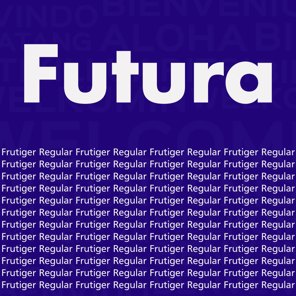 Futura + Frutiger |
Clean, modern geometric shapes paired with approachable curves | Tech, apps, modern startups |
| Vintage Serif + Script | 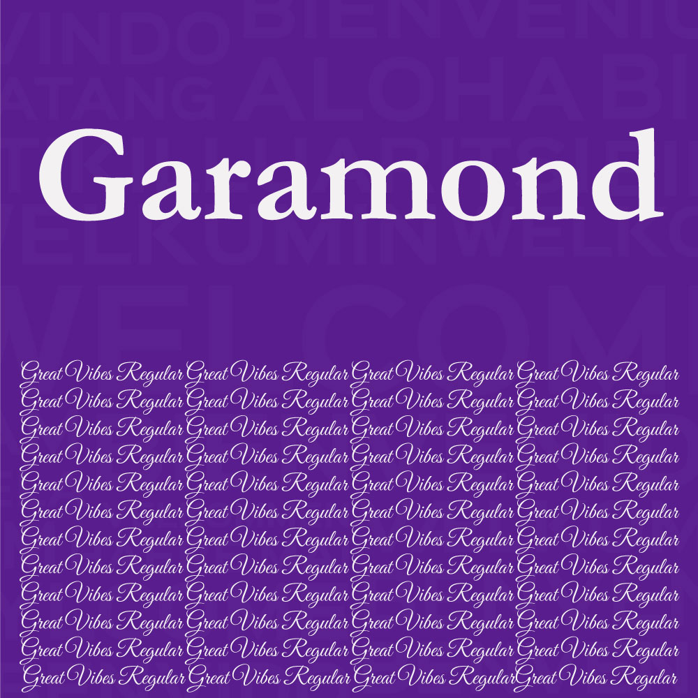 Garamond + Great Vibes |
Elegant and classic feel with personality and flair | Food & beverage, cafes, boutique shops |
| Monospaced + Sans Serif | 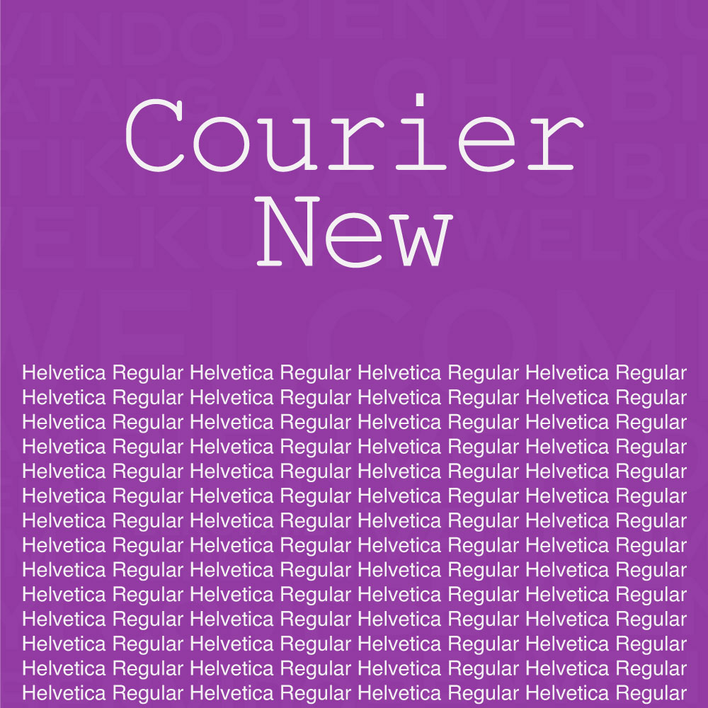 Courier New + Helvetica |
Technical, structured + readable, and modern | Tech, software, engineering brands |
| Condensed + Expanded | 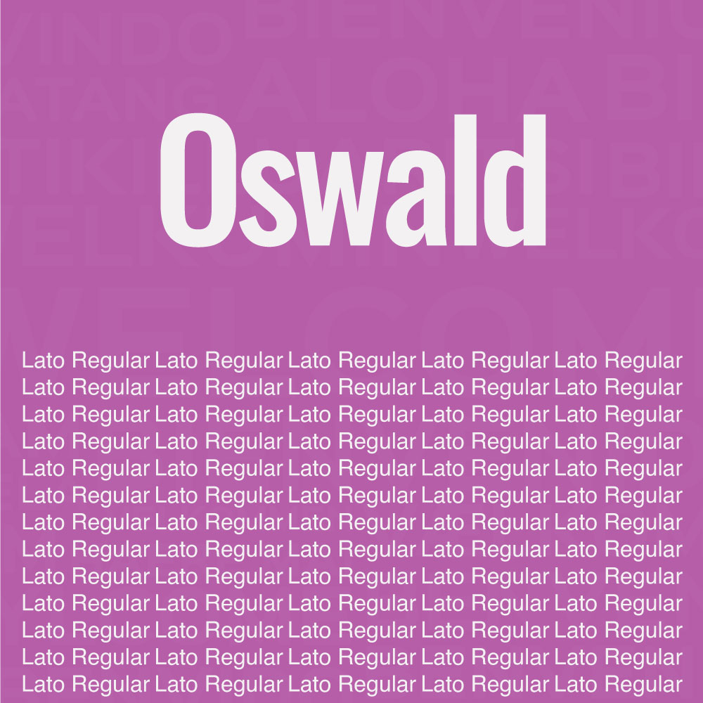 Oswald Condensed + Lato Regular |
Creates tension and hierarchy; adds visual rhythm | Headlines + subline logos, fashion, editorial brands |
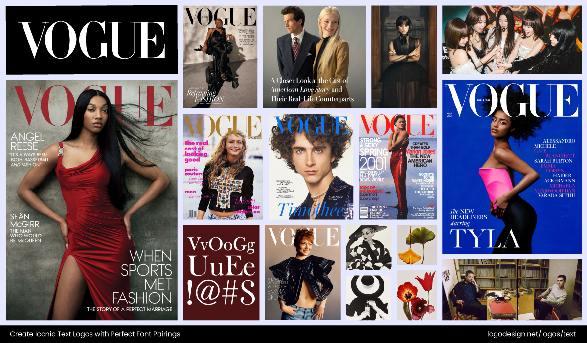
Vogue logo and branding materials on different platforms and backgrounds – Image Source: Cover image courtesy of Vogue
Vogue nails this in its logo and editorial layouts—the elegant Didone serif is paired with modern sans-serifs in supporting text. This mix keeps the brand rooted in its heritage while feeling contemporary and approachable.
This approach works especially well for logos and branding design for businesses that want to project both trustworthiness and a fresh edge.
The New York Community Trust logo uses a custom font that shows authority
You can also see contrast at play in the New York Community Trust logo, which pairs a refined serif with a modern sans. The balance creates a sense of authority and tradition while staying current.
AirTime logo using a combination of light blue and dark black to give an energetic and fresh look
Airtime takes a fresher route and combines clean sans serifs with a quirky complementary style in its logo and branding. This pairing injects energy and personality, making the logo feel dynamic yet easy to read.
#3: Rely on a Single Font Family
If you’re unsure about mixing and matching, use one versatile font family. Sometimes, keeping things in the family is the smartest move.
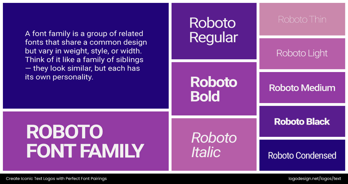
The Roboto being one of the font families that displays different versions with various weights, styles, and widths
Many professional typefaces like Montserrat or Lato come with multiple weights and styles (like regular, bold, light, italic), which means you can get variation while staying consistent.
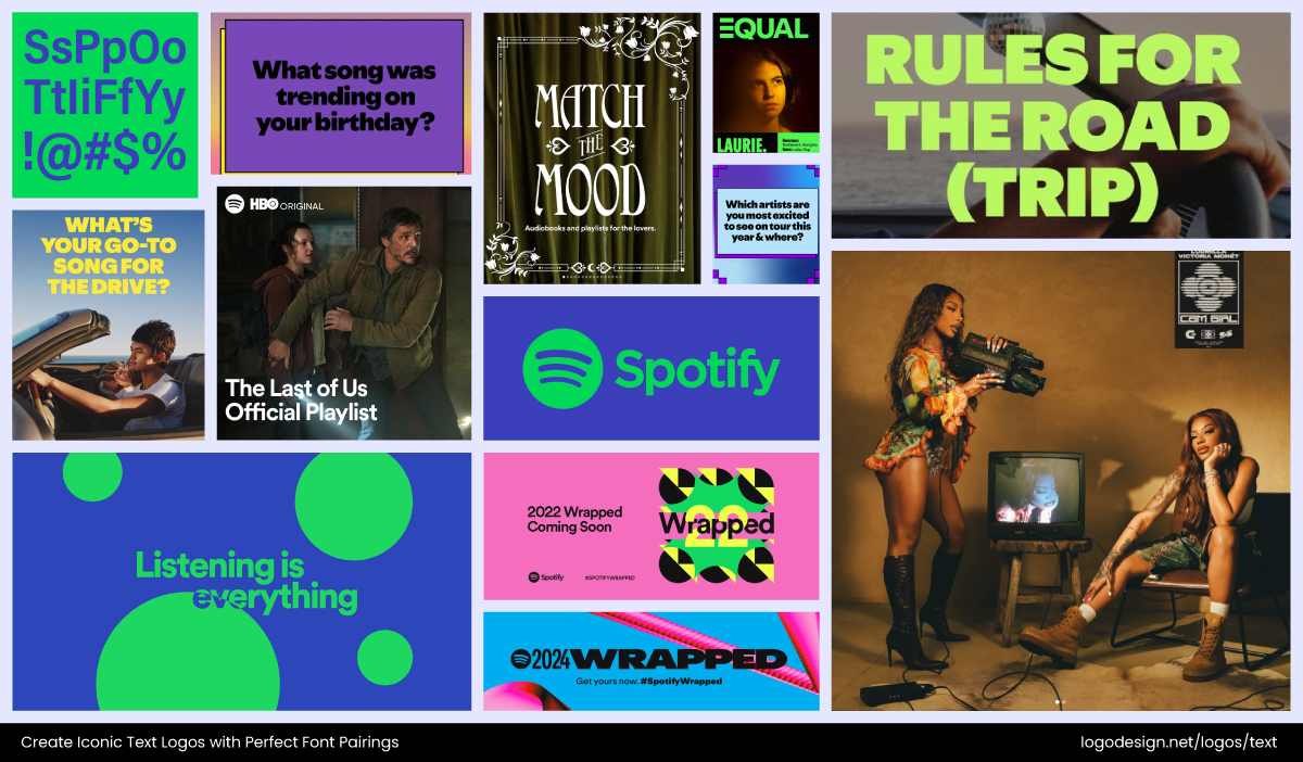
Image Source: Facebook.com/Spotify
Spotify, for instance, relies on its custom typeface, Spotify Mix, across everything from its logo to app UI and ads. Different weights give hierarchy and emphasis without breaking cohesion. This strategy ensures that whether you’re looking at the logo on your phone or a billboard, the brand voice feels unified and unmistakable. This way, your logo and branding stay versatile but always unified.
The UPL logo uses bold and thin text of the same family to emphasise specific parts
UPL takes a similar approach. Its logo alternates between bold and thin versions of the same typeface, which creates contrast while keeping cohesion intact. This subtle shift in weight allows the brand to highlight emphasis when needed, but still ensures everything feels like it belongs to the same family.
The Phoenix Organic logo uses bold and regular fonts of the same family to avoid complexity
Phoenix Organics also demonstrates the effectiveness of sticking to one font family. By using bold and regular versions of the same typeface in its branding, it creates hierarchy and rhythm without introducing unnecessary complexity. The consistency keeps the brand’s visual energy balanced across platforms.
#4: Stick to Two or Three Fonts Maximum
When it comes to type, less really is more. Using too many fonts creates visual chaos. Instead, limiting yourself to two fonts (and occasionally a third for accents) creates hierarchy without clutter.
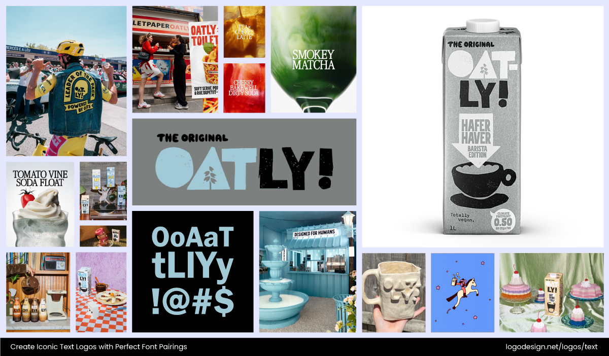
Oatly brand design using bold logotype and simple sans-serif fonts for packaging and campaigns. – Instagram/@oatly
Oatly demonstrates this perfectly. Its bold, chunky logotype is paired with a simpler, no-nonsense sans-serif in packaging and campaigns. The logo font adds personality and grit, while the secondary font ensures clarity for nutritional info and messaging. The combination is playful yet practical, proof that limiting typefaces often makes a stronger statement than overcomplicating things.
The Sage Theraputics logo uses two fonts, where the primary wordmark is bold and the supporting fonts are thinner
Sage Therapeutics keeps things clean by combining just two fonts in its lock-up design. The primary wordmark is bold and straightforward, while the supporting font adds a softer, approachable tone. This balance proves that simplicity in design can still feel dynamic.
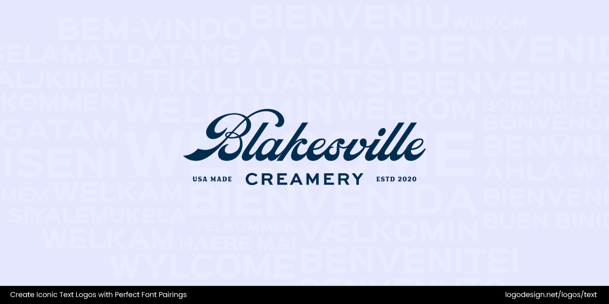
The Blakesville Creamery logo uses a combination of script and sans-serif fonts for legibility
Blakesville Creamery takes a slightly different approach by combining two fonts. The script font in its logo highlights craftsmanship and care, while the paired sans serif ensures legibility. It’s a pairing that feels artisanal yet professional.
#5: Align Typeface Styles with Visual Energy
Your fonts should feel like they belong with your logo’s design, not like an afterthought. The trick is to match the visual characteristics of your type with the design of your mark.
If your logo icon is geometric and structured, a crisp sans-serif like Futura reinforces that modern sharpness. If your logo has organic shapes, a flowing script, or rounded sans-serif mirrors the softness.
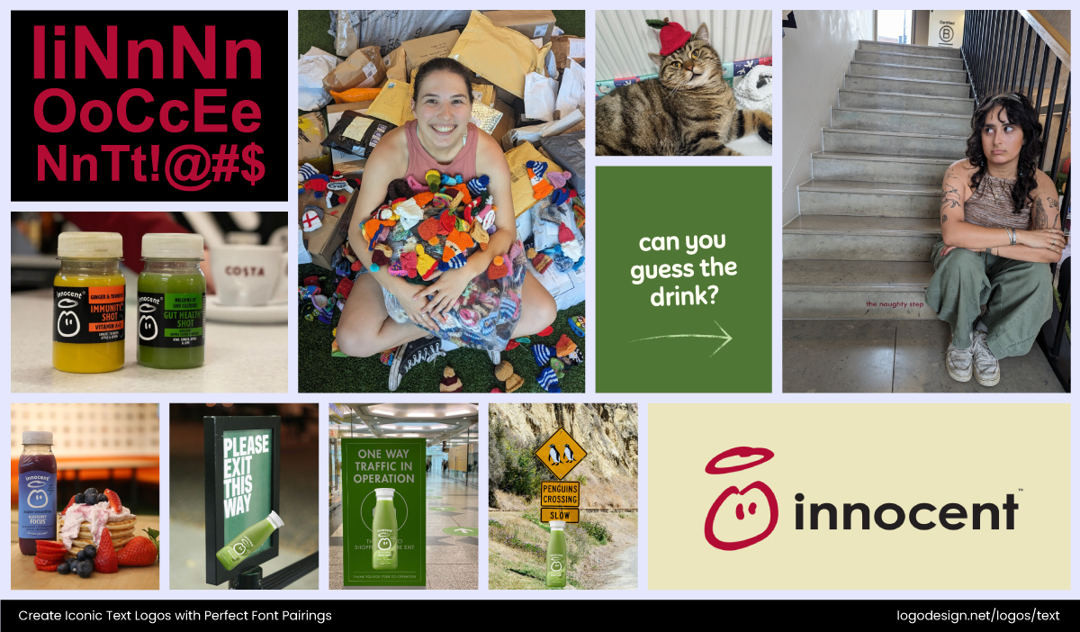
Innocent brand designs are rounded with sans-serif fonts, showing friendliness and a natural vibe. – Instagram/@innocent
Innocent Drinks is a standout here: its rounded, friendly sans-serif perfectly complements the hand-drawn logo icon (the little haloed face). The typography mirrors the brand’s approachable, natural vibe, making the whole identity feel warm and consistent. It’s a reminder that your fonts should match not just your message but also the “mood” of your graphics.
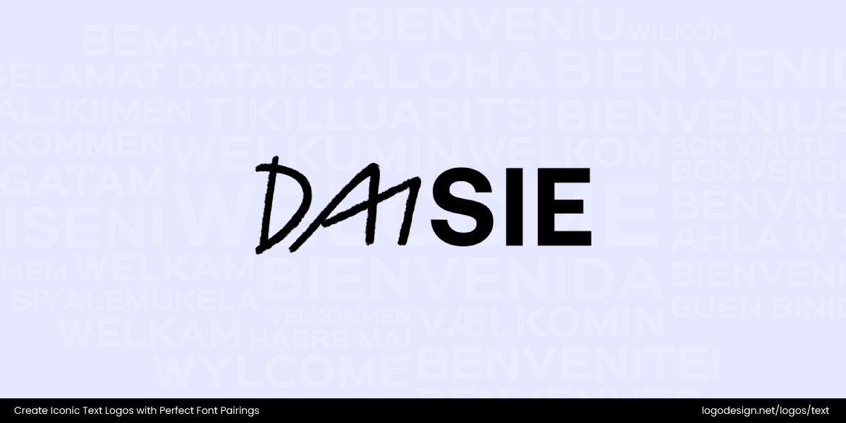
The Daisie logo combines the playful appeal of a hand-drawn wordmark and clean nature of a sans-serif font
The Daisie logo is more experimental. It pairs a playful, slightly grungy hand-drawn wordmark with a clean sans-serif. This contrast captures the platform’s blend of creativity and structure, reflecting its mission as a hub for artists and collaborators.
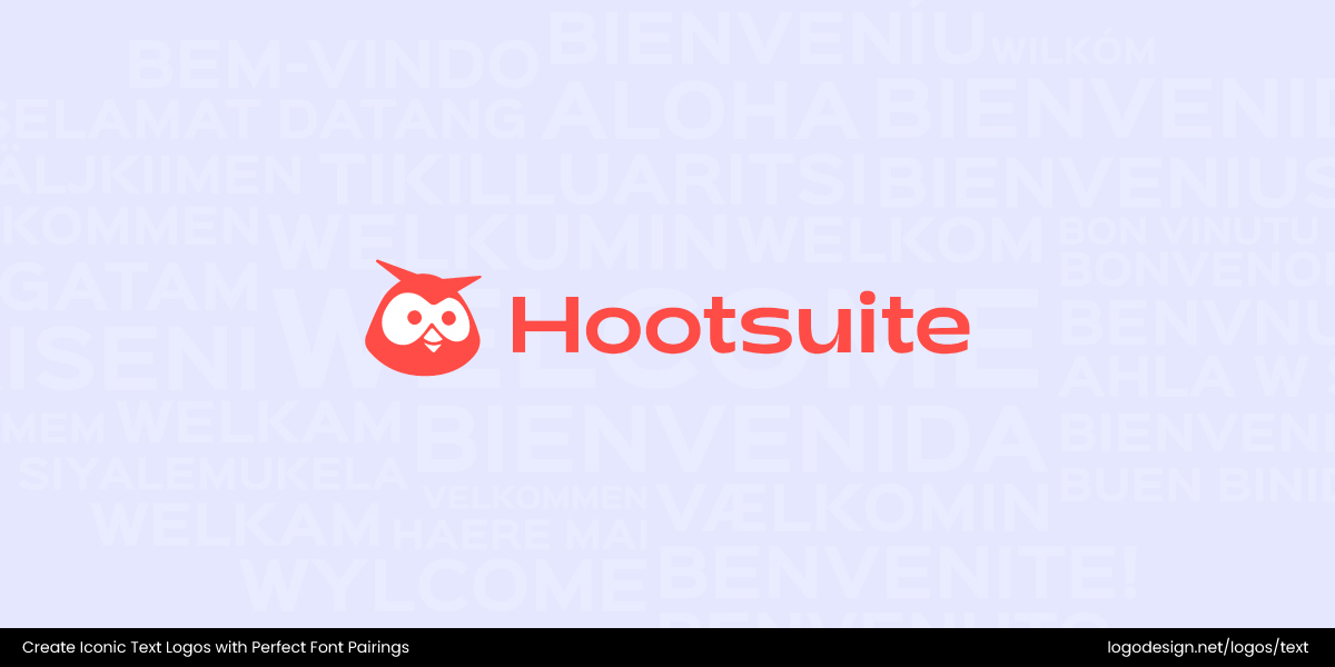
The Hootsuite logo uses a bold, modern sans-serif font that goes well with the owl mascot
Meanwhile, Hootsuite balances things differently. Its logo uses a bold, modern sans-serif that sits neatly alongside the owl mascot. The typography communicates reliability and professionalism, while the quirky icon softens the identity, making the brand feel both trustworthy and approachable.
#6: Don’t Compromise on Readability
No matter how creative your font choices are, they should stay clear and legible across all touchpoints. From storefront signage to small nutrition labels, a logo font that loses readability quickly weakens brand trust. This is especially important when brands scale internationally, where audiences rely heavily on instant recognition.
No matter how creative your font choices are, they should stay clear and legible across all touchpoints. From storefront signage to small nutrition labels, a logo font that loses readability quickly weakens brand trust. This is especially important when brands scale internationally, where audiences rely heavily on instant recognition.
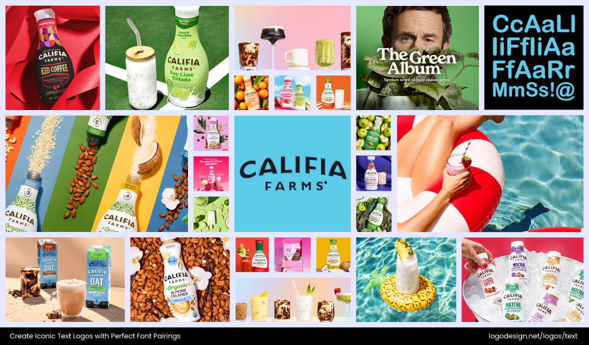
Califa Farm using a playful theme with decorative logotype and sans-serif font for product packaging for clarity – Instagram/@califiafarms
See how Califia Farms keeps its branding playful yet practical. The decorative logotype gives personality, but product packaging relies on clean sans serifs for ingredient lists and claims, ensuring clarity at smaller sizes.
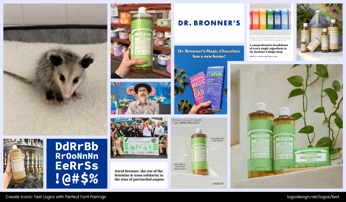
Dr. Bronner’s soap packaging using a quirky but simple sans-serif font that’s easier to read – Instagram/@drbronner
Dr. Bronner’s soap packaging is another strong case. The logo lettering is slightly quirky but simple, and all supporting information is tightly set in easy-to-read sans serifs, ensuring even dense text stays clear.
#7: Consider Mood, Tone, and Feel
Fonts carry emotional weight. The right shapes, curves, and details in typography can change how people feel about your brand, making you appear approachable, serious, or high-end. Throughout the history of typography, designers have used these subtle traits to shape perceptions and build lasting brand identities.
Here are some common shapes and their meaning:
- Rounded Shapes → Friendly, Approachable
Rounded fonts naturally feel soft and playful, which makes them great for brands that want to appear welcoming and casual.
Moo Free Chocolate has a bubbly logotype for a cheerful and friendly appeal
Moo Free Chocolates uses a rounded, bubbly logotype that feels cheerful and approachable, mirroring their family-friendly, playful brand identity.
- Angular Shapes → Strong, Professional
Sharp edges and angular letterforms communicate confidence and authority.
Full Metal Software using angular strokes to show tech-related skills, reliability, and professionalism
That’s why Full Metal Software’s logo works so well. The clean, angular type signals reliability and technical strength, a solid match for a professional software brand.
- Elegant Serifs → Luxury, Timeless
Serif fonts embody tradition and refinement, often tied to heritage and sophistication.
Harper’s Bazaar logo has a high-contrast serif typeface, showing a timeless appeal
The Harper’s Bazaar masthead is a perfect example. Its high-contrast serif type oozes elegance and timeless style, instantly positioning the brand in the luxury space.
#8: Test Across Applications
Brands need type choices that scale well, look sharp in print, and remain clear on smaller screens. A great font pairing doesn’t only have to work in a logo file; it needs to hold up across every medium your brand touches. From print to digital, consistency is key.
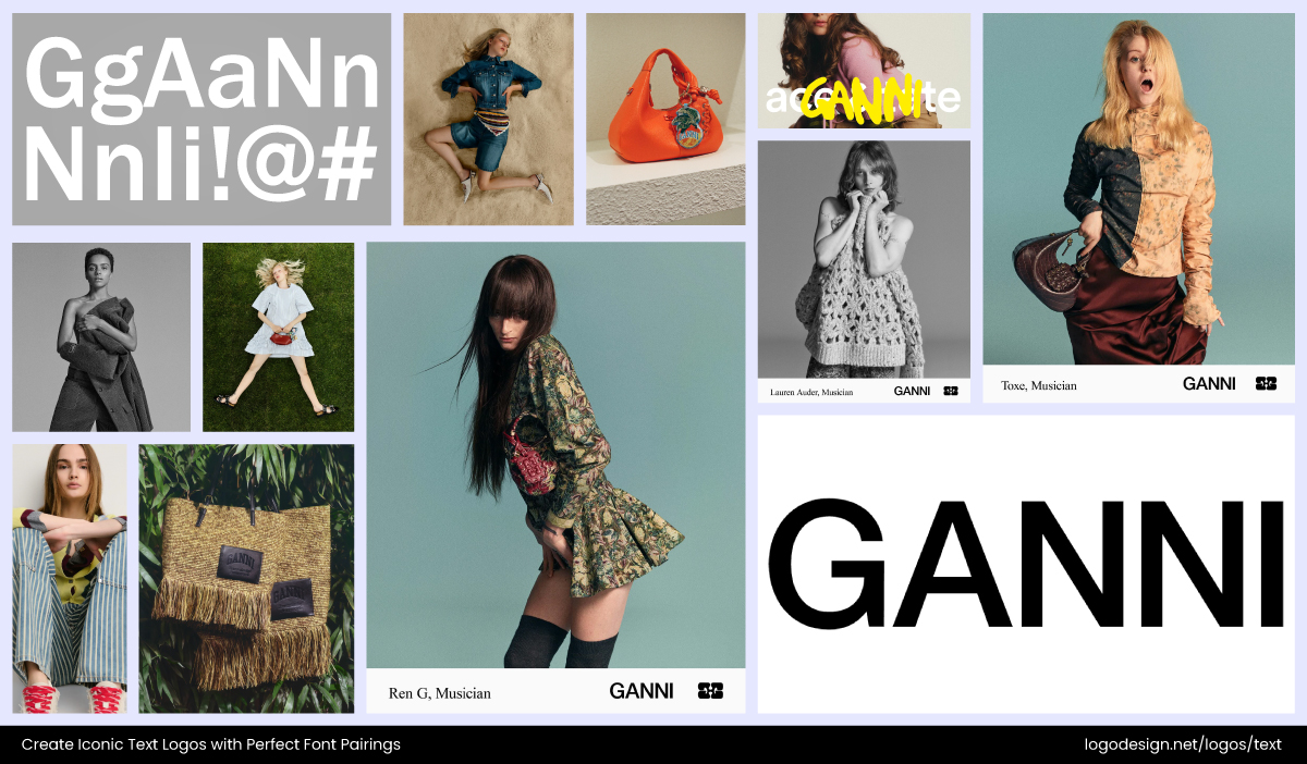
Ganni using a minimalist appeal with a bold sans-serif font on logo, packaging, signage, and social media campaigns – Instagram/@ganni
A perfect example would be Ganni. The Danish fashion brand uses a bold yet playful sans serif in its logo that scales beautifully. On clothing tags and packaging, the type feels clean and professional. On storefront signage, it stands out without losing clarity. And on Instagram campaigns, the same pairing keeps its character while staying instantly readable on smaller screens. It’s proof that a strong font choice should be consistent across every channel your brand operates on.
#9: Keep Alignment in Mind
Font pairing is about style and how well the details line up. When these proportions clash, even great fonts can look off-balance. Keep these in mind to avoid common typography mistakes.
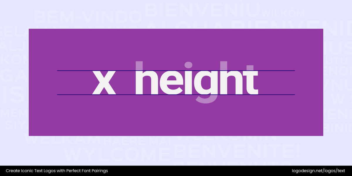
The X-height is the alignment for the lowercase letters like x, a, o
- X-height: The height of lowercase letters (like x, a, o). Mismatched x-heights can make one font look oversized next to another.
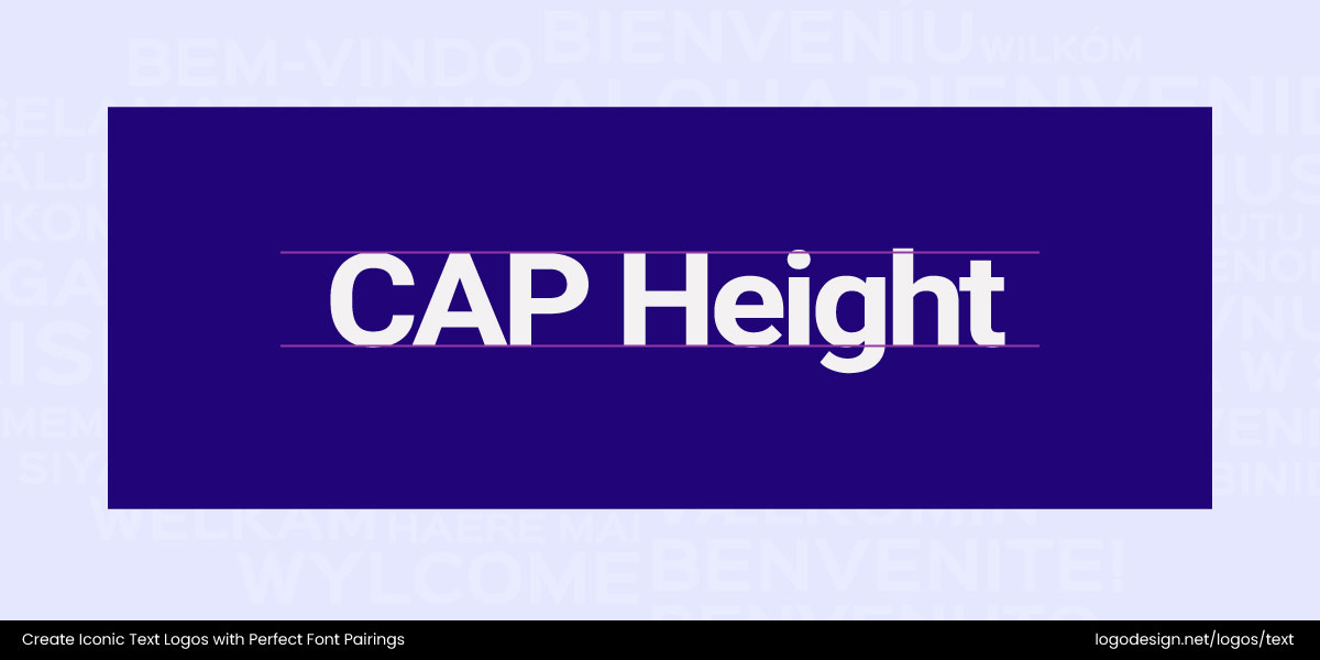
The Cap height is the alignment for the uppercase letters
- Cap height: It is the height of capital letters. If one font’s caps tower over the other, the pairing feels uneven.
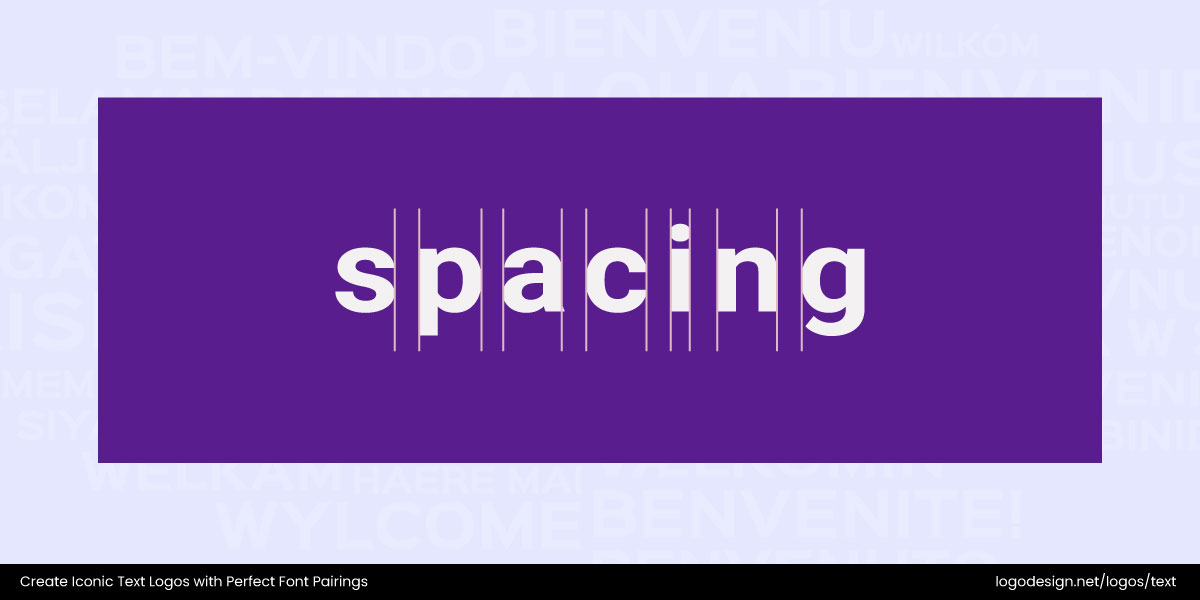
Spacing is the distance between letters
- Spacing: The distance between letters also matters. Fonts with very tight or very loose spacing can disrupt visual flow when combined. Ensure proper application of tracking and kerning in logos.
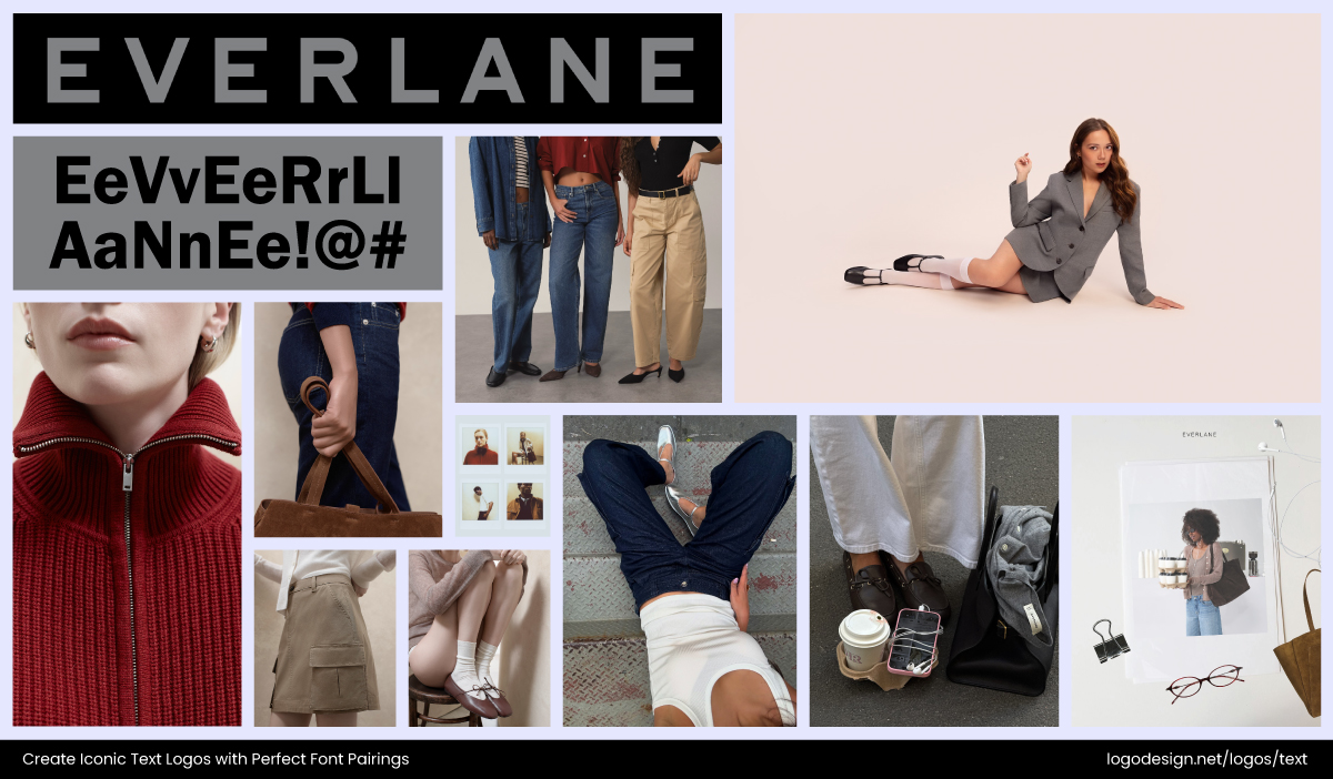
Everlane’s logo using a minimalist approach with sans serif logotypes for packaging and website due to x-heights and cap heights appeal – Instagram/@everlane
Everlane’s logo pulls these off perfectly. Its minimalist sans serif logotype pairs neatly with secondary fonts across packaging and the website because their x-heights and cap heights feel aligned. That consistency ensures the brand identity always looks balanced, whether on a clothing tag, Instagram post, or homepage.
#10: Avoid Conflicting Characters
Even if two fonts look good together at first glance, mismatched details can break the harmony.
This usually shows up in:
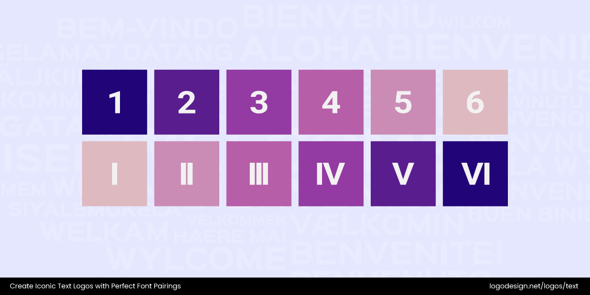
Use the same types of numerical as varying between types can create confusion
- Numerals: Some typefaces use old-style numbers with varying heights, while others use lining numbers that sit evenly. Mixing them can make dates or prices look awkward.
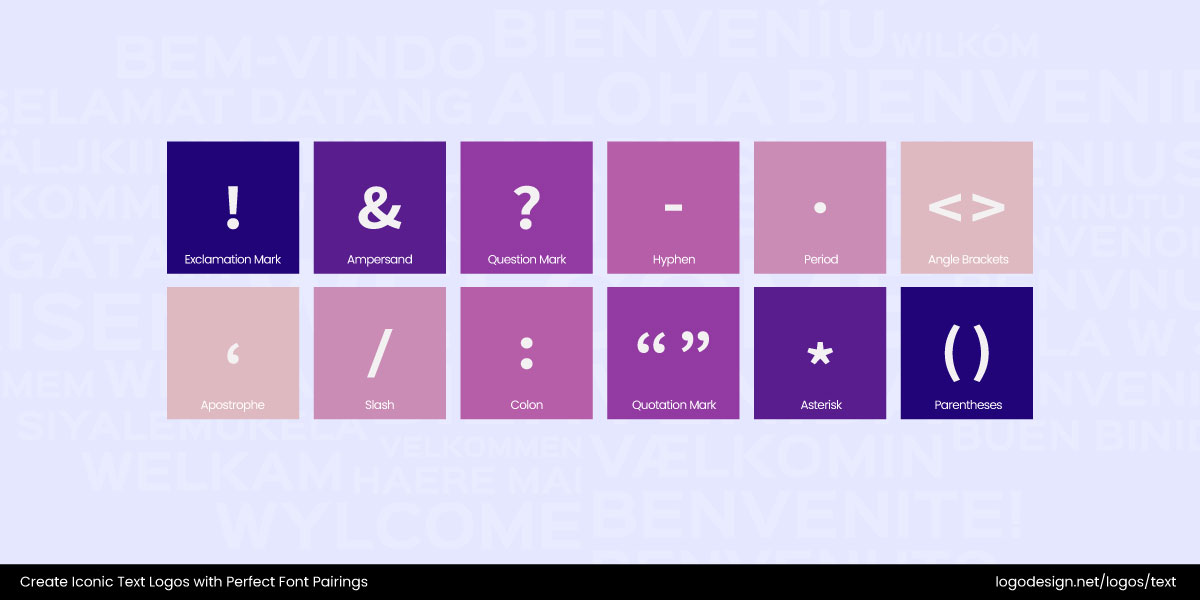
Use punctuations of the same height and thickness to avoid confusion
- Punctuation: Quotation marks, apostrophes, or ampersands may have drastically different shapes and weights, creating a jarring effect.
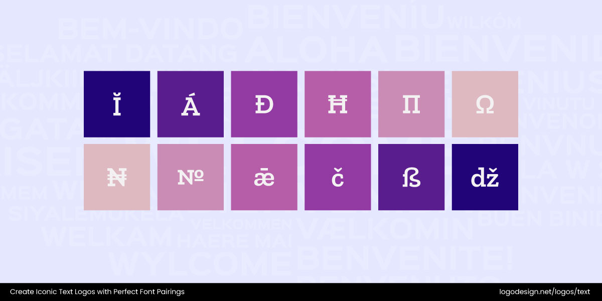
All special characters need to be of the same stroke weights and curves
- Special Characters: Symbols like @, #, or & can feel out of place if one font treats them with heavy strokes and the other with delicate curves.
By double-checking these details, you make sure your font pairing feels consistent not just in words, but in the fine print too.
#11: Trust Your Eye
At the end of the day, no rulebook can replace your own judgment. Font pairing is as much about intuition as it is about theory. Step back and look at your design from a distance. Does it still feel balanced? Then zoom in on the details and ask yourself if the weights, proportions, and curves are working together or clashing.
You can also try the pairing across different contexts, like a web header, product packaging, or even a simple business card. You might find that a font that looks perfect in a logo loses its charm in smaller sizes. And don’t be afraid to tweak; adjust spacing, play with sizes, or swap out a font if something continues to feel off.
And if you’re ever stuck, there are tools to give you a head start. Platforms like Fontjoy and Google Fonts’ Pairing Tool let you experiment with combinations quickly, so you can see what feels right before refining it by eye.
How to Pair Fonts Effectively Across Marketing Materials?
Fonts aren’t just design choices; they shape how people see and remember your brand. The same pair of fonts that looks brilliant on a logo might completely miss the mark on a flyer or social ad. Each marketing material has its own job to do, and the right typography makes sure it gets done well.
Below are some practical font pairing ideas tailored to different brand touchpoints. Who knows, one of these might spark inspiration for your next logo or brand design.
1. Logos: Stick to Crisp and Clear Fonts
When designing a logo, you don’t have much space to communicate, so every letter matters. Choosing two crisp fonts is often the safest and smartest route. A clean pairing, say a geometric sans-serif with a sharp display font, ensures your brand feels modern without clutter.
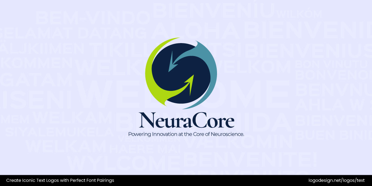
Combinations like Poppins with Scotch Display or Montserrat paired with Ingeborg work great. These duos balance clarity with style, making sure your name shines without distraction. Remember, the principles of good logo design also apply here: legibility first, personality second. In logo design, less really is more, and the right pairing sets the stage for recognition.
2. Business Cards: Classic Meets Professional
Business cards pack a lot of weight for such small pieces of paper; they carry your brand’s first impression. That’s why font pairings here should lean classic and clean. A serif like EB Garamond or Chaparral paired with a modern sans like Montserrat or Trade Gothic Next creates a balance of tradition and professionalism. This mix signals reliability while staying approachable.
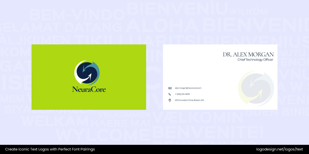
Avoid overly decorative fonts; you want people to read your details quickly and clearly. For the best logo and brand design identity, cards should feel cohesive, with type that’s consistent with your broader branding system.
3. Flyers: Bold Headlines with Straightforward Body Text
Flyers thrive on quick impact. Your headline needs to grab attention while the body text delivers the essentials. The trick is combining a funky, eye-catching display font with a grounded, clean sans-serif.

You can pair something bold like Funkydori or Birra with Open Sans or Roboto. The quirky header pulls readers in, while the straightforward body text ensures clarity. This play of contrast makes the flyer both stylish and functional. Following typography rules, remember to keep hierarchy in mind: your header should demand attention, but the supporting font must guide the eye smoothly through the message.
4. Social Media Ads: Striking Contrast That Stops the Scroll
Scrolling is the enemy of attention, so your ad fonts need to fight for those precious seconds. Big, stylish display fonts work brilliantly for headlines, paired with crisp, neutral fonts for the supporting text—combinations like Bungee with Lato or Gurkner with Open Sans balance personality and clarity.
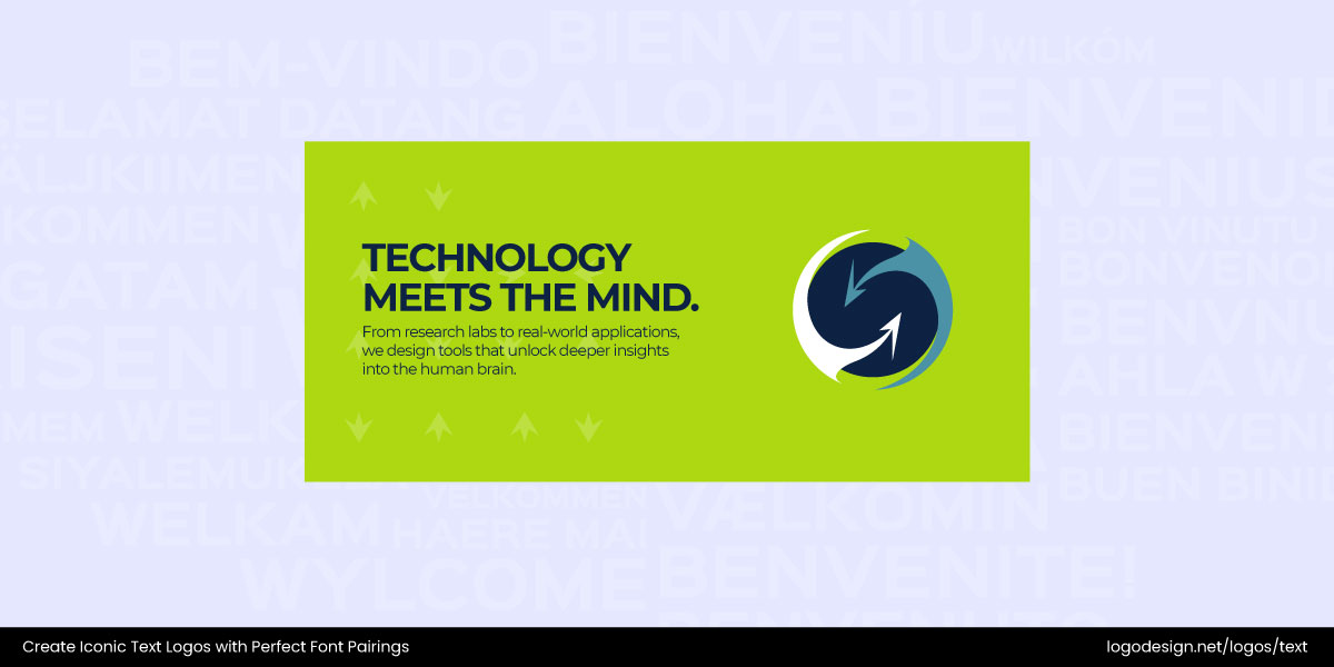
The bold header font grabs instant attention, while the simpler text communicates key details without overwhelming. This formula mirrors custom typography strategies often seen in digital-first brands: dramatic contrast that hooks the eye, followed by fonts that quietly deliver the message.
5. Websites: Versatility and Readability First
Websites demand the most versatile font pairings because users interact with them differently than with print. A readable sans-serif like Raleway, Lato, or Articulat CF works perfectly for body copy, while a more distinctive display or serif font can shine in headers.
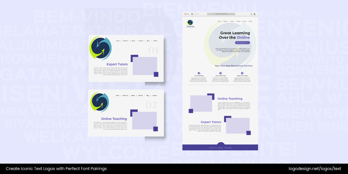
Pair Roc Grotesk with Gimlet Display, a mix that’s stylish but still user-friendly. Unlike a flyer, you can’t risk eye strain when building a website as legibility is everything. Done right, font choices support the best logo and brand design by extending a consistent visual identity online.
Key Takeaways
In the end, good typography is about balance and intention. Thoughtful font pairings elevate design, strengthen communication, and leave a lasting impression that words alone can’t achieve.
- Strong font pairings make your brand look professional and intentional.
- Use two contrasting fonts (for example, bold header + clean body text) for balance.
- Keep it simple, limit designs to two or three fonts max.
- Always prioritize readability over style.
- Create hierarchy with size, weight, and contrast to guide the eye.
- Match fonts to your brand’s personality and logo style.
- Different materials call for different pairings; logos need crisp fonts, while flyers and ads benefit from bold headers with clean text.
