SALES / SUPPORT : 844-232-4816
Typography Rules and Tools: The Whats and Hows of Fonts
Regardless of how an expert of a graphic designer you are, you’ll agree that the typography universe is simply too vast and complex to declare yourself a master of it. There are just too many individual typefaces to ever let you work confidently if you haven’t conquered the basics. Consider this article an attempt to ‘brush up on the basics’.
Ahead, you will find a discussion on the 8 cardinal rules of using typography in various forms of graphic design such as lettermark logo design, web design, print design, and such. Each rule will accompany two tools that we recommend for practicing and acing that rule.
Rule No. 1: Know Thy Fonts
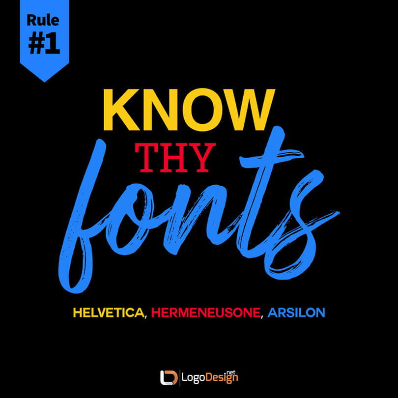
There are literally hundreds and thousands of unique fonts currently existing in the world. While nobody is expecting you to learn the ins and outs of each of those fonts, it is quite important to at least have a basic idea of the most important font families. The more you know the history, technicalities, and inner workings of these font families, the more meaning you can pack behind what you create. You learn to make your lettermark logo designs more powerful, your websites more layered, and your print more structured.
Our recommended tools that can help you get to know your fonts better are:
Type Kit
It is an immensely valuable source for you to gain a thorough understanding of the history and foundation of all the major typefaces present worldwide. It contains lessons, practice material, and a database of typefaces to browse and choose for your projects..
Type Wolf
It is a font recommendation site that hosts a huge collection of typefaces. It allows you to see how your real type will look on a website. It has a great variety of guides and resources, too to increase your type knowledge
Rule No. 2: Pair Thy Fonts
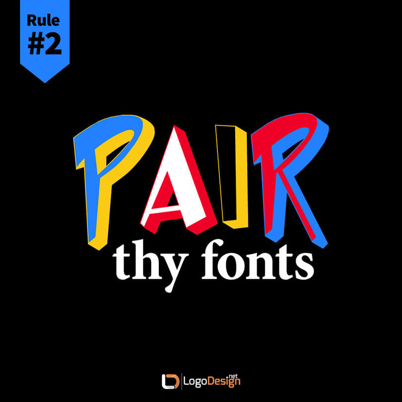
Once you’ve familiarized yourself with all the major typefaces there are and have got your hands on resources to introduce you to more, comes the most important part: font pairings.
Font pairings or font combinations are an integral part of any project where type is being used. The pairings not only help the project aesthetically but have practical purposes too. You need them for design hierarchy, font legibility, content meaning, and so much more.

Pairing the right fonts together can help with the look, meaning, and pecking order of the content. Choose the wrong combo and everyone struggles to understand what the heck you’re trying to say.
Use these tools to avoid such a disaster.
Arche type
It is a simple and intuitive tool. It allows you to choose and pair your fonts together and lets you see how the pairing looks. You can check the results for desktop and mobile, both. You can also adjust sizing and spacing and export your font pairing as CSS or to Sketch. If you are unsure of what you are looking for, Pair Suggestions are a great tool to get help
Tiff
It is a type-differentiating tool that lets you see the differences between two fonts, letter by letter. This visual contrast enables you to decide whether the font pairing you have in mind is a good idea. It works with both Google Fonts and your system’s fonts.
Rule No. 3: Thou Shalt Keep the Distance
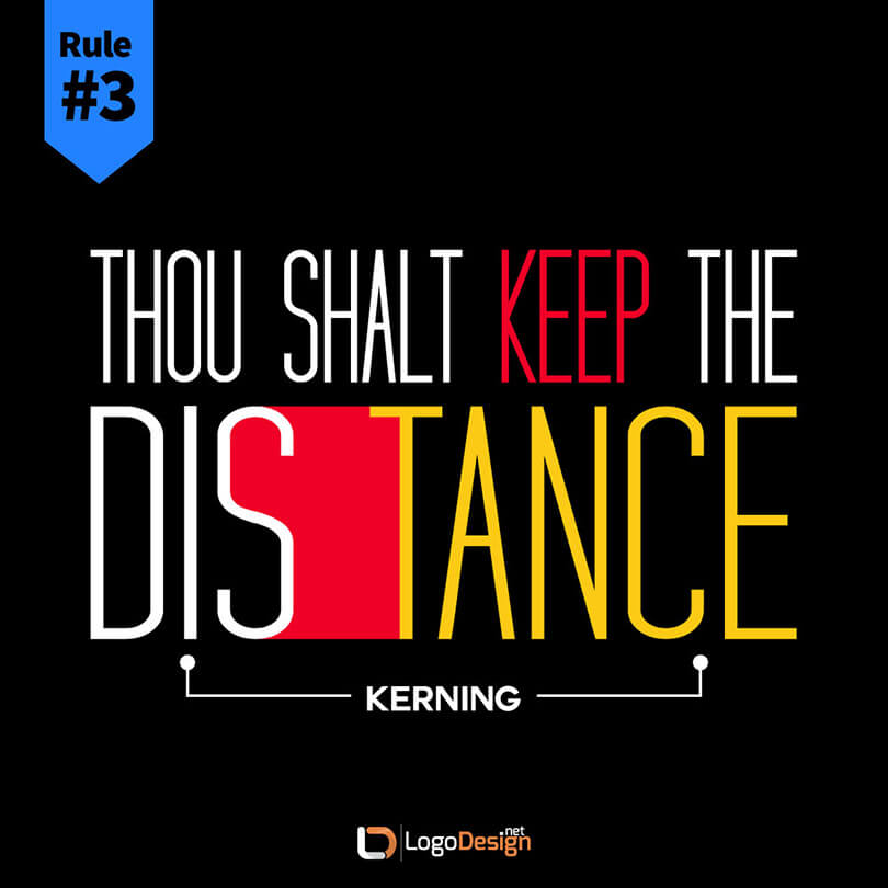
This next rule is about kerning. It is a technical term for the spacing between individual letters in a font. As a typography novice, you may not consider kerning as such a big deal. Yet, as you start to work on projects with clients, you’ll start to realize what a big role it plays. Kerning is a fundamental principle in establishing visual harmony, design meaning, and overall flawless work.
It plays an even bigger role in logo design – since the canvas is too small. You only use so many words in a logo design, therefore, the need to ensure that each word sits well together with others and conveys the exact intended meaning is crucial. Using these tools can help perfect your kerning.
Kern Type
It is a letter-spacing game. You are given a word on-screen with wonky kerning all over and you have to make it right. You get a score out of 100 on each try. After our every try you are able to see where you went wrong and what the right spacing was.
Lettering JS
I: This is a really cool jQuery plugin. It gives you complete control over your fonts at the individual lettering level when you are using CSS. This tool allows you to manage your fonts at the cellular level, including its kerning.
Read more: How to Design Letter Logos
Rule No. 4: Thine Type face Families
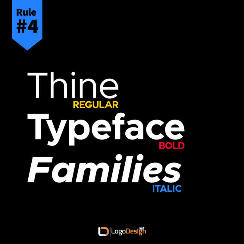
Being familiar and knowledgeable about the major font families – aka typefaces – is a rite of passage for any serious graphic designer or typography enthusiast. A font family is a collection of different fonts that are the same in design but vary in areas such as weight, slant, and width, etc. This is the reason you’ll find fonts belonging to the same family looking very similar.
A famous example of a font family is Arial where Arial Black, Arial Narrow, and Arial Rounded, etc., are members of this unique family. The more you know font families, the better you can pick individual fonts to pair together or use in a certain context.
Our recommended tools below help you gain a deeper knowledge about the font family.
My Fonts
It is one of the largest databases of font collections in the world. You can browse fonts based on categories such as font styles. You can also check out new and trending fonts. Font identification option, WhatTheFont is a popular feature of this site.
Type War
Use this online game to learn about the different font styles in a fun way. This game presents you with two fonts and you’ve to choose which font it is. The game is available on the browser as well as App Store. The game will help you get the nuances of different fonts right.
Rule No. 5: State Thine Purpose
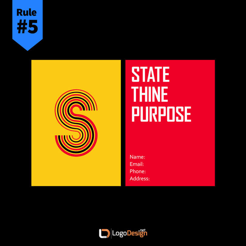
An important rule of selecting typography is that it must match the purpose behind the project. Some font styles are better suited for the screen while others for print. Similarly, certain fonts look good in certain weight and width, while others are more flexible. A script font may not always look good and legible in a logo design unless it is customize for a lettered logo design.
Therefore, when choosing your typeface for graphic design projects, make sure you understand the intent and purpose of the project. These tools below will help you get the hang of it.
Discover Typography
It is one of the largest databases of font collections in the world. You can browse fonts based on caA handy guide that showcases different typefaces grouped together and available as themes so you can pick the right one for your project. Each theme is interactive and identifies individual fonts as you hover on them. tegories such as font styles. You can also check out new and trending fonts. Font identification option, WhatTheFont is a popular feature of this site.
Emo Type
like other elements of design, typography also contains a whole lot of meaning and context behind it. This amazing site helps you pick the right font according to the mood you want to evoke through your type choices.
Rule No. 6: Arrange Thy Fonts
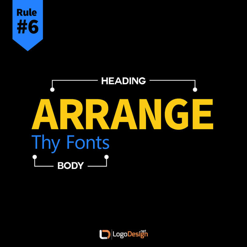
A major rule of typography is that it must convey the correct pecking order. Which part of the text should be read first and which next is not only important for readability and understanding but critical for aesthetics, too. In order to ride the type ladder without missing a step, it’s imperative you understand which font in which size conveys the best hierarchical order.
The pair of tools we’ve chosen to master this rule helps you understand the technicalities of hierarchy and scale in a fun and knowledgeable way.
Modular Scale
This handy tool makes it exceptionally easy to achieve the right hierarchy for your font pairings. It helps you understand the relationship between different font sizes, and from your base font size, suggests the right ratio of size for your different fonts.
The Type System
A lot of modern graphic design follows the rules of Material Design. This type scale generator automatically resizes any font that you choose based on Material Design guidelines and for optimum readability
Rule No. 7: Resize Thy Fonts
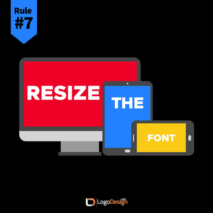
Almost every piece of graphic design you’ll create for clients will go online. Even if it’s created for print, chances are you’ll be asked to tweak it to suit digital screen requirements. Ensuring your typography will keep its quality, readability, and aesthetics when viewed on varied screens is paramount. The responsiveness of design is therefore a holy grail for all modern graphic designers.
The tools we’ve selected help you optimize and resize your typography to suit various screen sizes, both on desktop and mobile.
Ruck Sack
It is a neat, little CSS development tool that helps you create responsive typography for the web. All of the typography you’ll find on Rucksack is fully adjustable – all you have to do is to specify parameters and minimum and maximum font sizes.
Fit Text
It is a jQuery plugin that makes your headings text fluid and flexible. It helps you create responsive typography for various screen sizes. Though it only works for headings, it is a matchless tool for this niche area.
Rule No. 8: Count Thy Characters
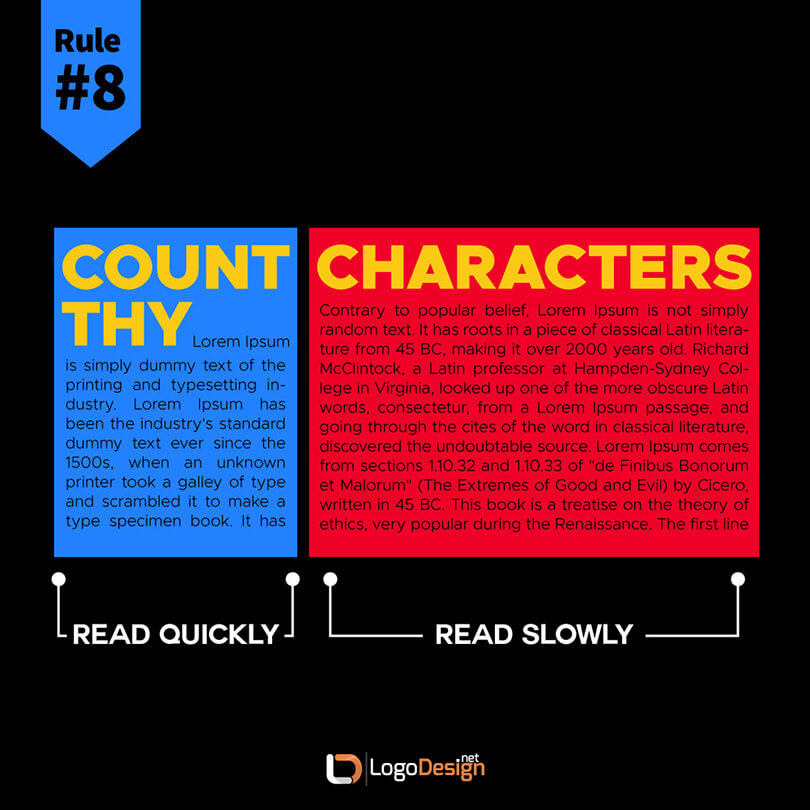
To make text look good and readable on the web, it must contain only a limited number of characters per line. What is this ideal number? Some people suggest 45-70 characters as the limit. However, it depends on a few factors: the length of the page, the font style, its size, and width, etc.
However, on average, you need to aim for 40-50 characters. This rule won’t matter much when you are working on a logo design. However, when designing typography for marketing materials such as flyers and brochures, or when choosing the perfect type for the site’s blog or large blocks of copy, you need to count your characters.
The two amazing tools we’ve discovered help with this purpose are shared below.
Flow Type
This jQuery plugin takes away the headache of choosing the perfect number of characters for various screen sizes. It aims to create the perfect balance between the number of characters per line and the screen size by basing the size of the font on each element’s width.
Type Slab
This space adjusting tool works at the font’s pixel level. It allows you to create perfectly spaced and aligned headlines by splitting them into rows that fill available space. The result is better reading and impressive presentation.
To Wrap Up
Typography is a pretty vast topic – it requires books and essays to truly grasp its universal appeal and application. While we do not claim to cover its subtleties in a short blog post, we have tried to discuss all of the fundamentals that you need to master if you wish to become an expert designer. The more you practice these rules, the more you’ll start acing your projects. And your clients will notice. The additional knowledge will also add value to your experience and help you come up with typographical solutions when there seems to be none.