SALES / SUPPORT : 844-232-4816
How to Design a Freeform Gradient Logo Using Adobe Illustrator CC
A gradient is a dynamic coloring choice employed in designs to add depth, dimension, and drama. Learning how to master the gradients begins with a simple understanding of how colors naturally bleed into each other. Nature will be your best guide here (more on this later).
In this tutorial by Will Paterson, we will learn how to use the freeform gradient – latest in Adobe Illustrator's gradient panel – and see its application in real design projects.
Paterson is a seasoned graphic designer, and vlogger who has years of experience in logo design. He's going to give us his secret tips and tricks in this video.
If you rather have this tutorial in a good old step-by-step method, here you are:
Step-by-Step Tutorial
Step 1: Choose Your Shape
Choose or create the shape that you want to use as your logo. Then enter the gradient panel by pressing G on your keyboard or click on the toolbar and find the gradient panel.
Once you're in there, you'll see that there are now three instead of two gradient options: linear, radial, and free-form. We will choose the last one – the freeform. Clicking on it will fill in your shape with a selection of two freeform gradient colors with two default color points.
Step 2: Choose Your Points
These points contain different colors in the gradient. You can create as many points as you like just by clicking at different locations inside the shape. Each location can have a different color.
Dragging the points across you can see how the gradient will move across the shape and how its fill will merge with other colors in the gradient. You can also increase or decrease the range of that particular color by dragging the circle around each point.
Since gradients give the illusion of light, by dragging the points across or changing colors, you can decide where you want the illusion of light to be.
If you want to delete a point, simply select the point and press 'Delete'.
Step 3: You Can Also Use Lines
In addition to the color points, you can also choose lines. Remove all the points and click on specific locations inside the shape. These locations form the path along which the gradient will move. Now assign different colors to the points you've created and you'll see that the gradients now move along a certain path.
Step 4: Selection of Color
It's really easy to create a freeform gradient but it isn't easy to make it look good. To add the most appealing colors in your gradients, try this website, UI Gradients. It has hundreds of different duotone gradients to choose from. When you find a color or a combination that you like, simply click on the color number or hex code given above each image and copy on your color swatch on Illustrator.
Step 5: To Change Colors
If you want to change the colors in your gradient but not the proportion of hue, saturation or other details, follow this simple process. It will allow you to change colors without having to change any other detail or removing each color one by one.
Click the Recolor Artwork button on the toolbar. A dialog box will open. Click on edit. It will give you a color wheel with a load of other things. Forget about everything on the right and click on 'link harmony'. It will show you a solid line going through the color wheel marking the range of colors you have chosen in your gradient. It keeps the saturation and the degree of color mix the same if you are happy with it and only replaces it with different colors if you move it around the wheel.
Now start choosing different colors through the slider and see which combination you're most happy with.
Step 6: Add the Text & Freeform Gradient Logo is Done
The last remaining part is to simply add the text. You can also add color gradients in your text, but only spartanly and voila, your freeform gradient logo is complete.
Did you know that not so long ago, designers had forsaken the use of gradients in favor of the cleaner, more simple approach to design, the flat design? What changed this preference? Read on to take a look back and see how it all re-started.
Why Gradient?
A Brief History of Gradient Logo Designs
The year was 2006. Microsoft had been championing the use of flat design for nearly 5 years now, right from the release of its Windows Media Center in 2002, and succeeding. Skeuomorphism had been announced, web interface designers wrinkled their noses at textures, and the gradient was all but annihilated.
Nobody thought they would ever see any of these defenders of visual depth style again.
But. It's 2019, and here we are. Talking about Gradients. How did it come to be?
It all started sometime in 2014. Flat design was ruling the land, but its limitations had started irking the artists who needed more expression and more emotion in their work. Gradients being nature's preferred coloring tool were the most obvious choice.
Everywhere you look in nature, colors are merging into each other, bleeding, morphing, and changing. Hues mingle with other hues and form different shades. The sky is never a constant color; one gray mixes with another and creates another gray that's unlike either.
And this transition of emotion in response to merging colors may have been what inspired many artists to introduce movement in their design or represent emotion as it occurs in response to art through gradients.
As I write this, I'm thinking of Spotify.
In 2015, the music streaming company released duotone portraits of people as representations of various sensations we go through when listening to music.
These duotone portraits were strong and visual ambassadors of the long-forgotten gradient.
Needless to say, the portraits were instantly famous and the designers who had started working during the reign of flat design wanted to know what this design form was. Brands also started taking notice. And in 2016, Instagram launched its brand new logo – proudly in gradient – and as the article aptly headlines, 'everyone lost their mind'.
The time since then has been a massive shift towards more and more people now looking at gradient as the bold, confident, and naturalistic design choice – with its own swag.
The use of gradients also isn't limited to any single form of application. It is used in web design, app interfaces, various forms of logo design, and many other ways of UX design. Keeping such a vast application of color gradients in mind, Adobe Illustrator offers three different types of color gradients to choose from:
Types of Gradients in Adobe Illustrator
In Adobe Illustrator you will find three types of gradient fills to use in your logo design: Linear, Radial, and Freeform. Each type of gradient offers a very distinct and unique way of color blend that you cannot achieve with others. Therefore, when choosing a gradient type to use for your logo, have a clear idea of how you want the finished product to look.
Linear Gradient:
Linear gradients are the best choice for background fills and adding a little life in your logo. You can add multiple stops or lines and change their locations percentage-wise to add as many colors in your gradient as you want. We recommend keeping this number 2 to 3, however, so as not to clutter the design.
Important to note: you can only add a linear gradient along straight lines or use angles.
To add angles in your linear-gradient, we recommend using the panel instead of the gradient annotator. With the annotator, you can modify the angle, location, and spread of the gradient but the panel gives you more precision for angles. You get the option to add precise angle calculations, and thus more appropriate color fills and spreads.
Linear gradients can blend together really well if you use colors from the same family, i.e. either use warm colors or cool colors.
TIP: For a perfect gradient, use the same family of color with each color in similar percentages. Meaning a bright color can go smoothly with another bright color gradient. Using a pastel color with a bright color will not go as smoothly as you may imagine.
Linear gradients can be applied to the fill as well as the strokes of an object and are perfect for wordmark logos.
Radial Gradient:
In the radial gradient option, the color is spread around a circular pattern inside the object. A radial gradient has a starting point initiating from the middle of a space and extends outwards in circles, creating a rippling effect. But the starting point of the radial gradient can be anywhere on your graphic. Similar to a linear gradient, you can change the location of your color percentage-wise to modify the smoothness of your design.
More than any other kind of gradients, radial gradients are perfect for giving the illusion of light and shadow, for which gradients are so famous. Because the passage of light is never straight but gradual, the radial gradient replicates that progression on images quite perfectly.
TIP: A perfect radial gradient will look best when used on an eclipse/circular graphic. It shows more depth and adds a 3D effect to your design.
Radial gradients can be applied to both the fill and the strokes of an object.
Freeform Gradient
Freeform gradients are the most recent addition in Adobe Illustrator's gradient panel and give us greater control over our gradients.
They offer more fluid and flexible color blending options than either linear or radial. With freeform, you get color spreads that are more naturally progressing since there are no strict origins or endpoints of spreads like in the other two. With the help of points in the shape, you can literally change the move of spread whichever way you like.
Unlike the other two, however, you can't apply freeform gradients to the stroke of objects; you can only use them as color-fill options.
TIP: To make the use of freeform gradient highly effective, we don't really need to go overboard with our colors. It's more about the placement and merges of colors than the number of colors used.
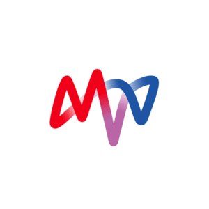
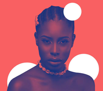
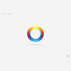
Image source: UnderConsideration
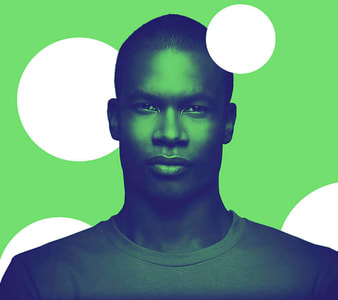
Image source: Behance
Since gradients are such a versatile coloring tool, their application and usage can sometimes overwhelm the best of us. Therefore, I'm presenting here a condensed list of Dos and Don'ts that you can use to figure out if your application of gradient in the design is enhancing or harming it.
Dos and Don'ts of Gradient Logos
Here are a few things that we should – and a few that we must never – do when using gradients in our designs.
Let's start with the Dos.
Keep the icon simple
Since gradients are loud, bold, and dynamic design choices, pair them with simpler shapes. Choose icon shapes which will improve with the gradient fill, not fall flat in the face of it. Gradients may not be the ideal choice for smaller icons and symbols – keep them for spaces that can handle its depth.
Know gradient types: Linear, Radial, Freeform
Practice with each type of gradient in your free time to get the hang of it. Each of the gradient types is unique and will look good on certain shapes than others. Some shapes will require a linear gradient, for others, you may want the use of radial. Still, for others, freeform will be the best choice.
To know which gradient type will have the most effect on the design, it is important to learn and practice.
Make it scalable and print-friendly
Gradients look their most sharp and dramatic selves on digital media. They aren't as suitable for print. Still, if you want your gradient logo printed, test it on different print surfaces and different backgrounds to see its reproduction potential. Also test it with black and white to see if it affects the readability, identification, or overall design aesthetics of the logo at all.
Now the Don'ts.
Don't use too many colors in the gradient
Don't overwhelm yourself or the design by using complicated gradients. You can create much more effective gradients by limiting yourself only to three or a maximum of four colors. Simpler, less intense gradients make a far more impacting statement.
Don't overdo the details
There may be parts of the logo – the smaller details especially – that will benefit more from a flat color than the forced depth of the gradient. In fact, in smaller or cramped portions of the design, the gradient may totally be lost. For such designs, weigh whether the gradient is the best choice here.
Don't just follow the fad
Gradient logos aren't suitable choices for every industry or every design. Use gradient logos with brands and audiences that will appreciate the bold statement you're making. A bank logo in gradient may not be as great an idea as it will be for the next tech startup. Use the gradient exclusively for design and markets where it is needed – and not just as a trend that you have to follow.
Now that you know the dos and don'ts let's study its application in popular gradient logo designs and see how artists are achieving perfection in gradient keeping within its limits.
Popular Gradient Logos
The most popular and identifiable gradient logo of our times is Instagram's. But Instagram isn't the only brand that saw what the gradient had to offer. Many others in recent years have opted for gradient logos too, giving up their flat designs.
So, feeling inspired yet?
These examples are some of the most perfect representations of gradients-in-action when you talk about design and aesthetics. But what about the most fundamental - and technical - question regarding gradients i.e. which colors to merge with which, and in what proportions?
To answer these questions, let's go to nature: the source of all creative inspiration.
The Gradients In and By Nature
The word 'gradient' means a gradual increase or decrease in measurement. This gradual progression and decline is present everywhere in nature. Stages and steps. Phases and periods. They are at the center of the harmony that runs this universe.
And nowhere is it more pronounced than in colors. Everywhere you look, nature is playing with color gradients. Color gradients in nature are always smooth, harmonious, and well, natural. For example purple, pink, and magenta. Or blue, pink, and green. Even the most hated color combination – red and blue – can show you its beauty when handled in gradient.
Let's see the different ways nature can guide us in our quest to find unique color blends for our gradient logo designs.
The Sky
The sky is perhaps the best source of inspiration for gradients because its colors are never the same two days in a row. Even when it is its most usual self of white and gray, the spread and merge of both the colors can inspire you to blend your own gradients in a different way that day.
And when the sky is being dramatic – green, blue-green, pink, white, purple, mustard, yellow, orange, brown – it's insane.
Here are a few favorites from the sky, along with their color palettes for your inspiration plus application.
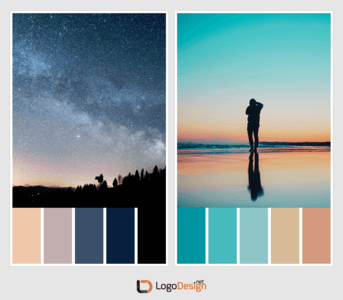
Photos by Aldain Austria and Martin Sattler | Unsplash
The Earth
Mountains, sand, soil, rocks, and stone. The ruggedness of earth provides another great vista of color gradients inspiration. Additionally, it also guides you on how to add textures into colors. The sand when wet and dry has distinct shades, for example. Similarly, the dried soil, the desert sand, and the dusty road, all have similar hues on the whole but are different from each other.
Studying elements like that, in different settings and interacting with other elements, can expand your design horizons and ultimately gives you more to work with.
Here are a few gradients provided by the earth.
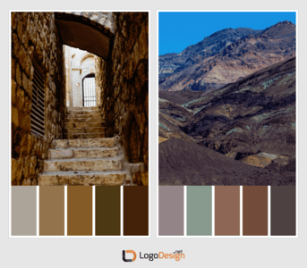
Photos by Dan Gold and Anchor Lee | Unsplash
The Forest
The forest has some highly characteristic features due to which it needs a mention here. Its colors offer a deeper variance in gradients. They are also cooler than the colors of Earth – meaning it addresses a whole other spectrum of the color wheel.
Plus forests handle green much more differently than other elements of the earth such as hills and fields do. The green of the forest is more wet, cold, and sharp. It is also wilder, more mysterious, and more present. The addition of mulch, streams, waterfalls, and dry leaves adds a whole other area of gradients to explore with.
Some of my favorite color gradients from forests:
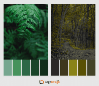
Photos by Heather Shevlin and Derek Story | Unsplash
The Ocean
The blue of the ocean is a color loved by everyone. But working with blue as much as we do as logo designers, you can hit a saturation point. This is when oceans prove to be a great source of inspiration. With oceans, you get blue in as many shades as you can handle. Not only that, you get various blends of it too when it mixes with green, white, gray, and black – all the other colors of the ocean. Not to mention the bleed of the sun into it when it sets every day.
Add to it, the shades of deeper depths of the ocean – the coral reefs, or the way waves change colors in proportion to other elements such as the sun or how you look at it from different perspectives, the eagle-eye position, for example, can be inspiring. The ocean truly holds many secrets.
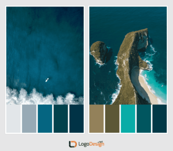
Photos by Jeremy Bishop and Janis Karkossa | Unsplash
The Fire
With gradients, we always have a limited number of colors to work with. Therefore, by studying the way fire burns, we get to see how differently it integrates similar colors again and again - red, blue, orange, white - repeatedly. It also helps you learn the principles of color blending to create in-depth effects. For example, the effect of heat in fire images doesn't always come from red or orange, mostly it’s white dominating the red that gives off such intense heat.
To see how absolutely scorching some of its gradients are, have a look below.
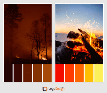
Photos by Cristofer Jeschke and Benjamin DeYoung | Unsplash
In short, there isn't a color gradient you won't find in nature. Plus choosing gradients from nature has its practical purposes too. Natural color combinations look pleasant to us because we are familiar with them. Therefore, even when they are striking and loud, they are never hurting or unpleasant to look at. Whereas color combinations that we don’t usually find in nature may look unpleasant. Look for natural color merges to make sure your customers have positive feelings associated with them that extend to your brand logo.
Concluding
Hopefully, the tutorial has helped you see how simple and easy it is to create freeform gradient logos. The creativity you can put in it is only limited by how imaginative and ambitious you want to be. However, we suggest subtlety for a design choice that is already so confident, fearless, and wild.
Credits:
Written by Zaheer Dodhia, CEO and Founder LogoDesign.Net.
Video by Will Paterson, Designer, and Vblogger, WillPaterson.Design