Logos play tricks on the eye, and our brains happily join in. Gestalt psychology shows why our brain connects the dots, fills gaps, and falls for designs that stick forever.
Why do some logos instantly click with us while others barely register? You see a mark, and before you know it, your brain has already pieced together shapes, filled in gaps, and decided what it represents. That instant recognition is hardly good design luck, but rather psychology at play.
Back in the 1920s, a group of German psychologists introduced the world to Gestalt theory, a way of understanding how people naturally perceive patterns and visuals. It relied on a core idea: “The whole is greater than the sum of its parts.” In other words, our brains prefer to see complete, unified pictures rather than scattered elements.
The Gestalt theory suggests that the brain prefers seeing a whole picture, instead of a scattered one.
Designers today lean heavily on these fundamentals, especially when creating a logo design. After all, the principles of a good logo boil down to making something simple, memorable, and meaningful — and Gestalt gives it the best shot at achieving that in a few seconds.
Let’s dive into the world of Gestalt principles and see how they shape the logos we connect with every day.
What Are Gestalt Principles?
Before we jump into logos, let’s rewind a bit. Gestalt principles come from Gestalt psychology, a movement started in the 1920s by German psychologists Max Wertheimer, Wolfgang Köhler, and Kurt Koffka. Their research asked a simple but fascinating question: Why do humans see things the way we do? Instead of focusing on individual parts, they discovered that our brains naturally prefer to organize visuals into complete, unified patterns.
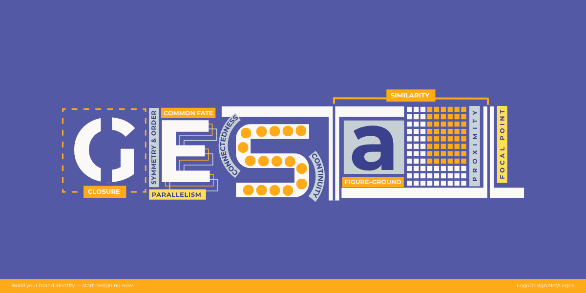
Gestalt psychology came from German psychologists, research that asked the question: why do humans see things the way we do?
It hints that the overall look of something is greater than the sum of its parts. Show us a half-drawn circle, and we’ll still see a circle. Place shapes close together, and we’ll assume they’re related. Our brains are basically hardwired to connect the dots even when the dots aren’t fully there.
In design, and especially logo design, this is a game-changer. Whether it’s simple lettermark logos or a collection of circle logos arranged to form a bigger picture, Gestalt explains why these visuals feel so balanced, recognizable, and almost impossible to forget.
Why Gestalt Principles Matter in Logo Design?
Think about how fast a logo has to work. You glance at it for maybe a second, and in that tiny moment, it needs to tell you something about the brand. If it’s too messy or confusing, your brain moves on. But when Gestalt principles are at play, logos feels effortless and leaves an impression without you even realizing why.
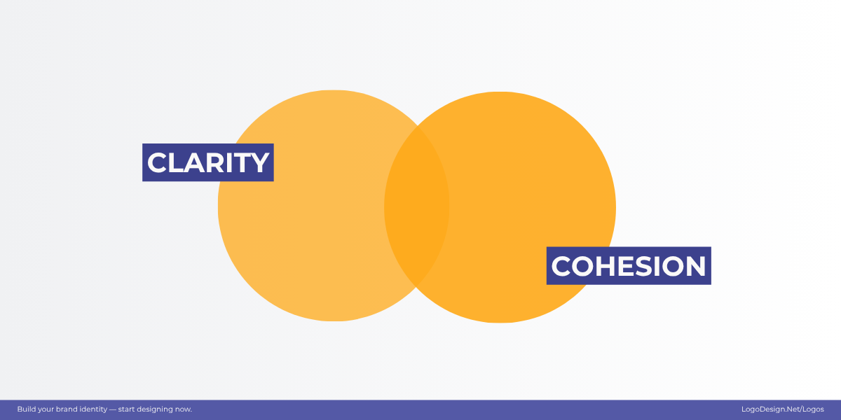
These are the principles that help organize the shapes, lines, and spaces to feel appealing to the human eye.
These principles act like a shortcut between the designer’s idea and the viewer’s perception. They help organize shapes, lines, and spaces in a way that feels natural to the human eye. That’s why so many iconic logos, whether for tech startups, nonprofits, or small businesses, look simple on the surface but are incredibly smart underneath.
Did you know that 75% of consumers recognize a brand by its logo?
As 75% of the consumers recognize the brand by its logo, Gestalt suggests that logos are understood, not just seen.
That means a logo’s visual clarity makes or breaks brand recall. Gestalt takes the guesswork out of logo design. Instead of throwing shapes together, it gives designers a framework rooted in psychology. The result? Logos that are not just seen, but understood.
The Gestalt Principles in Action
Now that we’ve covered where these principles come from and why they matter, let’s see them in action. In logo design, Gestalt principles are the invisible threads that tie shapes, colors, and spacing together into something your brain instantly understands. Each principle gives designers a tool to simplify complex ideas and create marks that feel cohesive and memorable.
Here’s how each principle plays a role in shaping logos you’ve probably seen but may not have realized why they work so well.
1. Proximity – Things close together feel related
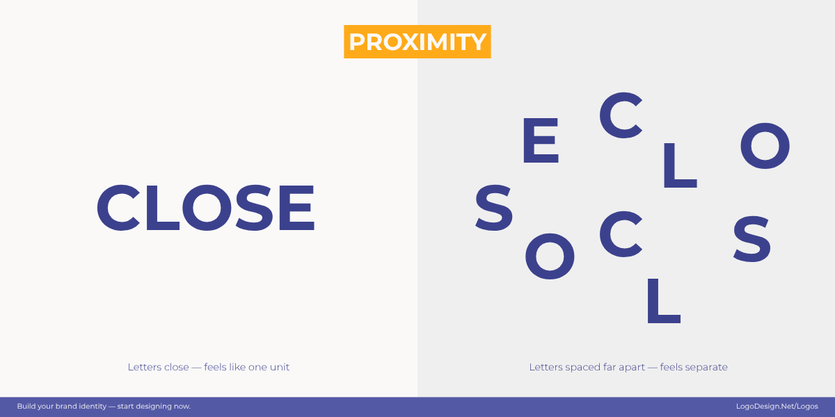
Proximity between the letters dictates how our brain reads the text, naturally grouping the elements that are close together.
The proximity principle explains how elements placed near one another are perceived as related, even if they’re not physically connected. Our brains naturally group nearby shapes, colors, or objects into a single unit. In logo design, this principle is often used to create harmony, organization, and a sense of unity. By carefully arranging elements close together, designers can communicate complex ideas in a clean and straightforward way.
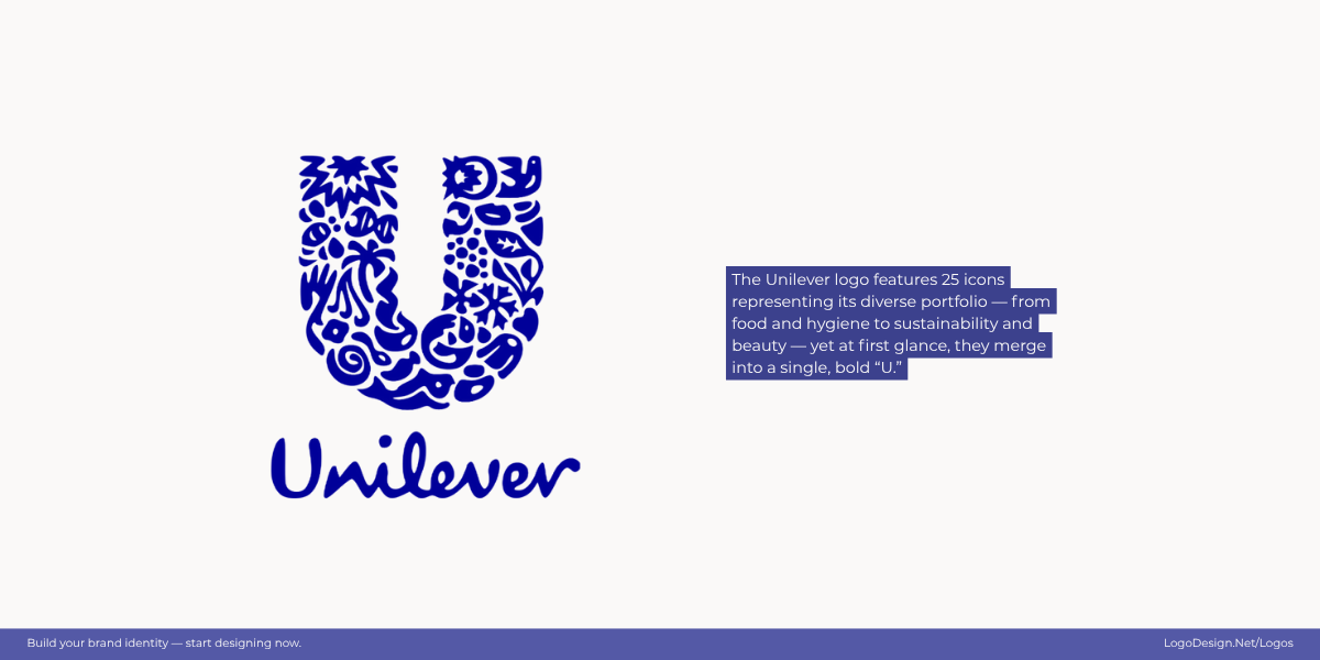
More than 25 tiny icons are featured closely in the Unilever logo, each representing a product or value.
At first glance, Unilever’s logo looks like a bold “U.” But look closer and you’ll see it’s actually made up of dozens of tiny icons. Each individual element represents a different product or value, but proximity ties them together into a single cohesive mark that reflects the company’s wide reach.
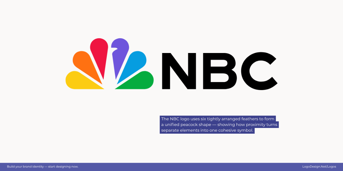
The NBC logo has a multi-color teardrop-shaped design, which is close together, causing our eyes to group and see a peacock.
In NBC’s logo, the iconic peacock is formed by multiple colorful teardrop shapes. Each feather is separate, but because of their close arrangement, our eyes group them into a unified fan-like form that represents the bird.
The Cisco logo has a series of spaced-out lines of different lengths, allowing the eyes to see a bridge-like figure.
Cisco’s logo is composed of a series of vertical lines in the design that resemble both a digital signal and the Golden Gate Bridge — a nod to the company’s San Francisco roots. Each line stands independently, yet their close spacing and alignment allow the eye to connect them into a single, cohesive bridge-like form — a perfect example of proximity.
2. Similarity – Things that look alike are grouped
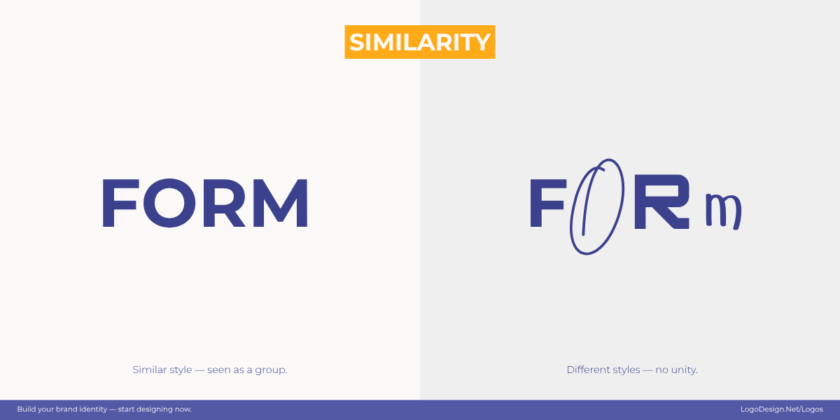
According to the Gestalt principle, if the elements look alike, we naturally assume they belong together.
Similarity is a Gestalt principle that says our brains naturally group elements that look alike—whether through shape, color, size, or style. When things share visual traits, we automatically assume they belong together. In logo design, similarity helps create cohesion, consistency, and recognizability. It allows designers to communicate unity without explicitly connecting elements. Designers often use this principle by repeating shapes, colors, or fonts, so the eye naturally ties them together into one complete idea.
Since the three stripes in the Adidas logo look similar, the brain looks at it as a single, mountain-like form, instead of separate bars.
Adidas uses three parallel stripes—equal in width, angle, and spacing—so our brain groups them into a single mountain-like form rather than seeing three separate bars. The similarity in line weight and alignment makes the logo instantly recognizable and cohesive.
Microsoft has 4 color grids, with consistent spacing to show different products of the company, but the eye looks at it as a window.
Microsoft’s logo consists of four colored squares arranged in a 2×2 grid. Each square is the same size and shape, with consistent spacing, so even though there are four distinct colors, we read them as one unified window pane — consistent and balanced.
The two overlapping curves in the Under Armour logo are perceived together, instead of being read as “U” and “A” separately.
Under Armour’s logo uses two identical curved “U” shapes facing each other. Their mirrored form and matching stroke thickness create symmetry and similarity — the two halves are perceived together, forming one strong emblem rather than two unrelated pieces.
3. Continuity – The eye follows smooth paths
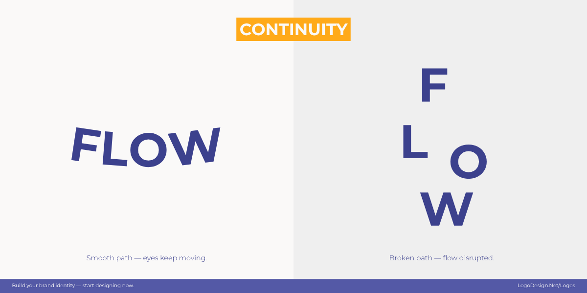
Continuity in the design creates a natural flow, and things like curves interrupt this flow.
Continuity is the idea that our eyes prefer smooth, logical paths — they naturally follow lines, curves, and implied directions even when those paths are interrupted. In logo design, continuity guides the viewer’s gaze across the mark, creates a sense of motion or flow, and makes separate elements read as part of one visual story. Designers create continuity through flowing strokes, aligned endpoints, repeating curves, or implied lines that lead toward a focal point.
The Coca-Cola script logo has connected strokes and loops that create continuity throughout the design.
Coca-Cola’s Spencerian script is a textbook example: the sweeping, connected strokes and graceful loops carry the eye from the wordmark’s start to finish. Ligatures and long tails link letters so they read as one continuous ribbon. That flowing continuity is a big part of why the script feels warm, familiar, and timeless.
The curved arrow in the Amazon logo helps ensure that the viewer’s attention remains on the brand name.
Amazon’s logo uses a simple but clever curve — the arrow that stretches from “A” to “Z.” This smooth line guides the viewer’s eye naturally across the wordmark, suggesting a continuous journey and reinforcing the brand’s message: everything from A to Z. The gentle upward arc also adds a sense of friendliness and motion.
The vertical bars in the SoundCloud logo lead the eye to the end of the design and suggest uninterrupted soundwaves.
SoundCloud’s logo visualizes the idea of music flow through continuity. The vertical bars on the left gradually merge into a rounded cloud form, leading the eye seamlessly from structured rhythm to organic shape. The uninterrupted progression mimics a sound wave, capturing the essence of streaming and sonic movement.
4. Closure – The mind fills in gaps
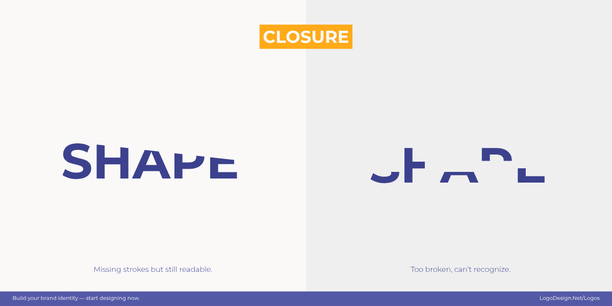
When we see an incomplete design, our brain connects the missing parts to make it whole.
Closure is the Gestalt principle that our brains naturally “fill in the blanks.” When we see incomplete shapes or fragmented elements, we instinctively connect the missing parts to form a whole. This allows designers to suggest more with less, using minimal elements to create logos that feel complete, clever, and memorable. Closure is especially powerful in logos because it engages the viewer — we get a small “aha” moment when our minds resolve the unfinished image.
Ontario Soccer’s logo has a swirling ribbon forming an implied soccer ball through motion and visual closure.
The Ontario Soccer logo uses a swirling ribbon-like form that loops into the outline of a soccer ball. The ball isn’t fully drawn; instead, our brains complete the circular shape and recognize the familiar pattern. The dynamic gaps give the logo motion and energy, while closure ensures the viewer perceives a soccer ball instantly.
The WWF panda logo uses simple black shapes and white space to let our brains complete the picture.
The WWF’s iconic panda is yet another great example. It is made up of bold black shapes with plenty of white space left blank. Despite missing outlines and details, our brains fill in the gaps to recognize the panda’s face and body. This clever use of closure makes the logo simple, scalable, and emotionally engaging.
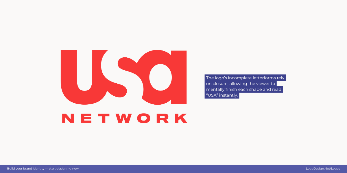
The negative space invites the viewer’s mind to complete the USA Network logo.
The USA Network logo demonstrates closure through its minimalist letterforms. The “U,” “S,” and “A” are not fully connected — portions of each letter are intentionally removed — yet our brains effortlessly fill in the missing parts to read the word as a whole. This subtle use of negative space creates a clean, modern identity that feels open and instantly recognizable.
5. Figure–Ground – Separating subject from background
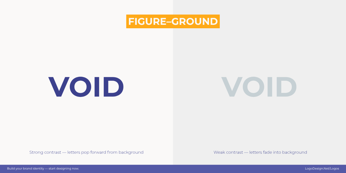
Figure-ground in design is where foreground and background trade places to create positive and negative spaces.
Figure-ground is all about how we distinguish a subject (the “figure”) from its background (the “ground”). Our brains are wired to separate foreground from background, often switching between the two depending on how the design is composed. This principle creates clever visuals where the negative space in the logo is just as meaningful as the positive. It can simplify complex ideas and make a mark instantly memorable.
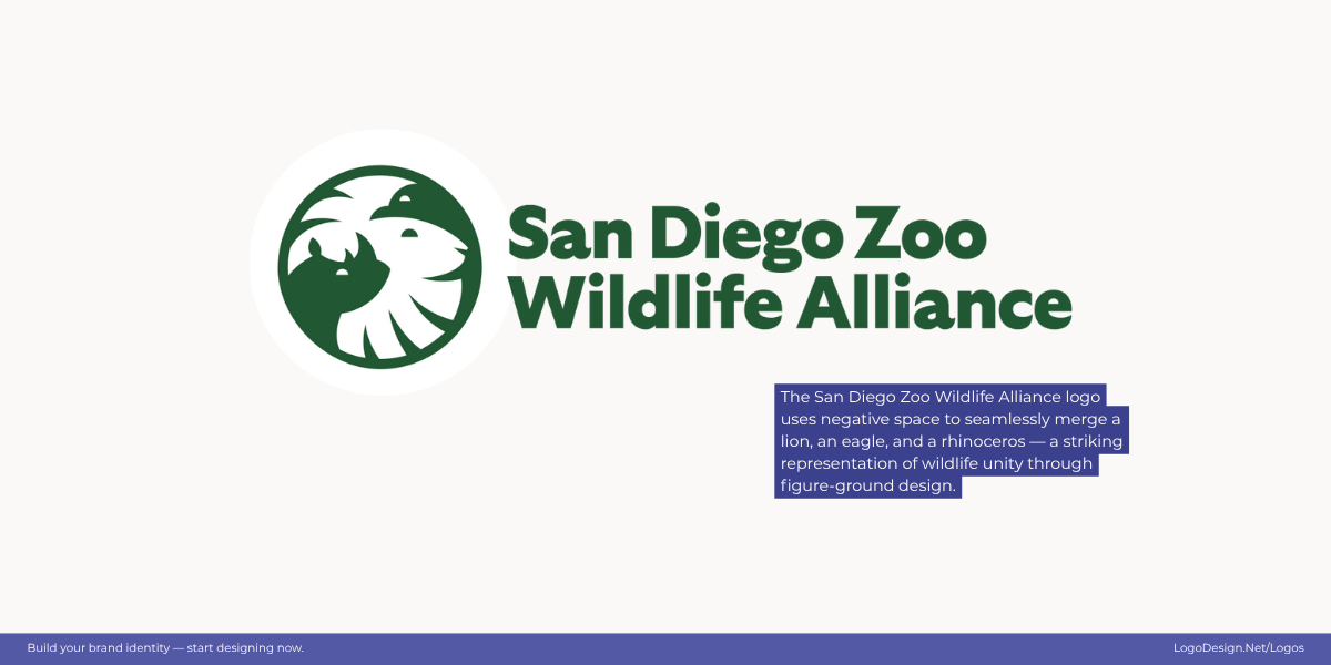
The San Diego Zoo Wildlife Alliance logo unites a lion, eagle, and rhinoceros in one seamless symbol.
At first glance, the San Diego Zoo Wildlife Alliance logo appears as a single circular mark, but look closely and you’ll notice the faces of a lion, an eagle, and a rhinoceros formed through the interplay of positive and negative space. Each creature emerges from the contours of another, symbolizing the interconnectedness of wildlife and ecosystems. It’s a powerful example of how figure-ground balance can merge multiple identities into one cohesive emblem.
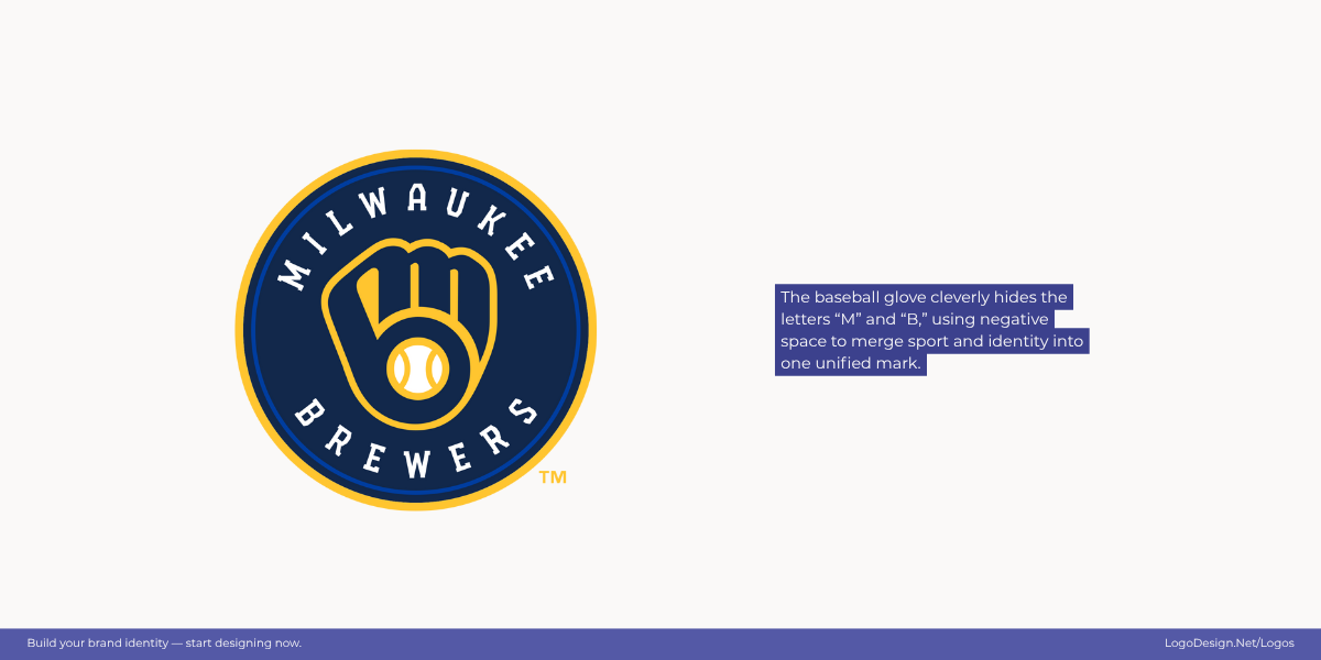
The Milwaukee Brewers logo uses a baseball glove-like figure that cleverly hides the letters ‘M’ and ‘B’.
The Milwaukee Brewers logo is a clever example of figure-ground balance. At first glance, you see a baseball glove catching a ball — but look closer, and the glove’s curves reveal the letters “M” and “B.” The negative space between the two shapes completes the illusion, seamlessly merging the team’s initials and sport into one timeless mark.
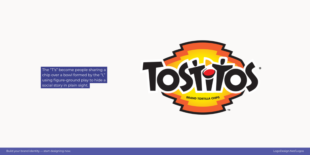
Two friends share a chip over a bowl of salsa hidden in the Tostitos logo, showing fun and togetherness.
In the Tostitos logo, the two lowercase “t”s double as people sharing a chip over the dot of the “i,” which becomes a bowl of salsa. This playful use of figure-ground turns ordinary letterforms into a lively scene that perfectly captures the brand’s spirit of sharing and fun.
6. Symmetry & Order – Balanced layouts feel stable
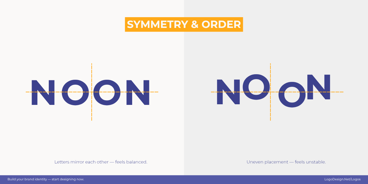
Symmetry and order in the design show balance, trust, and unity.
This principle taps into our brain’s preference for balance and stability. When a logo is symmetrical, it feels harmonious and trustworthy because both sides mirror or complement each other. Symmetry doesn’t always have to be perfect; even near-symmetry creates a sense of structure that helps logos look clean and intentional. This principle is especially effective for organizations that want to communicate reliability, authority, or tradition.
The owl-shaped TripAdvisor logo shows eyes and wings, hinting at direction, perfect for a brand guiding travelers.
The TripAdvisor logo captures symmetry and order through its mirrored owl design. The perfectly balanced eyes and wings create harmony and focus, symbolizing clarity and direction — key traits for a brand guiding travelers worldwide. Its visual balance makes the mark instantly recognizable and trustworthy.
The Uniqode logo has the same space between the thin letters, showing confidence and a digital appeal.
The Uniqode logo uses evenly spaced, geometric lines that reflect across a central axis. Its clean and structured form conveys precision and confidence, giving the design a sense of stability and modern sophistication. The orderly layout reinforces the brand’s promise of seamless digital experiences.
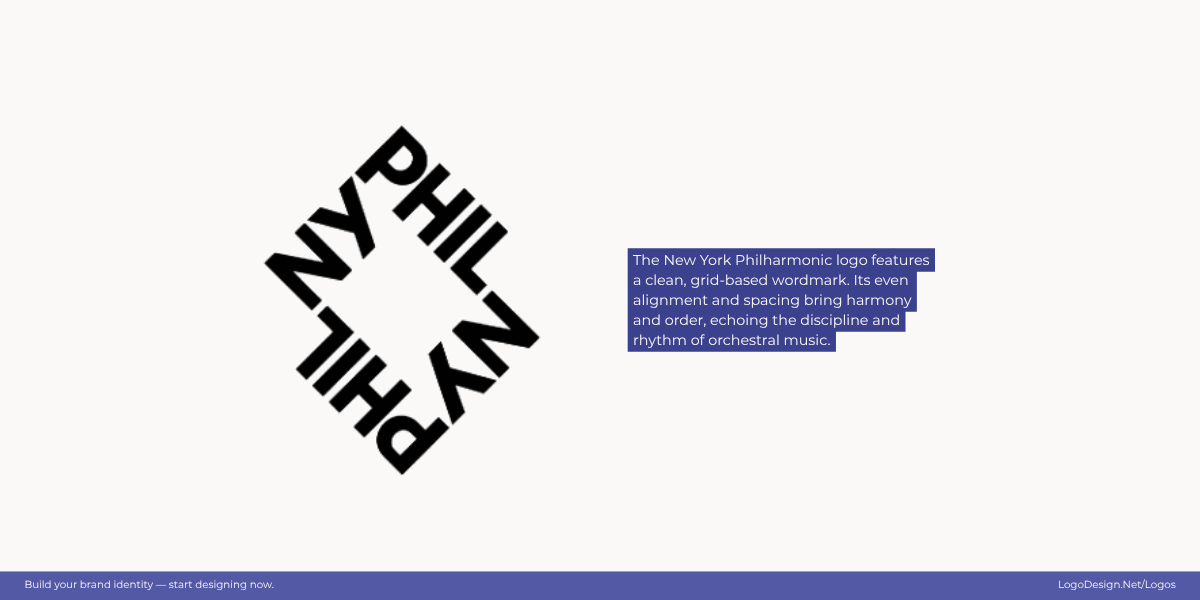
The New York Philharmonic logo shows precision and artistry to suggest unity.
The New York Philharmonic logo arranges its wordmark in a clear, grid-based layout. The measured spacing and alignment evoke rhythm and balance, echoing the harmony and refinement of the orchestra itself. Its well-composed structure reflects both creative expression and disciplined design.
7. Common Fate – Elements moving together feel connected
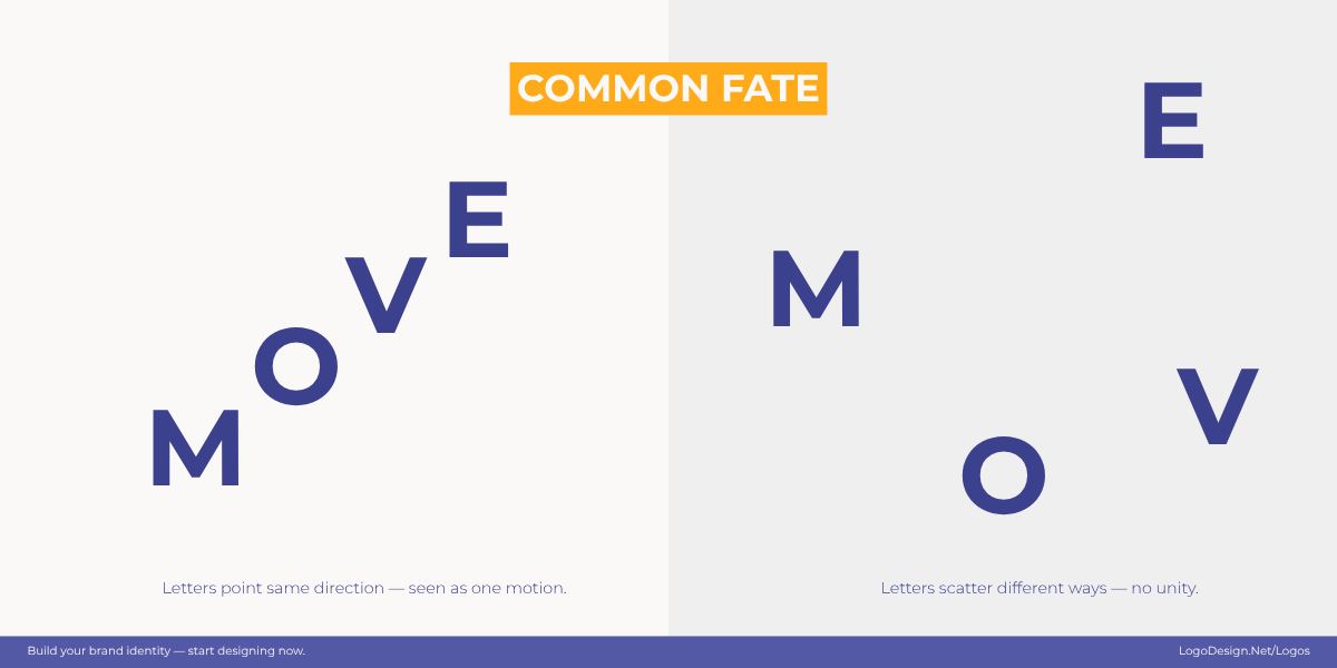
When the design elements are moving in the same direction, it usually shows progression and teamwork.
Common fate is the Gestalt principle in which elements moving in the same direction are perceived as related or part of a group. Even if the shapes differ, when their orientation or motion aligns, our brains connect them as one. In logo design, this principle is often used to suggest progress, collaboration, or forward momentum. It’s a subtle but powerful way to show unity and purpose without explicitly tying elements together.
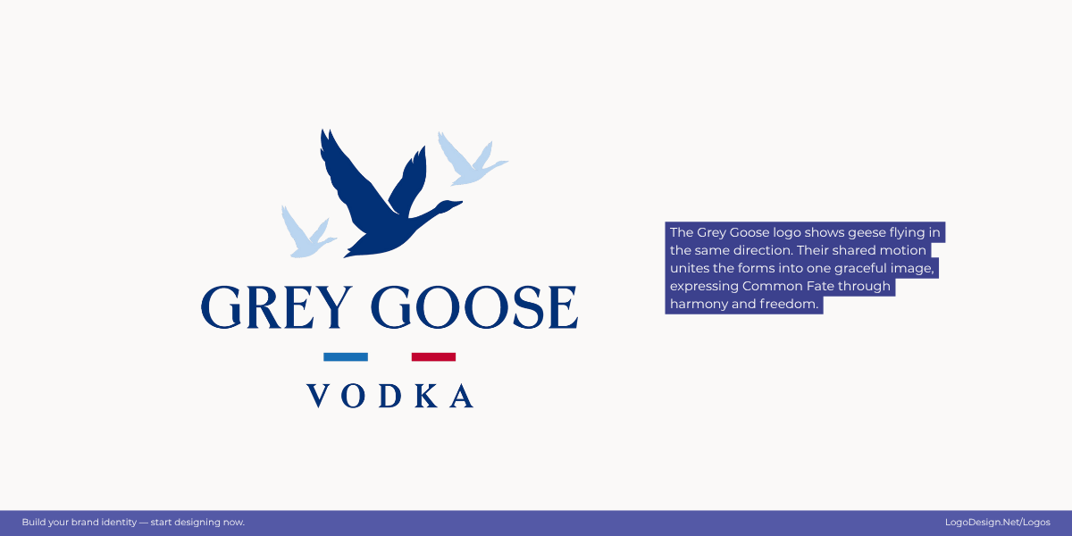
The Grey Goose Vodka logo features a flock of geese soaring in perfect harmony, showing unity and shared purpose.
The Grey Goose logo captures the essence of Common Fate through its flock of geese in synchronized flight. Each bird moves in the same direction, and their shared motion unites them into a single, graceful form. This harmony of movement conveys elegance, freedom, and the sense of soaring together toward a common horizon.
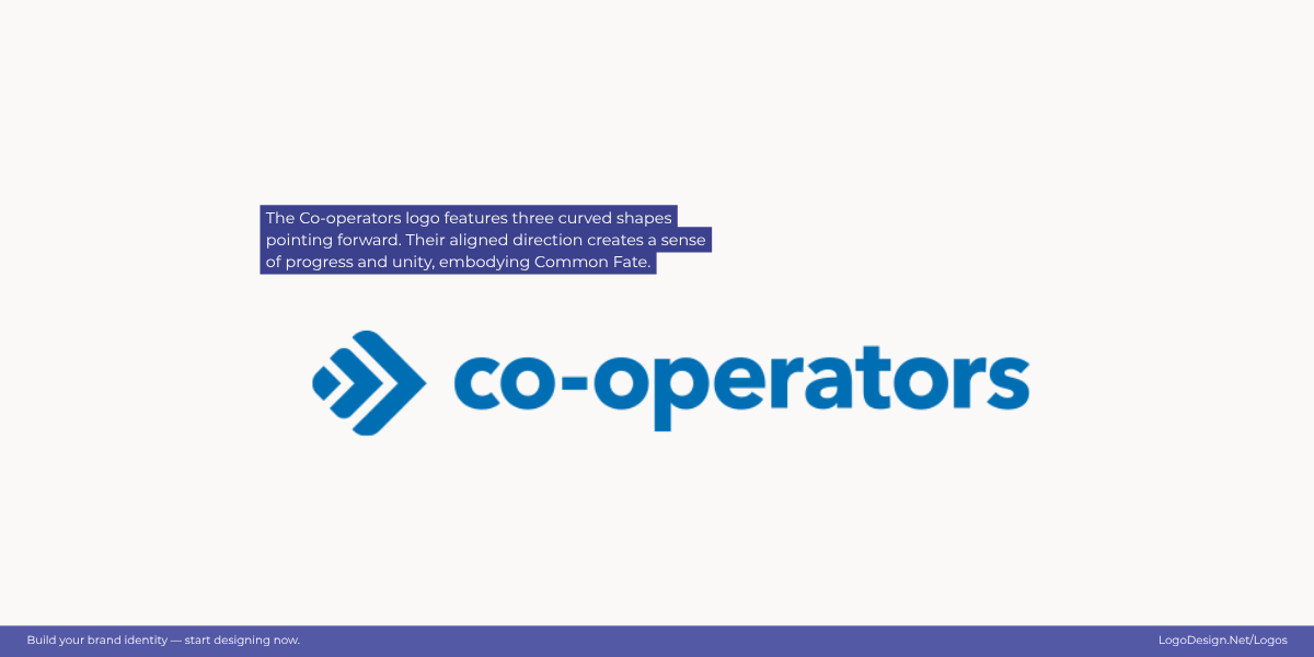
The Co-operators logo has three forward-moving shapes that hint at progress and unity.
The Co-operators logo builds on this idea with three curved shapes pointing forward. Their aligned direction and gradual progression create a clear sense of motion and unity. As the forms appear to move together, they symbolize collaboration, trust, and shared purpose—visualizing a collective journey toward growth and connection.
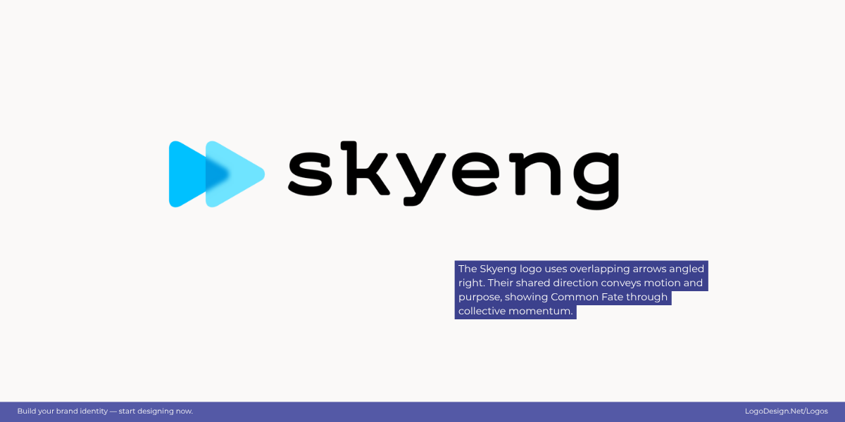
The overlapping forward arrows in the Skyeng logo show a fast-forward approach and progress.
The Skyeng logo continues this theme with its overlapping arrow-like shapes, all leaning to the right. The consistent direction suggests speed, progress, and purposeful movement. Just as the other examples, it embodies the Common Fate principle by transforming separate elements into one cohesive, forward-moving whole—reflecting momentum and continuous learning.
8. Focal Point – One element should dominate
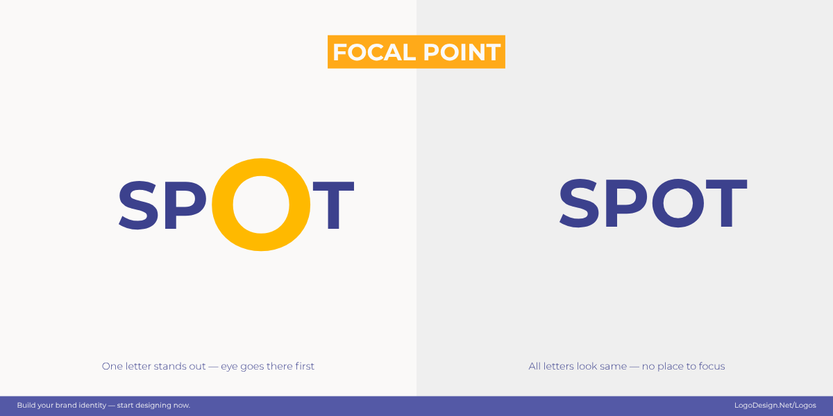
Using contrast, scale, and color draws the eye to a clear focal point, ensuring the attention goes to the important part of a design.
The focal point principle states that our eyes are naturally drawn to the area of greatest emphasis in a design. By using contrast, scale, placement, or color psychology smartly, designers can guide the viewer’s attention to the most important part of a logo first. A strong focal point makes a mark instantly readable, ensures the message isn’t lost, and helps the designs stand out in busy visual environments.
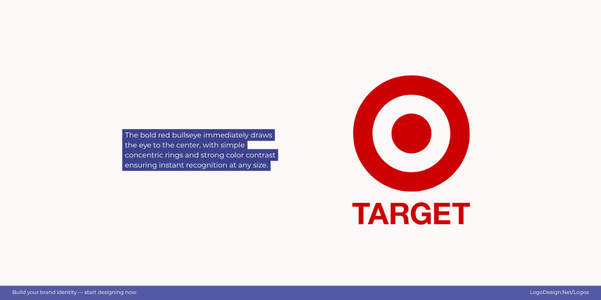
Target’s bold red bullseye logo instantly draws the eye to the center, showing the impact of having a visual focus.
Target’s logo is a textbook example of a focal point. With its concentric rings, the bold red bullseye pulls the eye immediately to the center. The simplicity of form and strong color contrast ensure instant recognition, regardless of the size.
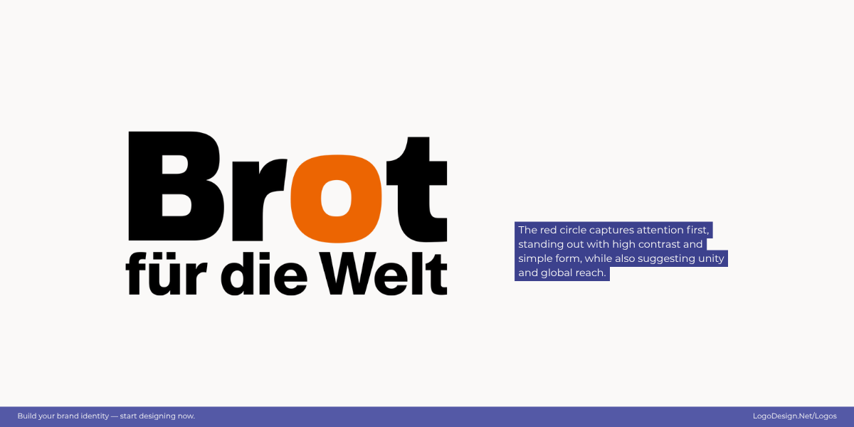
The bold circle in Brot für die Welt’s logo creates a powerful focal point, showing unity and global reach.
Brot für die Welt’s logo is a clear example of the focal point principle. The bold red circle immediately draws the eye, making the central design stand out. Its simplicity and high contrast ensure instant recognition, no matter the size. The circle also conveys a sense of unity and global reach, reinforcing the brand’s mission.
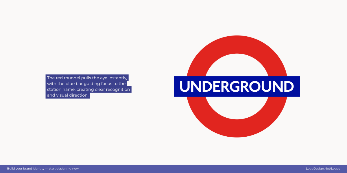
The London Underground logo has a bold red circle and blue bar that instantly catches the eye of the viewer and acts as a focal point.
The London Underground logo uses the bold red circle to draw the eye immediately, with the horizontal blue bar guiding attention to the station name. It’s one of those simple geometric form logos with strong color contrast ensure instant recognition, even at a distance or in small sizes. The iconic roundel also conveys clarity and direction, reinforcing the brand’s role in public transportation.
9. Connectedness – Elements linked are seen as a unit
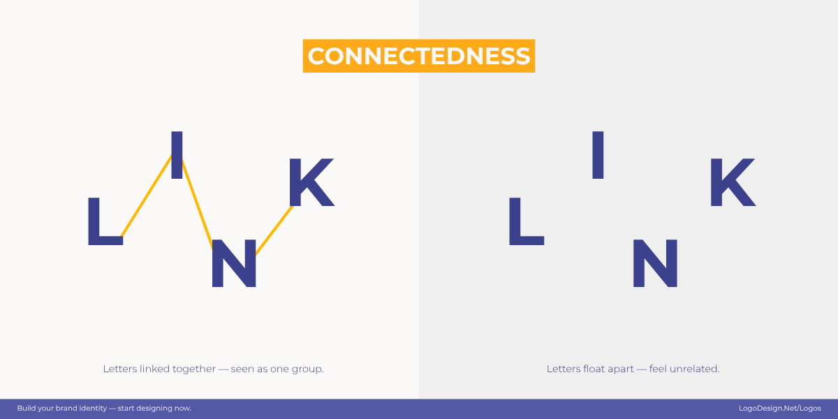
Connected elements in the design are seen as one, showing unity and integration through visual links.
Connectedness is the Gestalt principle that says elements physically linked — through lines, overlaps, or shared boundaries — are perceived as part of the same group. Even if they differ in color or form, our brains treat them as one once they’re joined. This is a smart way to show unity and integration in logos.
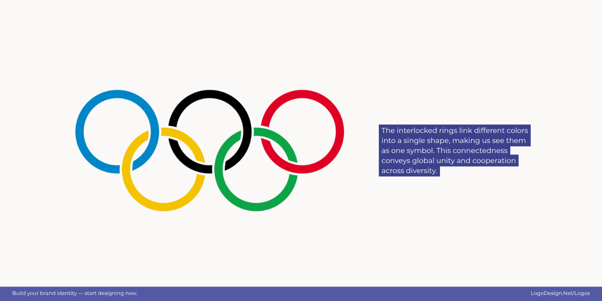
The interlocking rings in the Olympics logo are seen as one symbol that shows unity and diversity.
The Olympic rings are the classic example. Each ring has its own color, but because they’re interlocked, we perceive them as a single symbol. The connectedness communicates global unity and cooperation across diversity.
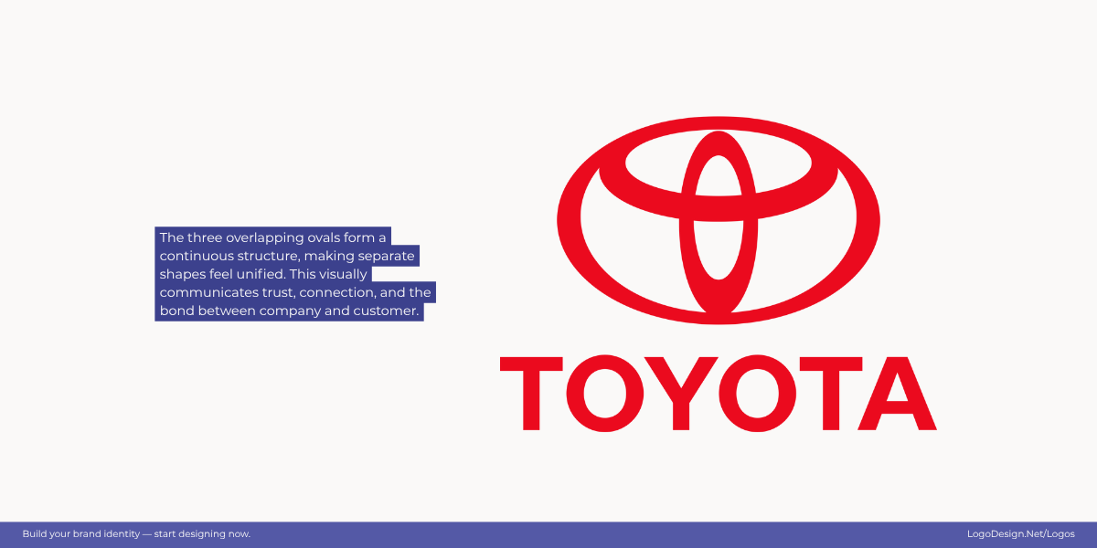
Three interlocking ovals in the Toyota logo, seen as one ‘T’ with the border around, show trust and unity.
The Toyota logo features three interconnected ovals. The overlapping shapes represent trust, connection, and the unification of customer and company. Even though the ovals are distinct, their linked structure makes them feel like one cohesive emblem.
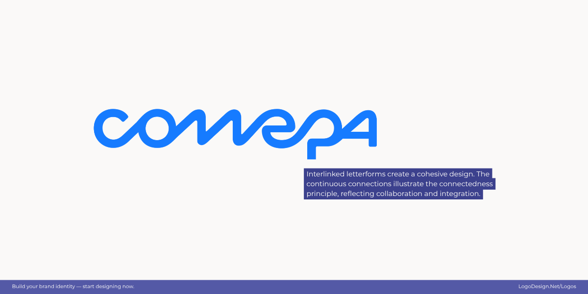
Interlinked letterforms in the COMEPA logo create a natural flow for the reader and hint at unity and collaboration.
The COMEPA logo uses interlinked letterforms to create a sense of unity. Though each element is distinct, their connected flow makes the design feel cohesive, reflecting the company’s commitment to collaboration, precision, and integrated technology. The continuous links visually demonstrate the connectedness principle, showing separate parts as a unified whole.
10. Parallelism – Parallel shapes feel related
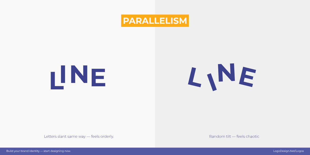
Parallel lines create a sense of unity and structure, while also showing movement, guiding the eye to focus on the relevant parts.
Parallelism is the perception of elements running in the same direction as related. When lines, shapes, or strokes are aligned in parallel, our brains instantly connect them as part of a single system. In logo design, parallelism is often used to suggest structure, consistency, and stability — or, when angled, to add a sense of energy and movement.
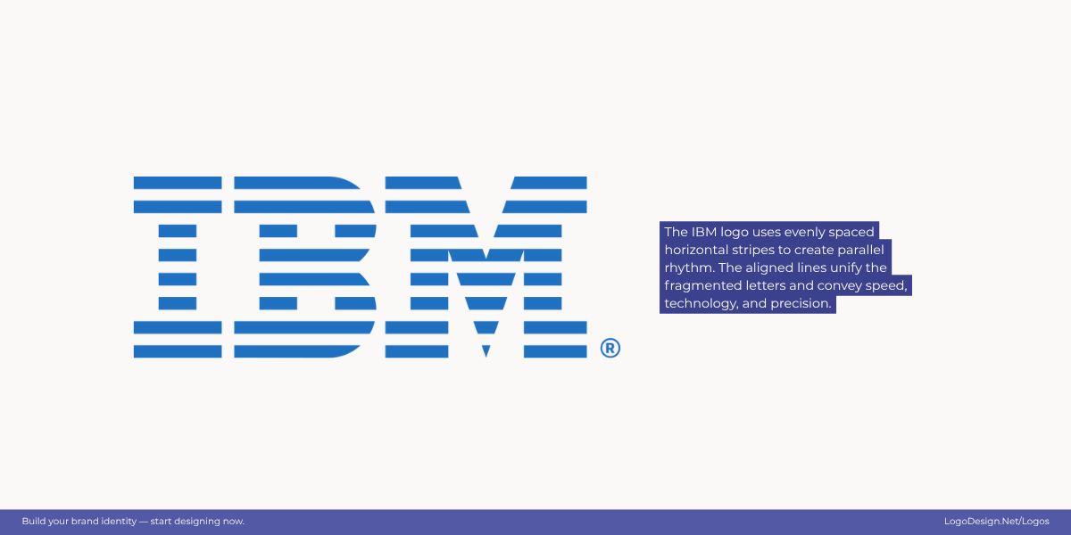
The IBM logo uses parallel horizontal stripes to signal speed and motion.
The IBM logo is a classic showcase of parallelism. Its bold letters are broken into evenly spaced horizontal stripes, all running in the same direction. This repetition and alignment make the fragmented letters feel unified while also suggesting speed and modernity.
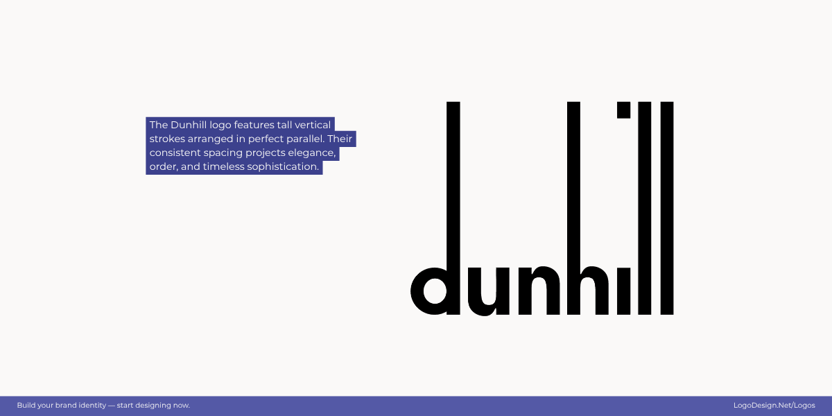
Parallel vertical lines create a rhythm in the Dunhill logo, matching the brand’s precision and sophistication.
The Dunhill logo exemplifies parallelism through its tall, evenly spaced vertical letterforms. The consistent alignment of these strokes creates a clean, architectural rhythm, giving the logo a refined and orderly look that mirrors the brand’s sophistication and precision.
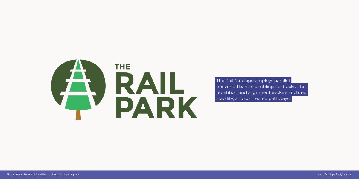
The Rail Park logo has parallel lines that illustrate rail tracks, showing structure and connected pathways.
The Rail Park logo uses parallel horizontal lines that resemble rail tracks, conveying structure and stability. The repetition of evenly spaced bars creates a sense of rhythm and connection, visually reinforcing the idea of pathways and movement within the park’s identity.
Seeing Logos the Way Our Brains Do!
Gestalt principles remind us that great logos aren’t all about shapes or colors. While fonts, colors, and shape psychology do play a part, what matters is how the human brain interprets them. These psychological shortcuts make logos feel natural and memorable. That’s why brands that use Gestalt thinking often end up with identities that stand the test of time.
For designers, the takeaway is simple: don’t just design for grids or software. Design for perception. When you understand how people instinctively process visuals, you can craft logos that stick in memory long after the first glance.
Play around with shapes and create a logo—it’s simple and fun with our free logo maker.
