Golden Hour Lens’s rebrand hit as hard as its best shot—bold, heartfelt, and all DIY, thanks to the magic of LogoDesign.Net’s branding tools. See the story behind the lens!
Weddings are all about the details, aren’t they? Not just for the couple, but for everyone involved, from wedding planners to vendors and photographers. For photographers, every small touch counts, right down to the font of their invoice.
Golden Hour Lens, a wedding photography business that had outgrown its DIY beginnings, learned this the hard way. Their photos? Beautiful. Their branding? Let’s just say… it was giving “college project.” Their logo looked like a placeholder. Contracts were sent as plain PDFs. And thank-you cards? Still sitting in the “someday” pile.
That’s when they hit pause and realized it’s high time they rework their visual identity from the ground up. So, using LogoDesign.Net’s creative tools, they created a logo, letterhead, and custom postcards that brought their business visuals up to the level of their storytelling, and finally looked like the pro behind the lens. Curious to dig into how they did it? Let’s learn!
About Golden Hour Lens
Golden Hour Lens started the way many creative businesses do—quietly, with one camera, a couple of referrals, and a love for capturing moments. Based in Savannah, Georgia, the brand was built by photographer Liam R. Dawson, whose calm, unobtrusive style quickly made him a favorite among couples looking for authenticity over staged perfection.
What began as weekend shoots for friends has grown into a small, tight-knit operation that books months in advance. Whether it’s a mountaintop elopement or a backyard ceremony, Liam and his team focus on telling real love stories—with soft light, subtle editing, and an eye for emotion. Over the years, Golden Hour Lens has become known for pixel-perfect shots and for making people feel completely at ease in front of the camera.
Company Snapshot
- Company name: Golden Hour Lens
- Company CEO: Liam R. Dawson
- Services offered: Wedding photography, engagement sessions, elopement packages, heirloom albums
- Industry: Photography
- Location: Savannah, Georgia
- Company size: 1–5 employees
The Business Challenge
As Golden Hour Lens picked up momentum, so did the expectations from clients, venues, and even other photographers. The quality of the work spoke for itself, but the branding was not up to the mark. The business logo was dated and inconsistent across platforms. Contracts were sent the boring way, and invoices lacked a professional touch.
While Liam was capturing picture-perfect moments for clients, his business identity was in the past. It started to show. Couples loved the photos, but first impressions—emails, quotes, and even his website—felt like a mismatch.
“Your work’s beautiful, but your brand doesn’t reflect it,” one client candidly told him. That comment stuck.
Soon after, a fellow photographer suggested giving his business identity a serious upgrade and recommended LogoDesign.Net as an easy, affordable place to start. The idea wasn’t just to look good but to finally compete visually with the bigger names in the photography world. Liam took the advice and decided to give Golden Hour Lens the brand presence it deserved.
The Design Process: From DIY to Distinctive
Rebranding wasn’t about going “fancy.” It was about being intentional. Liam wanted Golden Hour Lens to feel like his photos: personal, warm, and thoughtful. That’s where LogoDesign.Net’s branding tools came in. With a custom logo, letterhead, and postcards all created under one roof, it became less about “designing stuff” and more about building a consistent presence his clients could trust.
Creating the Logo: Simple, Strong, and Built to Last
Liam knew exactly what he didn’t want: a trendy logo that would look dated in two years. He needed something timeless, versatile enough to look sharp on his website, social posts, printed albums, and maybe even camera gear. A mark people would begin to associate with his name at a glance.
Since he wanted to keep it hands-on, he first looked up the golden rules of creating a professional logo, just to cover his bases. Then he jumped into LogoDesign.Net’s logo maker, typed in his business name, chose his industry, and instantly got a stream of beautiful, photography logo options to explore.
Color-wise, Liam spent a good amount of time experimenting. Should he go bold? Warm? Soft? After reading about color psychology in logo design, he landed on black and white—a classic choice with powerful advantages. It’s timeless, adaptable, works well across all mediums, and gives photos (not branding) the spotlight.
At first, he leaned toward camera logos as well and couple-themed logo designs. He liked a few, which he edited using the logo editor. The idea was to see how those logos would look in black and white.
A logo concept for Golden Hour Lens with color variations showing a wedding couple heart lens.
A logo concept for Golden Hour Lens with color variations showing a couple inside a camera lens.
A logo concept for Golden Hour Lens with color variations showing a bride and groom inside a lens.
A logo concept for Golden Hour Lens with color variations showing a camera with ornaments.
They were beautiful and on-brand for weddings, but a little too expected. And more importantly, they didn’t align with his long-term vision. Liam was already eyeing future work in commercial and editorial photography, so tying his identity too closely to weddings felt limiting.
He took a step back and refocused.
That’s when these two stood out:
A logo for Golden Hour Lens with a pixel camera lens.
Another logo for Golden Hour Lens with an abstract shutter icon.
Modern, clean, and not married to any one niche. He chose the first one, liking its blend of abstract geometry and camera symbolism (subtle, but clear).
Again, using the built-in editor, he fine-tuned the logo, adjusted color, tested fonts, and nudged details until everything clicked into place. Then, he downloaded the logo in all file formats.
Here’s the final result. We love it and are sure you’d too.
The final Golden Hour Lens logo with a pixel camera lens in black and white.
Building a Letterhead: Adding Structure without Losing Style
Next, Liam turned his focus to formal communication. For years, he had been sending contracts and proposals in plain text—functional but forgettable. Now that his logo was in place, he wanted his documents to match the same level of care. So, he opened up LogoDesign.Net’s letterhead maker to design a branded letterhead that felt professional, clean, and distinctly Golden Hour Lens.
But why did he need a letterhead? Because first impressions don’t stop at your website.
A branded letterhead gave Liam a polished way to:
- Send formal letters to venues, collaborators, or vendors
- Share invoices and proposals with clients that feel more official
- Manage internal and external communication (especially helpful when working with second shooters or editors)
- Attach his name to legal documents like contracts and agreements
Using the letterhead maker, he selected a minimal template and decided to make it his own from scratch. He uploaded his new black-and-white logo. Then, typed in his contact details and experimented with the layout—first, he tried the text on the left side, then switched to a right-aligned version to see which felt more balanced.
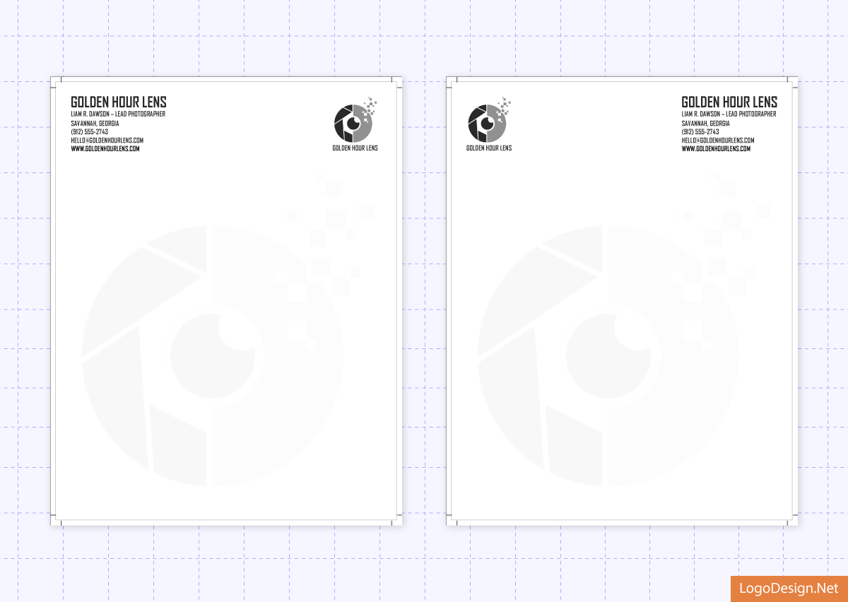
Golden Hour Lens letterhead by LogoDesign.Net with logo and info on left and right sides.
He settled on a clean, right-aligned format that let the logo shine without crowding the page. To test it out, he plugged the design into a real client proposal, and guess what? It worked beautifully.
See it yourself:
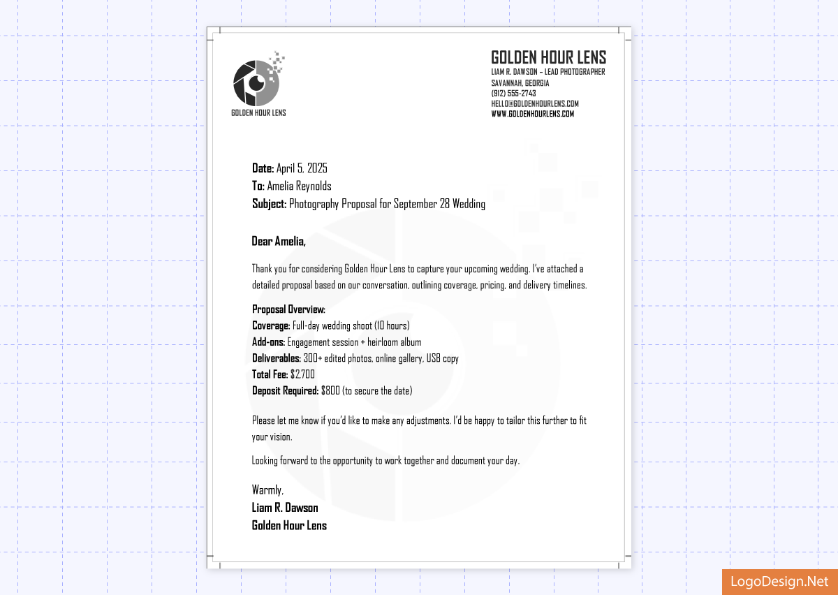
Golden Hour Lens’ final letterhead proposal for a client by LogoDesign.Net.
Designing a Postcard: Turning Gratitude into a Brand Touchpoint
With his logo and letterhead in place, Liam moved on to something a bit more personal: postcards. He wanted to design a piece of communication that felt thoughtful, simple, and genuinely “him.”
In the photography business, the experience doesn’t end when the photos are delivered. A well-designed thank-you card is a small gesture that leaves a lasting impression, and Liam wanted that moment to feel just as intentional as everything else he does.
Here’s what a postcard could do for his business:
- Act as personalized thank-you cards after weddings
- Give couples something physical to remember the experience by
- Reinforce branding in a warm, non-salesy way
- Encourage referrals by leaving a strong, final impression
For postcards, Liam had a clear idea in mind; he wanted to bring to life the Pinterest-worthy inspiration he’d saved over the years. The goal was a clean, modern design that featured his black-and-white logo paired with a highlight photo from each couple’s wedding. There were no mass-produced templates or one-size-fits-all thank-yous. He wanted every client to receive something unique and personal that lands in their mailbox days after their big day.
So, he headed to the postcard maker and started exploring.
Two minimal templates immediately stood out:
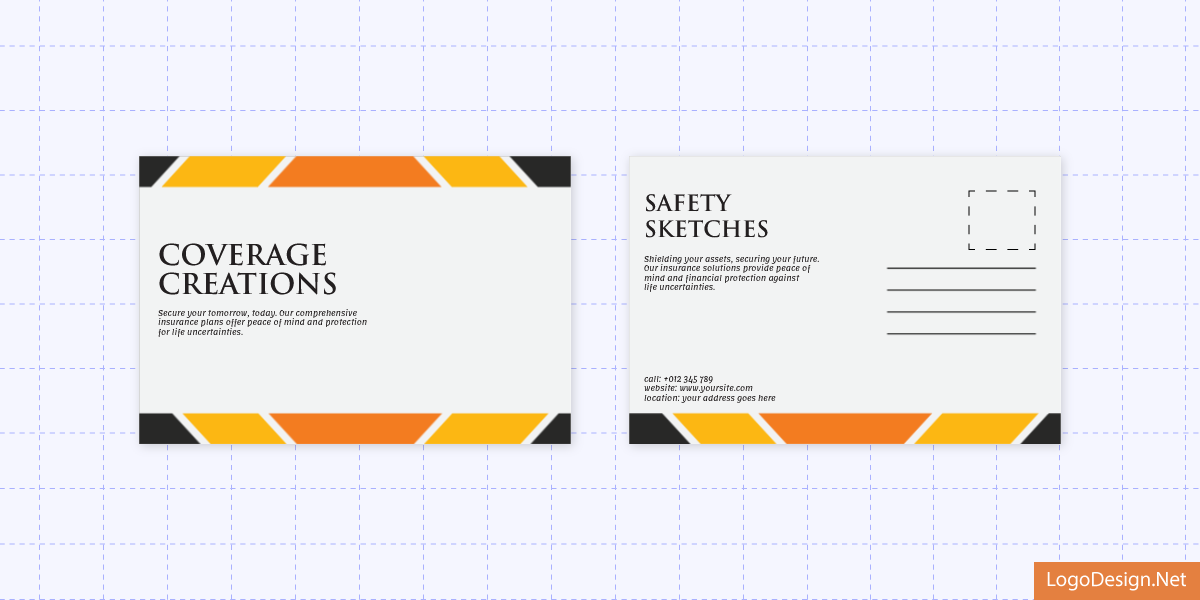
Postcard with sleek layout and space for an image by LogoDesign.Net.
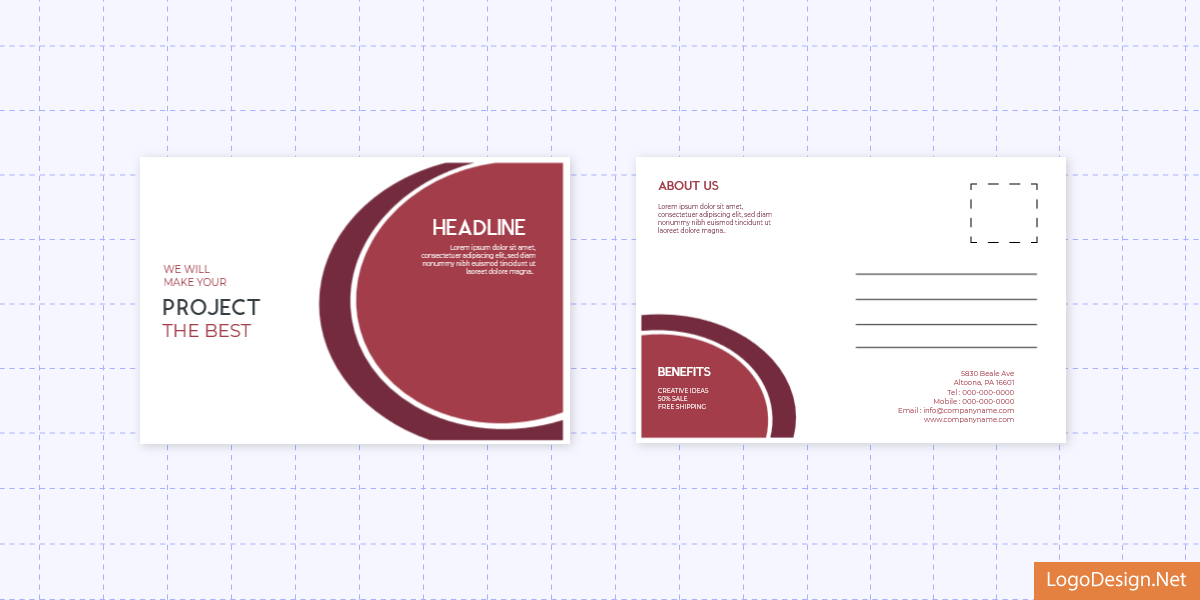
Postcard with balanced design and modern text placement by LogoDesign.Net.
The first one was a sleek layout with space for a full-sized image. The second one was a balanced design with modern text placement.
Using the simple drag-and-drop editor, Liam customized the first one. He swapped in the couple’s favorite photo, added his logo, adjusted the color profile for postcard design, and personalized the message on the back. The tool gave him total control over the look and feel.
So, he ended up designing a series of postcards for the clients he had recently worked with—each one a small but meaningful memento they weren’t expecting. Have a look at some of the custom postcards he designed and got printed.
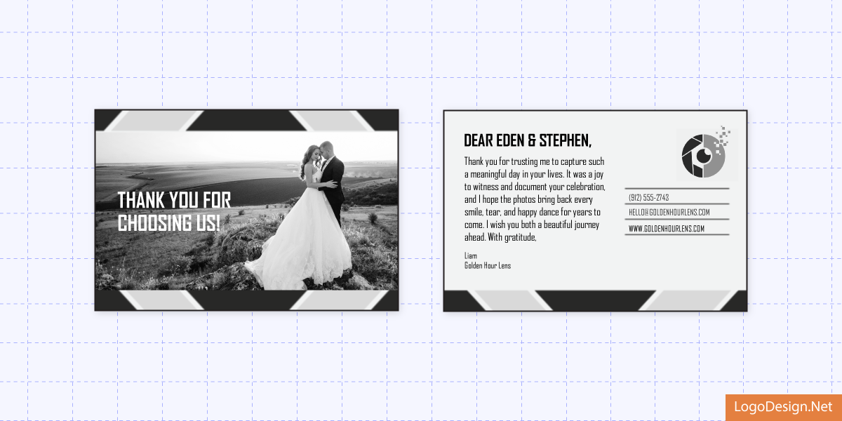
Front and back of a postcard with a custom message created for Golden Hour Lens’ client.
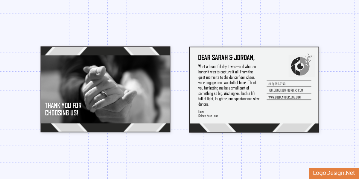
Postcard with an image and message created for Golden Hour Lens’ client.
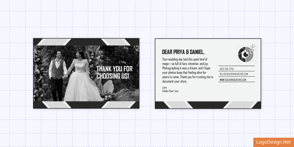
Front and back of a personalized postcard created for Golden Hour Lens’ client.
The Results
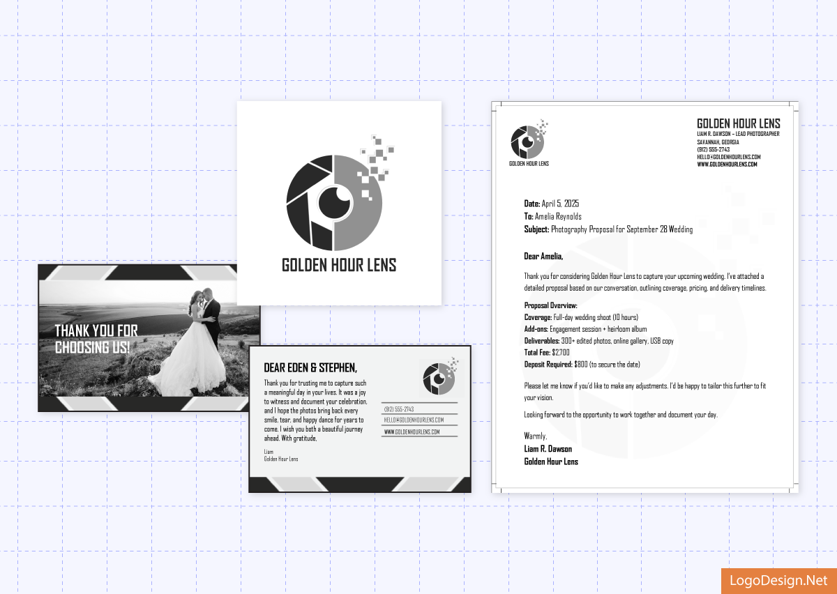
Golden Hour Lens’ final logo, letterhead, and custom postcard.
What started as a small rebrand for Golden Hour Lens turned into a complete refresh, one that now matches the tone, style, and sentiment of the photos he delivers. Every piece of visual, from logo to letterheads, now speaks the same language as Liam’s lens. And the postcards? They made the biggest difference. Now, every couple gets a custom-designed thank you card with one of their own photos on it. They have quickly become clients’ favorites, often framed or shared online. In the end, it’s fair to say that their brand experience is as thoughtful and memorable as the weddings they capture.
Ready to Capture Your Brand’s Best Look?
Golden Hour Lens did it, and so can you. If your brand feels a little out of focus, it might be time for a refresh. LogoDesign.Net’s DIY branding tools can help you liven up your brand without the hassle of hiring a designer or spending a massive budget.
Start today!
