SALES / SUPPORT : 844-232-4816
15 Golden Rules to Create a Professional Business Logo Design
For non-designers in the wild, logo design may seem like an exclusively creative process. You are going to brainstorm a bit, create a mood board, mix some colors, and draw a few sketches before you start designing.
In reality, though, the massive amount of logic and technicality that goes with this process is going to chaperon every creative thought you entertain.
“Will it work in scale?”
“Is the type weight right?”
“Is the color composition correct?”
“How many different versions do we need?”
That's because a business logo design – while a work of art – has a specific function to perform: to identify and differentiate a business entity. And here are the fundamentals that guide this process.
1. Always Do Your Research
The groundwork on a logo design project starts with research. You will research the company you are designing for, the audience it caters to, the market it belongs to, and the competition as well.
It’s important for five main reasons:
- Industry research teaches you to design according to industry standards and expectations. The global toy market requires very different identities than the global hospitality market, for example. If you have done your research, your design will show that distinction.
- With industry research, the amount of knowledge you accumulate allows you to create a confident design solution that will work in the real world.
- Knowing about the company’s long-term goals and ambitions will help you create a timeless logo that can continue working even after 5-10 years.
- It prevents you from accidentally copying a competitors’ mark. Saves you embarrassment as well as future litigation.
- Researching the competition helps you see where all the noise is, and to come up with a design that can break through it. Ideally, it should equip you to create a design that’s relevant to your industry but still looks nothing like 15 other logos working in the market.
Studies have indicated that certain styles of logo design are more suited to certain industries than others. For example, descriptive logos are considered more trustworthy and generally good for most brands than non-descriptive logos. If you are choosing not to do your research, it is details like these that you are opting out of. It not only devalues your work as a designer but may stand to hurt the brand you are representing, too.
2. Build a Meaningful Logo Design
A good logo design is a visual shorthand. It is not a random, pretty mark of drivel – it means something significant.
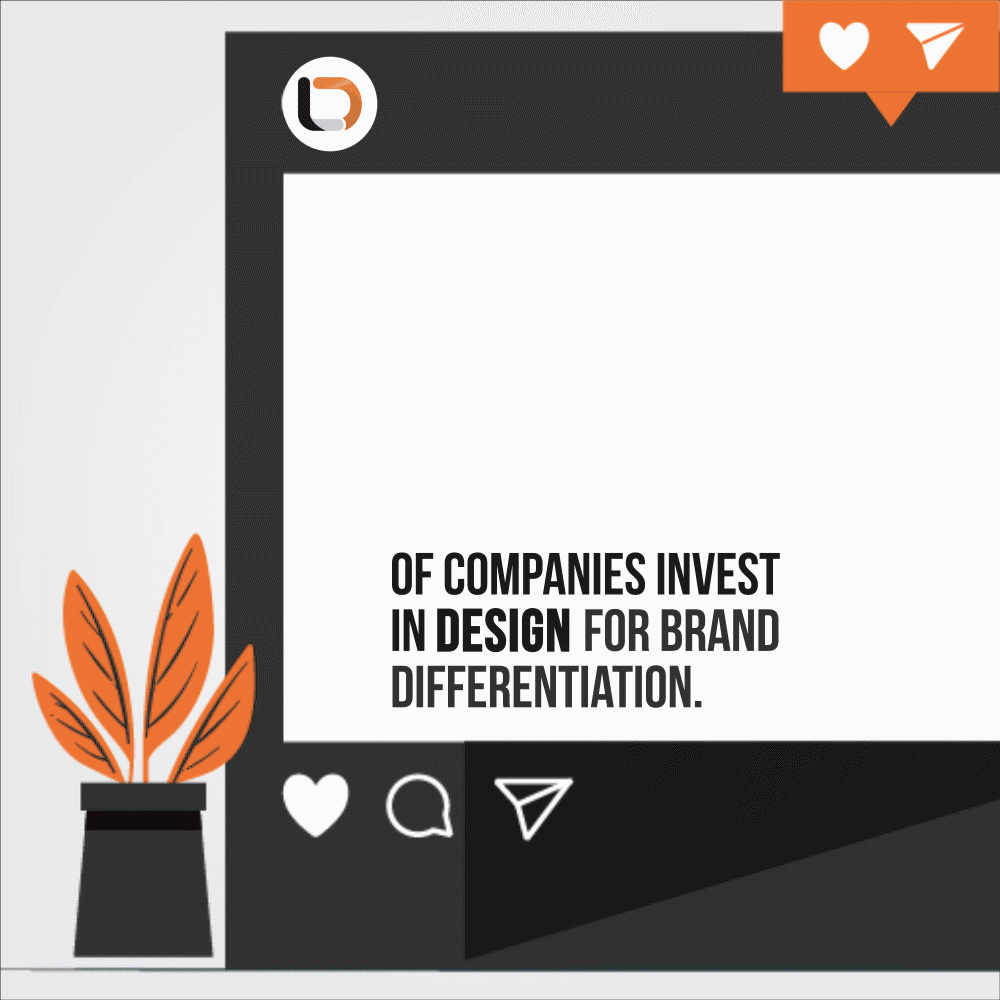
This something significant is your brand’s core values and ethos. To successfully communicate these values, you need a brand identity that is original and can separate you from the rest. This differentiation is the #1 goal of 73% of businesses that invest in brand design. Overstating its importance is not possible.
Tinder logo depicting gradient-colored flame
Take Tinder’s flame logo as an example. It’s a tongue-in-cheek, fun, and flirty logo. It conveys what the brand stands for. An instant connection, hope, and desire. In an ocean of heart-shaped dating logos, this unique and meaningful take on the logo instantly gives it its own place in branding.
An important point to remember: while these descriptive icons do carry meaning, avoid making your logo too obvious. Instead of focusing on your product, think about the emotion you want from your audience as they consume your product. Try to get that emotion on your visuals for the most meaningful impact.
3. Design in Mono Color or in Black and White
This section is an inventory of the essential elements that your branding guide should cover. And when we say
One of the most elemental rules of graphic design is that it should work in monochrome. Experienced designers always create their work in black and white, and only add color at later stages.
It’s important because:
- People have subjective associations with colors. If presented in color, your concept may get rejected (or accepted) regardless of how sound (or weak) the design is. In black and white, the logo stands a chance to be judged fairly.
- The logo should work on its own, without the help of color. If color is critical for the logo to work, the logo doesn’t work. Restart from the top.
- A logo needs to be on several marketing essentials – business card designs, Presentation templates, office stationery, storefront, and more. With a black and white version, it will become clear to you whether the logo works in all these different situations.
Using a monochrome version also benefits the designer in the sense that it lets you focus on the structure of the logo and doesn’t distract you with thousands of color choices. Once you have the skeleton, you are free to explore color themes for your logo.
4. Create Size and Style Variations of Your Business Logo
A modern business logo design has to present the brand on multiple platforms. From a storefront sign to the side of a ballpoint pen, it needs to present the brand consistently and legibly. A single logo of the standard size doesn’t work here.
An important rule for the modern logo design process, therefore, is logo variations. It means creating different versions of the primary logo using different bits and pieces of it, following a consistent theme. Some common variations include:
- A digital version
- A print version
- A wordmark
- Icon-only, and
- Lettermark
Depending on the scope of the logo, the number of variations can be adjusted but it’s important to try each variation for the purpose it is intended. For example, if you have created a favicon, apply it on the site to ensure it works perfectly.
Handing all these variations can be overwhelming. To ensure all the teams are on one page and the brand is always presented in a cohesive and consistent manner, brand guidelines serve as a godsend. These documents illustrate the different ways your brand identity materials can and cannot be used and ensure the brand puts its best face forward no matter where it goes.
5. Make the Logo Design Scalable
Tied to the point above, this rule addresses two important factors:
- Creating the logo design in vector so modifying the size doesn’t affect the image quality
- Creating a logo design that renders itself appealing as it moves from one extreme of the size to another
While logo variations allow you to present the brand consistently with no size restrictions, scalability is more concerned with the primary version. For example, a logo is scalable if it doesn’t have micro details that tend to lose themselves when the logo is shrunk to fit an app icon. Similarly, a scalable logo holds its form when advertised on a billboard with none of its areas appearing skewed or too large.
Coming to the vector part, it’s a cardinal rule of logo design not to create any identity work in raster graphics. A raster image is created with pixels. On sizes too large or too small, the image loses its integrity. Vector graphics, on the other hand, hold true to their original shape and are perfect for logo design files.
6. Ensure the Logo is Legible
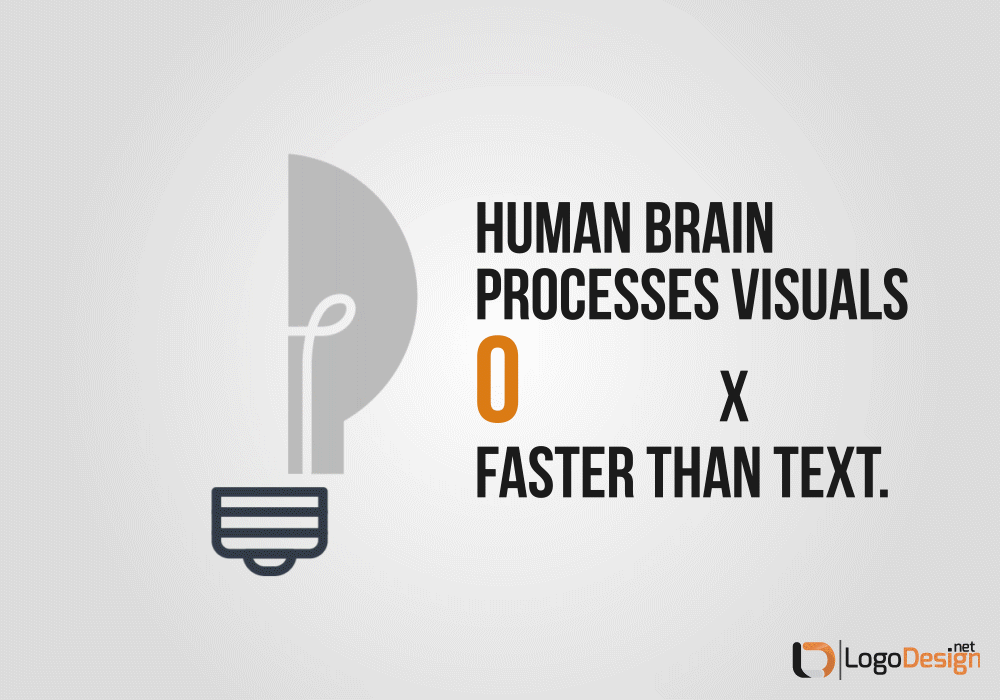
Recent neurological research tells us that the human brain processes visual data much faster than text – 60,000x faster, to be exact.
At this speed, when your eyes are scanning along a page and visuals are constantly moving on your social media feed, a business logo design only has a fraction of an instant to make an impact. Not only make an impact but for that impact to be meaningful. This directly refers to logo designs being legible even at a glance.
A lot goes into creating legible brand identity projects – physical characteristics of your chosen font(s) are one such important factor. These characteristics include the type case, weight, width, and style (among other considerations). When all of this comes together and is presented in a background that makes the design understandable, we create logos that can be consumed, comprehended, and memorized for ages.
7. Add Contrast to the Logo
Contrast is a design principle that deals with highlighting the hero elements of the logo. Along with this primary purpose, contrast also helps with design legibility as well as visual hierarchy. In terms of highlighting the main part of the logo, though, contrast plays a key role.
Think of the YouTube icon. It’s a rounded rectangle housing a tiny side-laying triangle. The icon uses three types of contrasts: color (red and white), shape (rectangle and triangle), and size (large rectangle, small triangle).
Using three forms of contrast in a single icon is ambitious but if there is meaning that guides your choices, the results are cohesion and an on-brand image.
Contrast is also achieved through font, orientation, and texture. Too much of it can seem chaotic, though. Stick with 2-3 forms in a single composition so your hero element can shine. Remember, you need enough similarity in the image so that when you add a contrasting element, it can make its presence known without any struggle.
8. Organize Via Visual Hierarchy
Visual hierarchy deals with arranging the visual elements of the logo in the order you want users to view them. As people spend nearly 7 seconds viewing the brand logo when on a new site, visual hierarchy allows viewers to figure out which part of the logo is most important.
Utilizing visual hierarchy on logo design is important because we always want at least one thing in there to be more prominent than others. The icon should be more visible than the wordmark, or the tagline should only be considered after consuming the rest of the design.
Contrast is usually employed to add hierarchy in design but not always. For example, if we remove the color contrast from the FedEx logo, we will still be able to identify it, right? But when we talk about hierarchy, we are always talking about more than one element. That’s why contrast and visual organization go hand in hand – some elements are always going to be more important than others and we need contrast to mark that distinction.
9. It Should Be Simple, Not Basic
Straightforward, minimalist logos are the staple of modern graphic design. Brands, far and wide, try to make their logos look as utilitarian as possible. Shedding unnecessary bows and frills, logo designs are reduced to their bare essentials.
The result: hoards of dull and plain images masquerading as minimal design logos.
Do not fall into this trap.
Your aim is to avoid complex graphics, not rid the design of meaning. Think of the newest Pfizer logo. Earlier, it used to be basic pill – not anymore. After successfully developing the world’s first Covid-19 vaccine, the company reimagined itself from a drug manufacturer company to a leading scientific organization aimed at improving lives. The new logo of a DNA emblem represents this core change succinctly.
In contrast, we have CIA’s logo redesign that is criminally basic. It is so bad that it’s painful to believe that it’s not a joke design but a real, approved graphic depiction of ‘the Nation’s first line of defense’. Compared to the institutional seal featuring an eagle and the agency’s name in commanding type, this new version uses weird shine, bizarre line art in the background, and ridiculous plopping of the acronym in the center.
We urge you to use this example as a lesson to handle simplicity with care – it’s so easy to overdo it.
10. The Logo Must Relate to the Business
The industry you are designing for matters in logo design. People have certain design expectations for certain industries, and these expectations change as we go from one industry to the next. Audiences for the education sector prefer school or college logos that feature icons. For financial services, people expect outline logos with green in the design. For legal logos, the best color-fits are grey and blue, while technology consumers trust logos that are text-dominant.
These findings were concluded in a Survey Monkey study that was conducted to see which kinds of logos inspire trust.
Following the study results, as well as fundamental logo design rules, keep your market in mind as you create brand identity works. Certain visuals are naturally associated with certain emotions. A circle logo will always make us feel whole and complete, while a logo featuring a triangle makes us think of paths, directions, and forward motion.
As long as you make the logo look relevant to your industry, not only can you create designs that people trust, but you also make the logo more easily understandable. Simple, easy-to-grasp visuals remain in the brain for longer, sometimes even for days, and are great for ready recall.
11. No Micro Details in a Professional Logo
For a modern logo design to work, every detail that you include must be significant to the logo. If it isn’t, it’s dead weight and needs to go. Do not overburden your logo by applying special effects and cool computer graphics that do nothing to further your message.
Additionally, small, micro details aren’t good for logo scalability either. In smaller scales, while the main icon may remain visible and meaningful, tiny details will lose their point of being. Also, in most cases, such micro details are an attempt to ‘fill up’ the logo when the designer knows they haven’t been able to create something meaningful.
So, avoid the fillers and use the time to research the industry, business, and client. There you will find plenty of things to add and create a logo that doesn’t need fillers to look meaty.
12. Use the Right Colors
Some colors are more suited to your industry and brand than others. Human beings, transcending culture and personal bias, associate green with nature and blue with the vastness of the sky. Therefore, we see so many health brands promoted in green while blue is used for brands that want to convey durability and trust.
Yet these universal meanings are not absolute. We also associate green with envy and blue with poison. Color psychology – the study of how color affects our emotions and behavior – is a complicated and delicate study. Therefore, logo design considers a variety of factors before the color palette is finalized. Some of these factors include:
- Marketing objectives
- Cultural values
- Desired customer relationship levels, and
- Intended message for the corporate communication
The color palette you choose for your brand needs to fulfill all these goals. Ideally, the palette should be concise – no need to overwhelm the senses with an onslaught of colors. An average of 5 colors in the palette is the norm.
However, as modern brands usually have broad scopes, we often see color palettes with even 10 or more different shades. Again, like with everything else, let your brand needs guide your decision. If you don’t need 7 shades communicating on your behalf, stick with three. Three is fine.
13. Use Well-Matched Fonts
As a newbie logo designer, the first rule of font selection is to use one that doesn’t compete for attention. Typography research even argues that the most successful fonts, the ones “that don’t hinder your perusal of the text on the structure of the type – are essentially invisible”.
In other words, if your font is too decorative or too attention-grabbing, it might distract the audience from fully understanding and engaging with the logo. Unless you are creating a wordmark where your font is your protagonist, in all the other styles of logo design, your font should only play the supportive role.
Fonts are also tools to add contrast. Experimenting with their weight, positioning, scale, and color, you can organize visual information within the graphic. But avoid making fonts too small or you may mess up the scalability of the logo. This issue is more common among the Script fonts and that’s why designers usually avoid using decorative letterings in logo images.
Pay close attention to logo font pairing, too. Whether you are going for a matching look or a bit of contrast, the end result must spell harmony and cohesion. Let nothing distract the effectiveness of the brand message you are trying to send through the design.
14. Create a Responsive Logo Design
Always create a responsive logo – always. There’s nothing more off-putting for a brand to see its logo shrunk to nothingness as viewers go from viewing it on full-screen to an icon tray. Not only the icon loses all its meaning, it practically becomes impossible even to make out what it is.
And that’s lazy logo designing that should be outlawed. Your clients deserve better.
Create agile and flexible logos that can respond to screen, size and orientation shifts. A logo that moves as the viewer moves. As our viewing devices change from morning to night, logos have no business remaining stationary.
Inject some life in your identity designs and give your clients logos that shift, move, and respond.
15. Make It Timeless
Time is an interesting concept when it comes to logo designs. On one hand, we have logo experts telling us that a business logo should have a shelf life of 5-10 years, yet, the Coca-Cola logo is virtually unchanged even after a century. And so is the I Love New York logo – truly a classic mark.
So what makes a timeless logo, and should a modern business have one?
It all depends on what your company goals are. Your logo is one of the most valuable business assets you have. It should not change just on a whim. Significant core change must accompany any visual redesign.
That said, if your original design is based on sound research and is formed on your long-term brand goals, it can remain unchanged for decades.
At any rate, no redesign should ever be attempted because of any latest graphic design trend. Trends, by their very nature, are temporary. When you design your logo based on a trend, you put an expiry date on its meaning and relevance. A few years later it may stop making any sense altogether.
So, make sure your design is rooted in meaning and brand needs, only then can you create a classic. Nike, Chanel, and Disney – all are thriving businesses, and all have unchanged logos going back decades. So, stick with what your brand needs, so you can design something that people will gush about even 40 years later.
16. And Once In A While, Break the Rules
What good are the rules if you can’t break them?
But first, you have to know them all.
So, practice, color within the lines, and follow everything we have outlined in this document.
Then, once you’ve been in the business for 20 years and learned the rules to master the structure, it’s time to break every single one of them – and create insane, wild, beautiful pieces of design that people fall madly in love with.
That’s the only way to go.