SALES / SUPPORT : 844-232-4816
A Brand Guide for Your Company Logo - Tips with Examples
Consistency is key in branding.
It is what allows you to spot your favorite brands from afar in a store where you’ve never been before.
When done right, consistency in logo design makes a brand more easily identifiable and memorable. Successful businesses are meticulous in their efforts to correctly replicate their logos from one version to the next, and from one medium to another.
But such meticulous replication and attention to detail only become possible due to a magical design document that we call a branding guide.
What is a branding guide? Our official explainer:
It is a document containing a set of rules that illustrate how different parts of your brand identity – logo design and others – are supposed to be presented and communicated to the public.
Depending on your brand requirements, a style guide (another name for a branding guide) can be as specific or as detailed as you want. For comparison, here is the Netflix brand guide containing only 2 sections with precise instructions on how to use/replicate their logo and brand colors. In contrast, the NASA brand guide is a comprehensive document going on for 60 pages.
Whether you are going for the short version or the more detailed guide, the purpose is singular: to keep your brand presentation consistent by ensuring all your design, marketing, and business teams are on the same page when it comes to executing your logo design philosophy.
Ingredients of a Brand Guide:
If you are a business that is creating its first brand guide, it is understandable not to know where to begin.
So here’s a cheat list to get it right.
No matter if your brand guide is long or short, these 3 ingredients are going to be a part of it. Together, they help keep the brand instructions exact, flawless, and comprehensive.
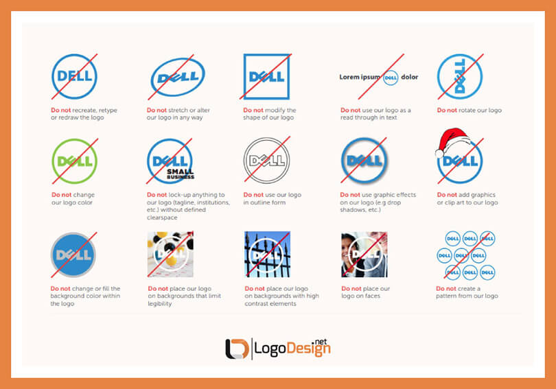
How not to use Dell logo – Dell brand identity standard and guide.
Some brands use a bulleted list for this section, others are more descriptive or graphical. But every style guide contains a dos and don’ts discussion. It’s the very foundation of a brand guide: telling everyone what they can or cannot do with a brand logo and any other brand assets.
Again, the wealth of the graphical references may vary but every brand has it. Graphical illustrations help clarify confusing points and bring everything out into the open.
The depth of details depends on you but if you want to instill consistency in your brand representation, being generous in your detailed instructions helps everyone.
What Should a Brand Guide Cover: The Essentials of a Brand Guide
This section is an inventory of the essential elements that your branding guide should cover. And when we say essential, we mean whatever’s relevant to your brand.
While we are going for a detailed explanation of a brand guide, we understand that some elements make more sense to one brand than another. Therefore, read on to get a clearer understanding of how each section represents a unique aspect of a brand (logo, color psychology, and voice, etc.) but feel free to pick and choose from this list based on your own goals of brand presentation.
1. Brand Story
Start your guide by explaining who you are. It allows other teams to get into your mindset and understand where you are coming from. In terms of brand comprehension and ownership, clearly outlining your purpose and vision helps everyone get on board and leaves no room for confusion.
The clearer you are, the more focused everything gets, starting from design and marketing, to growth and development.
The brand story section in the guide will usually contain these 5 discussion points.
- Mission: State your purpose. Describe why you are here and talk about the problem you are here to solve.
- Vision: How do you envision your future? What do you hope to accomplish for your business, stakeholders, and customers in the next few years? Be clear and concise in your goals.
- Buyer Persona(s): Who do you serve? What is your target market? Outlining your ideal customer persona will help your teams be clear on who they are selling to and how they should attract those customers.
- Core Values: What do you stand for? What do you believe in? You cannot be a soulless business entity; not in the present climate. Your values will help you forge genuine connections with your market and enable you to take stands that align with your brand’s soul and character.
- Brand Personality: Are you quirky and fun? Or more professional and straightforward? What kind of a sense of humor do you have? What is your general vibe? Outlining the core features of your personality helps everyone see you as more than just a business and understand you a bit better.
Example
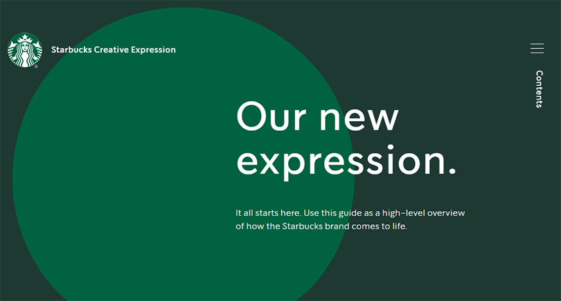
Starbucks brand guide on a dedicated microsite. The site opens to an interactive green circle representing the shape of the brand logo. As you hover over the circle, it fluidly moves its corners and follows the movement of the cursor.
Even if you are not familiar with the brand, such a specific detail tells you that it’s an engaging company with a fun and positive attitude and lots of brand expression to offer.
TIPS
- Design your brand guide in your brand colors.
- Use expressive vocabulary where you can’t show graphical examples.
- Add interactive elements to engage the audience.
2. Logo Design
No brand guide can exist without a logo design section. For some brands, such as Shopify branding style guide, focuses on logo design and makes up the entirety of the guide. There is no room for mistakes here. You need to focus on details when you are working on to perfect your logo design instructions.
List down the various versions of your logo, such as logo, wordmark, and symbol. Clarify the different rules for the use of each. Specify the dos and don’ts, and make sure you use ample graphical representation to illustrate your point.
While a brand logo can have many versions, most brands usually go with three main alterations:
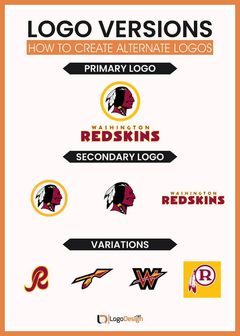
Washington Redskins logo – version and variations
- Primary Logo This is the main logo that you always display in full. It usually goes on websites, social media profiles, signage, flyers, office documents, and such. Specify its uses on various platforms. Illustrate correct and incorrect uses, both. Also, share the architecture of the logo to make replication even more precise. Include details about the negative space, margins, and cap height, etc., too.
- Secondary This is the version you use when the space is small for the primary logo. It usually contains only the wordmark from the logo or the brand name initials. Share how you envision its uses. If it’s a wordmark, state the typeface information including the name, font family, weight, size, kerning, and all relevant details.
- Variations In this part, you talk about other variations such as changes in layout, iconography, or color variations. Outline how and where each can be used. Specify the permissions as well as restrictions.
Example
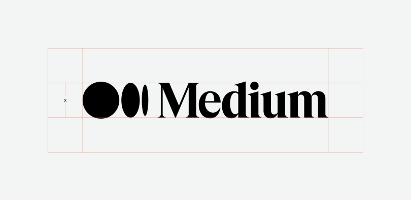
Medium presents its logo guidelines in the most meticulous manner. It covers everything from architecture, to don’ts, to negative space instructions.
TIPS
- Add information in relevant units, such as pixels.
- Show the logo in the grid so designers can understand its construction better.
- Be detailed in this section because your logo is your most valuable brand asset.
3. Color Palette
This area covers your color palette details. Why have you chosen those specific colors? How do they communicate to your market? What do they say? What are the combinations you approve of and those that you ban?
Sharing information along with the whys helps people take ownership of the brand and understand why they need to follow these rules. Since color emotions and branding go hand in hand, nailing down the right shade of colors every time your logo is replicated is essential.
The three main ways you can cover colors in your brand guide include:
- Core Color Palette As the name suggests, these are your main colors. For Coca-Cola, these would be red and white; for McDonald’s, yellow and red. Share color swatches along with textual information to illustrate your point. Outline if your colors follow a certain hierarchy.
- Secondary Colors Brands sometimes need diversity in meaning. Secondary colors help achieve that. Audi design guide uses a whole other color palette of gray tones for functional purposes.
Example
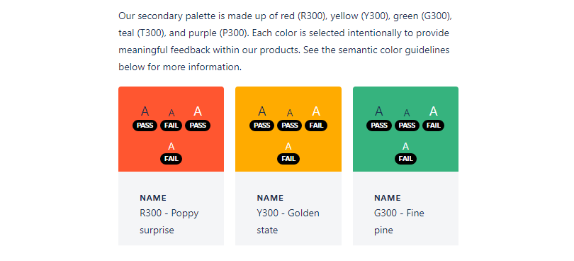
Trello brand guide digs into brand colors and outlines how we are supposed to use them Color codes are present to help us choose the right shade every time. Font colors are also presented on every swatch to aid accessibility.
TIPS
- Must use the four main color codes for each color in your palette: HEX codes, RGB codes, CMYK codes, and PMS codes.
- Always display relevant color swatches whenever talking about colors (with relevant codes).
- Mention the color hierarchy (or lack of it).
4. Imagery
Brand imagery is how you convey complex ideas more simply and meaningfully. The specific way you photograph your brand and use visuals to communicate your brand speaks volumes. Therefore, remaining on-brand in your photography and illustrations throughout your branding system is important.
Use this part to describe and display the distinct style of your imagery. Share best practices. State what is not allowed. And celebrate good examples.
Most brands use two forms of visual imagery for their brand:
- Photography This pertains to original photography for your brand. Be specific in your presentation and use technical terms to refer to your style. It will not only help the photographers working on your projects but will also allow everybody else to refer to what you are saying in no-confusing terms.
- Illustrations The same rules apply to illustrations, too. The style here could be different but instructions will remain similar. Like other parts of the guide, this will also contain a dos and don’ts section, detailed instructions to use the vector logo, and visual references.
Example
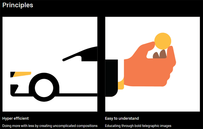
Uber style guide talks about the principles that guide its illustrations. The explanations are easy plus the visual examples help drive the point home.
TIPS
- Have specific guidelines about pictures, team photos, office imagery, screenshots, and illustrations, etc.
- Make sure to use proper terms for different visual/photographic styles for professional understanding.
- Talk about compositions, concepts, and other technical details.
5. Typography
Among design elements, typography plays a binding role in design. It combines symbology and color and strengthens their collective effect. Brands use this part of the guide to share which fonts they use, in what combinations, and if there are certain hierarchies to be followed.
Use this space to instruct on various font uses. Specify heading as well as body fonts. Share specimen and templates to illustrate the effect you are going for. Be precise in your instructions regarding technical details such as kerning, layout, typesetting, tracking, and font sizes, etc.
Example
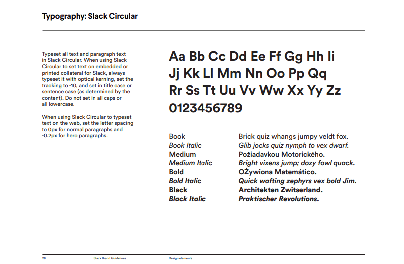
Slack brand guidelines gives detailed instructions on how to use its font when representing the brand to the public. The image contains examples of all font styles plus the whole type system laid out for all to see.
TIPS
- Always explain and show the font hierarchy in your typography system.
- Share typesetting examples from all major mediums including web, print, and app, etc.
- Show font combinations in action.
6. Voice
Everybody imagines how your brand sounds – even if they have never heard it speak. This is your chance to take control and establish your brand tone and voice. Are you funny? Authoritative? Expressive? Or casual?
Your brand voice must be aligned with your brand personality to communicate a consistent brand message. Use examples, adjectives, and word lists to illustrate your brand voice. Write down grammar, punctuation, and tone rules that go (or do not go) with your brand.
Example
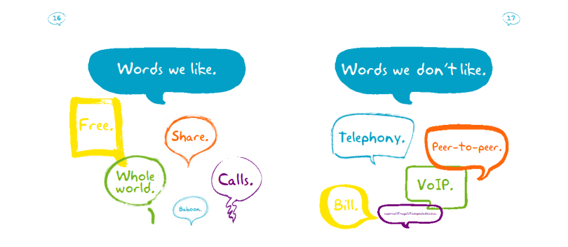
Skype uses colors words, shapes, and graphics to illustrate the tone of the brand. Anyone looking at these images cannot miss the fun and friendly brand voice that Skype is trying to establish.
TIPS
- Find your original brand voice instead of following the latest trends.
- Your brand voice must align with your industry. A pharmaceutical brand voice will be quite different from the voice of a local restaurant branding.
- Use word lists in your guide to showcase who you are as a brand and who you are not.
The Takeaway
Creating a brand guide is daunting. You are basically telling the whole world how to feel and relate to your brand. That’s why understanding it fully eases the pressure. Use this thorough understanding of your brand along with an authoritative voice to build a style guide that creates a consistent brand.