SALES / SUPPORT : 844-232-4816
How to Design a Logo from Sketch to Vector
A logo vector is a unique file format that allows for graphic files to be scaled and edited without losing their original quality. Since a logo design needs to go on many places, the vector format serves as the perfect carrier of logo designs. In this tutorial, you will find out the detailed way of how to bring a logo sketch to the vector resolution. At the end of the tutorial, you will find some additional information to enhance your understanding of vector art.
But before we do, here’s today’s tutorial video by ace logo designer, Will Paterson. You can peruse our logo design tutorials section to find more of Will’s work.
Step by Step Tutorial
A logo design, by its very nature, is a simple and uncomplicated shape that’s easy to understand and remember. But that simple shape requires context so that it can communicate its message. Therefore, a good logo designer spends a lot of time drawing and redrawing shapes and forms. The intent is to come up with the best icon or symbol that presents a complex concept in a simple but attractive package.
While many good logo designers work directly with the software, I’m one of those who start by sketching and drawing. It lets my thoughts walk free but also gives me limitations so I can create simple yet meaningful shapes. Basically, it lets me remain focused.
If you are a new logo designer, stick around, because this tutorial can be a great lesson on how to transform your simple drawings into professional vector logos for brands and companies.
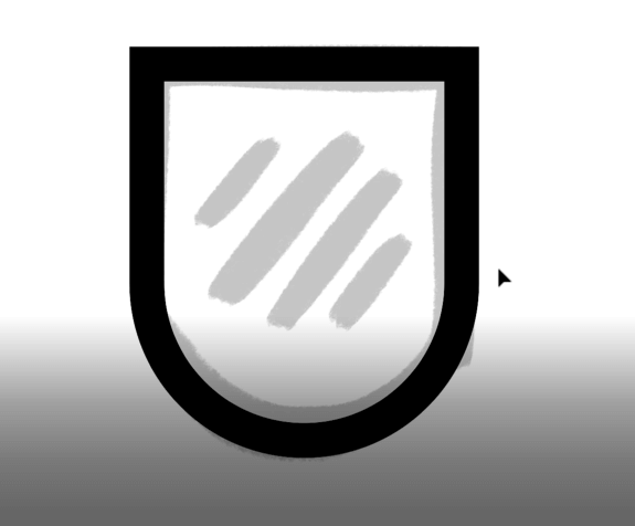
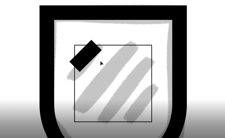
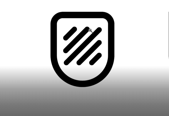
Today my design brief is for a computer cleaning software logo. I want this logo design to signify being clean, strong, and modern. For this, I’ve chosen as simple a shape as can be. It’s literally a square with some lines. But as you start to understand logo design and start seeing where to go with these shapes, you’ll start to see the potential in something like this.

Step 1 Sketch + Import
1. Bring your design from your drawing software/paper to your Illustrator program. Crop the unnecessary parts away so the drawing doesn’t take up the whole canvas and you can work with a neat and somewhat precise structure.
2. Change the opacity because we need to trace over it. Normally, I don’t trace over my drawings but this is something I’m doing today to help out the beginners in this journey.
3. Highlight the sketch. Press Command+2 (Ctrl+@ for PC) which will lock the shape on this layer. Now you cannot move this shape anywhere. You can see that its borders have disappeared.

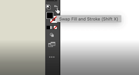
4. Now, go to your Color Swatches panel and choose black color.
5. Change your ‘Fill’ to ‘Stroke’ by either using the Swap Fill and Stroke tool on your left panel or pressing Shift+X.
Step 2 Draw Shape
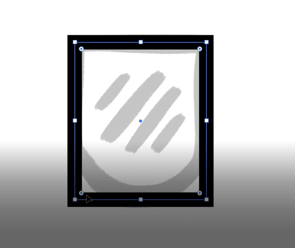
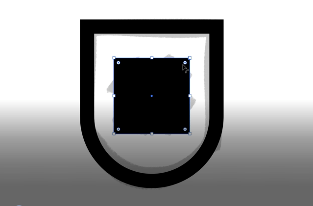
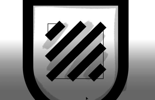
6. Next, since logo design is all about geometry so I’m going to draw a square on this shape.
As you can see, the boundary line of the square is way too thin. So, I’m going to increase the stroke weight for this by clicking on the stroke size like mad.

7. Try moving this square around. You can see that it’s not an actual square but a stroke. Therefore, we can modify its thickness according to our needs.
Note:
The reason we are not using a proper square is we want to keep all aspects of this shape consistent, and that can be done better if we are using a stroke instead of a shape.
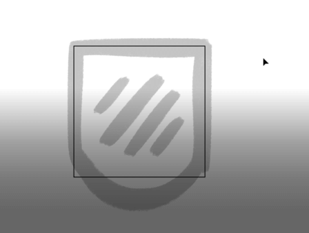
8. Next, let’s refer to our sketch now. As we can see, our shape contains a square and a circular structure. The round thing at the bottom.

These are the perfect shapes for a logo design. They are easy to see, easy to understand, and easy to remember. As a designer, too, these shapes are perfect. Easy to draw and very scalable.
9. Now, bring your square over to the sketch again and select it all with your Selection tool.
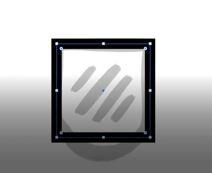
10. Now drag it down so it covers the entirety of the shape.
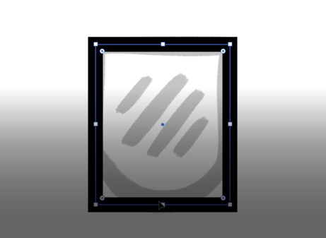
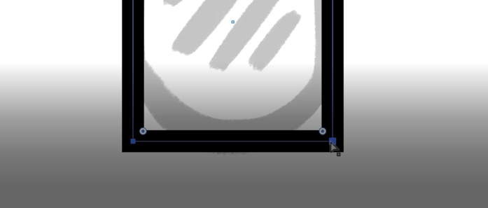
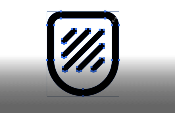
11. Obviously, there are no rounded corners at the bottom. But don’t worry. Do you see these little dots at the corners? These are called Anchor Points. They allow you to round the corners by the simple act of dragging. This used to be done by using a somewhat complicated procedure of going to Effects and then finding the ‘round corners’ effect. But, all this was fixed by the introduction of anchor points.
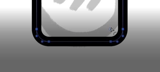
12. Now we’ll use our anchor points to round our corners. Since we only need rounded corners at the bottom, let’s only select the lower part of the shape. Go to your Direct Selection tool by pressing A and select these two anchor points at the bottom.
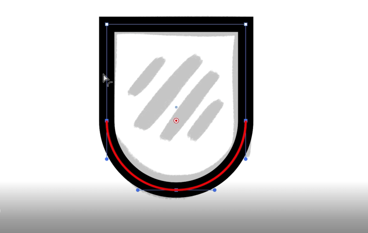
13. Next, use your Corner tool and drag the points up till a red line appears.
This is what we have created so far. You can start to see that it’s taking shape. Next comes the hard part.
Step 3 Draw Details
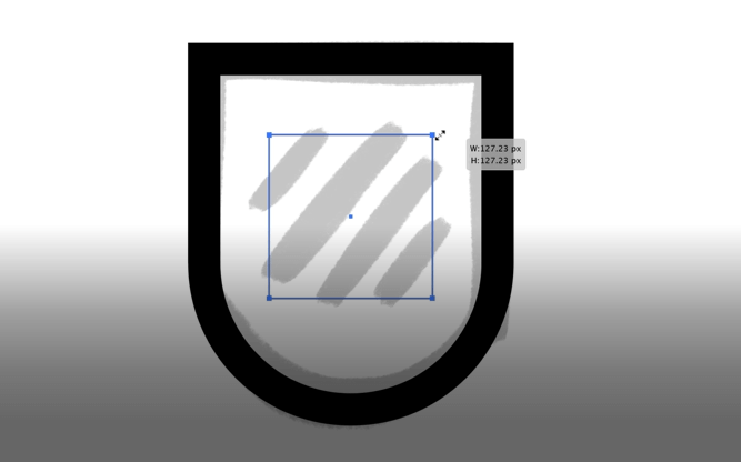
14. Look at the lines inside this shape. Perhaps you can see that these lines create another, smaller square. It is simple enough to sketch but can be quite tricky when you try to replicate it inside of Illustrator or any other program. So, let’s start by creating another square right at the top of it. But instead of a Stroke, we’re going to make it a Fill so as not to wreck the stroking area.
You can resize the square by holding Shift and then dragging.
15. Now go ahead and press Shift+X again to turn it into a Stroke. The difference between this stroke and the stroke that makes our main shape is that they are of differing weights but that’s okay. We only need it to give us our baseline of where all the lines need to be.
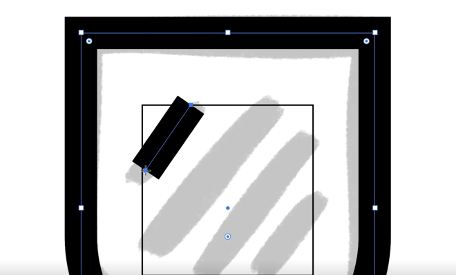
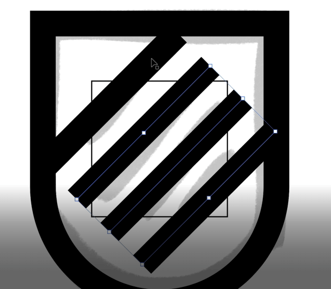
16. Now, let’s start creating the lines. We’ll use our Line tool. But first, we need to choose the stroke weights for the lines, and for that, we’ll use the stroke weight of our main logo shape. So, go ahead, and select it.
17. Use the Line tool and while holding Shift, draw a line over the topmost line in the sketch. What holding Shift will do is bring this line at the perfect 45 degrees snapped angle at which we need it.
18. Next, go ahead and scale it up to get all the lines in perfect shape.
19. Now, press Shift+Option (Shift+alt for PC) to copy this line at the 45-degree angle and start dragging it to drop over the next line in the sketch. Now press Command+D (Ctrl+D in PC) twice so our line-repetition is perfectly spaced out and equidistant from each other.
20. So, it looks good but I want it to look even better so I’m going to work on the lines a little bit more. I’m going to make them thinner and increase the number of lines.
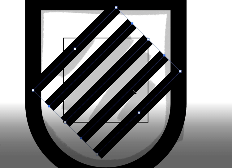
Make sure that the endpoints of the topmost and bottommost lines are closely parallel to each other.
21. Now, highlight everything else, de-select the outside shape, press Shift+M and then hold Option (Alt for PC) for the Shape Builder tool to get rid of the outside parts of the lines that we don’t need.
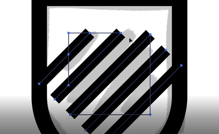
Start with the big thick lines first and then go to smaller parts. This is how it’ll look.
22. Now our final logo design shape is somewhat coming together. The lines inside are thinner than the boundary line of the main shape but that’s perfectly alright. It is giving the shape its balance.
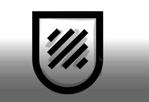
23. Now duplicate this shape by pressing Shift+Option (Shift+Alt for PC) and dragging. Bring it to your left. Duplication will allow you to save your progress so far and give you something to go back to if something goes wrong. It also gives you a reference point to guide you forward.
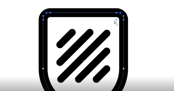
24. Let’s now polish up our design. Right now, the lines look a bit jagged so let’s round out their corners. The easiest way for me to do this is to select all these lines, go to the Stroke option on your top menu bar, and press it. From the dropdown menu select ‘Cap’ which will turn the line corners into rounded caps.
25. The line corners are done, let’s do something about the top two corners of the main shape too. They are contrasting quite harshly with the soft rounds of the lines and we want to blunt them down ever so slightly. Highlight the area with the Direct Selection tool, click the blue circles and drag them down till you’re happy with the curve of the top corners.
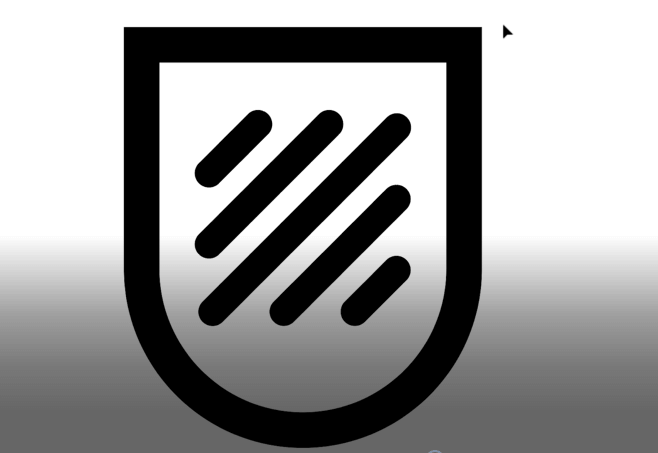
26. This is our final logo design shape. And we don’t want to mess around with it too much. Group this shape now by pressing Command+G (Ctrl+G for PC) and selecting all of it and duplicating it to a new art board very quickly.
27. Now, I don’t want this shape to change every time I try to scale it so there are a few ways you can go about securing this shape. One of those ways is to press Command+K (Ctrl+K for PC) and press Scale, Strokes & Effects. But we don’t want to do that because we want to keep things consistent when we scale. So, instead, we are going to highlight it, go to the Object option from the menu bar, go down to Path, and then select Outline Stroke. You can see that immediately all of these have turned into real shapes.
Now we can scale it any way we want without worrying about the line weight.
Step 4 Choose Font
28. The next thing is to add the brand name to let people know what this logo icon represents. As this is a clean and modern logo design, we need to use a clean and modern type. So, I’ll use Montserrat in the bold version.
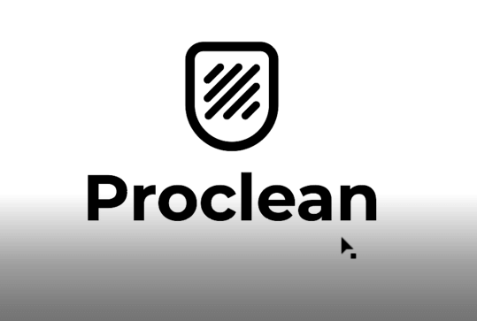
29. If sometimes you notice that your typeface is not looking good with your logo icon, it can be a difference in the line weight. When the type weight does not match closely to the stroke weight of the icon, the logo can look misbalanced. So pay attention to your weights.
Step 5 Add Color
30. Next are the colors. Choose colors that match with the overall theme. Since we are going with a clean and modern look, we will not be using bright shades or too many color gradients. So, we’ll use a subtle color gradient using pink and purple.
31. Go to the Window menu option and select Gradient to access the gradient panel. Now choose the colors and apply the gradient. For the type color, I’m going with a nice, clean grey as I don’t want the harsh black to contrast with the icon colors too much.
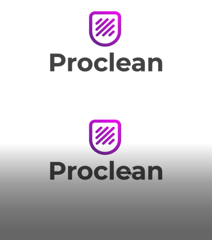
32. Finally, let’ see if the logo works with an off-white background. So duplicate your logo and create a box over it.
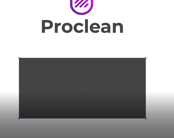
Add an off-white color from your color swatches, round the corners, and there you have it: the ready final design.
Drawing the Logo Helps the Design Process
Before we understand how important vector art is for logo design, let’s visit the basics first. The whole design process starts from sketching, drawing, and exploring the ideas. Some people do it on paper, others on their digital devices. The truth is, the ideation process doesn’t discriminate against your choice of canvas. Depending on your natural style and comfort level with the kind of technology you are using, you can get great results with both paper and software.
Let’s talk about the ways drawing a logo helps the design process:
1. It Stimulates Ideas and Imagination
Something very primitive happens when we begin to draw. Thoughts, ideas, and concepts that we are not even consciously aware of coming forward to the mind. This unique ability of drawing and sketching to stimulate ideas comes in handy when creating company logo designs. It helps us think of simpler shapes and structures in complex contexts. This facilitates inspiring, clever designs.
2. Gives You Foundation and Direction
The design process can take you anywhere. Some paths bear fruits, others are mindless distractions. Drawing out the concept in your mind gives your logo design a foundation, a focused-direction that you can follow without being distracted. What you have drawn so far on the sketch paper will serve as breadcrumbs to figure out how you got here and where you need to go next.
3. Fewer Distractions by Various Icons & Elements Present on Design Software
Paper is literally a blank canvas with no distractions inherent. In fact, its blankness is the most overwhelming part of it. You can create anything on it. With design software, you get a lot of distractions in the form of hundreds of different icons, menus, and buttons. Incoming notifications can also be a distracting hazard. With a simple pen and paper, you don’t have that risk.
4. Space to Make Mistakes
You create a shape on paper and decide it looks worthless. You bunch up the paper and throw it away. You take another page and repeat the process. Then another, and another. Something eventually clicks and you start to draw. This process allows you to have ideas, work on them, and discard them. If you begin to work on logo design software immediately, it leads to hasty work with poorly thought-out concepts. With design software, you have limited space to make mistakes. The temptation to keep working on a design, even though you feel it isn’t exactly the right design – becomes too strong.
5. Quicker, Natural, and Intuitive
Drawing is a natural process. It is also quicker as we are used to doodling since childhood. The hand movement on paper also follows our thought process in a more subconscious and intuitive way and thus, produces more original results.
Some Adobe Illustrator Tools to Design a Vector Logo
1. Pen Tool
It is a basic path creator tool. It helps you work with drawings by letting you trace over them, make strokes, or make selections.
2. Selection Tool
Different from ‘Direct Selection Tool’, it allows you to select entire objects as a whole. This tool is used when the intention is to manipulate the whole object. Perfect for taking a drawing to vector.
3. Shape Builder Tool
Use the shape builder tool to draw a logo or shape over what you have drawn. You can merge these shapes, subtract from them, and manipulate them into entirely new forms.
4. Crop Tool
Some parts of your sketch may not make it to the final logo design. Use the crop tool to get rid of those unnecessary parts.
The Dos and Don’ts of Vector Logos:
Dos:
1. Position Your Anchor Points Correctly
Always choose your correct points at exactly the right places.
2. Number of Your Anchor Points
The anchor points you choose must be in enough numbers to create the perfect path/shape.
3. Master the Bezier Curve
The Bezier curve tool gives you more freedom to work. The higher your command of the Bezier curve, the more precise your paths and strokes.
4. Make Your Stroke Weights Diverse
Add variety in stroke weights to create multi-faceted vector logos.
5. Delete Unnecessary Layers
Remember to delete layers in Illustrator that are not required in the final file.
Don’ts:
1. Don’t Add Raster Components
For your vector logo to be completely editable, it’s important that it does not contain any raster components.
2. Don’t Use Too Many Effects
Too many effects on your vector logo will leave your logo looking amateurish.
3. Don’t Skimp On Details
At the same time, do not ignore any details also. Keep it to the point and precise.
4. Don’t Forget About Keyboard Shortcuts
Vector logos are so much about following your train of thought. To create the most organic work, remember to use keyboard shortcuts for a faster process.
5. Don’t Forget to Use Smart Guides
For tracing and structuring of objects, Smart Guides are a great tool. Don’t forget to practice them as they can help you save time and create perfectly aligned shapes.
The Takeaway
In simple words: master the basics. All of the tools used in the tutorial are basic Adobe Illustrator tools. As a beginner logo designer, mastering these tools is critical for your survival and success. While there are many different ways to bring a logo design from sketch to vector, we have tried giving you an easy and hassle-free lesson. Save it for your design journey and keep coming back to it as you start learning and picking up your own technique.
Credits:
Verified by Zaheer Dodhia, CEO and Founder LogoDesign.Net.
Video by Will Paterson, Designer, and Vblogger, WillPaterson.Design