SALES / SUPPORT : 844-232-4816
The Ultimate Shape Builder Tool Tutorial
Welcome to LogoDesign.Net, where we keep bringing you tons of informational material on how to make yourself a master of the logo design game. In today’s tutorial, we will be exploring a lesser-known design option in Adobe Illustrator that’s probably the program’s best-kept secret. The reason we call it a secret is that not many people know about it or use it as extensively as it should be used.
As usual, our tutorial accompanies a detailed video tutorial. This one is by the logo design pro, Will Patterson. So without further ado, let’s see what he’s teaching us today.
The Tutorial
So, today’s video is all about creating this beautiful typographical shape using a clever little feature in Adobe Illustrator called the Shape Builder tool.
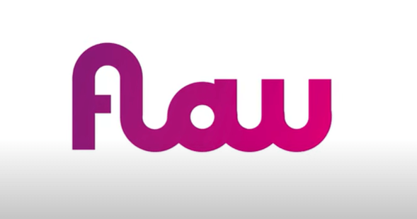
I am going to show you to create a logo from the concept to vectorizing it using the Shape Builder tool, which not many people use it to its full ability. So let’s start.
Step 1 Sketch the Logo
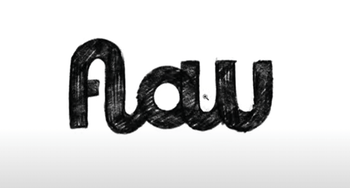
Being a designer, you probably know that the software side of the Illustrator or the software side of it is only about 5% of logo design; the rest is all about your idea and concept. Therefore, I’ve used Procreate in my iPad to draw this concept and work on it, and only now I’m coming to the Illustrator to use the Shape Builder tool to build around this logo. In its present form, it looks something like the above.
Step 2 Draw Guides
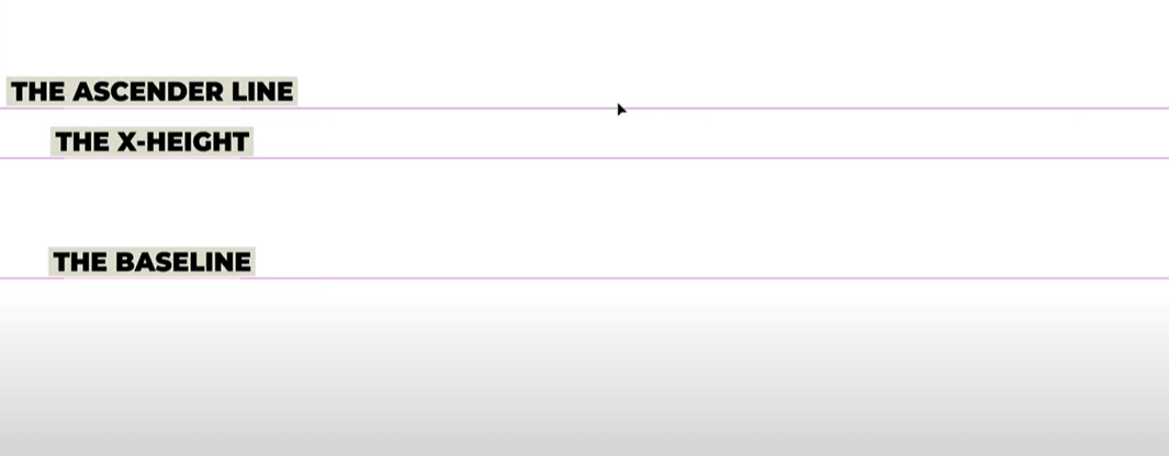
I’m going to put this design up there and draw some guides. I like to have my guides present when I’m working on typography-based projects to help keep the consistency and precision alive. The guides help you work with the height, size, and proportions of letters in a much neater and balanced way and very little room for mistakes is left. To create the guides, you need three lines: The Baseline, the X-height, and the Ascender line.
You can change these lines and adjust them as you go, of course, but for now, I’m going to lock them and keep them engaged. To lock your Guides, go to the View menu, select Guides from the dropdown list, and click on Unlock Guides. Your click will change the Unlock to Lock and keep your Guides consistent.
Step 3 Use Square and Circle Tools
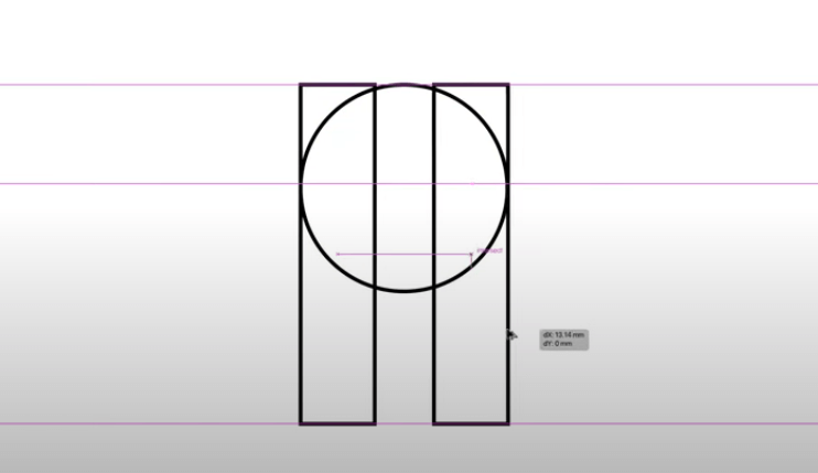
Now bring your Square tool here and make sure it’s a stroke and not the fill. Now eyeball that square bar for a minute because we have to make sure that it gives us the perfect shape that we require for our small case ‘F’ in the logo. The size looks okay but we also need a curve on the top. So we will draw a circle very near to the top bar, which may look strange now, but will serve our purpose. Next, we need another bar and bring it to the other side of the circle. Make sure that both the bars are intersecting with the edges of the circle.
How can you be certain of that? Go to the outline mode and you can see clearly whether the lines are perfectly joined together or not. If not, scale the shapes up and down a little till you get the perfect intersection.
Now, we don’t need those top bits of bars above our circle so we are going to remove them. To do that, instead of erasing anything, we’ll bring both of them down to the X-Height.
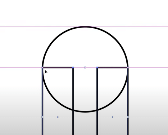
I want them at this level because there are anchor points on the right side of this circle and I want them to join up altogether and make a perfect shape logo. Hope that makes sense to you.
Also Check This Tutorial: How to Design a Social Media App Logo Tutorial
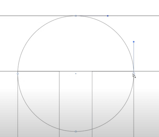
Ok, so this next step may look strange to you again because we are using shapes and no clear form is emerging so far – but bear with me. So, in this step, we are going to introduce another circle into the mix. The reason is, our ‘f’ has two curves – one that makes the top arch and the other that makes the bottom arch.
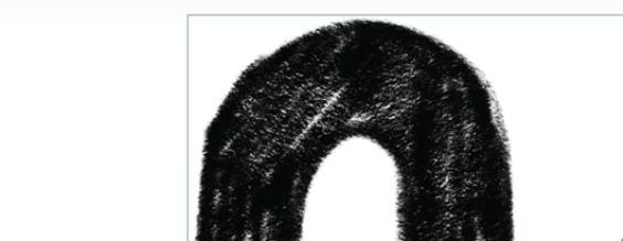
The two circles will help us create one positive and one negative space. So copy and paste your big circle and then scale it down to bring it to rest between the top inner edges of the two bars.
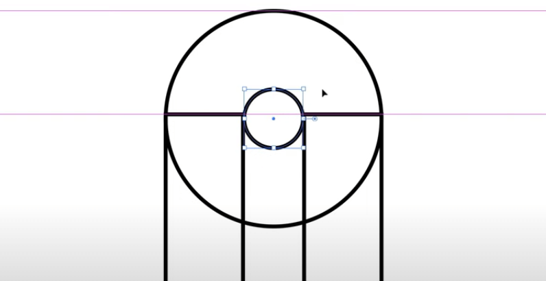
It is entirely possible that while in its present form it looks like that the smaller circle is meeting the edges of the bars but to be completely certain, go into the Outline mode and see if that’s actually the case.
Press Command + Y (Mac) or Ctrl + Y (Windows) to switch to the Outline mode. The action will help you see whether your edges are meeting or not. As you can see in the screenshot below, they are not. So time for some adjustment.
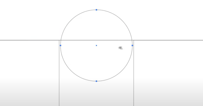
Highlight the shape and bring the edge of the circle slightly to the left till it meets the anchor point there. Do the same thing to the right edge of the circle and make sure it meets the anchor point theStep 4 Use Shape Builder Tool
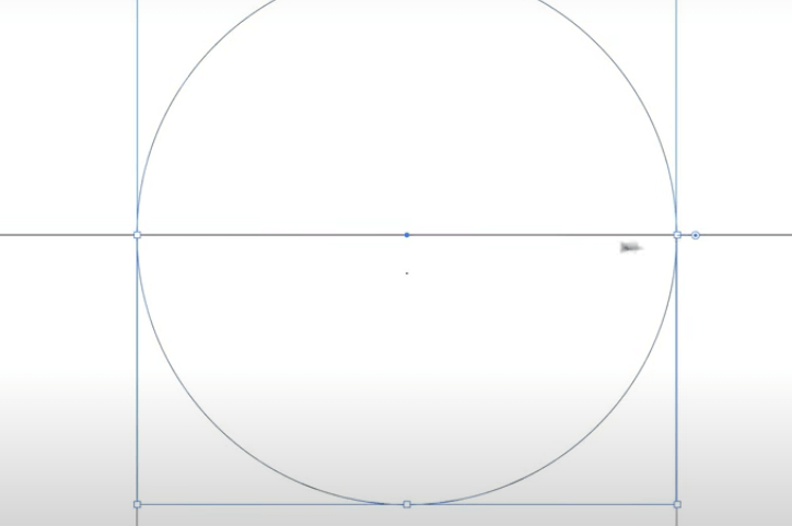
And now we’ve got our perfect shape.
Step 4 Use Shape Builder Tool
In this next step, we are going to access our shape builder tool and see what it can do for us. Press Shift + M to launch the Shape Builder tool. Now move your cursor over different parts of your design and you’ll see that each individual part is being highlighted. The reason is that the Shape Builder tool is looking at each of these sections as individual shapes.
Some of you might be thinking that we can also do it with the Pathfinder tool but what I’ve learned working with the Shape Builder tool is that is highly more intuitive and time-saving than the Pathfinder tool.
Step 5 Remove Unnecessary Shapes
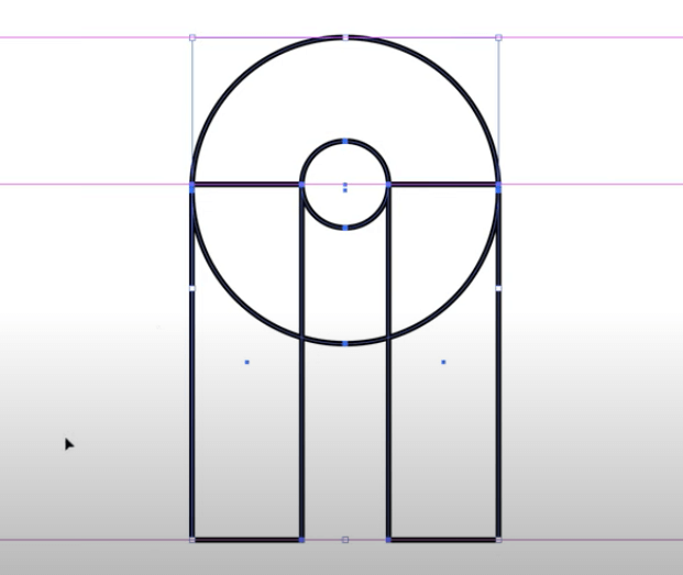
To let the Shape Builder tool do its job, copy and paste your whole design and let’s get working. The reason I’m copy/pasting is that I don’t want to make all the changes in just one design in case I make a mistake – so I create copies.
So, highlight your copy, and press Option (Mac) or Alt (Windows). When you don’t press Option, you’ll see that your cursor has a tiny + and – button that keeps switching between both signs but when you press Option, it stays at the minus symbol. This is your hint that your Shape Builder tool will now remove or subtract parts of the design that you drag your cursor across.
Right now, we don’t need to remove anything so we’re not going to press Option. We’ll simply go to our first bar – with the cursor still showing the plus sign – and drag the cursor right from the bottom of the first bar to the top.
When you release the drag, this whole area will become one.

This is the ‘merge’ mode of the Shape Builder tool. We’ll continue with this and drag our cursor to the top curve of the circle and the area till the edge of the second bar will also merge in our new shape. But we’re not stopping here. We’ll move the cursor to the bottom of the second bar because we also want our lowercase ‘L’ after the ‘f’.
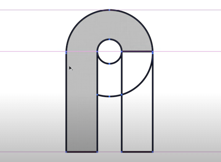
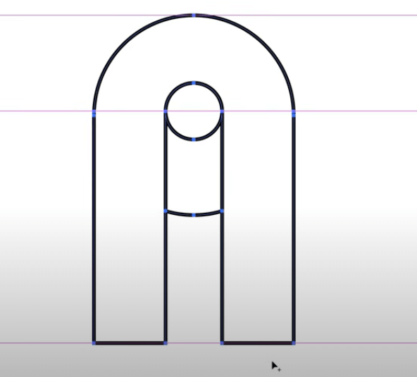
So while we got our new shapes, there’s a bit of a problem. Do you see that tiny circle up there and that dodgy line underneath? We want to get rid of it. To do that, press Option (for Mac) or Alt (for Windows) to switch your Shape Builder tool to the Erase mode and bring your cursor’s point to minus. Now hold Shift and drag your cursor from down to up to remove these parts.
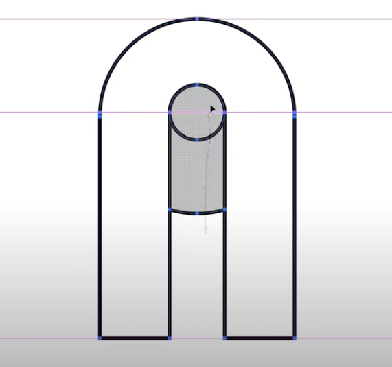
Now, highlight the whole thing and put it as a fill so we can get a shape that’s very close to what we want to create.
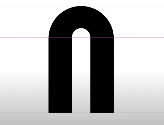
Step 6 Create Shapes with Shape Builder Tool
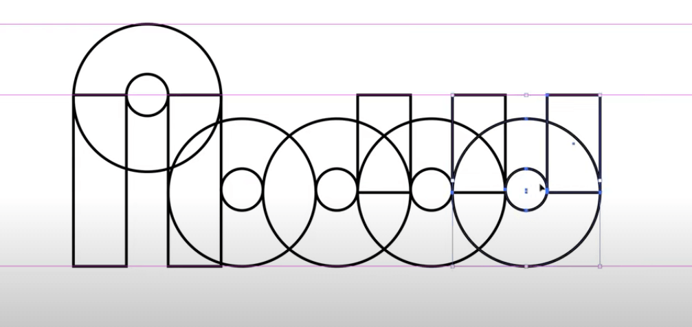
Now go back to your original shape that is still rectangles, squares, and circles, and continue finishing the design. Instead of creating new circles or rectangles, what I do is keep copying the existing ones in my shape so the consistency and precision of the design remain intact.
To create the curve in the ‘L’ that merges with the curve of letter ‘O’ in my logo we need another circle. So highlight the circle and copy it to the Baseline. Now highlight the circle again and copy it right next to the new circle to create the ‘O’. Next, highlight one of your bars and bring it next to the newest ‘O’ to create the first vertical of the ‘W’ letter in the logo. Since the lower parts of the ‘W’ are in curves, we’ll also need circles next to these bars. But first, bring the bottom edge of the bar and drag it up so it’s at a perfect height to the middle of the smaller circle. Continuing with this, you’ll have a collection of shapes like this:
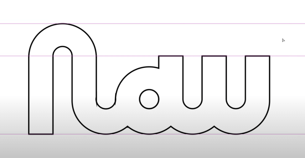
Do not worry or feel overwhelmed if this looks too strange to you. It’s all about trial and error. The more you practice with the Shape Builder tool, the more you’ll know which shapes will work and which parts need to be merged or removed.
Now highlight the whole thing, copy it, and paste the copy on top for safekeeping, and let’s launch our Shape Builder tool again. Now start merging parts of our shape and removing other parts till we get something like the above image.
Now go back to your original shape that is still rectangles, squares, and circles, and continue finishing the design. Instead of creating new circles or rectangles, what I do is keep copying the existing ones in my shape so the consistency and precision of the design remain intact.
To create the curve in the ‘L’ that merges with the curve of letter ‘O’ in my logo we need another circle. So highlight the circle and copy it to the Baseline. Now highlight the circle again and copy it right next to the new circle to create the ‘O’. Next, highlight one of your bars and bring it next to the newest ‘O’ to create the first vertical of the ‘W’ letter in the logo. Since the lower parts of the ‘W’ are in curves, we’ll also need circles next to these bars. But first, bring the bottom edge of the bar and drag it up so it’s at a perfect height to the middle of the smaller circle. Continuing with this, you’ll have a collection of shapes like this:
Do not worry or feel overwhelmed if this looks too strange to you. It’s all about trial and error. The more you practice with the Shape Builder tool, the more you’ll know which shapes will work and which parts need to be merged or removed.
Now highlight the whole thing, copy it, and paste the copy on top for safekeeping, and let’s launch our Shape Builder tool again. Now start merging parts of our shape and removing other parts till we get something like the above image.
Step 7 Fix Typography Mistakes
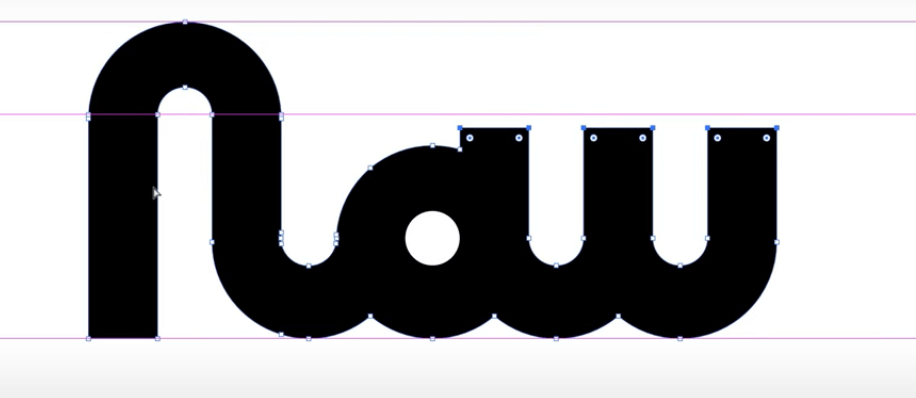
Highlight the design and change the stroke to fill. It will indicate some problem areas that you need to correct. To do that, we need to use a typographical technique called overshooting. Overshooting is going above or below the Baseline or Ascender line to employ optical illusions in our shapes. These illusions help us to look at the different letters of the typeface and convince us that all of them are of perfect height, size, distance, and weight. So, start overshooting and highlight the top portions of the ‘W’ and drag them down a bit lower.
The F on the baseline looks longer than the base of L and O, so let’s correct that too. We’ll highlight and drag it up a little. The reason we’re manipulating the base of F and not touching the other letters is that the other letters look perfectly aligned with each other. While F is too, it just doesn’t look like it, so that’s why we are decreasing it.
Almost the last step. We just need to create the crossbar of F. Adjust the crossbar to make sure it fits at the perfect place, relevant to other shapes in the structure.
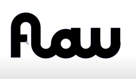
Our last step is going to be color but before we do that, we are going to switch to the Outline mode to make completely certain we haven’t left any flaws in the design. If you find a flaw, fix it before we can finalize the shape. You can also use your Pathfinder function to correct these tiny errors.
Step 8 Color Your Logo

Finally, the colors. So, I love creating modern designs. A quick color tip that can make your design look ultra-contemporary is to add a color gradient to it. So, highlight your shape and bring your gradient panel up above. I’m going to use a pink and purple gradient. If you are new to color gradients and want to learn how to perfect them, I’ve already done a free form gradient tutorial so do check that out.
Tinkering with my purple/pink gradient a bit, this is what I’ve got.
Pretty happy with it, to be honest. So there you have it. A perfectly flowing/flawed logo in mere minutes with the help of the Shape Builder tool.
Once you start working with it, it’d be pretty hard to stop, to tell you the truth. But why would you even want to? It’s easy, convenient, quick, and gives you perfectly precise shapes.
Also Check This Tutorial: How to Use Bezier Curve to Vectorize Your Logo Tutorial
Shape Builder Tool Main Modes
The Shape Builder tool comes in four main modes or features. All of its features perform pretty much the same function that you can accomplish with the Pathfinder tool; however, with the Shape Builder tool you get more flexibility, ease, and speed.
This tool is especially useful if you are creating an icon, a logo design, and such.
Merge
Obvious by the name, this function enables you to take simple and common shapes like squares, circles, and rectangles, etc. and merge them to create complex and unique shapes. It is the most well-known Shape Builder tool mode that most designers work with on the daily.
Extract
The extract mode is designed to allow you to extract or ‘take away’ sections of the shapes that you have combined or that are overlapping each other. By taking away parts of the design, you not only help define the shape but also use it for design techniques such as creating negative spaces. The extract mode is mostly used to remove sections that are inside the shapes to create blank spaces.
Erase
Again, pretty clear from the name itself, this mode helps you to remove entire sections of the overlapping/merged shapes that you do not need. The beginners may confuse it with the extract mode but here’s the distinction: the erase mode completely subtracts parts of the shape whereas the extract mode only takes away smaller, certain, parts of it that are usually inside the shape.
Create
The create mode is seldom used in the Shape Builder tool but it is quite a useful feature when you want to create specific shapes that are emerging in the negative spaces of the shapes you’re merging or overlapping.
This mode essentially allows you to create spaces from blank spaces.

How Does the Shape Builder Tool Help In Logo Design?
Now that we understand what design options the Shape Builder tool gives us, it is time to explore how we can use this secret tool to maximize our logo design potential.
Use Simple Shapes to Create Complex Designs
The Shape Builder tool is a life-saver when it comes to creating complex shapes and designs. It allows you to use existing shapes within the Illustrator and by multiplying, merging, and overlapping them with each other, create unique designs and distinct shapes.
For example, putting circles of varying sizes over each other and in different ways, you can create birds, clouds, flowers, parts of human anatomy, and whatnot.
If you routinely work with Illustrator to design logos, you’ll know how hard it can be to work with Pen tool or Pathfinder tool to create complex shapes. Worrying about gaps, angles, and points, etc. can be a real headache. The Shape Builder tool, though, takes all the bother out of it. You simply combine shapes, merge them, extract them, subtract them, and continue creating clever designs – in half the time.
Merge, Overlap, and Break
The simplicity of the functions within the Shape Builder tool is its most attractive feature. The tool allows you to combine as many shapes in as many various positions and sizes as your imagination warrants.
Then, by using simple functions like merge, extract, and remove, etc. you can create new and more complicated shapes easily. You can choose to apply a single function to achieve your design or use different modes on different parts of the merged and overlapping shapes to create more complicated structures.
Design with Consistency, Focus, and Precision
One of the most brilliant things that the Shape Builder offers you is the ability to focus on the concept of your design without worrying about angles, gaps, and other such details. It lets your imagination invested in what you want to create and doesn’t force you to take your eyes or focus away from what you are doing and think about which icon in the Pathfinder tool will be best-suited to achieve what shape.
This allows you to work with more liberty, freedom, and focus.

Image: Behance
Since the Shape Builder tool lets you work with the predesigned shapes, different areas or sections of your design are more consistent and precise than if you were working with the Pathfinder or the Pen tool.
Add Negative Space
In logo design, a lot can be said in the blank spaces. Think about the FedEx logo for a minute. For those of you who don’t know, the negative space between E and X of Ex creates the perfect forward-pointing arrow – denoting the brand message that the company will take your parcel and cargo forward.

It is the perfect example of a brand message creatively hiding within the simple-looking shape. Using the extract mode in the Shape Builder tool, you can create such creative negative spaces within any shapes you desire. The extract mode, as explained above, allows you to take away parts of the merged shapes that are present within the shape to create blank spaces that can serve many functions. One of those functions is embedding negative spaces, the lovechild of creative logo designing.
Intuitive and Smart
The Shape Builder tool is intuitive and smart. Following your cursor’s movements, it can detect whether the shape needs to be merged, subtracted, or parts of it removed. By stacking one shape over another, it allows you to visualize your concept taking a form. Following your creative instincts, you can add, remove, or merge more shapes into the one you’re working on.
Adding colors in these shapes is also an intuitive process. The tool again uses the movements of your cursor to figure out which color you may want to use in which parts of the design.
Working with the Shape Builder tool requires little thought as you don’t have to worry about the technicalities of it. Since you can create different shapes in a much faster time with this tool, you can spend your energies into coming up with unique concepts.
Save Time
If you have never worked with the Shape Builder tool before, you cannot truly understand how time-efficient this function is. The shape that will take twenty minutes to materialize using the Pathfinder tool can be executed in just a few clicks with the help of the Shape Builder panel.

Also, as the tool only has well-chosen modes and features, you don’t have to practice dozens of options to master the tool. By just gaining expertise on these few nifty functions, you can become a master of creating complex designs by manipulating basic geometric structures.
Conclusion
Though the Shape Builder tool is not a widely-known feature of the Adobe Illustrator, it is, without a doubt, one of the smartest, most useful, and time-efficient features of the program. It works on both logotypes and logo marks, and helps you expand your creativity with precision and consistency.
Hopefully, through this detailed tutorial, you have gained enough knowledge about this clever feature and will be using this information in your future works.
Keep practicing!
Credits: Written by Zaheer Dodhia CEO and Founder LogoDesign.Net
Video by Will Paterson, Designer, and Vblogger, WillPaterson.Design