The best designs don’t just look great; they’re Phi-nominal! The golden ratio is nature’s secret, and explains why some designs feel instantly right while others look glum.
Every logo tells a story, and some simply feel timeless. But what makes them look so balanced and pleasing to the eye? The answer often lies in a centuries-old secret: the golden ratio!
Loved by artists, architects, and designers alike, the golden ratio brings structure and flow to visuals without making them feel rigid. And it’s not just math on paper, but the world’s secret. You’ll find it in seashells, galaxies, and yes, in some of the most iconic brand logos.
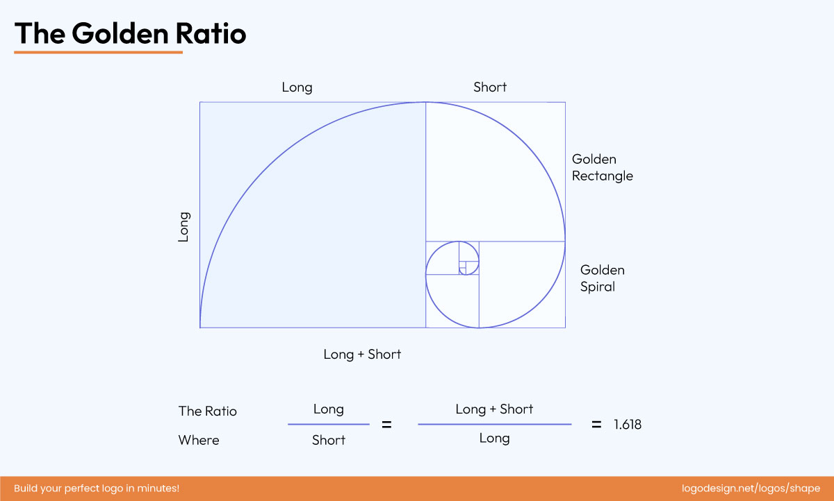
The golden ratio makes designs feel effortlessly right and visually appealing.
Let’s explore the golden ratio grids and how designers use them to craft logos that not only work but last a lifetime.
Where Did The Golden Ratio Come From? – A Timeline
If complex math makes you nervous, the golden ratio might initially sound intimidating, but at its heart, it’s a simple proportion of 1:1.618 (often referred to as the Divine Proportion). This ratio just feels right to the human eye.
This proportion shows up in the smallest and biggest wonders of life. For instance, if you look closely at a seashell, you will find this ratio within the spirals, or in the way sunflower seeds are arranged.
Many natural patterns that leave us in awe follow the golden ratio, reminding us how nature is designed in perfect harmony. The golden ratio may be a designer favorite now, but its journey is almost as old as time itself. Let’s take a trip back in time and see when, how, and where the golden ratio was discovered and rediscovered, and how it influenced design along its journey.
1. The First Blueprint: 2560 BC
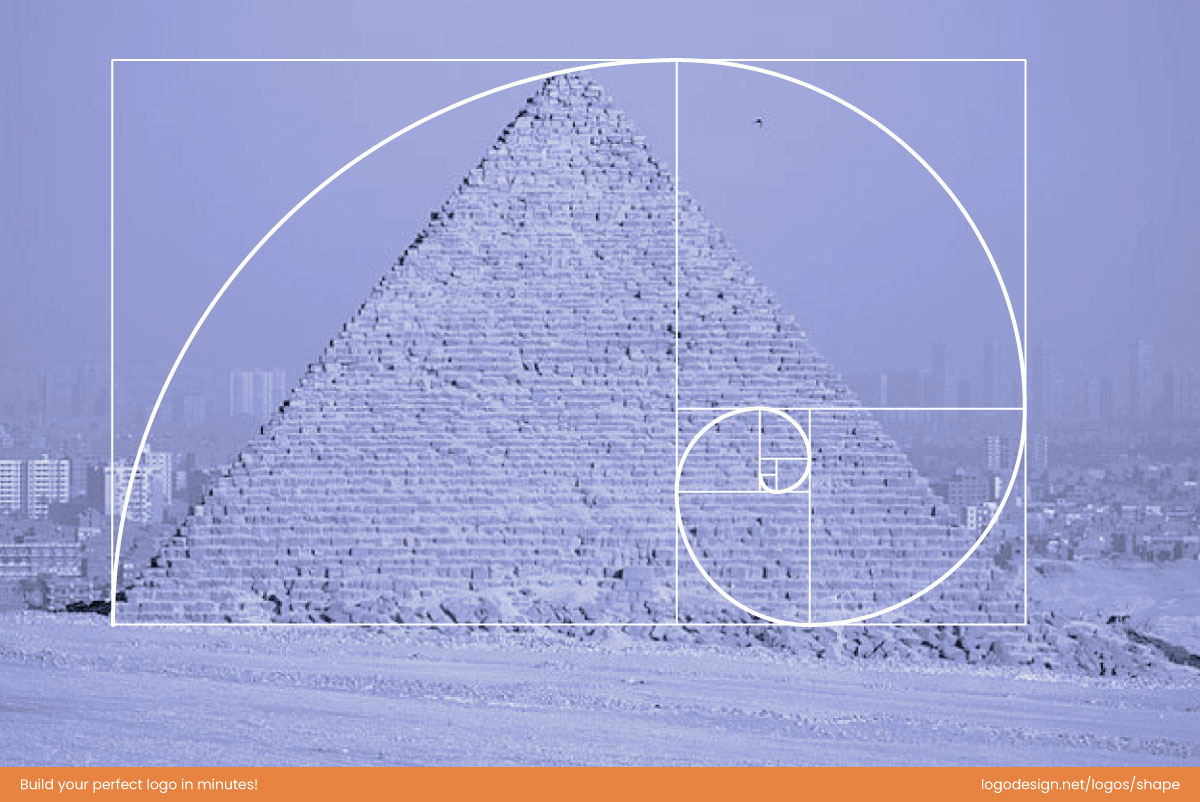
Ancient architects like the Egyptians applied the golden ratio in iconic structures like the Pyramids of Giza. | The Pyramids of Giza by Myousry6666, licensed under CC BY-SA 4.0
It is believed that the Ancient Egyptians used the golden ratio to build the Great Pyramids of Giza. According to the theory, the ratio of the pyramid’s slant height to half of its base is calculated to be the golden ratio. Similarly, who could hold the Greeks back? They also used this principle when constructing the Parthenon.
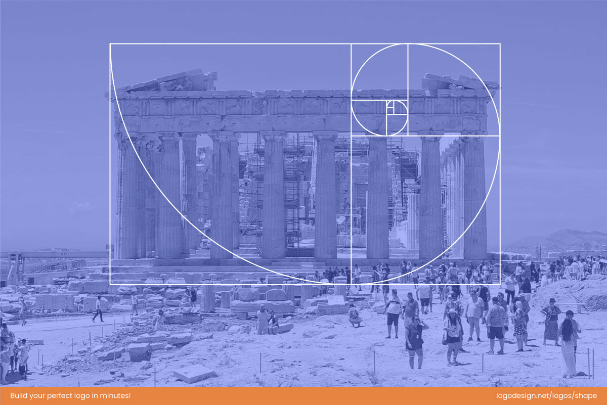
Ancient architects of Greece also used the golden ratio to build the Parthenon. | Parthenon, Athens, 20240531 1313 9650.jpg” by Jakub Hałun, used under CC BY 4.0.
In the beginning, the golden ratio was an architectural tool used to build large-scale buildings that continue to surprise designers and architects today.
2. Proportion In Stone: 350 BC – 450 BC
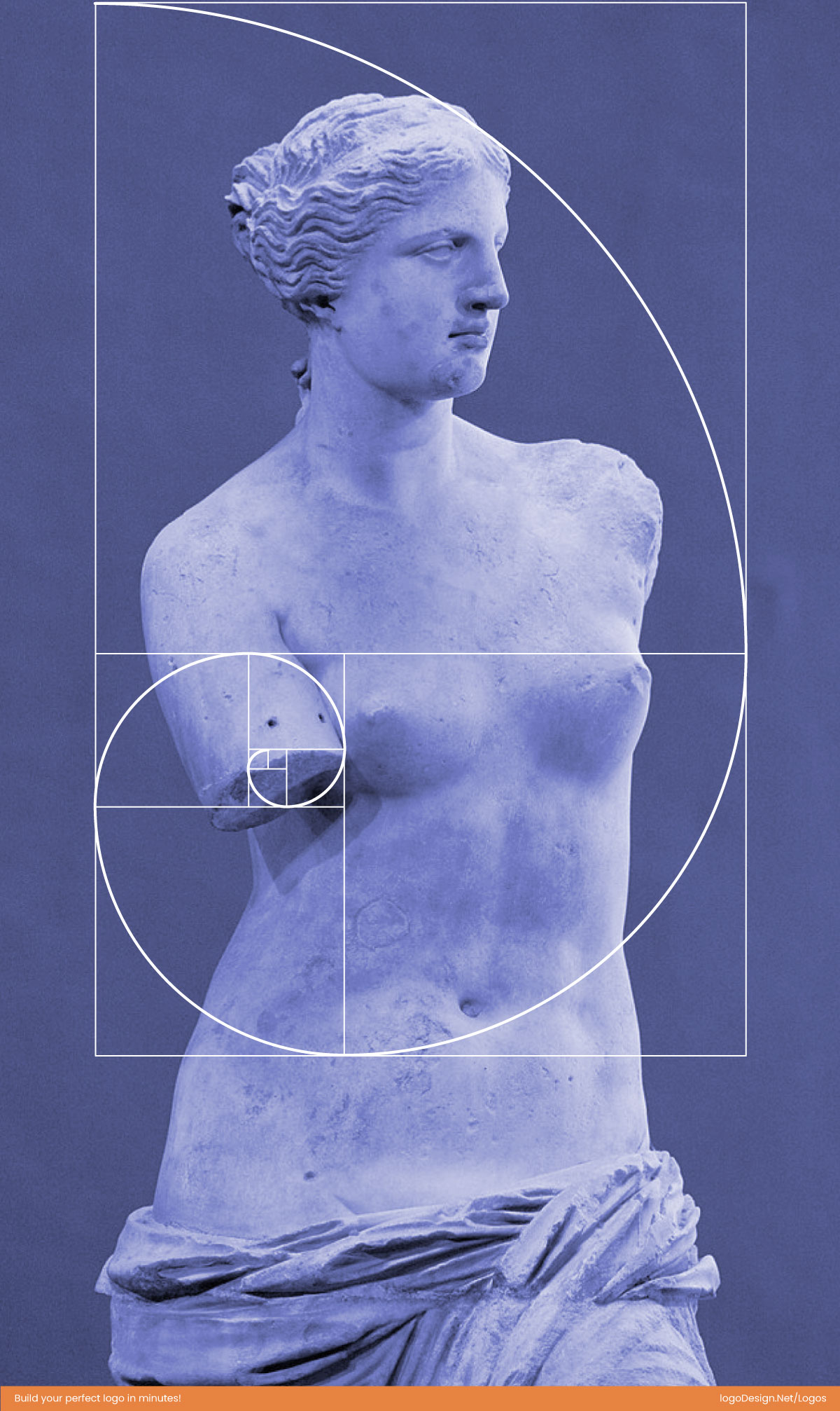
The sculptor Phidias used the golden ratio to give a classical touch. | Venus de Milo Louvre Ma399 n4.jpg” by Marie-Lan Nguyen, released into the public domain.
In Greece, the sculptor Phidias explored the use of the golden ratio in sculptures. His famous Athena Parthenos statue and the Zeus statue at Olympia are said to incorporate the golden ratio. The Greek letter ‘Phi’, representing the golden ratio, also comes from this.
This is when the golden ratio evolved from a building principle to an aesthetic ideal. It was used to achieve perfection in proportions and create timeless, beautiful art.
3. The Fibonacci Sequence: 200 BC – 1200 AD
The mathematicians tried their hand at the golden ratio, and a mathematician named Euclid provided the very first formal mathematical definition of the golden ratio, which we continue to use today.
With a format ratio, Euclid paved the way for designers and artists to use a precise and repeatable formula to use the ratio in their art and designs intentionally. It was no longer intuitive but intentional.
This is the same sequence we know as the Fibonacci Sequence, which was named and rediscovered some 1500 years later by an Italian mathematician, Fibonacci. He made this discovery in his book Liber Abaci, which was the first time the golden ratio was introduced to the Western world.
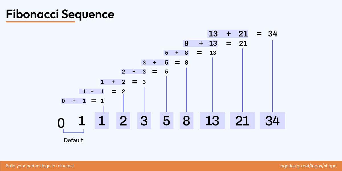
The Fibonacci Sequence was introduced to the Western world by Fibonacci in Liber Abaci, revealing the golden ratio.
Although it wasn’t immediately connected to the golden ratio, this sequence created a rhythmic and scalable pattern for designers to follow.
4. Renaissance Art and Astronomy: 1490s – 1600s
The golden ratio heavily influenced Renaissance art. Artists like Leonardo Da Vinci used it to define proportion in their works. Some of the most popular artworks, such as The Last Supper and illustrations in De Divina Proportione, are drawn with the golden ratio at the forefront.
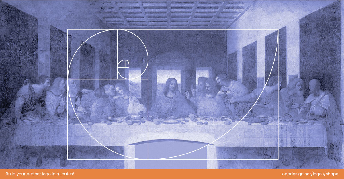
Renaissance artists used the golden ratio to achieve perfect proportions in masterpieces. | The Last Supper (1495-1498)” by Leonardo da Vinci, public domain. Edited from original.
At this point, artists used the golden ratio as a foundational element of their artistic composition, resulting in more visually balanced pieces across art forms.
Then came Johannes Kepler, a curious astronomer and mathematician who took the exploration one step further and studied the connection between geometry and proportion. He introduced the Kepler Triangle, a right triangle in which the ratio of its sides followed the golden ratio. This is where the Pythagorean theorem is beautifully linked with Kepler and the golden ratio, showing just how mathematics and natural harmony can exist simultaneously.
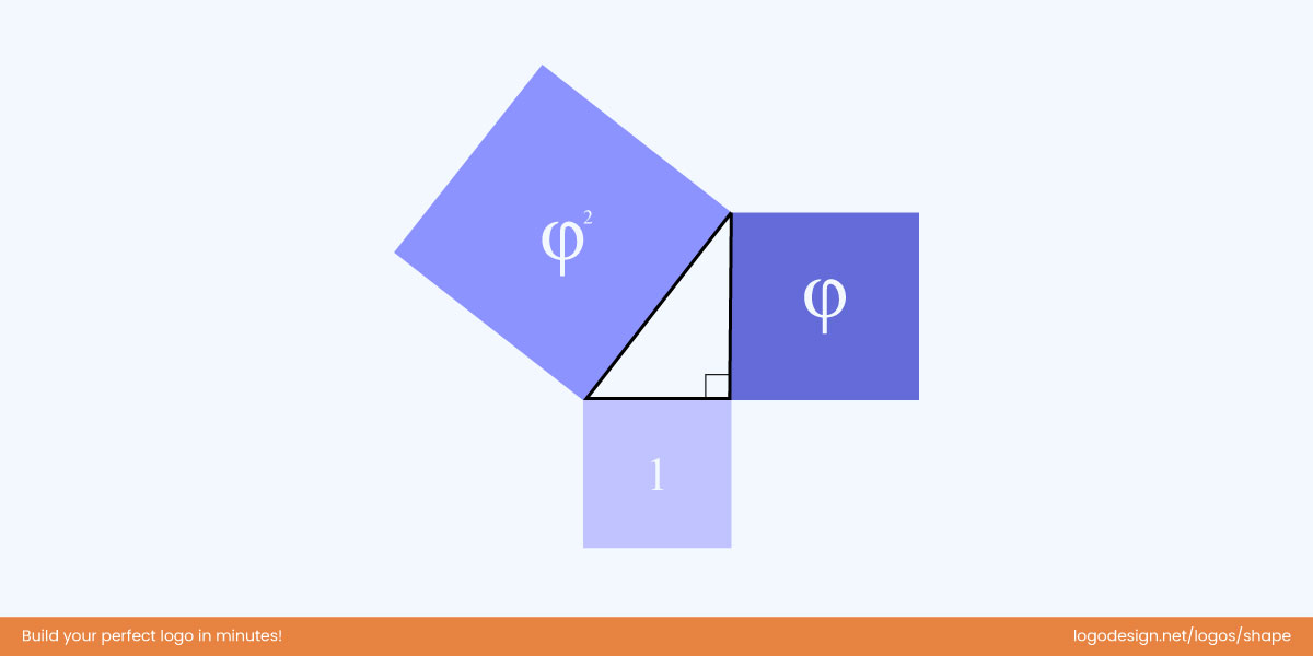
The Kepler Triangle is where the Pythagorean theorem meets the golden ratio.
This discovery opened the way for more artists to justify their use of the golden ratio. They stated that the golden ratio harmonized their work, much like the universe’s natural laws.
5. The Golden Name With A Golden Symbol: 1835 – 1900s
In his book ‘Die reine Elementar-Mathematik’, the German Mathematician Martin Ohm used the term Golden Section to give the concept a modern name. The previous name of ‘Divine Proportion’ was retired, giving it a timeless identity.
The new name was more than just a name; it also added a layer of prestige to the ratio. This new identity made the golden ratio even more popular and used as the gold standard for art and creation.
In the 1900s, Mark Barr, in an ode to Phidias, proposed using the letter Phi as a symbol to represent the divine, now known as the golden proportions.
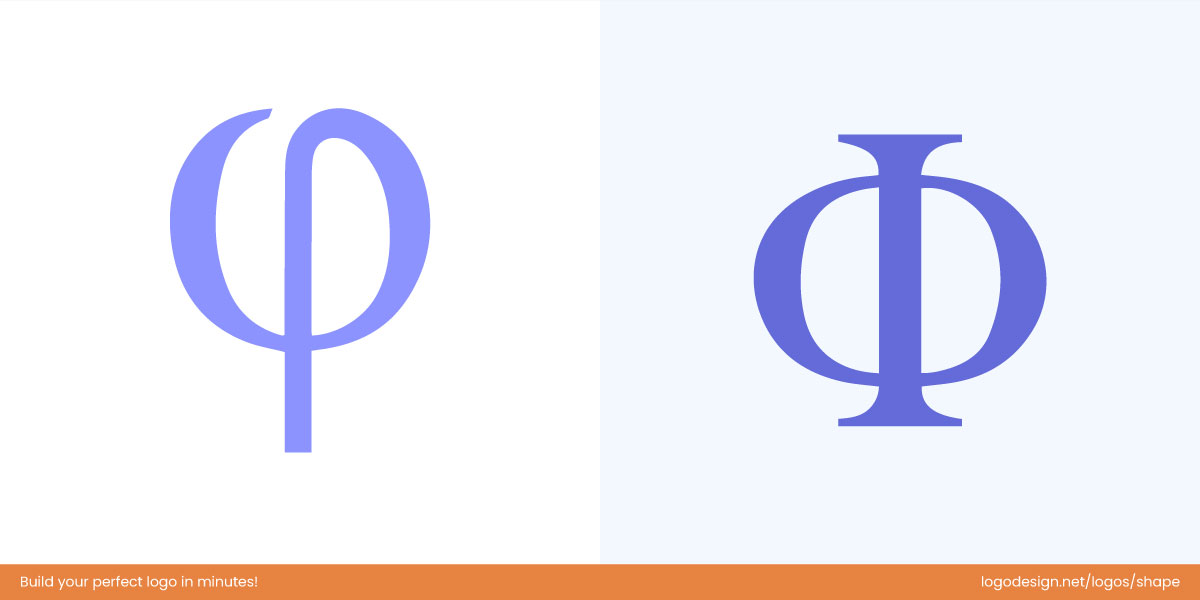
Mark Barr popularized the Greek letter Phi (Φ) to symbolize the divine golden ratio.
This gave the Golden Ratio its first professional identity. It allowed designers and artists to use the Golden Ratio and communicate its use as a cemented design standard.
6. The Digital Age: 1970s – Present
In the 1970s, the golden ratio emerged in digital design with technological advancements, such as computers and digital tools. What designers used to design by hand is not calculatedly designed on gadgets, but with better precision.
In the digital era, the golden ratio has become a tool for enhancing the user experience and designing interfaces. Web designers also use it to determine the proportions of layouts and the right placement for images to make everything look balanced.
The golden ratio is not limited to design; it can also be used in areas such as product packaging, typography, motion graphics, and so on.
Why Designers Obsess Over Proportion (and Why Our Brains Love It)
Even the most beautiful colors or typography can fall flat if a design feels “off.” That uneasy feeling usually comes down to proportion — how well all the elements fit together. Designers pay close attention to it because proportion brings everything into balance. When the parts of a design look right next to each other, the whole thing just feels right.
So, What Exactly Is Proportion?
Think of proportion as the rhythm and balance within a design — how one element relates to another in size, scale, and visual importance.

Balanced spacing and alignment create a visually comfortable, intentional design.
At its core, proportion is about relationships. It’s how text aligns with images, how icons sit beside headlines, and how much space surrounds each element. When these relationships are visually balanced, a design feels intentional and comfortable to look at.
Once you start noticing proportion, you’ll see it everywhere — and there’s a reason designers can’t get enough of it.
• It Feels Instinctively Right
Our brains are wired to recognize balance. When things are in proportion, we relax — it feels organized and trustworthy, even if we don’t consciously know why. This instinctive preference is deeply rooted in how we perceive beauty and order.
• It Guides the Eye Effortlessly
Good proportion leads your gaze through a design like a well-written story — no confusion, no visual clutter, just flow. The eye moves smoothly from one element to another, experiencing visual comfort and cohesion.
• It Creates Instant Harmony
Balanced relationships between elements make a design feel complete. Nothing screams for attention — everything works together in rhythm. This sense of order brings emotional satisfaction, as our minds crave structure and predictability.
• It Echoes Nature’s Design Code
From seashells to sunflowers, nature itself follows patterns like the Golden Ratio (≈1.618). These proportions are so deeply woven into the natural world that our brains have learned to see them as the standard for beauty.
As Professor Adrian Bejan explains, “Shapes that resemble the golden ratio facilitate the scanning of images… When we see these proportions, we are helped. We feel pleasure and we call it beauty.”
• It Feels Familiar — Because It Is
Over time, our visual memory has been shaped by this natural order. The Golden Ratio appears in leaves, faces, storms, and galaxies — so when we see it in design, we subconsciously associate it with harmony and life itself. Nature, in a sense, has trained us to find comfort in these proportions.
• It’s the Artist’s Universal Rhythm
For centuries, painters, architects, and musicians have built their masterpieces on these same proportions. The Golden Ratio gives design a rhythm that mirrors the human heartbeat — balanced yet dynamic, predictable yet endlessly pleasing. That’s why it continues to inspire designers who want their work to feel timeless and innately beautiful.
The Connection Between Proportion and the Golden Ratio
The Golden Ratio (≈1.618) is often called nature’s favorite number — a proportion that appears everywhere from spiraling galaxies to sunflower seeds. In design, it represents the perfect balance between harmony and contrast, helping layouts feel intuitively beautiful.
When used in logo design, web grids, or product layouts, the Golden Ratio creates relationships between shapes and spaces that feel effortless to the human eye. It’s not about strict math — it’s about rhythm and flow. The same principle that makes a seashell or leaf pattern appealing can also make a brand mark feel instantly “right.”
Our brains are naturally drawn to these proportions because they mimic how we perceive order in the world. As researcher Adrian Bejan explains, shapes that follow this ratio make it easier for our eyes to scan and interpret information — so we feel pleasure and call it beauty.
From Da Vinci’s art to Apple’s product design, the Golden Ratio continues to serve as a quiet guide, blending science, psychology, and aesthetics into a timeless formula for visual balance.
The Power of the Golden Ratio in Design
From logos to architecture, the Golden Ratio has quietly shaped some of the world’s most timeless designs. Its appeal isn’t just mathematical — it’s psychological. Our brains are naturally drawn to patterns and relationships that feel balanced yet dynamic, and the Golden Ratio captures that sweet spot perfectly.
An example comes from the beauty world. Anastasia Beverly Hills, the makeup brand famous for its brows, built an empire around the golden ratio. Anastasia herself once said,
“I thought that I could use [the] Golden Ratio to create that perfect brow.”
Her philosophy captures the essence of design proportion — using natural mathematics to create balance and harmony that simply “feels right.”
Designers do the same. When they use the Golden Ratio, they’re not just following an aesthetic formula — they’re tapping into how the human brain processes beauty, balance, and order.
Let’s explore how this timeless ratio shapes the way we see and feel design.
• Balance
Balance is about distributing visual weight so a composition feels stable — not lopsided or forced. The Golden Ratio helps designers achieve a dynamic balance, dividing space in a way that’s mathematically precise yet visually natural.
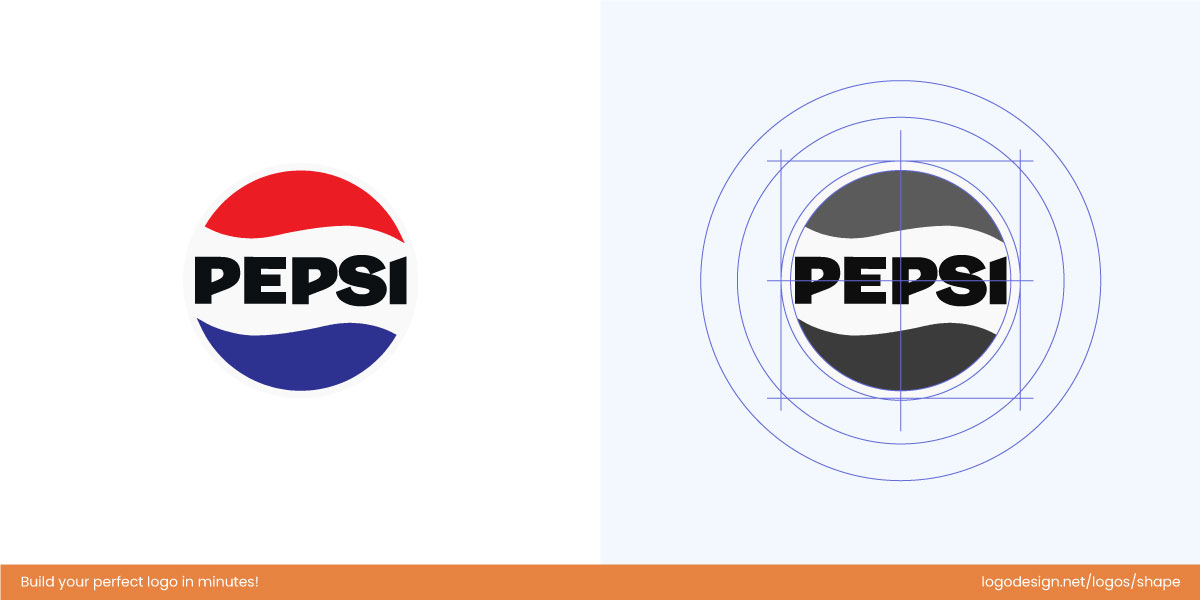
Pepsi’s red, white, and blue logo uses the Golden Ratio to create a visually balanced logo.
The Pepsi logo’s signature red, white, and blue sphere embodies perfect balance through proportions inspired by the Golden Ratio. The flowing white curve divides the circle in a way that creates natural harmony between motion and stability. This precise geometry in the logo gives the design its sense of dynamic equilibrium — visually balanced, instantly recognizable, and timelessly refreshing.
• Harmony
Harmony is what makes all design elements feel like they belong together. The Golden Ratio acts as an invisible grid, giving designers a framework for sizing, spacing, and alignment that feels effortless.
In art and architecture, this concept has guided creators for centuries — from Da Vinci’s Vitruvian Man to Le Corbusier’s Modulor system.
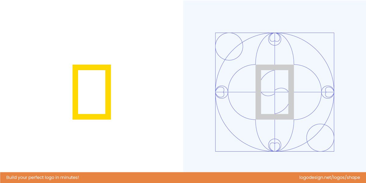
National Geographic’s iconic yellow frame follows the Golden Ratio to create a balanced logo.
The National Geographic logo, with its iconic yellow rectangular frame, embodies visual harmony through its proportions. The rectangle closely follows the Golden Ratio, a timeless mathematical principle found in nature and art, which creates a naturally pleasing balance between height and width. This simple yet precise geometry conveys stability, clarity, and elegance, making the logo feel balanced and harmonious while drawing the viewer’s eye effortlessly to the world it frames.
• Proportion
At its core, the Golden Ratio is the designer’s blueprint for proportion — defining how large or small one element should be compared to another. This relationship (1:1.618) creates natural tension and flow, helping the eye move effortlessly through the design.
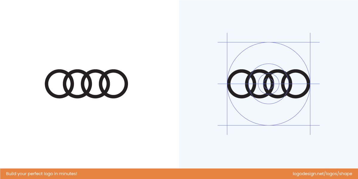
Audi’s four rings are proportioned and spaced using a Golden Ratio-inspired principle to show precision and elegance.
The Audi logo, with its four interlocking rings, is a masterclass in proportional harmony. Each ring is perfectly sized, and the spacing between them follows ratios inspired by the Golden Ratio, creating a natural rhythm and visual balance. This careful alignment ensures that no single ring dominates, while the interconnected arrangement conveys unity, precision, and elegance. The result is a logo that feels orderly, cohesive, and timeless, where the interplay of shapes embodies both technical perfection and aesthetic harmony.
• Focus
A well-balanced design subtly directs your eyes where they need to go — no extra effort required. The Golden Ratio helps establish a focal point that feels intuitive. Our eye naturally follows its spiral pattern, which mirrors how we scan scenes in real life.

Golden Ratio guides the Nvidia logo’s iconic eye, naturally drawing focus to its center.
The Nvidia logo, with its iconic stylized eye, exemplifies how Golden Ratio proportions guide focus. The spiral of the eye and the surrounding curves are aligned with proportions inspired by the Golden Ratio, naturally directing the viewer’s gaze toward the center of the eye — the focal point of the design. This careful geometric arrangement creates a sense of precision, depth, and visual hierarchy, ensuring that attention is immediately drawn to the core symbol. The result is a logo that feels dynamic yet balanced, with the eye’s central focus perfectly positioned to capture and hold the viewer’s attention.
• Aesthetics
Aesthetics are the emotional core of design — the feeling something gives you at first glance. The Golden Ratio heightens that emotional pull because our brains process its proportions more efficiently and find them more “beautiful” by default.
According to research in Frontiers in Human Neuroscience (2019), faces and objects that align with Golden Ratio proportions are rated significantly more attractive. The same rule applies in branding — designs that follow this geometry feel instantly pleasing, even if we can’t explain why.
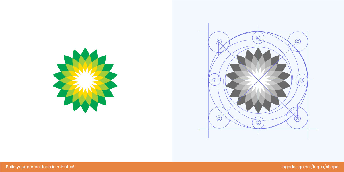
The BP logo, designed with Golden Ratio-inspired petals, creates a natural balance and visual flow.
The BP (British Petroleum) logo, with its radiant sunburst of green and yellow petals, exemplifies aesthetic beauty grounded in the Golden Ratio. Each petal varies in size according to proportions inspired by the Golden Ratio, creating a natural rhythm and visual flow. The interplay of larger and smaller petals produces balance and symmetry, while the circular arrangement guides the eye effortlessly toward the center. This careful proportional design gives the logo a sense of harmony, energy, and organic elegance, making it visually appealing and instantly memorable.
• Naturalness
From seashells to galaxies, nature loves the Golden Ratio. Because our brains have evolved surrounded by these proportions, we perceive them as the “default” for beauty and balance. A 2019 study in Frontiers in Human Neuroscience found that people rated objects and faces based on golden ratio proportions as more visually appealing.

Shell logo, inspired by the Golden Ratio, follows natural proportions for a balanced design.
The Shell logo, with its iconic scallop shape, exemplifies natural beauty grounded in the Golden Ratio. The curves of the shell fan out in proportions that mirror Fibonacci spirals, a manifestation of the Golden Ratio commonly found in nature. This creates a sense of organic growth, rhythm, and balance, making the logo feel alive and harmonious. The visual flow guides the eye effortlessly from the base to the tips of the shell, evoking the elegance and symmetry seen in real shells. Through these carefully crafted proportions, the Shell logo conveys both precision and a deep connection to natural forms, making it instantly recognizable and aesthetically pleasing.
• Flow
Flow is the path your eye naturally follows across a design. The golden ratio supports smooth visual movement by placing key elements along curves or intersections that align with our natural scanning patterns. This creates rhythm and momentum, keeping the viewer engaged while ensuring the composition never feels chaotic.

The Golden Ratio-inspired Firefox logo has spirals and curves to convey balance and energy.
The Firefox logo beautifully captures flow and energy through proportions inspired by the Golden Ratio. The fox’s body wraps around the globe in a spiraling motion that echoes the Golden Spiral, a natural expression of continuous growth and movement. Each curve — from the tail’s sweeping arc to the fox’s head — follows harmonious proportions that guide the eye smoothly around the circle. This precise geometry creates a sense of fluid motion and organic rhythm, making the logo feel alive, balanced, and dynamic. The result is a mark that embodies natural flow and digital speed, unified by timeless mathematical harmony.
• Elegance
The golden ratio lends an inherent sense of refinement and sophistication to design. Because its proportions are derived from natural mathematics, the resulting balance feels effortless rather than forced — like beauty that “just happens.” In logo design, elegance often comes from subtle control: consistent spacing, smooth curvature, and proportional hierarchy.
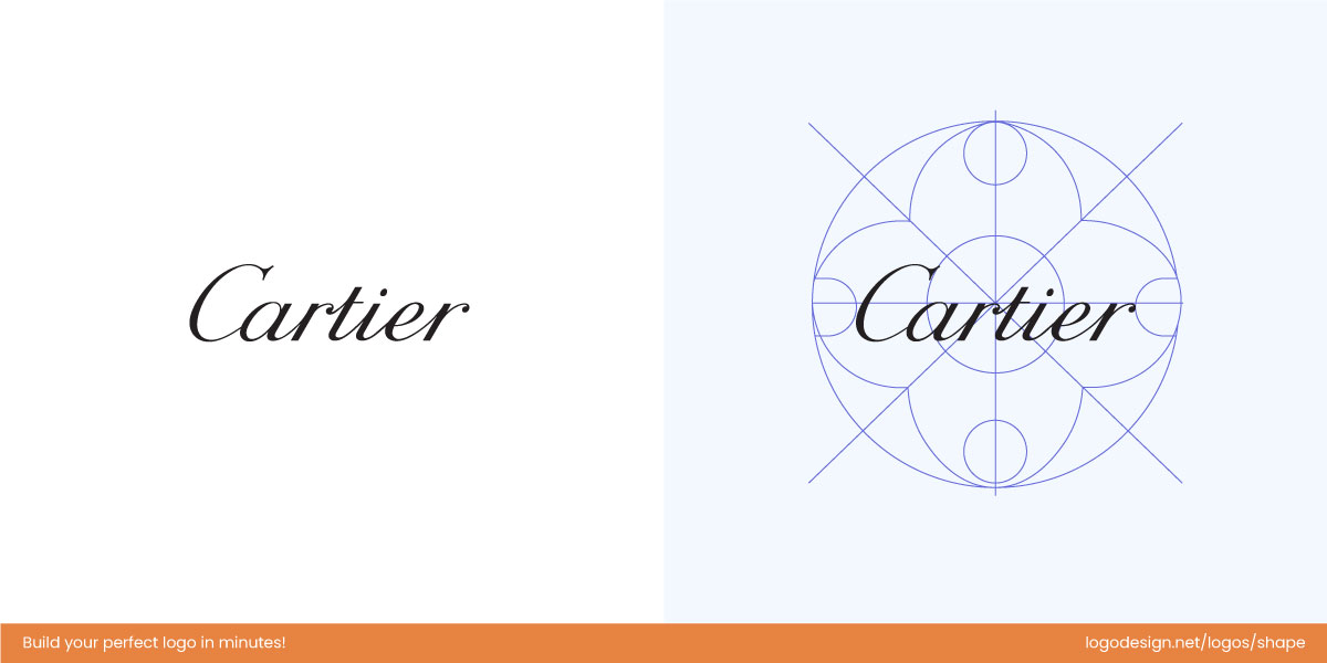
Cartier’s logo, using the Golden Ratio, shows elegance with flowing curves and perfect proportions.
The Cartier logo embodies refined elegance through the graceful balance of its handwritten script. Each curve and stroke follows proportions inspired by the Golden Ratio, creating a natural rhythm between thick and thin lines. The precise spacing in the logo between letters and the flowing continuity of the form guide the eye effortlessly from one character to the next, evoking a sense of harmony and sophistication. This subtle geometric precision gives the logo its timeless beauty — a perfect blend of artistry, proportion, and luxury that feels effortlessly elegant.
• Cohesion
Cohesion in design means that all elements — typography, shapes, and spacing — feel like they belong together. The golden ratio ensures consistent relationships among these parts, guiding how they connect visually. This mathematical relationship keeps even complex designs organized and integrated, so nothing feels out of place.
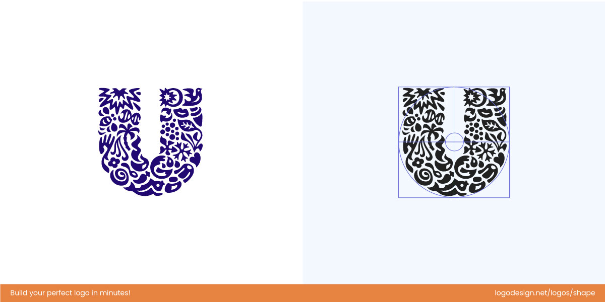
Unilever’s logo unites dozens of icons into a ‘U,’ using Golden Ratio proportions and spacing to create balance.
The Unilever logo achieves remarkable cohesion by uniting dozens of individual icons — each symbolizing an aspect of the brand’s diverse portfolio — into one harmonious “U.” The placement, curvature, and scale of these icons subtly follow Golden Ratio proportions, ensuring that no single element dominates while all contribute to a balanced whole. The rhythmic spacing and consistent geometric flow guide the viewer’s eye seamlessly around the form, creating a sense of unity within diversity. This proportional harmony gives the logo its cohesive strength and visual integrity, transforming many distinct parts into one elegant, interconnected identity.
• Visual Appeal
Visual appeal isn’t only about color or style — it’s how comfortably the human eye processes what it sees. Because the golden ratio mirrors natural visual patterns, designs that follow it often appear more “right” to the viewer. The ratio helps balance negative space and positive forms, producing logos that are memorable and satisfying to look at.
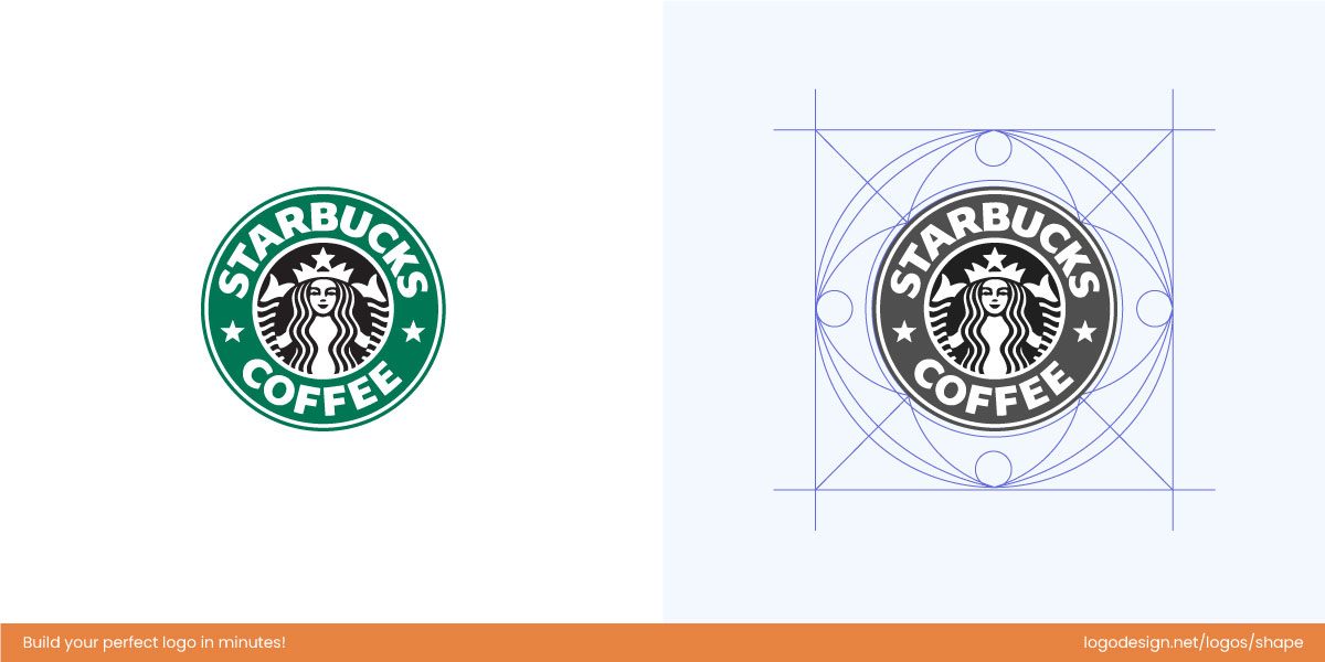
The Starbucks logo uses natural beauty and Golden Ratio-inspired spirals to create a balance.
The Starbucks logo captivates with its organic visual appeal, achieved through proportions inspired by the Golden Ratio. The curves of the siren’s hair and the circular frame are designed using spiral geometry that mirrors natural growth patterns, creating smooth, balanced motion. This subtle mathematical harmony gives the logo a sense of natural beauty and visual comfort, making it instantly attractive and effortlessly iconic.
• Symmetry
The golden ratio doesn’t require perfect symmetry — it creates visual symmetry of feeling. Even when elements differ in size, the spacing feels just right. This balance mimics how we perceive human faces or natural forms — not perfectly mirrored, but harmoniously aligned.
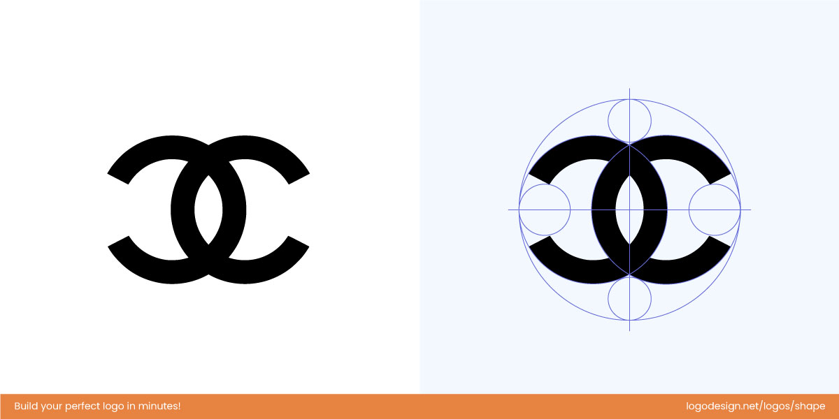
Chanel’s interlocking C’s create the perfect symmetry, guided by the Golden Ratio.
The Chanel logo, with its interlocking C’s, is a study in symmetry and proportion. The arcs and spacing between the two letters follow Golden Ratio relationships, creating a mirror-like balance that feels neither rigid nor forced. This precise harmony embodies the brand’s essence — refined, poised, and perfectly symmetrical — a mark of timeless sophistication shaped by mathematical elegance.
• Unity
Unity ensures that every visual element supports a single idea. The golden ratio connects all parts into one cohesive composition — a hallmark of strong branding. In design psychology, this creates Gestalt closure, where viewers see the whole before the parts.
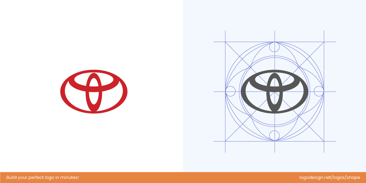
The Toyota logo, with overlapping ellipses in Golden Ratio harmony, shows unity, balance, and connection.
The Toyota logo expresses unity and cohesion through its precisely proportioned overlapping ellipses, arranged according to Golden Ratio dimensions. Each ellipse connects seamlessly to the next, symbolizing the harmony between company, customer, and innovation. The mathematical alignment creates a fluid sense of wholeness, making the logo feel complete, interconnected, and balanced — a perfect visual metaphor for unity.
• Timelessness
Designs based on natural mathematics age gracefully. Because the golden ratio mirrors the structure of the natural world, it stays relevant no matter how design trends evolve. Timeless proportion equals long-lasting recognition.
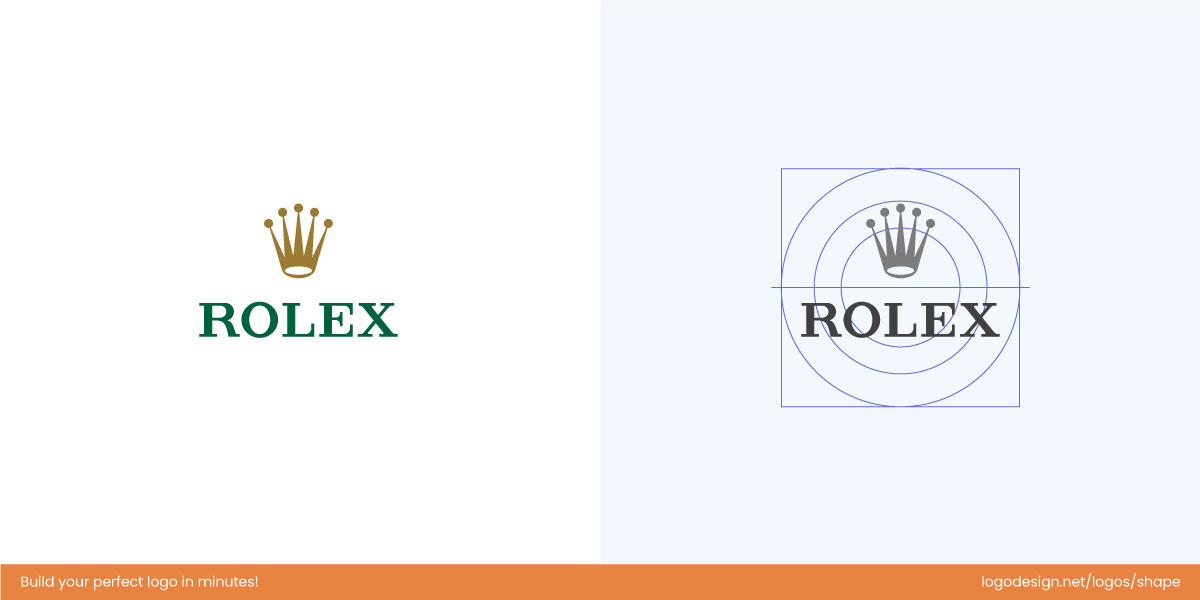
Rolex crown uses the Golden Ratio proportions to deliver an elegant design that balances form and space.
The Rolex crown achieves timelessness through Golden Ratio-based proportion in its structure. The height of the spikes, the curvature of the arc, and the negative space between elements are balanced in perfect harmony. These enduring proportions give the emblem a regal stability — elegant, measured, and unchanging across generations. It’s a design that transcends time because it’s built on the same geometry found in nature’s most lasting forms.
How to DIY Your Logo Using the Golden Ratio: Step-by-Step Guide
Creating a logo inspired by the Golden Ratio doesn’t have to be complicated. With our logo maker, you can design a balanced, visually pleasing logo by following these simple steps.
Step 1: Start with a Base Shape
The base shape is the foundation when creating a logo using a Golden Ratio
Start by selecting the primary shape or icon for your logo, whether it’s a circle, square, or letter-based mark. Choose a shape that feels slightly longer in one direction than the other — roughly following the 1:1.6 proportion. This shape will serve as the foundation, guiding the placement of all other elements.
Step 2: Add Supporting Elements
Create a balance between large and small elements for a consistent design
Next, introduce smaller icons, text, or decorative shapes around your base. Arrange them so they feel proportionate to the main shape. Larger elements can be balanced with smaller ones to create harmony, and layering thoughtfully will help your design feel cohesive. The goal is to achieve a natural visual balance without relying on precise measurements.
Step 3: Use Curves and Visual Guides for Flow
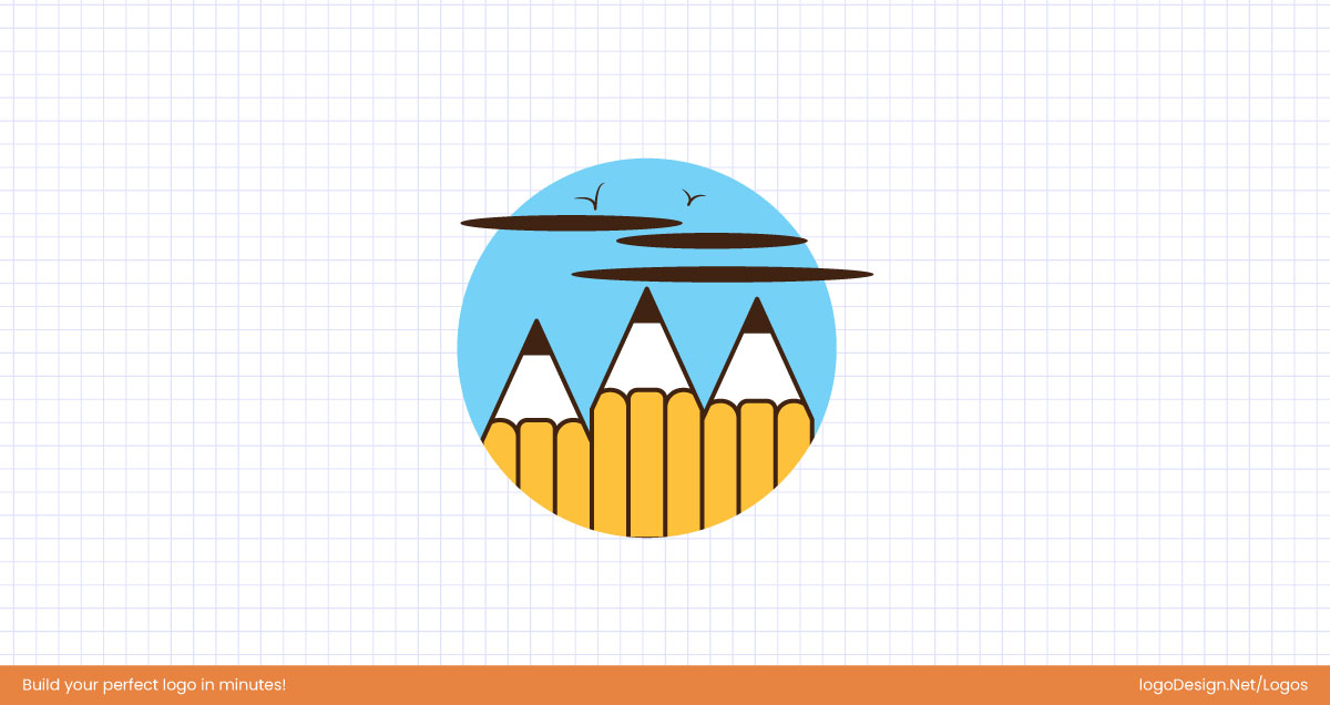
Use smooth arcs and flowing curves to guide the viewer’s eye and create a natural design.
If your logo has curved lines or swirls, imagine smooth arcs or circles to guide your design. These curves help your elements flow naturally and make the logo pleasing to the eye. Think about the path your viewer’s eye will take, and try to maintain gentle, continuous movement across the composition.
Step 4: Follow the Golden Spiral (Optional)
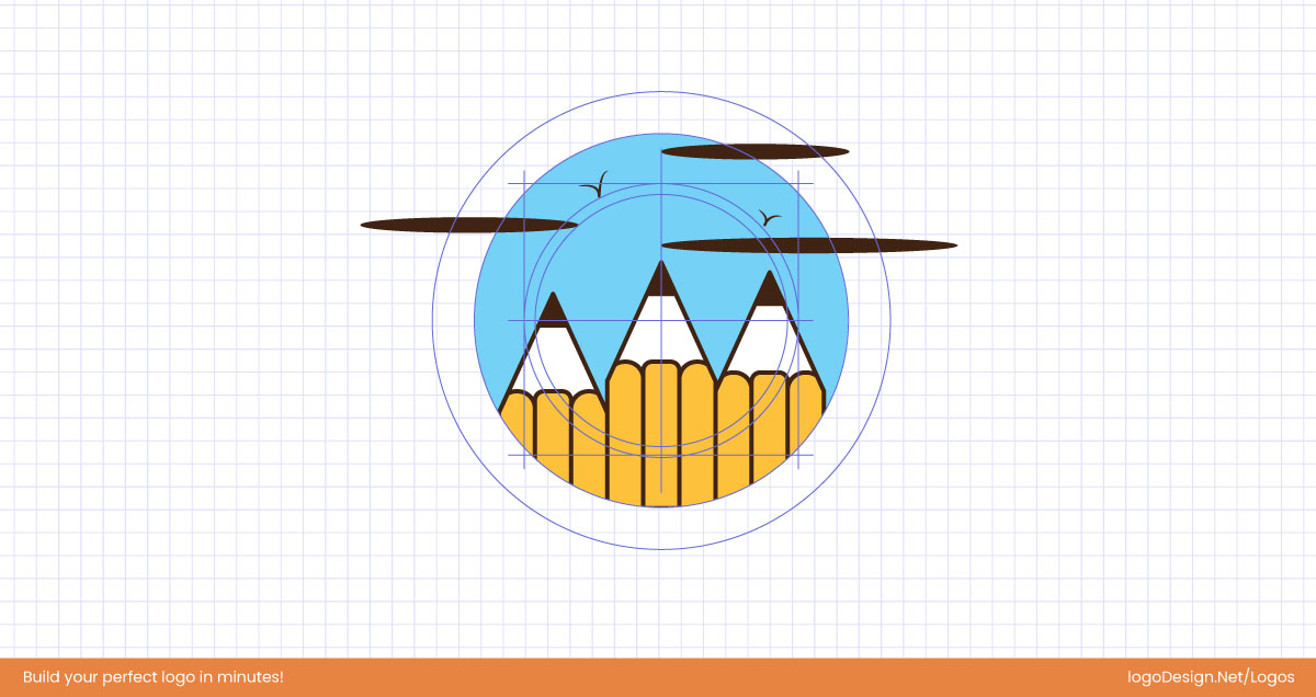
Use the golden spiral to place logo elements, creating natural movement and visual flow.
For logos with movement or rotation, lightly sketch a golden spiral or visualize its curve. Place key elements along the curve to guide visual focus and create a sense of flow. Use the spiral as inspiration rather than a strict rule — your design should feel balanced and effortless, not forced.
Step 5: Adjust and Refine

Adjust and refine your layout until the design feels balanced, simple, and visually unified.
Move and resize elements until the overall composition feels harmonious. Remove any unnecessary shapes and simplify where possible. Step back occasionally to check the design as a whole and make sure it feels unified and visually appealing at any size.
Step 6: Preview and Finalize

Preview your Golden Ratio-inspired logo across different displays to ensure it looks balanced.
Finally, test your logo in different contexts such as app icons, websites, or business cards. Once satisfied, download your design. You now have a Golden Ratio-inspired logo that is professional, balanced, and naturally pleasing to the eye.
Designer’s Takeaway – Conclusion
Take the golden ratio as your guide, but don’t be confined to it. When used with intention and the right knowledge, it can give your logo balance, flow, and the timeless feel most brands are looking for. But don’t rely on the ratio alone. Math will not make your design memorable, but you can do that by looking out for optical adjustements in your logo!
A great logo will tell your story, fit the brand, and still feel natural. The golden ratio will help you get there.
To keep in mind when designing:
- Use the golden ratio as a guide, not a cage.
- Start with your brand story, then refine with proportion.
- Keep it simple; don’t force spirals where they don’t belong.
- Test legibility at every size.
- Balance logic with brand personality
