Ever wondered how the fonts we see today came to be? The story stretches back to before the 1400s and has shaped the way we read, design, and connect with brands.
From the earliest days of commercial printing to the digital-first branding strategies of today, typography has undergone quite a few transformations. In the early modern period, businesses and publications began using specific typefaces to show authority or exclusivity. With industrialization, mass production, and culture in the 19th and 20th centuries, typography became a very important part of branding.
In the 20th century, fonts were chosen not only for readability but also for emotions and values. Be it Coca-Cola’s flowing script or Helvetica’s clean neutrality for brands like American Airlines, typography earned trust and familiarity. Today, typography in logos, for instance, must work across devices, screen sizes, and in cultural contexts.
Let’s discuss how typography has changed in the history of branding. And find out how it remains central to how brands express themselves.
Pre-1400s: Origins of Typography
Before typography as we know it became mainstream, the visual communication of written language was a long artistic process. Early civilizations developed systems of writing that would influence the shapes, styles, and purposes of letterforms in branding centuries later. And this also led to how font styles influence brand perception today.
• Cave Inscriptions & Ancient Scripts
The earliest forms of written communication include Egyptian hieroglyphs, Sumerian cuneiform, and later, Greek and Roman inscriptions. These were hand-carved into stone or added onto clay tablets. Roman capitals, for example, with their balanced, geometric precision, still influence type design today and are seen as timeless and authoritative. These are qualities many modern brands still aim to convey.

Zde / CC BY‑SA 4.0 (via Wikimedia Commons) – A close-up of an ancient Greek inscription carved into stone at the archaeological site of Delphi, Greece.

Kritzolina / CC BY‑SA 4.0 (via Wikimedia Commons) – This photograph captures a series of Latin inscriptions on stone tablets located in Dougga, a well-preserved Roman archaeological site in northern Tunisia.
Greek inscriptions introduced more fluid and structured alphabetic systems, while Roman square capitals set a foundation for elegance and legibility. They were two of the earliest typographic styles to be reused in modern branding.
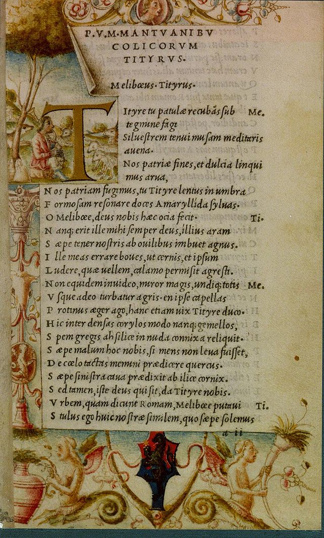
• Medieval Manuscripts
In medieval Europe, the production of written texts was handled primarily by scribes, particularly monks. They elaborate on handwriting styles such as Blackletter (also known as Gothic script, known for its thick, angular strokes and decorative appearance). Now, the script was decorative, but quite functional for their time. It was used to copy religious texts, legal documents, and scholarly pieces. They represented authority, tradition, and dedication, all of which were qualities that some luxury or heritage brands still associate with using Blackletter-inspired typography.

Paul Hermans / CC BY‑SA 4.0 (via Wikimedia Commons) – A medieval manuscript page, likely illustrating an ornate scene related to “Simonie” (the act of selling ecclesiastical roles), and named after the paleographer Albert Derolez.
At this stage, writing was both an art form and a craft. Each letter was carefully shaped by hand, and the visual identity of a manuscript was deeply tied to the script style chosen by the scribe. This was the time that set the ground for the aesthetic and communicative value of letterforms, before mass production or branding existed.
• Calligraphy
It is essential to note that this period is not closely tied to custom typography. In the pre-printing era, all writing was essentially calligraphy, whether individual, expressive, or handcrafted.

Unknown Artist/(via Wikimedia Commons) – This piece of Persian calligraphy, dating from the 13th century AH (approximately the 19th century CE), showcases the intricate artistry of Islamic calligraphy.
Calligraphy during this era set the stage for how letterforms were understood. These early letterforms became the starting point for what would become typographic style systems. They have significantly influenced the design of future typefaces used in branding.

Public Domain (via Wikimedia Commons) – A manuscript page from c. 1415 titled “Adam and Eve,” written in Bastard Secretary script — a cursive Gothic style known for its flowing strokes and abbreviations, common in 15th-century England.
Over time, writing styles grew more systematic, hinting at the transition from hand-drawn scripts to the printed typefaces that defined later centuries.
1450s–1600s: The Printing Revolution
When the printing press was invented, it was a turning point in the history of typography. For the first time, written language could be produced for the masses, standardized, and distributed widely.
• Johannes Gutenberg (1450s)
During the mid-15th century, German inventor Johannes Gutenberg developed the first movable type printing press in Europe.

Public Domain (via Wikimedia Commons) – This woodcut illustration by Jost Amman, created in 1568, depicts a 16th-century printing workshop.
Workshops became the center of Europe’s printing boom, where books, pamphlets, and religious texts could be produced at a scale never seen before. This innovation allowed individual metal letterforms to be arranged and reused.

Willi Heidelbach / CC BY-SA 3.0 (via Wikimedia Commons) – This close-up photograph shows metal movable type, a crucial element of traditional letterpress printing. It captures individual metal type pieces arranged in a composing stick, ready to be assembled into lines of text for printing.
Plus, with the movable type, printing was no longer a slow and manual task. It became a repeatable system that increased the speed and efficiency of knowledge spread across societies. Gutenberg’s breakthrough made books more affordable and accessible.
• Blackletter Typeface
The first printed books, including Gutenberg’s famous 42-line Bible, used Blackletter typefaces, also called Gothic or Textura. They had similar dense, angular handwriting styles common in medieval manuscripts, maintaining visual continuity between the handwritten and printed word.

Public Domain (via Wikimedia Commons) – A vellum copy of the Gutenberg Bible, printed by Johannes Gutenberg in Mainz, Germany, between 1453 and 1456.
Now, this typeface was a bit difficult to read by modern standards, but Blackletter conveyed tradition and authority.

Wellcome Library / CC BY 4.0 (via Wikimedia Commons) – A 15th-century English medical manuscript written in neat Gothic script, with 20 lines per page, decorative blue and red capitals, margins, and red underlines.
Though later replaced by more legible styles, blackletter left a lasting mark as a symbol of tradition and authority. Its legacy continues today in brands that want to bring a sense of heritage, such as The New York Times or Carlsberg.
• Roman Typefaces (1470s)
As the 1470s began, Nicolas Jenson introduced a new structure in typography design. He worked on Roman typefaces that were based on inscriptions. These letterforms’ balanced appearance with readability has inspired modern serif typefaces too.

Public Domain (via Wikimedia Commons) – A sample of the Roman typeface designed by Nicolas Jenson, featured in an edition of Laertius printed in Venice in 1475.
Jenson’s work also reflected the humanist ideals of the Renaissance, where clarity and proportion were celebrated in both art and tradition. The Roman style quickly became dominant in Italian and French printing at the time.
• Italics (1500s)
Aldus Manutius, a printer and publisher, introduced italic typefaces in the early 1500s. He was looking for a way to fit more words onto a page, making books smaller and more compact.

Wellcome Library / CC BY 4.0 (via Wikimedia Commons) – A 1501 edition of Virgil printed by Aldus Manutius, showcasing early italic type. This landmark in typographic history emphasized readability and compact design, influencing modern book typography.
This marked a turning point in book design. The compact format, paired with italics, encouraged private ownership and reading beyond religious and scholarly circles.

Public Domain (via Wikimedia Commons) – This image showcases pages from the 1501 edition of Vergilius, published by Aldus Manutius in Venice. It is renowned for being the first book printed in italic type, designed by Francesco Griffo.
Italics were a functional innovation that helped promote interest in personal reading and scholarship. Centuries later, italics still carry that sense of distinction. Whether for emphasis or style, they add personality to text in both print and digital typography.

Modern italics across various fonts, bringing emphasis, elegance, and dynamic flow to contemporary design.
Today, they are also known for drawing emphasis, adding elegance, or differentiation in text.
• Handwritten to Mechanical
At this time, there was a major shift from calligraphy to typography. It became an art that could be reproduced easily with the help of any designer and printer. This also began to develop into a design language that could reflect tone and identity, setting the foundation for its use in brand communication.

Frank R. Kepler / Public Domain (via Wikimedia Commons) – A page from the 1916 instructional manual Mechanical Drawing: Lettering, Materials and Methods by Frank R. Kepler, showing precise technical lettering practices used in early 20th-century drafting.
Many of the fonts designers love today were influenced by those times. For example, fonts like Adobe Jenson and Garamond trace their roots back to these shifts. They balance the precision of mechanical methods with the humanist qualities of handwritten forms.

As the demand for printed material increased, typefaces adapted to new cultural and commercial purposes. Design began to be considered as a tool, leading to typography’s key role in branding years later.
1600s–1700s: Baroque & Old Style Typography
Typography went through a lot of changes during the 1600s and 1700s. As printing became more widespread and refined, so did the design of letterforms. In this time, typography went beyond functional forms into something more expressive, elegant, and brand-relevant.
• Old Style Serifs: Warmth and Humanism
Old-style typefaces gained popularity during the Renaissance and the Baroque period. Most of them were recognized for their humanist characteristics.

Claude Garamond / CC BY‑SA 4.0 (via Wikimedia Commons) – A printed specimen of Claude Garamond’s “Gros Canon” typeface, showing upper- and lowercase letters. Reproduced in the 20th century from original matrices, with annotations by Jan Tschichold linked to his Sabon design.
These fonts, such as Garamond, were inspired by calligraphy and featured:

Garamond font features diagonal stress, subtle stroke contrast, and a low x-height.
- Low contrast between thick and thin strokes
- Angled stress, reflecting the movement of the human hand
- Serifs with a soft, bracketed style, rather than sharp edges
These features gave Old Style fonts a warm, organic, and readable quality.
Even today, fonts like Garamond bring out tradition, reliability, and sophistication. These traits are used by brands looking to convey a message of timelessness.
• Transitional Typefaces: Precision and Elegance
By the mid-1700s, the typographic style began transforming as type designers like John Baskerville introduced their work. It led to the rise of transitional typefaces that combined old and modern styles.

John Evelyn / Public Domain (via Wikimedia Commons) – The frontispiece and title page from Sculptura: or the History and Art of Chalcography and Engraving in Copper (1662) by John Evelyn.
Key characteristics of transitional fonts include:

Baskerville, an 18th-century English typeface, is known for its consistent letterforms, high stroke contrast, and refined serifs.
- Higher contrast between thick and thin strokes
- More vertical axis (or stress) in the letters
- Sharper, more refined serifs
- More consistency in letterform shapes and proportions.
Baskerville’s typefaces represented a balance between function and form, and they began to communicate not just information, but brand character and professionalism too.
• Functional and Aesthetic Typography
After that time, typography was no longer just a tool for content. It began to take on a visual meaning of its own. The style of the type could now influence how a message was perceived. Was it formal or informal? Elegant or rustic? Trustworthy or experimental?
These changes led to a key role in branding. As businesses and big brands base their decisions on public perception, they focus more on typographic choices that make audiences engage with them. And it also helped them avoid common mistakes in logo typography.

Oxford University Press Museum / CC BY-SA 4.0 (via Wikimedia Commons) – This photograph captures the interior of the Oxford University Press Museum, highlighting the historical significance of the Fell Types.
Bishop John Fell commissioned Fell Type for Oxford University Press. These types had a slightly idiosyncratic elegance—somewhat irregular but artistically expressive. Fell Type was designed for legibility in academic texts.
Key characteristics of aesthetic and functional fell type include:

Fell Type, a 17th-century English typeface, is characterized by its irregular letterforms, moderate contrast, and bracketed serifs.
- Slightly irregular, hand-cut appearance reflecting early typefounding
- Moderate contrast between thick and thin strokes
- Strong, bracketed serifs with some decorative flair
- Unique letterforms with subtle idiosyncrasies, blending readability and artistry
- Designed for clarity in academic and religious texts, balancing function and style
Today, we still see aspects of Baroque and Old Style typography in the branding:
- Universities and publishing houses (which often use Garamond or Baskerville)
- Luxury brands that convey refinement and legacy
- Editorial and lifestyle magazines that enhance readability
Late 1700s–1800s: The Rise of Modern & Didone Typefaces
In the late 18th century, you can find the rise of Didone typefaces, named after Bodoni in Italy and Didot in France. These typefaces featured contrast between thick and thin strokes and brought out a sense of luxury and refinement.

Redford & Robins / Public Domain (via Wikimedia Commons) – This mid-19th-century poster, created by Redford & Robins between 1840 and 1850, is held in the Museum of London. It features bold Didone typography and decorative borders typical of the era’s print design.
Didone typefaces thrived in print culture, giving posters, books, and advertisements a polished, high-contrast look that commanded attention. This new typographic style was different from the earlier transitional typefaces (like Baskerville), aiming for geometric precision.

Born in late-18th century France, Didone dazzles with its geometric elegance, pairing razor-thin unbracketed serifs with dramatic stroke contrast for a strikingly modern effect.
Its sharp serifs and dramatic contrasts embodied the precision of the Industrial Age, shaping a typographic language that still signals elegance and sophistication today.
• Fashion, Luxury, and Fine Printing
Didone typefaces became closely associated with high-end branding, a connection that continues today. Their refined and stylish look made them ideal for editorial layouts, perfume packaging, and luxury fashion brands (think Vogue magazine’s iconic banner).

Vogue Magazine / Public Domain (via Wikimedia Commons) – This is the February 13, 1908 issue of Vogue, with the magazine’s name prominently lettered in a Didone-style serif.
These typefaces helped establish the idea that typography showcased a brand’s personality, not just information.
• Industrial Revolution
As the Industrial Revolution took over, commercial printing shifted from books to advertising and signage. This era encouraged typographic experimentation, giving rise to bold, ornamental, and highly stylised letterforms. It marked the point where type design became a commercial art in its own right.

Warder, Mitchell & Company / Public Domain (via Wikimedia Commons) – Champion Reaping and Mowing Machines Brochure (1800s) features bold, serif typefaces with a strong emphasis on the company’s name and product offerings.
The ornate borders and bold lettering in trade brochures like this reflected a blend of function and flourish. Such designs not only advertised products but also mirrored the Victorian taste for decoration, where typography itself became part of the visual appeal.
This need drove the popularity of display typefaces that were loud and larger-than-life. They were primarily used in posters, billboards, and product labels.
• Functional and Expressive
This era was also the time when there was clear differentiation in type design between fonts for extended reading (e.g., books, newspapers) and those for visual impact.
The expressive display faces played a significant role in branding and marketing, and made typography an important asset.
19th Century: Industrial Expansion
The 19th century saw a lot of Innovations in printing technology, and mass production allowed for the development of new type styles.

Emerging in mid-19th century England, Clarendon stands tall with its sturdy slab serifs, balanced contrast, and slightly condensed forms that exude strength and reliability.
Slab serifs, like Clarendon, featured thick, block-like serifs that gave a sturdy, impactful appearance.

Public Domain (via Wikimedia Commons) – This late 19th-century poster showcases actress Fanny Davenport alongside bold, ornamental serif lettering that reflects Clarendon’s pronounced vertical emphasis and slab-like characteristics.
Posters for theatre and entertainment leaned heavily on these robust letterforms. They ensured names and titles stood out in busy urban streetscapes filled with competing signs.

Public Domain (via Wikimedia Commons) – This vibrant 1880 advertisement for Queen of the Laundry soap uses bold serif lettering that closely mirrors Clarendon’s strong vertical lines and substantial weight, though with a more decorative flair.
In consumer advertising, slab serifs projected trust and durability, qualities that aligned perfectly with household goods and everyday products vying for attention in an expanding marketplace.
In short, they were ideal for marketing materials like flyers, brochures, and advertisements, contributing to a growing visual language of branding.

Born in 19th-century Britain, Grotesque introduced the world to early sans-serif design with its squared letterforms, closed apertures, and a mechanical yet subtly humanist touch.
The earliest sans-serif typefaces were labeled ‘grotesque’. They were minimal and clear-cut, as they are today. While initially not received positively by audiences, sans serifs soon began to be seen in signage and corporate branding.

Public Domain (via Wikimedia Commons) – This late-19th-century poster for the Fire Extinguisher Mfg. Co. uses bold, condensed sans-serif lettering—an early Grotesque style—to convey industrial strength and clarity, typical of utilitarian advertising of the era.
Designs like these show how sans-serif fonts carried an industrial, no-nonsense character that stood them apart. Their clean lines were associated with modernity and neutrality, crucial values in 20th-century branding.
• Mass Printing
Publishers, advertisers, and retailers needed typefaces that could differentiate products, convey urgency, and attract the attention of viewers as well.

Public Domain (via Wikimedia Commons) – This 1891 campaign poster for Sir John A. Macdonald—bearing the slogan “The Old Flag – The Old Policy – The Old Leader”—uses bold, condensed serif display lettering.
More specifically, political campaigns of that era relied on striking typography to reinforce slogans and rally public sentiment. Typography at this time became a very competitive tool in brand visibility and consumer recognition.

Public Domain (via Wikimedia Commons) -The poster for “Dawn of the Century – March & Two Step” features bold, decorative serif typography with arched and shadowed lettering that reflects the grandeur and optimism of the early 1900s.
Entertainment posters also embraced elaborate type treatments that matched the spectacle of the events they promoted. This showcased that typography could amplify excitement as much as information.
Early 1900s: Modernism in Typography
The influence of Modernist art movements like Bauhaus, De Stijl (Netherlands), and Swiss Design (also known as the International Typographic Style) became mainstream in the 20th century. This influenced typography greatly as schools focused on order, clarity, and modern design, moving away from the decorative fonts of the Victorian era.
• Sans Serif Modernism
Jan Tschichold and Herbert Bayer were two of the most influential figures in 20th-century graphic design and typography, particularly associated with modernist design and the Bauhaus movement.

British Museum / Public Domain (via Wikimedia Commons) – A Penguin Books cover designed by Jan Tschichold, highlighting his minimalist approach to typography and layout.
Jan Tschichold revolutionized typography by championing clean, functional sans-serif design in The New Typography and applied these principles to create timeless, modern branding like his iconic Penguin Books redesign.

Herbert Bayer’s 1920s Bauhaus creation, Universal Type, strips typography to its essence with all-lowercase, geometric forms, and a perfectly even stroke weight.
Herbert Bayer, a Bauhaus pioneer, advanced geometric sans-serif typography with his Universal typeface and shaped modern corporate identity through minimalist, integrated design solutions.
Jan Tschichold
 Erling Mandelmann / CC BY‑SA 3.0 (via Wikimedia Commons) – A distinguished portrait of Jan Tschichold in 1963, captured by photographer Erling Mandelmann.
|
Herbert Bayer
 Soichi Sunami / Public Domain (MoMA Archives) – This black-and-white photograph captures Herbert Bayer standing thoughtfully amid his Bauhaus exhibition design.
|
Both promoted sans-serif typefaces for their ability to communicate ideas clearly and globally. Their work made typography a functional component of branding, one that conveyed trust, efficiency, and forward-thinking values.
• Iconic Fonts Born: Futura (1927) and Gill Sans (1928)
The introduction of Futura by Paul Renner and Gill Sans by Eric Gill in the late 1920s provided the design world with timeless sans serif fonts that are still used today.

Designed by Eric Gill in 1928, Gill Sans blends humanist warmth with clean modernity, featuring open apertures, gentle stroke contrast, and rounded terminals that give it a timeless appeal.

Created by Paul Renner in 1927, Futura embodies the Bauhaus spirit with its sharp geometry, uniform strokes, and tall x-height, delivering a sleek and unmistakably modern look.
Futura, with its geometric accuracy, and Gill Sans, with its warmth, became quite common in corporate branding. The font styles were used by companies like Volkswagen, BBC, and Swissair.

Public Domain (via Wikimedia Commons) – This early 20th-century Coors Malted Milk ad features the geometric sans-serif Futura, highlighting clean, modern lines and strong legibility typical of the era’s design style.
Ads like the Coors Malted Milk captured the optimism of modernism, where Futura’s sharp geometry symbolized progress, efficiency, and a forward-looking spirit.

Public Domain (via Wikimedia Commons) – This 1926 film poster features bold, clean sans-serif typography reminiscent of early Gill Sans, reflecting the modern and elegant style of the era.
Gill Sans, on the other hand, carried a friendlier, more human touch, making it a natural fit for cultural works and public communications of the time.
• Typography Became a Tool for Rational Design
In branding, it was essential to select fonts that were clear and universally recognized, as this would lead to global consistency and legibility.

Public Domain (via Wikimedia Commons) – This 1951 sci-fi poster uses bold, condensed sans-serif type resembling Futura, embodying the mid-century modern geometric style.
Brands began to recognize that the type they chose could significantly influence how their message was received and recalled. This 1951 Sci-Fi poster in a geometric style font is a great example.
The Chanel logo’s interlocking double-C uses clean, balanced typography that reflects timeless elegance and modern simplicity.
Back in 1910, when Coco Chanel opened her first boutique, she was already changing the way people thought about elegance. A few years later, in 1925, she introduced the now-famous double-C logo. This simple, bold, and modern brand mark captured her vision and went on to become one of fashion’s most recognizable symbols.
The 1937 Volkswagen logo featured bold, geometric lettering that mirrored the industrial precision and modernist spirit of its era.
When Volkswagen was founded in 1937, its logo carried the sharp, modern look of the era. Influenced by the Bauhaus style and the clean geometry of typefaces like Futura, it showed a stacked “V” and “W” inside a cogwheel. The design wasn’t lifted from a font but built to feel industrial and precise, a perfect fit for a company that wanted to represent progress and Germany’s growing automotive industry.
The 1924 Marlboro logo showcased elegant serif lettering, with refined strokes that conveyed sophistication and a sense of prestige fitting for its early image.
When Marlboro first came out in 1924, the brand leaned heavily on elegance. Its wordmark was set in bold serif capitals, dressed up with decorative touches that gave it a polished, upscale look. At the time, it was aimed mainly at women, and the refined typography was meant to match that sense of sophistication.
1950s–1960s: The International (Swiss) Style
By the mid-20th century, Switzerland became the center of a new approach to design. It was known as the International Typographic Style, commonly referred to as the Swiss Style. Instead of seeing typography as decoration only, Swiss designers placed it at the core of communication.
• Grid-Based Design
Swiss Style followed modular grid systems, which allowed designers to arrange text and images with precision and consistency.

A pair of Swiss-style posters shows one in minimalist typography and the other revealing the red grid beneath, highlighting the precision of International Typographic Style.
The grid brought order and consistency, letting type and images sit together with precision. Think of it as giving design its own invisible scaffolding, one that makes layouts feel balanced, logical, and effortless to read.
The 1960s Swissair logo uses a clean, geometric sans-serif typeface, embodying Swiss precision and timeless elegance.
By the late 1960s, even global brands were struggling to find that kind of structure. Swissair, for example, had a modern look but no real cohesion. In 1978, designer Karl Gerstner stepped in with a complete rebrand. He anchored the identity in Futura Bold, a typeface known for its clarity and geometric form, and paired it with a strict typographic grid.
Suddenly, everything from tickets and timetables to the aircraft livery followed the same logic. The result was branding with confidence, built on the Swiss belief that clarity is the highest form of style.
• Neutral Sans Serifs
Sans-serif fonts like Helvetica (1957) and Univers (1957) became the focus of this movement. These typefaces were designed to be neutral, highly legible, and adaptable.

A Swiss-born neo-grotesque classic, Helvetica boasts uniform strokes, tight spacing, and a clean, neutral design that stays effortlessly legible from posters to footnotes.
What made Helvetica famous was its clean construction and the ability to let the message take center stage, rather than the font trying to make a statement. That quiet neutrality is exactly why so many brands trusted it to represent them.
The 1967 American Airlines logo features bold Helvetica typography, emphasizing modernity and clarity through its clean, sans-serif letterforms.
When Massimo Vignelli redesigned American Airlines’ logo in 1967, he put Helvetica to work in its purest form. No frills, no symbols, just plain text. “American” in blue and “Airlines” in red, set in Helvetica, gave the brand a clean, modern voice. The design’s strength came from restraint: nothing distracted from the name itself. It showed how typography, when chosen well, could carry an entire brand on its own.
Epson’s 1975 logo uses a bold, geometric sans-serif typeface with tight spacing and sharp angles, reflecting a futuristic and tech-forward identity.
Epson’s 1975 logo carried the same spirit of modernism. Bold Helvetica Neue, evenly spaced and tightly set, gave the wordmark a sense of technical precision. There was no need for extra decoration; the simplicity of the type spoke volumes. Helvetica was the perfect fit for a company built on innovation and reliability.

Public Domain (via Wikimedia Commons) – This 1970 Buick ad uses Helvetica, a clean, modern sans-serif with uniform strokes and high legibility, reflecting the brand’s reliable and sophisticated image.
Even car ads weren’t immune to Helvetica’s charm. This 1970 Buick advertisement relied on its clean, modern lines to project trust, quality, and sophistication. Helvetica became the visual shorthand for reliability, whether you were selling technology, airlines, or automobiles.

Born in Switzerland, Univers brings a rational elegance to type with its open apertures, square counters, and a pioneering classification system that pairs consistency with a touch more contrast than its Helvetica cousin.
Designed by Adrian Frutiger in 1957, Univers took the same modernist ideals as Helvetica but gave them a more systematic approach. Its slightly wider letterforms and open apertures made it feel a bit friendlier and easier to read, while its grid of weights and widths offered designers an entire toolkit in one type family.

Public Domain (via Wikimedia Commons) – Yuban Coffee Ad (1970) ad uses Univers, a clean, legible sans-serif with uniform strokes, reflecting the minimalist, modern design trends of the 1970s.
This 1970 Yuban Coffee ad shows Univers in action. With its clean strokes and clear spacing, the typeface brings a sense of calm precision to the layout. Univers wasn’t trying to be expressive; it was built to support the message and give the product an air of modern confidence and straightforward sophistication.

Public Domain (via Wikimedia Commons) – Virginia Slims Ad features Kabel, a geometric sans-serif with crisp lines, emphasizing a sleek and contemporary look typical of the era.
The 1970 Virginia Slims advertisement features the Kabel typeface, a geometric sans-serif designed by Rudolf Koch. Kabel is noted for its clean, modernist design with geometric forms and uniform stroke weights. In this ad, Kabel’s use underscores the brand’s alignment with contemporary design trends, emphasizing a sleek and modern image.
This highlighted the idea that typography should convey the main brand message, not distract from it.
• Shift from Decorative to Functional
At this time, typography became neutral. It did not have any emotional or cultural associations for universal communication. For global brands, this worked very well. It allowed them to present consistent identities across languages and cultures.

Public Domain (via Wikimedia Commons) – The minimalist film poster for Wanda leans into a stark, all-caps sans-serif to project modern restraint and clarity. This typographic choice underscores the film’s austere, contemplative tone.
The stark film poster for Wanda uses an all-caps sans-serif that strips everything down to its essentials. The restraint in the typography mirrors the film’s raw, contemplative tone, proving that type alone can set a mood without the need for ornament.

Public Domain (via Wikimedia Commons) – The Mindset ad features clean, modern sans-serif typography to communicate the futuristic and performance-driven character of the hardware.
This 1984 Mindset computer ad leans on sleek sans-serif type to push a futuristic, performance-driven feel. The clarity of the letterforms reinforced the product’s promise of innovation which shows how modern typography could sell both an image and an idea.

Public Domain (via Wikimedia Commons) – Tandy’s tech-forward ad employs neo-grotesque font for both headings and body text, reinforcing a sleek, technical aesthetic in line with its innovative computer positioning.
The Tandy 2000 took a similar approach, using a neo-grotesque font across both headlines and body copy. This consistency gave the design a technical edge, aligning perfectly with the computer’s positioning as ahead of its time.
Helvetica, in particular, became the darling of corporate identity, especially after the 1960s, and many global brands adopted it. By the late 1900s (roughly 1960s–1990s), several well-known companies standardized their wordmarks in Helvetica.

Helvetica: The typeface that quietly took over corporate America in the late 20th century.
1970s–1990s: Postmodernism & The Digital Typography Revolution
The Postmodern era of the late 20th century promoted individualism and expression. Designers like David Carson (of Ray Gun magazine) and Neville Brody (of The Face magazine) rejected legibility as the primary goal in branding. They experimented with layouts, distressed type, and custom letterforms.

Public Domain (via Wikimedia Commons) – The April 1981 issue of The Face Magazine cover exemplifies a pivotal shift in late-20th-century typography—where once clarity and clean grids reigned, dynamic typography began to command not just attention, but emotion.
The cover of The Face magazine from 1981 shows just how radical this new wave was. This was typography breaking free from rules, proving that letters could be as expressive as images themselves. Typography once again became emotional and artistic.
• Introduction of Desktop Publishing (1980s)
The 1980s also witnessed a technological shift with the rise of desktop publishing software (e.g., Adobe PageMaker, Aldus FreeHand) and the increasing affordability of home computers.
The 1980s saw a tech shift with desktop publishing tools like Adobe PageMaker and Aldus FreeHand revolutionizing design.
For the first time, typography was accessible to people everywhere, not just trained designers or printers. This marked the beginning of typography as a mainstream design practice, leading to increased creativity and the support of digital formats.
With the rise of digital formats, certain fonts gained renewed attention, and completely new type categories began to take shape.
1. Humanist Sans Serifs
Humanist sans serifs take inspiration from traditional calligraphy, which gives them a more natural, approachable feel than the rigid forms of earlier sans-serifs. Their open shapes and variable strokes make them highly legible and versatile, especially on digital screens.

Humanist sans-serifs blend calligraphic warmth with open, legible forms, offering a friendly and highly readable style ideal for both print and screens.
These typefaces balance professionalism with warmth, making them popular choices for brands that want to feel modern but also approachable. Below are a few examples that show how Humanist sans serifs have been used in branding.
The Aéroports de Paris logo (1971–2006) used a clean humanist sans-serif typeface, balancing modern simplicity with approachable character to convey reliability and ease of travel.
The Aéroports de Paris wordmark (1971–2006) relied on the clarity and friendliness of a Humanist sans-serif to give an accessible yet professional identity.
The early Mozilla Firefox logo featured a humanist sans-serif wordmark with open, approachable letterforms that emphasized clarity while maintaining a modern, welcoming feel.
Mozilla Firefox’s wordmark also embraces a Humanist sans-serif, striking a balance between technical precision and user-friendly warmth.
2. Geometric Sans Serifs
Geometric sans serifs emerged from the modernist pursuit of simplicity and mathematical precision. Built on circles, squares, and straight lines, these typefaces embody clarity and rationality, with their perfectly round “O”s and even stroke widths.

Geometric sans-serifs feature precise, circle- and square-based forms with uniform strokes and minimal details, creating a clean, modern, and highly structured look.
Their clean, almost architectural forms give off a sense of balance and stability. It’s a favorite for brands that want to project modernity, confidence, and timeless design. Unlike the softer Humanist sans serifs, geometric styles feel cooler and more objective, perfect for bold, forward-looking identities.
Let’s look at the examples:
The 1975 NASA Worm logo uses a sleek, geometric sans-serif with continuous, curving letterforms that embody futuristic precision and streamlined modernity.
The sleek strokes of the NASA wordmark portray the futuristic precision that geometric sans serifs are known for.
The 1973 Pan Am logo features a bold, geometric sans-serif wordmark with clean, evenly spaced letters that project clarity, modernity, and global confidence.
Pan Am’s minimalist wordmark also pairs clean geometric forms with its globe icon.
3. Neo-Grotesques
Emerging in the mid-20th century, neo-grotesques refined earlier grotesque designs by stripping away quirks and favoring neutrality. They became the typefaces of modern corporate identity, offering brands a clean and professional voice that felt universally adaptable.

Neo-Grotesques are neutral, tightly constructed sans-serifs with minimal contrast and closed apertures, delivering a clean, impersonal clarity suited for universal use.
Carried by their neutrality and legibility, these typefaces became hallmarks of branding from fashion to furniture.
Examples here:
The American Apparel logo (1989) uses a stark, Helvetica-inspired sans-serif, projecting a minimalist, utilitarian aesthetic that aligns with its no-frills, urban identity.
American Apparel’s Helvetica-based wordmark projects a bold, straightforward confidence aligned with the brand’s stripped-down aesthetic.
The Knoll logo (1967), designed by Massimo Vignelli, employs Helvetica’s clean, modernist letterforms to embody timeless simplicity and functional elegance.
The Knoll logo uses Helvetica to embody timeless modernism and functional clarity.
4. Transitional Serifs
Transitional serifs marked a step between the old-style warmth of Garamond and the sharp precision of Didone faces. With their vertical stress, higher contrast, and refined bracketed serifs, they offered elegance while remaining highly readable. They are a natural fit for print, publishing, and timeless brand identities.

Transitional serifs blend classical warmth with sharper contrast and vertical precision, offering refined elegance and highly readable letterforms.
Favored for their balance and beauty, transitional serifs have made their way into global media and iconic branding, seen in the examples listed below.

TIME Magazine cover, [1980s], © TIME USA, LLC – used here for editorial/educational purposes. Time’s iconic masthead in the 1980s featured refined, uppercase serif letters with bold vertical stress and extended serifs
The recurring use of Times New Roman gave the TIME magazine a voice of authority, tradition, and global recognition.
Since 1990, the Seiko logo has featured a bold, sans-serif typeface that reflects precision, modernity, and timeless simplicity.
The clean serif logotype of Seiko underscores the brand’s precision while retaining a sense of classical refinement.
Designed by Alan Fletcher in 1989, the Victoria and Albert Museum logo features elegant, serif typography with a distinctive ligature between the "V" and the ampersand, blending tradition with modern visual flair.
The Baskerville-inspired logo fuses elegance with cultural gravitas, befitting a national art institution.
5. Grunge Display Fonts
By the 1990s, typography mirrored the rebellious energy of alternative culture. Grunge display fonts broke away from order and precision, embracing rough textures, chaotic forms, and deliberately imperfect legibility. They became a hallmark of underground music scenes, DIY zines, and brands that wanted to reject polish for raw authenticity.

Grunge and display fonts embrace rough textures, broken forms, and irregular spacing to capture the raw, rebellious spirit of 1990s alternative design.
Their power lies in capturing attitude over clarity, deliberately messy, but loaded with cultural impact. Examples below:

Public Domain (via Wikimedia Commons) – This 1995 vibrant event poster for E-Werk (a Berlin techno club) uses layered, distorted imagery and bold, glowing typography to evoke the energy of an ecstatic, late-20th-century nightlife scene.
With layered visuals and distressed type, the Berlin club flyer embodies the chaotic spirit of underground rave culture.
The 1993 Pearl Jam logo uses a bold, distressed sans-serif typeface, giving the wordmark a raw, grunge-inspired look that reflects the band’s unpolished energy and rebellious 1990s aesthetic.
The jagged, hand-drawn lettering style reflects the raw, unfiltered ethos of grunge music at its peak.
Epitaph Records – Punk/grunge record label launched in the 1980s whose logo incorporated distressed, gothic-inspired type with rough edges.
The rough-edged, gothic-inspired typography conveys the rebellious identity of one of punk’s most influential record labels.
6. Pixel & Bitmap Fonts
The rise of computers and video games in the late 20th century gave birth to pixel and bitmap fonts–typefaces built on tiny grids of squares. These fonts work within digital limits, where every curve had to be translated into steps of blocks. The result was a look that’s now instantly associated with early gaming, retro tech, and the first digital interfaces.
Pixel and bitmap fonts bring a retro digital vibe with blocky grids, step-like curves, and monospaced simplicity.
They may feel nostalgic now, but at the time, they were groundbreaking. Famous examples include:
Nintendo’s 8-bit pixel logo of the 1990s used bold, blocky letterforms with sharp edges, capturing the iconic retro gaming aesthetic.
Nintendo’s chunky, pixel-inspired form captured the essence of arcade graphics and home gaming.
Channel 4’s 1980 logo featured bold, geometric letterforms built from colorful blocks, reflecting modernist typography with a playful architectural feel.
Built from blocky, modular shapes, Channel 4’s 1980 logo reflected the aesthetic of early digital design long before it became retro-cool.
7. Script & Handwriting Fonts
Script and handwriting fonts bring a touch of humanity to design. Inspired by cursive and calligraphy, these typefaces often mimic penmanship: fluid, connected, and full of personality. They can range from elegant wedding invitations to playful streetwear logos, making them one of the most versatile styles in typography.

Script and handwriting fonts flow with cursive elegance, blending fluid strokes and expressive contrast for a personal, calligraphic touch.
These fonts allow brands to speak in a more approachable tone. Below are some well-known uses:

Disney replaced its sans serif with a flowing script, infusing the channel’s logo with a magical, storybook charm.
Disney swapped its earlier sans serif for a flowing script, giving the channel a magical, storybook feel.

The 1991 Krispy Kreme logo redesign introduced bold script lettering paired with a clean sans serif, balancing nostalgia with modern readability.
The swooping script in the Krispy Kreme’s 1991 logo reinforced its homemade, comforting identity.
Originated from Shawn Stüssy’s handwritten signature logo, which became one of the most recognizable script-based streetwear logos of the decade.
Originating from Shawn Stüssy’s handwritten signature, Stüssy logo became a cultural icon, proving the power of authentic, handwritten style in branding.
• Adobe, Apple, and Digital Fonts
Companies like Adobe and Apple revolutionized the industry by making digital fonts and layout tools widely accessible.

A collage of digital fonts highlights the shift from traditional type to screen-optimized designs, showcasing sharper edges, pixel precision, and endless stylistic experimentation born from the digital era.
Designers could now experiment with thousands of fonts, leading to the rise of custom and unique fonts. Fonts were no longer confined to specific places or platforms; they could be downloaded, shared, and edited.
• Novelty fonts (Web fonts)
With more access, there was the rise of novelty and display fonts, many of them creative, experimental, or highly stylized. The early internet also gave rise to the first generation of web-safe fonts like Arial, Times New Roman, and Verdana. These were limited but necessary for compatibility. Now, if you think about it, they became quite important for future typographic innovation online.
2000s–Today: Responsive, Digital, and Open Typography
The rise of web and mobile platforms has completely transformed typography in branding. Designers must now consider screen sizes, pixels, and viewing distances.
It is essential to optimize for legibility, loading speed, and accessibility. This has made typography an asset that adapts across devices quickly.
• Google Fonts and Open-Source Typography
Platforms like Google Fonts have made design accessible, as they provide free, open-source fonts for web and app developers. It is also easier to choose between serif and sans serif, as the choices are endless.
This has helped small businesses, startups, and global brands get access to high-quality typefaces without expensive licensing fees.
- Democratization of Design: Not too long ago, premium fonts were pricey and often reserved for big-name brands with deep pockets. Today, open-source fonts have leveled the playing field by giving small businesses and independent creators access to professional-quality typography.
| Premium Font | Price Range (USD) | Free Alternatives (2000s & later) |
| Helvetica | $300–$1500 | Arial, Liberation Sans, FreeSans |
| Futura | $30–$80 | Century Gothic, URW Gothic, Spartan |
| FF DIN | $30–$80 | D-DIN, Liberation Sans Narrow, Roboto Condensed |
| Univers | $200–$1200 | Source Sans Pro, PT Sans, DejaVu Sans |
| Gotham | $200–$1000 | Montserrat, Raleway, League Spartan |
- Consistency Across Media: With so many devices and screen sizes in play, a font has to look just as sharp on a phone as it does in print. That’s where families like Roboto, Poppins, and Inter come in. They are designed to stay clean, legible, and reliable no matter where they appear.
The early Figma logo featured Inter as the wordmark. Figma later opted for a custom font called Figma Sans.

Same on the website. The earlier UI and interface featured Inter. Later it also moved to Figma Sans to keep the font consistent.
- Globalization of Type: Brands today don’t stop at borders, and their typography shouldn’t either. With Google Fonts supporting hundreds of languages and scripts, companies can expand globally while keeping a consistent visual identity intact.

IBM rolled out IBM Plex, a neo-grotesque sans serif with a humanist touch, designed for clarity, balance, and global legibility across print and screen.
IBM rolled out IBM Plex, an open-source typeface family created by Mike Abbink in collaboration with Bold Monday. It was crafted to capture IBM’s design philosophy and is now used consistently across all of the company’s global brand materials.
The BBC logo shifted from Gill Sans to its custom Reith Sans, refining its typography into a cleaner, more contemporary voice for the digital age.
In 2021, the BBC gave its famous wordmark a refresh, replacing Gill Sans with its own custom typeface, BBC Reith Sans. The change resulted in a more consistent and legible look across everything from TV broadcasts to apps, unifying the brand for audiences worldwide.
- Design evolution and iteration: One of the best things about open-source fonts is that they don’t stay frozen in time. Designers and communities continue to refine and expand them, meaning brands can keep their typography fresh and modern without having to reinvent the wheel.

Classic fonts meet their modern counterparts—Times New Roman to Georgia, Rockwell to Roboto Slab, and Courier to Roboto Mono—showing typography’s evolution for the digital era.
- Generic vs. Distinctive: Open-source fonts have allowed brands to stand out instead of blending in. Rather than everyone leaning on the same Helvetica look (like so many did in the late 90s), companies now have the freedom to tweak and customize typefaces to avoid that cookie-cutter feel.
Uber introduced Uber Move, a custom typeface blending geometric clarity with transport-inspired character to create a flexible, instantly recognizable brand voice.
Uber wanted a typeface that felt as recognizable as its service. So, instead of sticking with a standard geometric sans-serif, the company introduced Uber Move, a custom font created with MCKL and Wolff Olins. Inspired by early 20th-century transportation signage, it blends clean geometric shapes with a touch of grotesque character, giving Uber a flexible typeface that works everywhere.
Spotify broke from generic geometrics with Spotify Circular, a custom typeface that gives the brand a modern, approachable, and unmistakably unique voice.
Spotify also decided it was time to break away from the sea of generic geometric fonts. To sharpen its identity, it commissioned Spotify Circular, a custom take on the Circular typeface. The result is a modern, approachable font that feels distinctly “Spotify,” ensuring the brand’s voice looks as unique as the sound it delivers.
• Variable Fonts Introduced Flexibility
These styles, introduced in the mid-20s, influenced progress in typographic technology. A single font file can now include multiple variations for weight, width, slant, and optical size.

Variable fonts unlock flexibility in typography, allowing a single font file to fluidly shift weight, width, and style for adaptable, responsive logo design.
This has made it possible for fluid, responsive typography to adjust based on screen size, interaction, or user preference. Variable fonts are changing how brands use typography by offering flexibility, speed, and adaptability. Instead of swapping between multiple font files, a single variable font can smoothly adjust to different screens, styles, and contexts, making design lighter and more dynamic.
- Dynamic Brand Identity: With variable fonts, brands can tweak details like weight or slant on the fly, shaping their type to fit the mood, message, or platform. This makes it possible to stay consistent while still feeling flexible and responsive wherever the brand shows up.

The Google logo employs a geometric sans serif whose simple, balanced letterforms adapt fluidly across contexts, making typography the core of its dynamic identity.
The full “Google” wordmark is used across the web, desktop branding, and print.
The multi-color “G” icon represents the brand on mobile apps, favicons, and browser tabs.
Product-specific icons (like Gmail, Drive, or Maps) connect visually to the parent brand while keeping their own identity.
Monochrome and flat versions are applied in dark mode, accessibility contexts, or when a stronger contrast is needed.

The Netflix logo uses a bold custom sans serif whose adaptable letterforms flex across applications, turning typography into a dynamic centerpiece of its brand identity.
Netflix employs a flexible logo system, adjusting its typography to fit different mediums. From the stylized ribbon version to a clean, minimal wordmark, the brand adapts seamlessly wherever it appears.
- Performance & Responsiveness: By combining multiple styles in a single file, variable fonts drastically reduce page load times and simplify code. This leaner approach improves performance and streamlines responsive typography across devices.
Hotjar’s new logo trades sharp edges for rounded sans serif shapes, turning its typography into a warmer brand voice.
Hotjar uses a flexible logo system that adapts across different platforms. Whether it’s the full wordmark, a simplified emblem, or the standalone icon, the branding stays instantly recognizable on web, mobile apps, and dashboards. This responsive approach ensures the logo works in every context without losing clarity or personality.
By uniting its letterforms into a cleaner sans serif, Auto Trader’s typography adapts seamlessly to modern screens.
Auto Trader also embraces a responsive logo system. Its wordmark, symbol, and simplified icon adjust depending on the medium. The brand is immediately identifiable and functional whether on a website, mobile device, or advertising.
- Accessible & Inclusive Design: Variable fonts make text easier to read for everyone. By adjusting things like size for small screens or letter width for clarity, they help ensure typography works well across different devices and for diverse audiences.
By softening its rigid letterforms into a balanced sans serif, the Apex Wheel logo reshaped its typography into a friendlier and more inclusive identity.
Apex Wheel’s original logo had tight spacing and less flexible letterforms, which could be harder to read at smaller sizes. The updated design uses variable font principles, improving legibility and balance across all sizes and media.
The move from complex letterforms to clean, open shapes turns Knowbility’s typography into a clear statement of accessibility and modern relevance.
The older version of Knowbility logo relied on static letter shapes that limited clarity in digital formats. The refreshed logo incorporates flexible, adjustable type, making it easier to read and more accessible for a wider audience.
- Creative Freedom & Flexibility: Variable fonts give designers real control, letting them adjust weight, width, or other attributes on the fly. This makes creating dynamic, expressive typography easier to bring a brand’s story to life.
The logo’s clean, geometric letterforms conceal an arrow that turns its typography into a smart visual metaphor for progress and delivery.
One of the most iconic examples, the FedEx logo cleverly hides a forward-pointing arrow in the space between the “E” and the “x,” subtly conveying speed and precision.
The playful fusion of numerals and letterforms in the Baskin-Robbins logo turns its typography into a vibrant expression of fun and indulgence.
The Baskin-Robbins logo is another example. It features a “BR” with a pink 31, which refers to the brand’s 31 ice cream flavors, one for each day of the month.
By bending typographic rules with a playful character, the Goodwill logo turns its typography into a memorable symbol of positivity and trust.
If you see the Goodwill logo, you’ll spot a smiley face that doubles as a stylized lowercase g and also as a face.
- Consistent Multiplatform Branding: Using a single, adaptable font lets brands keep typography consistent across web, print, mobile, and other platforms, creating a unified and recognizable identity everywhere.
• The Power of Nostalgia
Many brands today tap into nostalgia to create emotional connections with their audience. Vintage-inspired serifs, script fonts, and retro design cues from the 1970s and ’80s are combined with modern layouts to balance clarity with sentiment.
By reintroducing bold, retro-inspired letterforms in 2023, Pepsi’s logo evolution turns its typography into a nostalgic yet modern bridge between heritage and contemporary energy.
Pepsi remains a classic example, and in its 2023 redesign, it retains a nod to its retro color wave. The new wordmark blends modern simplicity with its iconic red, white, and blue wave.

Burger King’s recent logo redesign taps into nostalgia with a retro-inspired look that revives its classic brand heritage.
Talking about nostalgia, we can’t overlook Burger King. Their updated logo revisits the classic “bun” motif from the 1970s, bringing a familiar, nostalgic feel to a contemporary brand identity.
By reviving its classic serif wordmark, Reebok’s 2019 logo evolution turns its typography into a nostalgic nod to heritage while reclaiming a sense of strength and authenticity.
Reebok’s 2019 emblem revisited its heritage mark. The logo uses clean lines and geometric forms to echo past designs while giving the brand a refreshed, contemporary identity.
• Minimalism & Flat Design
Minimalism in typography emphasizes clarity, legibility, and functional design. Brands are stripping away extra details, heavy graphics, and ornate elements to focus on clean, flat type that works across screens, packaging, and print. This approach ensures the typography communicates efficiently while giving the brand a modern, approachable look.
Here are some brands that went minimal:

By dropping “Donuts” and streamlining its rounded sans serif, Dunkin’s logo evolution turns its typography into a cleaner, bolder statement of modern simplicity.
The 2019 Dunkin’ Donuts redesign removed the coffee cup and bright orange swoosh, leaving a bold, simple wordmark that reads clearly on all platforms.

From 2006’s bold uppercase Aurora-style type on green, to 2008’s black geometric sans-serif with a sideways ‘M’, and finally a friendly, modern lowercase wordmark under a playful jumping elephant in 2018.
Animal Planet also joined the trend. The brand gradually removed the globe and textures from its 2006 logo and introduced a minimalist wordmark in 2008, which was further simplified in 2018.

Over two decades (2002–2021), Pringles streamlined its branding—refining both mascot and wordmark typography with gradually cleaner lines and fewer embellishments for a more minimal and modern look.
Pringles is also on a journey to explore minimalism. Between 2000 and 2021, Pringles simplified its mascot and type, shedding unnecessary details for a cleaner, more versatile identity.
• Mobile & Responsive Typography
With more people interacting with brands on small screens, typography needs to be flexible and legible across devices. Brands are now designing type that works as well in app icons as it does on websites or print.

In 2019, Mastercard simplified its typography into a clean, lowercase sans-serif wordmark, evolving from the earlier bold corporate type to a modern, streamlined digital-friendly identity.
For instance, in the 2016 and 2019 redesigns, MasterCard simplified its logo for digital use. On apps or digital wallets, the overlapping circles alone are instantly recognizable, while the full wordmark appears in larger formats like websites, ads, or print materials.

In 2016, Pandora shifted to a cleaner sans-serif wordmark with a bold “P” icon for flexible, digital-first branding.
Pandora Music’s updated responsive logo features a standalone “P” for mobile apps and digital platforms, making the brand instantly recognizable even at small sizes.
• Return of Serif Fonts
Serif fonts are making a comeback as brands embrace heritage, tradition, and sophistication. After years of minimal, sans-serif logos, many companies are reintroducing serifs to convey timelessness and luxury.
Let’s look at examples.

Burberry’s logo shifted from heritage serif to stark sans serif and back again, turning its typography into a dialogue between modern minimalism and timeless tradition.
Burberry switched to a stark sans-serif in 2018 (by Peter Saville). However, it returned to a custom serif wordmark in 2023, blending modernity with its classic heritage.

By transitioning from a utilitarian sans serif to an elegant serif—a custom Mercury—the Sotheby’s logo transforms its typography into a refined heir to centuries of artistic authority.
Similarly, Sotheby’s reintroduced a serif-driven wordmark in 2020 to reinforce its long-standing authority and elegance in art auctions.

The move from sans serif to serif reshapes Bombardier’s typography into a voice of elegance, authority, and timeless sophistication.
Bombardier, an aerospace company, shifted from a simple sans-serif to a serif-influenced logo in 2024, emphasizing reliability and heritage.
• Experimental & Expressive Typography
Modern brands are no longer afraid to play with type. Experimental typography stretches the rules by mixing styles, rotating letters, exaggerating proportions, and combining unexpected elements to create logos that feel unique.
- Playful Letterforms: Exaggerated shapes, rotated characters, and stretched proportions bring a sense of movement and fun to branding. Some brands that nail this sort of typography in their logos are as follows.
The playful, slightly off-kilter letterforms of the FOMU logo give its typography a sense of fun and creative energy that engages the viewer.
The FOMU logo uses dynamic letterforms that feel energetic and unconventional. The updated version emphasizes quirky, expressive type.
By using bold, rounded letterforms with lively, swooping curves, the Fanta logo turns its typography into a vibrant expression of fun, energy, and refreshment.
The ever-famous Fanta logo blends playful curves and dynamic letters to convey fun and refreshment.
The playful, undulating letterforms of the Zoo de Granby logo give its typography a sense of energy and friendliness that invites exploration.
The Zoo de Granby logo uses lively letter shapes to evoke a sense of excitement and family-friendly energy.
- Blended Typeface Styles: Combining serif and sans-serif or script and geometric fonts creates contrast and visual interest, giving logos depth and sophistication. Here’s how:
The blend of classic serif and modern sans serif gives the Moda Operandi logo a typographic voice that is both luxurious and approachable.
The Moda Operandi logo features a serif and sans-serif mix, conveying elegance and modernity in the luxury fashion space.
The blend of timeless serif and modern sans serif gives the Practical Action logo a typographic voice that is both trustworthy and forward-looking.
Another fusion of the font styles can be seen in Practical Action’s logo. It blends serif and sans-serif for a professional yet approachable feel.
By pairing a lively script with a precise geometric sans serif, the Girls Who Code logo turns its typography into a dialogue between creativity and clarity.
Combining the best of both worlds, the Girls Who Code logo uses script combined with geometric sans-serif, which adds friendliness while maintaining structure, reflecting creativity and tech focus.
- Kinetic Typography: Typography isn’t just static anymore. Kinetic typography brings letters to life, moving, reshaping, or morphing to create dynamic, interactive experiences. It uses playful and unconventional letterforms to convey personality and energy.
The MIT Media Lab logomark adapts dynamically, reflecting the lab’s innovative and experimental identity. The animation example shows how the typography flexes and morphs across digital touchpoints.

The City of Melbourne logo uses dynamic, flowing letterforms that convey movement and energy, turning its typography into a lively reflection of the city’s vibrant character.
In the City of Melbourne (2010 rebrand), the “M” logomark expands, condenses, and reshapes itself depending on digital context, keeping the brand visually engaging and responsive.
The Sonatic logo by Pentagram displays typography that flexes and moves in animations to reflect innovation and creativity. It’s a perfect illustration of expressive typography.
- Emotion-Driven Shapes: Typography that visually feels lively, quirky, or bold gives brands a personality that connects emotionally with audiences.
Zocdoc’s playful, rounded letter shapes radiate warmth and comfort, turning each character into a subtle emotional cue for trust and ease.
In an industry often dominated by sterile logos, ZocDoc’s use of rounded, playful letterforms makes the brand feel approachable. The wordmark stands out and is instantly recognizable in the healthcare space.
The WeTransfer logo features smooth, flowing letterforms with subtle curves that convey simplicity, openness, and a calm, approachable personality through its typography.
The WeTransfer logo is a great example of quirky and expressive typography that sacrifices neutrality for emotional connection. The “W” in their logo doubles as a tooth, creating an instant connection with the audience.
With its soft curves and playful shapes, the Lyft wordmark transforms simple letters into an inviting, emotionally engaging presence.
The Lyft logo uses bold, bubbly letters and bright pink coloring that gives the logo a fun, energetic personality. The typography emphasizes friendliness over neutrality.
Key Takeaways
Today, typography plays a bigger role in branding than ever before. A brand’s fonts deliver a message, evoke emotion, convey personality, and tell a story. Typography has become both a functional design tool and a powerful form of expression.
- Early letterforms were created by hand and only used for communication
- Gutenberg’s press promoted mechanical typography
- Old-style and transitional typefaces focused on readability
- Didone styles introduced elegance and contrast
- Industrial growth saw new styles like Slab and Sans Serif
- Modernism introduced clean, functional typography
- The Swiss Style made typography neutral and accessible
- Postmodern and digital tools have led to more experimental typefaces
- Today’s typography is adaptive, combining tech and brand identity