Ever noticed how some logos stay crisp everywhere while others fade out? The secret lies in font choice. Let’s decode how to keep yours unshakably readable.
Readability is more than just choosing a good-looking font. It’s about selecting one that performs well at every size. A font that looks clean and professional at a larger size might become distorted and unreadable in a smaller display. It is important to consider that a typeface that works well for body text may appear dull or too simple when used for a headline.
There are a few key factors that influence font readability across sizes. From the way that letterforms appear to the role of spacing and font pairing, they all make an impact on how people view the text. Let’s discuss how to make smart font and typography choices that improve clarity and user experience at every scale.
How Different Fonts Influence Readability?
Choosing the correct type of font is crucial because it directly impacts how easily your audience can read and understand your content, especially when the font size changes. Each font style or type brings unique qualities to the table, making them suitable for different purposes and sizes.
– Serif vs. Sans-Serif Fonts
Serif and sans-serif fonts are the two most widely used typefaces, each bringing its own personality and function to design
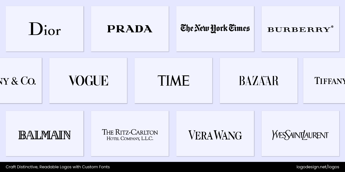
Examples of brands using Serif logos in their brands
Serif fonts are defined by the small decorative strokes (or “feet”) at the ends of letters, which give them a classic and timeless feel. Traditionally, they’ve been the go-to choice for print (think newspapers, books, and magazines) because the strokes help guide the eye across long passages of text. Luxury houses, heritage brands, and editorial outlets like The New York Times and Time Magazine often use serif fonts to convey authority, tradition, and elegance.
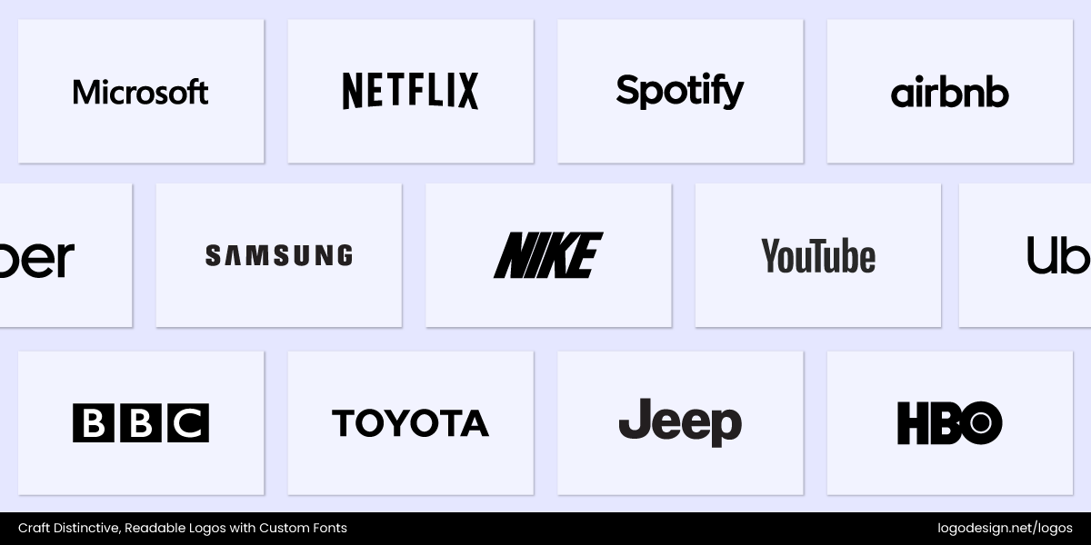
Brands using Sans-Serif fonts to give a clean and modern look
Sans-serif fonts, on the other hand, are sleek, clean, and modern. Without the added strokes, they remain crisp and legible even at smaller sizes, which makes them a natural fit for digital spaces. Tech companies, startups, and global brands like YouTube (with a custom Roboto-style font) and Uniqlo (inspired by Helvetica) often rely on sans-serif typefaces to express simplicity, innovation, and accessibility across devices.
The choice between serif and sans serif fonts in logo design depends on the tone your brand wants to set—here’s how to choose the right one:
| Serif Fonts – Timeless & Trustworthy | Sans Serif Fonts – Modern & Minimal |
| Convey tradition, reliability, and sophistication—great for brands that want to show stability and heritage. | Communicate simplicity, clarity, and innovation—ideal for brands that want a sleek and approachable feel. |
| Best suited for law firms, financial institutions, publishers, and educational brands. | Perfect for tech companies, startups, fashion, lifestyle, and digital-first brands. |
| Their decorative strokes give logos a sense of elegance, authority, and depth. | Their clean lines make logos versatile, bold, and easy to read across all platforms. |
| Shine in print-heavy designs like magazines, books, or professional stationery. | Excel in digital branding, apps, websites, and social media where clarity is key. |
| Offer a classic, established look that stands the test of time. | Provide a contemporary, adaptable vibe that fits evolving brand identities. |
While serif is a natural choice for print, and sans-serif excels in digital. Both can work across mediums depending on factors like stroke contrast, spacing, and scalability. That’s why thoughtful font selection is less about rules and more about aligning the typeface with the brand’s personality and where it will live.
-
Script and Decorative Fonts
Script and decorative fonts are often eye-catching because of their loops, curls, or quirky letterforms, but they’re also the trickiest to pull off. The problem is they don’t always scale well. On a business card or app icon, a fancy script can shrink into a tangle of strokes. If your brand name is long, the flourishes can stretch it out and make it harder to read. And when paired with subtle or low-contrast colors, these fonts can quickly lose their charm and turn into a blur.
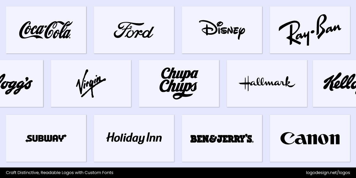
Brands using Script fonts in their wordmark logos
That said, they can add loads of personality when used thoughtfully. Disney’s playful script feels magical, while Coca-Cola’s flowing type has become iconic worldwide. The key is knowing where and how to use them.
However, it is important to consider that all font styles influence brand perception. Here are a few key points to consider to using script fonts without sacrificing readability.
- Keep it Short: Works best for short brand names or initials.
Driscoll’s logo using a handwritten-style script to show simplicity and approachable
Driscoll’s logo uses a casual, handwritten-style script that feels approachable, while staying legible at a glance. The rounded letterforms and smooth flow of the typeface make it easy to read even when scaled down, which is ideal for packaging. Its simplicity ensures strong brand recognition, especially for a short name like Driscoll’s.
Allbirds logo using a lowercase handwritten-style typeface to feel personalized
Allbirds features a custom, lowercase logotype with connected, rounded letterforms that give it a personalized feel. The varying heights of the “l”s and the elongated “s” add subtle personality and make the short name visually memorable without compromising clarity. Its monochrome palette, black script on a white background, ensures readability across mediums.

Rapha’s logo using a handwritten-style typeface that shows motion and elegance
Rapha’s logo is displayed in a handwritten-style script that conveys elegance and motion. The fluid strokes are smooth yet clear, maintaining readability even at smaller sizes. Its minimalist form works especially well for a short name, ensuring instant recognition and a timeless appeal that keeps the logo appealing for many years.
Ben’s Cookies logo using a playful script to trigger a personalized feeling with consistent curves
The logo features a playful, hand-drawn script in bold red that reads “Ben’s Cookies,” where the casual lettering evokes approachability. Its curves and consistent stroke width ensure clear readability even when scaled down, making it ideal for a short brand name. The simplicity of the font style strengthens instant recognition and maintains clarity.
- Pair with Clean Fonts: Use a plain sans serif for taglines or subtext to balance out decorative scripts.

Sunday Road Brewing Co. logo using a handcrafted typeface to look clean and expressive
This Sunday Road Brewing Co. logo adopts a decorative script style that conveys a relaxed, handcrafted feel. It ensures readability and balance by using clean sans-serif fonts for taglines. This contrast between expressive script and plain sans serif creates a polished hierarchy highlighting the brand name while keeping the subtext approachable and easy to read.
Not Your Father’s logo using a vintage typeface that gives a nostalgic feeling to an old-fashioned brand
The Not Your Father’s logo uses a vintage-inspired script that feels nostalgic, echoing the brand’s old-fashioned appeal. When paired with a plain sans serif for taglines or descriptive text, the clean lines ground the script, ensuring clarity and modern balance. This combination enhances readability and allows the decorative logo type to remain the focal point of the design.
Crumbl Cookie logo using a playful, bold typeface to give a sense of warmth and has strong readability
The Crumbl Cookies logo uses a playful yet bold script that shows a sense of warmth, ideal for a dessert-focused brand. The clean lines offer strong readability and balance against the logo’s decorative character when paired with a plain sans serif for taglines or descriptive text. This combination ensures the brand feels fun and approachable, while maintaining clarity.
The Ford logo using a classic typeface with clean lines that provide strong readability
The Ford logo’s flowing script style feels classic and timeless, reflecting the brand’s long automotive heritage. When paired with a plain sans serif font for taglines or secondary text, the clean lines provide strong readability that balances the curves of the main wordmark. This combination emphasizes Ford’s tradition while ensuring clarity and professionalism.
- Go Bold with Contrast: Strong color contrast ensures that the intricate strokes don’t fade into the background.
Olive Green logo using a clean script that balances elegance with clarity, with a bold contrast to ensure legibility.
The Olive Garden logo uses a clean, flowing script with a simple sans-serif tagline, balancing elegance and clarity. The bold contrast between the handwritten style and the modern font ensures the strokes remain highly legible, even at smaller sizes. The logo maintains readability by using distinct weights and spacing, reinforcing its inviting brand identity.
The Saintly logo using a modified serif font with elongated strokes that show elegance and sophistication
The Saintly logo features a modified serif font with graceful, elongated strokes that convey elegance and sophistication. Its bold contrast between thick and thin lines ensures the delicate details remain sharp and readable against any background. Careful spacing and weight distribution enhance legibility while preserving the logo’s intricate, elevated character.
Jelly Belly logo using a playful and rounded script to show the softness of the brand
The Jelly Belly logo features a playful, rounded script that reflects the softness and fun of the brand itself. Its bold yellow lettering against a vibrant red bean-shaped background creates a strong contrast, preventing the playful strokes from blending into the backdrop. The exaggerated curves and bright color palette enhance readability, keeping a lively personality.
Havaianas’ logo using a smooth and rounded script to show the simplicity and highly readable
The Havaianas logo features a smooth, rounded lowercase sans-serif font that emphasizes simplicity and approachability. Its bold, high-contrast red color ensures that the gentle curves of the letters remain crisp and readable against any background. The balance of playful shapes with strong color contrast reinforces both clarity and the brand’s fun, casual identity.
- Pick Friendly Scripts: Fonts like Lobster or Pacifico are designed to stay legible while still feeling decorative.

The Open Water logo using a friendly typeface that’s easily readable and has a sense of movement
The Open Water logo uses a friendly script style that balances elegance with readability, giving it a decorative, approachable feel without overwhelming the eye. Its smooth, flowing letterforms trigger a sense of movement, echoing the theme of water while avoiding overly flourished to ensure clarity. The design maintains accessibility across different sizes.

The Goode logo using a friendly script that’s inviting and has gentle curves to make it easily readable
The Goode logo features a friendly script that feels warm and inviting, while still keeping the letterforms clear and easy to read. Its gentle curves and balanced strokes give it a decorative touch without compromising legibility, making it accessible for a wide audience. The typeface ensures the brand feels stylish yet accessible across different uses.
The Jeni’s Splendid Ice Cream logo using a hand-drawn font that feels inviting and personal
The Jeni’s Splendid Ice Creams logo features a playful script font that feels hand-drawn, giving it a personal and inviting character. Its rounded, casual strokes keep the design decorative yet easy to read, even on smaller displays. By striking a balance between playful and readable, the logo conveys a sense of friendliness across packaging and signage.
The Blue Bunny logo using a lively script that’s inviting and has soft curves to enhance it’s friendly personality
The Blue Bunny logo features a playful script font that feels lively and inviting, with soft curves that enhance its friendly personality. The lettering is decorative yet clear, ensuring that the playful character of the brand doesn’t compromise readability. Its smooth, rounded strokes create a sense of fun and approachability, making the logo easy to recognize.
- Check Different Sizes: Test how it looks on everything from a billboard to a favicon. A font that dazzles on a poster may be unreadable on a small screen.
The Kleenex logo using a handwritten script that feels approachable and has high visibility
The Kleenex logo uses a bold, handwritten-style script that feels approachable, and works well on large formats like billboards where its curves are eye-catching and inviting. However, the playful strokes can lose clarity at smaller scales, making it harder to read when reduced to something like a favicon and other very small displays.
The Kiehl logo using an elegant script that shows heritage and sophistication, clearly standing out on larger platforms
The Kiehl’s logo features an elegant script that shows heritage and sophistication, standing out clearly on larger surfaces like posters or storefront signage. At billboard scale, the flowing lines and refined serifs enhance its premium feel, but at favicon size, the complicated strokes risk blending together. That means when the logo is scaled down, the legibility diminishes.
The Barbie logo using a lively script that has sweeping strokes to trigger a youthful energy
The Barbie logo features a lively font with sweeping strokes that radiate fun and youthful energy, making it striking and memorable on large formats like posters or billboards. When scaled down to a smaller display, though, the exaggerated curves and playful loops can compromise legibility. Its charm lies in its full-size personality, but fine details risk blurring at smaller scales.
The Smiggle logo using a rounded sans-serif typeface that stands out for the youthful audience
The Smiggle logo features a rounded, playful sans-serif font with quirky details, giving it a youthful energy that stands out on large displays like posters or billboards. At smaller sizes, the playful shapes and tight spacing can reduce legibility. Its charm lies in its bold personality, but careful scaling is needed to maintain clarity across all formats.
When used sparingly and paired wisely, script fonts can give your brand a touch of elegance or playfulness that standard fonts can’t. The trick is to treat them as a highlight, not the main course.
– Monospaced Fonts
Monospaced fonts give each letter the same amount of horizontal space, which creates a clean, grid-like look. Because of this, they’re often tied to coding, tech, and anything that feels structured. Brands in the tech and developer space use them to signal precision and innovation.
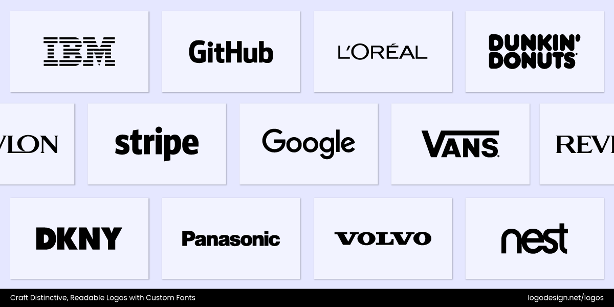
Some of the brands using monospaced fonts in their wordmark logos
For instance, Hack Club, a nonprofit that supports high school coding clubs, uses a monospaced-inspired typeface that instantly connects with its audience of young coders. Similarly, IBM’s classic branding leans on monospaced design principles to echo its deep roots in technology and computing.
That said, these fonts aren’t the best for long paragraphs of text; the uniform spacing can make large blocks harder to read. But when used in logos, editorial layouts, or digital-first marketing campaigns, monospaced fonts can create a modern, tech-forward vibe that feels authentic.
To keep monospaced fonts readable in logos:

The two versions of the GitHub logo using a bold and thin weight
- Use Bold Weights: Thin monospaced fonts tend to disappear at smaller sizes. A bold weight keeps them sharp and clear.
The Bridge Theatre logo using letter customization with the “I” to show a bridge
- Add Letter Customization: Adjusting tricky characters like “i” and “l” helps avoid confusion. This is especially useful in branding, where clarity is key.
The Coinbase logo using a clean sans-serif font to look more approachable
- Pair with Modern Sans-Serif: Balancing the rigidity of mono with the softness of a clean sans-serif keeps your logo approachable.
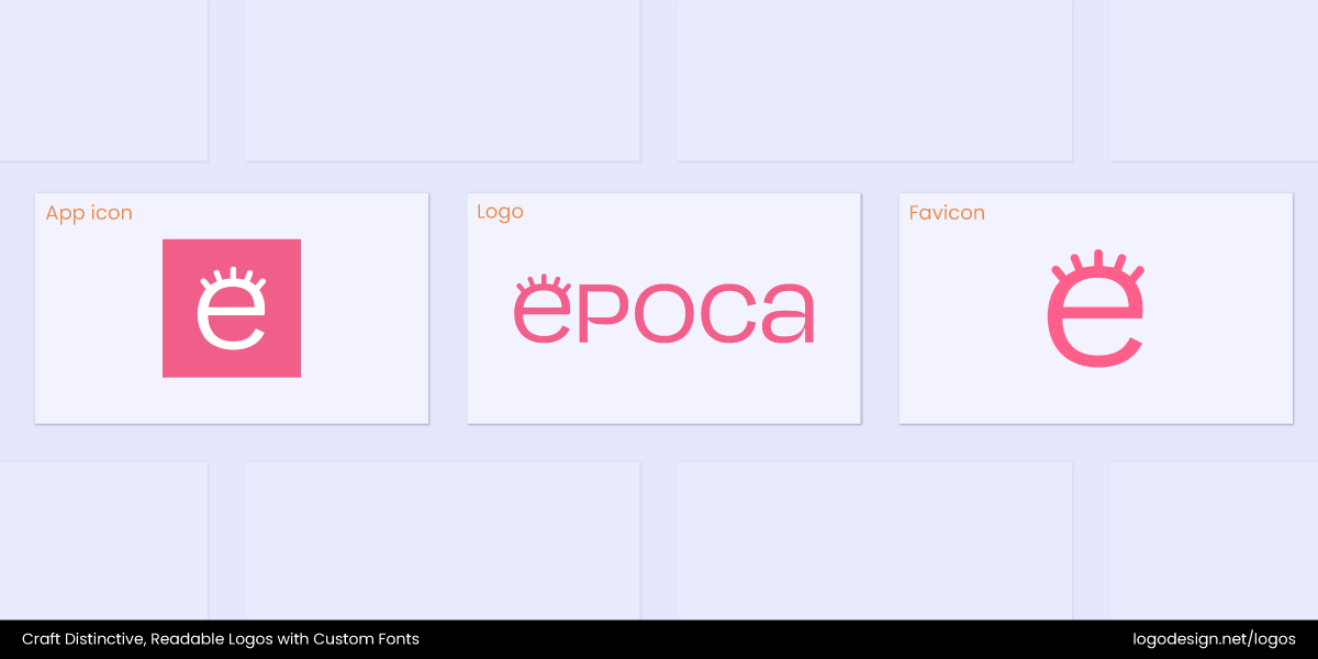
Branding items of Epoca for the app icon, logo, and fav icon to show text scalability
- Test Scalability: Make sure the font looks just as good on a website favicon as it does on a large poster.
Key Characteristics of Readable Fonts
To choose top fonts for your logo that remain readable at every size, you need to pay attention to several design features. These characteristics help make sure that your text is clear, easy to read, and visually appealing, be it on a website, app, or printed material.
1. Clear Letterforms
What Is a Letterform?A letterform is the visual shape or design of a letter, including its style, proportions, curves, angles, and overall structure. It’s what gives each letter its distinct appearance—whether it’s bold or thin, serif or sans-serif, sharp or rounded. |
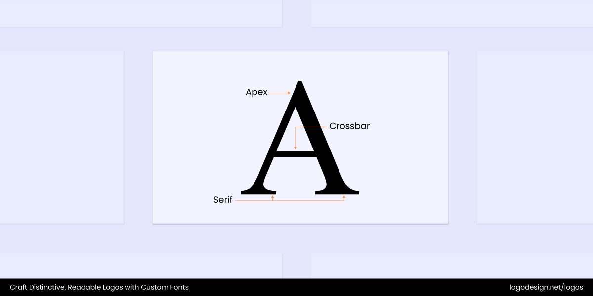
The letter A that highlights the style, proposition, curves, angles, and the structure
Some letters can look very similar, like the lowercase ‘l’, the uppercase ‘I’, and the number ‘1’, or the letter ‘O’ and the digit ‘0’. So clear letterforms that make each one distinct are key to creating brand awareness. Fonts with clear and recognizable letterforms help avoid confusion between similar characters, making it easier for viewers to identify brand names in logos.
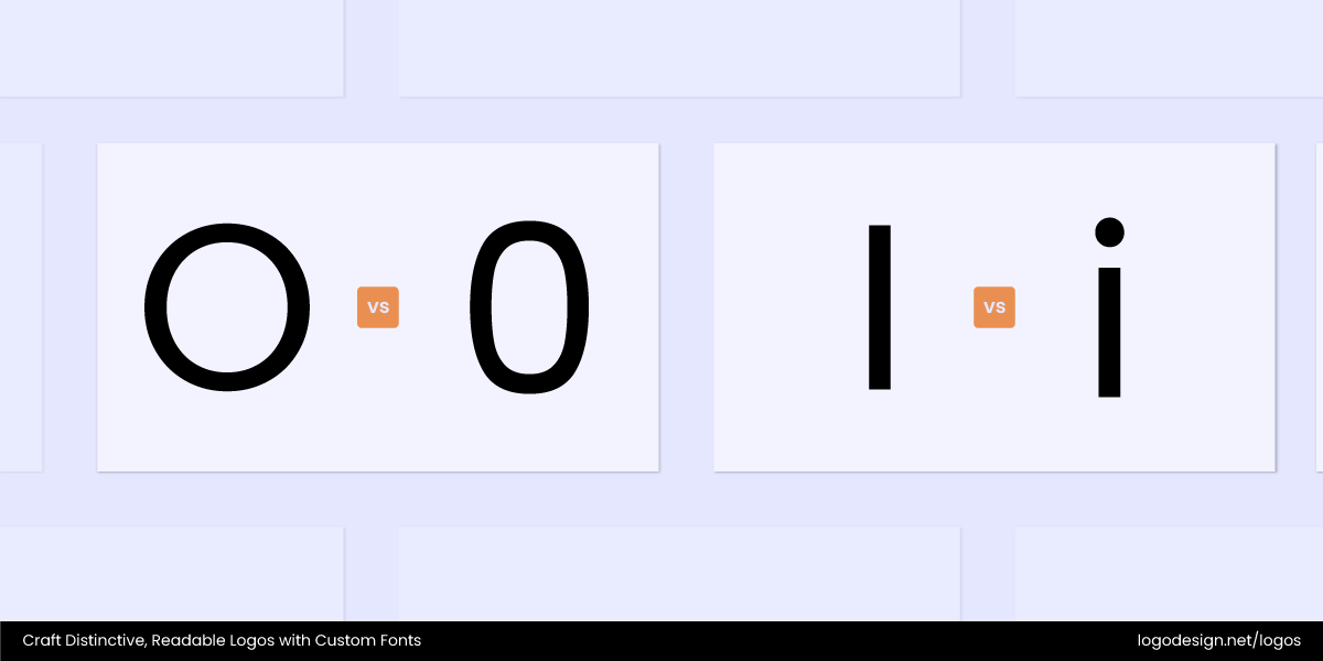
Two examples of the alphabet that look similar in both uppercase and lowercase
This is especially important on digital platforms where speed and clarity matter. When fonts don’t clearly differentiate these characters, readers can lose recognition and miss the logo on display. The clarity in letterforms is very important for brands as recognition across digital interfaces such as websites, apps, and software can help them grow further.
It also benefits accessibility, as people with visual impairments or dyslexia rely heavily on fonts that minimize overwhelming shapes or designs. And you can pair colors and fonts in this way as well.
| Category | ✅ Clear Letterforms | ❌ Unclear Letterforms |
| Legibility | Easy to read at a glance and from a distance | Hard to read due to abstraction, distortion, or overly complex forms |
| Kerning & Spacing | Even, balanced spacing between letters | Letters are too close, too far, or overlapping |
| Contrast | Strong contrast between text and background | Low contrast or busy background makes letters blend in |
| Style Consistency | Uniform typeface or cohesive design language | Mixed styles (e.g., serif + sans-serif) or inconsistent visual elements |
| Scalability | Remains readable and recognizable at small sizes | Loses clarity when scaled down due to thin lines or intricate details |
| Decoration Level | Minimal, purposeful styling that enhances readability | Overly decorative elements (e.g., swirls, distortions) hinder recognition |
| Letter Differentiation | Each letter is distinct and recognizable | Similar-looking letters (e.g., “I” vs. “l”) create confusion |
| Graphic Integration | Text integrates smoothly with icons or graphic elements | Text is hidden, overlaid, or interfered with by imagery |
| Typeface Appropriateness | Typeface matches the tone of the brand (e.g., professional, playful, bold) | Typeface conveys the wrong message or tone for the brand |
2. Ample Spacing (Kerning, Tracking, Leading, and More)
Tracking and kerning are the hidden heroes of typography in logos. If the letters are too close or unevenly spaced, it can be presented as unprofessional or rushed. Designers need to make sure that each character has enough spacing so that they don’t get pushed together. Tracking, which adjusts spacing uniformly across words or entire lines, helps maintain consistent flow, making the brand name feel cohesive.
When spacing is too tight in a logo font, letters can crowd each other, causing the text to look cluttered or cramped. This not only makes reading difficult but also overwhelms visually, as people can get eye strain when viewing the text at smaller sizes or from a distance. Proper spacing between letters, words, and lines prevents text from feeling cramped or cluttered.
In a logo design, everything needs to be spot on, including the spacing. The structure of the letters and words on a logo can make or break your brand perception. This includes the space between the characters, along with their alignment and scale. Making these subtle changes can significantly impact clarity, balance, and the brand’s professionalism.
Here are some key spacing elements to consider when choosing or customizing a font for a logo. These considerations impact how your logo looks, feels, and communicates with the viewer.
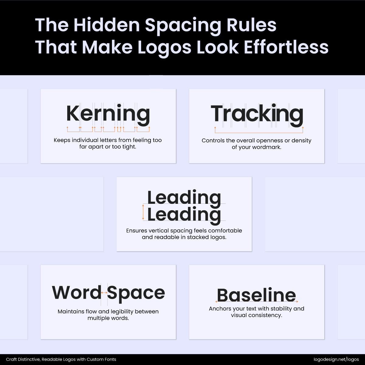
Visual representation and explanation of Kerning, Tracking, Leading, Word Space, and Baseline
- Kerning – Finds the right spacing between letters; not too far and not too tight
- Tracking – Controls how open or tense the wordmark is.
- Leading – Ensures vertical spacing in a stacked logo that feels easily readable.
- Word Spacing – Maintains the right flow and legibility between words
- Baseline Alignment – Aligns the text properly for consistency and readability.
By keeping all these elements in mind, the logo becomes readable, refined, and consistent, delivering the right brand identity.
3. Consistent Stroke Weight
What Is Stroke Weight?Stroke weight refers to the thickness of the lines (or "strokes") that make up a letterform or graphic element. It’s a fundamental aspect of typography and logo design that affects both readability and visual impact. |
Fonts with uneven stroke weights can cause parts of the letter to disappear or blur, especially on low-resolution screens or in poor lighting conditions. This can lead to visual clutter, forcing the viewer to spend extra effort identifying letter shapes.
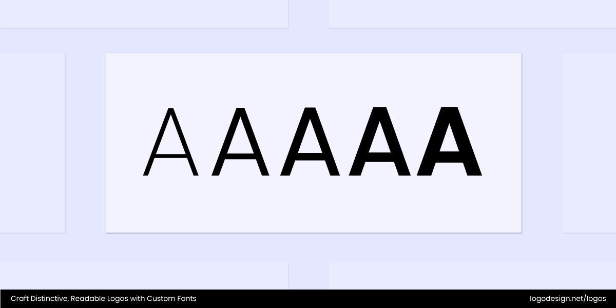
Five different thicknesses of the letter A
When the thickness of the lines forming each letter is consistent, it allows the reader’s eyes to flow naturally across the text without interruption. At smaller sizes, this consistency becomes even more important.
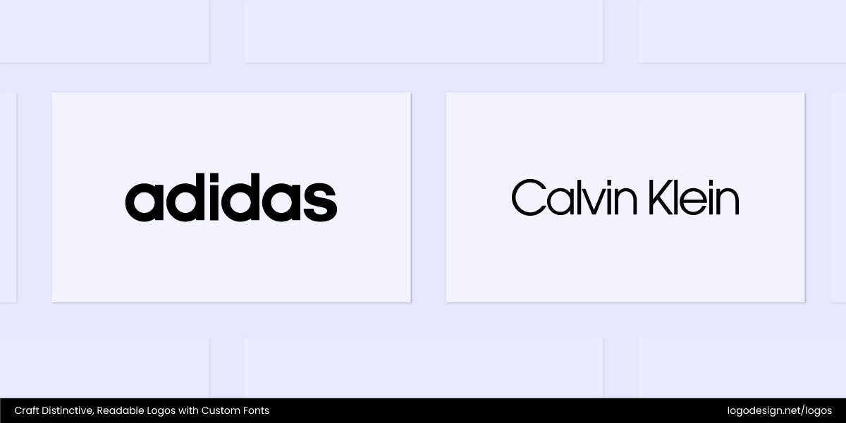
Adidas using thick weights to show power, while Calvin Klein using thinner weights to show luxury
- Bold stroke weight: The Adidas wordmark uses a thick, strong typeface that conveys power and athleticism.
- Thin stroke weight: The Calvin Klein logo uses a light, refined typeface to express minimalism and luxury.
Consistent stroke weight also enhances the overall legibility of a font. It allows you to make sure that no single stroke stands out from the rest or distracts from the surrounding text.
- Show a consistent display—When we use strokes with consistent thickness and form, the result is better crafted rather than disorganized.
- Better readability—Variable stroke thickness can distract the viewer and make some parts, especially small ones, harder to read.
- Good for scalability — A logo with inconsistent thickness and strokes might not be clearly viewable when they’re resized. Thin strokes might disappear, while thick strokes might appear awkward.
- Communicates brand tone — Consistent strokes give the brand a modest and clear look, indicating a modest and professional brand identity.
4. Open Counters
What Are Counters in Fonts?In typography, counters are the enclosed or partially enclosed spaces inside letterforms. They appear in letters like "o", "e", "a", "b", "d", "p", and "g", as well as in some numbers (like 8 or 0). |
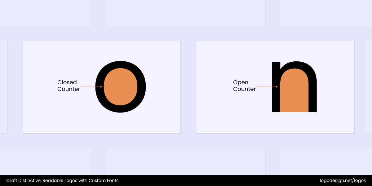
The visual illustration of the open and closed counters by using the letters O and N
Open counters, the spaces inside letters such as ‘o’, ‘e’, and ‘a’, help keep letters clear-cut and prevent them from merging. When they are too tight or closed, the text can appear squished on low-resolution screens or at small font sizes, making the text harder to read.
Fonts with open counters maintain clarity by allowing more light or background to show through these internal spaces. It creates a natural separation between letters. This keeps the overall text crisp and easy to understand.
- Wide counter: The letter “e” in Futura has a large open space, making it airy and modern.
- Tight counter: The “e” in Times New Roman has a smaller counter, giving it a more compact and traditional feel.

The Away logo using a clean sans-serif typeface with a wide counter in A and W
The Away logo uses a clean, sans-serif typeface with wide counters in the “A” and “W,” creating an open, airy feel that balances clarity with modernity. Its geometric construction makes the wordmark appear compact, reinforcing reliability and durability. The combination of generous open spaces inside the letters ensures high readability at any scale.
The Thinx logo using a minimalist typeface with a tight counter in letters like H and N
The Thinx logo features a minimalist sans-serif typeface with tight counters in letters like “h” and “n,” giving it a sense of compact strength and intimacy. The letterforms maintain slim, consistent strokes that create a clean silhouette, while the spacing keeps the wordmark balanced without losing readability. All this makes the logo approachable, modern, and trustworthy.
The Olipop logo using a rounded typeface with a wide counter in letters like O and P
The Olipop logo is set in a rounded, sans-serif typeface, where the wide counters of the “O”s and “P” create a playful openness. The slightly tight spacing pulls the letters together into a compact wordmark, showing the brand’s modern yet nostalgic personality. The balance of generous interior spaces and bold, rounded strokes ensures excellent readability in displays of all sizes.
The Bose logo using a bold typeface with tight counters
The Bose logo uses a bold, italicized sans-serif typeface with tight counters that minimize interior open space, giving the wordmark a compact appearance. The forward-leaning italic angle conveys motion, while the thick strokes enhance high legibility. Its compressed form, paired with dynamic slanting, reinforces the brand’s identity as performance-driven.
5. High X-Height
What is X-Height?X-height refers to the height of the lowercase letters in a typeface, specifically the height of the lowercase letter “x”, excluding any ascenders (like in “b” or “d”) or descenders (like in “p” or “q”). It essentially measures the main body of lowercase letters. |
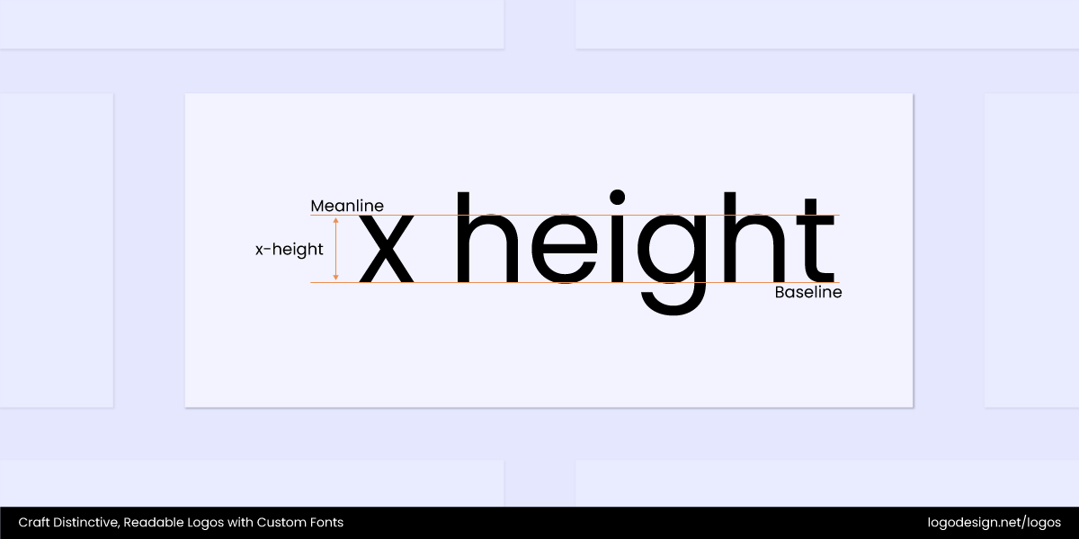
The visual illustration of what X-Height is about
A high x-height means lowercase letters are taller than the overall font size. This improves readability and makes your logo font accessible for all. Since your brand mark appears in a variety of sizes from tiny app icons to large signage, a high x-height makes sure that the lowercase letters remain clear as scaled down.
Fonts with a high x-height make the main body of lowercase letters more prominent, which improves the letterforms’ visibility and balance within the logo. This makes it easier for the letters to be displayed like they are instead of overlapping or merging. Styles that have low x-heights, making logos harder to read in smaller contexts.
| Logo | X-Height | Effect on Readability & Brand Personality |
| The New York Times | Low | The small x-height gives a classic, authoritative feel but can reduce legibility at smaller sizes or digital displays. |
| Etsy | Low to Medium | Serif font with moderate x-height that supports a vintage, handcrafted vibe but may lose clarity in very small sizes. |
| FedEx | Medium | Medium x-height balances boldness and readability, supporting a strong and trustworthy brand identity. |
| Medium | Balanced x-height creates an approachable and clean look, fitting its playful yet professional personality. | |
| Airbnb | Medium to High | Generous x-height enhances legibility across digital and print, contributing to a modern and friendly vibe. |
| Spotify | High | High x-height improves readability at small sizes, making the logo feel open, friendly, and highly accessible. |
| Medium | Very High | Very large x-height gives maximum clarity and modernity, perfect for a digital content platform with lots of small text. |
6. Universal Compatibility
Choosing a font that supports a wide range of characters, accents, and scripts allows you to maintain consistent readability. Fonts that are not universally compatible or have limited language support can cause display issues such as missing characters or inconsistent styles. Compatibility is key for brands with international websites, marketing materials and product packaging.
For example, accented characters like ‘é,’ ‘ñ,’ or ‘ç’ are common in many European languages. Non-Latin scripts such as Cyrillic, Arabic, or Chinese require entirely different character sets. A font designed only for the Latin alphabet won’t work if your content needs to be understood worldwide.

The IBM logo using a bold typeface that shows clarity and legible across print and digital platforms
The IBM logo uses a bold, geometric sans-serif typeface that shows clarity, making it universally legible across print and digital platforms. Its evenly spaced, block-like letterforms enhance readability at any size. The horizontal stripes within the letters create a distinctive visual identity while maintaining simplicity and ensuring compatibility across contexts.
The Drift logo using a clean typeface that combines modernity with professionalism, making it visible across platforms
The Drift logo features a clean, sans-serif typeface that balances modernity and professionalism, ensuring readability across all digital and print formats. Its bold letterforms enhance legibility at both small and large scales, making it adaptable to various applications. The minimalistic design ensures compatibility, allowing the logo to be clear across platforms.

The Plaid logo using a clean font that shows simplicity and trust, making it visible across platforms
The Plaid logo uses a clean font to show simplicity and trust, and it is highly readable across digital environments. Its balanced letterforms maintain clarity at both small and large scales, ensuring accessibility and consistency on different platforms. The precision of the typography shows universality, supporting seamless compatibility across global applications.
The Typeform logo using a sans-serif font with rounded edges and easy readability across platforms
The Typeform logo uses a sans-serif font with soft, rounded edges for enhanced readability across platforms. Its minimalist design ensures clarity at any scale, making it universally adaptable from mobile interfaces to large displays. The simplicity of the letterforms allows the logo to maintain consistency and compatibility across diverse digital and print platforms.
The Twilio logo using a sans-serif font that’s easily readable across different platforms
With a clean and rounded sans-serif typeface, Twilio logo ensures clear readability across platforms. Its smooth, balanced letterforms make the text highly legible at both small and large scales. The simple, geometric styling of the font reinforces universal compatibility, allowing the logo to adapt seamlessly across digital and print environments.
The Cameo logo using a clean font that has high readability and recognition across different platforms and scales.
The Cameo logo has a clean font that prioritizes readability and clear recognition across digital and physical platforms. Its rounded and balanced letterforms project approachability, making it easy to identify at different scales. The simplicity of the design ensures universal compatibility, allowing it to stand out in both light and dark backgrounds without losing clarity.
7. Adequate Contrast Between Characters
Good readability also depends on how well each character stands out from its background and neighboring letters. Fonts with suitable contrast in stroke thickness and clear differentiation between similar shapes make it easier for viewers to recognize the logo and brand name. High-contrast fonts, where the difference between thick and thin strokes is very clear, can look elegant and eye-catching at large sizes.
Low-contrast fonts with more balanced stroke thickness are more readable across sizes and formats. The contrast must be carefully considered in logo fonts so that the brand name remains prominent. Too much of it can make small versions of a logo difficult to read, while too less can make the logo appear flat and forgettable.
The Mozilla logo using a Fira Sans font that offers strong contrast and visibility between characters
Fira Sans, used by Mozilla in its branding and web products, offers strong contrast and clear differentiation between characters. This makes it easy to read the text across different devices and mediums.
How to Pick Fonts That Make Your Logo Easy to Read?
A logo’s typography showcases the purpose of the brand. It also needs to be legible across various media as otherwise the core message can get lost or missed.
Here are a few aspects to consider whether you go for an existing font or choose custom typography in logos for better readability.
1. Prioritize Simplicity
Go for simple fonts with minimalist appearances for clarity. Avoid overly complicated typefaces that may be hard to read, especially at smaller sizes. The letters need to be differentiated from one another. So go with a style that shows text as it is and does not change the meaning or context in upper or lower case.

The Track&Field logo using a clean font that makes it easily viewable across different platforms and displays
The Track & Field logo emphasizes simplicity and balance by using a clean font, ensuring it remains easily legible at any size. Its minimalist appearance avoids decorative elements, allowing the focus to stay on clarity and precision. This straightforward design choice enhances readability, making the logo versatile across digital and print mediums.

The Typotheque logo using a simple sans-serif font to show modernity and avoids unnecessary embellishments.
The Typotheque logo has a straightforward sans-serif font for showing modernity and maintaining clarity. Its minimalist style avoids unnecessary embellishments, ensuring the text remains highly readable. The clean letterforms make the logo adaptable across different platforms while preserving a professional and timeless appearance.
2. Focus on Scalability
A logo does need to be resized for various uses, from business cards to billboards. Make sure your chosen typography and font remain readable both in large and small formats. Test how the font looks when it appears on social profiles or business cards.
The Base logo using a clean sans-serif font that’s clear, modern, and has strong readability.
The Base logo uses a clean sans-serif typeface that shows clarity and modernity, ensuring strong readability at both small and large scales. Its simple letterforms allow the mark to remain legible without distortion when resized across digital and print applications. The minimal and confident design adapts seamlessly across contexts and retains a recognizable identity.
The Moscow Exchange logo using a bold font to ensure clarity, authority, and eligibility across different platforms.
The Moscow Exchange logo features a bold typeface paired with a strong red square mark, designed to ensure clarity and authority. Its clean lines and high-contrast color scheme maintain readability even when scaled down for smaller digital or print applications. The simplicity allows the logo to adapt seamlessly across diverse formats and keep its professional identity.
3. Incorporate the Brand Personality
Each style conveys a brand’s tone, be it modern, elegant, playful, or professional. But when you are selecting a font that reflects the brand’s personality, you need to make sure that it’s readable as well. A luxury brand might use an elegant serif font, but it must remain easy to read even in small print.

The Komoni logo using a hand-lettered casual font to show an approachable tone and legibility across different sizes.
The Komoni logo uses a hand-lettered, casual sans-serif font that strikes an approachable tone while remaining clean and legible even at small sizes. Its slightly irregular strokes give a human touch, conveying authenticity without sacrificing clarity or readability. The typography balances a modern artistic feel with easy readability.

The Stevenson Systems logo using geometric shapes to display “S”, along with clean, custom sans-serif type to remain legible.
The Stevenson Systems logo pairs a meticulously geometric and monoline ‘S’ that evokes precision and architectural structure. It also has a clean, custom sans-serif logotype that matches the symbol’s stroke weight. The typography conveys a modern and highly technical tone while remaining legible and free from unwanted decorative.
4. Use One or Two Font Styles
It is recommended that you stick to one or two fonts when creating a logo design. If you pair multiple or more than two fonts, then it could create confusion among the target audience about your brand’s purpose. Different fonts in a logo also impact its recognition in the long run. So it’s a good idea to combine a bold or strong font for the leading brand name with a complementary font for a tagline, if there is one.
The BioBurger logo using a clean, thick font to show modernity and legibility across all sizes and platforms.
The BioBurger logo uses a clean sans-serif typeface, giving it a modern and approachable feel while ensuring readability at all sizes. The choice to stick to a single, bold font keeps the identity consistent and uncluttered. Paired with subtle, rounded forms, the typography balances friendliness with clarity, making it recognizable in digital and physical platforms.

The Extreme Reach logo using a clean font to show simplicity, and using one font means the brand retains its appearance
The XR logo uses a clean sans-serif font that emphasizes simplicity, making it highly readable across digital and print formats. Its secondary typeface is subtly condensed, providing a sleek contrast without compromising legibility. Overall, the restrained use of just one or two fonts ensures the brand appears professional and easy to recognize at a glance.
5. Maintain Balance with Spacing
Letter spacing (tracking) and word spacing are key to good readability. Tight spacing can cause the text to merge, while excessive spacing can make the logo appear awkward. Make sure there’s enough space between letters, especially if you’re using a bold or decorative font.

The Outschool logo using a clean sans-serif font with rounded edges and an approachable look
The Outschool logo uses a clean, sans-serif font with rounded edges, creating a friendly, approachable look while maintaining excellent legibility. Generous spacing between letters ensures that the wordmark remains clear, even at smaller sizes. This balance of typeface and spacing enhances readability across both digital and print applications.
The Noom logo using a modern sans-serif font with circular letterforms to create a sense of balance
The Noom logo features a modern, sans-serif typeface with circular, geometric letterforms to show simplicity. Consistent spacing between each rounded letter creates a sense of balance, making the wordmark easy to read at any scale. The clean design and even rhythm of the font ensure strong readability while reinforcing the brand’s minimalist, health-focused identity.
6. Use Contrasting Weights
Experiment with font weights (bold, regular, light) to create contrast and for clarity. A heavier weight can draw the focus on the logo, but a lighter weight provides subtlety. And it doesn’t impact readability either. So you can go with contrasting weights or choose a light one.

The SodaStream logo using a clean font with rounded letterforms, with high readability
The SodaStream logo uses a clean sans-serif font with rounded letterforms for higher readability. By keeping the weight consistent, the brand communicates clarity and accessibility, avoiding the heaviness of bold or the delicacy of light. The simplicity ensures contrast is achieved through spacing and balance, making it easy to recognize across different sizes and mediums.

The Kathrein Privatbank logo using a refined font typeface to show authority that’s legible across different scales.
The Kathrein Privatbank logo features a refined serif typeface to show tradition and authority, with letterforms that remain highly legible on all scales. The regular weight strikes a balance, stronger than a light cut yet less imposing than bold, displaying a professional image. Subtle variations in stroke contrast enhance readability while emphasizing clarity.
7. Test on Neutral and Colored Backgrounds
Make sure the font works well against both bright colors and neutral or pastel backgrounds. If the logo is placed on a shiny material or with multiple colors, it should show clearly. Test it before finalizing so you don’t have to make changes to it later on.

The Veriff logo, with a light background, using a modern sans-serif font with clear lettering, showing an approachable feel.
On a light background, the Veriff logo uses a modern sans-serif font with clean, lowercase lettering that gives it a professional yet approachable feel. The typography is simple and well-spaced, ensuring that each character is clear. Combined with a strong contrast between the text color and background, the design achieves high readability on different sizes.

The Veriff logo, with a darker background, ensures strong readability with clear sans-serif typefaces and balanced spacing
On a darker background, the Veriff logo maintains strong readability thanks to its clean, sans-serif typeface. The font has rounded edges and balanced spacing, which prevents it from appearing harsh while ensuring clarity on all sizes. Against the dark backdrop, the high contrast of the white lettering preserves legibility, making the brand look professional.
The Coopertone logo using a bold sans-serif typeface with strong visual contrast and a light background
The Coopertone logo in a bold, sans-serif typeface with rich offers a strong visual contrast and excellent clarity on light backgrounds. Each letter features soft, rounded edges and consistent spacing, giving the wordmark a friendly feel while ensuring readability even at smaller sizes. The font’s simplicity makes the logo immediately legible in various light backgrounds.
The Coopertone logo, with a dark blue background, using a bold, rounded serif font to give a classic feel and strong legibility
On a dark background, the Coppertone logo remains highly readable due to its bold, rounded serif font, which gives it a classic feel. The lettering’s thick strokes and generous spacing ensure clarity, preventing the logo from blending into the dark backdrop. This contrast highlights the brand’s friendly identity while maintaining strong legibility.
These are some of the factors to consider when choosing readable fonts for your logo and website. Make sure to avoid typography mistakes and test it out before finalizing and do keep the display and formats in mind so you make the right choice. This way, in the long run, you can avoid an expensive rebrand and add to the timelessness of your logo.
Key Takeaways
- Focus on clear letterforms so each of them is easy to recognize
- Proper spacing prevents text from clutter
- Consistent stroke weight creates visual balance
- Open counters keep letterforms clean and prevent merging
- High x-height improves lowercase letter visibility
- Adequate character contrast for less eye strain
- Prioritize scalability and versatility across platforms
- Cross-language support maintains clarity
- Simplicity in style improves legibility and brand clarity
