Take a brand like Coca-Cola without its signature font or imagine Google using Times New Roman. Would it be recognizable? That’s how font styles influence branding.
The spacing, weight, and structure of a font can bring out certain emotions, establish trust, and set the tone for your entire brand within seconds. They show whether you’re serious or playful, high-end or affordable, tech-savvy or traditional.
As design trends come and go, choosing the right font is more important than ever. No matter if you’re launching a startup, rebranding an established company, or just upgrading your website. The typography you use in logos will influence how people feel about your brand. Let’s discuss how it can change brand perception.
The Importance of Fonts in Branding
Fonts are a visual language that communicates more than just what’s in text. Just as colors influence psychology and shape perceptions, typefaces also impact the emotional tone of a message before anything else.
Every font style has its own psychological associations. These depend on cultural exposure, historical context, and visual form.
Let’s take a look at how fonts play a role in branding.
– Shapes Brand Personality
Fonts promote a brand’s tone with their visual appearance. Serif fonts show elegance and sophistication, while sans-serif fonts have a clear-cut tone.
– Triggers Emotional Response
Typography can get emotional responses from consumers. Script fonts feel warm and personal, and bold display fonts appear confident or playful.
– Improves Brand Recognition
Consistent use across platforms boosts familiarity that helps customers recognize the brand even without a logo sometimes.
– Maintain Readability and Usability
One of the common typography mistakes is going for a font type style that isn’t legible across platforms and mediums. The right font style improves clarity on print and digital mediums. You can also make sure that your brand messages are easily understood by the audience.
– Differentiate From Competitors
Unique or customized fonts help a brand stand out in a crowded market by giving it a distinctive visual voice.
What Your Font Style Says About Your Brand?
Choosing the right font isn’t just about style; it’s about strategy. There are quite a few to choose from, like display, script, monospaced, and handwritten, along with serif and sans serif. And each of these is associated with certain traits in branding.
Here’s what different font styles say about your brand identity.
1. Serif
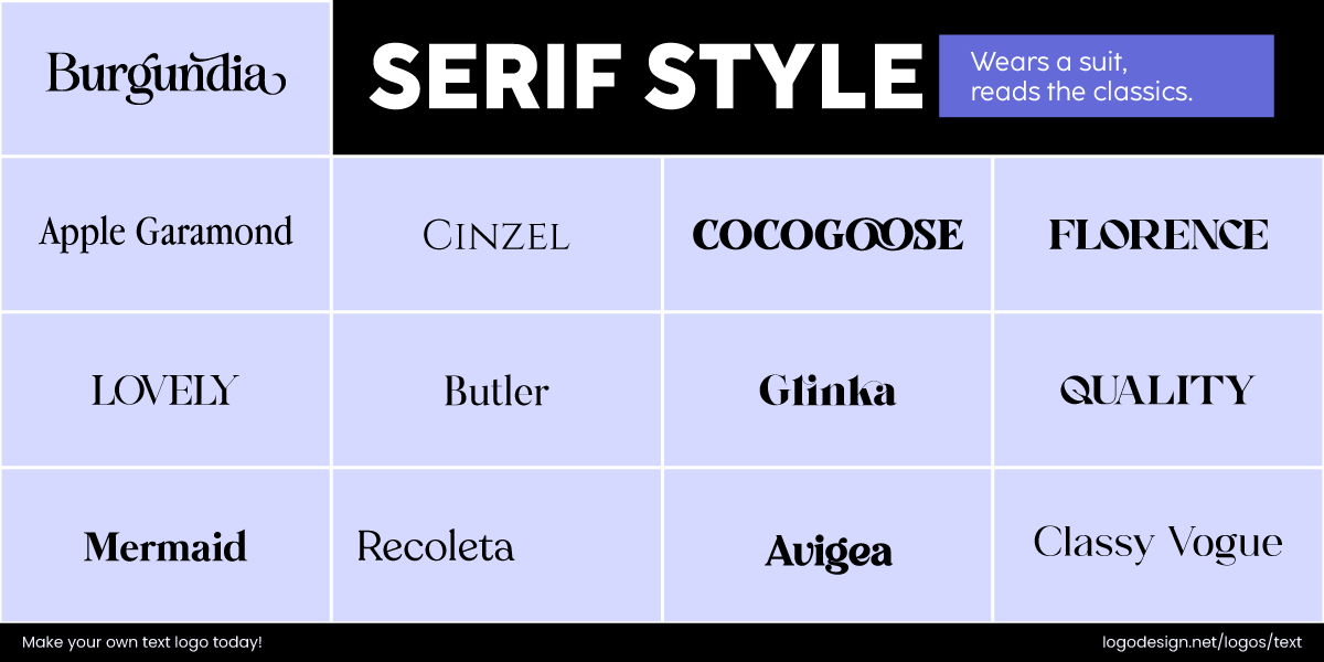
Serif fonts, the classic style that shows heritage and formality
Serif fonts are among the oldest typefaces in design. Their classic structure brings a sense of heritage, formality, and dependability, and that’s how it influences brand perception. You’ll commonly find attorney and law firm logos or publishing logos in serif fonts.
The Time Magazine logo using a bold serif fonts
Time Magazine uses a bold serif for its wordmark that shows seriousness and legacy.
The Harvard University logo using traditional serif typography
Similarly, Harvard University, like many academic institutions, draws focus to the serif typography that shows tradition and prestige.
The Living Roots logo using simple and traditional serif fonts
The serif font used in the Living Roots logo gives a sense of tradition, suggesting a deep connection to history and natural origins.
2. Sans Serif
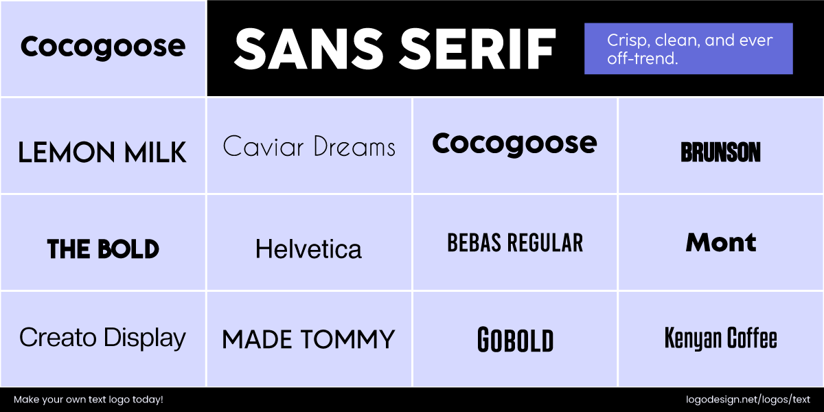
Sans Serif fonts that shows a modern and minimalist approach
They offer a clean and modern appearance, which makes them ideal for brands that want to appear progressive, minimalist, and user-friendly.
The Uniqlo logo using san-serif fonts for a minimalistic look
Uniqlo’s sans serif type reinforces minimalism and global accessibility. The clear-cut, neutral forms convey a message of affordability and modern design.
The North Face logo using san-serif font like Helvetica for a timeless appeal
Another example would be how Helvetica’s functional, timeless quality aligns perfectly with The North Face’s focus on performance and durability.
The Inbox Monster logo using a custom san-serif font for minimalistic look
The Inbox Monster logo uses a custom sans-serif font to add modernity and clarity in the design. The straight lines show straightforwardness and minimalism.
3. Script
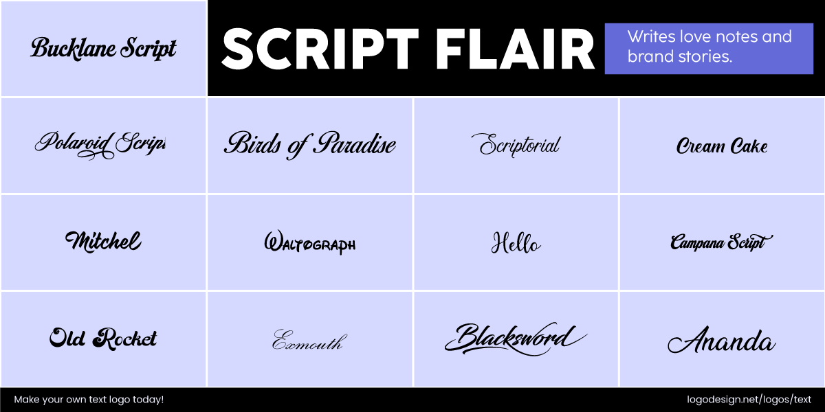
Script fonts that look like handwritten and casual, giving the perception of creativity
Script fonts appear as cursive handwriting, featuring fluid strokes and elegant curves. They are associated with a perception of sophistication and creativity. But it’s important to keep in mind that too much or in the wrong context, and they can appear outdated or hard to read. Some car logos or artist logos might go for serif fonts in design.
The Ray-Ban logo using script fonts to give a personal touch
Ray-Ban’s logo feels like a signature and grabs attention for bringing out authenticity and personal style. It blends casual cool with classic confidence, and the script-style font works for it quite well.
The Ford logo using script fonts to display traditional craftsmanship
If you look at the name in the Ford logo, the flowing script suggests traditional craftsmanship, while balancing the legacy of innovation.
The Saintly logo using script fonts to show sophistication
The Script font seen in the Saintly logo creates elegance and shows craftsmanship, triggering a feeling of sophistication. The flowing handwritten quality suggests connection to tradition.
4. Display
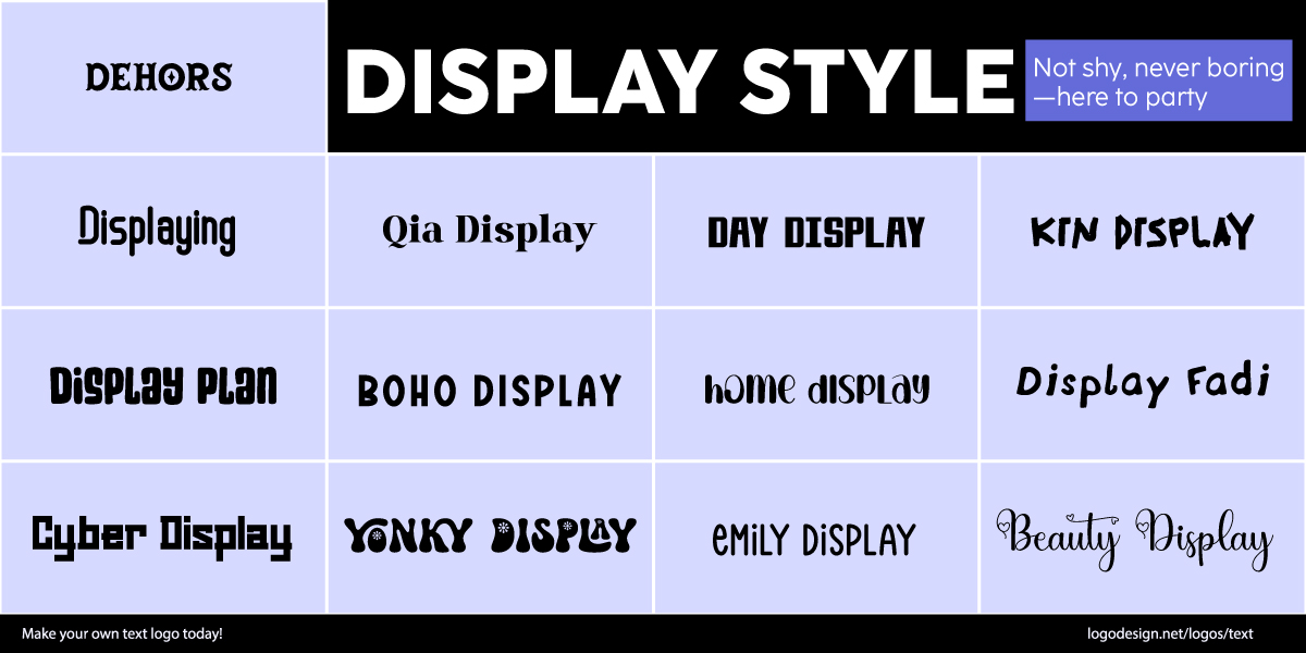
Display font styles that’s decorative and stylized, used for large format platforms
Decorative, stylized, or unconventional, they’re used in large formats for versatile logo designs or billboards. When brands are looking to create a perception of confidence, creativity, and individuality, they can go for display font styles.
The Fenty Beauty logo using display fonts to give a bold look
These might not work for slogans in a logo design, but just for brand names. Fenty Beauty uses a stark, geometric display type that feels high fashion and quite bold.
The Supreme logo using display fonts like Futura to give a bold look
The red box logo of Supreme is instantly recognizable. While Futura is a classic geometric sans serif, its use in this context is display-driven, bold, tilted, and high-impact.
The Lyft logo using display fonts for a friendly look.
The Lyft logo has a custom typeface that is both bold and friendly. The rounded terminals give the logo a modern design and create a sense of motion.
5. Monospaced
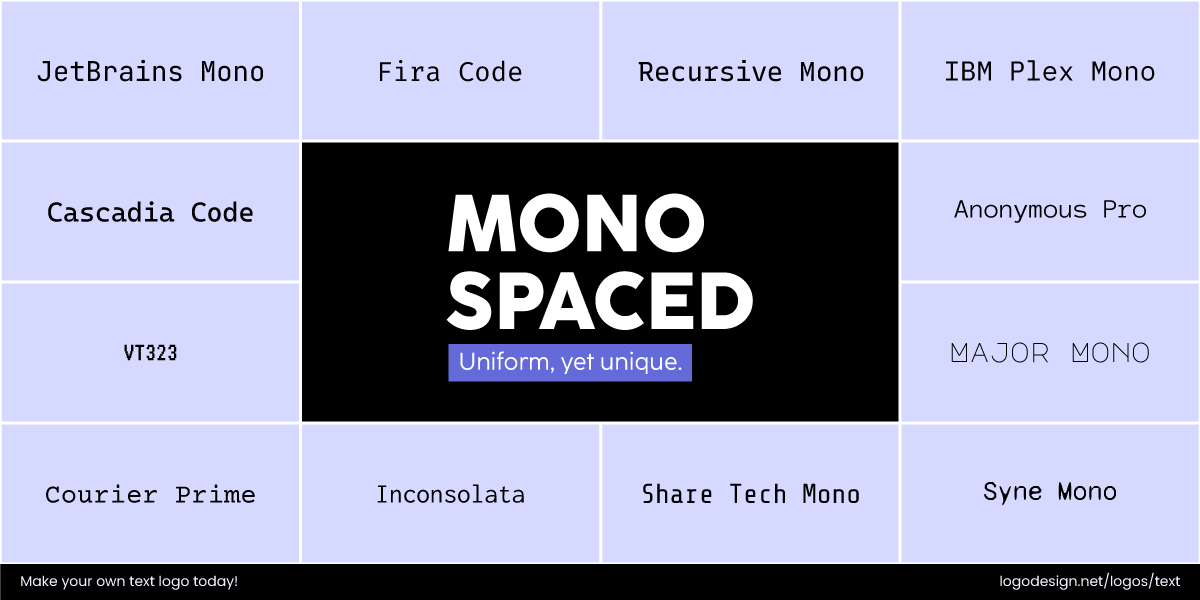
Monospaced font style used in typewriters and coding environments, often used by tech companies.
Initially used in typewriters and coding environments, these fonts now lend a minimalist, utilitarian look to modern branding. They are chosen mainly by tech companies, developer tools, or brands that want to focus on clarity and precision with a creative edge.
The GitHub logo using display fonts along with a pictorial element
Consider the logo fonts for GitHub here. It is a clean monospaced style featuring a pictorial element to reflect its developer-first identity.
The Homa Games logo using display fonts to meet the digital nature of the company
In the Homa Games logo, the use of monospaced font adds a clean and an aesthetic feel, along with the choice of typography. This meets the digital nature of this game development company.
The No Two Ways logo using display fonts for a minimalistic feel
The use of a monospaced font in the No Two Ways logo creates clarity and precision in the design, reflecting a vintage aesthetic. This logo shows a straightforward and minimalist approach.
6. Handwritten
Such fonts appear as handwriting, making them feel human, approachable, and expressive. When a brand uses a handwritten font, it conveys a message of friendliness, creativity, and a desire to connect on a more personal level with its audience.
Be it a casual script that feels playful and fun, or a calligraphic style that adds sophistication, handwritten fonts help brands appear less corporate. It’s a way to stand out by showing that there’s a human behind the brand.
The Barbie logo using display fonts to appeal youthful fans.
The Barbie logo features a bold, playful handwritten font that resembles a child’s script. It perfectly reflects the youthful, fun, and imaginative nature of the brand.
The MadeForMed logo using handwritten fonts for a personalized and approachable feel.
The handwritten font in the MadeforMed logo gives a personal and approachable feel, matching their brand identity. The formal typography creates trust and brings a sense of care for the viewer.
The Knot logo using a script-like handwritten display font for a personalized look
The handwritten font in The Knot’s logo creates a personalized touch and connection, necessary for their brand identity. The script-like style makes the brand approachable and authentic.
Font Style Elements That Shape Brand Perception
Understanding the elements of font style helps designers create identities that connect within seconds and stand the test of time. Below are the key font style elements and how each one influences perception.
1. Font Weight
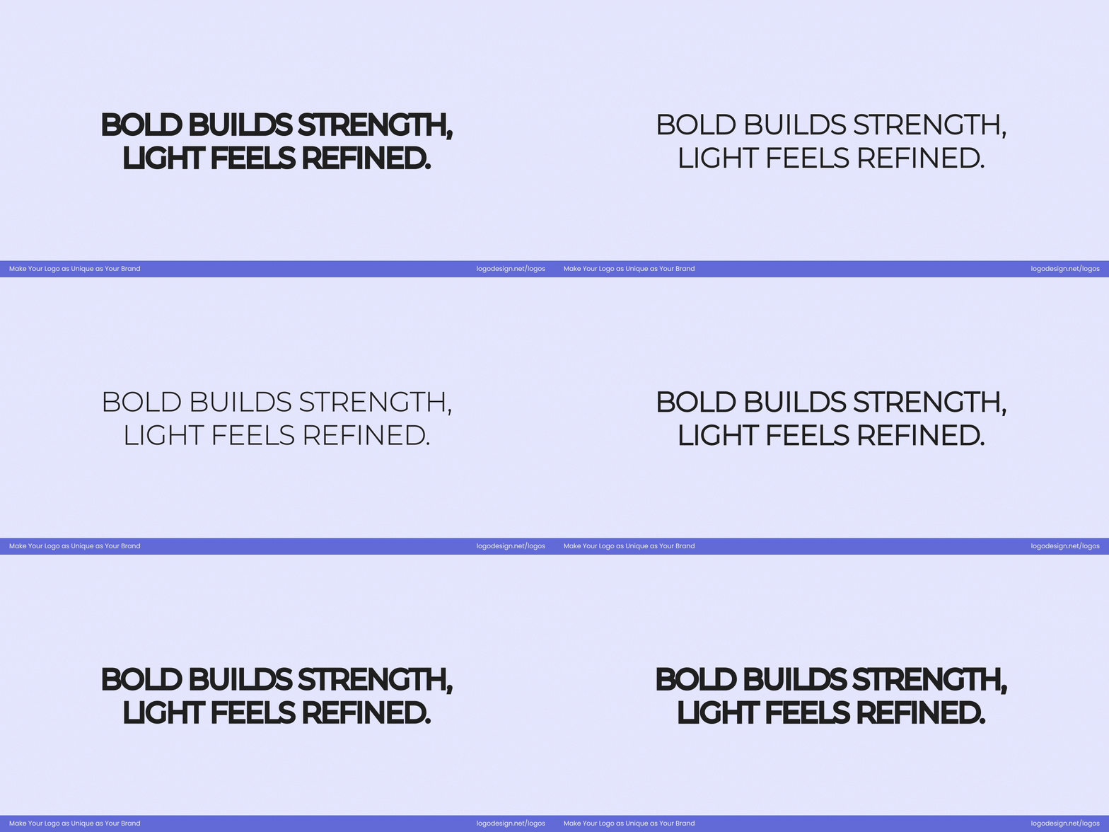
Thick fonts are used to display strength. The lightweight fonts show a luxury feel
This has to do with the thickness of a font style’s strokes and can influence the brand perception on first look. Thin or light fonts add exclusivity and a sense of luxury. They work well for fashion logos, skincare, and wellness brands. Their airy structure pairs well with spacious layouts but requires good contrast for readability.
The DIOR logo using font weight for an elegant look
Dior uses a thin, elegant serif font for its logo design that draws attention to its high-end and minimalist aesthetic.
Bold or black fonts are a bit different from these. They appear thicker and sometimes closely spaced as well. Such styles are known to convey power, confidence, and high visibility. You’ll see tech, sports, and retail brands using black and thick fonts to appear strong and distinct. These weights ensure high readable of fonts even at smaller sizes or in cluttered spaces.
The Adidas logo using font weight to show an energetic feel
Adidas has opted for a bold, sans-serif type in its logo for strength, confidence, and an energetic tone.
The Guggenheim logo using font weight to give an assertive brand identity
The Guggenheim’s changed to a bolder logo that shows a strategic shift towards a more unified and impactful global brand identity. This change moves away from the previous delicate design to a more assertive one.
- Thin fonts: Delicate, premium, minimal
- Bold fonts: Strong, confident, loud
2. Letter Case Style

All uppercase shows authority and boldness
It includes different styles like uppercase, all lowercase, or title case, and they can influence how people see and think of your brand. All caps typography brings out authority, boldness, and professionalism.
The NASA logo using letter case style for a confident identity
It’s sometimes used by brands that want to appear strong and established, like NASA, as the capital letters create a sense of confidence and immediate impact.
The Flickr logo using letter case style to give a friendly and modern design
Lowercase type offers a softer, more casual, and approachable tone. It suggests friendliness and modern sensibility. These qualities work well for startups and digital platforms like Flickr. The last one, title case, balances in the middle. With just the first letter of each word capitalized, it feels clear-cut yet approachable.
The FedEx logo using letter case style for a simple yet impactful appeal
This makes it a go-to choice for service-based brands looking for a polished yet personable look. FedEx has gone with title case in their wordmark to make a strong visual impact.
- All Caps: Assertive, bold, serious
- Lowercase: Casual, friendly, modern
- Title Case: Balanced, approachable
3. Letter Width
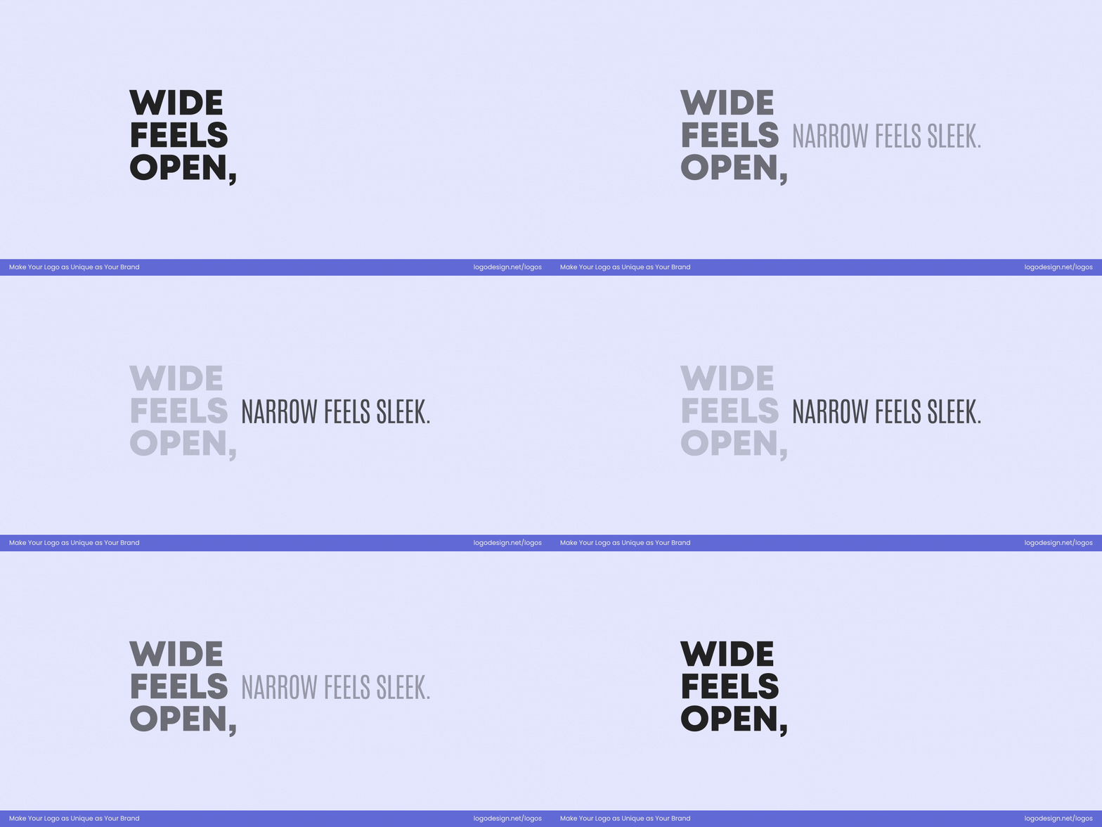
Wide character space shows urgency. A narrow letterform shows seriousness
It is used to describe whether the characters appear narrow or wide in a typeface. By adjusting letter width, designers can influence how a brand communicates space, tone, and urgency. Your logo feels tight and efficient, or open and bold. The choice between condensed vs. extended is really based on a brand’s personality and message.
Condensed letterforms are narrow, vertically stretched characters that take up less horizontal space. They’re often used to convey seriousness, modernity, and space-conscious design. Brands aiming for an efficient feel may use condensed fonts to pack information clearly without losing legibility.
The PUMA logo using letter width to appeal the athletes
Puma’s logo font is slightly condensed, giving it a streamlined, athletic appearance.
But extended letterforms are wider, giving off an impression of openness, confidence, and stability. These fonts are less congested and more visually impactful, helping logos stand out with a relaxed yet strong presence.
The Samsung logo using wide letters to give a modern appeal
Samsung’s logo uses wide letters that give the brand a confident, modern, and approachable identity.
The Royal Ontario Museum logo using letter width to give a dynamic feel
The change from a condensed logo to a dynamic one, allows the Royal Ontario Museum (ROM) to visually represent its vast and diverse collection as an ever-expanding timeline of human and natural history.
- Condensed: Compact, formal, efficient
- Extended: Bold, open, confident
4. Edge Style

Soft, rounded edges feel warm and casual. Sharp edges show modernity and professionalism
This is basically used to define the shape and finish of the corners and endpoints of each letterform, be it rounded (soft and curved) or sharp (angular and pointed). This influences the way a brand is perceived, as both styles have certain traits associated with them.
Rounded edges typically feel warm and casual, making them great for brands focused on accessibility or creativity.
The Slack logo using edged-style fonts to suggest precision and sophistication
Slack’s brand name in the logo incorporates soft curves that convey collaboration and ease of use. Now, sharp edges draw attention to precision, strength, and sophistication.
Tesla logo using edged-style fonts to give a futuristic look
Tesla features a geometric, angular font that feels futuristic and innovative, fitting the brand’s cutting-edge image.
Crumbl Cookies using rounded edge-style font to suggest comfort and friendliness
The Crumbl Cookies logo has a rounded edge style to create warmth, comfort, and friendly, meeting the brand’s focus on freshly baked, shareable treats.
Choosing the right edge style helps communicate your brand’s personality with clarity and intention.
- Rounded: Soft, friendly, modern
- Sharp: Sleek, high-end, aggressive
5. Stroke Contrast

Thick and thin letterforms play an important role in setting the brand tone and personality
It is used to define the variation in thickness between the thick and thin parts of a letterform. This typographic feature plays a key role in setting the tone and personality of a font. Fonts with high stroke contrast appear quite different between thick and thin strokes, seen in many classic serif typefaces. Low contrast fonts maintain a more uniform stroke width throughout.
High-contrast typefaces are known to create a perception of luxury with their sophisticated look. Their appearance brings a sense of formality and high-end appeal.
Harper’s Bazaar logo using stroke contrast to signal sophistication
Harper’s Bazaar’s wordmark emphasizes sophistication with its dramatic thin-thick strokes.
Low-contrast fonts such as appear stable, clean, and direct. These are widely used in tech and retail for their legibility and neutral tone, helping brands feel more accessible and trustworthy.
Microsoft logo using stroke contrast to signal professionalism and clarity
Microsoft’s logo font shows clarity, accessibility, and professionalism in digital interfaces.
Hennessy logo using stroke contrast to give a minimalist feel
The Hannessy logo uses a consistent line weight across the entire letter, giving it a modern and minimalist feel.
- High contrast (thin/thick strokes): Elegant, luxury
- Low contrast (uniform strokes): Neutral, stable
6. Font Construction
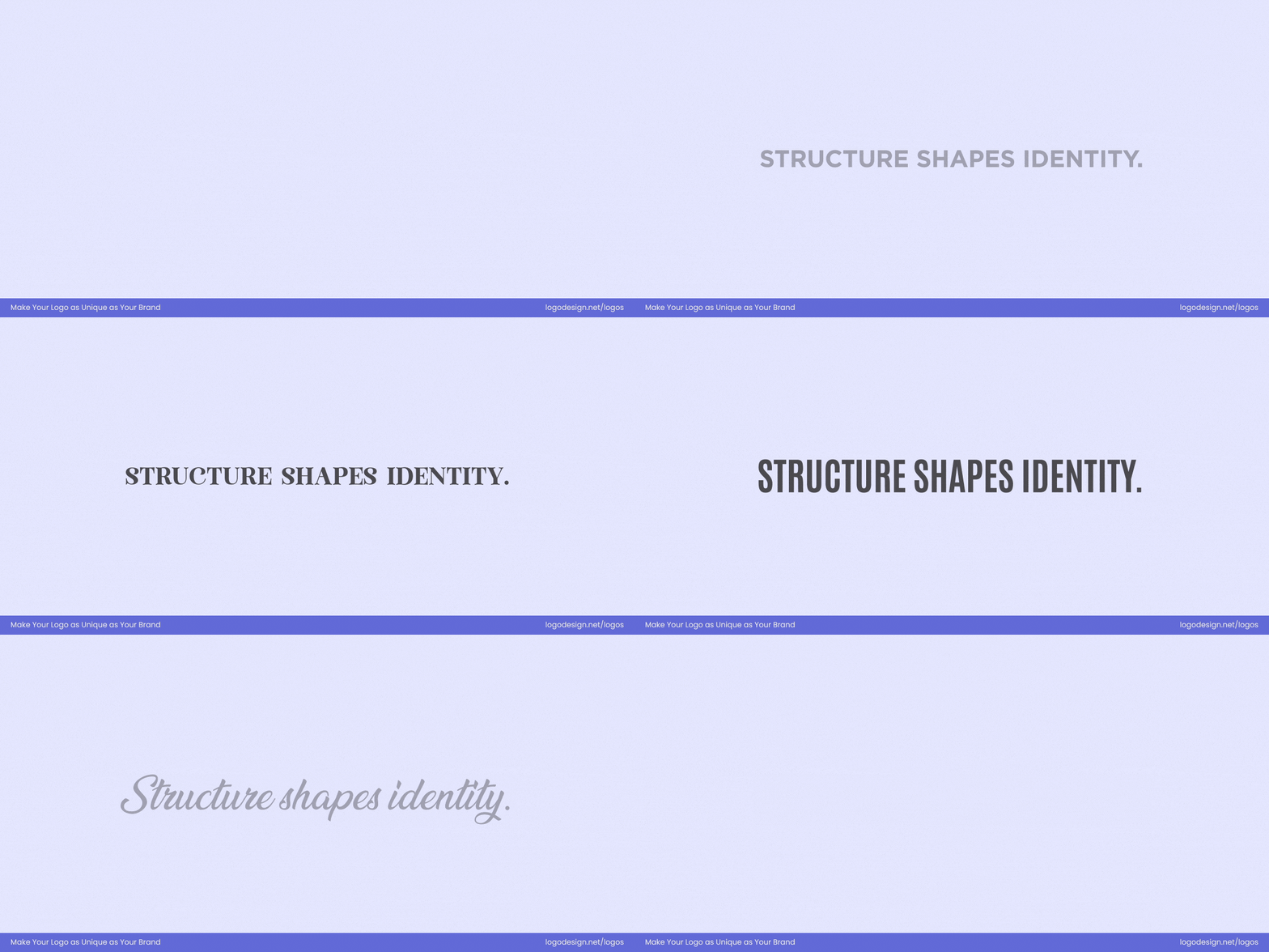
The font structure impacts how people respond to the brand and it’s logo
The structure of fonts can affect the way people respond to a brand and its logo. There are mainly two types that we see in design: geometric and humanist. Geometric fonts have shapes like circles, squares, and triangles. These symmetrical forms create a modern, rational feel. Mostly, brands that want to appear innovative or authoritative opt for such fonts.

Volkswagen logo using geometric strongs to give a sleek appearance
Volkswagen has a geometric sans-serif font for a sleek and precise brand image.
Humanist fonts are more personalized and human-like. They have a more natural flow and a warmer look.
Airbnb logo using a human-like font to produce a reader-friendly design
Airbnb has chosen a custom typography to create a humanist feel that’s friendly and approachable.
The Omaha Performing Arts logo using geometric sans-serif font for a sophisticated design
The Omaha Performing Arts logo has a geometric sans-serif typeface, softened by a humanistic touch. This combination adds technological sophistication, while the curves and the slight flaring of letters gives a warmth and approachable feeling.
- Geometric fonts: Rational, structured, modern
- Humanist fonts: Organic, warm, readable
7. Era-Based Style
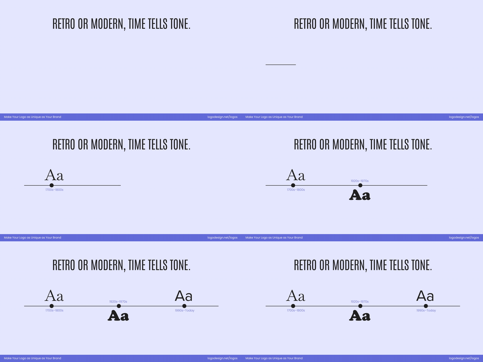
Retro or modern font style triggers nostalgia, heritage, and cultural identity
These styles, especially vintage and retro, get inspiration from specific periods to bring out nostalgia, heritage, or cultural identity. Vintage fonts often feature ornate serifs or distressed textures, giving a handcrafted, timeless feel. They work very well for artisan or heritage brands.
Jack Daniel’s logo uses an old school font type to give a vintage appeal
Jack Daniel’s has chosen a font that looks vintage and old-school.
Stranger Things logo using retro fonts with bold curves to give a playful appearance
Similarly, retro fonts go with mid-century aesthetics that include bold curves and playful flair, as seen in the Stranger Things logo, adding personality and familiarity.
The Murray’s Cheese logo using a classic serif typeface to display craftsmanship
The Murray’s Cheese logo uses a classic serif typeface and a simple, hand-drawn illustration. This makes the design more aesthetic by showing amazing craftsmanship, suggesting the brand’s authenticity.
These styles help brands emotionally connect with audiences, as nostalgia can be an essential factor in their response.
- Fonts that evoke nostalgia, heritage, and legacy
These are some of the most important elements in font styles that impact or influence brand perception. When creating a logo for your business, it’s essential to focus on all these factors as you choose the typography and text. Combined with matching brand colors and icons, it will bring the entire design together and send the right message to your audiences.
Key Takeaways
- Fonts instantly communicate a brand’s personality and tone
- Typography creates emotional connections with the audience
- Font weight builds trust and accessibility
- Letter case styles guide attention and visual hierarchy
- Letter width must be used thoughtfully
- Edge style strengthens brand recognition
- Stroke contrast sends a clear brand message
- Font construction maintains clarity
- Era-based style has a timeless visual appeal
