From the tiniest gap between letters to the breathing room around a symbol, spacing can make or break a logo. Subtle, yes—but absolutely powerful!
When you look at a logo, your eyes probably jump straight to the shapes, the colors, or maybe even the clever symbolism tucked inside. But what often goes unnoticed are the tiny spaces between those elements—the details that quietly shape how polished, balanced, and professional a logo feels. Designers call this micro and macro spacing, and while the terms might sound technical, they’re really about one simple truth: every pixel matters.
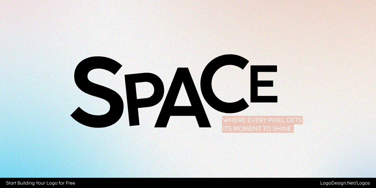
The word space written by highlighting different spaces between letters
Micro spacing deals with the finer adjustments, like the gap between two letters or how close an icon sits to a wordmark. Macro spacing, on the other hand, is the breathing room around the entire logo when it sits on a page, a product, or a screen. When these two work together, the result is harmony; when they don’t, the design can feel cluttered or incomplete.
In the world of logo design, pixels are precious. And as you’ll see, the spaces between them can be just as powerful as the marks themselves. Let’s explore in detail below.
Spacing in Logo Design
In logo design, space does more than “fill the gaps.” It creates balance, clarity, and personality. Designers often think about space on two levels: the fine details (micro-spacing) and the bigger breathing room (macro-spacing).
Each has its own role, and together they decide whether a logo feels clean and professional—or messy and uncomfortable.
What is Micro-Spacing?
The precise, small-scale use of negative space within design elements.
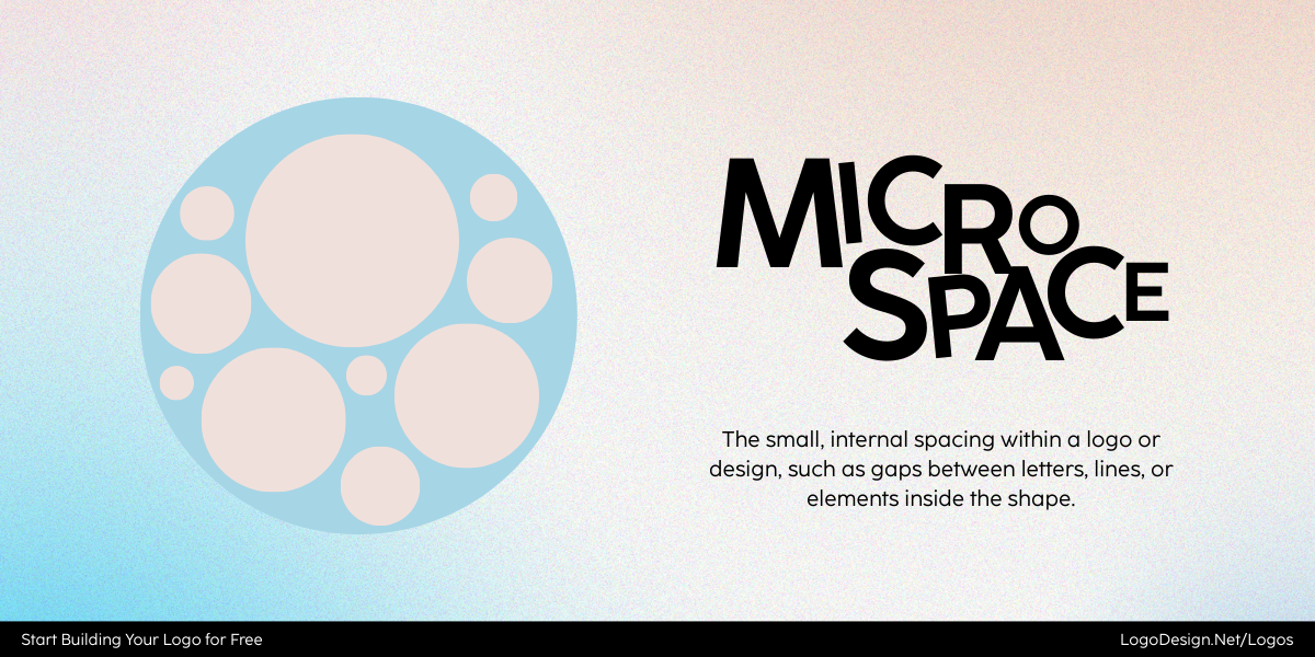
Microspace shown with different gaps between characters and lines
Here’s where it appears:
- The space between individual letters (kerning).
- The distance between lines of text (leading).
- Subtle gaps around small graphic elements.
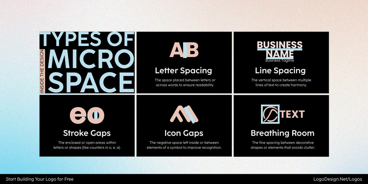
Different types of microspaces that show varying gaps between the letters
When handled well, micro-spacing keeps the legibility in logo design in check, avoids clutter, and adds refinement.
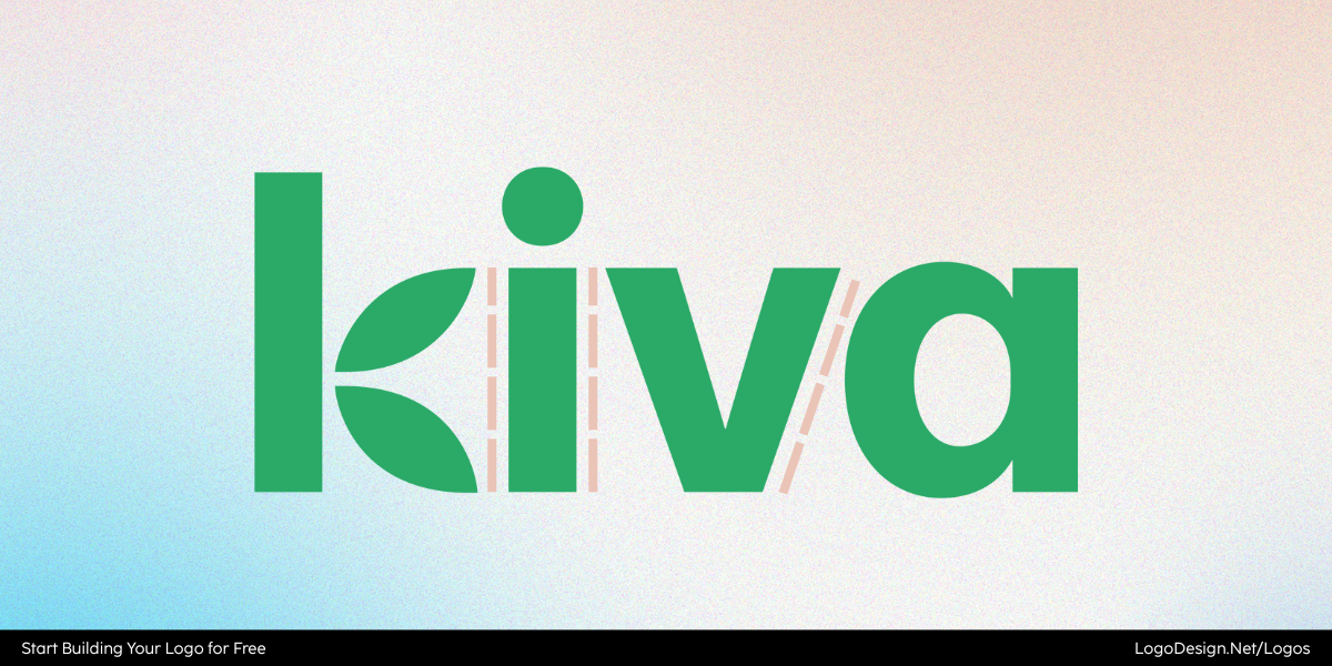
Wordmark Kiva logo that shows significant spacing between the letters
Take the Kiva logo, for instance. Its simple wordmark could easily look too plain, but the generous spacing between letters adds a sense of openness that reflects the nonprofit’s global outlook.
Grammarly logo showing spacing between the rounded ‘G’ icon and the wordmark
Another subtle example is the Grammarly logo. The spacing between the rounded “g” symbol and the name is carefully tuned so that the mark feels like part of the wordmark without crowding it. These are small, almost invisible tweaks—but without them, both logos would feel awkwardly tight.
What is Macro-Spacing?
The larger, more expansive negative space that surrounds and separates the main parts of a logo.
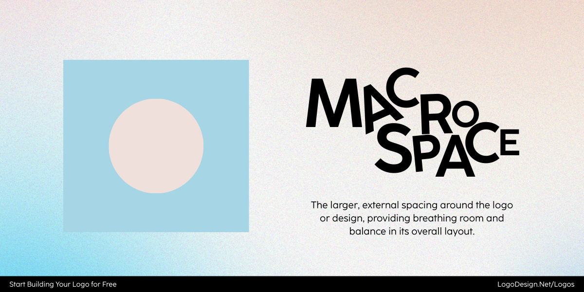
Macrospace shows different gaps between letter and the design
Here’s where it appears:
- Space around a logo icon.
- The buffer between a symbol and its wordmark.
- The “clear space” zone that prevents crowding in layouts.
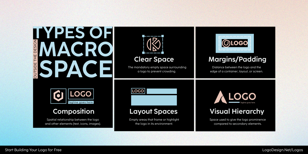
Types of Macrospace that shows different amounts of gaps, margins, and other hierarchy.
Macro-spacing gives the logo breathing room when placed on a website, packaging, or app. It helps achieve balance and improve overall impact.
The Intercom logo shows negative space around the design to make it more better readable
Look at the Intercom logo. The chat-bubble symbol sits well apart from the text, with clear space around the whole design. That openness gives the brand a friendly, approachable feel while keeping it versatile for different uses.
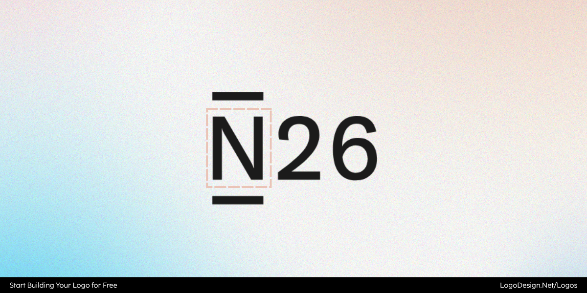
The N26 logo shows the letter ‘N’ having a square outline with a significant gap between it and the letter
Another good example is N26, the digital bank. Its square outline around the “N” has been designed with ample space from the wordmark, making the logo clean, structured, and easy to drop into any layout without feeling crowded.
Micro vs. Macro Spacing: How They Work Together
Micro and macro spacing often sound like two separate jobs, but in practice, they’re constantly overlapping.
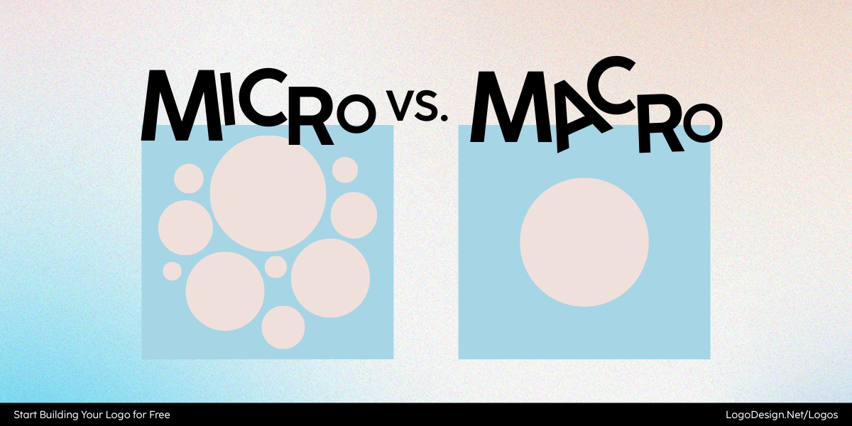
The comparison shown between Microspacing and Macrospace with circular elements
Micro handles the tiny details inside the logo, like kerning, letter gaps, or how a symbol fits beside text. Macro deals with the breathing room around the entire design. One without the other feels incomplete.
To see this in action, let’s look closely at business logos that handle spacing with care.
1. Wise
Wise (formerly TransferWise) keeps its fintech brand logo simple: a clean wordmark paired with a subtle “fast flag” icon. Yet the way spacing is handled makes all the difference.
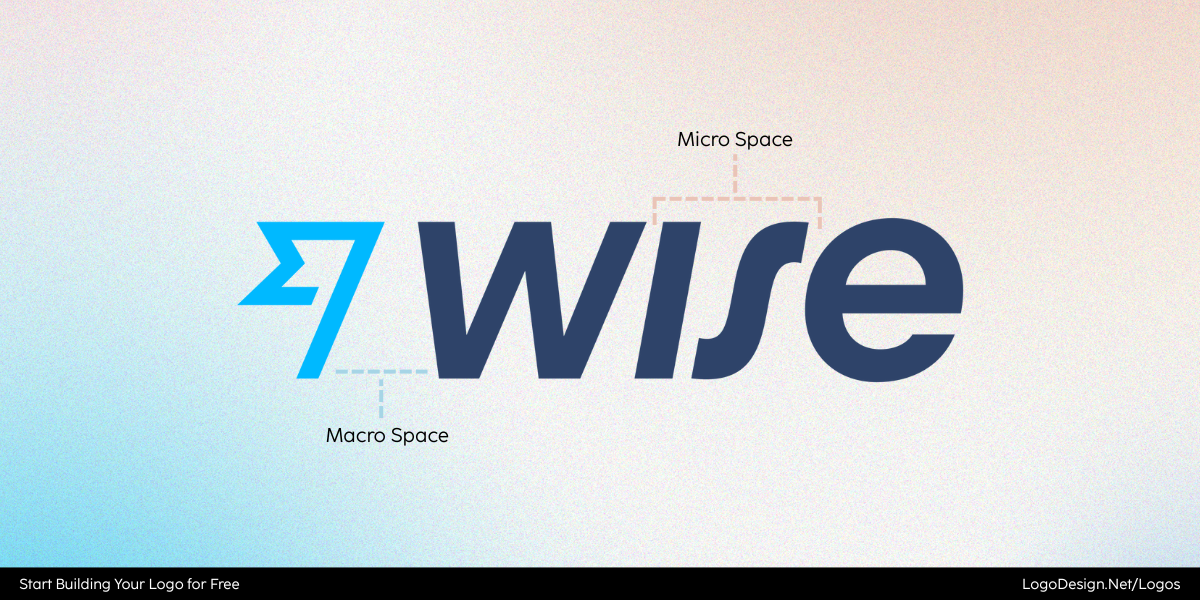
The Wise logo using macrospacing after the icon, and microspacing between the letters
Micro-spacing in Wise
- The wordmark uses even kerning between letters, so no character feels too close or too far apart.
- The tracking across the entire word is slightly open, giving it an approachable, friendly tone instead of a cramped one.
- This precision keeps the logo legible at small sizes, like on a mobile app or debit card.
Macro-spacing in Wise
- The “fast flag” symbol isn’t jammed against the text. Instead, there’s generous negative space between the icon and wordmark.
- This buffer ensures both parts feel distinct but connected, creating a sense of balance.
- On digital platforms, this macro-spacing helps the logo stay uncluttered, no matter how small the screen.
Without this balance, the clean kerning of the wordmark would lose impact if the icon sat too close. Wise shows how micro and macro complement each other to build confidence and clarity.
2. Notion
Notion’s logo combines a serif wordmark with a bold, blocky “N” icon. The design could easily feel heavy—but careful spacing saves it.
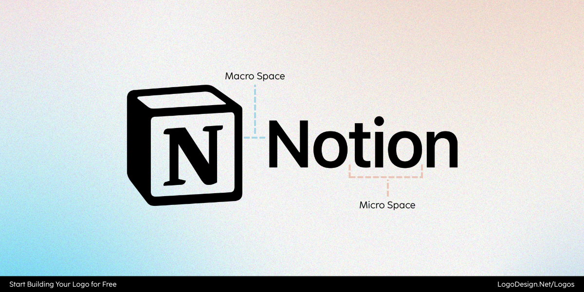
The Notion logo shows macrospacing after the box-like icon and microspacing between the letters
Micro-spacing in Notion
- The serif letters are kerned with precision, keeping strokes and curves from colliding.
- Subtle tracking adjustments prevent the text from looking old-fashioned or too tight, giving it a modern, digital-friendly rhythm.
- These refinements make the wordmark crisp and easy to scan, even inside dense interfaces.
Macro-spacing in Notion
- The “N” cube sits apart from the wordmark, with clear separation that stops the design from looking top-heavy.
- This spacing allows the chunky icon to act as a standalone mark (great for app icons) without overwhelming the text when used together.
- Whether in a favicon or a printed handbook, the breathing room around the logo ensures it always feels balanced.
Together, micro and macro spacing give Notion’s logo its harmony: sharp detail inside the letters, and breathing room outside the symbol.
3. Basecamp
Basecamp pairs a friendly mountain icon with a rounded wordmark. The spacing keeps the two pieces working together instead of competing.
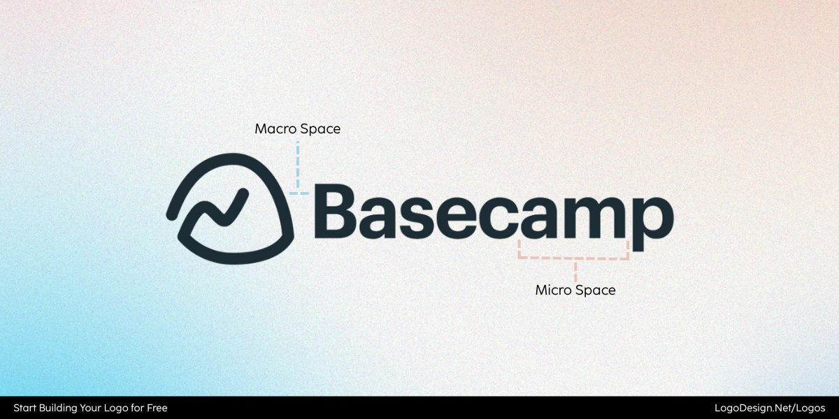
The Basecamp logo shows macrospacing after the icon and microspacing between the letters
Micro-spacing in Basecamp
- The rounded letterforms are carefully kerned so curves don’t collide; that kerning keeps each character distinct and the wordmark legible even at small sizes.
- The overall tracking is slightly open, which prevents the type from feeling dense and gives the wordmark a relaxed, approachable rhythm.
- These fine adjustments mean the text logo reads cleanly across UI labels, menus, and compact screens.
Macro-spacing in Basecamp
- The mountain-and-smile icon is set with generous negative space from the wordmark; this clear buffer stops the playful symbol from overpowering the text.
- The macro-spacing lets the icon act as a standalone mark (useful for app icons or favicons) while still feeling like part of the full logo when paired.
- The overall clear-space strategy improves contrast and balance across backgrounds and sizes, keeping the logo friendly and easy to place.
4. Loom
Loom’s logo combines a radiating sunburst-like symbol with a clean, lowercase wordmark — and it’s the spacing choices that tie the two elements into one cohesive system.
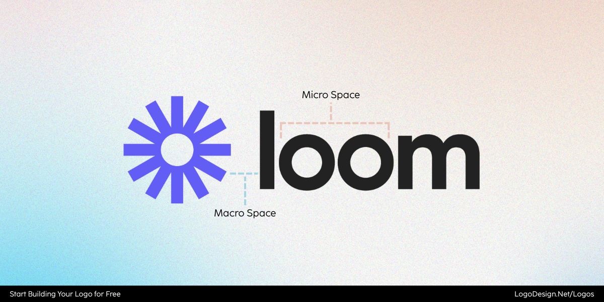
The Loom logo having macrospacing after the icon and microspacing between the letters
Micro-spacing in Loom
- The lowercase letters are spaced with careful kerning so the circular shapes of the “o’s” don’t visually merge.
- Tracking is slightly loose, giving the wordmark a calm, breathable rhythm that reflects Loom’s identity as a tool for clarity and communication.
- This attention to micro-spacing ensures the wordmark is legible and balanced, even when scaled down in a sidebar or toolbar.
Macro-spacing in Loom
- The vibrant sunburst symbol is positioned with ample space from the wordmark; this prevents the energetic icon from overwhelming the softer type.
- The clear buffer zone highlights the relationship between symbol and text, making the mark feel modern and uncluttered.
- The macro-spacing also allows the icon to stand alone in app environments while still looking harmonious when paired with the full logo.
5. Shake Shack
Shake Shack’s fast food logo strikes a balance between playful branding and functional clarity. Its simple wordmark and burger icon could easily clash, but spacing keeps everything in harmony.
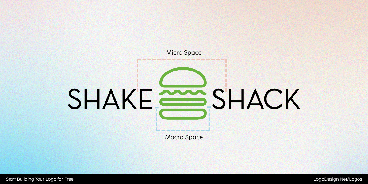
Shake Shack using microspacing between the two letters and macrospacing before and after icon.
Micro-spacing in Shake Shack
- The rounded letters are spaced with consistent kerning, giving the wordmark a relaxed yet polished rhythm.
- Subtle tracking ensures the text feels open and legible, echoing the approachable, casual tone of the brand.
- These refinements allow the logo to hold up across packaging, menus, and signage without losing readability.
Macro-spacing in Shake Shack
- The burger icon sits with intentional breathing room beside the wordmark, preventing the design from feeling cramped.
- This separation lets both elements shine independently: the text as a friendly identifier, and the burger icon as a quick visual cue.
- Whether on a storefront or mobile app, the macro-spacing keeps the logo fresh, clear, and instantly recognizable.
These examples highlight the core idea: kerning and tracking handle the details, while macro-spacing shapes the overall balance. When they work together, the result is a logo that feels intentional, adaptable, and trustworthy.
How to Get Spacing Right in Logo Design
Spacing is the backbone of how a logo communicates. A well-designed logo can be ruined by sloppy kerning, loose tracking, or neglected clear space. On the flip side, refining these details can completely change how a brand is perceived.
If you’re figuring out how to design a negative space logo perfectly, below are five principles to follow and pitfalls to avoid.
1. Mind Your Kerning
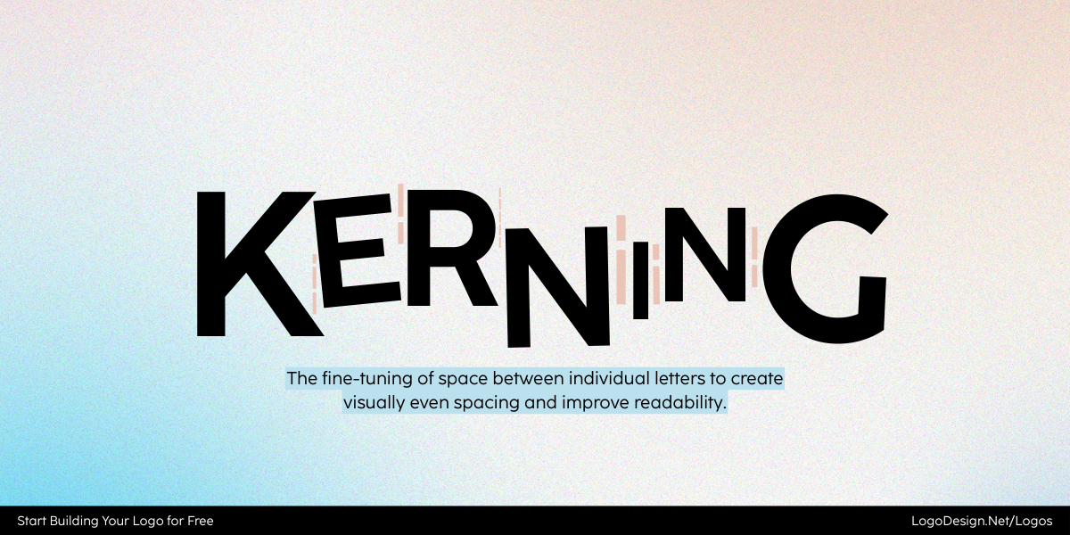
Kerning shows with different gaps between various parts of letters
What to do: Kerning — the space between individual letters — should be adjusted so the text flows naturally without letters colliding. When it’s right, the wordmark feels effortless to read.
What not to do: Overly tight kerning is one of the most common logo design mistakes. When letters squeeze together, legibility drops, especially at smaller sizes.
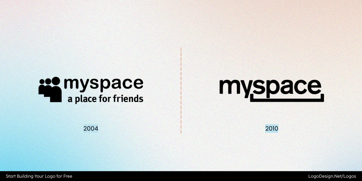
Two versions of MySpace from 2004 and 2010 that show cramped and spaced letters
Myspace’s early-2000s logo had cramped spacing that reflected the era’s design trends but aged poorly. By the time they rolled out their 2010 redesign, they adjusted the kerning and gave the letters more breathing room, making the wordmark usable across web and mobile. Though the rebrand itself wasn’t universally loved, the correction showed how critical kerning is for readability in digital spaces.
2. Don’t Let Tracking Go Wild
Tracking shows the same gap between the different parts of the letters
What to do: Tracking (overall letter spacing across a word) should give text room to breathe while maintaining cohesion. It works best when you need a modern, airy feel without losing connection between letters.
What not to do: Too much tracking can make a wordmark look like a random collection of letters instead of a brand name.
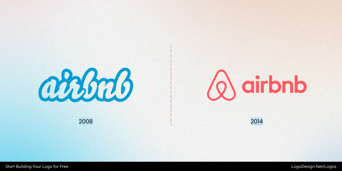
Two versions of the Airbnb logos from 2006 and 2014 show tight and open tracking.
Airbnb is a textbook case. Before its 2014 rebrand, the company used a quirky wordmark with very tight letter spacing that felt compressed and a little dated. When they introduced the current “Bélo” logo, they paired the symbol with a new wordmark that used more open tracking. The refined spacing gives the rounded sans-serif letters a softer rhythm and makes the name easier to read across digital interfaces. It wasn’t a dramatic font change; the difference came largely from the way tracking was adjusted, shifting the tone from scrappy startup to global-friendly brand.
3. Balance Symbol and Wordmark
Balance shows the use of marcospacing to create a tighter space between letters
What to do: Use macro spacing to keep icons and text distinct but unified. The right buffer zone creates harmony between the two parts and ensures elements work together without feeling jammed.
What not to do: Avoid cramming symbols too close to the text, which makes logos feel heavy and cluttered.
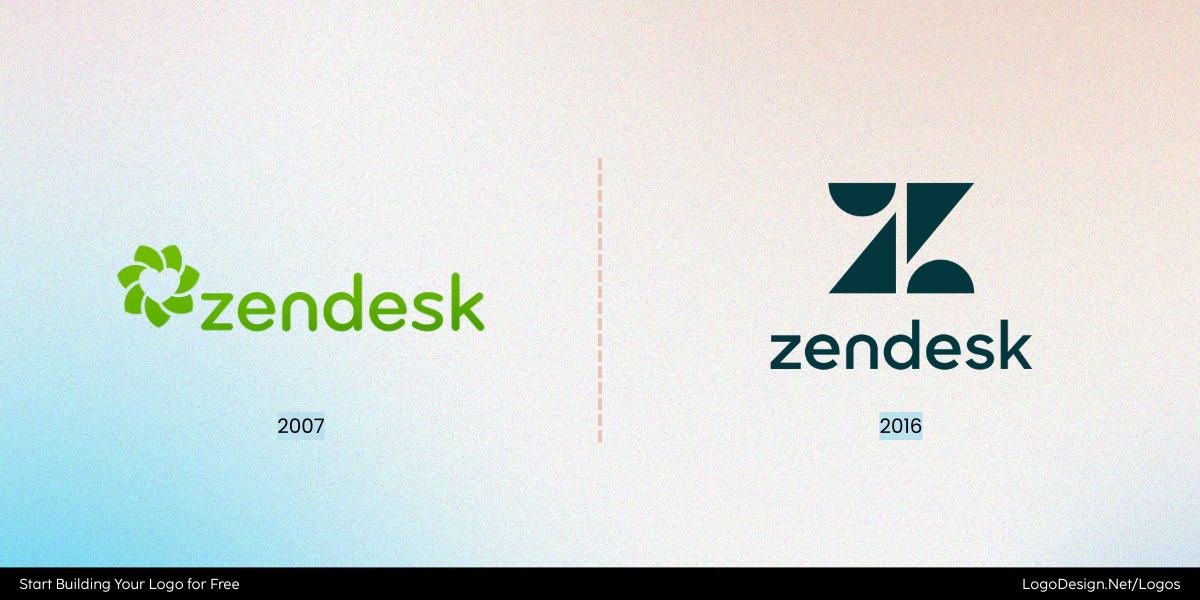
Two versions of the Zendesk logos from 2007 and 2016 that shows tight and openly spaced letters
Zendesk’s original lotus-style logo (used until 2016) often felt cramped when paired with the wordmark. The petals pressed too closely against the text, leaving no breathing room. When Zendesk unveiled its 2016 rebrand, the clean geometric “Z” icon was spaced apart from the wordmark with clear boundaries. This refinement gave the brand a calmer, more professional presence while making the symbol flexible enough to stand alone as an app icon.
4. Test Across Real Applications
Field test puts the logo design on different-sized platforms to ensure it’s readable
What to do: Your logo must be versatile and work everywhere, from tiny favicons to billboards. Testing spacing across mediums ensures it doesn’t collapse in one format while looking fine in another.
What not to do: Designing only for one context (like a web mockup) is a recipe for problems. Spacing that looks fine on a giant screen can turn into a blur on packaging or mobile.
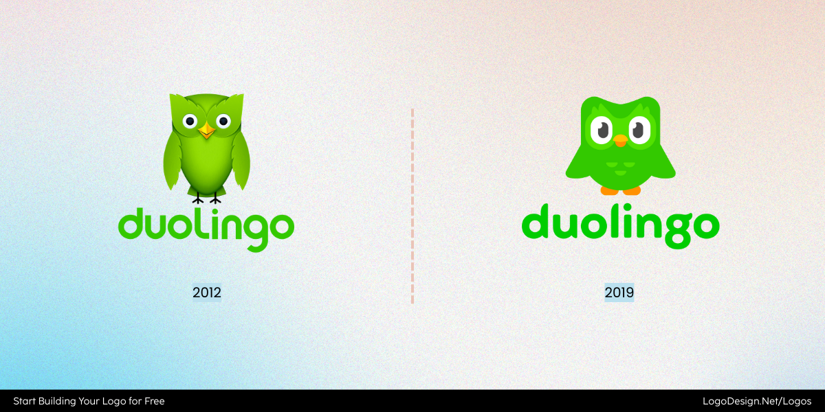
Duolingo logo versions of 2012 and 2019 that shows a thinner icon and typography, and a bolder icon with typography
Duolingo’s logo is a good case study. Its owl icon is bold and playful, but the wordmark needed to work in tandem. Earlier versions had tighter icon-to-text spacing, which felt crowded when shrunk for mobile. The 2019 refresh increased the macro spacing, giving the owl space to “perch” beside the text. As a result, the logo scales smoothly from app icons to print guides without losing clarity or charm.
5. Listen to Perception
Perception is the way people interpret the design based on cues, context, and experience
What to do: Don’t treat spacing as a technical issue all the time. Sometimes, let your perception make decisions. Designers should gather feedback because what feels mathematically balanced on a grid may still look “off” to viewers.
What not to do: Don’t assume precision equals perfection. Logos live in the real world, not just design software. Make sure to test it thoroughly.
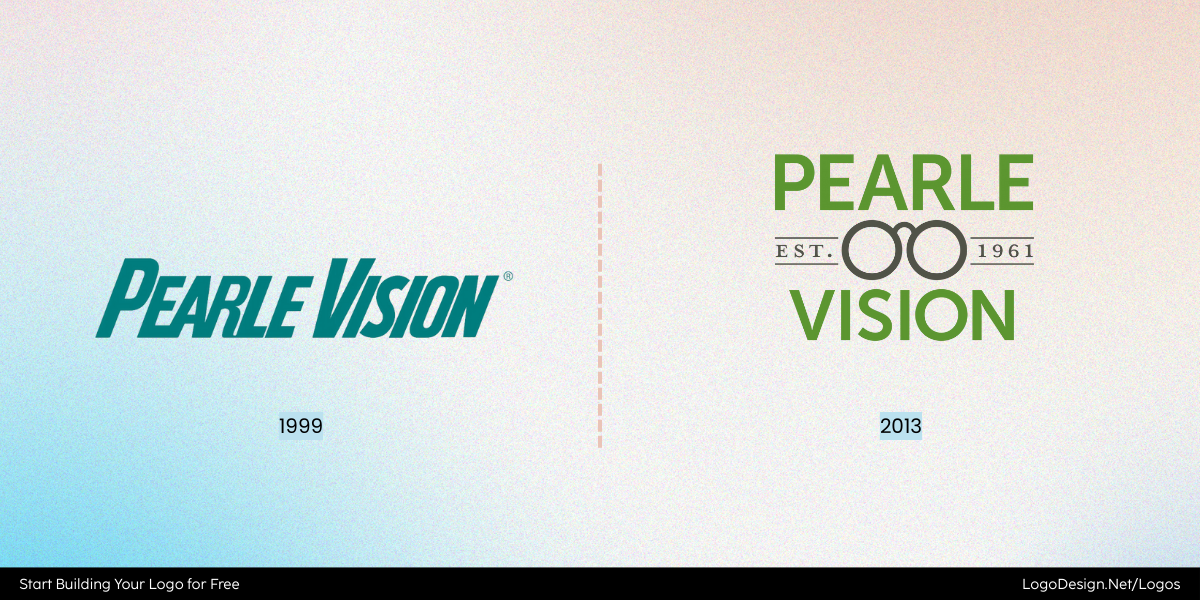
The two versions of the Pearle Vision logo from 1999 and 2013, where one of tightly spaced and the other is more open
Pearle Vision’s 2013 rebrand is a good reminder that perception matters just as much as math. The earlier wordmark had letters set too tightly together, which looked fine on a design grid but felt cramped on storefronts and marketing materials. After customer feedback and internal testing, the kerning was loosened, and the spacing between the eyeglass icon and text was increased. The change may look subtle in a vector file, but in the real world — on signs, packaging, and ads — the logo suddenly felt clearer, more approachable, and easier to read from a distance. It’s a classic case of perception guiding spacing decisions beyond technical precision.
Wrapping Up
Spacing may not grab attention like bold colors or striking icons, but it’s the quiet force that shapes how a logo feels. It decides whether a design whispers elegance or shouts chaos, whether it earns trust at a glance or leaves viewers unsettled. The smallest tweaks—sometimes a single pixel—can turn “almost right” into timeless logos. The brands that last are the ones that sweat the details most people never notice.
Ready to put that precision into action? Start designing your logo now and see how powerful good spacing can be.
