Even the best logo idea can fall flat with poor typography. Learn the slip-ups designers regret most and how to cleverly dodge these rookie mistakes for a polished brand.
In typography, the spacing between letters, the weight of the strokes, and even the curve of a serif all play a role in how people perceive your brand. A logo has to work across various platforms and sizes, from a business card to a billboard. So the fonts or typography you choose need to be suitable for it. Many designers are likely to make common mistakes when it comes to typography in logo design.
Whether it’s choosing trendy fonts that don’t age well, over-stylizing text, or simply overlooking spacing, these mistakes can reduce a logo’s clarity and memorability.
Let’s take a look at some of the common typography mistakes designers make when creating logos and how to avoid them.
Common Typography Mistakes to Avoid in Logos
Here are a few errors that designers and brand owners could be making when picking out the font styles for their logo designs. These mistakes break the rules of typography and fonts.
1. Choosing the Wrong Typeface in Logo Design
Selecting the right typeface is essential for communicating your brand’s identity. The wrong font can confuse your audience or make your brand appear unprofessional.
- Too Complex or Decorative Fonts
Using a complex script font or a heavily stylized one can make the logo difficult to read, especially at smaller sizes.
- Using Trendy Fonts
It would be better to avoid fonts that are too trendy, like Y2K, for instance, and instead opt for something more timeless, like Helvetica or Montserrat.

The 2013 Yahoo logo with a loose design and inconsistent strokes
Type Tale: Yahoo!’s 2013 Misadventure in Typography
The chosen typeface, a custom, semi-serif design loosely resembling Optima, did not receive the desired reaction from the audience. It featured inconsistent stroke weights and uneven letter spacing (kerning), which made the logo appear visually unbalanced and somewhat amateurish. While the intention was to create a modern and clean look, the result stripped away the distinctive, whimsical personality of Yahoo’s original logo.
The new typeface failed to capture the energy and uniqueness of the brand, instead making it look generic and corporate. It made the logo feel rushed and underwhelming, weakening its impact and inviting criticism.

The GAP logo, missing that distinctive touch, with the blue box icon looking forced
Type Tale: Mind the GAP in Typography
Gap swapped its iconic serif logotype (refined and classic) for a generic Helvetica wordmark with a slight, square, blue gradient behind the ‘p’. This sans-serif version felt drastically modern and minimal.
Helvetica is neutral and widely used; it lacks the heritage and distinctiveness of Gap’s original logo, which had an established, recognizable serif font. The blue box looked like a last-minute design element, not integrated with the wordmark. It appeared almost like a clip art addition.
The font shift was too sudden and confusing, offering no connection to the old brand identity. It mostly got backlash from consumers, and it was so severe that Gap reverted to the old logo within a week.
What to Do Instead?
Make sure the logo is clear, easy to understand, and matches the brand’s identity. Overly complicating the logo with trendy fonts and styles just because they’re trending can compromise its readability and adaptability across platforms.
2. Ignoring Typography Readability in Logos
If viewers struggle to read the text, they may overlook the brand message or get confused about it. With good readability, you make sure that the brand name is accessible across all print and digital mediums.
Thin typefaces like Great Vibes or Alex Brush may look elegant at large sizes, but can completely lose their appearance when scaled down. Similarly, complex details could blur or disappear on small screens, making the logo distorted in smaller or wider sizes. Slanted or tightly condensed letters might seem unique, but they do reduce clarity.
Always test your logo at various sizes and on different backgrounds. Scale it down to the size of a favicon or app icon to see if it’s still legible. Consider how it looks in various formats and prioritize clean, clear typography that maintains its readability anywhere.

The Kickstart logo with overly thick fonts that can compromise readability and overwhelm viewers
Type Tale: Kickstart into a Typo Trap
The Kickstarter logo font also confused a lot of people by prioritizing stylistic uniqueness over readability. Now you may find the font visually distinctive and playful, but its rounded, bubble-like letters with minimal spacing compromise readability. Letters like ‘K, S, and R’ appear in ways that can overwhelm viewers when they try to recognize the logo.
This design choice works with Kickstarter’s creative image but has drawn a divided reaction from people for reducing practical readability. So you may see that the logo is memorable and on-brand but has usability concerns where clarity and accessibility are important.

Bloom and Bloosom logo with visual complexity, reducing legibility across platforms
Type Tale: When Bloom & Blossom Went on a Font Diet
Now, you’ll find its logo font for Bloom and Blossom visually elegant and reflective of the brand’s core identity, but is it really? The design features a high-contrast serif typeface with very thin strokes, which can easily blur or fade when scaled down or viewed on screens with lower resolution.
Closely spaced letters like those in ‘Blossom’ make the word difficult to read at first glance. The unique style is a bit decorative and adds to the visual complexity, too. These design choices, while aesthetically pleasing, prioritize style over function. It reduces legibility and the logo’s impact across practical touchpoints such as packaging, mobile apps, or website headers, where quick readability is essential for busy consumers like new parents.
What to Do Instead?
Test the logo across platforms of various sizes and different background colors to ensure a clear appearance, making it easier for the viewers and potential clients to read.
3. Poor Kerning and Letter Spacing in Logo Fonts
Kerning, the space between individual letters, plays a key role in logo design. Even small inconsistencies in spacing can throw off the balance of a logo, making it feel awkward. Proper spacing creates visual harmony, improves readability, and gives the logo a polished, professional appearance. When spacing is ignored, even great typography can look off-balance.
If the letters in the word ‘FIT’, for instance, are too close together, especially the ‘F’ and ‘I’, people might read it as a single shape or a different letter altogether.
Always pay attention to spacing and kerning before anything else. Step back and view the logo as a whole to make sure that the spacing feels balanced and intentional.
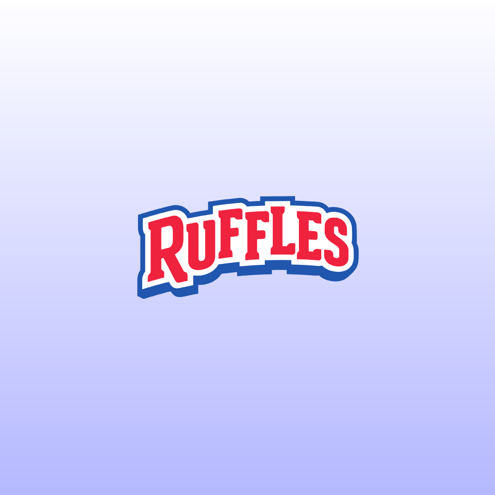
The Ruffles logo with poor kerning and is tightly packed together
Type Tale: Ruffled Feathers Over Font Choices
Ruffle’s logo font has been criticized for poor kerning, particularly in the arrangement of its custom, playful typeface. The letters in ‘Ruffles’ are often tightly packed in an uneven way, with inconsistent spacing that disrupts visual balance and readability. You’ll find that the spacing between letters is either too tight or too loose, making the wordmark appear slightly awkward.
The exaggerated font style fits the brand’s fun personality, and the poor kerning reflects a common issue where bold design choices take priority over typographic principles.

Flickr logo with inconsistent spacing, causing imbalances
Type Tale: Flickr’s Letters Got Too Close for Comfort
The kerning between the ‘c’ and ‘k’ in Flickr’s logo font appears slightly too tight, causing the letters to feel cramped. Sometimes, even the spacing between ‘r’ and the final character feels wider, creating a minor imbalance, which it does in the Flickr logo.
Another visual problem is the use of the two-color dot icon (pink and blue), that is placed next to the wordmark. This symbol adds visual weight to one side and affects the logo’s balance. But these issues are not that big and just show how minor kerning choices can affect overall harmony in logo text.
What to Do Instead?
Maintain proper spacing in the typography to ensure each letterform stands out. This makes the logo feel polished and easier on the eyes.
4. Overusing Common or Cliché Logo Fonts
Relying on default fonts or common choices like Times New Roman, Arial, or Comic Sans can work for general text. But they lack the uniqueness and distinctiveness in logos at times and that can be quite a mistake.
A creative design studio using Comic Sans in its logo immediately loses professionalism. It’s associated with informal or even amateur use, and it doesn’t convey creative excellence.
The font choice should match the brand’s voice and values. A mismatch creates confusion or sends the wrong impression.
Invest time in choosing or creating a font that fits your brand’s personality. Modified fonts or Custom typography in logos offer a unique identity and prevent your logo from looking like hundreds of others. If custom design isn’t possible, opt for high-quality, less commonly used fonts from trusted type foundries or designers.
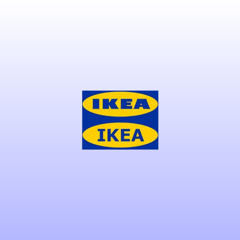
IKEA’s logo uses a font that many brand logos adopt, making them give up their unique charm
Type Tale: IKEA’s Verdana Misadventure
When the IKEA adopted Verdana, it got a strong reaction from designers and consumers. Its use in default digital interfaces, documents, and web content has made it feel generic and uninspired. By going with such an overused font, people felt as if IKEA gave up on the uniqueness and modernist charm that was associated with it’s brand identity.
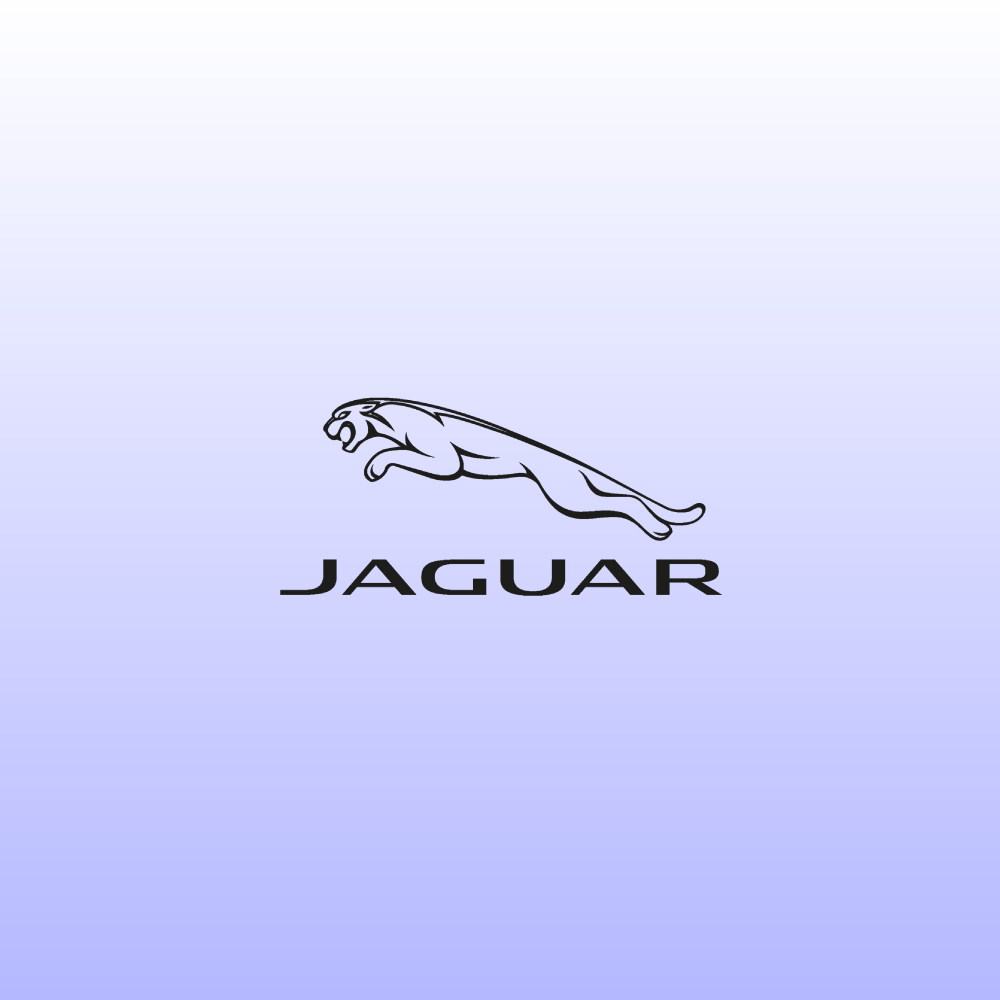
The Jaguar logo feels generic, with a rounded font. Not what people expect from a heritage brand
Type Tale: Jaguar’s Leap into Generic Lettering
In the recent rebrand, the company’s logo font, which aims for modernity, feels dated and generic. It features a rounded, geometric style that’s already commonly found across tech startups, electric vehicle brands, and lifestyle apps. Its minimalist, symmetrical look lacks the distinctive edge or luxury refinement expected from a heritage brand like Jaguar.
There are quite a few similar sans-serif wordmarks that sometimes prioritise trendy over timeless designs. The once-bold identity of Jaguar is now visually aligned with design tropes that are already on the verge of overuse, making the font appear more like a recycled template.
What to Do Instead?
Choose a customized font style that matches the brand’s personality to help the logo stand out from the generic ones. This can help add to the aesthetic appeal and credibility.
5. Mismatched Font and Color Pairings in Logos
If the text fades into the background or the colors clash with the style of the typeface, it can confuse readers or make the message feel off-brand. Successful font–color pairing creates enough contrast for readability while also maintaining the brand’s personality. So it could show how a brand is bold and energetic, calm and professional, or anything in between.
Poor pairings often result from choosing colors that are too similar in tone, too low in contrast, or simply mismatched with the style and weight of the type.

The British Telecom logo lacked a strong contrast, making it difficult to read in small sizes
Type Tale: British Telecom’s Color Choice Muffled the Typeface
Its rebrand introduced a minimal logo with a thin, modern typeface inside a purple circle. But the light-colored font lacked strong contrast against the purple background, making this British Telecom logo difficult to read in small sizes or from a distance.

The 2009 Syfy logo lacked contrast, making it difficult to read on different platforms
Type Tale: Syfy’s Faded Lettering Lost Its Punch
When Sci-Fi Channel rebranded as Syfy in 2009, the new wordmark appeared in a purple shade while ditching the Saturn in its logo for the first time. The font was clean and modern, but the color pairing didn’t do it any favors. On white or gradient backgrounds, the large purple letters lacked enough contrast, making the logo easy to overlook, especially on screens or in smaller applications. The weak color–type combination diluted the bold, imaginative identity that the network was aiming for.
What to Do Instead?
Balance the typography style (serif, sans-serif, bold, light) with color psychology (warm, cool, neutral tone) to ensure the logo aligns with the brand’s identity. Consistent use of contrast, tone, and weight can help the brand stand out.
6. Incompatible Font Pairings in Logo Design
If two or three font styles that are wrong for each other are paired up, they clash and overwhelm the viewer. Combining incompatible fonts like a sleek, modern one like Helvetica Neue with a stylized serif such as Didot could create visual tension that distracts from the brand message. The viewer may feel uncertain about the brand’s tone; are they cutting-edge or vintage?
A logo that uses a bold serif font for the company name, a quirky handwritten font for the tagline, and a futuristic sans-serif font in one design may fail to connect with audiences. This overcrowding confuses the brand’s identity and makes the logo visually confusing.
To prevent such a common mistake, stick to one or two typefaces that match your brand’s personality and will stand the test of time. You can find the top fonts used in logos by designers and start from there, too.
Choose fonts that share similar characteristics or create a harmonious contrast. For example, pairing the classic serif Georgia with the clean sans-serif Arial provides a nice balance of tradition and modernity. Between serif vs. sans serif font styles, you need to make careful choices.

The 2009 Kraft Foods logo used slim fonts that didn’t translate the brand’s identity as a family-friendly brand
Type Tale: Krafting Fonts That Don’t Blend
Kraft Foods’ 2009 logo combined its friendly, rounded primary wordmark with secondary taglines written in a completely different style. These supporting lines were set in slimmer, more formal fonts that didn’t match the warmth of the main lettering. As a result, Kraft faced a visual disconnect, as the contrasting typography communicated formality, weakening its image as a casual, family-friendly brand.

The CareerBuilder logo has an inconsistency in the text, signaling a mismatch for the viewer
Type Tale: CareerBuilder Couldn’t Get Its Fonts Hired
The logo of CareerBuilder once paired a clean, modern sans-serif font for ‘Career’ with a more stylized, exaggerated font for ‘Builder’. This created a slight inconsistency within the same wordmark, as the text for the first word felt professional, while the second part introduced flair that appeared too informal or energetic. The pairing felt almost like two separate brands stitched together. For a job and recruitment platform, this mismatch sent mixed signals.
What to Do Instead?
Use two complementary typefaces that match the brand’s identity. This can prevent the viewer from being overwhelmed by quirky designs and other elements.
7. Skipping Typography Hierarchy in Logo Layouts
This refers to the visual ranking of text elements, guiding the viewer’s eye by focusing on what’s most important through variations in size, weight, spacing, or style. In logo design, especially when combining a brand name with descriptors or taglines, a lack of clear hierarchy leads to confusion. It also creates visual clutter and reduces brand recall.
Without differentiation, the eye doesn’t know where to look first, and all parts of the logo compete for attention instead of working together harmoniously.

The Pohoda logo uses a block of text, making it less recognizable to the audience
Type Tale: When Pohoda’s Fonts Played All at Once
In some versions, the Pohoda event name is displayed in the same weight, style, and size as the surrounding text, such as dates or locations. This causes the logo to read more like a block of text than a clear identity. The brand name, which should be the focal point, gets lost, and its impact and recognizability are not the same. By not visually separating the main identity from the supporting information, the logo fails to communicate effectively or leave a lasting impression.

The MassArt logo lacks the typography contrast, making it unclear where the viewer should focus
Type Tale: MassArt’s Design Where No Font Graduates First
The full institutional name and ‘MassArt’ are presented without a clear visual distinction. The logo lacks typographic contrast in size, weight, or color, which makes it unclear where the viewer’s focus should be. This absence of hierarchy leaves the logo design visually dense and harder to interpret.
What to Do Instead?
Emphasize the brand name in the logo design with different sizes, weights, and styles. At the same time, taglines can have different design elements, such as lighter weights, smaller sizes, and increased spacing. This prevents potential clutter and improves readability.
8. Using Unlicensed Fonts in Logo Design
Many typefaces, mostly those downloaded from free font sites, come with restrictions. Using a font without the proper license in a logo (which is a commercial asset) can result in legal issues, including fines, take-down notices, or costly rebranding.
Just because a font is available online doesn’t mean it’s free for commercial use. You’ll find that quite a lot of free fonts are only licensed for personal use unless you purchase a commercial license.
It’s important to register for a commercial license to use a font from MyFonts or Adobe Fonts, so that you have legal rights. Some fonts have different licenses, like one for print, one for web, and another for logo use.
Always verify the font license before using it in a logo. When in doubt, reach out to the font creator or foundry for clarification. To avoid such mistakes, it’s also a good idea to consider hiring a type designer to create a custom font or logotype.

Rite Aid’s logo used a font that couldn’t be used for logos and advertising. They faced cases against them
Type Tale: Rite Aid’s Prescription for a Copyright Headache
The company that created the Neutraface font sued Rite Aid for using the font in its new logo and branding during a major rebrand. The font license clearly said it couldn’t be used in logos or advertising, but Rite Aid and its marketing agencies used it anyway. House said this hurt the value of their font and that Rite Aid ignored their attempts to fix the issue. The case was filed after those talks broke down.
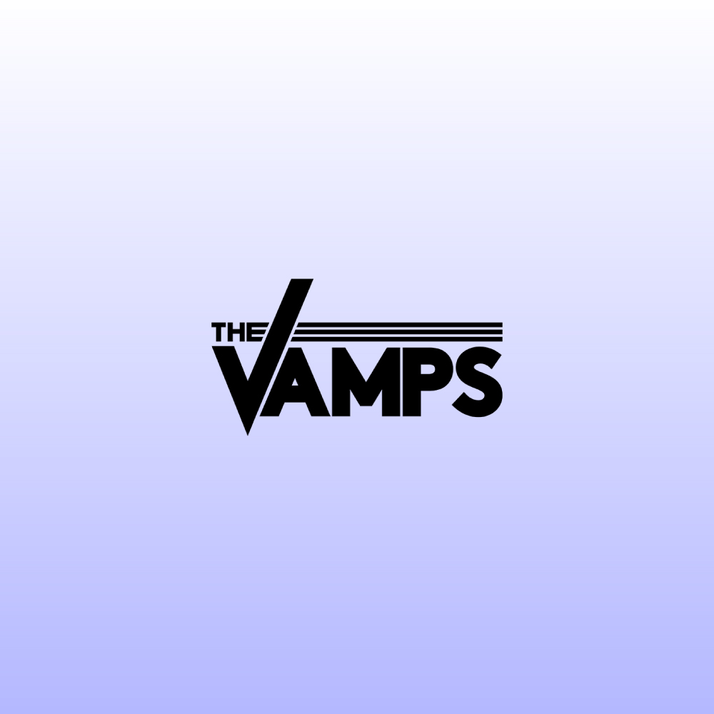
The 2017 Vamps logo used fonts before they had the commercial license, leading to the original license holder demanding money
Type Tale: The Vamps’ Design in Need of a Licensing Encore
In 2017, HypeForType filed a case against Universal Music Group that UMG used its Nanami Rounded and Ebisu Bold fonts in the logo and merchandise for the British band The Vamps. They failed to get the commercial licensing for the fonts. HypeForType asked to be paid in damages and made a move to stop the use of the styles across marketing and promotional materials.
What to Do Instead?
Either confirm if the typefaces are properly licensed before using them or opt for a custom typeface uniquely designed to meet the brand’s identity. This protects the brand from legal complications and improves its visual presence.
9. Logo Fonts That Don’t Scale Well Across Platforms
In many designs, brands go for sleek, minimalist, and elegant font styles. Sometimes, they are ultra-thin fonts or tightly spaced letters. These choices might look clean and fashionable on large-scale applications like posters, websites, or social media profile displays, but can get disrupted when the logo is resized for smaller uses.
This can cause problems as the logo has to appear as it is across a wide range of formats, from a favicon or app icon to embroidery on merch. If a logo’s font is too delicate or overly styled, it risks disappearing, blurring, or becoming illegible.

The University of California logo received unpleasant feedback about losing the original seal in the logo
Type Tale: When UC’s Typeface Failed the Growth Test
The University of California logo redesign used a clean, minimalist typeface alongside the mark. While they aimed to modernize the icon, it received negative feedback as people felt that the new look lost the tradition of the original seal. The simplified logo didn’t scale well, especially at small sizes or in single-color prints, where key design elements became unclear or too subtle to be effective. The backlash led University of California to drop the new logo entirely.

The 2009 Tropicana logo changed the design on the packaging, leading to significant backlash
Type Tale: Tropicana’s Logo Squeezed the Life Out of Legibility
In 2009, Tropicana redesigned its packaging of its best-selling orange juice for the North American market. This turned out to be a disaster as there was a major backlash from the audience. From a bold watermark, it went to a thin sans-serif font. While they wanted a cleaner appearance, the lighter typography lacked the strong shelf it originally had. This made the text difficult to read. This made the company revert to the previous design within months.
What to Do Instead?
Choose a font with balanced weight and clear spacing that remains legible on large and small platforms. This makes the logo design more recognizable on digital and print platforms.
10. Typography Choices That Date Your Logo Quickly
Fonts that don’t age well can be influenced by recent trends, including overly stylized shapes or visual references that lose relevance over time. As design and platforms change, these fonts can become harder to use effectively and feel out of place as well. Like colors or icons, typography is used everywhere. So when it does not have the same meaning after a few years, it can lose the whole brand experience and lead to an expensive rebrand just to stay relevant.
You have to make sure that the font styles you go with are relevant in a few years or even decades (think Nike!) and can be associated with your brand.
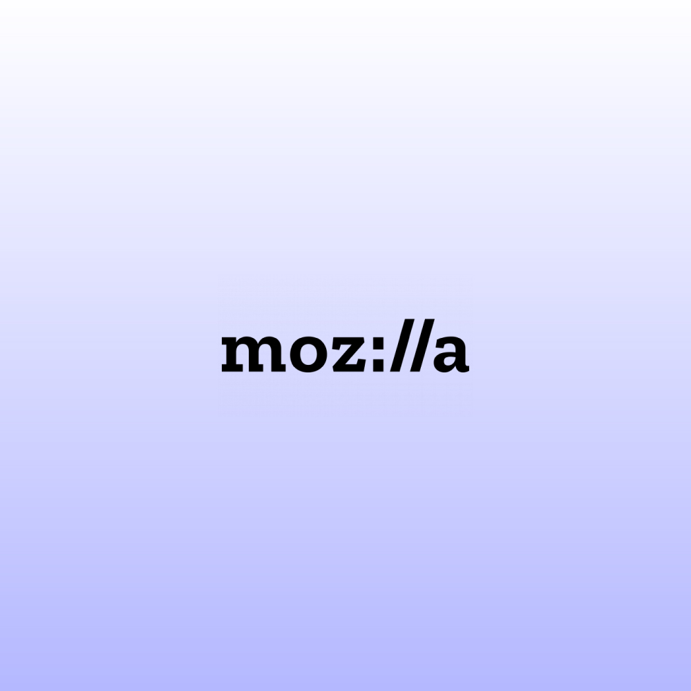
The Mozilla logo tried to use a claver typography, which felt dated and uninteresting
Type Tale: When Moz://a Got Stuck in an Expired Tab
The browser rebranded itself using a clever typographic logo that appeared like a URL to highlight its connection to the open web. It was a good move by Mozilla at the time; it made a reference to a tech joke that soon lost relevance. As user preferences changed from typing or even seeing URLs, the typographic design began to feel dated.

The Energy Heritage logo went for an overly stiff design that didn’t sit well with the viewers
Type Tale: English Heritage’s Design That Weathered Badly
English Heritage once used a serif-heavy and old-timey font that looked historical, but felt overly stiff or decorative in modern placement. This led to a redesign for English Heritage with a more versatile and contemporary typeface.
What to Do Instead?
As the years go by and design trends change, update the logo to ensure the brand does not look outdated. This ensures the logo meets the brand’s identity across decades and beyond.
Key Takeaways
These are some of the mistakes in logo fonts that designers need to avoid. You may find a few others if you take a look at more famous logos, but mostly the brands go with them as they appear close to their new or evolved messaging.
- Pick typefaces that match the personality of the brand
- Avoid trendy fonts, which lose their relevance
- Use one or two typefaces that complement each other
- Pair fonts that appeal visually or contrast well
- Prioritize readability to make sure the text is readable
- Don’t use a lot of effects in a brand name
- Be consistent with kerning and spacing
- Don’t choose from overused or generic fonts
- Always get licensed fonts to prevent legal problems
