Which part of a logo grabs you first – the name, the symbol, or the color? That split-second choice is the invisible hierarchy trick designers use to make logos unforgettable.
The truth is, a logo does not need to explain itself. It needs to be understood. Because when people look at a logo, they do not study it; they scan it. Their eyes land somewhere first, move once or twice, and then decide whether the mark feels familiar, clear, or worth remembering. That path is not accidental. It is shaped by design hierarchy.
Many logos struggle because they try to say too much at once. A symbol asks for attention, the name pushes back, colors argue among themselves, and nothing truly leads. The result is not bold. It is unsettled. Viewers may not notice the problem, but they feel it.
Strong logos make quiet decisions. They choose one clear focal point and allow everything else to support it. The name reads easily. The symbol earns its place. The details stay in the background where they belong.
Design hierarchy is less about rules and more about discipline. It asks a simple question: What should someone notice first, and what can wait? Getting that answer right is often the difference between a logo that survives and one that keeps needing to be fixed.
Hierarchy in Logo Designs – Why It Matters
Design hierarchy is the logic behind where the eye goes first. In logo design, that logic has to work fast and without instruction. A viewer should not have to decode a mark to understand what they are looking at. On average, a user spends only 5 seconds looking at a logo. The hierarchy quietly points them in the right direction.
In simple terms, hierarchy decides priority. It answers questions before they are asked, such as, What is this brand called? Is there a symbol I should remember? What detail can I safely ignore? When hierarchy is missing, every element competes for attention, and the logo feels unsettled. When it is done well, the logo feels calm and confident, even if the viewer cannot explain why.
For logos, hierarchy matters because they live in tight spaces and fleeting moments. A website header, an app icon, and a storefront sign all demand clarity. The stronger the hierarchy, the less effort the viewer has to spend understanding the mark.
Here’s why a strong hierarchy makes logos work better.
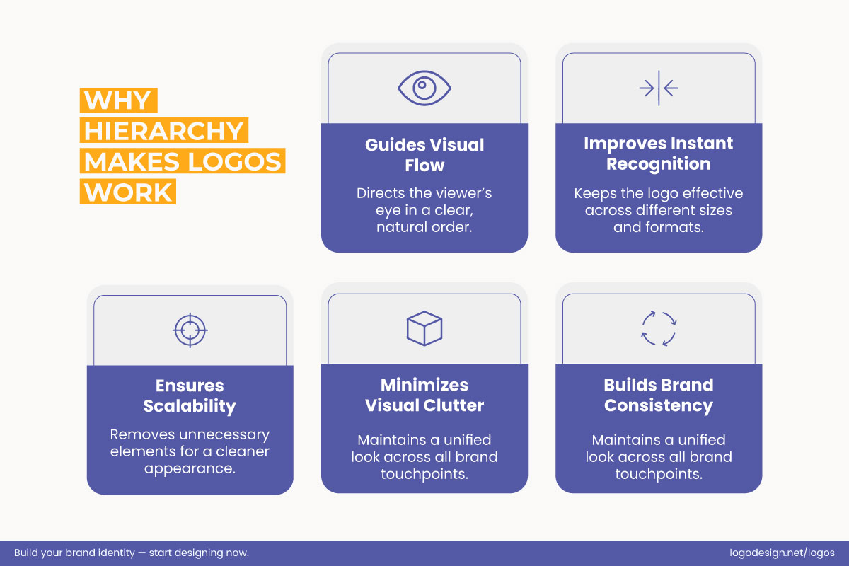
A strong visual hierarchy guides the eye, sharpens recognition, and keeps logos clear, scalable, clutter-free, consistent, and timeless.
- Guides the eye without forcing it
- Improves instant recognition
- Helps logos scale across sizes and formats
- Reduces visual noise
- Supports long-term brand consistency
The Nike swoosh is clear, confident, and instantly recognizable across cultures.
Have you ever noticed how decisive Nike’s hierarchy is? The swoosh leads, whether or not the wordmark is present. Nothing competes with it, which is why the symbol works across products, ads, and cultures without explanation.
The FedEx logo speaks softly, revealing the meaning to those who look closer.
Similarly, FedEx places the name first and lets the details work quietly. The hidden arrow rewards attention without demanding it. The hierarchy keeps the logo readable while adding meaning through restraint.
How the Human Eye Processes a Logo?
A logo is processed in a fraction of a second. There is no scanning, no comparison, and no conscious analysis. The eye lands, the brain decides, and the impression is formed. That moment is where design hierarchy either works or fails.
1. Logos Are Not Read Like Web Pages
Web pages often follow an F-pattern, where the eye moves left to right and top to bottom. Logos work differently. Most logos rely on a central focus. The eye lands once, sometimes twice, and forms an impression almost instantly. If there is no clear focal point, the eye hesitates, and that hesitation weakens recognition and memory.
| Feature / Aspect | Logo Reading | Web Page Reading |
| Eye Movement Pattern | Single landing, sometimes revisits once | F-pattern: left to right, top to bottom |
| Scanning vs. Instant Impression | Almost no scanning; instant recognition | Requires scanning, comparing, and scanning multiple elements |
| Focus | Central focus dominates; hierarchy is key | Multiple focus points depending on layout and content |
| Conscious Analysis | Minimal; brain decides immediately | Higher; conscious reading and interpretation often required |
| Time to Process | Fraction of a second | Longer; depends on content and navigation |
| Effect of Poor Design | Weak focal point causes hesitation and weak recognition | Confusing layout slows reading, comprehension, and memory |
2. Gestalt Principles and Visual Grouping
The brain looks for structure before it looks for meaning. Gestalt principles describe how people naturally organize visual information in a split second, which makes them especially important in logo design.
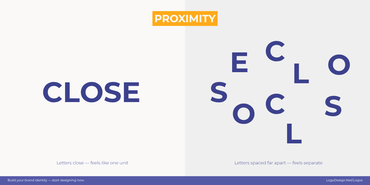
Proximity shows how grouped items feel like a family, and those spaced out create a clear boundary.
- Proximity: Elements placed close together are seen as related, while space signals separation.
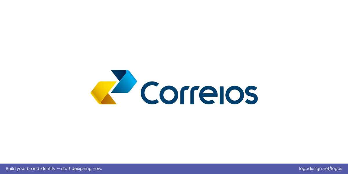
The Correios logo has unified arrows, showing movement, direction, and seamless connection.
The Correios logo uses closely positioned arrow shapes that the eye reads as a single, unified symbol. This arrangement conveys a clear sense of direction and movement, making the logo feel dynamic while reinforcing the idea of connection and flow. The viewer instantly interprets the multiple elements as a cohesive mark.
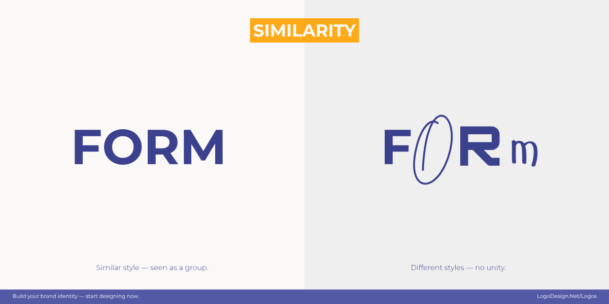
Similarity in shapes and colors creates a visual rhythm, signaling that these elements belong together.
- Similarity: Repeating shapes, colors, or styles tells the eye which elements belong together.
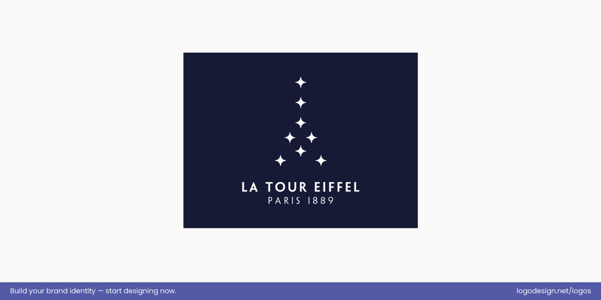
The La Tour d’Eiffel logo has multiple star shapes to form the Eiffel Tower, showing visual similarity.
The La Tour Eiffel logo uses repeated star shapes that the eye groups together because of their similarity in form and style. These consistent elements form the recognizable shape of the Eiffel Tower, allowing viewers to see the whole structure through a pattern of like parts. The shared visual traits of the stars create unity and help the symbol read clearly and memorably.
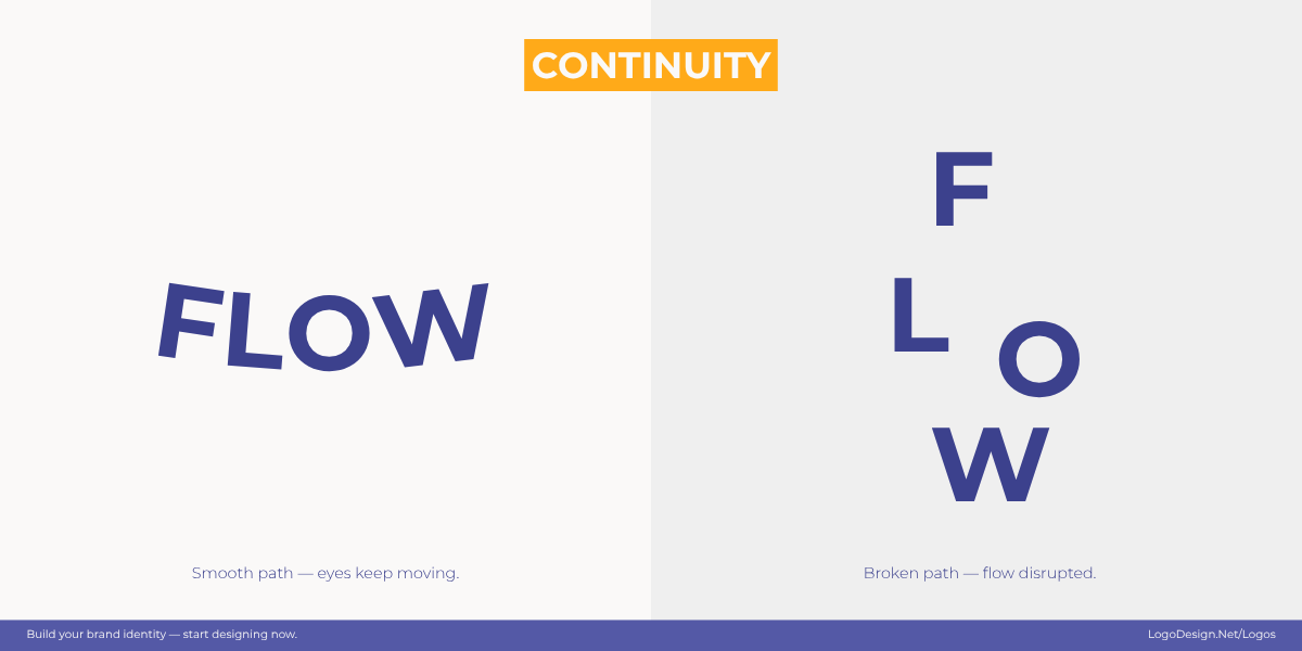
Continuity guides the eye through smooth paths and curves to create a sense of movement.
- Continuity: The eye naturally follows smooth lines, curves, or paths to perceive a unified flow.
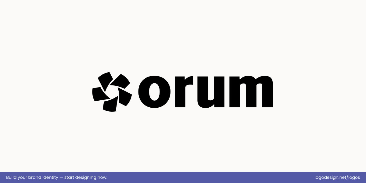
The Orum logo uses smooth, flowing curves to create a sense of movement and connectivity.
The Orum logo is a clear example of continuity because its smooth, flowing curves guide the eye naturally around the mark. The interconnected forms create a sense of movement and cohesion, letting the viewer perceive the elements as part of a single, fluid shape. This seamless path reflects the brand’s focus on streamlined interaction and connectivity.
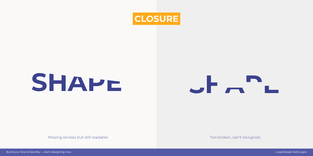
Closure is where the brain naturally fills in gaps to perceive a complete shape.
- Closure: The brain fills in missing parts of a shape, creating a complete form without extra detail.
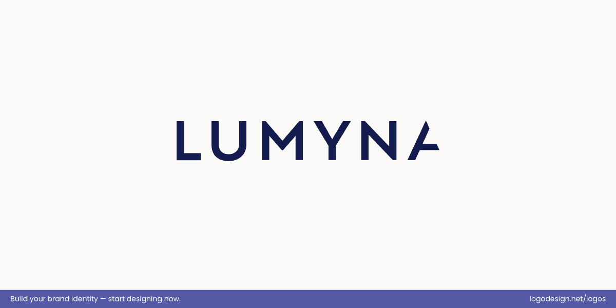
The Lumyna logo uses intentional gaps to suggest closure, allowing the eye to complete the form.
The Lumyna logo illustrates closure by leaving intentional gaps in several letters while still allowing the eye to complete the word effortlessly. This approach creates a clean, modern look that engages perception without adding unnecessary detail. By relying on the viewer’s visual completion, the logo remains recognizable and striking.
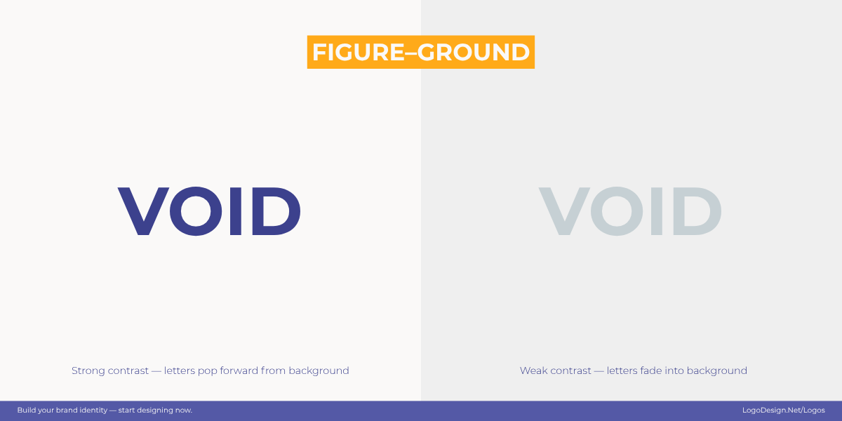
The positive and negative spaces create a clear distinction between the subject and the background.
- Figure–Ground: Positive and negative space interact so the subject stands out from the background.
The MyHealth RCSI logo uses spaces to form a clear “H,” creating instant recognition.
The MyHealth RCSI logo is a clear example of figure–ground because it uses positive and negative space to form a recognizable “H.” The solid shapes interact with surrounding gaps so the eye perceives a complete symbol, giving the mark strong visual clarity. This interplay makes the logo immediately identifiable and memorable.
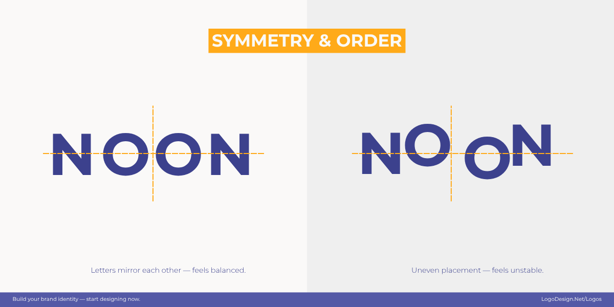
Harmonious balance is using symmetry and order to build visual stability and trust.
- Symmetry & Order: Balanced layouts create harmony, stability, and a sense of trust.
The Vergia logo has balanced geometric shapes, showing stability and trust.
The Vergia logo demonstrates symmetry and order through its balanced geometric shapes and consistent spacing. The precise arrangement creates a harmonious, stable form that conveys structure and reliability. This visual organization reinforces a sense of professionalism and trust at a glance.
- Common Fate: Elements moving or pointing in the same direction are perceived as connected.
The NCVO logo has angled shapes, showing upward motion and progress.
The NCVO logo is a clear example of common fate because its angled shapes and upward-leaning forms all appear to move in the same direction. This shared orientation creates a sense of collective motion and progress, making the elements feel connected as part of a unified visual trajectory.
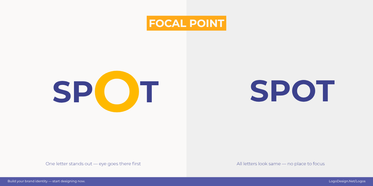
A single, vibrant element commands the frame, using contrast and scale to create a clear focal point.
- Focal Point: One element dominates through size, contrast, or color to guide attention.
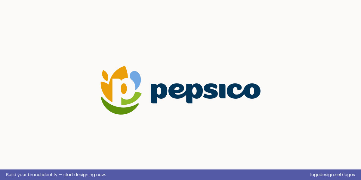
The PepsiCo logo has a colorful emblem and bold wordmark, making the brand recognizable.
The new PepsiCo logo is a clear illustration of focal point because the colorful emblem and bold lowercase wordmark immediately draw the eye. The negative space “p” within the icon adds subtle visual intrigue, enhancing attention on the central mark and making the brand instantly recognizable.
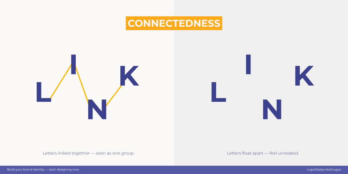
Connectedness helps to explain the action and the result.
- Connectedness: Physically linked elements are seen as a single, unified group.
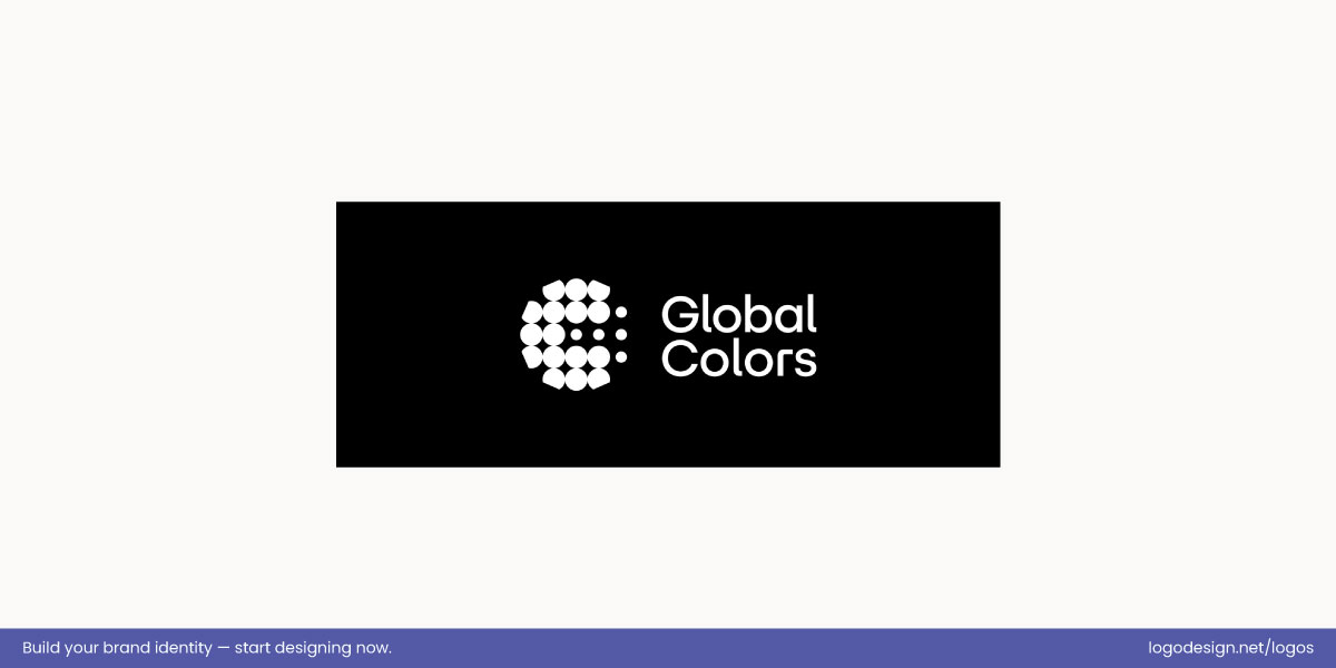
The Global Colors logo has clustered dots, showing unity and global connection.
The Global Colors logo is a clear example of connectedness because many small, identical dots are grouped together to create one recognizable form. The physical linkage between the elements causes the eye to read them as a unified whole, emphasizing cohesion and global connection.
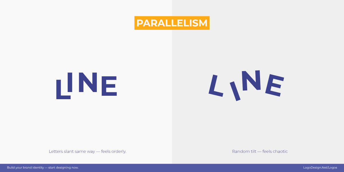
Parallel lines guide the eye, creating rhythm, structure, and a sense of connection.
- Parallelism: Parallel shapes or lines are interpreted as related, creating structure and rhythm.
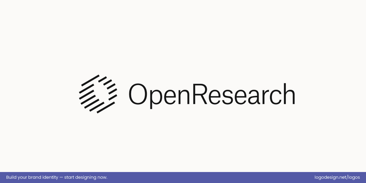
The OpenResearch logo has repeating lines, showing rhythm and visual harmony.
The OpenResearch logo is a clear example of parallelism because its repeated, evenly spaced lines are interpreted as related, forming a cohesive, circular shape. This structured repetition creates rhythm and visual harmony, giving the mark a sense of order and unity that reflects the organization’s focus on research and collaboration.
Good logo hierarchy works with these instincts rather than against them. When related elements are grouped, patterns are reinforced, and forms are allowed to suggest rather than explain, the logo feels organized and easy to understand. The viewer does not have to think about what connects to what. The structure is sensed immediately, which strengthens clarity and recognition.
3. Visual Weight and Eye Movement
Every element in a logo carries a certain amount of visual weight, whether intentional or not. Size is often the most obvious factor, but contrast, color intensity, thickness, and spacing also play a strong role. Darker, bolder, or more compact elements naturally pull the eye first, while lighter elements act as support.
When hierarchy is clear, the eye moves through the logo in a controlled way, landing on the primary focus before noticing secondary details. When too many elements demand attention at once, the eye has no clear path, and the logo feels cluttered or unsettled.
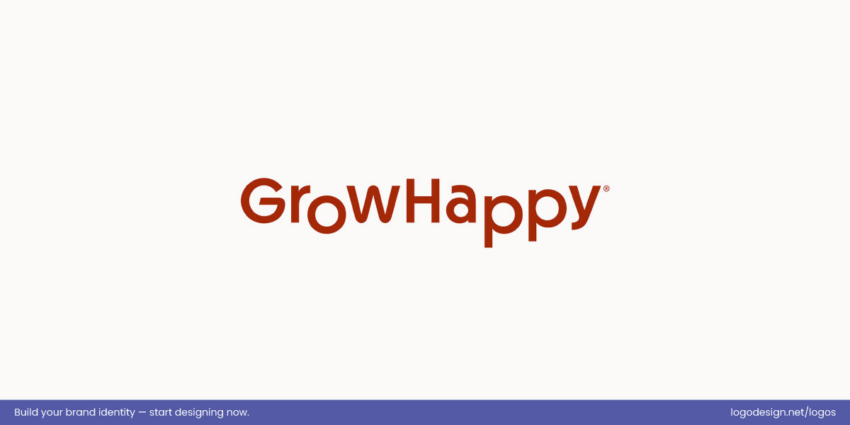
The GrowHappy logo uses bold, rounded lettering to give a friendly, trustworthy first impression.
The GrowHappy logo demonstrates this principle clearly. The brand name carries the most visual weight through its size and rounded, approachable letterforms, drawing the eye immediately to the primary message. Color theory and secondary details stay deliberately subtle, supporting the name without competing for attention. This controlled hierarchy creates a calm visual flow, helping a complex, science-led brand feel simple, friendly, and trustworthy at first glance.
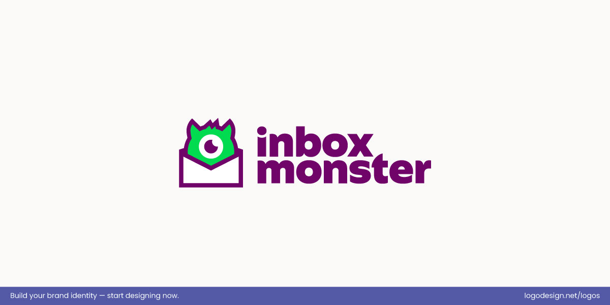
Inbox Monster uses a bold wordmark and playful mascot for an approachable logo with a clear hierarchy.
Another strong example is Inbox Monster. Here, the bold wordmark anchors the logo, while the playful mascot adds secondary visual weight, guiding the eye naturally from text to icon. Bright, contrasting colors using a professional color palette tool and clear spacing keep the hierarchy intact, making the logo both memorable and approachable without feeling cluttered.
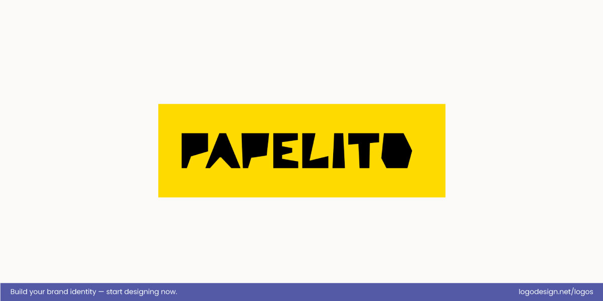
Papelito’s logo balances bold icon and strong wordmark, creating a lively, dynamic visual flow.
The new Papelito logo pairs a bold, graphic emblem with a wordmark of similar visual prominence, giving neither element a strictly dominant role. The emblem’s vibrant shape and color are eye‑catching, but the equally strong type treatment keeps the viewer’s attention shifting back and forth between icon and text. This contrast in visual weight makes the logo feel lively and dynamic rather than settled into a hierarchy.
4. Cognitive Load and Instant Recognition
The human brain is wired to conserve effort. When a logo is difficult to process, even slightly, it creates hesitation. That pause may be brief, but it affects how the brand is perceived. Clear hierarchy reduces cognitive load by making the message obvious at a glance, whereas cognitive overload reduces brand recall.
The viewer does not need to decode the design or search for meaning. Instant recognition feels natural and comfortable, which helps the logo register faster and makes the brand easier to trust and remember.
Recent neuroscientific research supports this principle. Šola, Khawaja, and Qureshi (2025) analyzed how visual complexity, contrast, and hierarchy influence the brain’s processing of logos, finding that designs that minimize cognitive effort are recognized faster and remembered more reliably. Their findings highlight that even subtle design choices can significantly impact brand perception and recall, particularly in premium and luxury markets.
Why This Matters for Businesses
- Less mental effort = higher trust.
- Faster recognition = stronger brand equity.
When a logo feels easy to understand, people feel more comfortable with the brand behind it. Over time, that comfort compounds into familiarity, credibility, and recall.
Core Elements That Create Hierarchy in Logos
Design hierarchy is built through a small set of visual levers that decide what leads, what supports, and what fades into the background. In logo design, these choices are especially critical because there is very little room for correction once the mark is in use.
• Size and Scale
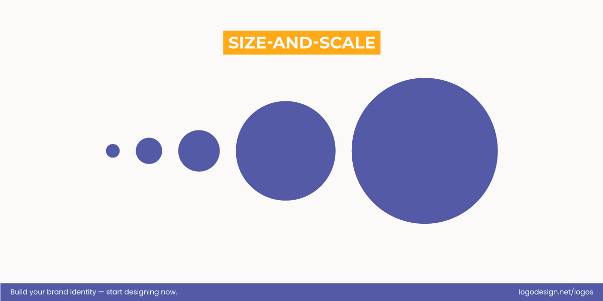
Size in design sets hierarchy, with larger elements signaling importance and smaller ones supporting the message
Size is the fastest way to establish priority. Larger elements signal importance immediately, while smaller ones take on a supporting role. In most logos, one element must clearly dominate, whether that is the brand name or a symbol. When multiple elements compete at the same scale, hierarchy breaks down.
Small details are where recognition often suffers. Fine lines, secondary icons, or tiny text may look intentional in a full-size layout, but they disappear quickly at reduced sizes. If an element cannot survive being scaled down, it does not deserve a leading role.
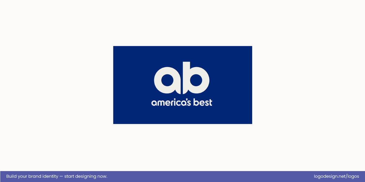
The America’s Best logo emphasizes a bold ‘AB’ monogram, using size and scale for instant brand recognition
The redesigned America’s Best logo uses size and scale to establish hierarchy and guide the viewer’s attention. The large “AB” monogram dominates the composition, drawing the eye immediately, while the wordmark below is smaller, supporting the main mark without competing for focus. This contrast in scale ensures the lettermark logo registers quickly, stays legible at smaller sizes, and reinforces instant brand recognition.
• Typography
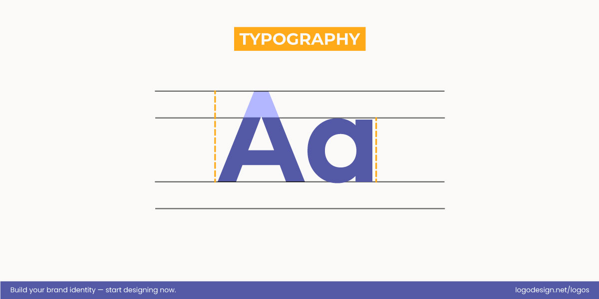
Logo typography sets the hierarchy (wordmark or symbol first), followed by the weight, width, and contrast to amplify it.
Typography in logos often carries more hierarchy than designers realize. Deciding whether the wordmark or the symbol leads sets the tone for the entire logo. Once that choice is made, font weight, width, and contrast reinforce it.
Heavier type commands attention; lighter type supports. Wide letterforms feel stable, while condensed ones feel sharper and more urgent. Legibility should always be the top priority when designing custom logo typography. If the type struggles at small sizes, hierarchy collapses, no matter how well the logo looks in a mockup.
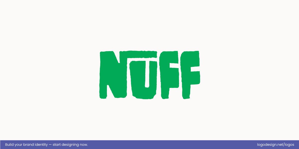
The NUFF logo uses bold, heavy typography, making the brand name instantly recognizable.
The NUFF logo leverages bold, heavy typography to make its brand name impossible to miss. The chunky, substantial letterforms not only reflect the handcrafted, linocut‑inspired aesthetic of the overall identity, but also ensure that the wordmark carries priority in visual hierarchy, pulling the eye in immediately. By giving the type significant weight and presence, the design reinforces recognition at a glance and avoids any competition from supporting graphic elements.
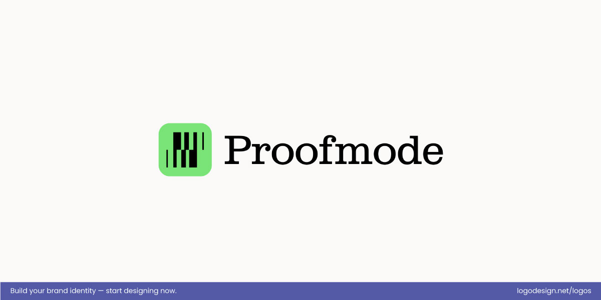
The Proofmode logo uses subtle typography to keeping the wordmark clear and consistent.
In contrast, the Proofmode logo uses lighter, more restrained typography that supports rather than dominates the identity. Here, the type sits comfortably alongside the icon and graphic system without overpowering them, allowing the symbol to take the lead in visual interest. This subtler use of type keeps the wordmark legible and cohesive while letting the main graphic device capture initial attention and carry the brand’s personality.
• Color and Contrast
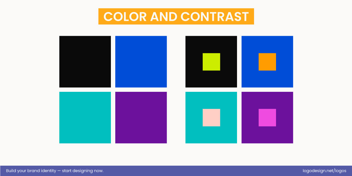
Color guides attention and shapes brand recognition, while high contrast pops and muted tones recede.
Color is one of the most powerful tools for guiding attention. Did you know 80% of people say logo color theory plays a key role in brand recognition? High-contrast colors naturally rise to the top of the hierarchy, while muted tones fall back. Used with restraint, color can direct the eye exactly where it needs to go.
Too many colors weaken this effect. When everything is colorful, nothing feels important. Limiting the brand color palette allows contrast to work properly and keeps the hierarchy intact across different backgrounds and formats.
Here’s an overview of the ways different color contrasts shape how a logo is seen and how the brand is perceived:
| Type of Color Contrast | Description | Effect in Logos / Brand Perception |
| High-value contrast (light vs. dark) | Extreme difference in brightness between colors, e.g., black and white | Creates clarity and legibility; emphasizes hierarchy; makes the logo easy to read at any size; conveys authority and simplicity. |
| Hue contrast (different colors on the color wheel) | Using distinctly different colors, e.g., red vs. green | Draws attention to key elements; creates energy and visual interest; communicates excitement or distinctiveness. |
| Warm vs. cool contrast | Juxtaposing warm colors (red, orange) with cool colors (blue, green) | Highlights focal points; creates a dynamic or balanced visual feel; can evoke emotional warmth or calm depending on application. |
| Complementary contrast | Colors opposite on the color wheel, e.g., blue vs. orange | Maximizes visual impact; grabs attention; makes elements stand out instantly; feels bold and energetic. |
| Analogous contrast | Colors next to each other on the color wheel, e.g., pink and purple | Creates harmony and subtle depth; conveys friendliness, approachability, and cohesion; softer on the eyes. |
| Saturation contrast (vivid vs. muted) | Combining bright, intense colors with dull or pastel shades | Directs focus to the saturated elements; allows hierarchy; adds dimension while keeping less important elements in the background. |
| Gradient / tonal contrast | Variation of shade or lightness of a single color | Creates movement and flow; emphasizes depth and hierarchy; adds visual interest without introducing multiple hues. |
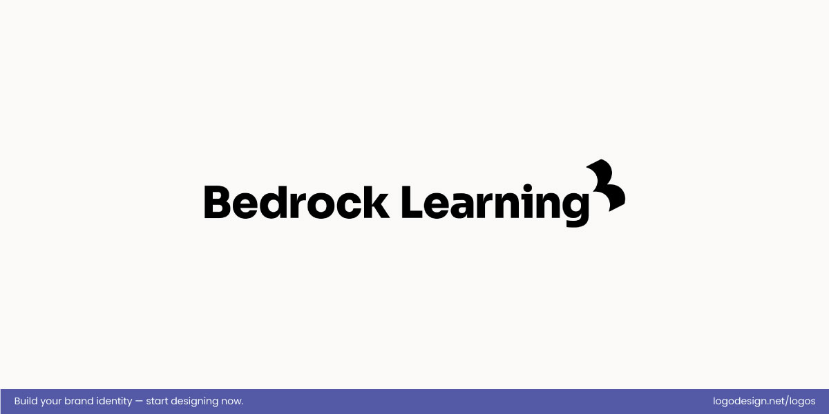
The Bedrock Learning logo uses high-contrast black and white for a strong presence.
Bedrock Learning uses a black-and-white, high-value contrast to create immediate visual clarity. The stark opposition between dark and light elements makes the wordmark and accompanying symbols stand out sharply, ensuring that the logo reads clearly at any size or application. This restrained palette directs attention efficiently, giving the identity a strong, authoritative presence without distraction.
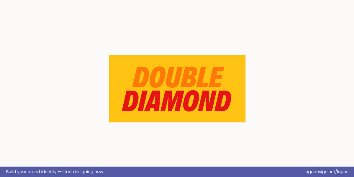
The Double Diamond Beer logo uses warm orange and red tones to show energy.
Double Diamond Beer employs warm hue contrast between its orange and red tones, creating energy and movement in the mark. The gradient-like interplay guides the eye along the diamond shapes, emphasizing the flow and structure of the logo. This thoughtful color choice makes the identity feel dynamic and engaging, while still maintaining cohesion through a limited, carefully chosen palette.
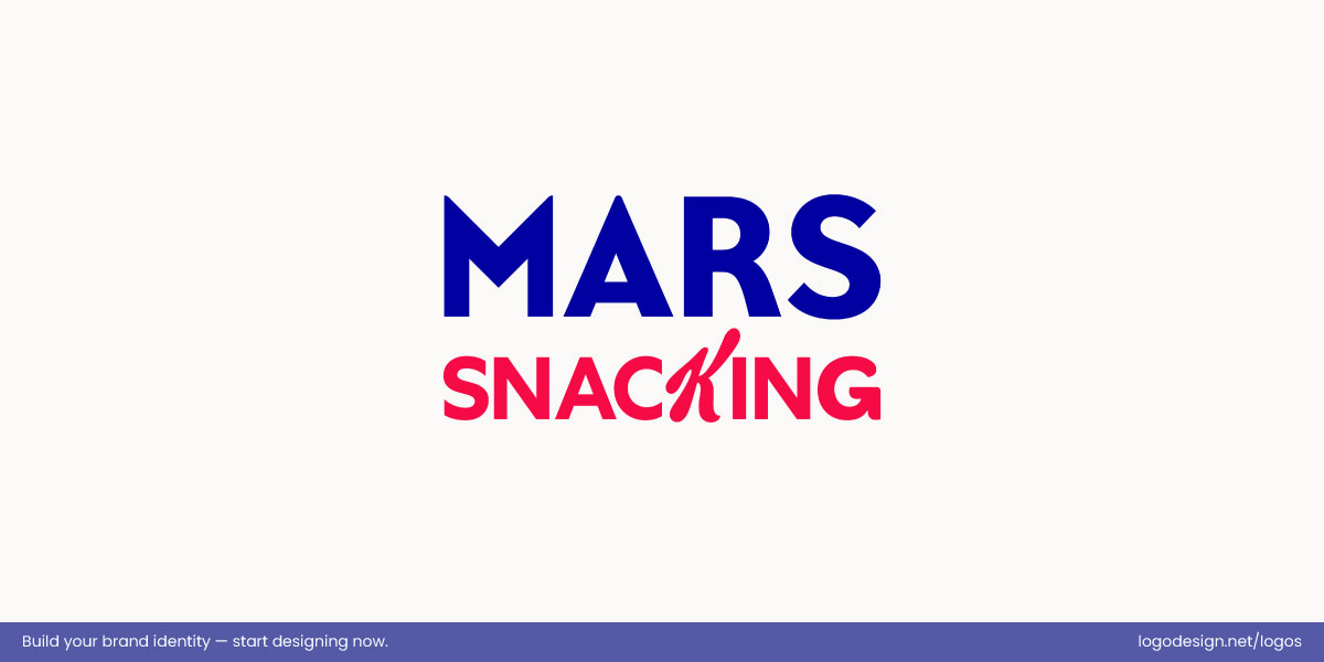
Mars Snacking uses pink and purple tones, creating a playful and approachable look
Mars Snacking relies on analogous color contrast with pink and purple, giving the logo a playful, approachable tone. The subtle differences between these hues create depth without overpowering the viewer, letting the wordmark and icon sit comfortably together. This softer contrast supports brand recognition while evoking a friendly, inviting personality, well-suited to a consumer-focused product.
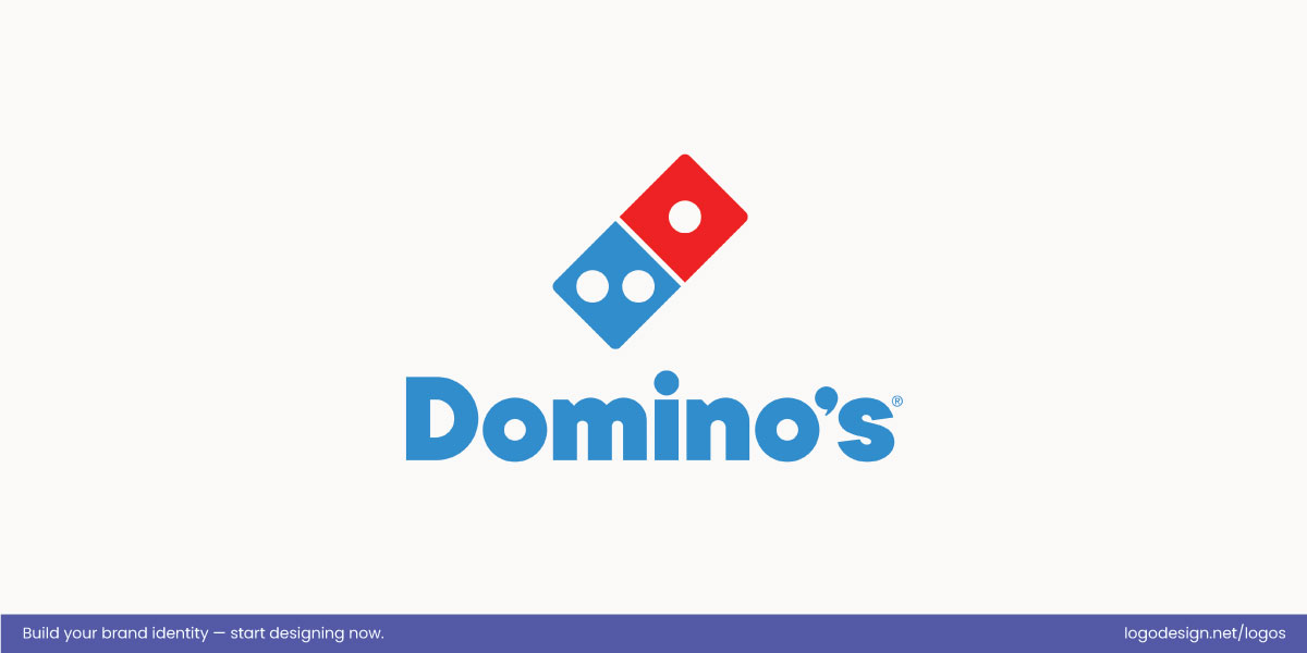
The Domino’s logo uses red and blue contrast, creating boldness and instant recognition.
Domino’s uses red and blue, complementary contrast, creating a bold and immediately attention-grabbing identity. The stark opposition between the two saturated colors ensures that both the dice icon and wordmark are highly legible, even at a distance, and gives the logo a lively, energetic presence. This non-subtle contrast and strategic font selection reinforce brand recognition and makes the mark impossible to miss in crowded environments.
• Spacing and Alignment
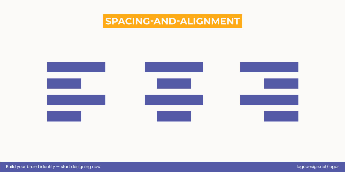
White space guides the eye, separates elements, and clarifies relationships.
White space is not empty space. It is an active part of the hierarchy. Space in logos separates elements, creates breathing room, and helps the eye understand relationships at a glance.
Crowded logos feel tense and harder to process. When elements are given room to exist, clarity improves. Alignment reinforces this clarity by creating visual order. Clean alignment tells the eye that the logo is intentional and controlled, not improvised.
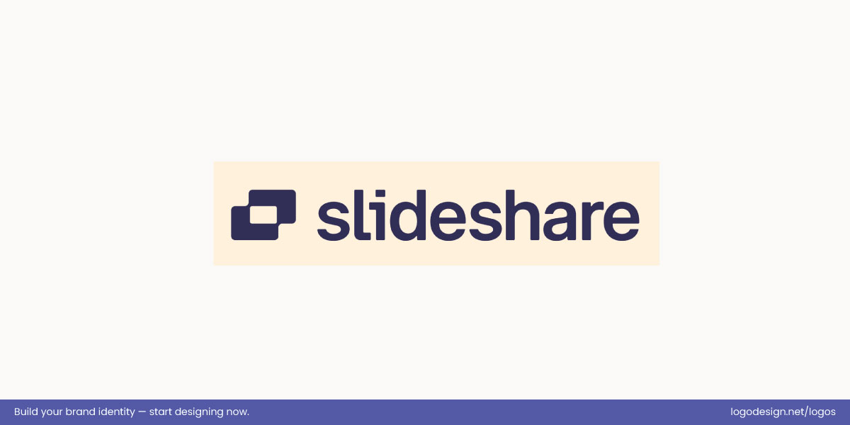
Slideshare’s logo uses white space to form a flowing ‘S’, turning empty space into a defining element.
The Slideshare logo uses white space within the icon to create a flowing, recognizable “S” shape. The gaps between the curves allow the eye to follow the form naturally, making the abstract icon feel open, approachable, and easy to read at a glance. By turning empty space into a defining element, the logo demonstrates how micro and macro spacing in the logo can actively shape perception.
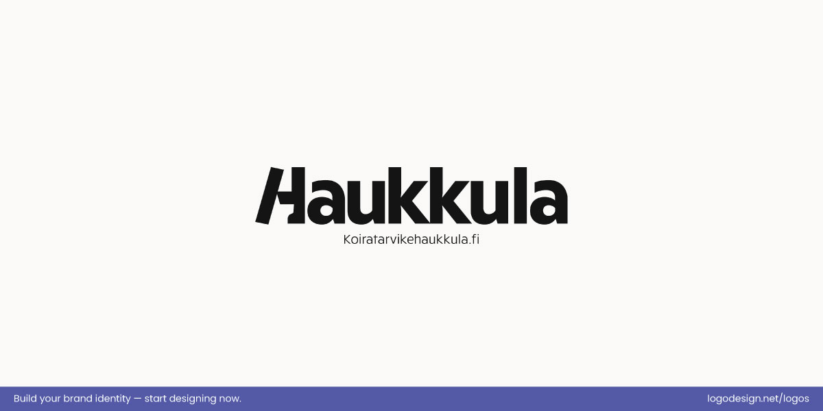
The Haukkula wordmark uses negative space to subtly show a dog icon, giving the logo personality and visual balance.
The Haukkula wordmark incorporates strategic spacing within the “H” to form a subtle dog silhouette, integrating the brand’s identity directly into the letter. The negative space around the shape ensures the figure is instantly recognizable without crowding the surrounding letters, giving the wordmark clarity, personality, and visual balance.
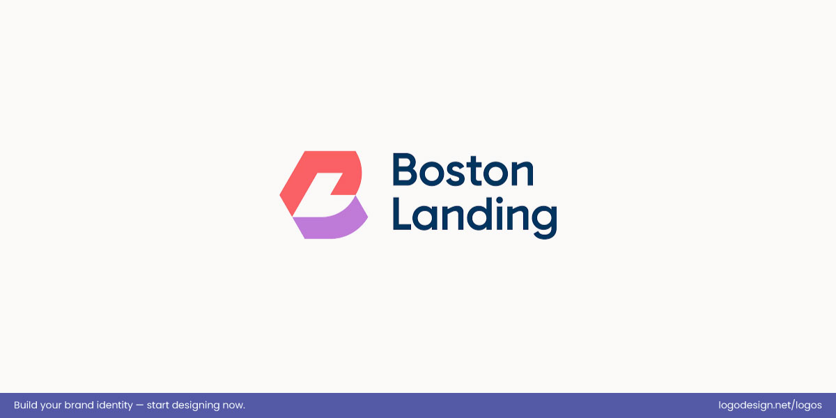
The Boston Landing logo uses negative space to create a dynamic “BL” monogram that feels modern.
The Boston Landing logo uses active space to construct a “BL” monogram alongside the wordmark. The negative space between the letters defines the forms while keeping the mark clean and legible, allowing the initials to interact seamlessly with the full name. This careful use of space makes the monogram feel dynamic, modern, and integrated without visual clutter.
• Shape and Form
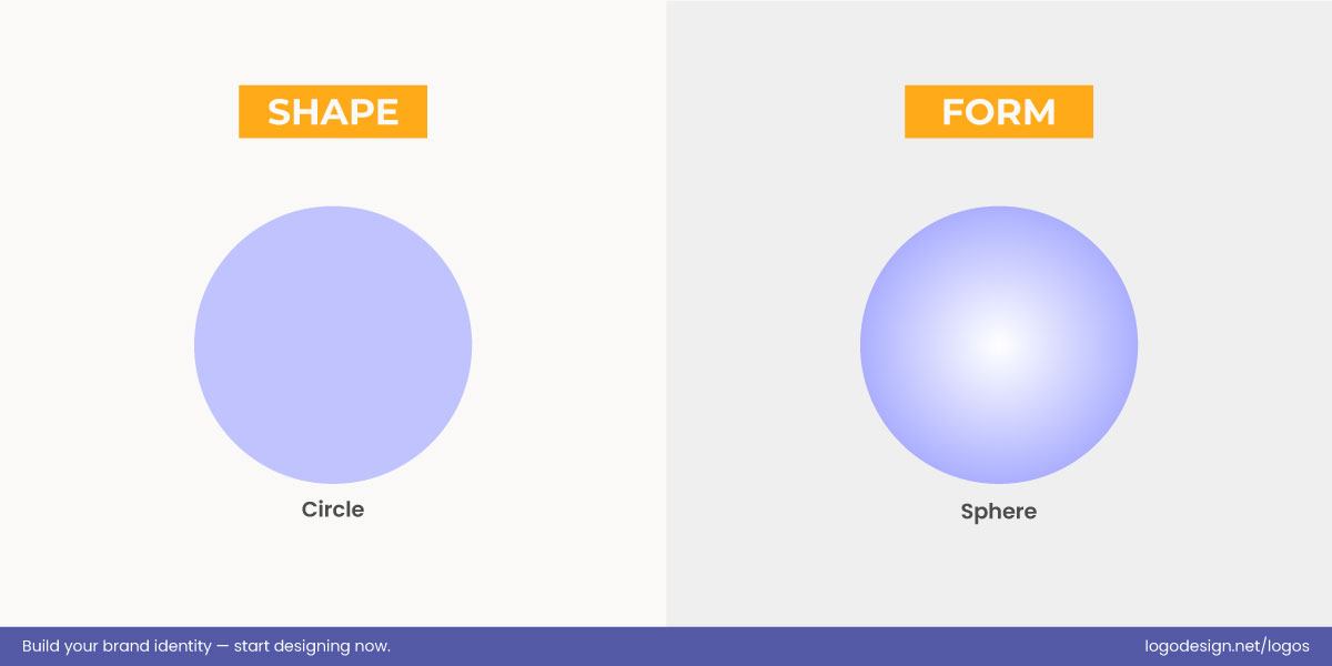
Simple shapes, circles, squares, and clean lines are easier to recognize and remember than complex forms.
Simple shapes are easier to remember than complex ones. Circles, squares, and clean lines register faster and stay in memory longer. Complex forms may look interesting, but they often slow recognition.
Geometry also influences how a logo feels. Balanced shapes feel stable. Sharp or irregular forms feel energetic or disruptive. Choosing the right shape language strengthens hierarchy by aligning visual form with the brand’s personality and message.
| Shape / Form | Typical Use in Logos | Perception / Meaning |
| Circle / Oval | Entire logo or parts of icons | Suggests unity, wholeness, friendliness, and inclusivity; approachable and safe. |
| Square / Rectangle | Frames, badges, or structured layouts | Conveys stability, reliability, and professionalism; creates a sense of order. |
| Triangle / Angular shapes | Accents or main symbol | Implies energy, direction, innovation, or risk; can feel dynamic or disruptive. |
| Lines (horizontal, vertical, diagonal) | Dividers, underlines, or abstract marks | Horizontal: calm and stable; Vertical: strong and structured; Diagonal: movement, speed, or progress. |
| Geometric symmetry | Full logo or icon composition | Reinforces harmony, balance, and trustworthiness; feels intentional and organized. |
| Organic / irregular shapes | Natural elements, mascots, or abstract forms | Feels playful, creative, or informal; can express uniqueness and approachability. |
| Abstract / simplified forms | Minimalist icons or symbols | Easy to recognize and remember; allows flexibility in interpretation; modern and clean. |
| Combination of shapes | Logos combining circles, squares, lines, etc. | Balances multiple perceptions: stability with movement, friendliness with professionalism. |
The Behavioral Essentials logo uses smooth, rounded shapes to convey unity, safety, and approachability.
The Behavioral Essentials logo features rounded, circular shapes that communicate unity, safety, and inclusiveness. The smooth curves reinforce a sense of approachability, making the brand feel welcoming and stable. This simple, geometric form ensures the logo is easy to remember and fosters a positive, trustworthy perception.
The Benmax logo uses square shapes to convey reliability and professionalism.
The Benmax logo uses square shapes to evoke a sense of reliability and professionalism. The clean, solid form suggests stability and order, giving the brand a strong, structured presence. This geometric choice helps reinforce the brand’s serious, dependable identity, making it feel grounded and trustworthy.
The Zalando logo uses a triangle to convey movement, energy, and a modern identity.
The Zalando logo incorporates a triangle, a dynamic shape that implies movement, direction, and innovation. Triangles are often associated with progress and energy, and in this case, they help the logo feel fresh, forward-thinking, and cutting-edge. The sharp lines give the brand an energetic vibe, suggesting a modern and agile identity.
The Snuggle logo uses soft, organic shapes for a playful and comforting feeling.
The Snuggle logo embraces organic shapes, which bring a sense of playfulness and comfort. These softer, more fluid forms evoke feelings of warmth, gentleness, and friendliness, aligning perfectly with the brand’s nurturing, cozy identity. The logo feels approachable and easygoing, reinforcing its emotional connection with consumers.
Austin’s logo uses flowing curves to capture the city’s creative and community-centered spirit.
The City of Austin logo features curved lines that give the design a sense of movement and flow. These curves reflect the city’s dynamic and creative nature, helping the logo feel modern and progressive while maintaining an organic, community-centered feel. The fluid lines align with Austin’s identity as a vibrant and ever-evolving city.
What to Emphasize in Logo Design: Elements That Should Lead
A good hierarchy starts by deciding what deserves the spotlight. In logos, emphasis is not about making elements louder. It is about making the right elements unavoidable. The strongest logos feel clear because they know what to lead with and what to keep in a supporting role.
1. Brand Name and Wordmark
For most brands, the name does the heaviest lifting. If people cannot read it quickly or remember it later, the logo has already fallen short. That is why the wordmark often sits at the top of the hierarchy. Size, spacing, and contrast all work together to give the name visual authority.
Google’s logo uses a simple and playful color rhythm for clarity and personality.
Think of Google’s wordmark logo. The letterforms are simple, open, and easy to read at any size. Nothing distracts from the name, yet the color rhythm gives it personality.
Coca-Cola’s logo uses custom script typography keeps the brand front and center while enhancing recognition
Coca-Cola takes a different route, using custom script typography, but the outcome is the same. The name leads every interaction, and the style only strengthens recognition rather than competing with it.
2. A Distinctive Symbol or Identifier
Symbols earn their place when they add speed and memory. A good symbol allows the brain to recognize the brand before reading a single letter. In strong hierarchies, the symbol either supports the name or confidently replaces it when the brand is established enough.
The Apple logo uses a simple bitten apple symbol, making the brand instantly recognizable without needing the name.
Apple is a clear case of this balance. The bitten apple leads the hierarchy, with the name often unnecessary. Almost everyone recognizes the symbol at a glance.
Target’s bullseye logo uses repetition and clarity to create a bold, recognizable identity
Target achieves a similar effect through repetition and clarity. The bullseye sits front and center, and the wordmark simply reinforces what the symbol already communicates. In both cases, the hierarchy feels intentional, not decorative.
3. Visual Simplicity and Clarity
Simplicity in logos is not a style choice but a functional one. Logos must survive being shrunk, stretched, printed, and viewed in motion. Clear shapes and restrained details make that possible.
Airbnb’s logo uses a clean, simple form to stay instantly readable and easy to remember.
Airbnb’s mark works because it avoids visual clutter. The form is simple enough to read instantly but distinctive enough to remember.
The Dropbox logo uses a simplified shape and clean wordmark for a more confident and modern feel.
Dropbox followed a similar path by stripping its logo back to a cleaner shape and wordmark. The hierarchy became clearer once unnecessary details were removed, allowing the brand to feel more confident and modern without shouting.
4. Color Palette Consistency
Color plays a powerful role in hierarchy, but only when it is controlled. Too many colors flatten the visual order. A limited brand color palette helps direct attention and builds recognition over time.
Tiffany & Co. logo uses a signature robin’s egg blue to establish immediate brand recognition and a sense of luxury.
Tiffany & Co. demonstrates how a single color can carry hierarchy on its own. The distinctive robin’s egg blue signals the brand before the name is even processed.
Spotify’s logo uses a dominant green for a consistent brand feeling.
Spotify uses a dominant green in much the same way. Even as layouts and graphics change, the color remains the anchor, guiding the eye back to the brand.
5. Purpose-Driven Typography
Typography should support the hierarchy, not compete with it. The wrong typeface can pull attention away from the logo’s main message or weaken its tone. The right one strengthens it quietly.
The Netflix logo uses bold lettering and even spacing for an immediate and powerful presence.
Netflix’s wordmark relies on weight and proportion rather than visual tricks. The letters are bold, tightly controlled, and evenly spaced, which gives the name immediate presence.
IBM’s striped logo uses a distinct form for structure and reliability.
IBM’s striped lettering does something different, reinforcing structure and reliability through form alone. In both cases, typography is not decoration. It is the backbone of the hierarchy, carrying meaning while staying readable and controlled.
What to Let Go in Logo Design?
Design hierarchy becomes clearer when unnecessary elements are removed. Letting go is not about stripping personality from a logo. It is about removing distractions that weaken focus and shorten the logo’s lifespan. When fewer elements compete for attention, the important ones naturally rise to the surface.
1. Overly Complex Details
Logos are rarely viewed at a comfortable size. They shrink, move, and reproduce across dozens of formats. Fine lines, heavy shading, gradients, and layered effects tend to break down under those conditions. What looks impressive in a large mockup often turns into visual noise in real use. Simpler forms preserve clarity and keep the hierarchy intact across every application.
2. Taglines Inside the Logo
Taglines introduce a second message into a space that should deliver one. Small text pulls attention away from the main identifier and disrupts the visual order. As the logo scales down, taglines are usually the first thing to suffer, becoming unreadable while still adding clutter. Keeping messaging outside the logo allows the mark itself to stay focused and adaptable.
3. Trend-Driven Design Choices
Design trends shift quickly, but logos are meant to last. When design decisions are driven by what is popular rather than what is appropriate, hierarchy becomes unstable. Elements added for style often overpower the core identity. A logo built on clear structure and timeless choices holds its ground far longer than one chasing visual fashion.
4. Irrelevant or Literal Imagery
Every element in a logo should earn its place. Imagery that explains too much or connects loosely to the brand muddies the message. Literal visuals can also limit future growth by locking the brand into a narrow interpretation. Strong hierarchy favors suggestion over explanation and clarity over excess detail.
5. Excessive Use of Color
Color is one of the fastest ways to guide attention, but overuse flattens hierarchy. When everything is colorful, nothing stands out. A restrained palette helps establish clear focal points and ensures the logo works just as well in single-color applications. Fewer colors also improve consistency across print and digital environments.
How to Check If Your Logo Hierarchy Works
The thing about good logos is that they feel obvious, even effortless. The hierarchy should guide the eye naturally, but how can you tell if it’s actually working? A few simple checks can reveal whether your design decisions are landing as intended.
Try asking yourself these questions:
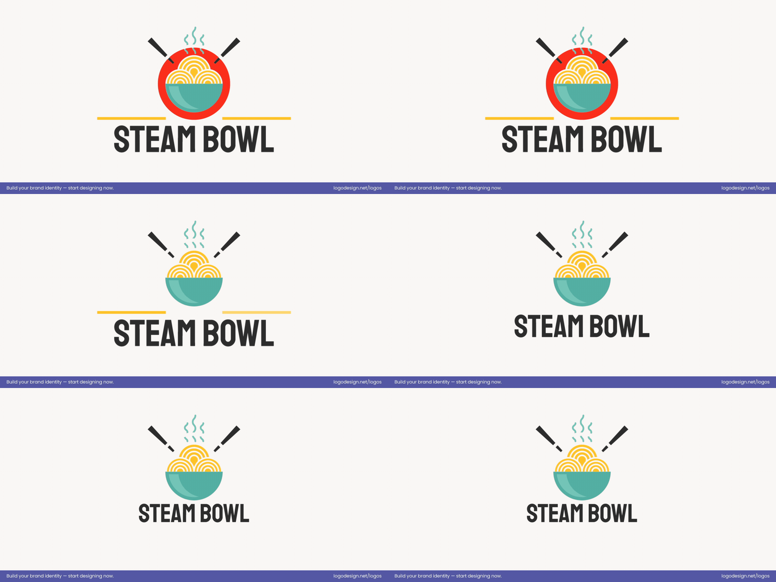
Step-by-step process of a minimal food logo created using LogoDesign.Net editor
- What do I notice first? Step back or shrink the logo down. Does the main element stand out, or does your eye jump around?
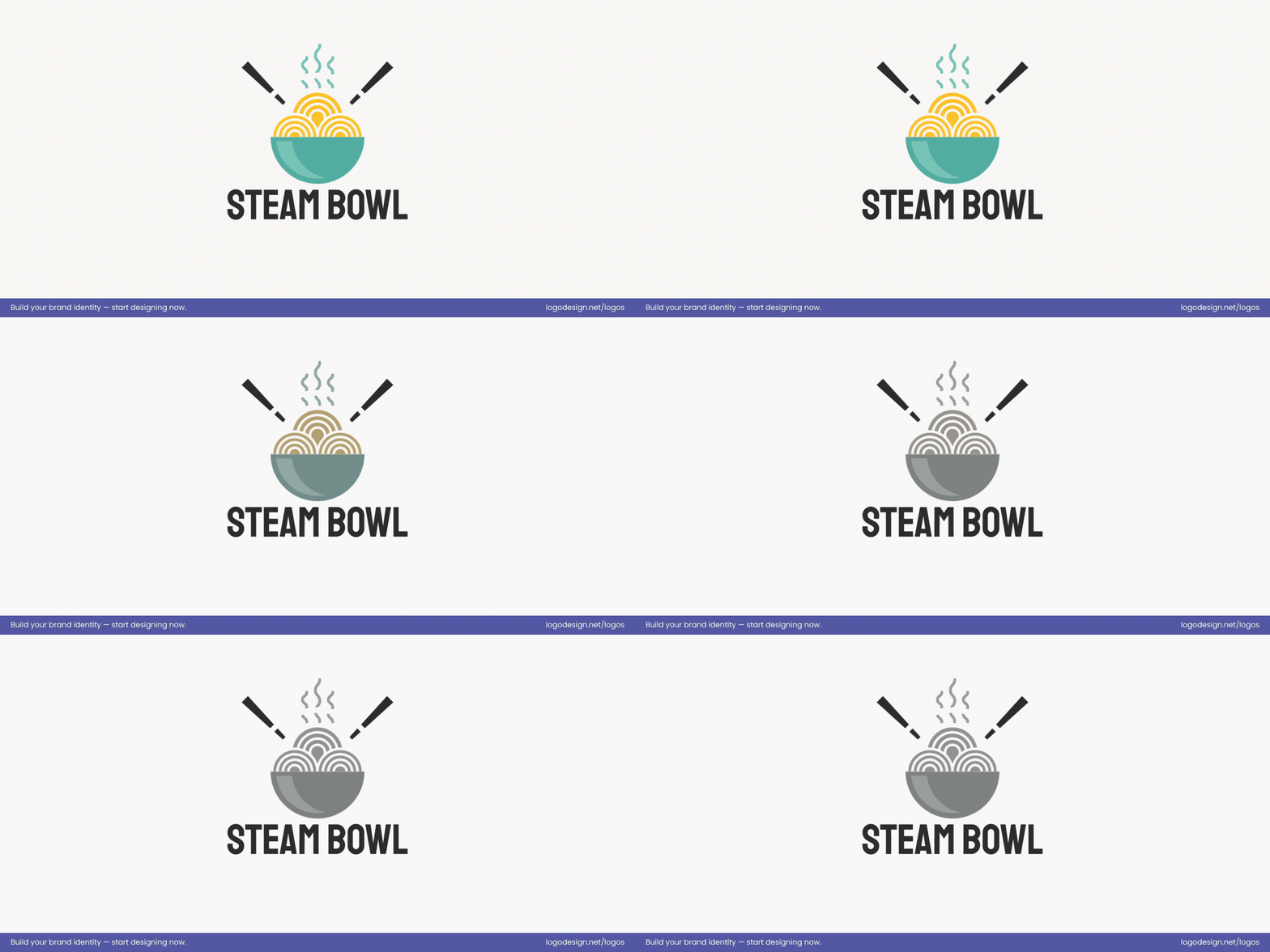
Testing the legibility of the food logo in different conditions
Is it readable in black and white? A good hierarchy survives color removal. The focus should remain clear and recognizable.
Check whether the logo icon without the name creates a recall value
- Can someone recall it quickly? Show the logo for just a few seconds. Can viewers remember the brand name or identify the symbol?
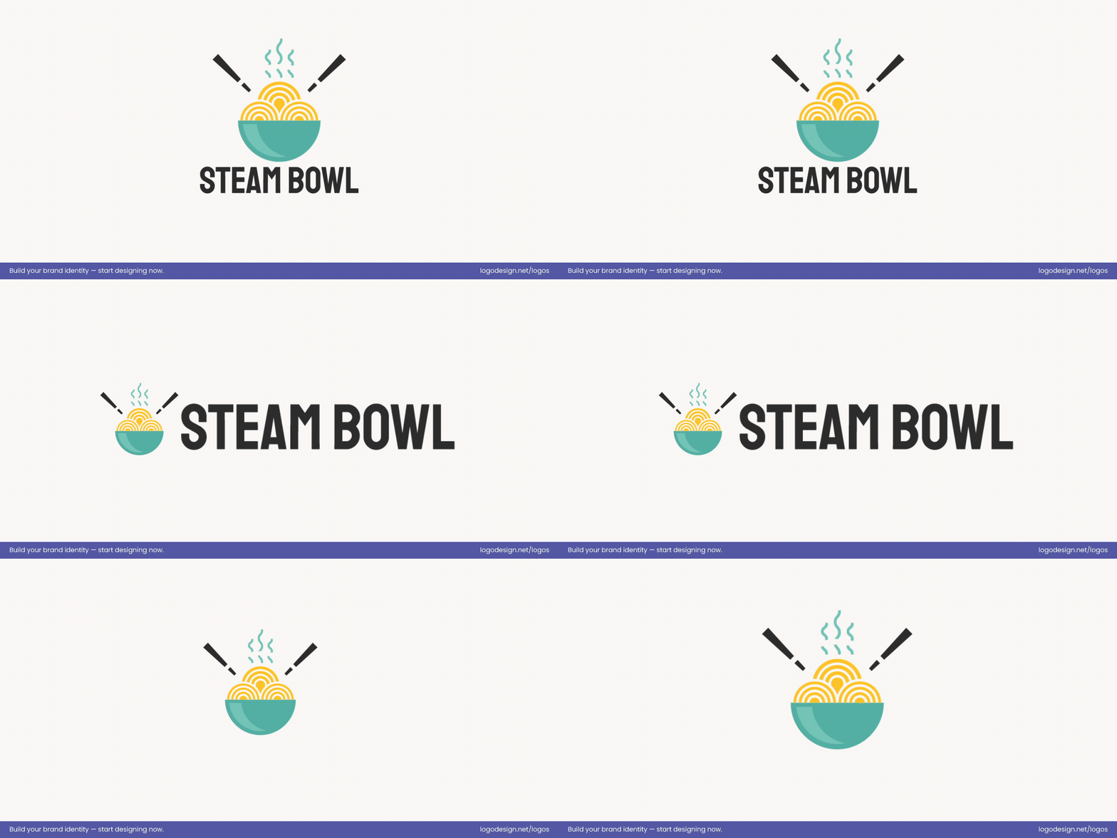
Understand if the logo can be used in different sizes, like headers, icons, packaging, and more
- Does it work across formats? Consider website headers, social media icons, packaging, and print. If it fails in any context, the hierarchy may need refinement.
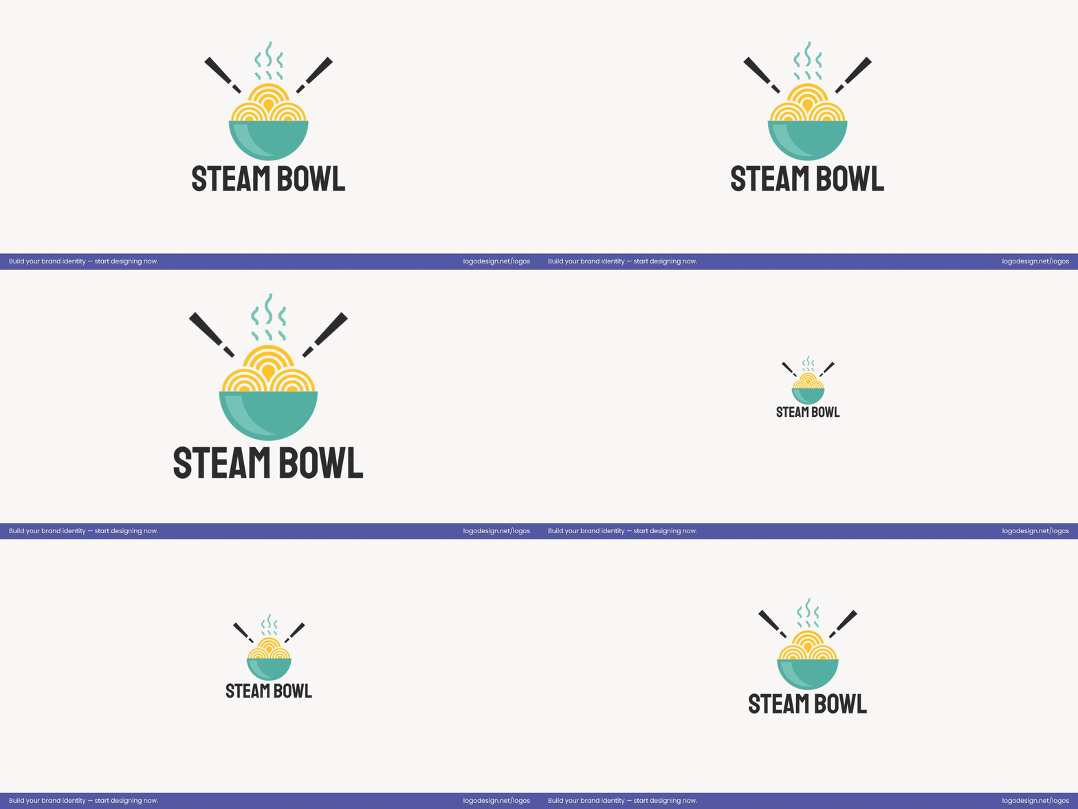
View the logo in smaller sizes to know if it’s still clearly visible and legible
- Does it work at 32px? At icon size, unnecessary details disappear. The most important element should remain clear, legible, and unmistakable.
Running through these questions helps ensure the logo communicates instantly and leaves a lasting impression—the core goal of thoughtful hierarchy.
Summing Up
A logo works when every element knows its place. Design hierarchy ensures the brand name, symbol, color, and typography guide the eye naturally, while unnecessary details step aside.
This clarity makes a logo instantly recognizable, flexible across formats, and memorable over time. The key is making intentional choices—emphasizing what matters and letting go of distractions.
For anyone ready to put these principles into practice, LogoDesign.Net’s logo maker offers an easy way to experiment with hierarchy, refine your visuals, and create a logo that communicates clearly and feels truly yours.
