Most "bad" color palettes were never actually bad. They were just never assigned a job — no lead color, no support, nothing designed to disappear so the real content could breathe.
Anyone can drag five swatches into a design tool and call it a palette. That part’s easy, and it always looks fine in isolation.
Then it hits a real interface, and things get harder. Buttons need to stand out. Text needs to stay readable. Backgrounds need to stop stealing attention from everything else. This is where most sites quietly fall apart, not because the colors were wrong, but because nobody decided what each one was for.
So pairing colors in web design isn’t really about finding pretty combinations. It’s about assigning roles: what grabs the eye first, what backs it up, what fades into the background so the important stuff can breathe. Get that right, and visitors move through your site without thinking about it. Get it wrong, and they’re gone before they ever find the button you wanted them to click.
Before choosing your color combinations, it’s worth understanding the fundamentals of website color selection in our guide on website color basics.
This guide dives into the details of color pairing: how to balance a palette, how to pair colors using proven harmony models, mistakes worth avoiding, and how to use color to actually drive people toward the action you want them to take. And a lot more.
Choosing Colors Is Easy. Pairing Them Isn’t.
Here’s why:
- A color that looks great as a swatch can still clash the moment it’s sitting next to real text and real buttons.
- Palettes rarely fail because the colors were ugly. They fail because no one decided which color leads and which ones support.
- What works on a mood board doesn’t always survive contact with a live layout, different screen sizes, and actual content.
- Pairing is a design decision, not a taste test. It’s about function first, appeal second.
Designers often use dedicated color tools to test contrast ratios, build palettes, and experiment with complementary color combinations.
What Makes Two Colors Work Well Together?
A balanced palette has surprisingly little to do with which swatches you picked in the first place. What matters is how those colors behave once they’re living inside real buttons, headers, cards, and body copy. Three things decide that: contrast, harmony, and consistency. u
1. Contrast Creates Clarity
Contrast is what makes a site easy to scan. It separates what matters from what doesn’t, sets up hierarchy, and keeps text legible.
High contrast isn’t just "bright against dark." It’s about making sure there’s enough separation between elements that people know where to look without thinking about it.
Poor contrast is still one of the most common mistakes out there. WebAIM’s Million Report found that 83.9% of the top one million home pages contain low-contrast text, making it the single most common accessibility issue on the web. Strong pairings put readability first and treat aesthetics as the second question, not the first.
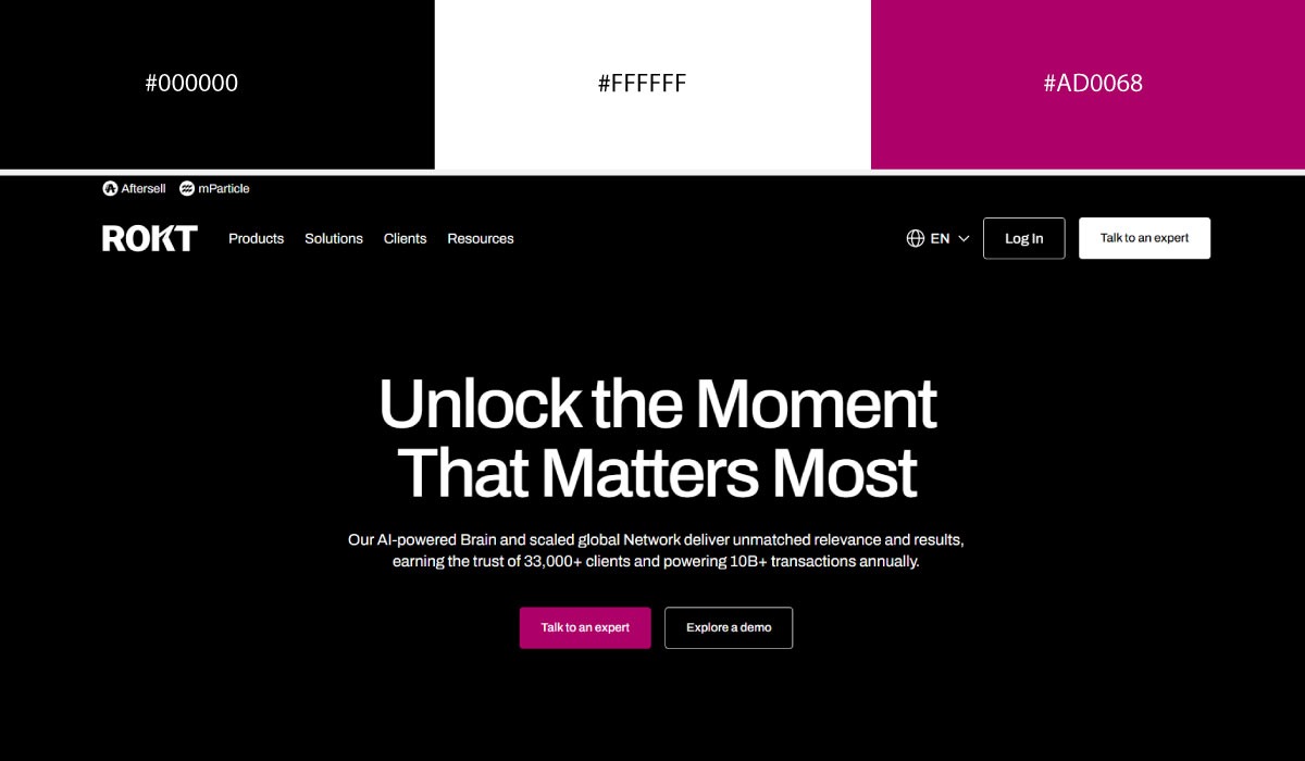
Rokt runs a crisp black-and-white base and lets Vivid Magenta (#A90968) do the accenting. The contrast pulls your eye straight to the calls to action, and the hierarchy stays obvious even though the interface itself is minimal.
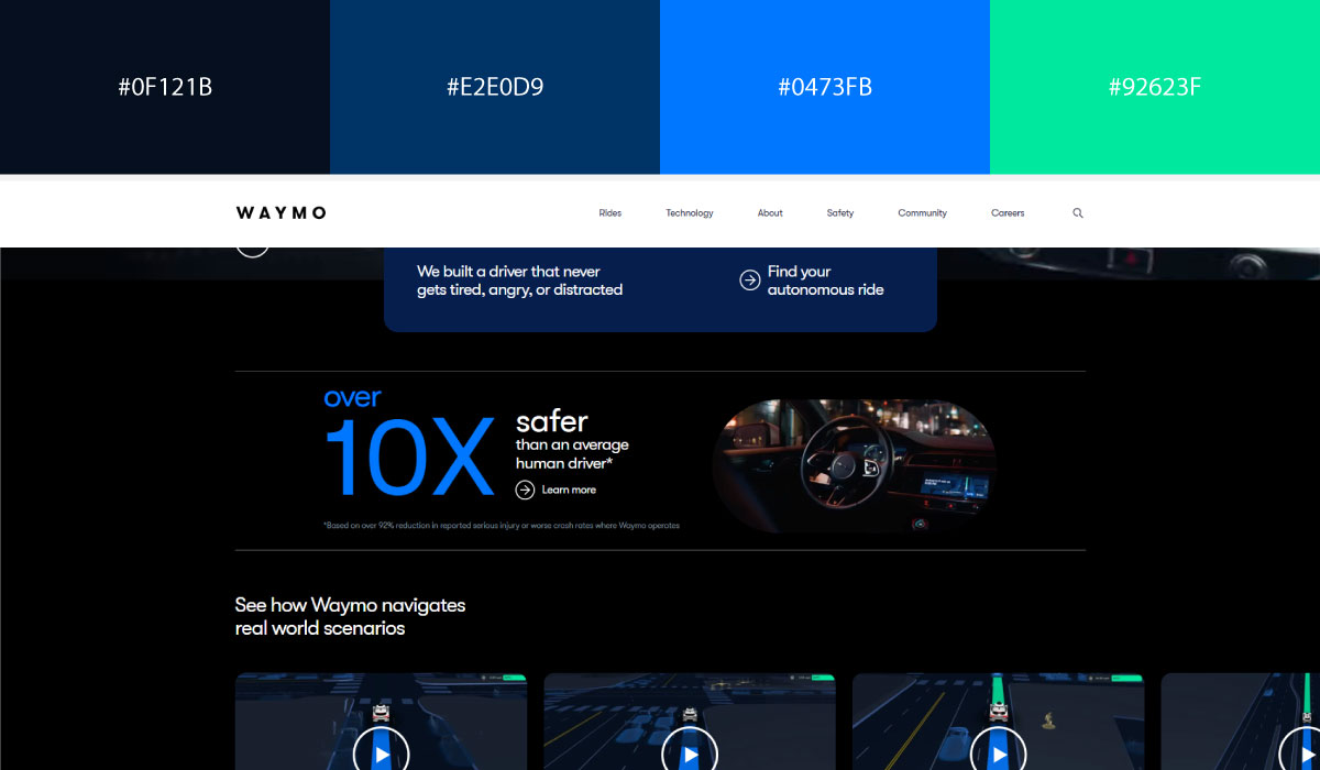
Waymo layers a deep Midnight Navy (#050F1E) under a muted Steel Blue (#003366), then drops in Electric Blue (#0077FF) and Bright Aqua (#00E89D) on top. That stacking is what makes key actions pop without turning the browsing experience noisy.
2. Balance Warm and Cool Colors
Pairings feel balanced, not overwhelming, when there’s some give and take. A bold, saturated primary color needs softer neutrals around it so it can stand out instead of dominating. Mixing warm and cool tones tends to have the same effect: it keeps a site from feeling one-note.
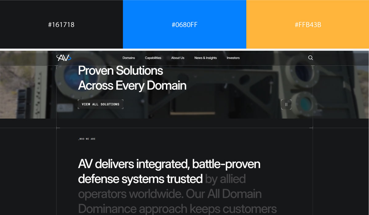
AV Inc. sets a Charcoal Gray (#161718) base against Azure Blue (#0680FF) and Golden Apricot (#FFB43B). The blue reads as precise, the orange softens things back down, and together they land somewhere balanced and inviting rather than cold.
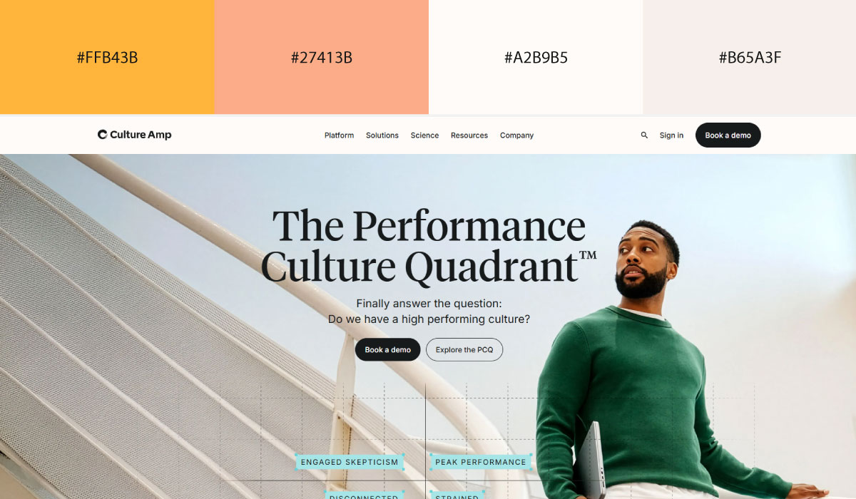
Culture Amp pairs a cool Powder Cyan (#AEE2E3) with a warm Peach Coral (#FBAC87), then sits both against Warm Ivory (#FEFBF8) and Light Sand (#F6EFEA) backgrounds. Nothing here fights for attention, and the result is calm and approachable without going flat.
3. Match Saturation and Brightness
Two colors can technically complement each other on paper and still clash the moment one is highly saturated and the other looks washed out. The palettes that actually work tend to hold a consistent saturation level, or vary it on purpose to build hierarchy rather than by accident.
Brightness works the same way. Similar lightness values feel calm and cohesive; deliberate differences are what make a button or an alert jump out.
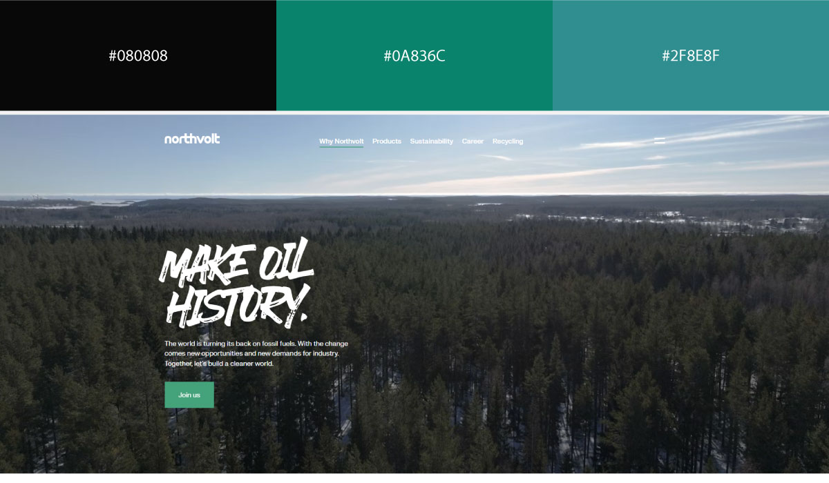
Northvolt keeps saturation uniform across the whole site. The Jet Black (#080808) base, Deep Teal (#0A836C), and Slate Cyan (#2F8E8F) accents all sit at a similarly subdued intensity. Hierarchy comes from brightness and placement, not from throwing in a louder color.
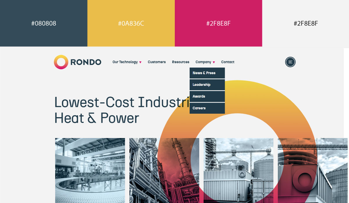
Rondo does the same thing across every element, backgrounds included. Blue Slate (#344C59) text, Harvest Gold (#EABC4A), Raspberry Rose (#CE1E64), and Soft Ash (#F3F3F3) backgrounds all sit at roughly the same muted intensity, so the site feels cohesive despite using four fairly distinct hues.
4. Support Your Brand Personality
Every pairing says something whether you plan it or not. Navy and white read as professional and trustworthy. Black and gold read as luxury. Soft greens with earthy neutrals feel natural and sustainable. Bold pinks and purples feel playful and creative.
Pick combinations that back up your brand identity, not whatever happens to be trending this quarter. Understanding how color psychology shapes perception can help you choose color combinations that reinforce your brand personality. Many of the same principles explained in color theory in logo design also apply when selecting colors for websites.
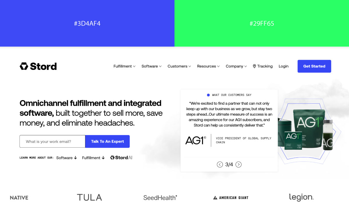
Stord leans on a black-and-white base with Royal Blue (#3D4AF4) and Neon Lime (#29FF65) as accents, which lands the site somewhere between trustworthy and forward-looking without tipping into "overly corporate."
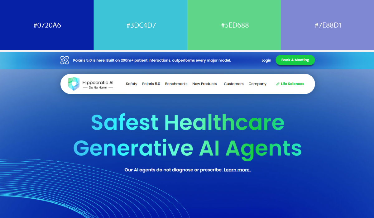
Hippocratic AI carries its logo colors through the entire site. A Cobalt Blue (#0720A6) and white base gets layered with gradients of Sky Cyan (#3DC4D7), Fresh Mint (#5ED688), and Soft Periwinkle (#7E88D1), a palette built around clarity, trust, and compassion that tracks for a healthcare brand.
5. Keep Accessibility in Mind
Even a genuinely great pairing fails if people can’t read the content. Text, buttons, links, and anything interactive should clear accessibility contrast guidelines so the site stays usable for people with low vision or color blindness too.
Inclusive websites start with accessible color choices that improve readability for all users. Running your palette through an accessibility checker before launch is a cheap way to avoid this problem entirely.
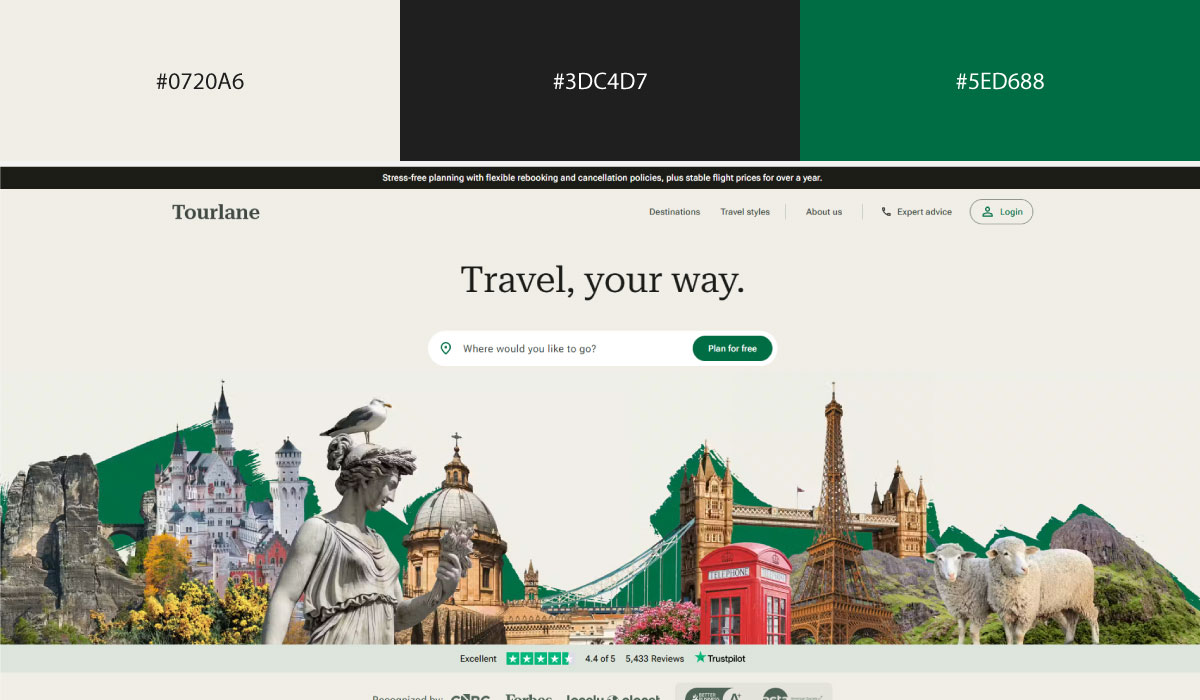
Tourlane keeps things readable with a Warm Linen (#F0EEE6) background, Charcoal Black (#1F1F1F) text, and Forest Green (#006D44) CTAs. The contrast is strong enough that content stays legible and the primary actions never get lost.
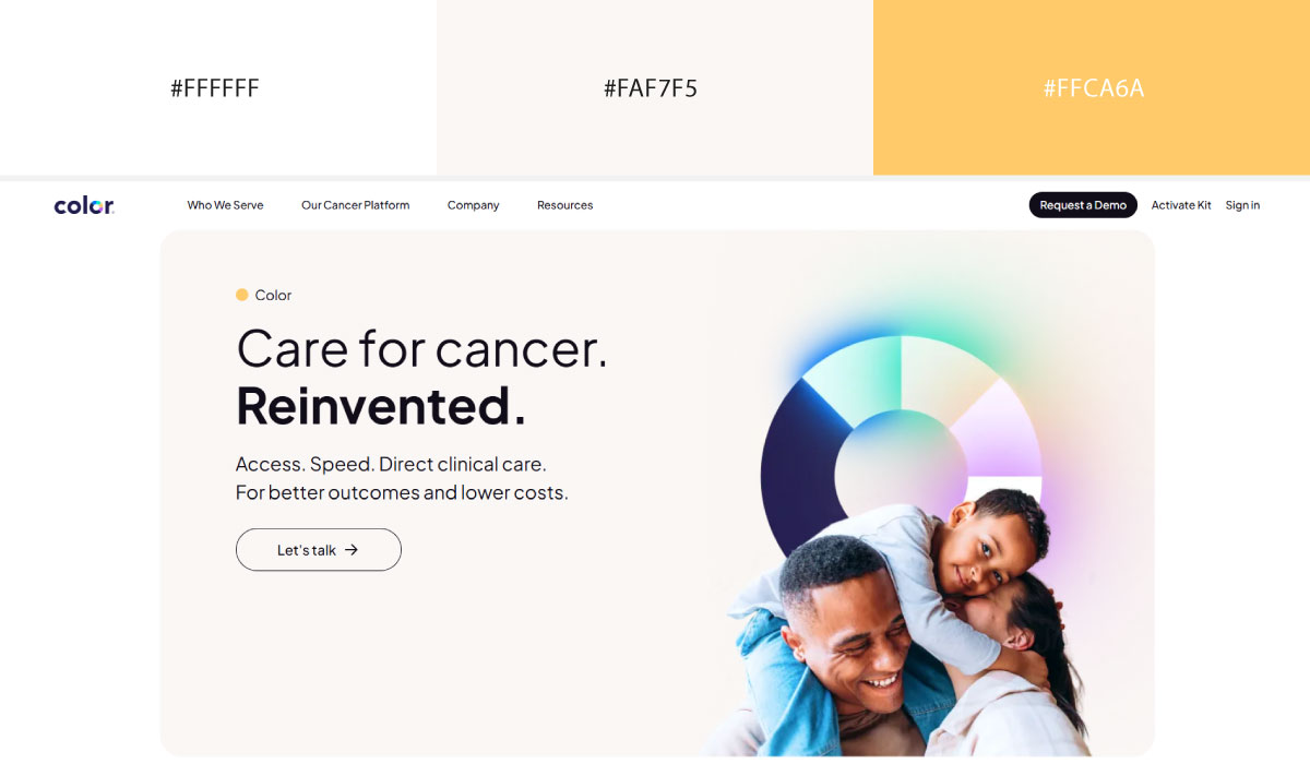
Color Health takes an accessibility-first approach: Pure White (#FFFFFF) as the base, Soft Ivory (#FAF7F5) for section backgrounds, and restrained Burnt Apricot (#ffca6a) accents. High-contrast type and an uncluttered color system make it comfortable to read.
6. Consistency Makes Pairings Feel Intentional
The best pairings stay consistent everywhere they show up. Once a color has a job (primary brand color, CTA color, status indicator), it should keep doing that job on every page. That consistency is what lets people recognize actions and navigate the site without re-learning it on every screen.
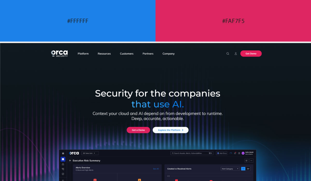
Orca Security keeps Ocean Blue (#1C81E9) as its primary color across both light and dark sections, and every CTA shows up in Crimson Rose (#DC2661), no exceptions. That discipline is what makes the navigation feel intuitive.
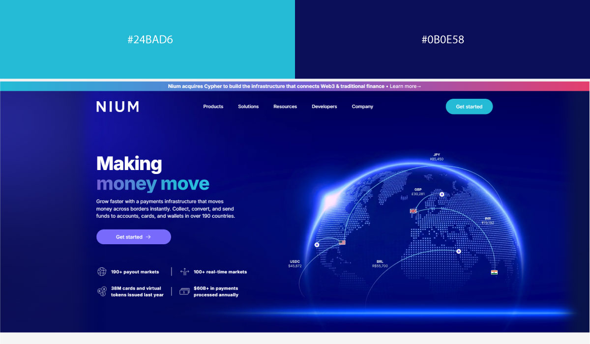
Nium does the same: Bright Azure (#24BAD6) for every primary CTA, Midnight Indigo (#0B0E58) across the header, footer, and gradients. Repeating those roles is what makes the site feel familiar almost immediately.
How To Actually Pair Colors For A Website?
Following a structured process makes this a lot less guesswork-y. Instead of picking several colors at once, start with one and build outward. That’s what produces a balanced interface where every color earns its place.
1. Start With One Primary Brand Color
Every site needs one color that carries the brand: the one people associate with the business, the one that shows up most often across the interface. Different industries use colors differently, and understanding those patterns can help you select a primary website color that aligns with your niche.
Rather than choosing three or four colors up front, most designers pick a single brand color first and build everything else around it.
• What Each Primary Color Says About a Website
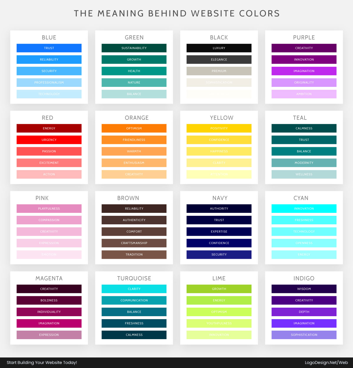
- Blue communicates trust, reliability, and professionalism.
- Green represents sustainability, health, and growth.
- Black creates a premium or luxury feel.
- Purple conveys creativity, innovation, and imagination.
Your primary color is the one that ends up in your logo, your headings, your buttons. The rest of the palette exists to support it, not compete with it.
2. Pair a Primary Color With Neutral Colors First
One of the most common mistakes is cramming a page full of vibrant colors. Bold colors do grab attention, sure, but the moment every element is fighting for it, the whole page starts to feel like too much. Once you’ve chosen a primary color, building a cohesive palette becomes much easier when you understand how supporting colors work together.
That’s exactly why neutrals carry so much weight on professional websites. They create breathing room, keep things readable, and let your primary color actually stand out instead of getting lost in the crowd.
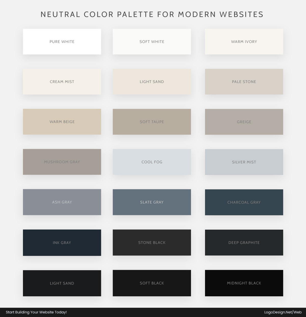
The formula that keeps coming up, over and over, across the strongest sites: primary brand color + neutral palette = a clean, balanced interface. It’s simple, but it works.
Primary brand color + neutral palette = a clean, balanced interface.
3. Choose One Accent Color (Not Five)
Once your primary and neutrals are locked in, add exactly one accent color for attention.
An accent color isn’t decoration. Its whole job is pointing people toward the actions that matter. That usually means:
- CTA buttons
- Links
- Icons
- Notifications
- Promotional banners
- Highlights
A single contrasting accent does more work than five competing ones ever could. If you’re unsure whether to keep your palette simple or colorful, explore the differences between monochrome vs multicolor logos.
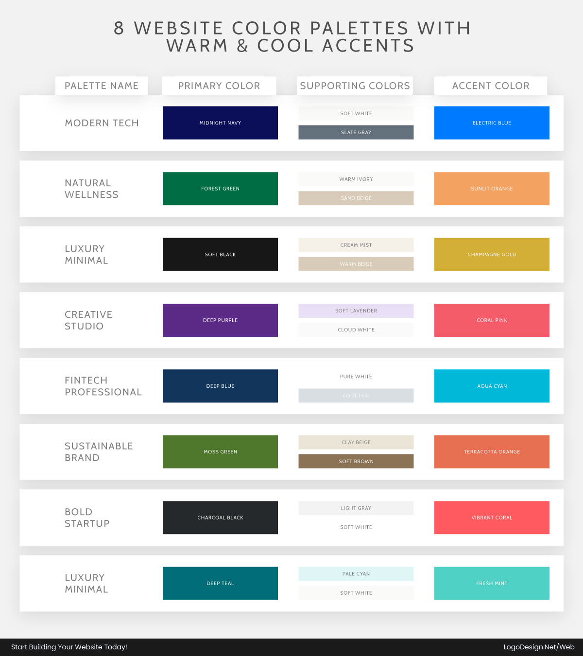
If your interface skews cool overall, a warm accent tends to create the strongest single focal point. The reverse holds too: a warm palette often benefits from one cool accent for contrast, without tipping the whole thing off balance.
4. Pair Colors Based on Their Roles, Not Just Their Looks
Skip "which colors look good together?" and ask instead: what job does each color need to do?
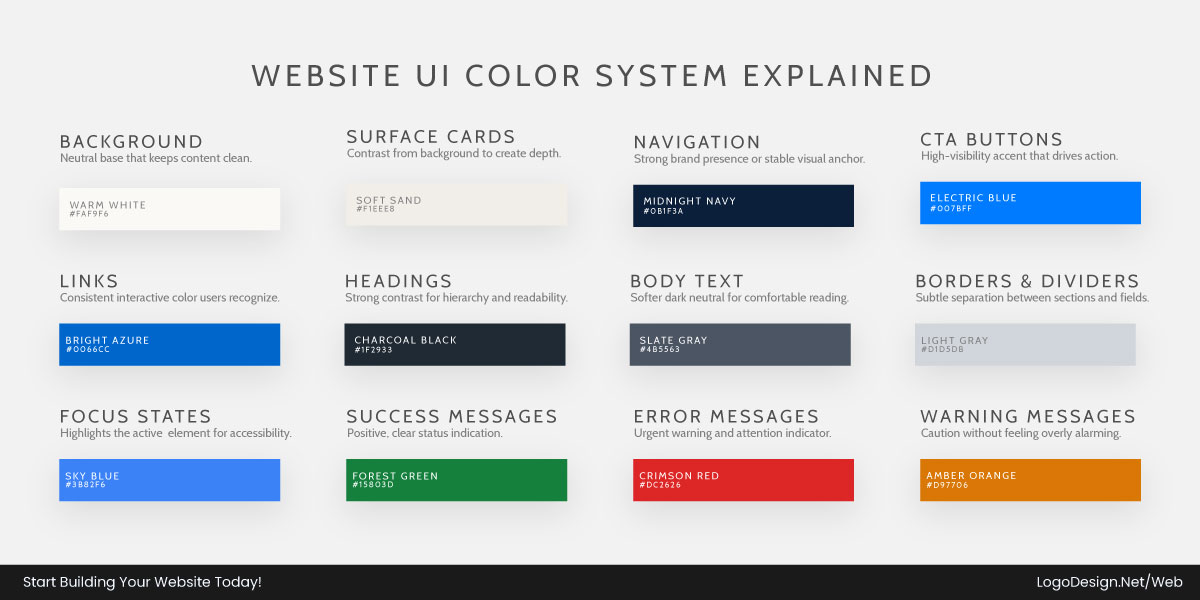
Once every color has a defined job, the interface starts to feel predictable in a good way. Consistent color systems work best when paired with strong typography, which is why understanding matching colors fonts logo design can be helpful.
People pick up on what’s clickable, what’s most important, and what a status message means, usually without ever consciously noticing the color choices at all.
How Many Colors Should a Website Use?
There’s a persistent myth that more colors equal a more visually appealing site. In practice, it’s the opposite: the sites that work best tend to run on a tight palette where every single color has a clear job to do.
For most sites, four to six core colors is plenty for something that reads as professional and cohesive:
- 1 primary color for branding, key UI elements, and important interactions
- 1 accent color for CTAs, links, and highlights
- 2–4 neutral colors for backgrounds, text, borders, and supporting elements
- Optional semantic colors for success, warning, and error states
Keeping the palette this tight is what makes the interface feel consistent: people always know what a given color represents.
Many designers also follow the 60–30–10 rule as a guideline for balancing colors:
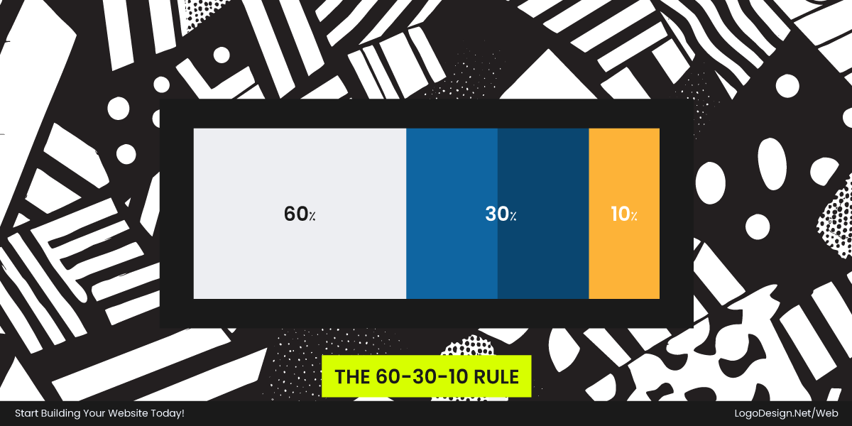
- 60% of the interface uses a dominant color, typically a neutral background.
- 30% is a secondary color, often your primary brand color.
- 10% is reserved for an accent color that highlights important actions and interactive elements.
The exact numbers don’t need to be precise. The real value is that they stop you from overusing your accent color. When every element is loud, nothing actually stands out. Current color trends in logo design can also provide inspiration for modern website color combinations.
Keeping the palette tight and using each color on purpose is what produces a page that guides people naturally instead of shouting at them.
How to Use Color to Create Visual Hierarchy in Web Design?
Color isn’t just styling. On a website, it’s a structural tool. Once the palette exists, its real job starts: guiding people through a page, directing their attention, and making the interface make sense at a glance.
Good design doesn’t assume anyone will read everything on a page. It uses color to build an order that works instantly, regardless of screen size or device. Understanding visual hierarchy is really what separates usable design from noisy design. A strong color system does more than look nice: it controls attention, cuts down on cognitive load, and points people toward the actions that matter.
When hierarchy is working:
- People know what matters instantly
- Actions feel obvious, not hidden
- The interface feels simple even when the underlying content is complex
Color, in other words, isn’t decoration. It’s navigation and decision-making, quietly running in the background of every page.
• Define Hierarchy Before Applying Color
Hierarchy comes first, color second. Before you touch a single hex code, it helps to map out what the page is actually trying to say. Every page breaks down into:
- Primary content: what the page is actually about
- Secondary content: supporting information
- Actions: what you want the user to do next
Color should reinforce that structure, not dress it up. The single most important element on the page (usually a headline or a CTA) needs to be visually dominant before any other styling decision gets made. If everything looks equally important, nothing actually is.
• Use Contrast as the Core Hierarchy Tool
Contrast is what separates a functional interface from a merely decorative one. It’s what determines what a person notices first the moment a page loads.
A well-built hierarchy uses contrast deliberately:
- High contrast for headlines and CTAs
- Medium contrast for section titles and cards
- Low contrast for supporting text and metadata
- Minimal contrast for backgrounds, grids, and layout structure
That gradient is what creates a scanning pattern: people understand what matters without having to read the whole page.
• Make CTAs the Strongest Visual Element
The call-to-action is the single most important conversion point on a page, and color is what makes it unmissable. Everything else on the page can be quiet as long as this one element isn’t.
A strong CTA:
- Uses the most dominant accent color in the system
- Carries more contrast than anything around it
- Stays consistent across every page and every state
If a CTA blends into the background, hierarchy has already failed. People shouldn’t have to hunt for the next step.
• Let Neutral Design Carry the Layout
Modern sites lean hard on neutral backgrounds and surfaces to build structure, and that’s intentional. It’s what lets the functional elements actually stand out. The less noise in the background, the harder a single accent works.
Neutrals typically show up as:
- White and off-white backgrounds for clarity
- Light grays for sections and separation
- Charcoal or dark tones for text hierarchy
When neutrals dominate, even a small accent becomes a powerful signal.
• Use Color Only Where Interaction or Meaning Exists
In an effective web design, color is always tied to purpose, never used just to fill space. Every colored element should be saying something:
- Buttons → action
- Links → navigation
- Alerts → system feedback
- Highlights → emphasis or priority
Color that shows up without meaning behind it weakens the whole system. Hierarchy depends on that kind of discipline.
• Build a Predictable Visual System Across Pages
A website isn’t one screen. It’s a system, and users move between pages constantly, carrying expectations from one to the next. Color hierarchy has to hold up across the whole thing:
- Primary buttons always look the same
- Links behave and appear consistently
- Status colors never change meaning from page to page
That consistency is what turns color into an actual interface language instead of a set of one-off styling decisions.
• Design for How Users Actually Scan Websites
Hierarchy has to reflect real behavior, not an idealized one. People don’t read pages top to bottom. They scan for cues that tell them where to focus.
Color supports that scanning pattern by:
- Pulling attention to headlines first
- Highlighting key actions next
- Supporting quick navigation through visual grouping
Done well, people understand a page before they’ve consciously thought about it.
Popular Website Color Pairings by Brand Personality
Colors and shapes often work together, making the psychology of shapes in logo an interesting complement to color selection principles. Let’s dive deeper.
1. Trustworthy & Professional (Blue-Based Pairings)
Blue-based palettes are the safest bet when the whole point of the site is to feel credible. These pairings show up constantly across industries where trust matters more than novelty.
Best for: SaaS, fintech, healthcare, enterprise, B2B.
• Blue + White
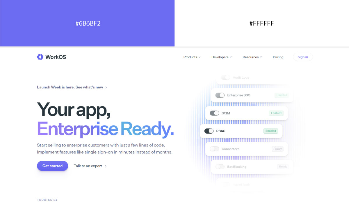
On WorkOS’s site, white functions as the base for nearly the entire layout, and that emptiness is exactly what makes the blue-indigo accent so effective at marking clickable elements. Black text stays deliberately neutral so it never competes with the accent color for attention.
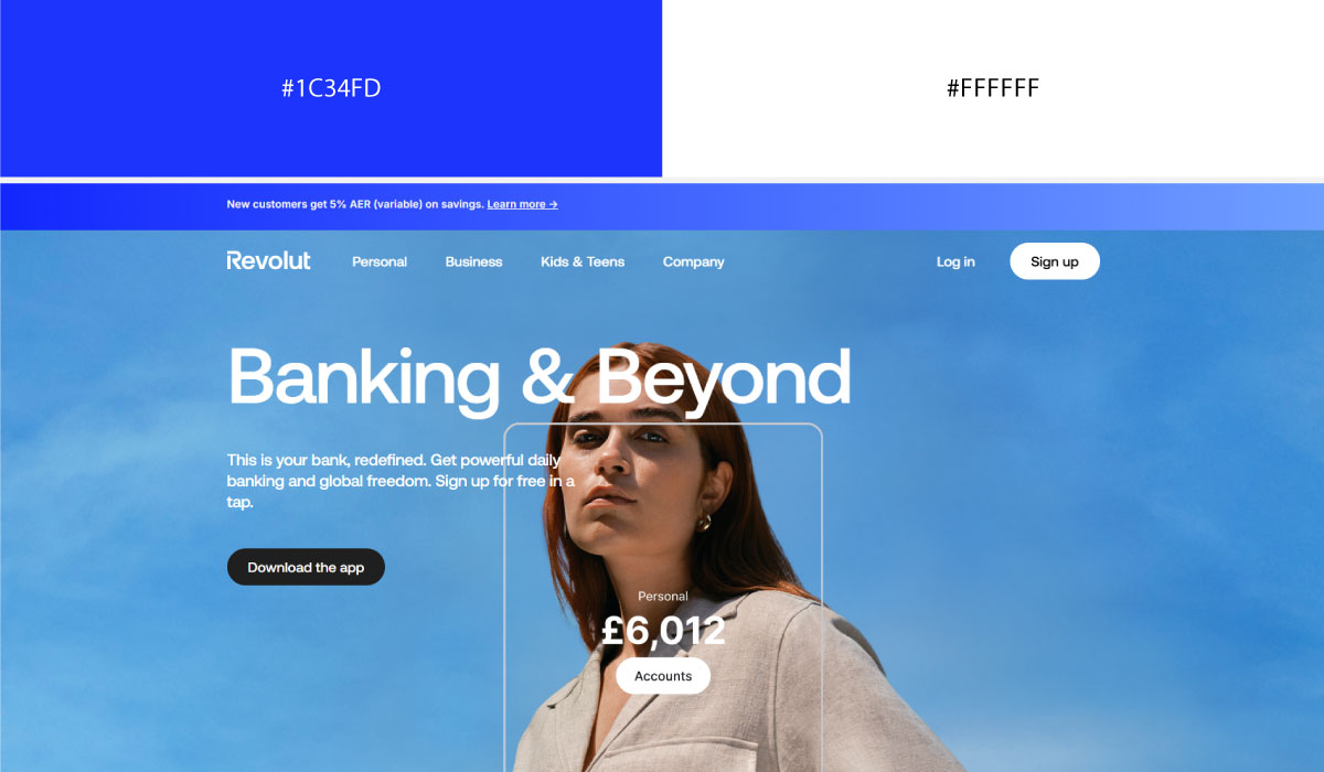
Revolut swaps its background between solid black and solid white from section to section, which resets the mood as you scroll. Blue-to-pink gradients only show up in hero and feature blocks, reserved for the moments the brand wants to feel most alive.
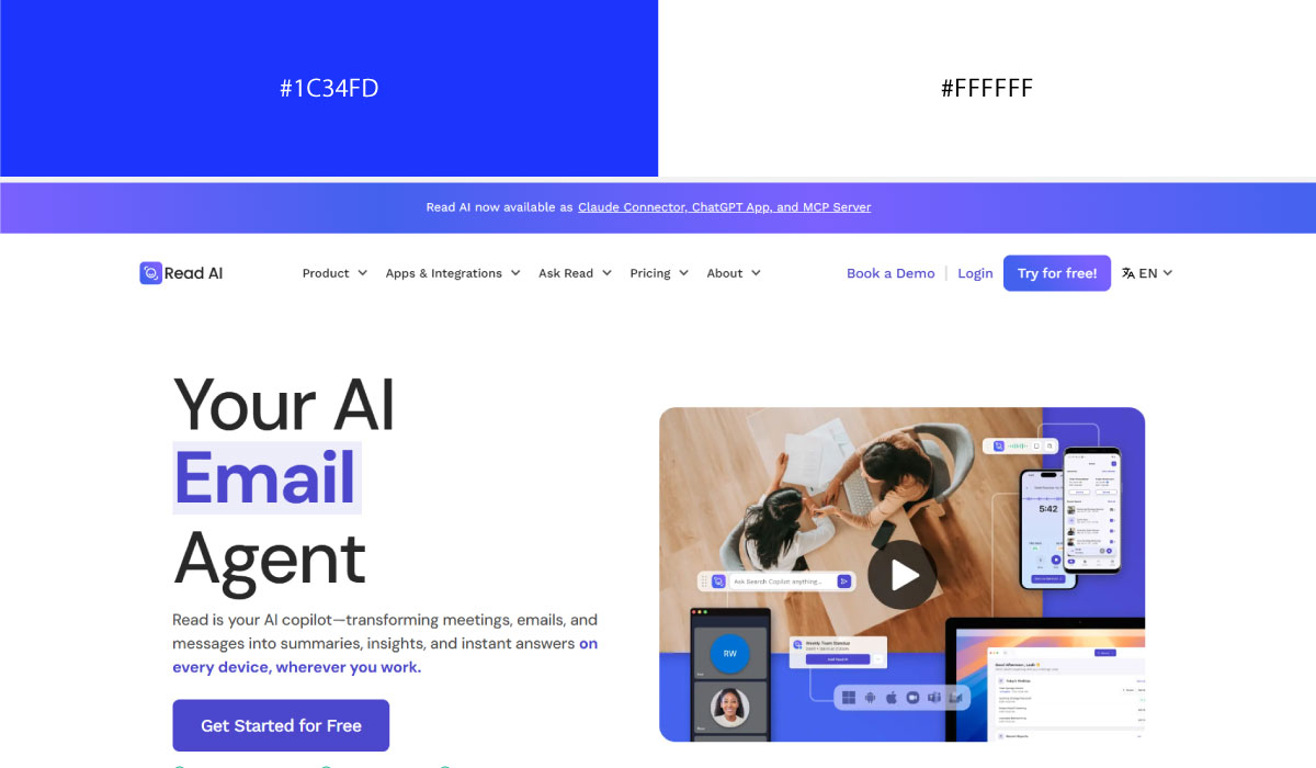
Read.ai keeps white behind almost every section so the content itself stays the visual priority. Blue is used narrowly there, confined to buttons and links, so it reads instantly as "this is where you click."
• Navy + Grey
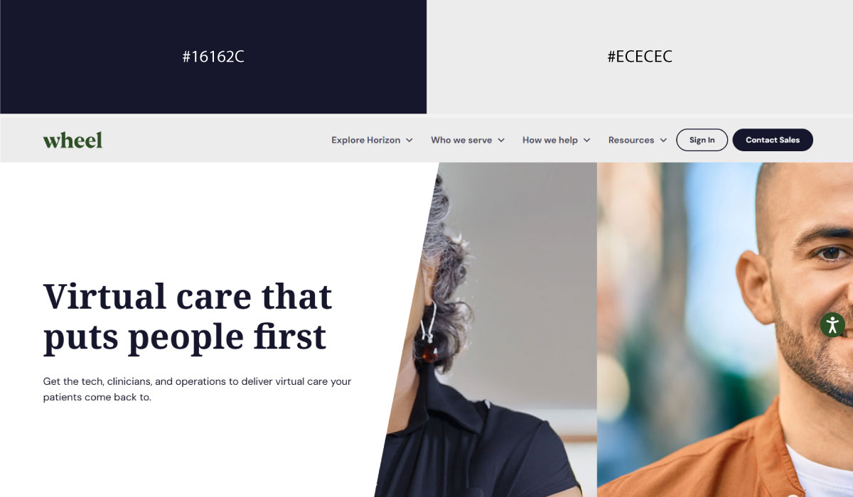
Wheel opens with navy as a full-section background, a choice that establishes authority right from the first scroll. From there, grey and white take over the body content, letting the page settle into something calmer after that strong opening move.
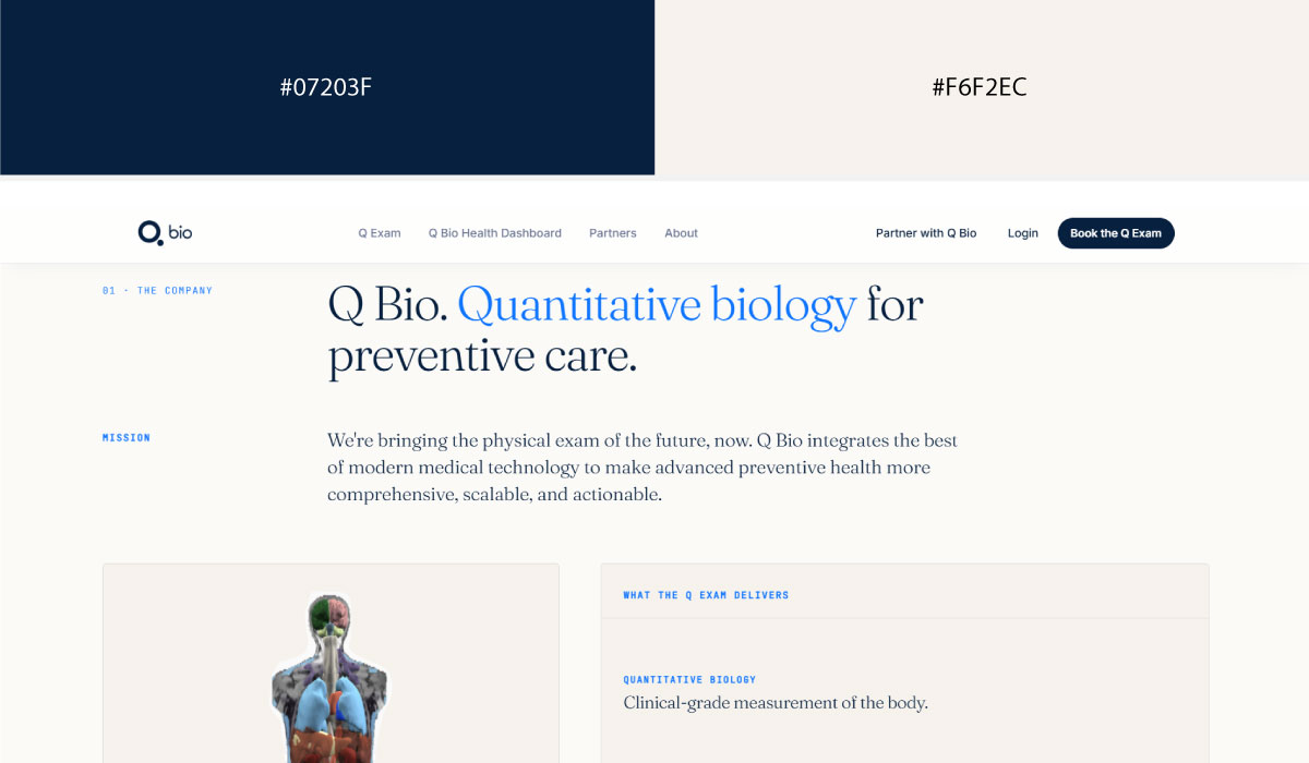
Over at Q Bio, a navy-to-black gradient fills large background areas and creates an immersive, tech-forward mood. Grey and white are left to handle the typography, since there’s no separate accent color competing for focus.
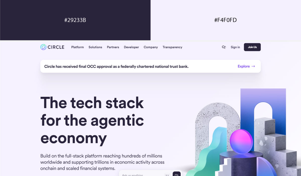
Circle uses navy specifically for its header and other key brand moments, while white carries the bulk of the remaining page. Grey is kept in a supporting role, showing up only in secondary text and dividing lines so it never rivals the navy.
• Teal + Grey
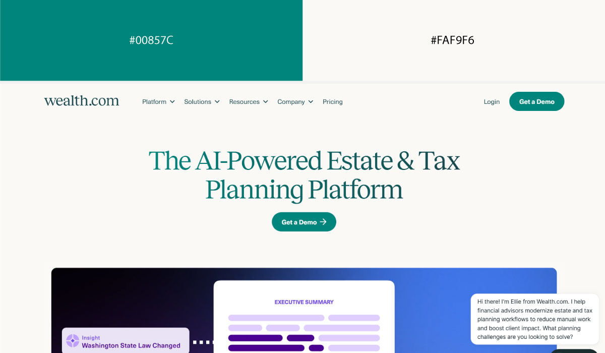
Wealth.com is careful with its teal, applying it only in small, deliberate doses on icons and highlights rather than large blocks. Grey and white end up carrying most of the page, which keeps that teal reading as a true accent rather than a base color.
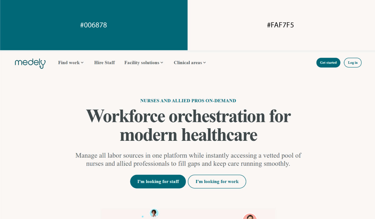
On Medely, teal is applied consistently across every button and icon, turning it into the site’s single call-to-action signal. Everything else stays white or light grey, which is what lets that one teal do all the pointing.
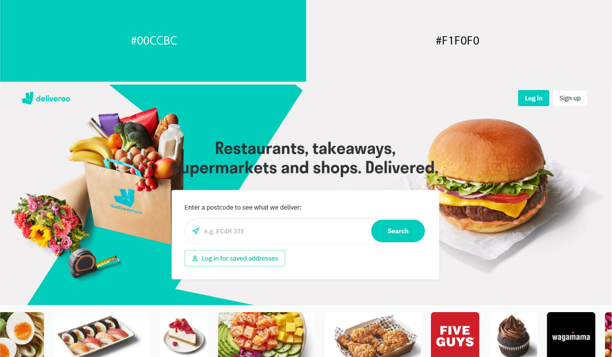
Deliveroo, by contrast, uses its teal boldly and often, letting it show up on buttons, icons, and branding throughout the site. Charcoal text and open white space exist mainly to give that teal room to stay the loudest element on the page.
• Blue + Blue (Monochromatic)
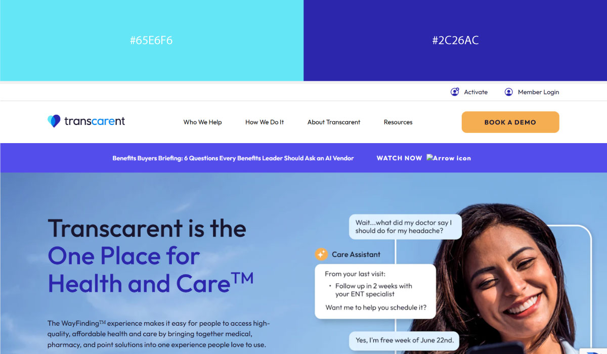
Since Transcarent has no second hue to lean on, it uses different shades of blue to create depth and separate one section from the next. White only steps in where something specifically needs to pop against all that surrounding blue.
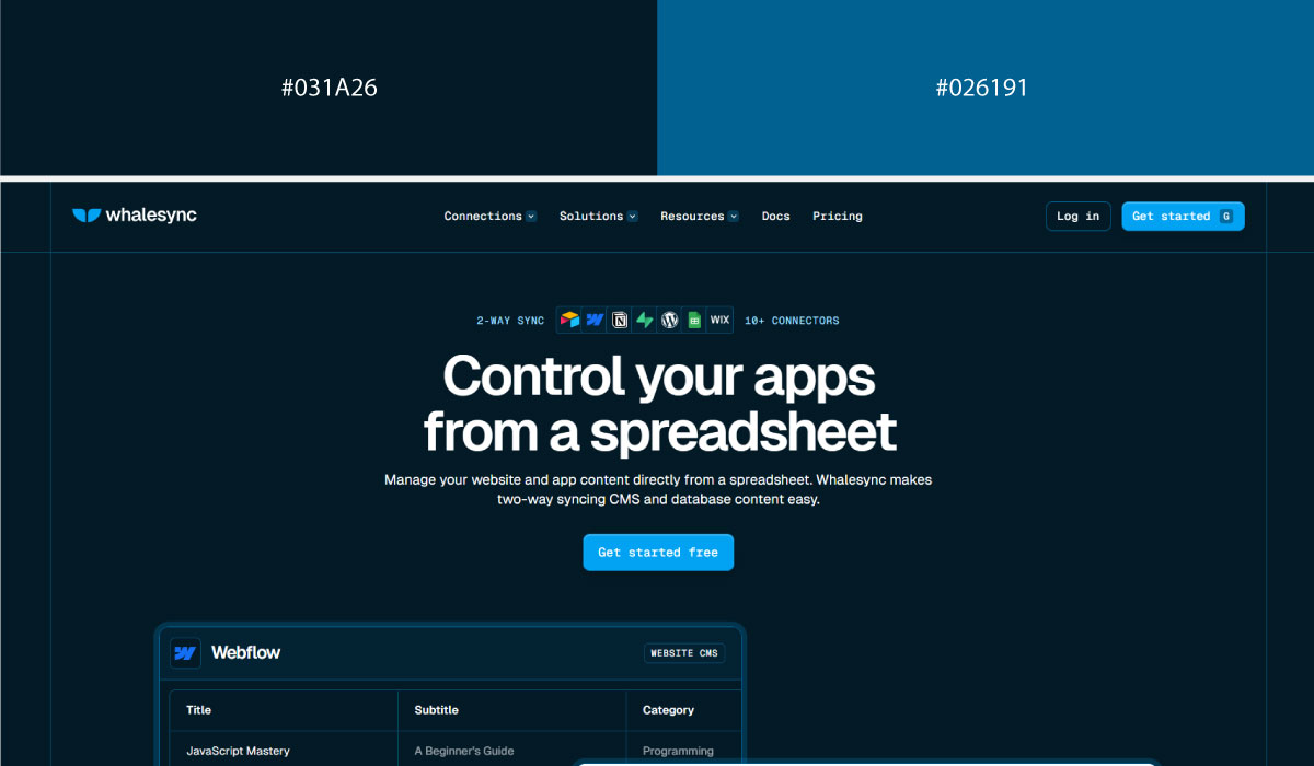
Whalesync takes a similar approach, layering blue tones to distinguish sections in place of a traditional accent color. White is used sparingly there too, mostly just to keep text legible against the darker blue backgrounds.
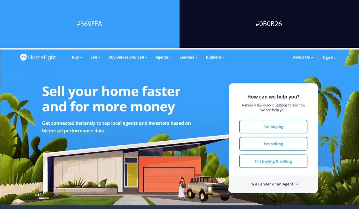
HomeLight frames its page with a darker navy up top, then eases into lighter blues as you move further down. That gradual shift in shade, rather than the introduction of a new color, is what signals movement through the page.
• Charcoal + Blue
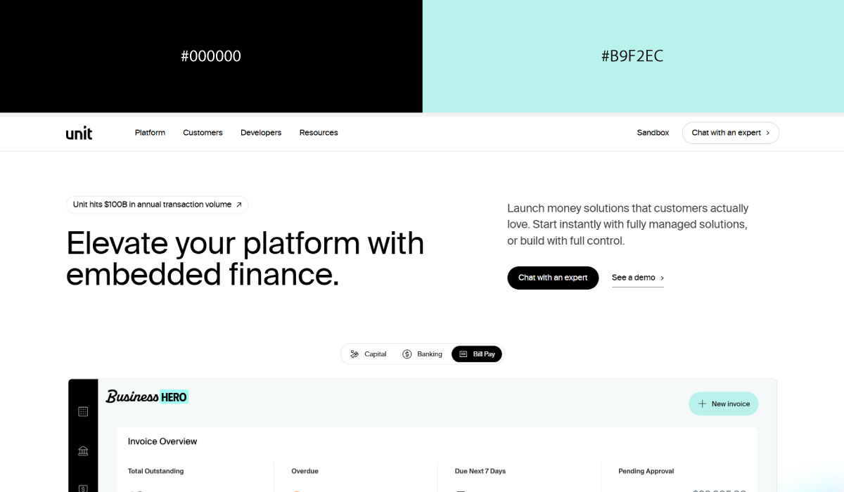
Unit lets charcoal dominate as the background across most of the site, which makes its bright blue accent stand out sharply wherever it appears. That contrast is really what gives the whole page its developer-tool feel.
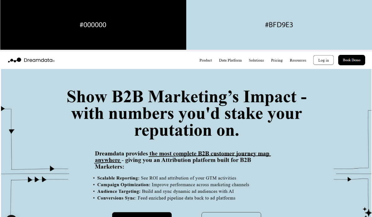
Dreamdata sets its tone with dark charcoal grey across large sections, and saves blue specifically for CTAs and small highlights. That restraint is what keeps the blue feeling meaningful instead of just decorative.
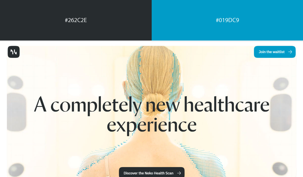
Nekohealth uses charcoal and blue in smaller, controlled amounts, set against a generous amount of open white space. That balance is what keeps the palette from feeling heavy despite leaning on darker tones.
2. Modern Tech & AI (Dark + Accent Pairings)
Dark backgrounds paired with one sharp accent have become the default look for anything that wants to feel cutting-edge. It’s a formula that reads as confident without much effort.
Best for: AI, developer tools, cybersecurity, futuristic products.
• Black + Neon Green
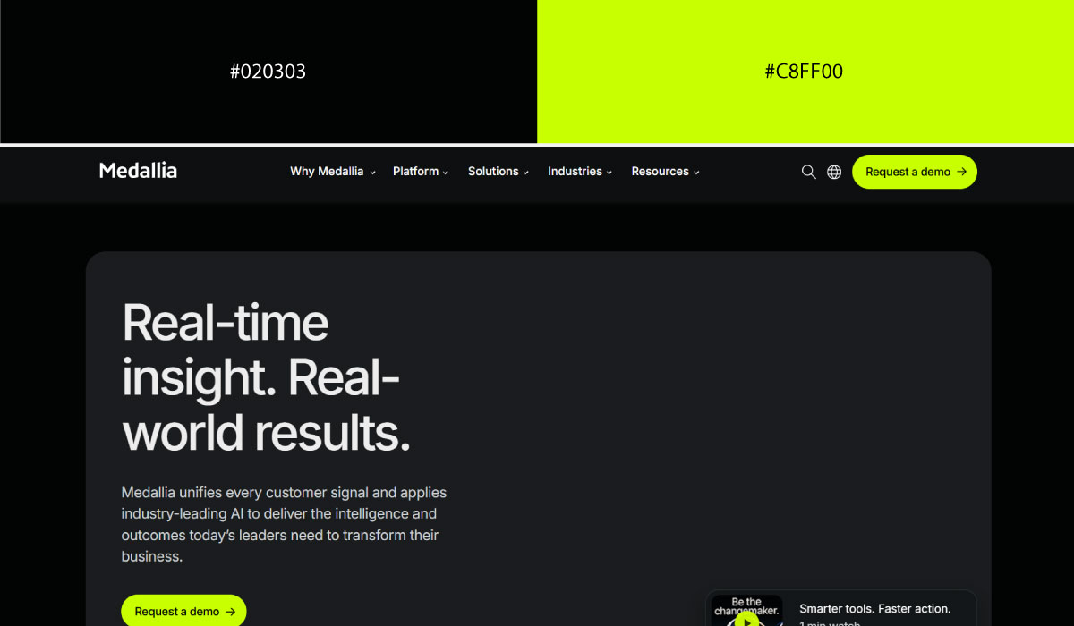
Medallia leans on black as the dominant background across key sections, which makes its neon green accent read almost like a signal flare whenever it appears on buttons or highlights. That sharp contrast is what gives the page its confident, high-tech feel.
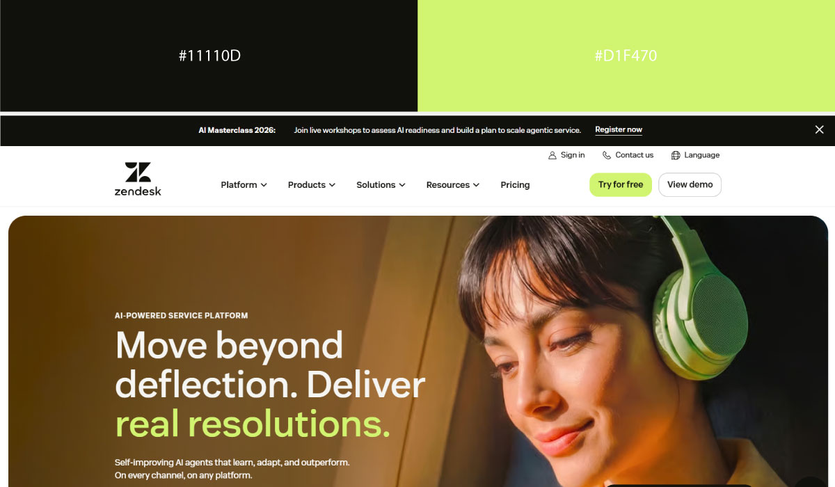
Zendesk uses black in a more selective way, reserving it for specific hero or feature blocks rather than the whole page. Neon green shows up consistently on CTAs there, so it functions as a clear, repeated cue for where to click.
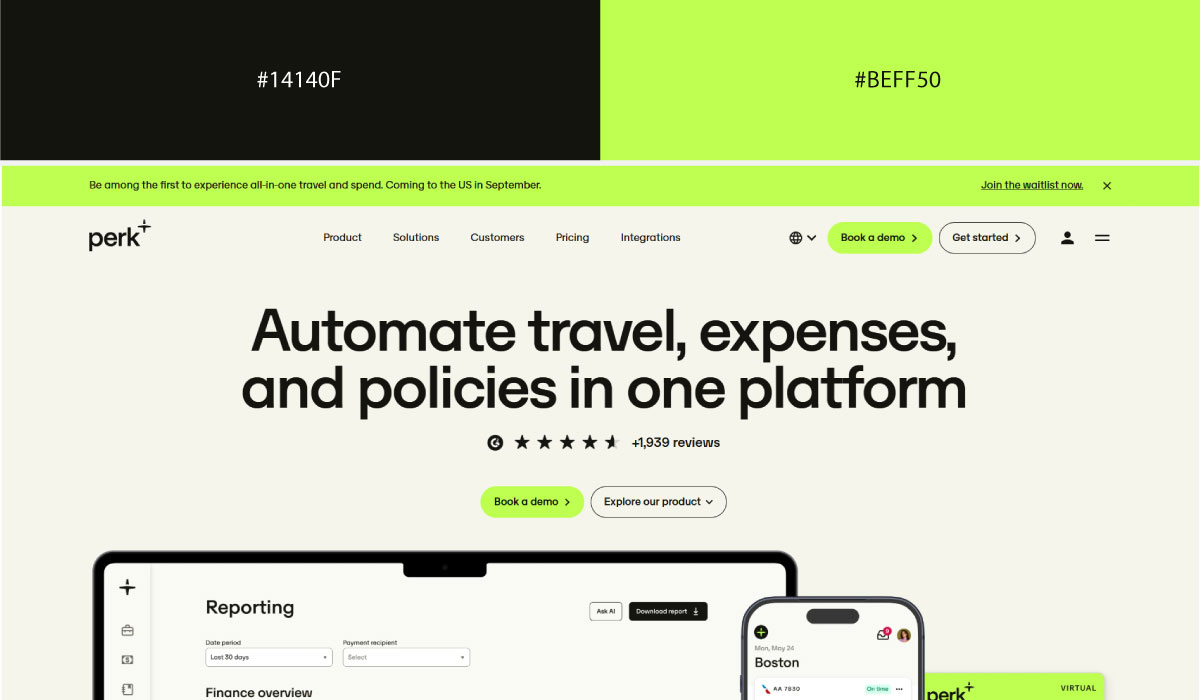
Perk keeps black as its base tone throughout, letting a bright green accent do all the work of highlighting action points. The green never spreads too far, which keeps it feeling deliberate rather than decorative.
• Black + Electric Blue
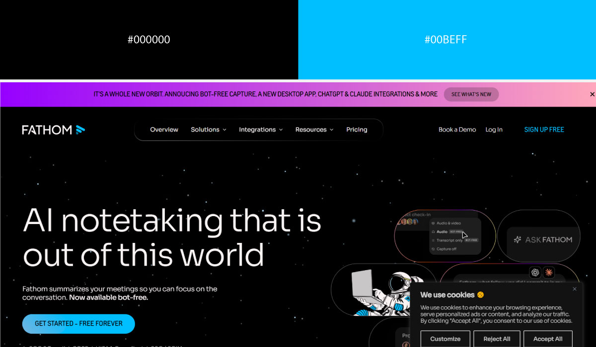
Fathom builds its layout on a black background, and electric blue is layered on top specifically for interactive elements and key callouts. The blue reads almost luminous against all that black, which is clearly the intent.
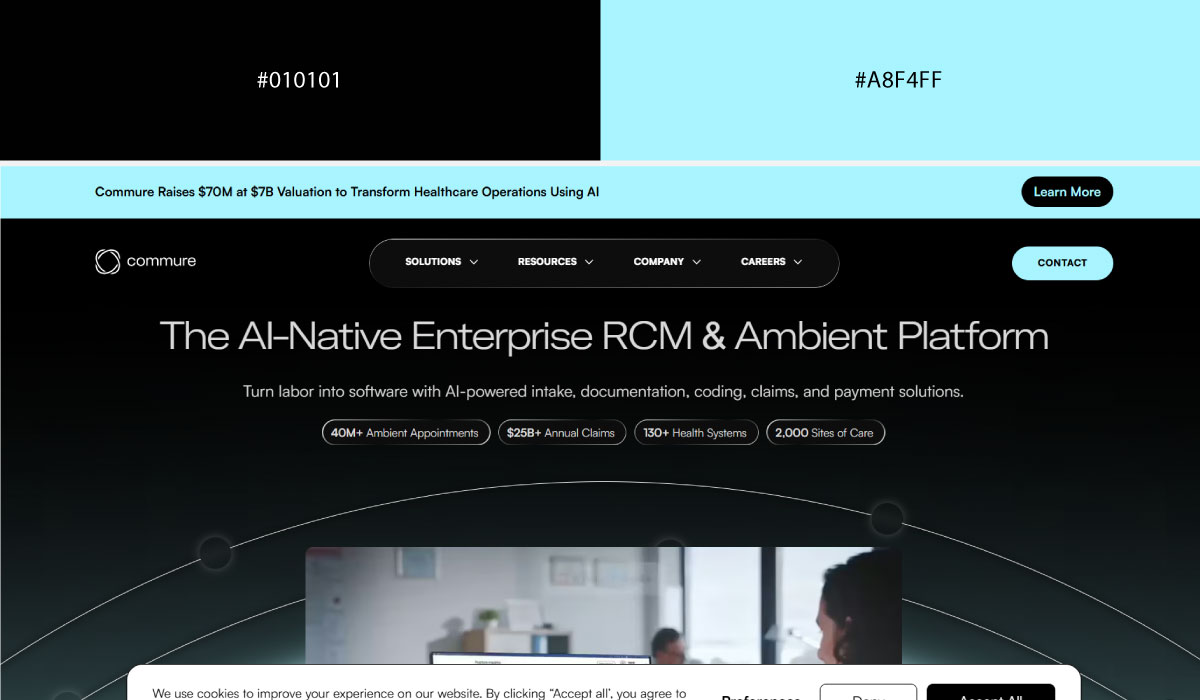
Commure uses black across large sections to set a serious, enterprise tone, with electric blue reserved for buttons and small accent details. That restraint keeps the blue functioning as a pointer rather than a mood-setter.
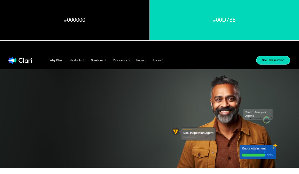
Clari follows a similar pattern, with black carrying most of the page and electric blue appearing only where it wants to draw the eye. The color is used sparingly enough that it never competes with the black for dominance.
• Dark Navy + Neon Green
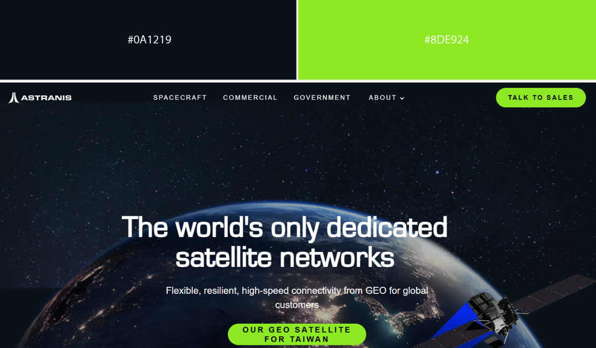
Astranis pairs a dark navy background with neon green used specifically for highlights and small UI accents. The navy sets a space-tech, serious mood, while the green injects just enough energy to keep it from feeling flat.
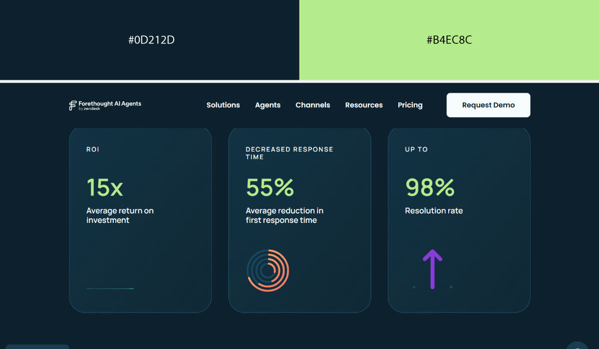
Forethought applies dark navy across its main sections, then uses neon green narrowly, mostly on CTAs and interactive elements. That narrow use keeps the green feeling intentional rather than scattered.
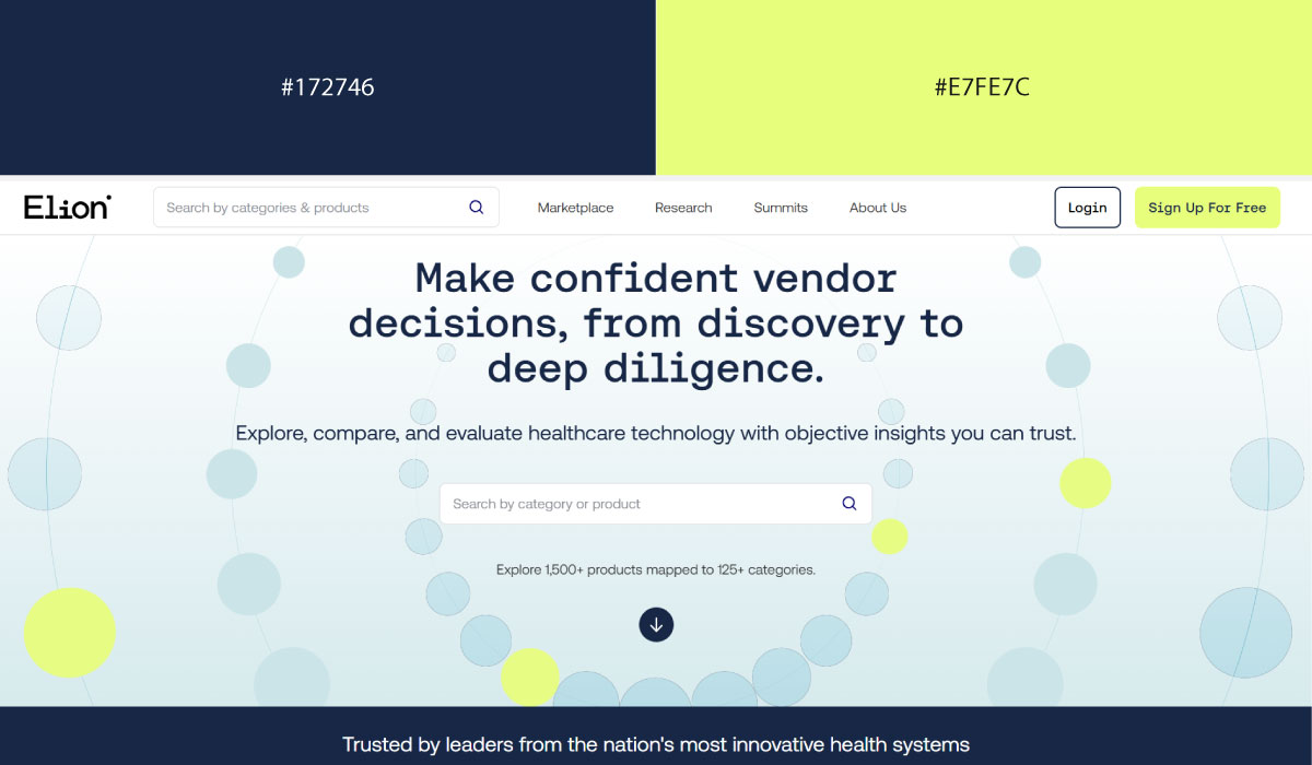
Elion.health uses navy as its foundational tone throughout the site, with green stepping in only where it wants to signal action or progress. The pairing stays calm overall because the green never takes up much visual space.
• Black + Purple Glow
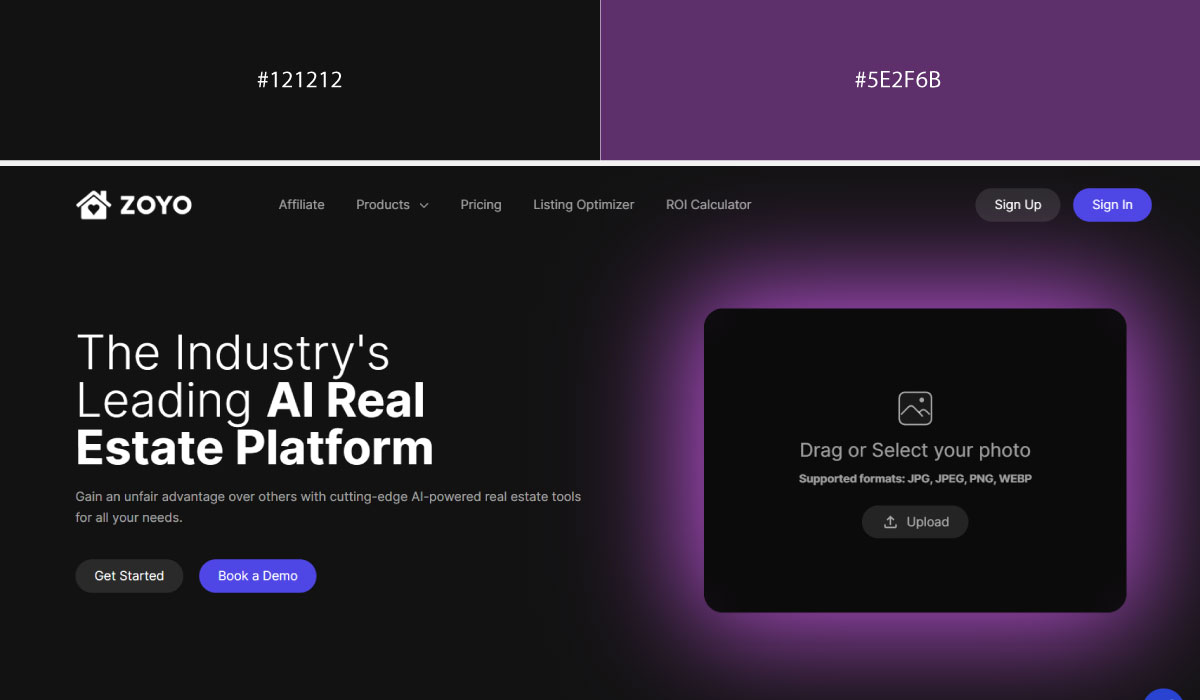
Zoyo.ai uses black as a near-total background, and a glowing purple is layered in for gradients and accent lighting effects. That glow effect is what gives the site its distinctly futuristic, AI-forward feel.

PMD Tec keeps black as the base across the page, with purple appearing more subtly, mostly in highlights and secondary accents rather than large glowing areas. The purple there reads more restrained than showy.
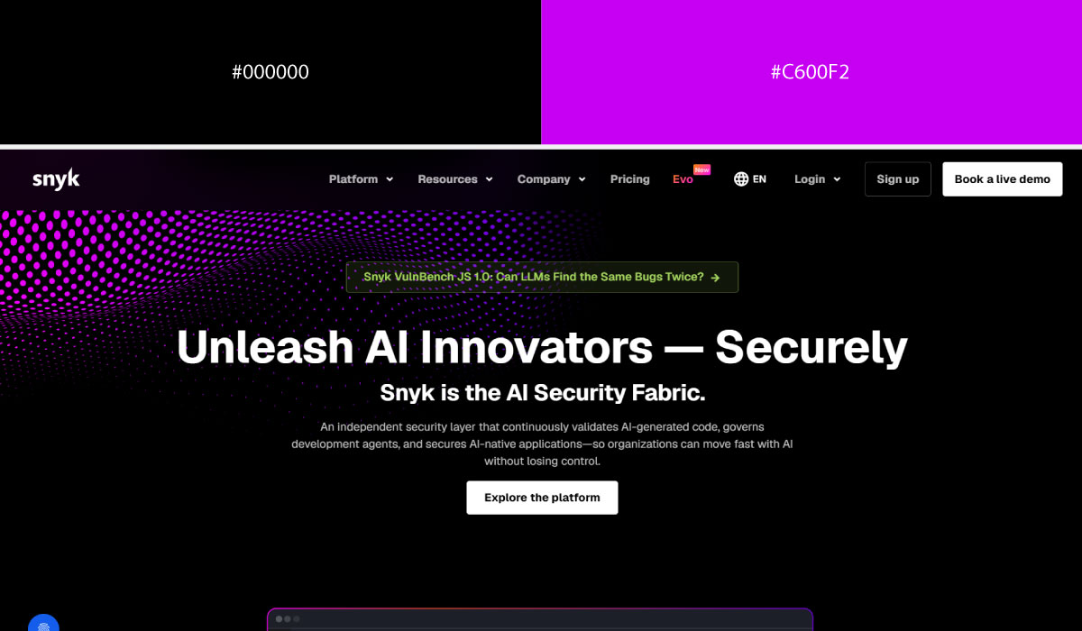
Snyk uses black for large sections of the layout and brings in purple specifically for buttons, icons, and small glow effects around key elements. The purple is concentrated enough that it consistently marks where attention should go.
• Black + Red
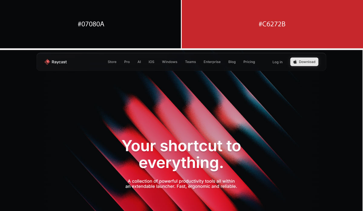
Raycast relies on black as its dominant background color, with red used sparingly and precisely, mostly for accents and small highlights. That restraint makes the red stand out sharply whenever it does appear.
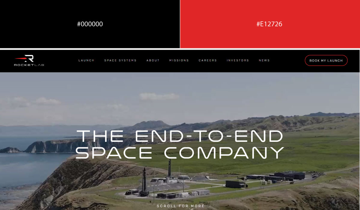
Rocket Lab Corp uses black extensively across the site, with red reserved for specific brand moments and call-to-action elements. The pairing reads bold and serious, fitting for an aerospace brand.
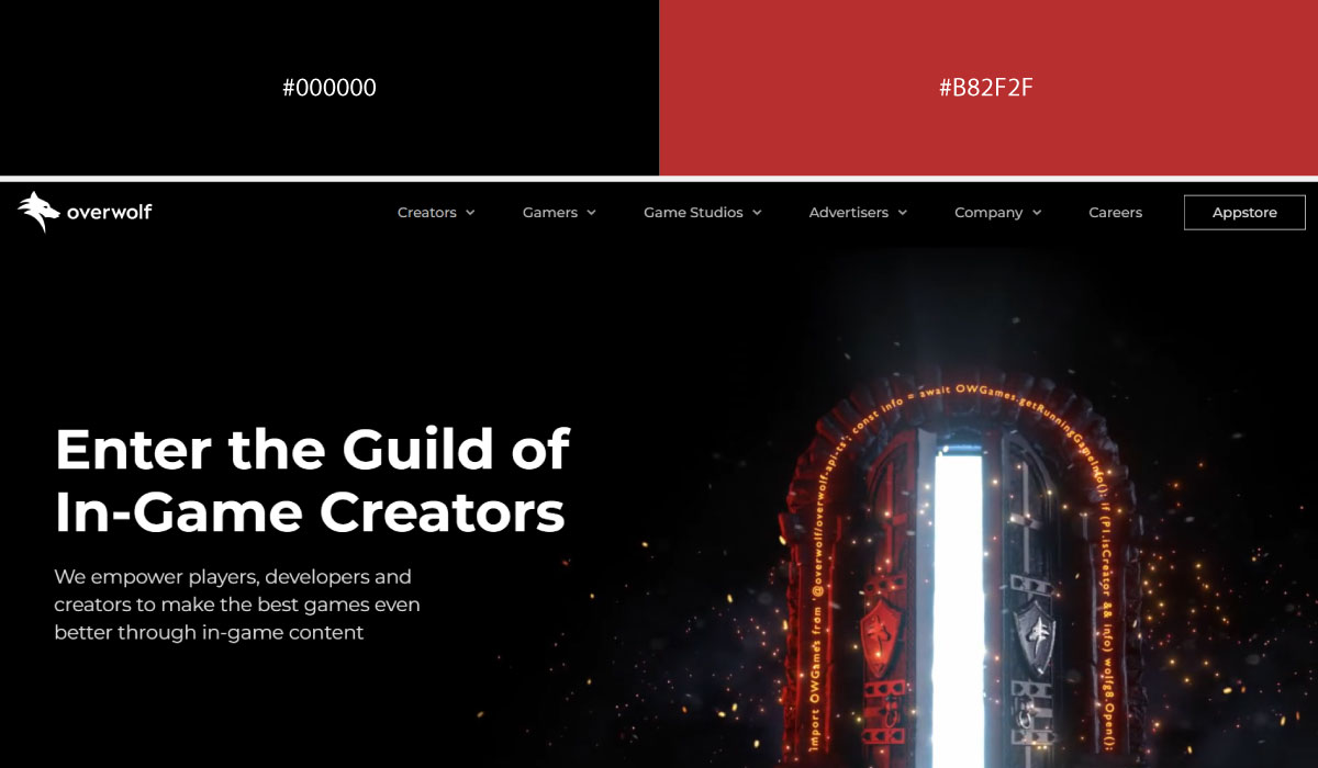
Overwolf keeps black as the base throughout, and red is applied to buttons and interactive highlights in a consistent, repeated way. That consistency is what turns the red into a reliable visual cue rather than a one-off accent.
3. Premium & Luxury-Inspired Pairings
These pairings lean on richness and restraint rather than brightness. Deep tones and metallic accents do the work of signaling quality without a single loud color in the mix.
Best for: Finance, luxury services, travel, real estate
• Black + Gold
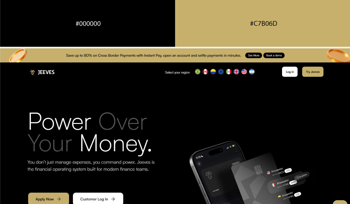
Jeeves uses black as its dominant background across the site, and gold appears specifically on accents and key highlights, which gives it a premium, understated feel. The gold never spreads too far, so it keeps functioning as a signal of importance rather than decoration.
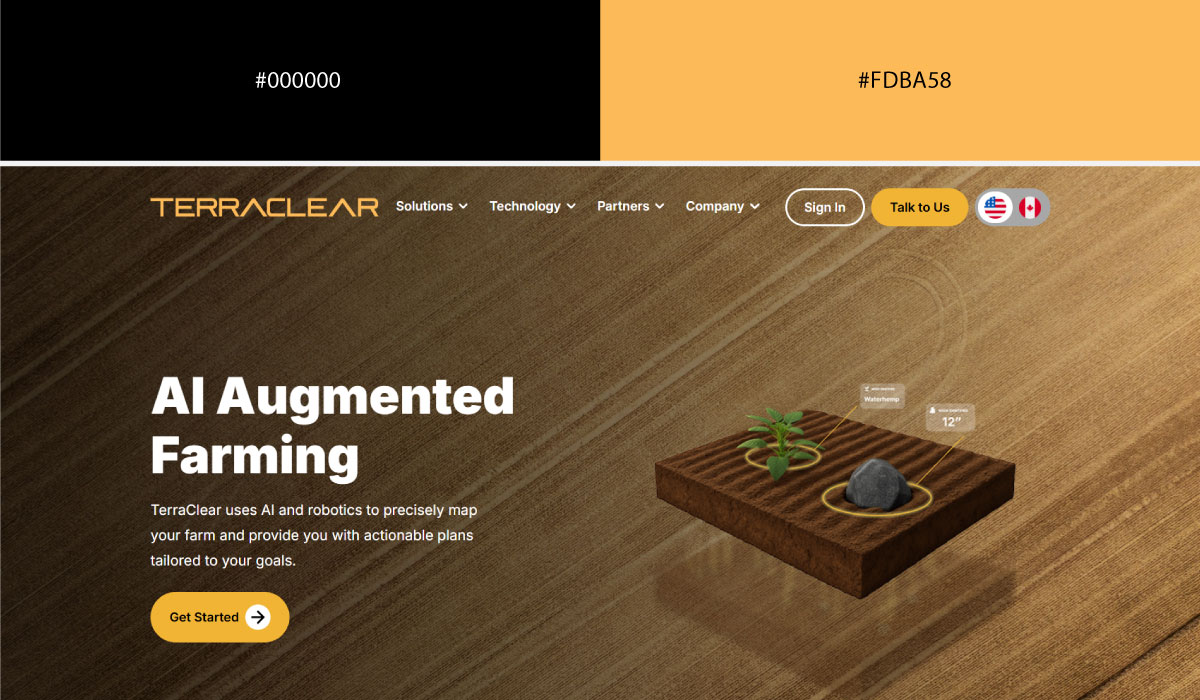
TerraClear applies black more selectively, using it mainly for hero and feature sections rather than the entire page. Gold shows up narrowly there too, mostly around icons and small brand details, keeping the overall palette restrained.
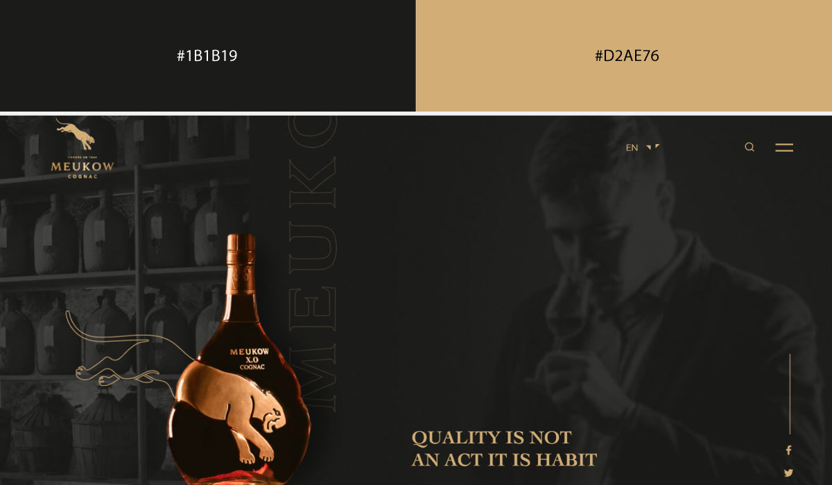
Meukow Cognac leans into black as a rich, near-total base, with gold layered in for typography and ornamental touches that echo the brand’s cognac heritage. That pairing is used consistently enough to feel like a core part of the brand identity, not just an accent.
• Ivory + Charcoal
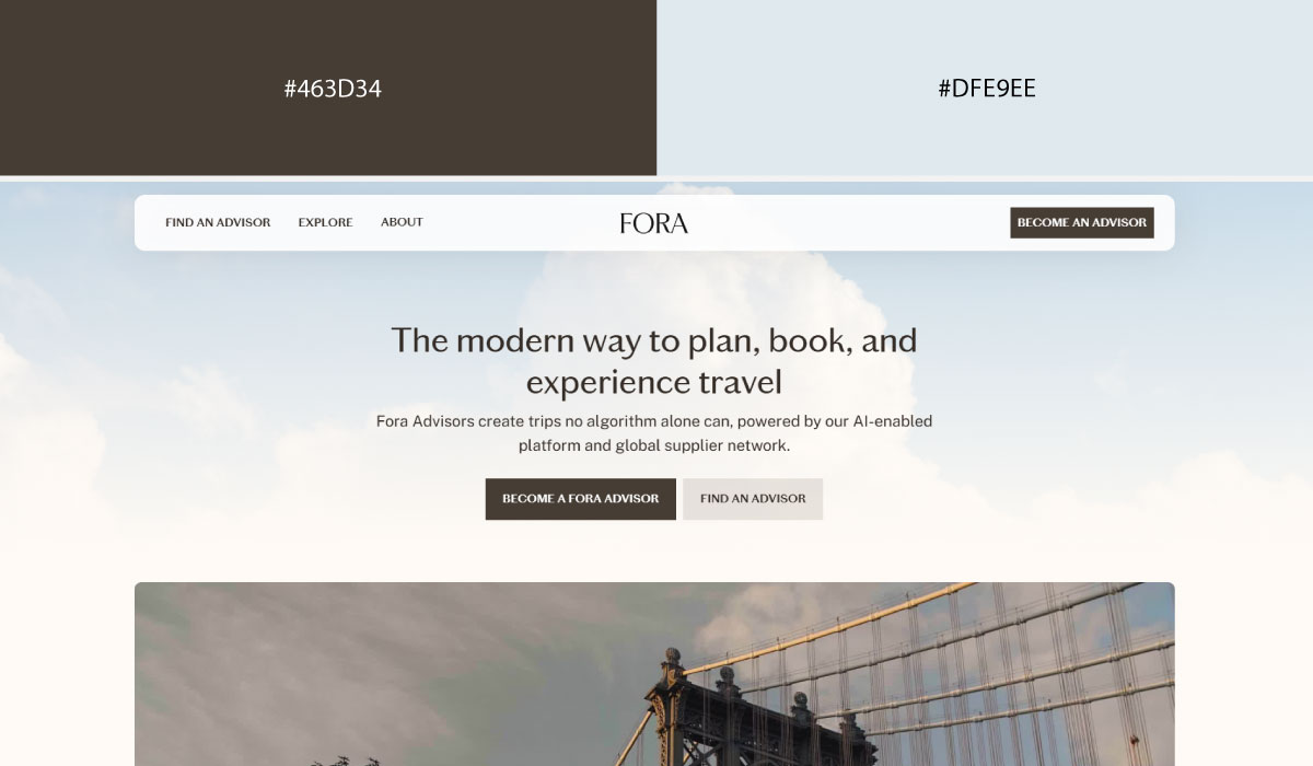
Fora Travel uses ivory as a warm, soft background across most of the site, with charcoal reserved specifically for text and structural elements like navigation. That contrast keeps the page feeling calm and legible without needing a separate accent color.
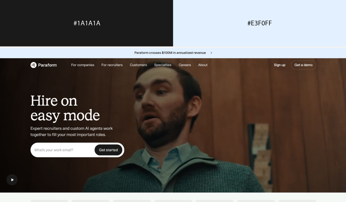
Paraform follows a similar pattern, letting ivory carry the bulk of the layout while charcoal handles headings and body copy. The pairing stays understated throughout, with no bright accent competing for attention.
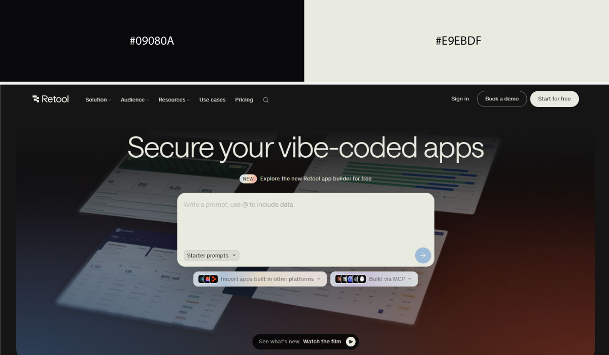
Retool uses ivory or off-white as its base tone in lighter sections, paired with charcoal for text and darker UI elements. The two colors alternate section to section, which helps break up a long page without introducing new hues.
• Navy + Gold
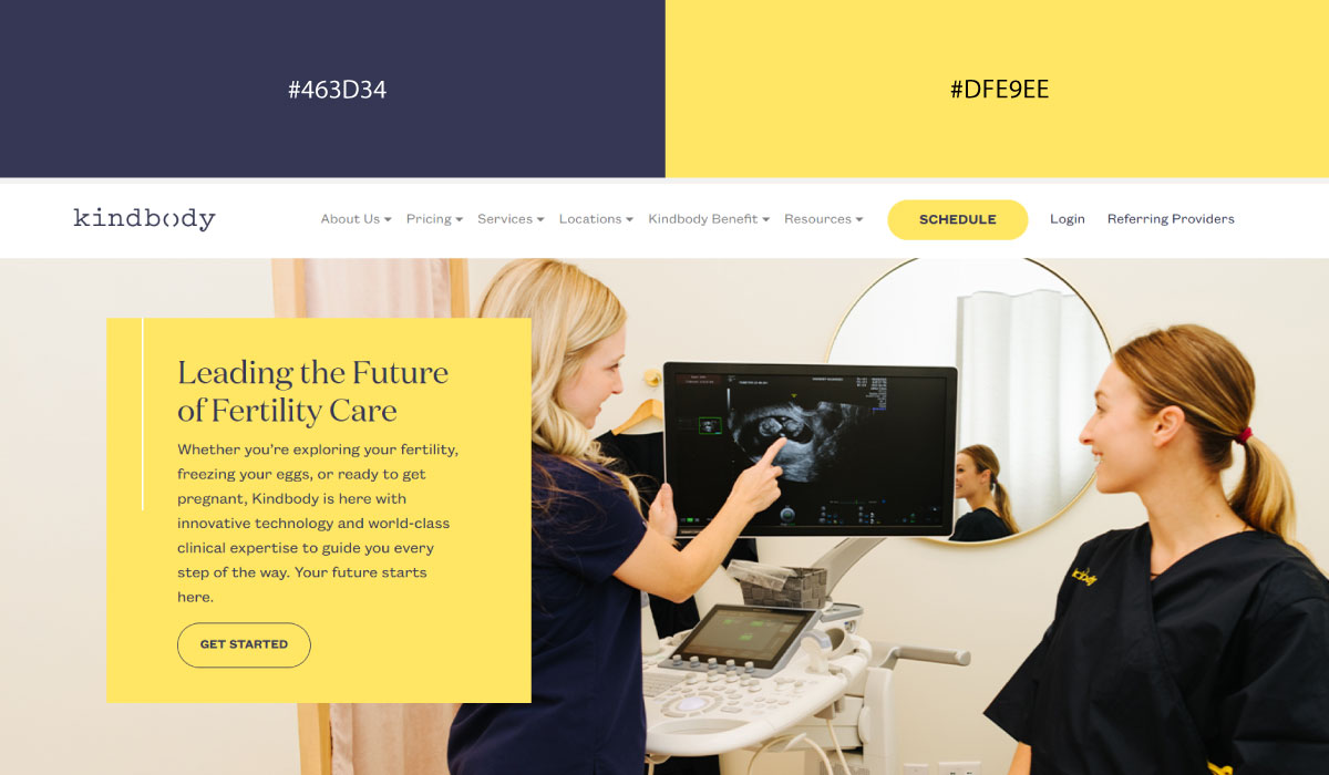
Kindbody applies navy across key sections as a grounding, trustworthy base color, with gold used sparingly for accents and small highlight details. The gold is concentrated enough to read as a deliberate touch of warmth against all that navy.
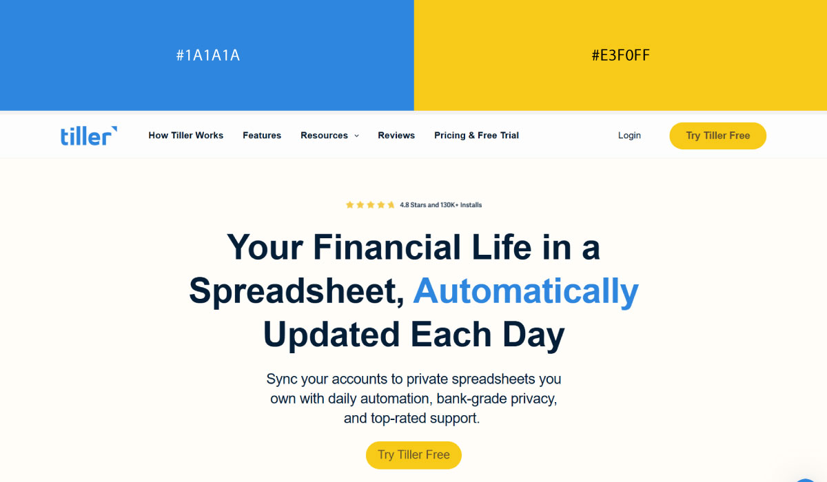
Tiller uses navy more broadly throughout its layout, and gold appears mainly on buttons or specific callouts rather than large areas. That selective use keeps the gold functioning as a clear point of emphasis.
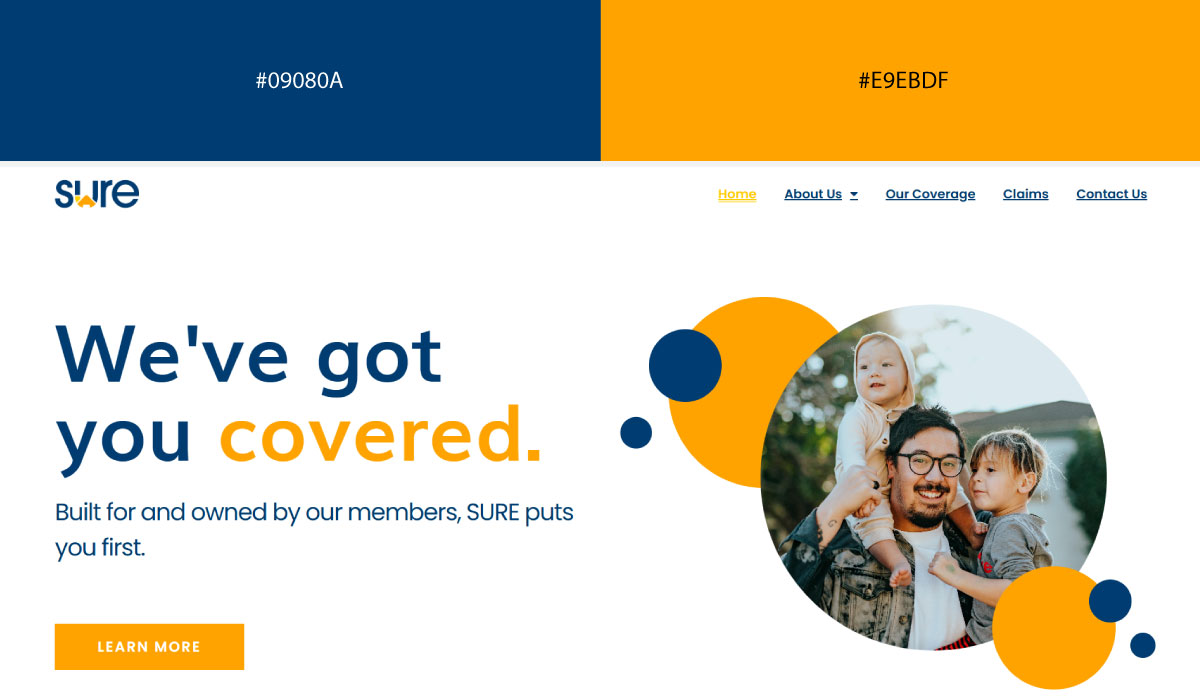
Sure Insurance leans on navy for its primary sections, pairing it with gold in a similarly narrow way, mostly around icons and CTA elements. The restraint on both ends keeps the palette feeling polished rather than busy.
• Terracotta + Soft Ivory
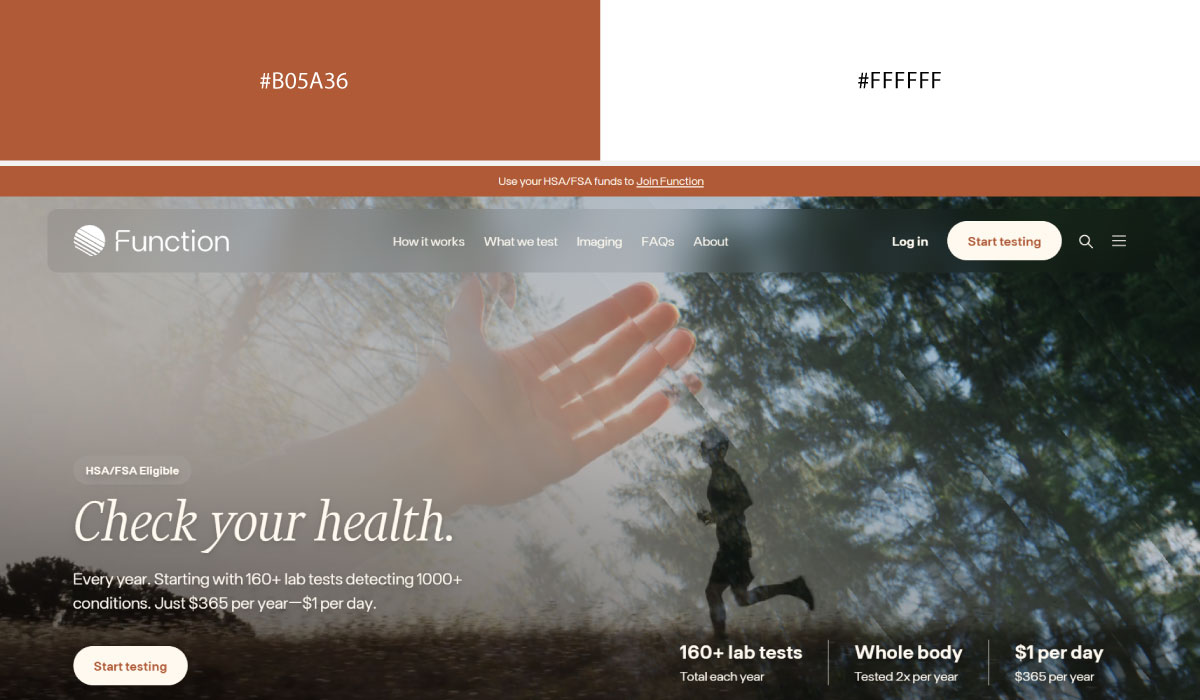
Function Health uses soft ivory as its main background tone, with terracotta layered in for accents, buttons, and select highlight areas. That warm pairing gives the site an approachable feel without leaning on anything too saturated.
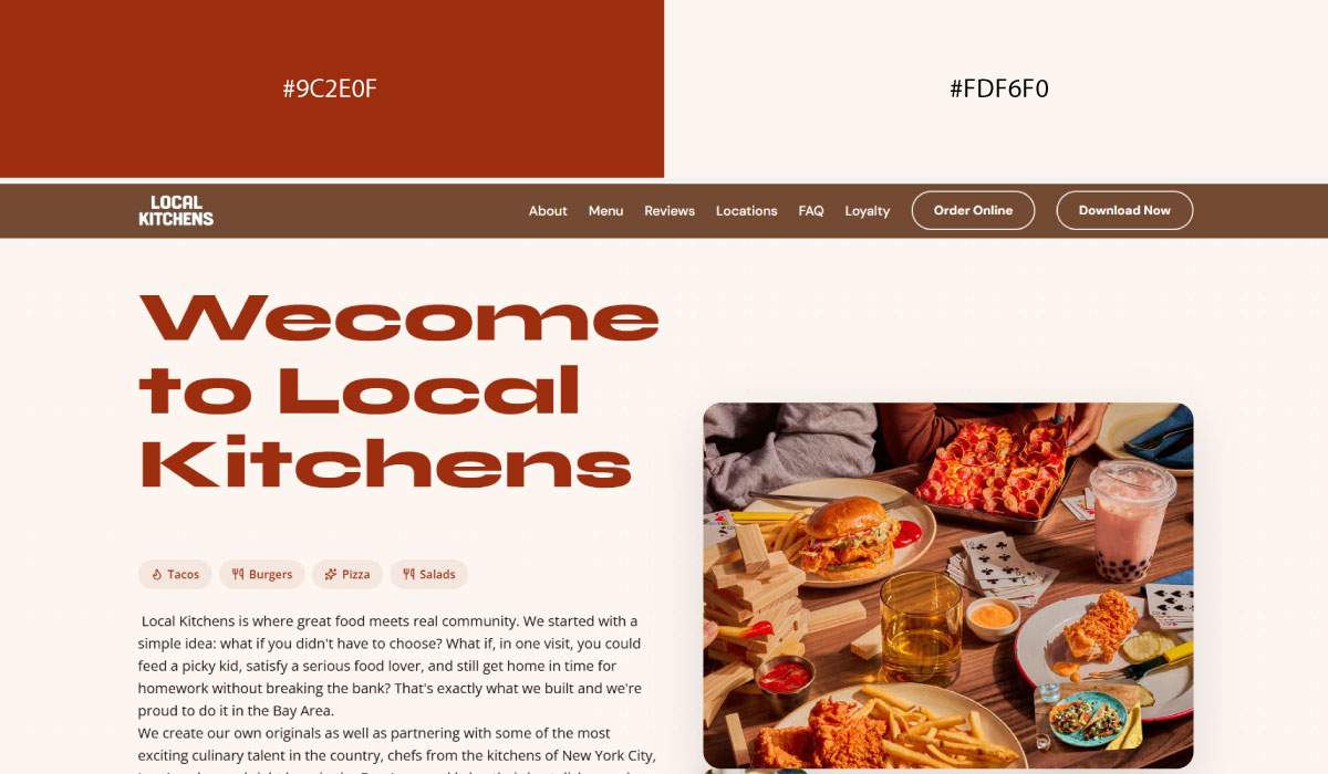
Local Kitchens applies ivory across most of its backgrounds, while terracotta shows up specifically in food photography framing and CTA elements. The terracotta stays concentrated in those spots rather than spreading across the whole page.
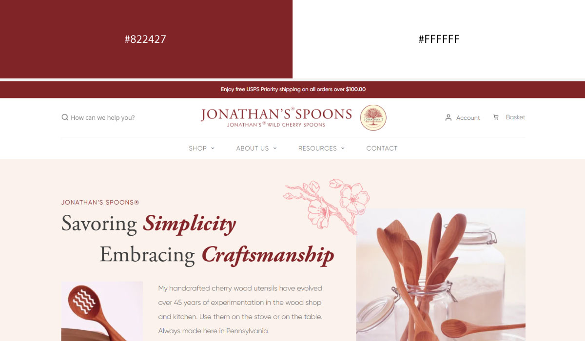
Woodspoon uses ivory as a consistent base throughout, with terracotta reserved for accents tied to food and brand imagery. The two colors work together evenly, without one ever fully dominating the other.
• Green + Grey
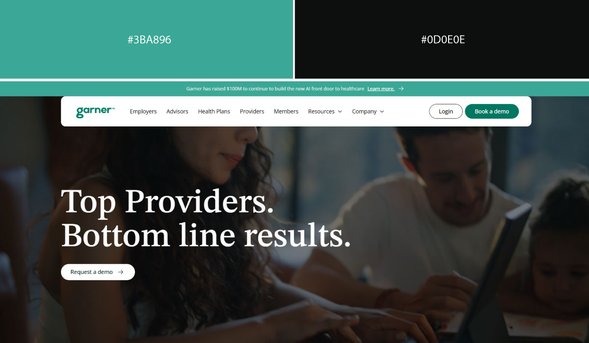
Garner Health uses grey as its structural base color across most sections, with green applied specifically to CTAs and small highlight details. That contrast makes the green easy to spot as the site’s action color.
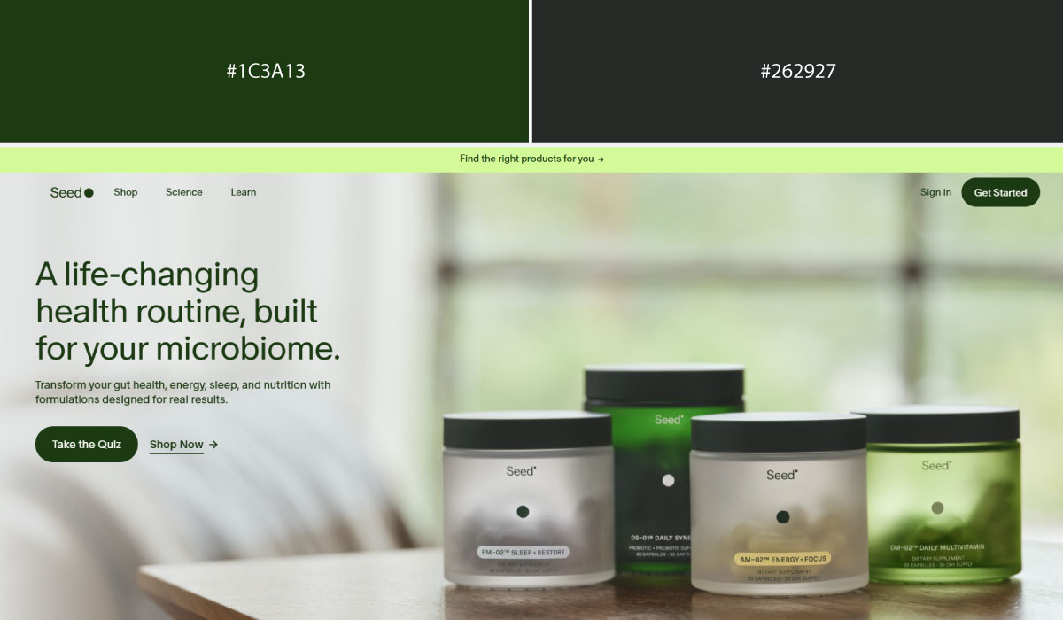
Seed leans on a similar split, with grey carrying the bulk of the layout and green reserved for accents tied to its wellness branding. The green stays fairly contained, appearing mostly around key interactive elements.
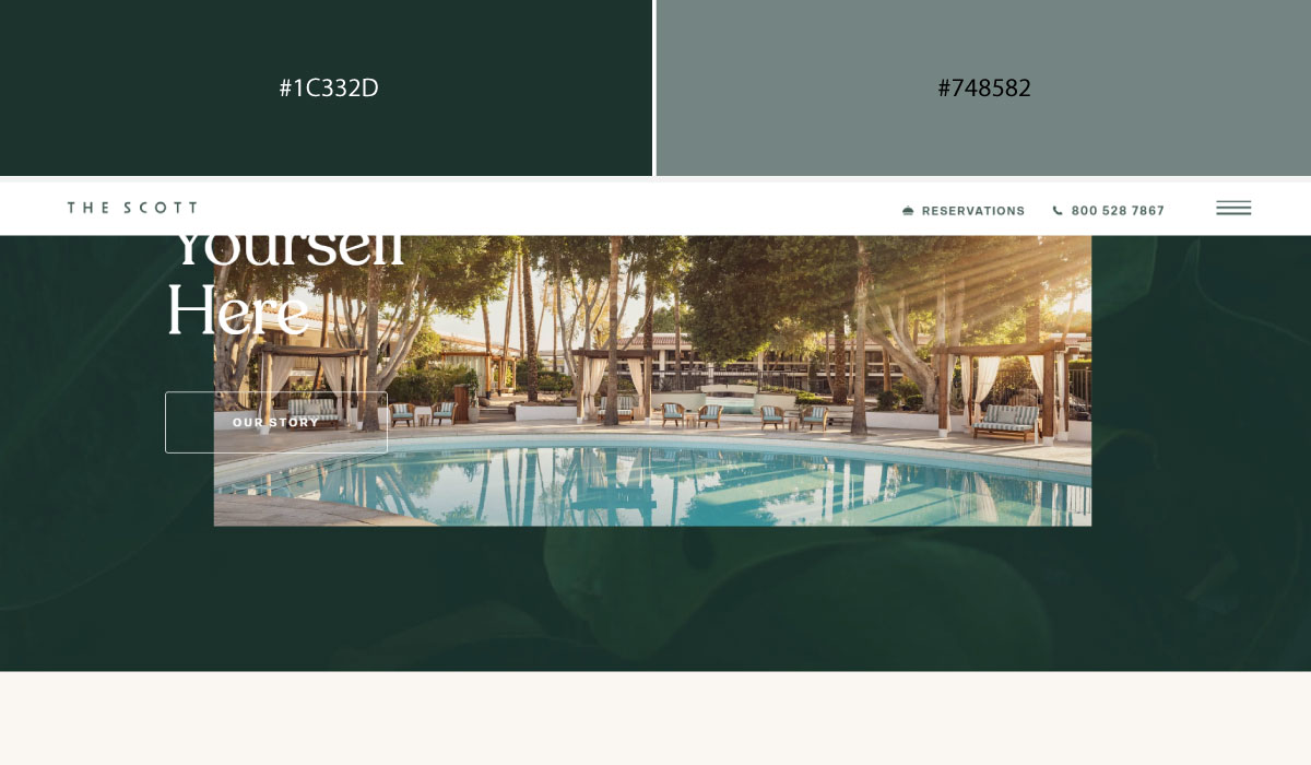
The Scott Resort uses grey more as a neutral backdrop for photography and text, while green shows up in smaller doses, mostly in branding touches and highlight details. That balance keeps the page feeling calm rather than heavily colored.
4. Fresh & Sustainable (Green-Based Pairings)
Green carries the sustainability association almost automatically, so these pairings tend to lean on natural, earthy tones rather than anything synthetic-looking.
Best for: Climate tech, agriculture, wellness, sustainability.
• Forest Green + Ivory
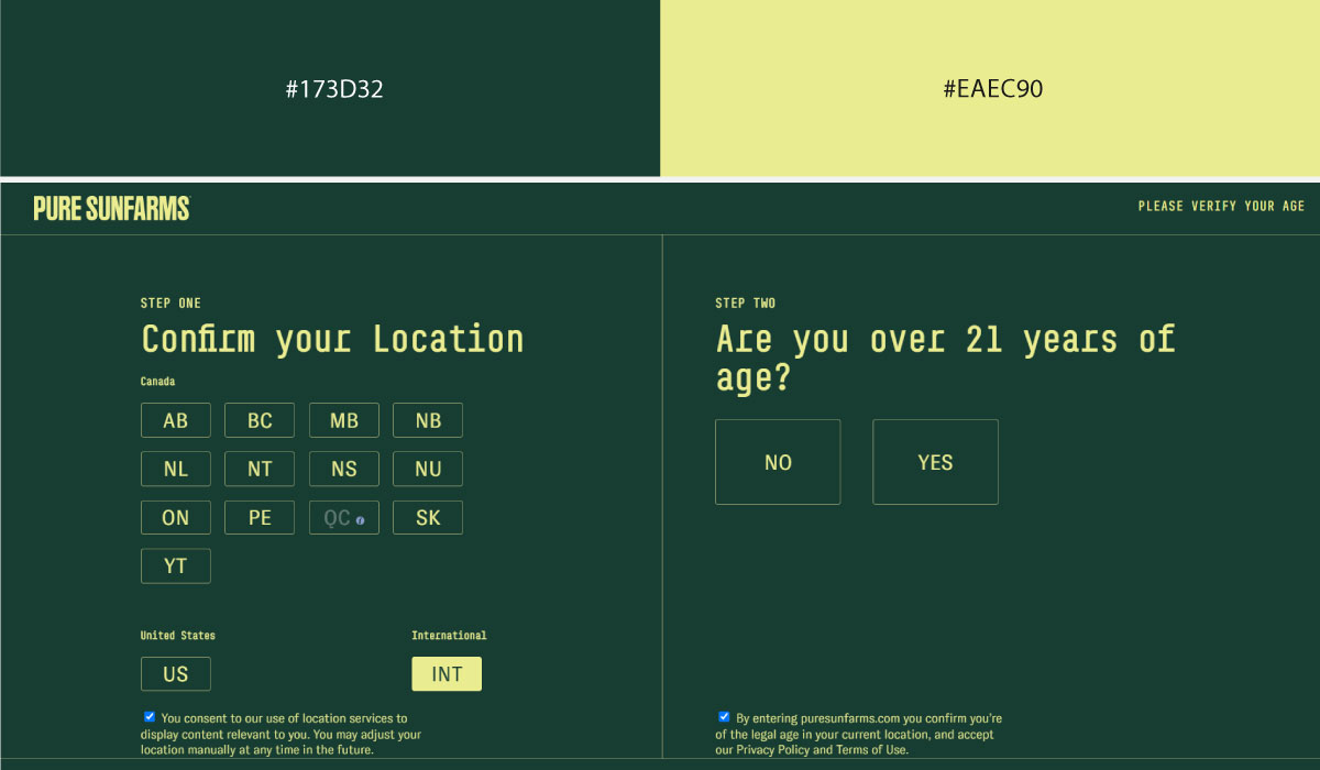
PureSun Farms uses ivory as a soft, warm background across most of the site, with forest green reserved for text, branding elements, and select highlights. That pairing keeps things feeling natural and calm rather than bold or high-contrast.
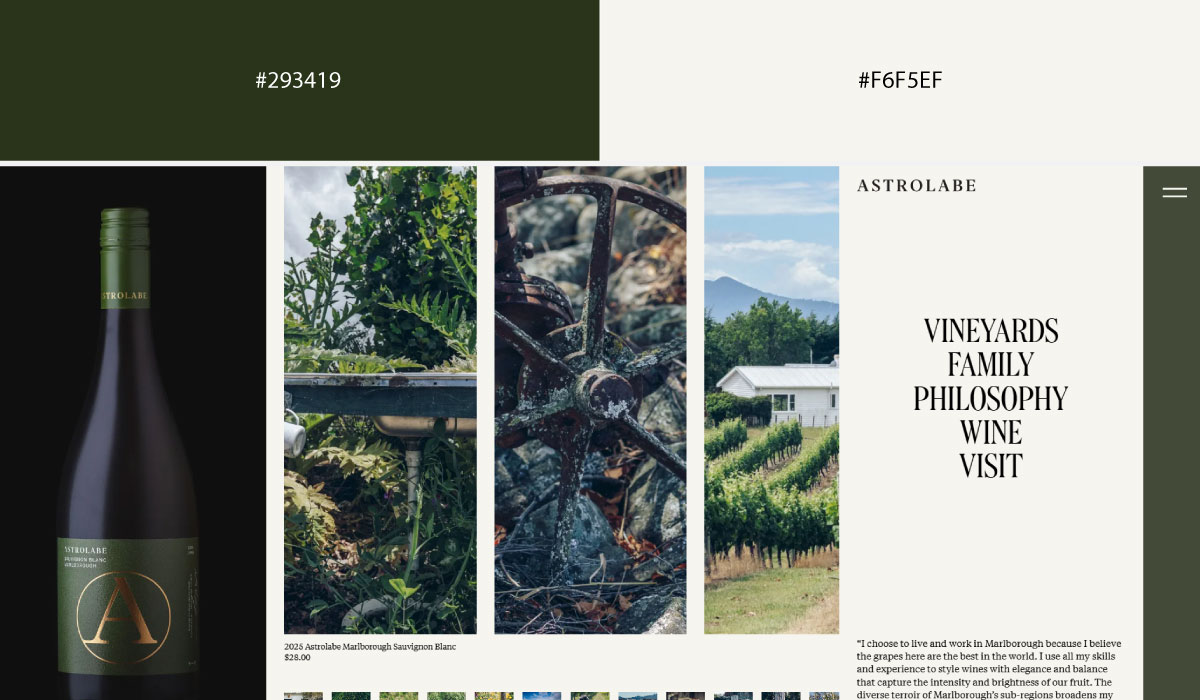
Astrolabe Wines applies forest green more prominently in header and label-inspired sections, while ivory carries the surrounding content areas. The green stays deep and grounded, echoing the wine branding without ever feeling harsh.
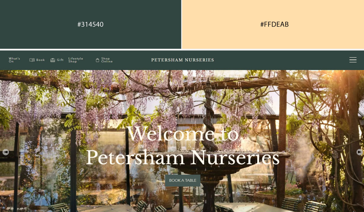
Petersham Nurseries leans on ivory as its dominant tone throughout, with forest green appearing mainly in accents tied to plant and garden imagery. The two colors stay evenly balanced, letting the photography do most of the visual work.
• Green + Charcoal
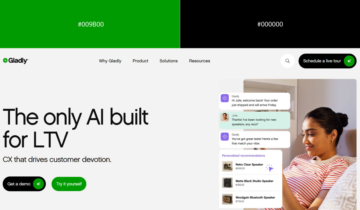
Gladly uses charcoal as a strong structural base across its layout, with green applied specifically to CTAs and small highlight details. That contrast makes the green function clearly as the site’s action color.
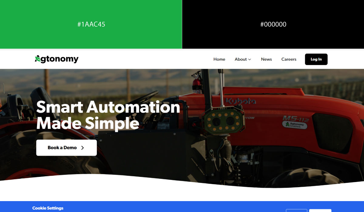
Agtonomy pairs charcoal backgrounds with green used more broadly across icons and feature callouts, fitting for an agriculture-tech brand. The green stays consistent enough to read as a core brand color rather than a one-off accent.
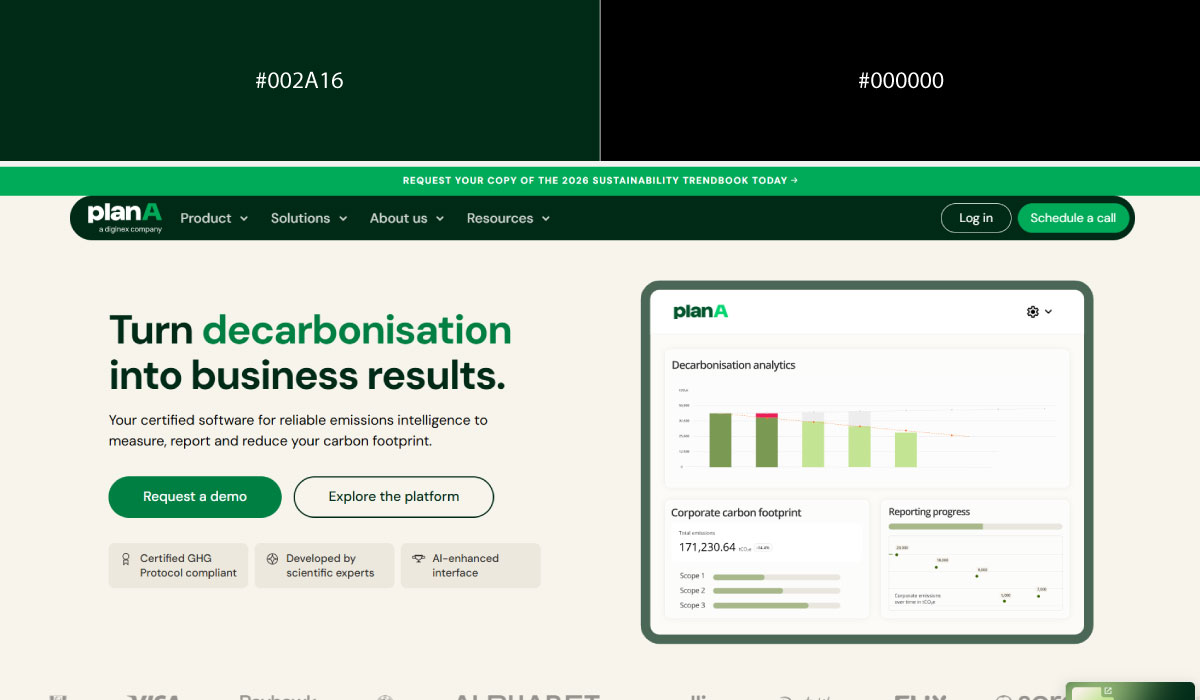
Plana.earth applies charcoal in select sections for contrast, while green carries much of the branding and interactive elements throughout. The pairing leans slightly greener overall, reinforcing the sustainability focus of the site.
• Deep Green + Pink
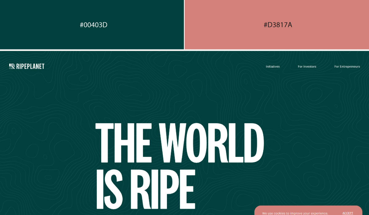
Ripe Planet uses deep green as its dominant background tone, with pink layered in for accents and highlight details that add unexpected warmth. That contrast between a serious green and a playful pink gives the site a distinct personality.
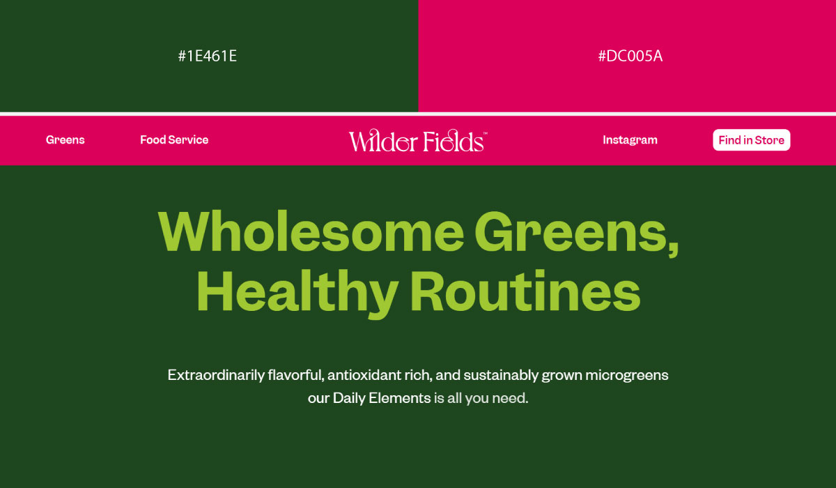
Wilderfields applies deep green more evenly across sections, while pink shows up narrowly, mostly around CTAs and small brand touches. The pink stays contained enough to feel like a deliberate accent rather than a competing color.
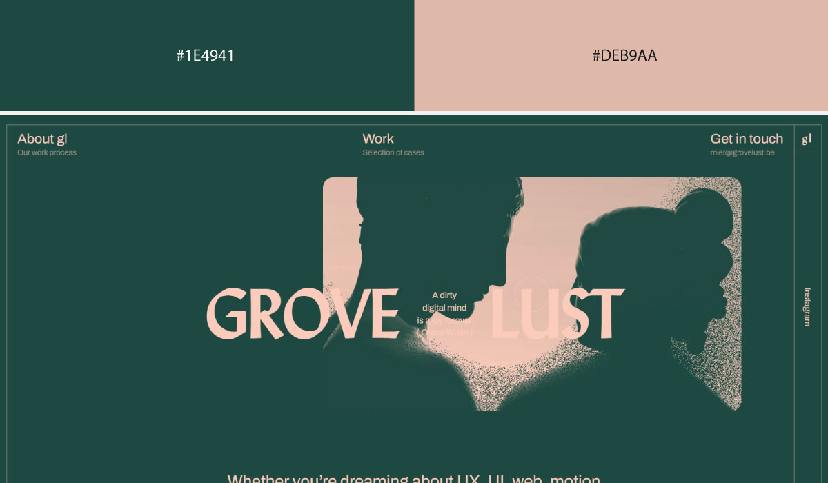
Grovelust uses a similar split, with deep green forming the base and pink reserved for specific highlight moments throughout the page. The two colors balance each other so neither one overwhelms the layout.
• Light Green + Dark Green
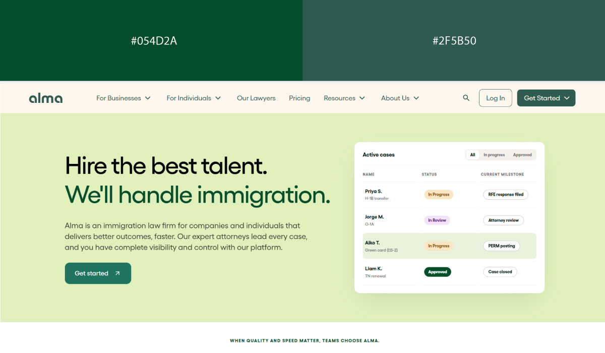
Alma uses light green as a soft background tone in several sections, paired with dark green for text and structural contrast. That range within a single hue creates depth without needing a separate accent color.
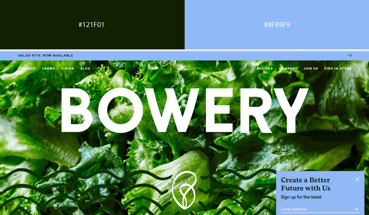
Bowery Farming leans on dark green for header and hero areas, then shifts into lighter green tones further down the page. That gradual shift signals movement through the content while keeping the palette cohesive.
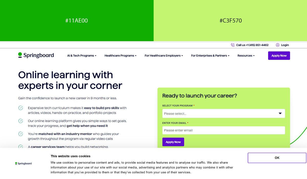
Springboard applies both light and dark green throughout, using the lighter shade for backgrounds and the darker one for emphasis on text and buttons. The contrast between the two shades does the job an accent color would normally do.
• Green + Brown
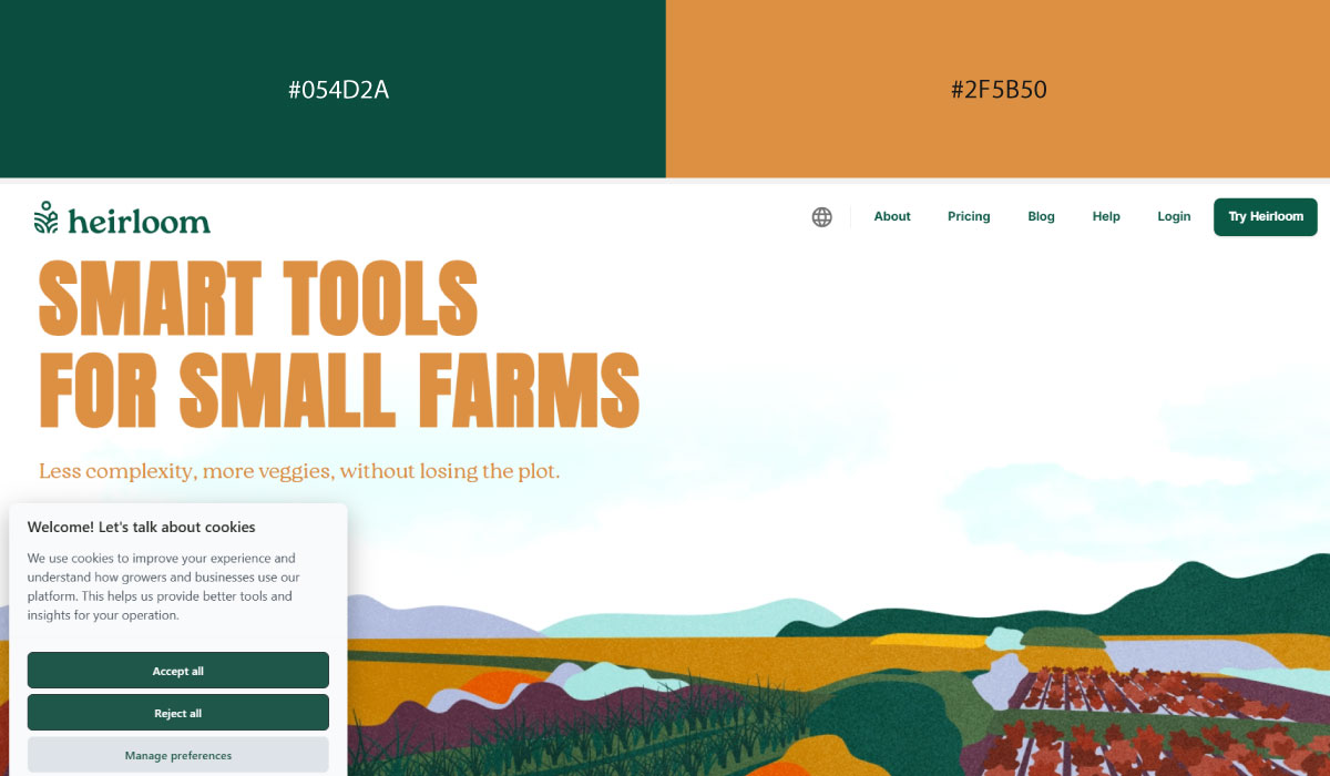
Heirloom pairs a natural green with brown used for grounding elements like text and structural details. The combination feels earthy and consistent with the brand’s agricultural focus, with neither color overpowering the other.
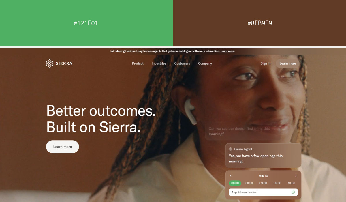
Sierra.ai applies green more broadly across its layout, with brown appearing in smaller doses, mostly in accents and secondary details. That balance keeps the palette feeling warm without leaning too heavily into either tone.
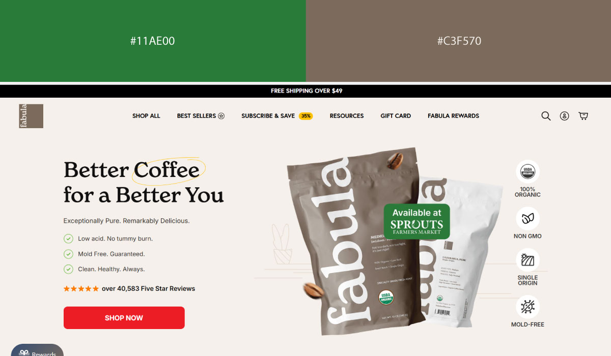
Fabula Coffee uses brown prominently, echoing its coffee branding, while green is layered in for accents and highlight touches throughout. The pairing stays warm and natural, fitting for a coffee-focused site.
5. Energetic & Action-Oriented Pairings
These combinations trade restraint for momentum. Warm, saturated tones dominate, which makes them a natural fit for brands that want to feel fast and immediate rather than calm.
• Coral + Blue
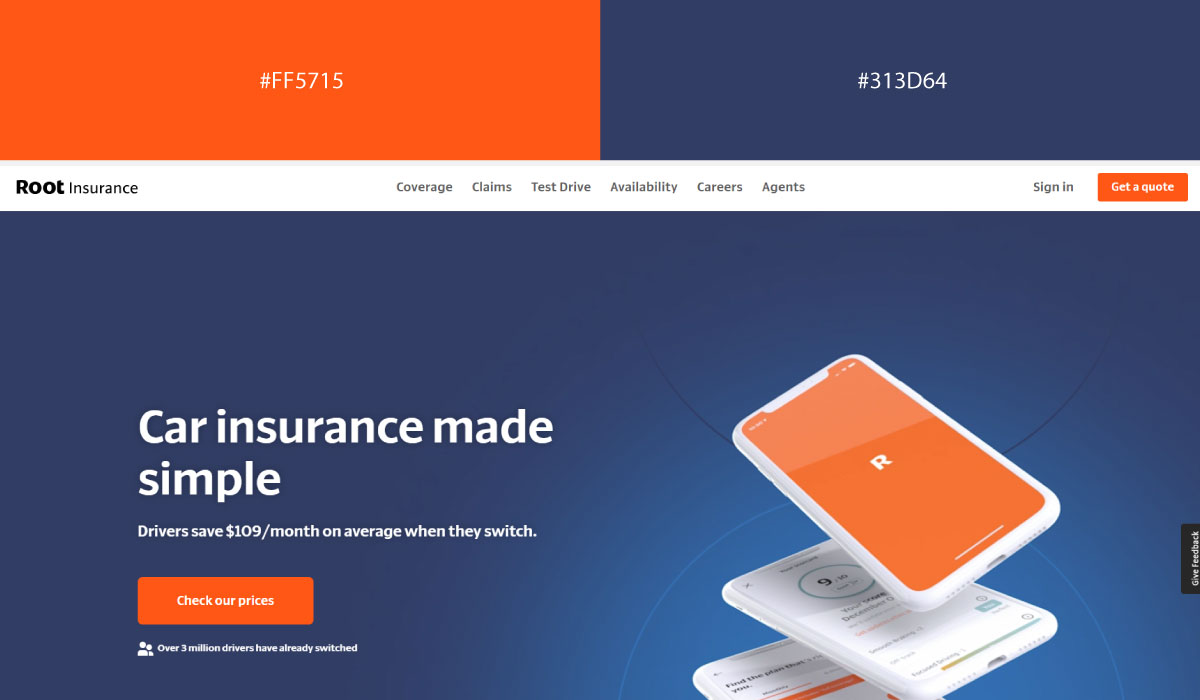
Root uses blue as a structural base across much of its layout, with coral applied specifically to CTAs and highlight moments. That contrast gives the coral a clear job as the site’s primary action color.
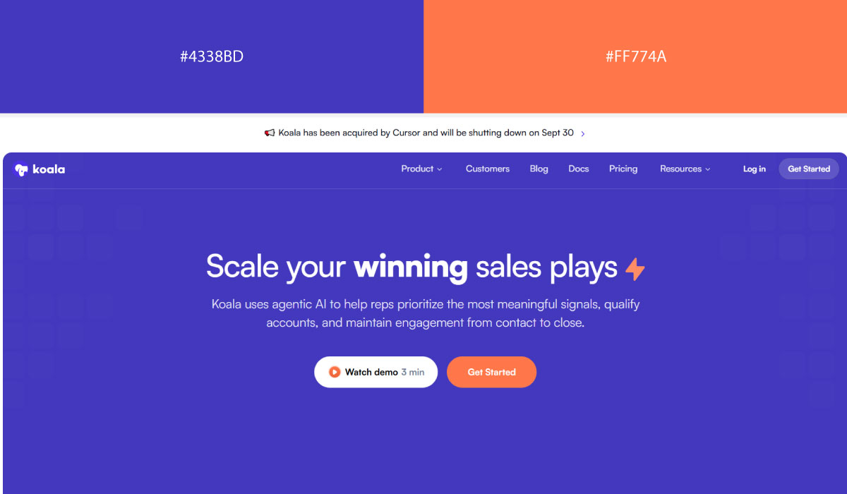
Koala pairs blue more broadly throughout its sections, while coral shows up narrowly, mostly around buttons and small brand accents. The coral stays contained enough to feel deliberate rather than scattered across the page.
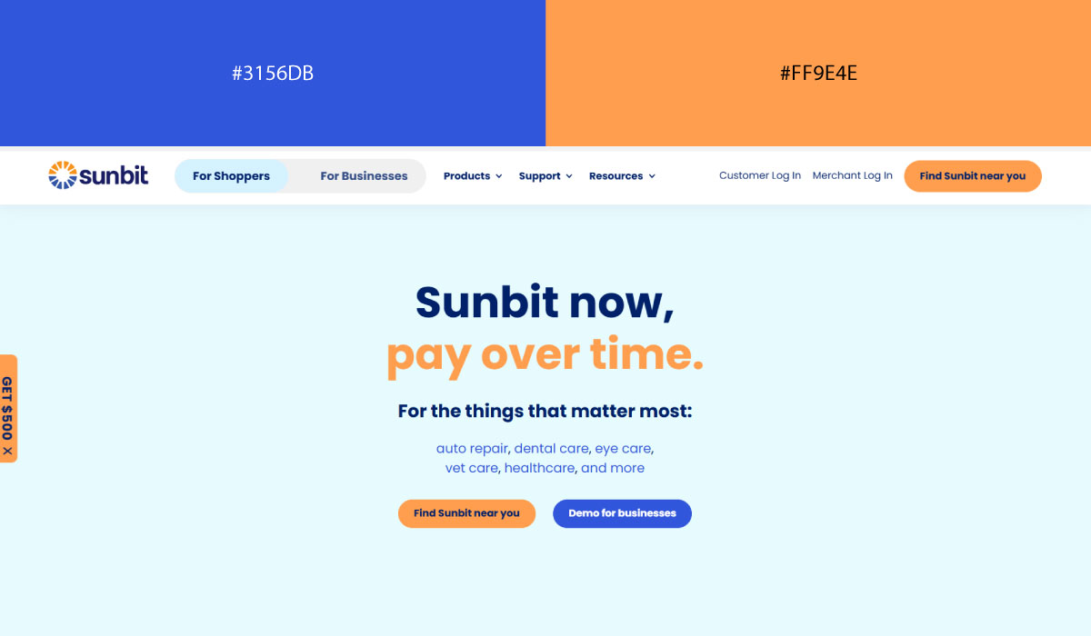
Sunbit leans on a similar split, with blue carrying most of the background and coral reserved for interactive elements and key callouts. The two colors stay distinct from each other, which keeps the hierarchy easy to follow.
• Yellow + Red
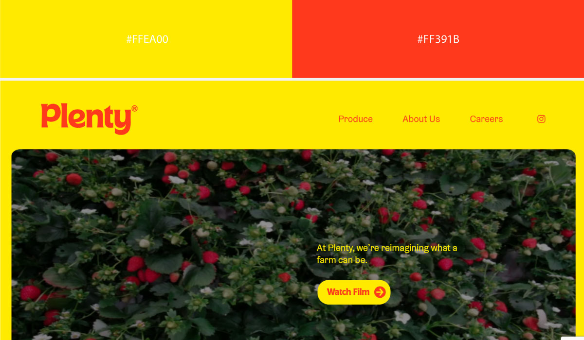
Plenty uses yellow prominently across sections tied to its agriculture branding, with red layered in for accents and select highlight details. The combination feels energetic without either color fully taking over.
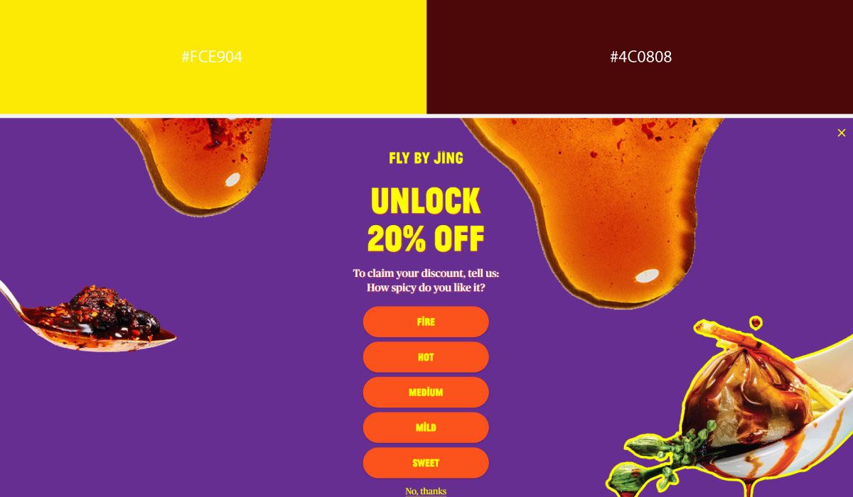
Fly By Jing leans on red as a bold, dominant tone throughout the site, while yellow appears in smaller doses around accents and product highlights. That balance keeps the red as the clear lead color.
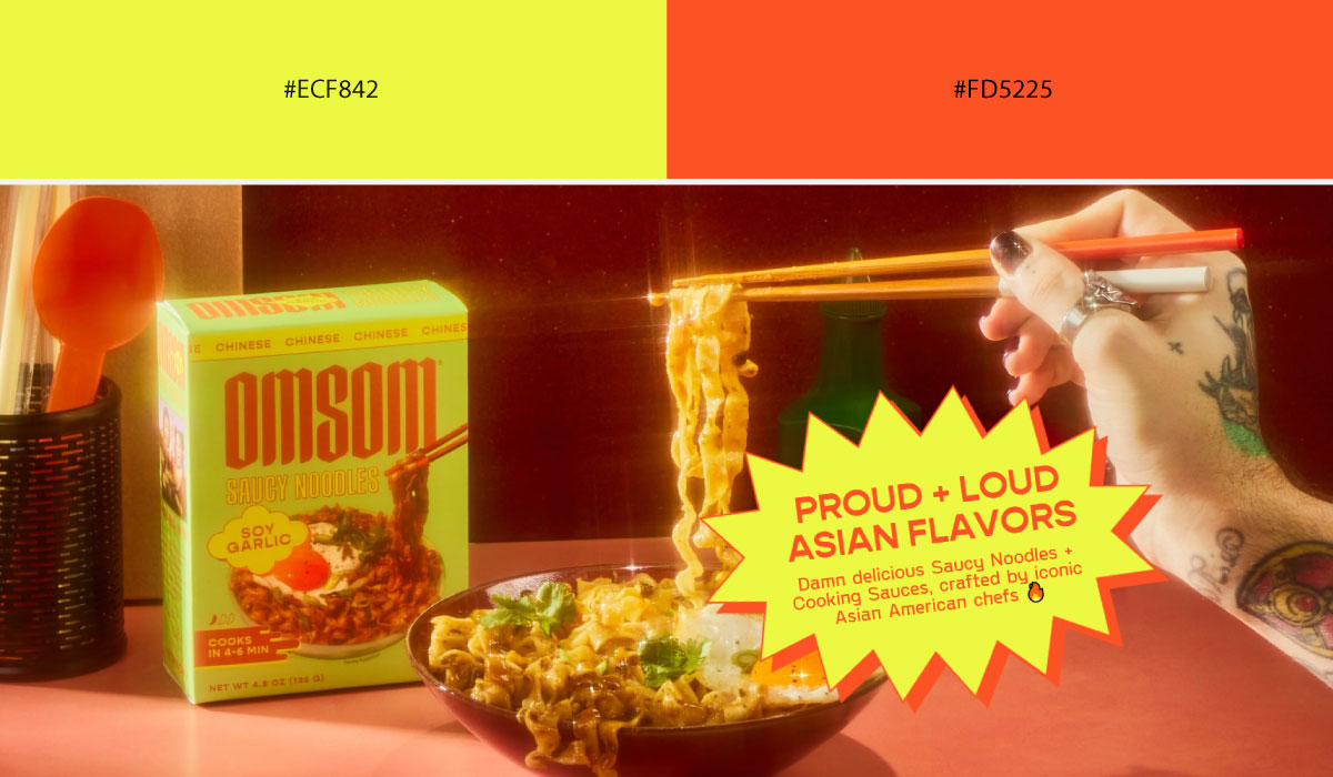
Omsom applies both yellow and red generously throughout its layout, alternating between them across sections rather than confining either to a narrow accent role. The result is a vibrant, high-energy palette that matches the brand’s bold personality.
• Moonlit Linen + Yellow
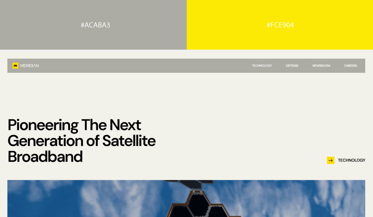
Meridian Space uses a soft, muted linen tone as its dominant background, with yellow reserved for accents and small highlight touches. That restraint keeps the yellow feeling like a considered pop of color rather than a loud statement.
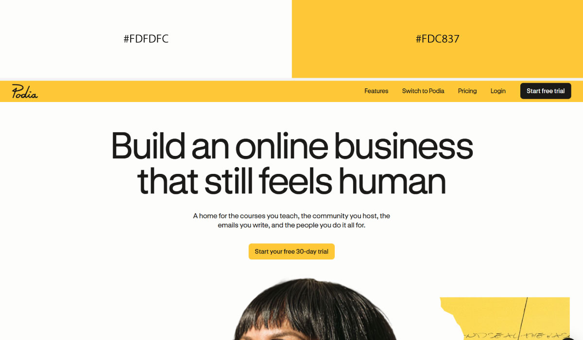
Podia applies linen tones broadly across its content sections, while yellow shows up specifically on CTAs and interactive elements. The yellow stays fairly contained, functioning clearly as the action color throughout.
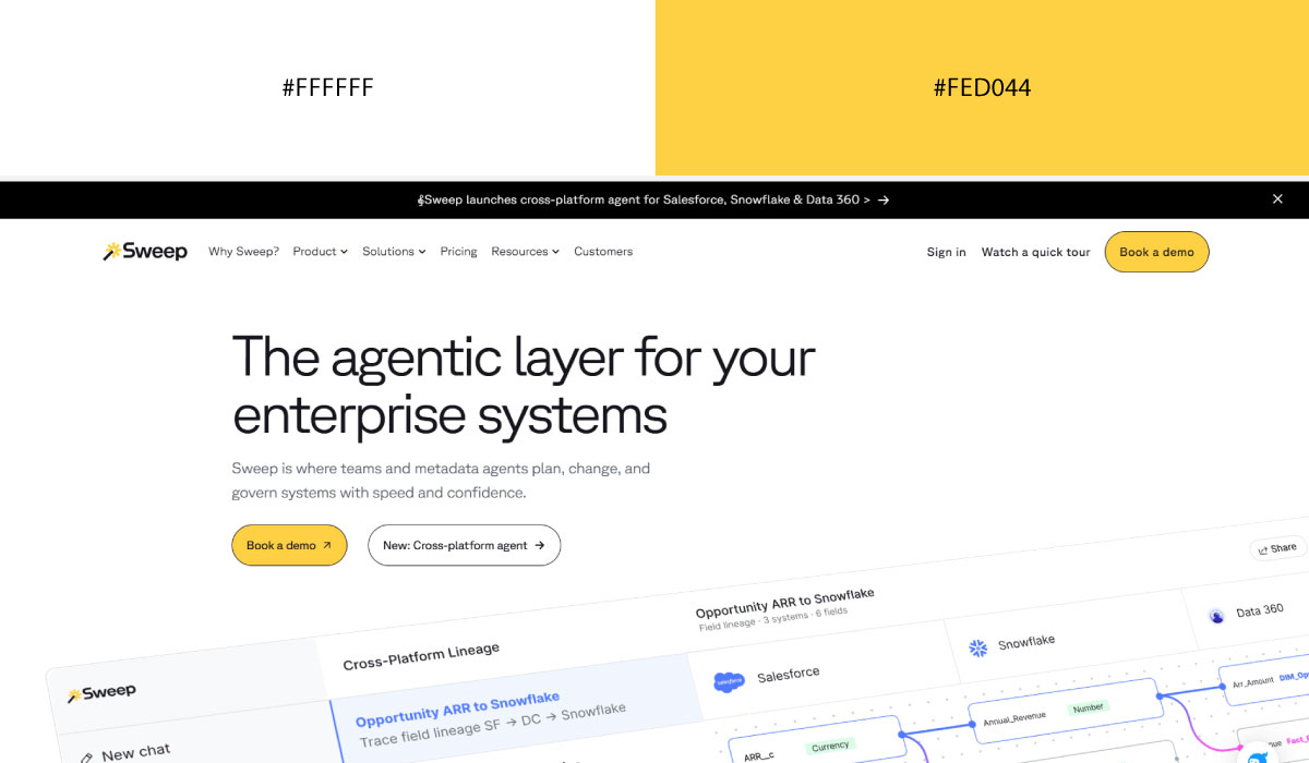
Sweep.io leans on linen for most of its backgrounds, with yellow appearing in smaller, deliberate doses around key highlights. The pairing overall stays soft and calm, with yellow providing just enough contrast to guide attention.
• Orange + Velvet Gray
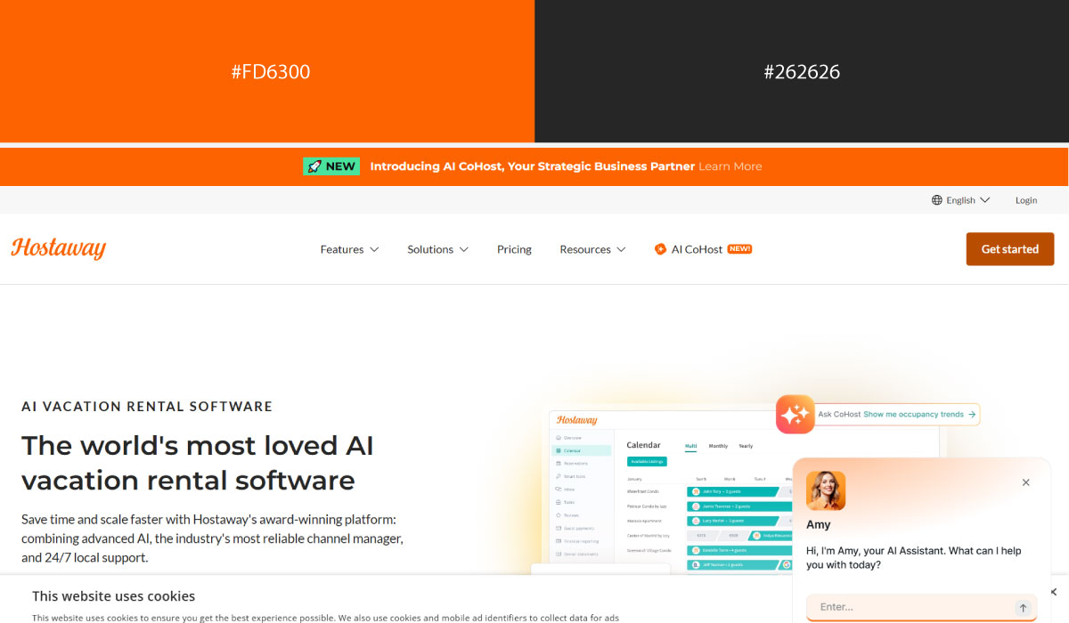
Hostaway uses velvet gray as a structural base across much of the site, with orange applied to CTAs and specific highlight elements. That contrast makes the orange easy to spot as the primary point of action.
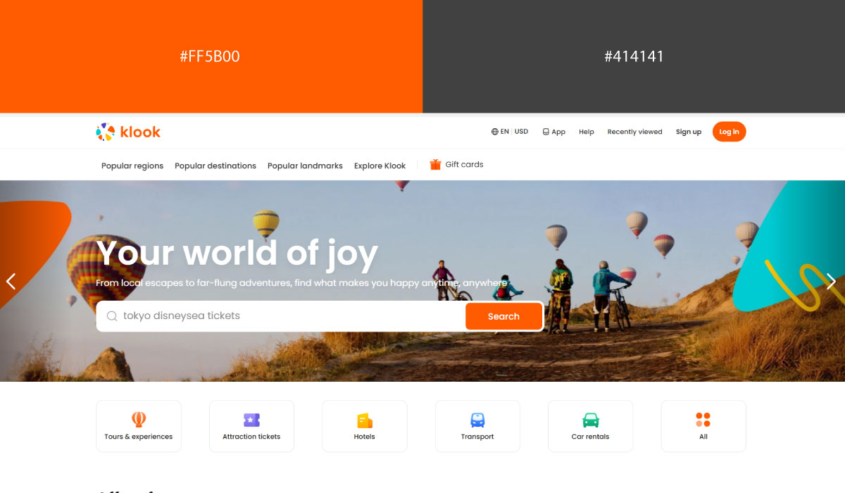
Klook leans on orange more broadly throughout its layout, especially in imagery-heavy sections, while velvet gray handles text and supporting structure. The orange feels more prominent here than in a purely accent role.
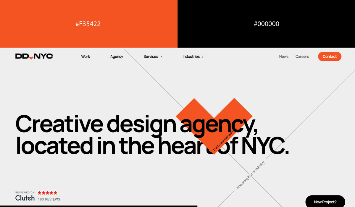
DD.nyc pairs velvet gray backgrounds with orange reserved for smaller accents and interactive touches. The restraint keeps the orange functioning as a clear signal rather than a dominant color.
• Pink + Silver:
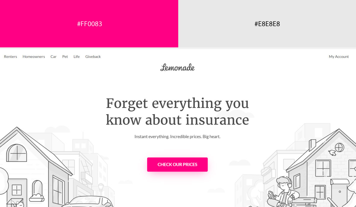
Lemonade uses pink prominently across hero and brand sections, with silver or light gray tones supporting the background and structural elements. That combination gives the site a soft, approachable feel while keeping pink as the clear brand signature.
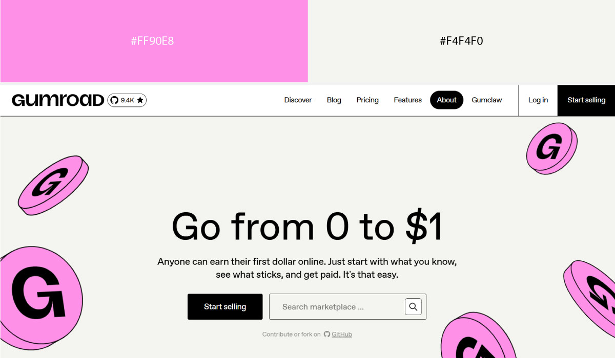
Gumroad applies pink more selectively, mostly on buttons and highlight details, while silver and lighter neutrals carry the bulk of the page. The pink stays concentrated enough to function as a consistent action color.
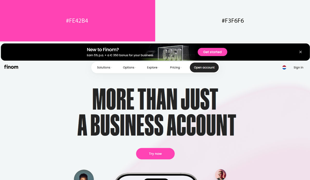
Finom leans on silver and light gray tones for most of its layout, with pink reserved for accents and specific brand touches throughout. That balance keeps the palette feeling clean and fintech-appropriate, with pink adding just enough personality.
6. Playful & Creative Pairings
Unexpected pairings work here in a way they wouldn’t for a finance site. These brands use color to signal personality first, credibility second.
• Bubblegum Pink + Graphite
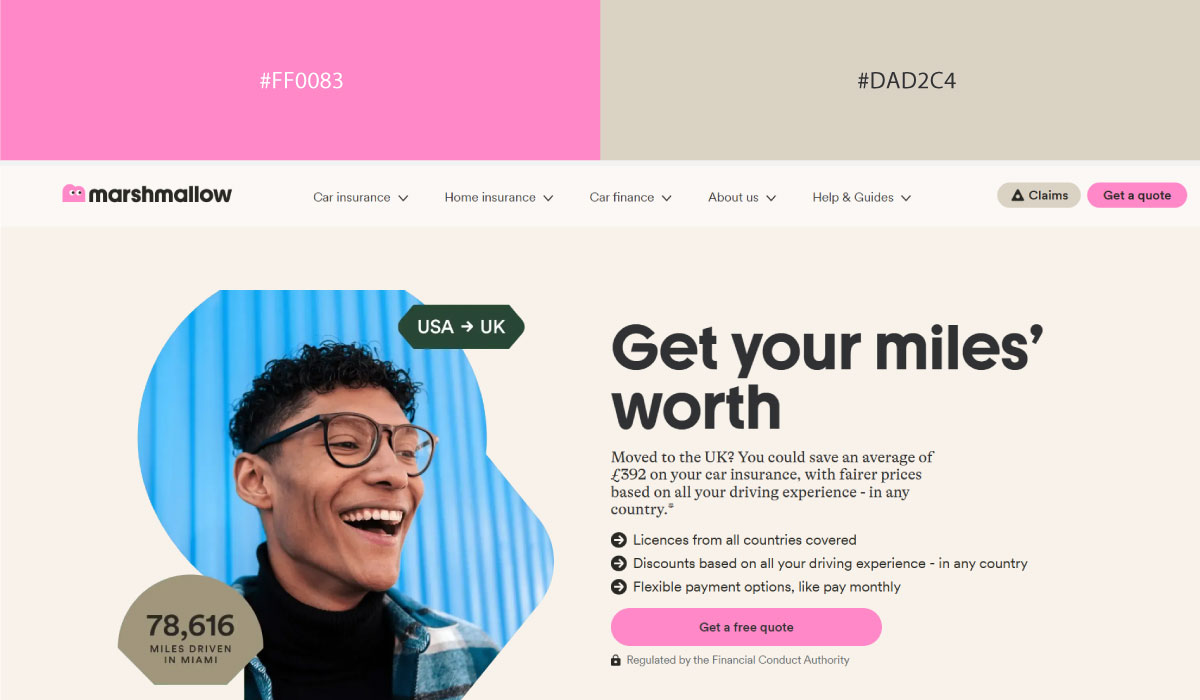
Marshmallow uses bubblegum pink prominently across hero and brand sections, with graphite reserved for text and structural contrast. That pairing gives the site a soft, friendly feel while keeping the copy easy to read against all that pink.
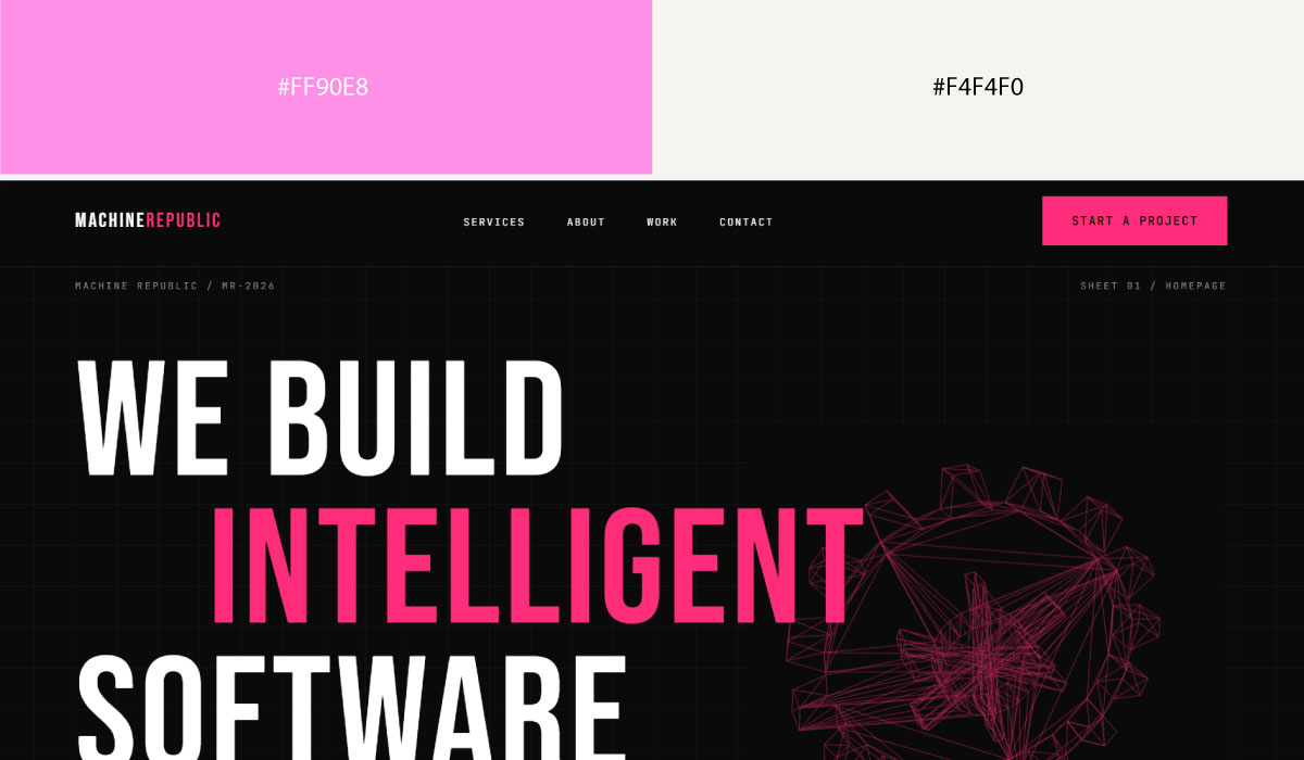
Machine Republic leans on graphite as its dominant background tone, with pink appearing in smaller, deliberate doses around accents and highlights. The restraint there keeps the pink feeling like a playful touch rather than the main event.
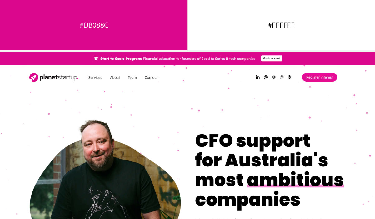
Planet Startup Australia applies both colors more evenly throughout its layout, alternating between graphite-heavy sections and pink accents on buttons and callouts. That back-and-forth keeps the page feeling energetic without settling into a single dominant tone.
• Pink + Purple
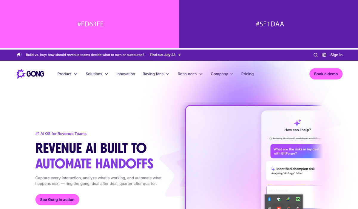
Gong uses purple as a structural base across much of its site, with pink layered in for accents and specific highlight moments. That contrast gives the pink a clear role as the secondary point of emphasis.
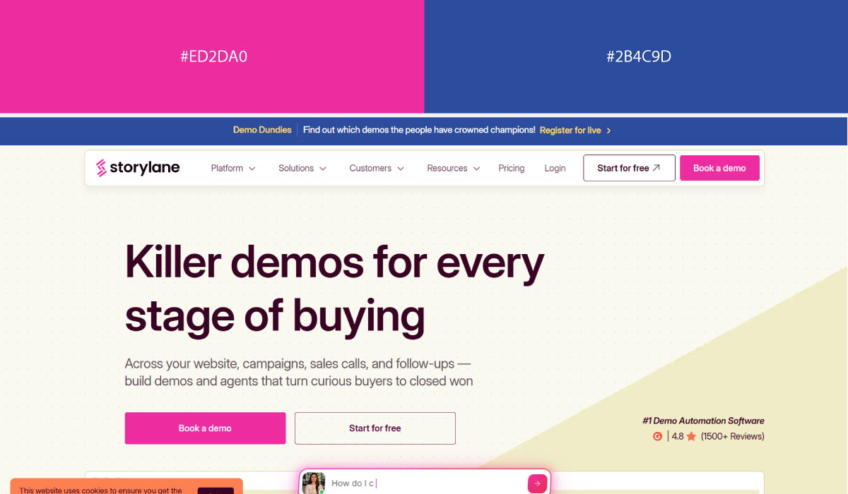
Storylane leans on a similar split, with purple carrying most of the background and pink reserved for CTAs and small interactive details. The pink stays fairly contained, functioning as a consistent action signal.
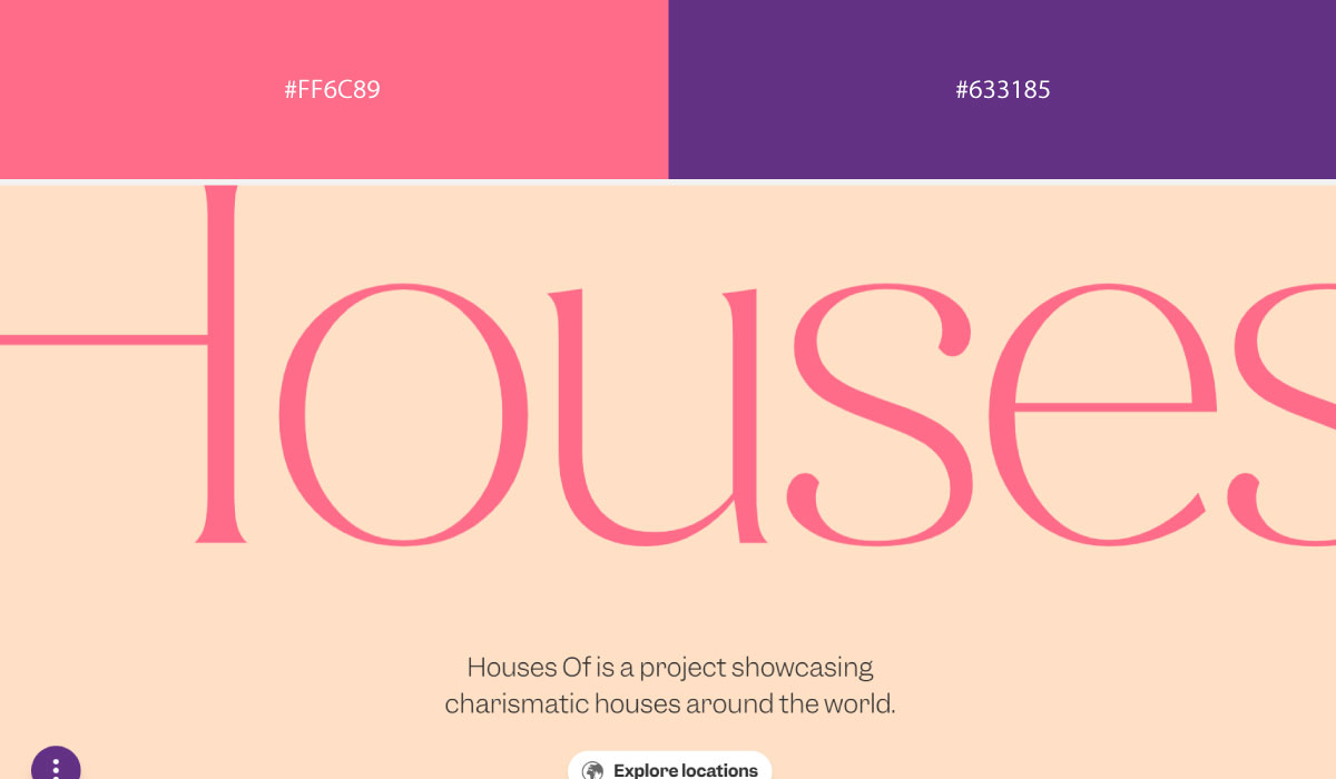
Houses Of applies pink and purple more evenly across sections, letting the two shift back and forth rather than assigning one a clearly dominant role. The result feels more expressive, fitting for its creative branding.
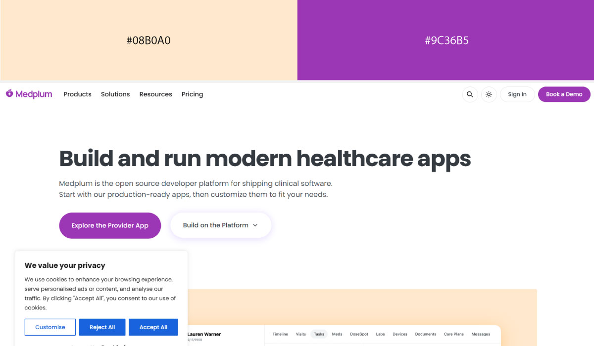
Medplum uses purple prominently throughout its layout as the primary brand color, with pink appearing in smaller touches around highlights and accents. That balance keeps the overall feel clean and technical despite the playful color pairing.
• Red + Pink
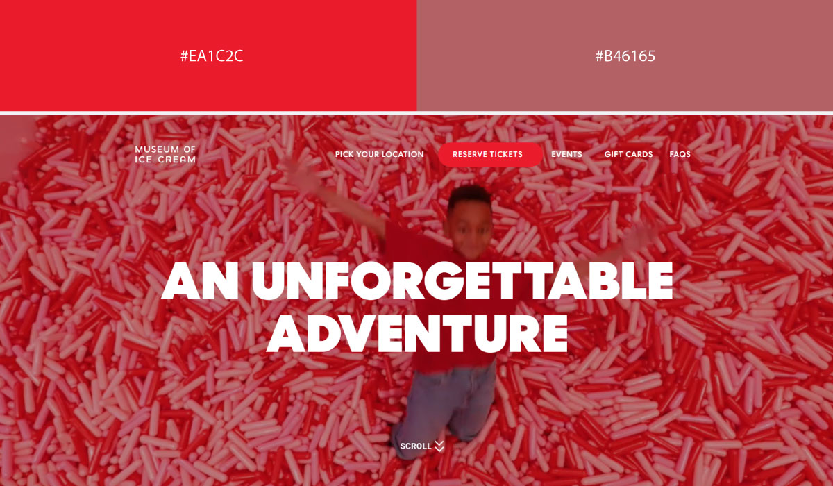
Museum of Ice Cream leans on pink as its dominant, almost total background color, with red layered in for accents and bolder highlight moments. That combination makes the whole site feel vibrant and immersive, matching its experiential branding.
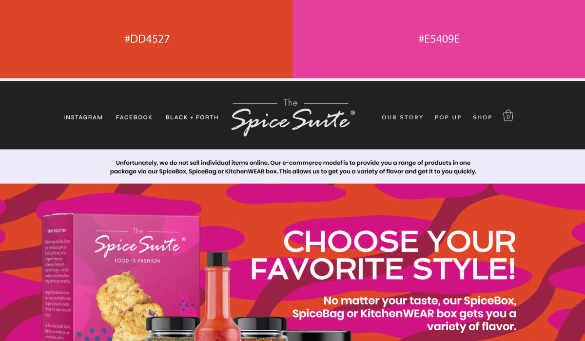
The Spice Suite uses red more prominently across sections, with pink reserved for smaller accents and supporting details. The red carries most of the visual weight there, giving the site a bold, energetic feel.
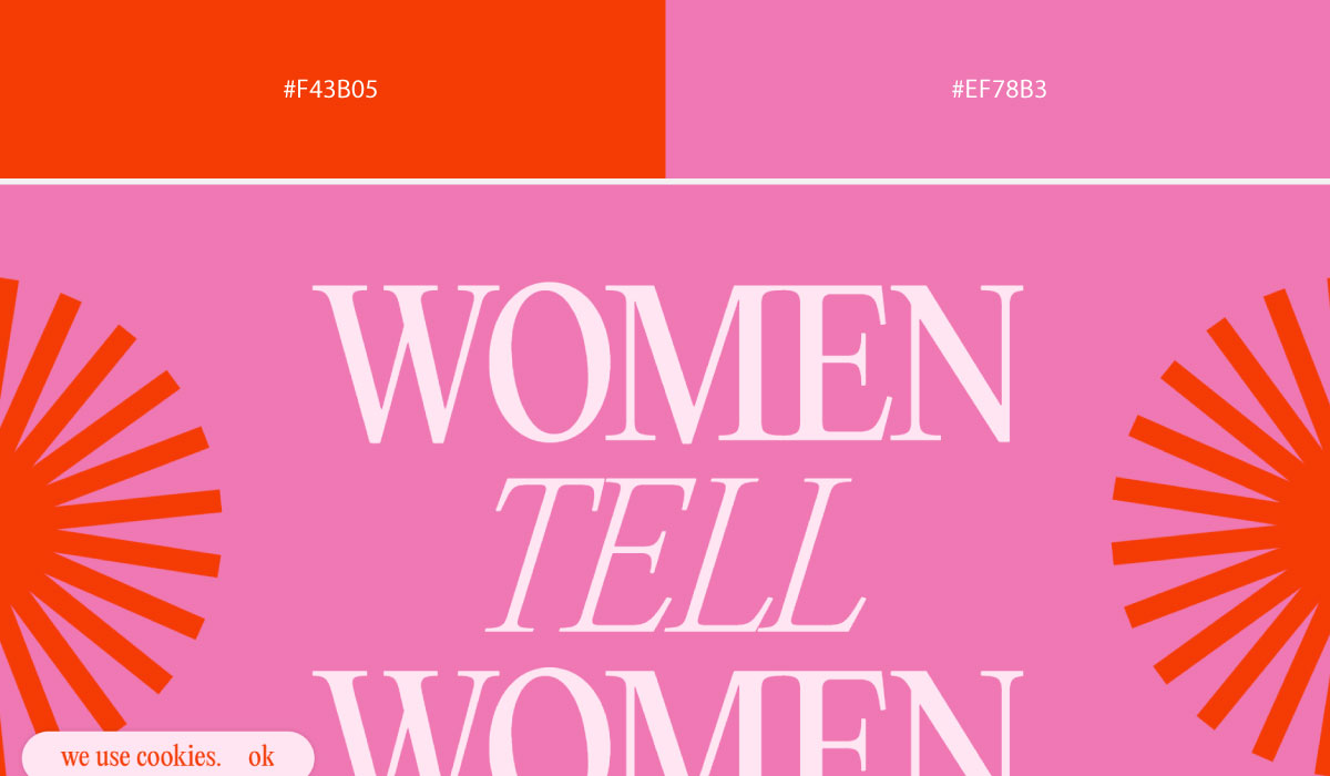
Women Tell Women applies both red and pink generously throughout, without confining either to a narrow accent role. The two colors work together closely, creating a warm, expressive palette rather than a strict lead-and-support pairing.
• Yellow + Orange
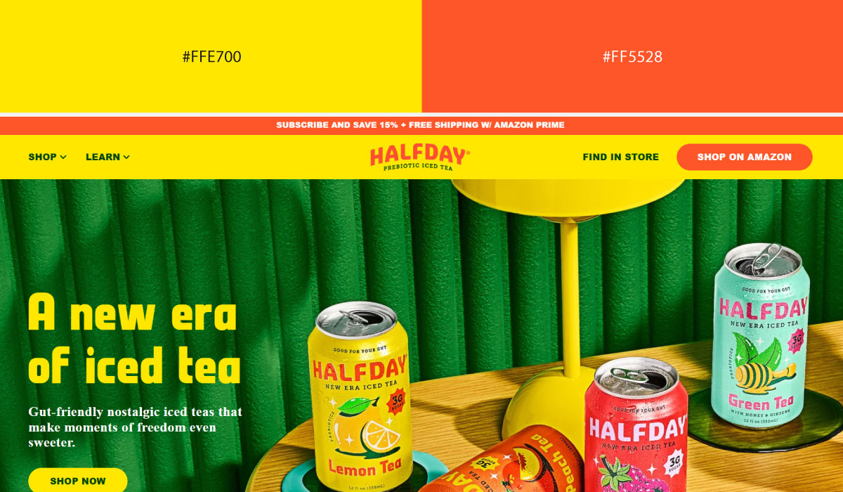
Half Day uses yellow as its dominant background tone across much of the site, with orange applied to accents and highlight details. That contrast keeps the orange functioning clearly as a point of emphasis against all that yellow.
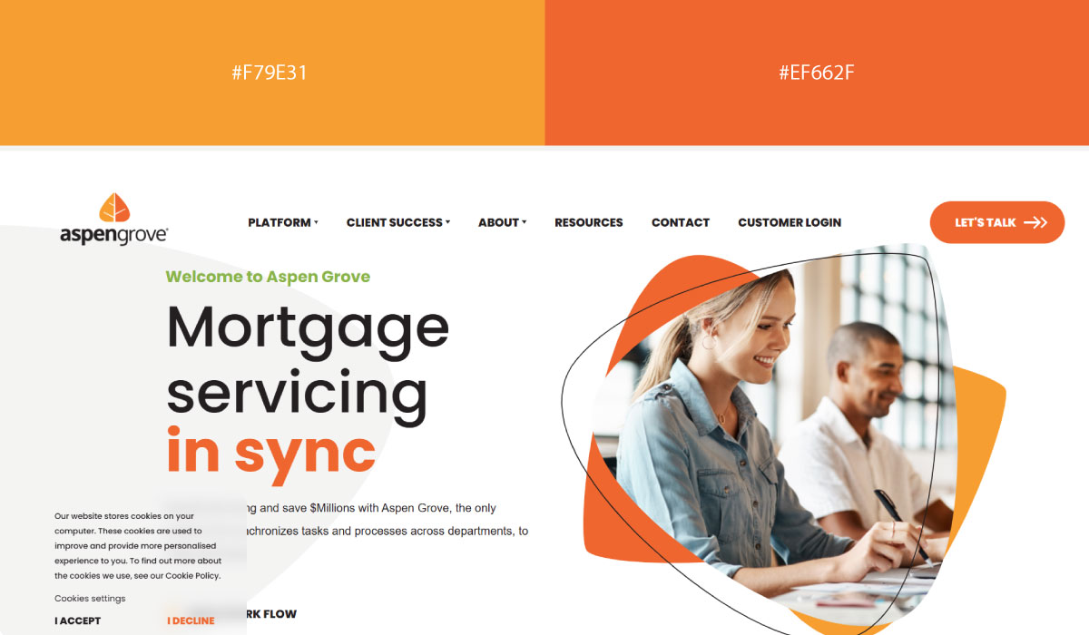
Aspen Grove Solutions leans on orange more broadly throughout its layout, while yellow shows up in smaller doses around supporting elements. The orange carries more visual weight here than in a purely accent role.
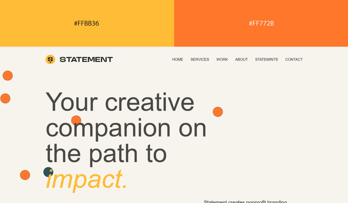
Made by Statement applies yellow and orange fairly evenly across sections, letting the two alternate rather than assigning one a dominant position. That balance gives the site a warm, energetic feel throughout.
• Playful Pastels
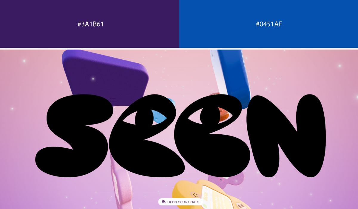
Seen.space uses a range of soft pastel tones across its backgrounds, shifting gently between them section to section rather than settling on one dominant color. That variety keeps the page feeling light and airy throughout.
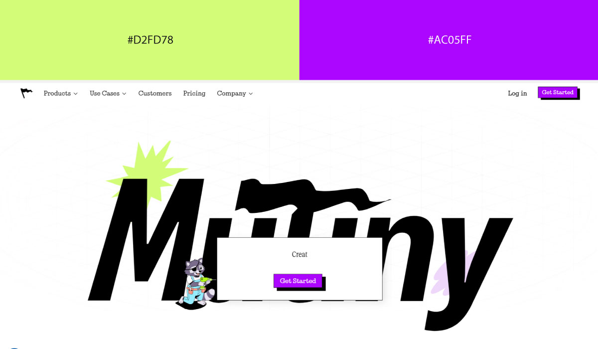
Mutiny HQ applies pastel colors more selectively, using them as accents against a neutral base rather than as full-section backgrounds. That restraint keeps the pastels feeling like deliberate highlights rather than the main visual driver.
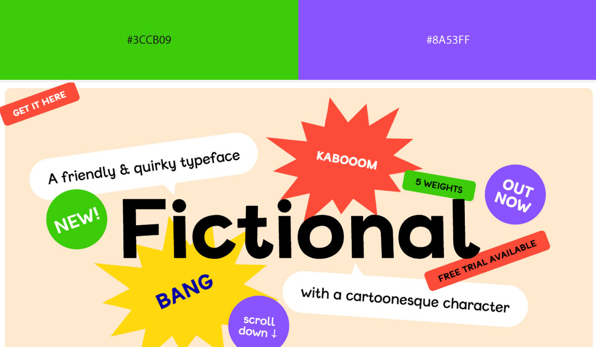
Fictional Typeface leans into pastels broadly across its layout, pairing soft tones with plenty of white space to keep the overall feel calm despite the range of colors in play.
7. Healthcare & Human-Centered Brands
Healthcare brands walk a line between clinical and comforting, so these palettes tend to favor softer, muted tones over anything too saturated or cold.
• Light Green + Mosswood
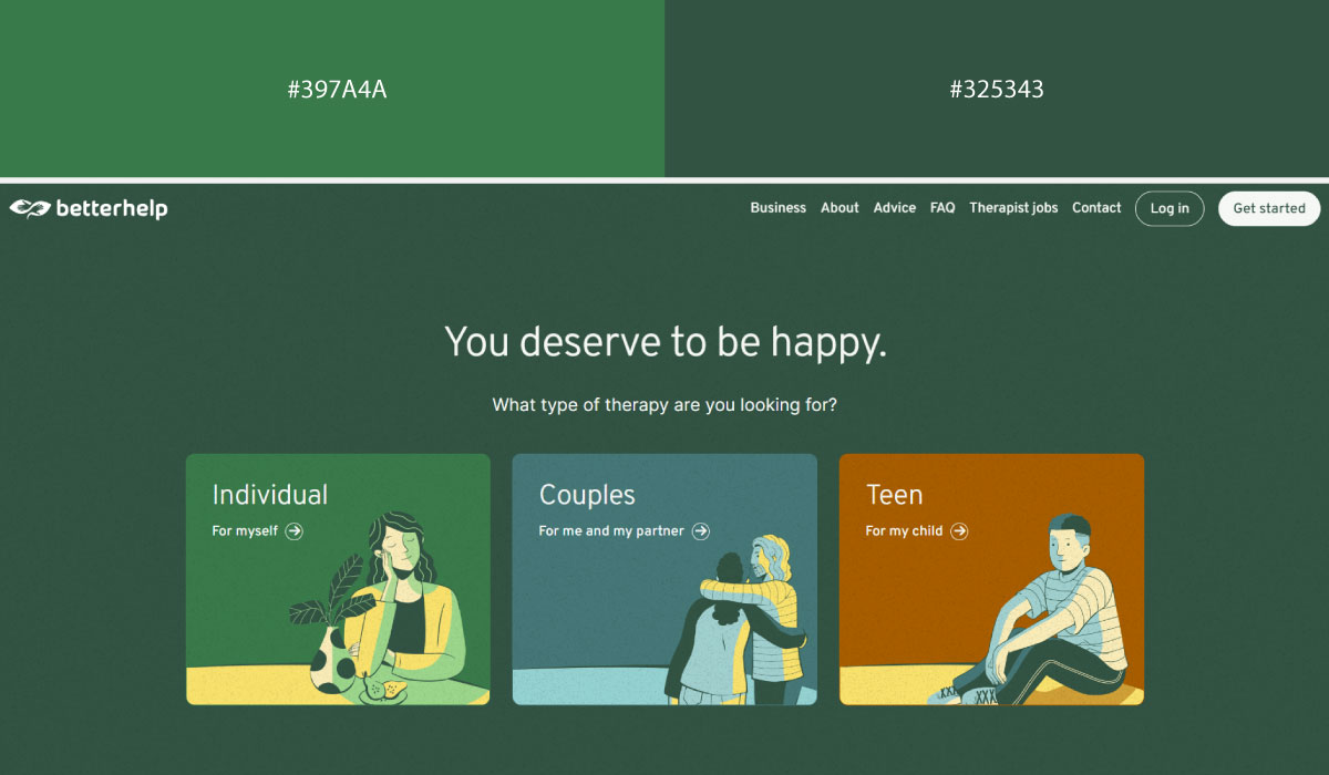
BetterHelp uses light green as a soft, calming background tone across much of the site, with a deeper mosswood green reserved for text and structural contrast. That pairing feels gentle and reassuring, fitting for a mental health platform.
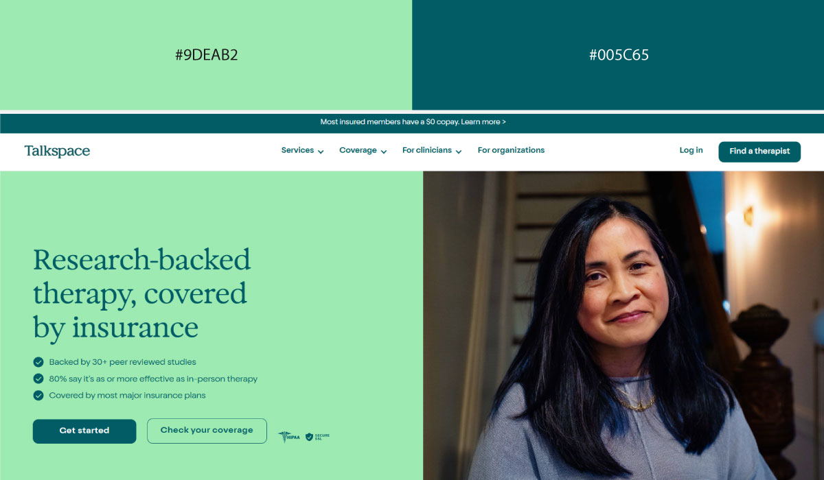
Talkspace leans on a similar range, with mosswood green carrying header and brand sections while light green fills in supporting areas. The shift between the two shades keeps the page feeling cohesive without needing a separate accent color.
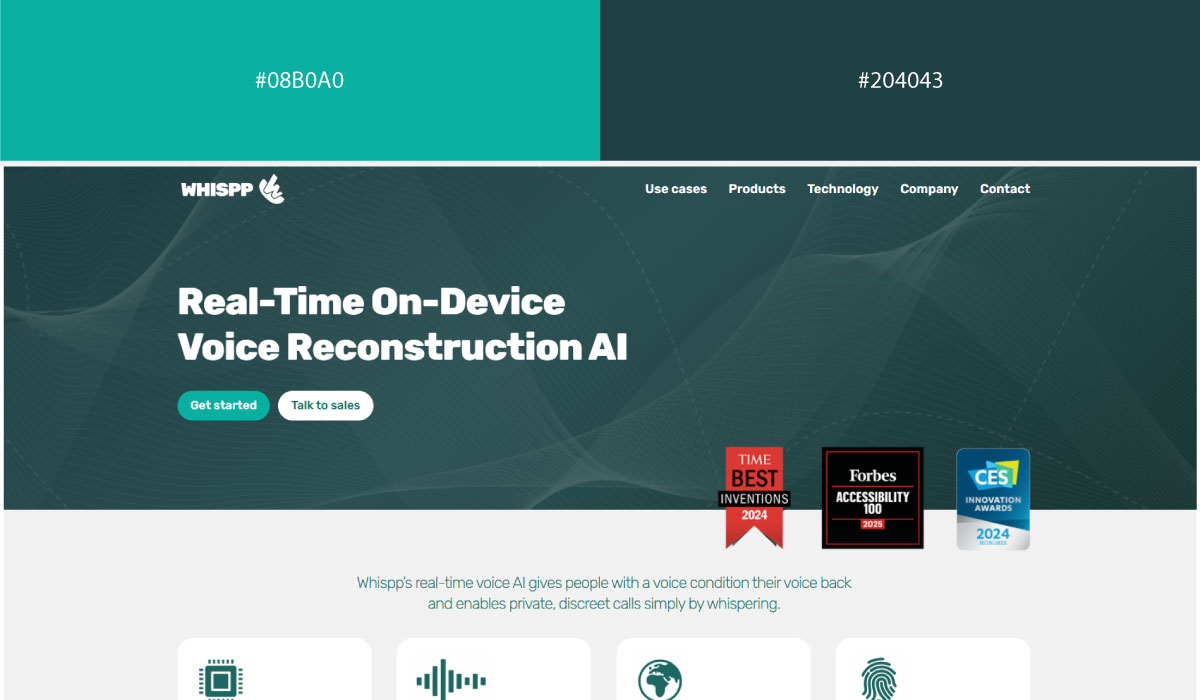
Whispp applies light green more broadly throughout its layout, with mosswood green appearing in smaller doses around text and highlight details. The overall effect stays soft and approachable, avoiding anything too saturated.
• Blue + Green:
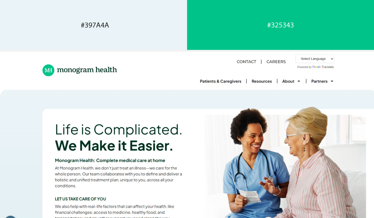
Monogram Health uses blue as a structural base across much of its site, with green layered in for accents and highlight details tied to health and wellness. That contrast gives the green a clear, deliberate role.
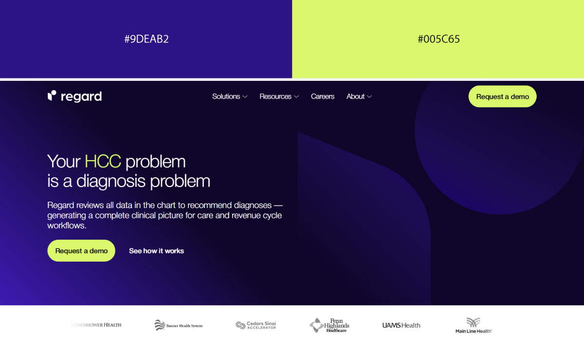
Regard leans on a similar split, with blue carrying most of the background and green reserved for CTAs and small interactive touches. The green stays fairly contained, functioning as a consistent point of emphasis.
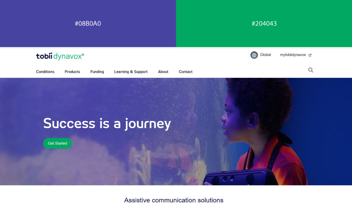
Tobii Dynavox applies blue and green more evenly across sections, letting the two colors share visual weight rather than assigning one a dominant role. That balance suits its accessibility-focused, human-centered branding.
• Soft Blue + Royal
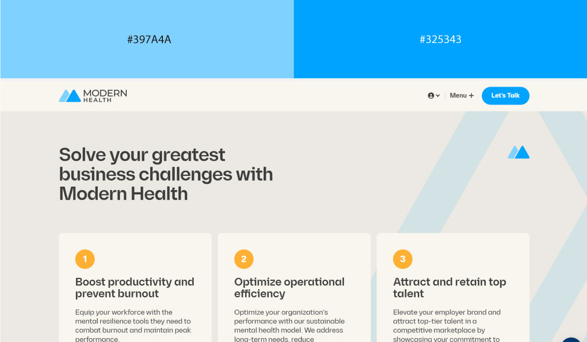
Modern Health uses soft, muted blue across most of its backgrounds, with a richer royal blue reserved for accents and key highlight moments. That range within the same hue adds depth without introducing a separate color.
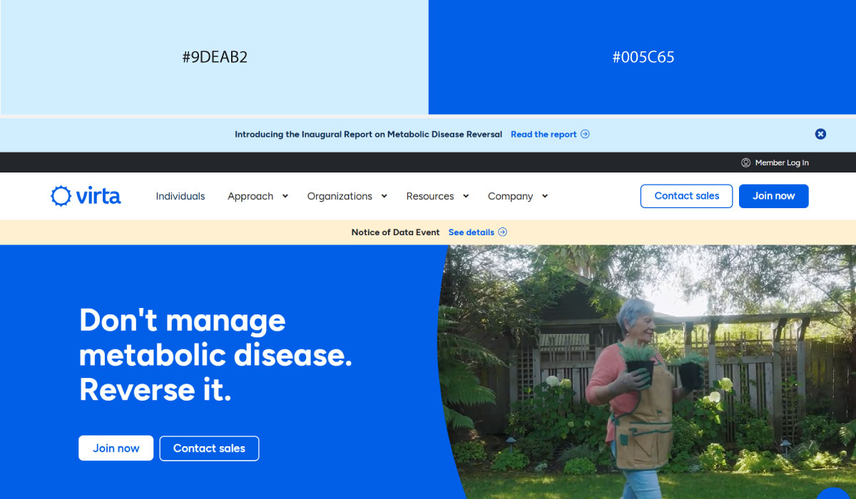
Virta Health leans on soft blue for the bulk of its layout, while royal blue shows up specifically on CTAs and interactive elements. The contrast between the two shades makes those action points easy to spot.
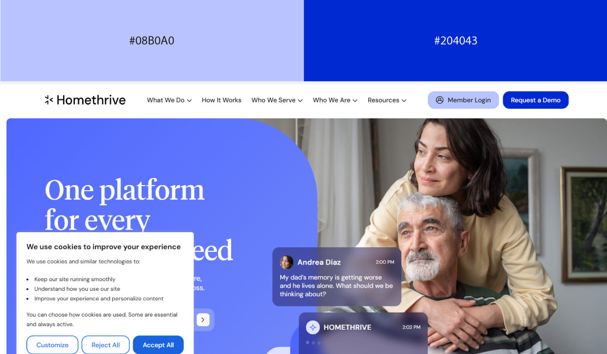
Homethrive applies a similar pairing, with soft blue carrying supporting content and royal blue used more sparingly for emphasis. The overall feel stays calm, with the deeper blue doing the work of guiding attention.
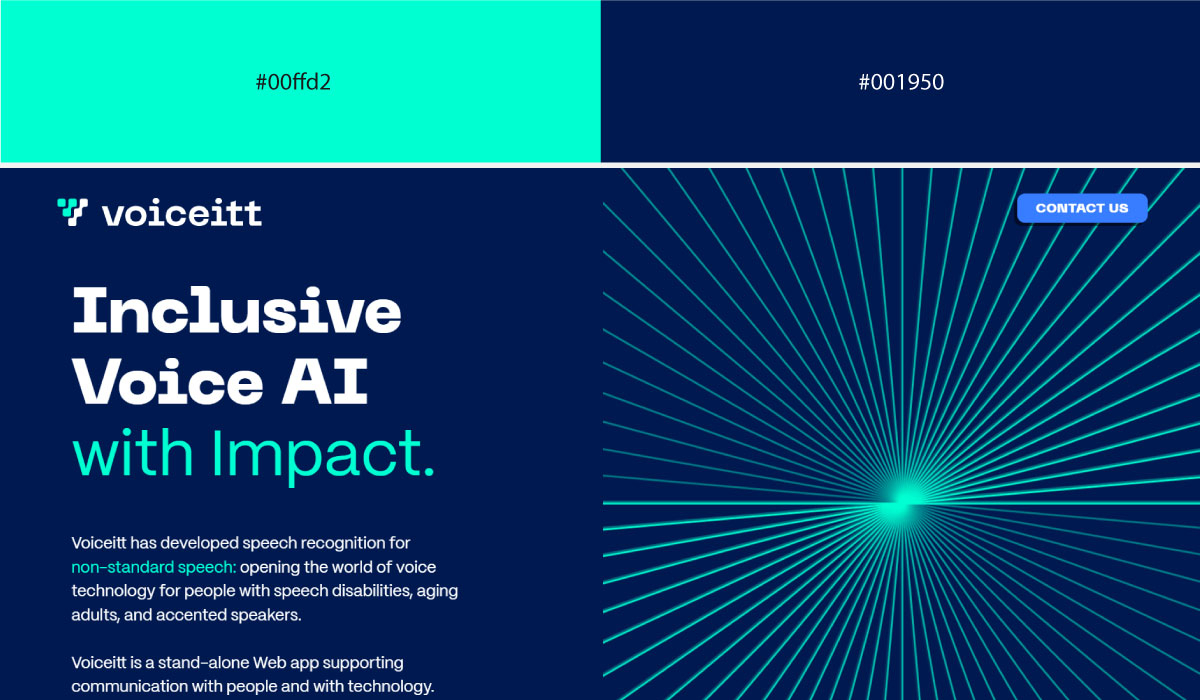
Voiceitt uses soft blue broadly throughout its site, with royal blue appearing in smaller, deliberate touches around highlights and branding details. The pairing stays gentle overall, fitting for an accessibility-focused product.
• Warm Ivory + Tangerine
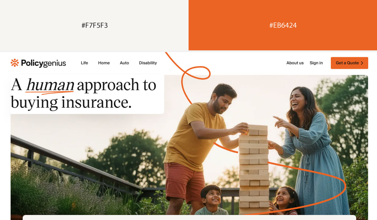
Policygenius uses warm ivory as its dominant background tone, with tangerine applied to CTAs and select highlight elements. That contrast makes the tangerine easy to spot as the primary action color against all that softness.
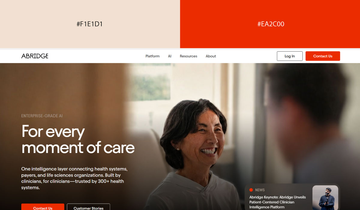
Abridge leans on ivory for most of its layout, while tangerine appears in smaller, concentrated doses around interactive elements. The restraint there keeps the tangerine feeling purposeful rather than decorative.
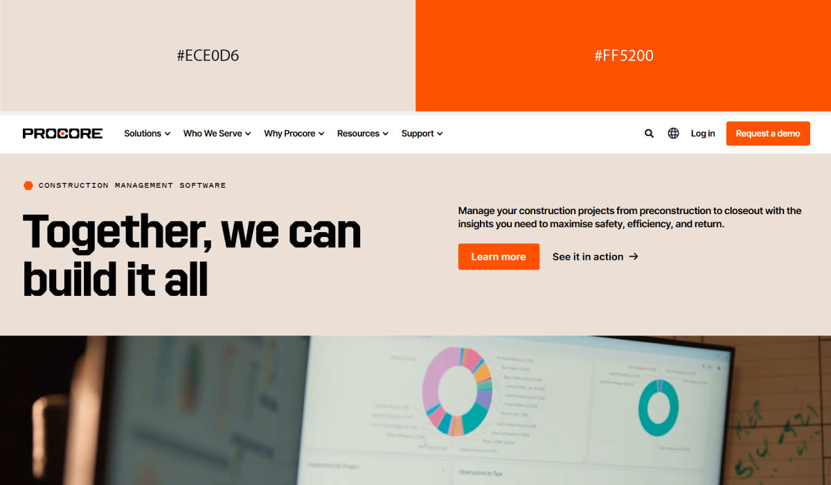
Procore applies ivory tones broadly across its content sections, with tangerine reserved for accents and brand touches throughout. The pairing stays warm and approachable without either color overwhelming the other.
• Soft Gradients
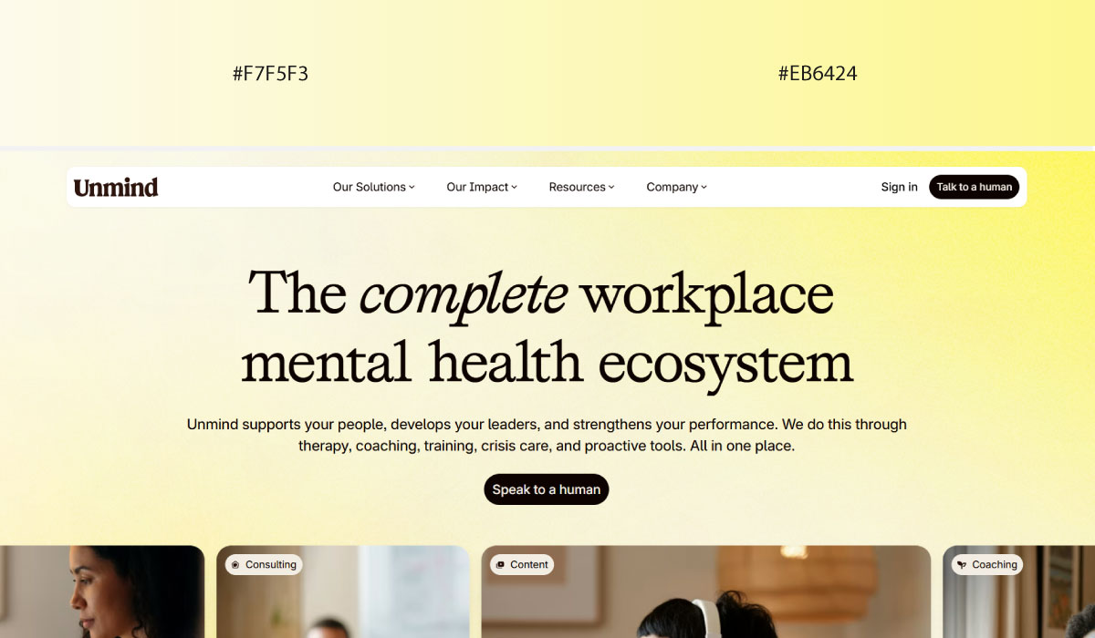
Unmind uses soft gradient transitions across its backgrounds, blending gently between tones rather than relying on a single flat color. That approach gives the site a calming, fluid feel throughout.
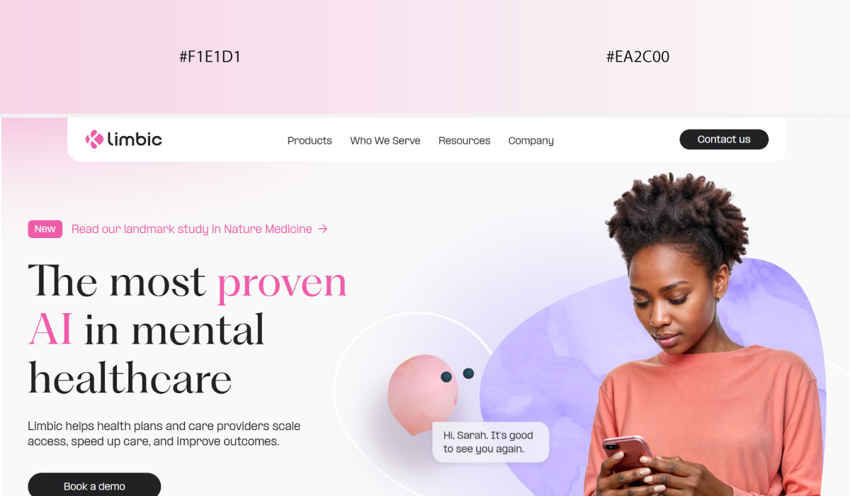
Limbic.ai leans on gradients more selectively, using them in hero and feature sections while keeping supporting content areas flatter and more neutral. That contrast helps the gradient sections stand out as focal points.
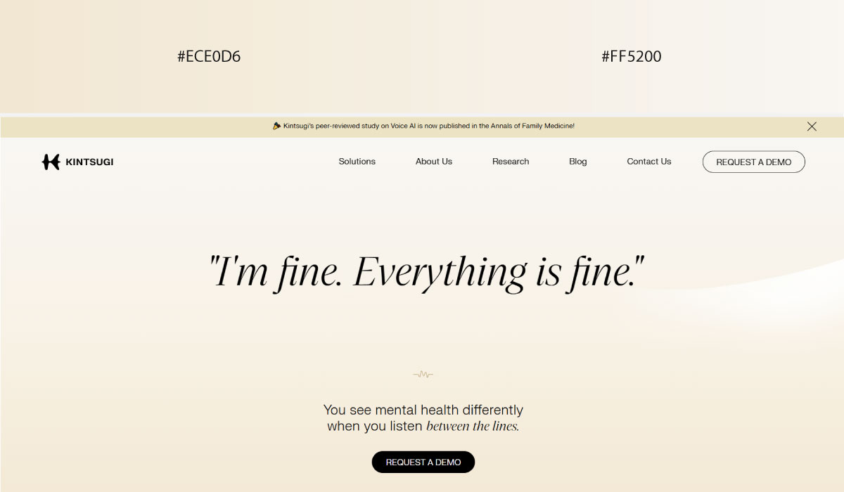
Kintsugi Health applies soft gradients broadly throughout its layout, shifting gently between related tones section to section. The overall effect stays soothing, consistent with its mental health branding.
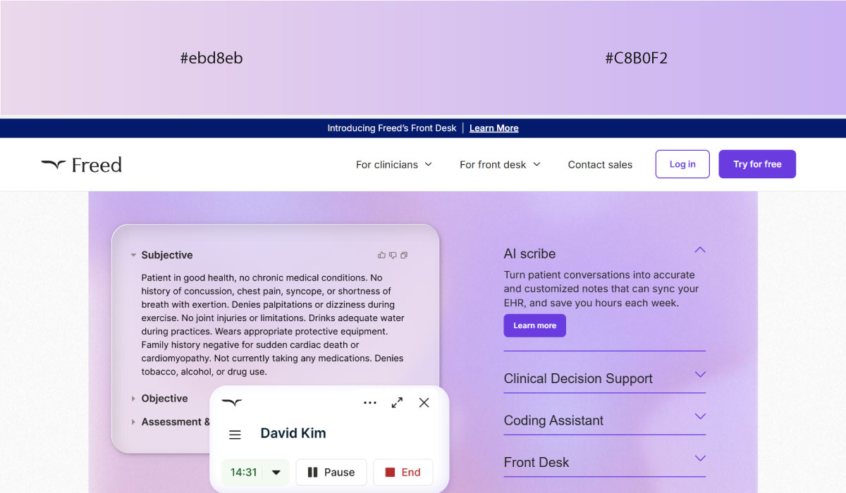
Getfreed.ai uses gradients in a similarly gentle way, blending colors across backgrounds rather than using sharp transitions. That softness keeps the page feeling calm despite covering a fair amount of visual ground.
8. Futuristic Aerospace / Deep Tech
Dark, high-contrast palettes dominate this category, borrowing heavily from the visual language of space and precision engineering.
• Black + Silver
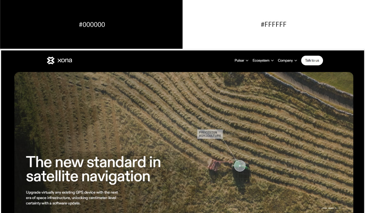
Xona Space uses black as a near-total background across the site, with silver reserved for text, line work, and technical accents. That contrast gives the page a sleek, precision-engineered feel fitting for an aerospace brand.
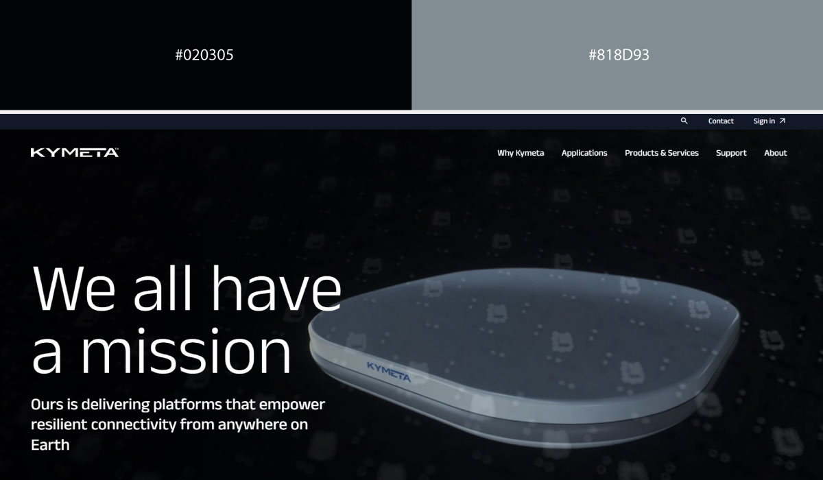
Kymeta leans on a similar split, with black carrying most of the layout and silver appearing in smaller doses around highlights and structural details. The restraint keeps the silver feeling purposeful rather than decorative.
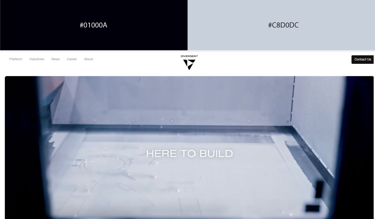
Divergent applies black broadly throughout its sections, while silver shows up specifically in product imagery framing and small UI touches. That pairing stays consistent, reinforcing a serious, industrial tone.
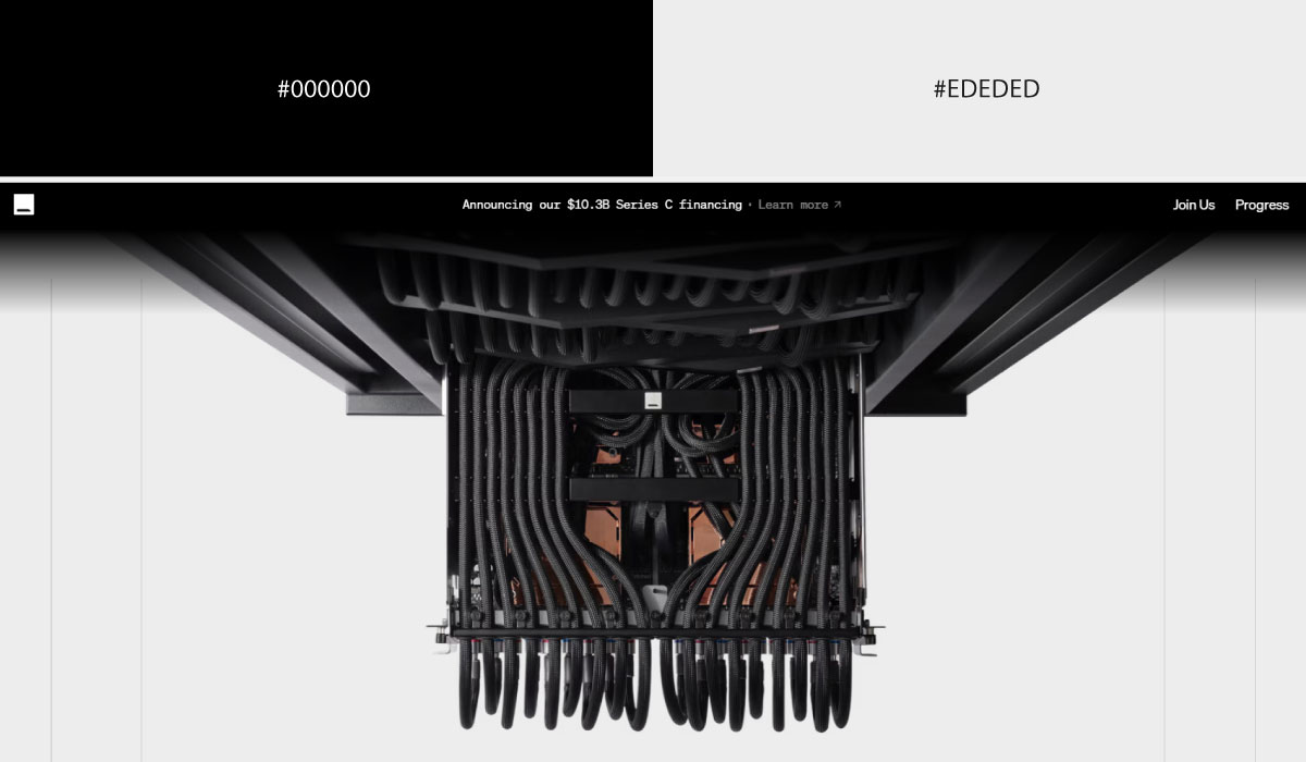
Etched uses black as its dominant base as well, with silver used sparingly for accents and technical diagrams. The overall effect stays minimal, letting the silver mark exactly where attention should go.
• Black + Orange
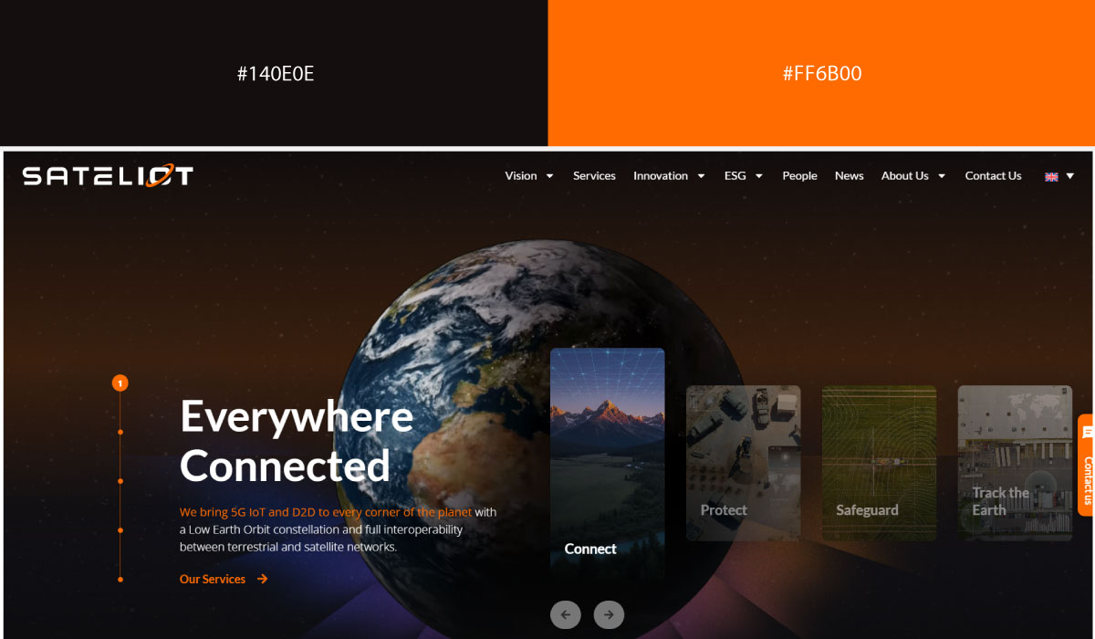
Sateliot uses black as a structural base across much of its site, with orange applied to CTAs and select highlight elements. That contrast makes the orange easy to spot against all that darkness.
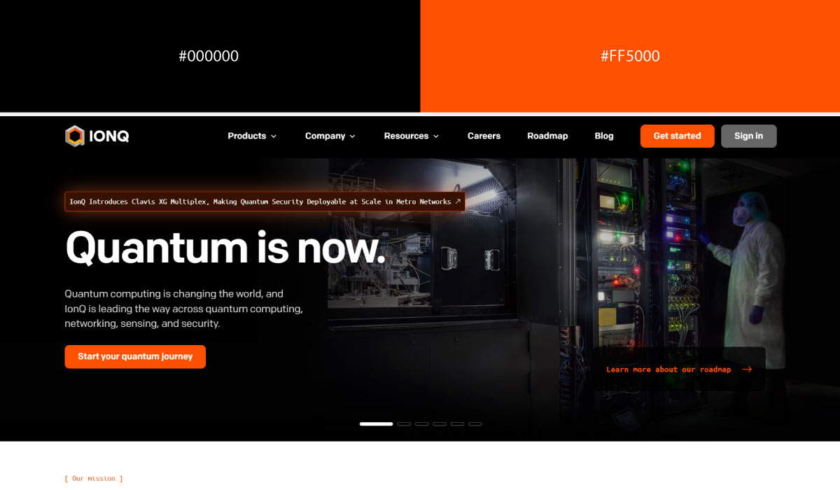
IonQ leans on black more broadly throughout its layout, while orange appears in smaller, concentrated doses around interactive elements and branding touches. The restraint keeps the orange feeling deliberate rather than scattered.
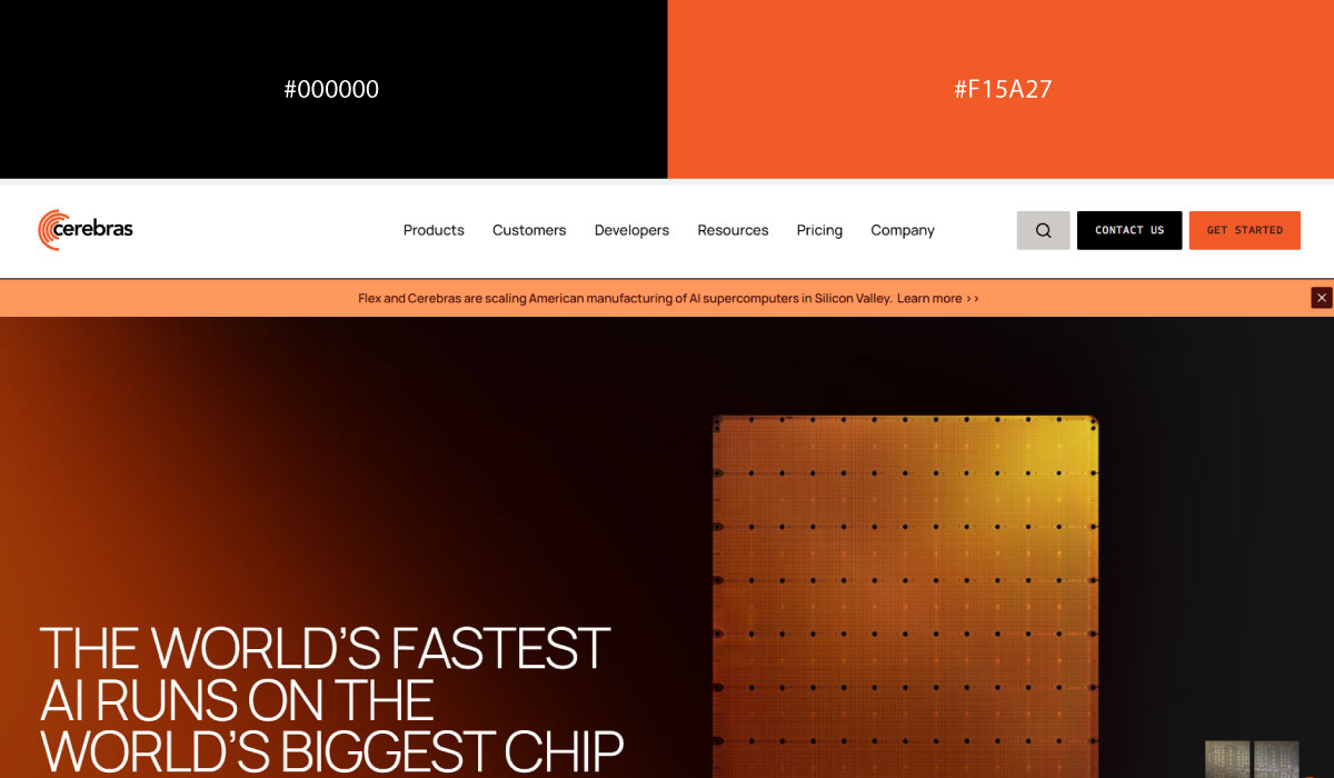
Cerebras applies a similar pairing, with black carrying most of the background and orange reserved for accents tied to key product moments. That balance suits its serious, technical positioning.
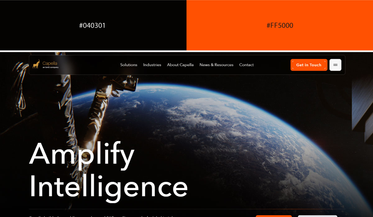
Capella Space uses black throughout its site as well, with orange appearing in smaller doses around highlights and imagery framing. The pairing stays restrained, letting the orange do focused, specific work.
• Black and Grey:

Cesium Astro uses black as its dominant tone across most sections, with grey layered in for text and secondary structural elements. That combination keeps the page feeling serious and minimal, without introducing any bright accent.
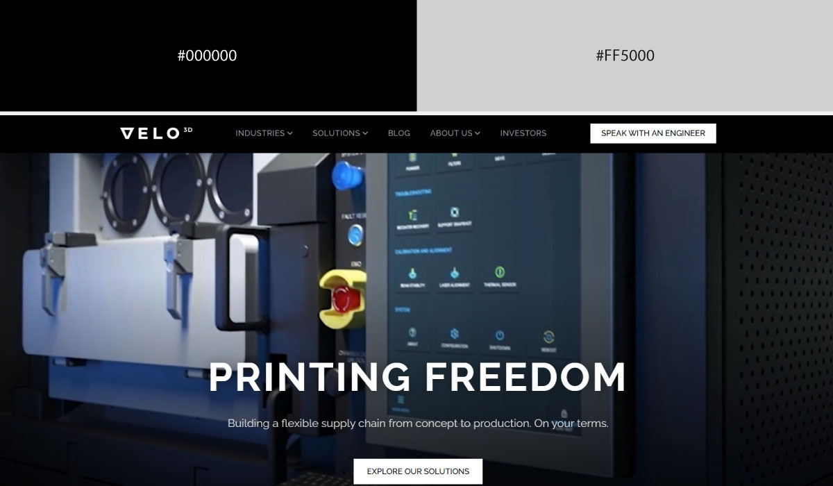
Velo3D leans on a similar split, with black carrying the bulk of the layout and grey used for supporting content and dividers. The pairing stays understated throughout, fitting for an industrial manufacturing brand.
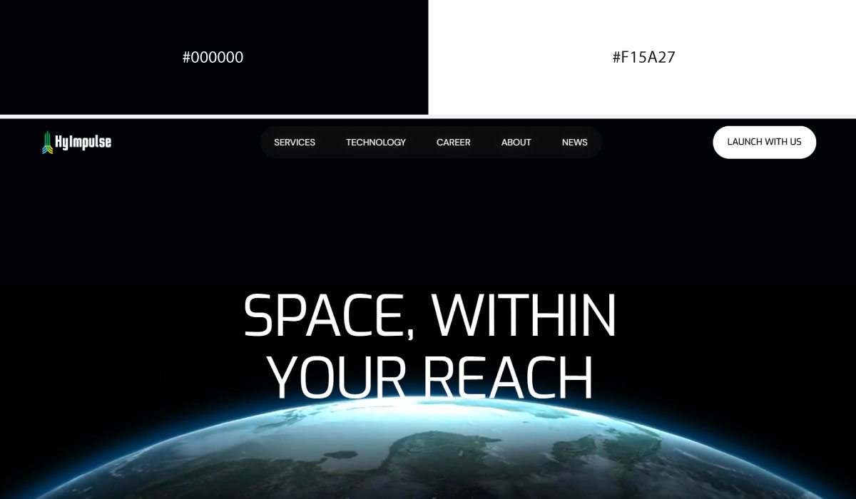
Hyimpulse applies black and grey fairly evenly across its sections, alternating between them rather than settling on one dominant tone. That balance gives the site a clean, technical feel.

K2 Space uses black broadly throughout its layout as well, with grey reserved for text and smaller structural touches. The overall palette stays quiet and controlled, letting product imagery carry most of the visual weight.
• Black + Yellow:
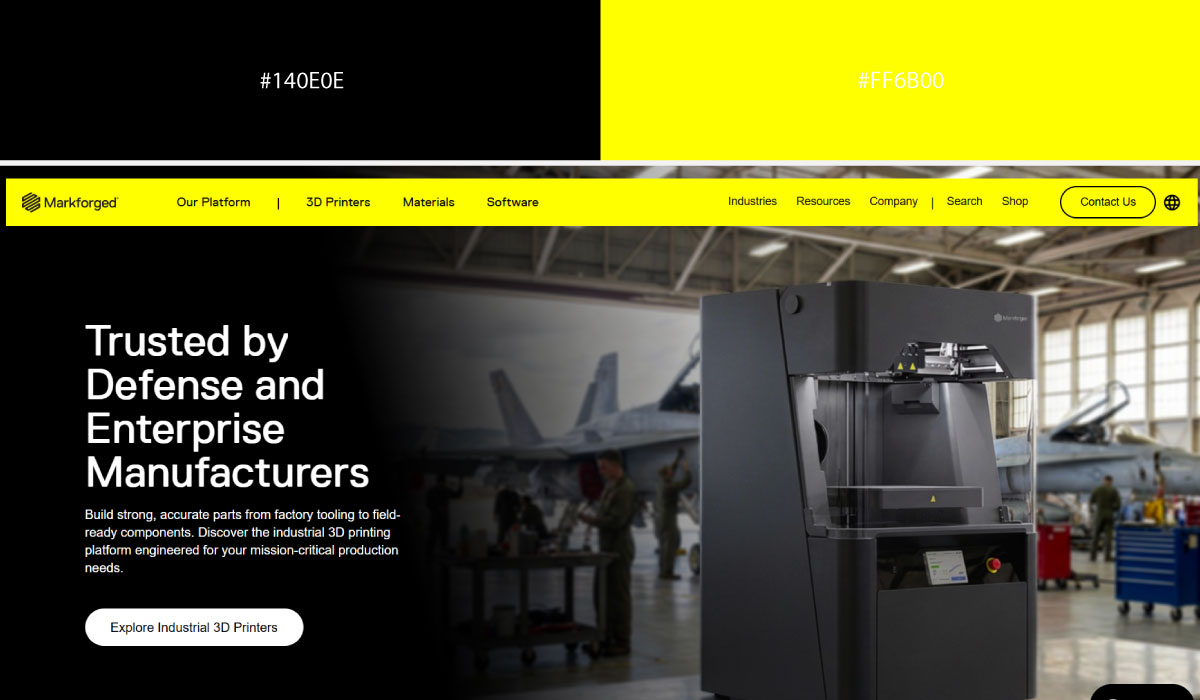
Markforged uses black as a strong structural base across its site, with yellow applied specifically to accents and highlight details. That contrast makes the yellow function clearly as a point of emphasis.

Alice & Bob leans on black more broadly throughout its layout, while yellow shows up in smaller, deliberate doses around interactive elements. The restraint keeps the yellow feeling intentional rather than overwhelming.

Apex Space applies a similar pairing, with black carrying most of the background and yellow reserved for CTAs and select brand touches. That balance keeps the palette feeling bold but controlled.
• Charcoal + Teal
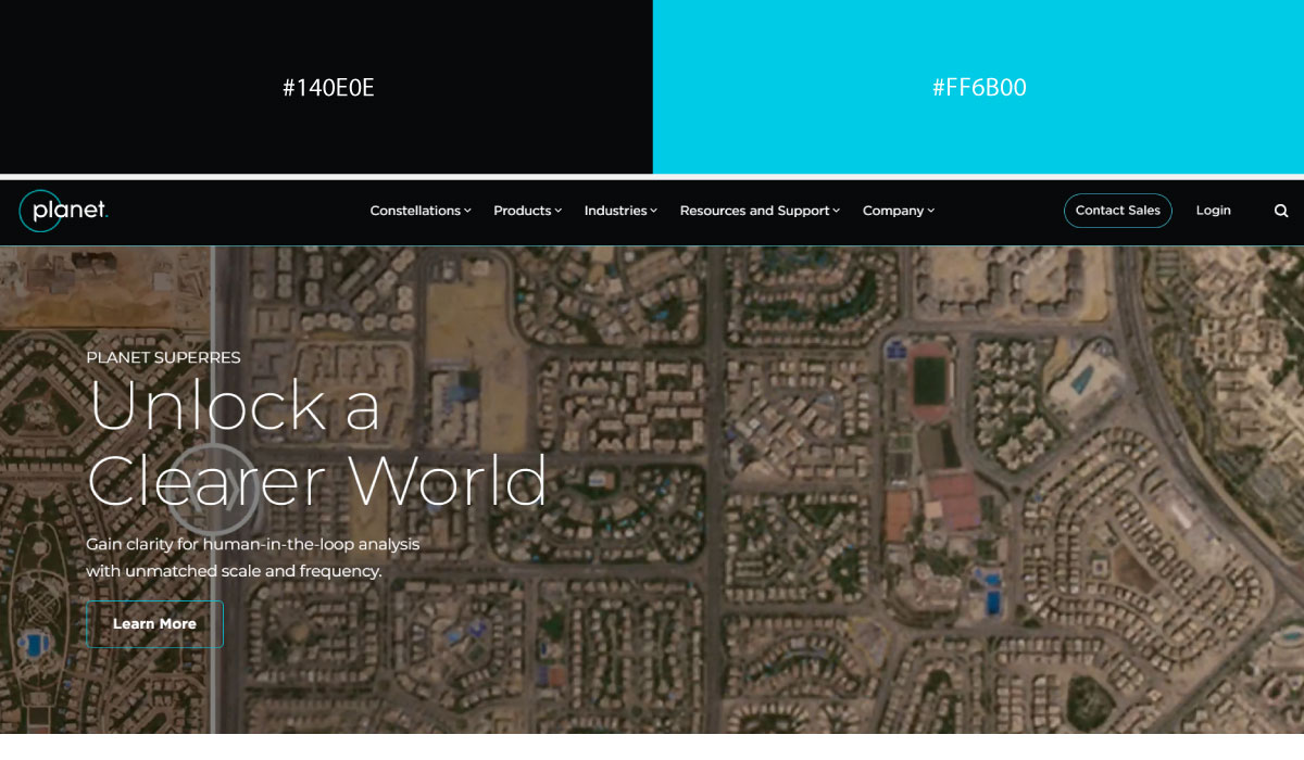
Planet uses charcoal as its dominant background tone across much of the site, with teal applied to accents and highlight elements tied to its satellite imagery branding. That contrast gives the teal a clear, purposeful role.
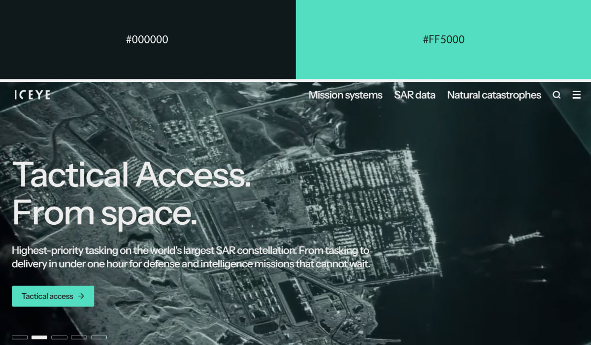
Iceye leans on a similar split, with charcoal carrying most of the layout and teal reserved for CTAs and smaller interactive touches. The teal stays fairly contained, functioning as a consistent action signal.
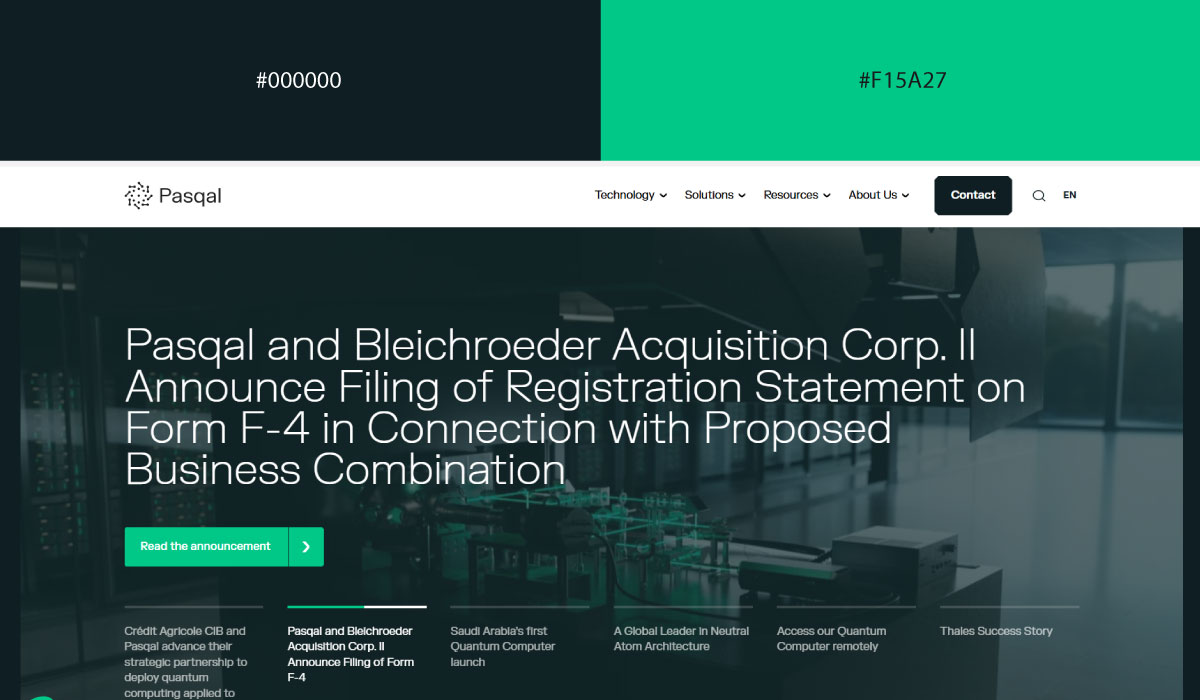
Pasqal applies charcoal broadly throughout its sections, with teal appearing in smaller doses around highlights and technical diagrams. The pairing stays restrained, suiting its quantum-computing positioning.
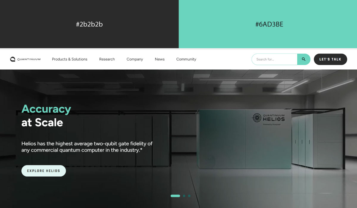
Quantinuum uses charcoal as its base tone as well, with teal reserved for accents and specific brand touches throughout. That balance keeps the palette feeling serious and technical, with teal adding just enough color to guide attention.
9. Gradient & Multi-Color Systems
Gradients let a brand use more than one hue without breaking the "one accent color" rule, since the transition itself reads as a single visual element rather than competing colors.
• Blue + Purple Gradient
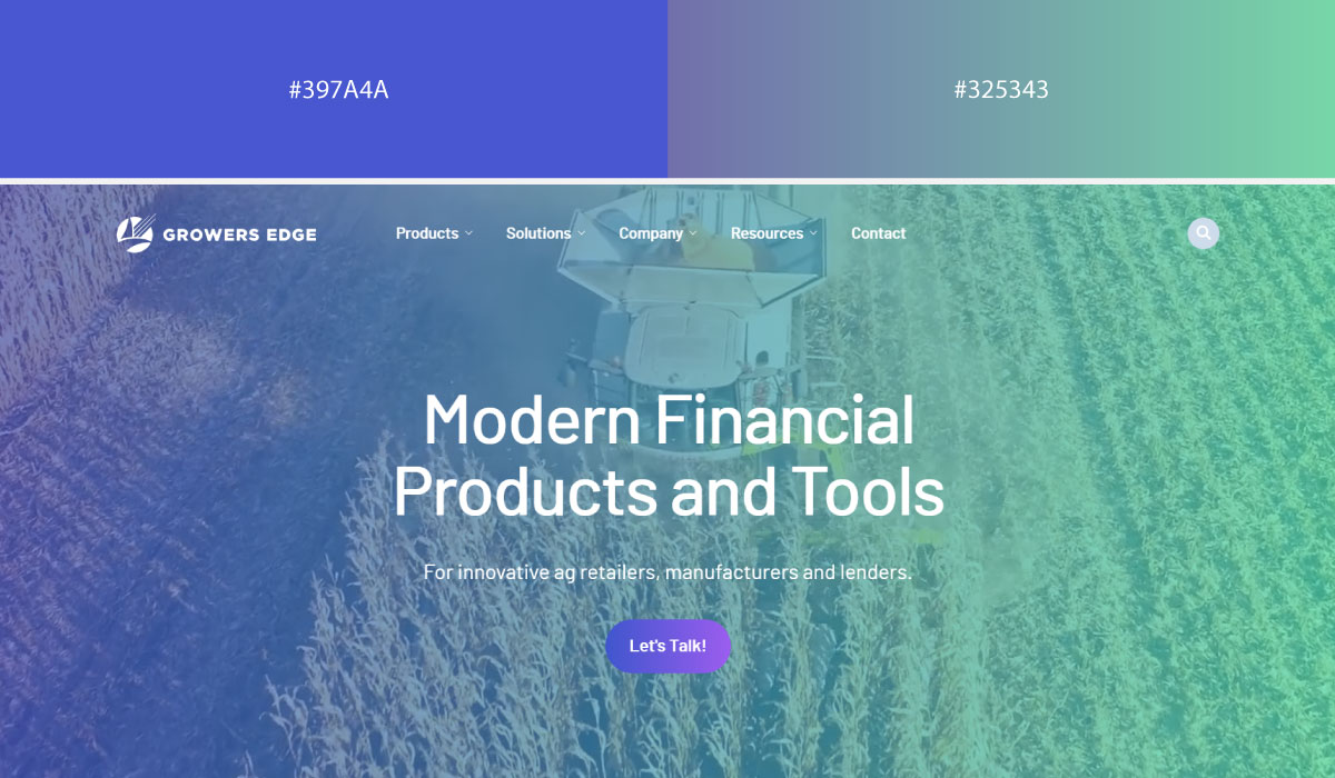
Growers Edge uses a blue-to-purple gradient across its hero and feature sections, blending the two tones smoothly rather than using them as separate flat colors. That gradient gives the site a modern, tech-forward feel appropriate for an agtech brand.
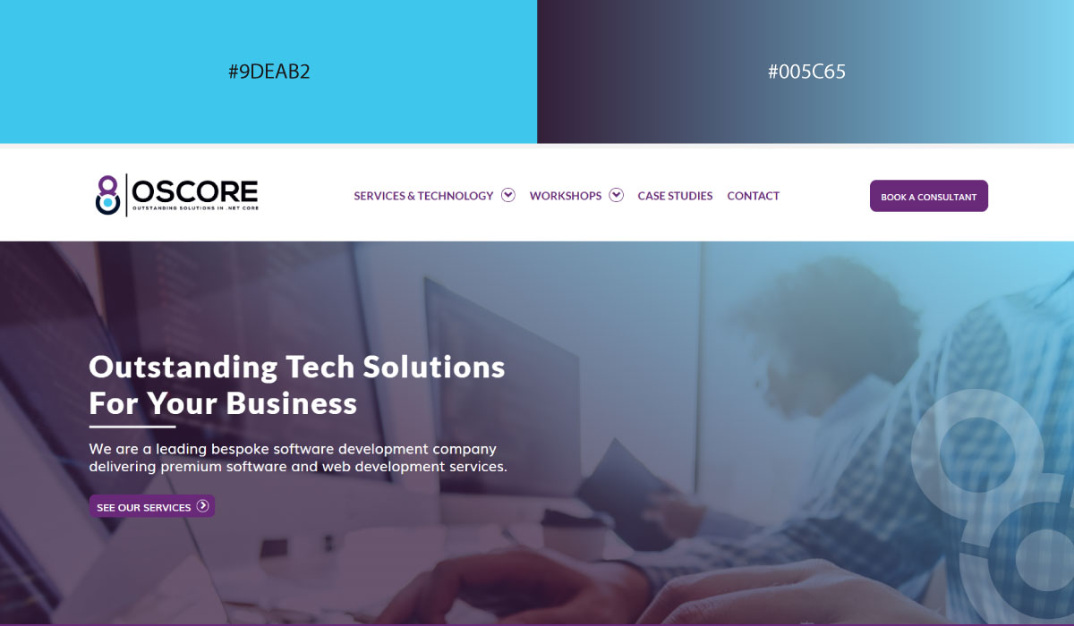
Oscore leans on a similar blend, with blue dominating the upper portion of the gradient and purple taking over further along. The transition is used mainly in background sections, while text stays neutral for readability.
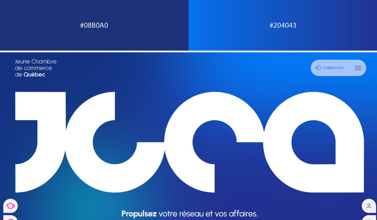
JCCQ applies the gradient more selectively, using it in specific hero or banner areas rather than across the whole page. Supporting sections stay flatter, which helps the gradient moments stand out as focal points.
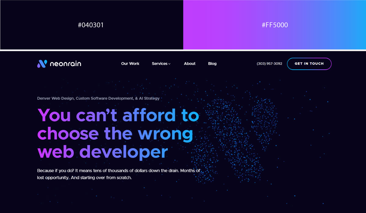
Neon Rain uses the blue-purple gradient broadly throughout its layout, letting it carry a lot of the visual identity rather than confining it to one section. That consistency makes the gradient itself feel like the brand’s signature color.
• Blue + Pink Gradient
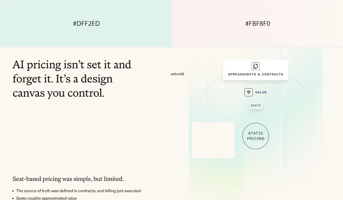
Orb uses a blue-to-pink gradient in its hero section to set an energetic first impression, then shifts to flatter, more neutral tones for the rest of the page. That contrast keeps the gradient feeling special rather than repetitive.
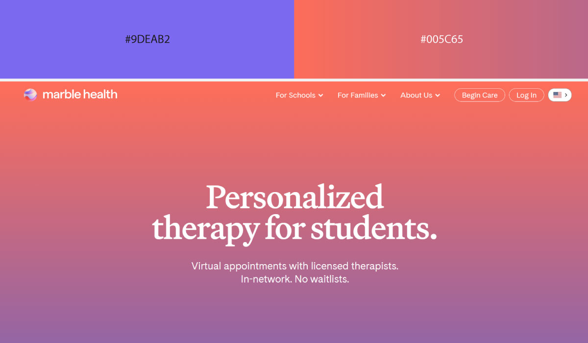
Marble Health leans on the gradient across multiple sections, blending blue into pink gradually rather than switching abruptly between them. The softness of that transition suits its healthcare branding.
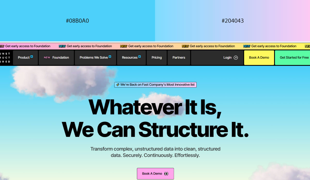
Unstructured applies the gradient mainly in background accents and illustrative elements, while text and UI components stay in flat, readable colors. That separation keeps the gradient decorative without interfering with legibility.
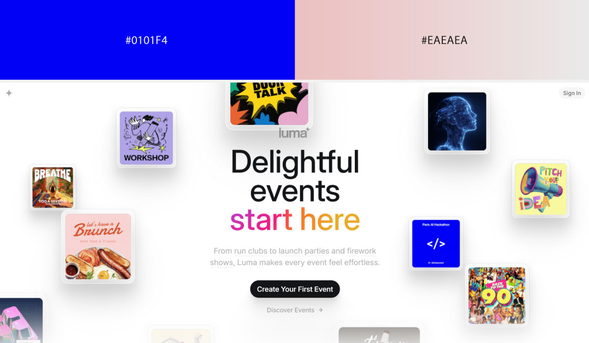
Luma uses the blue-pink gradient prominently in hero and event-card imagery, letting it carry a lot of the page’s visual energy. Supporting sections rely on simpler, flatter colors by comparison.
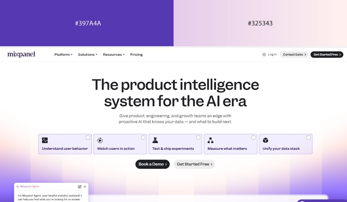
Mixpanel applies the gradient more sparingly, reserving it for specific highlight moments rather than large background areas. The rest of the layout stays close to white or light neutral tones.
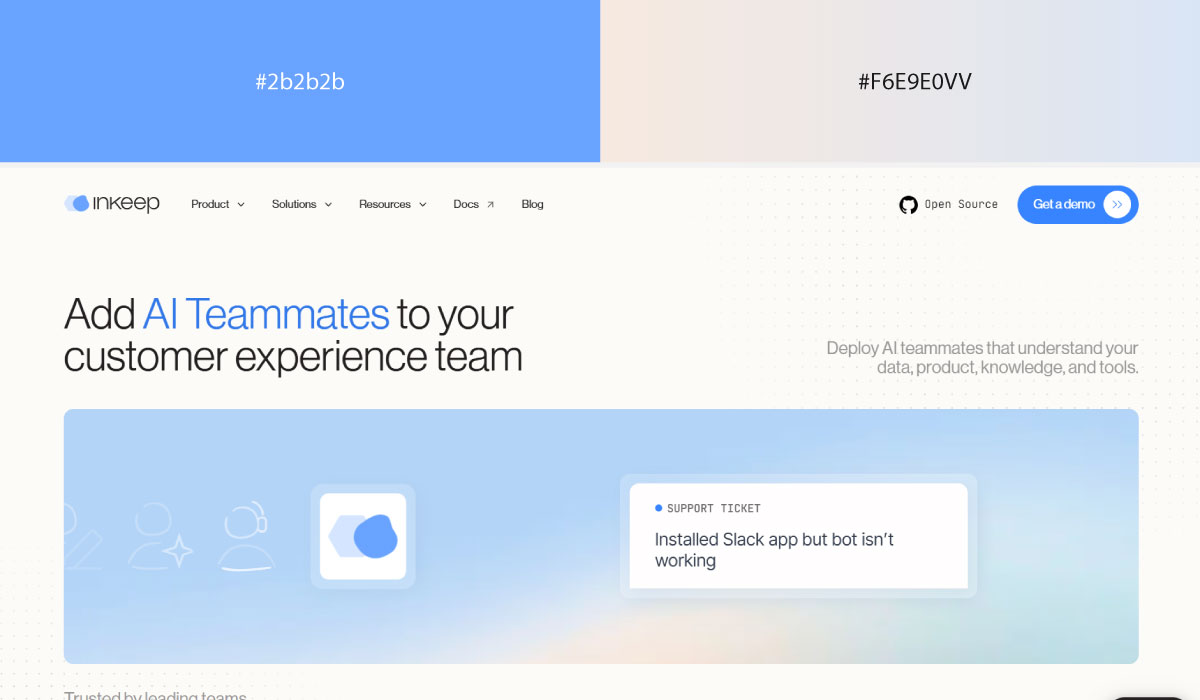
Inkeep uses the blue-pink gradient across its hero and feature sections, with the transition kept fairly subtle rather than high-contrast. That restraint keeps the gradient feeling clean and professional.
• Blue Gradients
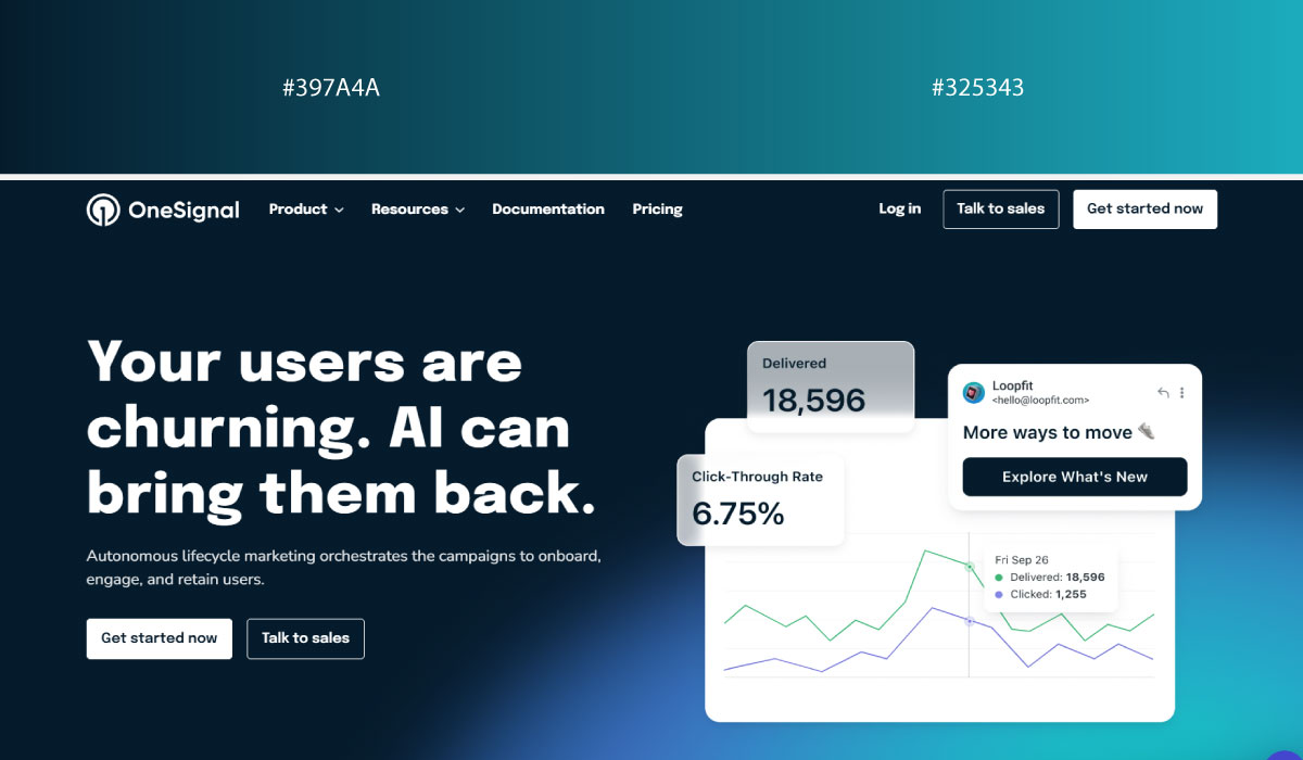
OneSignal uses a range of blue tones blended together across its backgrounds, relying on the gradient itself to create depth rather than introducing a second color. That approach keeps the palette focused and cohesive.
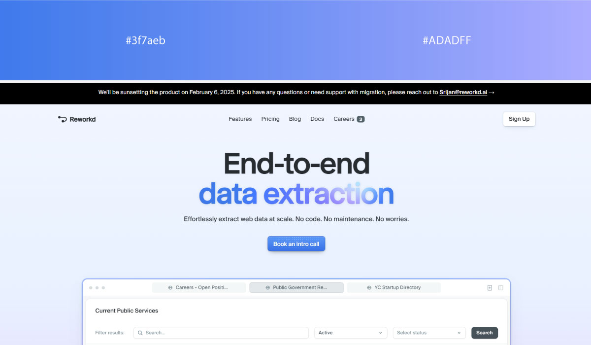
Reworkd.ai leans on blue gradients specifically in hero and product-demo sections, while other areas of the page use flatter, simpler blue tones. That contrast helps the gradient sections read as key moments.
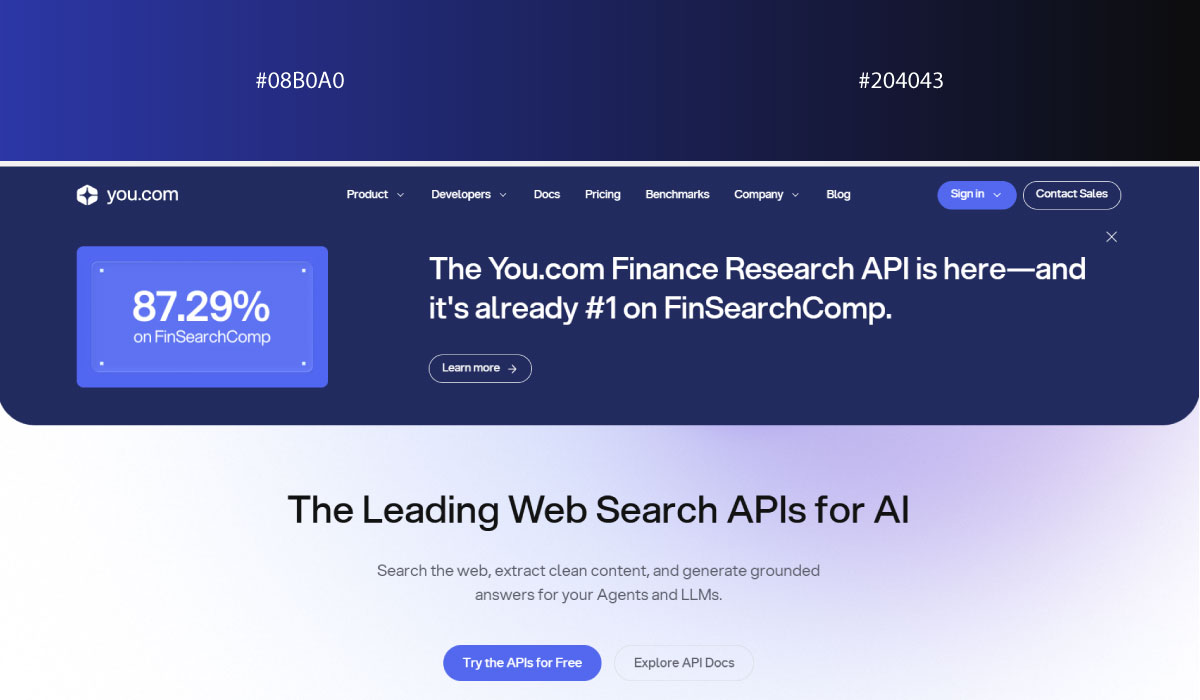
You.com applies blue gradients broadly across its layout, shifting gently between shades to add depth to what would otherwise be a flat blue background. The effect stays subtle rather than dramatic.
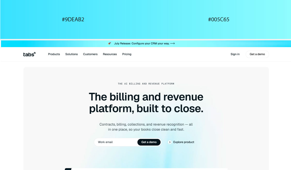
Tabs uses a similar approach, blending blue tones across backgrounds to create a sense of dimension. The gradient is used consistently enough to feel like part of the core brand identity rather than a one-off effect.
• Blue, Green
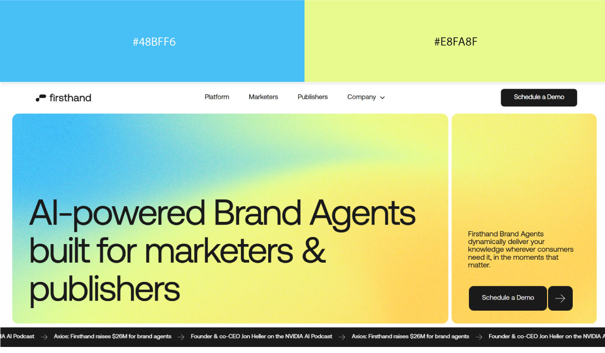
Firsthand.ai uses blue as a structural base across much of its site, with green layered in for accents and highlight details. That contrast gives the green a clear, deliberate role against the blue.
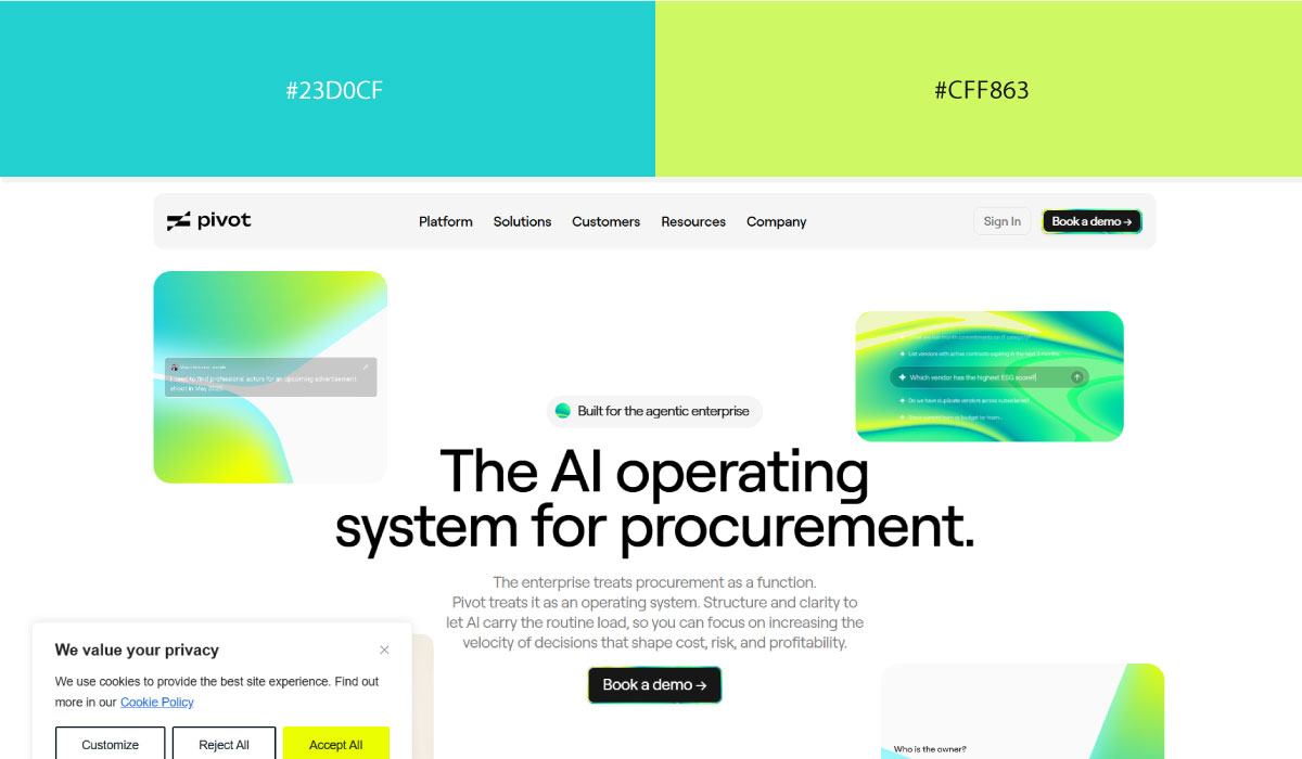
Pivot leans on a similar split, with blue carrying most of the background and green reserved for CTAs and small interactive touches. The green stays fairly contained, functioning as a consistent action signal.
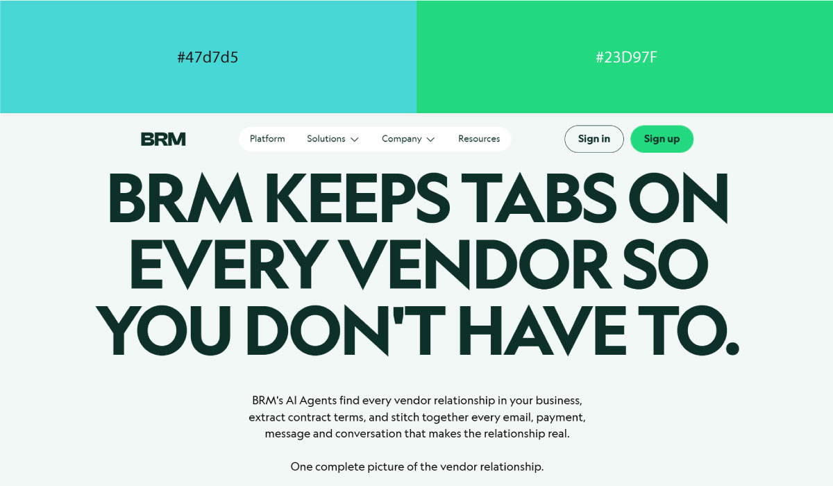
BRM applies blue and green more evenly across sections, letting the two share visual weight rather than assigning one a dominant role. That balance keeps the palette feeling fresh without leaning too far into either color.
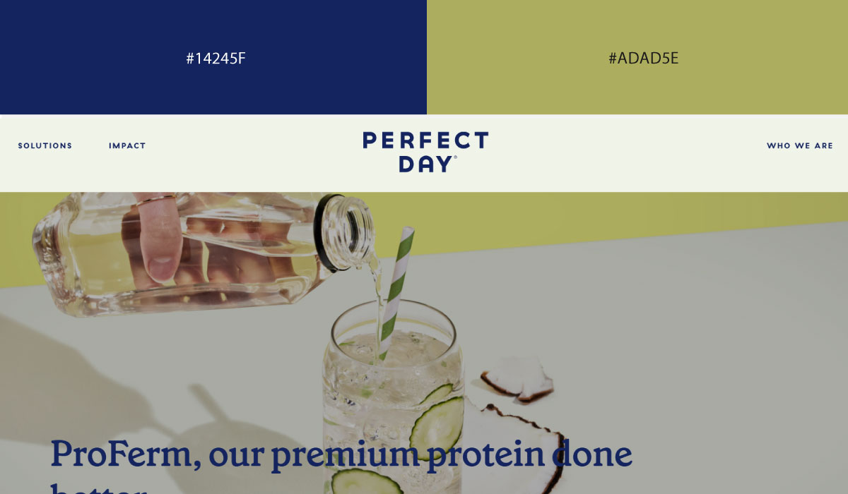
Perfect Day uses blue as its primary tone throughout the site, with green appearing in smaller doses around branding touches and highlight details. The pairing stays clean and simple, fitting for a food-tech brand.
10. Minimal & High-Contrast Pairings
Stripping a palette down to near-zero color forces every remaining element to earn its place, which is exactly why these pairings read as so deliberate.
• Black + White
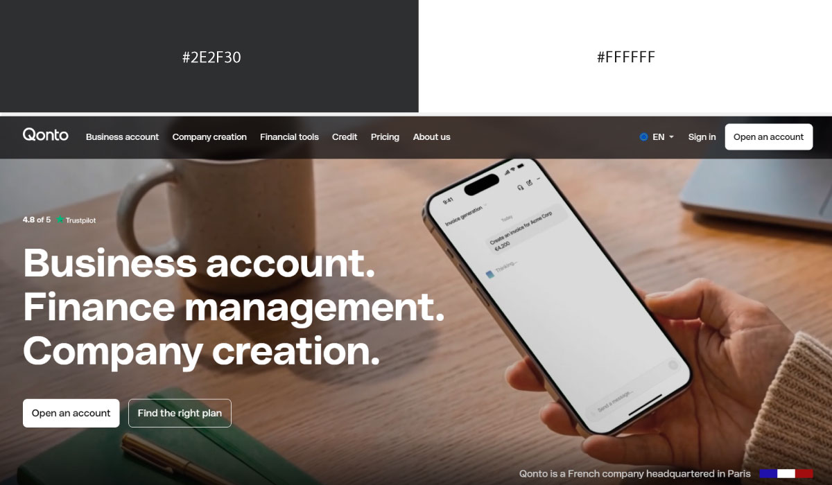
Qonto uses white as its dominant background across most sections, with black reserved for text and structural contrast. That stark pairing keeps the layout feeling clean and confident, without any accent color pulling focus.
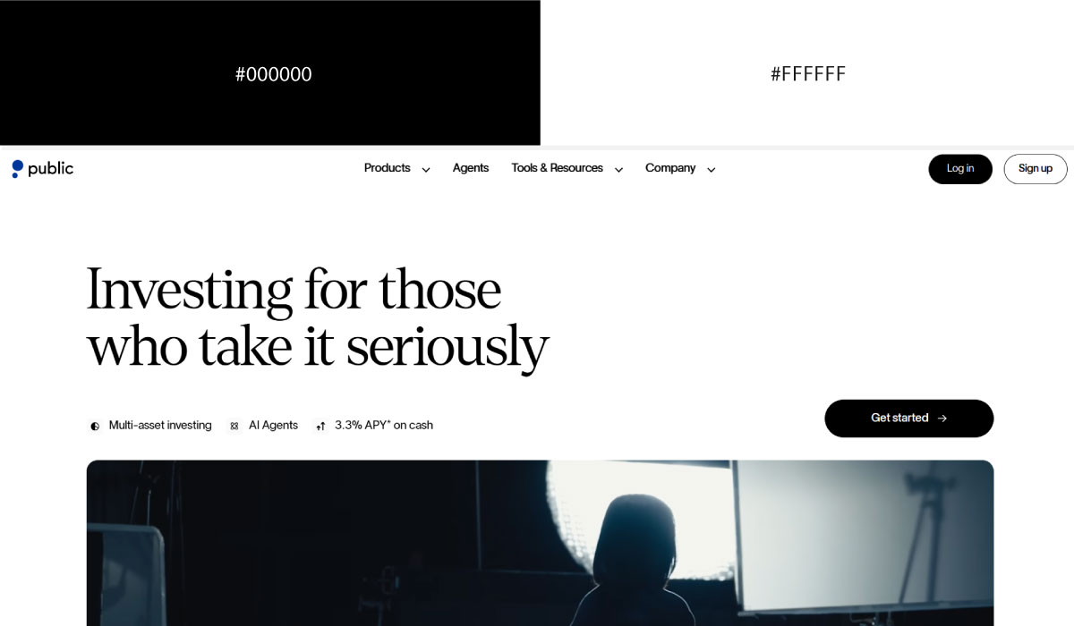
Public.com leans on a similar split, with black carrying headline text and key UI elements against a white base throughout. The absence of color keeps attention squarely on the content and numbers.
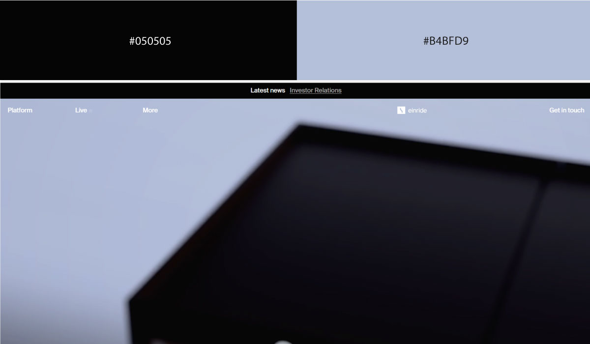
Einride applies black more broadly across its layout, using it for full-section backgrounds in places while white handles the surrounding content areas. That alternation gives the site a bolder, more industrial feel than a purely white base would.
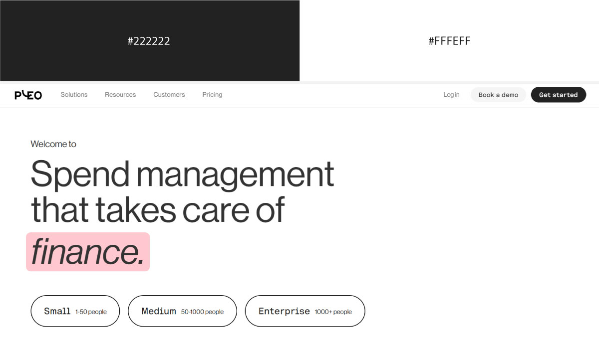
Pleo uses white as its foundation throughout, with black limited mostly to typography and fine UI details. The pairing stays minimal and restrained, letting product screenshots carry most of the visual interest.
• Pink Undertones + Dark

Isometric uses a dark background across much of its site, with pink undertones showing up subtly in gradients and accent lighting rather than as a solid color. That soft pink glow adds warmth without disrupting the overall darkness.
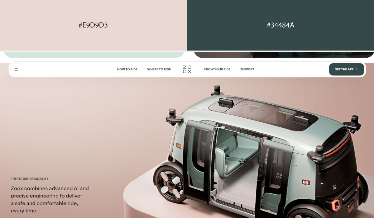
Zoox pairs dark backgrounds with pink used sparingly, mostly in small highlight details rather than large areas. The restraint keeps the pink feeling like a subtle brand touch rather than a dominant color.
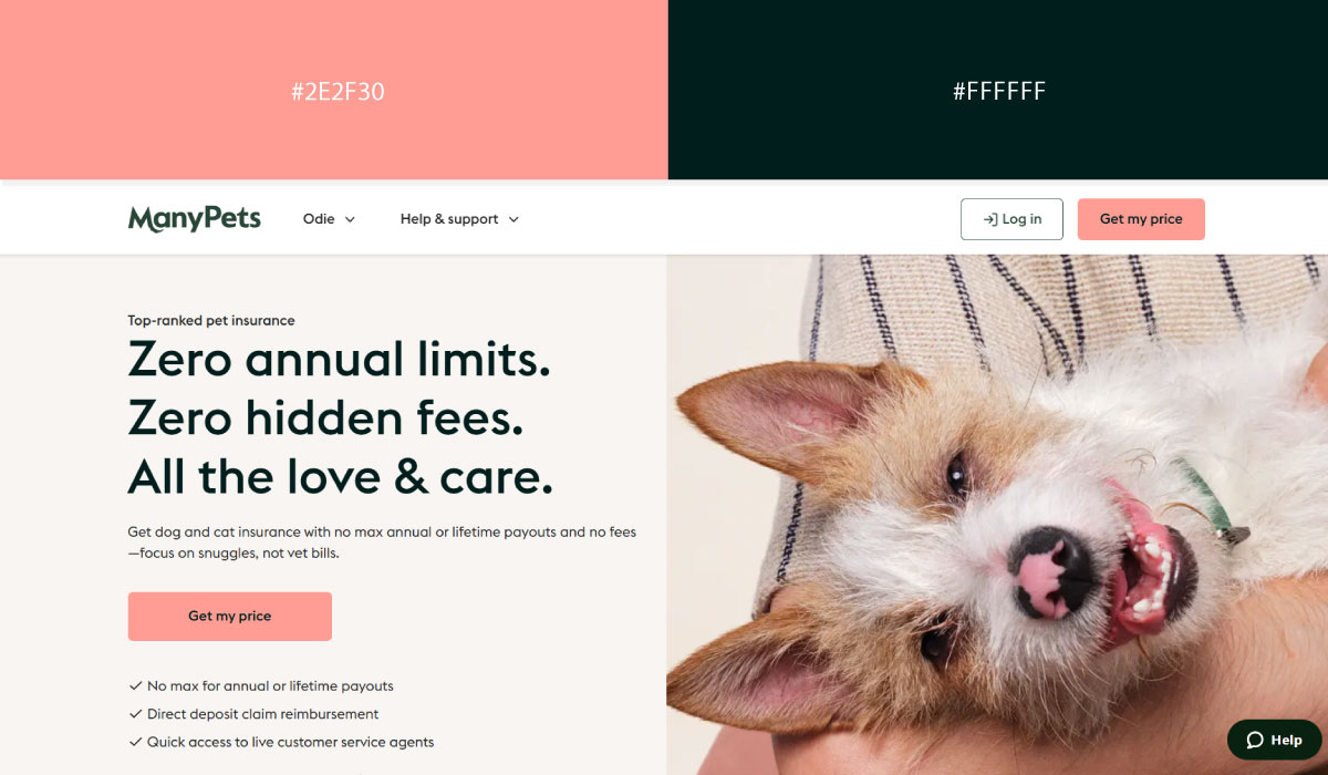
ManyPets applies a similar approach, with dark tones as the base and pink undertones appearing in accents and illustrative elements. That combination gives the site a bit of warmth against the darker backdrop.
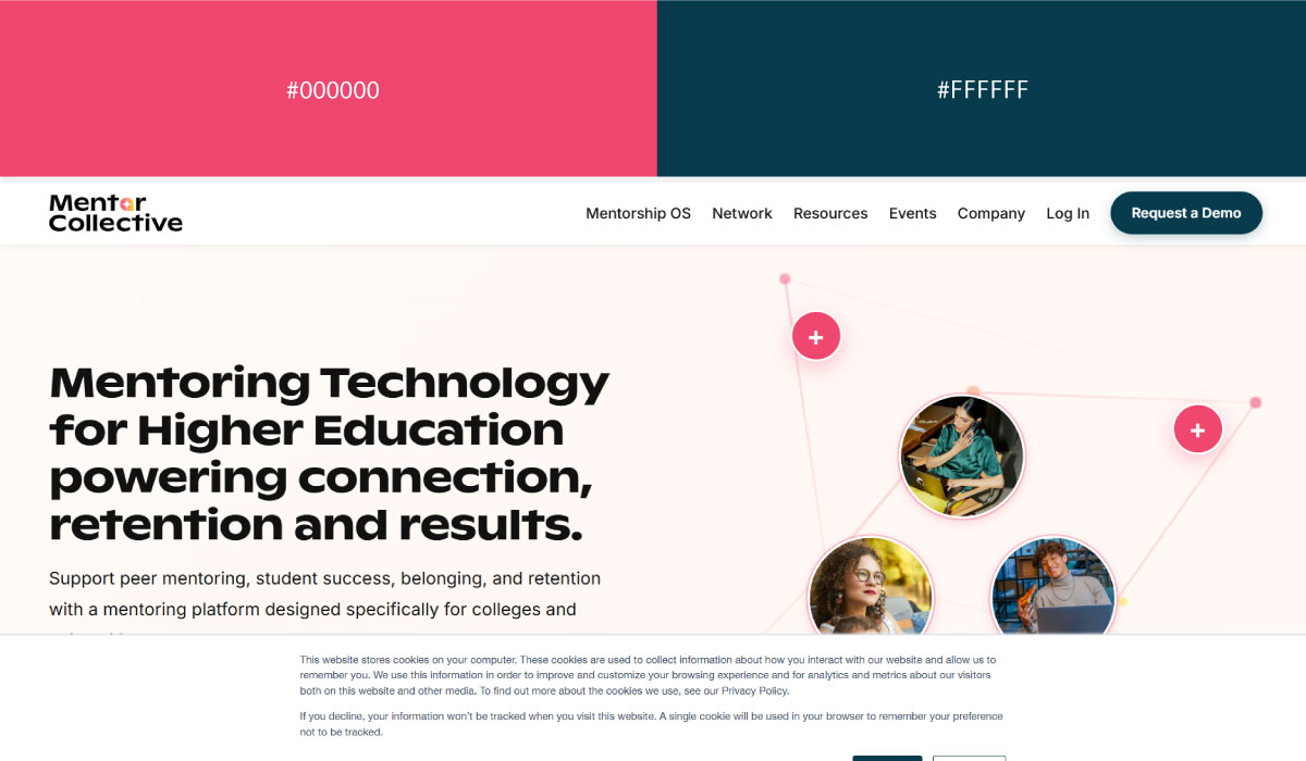
Mentor Collective leans on dark backgrounds with pink used narrowly for CTAs and highlight moments. The pink stays contained enough to function clearly as an action signal.
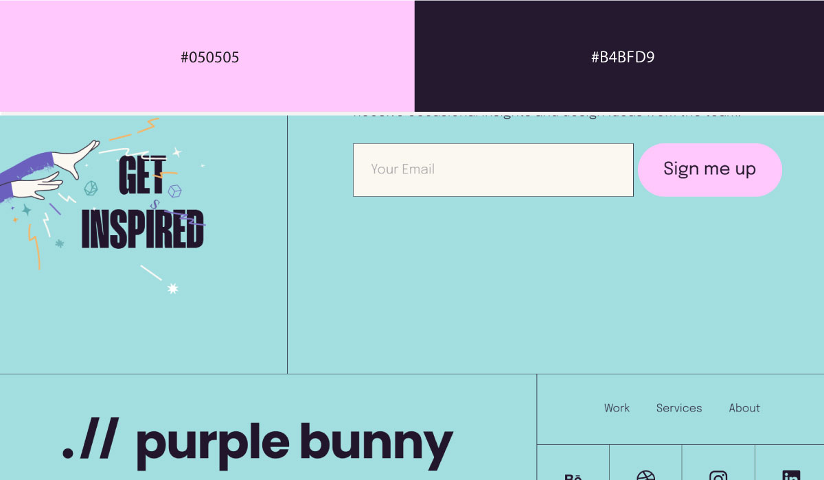
Purple Bunny uses pink undertones more visibly against dark backgrounds, letting the pink show up in gradients and glow effects throughout. That combination gives the site a softer, more playful edge despite the dark base.
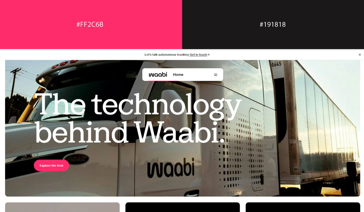
Waabi applies dark tones broadly across its layout, with pink undertones appearing mostly in subtle lighting effects and accents. The overall feel stays serious and tech-forward, with the pink adding just a touch of warmth.
• Yellow + Faded Blues
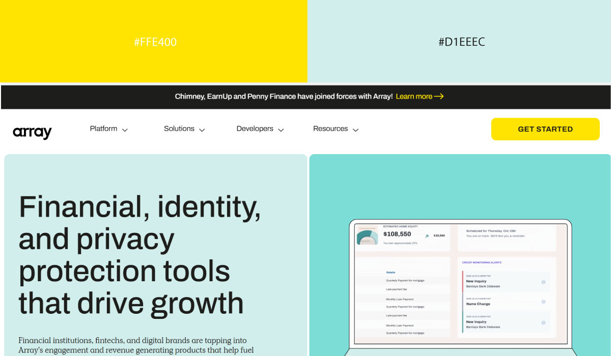
Array uses faded blue as its dominant background tone, with yellow applied to accents and specific highlight elements. That contrast gives the yellow a clear, deliberate role against the softer blue base.
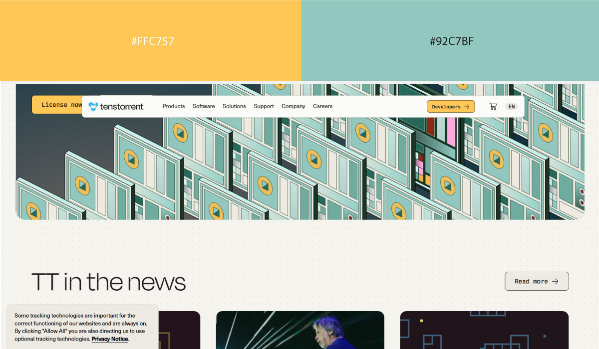
Tenstorrent leans on a similar pairing, with faded blue carrying most of the layout and yellow reserved for CTAs and small interactive touches. The yellow stays fairly contained, functioning as a consistent point of emphasis.
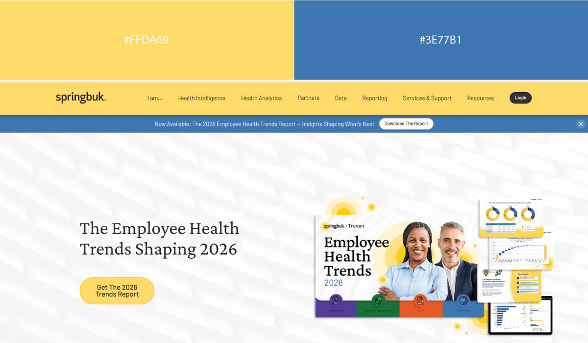
Springbuk applies faded blue broadly throughout its sections, with yellow appearing in smaller doses around highlights and branding details. That balance keeps the palette feeling calm despite the pop of yellow.
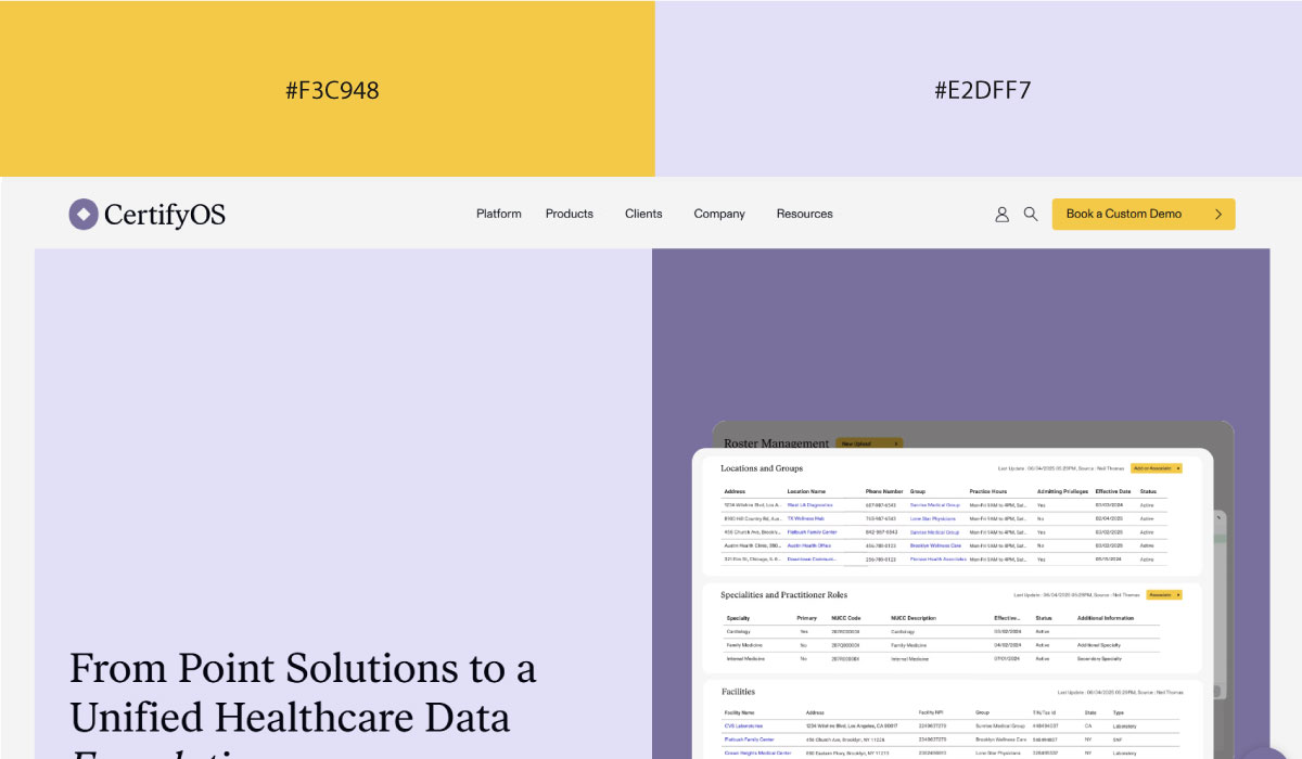
CertifyOS uses faded blue as its base tone as well, with yellow reserved for accents and specific brand touches throughout. The pairing stays understated, letting the yellow do focused, specific work.
• Grey + Muted Yellow
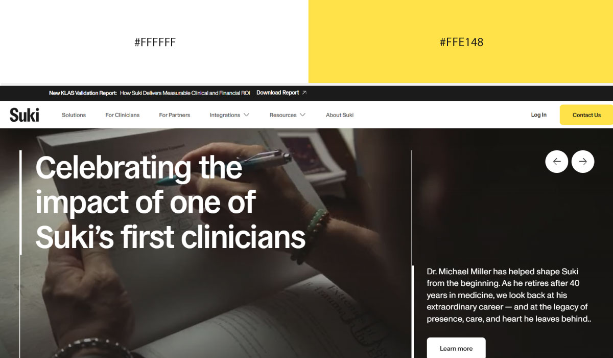
Suki.ai uses grey as its structural base across much of the site, with muted yellow applied to accents and highlight elements. That contrast keeps the yellow readable as a signal without it feeling too bright or jarring.

Antora leans on a similar split, with grey carrying most of the background and muted yellow reserved for CTAs and small interactive touches. The restraint keeps the yellow feeling deliberate rather than decorative.
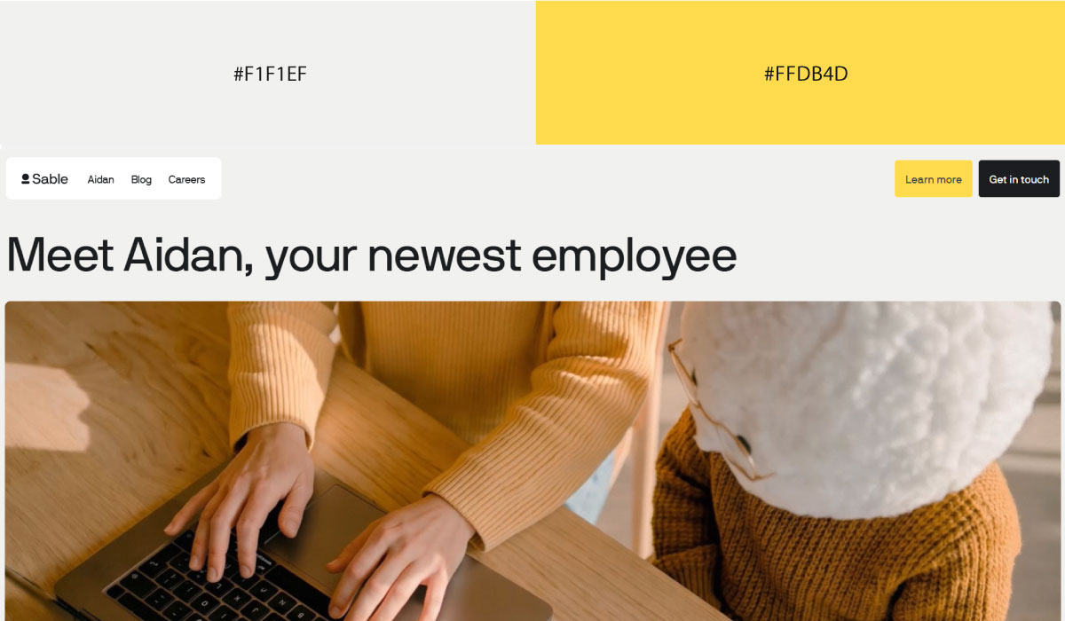
Sable applies grey broadly throughout its layout, with muted yellow appearing in smaller doses around highlights and branding details. That balance gives the site a calm, understated feel overall.
• Black + Bright
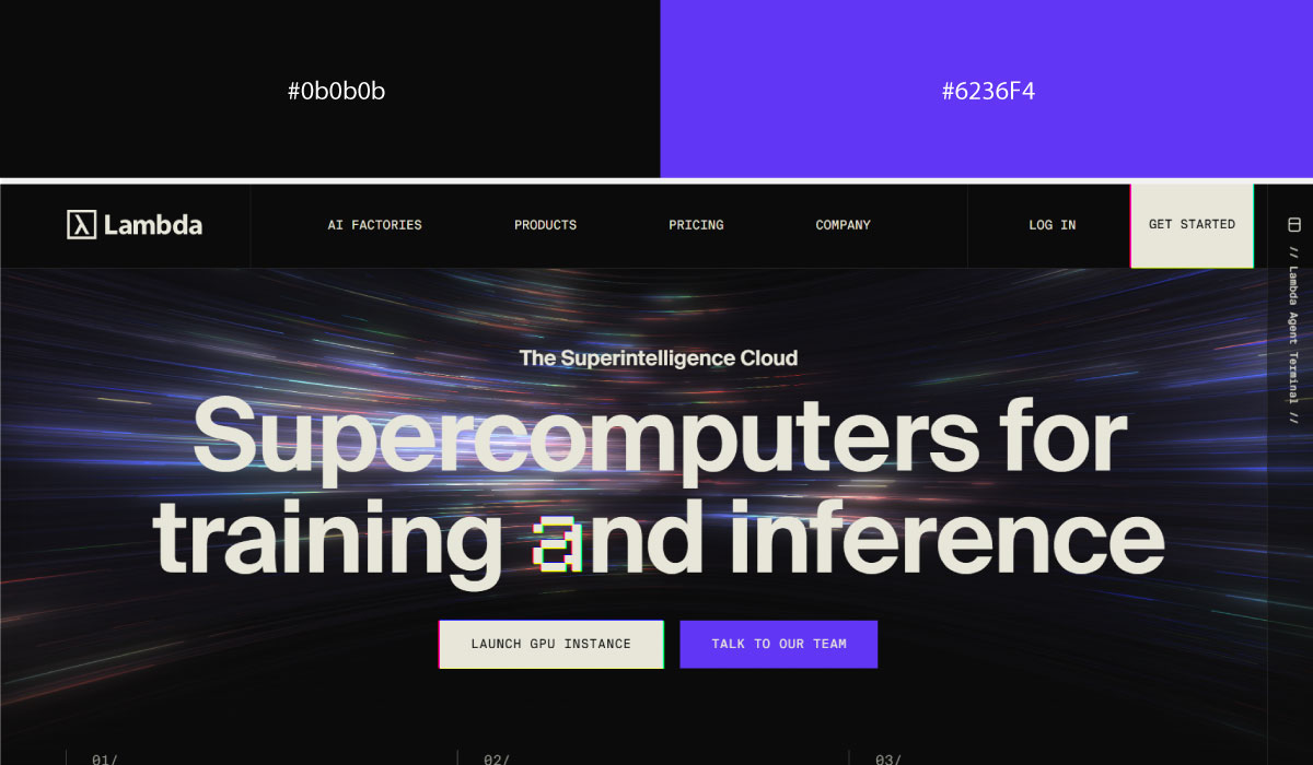
Lambda uses black as a near-total background across the site, with a bright accent color layered in for CTAs and key highlight moments. That contrast makes the bright accent easy to spot against all that darkness.
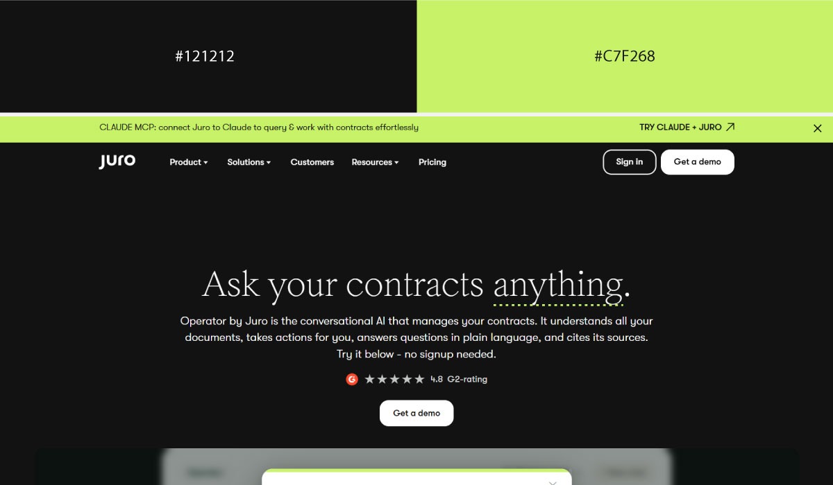
Juro leans on black more broadly throughout its layout, while the bright accent shows up in smaller, concentrated doses around interactive elements. The restraint keeps the bright color feeling purposeful rather than overwhelming.
Markforged applies a similar pairing, with black carrying most of the background and the bright accent reserved for select highlight touches throughout. That balance keeps the palette feeling bold but controlled.
Bonus: Multi-Color Systems
A handful of sites break the "keep it tight" rule on purpose and make it work, usually because every color still has a clearly assigned role.
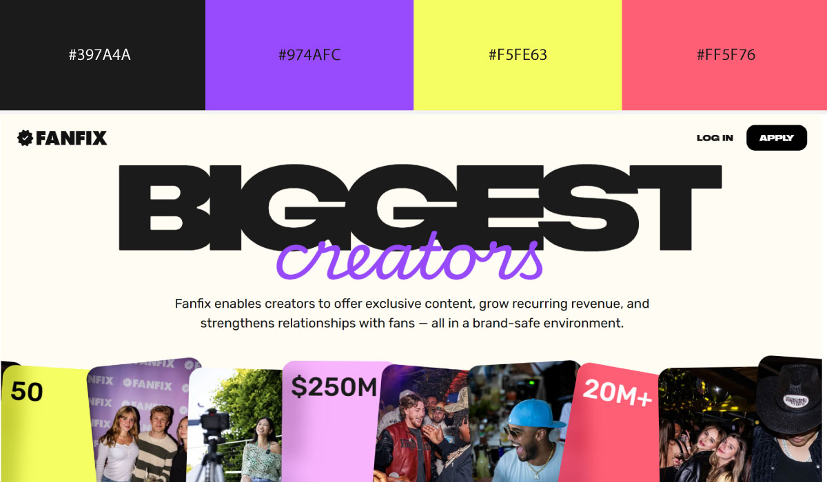
Fanfix uses a vibrant, saturated color as its dominant background in hero sections, then layers in additional accent colors for buttons and highlights rather than sticking to a single pairing. That willingness to mix several bright tones fits its creator-platform, social-media energy.
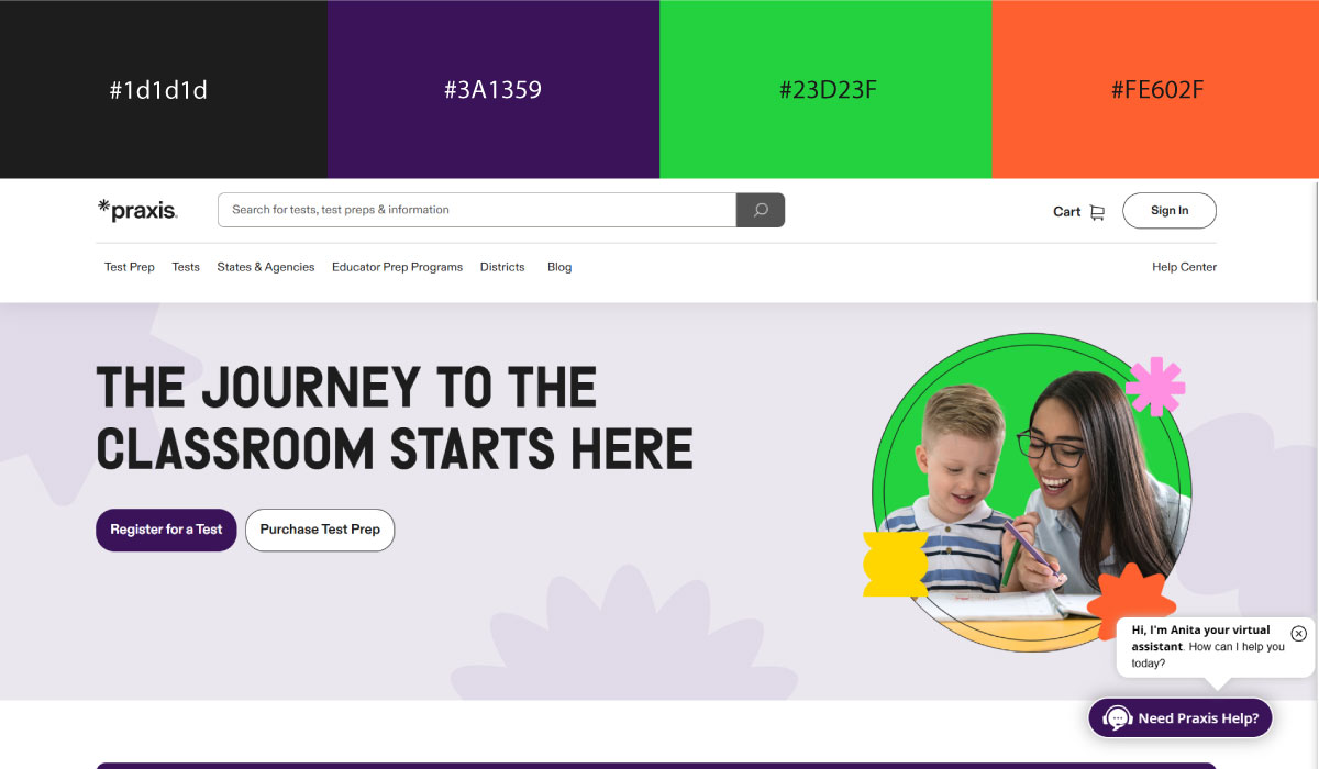
Praxis (ETS) leans on a calmer palette overall, with a neutral base color carrying most of the layout and one or two accent colors reserved for CTAs and interactive elements. The restraint there suits its more formal, education-focused positioning.

Avoma uses a light, neutral background across most sections, with a single accent color applied consistently to buttons and highlights throughout. That consistency keeps the accent functioning clearly as the site’s action color rather than one of several competing tones.
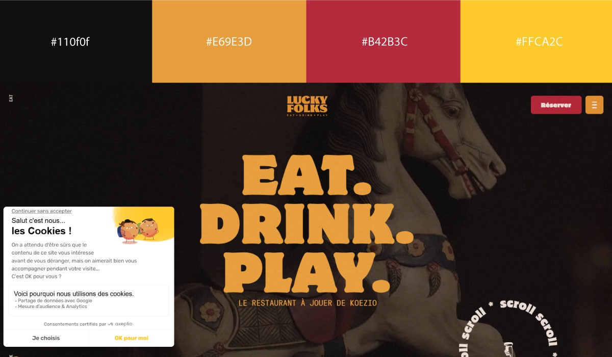
Lucky Folks applies a bolder, more playful mix of colors across its sections, shifting tones section to section rather than settling on one fixed pairing. That variation gives the site a more expressive, less rigid feel than the other sites in this group.
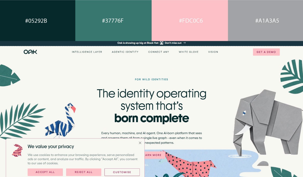
Oak.id uses a cleaner, more minimal palette, with a neutral base and a couple of accent colors reserved for specific highlight moments. The overall effect stays controlled despite pulling from more than two colors across the page.
Common Color Pairing Mistakes
Even carefully chosen colors can wreck the user experience once they’re applied inconsistently. Most of these mistakes aren’t really about picking the "wrong" colors. They’re about giving colors the wrong jobs.
Here are some of the most common mistakes to avoid.
1. Using Two Equally Vibrant Colors
When two bold, saturated colors compete for the same attention, neither wins. Instead of contrast, you get visual tension that makes the whole interface feel like too much. Let one vibrant color lead, and support it with neutrals.
2. Overusing Saturated Colors
Bright colors grab attention by nature. If every section, button, and icon is vivid, people have no idea where to look first. Save the bold colors for what actually matters, and let neutral backgrounds do the rest.
3. Poor Text Contrast
Pairing text with a background that doesn’t offer enough contrast is one of the fastest ways to tank usability. Light gray text on white, or dark text on a similarly dark surface, might look sleek, but it’s rough to actually read. Legibility should always beat aesthetics, and it’s worth checking your combinations against accessibility standards to confirm.
4. Using Random Button Colors
Buttons exist to communicate priority, not to decorate the page. When every button is a different color, people lose the ability to tell primary actions from secondary ones. Pick one color for primary CTAs, a distinct style for secondary actions, and reserve semantic colors strictly for success or error states.
5. Using Multiple Accent Colors
Accent colors exist to direct attention. Once several of them show up in the same interface, they cancel each other out and just add clutter. One well-chosen accent is almost always enough.
6. Ignoring Dark Mode
A pairing that looks balanced on white doesn’t automatically translate to a dark surface. Bright accents can turn overpowering, muted colors can disappear entirely. If your site supports dark mode, test the whole palette there. Don’t assume it’ll hold up.
7. Following Trends Instead of Your Brand
A trending combination might look great this year and clash with your identity the next. Pick colors that reinforce your brand and serve your users, not whatever’s popular in design circles right now.
8. Ignoring Visual Hierarchy
Probably the biggest mistake of all: giving every element equal visual weight. If headings, buttons, links, banners, and highlights are all fighting for attention with bold colors, there’s no clear path through the page. Real hierarchy means the important elements stand out and everything else stays quiet.
Test Your Color Pairings Before Launch
A palette that looks solid in your design file can still fall apart once real users and real devices get involved. Run it through a few checks before it ever goes live.
• View in grayscale
Strip all color out and look at the layout in black, white, and grey only. If hierarchy still makes sense (important elements still stand out), your contrast is doing its job independent of color.
• Run an accessibility check
Run your text and background combinations through a contrast checker against WCAG standards. This catches readability problems for people with low vision or color blindness before real users ever hit them.
• Test on mobile
Colors and contrast that look fine on a large monitor can behave differently on a smaller, brighter phone screen. Check that CTAs and text still read clearly at that size and in outdoor lighting conditions.
• Preview in dark mode
If your site supports a dark theme, check the whole palette there separately. Accents that pop on white can wash out or overwhelm on black, so this needs its own pass rather than an assumption it’ll carry over.
• Ask actual users
Show the design to real people outside your team and watch where their eyes go first. Their reactions will tell you whether your hierarchy is working as intended, not just whether the colors look nice.
• Create mood boards
Put your palette next to imagery, competitor sites, and brand references before committing. It’s a fast way to catch a pairing that feels off in context, even if it looked fine as isolated swatches.
• Compare against competitors
Look at how similar companies in your space use color. This helps you understand what’s expected in your category and where you can differentiate without breaking user expectations entirely.
• A/B test CTA colors
Run two versions of a button color live and measure which one actually gets more clicks. This replaces guesswork with real data on what drives action for your specific audience.
Tools That Make Color Pairing Easier
You don’t have to build a palette from scratch or eyeball contrast by hand. These tools handle most of the heavy lifting, from generating combinations to checking accessibility.
- Adobe Color: A long-standing web tool for building color schemes using color theory rules like complementary, analogous, and triadic. It also lets you extract a palette directly from an uploaded image, then export the result as hex codes or swatches.
- Coolors: A fast, no-frills palette generator where you hit the spacebar to cycle through random combinations and lock in the colors you like. It’s popular for quick brainstorming rather than deep customization.
- Huemint: An AI-driven generator that produces palettes based on how colors will actually function in a layout, not just as flat swatches. It assigns roles like background, text, and accent automatically, and previews the result on templates like websites or logos.
- Color Hunt: A curated gallery of pre-made, four-color palettes submitted by a design community. It’s less about generating your own combination and more about browsing ones that already look tested and cohesive.
- Eva Design System: An open-source design system that ships with a built-in color generator for building full UI palettes, including light and dark theme variants. It’s aimed at teams building consistent, scalable component libraries rather than one-off branding.
- Material Theme Builder: Google’s tool for generating a complete Material Design color scheme from a single seed color. It automatically produces the full set of tonal variations needed for both light and dark modes across an app.
- Figma Variables: A native Figma feature that lets you define color tokens once and reuse them across a whole file, including swapping entire themes (like light/dark) in one click. It keeps color pairings consistent across every screen in a design system.
- Tailwind Color Generator: A tool for building custom color scales that match Tailwind CSS’s shading system, typically generating a full range from 50 to 900 for each base color. It’s built specifically for developers working within the Tailwind framework rather than general design use.
- LogoDesign.net Color Wheel: The Color Wheel helps in building palettes off traditional harmony rules like complementary and analogous relationships. Simply pick a base color and it generates a range of coordinated combinations aimed specifically at logo design instead of general UI palettes.
Conclusion
A good color palette isn’t a stroke of luck. It’s a handful of deliberate decisions, made in order: pick one primary color, build it out with neutrals, add a single accent, then assign every color a specific job before it ever touches the page.
Once you’ve finalized your color palette, choosing the right website layout will determine how effectively those colors guide user attention and improve conversions. Get the roles right, and the hierarchy takes care of itself. Skip that step, and no amount of "pretty" swatches will save the layout.