From confused fans to viral mockery, these 2025 logo makeovers turned simple design updates into full-blown internet moments that prove just how much people still care about brands.
2025 turned out to be one of those years when logos quietly became dinner table topics. Brands all over the world decided it was time for a glow-up. Some wanted to look younger. Others wanted to feel more digital, more global, or more future-ready. Design teams rolled out sleeker fonts, flatter shapes, and cleaner layouts at a pace we have not seen in years. On paper, it all made sense. Markets were shifting, screens were getting smaller, and attention spans were shrinking. A fresh look felt like the right move.
But logos do more than sit on websites and billboards, right? They hold memory. They carry trust. They tell people who a brand is before a single word is read. When that balance between modern style and familiar identity gets shaky, things start to feel off in a way people cannot always explain but definitely notice.
And in 2025, plenty of eyes were paying attention.
Why So Many Rebrands Felt Off in 2025
Before we get into the names and drama, it helps to look at the mood that shaped the worst logo transformations 2025 had to offer. This was the year when branding started to feel like a race. Every company wanted to look cleaner, flatter, faster, and more at home on a phone screen. And if a logo didn’t feel digital-first, it was treated like a problem that needed fixing.
The trouble is that good branding does not work on urgency alone. Many of these redesigns were driven by logo design trends rather than by identity. Rounded fonts, muted colors, stripped back symbols, and soft gradients kept showing up, no matter the industry. Logos that once had personality began to look like they were cut from the same design kit.
Another big factor was fear. Brands worried about looking old, slow, or out of touch. Instead of building on what already worked, they reached for something safer and more neutral. That might sound smart in a boardroom, but to customers it often reads as bland, or worse, unfamiliar.
1. Cracker Barrel: When Familiar Suddenly Felt Disposable
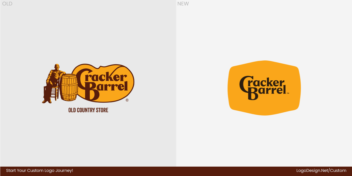
Cracker Barrel did not just tweak a logo. It touched something people felt was theirs. For decades, the Old Timer rocking on that wooden chair had been more than a drawing. He was part of the brand’s promise. Warm food, slower days, a kind of small-town comfort that felt steady in a busy world.
Then 2025 arrived, with a new look that stripped it all away. Out went the creative mascot. In came a clean, text-only logo that could have belonged to almost any casual dining chain. The design itself was not ugly; it was empty. Nothing in it hinted at biscuits, front porches, or the homespun charm that made Cracker Barrel feel like Cracker Barrel.
Customers reacted fast and not kindly. People felt the brand had tossed aside its own story in favor of something that looked fashionable but hollow. Social feeds were filled with anger, jokes, and disbelief.
Even Donald Trump Jr. couldn’t resist tweeting, and his post captured the mood of many users.
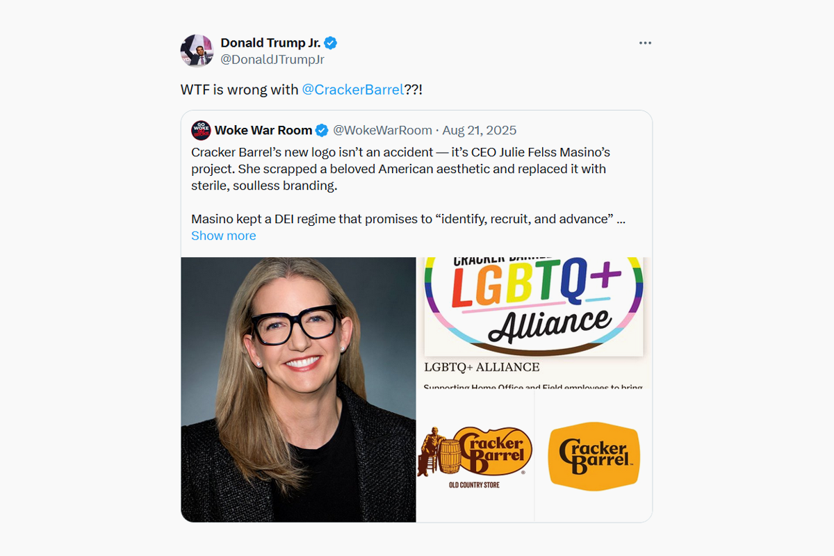
Image Source: X.com
In Reddit design threads, users mocked the logo as bland and generic, while others said the empty space made it feel disconnected from what Cracker Barrel stood for.
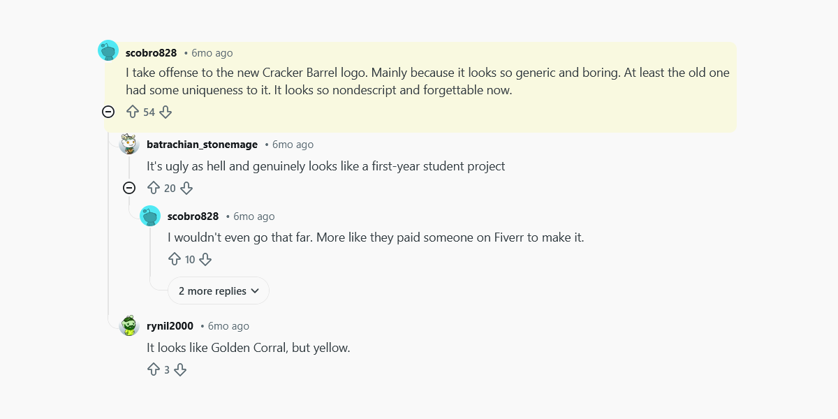
Image Source: Reddit.com
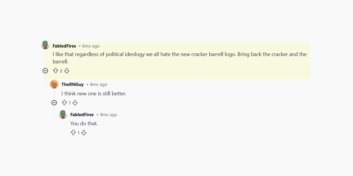
Image Source: Reddit.com
The backlash went beyond online snark. The stock price dipped, and within days the company quietly reversed course, saying it would keep the Old Timer in place. Here’s what Cracker Barrel had to say:
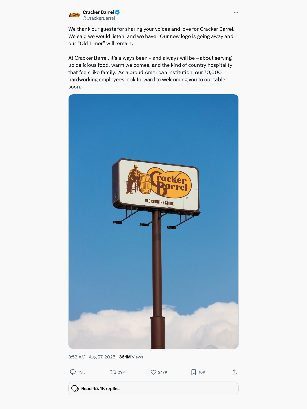
Image Source: X.com
Cracker Barrel learned the hard way that when a logo holds decades of memory, changing it is never just a design decision.
2. RE/MAX: A Bold Reset That Landed… Between Loud and Bland
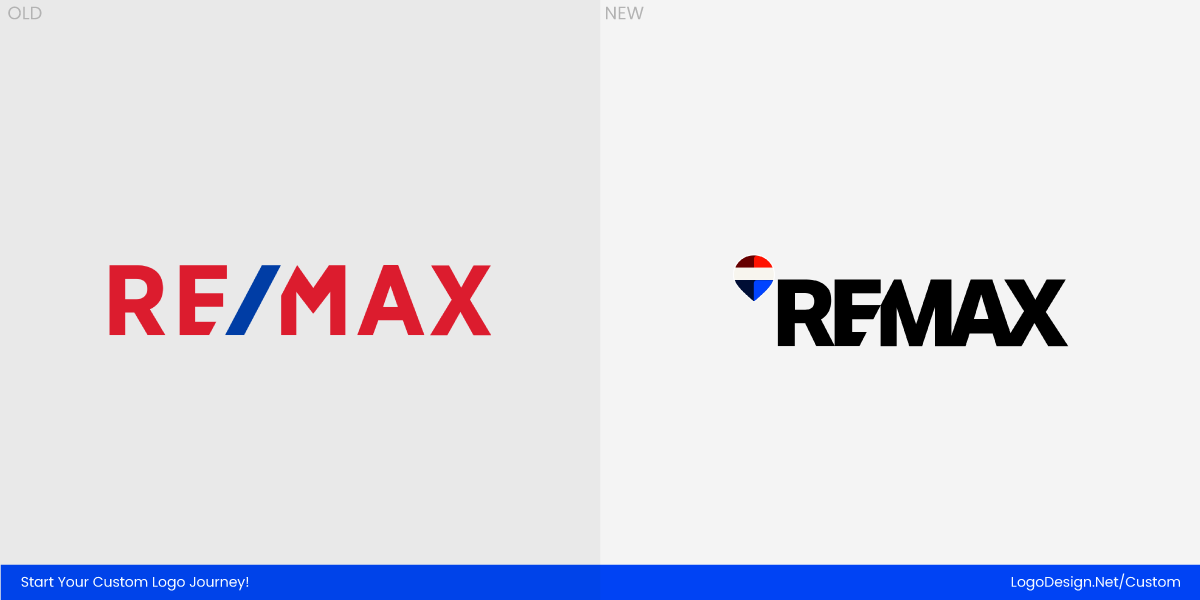
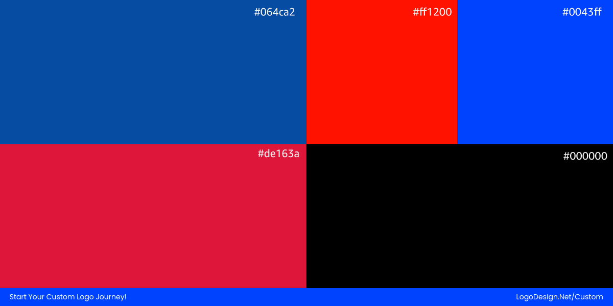
In early 2025, RE/MAX revealed a much-talked-about “digital first” refresh of its iconic hot-air balloon logo and workmark. The company’s intent was clear: to make the brand stand out in a crowded digital landscape where buyers and sellers first meet agents online. This update reworked the famous balloon shape and introduced a heavier, condensed typeface, resulting in a more versatile logo that performs well across screens and social feeds. The new identity debuted at the RE/MAX R4 convention, where executives said the move was meant to strengthen professionalism and relevance for the next decade.
Even though the balloon remained a central element, the redesign sparked a steady stream of reactions online. Some celebrated the modernized look as a breath of fresh air, while others were more cautious, questioning how the bolder, industrial wordmark fit with the warm, approachable feeling many buyers associate with the classic balloon.
On Reddit, designers and brand watchers shared honest takes on the refreshed RE/MAX identity in r/Design, with comments like “It kinda gives me a headache the longer I look at it” and “the flat balloon saps the joy the current logo has,” even comparing the new shape to soda brand aesthetics.
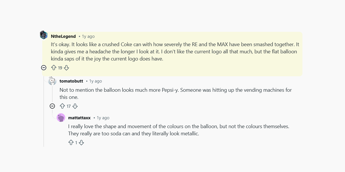
Image Source: Reddit.com
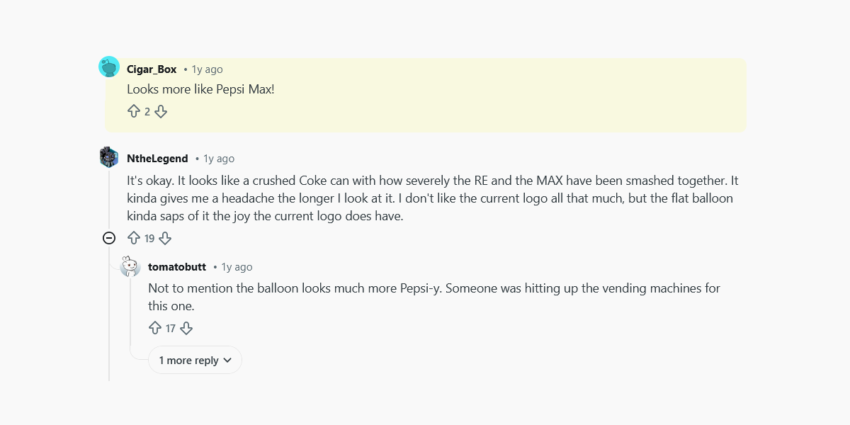
Image Source: Reddit.com
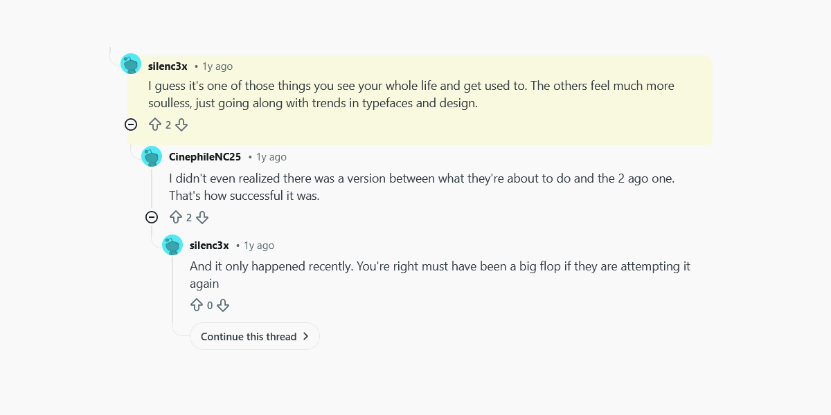
Image Source: Reddit.com
And on X, users have been asking straightforward questions about the new look, too. One post simply asked, “What do you think of the #REMAX branding update?” It drew replies from followers weighing in on the refresh and sparked conversation about how well it connects with the company’s legacy.
Have a look at it yourself:
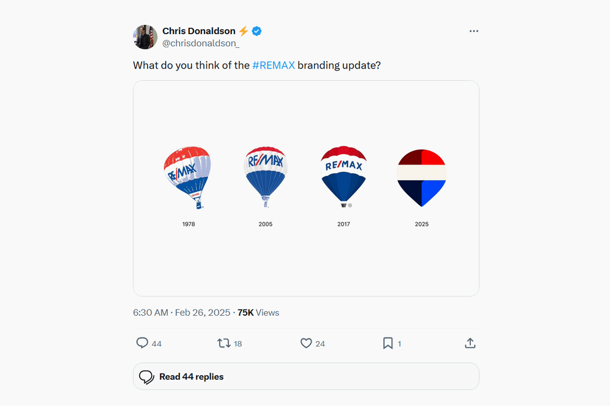
Image Source: X.com
One clear pattern in these conversations was how rarely the change felt invisible. People were talking about the logo more than they might expect from a typical refresh, which says something about the strength of the original symbol and its deep connection to RE/MAX’s identity.
3. OpenAI: A Rebrand Too Subtle to Notice
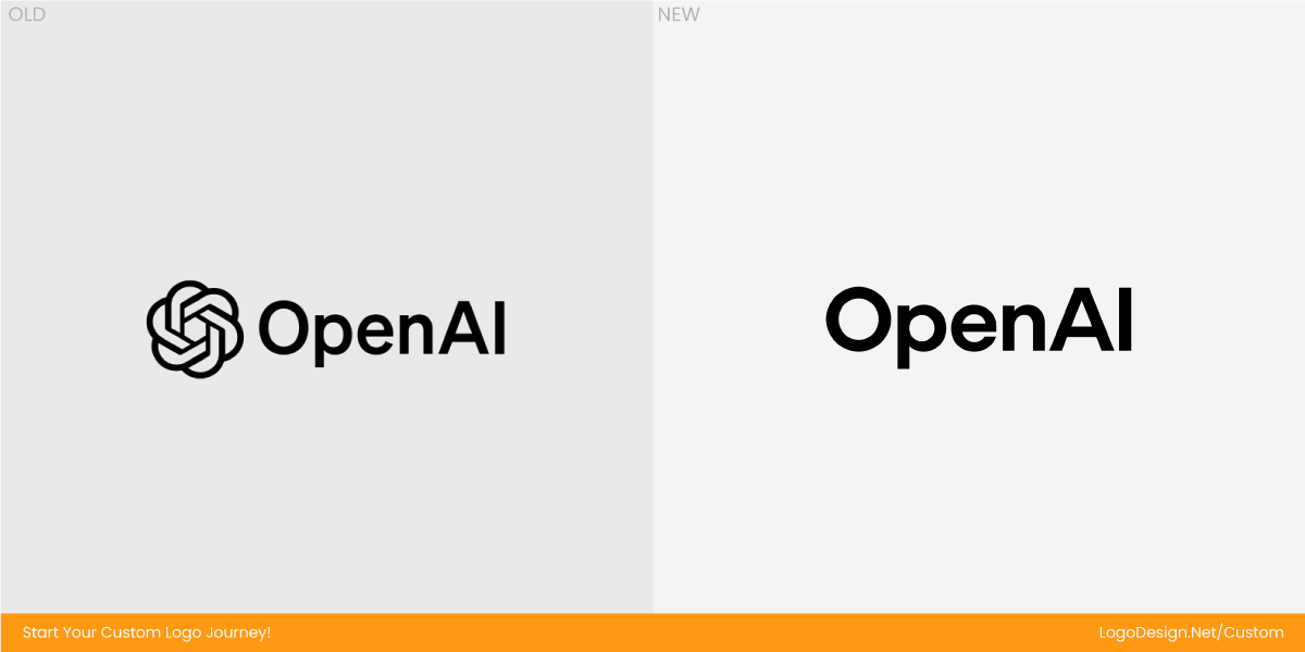
In early 2025, OpenAI introduced a full brand refresh that touched its logo, typeface, and color palette. The core aim was to make the brand feel more organic and human, with a refined version of the familiar “blossom” mark, a bespoke typeface called OpenAI Sans, and smoother lines throughout the visual system. The new wordmark and softer geometry were meant to bridge high‑tech precision and a friendlier character — a nod to the company’s expanded mission and global user base.

Even though the redesign was subtle, reactions on Reddit showed how curious and creative communities picked up on it. Users poked fun at the refresh, treating it as a meme-worthy moment rather than a clear improvement.
Image Source: Reddit.com

Image Source: Reddit.com
That mix of appreciation and bemusement captures why OpenAI’s 2025 logo update became part of a broader conversation about how a tech giant chooses to look as it grows: clean and modern on one hand, but on the other hand, so subtle that many users struggled to articulate what had actually changed.
4. Jaguar: A Luxury Rebrand That Forgot to Show Its Cars
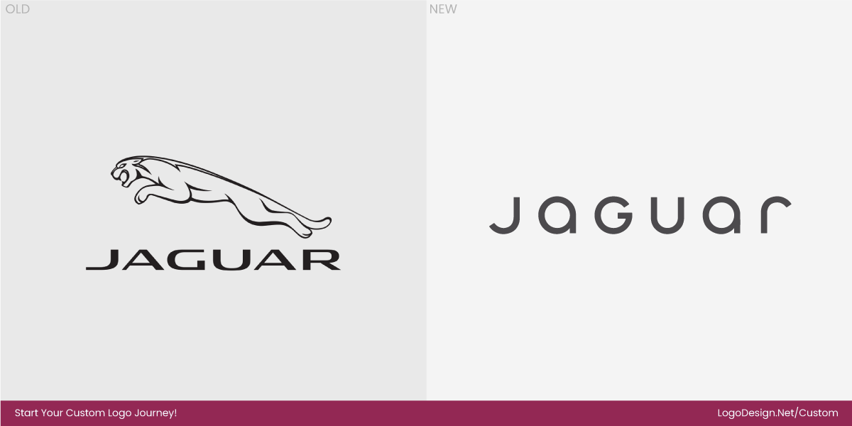
Jaguar rolled out its rebrand in late 2024, though its effects and conversations carried well into the following year. What would normally be a quiet evolution of identity instead became a global discussion piece thanks to a bold campaign video and a new minimalist logo that leaned into abstract, fashion-inspired imagery rather than the sleek heritage of snarling cats and fast machines.
Here’s the launch video we’re talking about:
Jaguar’s ad was all color, all humans, and no vehicles. Bright backdrops, androgynous models, and slogans like “Copy nothing,” “Live vivid,” and “Delete ordinary” replaced any hint of engineering or automotive prowess.
The reaction came fast on X (formerly Twitter). One of the most-shared responses was from Elon Musk, who replied to Jaguar’s post with a single question: “Do you sell cars?” — a biting, curious jab that highlighted how baffling the campaign seemed to many.
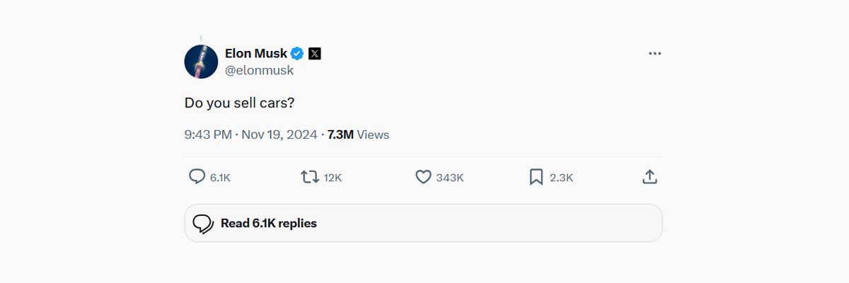
Image Source: X.com
Jaguar itself responded with humour, inviting him to “come for a cuppa in Miami,” but the exchange only drew more attention.
Everywhere you looked on social platforms, people were puzzled. Twitter users quipped it looked more like a dating site promo than an auto brand. On Reddit, conversations ranged from serious critiques about abandoning heritage to humorous remarks about the visuals feeling generic or out of place for a car maker.
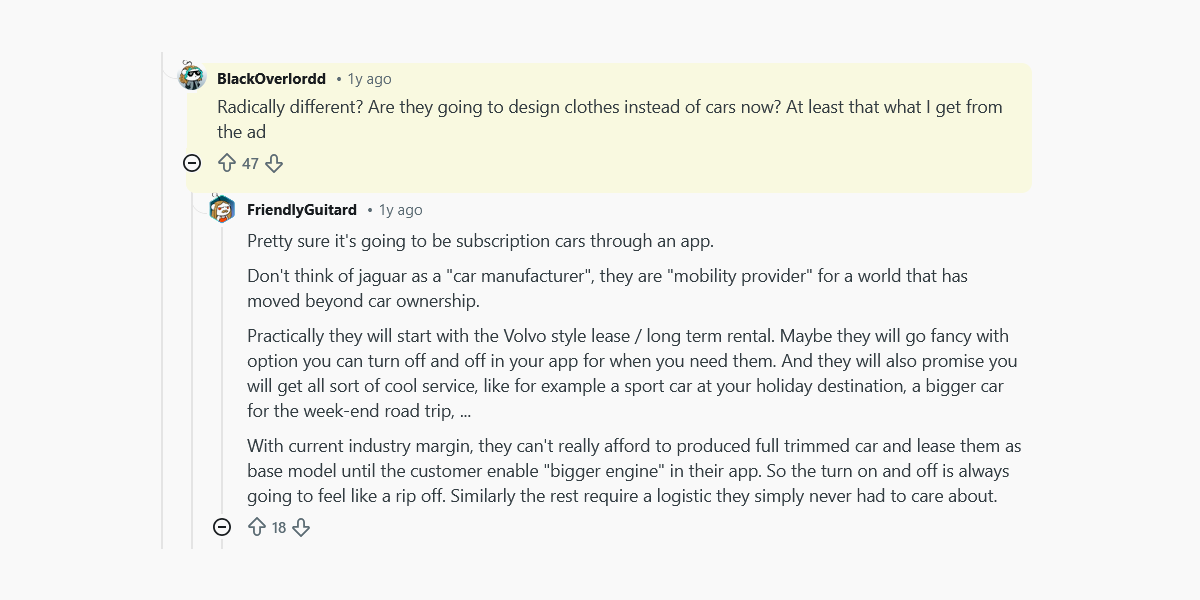
Image Source: Reddit.com
The rebrand was meant to signal Jaguar’s leap into the electric age and a broader cultural identity. Instead, for many long-time fans, it felt like the brand lost sight of what made Jaguar itself: the cars.
5. HBO Max: A Streaming Identity Whiplash That Got Everyone Talking
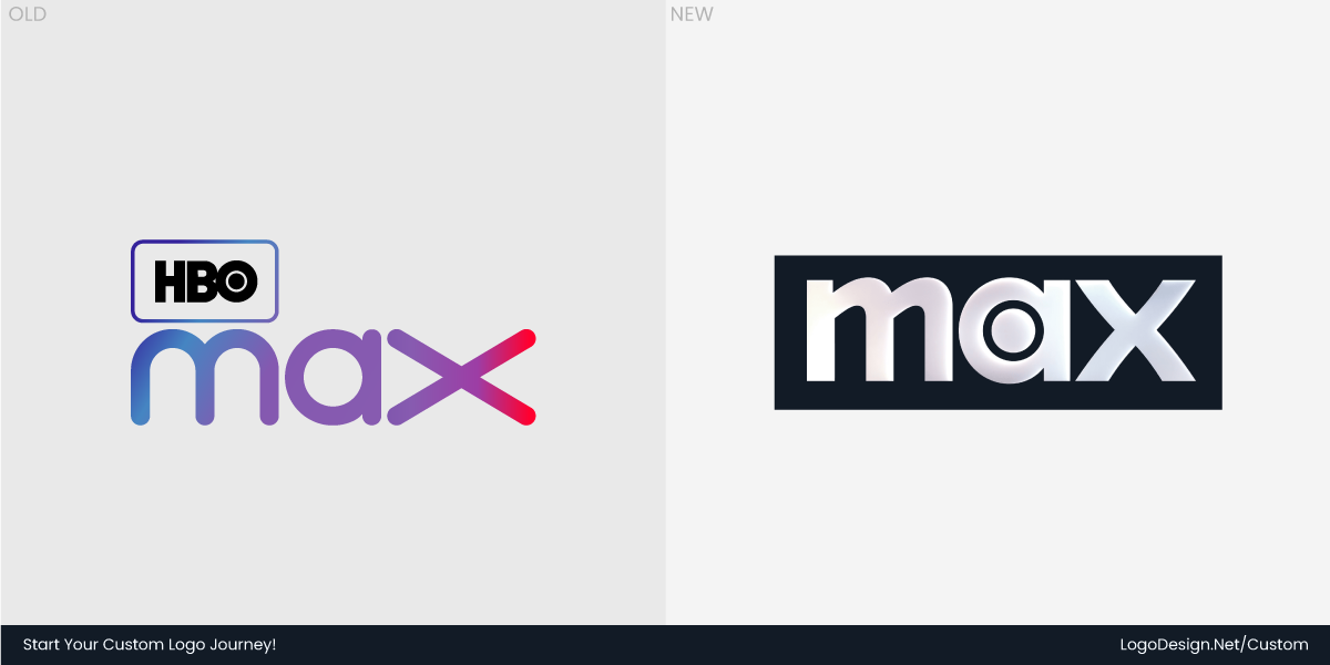
In 2025, the streaming service formerly known as Max reverted to the familiar HBO Max name after a series of brand shifts that left many users scratching their heads. The service had originally dropped HBO from its title in 2023 to signal broader content, but by mid‑2025, Warner Bros. Discovery decided to return HBO to the forefront, leaning on the legacy and prestige that name still carries.
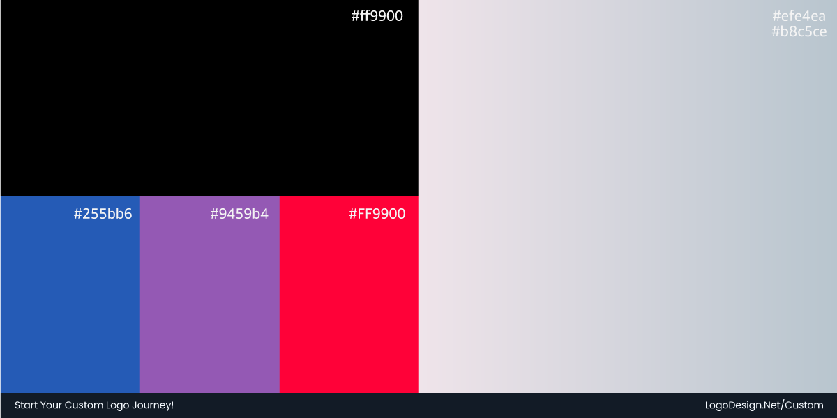
Even before the name change was fully official, the app’s design and logo were updated to a stark black‑and‑white palette that clearly echoes HBO’s classic look — a move some fans welcomed as a nod to the brand’s history.
Once the return to HBO Max was announced, social feeds lit up with humour and bewilderment. The Max account on X even leaned into the chaos with self‑aware posts. One tweet simply said, “Twitter won’t let me change my name back,” after the platform’s rules blocked an immediate handle update — a line that got lots of laughs for its irony given Twitter’s own controversial rebrand to X.
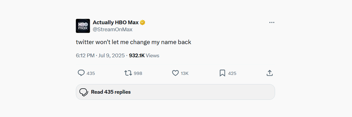
Image Source: X.com
Across Reddit communities that follow the streamer, conversations ranged from fond nostalgia for the old name to sarcastic takes like calling the back‑and‑forth branding “a corporate identity crisis.”
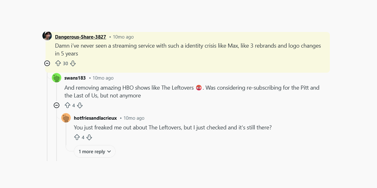
Image Source: Reddit.com
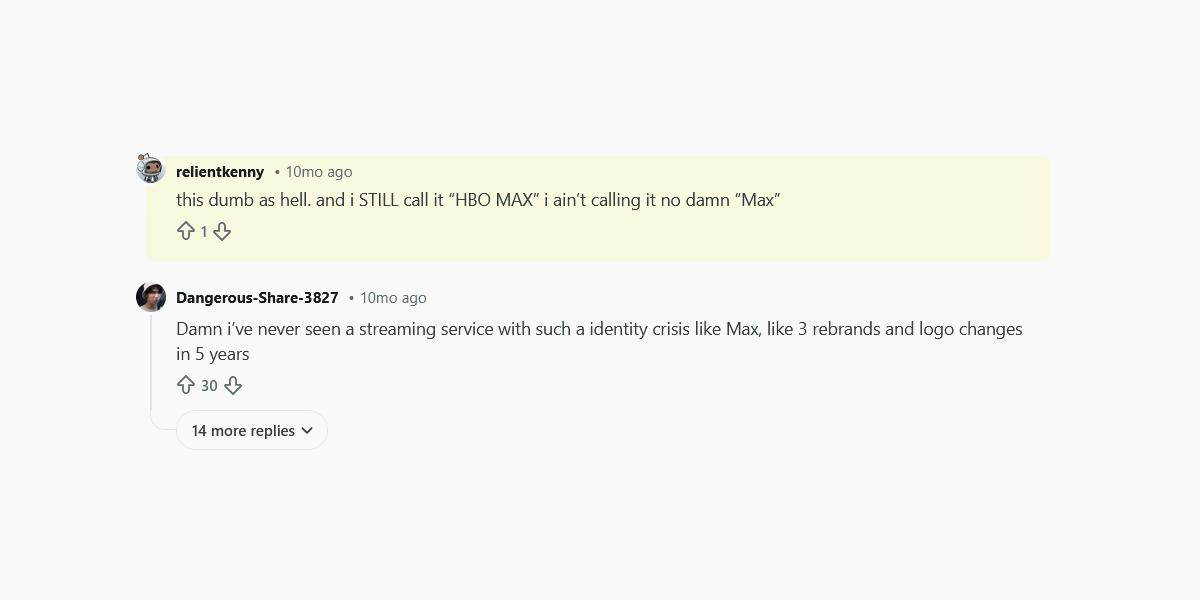
Image Source: Reddit.com
Whether viewers saw the rebrand as clever self‑parody or confusing back‑pedalling, one thing was clear: HBO Max’s design journey became a cultural moment as much as a marketing decision.
6. CNBC: When Abstraction Replaced Distinctive Identity
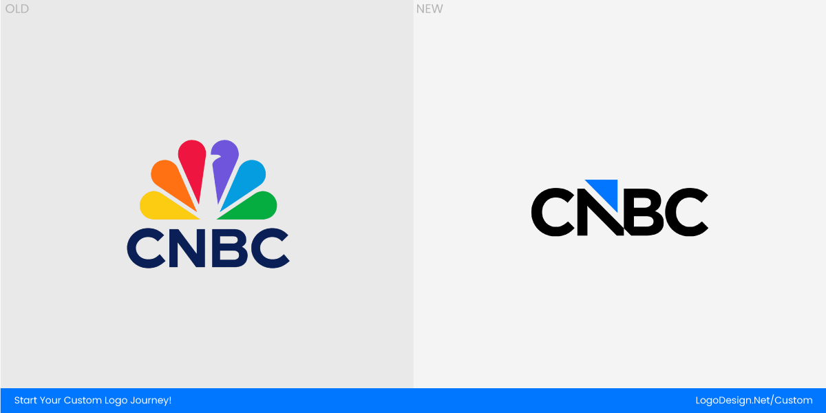
CNBC rolled out a new logo in 2025 that left many viewers and design watchers puzzled. The network kept its name, but the familiar and highly recognizable NBC peacock was dropped entirely. Instead, the new identity leaned into a simplified alphabet monogram in which the “N” and “B” are fused as a nod to a much older logo from the channel’s early days.
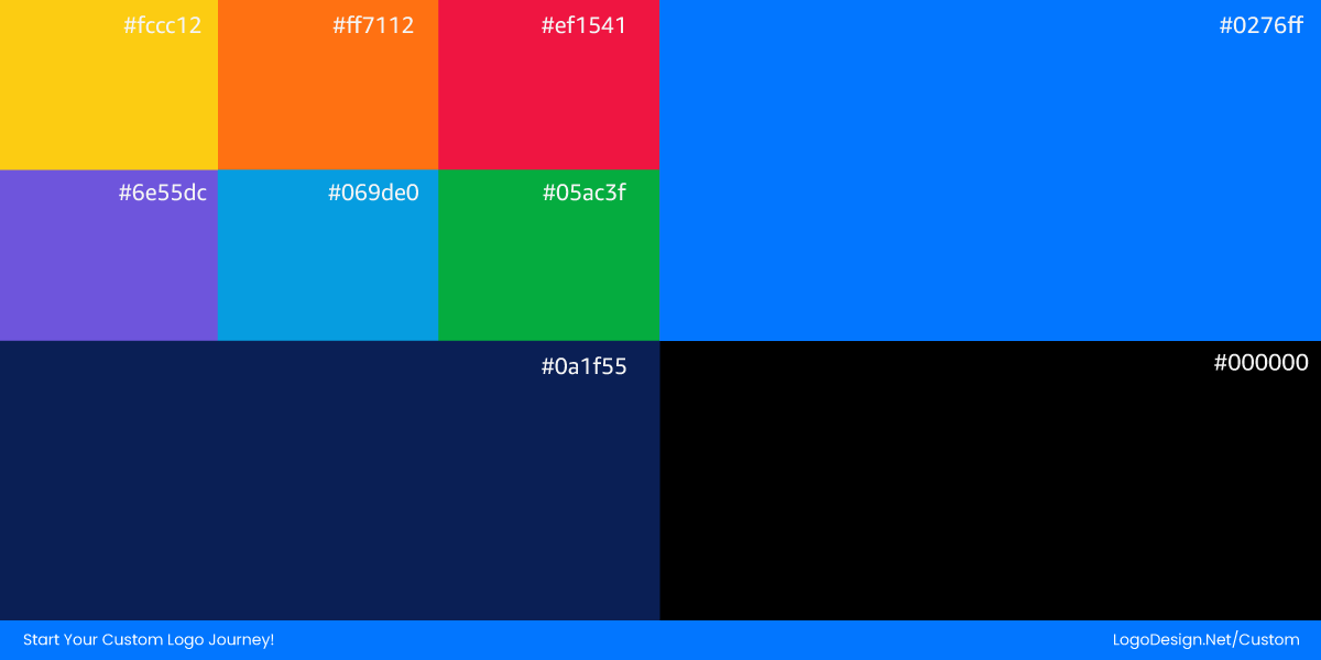
The intention was clear: a cleaner visual for a streaming-era world. But many felt the result was colder and less distinctive, trading a beloved visual cue for something more abstract and generic.
Users on X mocked the new logo while some shared different opinions.
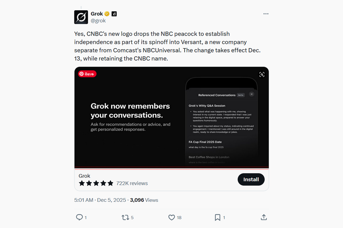
Image Source: X.com
On Reddit, design communities were vocal. In one widely shared thread, commenters described the new mark as CABC, which is way too generic. Others noted the irony that in trying to be modern and timeless, the identity simply became forgettable.
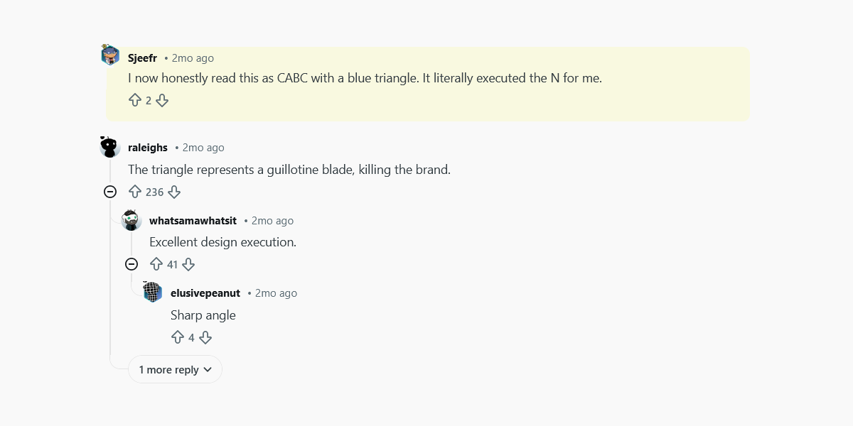
Image Source: Reddit.com
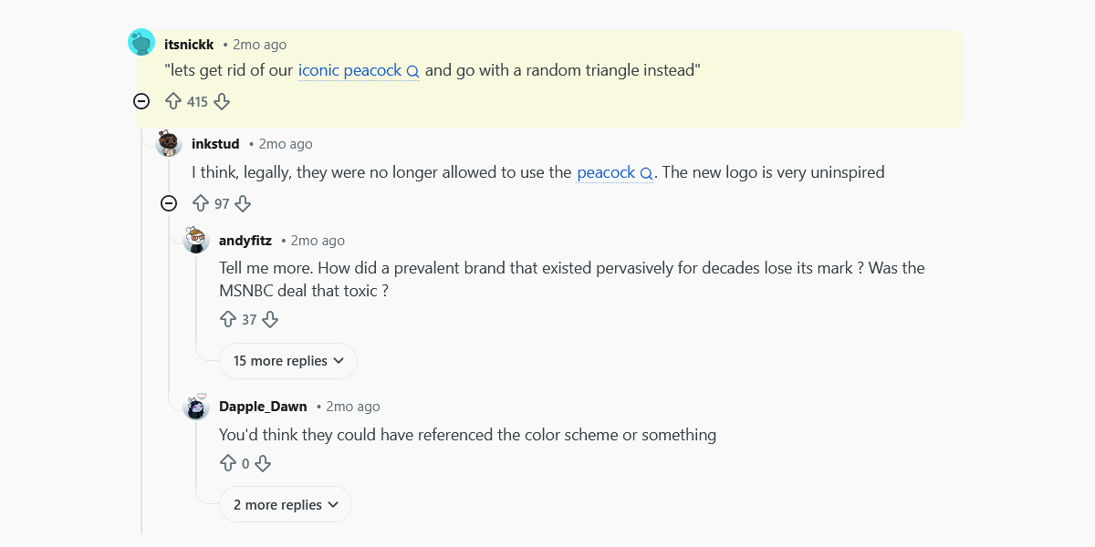
Image Source: Reddit.com
In a media landscape where every network wants to catch attention at a glance, CNBC’s 2025 logo shift proved that simplicity alone is not enough. Memorable identity still demands character as much as minimalism.
7. La-Z-Boy: When Comfort Lost Its Character
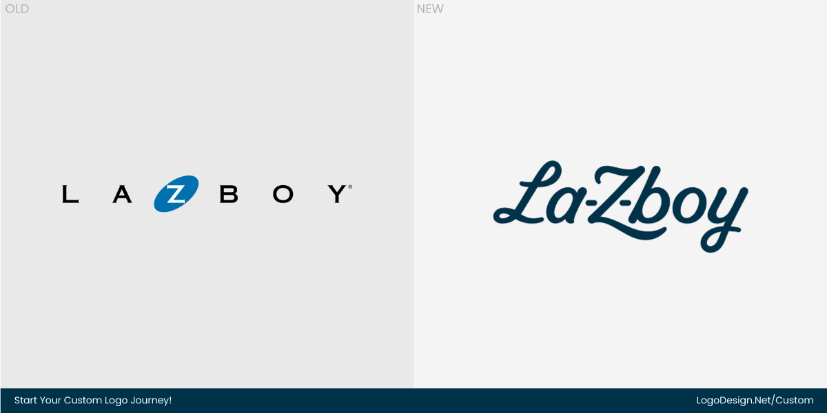
In 2025, La-Z-Boy unveiled a refreshed logo and visual system to give the brand a sleeker, more contemporary feel. The idea was to look design-forward, modern, and appealing to younger buyers. But in reality, the update smoothed out much of what made the brand instantly recognizable.
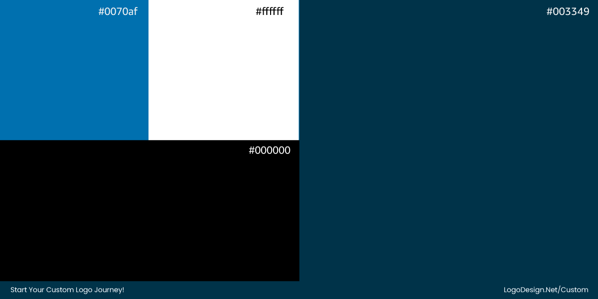
The playful dash in the name, the slightly rounded letters, and the personality that suggested comfort and approachability all got toned down, leaving a mark that could belong to almost any generic furniture brand.
Design communities on Reddit didn’t hold back. Some liked the new update, while others had different opinions, as shared below.
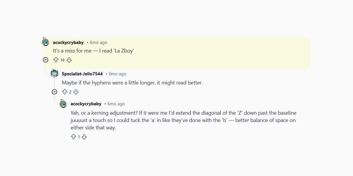
Image Source: Reddit.com
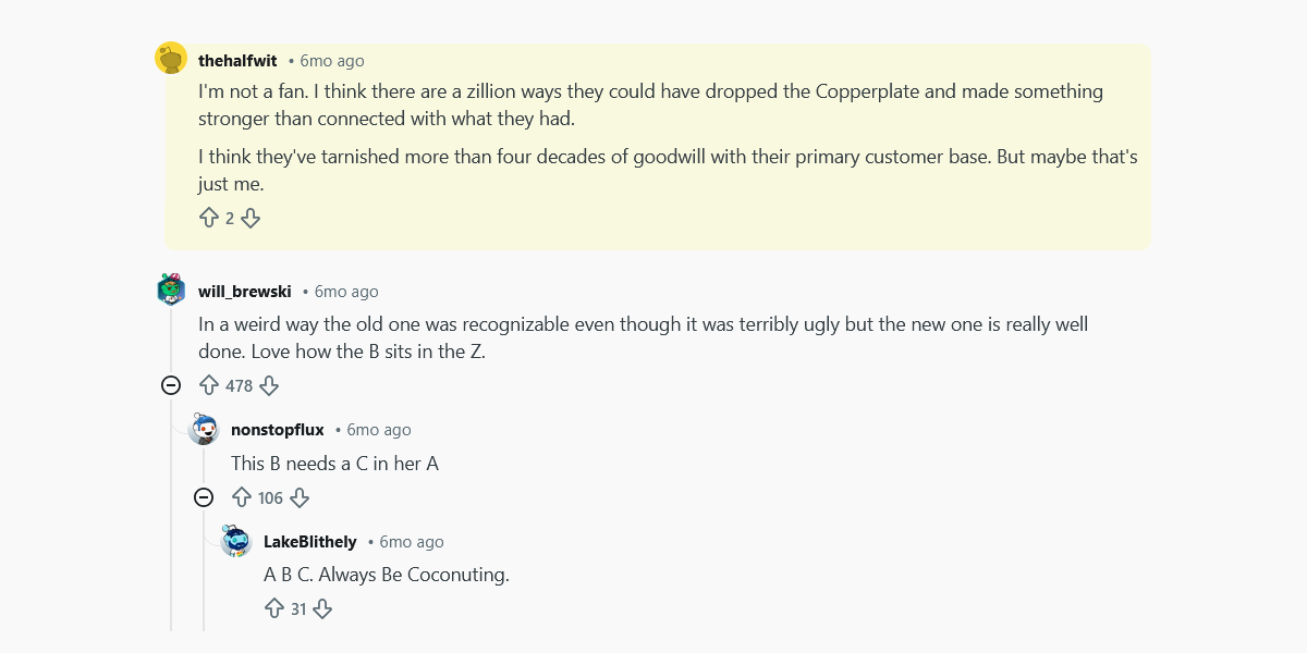
Image Source: Reddit.com
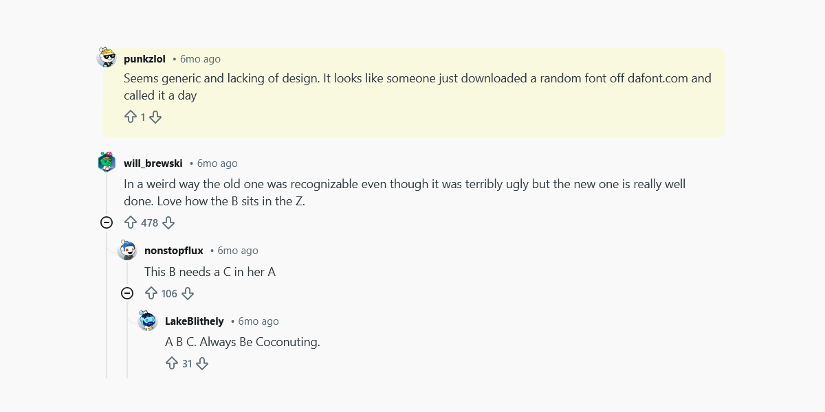
Image Source: Reddit.com
These reactions underline how removing distinctive quirks and softening the typography alienated part of the brand’s loyal audience while doing little to attract new fans.
By chasing modern aesthetics, La-Z-Boy sacrificed brand character and memorability. The redesign proves that even household names with deep equity can falter when they oversimplify in the name of style.
8. Starburst: Losing Its Signature Snap
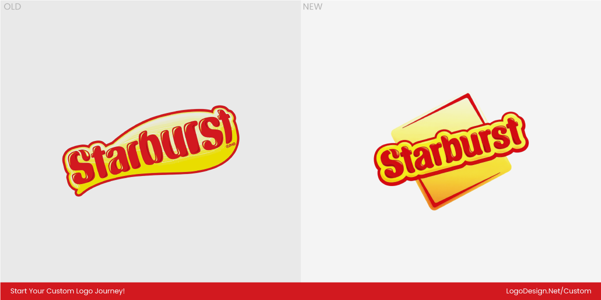
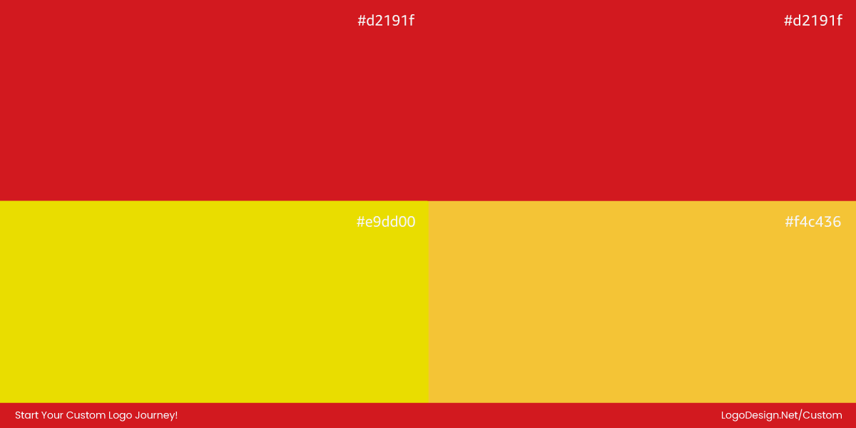
Starburst tried to shake things up in 2025 with a logo and packaging overhaul designed to feel sleek, modern, and consistent across screens and shelves. But the update had an unexpected side effect: it drained much of the brand’s signature exuberance. The zesty, playful vibe that once made Starburst instantly pop was replaced with a more muted, polished look that could easily be mistaken for any other candy on the shelf.
The audience’s reaction was mixed but revealing. Some described the update in surprisingly blunt terms, such as “trivial change” and “pretty meh,” questioning whether it added much beyond a minor facelift.

Image Source: Reddit.com
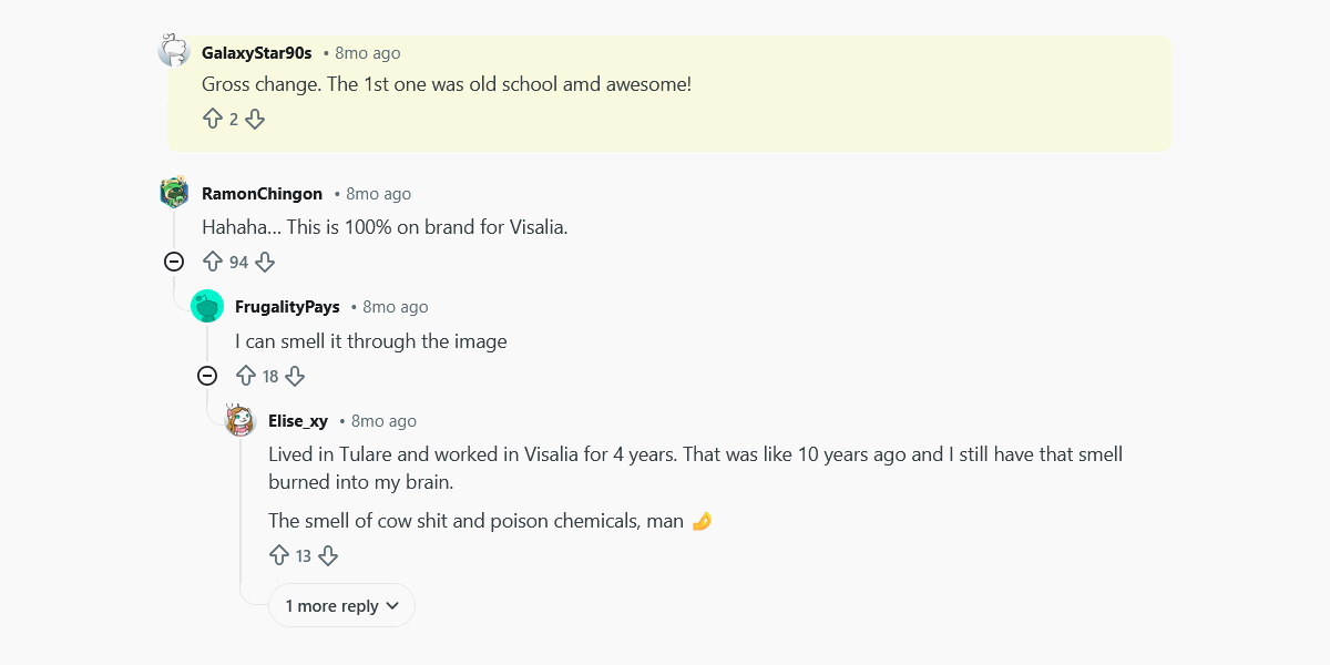
Image Source: Reddit.com
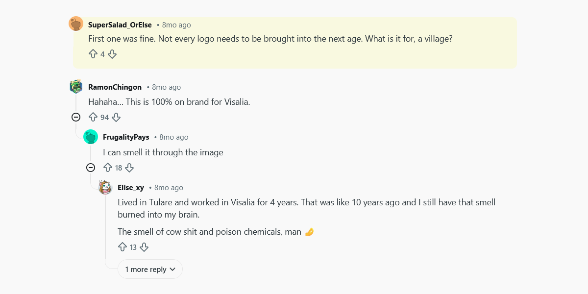
Image Source: Reddit.com
Another Reddit thread summed up the broader sentiment when someone wrote that the whole refresh feels like an attempt to fit into minimalist trends rather than celebrate what made Starburst instantly identifiable in the first place.
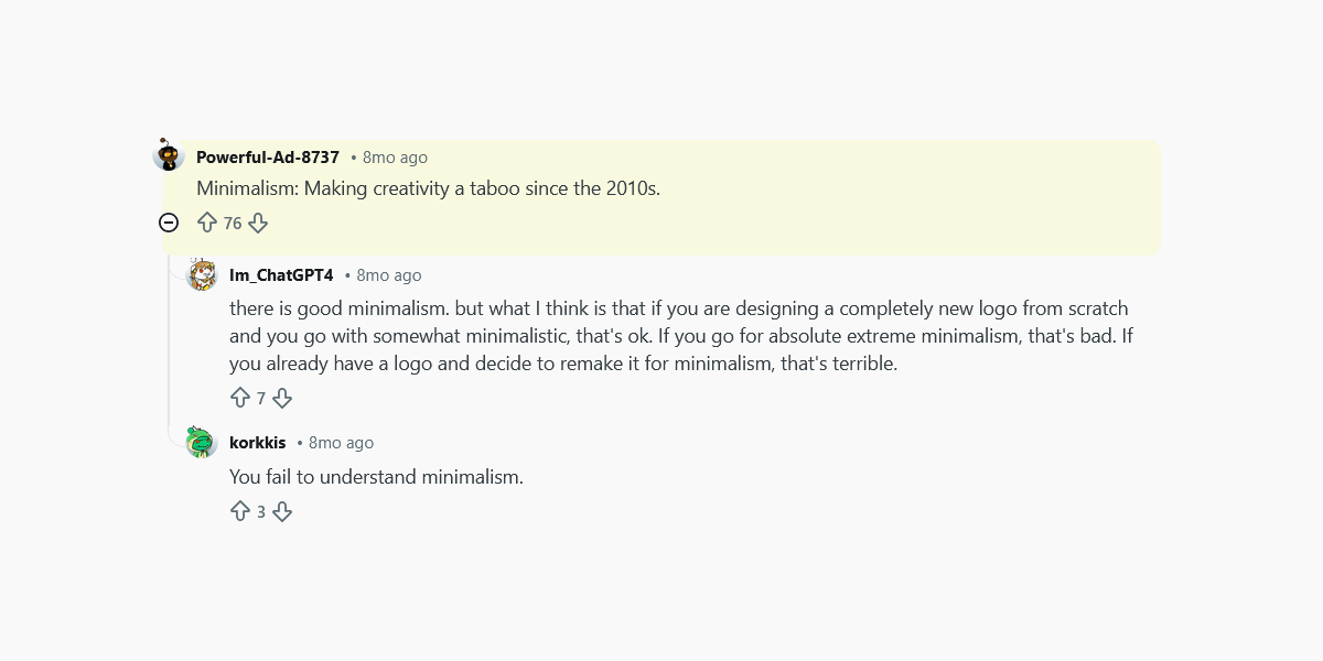
Image Source: Reddit.com
These authentic community reactions show that some people feel the update traded Starburst’s joyful punch for a clean look that is simply not distinctive. And that’s exactly the type of redesign that lands a brand on a “worst of” list.
9. PepsicCo: Too Corporate, Not Enough Character
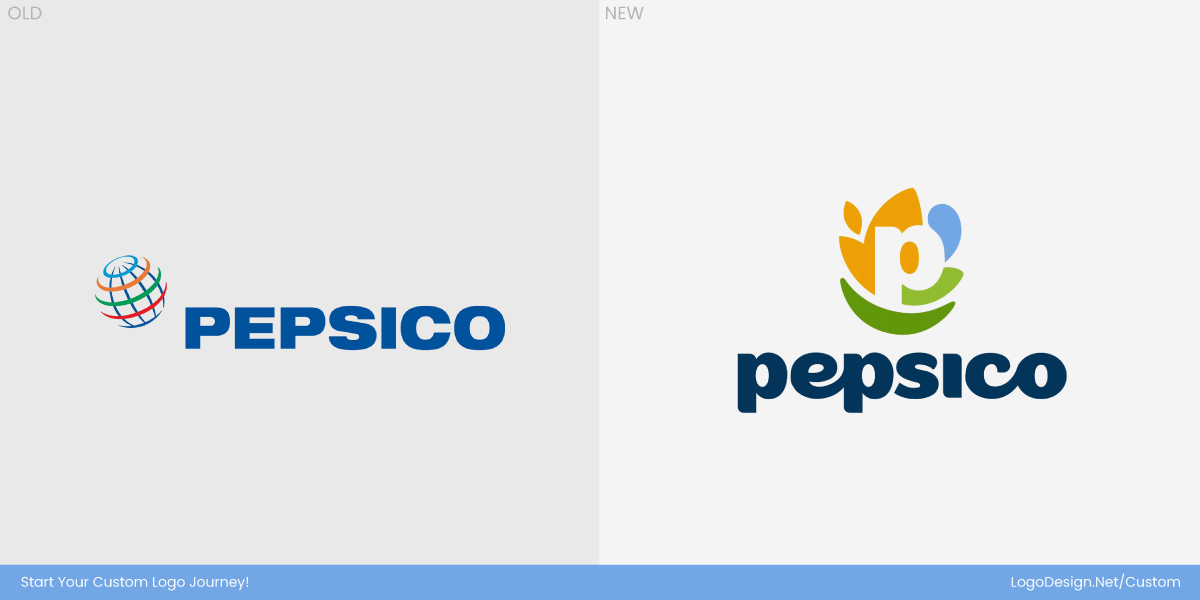
PepsiCo’s 2025 identity overhaul was meant to signal a new era for the food and beverage giant. The company unveiled its first major corporate branding refresh in nearly 25 years, aiming to unify a sprawling portfolio of more than 500 brands under a single visual language. The new logo places a stylized white “P” at the centre, surrounded by abstract shapes meant to symbolize food, beverages, sustainability, and the company’s smile-forward tagline: Food. Drinks. Smiles.
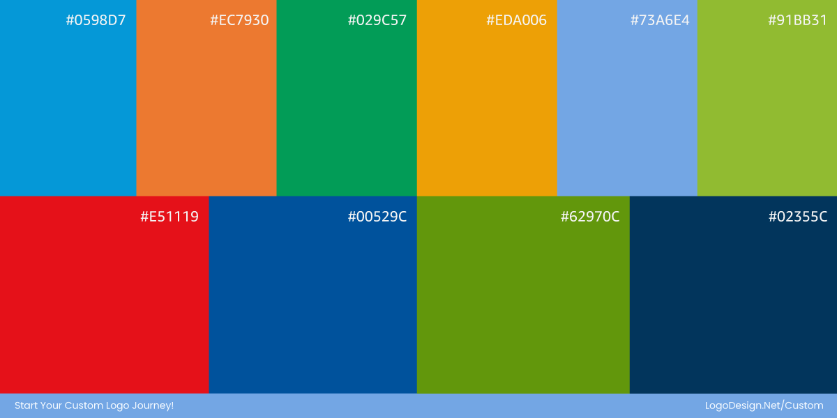
From a strategy standpoint, the shift focused on color rather than product recognition. The previous visual system relied heavily on the iconic Pepsi blue, closely tying the corporate brand to its soda namesake. The updated brand color palette expands beyond that association, introducing a broader, more flexible range of multi-colors that can represent beverages, snacks, and sustainability initiatives equally. This approach allows the brand to visually signal purpose and scale across its diverse portfolio, rather than being defined by any single product.
But not everyone was convinced it hit the right note. Many people even argued that the new logo wasn’t needed.

Image Source: Reddit.com

Image Source: Reddit.com

Image Source: Reddit.com
For a company that owns cultural icons like Lay’s, Doritos, and Gatorade, this refresh reads more like a compliance-driven corporate system than a confident parent-brand statement. Instead of tying the new identity to the heritage of its flagship equities in a way that consumers instantly recognize, PepsiCo’s new logo prioritized abstract symbolism and institutional polish — making it feel oddly detached at a moment when strong, ownable design still matters.
10. Microsoft AI: Copilot Chaos in Branding
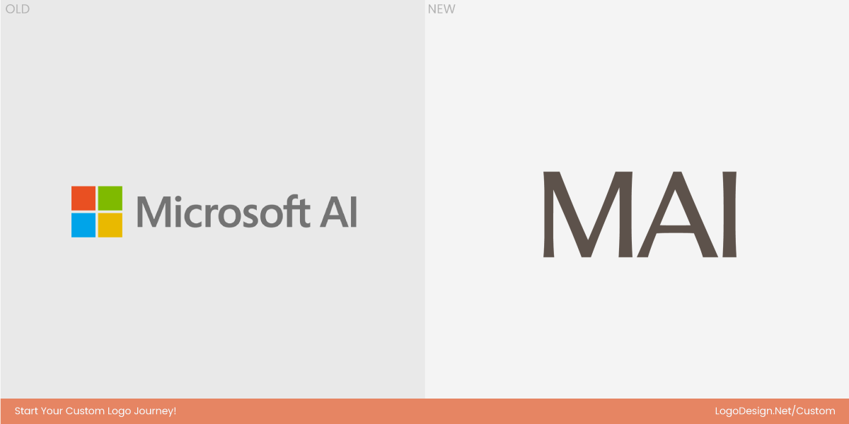
Microsoft AI was meant to tidy up a fast-growing product family. Copilot, Azure AI, and half a dozen other tools were starting to blur together, so leadership tried to give the company’s AI work a single visual and naming system. The idea sounded sensible, but in practice, it created something that felt oddly hollow.
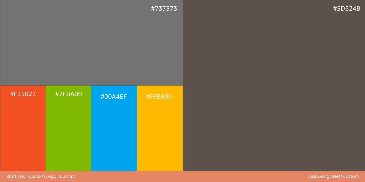
The new Microsoft AI identity looks like a sub-brand that never quite decides what it is. It does not feel like a flagship. It does not feel like a product. It does not even feel like a clear umbrella. Instead, it sits in that awkward middle space where everything looks approved by a committee and remembered by no one.
Users everywhere felt confused about the renaming and product overlap.
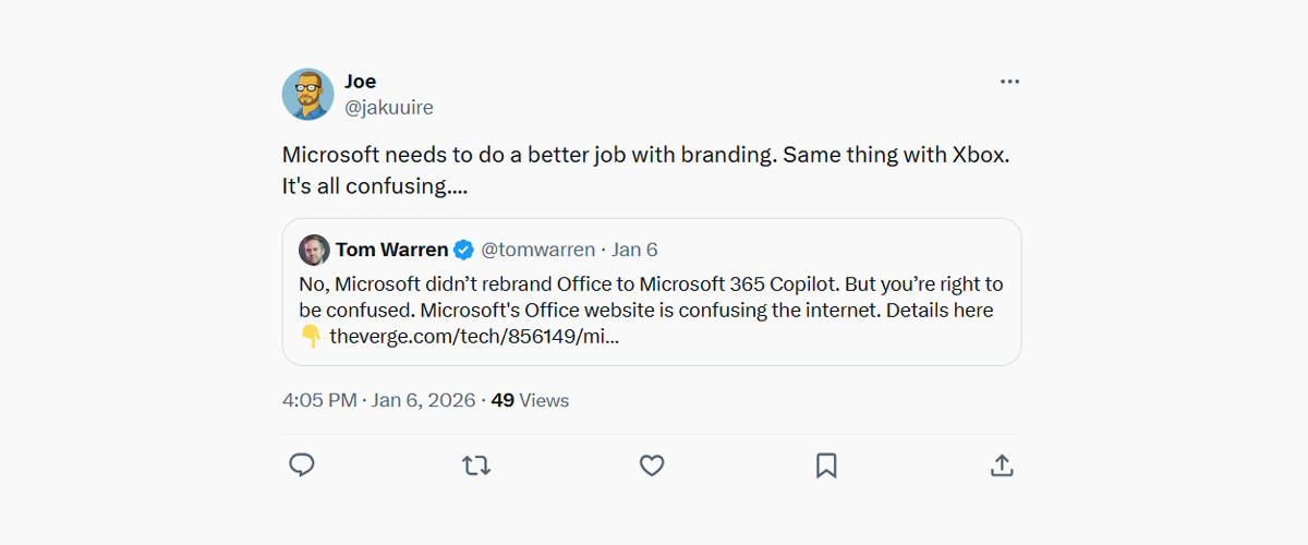
Image Source: X.com
Part of the problem is how little the system says. The psychology of shapes and logo typography leans heavily on safe, modern corporate design. There is no metaphor, no story, no visual idea that helps people connect Microsoft’s AI work to anything human or useful. For a company trying to lead the AI era, its branding ends up sounding like internal shorthand rather than an outward-facing promise.
There is also a hierarchy problem. Microsoft already has one of the strongest master brands in tech, yet Microsoft AI does not feel clearly tied to it. It neither borrows enough equity from the parent brand nor builds a timeless brand identity of its own. The result is a label that feels more like a line item in a product roadmap than something customers can latch onto.
Worst of all, the design slips straight into the wider “AI sameness” trend. Soft gradients instead of flat colors, abstract shapes, neutral type. It could belong to almost any AI startup or enterprise platform. For a company with Microsoft’s reach and history, blending in is the last thing it should be doing.
The problem doesn’t seem to end here. Here are a few real reactions by frustrated users due to the sprawling Copilot naming situation.
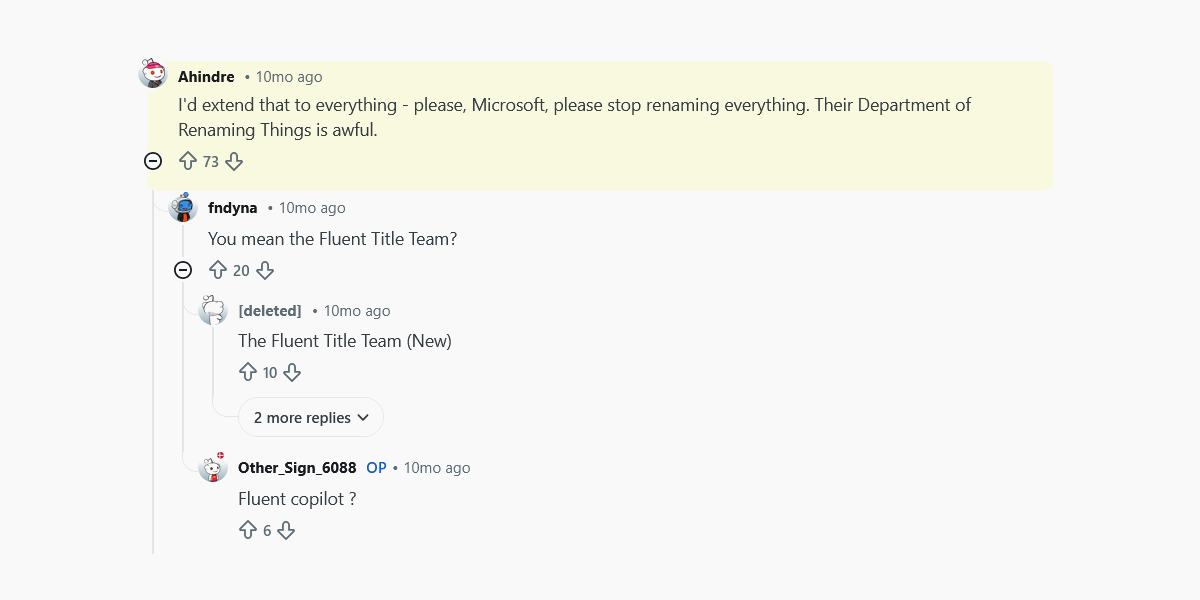
Image Source: Reddit.com
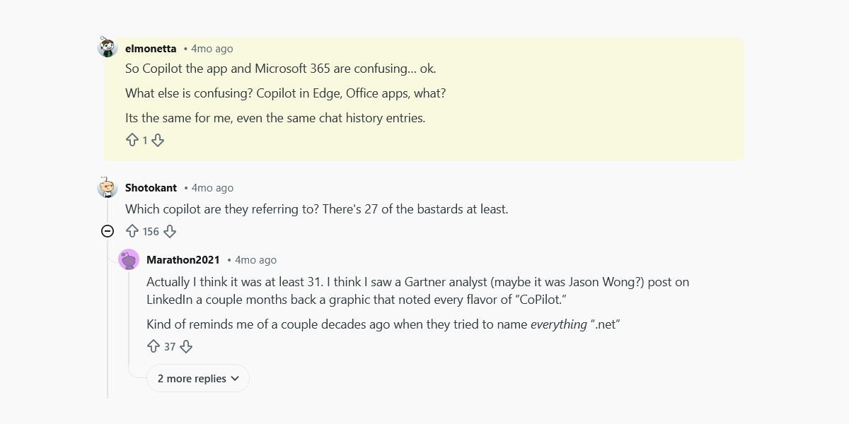
Image Source: Reddit.com
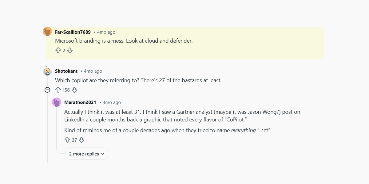
Image Source: Reddit.com
The Pattern Behind All These Flops
When you line up the 2025 logo rebrands side by side, the problem is not bad designers or lazy execution. The problem is repetition. Different brands, different industries, same decisions made for the same reasons. Once you spot the pattern, the outcomes feel almost predictable.
These are the missteps we believe made so many brands struggle to land.
• Removing Emotional Hooks
Many of these brands cut away the very details people felt attached to. Mascots, symbols, familiar shapes, even a certain awkward charm. Those elements may look old on a mood board, but they carry memory. When brands removed them, they also removed trust. This is one of the most common logo design mistakes because emotion rarely shows up in internal presentations, but it matters deeply to customers.
• Over-Smoothing and Over-Simplifying
Clean design became the goal instead of meaningful design. Logos were flattened, softened, and polished until nothing distinctive remained. In trying to appeal to everyone, brands ended up looking like no one in particular. Smooth is not the same as memorable, and smooth rarely helps when the goal is to design for brand recall.
• Letting Trends Override Identity
Minimal fonts, abstract symbols, muted palettes. These trends dominated rebrands across 2025, regardless of whether they suited the brand. Instead of asking, “Does this feel like us?” many teams asked, “Does this feel current?” Trends age quickly. Identity should not.
• Forgetting What Customers Already Loved
Perhaps the biggest mistake was assuming customers wanted change as much as brands did. Loyalty is built on familiarity. When logos abandons what people already recognize, it creates distance rather than excitement. The backlash we saw was not resistance to progress. It was resistance to being erased.
The Final Takeaway
2025 showed us that a logo is not just a graphic; it’s a memory trigger. When brands forget that, even the cleanest redesign can feel wrong. The worst logo transformations of 2025 all point to the same truth.
People do not fall in love with trends; they fall in love with what feels familiar, honest, and true to a brand’s story. Good design should evolve that story, not replace it. If you want a logo that people actually remember and trust, start from who you are, not what is popular.
Do you want to create a logo that lasts? Try our logo maker today.
