With a passion for baking pizzas and a goal to deliver the best, see how a Portland chef created the perfect logo for her dream brand using LogoDesign.Net’s logo maker tool.
When it comes to food businesses, first impressions start long before the first bite. That’s what Maya, the chef behind The Cheesy Cap, realized when her weekend pizza gig started picking up steam. For her, creating a logo meant creating a brand identity that customers could connect with at the very first glance. See how the logo helped them slice into the local market.
About The Cheesy Cap
The Cheesy Cap was born in the heart of Portland, Oregon, from a simple idea: handmade, wood-fired pizzas baked with love and delivered hot to your doorstep. Founder and head chef Maya Russo started the business from her home kitchen during the pandemic, where she used to make small-batch pizzas for friends and neighbors. But word spread fast because when you pour your soul into pizza, people taste it.
What began as a weekend hobby quickly turned into a full-time gig, and Maya knew it was time to step up her branding game. She had the recipes and the vision, but she needed a logo that captured her love for the craft.
Some quick facts:
Company Name: The Cheesy Cap
Industry: Food Delivery
Company Size: 10-12 employees
Location: Portland, Oregon
The Business Challenge
With a growing customer base in Portland, the business needed a memorable brand identity to stand out in the local food market. They needed a logo to truly capture their business vibe and help customers spot them at a glance.
When Maya, the founder of The Cheesy Cap, calculated her options, she quickly realized that hiring a graphic designer would be expensive, time-consuming, and frankly, overwhelming. She wanted full control over her brand image without back-and-forths, delays, or blowing her budget.
Thankfully, a colleague shared her experience and asked her to give LogoDesign.Net’s logo maker tool a try – and that’s when she got to know about it.
The Logo Creation Process
Designing a logo that captures the true essence of your food brand is no small feat. What every restaurant logo designer must know is that your logo is what communicates taste, experience, and personality to your customers. That’s why you need to get it right.
With LogoDesign.Net’s logo maker, Maya didn’t need to sketch, outsource, or decode any complex software. All she had to do was head over to the logo maker tool and simply type the company name in the search bar, filter by the Food and Restaurant category, and instantly browse hundreds of logo templates tailored to her niche.
When it came to choosing the right logotype, her first instinct was to keep it simple with a wordmark logo. She explored various text-based options that leaned on clean typography to make an impact. Some examples that caught her attention were:

This is a logo concept of The Cheesy Cap, which shows a slice away from Pizza

This is a logo concept of a cheesy cap with a text logo icon italics, and white filling color.
While the simplicity was appealing, Maya felt that a text-only logo didn’t fully capture the fun, flavorful vibe of her pizza kitchen. It lacked personality and, more importantly, it didn’t clearly communicate what the business was about.
So, she kept exploring and stumbled across more illustrative designs. She was drawn to pizza-themed visuals that were more expressive.

This is one of the options for The Cheesy Cap logo, where a hot slice of Pizza is visible.

A Cheesy Cap Logo Concept Where the Pizza is in the Shape of Heart

In this Cheesy Cap logo, the Pizza is on fire, shaped like a burning wheel.
These logo designs had more visual pop and a stronger food connection. But they didn’t quite say “The Cheesy Cap” to her. They felt too commercial or fast-food driven and not personal enough. At one point, a mascot-style logo also caught her attention.

This Cheesy Cap logo concept shows a Pizza man character with a knife and fork.
But she dropped the idea after a brief discussion with her team, as the whole point was to appear playful but not gimmicky, and a mascot may risk making her brand look less serious about the food itself.
Eventually, the chef had a breakthrough. As a nod to her origins–making pizzas from her home kitchen–she decided her logo needed a chef’s hat. She’s always worn her lucky chef hat while cooking, so why not reflect that in the logo? This idea led her to some charming, chef-themed Italian restaurant logo designs like:

The Cheesy Cap Logo concept, where a chef’s hat with a Pizza slice is visible.

This is a Cheesy Cap logo concept with the Mexican hat on a Pizza slice.

Cheesy Cap logo with a Chef hat with Pizza.
The last one clicked immediately. It felt warm, professional, and perfectly aligned with her vision.
Using LogoDesign.Net’s intuitive logo editing tool, she got to work making it her own. She leaned into the psychology of colors in logo design to shape how people would perceive her brand.
Her color choices were intentional.

In two frame, one shows the Cheesy Cap logo, and the other shows a color palette
- Warm Yellow: to reflect friendliness, happiness, and an inviting atmosphere
- Earthy Red: to stir up the appetite and excitement
- Basil Green: to suggest freshness, comfort, and a homemade feel
- Rustic Brown: to evoke warmth and the authenticity of oven-baked goodness
Each color added its own emotional layer that made the logo full of meaning.
Next came the fonts. Maya knew that the typography and fonts could make or break the tone of her logo, so she tested a few to strike the right balance. Some fonts she explored were:
- Baloo 2: a typeface with rounded edges and modern friendliness, it gave off a cozy, upbeat vibe to the logo
- Courgette: a handwritten font that made the brand feel intimate and artisan-crafted
- Comfortaa: a rounded geometric sans-serif typeface that’s great for versatility, which gave the logo a modern and friendly appearance


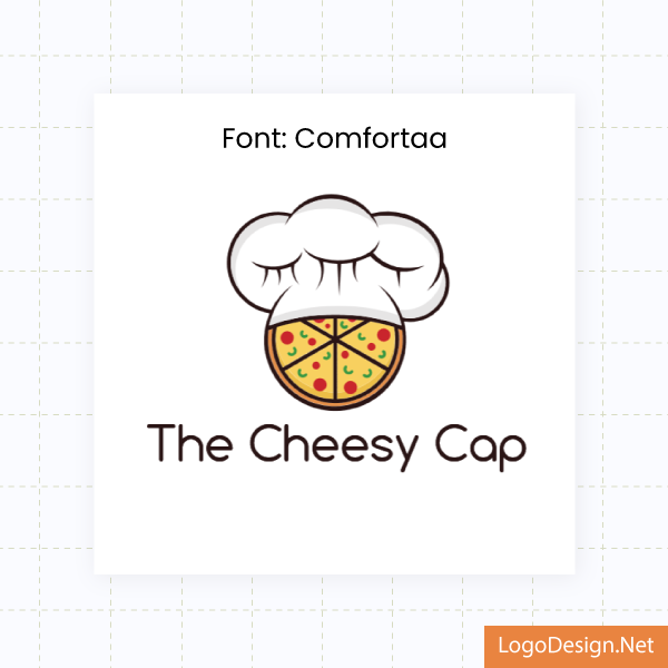
Three frames showing three Cheesy Cap logos, where a Chef hat with Pizza is visible, with different typography.
After comparing various styles on her logo preview, she chose to go with Comfortaa because it best balanced fun with professionalism.
The ability to preview her customized logo with business slogan “Topped with Flavor, Capped with Cheese!” across real-world mockups was a game-changer. It helped her see exactly how the logo would look on a business card. She got a first-person view of what her brand would feel like when the business card is handed to a customer or left at the counter.

The Cheesy Cap logo with a business card overlapping it

A logo concept of The Cheesy Cap on a Social Header.
The same went for social media headers. She assessed how the business logo would look at a glance across platforms like Facebook and Instagram and how she could fine-tune it further to stand out in crowded feeds.

A logo of the Cheesy Cap on a Flyer.
Moreover, the flyer mockup gave her a complete picture of how the logo anchors her promotional materials, from takeout menus to local event handouts. This helped her ensure consistency and visual impact at every touchpoint.
Doing so, she visualized the final product and made adjustments instantly, from layout tweaks to font sizing, all without ever leaving the browser.
After making some final tweaks, it was downloaded in all logo file formats (PDF, SVG, PNG) in minutes and was ready to be used across her branding, including the website, pizza boxes, delivery stickers, and social media.
Here’s what the final version of her business logo looked like:

A cheesy cap logo with a chef’s hat on top of a full Pizza, along with a slogan.
The Results
A logo might seem like a small thing, but its impact can be huge. That’s exactly the case with The Cheesy Cap. Since unveiling her new look, the chef Maya says customers now instantly recognize The Cheesy Cap brand, especially with the logo proudly displayed on delivery boxes and all over her Instagram.
What once felt like a side hustle now looks and feels like a full-blown, professional business. The logo has helped build trust, attract new orders, and give her brand the identity it truly deserved.
Want to Create Your Business Logo?
Are you baking up a business or building one from scratch? LogoDesign.Net gives you the tools to create your perfect logo, with no design skills and no downtime. From eye-catching logos to business cards and websites, we’ve got all the branding tools to help you look like a pro from day one.
Try our free logo maker today!

Case Study: The Cheesy Cap Found Their Perfect Logo—Here’s How
What does turning a weekend pizza gig into a recognizable brand take? For Maya, a Portland-based chef, the answer started with the right logo. From playful sketches to a polished identity, she used LogoDesign.Net’s logo maker to capture her vision without hiring a designer. Download the full case study to see how her brand, The Cheesy Cap, carved out its place in a competitive food market.